21 Best Parallax Scrolling Websites 2026
Explore the best collection of parallax scrolling websites that’ll excite you to add this catchy “depthy” feature to your page.
While we always recommend keeping responsive web design simple, adding creative elements to spice things up can be beneficial. (Just don’t overdo it.)
Integrating a parallax effect is a common practice that even some of the biggest websites in the world use.
You’ll gain plenty of new ideas and inspiration when checking the extensive list of amazing designs below.
Remember, while you can use any recommended page builders to achieve this, a parallax-scrolling WordPress theme is our favorite option.
Best Examples Of Parallax Scrolling Websites
1. Supernatural
Built with: Squarespace
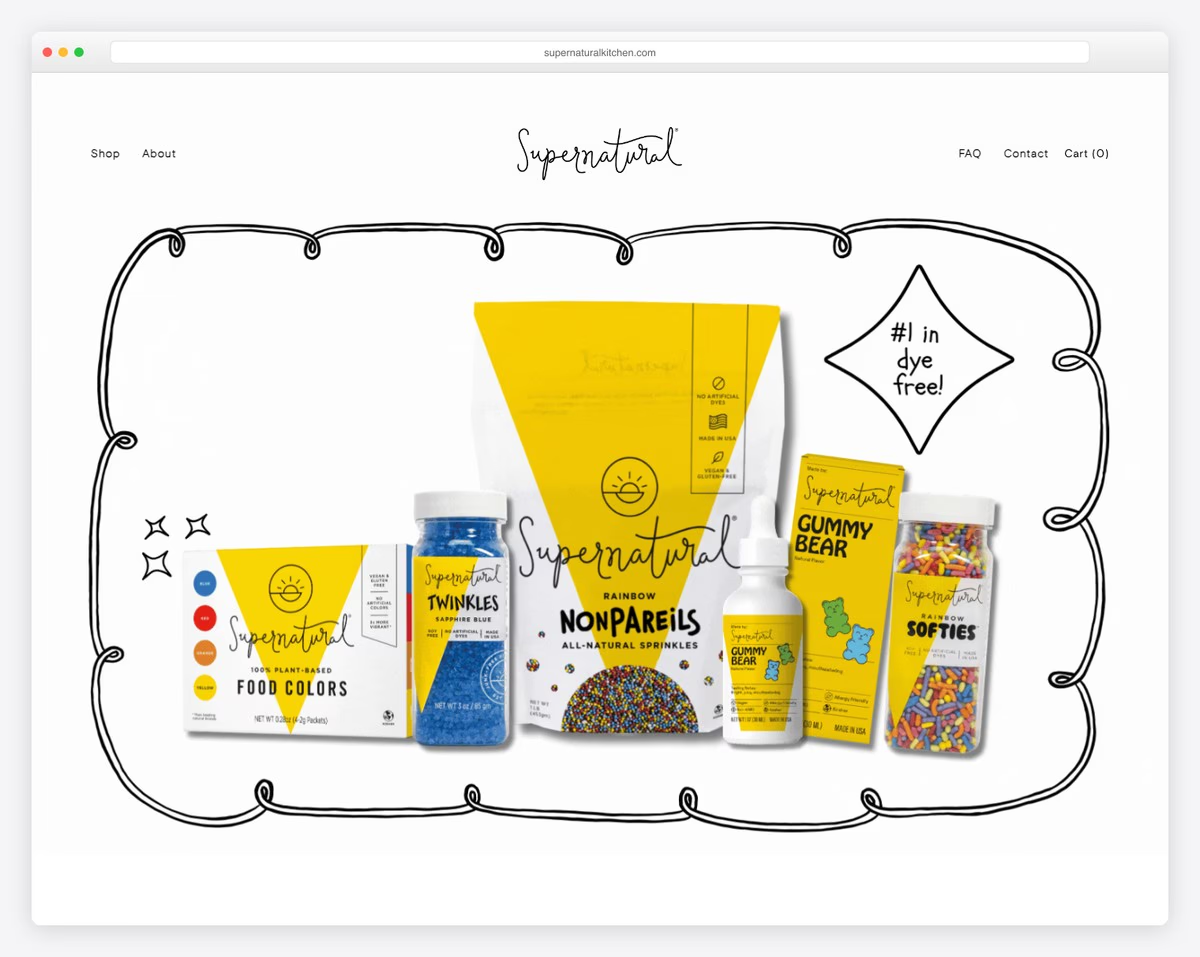
Supernatural has a minimalist yet vibrant, responsive web design with a larger hero image with a parallax effect.
What’s particularly interesting is that there’s no text or call-to-action (CTA), just a mouthwatering image. The header is 100% transparent, so it doesn’t cause distractions.
There’s another parallax section to spice things up before the Instagram feed.
What stands out: Integrating an IG feed is one simple (and smart) way of adding more content to your website.
2. Minna
Built with: Squarespace
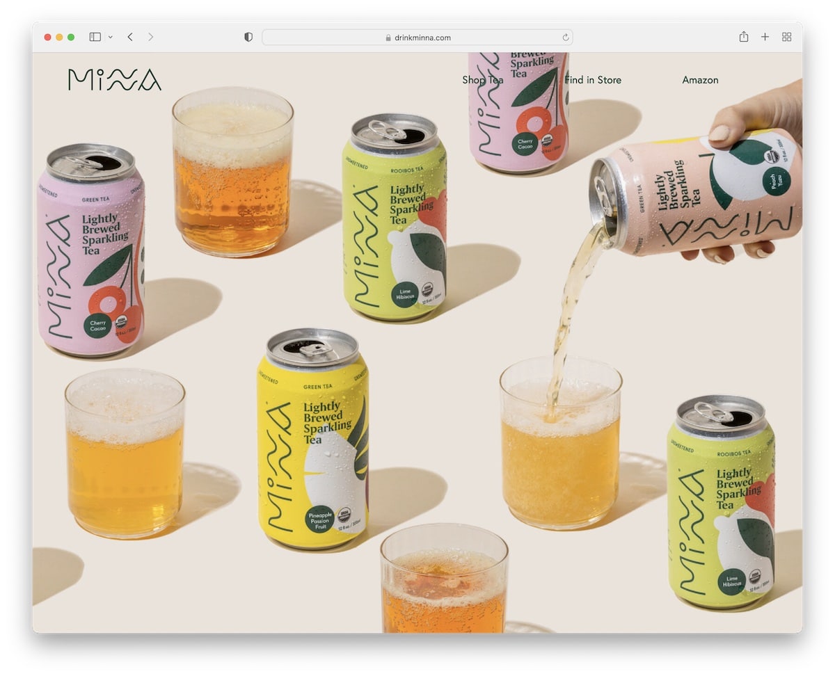
Like Supernatural, Minna has a massive, full-screen image above the fold with parallax functionality to make it more engaging. Besides the image, the two “wavy” backgrounds also contain a parallax effect.
The rest of this stunning website are multiple colorful sections, each advertising one of their products.
What stands out: You don’t necessarily need to add a parallax image; it could also be background patterns, graphics, etc.
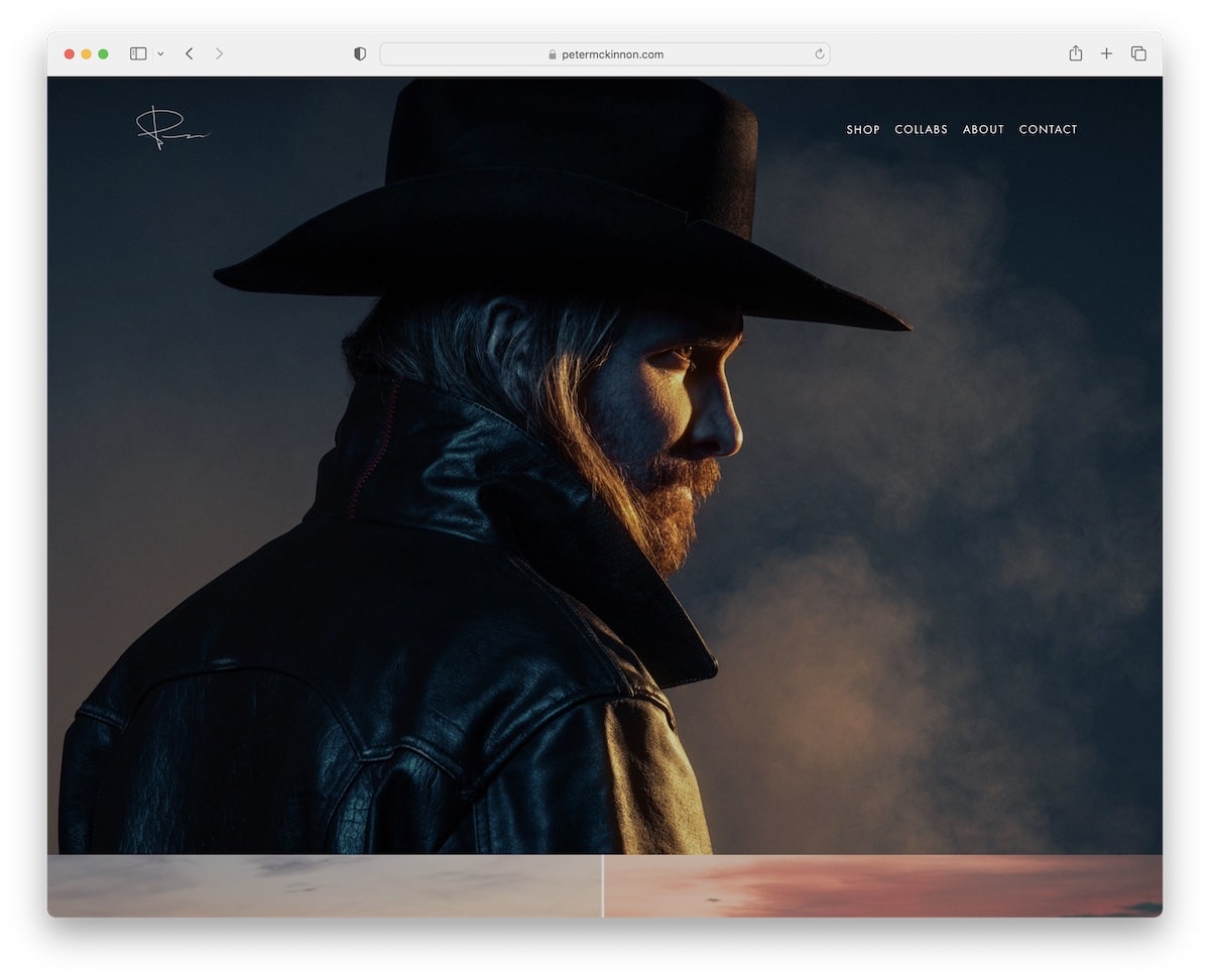
3. Peter McKinnon
Built with: Squarespace
Peter McKinnon is a full-screen parallax scrolling website that will immerse you in the content from the moment it loads.
The header (with a drop-down menu) and the footer are very minimalistic, so they don’t detract from this page’s overall beauty.
What stands out: Combining large images with a parallax effect creates a strong and lasting first impression.
We have a list ready for you if you want to see more terrific Squarespace photography examples.
4. A Fork & A Pencil
Built with: Squarespace
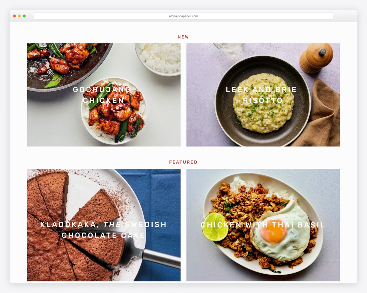
In between the on-scroll loading grid, A Fork & A Pencil has a parallax background that creates a more dynamic vibe.
This parallax scrolling website also has an IG feed (with a follow button) that opens each post in a new tab. You’ll also find a subscription form and a multi-column footer with plenty of links the header lacks.
What stands out: To keep the header cleaner, move the necessary links to the footer. You can also use a hamburger menu icon so the links appear only when clicked.
You’ll also enjoy checking all these other fantastic Squarespace blog examples.
5. Healthway
Built with: Squarespace
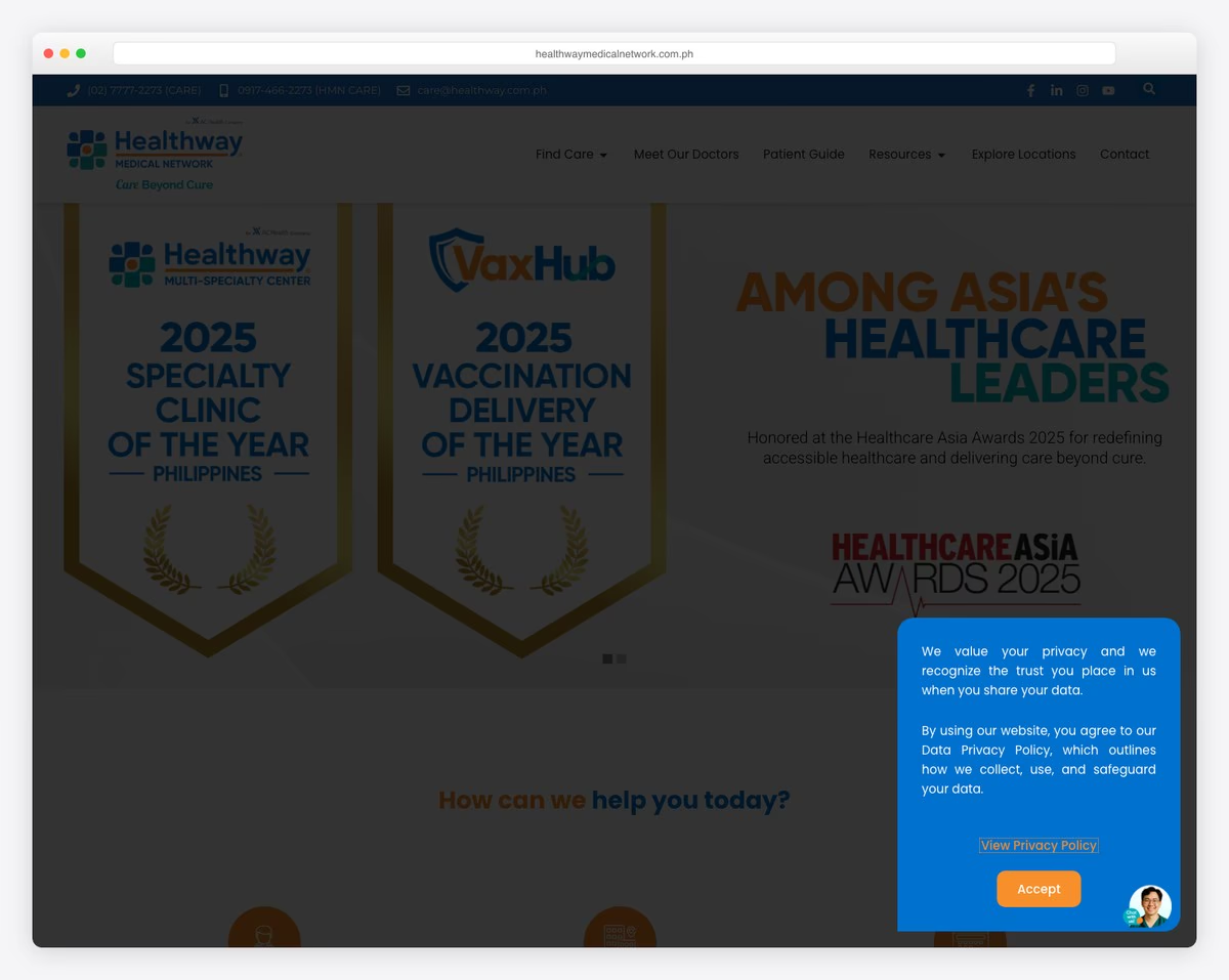
We already mentioned that a parallax scrolling website doesn’t necessarily need parallax images; it could also be creative elements, like on Healthway.
This minimalist website creates a pleasant atmosphere with color combinations and lots of white space. It has testimonials for social proof, buttons with a hover effect and an information- and link-rich footer.
What stands out: Client testimonials, user reviews, and ratings are great ways to build trust in your services and products.
6. Flatiron Family Medical
Built with: Squarespace
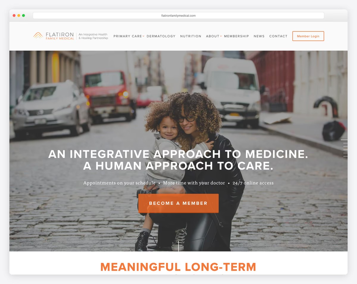
Flatiron Family Medical is a parallax scrolling website with a large hero image overlayed by text and a CTA button.
The header is very discreet, with a logo on the left and a hamburger menu icon on the right.
What’s unique about this healthcare website is the vertical line “pagination” on the right screen side to jump from section to section instead of scrolling.
What stands out: Use the hero section to promote your services with a large CTA button and compelling text.
This website looks awesome, but did you know that it was created using one of our parallax templates for Squarespace?
7. ScrubaDub
Built with: Highend Theme

ScrubaDub has lots of attention-grabbing elements that spice up its car wash website design. It has a slider, a parallax background, animated statistics and hover effects.
The sticky navigation bar has a multi-column and multi-level drop-down with many links. But you can always type your keyword in the search bar and hit enter.
What stands out: Add a slider above the fold to showcase more valuable content, information and specialties without taking extra space.
8. Casa Mami
Built with: Squarespace
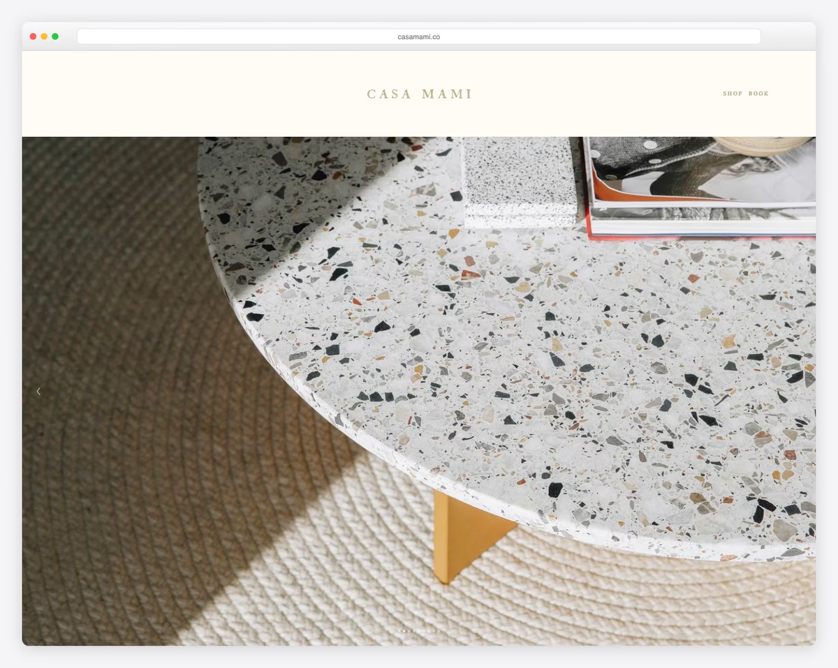
Casa Mami takes the first impression to the next level with its massive image slideshow featuring no text and CTAs. It’s pure enjoyment.
The website has a clean design with a special parallax section that promotes bookings with an outlined button that turns solid on hover, making it more actionable.
What stands out: A button’s hover effect can make it more clickable, contributing to more conversions.
9. Zion Adventure Photog
Built with: Wix
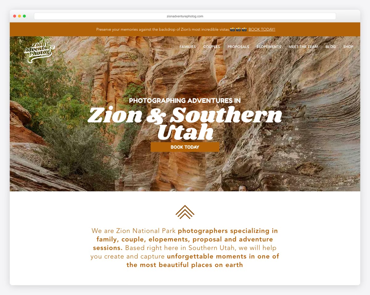
Zion Adventure Photog is a clean website with a pleasant color scheme and easy-to-digest typography. It also uses the cool parallax effect, adding depth for improved UX.
While the header doesn’t float, the notification bar does. It only reappears on a back scroll and is transparent, so it doesn’t clutter the screen.
What stands out: Your website’s color scheme can greatly impact the user experience, so choose wisely.
10. Shola Richards
Built with: GeneratePress
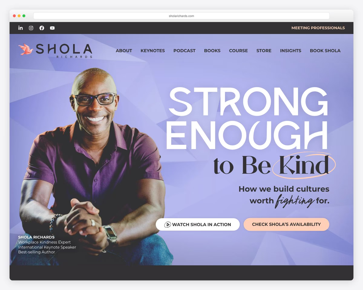
Shola Richards rocks them both from a parallax background to a parallax background pattern. Shola uses the top bar for social media icons, so it’s very easy to connect with him.
Moreover, even though this is a multi-page public speaker website, the home page feels like a landing page, with an excellent presentation and a contact form at the bottom.
Note: Use your home page to comprehensively present your business, products and services.
What stands out: A hero slider showcases multiple offerings at a glance, giving visitors quick access to key content.
11. Melyssa Griffin
Built with: Showit
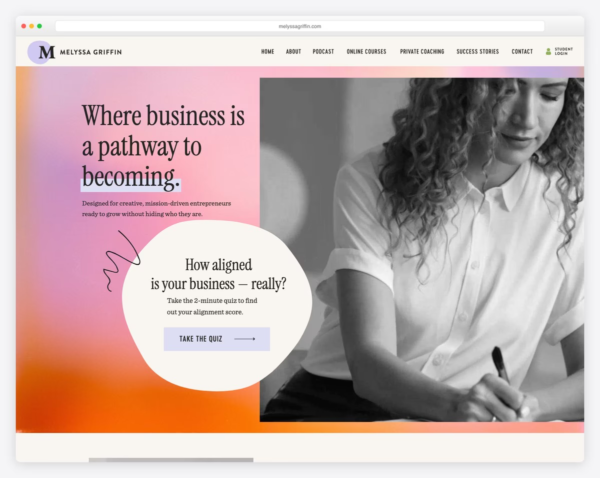
Besides the parallax scrolling effect, Melyssa Griffin has other exciting elements that create a captivating personal website.
From GIFs and a video background to a popup quiz that helps her strategically collect leads, this vibrant website has it all and then some. You get a personalized experience by checking the images and the site’s design.
What stands out: Let your visual content and website look express your personality.
12. A Branch Of Holly
Built with: Squarespace
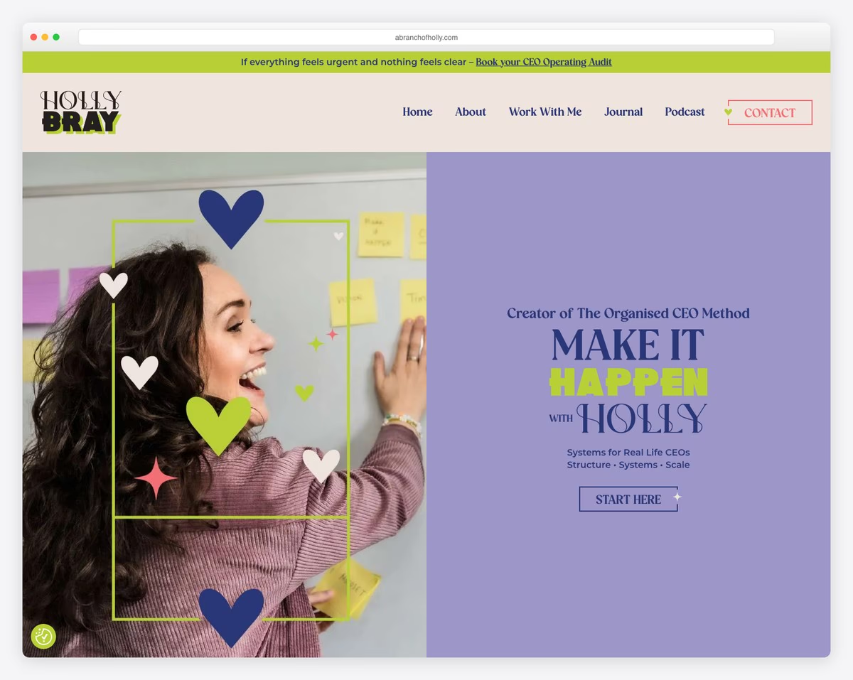
A Branch of Holly has a catchy split-screen hero section design. Its left side has a parallax image, and the right side has text with a CTA button.
This page has plenty of white space, making it more readable. It also has a feminine color palette that’s calming and mellow.
A Branch Of Holly has floating social media icons on the left screen side, so access to her profiles is always at your fingertips.
What stands out: Simple fonts and white space will make your website easy to flip through.
13. Body By Amanda
Built with: Squarespace
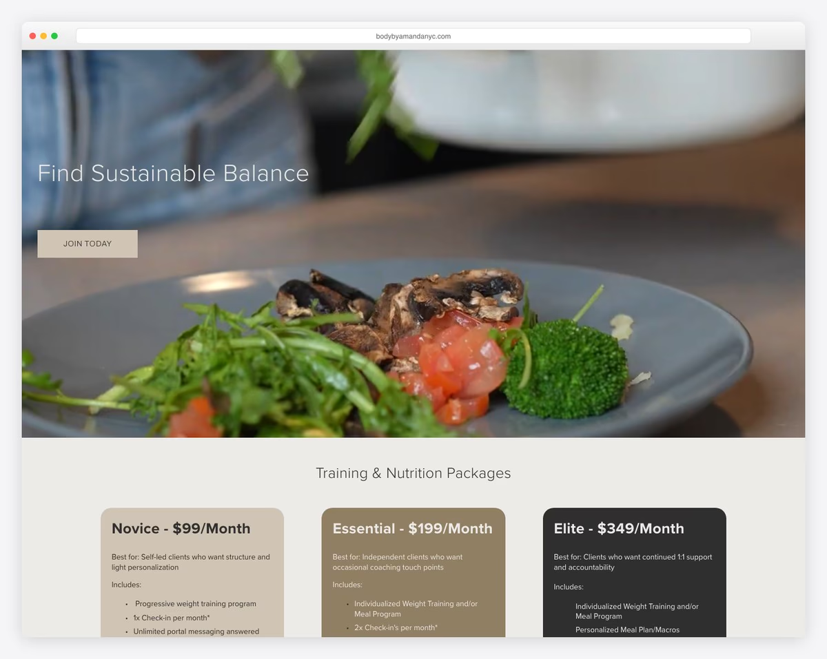
Body By Amanda’s home page has two parallax scrolling image backgrounds that animate it, boosting UX.
You’ll find a top bar notification above the simple header with a menu highlighting links on hover.
Moreover, the footer only has three quick links and social media icons, all of which have the same hover effect as the main navbar.
What stands out: Add more shine to that something extra you offer by creating a top bar notification.
14. Elles Bailey
Built with: Wix
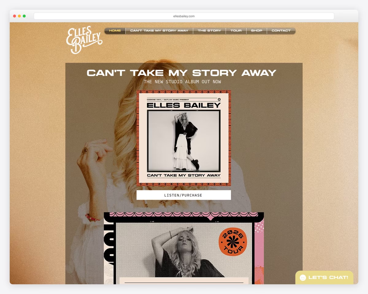
Elles Bailey has a full-screen parallax background that makes this musician’s website more interactive. The page’s content feels “overlayed,” which gives it a unique touch.
You’ll also find an embedded audio playlist and video to enjoy the tunes without using a 3rd-party platform.
What stands out: Embed audio and video content into your website, so there are more reasons for your visitors to stay on it for longer.
15. Chris Boyer
Built with: Squarespace
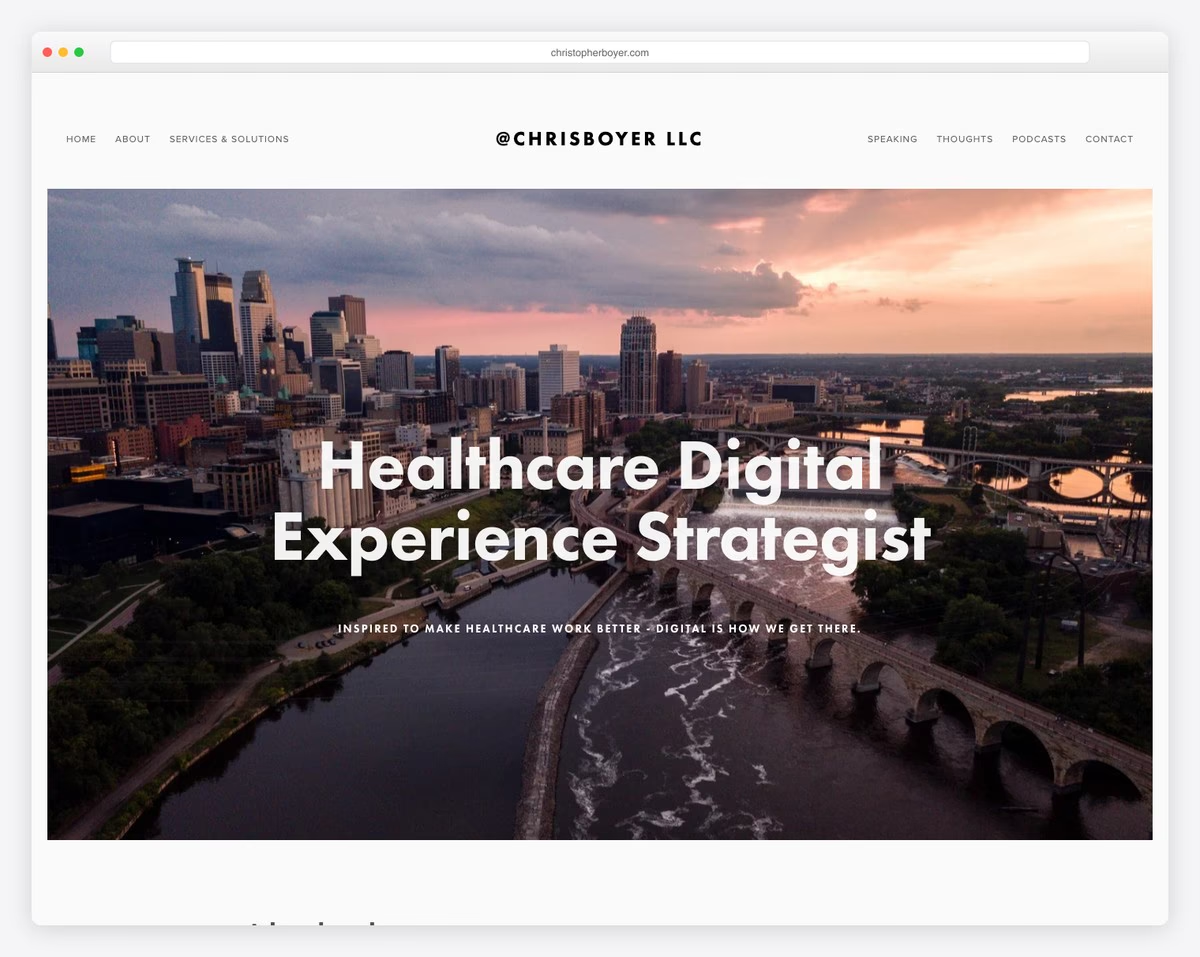
Chris Boyer runs a minimalist website with parallax inclusions to make it more sparkling. Another attribute we like on this service site is the use of a white background across all pages, including the header and footer.
Furthermore, the latter two are basic, featuring quick links and social buttons, maintaining flawless flow.
What stands out: One unofficial rule helps you when you don’t know how to approach your site’s design: Keep it simple and minimal. (For more design ideas, check out these top-notch simple websites.)
16. Michelle Harwell Therapy
Built with: Squarespace
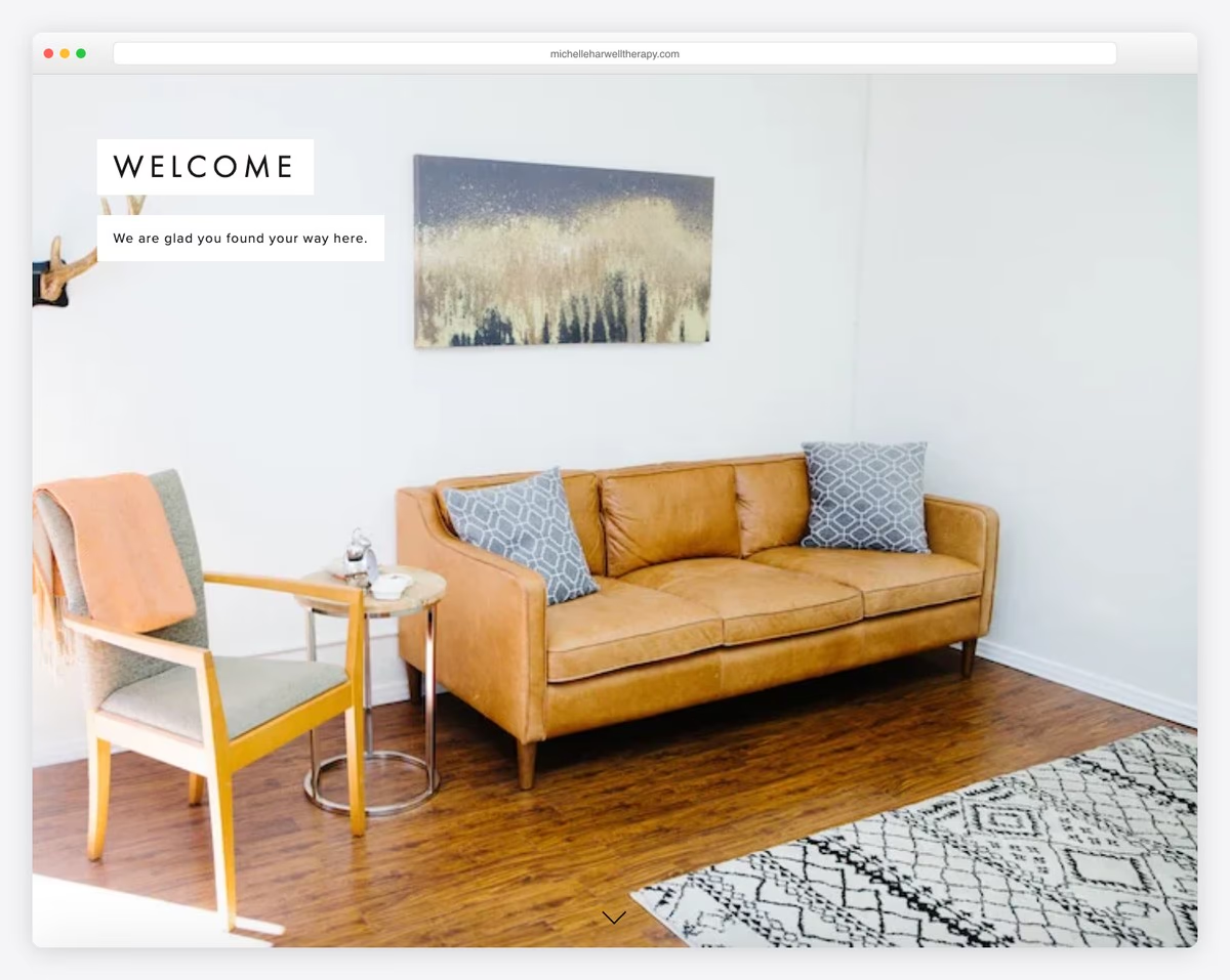
Instead of one, this parallax scrolling website has multiple parallax sections to keep the visitor’s eyes busy.
While you can scroll Michelle Harwell Therapy’s page, you can also use the sidebar dot navigation. (Each dot represents a section that displays on hover.)
What’s more, using the back-to-top button helps avoid scrolling, ensuring getting to the navigation bar with a click.
What stands out: A (floating) back-to-top button can significantly improve your website’s UX.
17. Angie Richey
Built with: GoDaddy Builder
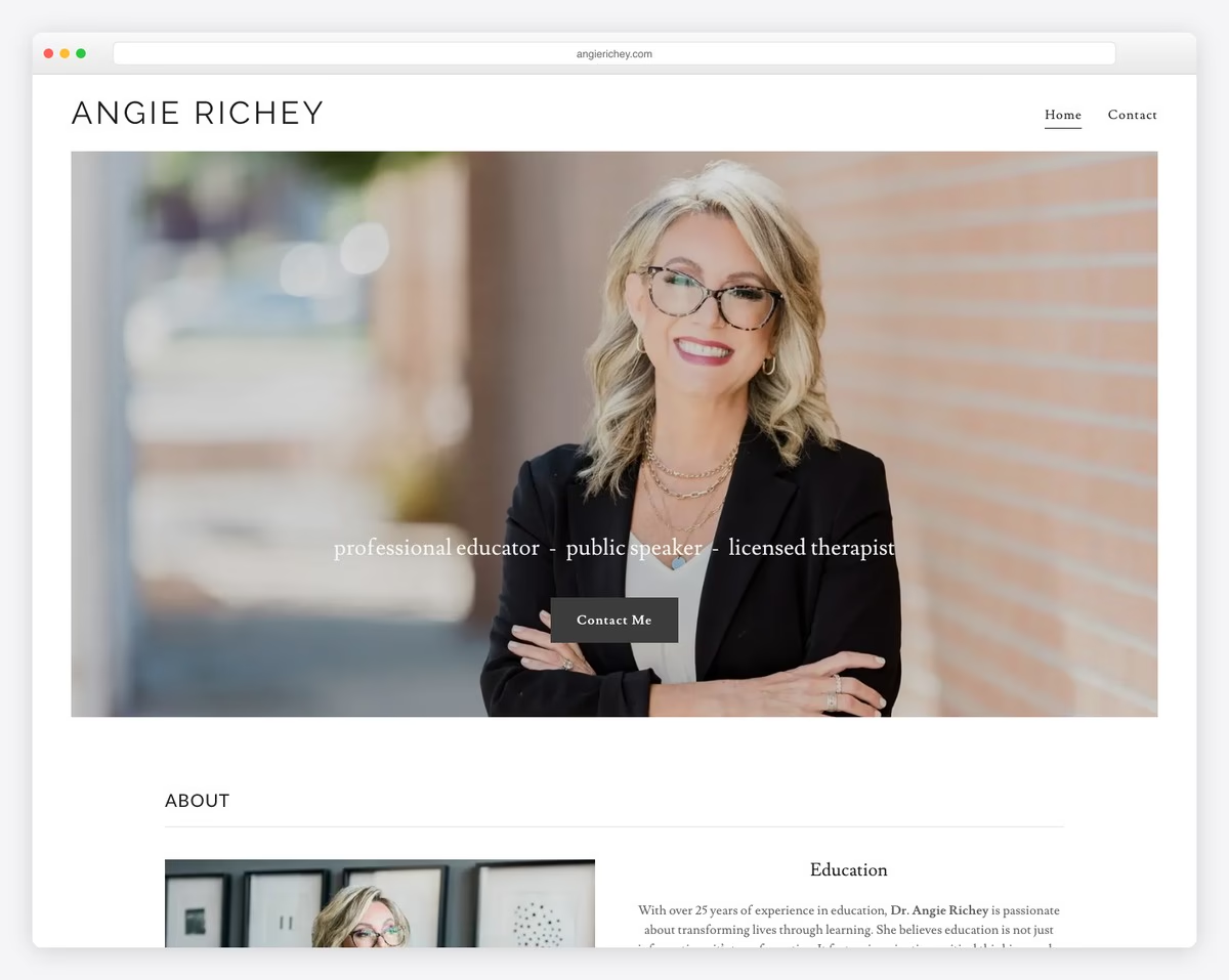
Angie Richey is a two-page therapist website with a more basic appearance enriched with parallax scrolling.
Besides the home page that acts as a service and about me page, Angie rocks a contact page with a form that has a checkbox for the newsletter subscription.
What stands out: Instead of using a popup or a separate newsletter form, you can expand your contact form with an extra sign-up checkbox.
18. Page Law
Built with: Squarespace
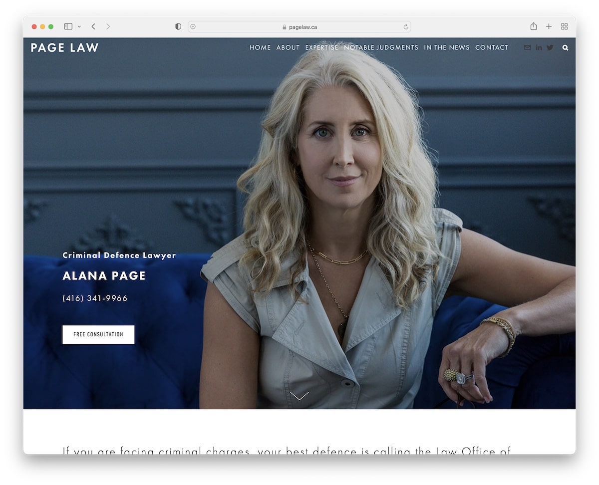
The parallax hero image creates an even stronger impression with a transparent header. Besides the navigation bar are social and email icons and a magnifying glass that opens a search bar with live results on a new page.
There’s one CTA above the fold and one in the footer. The former takes you to the contact page with Google Maps integration, while the latter showcases the exact office location for easier finding.
What stands out: Integrating Google Maps into your site is one of the best ways to display your business’s location.
19. Cyclemon
Built with: Custom
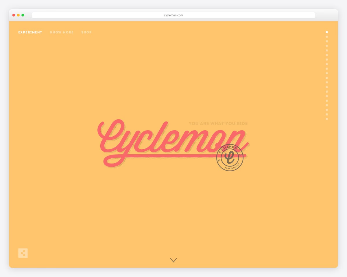
Cyclemon is a French illustration project by Thomas Brisset that matches bicycle types to rider personalities — and the parallax execution is pure delight. The warm yellow landing page with “You Are What You Ride” slowly reveals beautifully illustrated bicycles as you scroll, each paired with a witty personality profile.
The dot navigation on the right lets you jump between bicycle types, while the Experiment / Know More / Shop navigation keeps the experience focused. Each scroll triggers layered animations where bicycle parts assemble themselves, creating a sense of discovery and play.
What stands out: Using parallax to progressively reveal illustrated elements turns a simple product showcase into an interactive storytelling experience that keeps visitors scrolling.
20. NASA Prospect
Built with: Custom
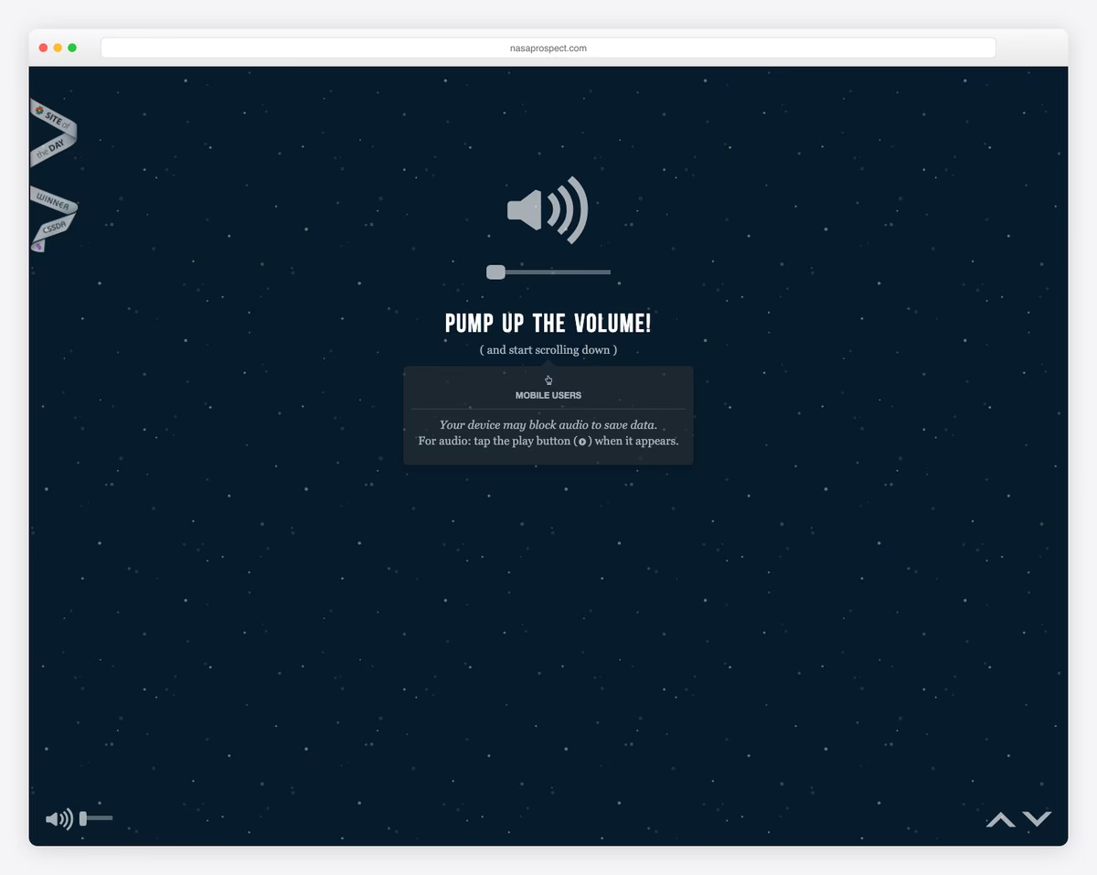
NASA Prospect is a CSS Design Awards winner that takes you on a scroll-driven journey through space exploration. The dark starfield background with “PUMP UP THE VOLUME!” instruction sets the stage for an immersive audio-visual experience where parallax layers create genuine depth as you scroll through the cosmos.
The experience combines ambient sound design with multi-speed scrolling layers — stars drift slowly while foreground elements move faster, creating a convincing sense of traveling through space. Volume controls and mobile instructions show thoughtful attention to cross-device experience.
What stands out: Combining parallax scrolling with ambient audio creates a multi-sensory web experience that’s far more memorable than visual-only parallax effects.
21. SpaceX Starship
Built with: Custom
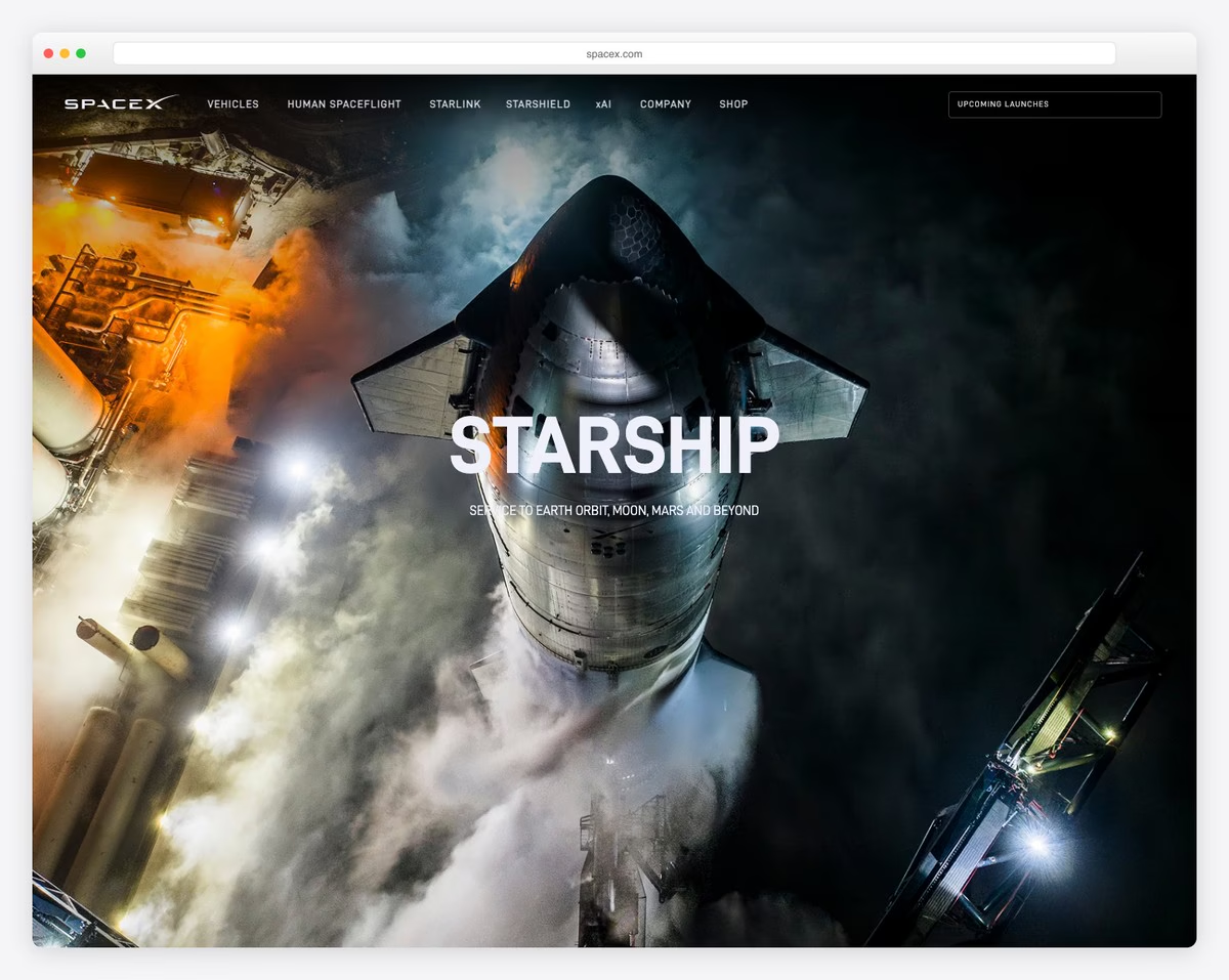
SpaceX’s Starship page opens with a jaw-dropping full-bleed aerial photograph of the rocket on the launch pad, steam billowing around it. “STARSHIP — Service to Earth Orbit, Moon, Mars and Beyond” — the tagline matches the scale of the visuals. As you scroll, dramatic parallax transitions reveal technical specs, mission profiles, and engineering details.
The scroll-triggered animations are tasteful rather than excessive — images fade and slide in at different speeds, text appears with subtle motion, and high-resolution photography dominates every section. The navigation (Vehicles, Human Spaceflight, Starlink, Starshield, xAI, Company, Shop) reflects SpaceX’s expanding empire.
What stands out: Full-bleed hero photography with scroll-triggered parallax reveals is how you build awe for a physical product — SpaceX uses this to make visitors feel the scale and power of Starship.
Related Posts


Comments (0)