22 Best Public Speaker Websites (Examples) 2026
Welcome to our massive collection of the best public speaker websites, where you’ll discover various designs you can use, copy and improve for your online presence.
Use your page as the central hub to promote your services, embed videos, integrate social media feeds and build social proof via testimonials.
But you can also use it to start a blog, sell your books (and merch) and invite clients to work with you.
Advertise your personal brand the right way – with a website.
Do you know what’s best? You don’t need the experience to build a great online presence when using any of these greatest speaker WordPress themes.
Best Public Speaker Websites For Your Inspiration
1. Mike Ganino
Built with: Squarespace
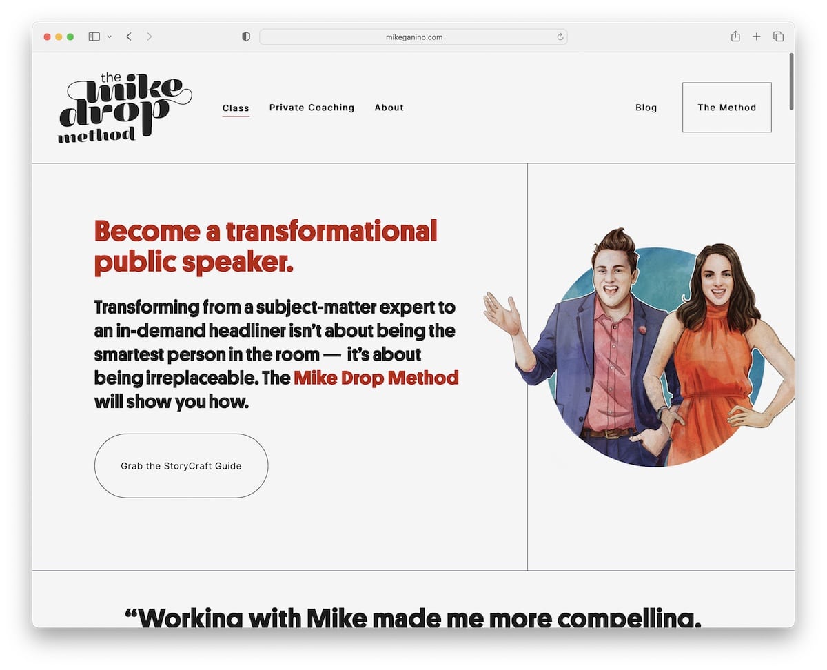
Mike Ganino is a minimal and creative public speaker website with an awesome scrolling experience, spiced up by some cool graphics.
This Squarespace site also has a left-corner popup promoting the workshop and a back-to-top button, so you don’t have to scroll.
We also like that the footer and header have the same background color as the base, which makes for a neater presence.
Note: Use a popup to promote your services, products or a subscription form.
What stands out: A hero slider showcases multiple offerings at a glance, giving visitors quick access to key content.
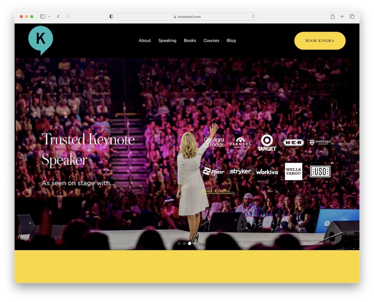
2. Kindra Hall
Built with: Squarespace
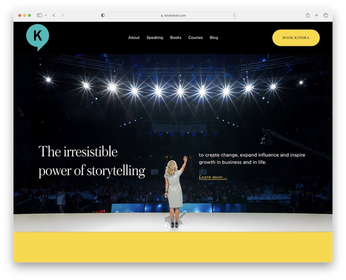
Kindra Hall does a great job sparking interest with a large slider featuring text and links. This public speaker website has a top bar promotion you can close by pressing “x.”
The header has plain navigation with a contrasting CTA button for bookings. The page loads content while scrolling for a better viewing experience and a large section to sign up for Kindra’s newsletter.
Note: Adding a CTA button in the header can raise click-throughs.
What stands out: Parallax scrolling adds visual depth and encourages visitors to keep exploring.
3. Mel Robbins
Built with: Webflow
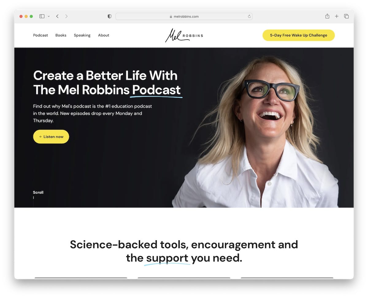
The number one thing that makes Mel Robbins’ website stand out is the awesome branding and use of the yellow color.
Also, this speaker’s website uses a header that disappears when you start scrolling but reappears on a back scroll, which is a nice contribution to a better UX.
What’s more, the sectioned home page is executed with a smart storytelling approach that makes it a lot more exciting to read.
Note: Make a scrolling experience neater with a disappearing/reappearing header.
You’ll also enjoy all these amazing Webflow websites from different industries.
What stands out: The image carousel keeps the above-the-fold area dynamic without requiring visitors to scroll.
4. Bill Nye
Built with: Craft CMS
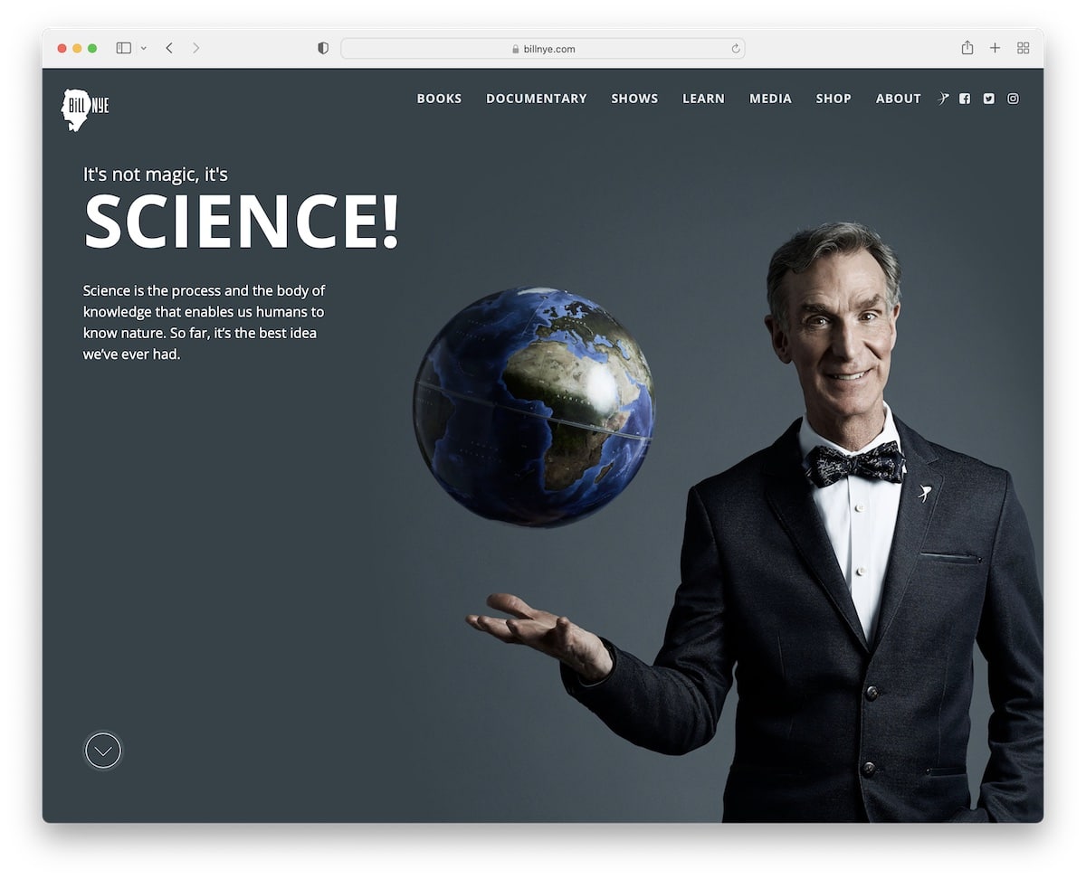
Bill Nye’s page has an awesome full-screen design with a catchy hero section. It has a transparent header that turns solid on the scroll and sticks to the top of the screen. The navigation bar has a drop-down menu and social media icons for easy access.
Moreover, the home page has three main sections and a simple footer with a particle effect background.
What stands out: Use a full-screen, full-width website design to create a strong and lasting first impression.
5. Simon Sinek
Built with: Underscores & Elementor
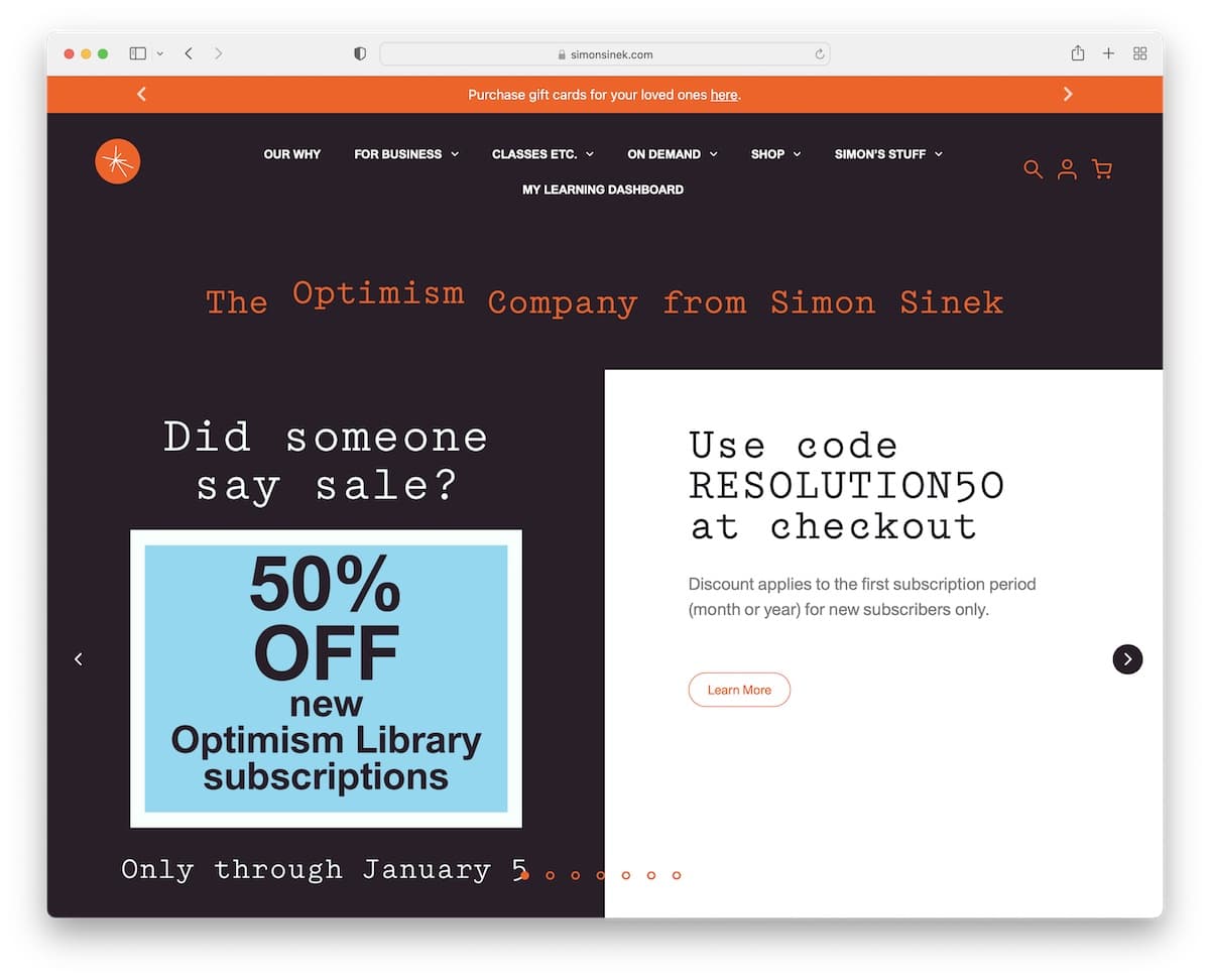
Simon Sinek is a great public speaker’s website example with a modern and bold design. The header takes a relatively large amount of the above-the-fold section, with all the necessary menu links, shopping cart icons, and more.
The slideshow features slides with a split design, one side featuring an image and the other text and a CTA.
Larger text and plenty of white space make this page easy to skim through. Plus, the newsletter subscription form helps capture emails for a growing list.
What stands out: Use a slider to present and promote content, services, products, etc.
6. Seth Godin
Built with: Strikingly
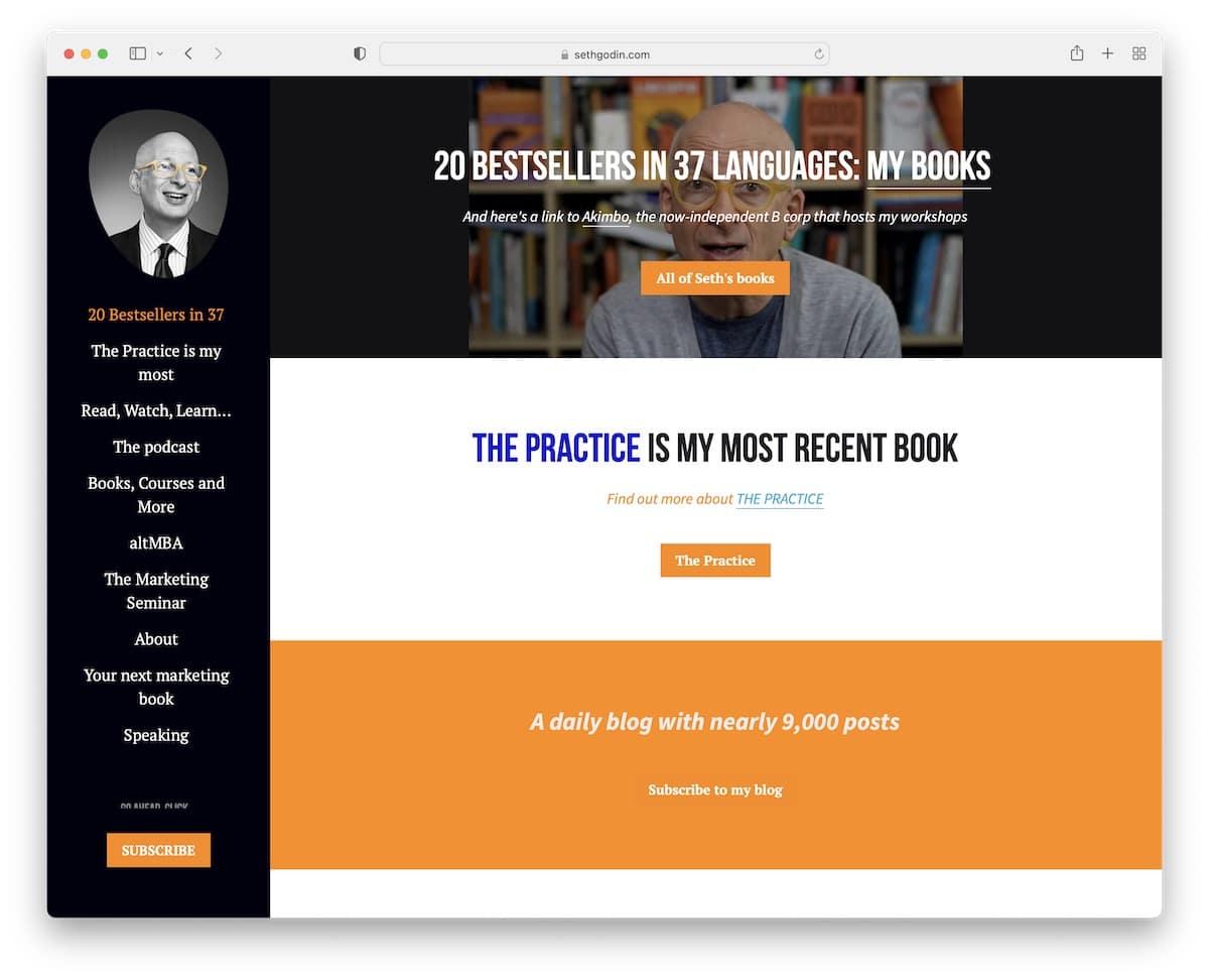
Seth Godin is a one-page website with sticky sidebar navigation. The site also has a newsletter subscription call-to-action (CTA) button.
What’s interesting is that the site doesn’t use a header or a footer, keeping things look cleaner. But the base of the clean site has all the links you need to get to the right information, books, and more.
What stands out: Create a pleasant user experience with a single-page layout.
7. Jay Baer
Built with: Genesis
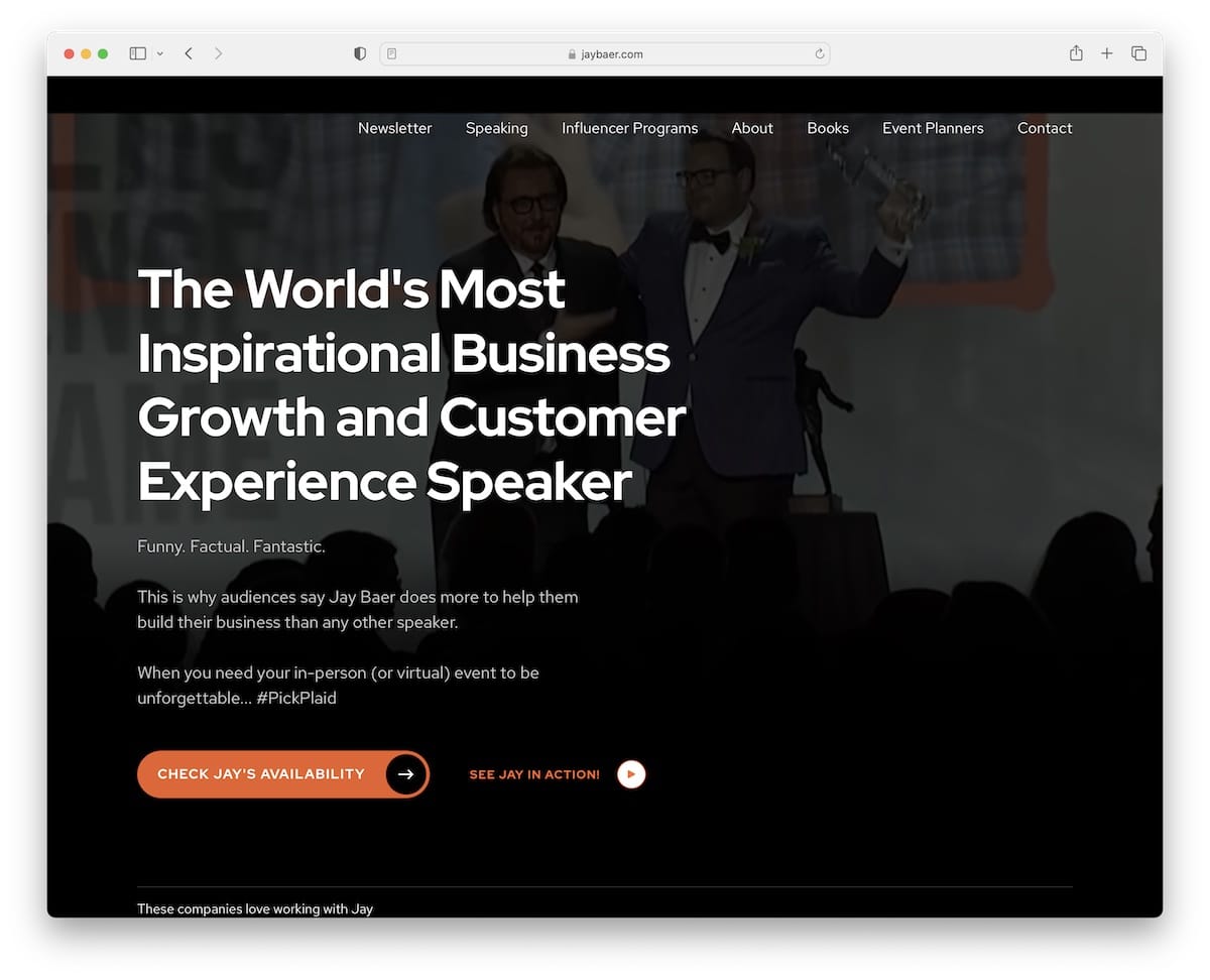
Jay Baer tries to capture every visitor’s attention with a video background, bold statement and a CTA. A section we really like is right below the fold, where Jay showcases some of the companies’ logos, he worked with to build trust.
Furthermore, the branding is amazing, with a great color scheme that makes the website a lot more dynamic while at the same time keeping a relatively clean appearance.
Note: Add your promotional video in the hero section to make your page more engaging.
You can help yourself make a professional website with any of these powerful Genesis child themes.
What stands out: The background video creates an immersive first impression that immediately sets the mood.
8. Phil Jones
Built with: Elementor
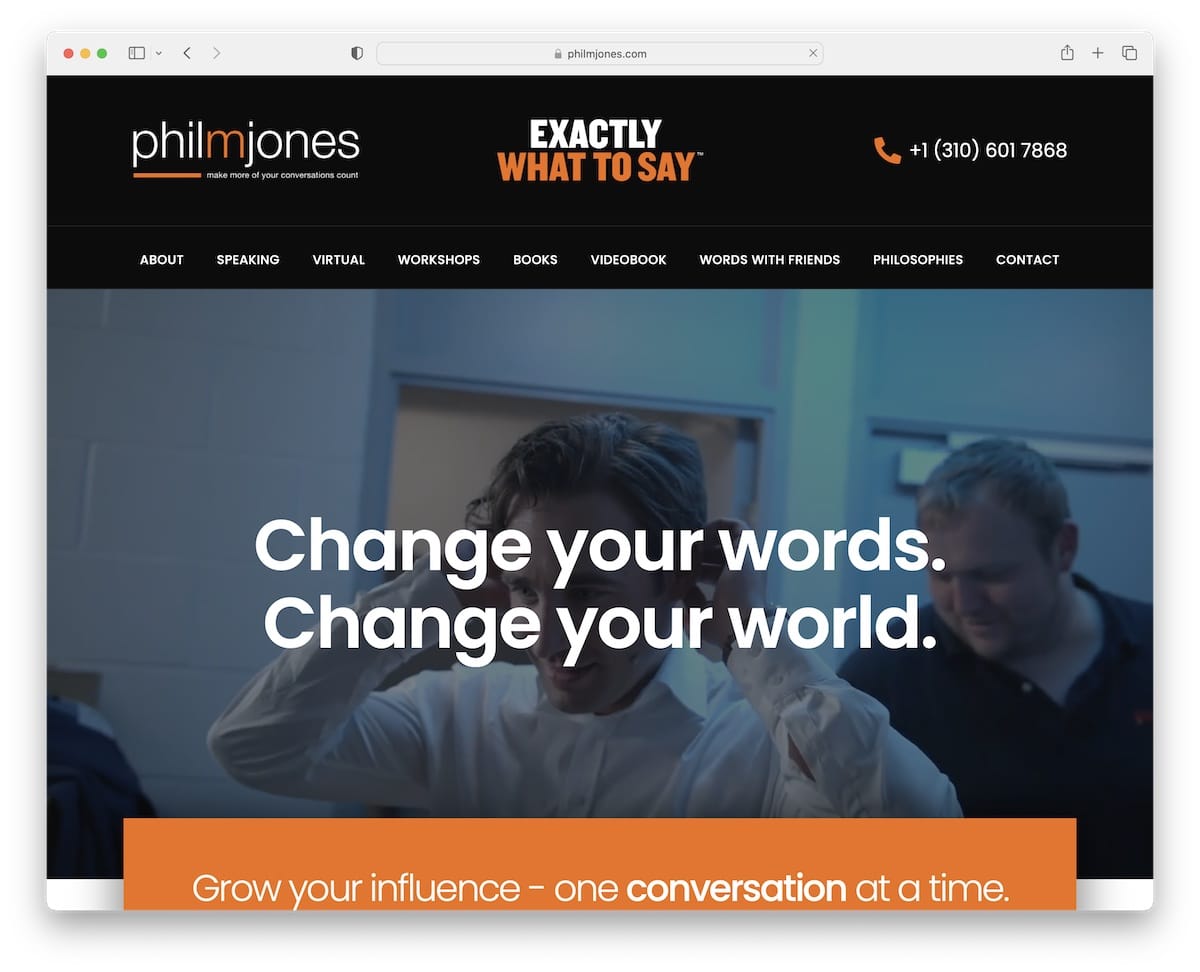
Phil Jones is another excellent example of a public speaker website with a hero video. But it also has this cool typewriter text effect just below the hero to make the first-time experience more gripping.
The floating navbar is minimalist but has all the necessary quick links.
Furthermore, Phil Jones has one of the most packed footers with additional information, blog links, social media, subscription form, etc.
Note: A simple (typewriter) text effect can add more life to your professional website.
What stands out: Full-screen video on the homepage draws visitors in before they even start scrolling.
9. Andrew Davis
Built with: Ruby On Rails
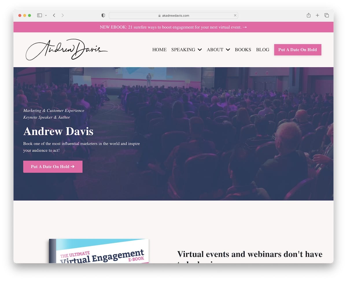
Andrew Davis is a vibrant website with great attention to detail, especially the attention-grabbing pink CTA buttons.
It has a top bar notification, a drop-down menu, embedded videos and Twitter mentions (instead of traditional testimonials). Multiple little golden nuggets are scattered across the website to keep reminding you of Andrew’s quality work.
Lastly, the light header and the dark footer work hand-in-hand nicely.
Note: Dare to create CTA buttons using vivid colors to make them pop more.
What stands out: A vibrant color palette creates energy and personality that sticks in visitors’ minds.
10. Neen James
Built with: Salient Theme
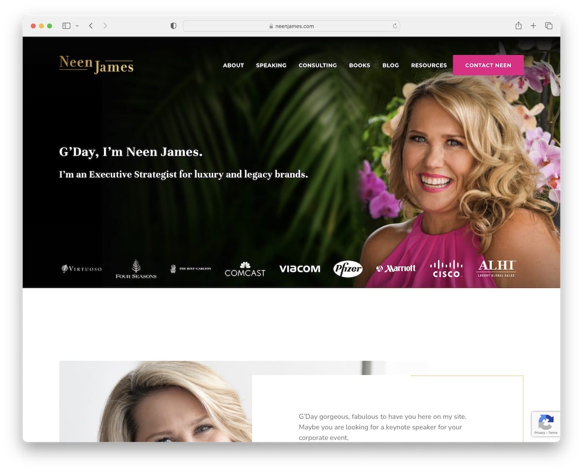
Neen James welcomes you to her online world with a banner and some text that give you a quick glimpse at what she does.
Combining company logos is a strategic move to instantly know that Neen’s services are used by some of the largest businesses in the country. But there’s also a testimonial logo of some of the companies sharing their feedback. Social proof!
Note: Built trust in your services by integrating client testimonials/reviews into your public speaker website.
Need more inspiration? Then check these Salient theme examples.
What stands out: Layered parallax effects create a sense of movement that makes scrolling feel dynamic.
11. Scott McKain
Built with: Divi
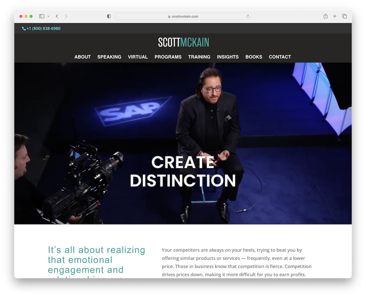
What Scott McKain wants everyone to see is the phone number that he promotes in the top bar. Which, in unity with the header, both stick to the top of the screen.
Next is a promotional video with a simple message that sums up Scott’s aim.
While there’s only one client testimonial on the home page, this public speaker site has a large collection of client logos that are enough to know how effective Scott McKain’s impact is.
Note: Use a top bar if you’d like to put an extra shine on a notification, contact detail, etc.
Don’t forget to check other excellent websites using the Divi theme that show how powerful it is.
What stands out: Client testimonials placed prominently on the homepage build trust before visitors even explore the services.
12. Brittany Hodak
Built with: Elementor
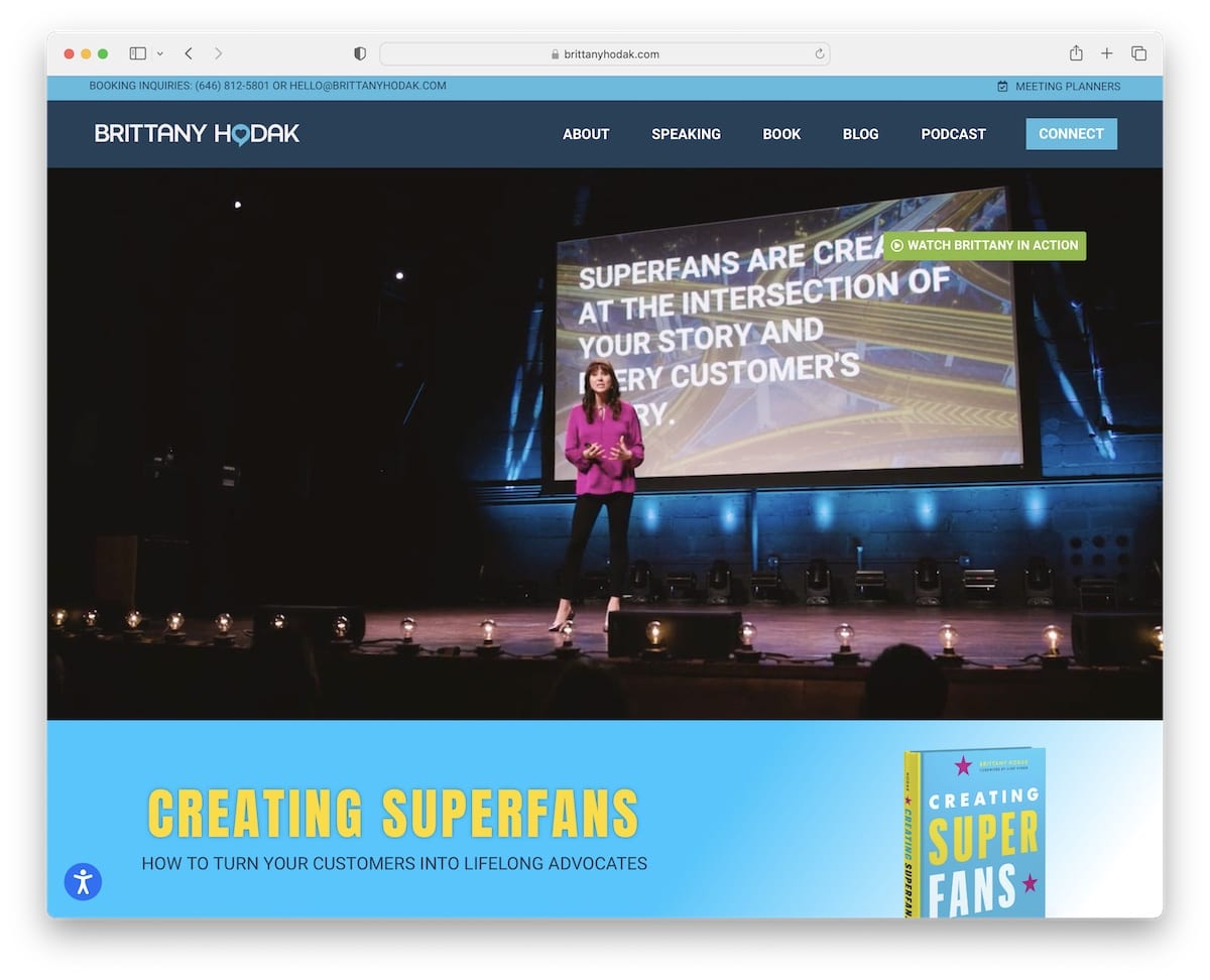
Yup, videos are pretty popular on public speaker websites, and Brittany Hodak is another proof that they work.
The hero video only uses a CTA button that opens a lightbox video to watch Brittany in action without leaving the current page.
Besides multiple CTA buttons, accordions for program details and client testimonials, this site also has a contact form on the home page, so everyone interested can get in touch immediately.
Note: Integrate a contact form on the home page.
What stands out: A portfolio-first layout lets the work speak for itself with minimal distraction.
13. Cassandra Worthy
Built with: Divi
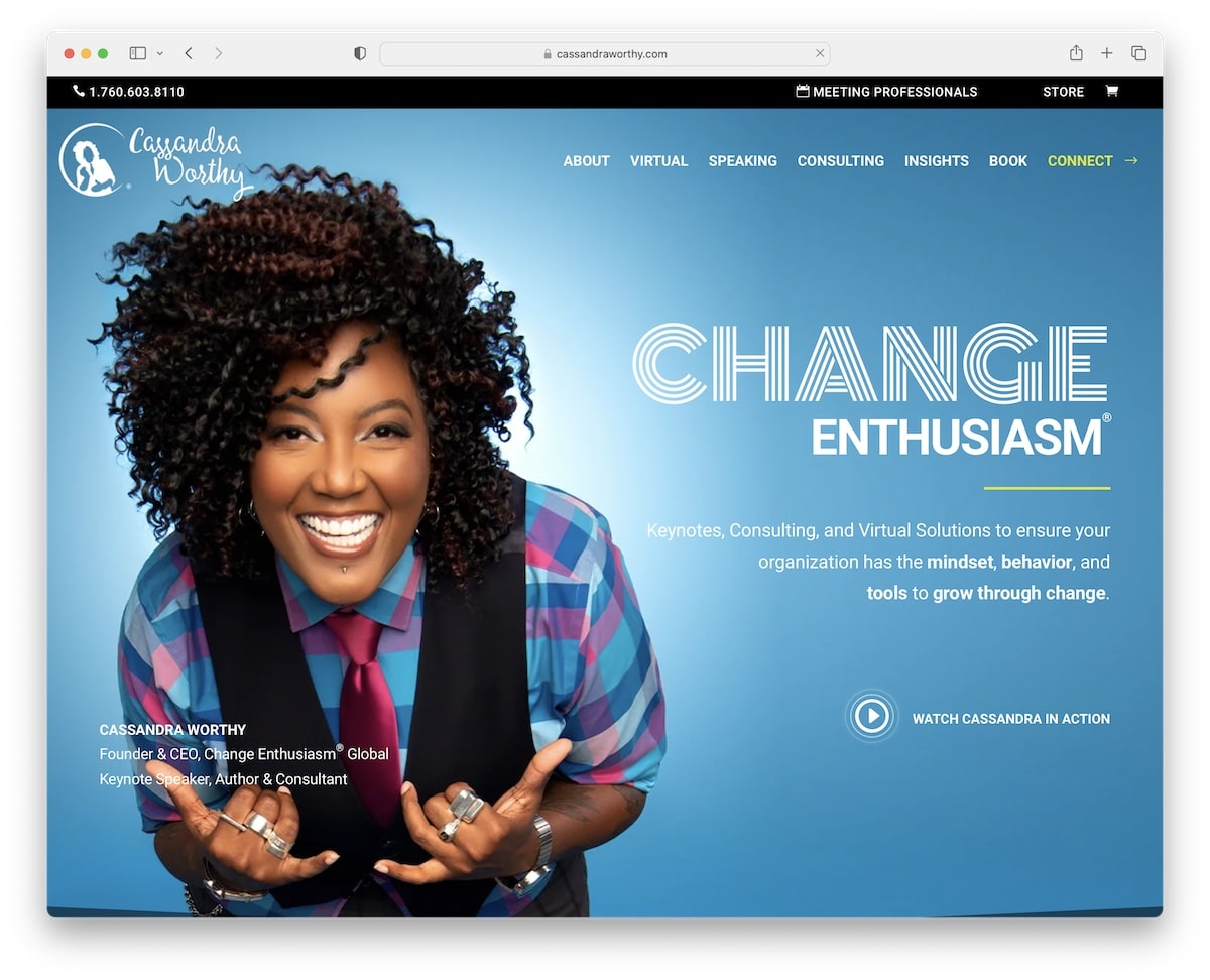
You always have access to everything on Cassandra Worthy’s website with a floating header and top bar.
Instead of using a CTA to promote her services in the hero section, you can press the play button to watch a (lightbox) video.
Cassandra’s public speaker website also has various animations and plenty of dark background sections that give it a more premium feel.
Note: Introduce the lightbox function so visitors can view content without leaving the page.
What stands out: The dark color scheme gives the site a sleek, modern feel that makes imagery pop.
14. Christine Hassler
Built with: Beaver Builder
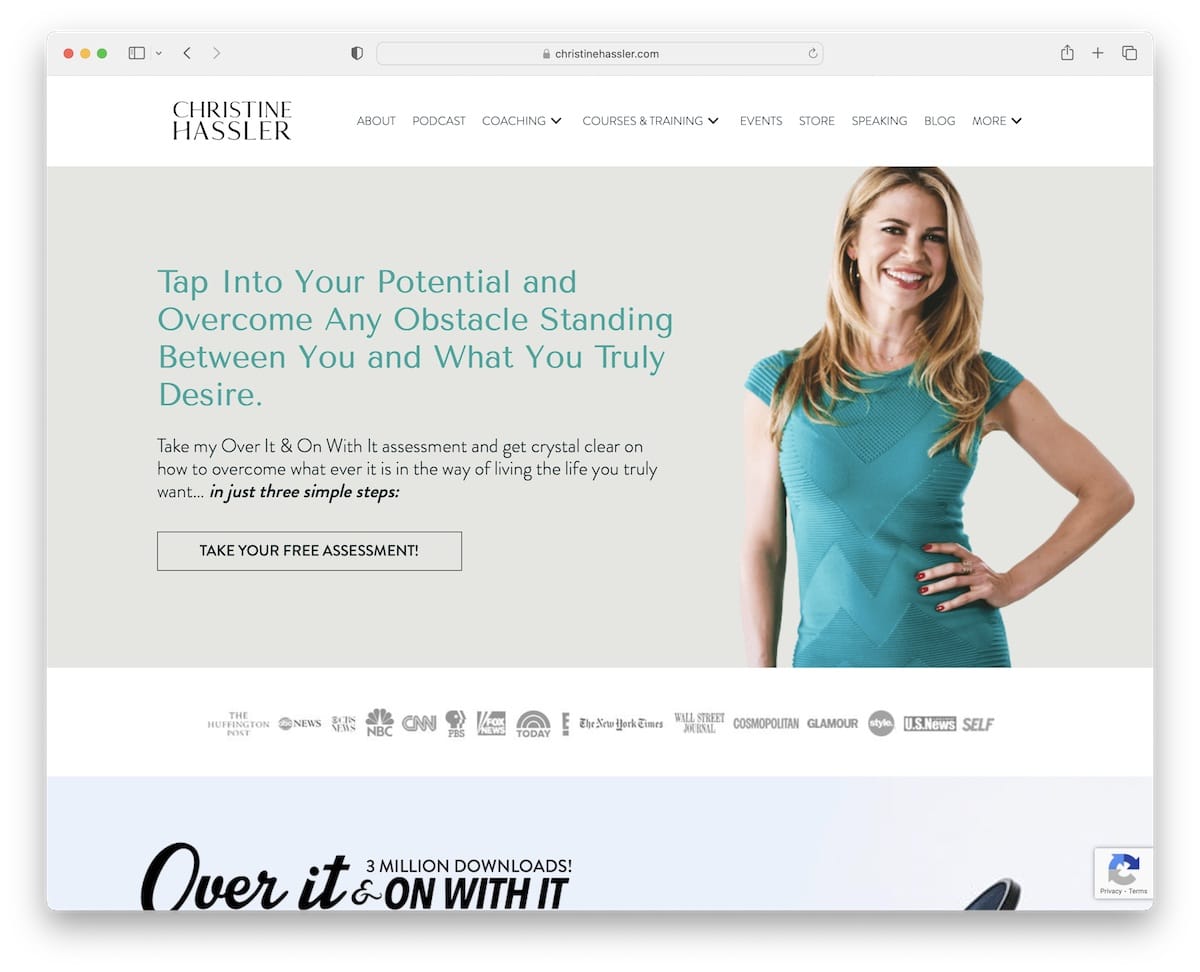
A few seconds after landing on Christine Hassler’s website, a popup window opens, offering a free product in exchange for an email.
The basic header and footer work nicely in combination with the content-rich home page.
What differentiates this page from the rest is the inclusion of an audio player, which you can listen to on the spot. But it also has a CTA to visit other podcast episodes if interested.
Note: If you also run a podcast, ensure you build in a player, so fans don’t need to access 3rd-party platforms to listen. This also means more time on your website and a lower bounce rate.
What stands out: A dark background paired with bold accent colors creates striking visual contrast.
15. Jacob Green
Built with: GeneratePress
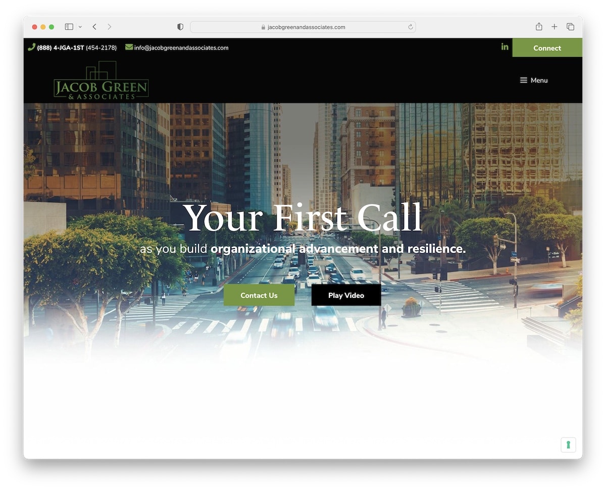
Jacob Green has a modern single-page website design with a hamburger menu (for smaller screens) that takes you from section to section (if you don’t want to scroll). The header/menu floats, so you don’t have to scroll to the top, which is a big plus for one-page sites.
Furthermore, you’ll find two CTA buttons above the fold for contacts and watching a lightbox video.
Note: Use a hamburger menu icon for mobile navigation to keep it more organized.
What stands out: A masonry grid layout organizes content attractively while maximizing screen real estate.
16. Nick Vujicic
Built with: Elementor
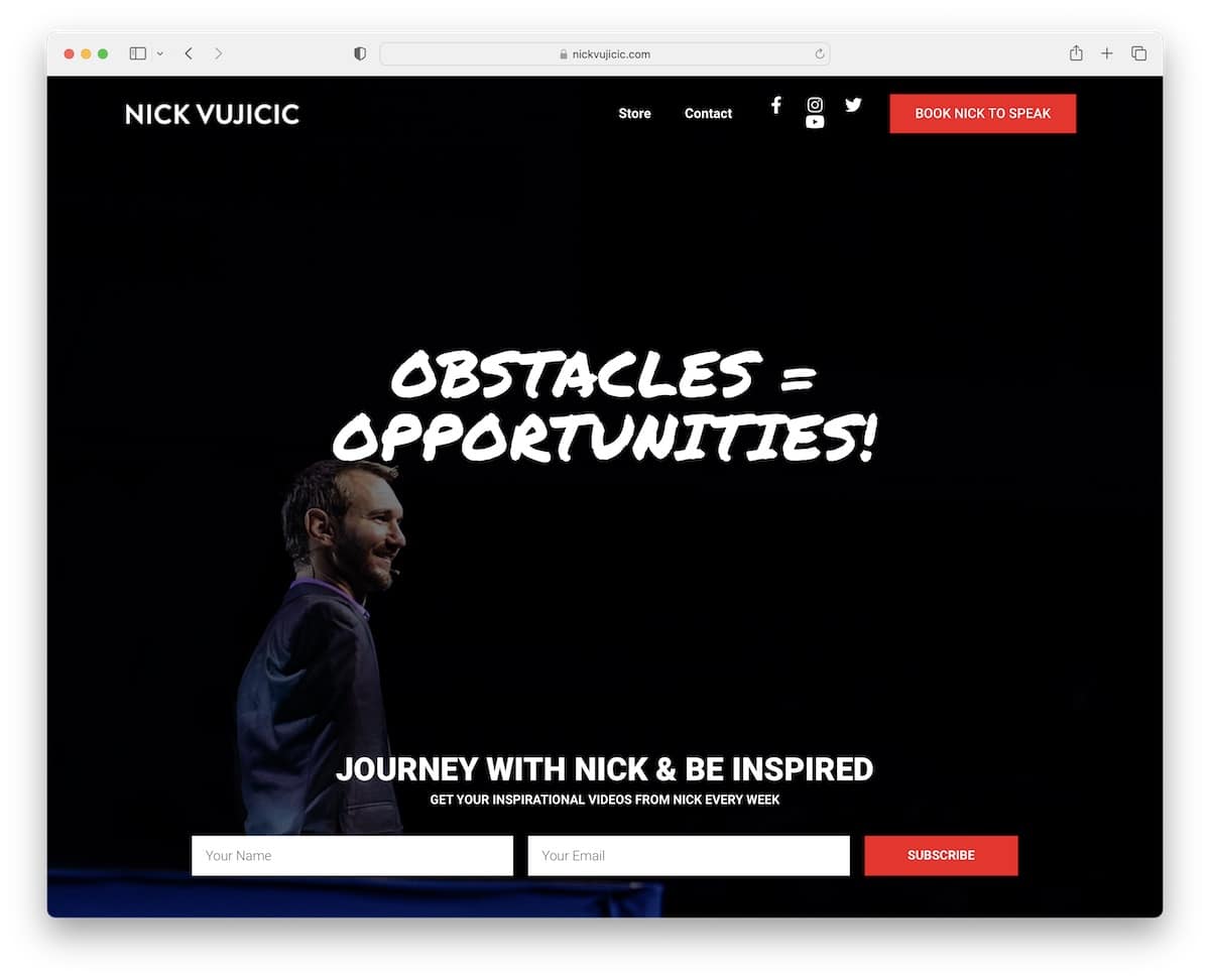
Nick Vujicic takes the hero section to the next level with a full-screen video background, text and a newsletter subscription form.
This public speaker website also uses a transparent header for a cleaner look. The navigation bar contains social media icons and a booking CTA button for immediate action.
Note: Create a strong impact on your visitors with a full-screen hero video background.
What stands out: The minimalist design keeps the focus on what matters most — the content itself.
17. Katrina Cravy
Built with: Elementor
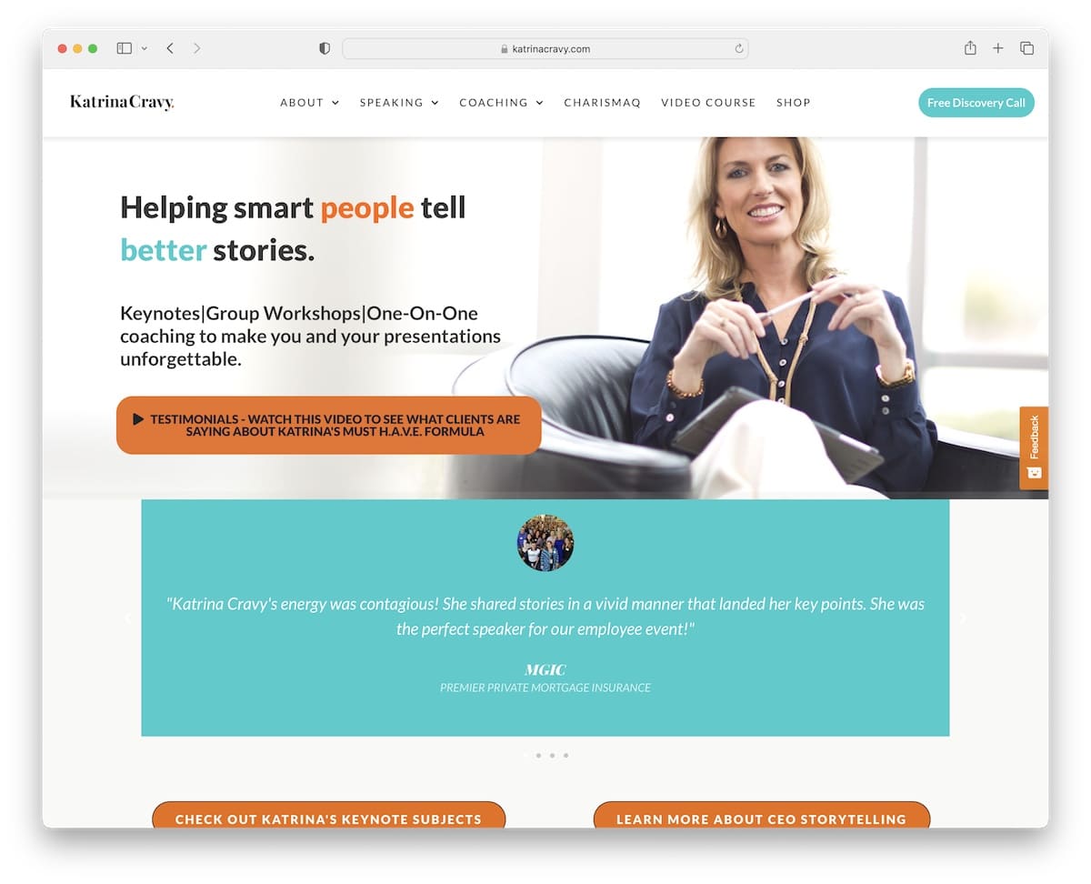
Katrina Cravy has one of the simplest (read shortest) home pages we came across when creating this collection of the best public speaker websites.
What’s definitely a stand-out feature is that besides the classic testimonials slider, this page also has a video where clients speak about Katrina’s services.
Another handy function is the sticky sidebar feedback button to collect real-time feedback from visitors.
Note: Take social proof to the next level with video testimonials.
What stands out: A prominent search function helps visitors find exactly what they need without scrolling through pages.
18. Sally Hogshead
Built with: The7 Theme
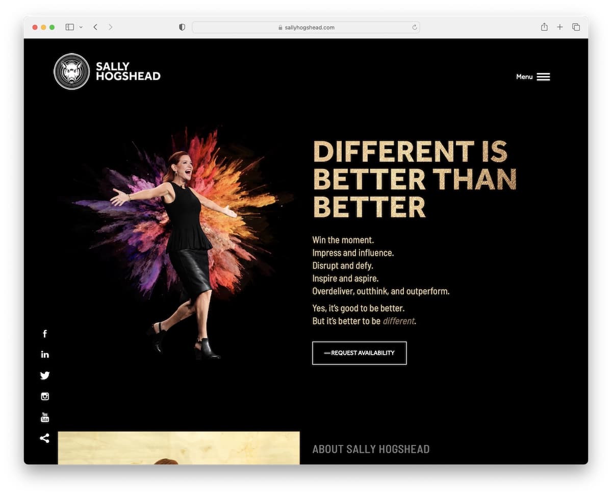
The dark design makes this public speaker website example look much more premium and elegant.
The website has a sectioned home page with animations, a slider and an integrated video that make it much more engaging.
The header is super minimalist, with a logo on the left and a hamburger menu on the right. While there’s no header, Sally Hogshead’s website has sticky social media icons in the left corner and a back-to-top button.
Note: When most of the websites in your industry use a light design, you can stand out with a dark one.
We also created an extended bundle of the dominant example websites using the The7 theme.
What stands out: A clean, uncluttered layout lets visitors find information without visual noise.
19. Shola Richards
Built with: GeneratePress
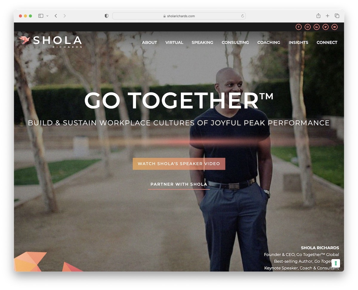
The various backgrounds, including the parallax effect, make Shola Richards’ page different from the rest.
Both the top bar and the header stick to the screen, so navigation and social icons are always available.
While you can read all the content and gain the necessary information about speaking and consulting, you can also watch a promo video to understand better how Shola approaches it.
Note: Parallax effect can add depth to your site and make it more engaging and immersive.
What stands out: Intuitive navigation makes the site easy to explore even for first-time visitors.
20. Erik Elvingsson Hedén
Built with: Squarespace
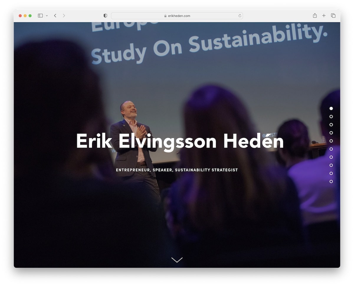
Do you want to see a public speaker website without a header or a menu? Erik Elvingsson Hedén’s is a top-notch example with a sidebar dot navigation (of course, you can also simply scroll it).
However, this page does have a footer but a more basic one.
Note: If you want to stick to a simpler, single-page website layout, you may skip using the header for a refiner look.
21. Katie Linendoll
Built with: Squarespace

Katie Linendoll is known as a technology consultant and one of the leading women in technology. She has appeared on many TV shows, radio, and speaking gigs. She has even received an Emmy Award for her work on ESPN’s SportsCenter. That was nearly 20 years ago but she is still an active speaker and contributor to this day.
Katie Linendoll’s website is one of the best examples of social proof because she has listed all the main shows and channels she has appeared in and mentioned brands she has worked on. The website itself is fairly simple and is built using Squarespace drag and drop website builder.
What stands out: Call to action and social proof is important not just for eCommerce and business websites but also for public speakers like Katie Linendoll.
22. Brene Brown
Built with: Custom
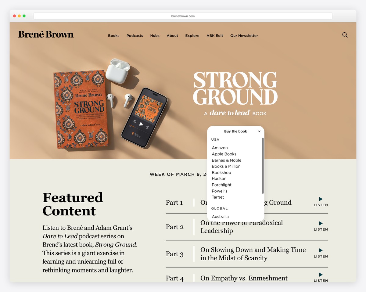
Brene Brown’s website reflects her brand as one of the world’s most influential researchers and speakers on vulnerability and courage. The warm, approachable design features earthy tones and a clear content hierarchy that directs visitors to her latest books, podcast, and speaking engagements.
The navigation covers her full ecosystem — Books, Podcast, Hub, and Community — while the hero section promotes her latest work. For a speaker who has delivered one of the top five most-viewed TED talks ever, the design is remarkably grounded and personal rather than corporate.
What stands out: Even the most famous speakers benefit from a warm, personal website design — it reinforces approachability and authenticity, which are the qualities audiences connect with.
Related Posts


Comments (0)