17 Best Squarespace Landing Page Examples & Templates 2026
Are you down to check some seriously inspiring Squarespace landing page examples to kick your website up a notch?
Look no further!
These websites aren’t just about looking good (though they certainly do that); they’re about creating an engaging, user-friendly experience that captivates visitors from the moment they land.
We also added a bunch of superb templates, so you can start working on your lander right away.
Whether you want to build something simple and minimal or add your creative touch, it’s all possible.
But first, spark your imagination with these examples.
This post covers:
- Best Squarespace Landing Page Examples
- Best Squarespace Landing Page Templates
- How To Make A Landing Page With Squarespace
- FAQs About Squarespace Landing Pages
- Can I integrate 3rd-party tools with my Squarespace landing page?
- Is it possible to customize my Squarespace landing page for mobile devices?
- How can I improve the loading speed of my Squarespace landing page?
- Can I A/B test different versions of my landing page on Squarespace?
- How do I ensure my Squarespace landing page is SEO-friendly?
- What’s the best way to collect visitor information through my Squarespace landing page?
Best Squarespace Landing Page Examples
Below, you’ll find a curated selection showcasing the best in creativity, design, and user experience – each one a source of inspiration for your website projects.
1. The Gutsy Mama Project
Built with: Squarespace
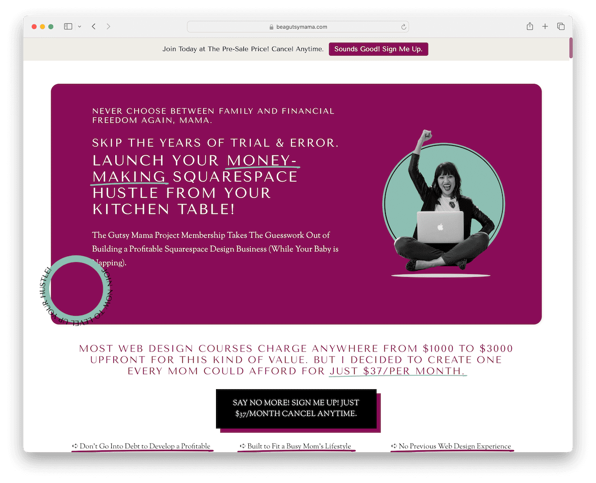
The Gutsy Mama Project’s Squarespace page nails it. Right off the bat, a pop-up CTA grabs your attention, and there’s a cool top bar notification for immediate action.
Despite being text-rich, it’s super neat and easy to read. The color vibe? Totally pleasant.
They’ve got sticky elements that stay put as you scroll, CTA buttons perfectly placed to catch your eye, and even accordion FAQs to keep things tidy.
It’s like every detail’s thought out to make your visit smooth and engaging.
What stands out: Boost your conversion rates with a catchy popup.
What stands out: Because it balances comprehensive information with gripping design elements.
2. Tatum Hamernik
Built with: Squarespace
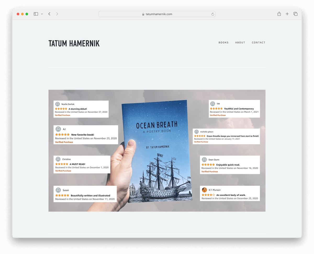
Tatum Hamernik’s Squarespace site is a gem. It’s like a landing page right from the start, with a simple header and footer.
A slick reviews slider showcases real feedback, which contributes to sales. It also has a cool grid that lets you sneak a peek inside the book, drawing you in.
Plus, there’s an Amazon CTA button for easy purchasing.
If you’re curious, there are About and Contact pages to learn more about Tatum and get in touch.
What stands out: Build credibility and trust with reviews and testimonials.
What stands out: Because of its sleek, focused design that cleverly showcases and promotes the book.
3. Soundboy Pro
Built with: Squarespace

Soundboy Pro’s Squarespace landing page hits you with a bold dark design, making a strong first impression.
It’s simple and clean, with navigation that contains handy jump links that glide you through the page without the need to scroll.
There are embedded videos for more information and convincing, and those red CTA buttons? Can’t miss them.
The scrolling parallax website effect adds a cool depth, while the pricing and contact form are clear and straightforward.
The footer? Minimalist, with just the essentials. It’s all about vibe and efficiency.
What stands out: One great strategy for capturing your visitors’ attention is to choose a dark/black website design.
What stands out: Because of its immersive dark look and user-friendly design, blending visual impact with easy navigation.
4. The Everyday Athlete
Built with: Squarespace

The Everyday Athlete’s Squarespace site is a breath of fresh air with its clean, minimalist vibe.
It sports a neat boxed layout that keeps everything organized. The dark CTA buttons stand out, urging you to click.
There’s an Instagram feed showcasing real moments, adding a personal touch. Plus, you’ll find social media icons in the footer for easy connecting.
While it’s not purely a landing page, the homepage doubles as one, drawing you in and smoothly guiding you through the site.
What stands out: Don’t reinvent your landing page design with fancy elements, animations and effects. We recommend keeping it simple and minimal. (See more excellent minimalist website examples.)
What stands out: Because of its simplicity and seamless integration of social elements.
Best Squarespace Landing Page Templates
1. Forma

The Forma Squarespace template rocks a sleek dark design that really makes it pop.
What catches your eye? The large, contrasting orange typography can’t be missed.
As you scroll, content loads smoothly, keeping you hooked. It’s got everything from clear pricing plans to a handy contact form.
And the footer? It’s not just an afterthought – packed with social icons and a subscription form, making staying connected and updated a breeze.
It’s modern, bold, and interactive.
What stands out: A vibrant color palette creates energy and personality that sticks in visitors’ minds.
2. Electra

Electra Squarespace landing page example is a burst of modern energy with its vibrant design.
The header and footer? Super clean, making for a clutter-free experience.
It boasts an “as seen in” section to showcase credibility, plus pricing packages laid out clearly for easy choosing. Don’t miss the testimonial slider – it’s gold for building trust.
There’s also a contact form for easily reaching out. And for the ‘gram lovers, there’s an Instagram-ready feed that keeps your visuals fresh and engaging.
Electra is stylish and functional.
What stands out: The minimalist design keeps the focus on what matters most — the content itself.
3. Terranova
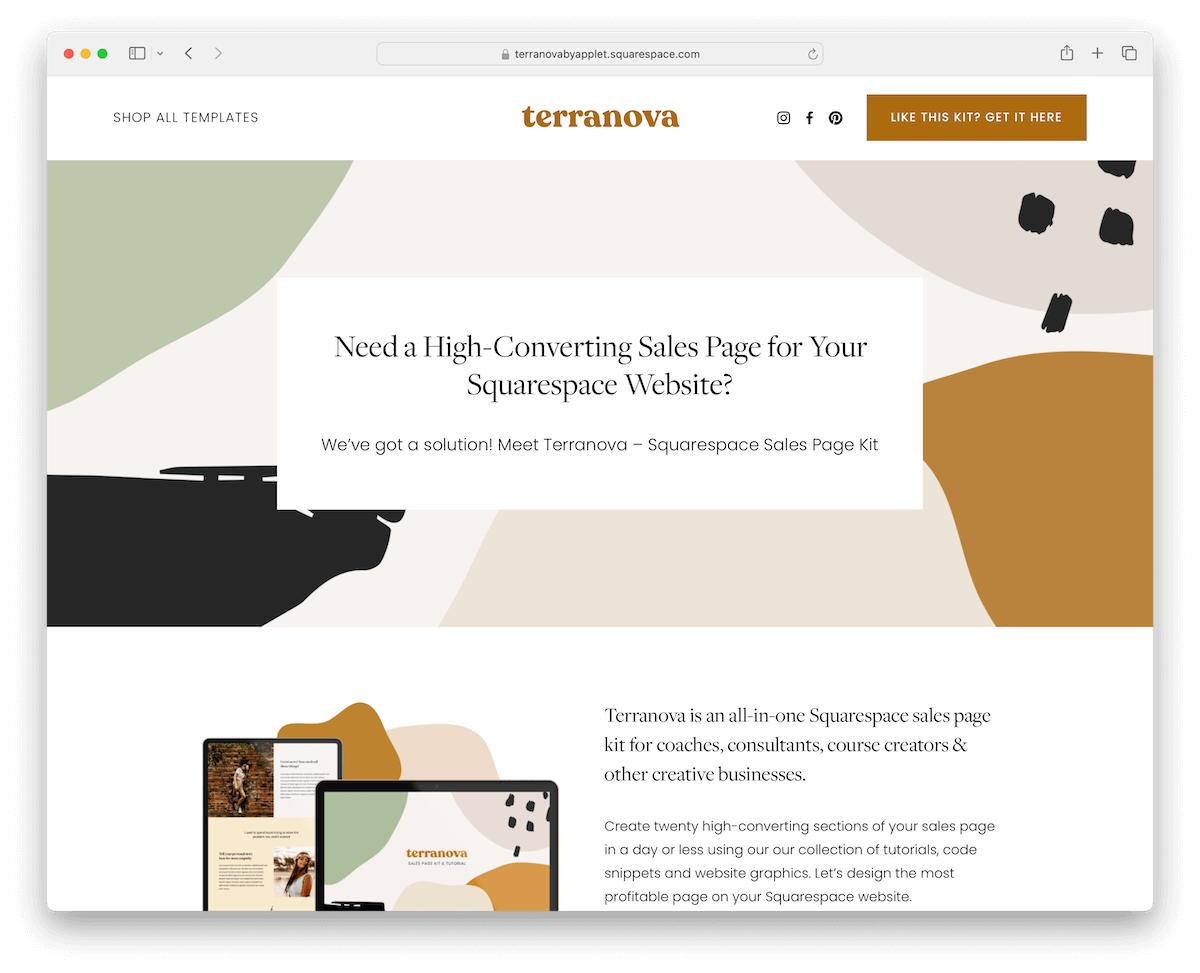
The Terranova landing page template is a detailed affair, with twenty distinct page sections, each crafted carefully.
It comes loaded with Canva graphics, adding that custom touch without the hassle.
The color scheme? Soothing to the eye, making every visit a relaxed one.
It doesn’t skimp on info, offering in-depth pricing plans and handy accordions for FAQs to clear up any queries.
The footer, with its dark contrast, grounds the design and ties everything together beautifully.
What stands out: The clean Squarespace layout demonstrates how the platform handles whitespace and typography by default.
4. Evergreen
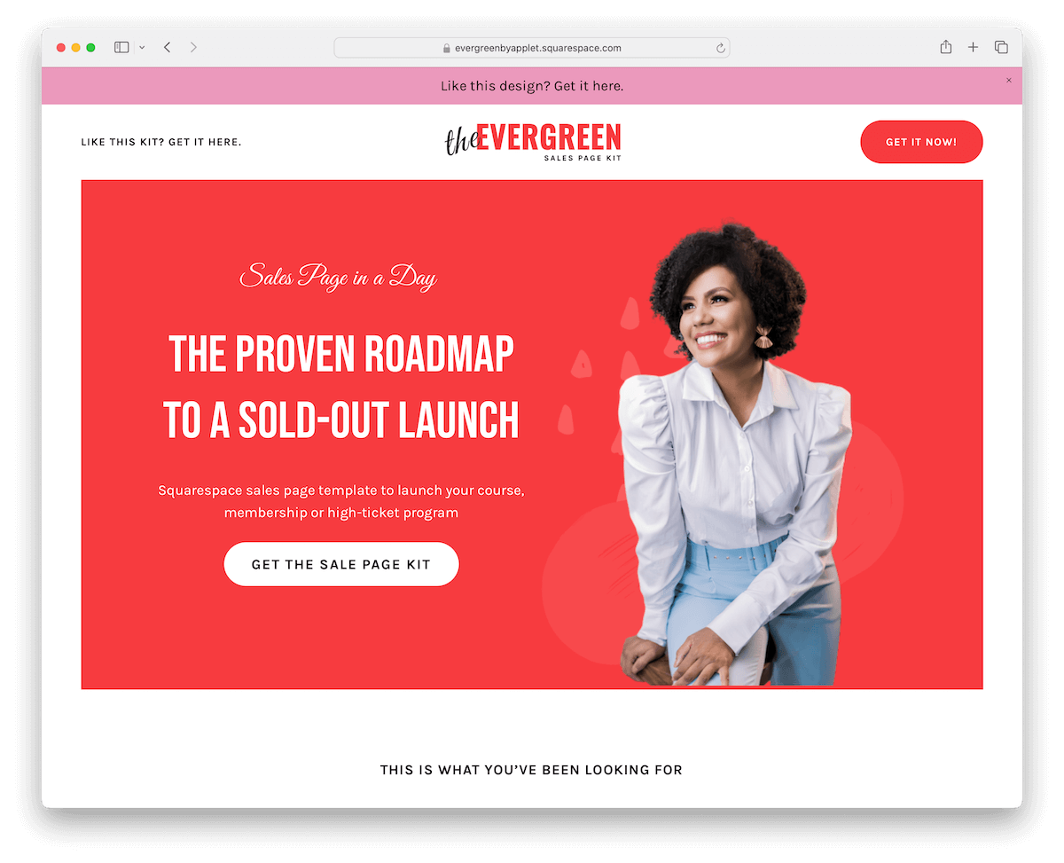
The Evergreen Squarespace template is sleek and minimal, but don’t be fooled; it’s packed with fifteen-page sections designed to engage.
The centerpiece? A long-form sales page that tells your story compellingly.
It features client testimonial boxes that build trust by showcasing real feedback. Moreover, the pricing section is straightforward, making it easy for visitors to decide.
And the large dark footer? It anchors the site, giving it a solid, finished look.
Evergreen is all about simplicity that sells.
You might also be interested in checking these top-notch Squarespace sales page templates.
What stands out: A clean, uncluttered layout lets visitors find information without visual noise.
5. Alignflow
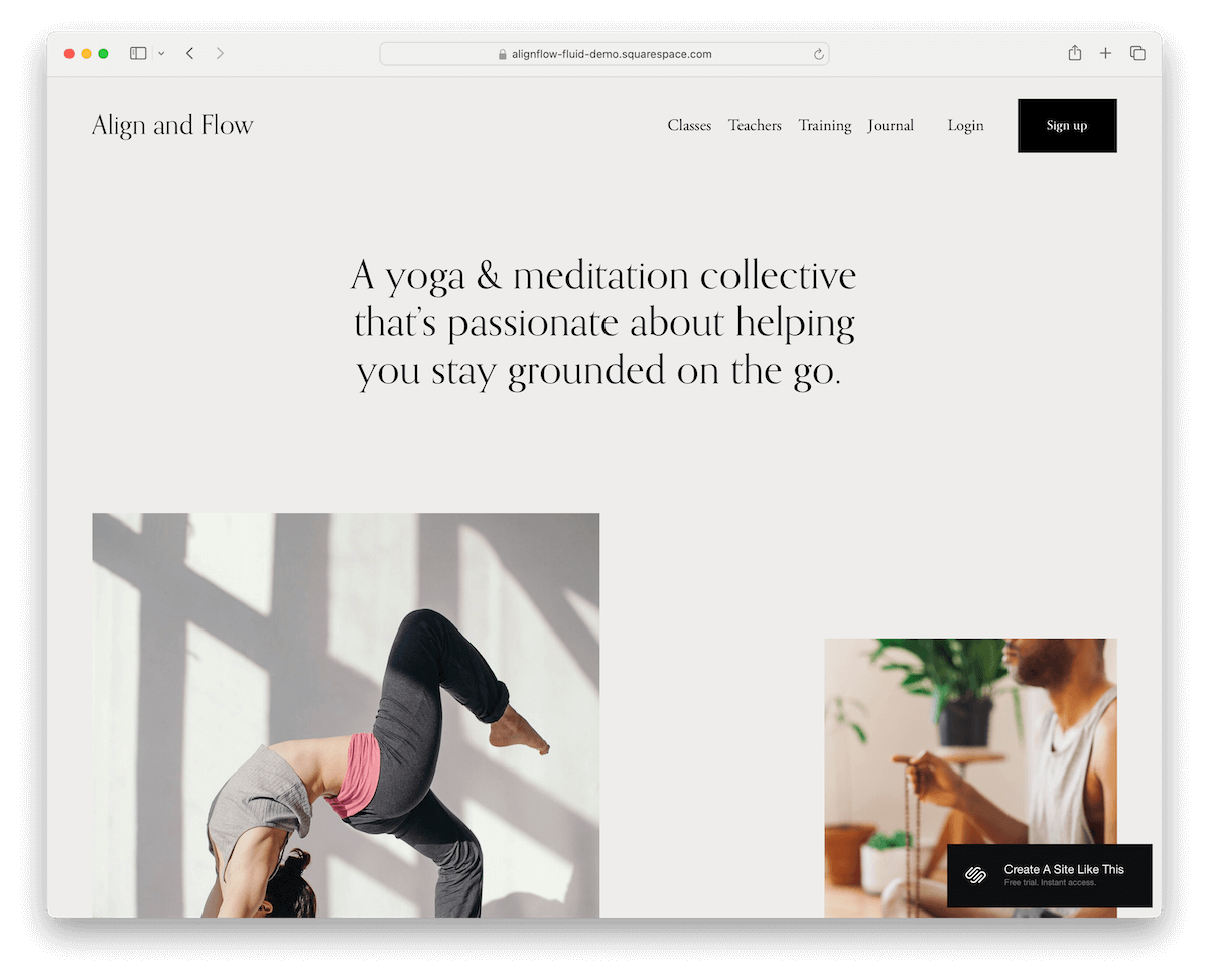
Alignflow Squarespace template brings minimalist elegance with its floating header that stays with you as you scroll.
The dark CTA button in the navigation bar stands out, catching your eye and guiding you smoothly to action.
What is its design philosophy? Less is more.
The header, base, and footer’s uniform grayish backdrop creates a cohesive look. The site also features crisp pricing plans amidst a sea of clean, white sections.
And tucked in the footer, a subscription form awaits, making staying connected a snap.
What stands out: Intuitive navigation makes the site easy to explore even for first-time visitors.
6. Essex
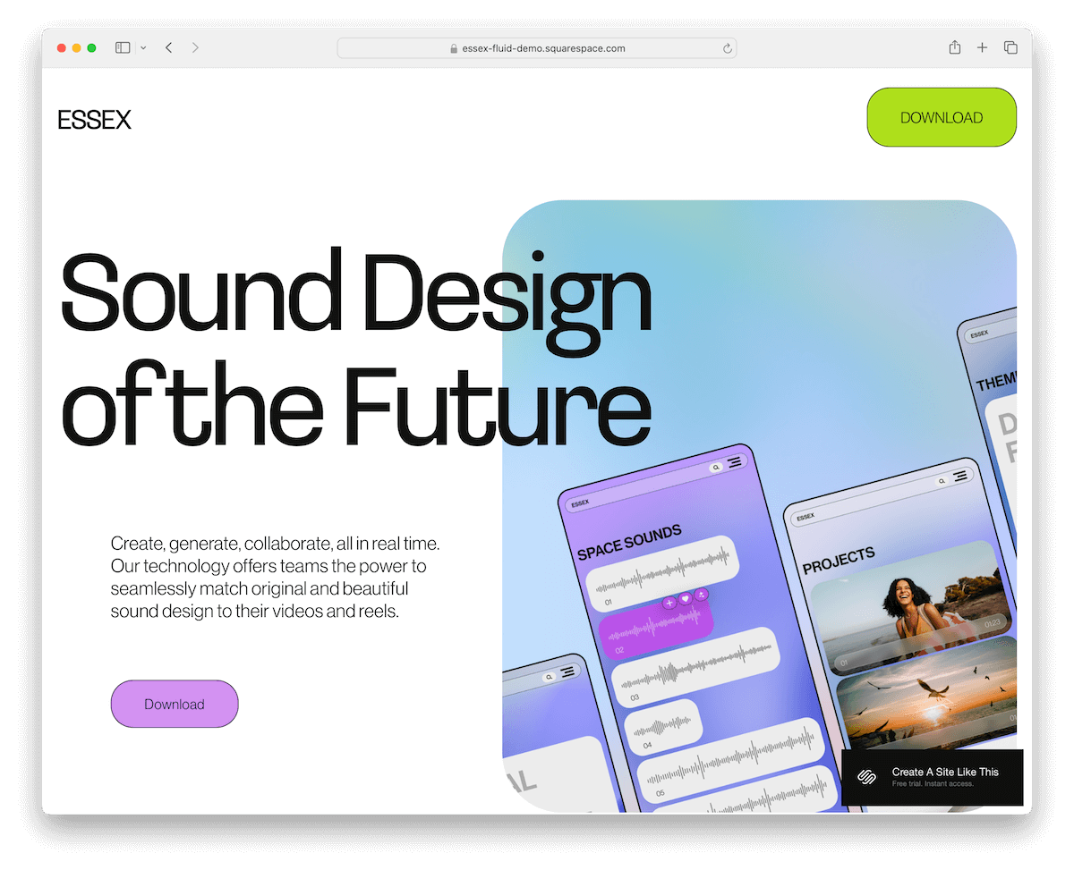
Essex Squarespace template brings that dynamic, mobile-like vibe to the desktop.
It’s got scrolling animations that add a layer of interactivity, making every visit a little journey.
The CTA button in the header? Super prominent, practically inviting clicks, which can significantly improve conversion rate.
Down in the footer, a subscription form makes connecting a breeze.
But the real showstoppers are the parallax and animated backgrounds – they create a sense of depth and movement that’s just captivating.
Essex is lively, inviting, and impossible to ignore.
What stands out: Template customization choices show the range of what Squarespace can achieve beyond its defaults.
7. Belisa

The Belisa Squarespace landing page template wows with a full-screen image background that grabs your attention immediately.
The transparent header? It magically turns solid black and floats at the top as you scroll down, always there when needed.
As you dive deeper, content seamlessly loads, keeping the experience smooth and engaging.
Need more details? Accordion sections unfold with additional info.
There’s also an online reservation form for easy bookings, and the Instagram feed at the bottom keeps the vibe fresh and connected.
What stands out: High-quality photography does the heavy lifting, making the content feel premium.
8. Manual
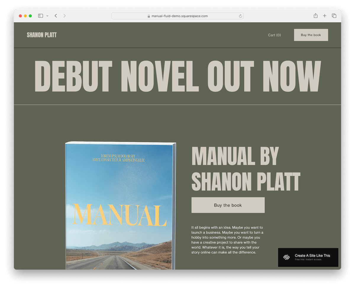
Manual Squarespace template stands out with its cohesive green background that unites the header, base, and footer, creating a seamless visual flow.
Right up in the header, you’ll find a handy shopping cart and a compelling CTA button, making navigation and action-taking straightforward.
The design cleverly uses thin lines to subtly separate page sections, maintaining a clean and organized look.
A newsletter subscription form invites engagement, while social icons in the footer ensure you stay connected.
Manual is a study in simplicity and functionality, wrapped in a refreshing green hue. (But remember, you can customize it entirely.)
What stands out: Strong visual storytelling makes browsing feel more like flipping through a curated magazine.
9. Oranssi
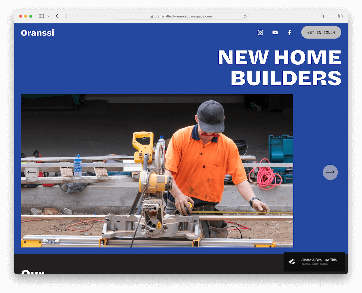
Oranssi Squarespace template nails it with a basic yet effective floating header: logo on the left, social icons, and a punchy CTA button on the right – everything you need, right where you need it.
Dive in, and you’re greeted by a slider showcasing top features or products.
Keep scrolling for a project carousel and a client testimonial slider, adding credibility and flair.
The finale? A unique animated footer background that brings life to business and contact details.
Oranssi is minimalist, engaging, and perfectly balanced.
What stands out: Client testimonials placed prominently on the homepage build trust before visitors even explore the services.
10. Degraw

Degraw is a Squarespace landing page template that charms with its light, feminine design that feels elegant and inviting.
Its header plays a neat little trick: it disappears as you scroll down and reappears when you scroll back up. This ensures a clean, distraction-free experience.
The initial view is text-heavy, setting a straightforward, informative tone right from the start.
Down below, a three-column footer smartly organizes location, contact, and social media details, making it easy to connect.
What stands out: The responsive design adapts seamlessly across devices — a core Squarespace strength on display.
11. Lusaka

Lusaka Squarespace template exudes sophistication with every click.
A transparent header houses a standout donation button, making support seamless and easy to access.
As you explore, you’re met with beautifully organized sections that blend images, text, and clear CTAs – each element designed to inspire and inform.
The contact form is streamlined for ease, inviting queries or connections.
And the minimalist footer? A clean wrap-up with business details and quick links, ensuring everything you need is just a click away.
What stands out: The responsive design adapts seamlessly across devices — a core Squarespace strength on display.
12. Agaro

The Agaro template bursts with energy thanks to its vibrant gradient background, which sets a lively tone right off the bat.
Dive into cool details and catch the animated sliding text that adds a dynamic layer to your browsing experience.
The way images are presented? Utterly unique, making every scroll a discovery.
And the dark contrasting footer isn’t just an end note; it’s a hub of additional information, links, and social icons, neatly wrapping up the layout in style.
Agaro is bold, it’s fun, and it doesn’t forget to be informative.
What stands out: Bold use of color sets this site apart from the typical corporate template look.
13. Laurie
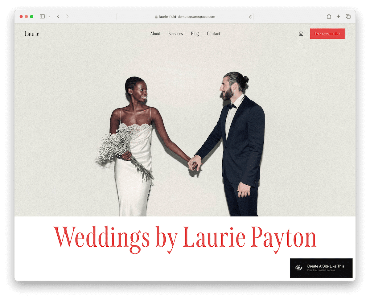
Laurie Squarespace template is a visual feast with stunning full-width image sections that pull you into the story.
The typography? A striking contrast of black and red that stands out against the light design, adding a touch of drama and elegance.
The original client testimonial slider and wedding stories sections are heartfelt, offering a glimpse into real-life fairytales.
And don’t miss the subscription widget in the footer – it’s a ticket to staying connected and catching all the latest.
Laurie is romance and sophistication, beautifully intertwined.
What stands out: Have you seen our collection of the best Squarespace wedding websites?
How To Make A Landing Page With Squarespace
Creating a captivating landing page on Squarespace can be a breeze with the right steps.
- Sign up or log in: Head to Squarespace.com and sign up for a new account or log into your existing one. Choose the plan that best suits your needs, keeping in mind that you can start with a trial to explore the platform first.
- Select a template: Browse Squarespace’s template library once logged in. Look for templates specifically designed for landing pages or strongly focusing on single-page layouts. Select one that aligns with your vision and goals.
- Customize your template: After choosing your template, start customizing it to fit your brand. Squarespace’s drag-and-drop editor makes it easy to modify layouts, add new sections, and insert elements like text, images, and buttons. Pay special attention to your headline and call-to-action (CTA) – these are key to capturing your visitors’ attention.
- Add your content: Fill your landing page with compelling content that speaks to your audience. This includes text, images, videos, and anything else that conveys your message effectively. Ensure your content engages and directs visitors toward your intended action, such as signing up or purchasing.
- Optimize for SEO: Optimize your landing page for search engines to help it get found online. Squarespace provides built-in SEO tools where you can add meta titles and descriptions, customize URLs, and more.
- Preview and publish: Before going live, use Squarespace’s preview feature to see how your landing page looks on different devices. Once satisfied with the design and functionality, hit the publish button.
FAQs About Squarespace Landing Pages
Can I integrate 3rd-party tools with my Squarespace landing page?
Yes, Squarespace allows you to integrate a wide range of 3rd-party tools and services, including email marketing platforms, social media feeds, and analytics tools, enhancing the functionality of your landing page.
Is it possible to customize my Squarespace landing page for mobile devices?
Yes. Squarespace templates are designed to be responsive, meaning your landing page will automatically adjust to look great on mobile devices. You can also make specific design adjustments for mobile view through the site editor.
How can I improve the loading speed of my Squarespace landing page?
To improve loading speed, optimize your images by resizing them or using Squarespace’s built-in image editor, limit the use of custom code, and minimize the number of large videos or complex scripts on your page.
Can I A/B test different versions of my landing page on Squarespace?
Squarespace itself doesn’t offer built-in A/B testing tools. However, you can use 3rd-party services to conduct A/B testing by directing users to different URLs or using custom code injections for more advanced testing scenarios.
How do I ensure my Squarespace landing page is SEO-friendly?
Utilize Squarespace’s SEO settings by adding relevant keywords to your page title, meta description, and headers. Also, ensure your URLs are clean and descriptive, and take advantage of image alt tags. Regularly updating your content also helps improve SEO performance.
What’s the best way to collect visitor information through my Squarespace landing page?
Use Squarespace’s Form Block to collect visitor information. You can customize forms to capture the needed data, such as names, email addresses, or feedback, and integrate them with email marketing services to automate your follow-up process.




Comments (0)