21 Best Small Business Websites (Examples) 2026
Are you ready to check the best small business websites to enjoy some great web design?
We sure are!
For this reason, we reviewed 150 business pages to create the ultimate collection for your viewing pleasure.
This list features them all from simple to more advanced and creative designs.
If you’re building your page, you can use a small business WordPress theme or a small business website builder (it’s an all-in-one solution). But a theme in combination with plugins gives you complete creative freedom.
Enjoy!
Best Small Business Websites & Designs
1. Puffin Packaging
Built with: Wix
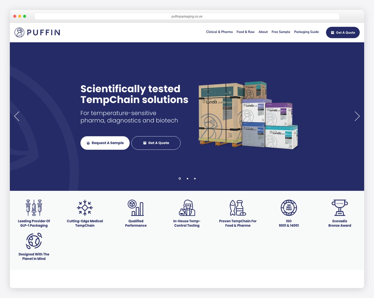
Puffin Packaging has a light design with a sticky top bar and header so that everyone can access other pages anytime. Plus, they added a call-to-action (CTA) button in the header to go to the “get a quote” form with a single click.
Cool scrolling animations enhance the browsing experience, while enough white space ensures great readability.
What stands out: Use the header section to integrate a CTA button for better visibility.
2. Islango
Built with: Wix
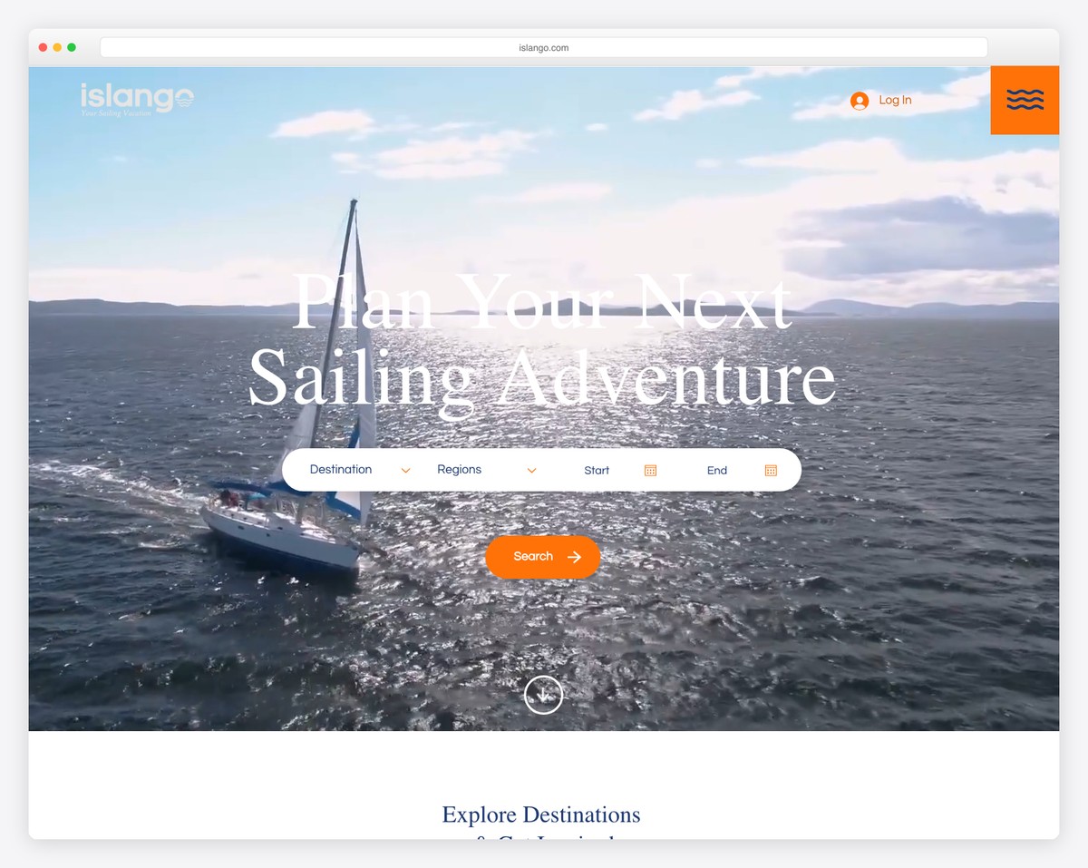
Islango integrates an advanced search function above-the-fold with a parallax image background and a transparent floating header.
The hamburger menu icon opens a full-screen navigation overlay, making finding information easy to access.
While Bonny’s footer feels nonexistent, Islango added links, a contact form, social icons, and more to it.
What stands out: Use a search/booking form above-the-fold so potential customers don’t need to search for it (which, if they do, may cause a drop in conversions).
3. Fabi Acupuncture
Built with: Wix
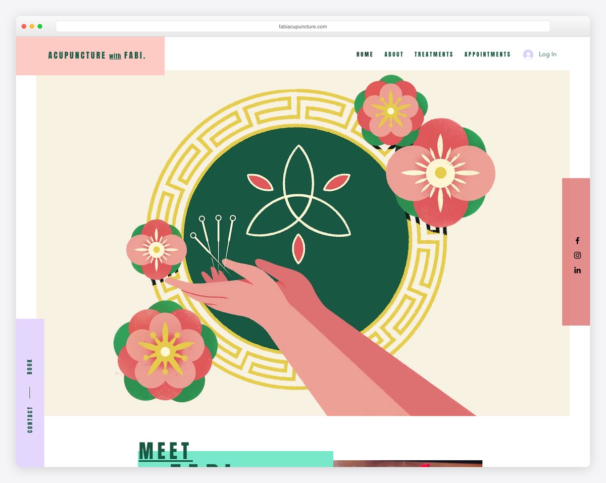
Fabi Acupuncture is a colorful website with a sticky header, social icons on the right and a contact/book button on the left.
Browsing is very easy on the eyes, with the hover effect highlighting each service and showcasing the “book now” button.
The website also integrates Google Maps with a location for easier finding.
What stands out: Use Google Maps to showcase your business location.
Don’t forget to check all these extra service websites for some more excellent web design.
4. LivSo
Built with: Shopify
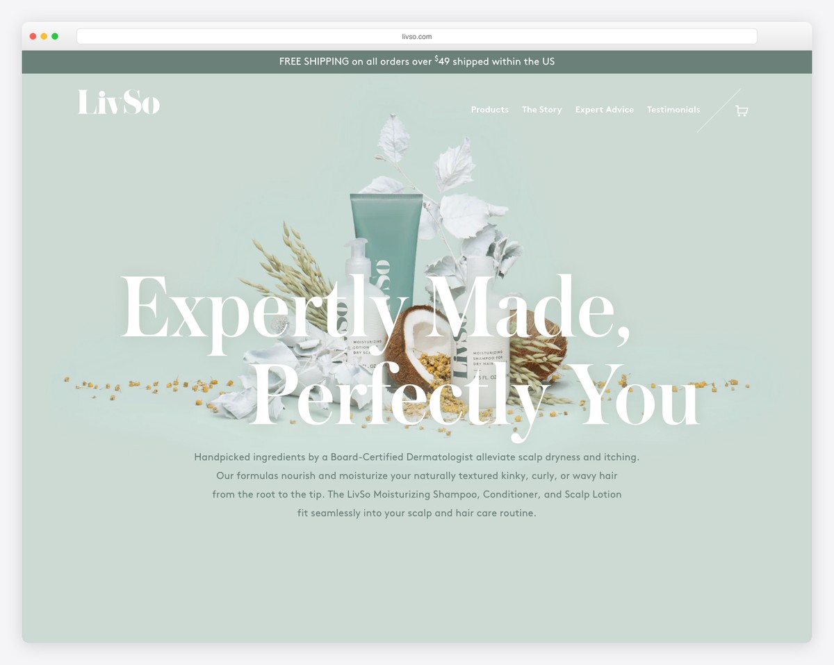
LivSo is a small business website example with an elegant design that makes you want to scroll it to learn about the products, the story, and more.
They also integrate an awesome approach to testimonials and a logo slider featuring authorities mentioning them (with links to full articles).
Furthermore, the header disappears on scroll but reappears when you scroll back to the top.
What stands out: Use testimonials to build social proof.
5. Lavada
Built with: Squarespace
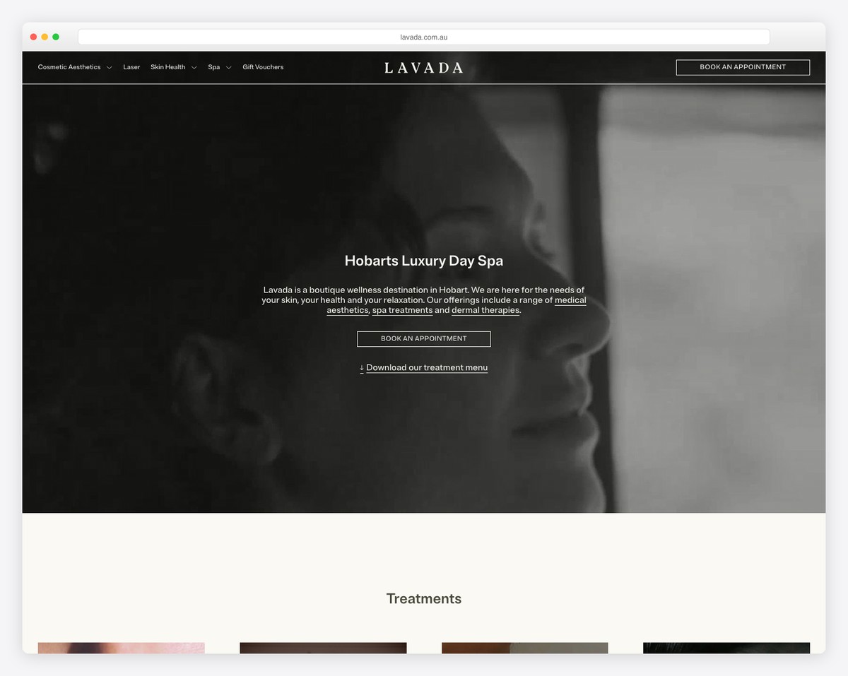
Lavada does things differently with a background video above the fold, a text overlay and a CTA button for bookings.
They also use a disappearing/reappearing header with a booking CTA, so there’s no need to search for it.
The page follows a minimalist design approach and a full-width Instagram feed. Moreover, the footer consists of four columns, displaying location, opening hours, additional information and contact details.
What stands out: Integrate an IG feed to add more content to your site and to grow your profile.
You also don’t want to miss these Squarespace website examples.
6. Altrock
Built with: Squarespace
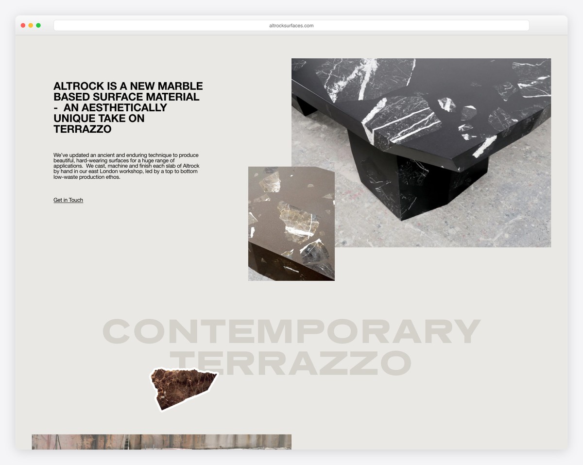
Altrock has a collage-like hero section featuring images (some are clickable) and text, and a clean navigation bar.
The rest of this simple website has the same style, which creates a one-of-a-kind portfolio of some of their items.
Meanwhile, the footer only contains links to the contact page and Instagram.
What stands out: Do you want to create an online portfolio of products but don’t want to use a traditional grid layout? That’s great; use Altrock’s as inspiration.
7. Casa Mami
Built with: Squarespace
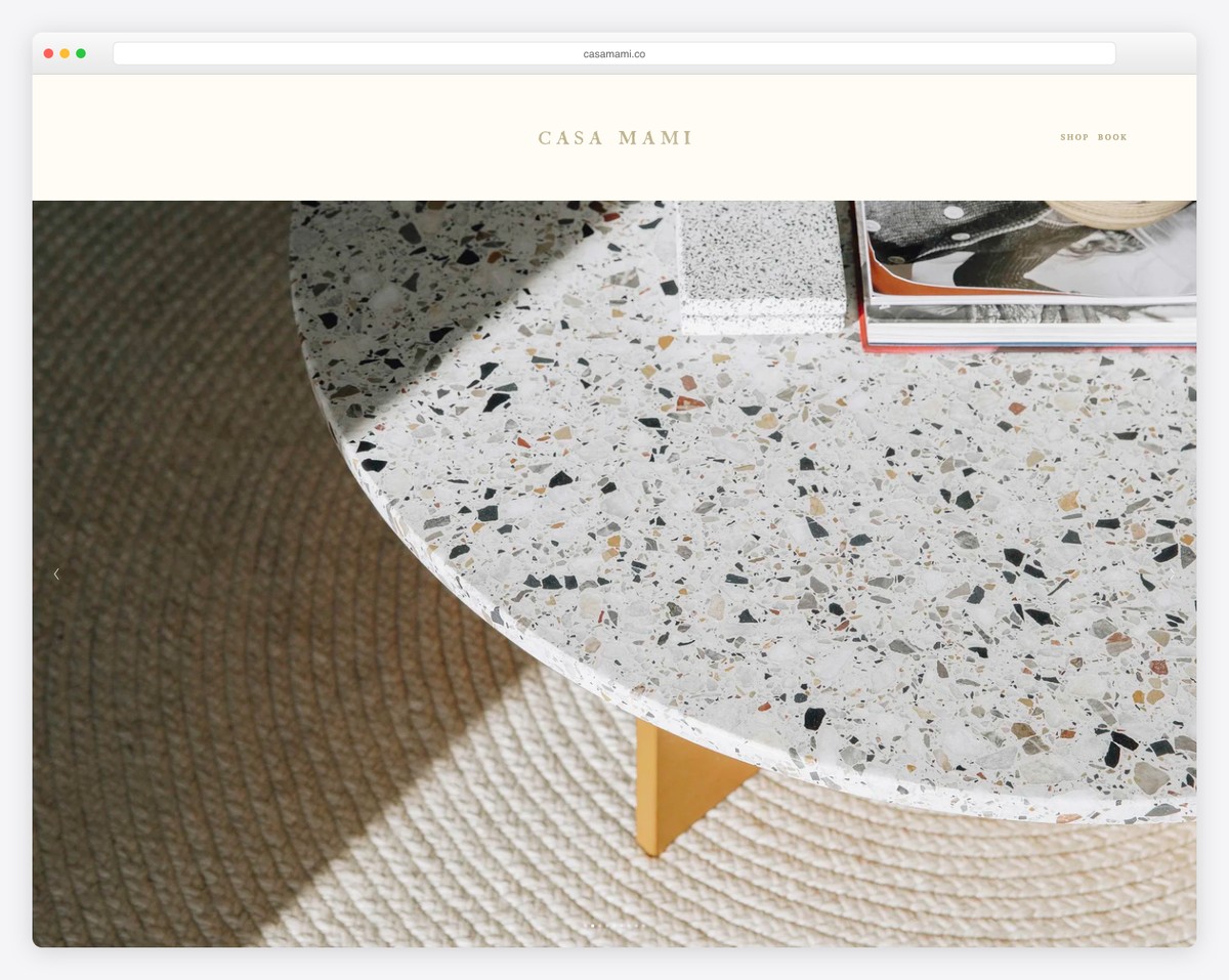
Casa Mami has this simple but bold responsive web design that we absolutely needed to include in this list.
Below the neat header is a large image slider containing only the location’s images – no text and no links/CTAs.
They added a parallax image background with a booking button before the footer for an added depth.
What stands out: Create a slideshow for pure enjoyment, avoiding adding text, links and CTAs.
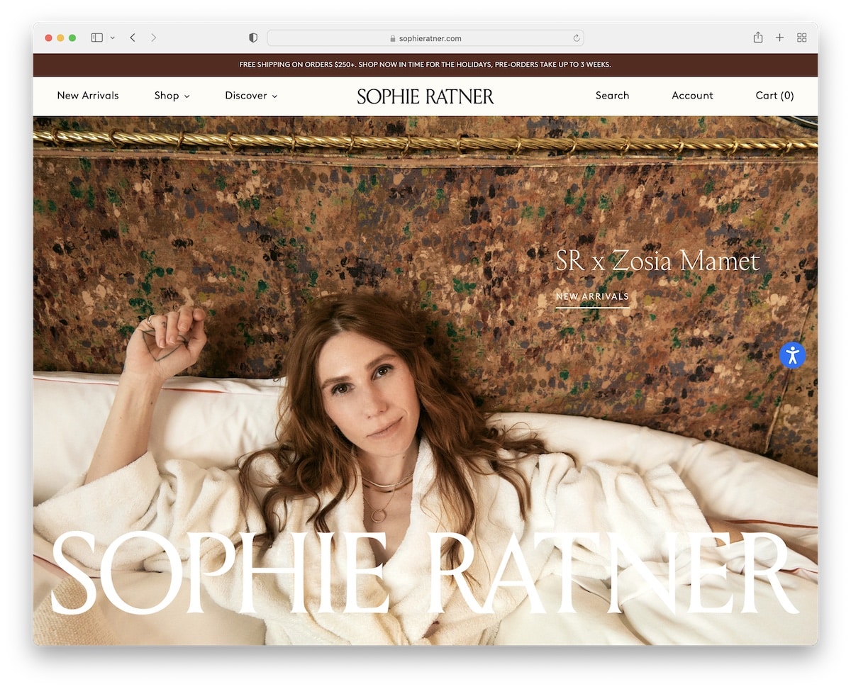
8. Sophie Ratner
Built with: Shopify
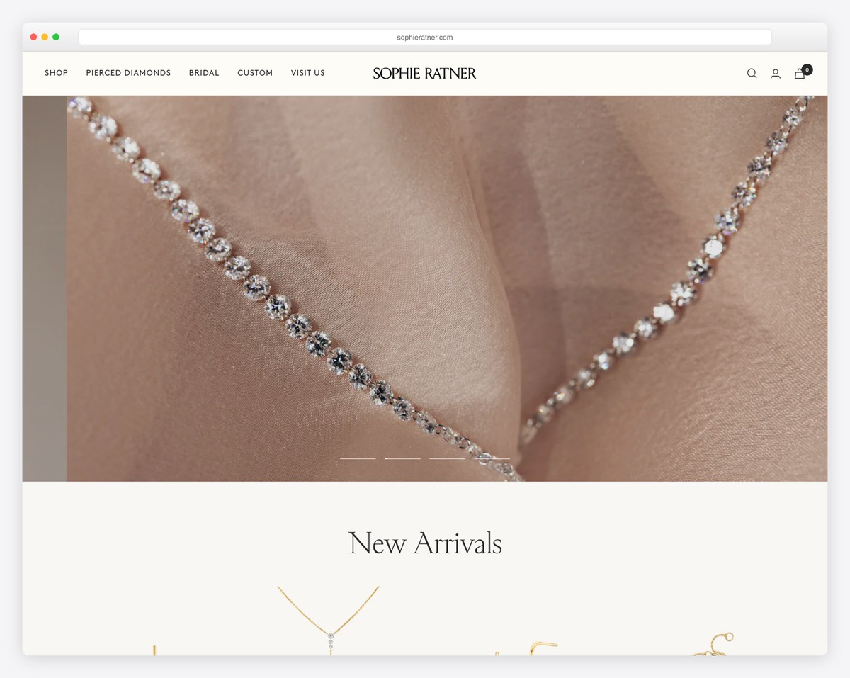
Similar to Casa Mami, Sophie Ratner also has a massive slider, but they use text and links to promote their products.
You cannot close the top bar notification, but it doesn’t stick to the top of the screen as the header does.
What’s unique about Sophie Ratner is the floating accessibility button on the right, so users can customize the website look however they want.
What stands out: Include an accessibility widget so everyone can get the most out of your website.
9. Upstate Laundromat
Built with: Squarespace
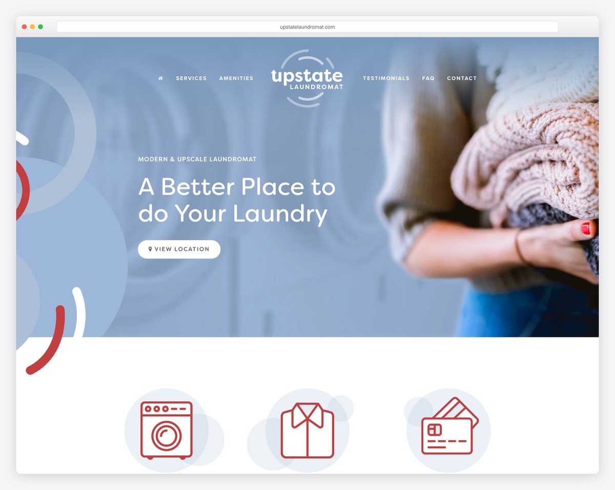
Upstate Laundromat has a minimalist one-page layout with a floating header and a handy menu that takes you to the desired section with a click (no need to scroll).
They feature a FAQ section with accordions, Google Maps with location and a minimalist footer with additional business information and contact.
What stands out: Use a single-page startup website layout in combination with a floating header to boost user experience.
10. Traackr
Built with: Webflow
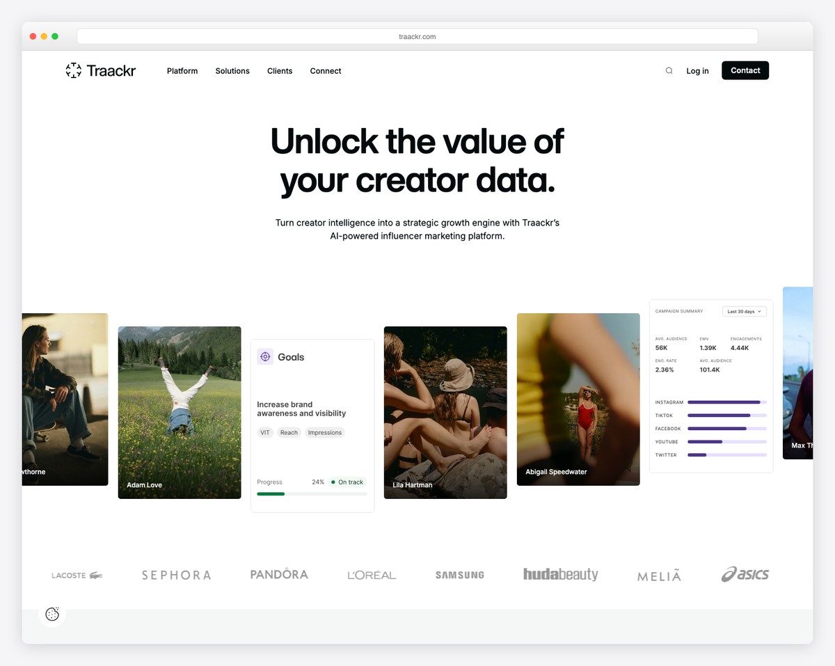
While Traackr features a lot of content on its home page, it does things with great care for readability to ensure everyone gets the most out of it.
It uses screenshot sliders to showcase the software with complementary text, a sticky header with a mega menu and a floating sidebar button promoting featured content.
What stands out: Use a sticky sidebar element if you’d like to put an extra shine on something.
These Webflow websites show you how powerful this page builder is.
11. Poetic
Built with: Webflow
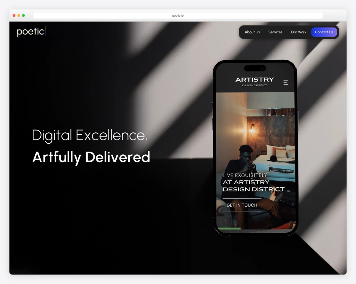
What’s unique about Poetic is that it doesn’t have a header when the website loads. However, it immediately appears once you start scrolling, creating a cleaner first-time interaction with it.
They also created a more engaging atmosphere with scrolling animations to immerse you more in the content.
The footer is split into two parts, one for the business details and subscription form and the other for social icons and career links.
What stands out: Keep your footer more transparent by splitting it into two parts.
12. World Financial Group
Built with: Webflow
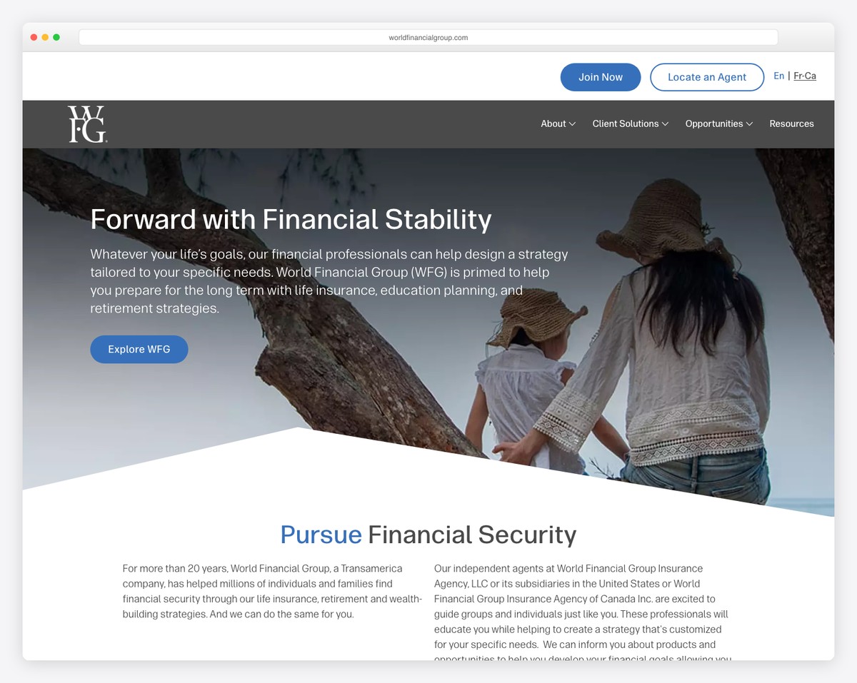
World Financial Group features a more basic but professional look with a transparent header, title, text and a CTA above the fold.
On the other hand, the footer section is stuffed with information, including menu links, social icons, business addresses and a language switcher.
What stands out: Give your website a more minimalist look with a transparent header/menu.
13. Mighty
Built with: Webflow
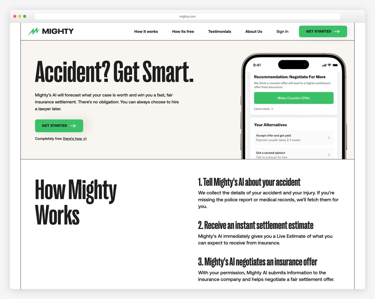
Mighty has a more interesting, semi-boxed website layout, with lines separating sections. It’s a great example of a “serious” business that doesn’t take its online presence so seriously design-wise.
Mighty is a catchy small business website with a mega menu, a live chat function and a clickable phone number in the header.
What stands out: Ensure the best user experience with a live chat widget.
14. Qualified
Built with: Webflow
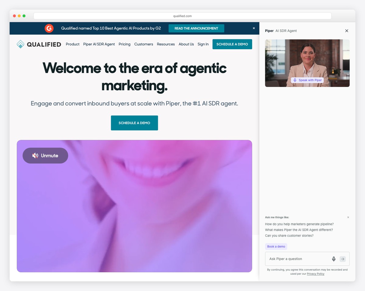
Qualified’s colorful and animated hero section easily triggers visitors’ attention. The two CTA buttons either open the live chat option or a lightbox video.
While the above-the-fold area provides a ton of information, the content-rich home page and handy floating navbar reveal all the ins and outs of Qualified.
What stands out: Create a lively hero area and benefit from the attention-grabbing effect.
15. Confluera
Built with: Webflow
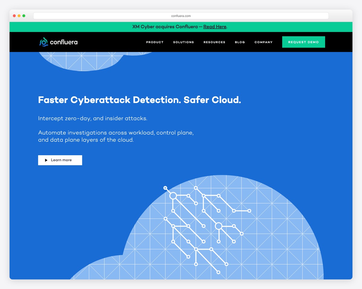
Confluera has a bold header and top bar that both stick to the top of the screen to ensure instant accessibility anytime. This is especially handy for the CTA button that’s in the navbar, so a user can “request a demo” when they feel like it (and don’t need to search for it).
The home page features some scrolling animations/graphics but keeps the look simple with extra white space that goes well with the amount of information you get.
What stands out: Adding a CTA in the (floating) navigation bar can increase conversions.
16. Nalen Ayurveda
Built with: Shopify
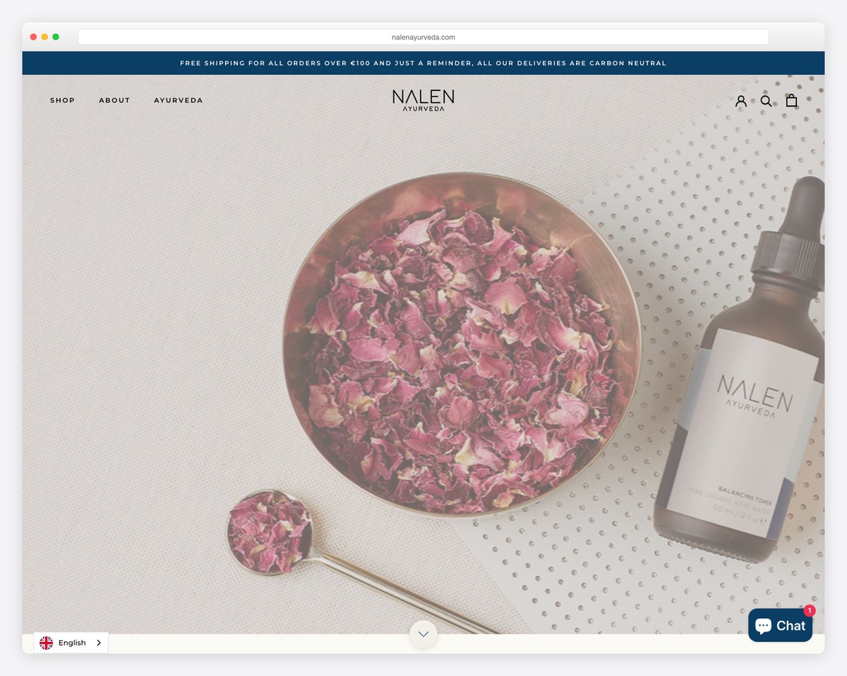
Nalen Ayurveda has a full-screen slider and a soothing design and color scheme that takes you into the world of Ayurveda without force.
Below the slider is the “Nalen in the news” section that features logos of some authorities mentioning the brand.
We also like the minimalist mega menu with links and images that help you find products and information a lot easier.
What stands out: If big brands and publishing companies mention you, you mention them on your website as a reference.
17. Entrance
Built with: Webflow
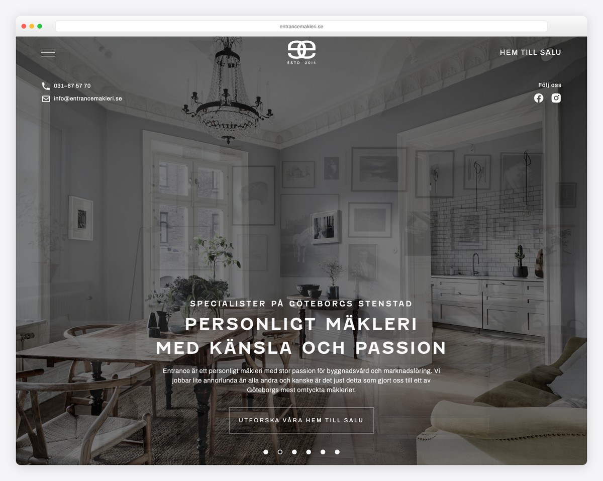
The Swedish design speaks through Entrance’s small business website nicely. Its black and white appearance, combined with the minimalist touch, creates a pleasant atmosphere.
The header floats on top of the screen and opens a full-screen menu overlay featuring address and contact information.
What stands out: If you plan to use a menu overlay, feel free to include additional business information and even social media.
18. Magic Spoon
Built with: Shopify
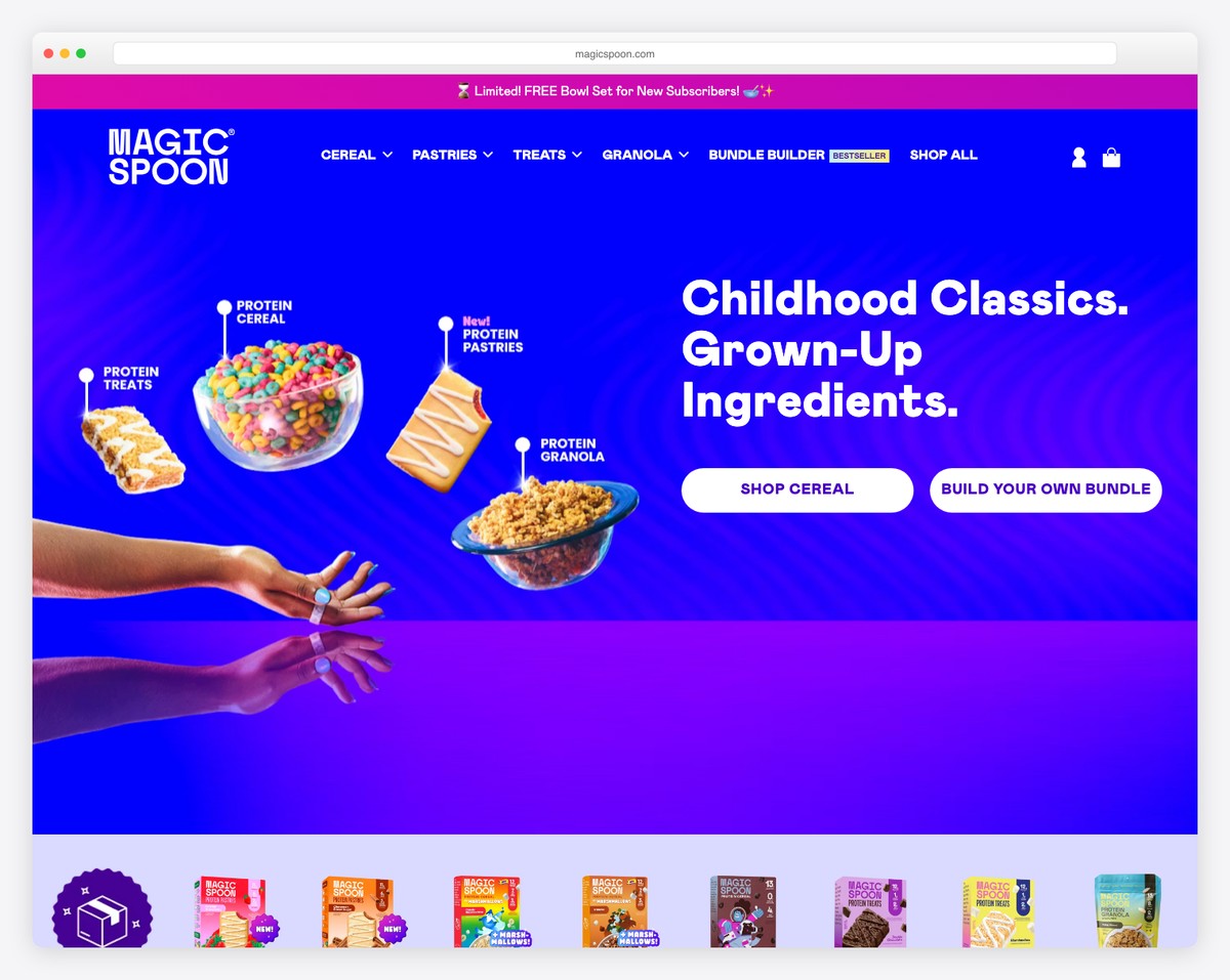
Magic Spoon is a niche ceral brand that focuses on gran-free cereal with high fiber, protein and low sugar content.
The website itself shows that kids are their main target audience thanks to vibrant colors that are matching their brand identity and packagin. Magic Spoon website is made using Shopify eCommerce website builder that is popular for sall business websites thanks to quick setup and resaonable pricing.
What stands out: Choosing the right color combination for your website is crucial because it says a lot about your brand and its message. Here are the best colors for websites backed by research
19. Lori May Interiors
Built with: Squarespace
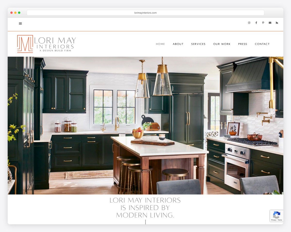
Lori May Interiors’ website exudes sophistication with its gold-and-dark-green color palette and a stunning full-width kitchen photograph as the hero image. The elegant logo and structured navigation immediately convey a premium design-build firm.
The site uses a clear content hierarchy with sections for About, Services, Our Work, Press, and Contact — making it easy for potential clients to explore the portfolio and get in touch.
What stands out: A signature color palette paired with portfolio-quality photography instantly communicates the caliber of a design business.
20. Solo Salon
Built with: Squarespace
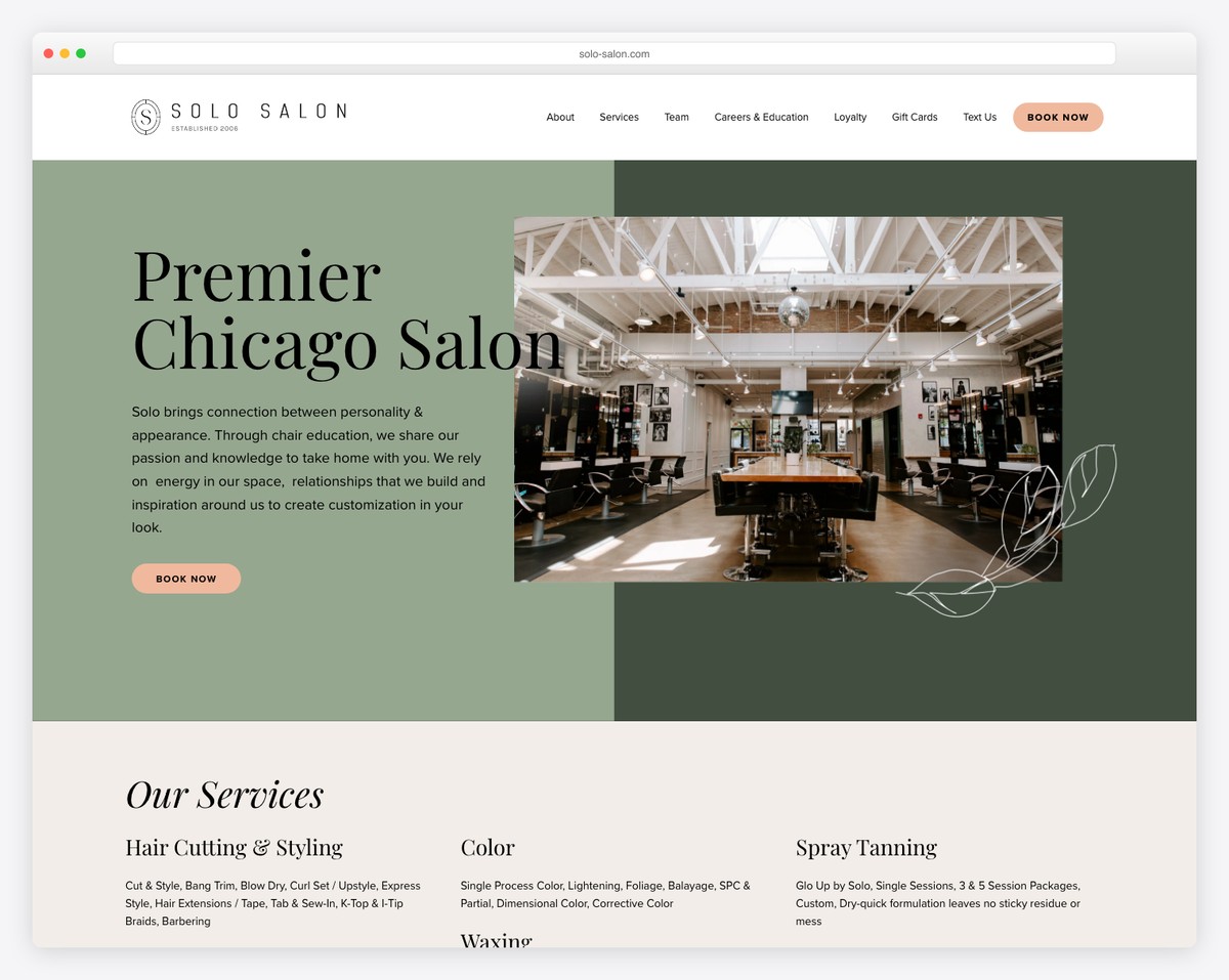
Solo Salon’s website balances elegance with approachability. The muted sage-green hero section with bold serif typography (“Premier Chicago Salon”) makes a confident statement, while interior photos of the space showcase the salon’s upscale atmosphere.
The site clearly organizes services (Hair, Color, Spray Tanning, Waxing) and includes prominent “Book Now” CTAs throughout. Additional pages for Team, Careers, Loyalty programs, and Gift Cards show a well-rounded business presence.
What stands out: Showing your physical space with professional photography helps service-based businesses build trust before the first visit.
21. Salt & Straw
Built with: Shopify
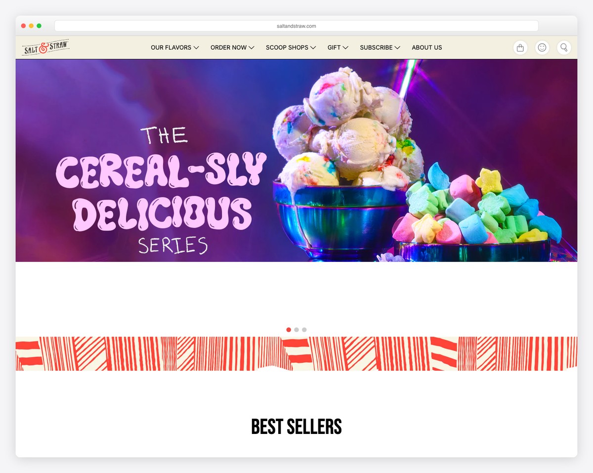
Salt & Straw’s website explodes with color and fun — their “Cereal-sly Delicious Series” hero features vivid neon lighting and playful cereal-inspired ice cream photography. The hand-drawn logo and whimsical typography perfectly capture the brand’s creative spirit.
The navigation smartly bridges online and in-person experiences (Our Flavors, Order Now, Scoop Shops, Gift, Subscribe, About Us), reflecting a small business that has successfully scaled from a single Portland cart to a nationally recognized brand.
What stands out: Bold, colorful hero imagery with playful typography helps food businesses convey their personality and stand out in a sea of minimalist designs.
Related Posts


Great roundup of small business website designs! The variety and creativity showcased here are truly inspiring. Thanks for putting this together!