16 Best Resume Websites (Examples) 2026
Are you ready to see the best resume websites to gain inspiration before creating your own?
The quality of your personal page is essential if you want to increase your potential when seeking a new job or client.
Luckily, these top-notch examples will help you train your creativity. But don’t forget to add your original twist to make yours stand out more!
We also made sure to add the product/website builder each website is built on, so you can try it, too.
To take immediate action, you can also check our review of the best personal website builders or WordPress resume themes.
Best Resume Websites & Examples
1. Gary Sheng
Built with: Strikingly
Technologist Resume Website
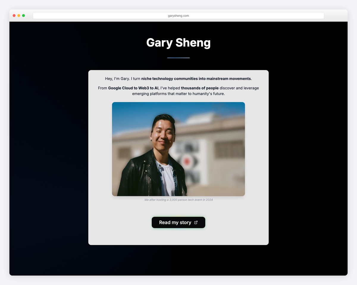
Gary Sheng runs a one-page website without a header or menu—just a large hero image with simple, welcoming text.
His website features a simple “My journey” timeline, links to communities where he’s most active, and more.
Scroll down and up buttons accompany you all the time if you don’t feel like scrolling.
What stands out: Make your resume website feel more personal with an image of yourself (and it doesn’t have to be too formal).
You can also use any of these user-friendly one-page website builders to create your ideal online presence.
2. Alisha Selena
Built with: Squarespace
Copywriter Resume Website
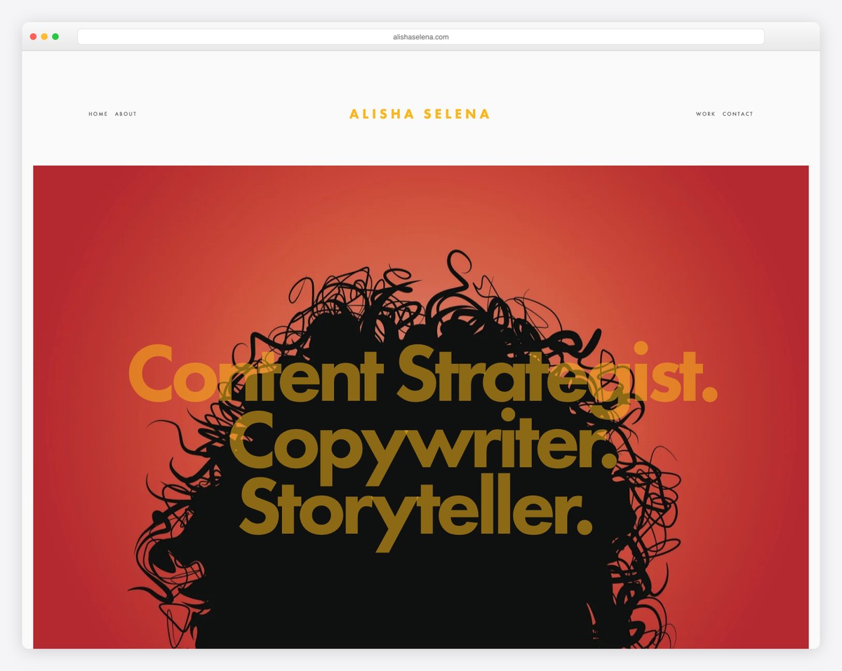
Like Quinnton’s page, Alisha Selena’s home page is very simple but features a parallax image to spice things up.
The header is very minimalist, and the footer only features social links. But in between is a “view my resume” button that opens a PDF in a new tab.
Alisha Selena is a master copywriter and storyteller, and we have included her website as one of the best copywriter portfolio examples.
What stands out: Parallax functionality can bring more life to your page instead of keeping things static.
Do you have a personal portfolio website and need more ideas? Check out our list of the best Squarespace website examples.
3. Kristina Plummer
Built with: Squarespace
Product Designer & Marketer Resume Website
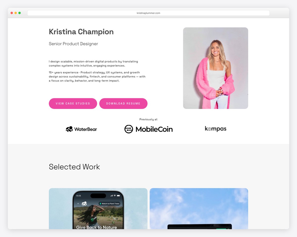
Since we’re in the simplicity flow, here’s another cool resume website that uses the typewriter effect to welcome you.
Kristina Plummer’s front page features no images, but the text animation does a good job of sparking interest.
The resume button also features a pink hover effect, which makes it more clickable.
What stands out: Text and no images for your home page can easily differentiate you from the masses.
Looking to build a similar website? Here are the most beautiful Squarespace website templates for designers.
4. Erik Kindel
Built with: Squarespace
Freelancer Copywriter Resue Website
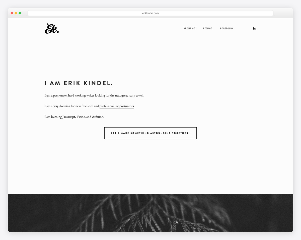
Erik Kindel runs a three-page resume website that starts with a text-heavy, above-the-fold area. But the front page also has two parallax sections with links, an Instagram feed and a basic contact form.
The site’s basic web design works great on desktop and mobile, offering the best performance.
What stands out: In the hero section, go straight to the point, telling more about yourself with text and a solid-colored background.
5. Alex Naraghi
Built with: Squarespace
Game Developer Resume Website Example
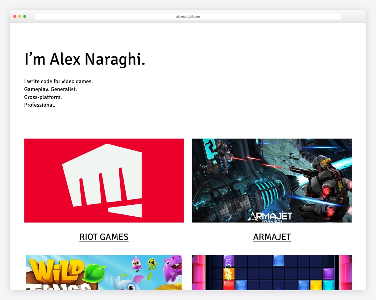
Alex Naraghi’s resume page is all about simplicity, with a lot of white space and a minimalist header and footer.
The projects section opens each as an individual page with more information, explaining everything in detail.
And it’s impossible to miss the resume with the vivid green background that screams, “Click me!”
What stands out: There’s no need to overcomplicate your web design; let your works and projects do the talking.
6. Nate Hinners
Built with: Squarespace
Creative Director Resume Website
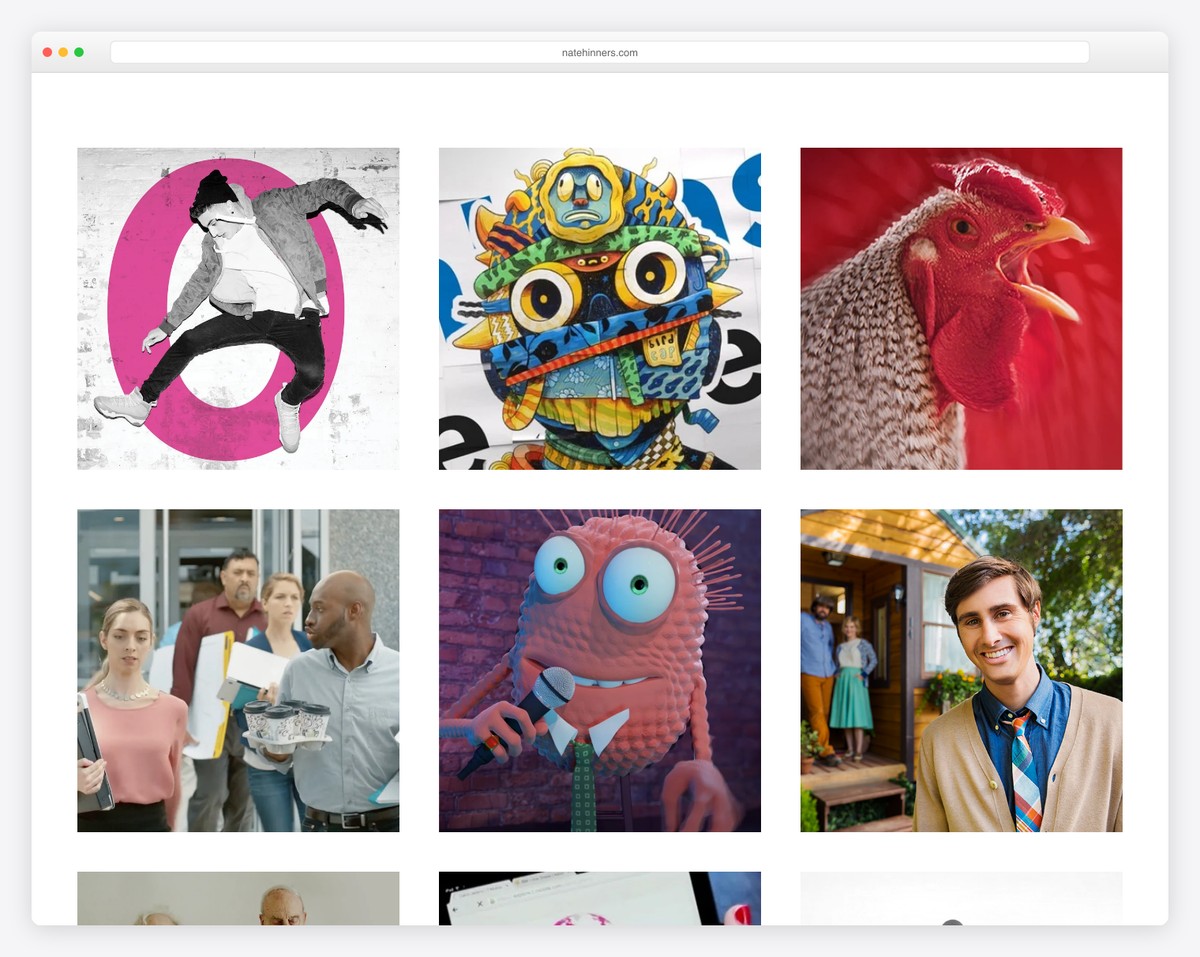
A grid-style portfolio website home page is a great option for presenting some of your best works without wasting potential clients’ time. Nate Hinners does this nicely and cleanly, emphasizing content first and foremost.
However, there’s also a minimalist header with links to other works, resumes, shops, contacts, etc.
What stands out: Instead of featuring only one or two projects on the home page, use a grid layout to feature five, ten, or more.
7. Anthony Wiktor
Built with: Gatsby
Creative Director & Frontend Developer Resume Website
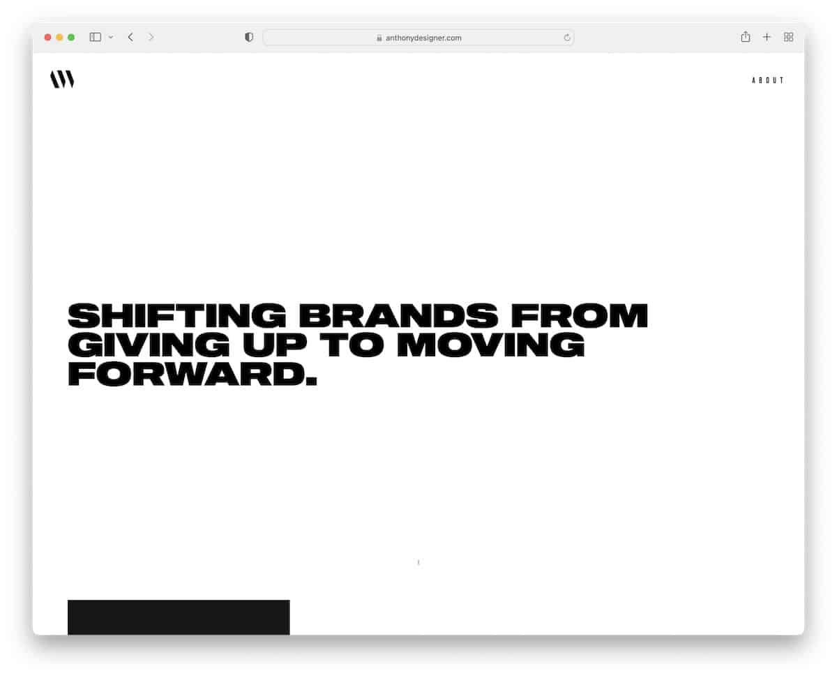
Anthony Wiktor’s two-page website is epic from start to finish. It’s super simple and minimalist, which makes it so special.
Also, switching between a light hero section to a dark design once you start scrolling is a great attention-grabber. (You need to see it.)
What stands out: Mixing light and dark design can work really well for boosting user experience.
8. Sean Halpin
Built with: GitHub Pages
Designer and Front End Developer Resume Website
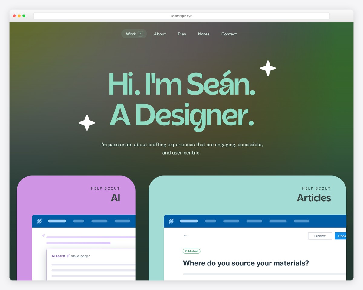
Sean Halpin’s personal brand and website are very creative and modern, with many unique elements that enhance the user experience.
It also has a floating menu, so you don’t need to scroll back to the top to learn more.
The live chat function may be a bot but responds with quality answers.
What stands out: Adding a live chat button to your website (even if it’s a bot) can gain you more clients.
9. Diogo Correia
Built with: Gatsby
Developer and Student Resume Website
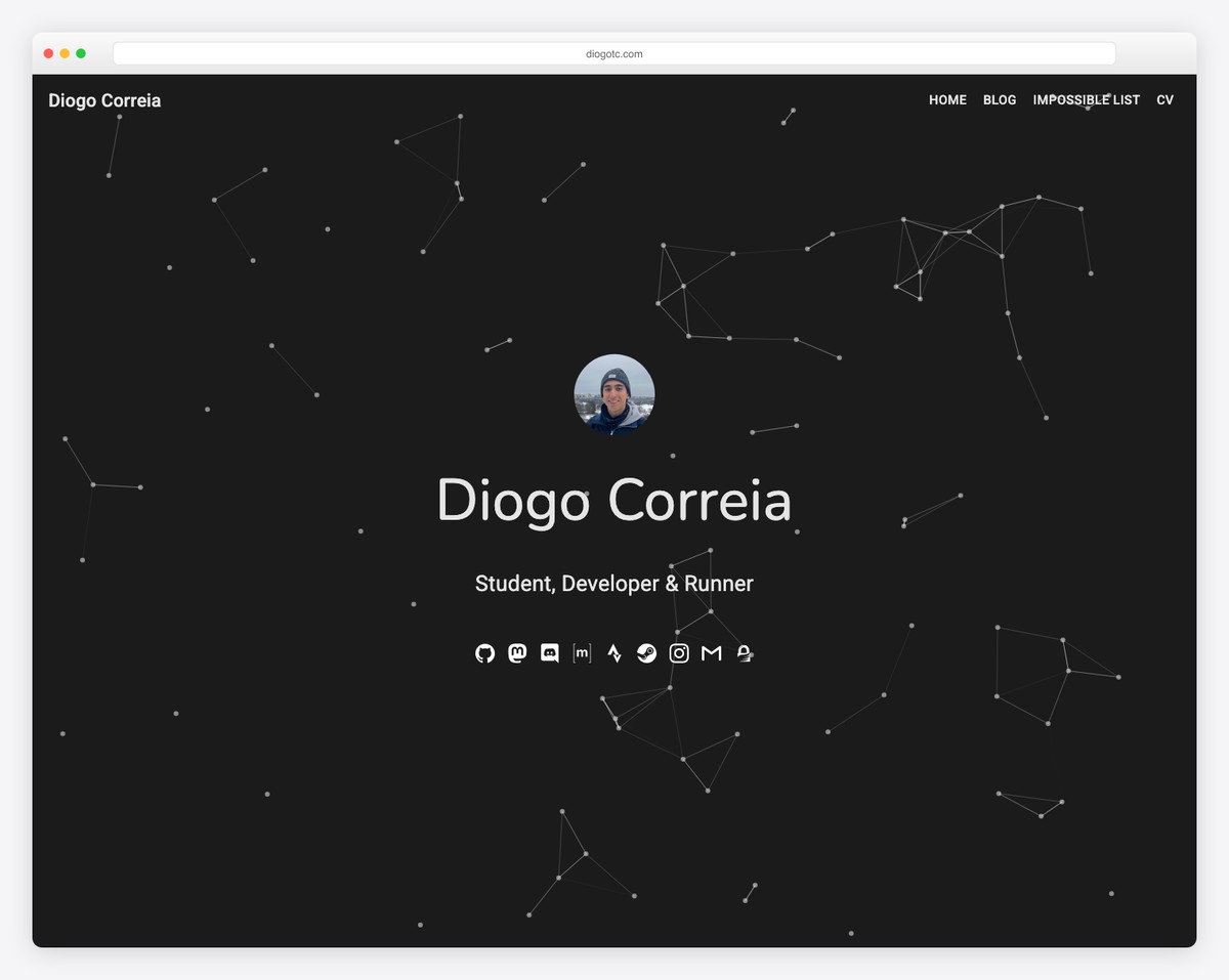
You don’t see a particle effect-style hero section too often, which makes Diogo Correia’s page unique.
Just below the fold is a quick message from Diogo that continues with a portfolio and an animated timeline.
Moreover, the footer provides additional contact information and a site map with links.
What stands out: Use an animated timeline to showcase your education, experience, achievements, etc.
10. Allison Driscoll
Built with: GoDaddy Builder
Senior Digital Marketing Strategist Resume Website
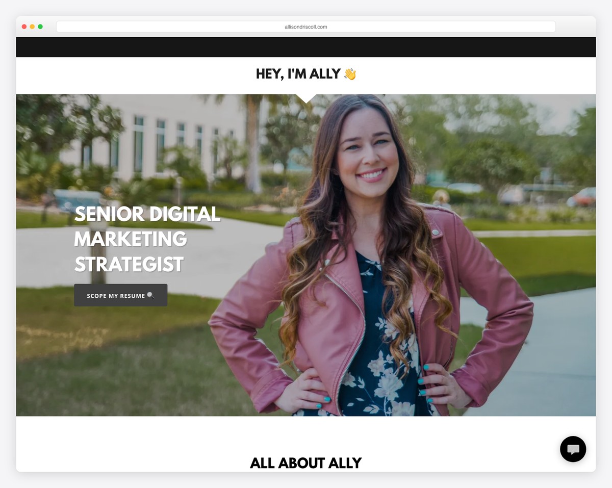
Allison Driscoll is a great resume website example that doesn’t overcomplicate things and goes straight to the point. And that’s exactly what you want – give the potential employers and clients what they need.
The website has a single-page layout without a header but a call-to-action button that takes you straight to the resume section.
What’s also interesting is the floating contact button that opens a simple form to get in touch. However, she also has another contact form that allows adding attachments.
What stands out: Avoid fluff and go straight to providing information about yourself, your experience, etc.
11. Andrew McCarthy
Built with: GitHub Pages
Designer & Developer Resume Website
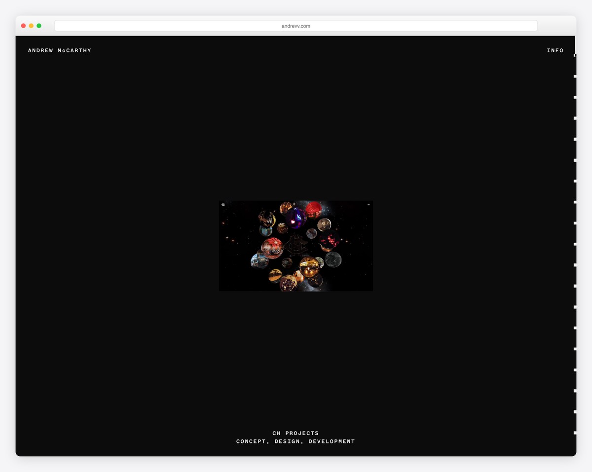
Andrew McCarthy’s site is another with infinite scrolling that repeats the same sections over and over. But the overlayed shapes change, tricking you into continuous scrolling before you realize it’s all the same. Creative!
On the other hand, there’s another page that features a long list of his works—you can actually scroll to the end.
What stands out: Even if you think that everything’s been done, think again.
12. Ximena Vengoechea
Built with: Squarespace
Speaker and UX Researcher Resume Website
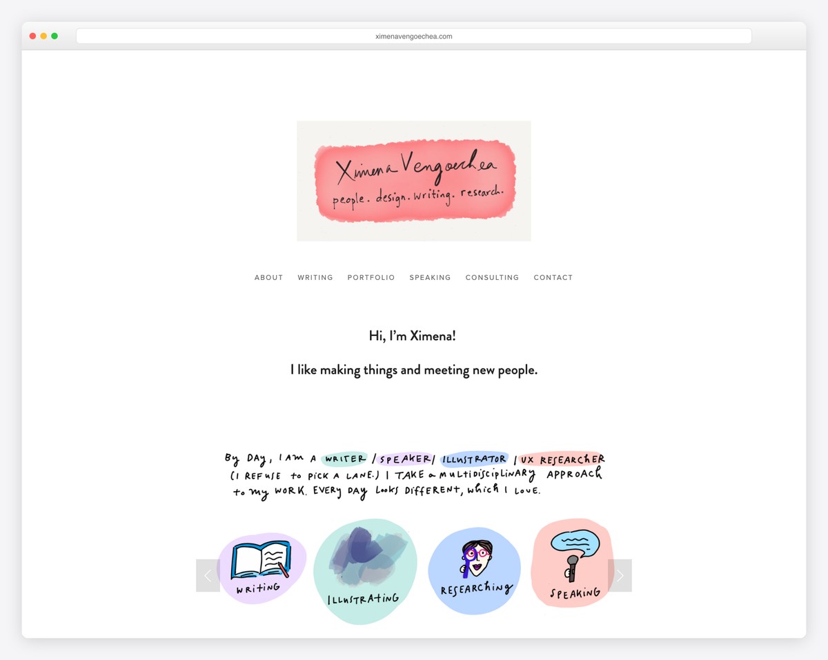
Ximena Vengoechea used her skills when building her personal website to promote her services.
While the page has a drop-down menu, guiding you to all the information, the cool and catchy slider makes you want to skim through it first and learn more about Ximena.
What stands out: Sprinkle your resume website with fun elements to make browsing more exciting.
13. Nathaniel Koloc
Built with: Webflow
Entrepreneur & Recruiter Resume Website
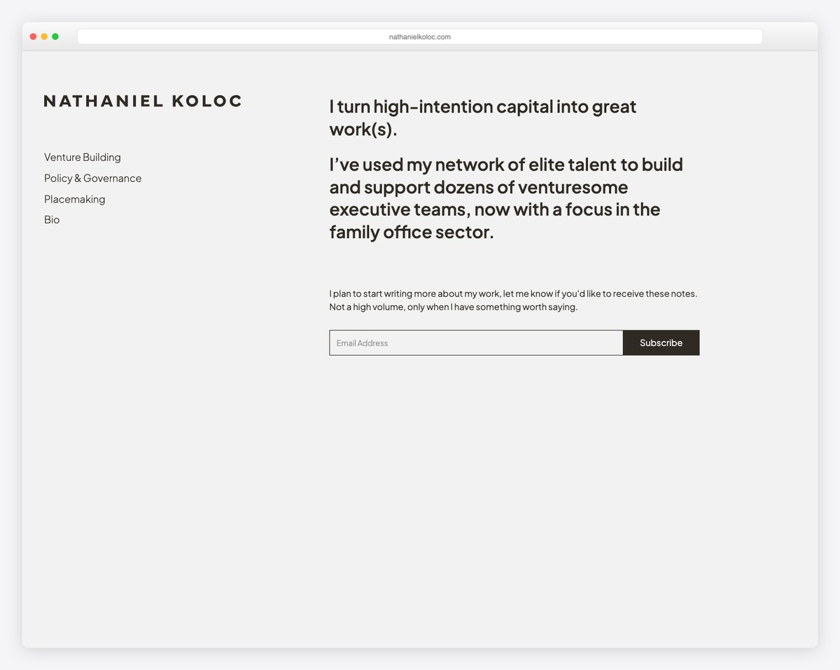
This is a simple, somewhat basic resume website that you can easily copy and improve with your ideas. What’s great about this website is that you can recreate it using a simple resume website template by Colorlib.
The one-page layout with a floating navbar is very easy to navigate and find the necessary information. The multi-colored background sections also work really well, creating a more pleasant experience.
What stands out: Feel free to test using different background colors for different page sections to make it more dynamic.
14. Olivia Sisinni
Built with: Squarespace
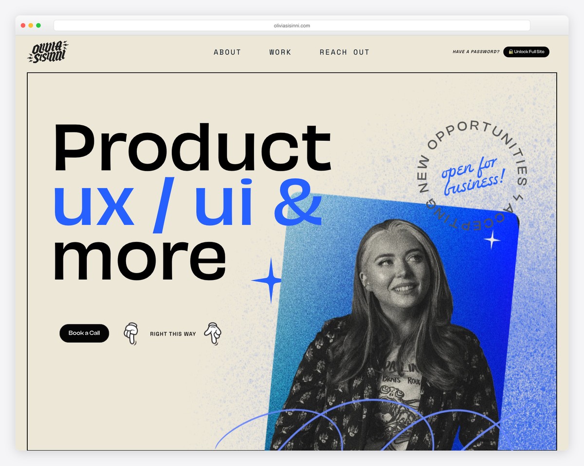
Olivia Sisinni’s portfolio makes a bold first impression with oversized typography (“Product ux / ui & more”) and a playful blue-toned portrait cutout. The “open for business” rotating badge adds personality and signals availability.
The site uses a cream-and-blue color palette with hand-drawn-style elements that set it apart from typical portfolios. The clear “Book a Call” and “Right This Way” CTAs guide visitors to take action.
What stands out: Adding playful, animated elements like a rotating badge can make a portfolio stand out from more traditional designs.
15. Nicole Edgar
Built with: Squarespace
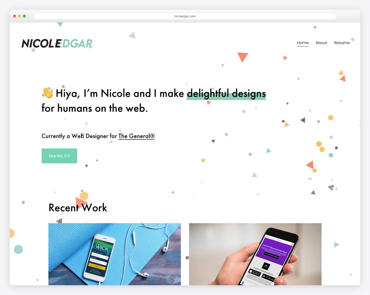
Nicole Edgar’s portfolio opens with a cheerful, personality-driven hero — a wave emoji, a friendly headline (“Hiya, I’m Nicole and I make delightful designs for humans on the web”), and animated geometric confetti in the background.
The site includes a dedicated Resume page alongside Home, About, and work samples. The mint-green CTA button (“See My CV”) and playful design elements create a memorable, approachable feel while still being professional.
What stands out: Infusing your resume website with personality through color, animation, and casual copy can make you more memorable to potential employers.
16. Laura Rountree
Built with: Squarespace
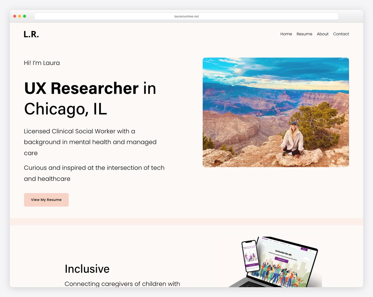
Laura Rountree’s resume website clearly positions her as a UX Researcher in Chicago with a clean, professional layout. The split hero section pairs a brief bio with an eye-catching travel photo that adds personal warmth.
The navigation includes dedicated Home, Resume, About, and Contact pages. Below the hero, case studies of her UX research work (like “Inclusive” — connecting caregivers with resources) demonstrate her expertise through real projects.
What stands out: Combining a professional title with a personal photo creates an approachable resume website that goes beyond a plain CV.



Comments (0)