20 Best Contact Us Pages (Examples) 2026
Do you want to check the best ‘Contact Us’ pages for inspiration on creating your own?
There are many ways of building the perfect contact section for your website or blog.
Although there are some “rules,” there’s no limit to how you’d like to do it.
For example, a contact form is a common practice, but you can also only add a clickable email and phone number.
Moreover, a Google Maps integration to showcase your location is handy, but some only add the full address.
Do it your way!
But these examples will undoubtedly help you on your journey.
Inspiring Examples Of Contact Us Pages
1. Yummygum
Built with: Dato CMS
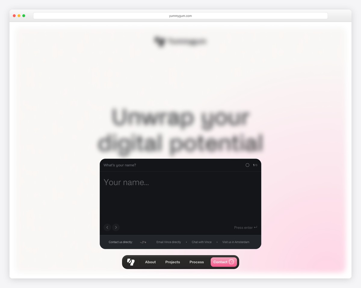
Yummygum’s page is light and creative, aiming for a minimalist look. It has a title text, a little explanation that they’re there for you and a contact form with a contrasting background color.
Moreover, instead of using the general contact form, you can also hit up Vince directly, which creates a more personal experience.
Instead of Google Maps, they use a custom 3D map to showcase their location.
What stands out: Make the contact us process more personal by adding the contact details of one of your team members.
2. The Charles
Built with: Gatsby
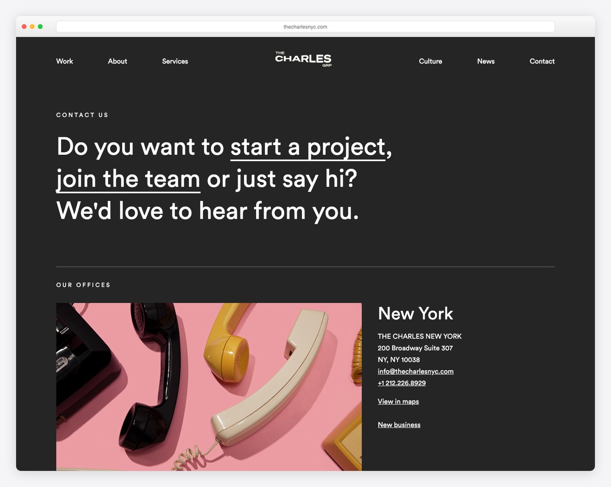
Charles also uses a dark design on its Contact Us page. Because it has multiple office locations, it broke things down into three sections, with each office’s business and contact details, including “view on map.”
Meanwhile, the footer is light, which gives the page a more dynamic feel.
What stands out: Copy The Charles’ strategy if you also run multiple office locations.
3. Basecamp
Built with: Squarespace
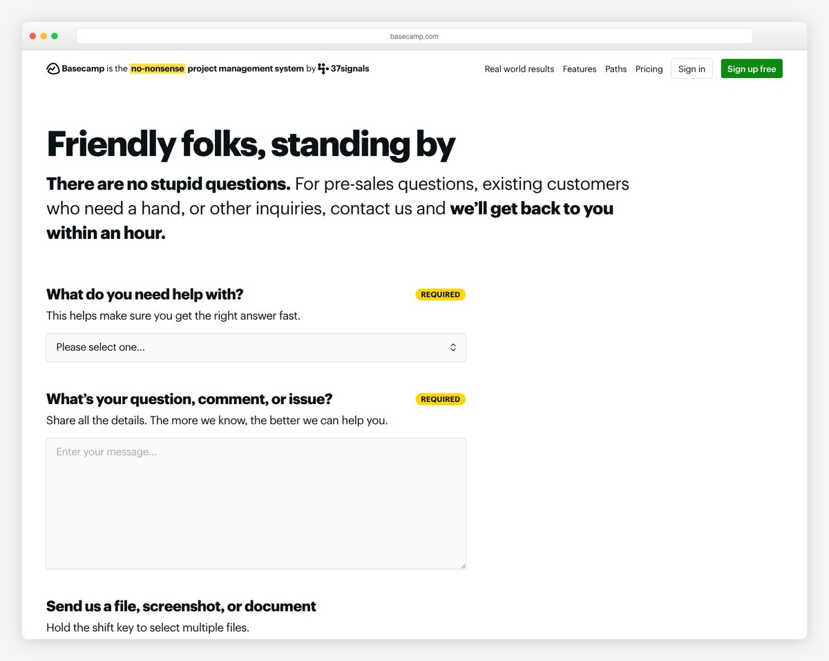
Basecamp mixes simplicity and uniqueness very well on its contact/support page. They use a title and additional text, with the information of how quickly they will get back to you (6 mins, really?!).
The contact form features multiple fields with a drop-down, so your message lands in the hands of the right department.
What stands out: Use a drop-down for subject selection/reason of contact to dissect emails.
Check out more fantastic Squarespace website examples.
4. Bumble
Built with: Squarespace
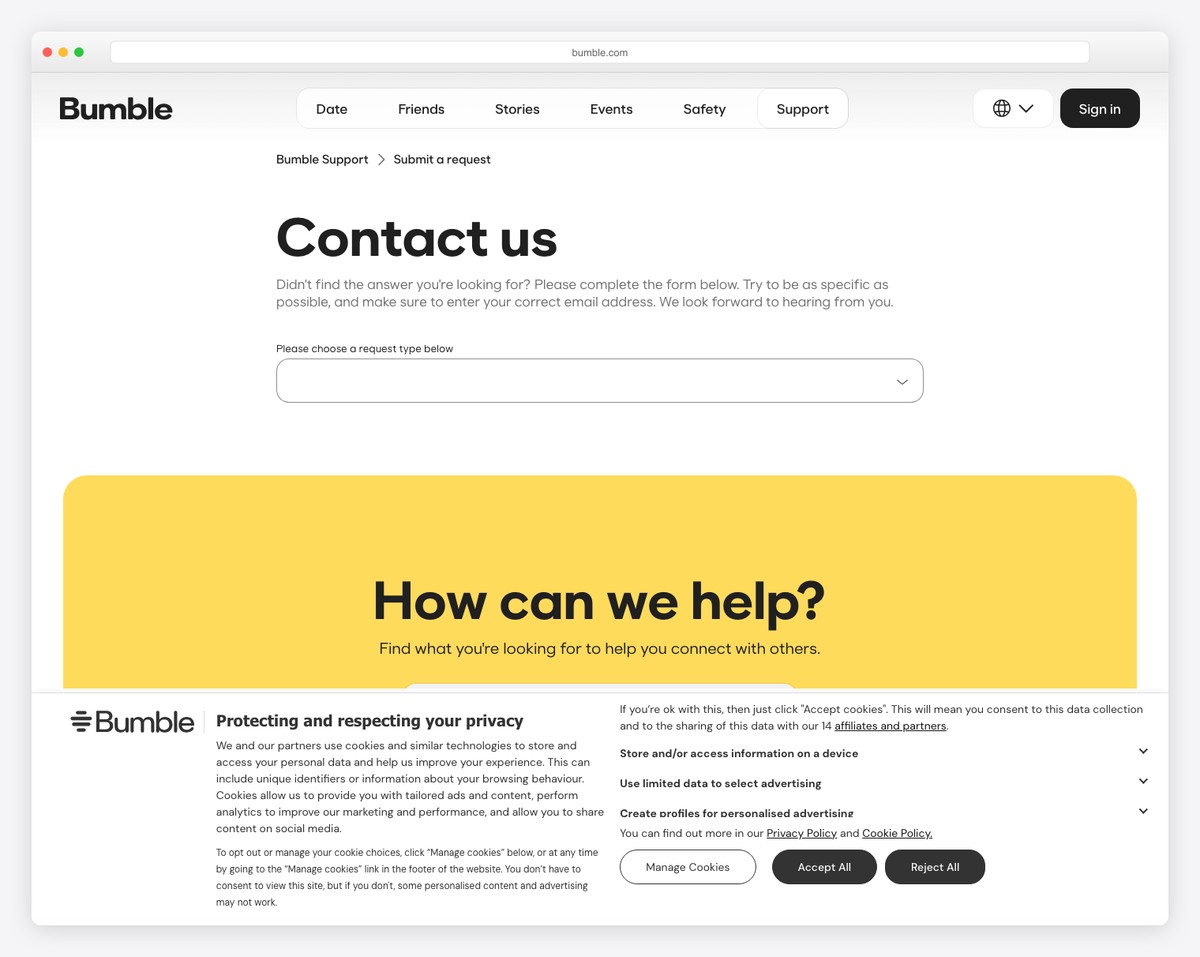
Bumble uses multiple links and contact options, which increases user experience but, at the same time, makes their lives a lot easier. Why? Help goes to support people, PR to PR people, advertising to advertising people, etc.
What’s also handy is that the contact form opens in a popup, so the user doesn’t have to leave the current page.
What stands out: Offer users multiple contact options to address the query to the correct department.
5. Marvel
Built with: Gatsby
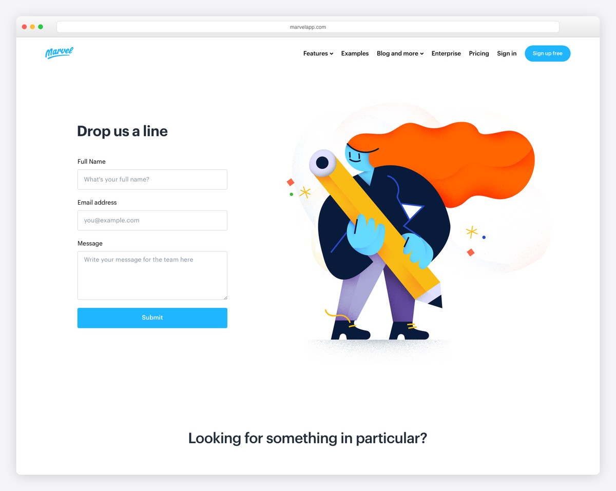
Marvel’s contact us page uses a light background with blue detailing that works well with their branding. They feature a contact form above the fold, so it’s easy to access.
Moreover, they also have a second contact section for everyone looking for something particular, like sales, support or press kit info.
What stands out: Add a contact form above the fold, so users don’t have to scroll and search for it.
6. Bando
Built with: Shopify
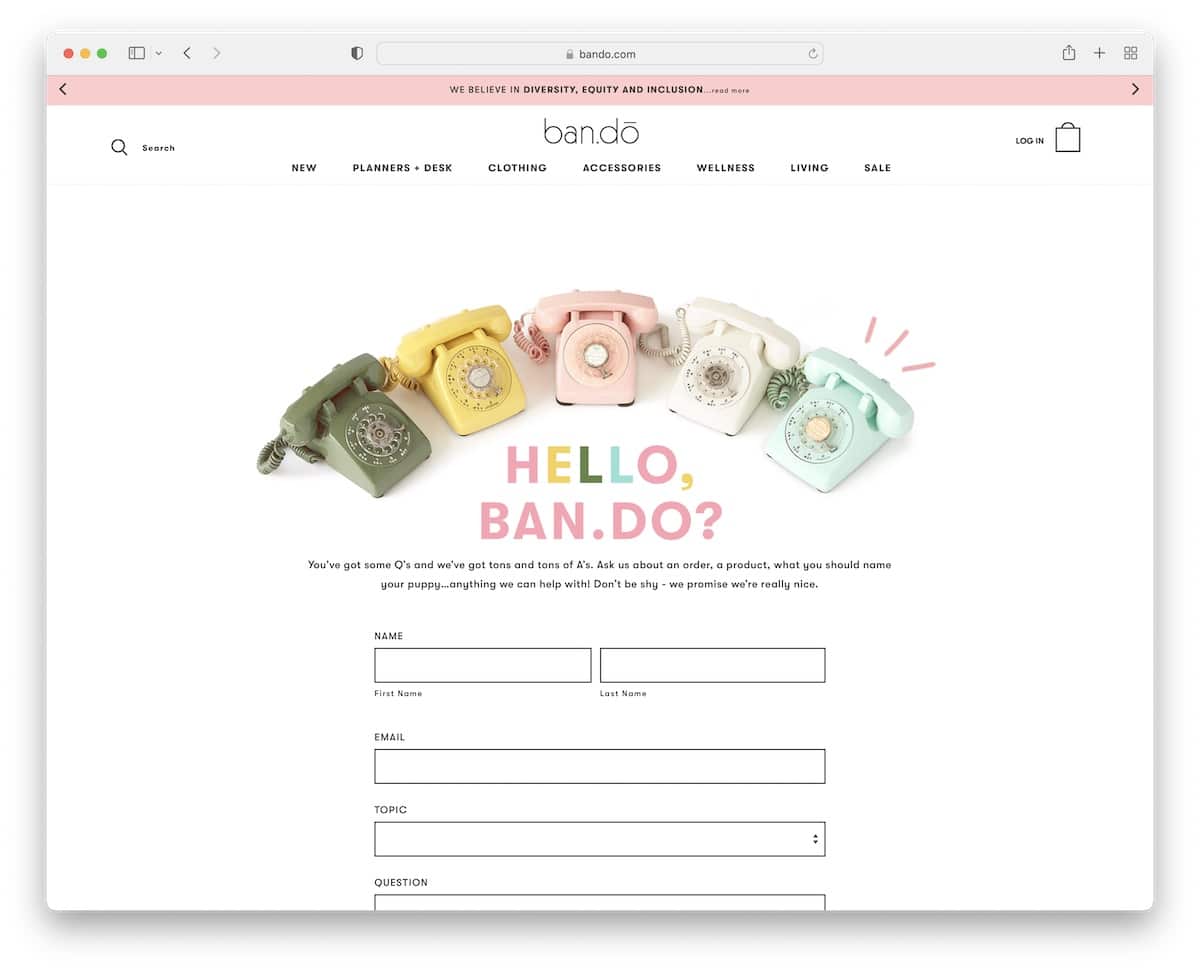
Bando runs a cool and fun contact page with a simple design but an added touch of creativity through visuals and text.
The form uses a drop-down for topic selection because writing a subject is always the hardest thing to do.
Besides, they also showcase a phone number if you feel like calling and opening hours. But they also use their contact us page to sneak in a newsletter subscription form.
What stands out: Don’t forget that a contact page can also work great for collecting emails.
7. Doughnut Time
Built with: Shopify
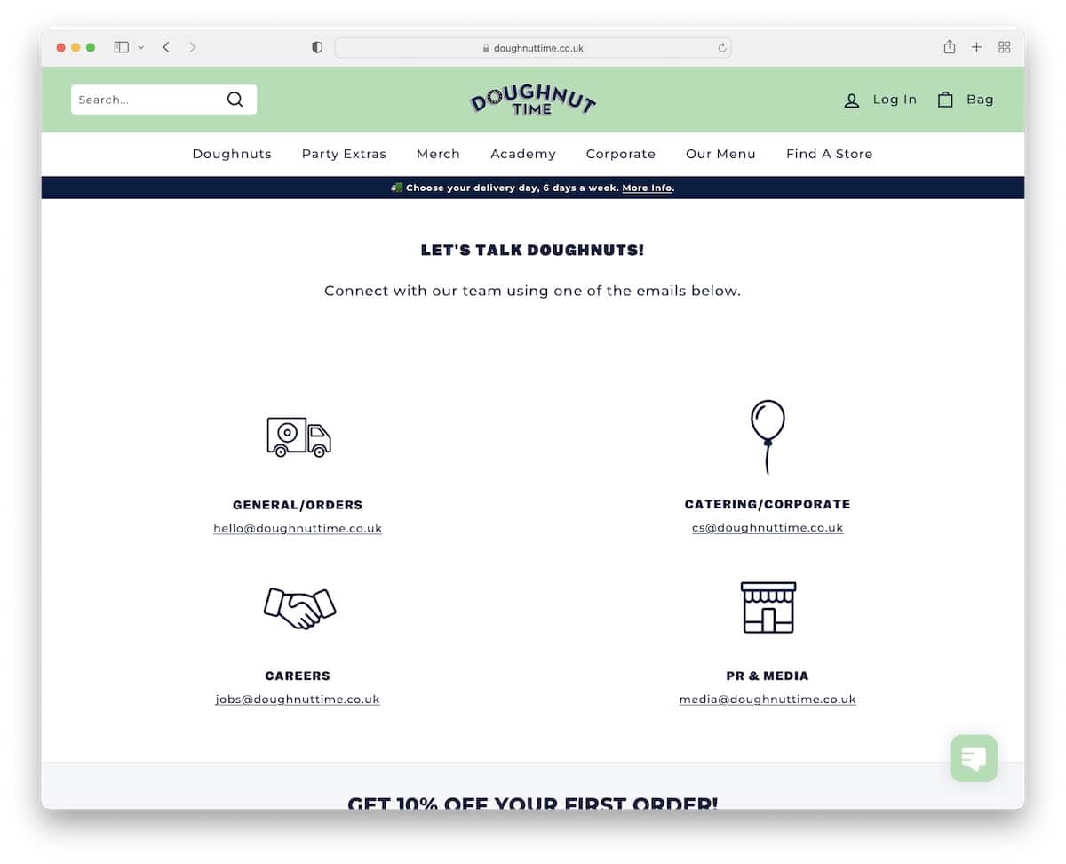
Instead of a contact form, Doughnut Time has four sections with four clickable emails so you can get in touch with people directly a lot easier.
Plus, they use an additional section to grab the opportunity and offer you a discount in exchange for an email.
What stands out: Offer visitors a discount code through a form, even on a contact page.
8. Impact
Built with: Hubspot CMS
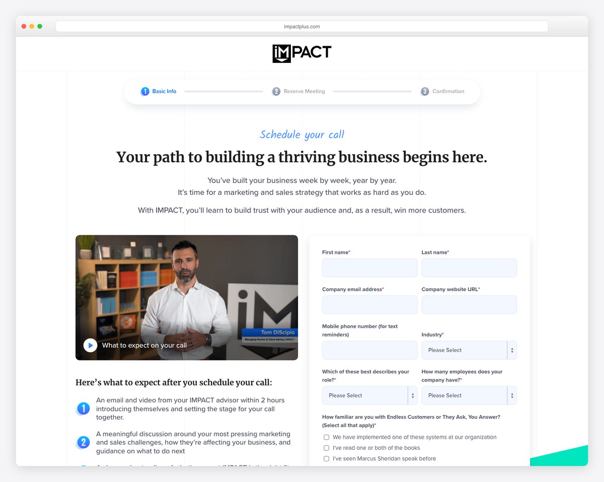
What’s unique about Impact is that they use a video on their contact page, which addresses the contact form and filling out the fields, making you feel more comfortable.
Additionally, they also have a FAQ section with accordions to keep the look cleaner.
What stands out: Why not use a video on the home page letting people know what happens next after they reach out.
9. Survicate
Built with: Webflow
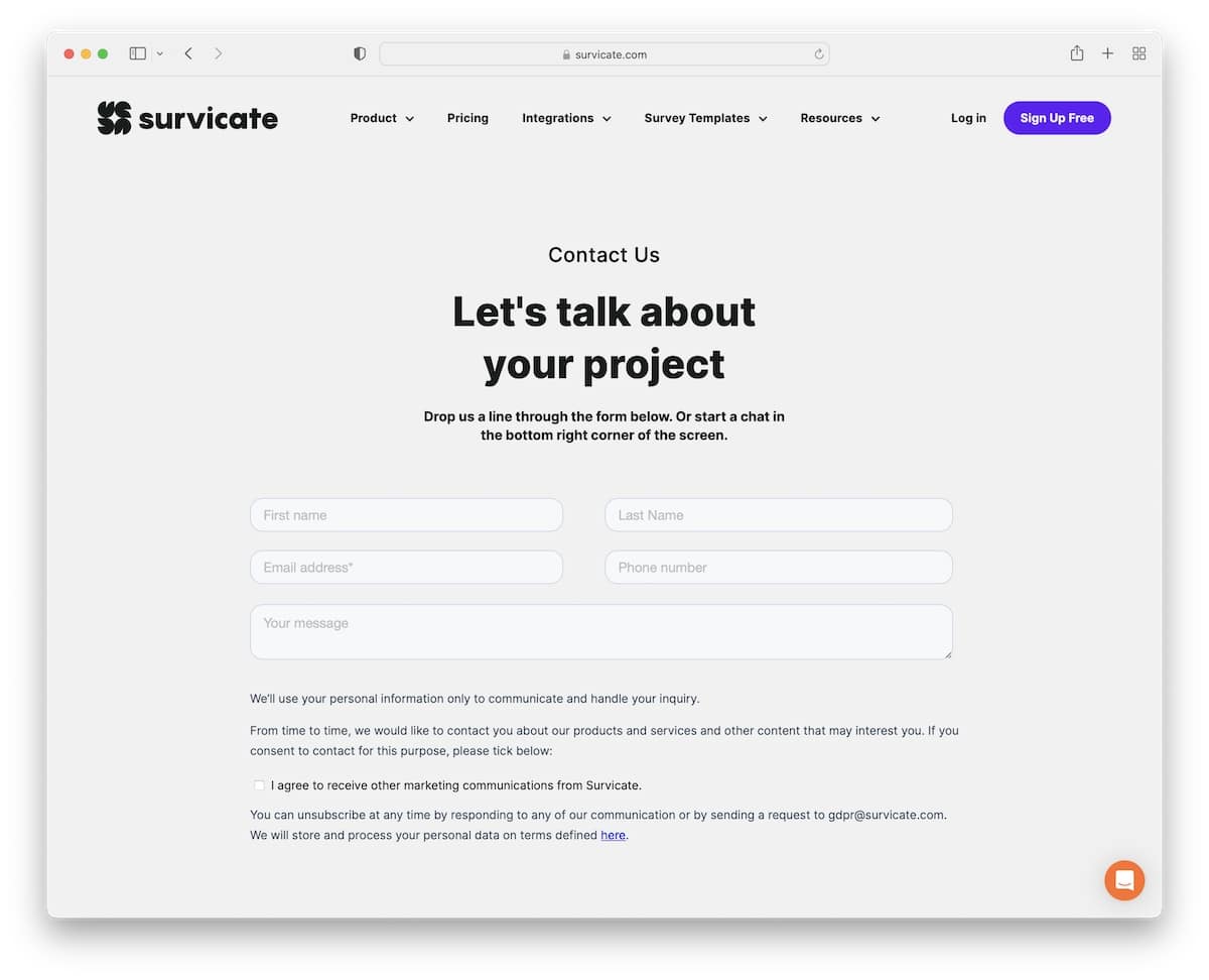
This contact page uses two sections. The above-the-fold area contains a title, text and a simple contact form. And Survicate uses the below-the-fold area as another opportunity to get you on board, explaining the three-step process with call-to-action (CTA) buttons.
What stands out: Use a simple “sales” element on your contact page.
Don’t miss peeking at our list of the best Webflow websites.
10. Glossier
Built with: Shopify
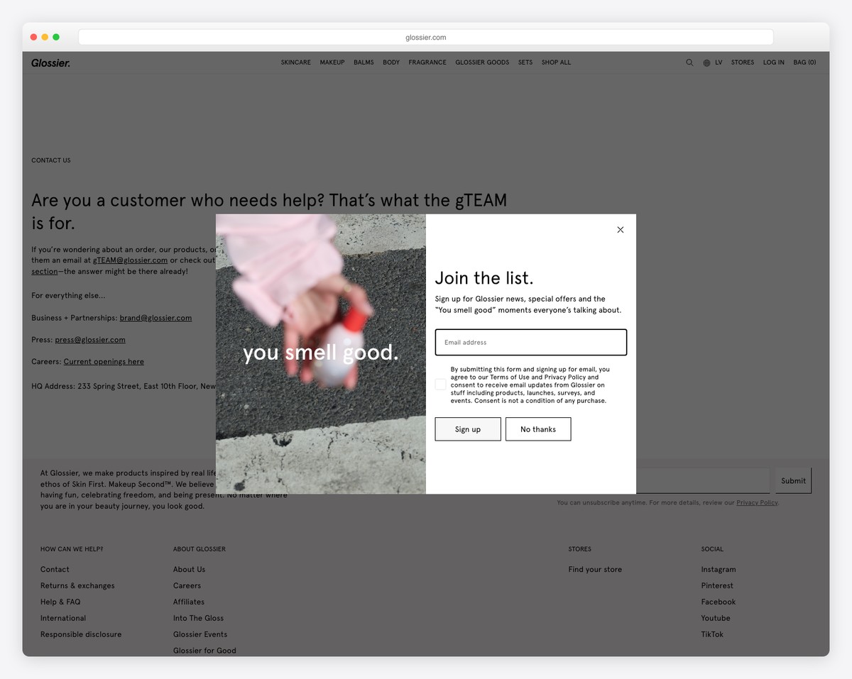
Glossier’s contact page is one of the simplest featuring only a bunch of text and different email addresses – no contact form. That’s it!
But they also added a link to careers and the business address; all the rest is a header and a footer.
What stands out: Give the visitors contact information; you don’t need any fancy stuff.
11. Scribd
Built with: Ruby On Rails
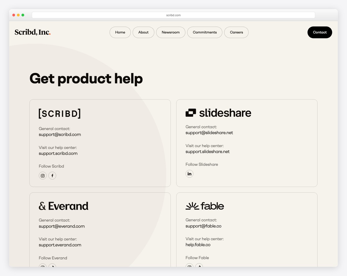
Scribd has a slightly different approach, starting with a full-width Google Maps background to showcase its business location.
Below the maps are the address and social media links, followed by multiple buttons that link to different contact and information departments.
What stands out: Use a visible spot to add Google Maps with a marker to showcase your location.
12. Atlassian
Built with: Magnolia CMS
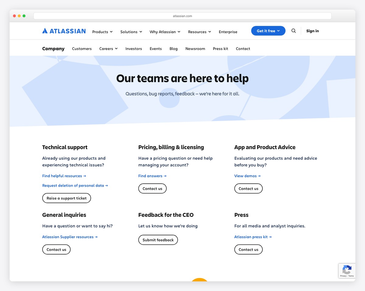
Besides the different contact sections, Atlassian also has all their worldwide office details on their contact us page.
However, even though there’s a lot of content, the use of white space ensures it’s easy to skim through and find the right info.
What stands out: Use extra white space when you plan to feature plenty of contact details and multiple business addresses.
13. Fear Of God
Built with: Shopify
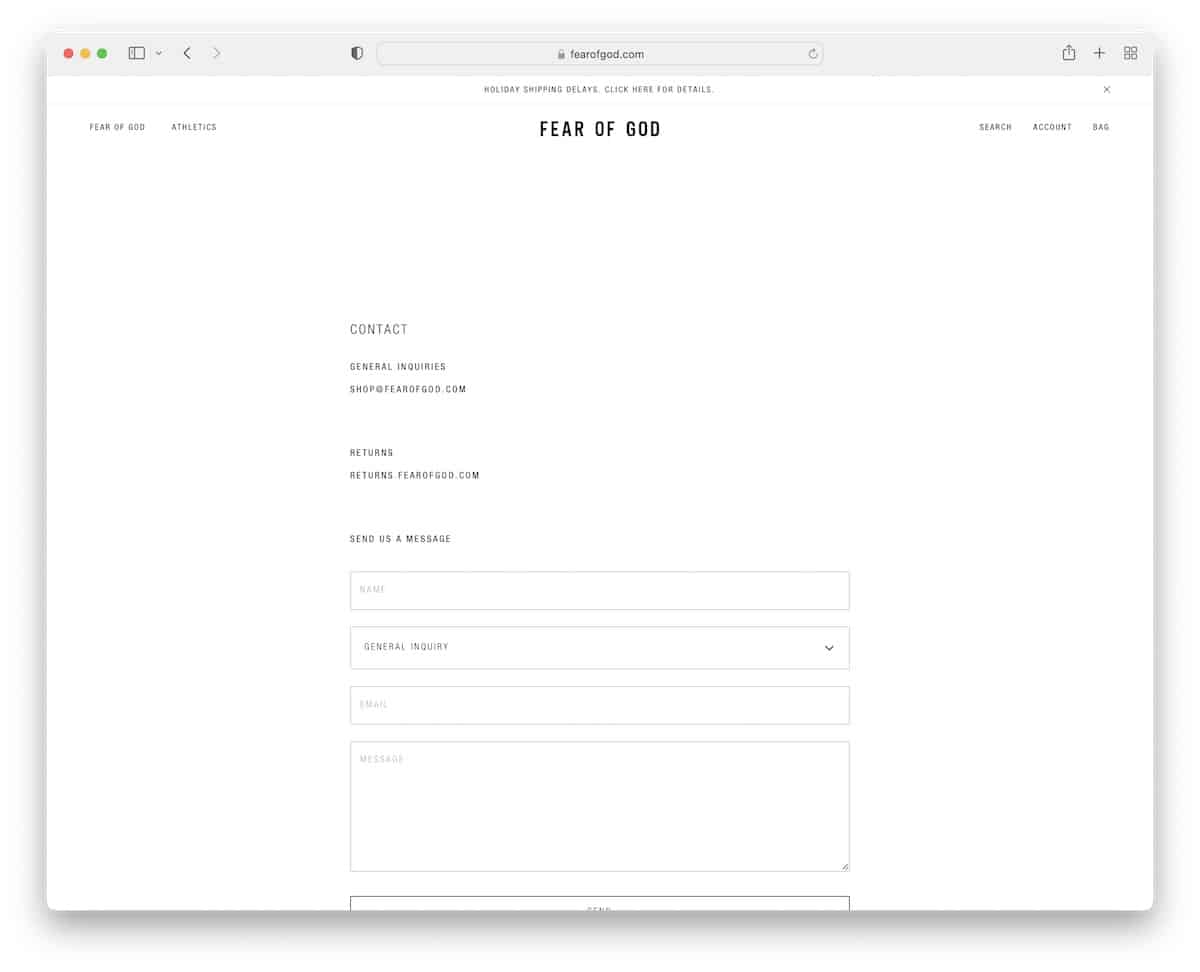
Fear Of God has the most minimalist contact us page, with two contact emails and a contact form with a drop-down to pick the topic.
What stands out: A simple contact form is all that’s necessary.
14. Brixton
Built with: Shopify
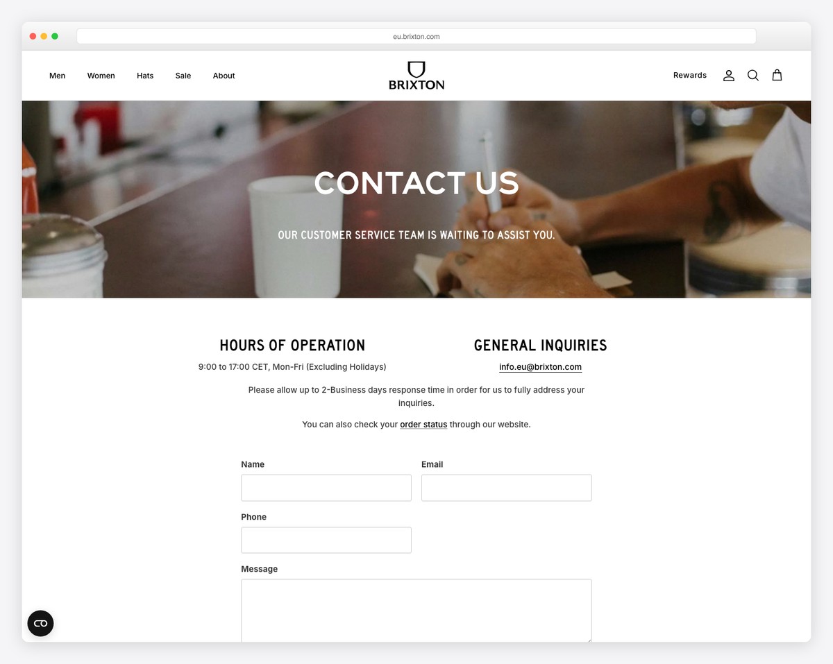
Brixton displays opening hours, clickable phone number and email address below the banner. Further down is a contact form, followed by a product carousel that takes you back to the online shop.
What stands out: A simple and clean product carousel on the contact page can benefit you greatly.
15. Cuup
Built with: Shopify
Cuup has a split-screen design with a floating image on the left side and all the details and information on the right. There’s no contact form, but all the emails are clickable. Additionally, you’ll find the phone number and when they’re available to contact.
What stands out: Instead of using a traditional layout, create a split-screen one, like Cuup.
16. Podia
Built with: Contentful
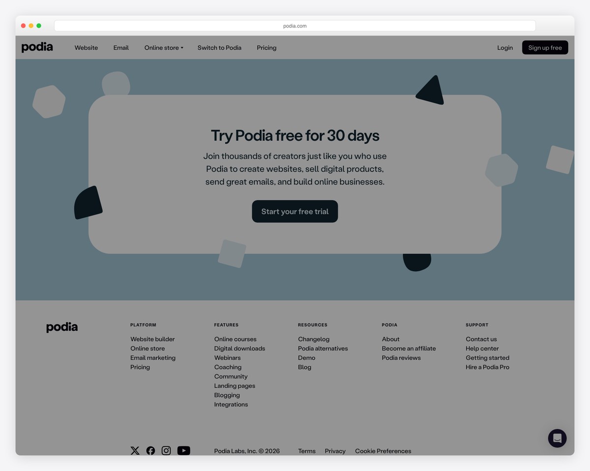
While the first part of Podia’s contact page displays chats, email, and help center support details, the second is dedicated to their team. The avatar, the location and the simple one-sentence bio familiarize you with the support team beforehand, so you know exactly who you’re talking to – real people.
What stands out: Create a special section dedicated to your support team, so users know there are actual folks behind the brand.
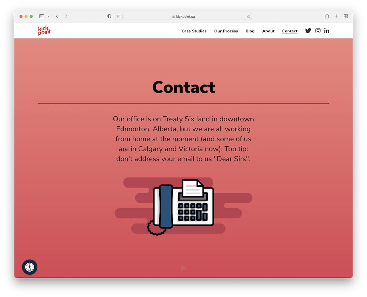
17. Kick Point
Built with: Underscores
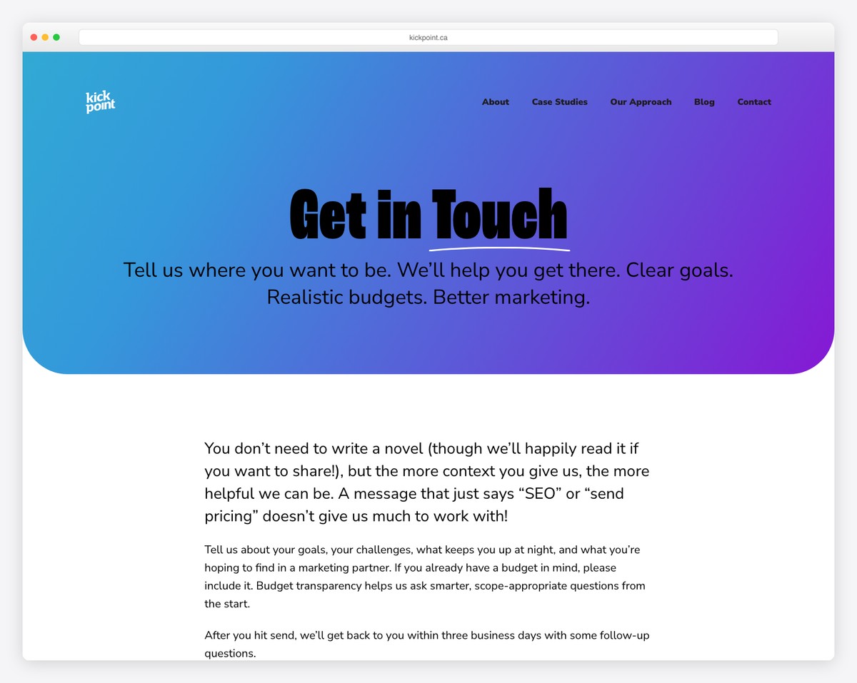
Kick Point has a unique above-the-fold section with additional information and a quick tip about how not to address your emails.
Below the fold are all the extra details and a contact form with the “I’m not a robot” checkbox. The phone number and email address, both clickable, are at the bottom.
What stands out: If you have anything special to share or announce, make it visible in the above-the-fold area.
18. Toggl Track
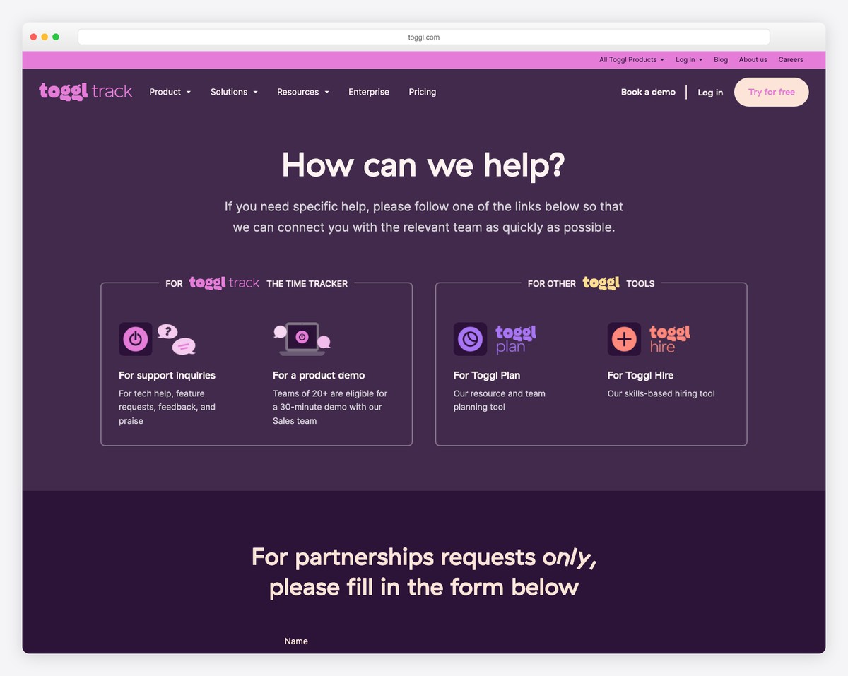
Toggl Track’s contact page uses a bold dark purple-and-pink color scheme with card-based sections for different contact needs. Rather than dumping visitors on a generic form, it segments inquiries into clear categories — Sales, Support, Partnership — so each query reaches the right team.
The interactive FAQ accordion handles common questions before visitors even need to submit a form, reducing support volume while improving user experience. The clean layout with generous spacing and strong visual hierarchy makes finding the right contact method effortless.
What stands out: Segmenting contact options by inquiry type (sales vs. support vs. partnerships) routes visitors to the right team faster — reducing response times and improving the experience for everyone.
19. BASIC/DEPT
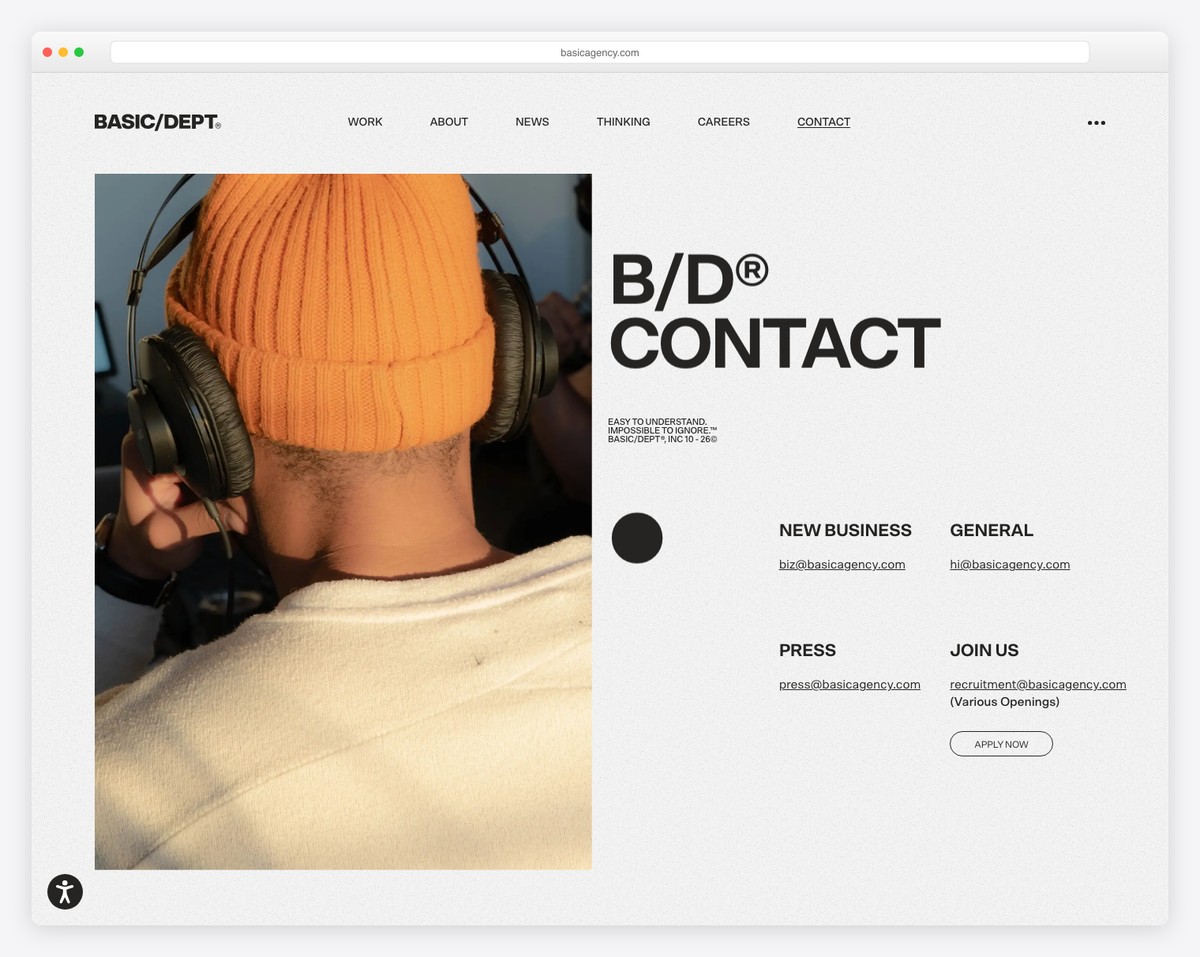
BASIC/DEPT’s contact page opens with a full-width hero image that immediately sets a creative, premium tone. Below, a clean grid of eight global office locations features local photography and live time zones — making the agency feel simultaneously global and approachable.
The page balances visual impact with practical international contact information. Each office card includes the city name, time zone, and a direct link to get directions, while the overall design maintains the agency’s bold, award-winning aesthetic throughout.
What stands out: Showing global office locations with local photography and live time zones communicates international reach while making each location feel personal and accessible — crucial for agencies serving global clients.
20. Figma
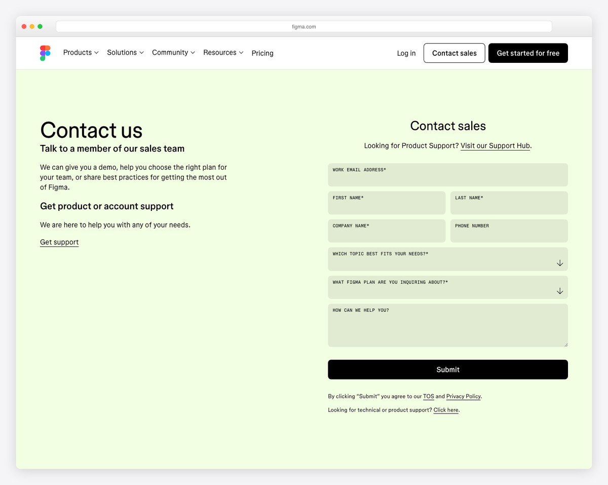
Figma’s contact page is a minimalist, typography-driven design that reflects the tool’s own clean aesthetic. Floating-label form inputs and animated underline hovers create a polished interaction experience that feels native to Figma’s brand — simple, precise, and thoughtfully crafted.
The page prioritizes accessibility with strong focus-visible states, clear form labels, and a logical tab order. The contact options are organized by purpose — Sales, Support, Press, Partnerships — with each path leading to a tailored experience rather than a one-size-fits-all form.
What stands out: A design tool’s contact page is itself a showcase of the brand’s design philosophy — Figma’s clean, accessible form design practices what it preaches about thoughtful interface design.
Related Posts

Comments (0)