17 Best Squarespace Membership Site Examples 2026
Are you searching for the best Squarespace membership site examples?
Creating a membership site can be a game-changer for businesses and creators looking to build a community, offer exclusive content, or sell online courses.
Squarespace offers an excellent platform for building beautiful, functional membership sites.
This article guides you through some of the best Squarespace membership site examples, handpicked for their outstanding web design and functionality.
Whether you’re a fitness guru, an artist, a tech enthusiast, or someone with a unique idea waiting to be shared with the world, these examples will inspire you to create a stunning membership site that engages and retains your audience.
This post covers:
- Best Squarespace Membership Site Examples
- How To Make A Membership Site With Squarespace
- FAQs About Squarespace Membership Sites
- Can I customize the design of my Squarespace membership area?
- Is it possible to have multiple membership levels on a Squarespace site?
- How do I manage members and subscriptions on Squarespace?
- Can I offer free trials or discount codes for my membership site?
- How does Squarespace handle member-only content security?
- Can I integrate 3rd-party tools with my Squarespace membership site?
Best Squarespace Membership Site Examples
From innovative design to seamless user experience, each example showcases the power of Squarespace in creating vibrant, engaging online communities and platforms.
1. Masters Meridian Yoga
Built with: Squarespace

Masters Meridian Yoga’s membership site captivates with a floating top bar notification and header, ensuring key info is always in view.
Its full-screen hero image, enriched with overlay text and a CTA button, immerses visitors immediately.
A persistent “Apply now” button in the corner beckons users to join while accordions expand to reveal details, maintaining a sleek appearance.
Authentic student testimonials and an engaging newsletter form add trust and community feel, rounded off with a bold dark footer.
What stands out: Keep your header floating to boost your website’s user experience.
What stands out: For its dynamic engagement features and clean design.
2. Amanda Rose
Built with: Squarespace
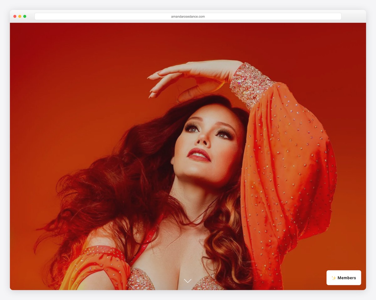
Amanda Rose’s Squarespace site enchants with a full-screen parallax background image, creating an immersive first impression above the fold. (Plus, more parallax sections are present throughout the site for added engagement.)
Moreover, a clean header with an intuitive drop-down menu guides visitors smoothly. The site also features a floating CTA button in the bottom right corner for instant action.
A neatly integrated subscription form decorates the space at the footer with an IG icon.
Detailed membership plans with clear pricing invite commitment, while an Instagram feed adds a personal touch, showcasing community and authenticity.
What stands out: Add depth and liveliness to your website with the continent parallax effect.
What stands out: For its captivating visuals and straightforward navigation.
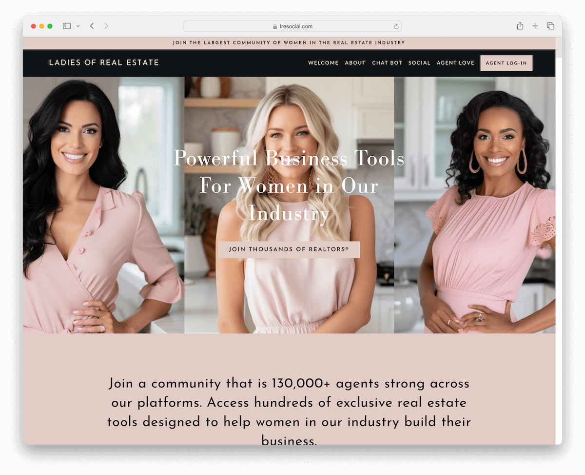
3. Ladies Of Real Estate
Built with: Squarespace
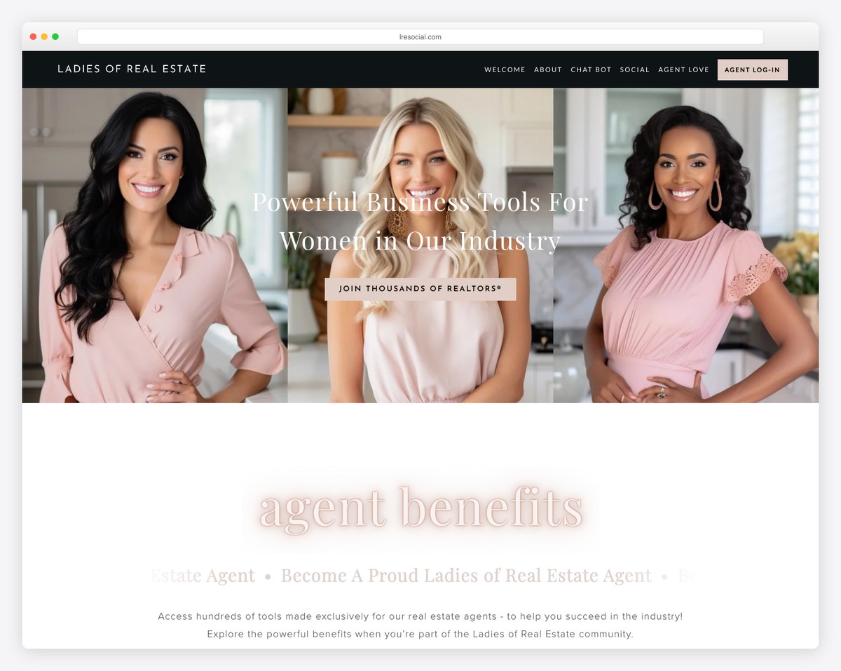
Ladies Of Real Estate’s Squarespace membership site impresses with its dark, contrasting header that stands out against a clean, feminine color scheme.
A top bar notification ensures important messages are front and center, complemented by a convenient log-in button in the navbar.
The design breathes with plenty of white space and easy-to-read typography for effortless browsing.
A dedicated testimonial page builds trust, and a direct email contact, instead of a form, invites straightforward communication.
Finally, engaging videos add depth, while a basic footer maintains simplicity.
What stands out: Use a top bar for special announcements, news, etc. (Use a contrasting background so it pops more.)
What stands out: Its effective use of contrast and space makes it visually appealing and user-friendly.
4. Michelle Atzenwiler
Built with: Squarespace

Michelle Atzenwiler’s Squarespace site radiates with a clean, soothing design that instantly calms visitors.
Its simplicity begins with the header and extends to a large, informative footer.
A floating subscription form subtly invites engagement, while a member login button and Instagram icon in the bottom right corner seamlessly integrate social connectivity.
Parallax background sections add depth without overwhelming, and the eCommerce section offers easy class booking.
Blog enriches the site with valuable insights, and a calendar page displays class dates for better organization.
What stands out: Use your membership site to sell classes directly without using any 3rd-party solutions.
What stands out: For its serene design and intuitive functionality.
5. Caveday
Built with: Squarespace
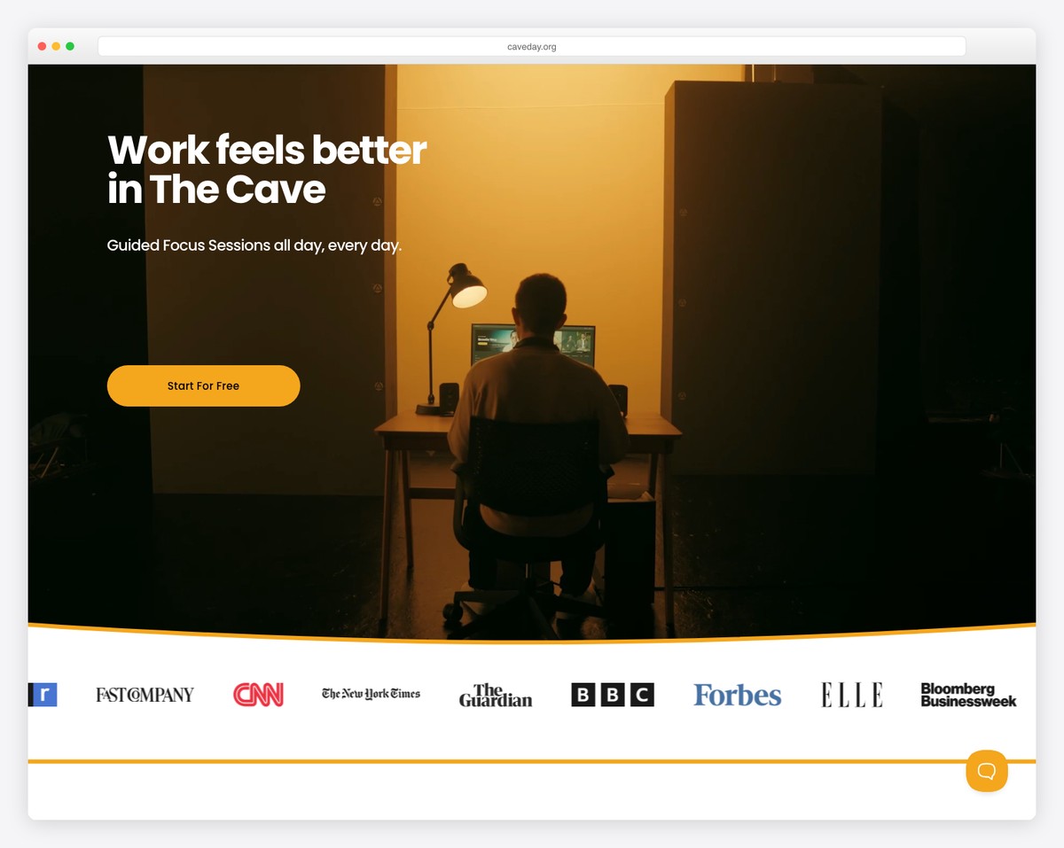
Caveday’s Squarespace membership site has a minimalist design that expertly plays with contrasting light and dark backgrounds.
Embedded student videos bring authentic experiences to the forefront, while a floating chat widget ensures support is just a click away.
A convenient schedule popup provides easy access to event times, and clear pricing plans lay out the value proposition.
A subscription form entices with a 14-day free trial, and the multi-column footer offers quick links to essential information.
What stands out: Opt for a clean and simple web design so all your convent, services, schedules, etc., come front and center.
What stands out: Because of its minimalist design and interactive features, which enhance user engagement and accessibility.
6. DV Collective
Built with: Squarespace
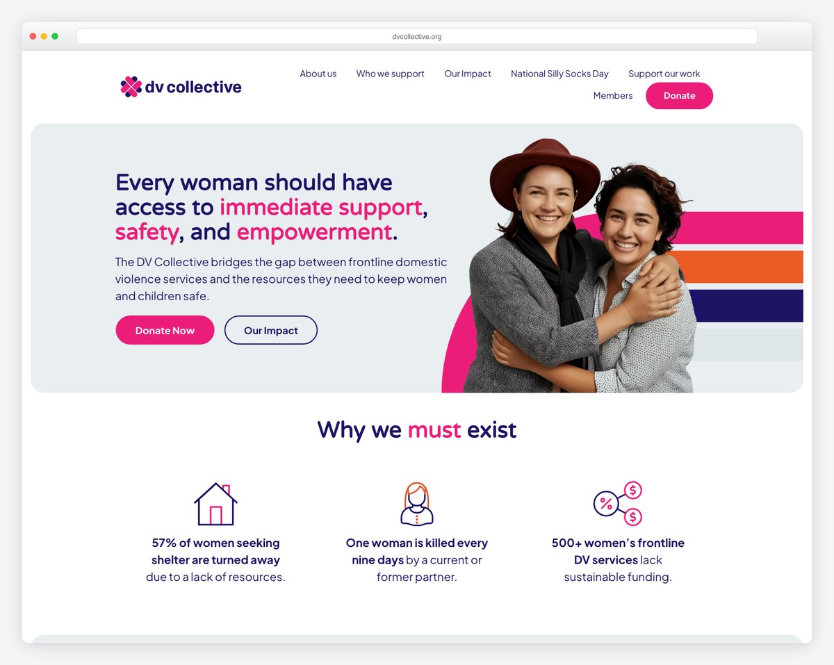
DV Collective’s site greets visitors with a subscription popup, initiating initial engagement. Its navigation is basic yet functional, featuring a user-friendly drop-down menu for the member area.
The animated text adds a dynamic touch, while the simple homepage design focuses on content. And the sophisticated white and blue palette evokes a sense of professionalism and creativity.
A sticky member login button ensures easy access, and the footer, complete with contact details and social media icons, rounds off the site with practicality and style.
What stands out: Collect emails so you can later start working on email marketing campaigns and grow your business.
What stands out: For its elegant design and thoughtful member involvement.
7. Connect PSHE
Built with: Squarespace
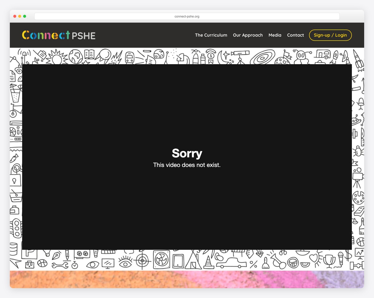
Connect PSHE’s website bursts with vibrant design, immediately engaging visitors with an embedded video above the fold.
Navigation is enhanced with two prominent CTA buttons, offering a free trial and member access.
Large image background sections captivate, leading to a feature-rich footer that’s a hub of information with business/contact details, quick links, and social icons.
The contact page is uniquely interactive, displaying Twitter and Instagram feeds, while dedicated blog and podcast pages enrich the site’s content.
What stands out: Integrating social media feeds can easily add more content to your website.
What stands out: For its lively appearance and comprehensive participation options.
8. The Sapphire Room Boise
Built with: Squarespace
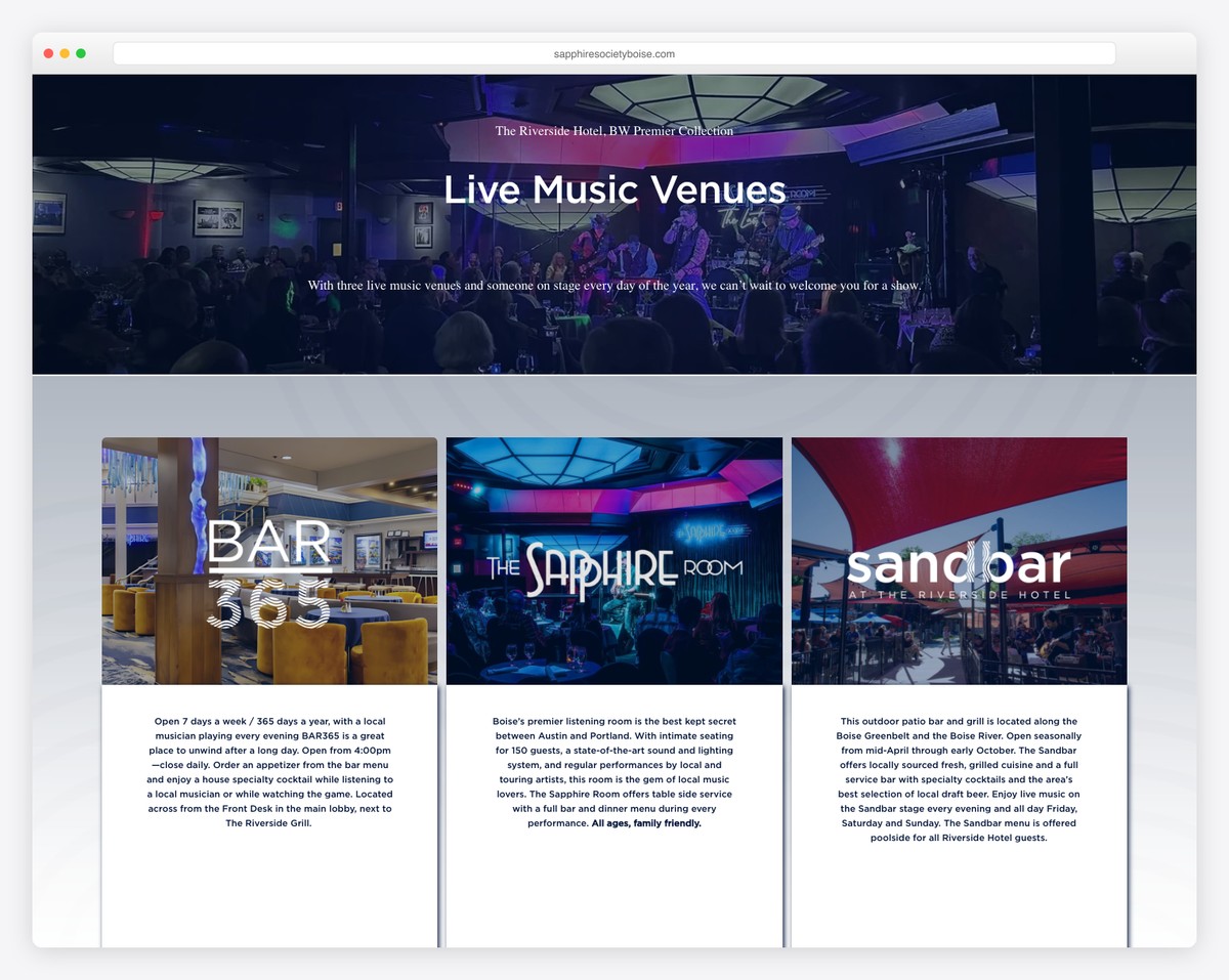
The Sapphire Room Boise’s Squarespace site has a catchy design, instantly drawing visitors into its vibrant atmosphere.
As you scroll, content dynamically loads, creating a seamless journey through the site.
You’ll notice a three-column gallery grid showcasing vivid images, offering a glimpse into the venue’s ambiance.
Integrated Google Maps also aids in location discovery and enhances user convenience.
A subscription widget in the footer invites ongoing connections, making it easy for visitors to stay informed about the latest events and offerings.
What stands out: The best way to showcase your location is with Google Maps.
What stands out: Its enhanced navigation fosters a strong connection with the audience.
9. Ginko Embodiment
Built with: Squarespace
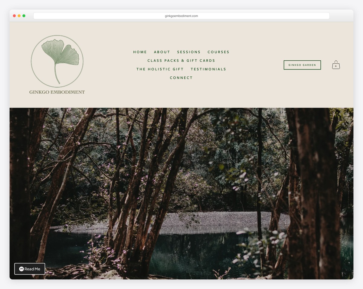
Ginko Embodiment’s Squarespace site greets visitors with a practical top bar notification and a well-organized header. It has the logo on the left, a central array of menu links, and a CTA button alongside a shopping cart icon on the right.
The site’s earthy design resonates with its wellness theme, enriched by audio elements and large image background sections that invite tranquility.
An online weekly timetable offers easy access to sessions, while simple course pages clearly outline offerings and pricing.
What stands out: Display an online calendar or weekly timetable so your members can always check when’s the next class.
What stands out: For its tuneful design and chilled UX, which aligns with its wellness focus.
10. Tennis Business Academy
Built with: Squarespace
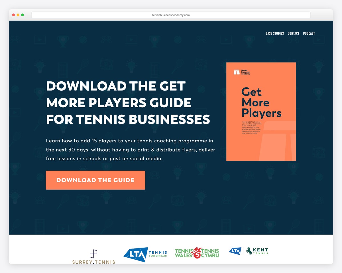
Tennis Business Academy’s site strikes visitors with its distinctive background image pattern, enhanced by a captivating parallax effect for depth.
The navigation is streamlined, featuring a simple four-link menu for uncomplicated exploration.
We particularly enjoyed the video case studies. They bring real success stories to life, adding credibility and engagement.
A basic contact page includes a straightforward form, facilitating easy inquiries.
A dedicated podcast page lets users listen to episodes directly on the site, enriching the user experience with valuable, on-demand content.
What stands out: Take your trustworthiness to the next level with video case studies.
What stands out: For its smooth integration of a professional look and valuable, easily accessible content.
11. LINK
Built with: Squarespace
LINK’s Squarespace membership site carries a dynamic header that vanishes on a downward scroll and reemerges when scrolling up. (This ensures effortless browsing.)
The site boasts a clean design with a contrasting header, CTA buttons, and a footer to capture visitors’ eyes.
The footer has quick links, contact details, and a subscription form, giving users easy access to essential information.
Additionally, a request quote form appears (as a popup), offering users a direct and convenient way to contact the service.
What stands out: Use contrasting background colors to ensure your CTA buttons are clear and visible.
What stands out: For its innovative navigation features and handy footer, with quick access to vital information.
12. Ceramicon
Built with: Squarespace
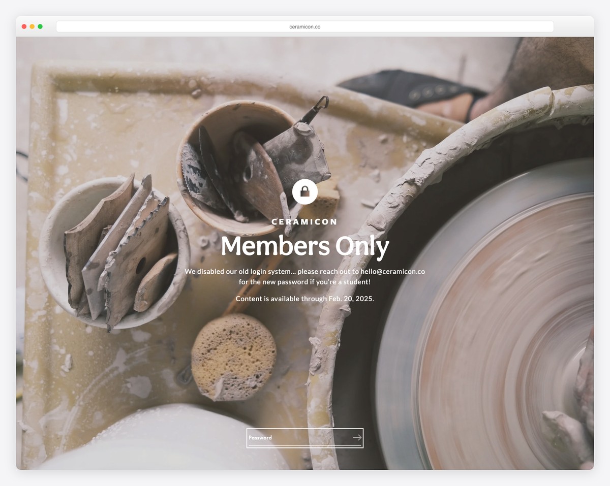
Ceramicon’s Squarespace site delights with content unfolding beautifully as you scroll, sparking interest.
The impactful full-screen hero section and a transparent header set a striking first impression.
An embedded promotional video offers a deep dive into their world, while a minimalist footer keeps the design sleek and uncluttered.
The extensive artists page, featuring individual artist pages and waitlist subscription forms, showcases talent and invites engagement.
A handy FAQs page answers common queries, enhancing user experience with thoughtful design and comprehensive information.
What stands out: Provide your potential members with as much content as possible, including an extensive FAQs page.
What stands out: For its gripping layout and artistic showcase that sparks interest.
13. Natasha Baradaran
Built with: Squarespace

Natasha Baradaran’s site mesmerizes with a semi-boxed layout, presenting content visually ordered.
The home page features a stunning image grid that elegantly guides visitors through various categories and pages, showcasing her work’s breadth and depth.
A simple header and footer design ensures the focus remains on the content, while a subscription form encourages ongoing interaction.
Including a search bar with live results enhances navigation, and a gallery equipped with a lightbox function allows for an immersive viewing experience.
What stands out: Use grid layouts and galleries with lightbox functionality for a more immersive content viewing experience.
What stands out: Its elegant presentation and intuitive navigation make the exploration enticing and effortless.
14. Practice Yoga With Erika
Built with: Squarespace
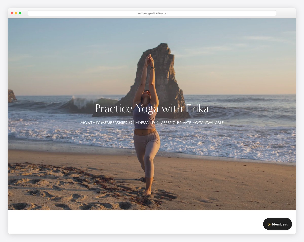
Practice Yoga With Erika’s Squarespace site features an intuitive interface. The top bar and header smartly disappear when scrolling down and reappear when scrolling upward, enhancing the viewing experience.
A significant testimonial slider on the homepage showcases the transformative experiences of her students, adding credibility.
The footer is efficiently designed with quick links and a subscription form, fostering easy navigation.
The About page is captivated by a large image slider, describing Erika’s practice and philosophy.
Lastly, a basic contact page with a form simplifies inquiries, making communication straightforward and accessible.
What stands out: Display your beautiful content without sacrificing website space with a slideshow.
What stands out: For its spirited interface and thoughtful design elements.
15. Soulcial Mate
Built with: Squarespace
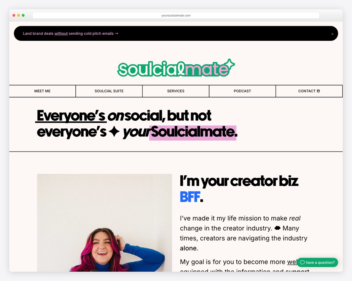
Soulcial Mate is a creator monetization coaching business with a paid membership community called Soulcial Suite, helping influencers build profitable businesses. The Squarespace site uses testimonials and income proof to sell the membership’s value proposition.
What stands out: Membership sites that showcase member success stories and income results see higher conversion rates — social proof is the best sales pitch for community products.
16. Jamar Diggs
Built with: Squarespace
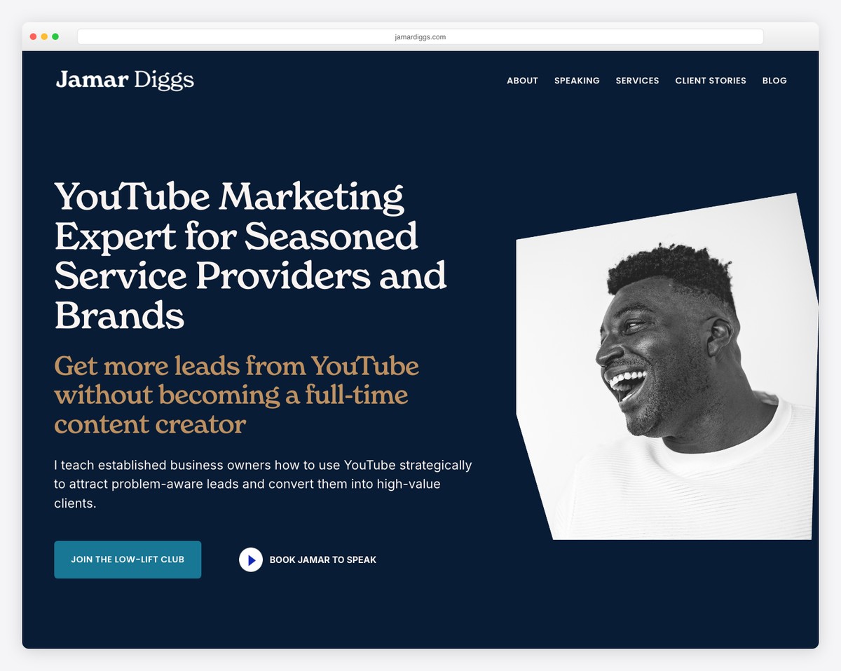
Jamar Diggs is a YouTube marketing consultant with a membership-based Low-Lift Club helping business owners build lead generation systems through video content. The clean Squarespace design clearly communicates the membership tiers and included resources.
What stands out: Membership sites benefit from clear tier comparison tables — visitors need to quickly understand what they get at each level before committing.
17. Ascend Leadership
Built with: Squarespace

Ascend Leadership is a professional membership network providing career development, networking events, and mentorship for business leaders across experience levels. The polished Squarespace design reflects the premium positioning of the organization.
What stands out: Professional membership organizations should lead with the networking value — career-focused members join for connections as much as content.
FAQs About Squarespace Membership Sites
Can I customize the design of my Squarespace membership area?
Yes, you can customize the design of your membership area to match your brand’s aesthetic. Squarespace allows you to adjust colors, fonts, and layout elements within the members area, though customization options might be slightly more limited than regular pages.
Is it possible to have multiple membership levels on a Squarespace site?
Yes, Squarespace supports the creation of multiple membership levels. You can set up different access levels, pricing plans, and exclusive content for each membership tier directly within the Members Area settings.
How do I manage members and subscriptions on Squarespace?
Squarespace provides an integrated dashboard where you can manage members, view subscription statuses, and handle cancellations or refunds. This dashboard offers a comprehensive overview of your membership base.
Can I offer free trials or discount codes for my membership site?
Yes, Squarespace allows you to offer free trials and discount codes. You can set up promotional offers for new members or discounts for long-term subscribers, providing flexibility in how you market and grow your membership site.
How does Squarespace handle member-only content security?
Squarespace ensures that member-only content is secure and accessible only to users with the appropriate membership level. It uses authentication and permission settings to restrict access, protecting your exclusive content from unauthorized viewing.
Can I integrate 3rd-party tools with my Squarespace membership site?
Yes, Squarespace allows for integration with various third-party tools and services, including email marketing platforms, analytics tools, and customer relationship management (CRM) systems. These integrations can enhance your membership site’s functionality and improve user experience.
Related Posts


Comments (0)