21 Best Knowledge Base Examples In 2026
These knowledge base examples will hype you up to create a fantastic help and support section to ensure your customers get all the assistance they need (only a few clicks or searches away).
There’s no great business without offering even greater customer support.
Not all customers and users will go straight to emailing a business or starting a live chat. Many will first try to get the answer to their question by Googling it (because most prefer it this way).
Your knowledge base might just be the first hit. This will improve SEO, and your help pages can also have other valuable links and CTAs to products and services (to increase conversions).
Your Business Website Needs A Knowledge Base
Your customer service matters – BIG time. Period.
And if you don’t create an organized, well-structured (use sub-pages, categories, search bar (with recommendations, etc.)) and insightful knowledge base/help/support page, you’re screwed.
Okay, I overreacted.
But seriously, you need to offer all the much-needed support and help your existing and soon-to-be customers in every way possible.
The more comprehensive the knowledge base, the better. This doesn’t necessarily mean Wikipedia-style how-to articles – sometimes, quick answers are a lot better (unless it’s something super technical).
Create your knowledge base with quick solutions in mind. Ask yourself: “How can I (we) simplify this answer or tutorial.”
Why Will A Knowledge Base Benefit You
A knowledge base is all about the customer, right? Not really.
It’s a win-win situation that benefits both the customer and you, the business owner.
First, a knowledge base is available 24/7/365, while your support team may not be. This ensures that no matter when someone lands on it, all the help content is always available to them. Plus, it creates a faster resolution, which is a big plus in creating better customer service.
Second, instead of answering frequently asked questions, your support team can concentrate on helping solve complex tickets. (And you can even use a chatbot that uses knowledge base articles as a resource to sort basic queries.)
Third, SEO. Yes, a knowledge base can contribute considerably to a better search engine optimized website! You can have 100s of articles, covering 100s of keywords, which means you’ll attract A LOT more organic traffic to your website.
Best Knowledge Base Examples With Great UX
1. Amplitude
Built with: Next.js
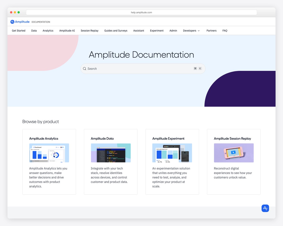
Amplitude has a clean and modern help page with a hero search bar that offers recommendations for easier topic finds.
The six-part grid section for the main categories has a hover effect that highlights each section. Moreover, you can also search by “popular content” that’s toward the bottom of the page.
It’s also equipped with the header and the footer if you’d want to go “outside” the knowledge base.
What stands out: Integrate a search bar with live results/recommendations to improve user experience.
2. Confluence Support
Built with: Magnolia CMS
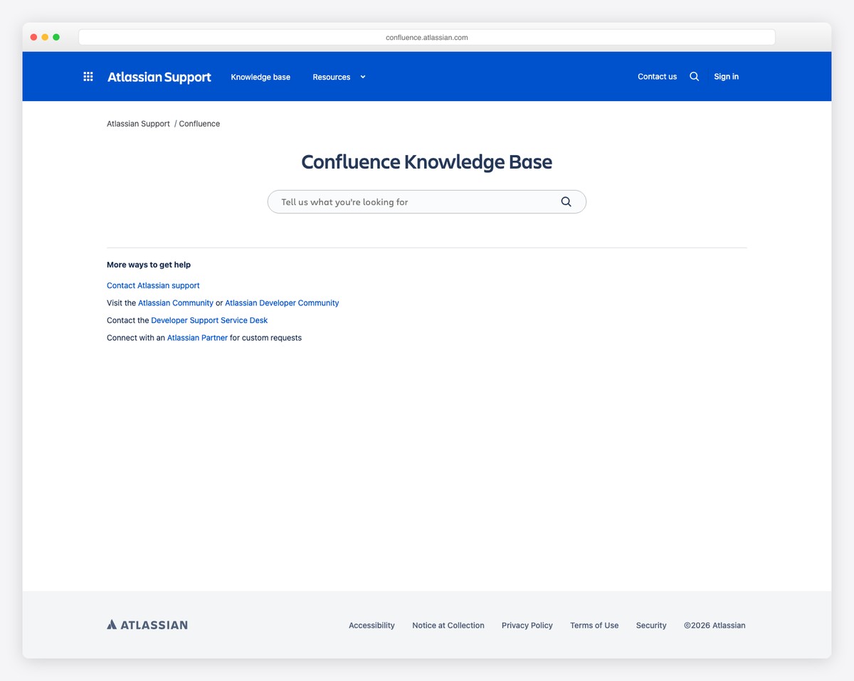
Confluence has a very simplistic knowledge base page with a search bar, recently created articles and links to additional help and support.
The layout is minimalist to ensure excellent readability. Each article also has a right sidebar with related content and a sticky widget for “still need help?”
What stands out: You must keep the design of your knowledge base clean to ensure as few distractions as possible.
3. HubSpot Knowledge Base
Built with: HubSpot CMS
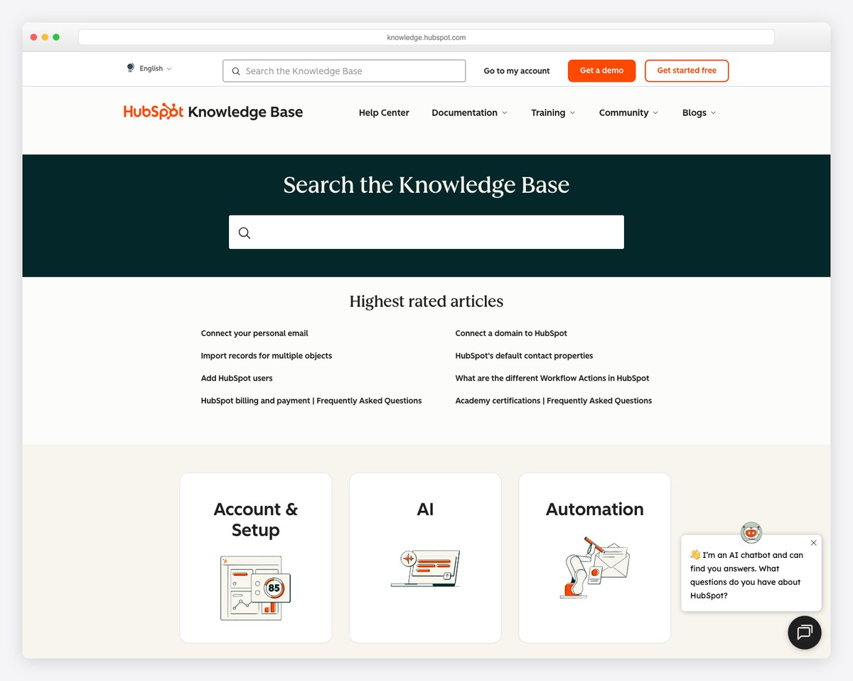
HubSpot is an excellent knowledge base example with all the special perks you’d expect from this technologically advanced company.
The large search bar has Ajax functionality to find the necessary help quicker. Below is a section with the highest-rated articles, followed by a category grid that takes you to other “educational” sections.
Also, the chat widget is always at your service in the bottom right corner.
What stands out: In addition to the excellent knowledge base and documentation page, you can also take your customer service to the next level with a (live/bot) chat widget.
4. Apple Support
Built with: Adobe Experience Manager
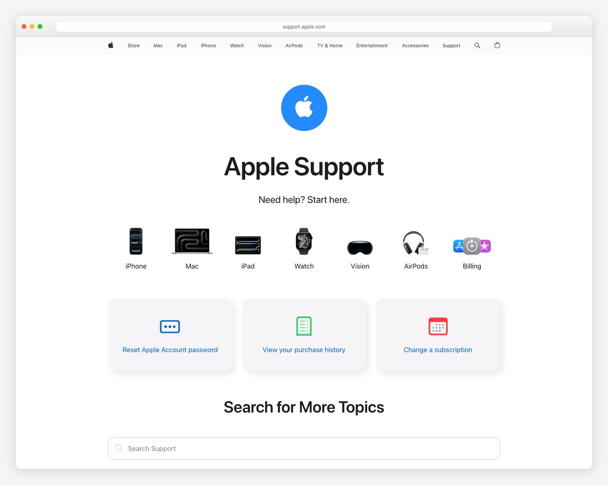
Apple’s support page is modern and elegant, just like it should be. It has an awesome sectioned structure with quick links and a search bar if you want something more specific.
When you click the search bar, it displays multiple quick links and offers recommendations when you start typing your query.
Interestingly, the hero image collage section lacks text or a call-to-action button, showing you’re in the “Apple environment.”
What stands out: Add quick links, buttons or icons (or all three) to get to the help articles faster.
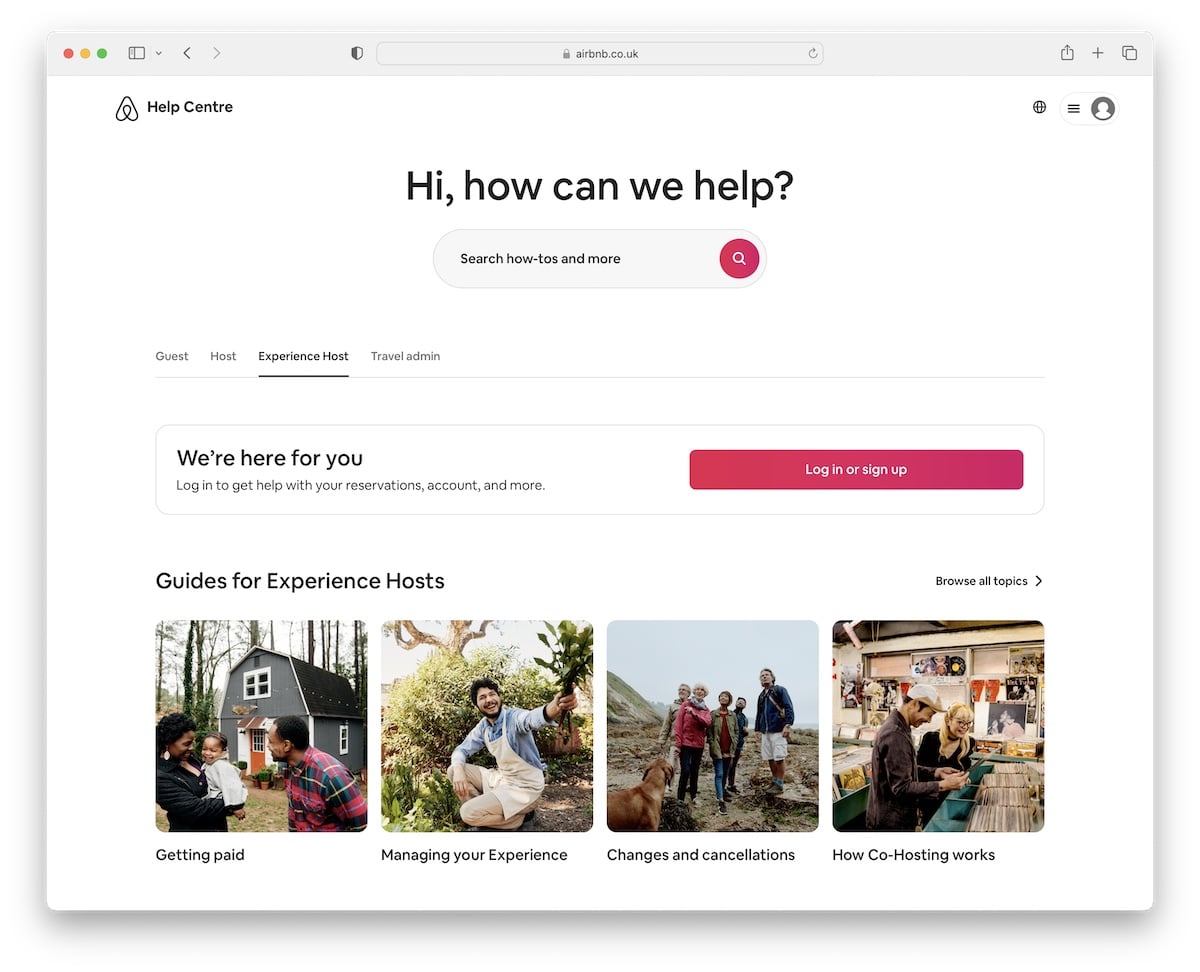
5. Airbnb Help Center
Built with: Ruby On Rails
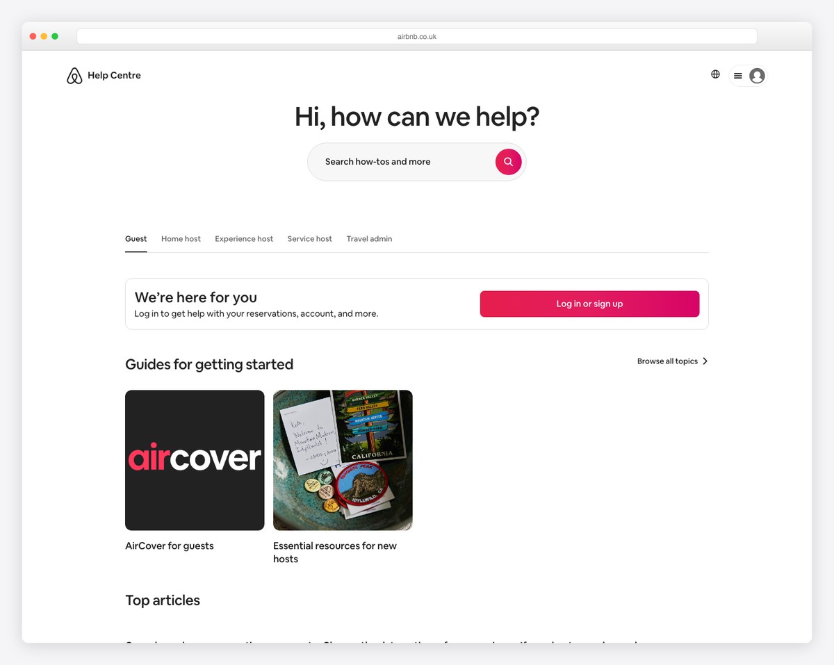
Airbnb knows how to trigger your attention with the question below the header that goes straight into the search bar. The search functionality has top articles first or you can choose from the recommendations or type in your query and hit enter.
Additionally, the categorization offers the user to find specific recommendations, read top articles or enjoy related guides.
What stands out: Use images and text to make your knowledge base page more engaging and likable.
6. 1Password Support
Built with: Webflow
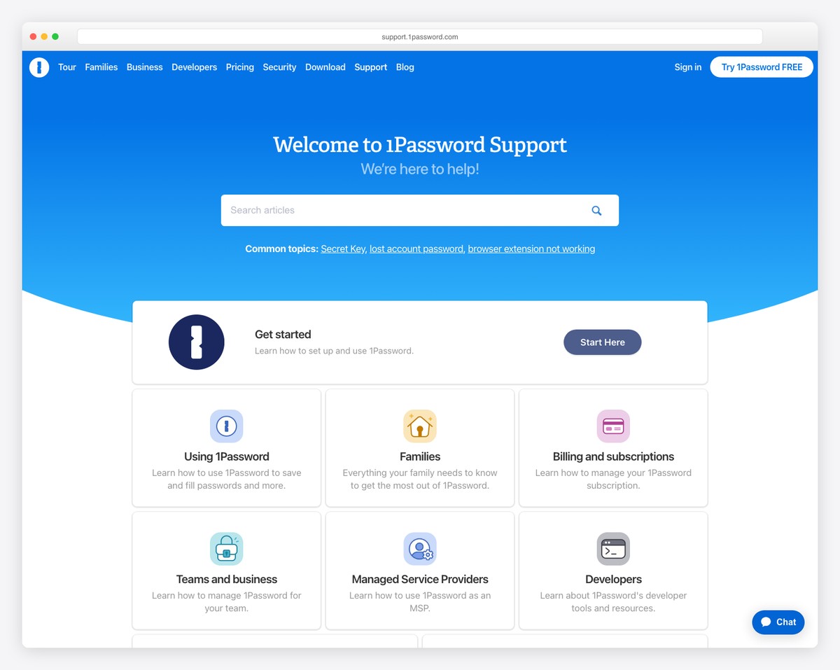
1Password gives you this cool, friendly feel when you start scrolling it. However, you may stop at the search bar, which, surprisingly, is very basic, without recommendations, top searches, etc.
What we also find handy is the language selector to translate this knowledge base page with a single click.
Besides all the useful links and content, there’s also a link to contact 1Password’s support directly.
What stands out: Create a better user experience by translating your page and offering a language switcher.
Don’t miss these excellent Webflow websites for more design ideas.
7. Nike Customer Service
Built with: Next.js
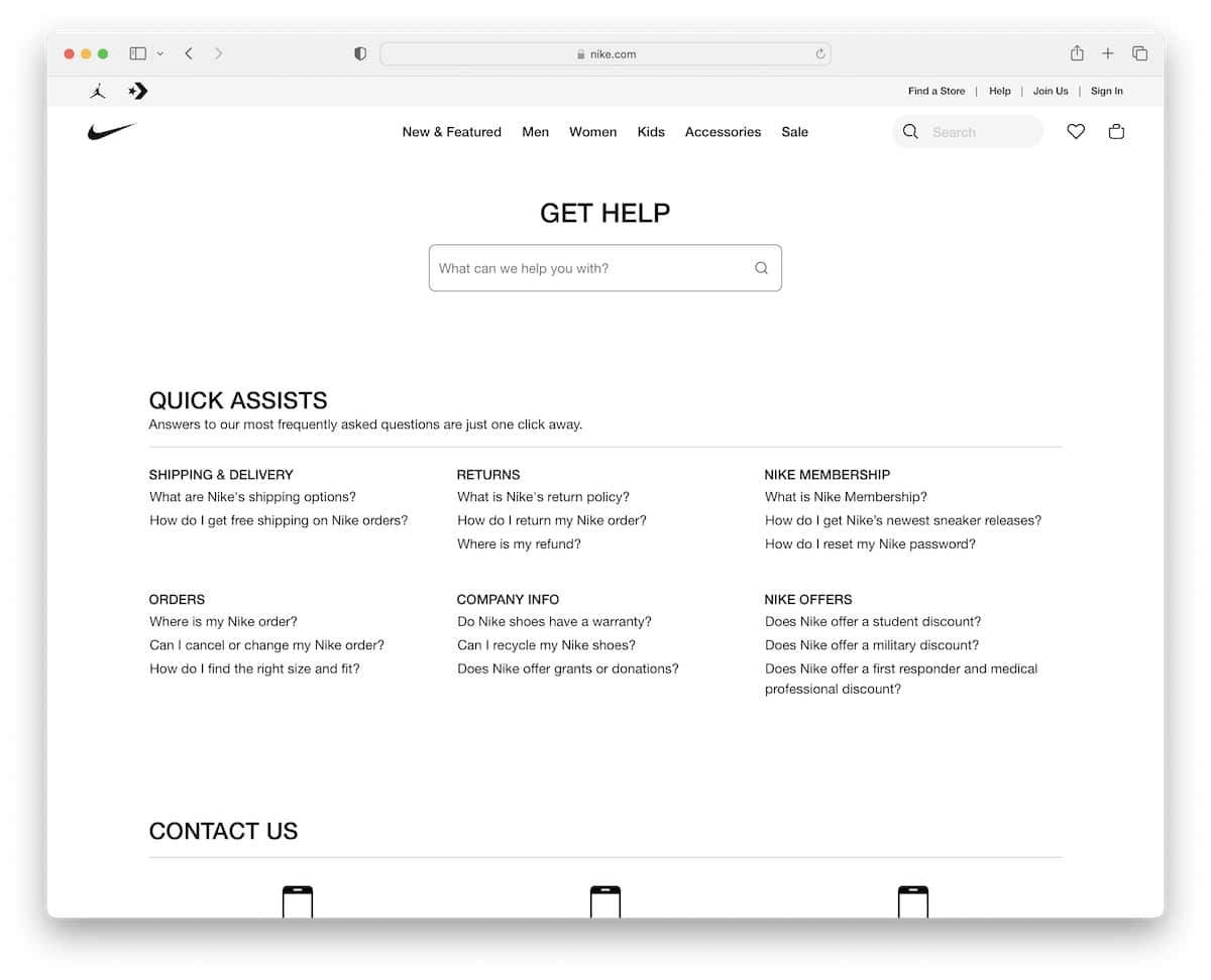
Nike does an excellent job of sticking to simplicity, offering a search bar, “quick assists” links and an extra section with other ways of getting help through the telephone, chat, etc.
When done searching for help articles, you can always go back to shopping by using their disappearing/reappearing header with mega menu functionality.
What stands out: Use a disappearing (down scrolling) and reappearing (up scroll) header to eliminate disruptions as much as possible.
8. Spotify Support
Built with: Next.js
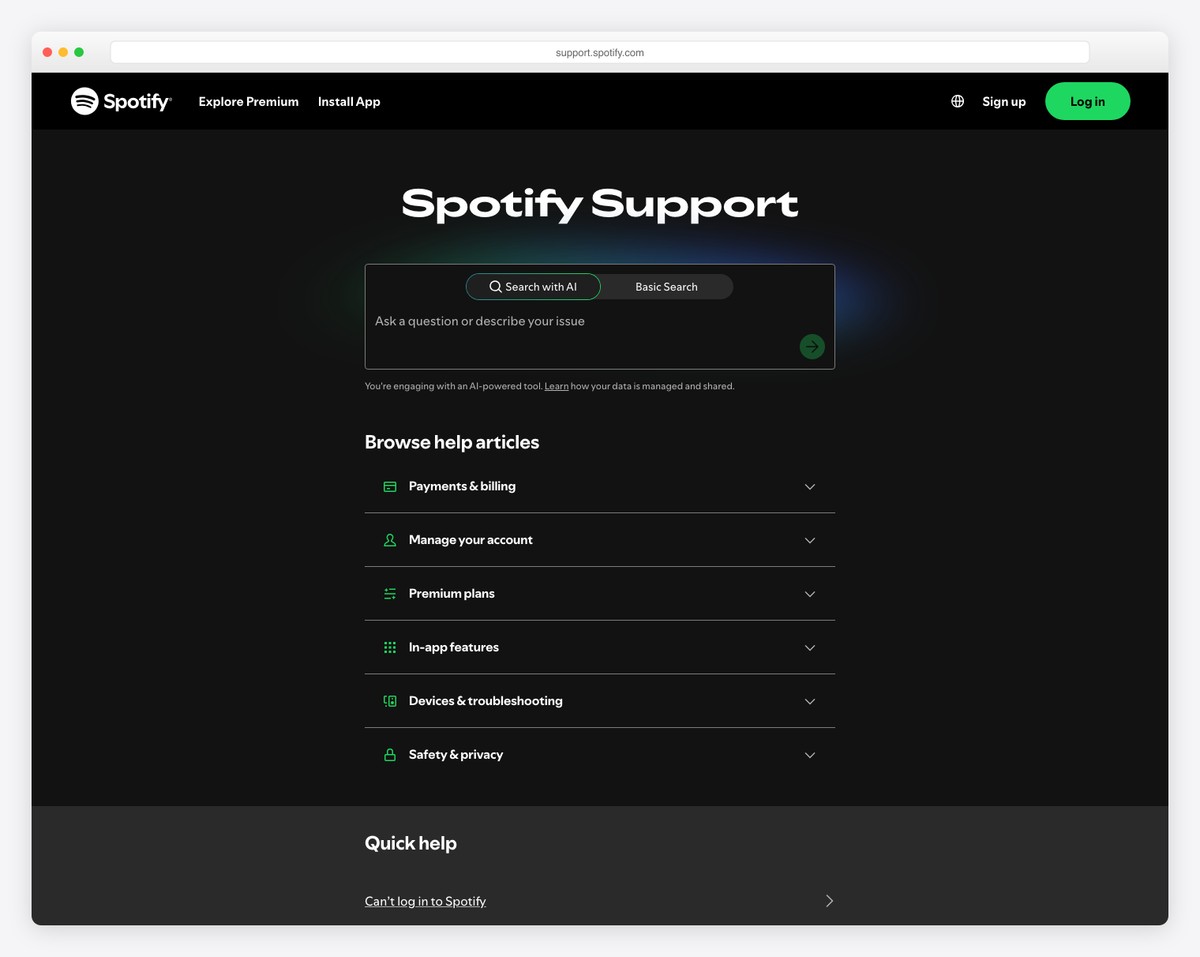
Spotify sticks to its dark tone even regarding the support page. However, this knowledge base example uses more vibrant colors to create a grippier atmosphere and bring the content front and center.
Also, once you start typing in your search query, multiple recommendations will pop up underneath the search bar with direct links.
Last and not least, Spotify allows you to log into your account from where you can enjoy even faster help.
What stands out: Maintain your branding throughout your entire online presence, including your help center/knowledge base.
9. Instagram Help Center
Built with: Django Framework
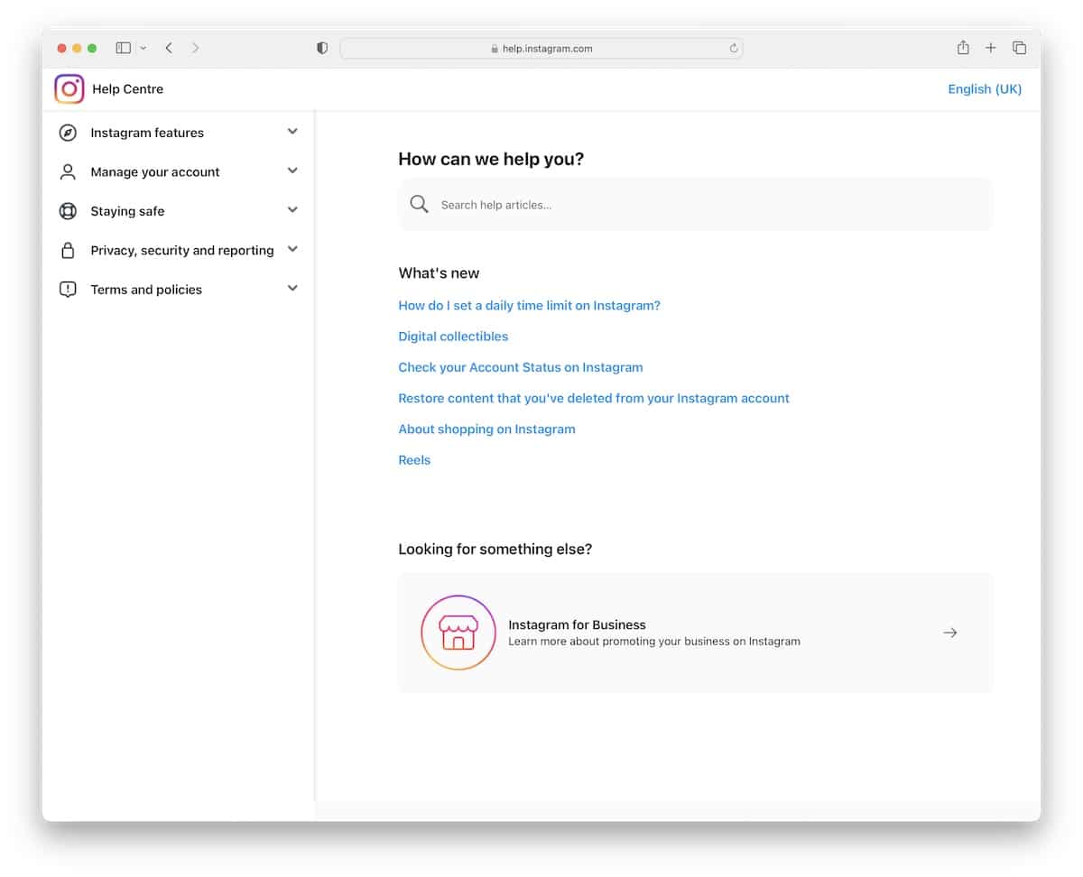
Some of the world’s largest websites and web apps have the simplest and cleanest designs, and Instagram is no different.
However, while Instagram’s help center does have a refined look, its main focus is to deliver the necessary help as quickly and easily as possible.
The base section features a search bar (with recommendations) and “what’s new” links, but you can also navigate the help articles using the sidebar drop-down menu.
Finally, the language selector is in the top right corner to personalize the experience.
What stands out: Use the drop-down sidebar navigation to make finding something more specific in a few clicks.
10. Lyft Help
Built with: Next.js
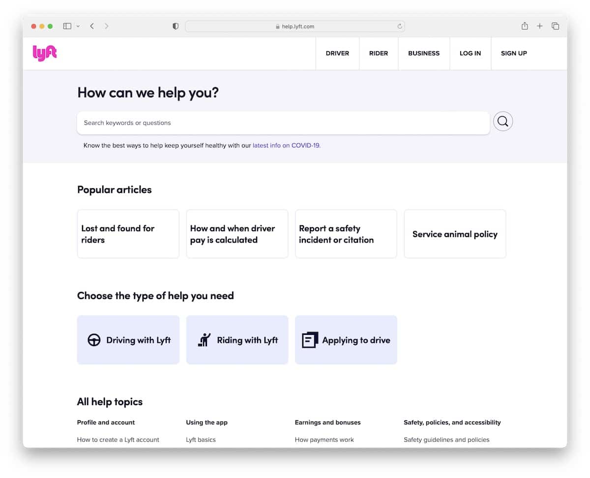
Lyft urges you to log in to your account for faster help with a popup, which you can close by pressing “x.”
You can then search for keywords and questions or help with the recommended topics.
Moreover, this knowledge base page links to popular articles, the type of support you need, and more.
Plus, there’s a CTA button to contact the team if you can’t find what you’re looking for.
What stands out: Provide your users with more support options besides the help articles—via email, phone, live chat, etc.
11. Dropbox Help Center
Built with: Adobe Experience Manager
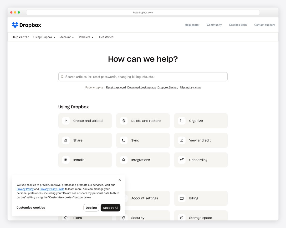
Most of the knowledge bases aren’t too artistic or have that special oomph to them, but Dropbox’s kind of is.
Although this responsive web design is minimalist, it feels catchier than most we’ve listed.
It’s likely because of the white space, the larger text and the graphics and icons that make it a tad spicier. All the amazing and helpful functionality to get to the articles is also there for an overall pleasant and practical vibe.
What stands out: You don’t have to make your support page boring and dull; enhance it with graphics and icons.
12. AWS FAQs
Built with: Adobe Experience Manager
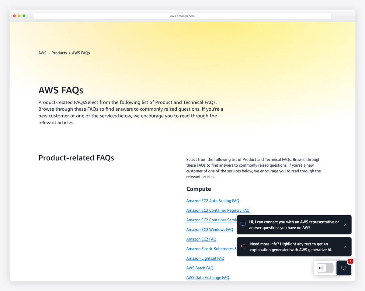
Similar to Instagram, AWS also uses sidebar navigation but with an addition of a sticky header with a mega menu and a search bar.
This page’s base is an endless list of quick links broken down into categories for more comfortable navigation.
Moreover, CTA buttons also take you to account creation if you aren’t already part of AWS.
What stands out: Create a more organized header navigation with a mega menu where you can also add images, icons, extra text, etc.
13. Billie FAQ
Built with: Shopify
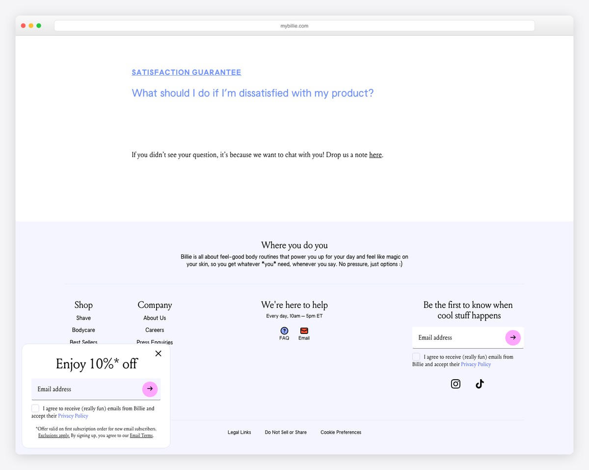
Billie has a colorful branding that they also use on their knowledge base page. It starts with a banner and text, followed by multiple tabs/buttons that let you jump straight to the section you’re interested in – no scrolling.
Each topic then opens like an accordion, so you don’t need to open a new page to read it. While all the information is at your fingertips, the initial look is spotless and appealing to the eye.
What stands out: Create a single-page layout for your FAQ section so all the answers are easily accessible.
14. Starbucks Customer Service
Built with: Next.js
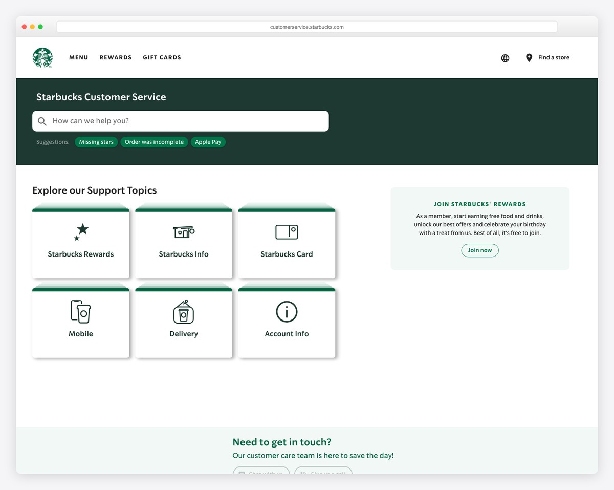
You’d expect a more modern and sophisticated customer service page from Starbucks, but they’re keeping it very classic.
The page has a “how can we help you?” text box, a basic search bar, and a two-column list of quick links. A sidebar with links to answers to popular questions and another link for contact is also included.
What stands out: Create a sidebar to display other practical links and contacts.
15. Nimble AMS Help
Built with: Atlassian Confluence
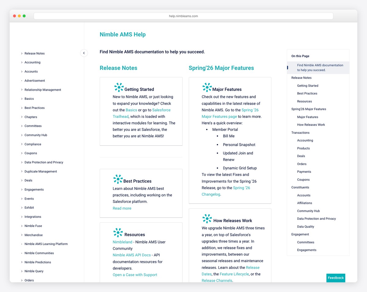
While other knowledge base examples on this list feature quick links, Nimble AMS does it differently with excerpts + “read more” links.
This may help everyone new to the software quickly skim through further details and information without going in-depth. All the additional information opens on a new page where you can find other links and a left sidebar with more helpful content.
What stands out: Make the main page of the knowledge base deliver a brief on every topic to improve UX.
16. Huel FAQ
Built with: Shopify
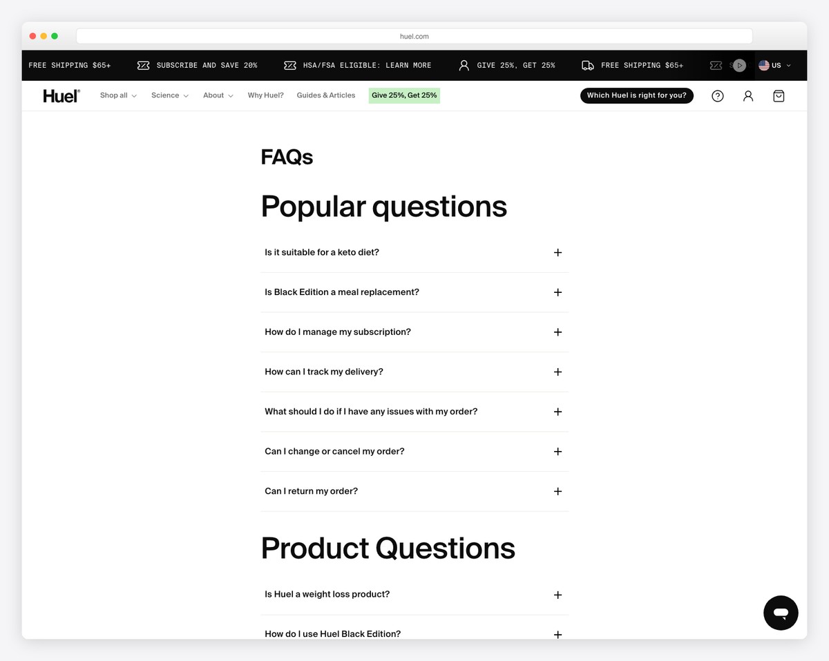
While a search bar is very handy on a help/support page, Huel made it without one, but it’s still convenient. There’s also a “live” chatbot widget that works as a search bar replacement.
They use large titles to find the needed sector effortlessly, even if you scroll fast. All questions have accordion functionality for answers, where you can also find links to other useful content.
Besides, there’s a CTA button to the help center and multiple ways of contact at the bottom, before the Instagram feed.
What stands out: Using accordions for FAQs is very common. Why? Because they work! So feel free to use them on your website.
17. Jiminny Help
Built with: Ruby On Rails
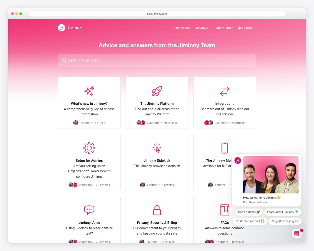
Jiminny keeps things plain and simple, with a search bar, a few buttons with hover effects and links to the most popular articles. By the way, the search bar showcases three of the most relevant articles and then a link to view all the other relevant ones.
And to make it even more user-friendly, there’s always the messaging widget available for your convenience.
What stands out: Add a hover effect to buttons to make them more interactive (read more clickable).
18. Aleris Knowledge Base
Built with: Umbraco CMS
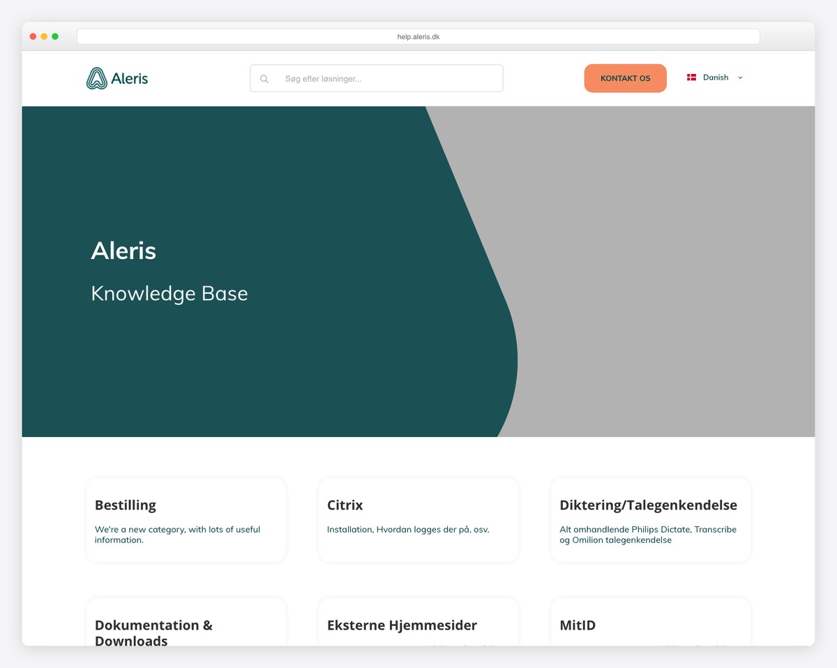
Aleris has a header with a search bar, a CTA button and a language switcher. This knowledge base page continues with a hero image, a card-like grid of categories and a list of popular topics.
Before the three-column footer is a contact form for anyone with further questions.
What stands out: Instead of adding a search bar in the hero section, you can also place it in the header (which can be even handier if you make it stick to the top of the screen).
19. Interfolio Product Help
Built with: Ruby On Rails
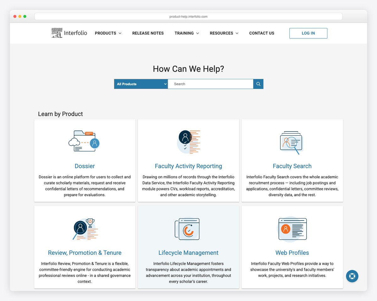
Interfolio created an entire knowledge base sub-website with a drop-down menu, a CTA log-in button, an advanced search bar, plus multiple sections with the necessary help and support content.
Furthermore, the footer contains supplementary links, social icons, a clickable email and a “submit a ticket” button that opens a form popup.
What stands out: Create a search bar with an additional drop-down menu for the user to search for articles in the preferred category.
20. Wefunder FAQ
Built with: Ruby On Rails

Wefunder’s knowledge base/FAQ section has a semi-single-page layout with sidebar links that lets you jump from section to section.
Moreover, once you start typing your query in the search bar, the existing content disappears and gets replaced by recommendations. You must then click “back to FAQs” to go to the “home page.”
What stands out: Create a sticky sidebar or header navigation to improve your knowledge base’s user experience (especially if you plan to create a one-page layout).
Now that you have found inspiration, here are the best knowledge base WordPress themes to create a fantastic website for your product.
21. Figma Help Center
Built with: Custom
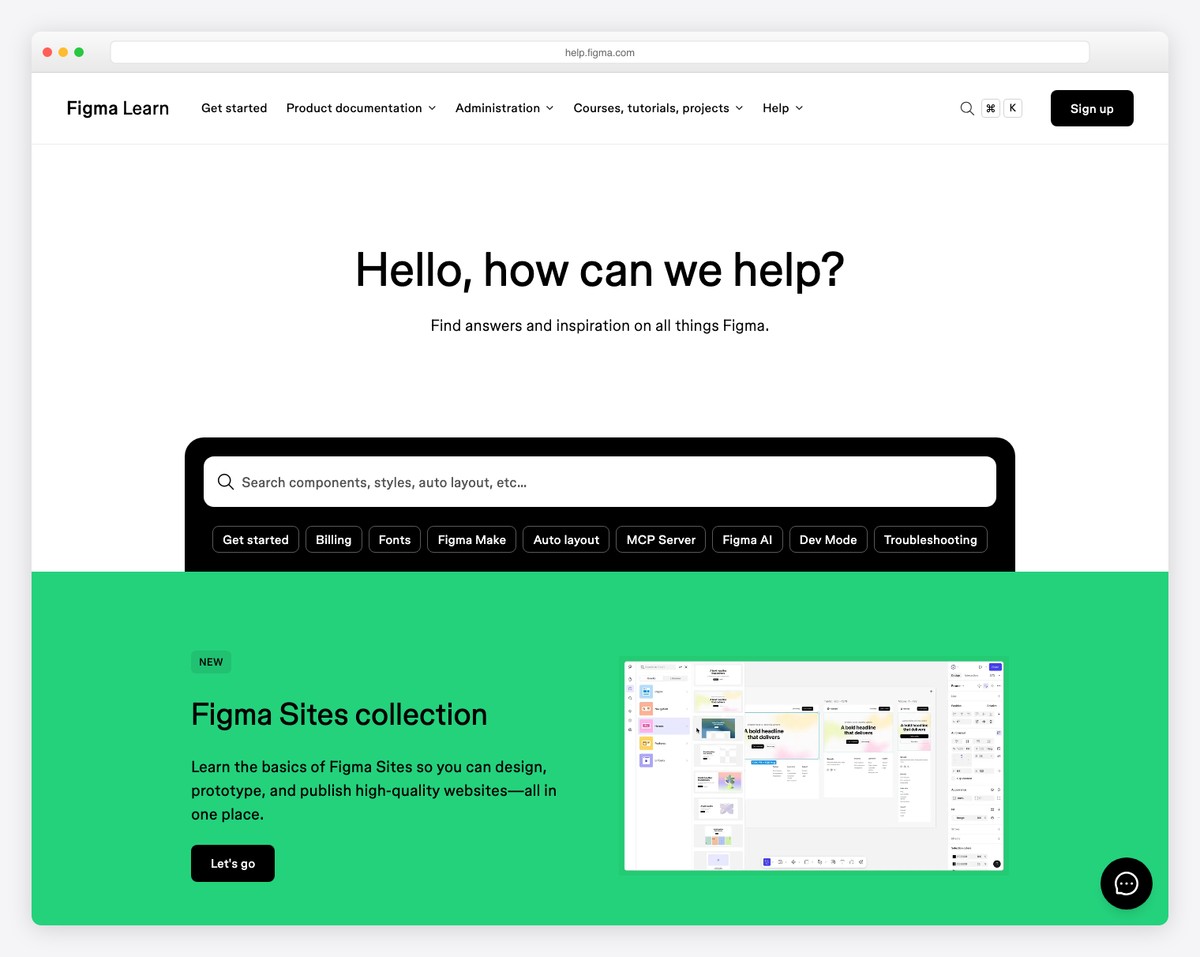
Figma’s Help Center reflects the same design excellence that made their product an industry standard. The clean, spacious layout organizes help content into clear categories — Getting Started, Using Figma, Account Settings — with a prominent search bar that makes finding answers effortless for their millions of users.
The visual hierarchy uses Figma’s signature purple accent color sparingly, keeping the focus on content discoverability. Category cards with descriptive icons guide users to the right section, while the minimal header (Home, Community, Status) avoids overwhelming visitors who just need quick answers.
What stands out: A knowledge base should mirror the product’s design language — Figma’s help center feels like a natural extension of the tool, which builds confidence that the answers will be just as thoughtfully crafted.
Related Posts


Comments (0)