26 Best Church Websites (Examples) 2026
Do you want to see the best church websites because you’re in the process of creating a religious page?
We curated a list of the twenty best after studying 100+ to guarantee the most outstanding design for your viewing pleasure.
Some are cleaner than others, some include videos, some sliders, some have embedded videos and sermons and many have online donations that help them raise funds. (We recommend adding a “donation” button to your websites.)
You can choose between two options if you’re just starting; either pick a church website builder or a church WordPress theme.
While the former is easier and faster, the latter offers unlimited options and possibilities to create your desired site.
Let’s go!
Best Church Websites To Inspire You
1. Grace
Built with: Squarespace
Grace has a top bar notification you can close by pressing “x” if it disturbs you. The header is transparent, so the parallax image with text and a CTA button shines more.
The CTA buttons come with a hover effect for interactivity (to make them more clickable).
Interestingly, the search bar opens on a new page but works so well because of the live results/recommendations it displays.
What stands out: A search bar with live results and recommendations improves user experience with quicker finds.
2. Mosaic
Built with: Squarespace
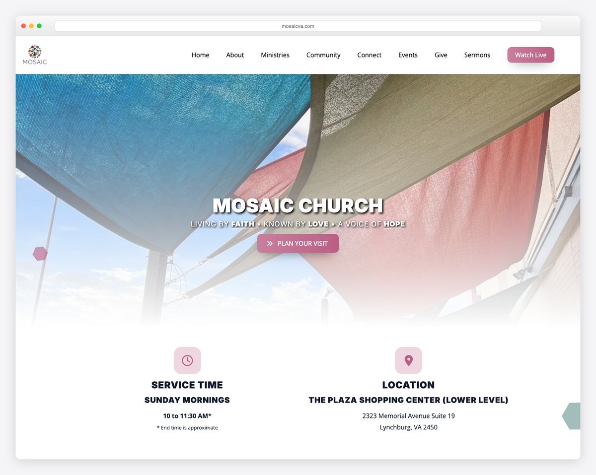
Mosaic mixes minimalism and creativity in one beautiful church website that you can learn from. The use of white space and the site’s pleasing color palette calls for an enjoyable experience when viewing the content.
Mosaic displays multiple CTA buttons in the navigation bar with contrasting colors, so they grab the attention. Meanwhile, the footer consists of social media icons and additional contact details.
What stands out: Inserting your call-to-action buttons into the header gives you more exposure.
3. Knox Toronto
Built with: Squarespace
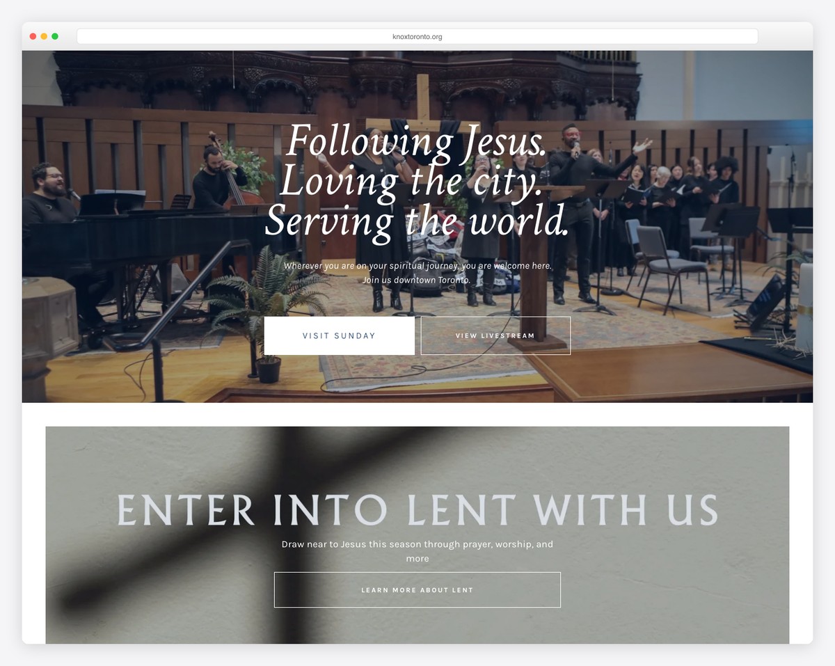
Check Knox Toronto if you would like to collect donations via your website.
This church website uses a “Give” button in the header, linking to a donation form on a new page. The form gives the user complete freedom regarding how much they want to donate, with two additional drop-downs for the location and frequency.
What’s also cool is that the Give page is very transparent with where the donations go and offers other ways of contributions besides online.
What stands out: Including an online donation form on your church website can help you gain more funds.
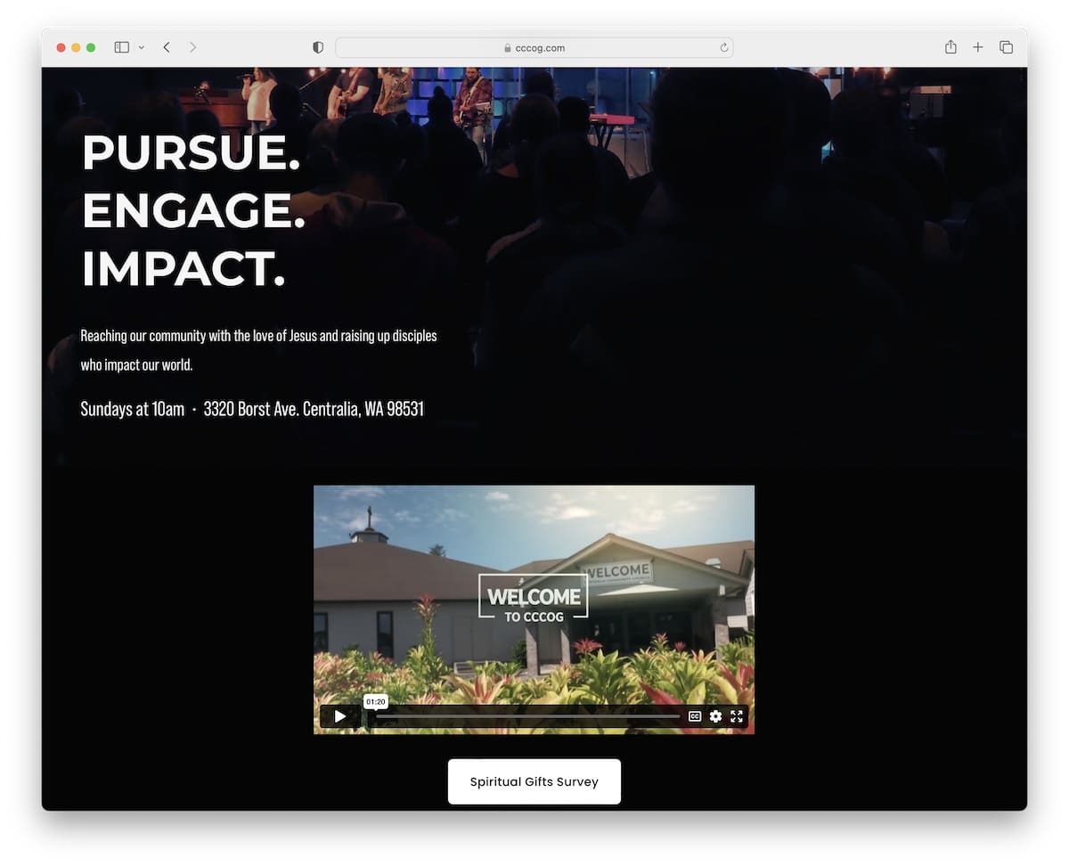
4. Centralia Community Church
Built with: Squarespace
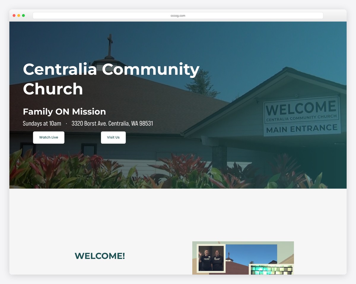
While Centralia Community Church uses a pretty large header, it disappears when you start scrolling but reappears when you return to the top for a more distraction-free experience.
This church website uses a mixture of lighter and darker tones for dynamic vibes and has an embedded video to keep visitors on the page longer.
What stands out: Instead of using a standard header, you can use such that disappears/reappears depending on the scrolling movement.
5. Apostolic Church
Built with: Squarespace
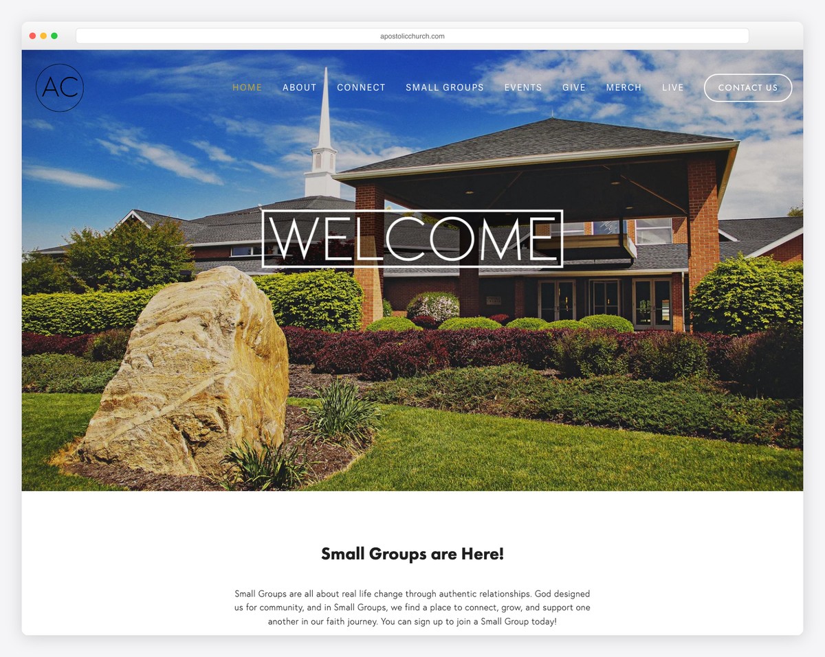
Apostolic Church’s hero image turns into a video that triggers your curiosity as soon as the website loads. The first few seconds matter the most and define whether you’ll keep or lose a visitor.
The rest of the page has a more basic look, displaying all the CTAs, content, images, and more.
One interesting feature is the header, which only appears when you get to the bottom of the page.
What stands out: It’s always better to aim for a minimalist design rather than stuffing it with (too many) animations and effects.
This website is built using a Squarespace church template from our library. Start building your website today!
6. HTB Church
Built with: Squarespace
HTB Church is a website with a vibrant design that sparks interest, making you want to learn more.
While it isn’t equipped with a search bar, it has a drop-down menu to get to the desired information with a click.
Moreover, the footer’s background is black, kind of unexpected, but that’s the whole point.
What stands out: Don’t be afraid to make a bolder footer with a contrasting background color, like black. It’ll make links, CTAs, forms and other elements more front and center.
There are thousands of church websites made with Squarespace, and we have reviewed the best of them.
7. Second Baptist Church
Built with: Pro Theme
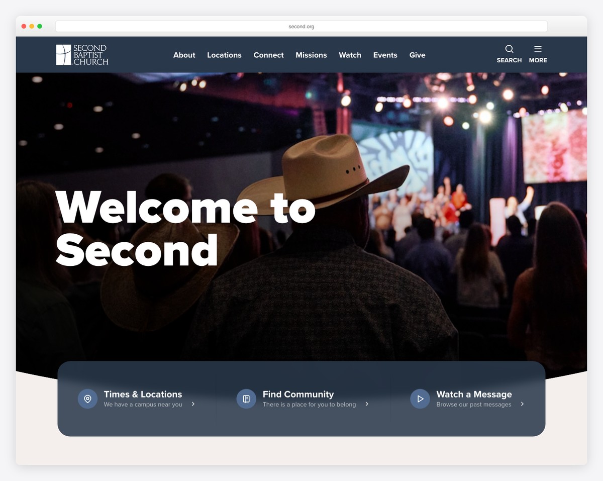
Second Baptist Church stands out with its full-screen video background that captures everyone’s attention. On top of that, the video also has a parallax effect that increases engagement.
The header is transparent and the call-to-action (CTA) buttons are outlined for a cleaner look.
Besides the main navigation, Second Baptist Church also has a hamburger menu that slides from the right with drop-down functionality.
What stands out: Add a promotional video above the fold to trigger curiosity and keep your visitors on your page longer.
8. Elevation Church
Built with: Elementor
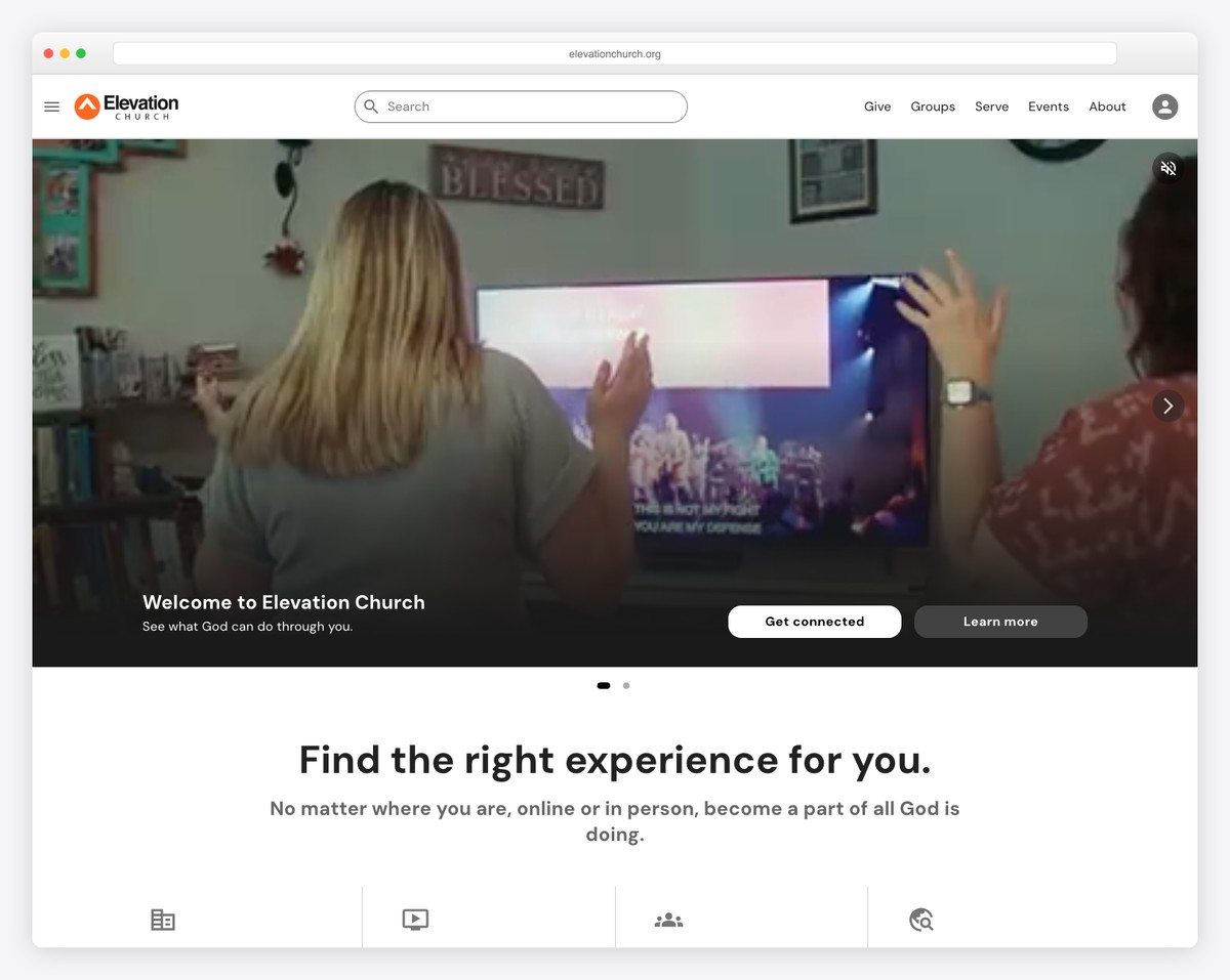
Elevation Church has a modern, mobile-like look with a minimalist design, making the content pop more.
The header is clean with essential menu links, a language switcher and a hamburger icon for a more refined search.
What increases interactivity is the hero image that starts playing a video once you hover over it.
What stands out: Do you have a lot of global followers? Then translate your website and offer them to personalize their experience by picking their language.
You should also not miss checking our ultimate collection of the best Elementor websites.
9. Freedom Church
Built with: Wix
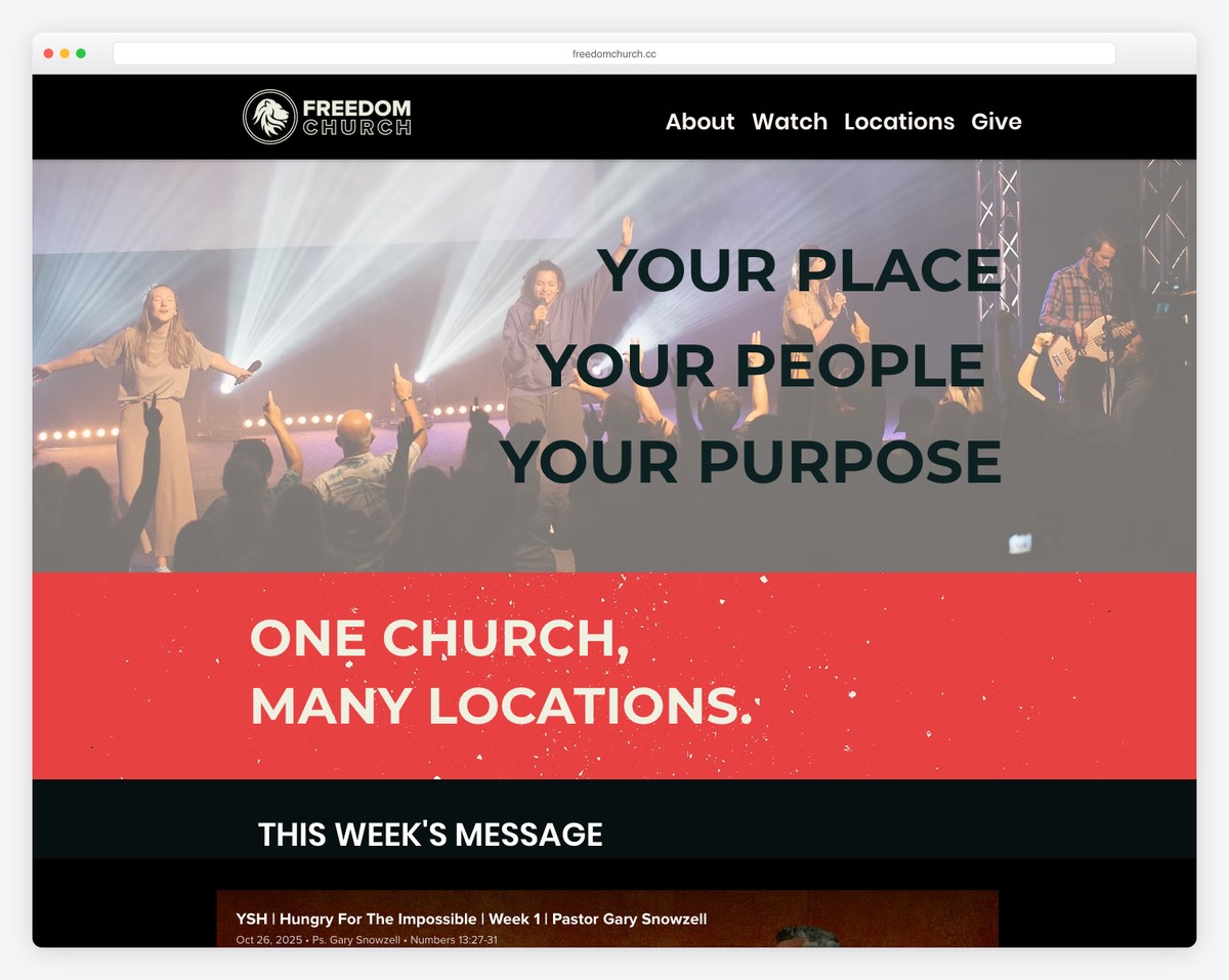
Instead of one, Freedom Church takes things to the next level with multiple videos on the home page.
Moreover, the internal pages’ sections go from dark to light to make a more dynamic experience, ending with a multi-column footer featuring an embedded sermon.
What stands out: Let visitors listen to your sermons by embedding an audio player (even creating a playlist).
You can also peek at some of the best websites built on the Wix platform.
10. Crossroads Church
Built with: Next.js
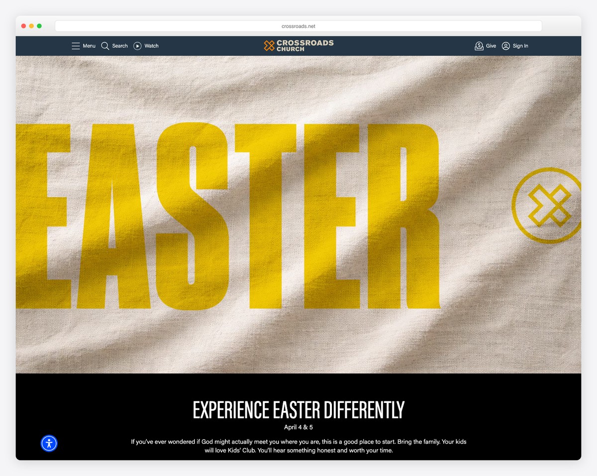
Crossroads Church has a content-rich front page with a top bar notification and a floating header. The latter ensures that all menu links, search, and account access are always only a click away.
An embedded video, a grid layout for shows, series and podcasts and a practical footer with lots of quick links make Crossroads Church a handy online presence for worshippers.
What stands out: Create a sticky header to improve your church website’s user experience – no more scrolling back to the top!
11. One Church
Built with: Squarespace
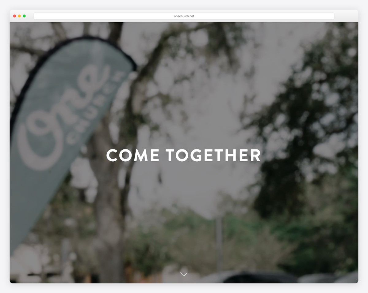
One Church has a full-screen above-the-fold section with a two-word message, transparent navigation and a scroll-down button.
This responsive web design is simple and creative, with lots of white space and a parallax effect. The footer takes a significant part of the website with a newsletter subscription form, location details and social media icons.
What stands out: Make your Squarespace website more engaging with parallax sections.
12. Calvary
Built with: Enfold Theme
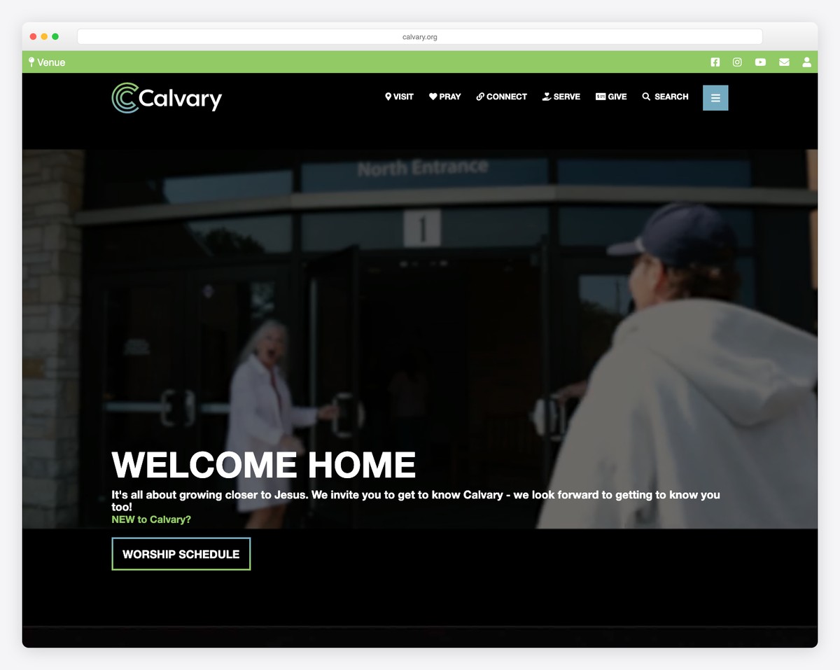
Calvary has a massive hero section with a title and three CTA buttons. But you can also access the sticky drop-down navigation if you search for something more specific or type your query in the search bar.
This church website also has a back-to-top button and a footer with additional CTAs, including app download buttons and business details.
What stands out: A back-to-top button is a practical addition to any website that lets visitors avoid scrolling back to the top.
But you may also be interested in other great examples of websites using the Enfold theme.
13. LCBC Church
Built with: Craft CMS
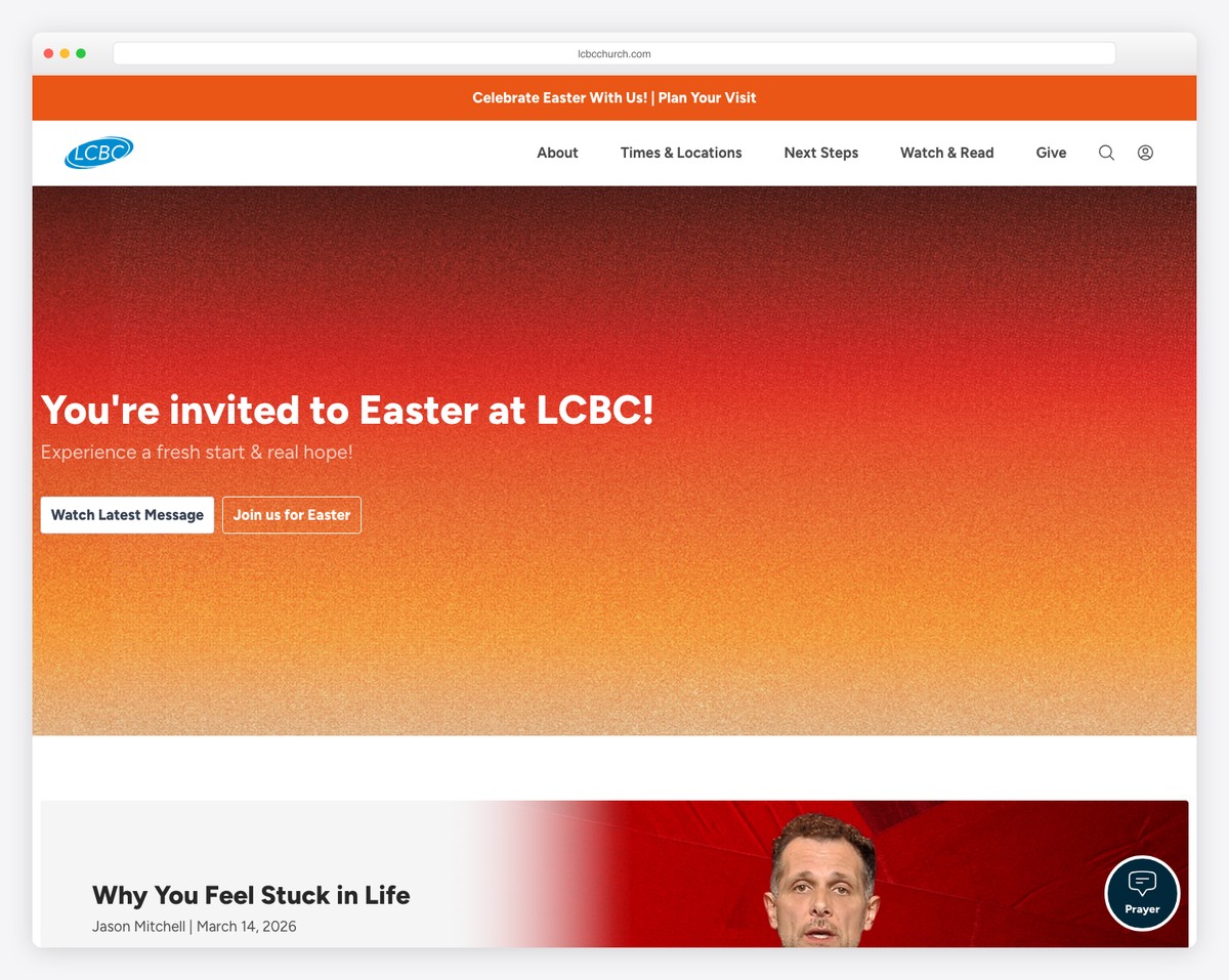
LCBC Church is another excellent example of a church website with a hero video that makes it more captivating.
The sections are large and clean, so the content is easy to skim through and read on mobile and desktop.
Furthermore, the semi-transparent basic floating navigation bar is always available, but LCBC Church has all its menu links in the footer section.
What stands out: Use larger text and white space to improve your site’s readability.
14. Sonship Bay Ridge
Built with: Maranatha Theme
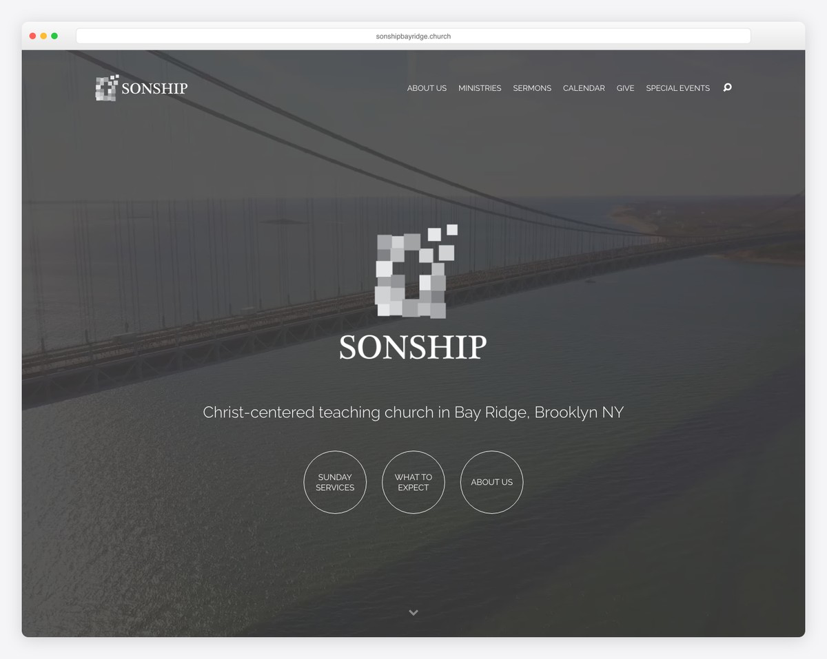
Sonship Bay Ridge has massive sections to promote their sermons, Bible studies, prayer meetings, etc. While all use an image background, the one above the fold has a smooth video that gives enough engagement to keep the visitor focused.
What’s also helpful is the integrated map with location, contact details and directions (with a link to Google Maps).
What stands out: Showcase your church’s location with a map (we recommend integrating Google Maps).
15. North Coast Church
Built with: WPBakery
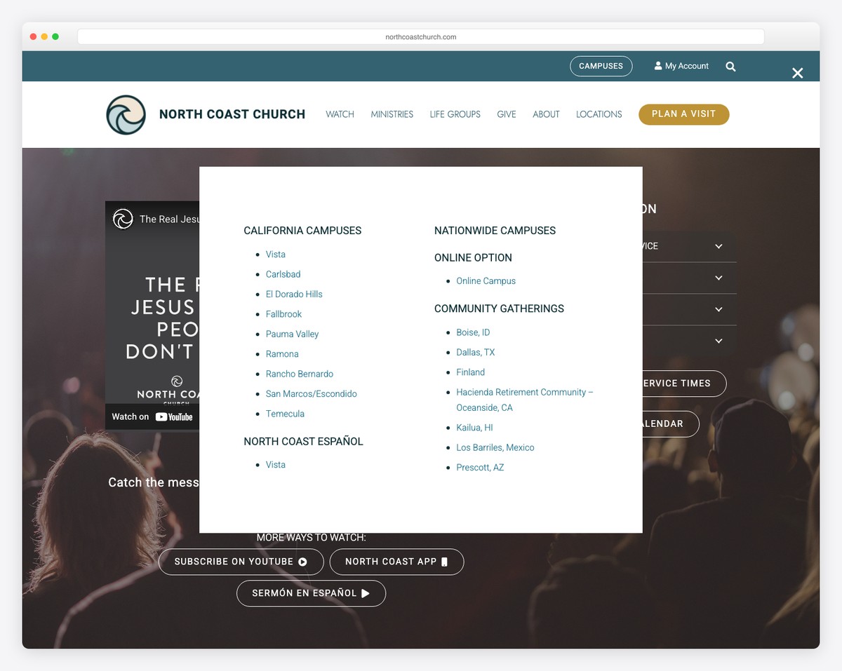
North Coast Church uses its hero section to let you watch its latest sermon. But they also have two CTAs to subscribe to YouTube or their app for direct access.
It’s a church website with an elegant design, using a top bar and a header but only the latter sticks. Additionally, there’s a back-to-top button to avoid scrolling altogether.
Moreover, the footer has multiple CTA buttons, contact details and social buttons to connect with them via your favorite platform.
What stands out: Embed an entire sermon video above the fold so everyone can watch it immediately without needing to search for it (and improve UX).
Need more ideas? Then check these epic WPBakery website examples.
16. Pathway Church
Built with: Squarespace
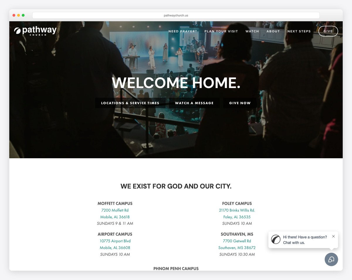
Pathway Church is a clean website, delivering an outstanding performance and atmosphere to enjoy its content more.
While it has many effective sections and elements, the key feature of this church website is the floating chat widget in the bottom right corner.
Also, their media section/portfolio has multiple tags and a search bar to find the right video, speaker, etc., faster.
What stands out: Improve customer service with a (live) chat box and offer quicker answers.
17. Heritage Church
Built with: Squarespace
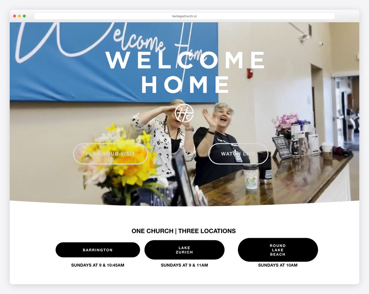
Heritage Church’s beautiful, modern layout makes scrolling and peeking at its content much more likable. The top bar notification has a contrasting background color to trigger your interest (but you can also close it).
You’ll also find a simple, transparent floating menu, a sticky Facebook Messenger icon, a carousel for upcoming events, and a lightbox gallery that collects their Instagram posts.
What stands out: Add more content to your website by integrating an IG feed. Plus, using the lightbox functionality to check larger images and videos allows viewing without leaving the current page.
18. Declaration Church
Built with: Squarespace
Declaration Church uses a simple popup window in the bottom right corner to collect emails to grow its loyal community of followers through must-read newsletters.
The layout is heavy on visuals with a cool text animation for extra engagement. It’s also great to see clickable email and telephone number in the footer to get in touch more effortlessly.
And the CTA buttons are all outlined but become solid on hover to draw attention, which is worth testing yourself.
What stands out: Build your email list by inserting a newsletter subscription form popup.
19. Everyday
Built with: Squarespace
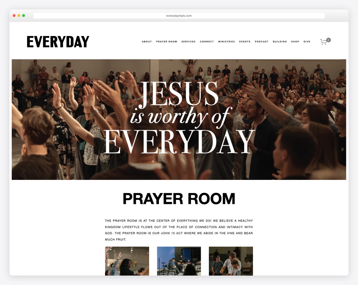
Everyday is a minimalist website with one of the more delightful layouts we’ve encountered.
Thanks to its black and white design, its uncomplicated appearance is simple and quick to flip through.
The monthly event calendar is worth introducing to your website, so potential attendees know precisely when the next awakening service is or at what time is the Thursday class.
What stands out: Create a monthly calendar/schedule with all your sermons, prayers, events, etc.
20. New Life Oxnard
Built with: Squarespace
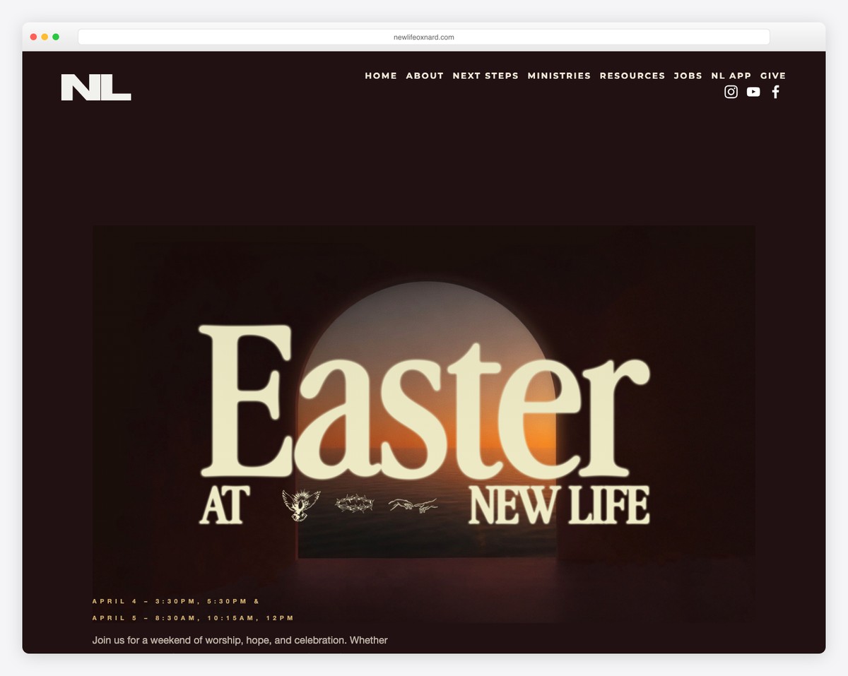
Even though New Life Oxnard is a church website with a clean design with plenty of white space, its visuals and large typography create a strong impression on the visitor.
The header and footer are minimalist, with the necessary links and social icons to keep up with the neat flow.
New Life Oxnard also uses a Facebook Messenger button to reach out directly.
What stands out: Increasing font size can work well on a website with plenty of white space.
21. Mariners Church
Website made with WordPress and Gutenberg builder
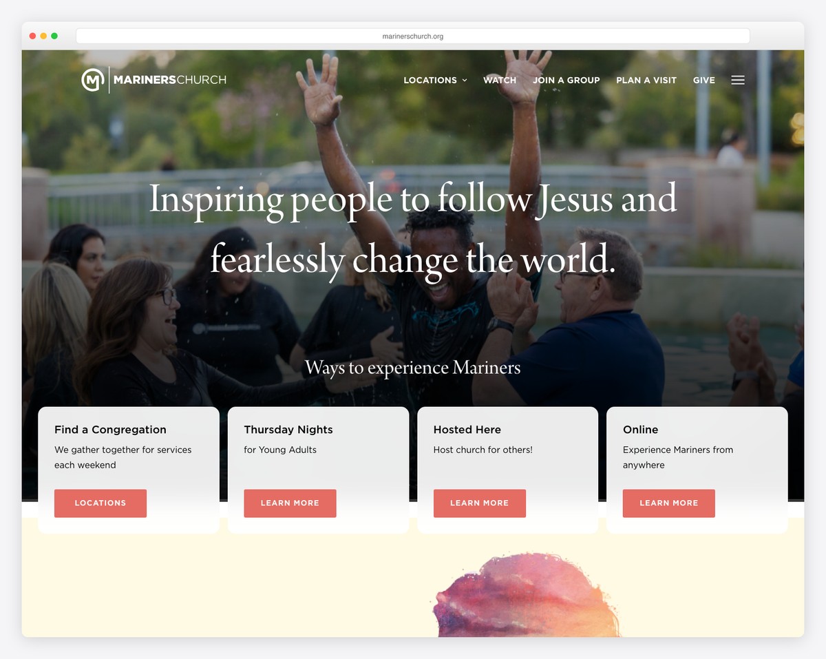
Mariners Church is a modern church website with full-screen video and images—something you never see on a religious website. The website is made using WordPress and the Gutenberg website builder in combination with plugins like Yoast SEO and Contact Form 7.
It is one of the most advanced church platforms I have seen because it has an online community with live streams, mobile apps for iPhone and Android, and a straightforward online donation system. Overall, the person who created this website did an outstanding job.
What stands out: Any website should go online, and the Mariners Church website is an exceptional example of it.
22. ITOWN Church
Built with: Squarespace
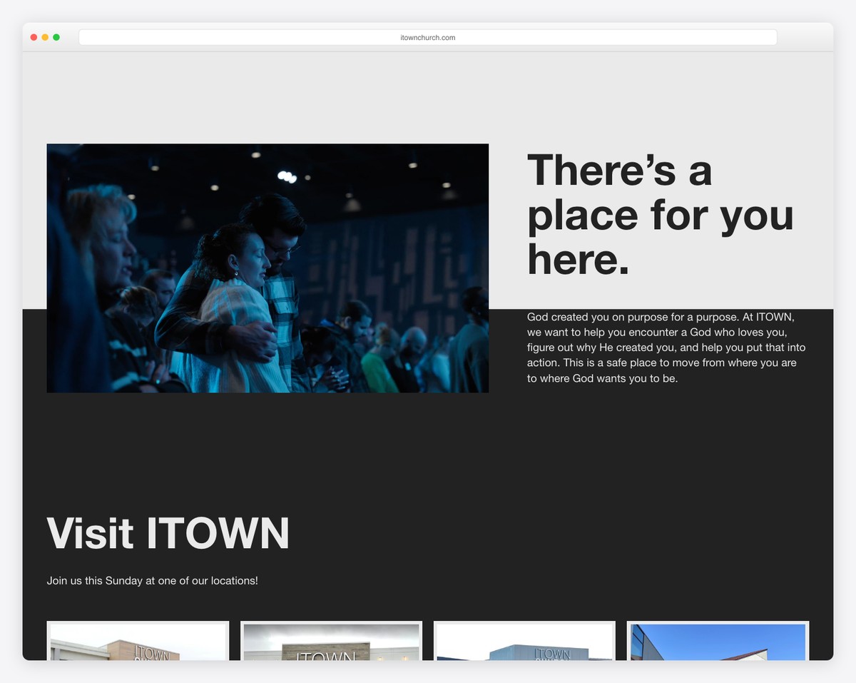
ITWOWN Church is yet another online-focused church that offers online donations, live-creaming, and other options for interacting with the community. The website itself features a minimalistic design that makes good use of white spaces.
The website is built using the Squarespace website builder, one of the most complex websites I have seen built with it. It has numerous pages with advanced functionality, which you don’t see often with Squarespace since it is a DIY website builder.
What stands out: Drag-and-drop website builders can be used to create truly unique and complex websites like ITOWN Church.
23. Bay Area Christian Church
Website made with WordPress
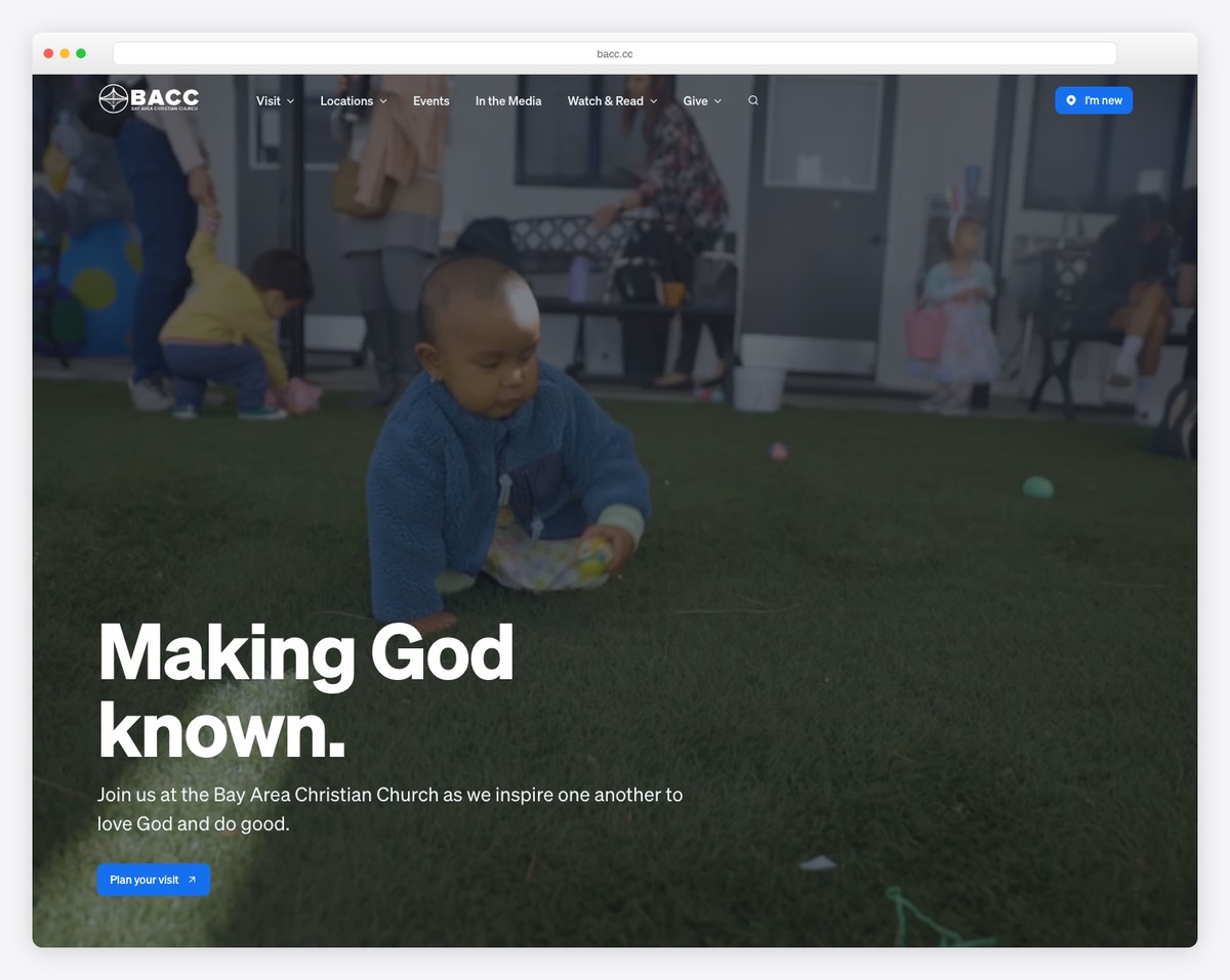
Bay Area Christian Church welcomes people of all ages and engages theme with weekly services that are filled with both worshipping and entertainment. The website itself is an exceptional example of what can be done with WordPress and free plugins.
What stands out: A welcoming hero section with community photography sets a warm, inviting tone for first-time visitors.
24. Centralia Community Church
Built with: Squarespace
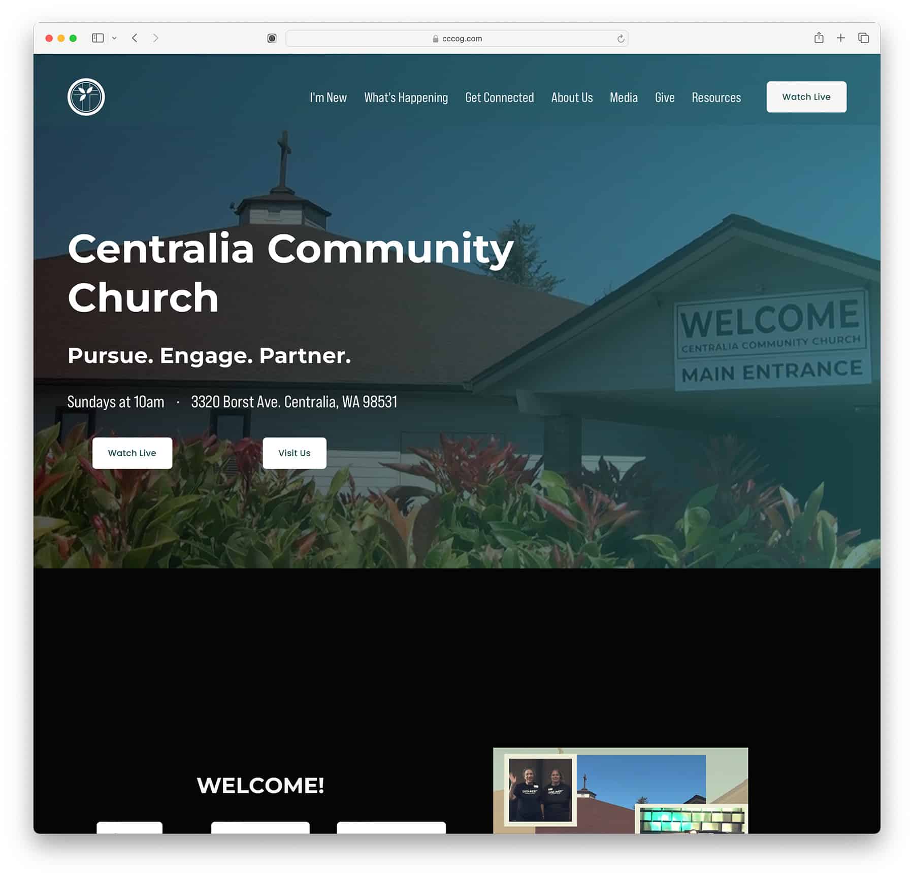
Centralia Community Church’s website features a minimalistic design with an online focus. Weekly events are live-streamed for everyone’s convenience. The website is made using the Squarespace drag-and-drop website builder, which comes with hosting and a domain name.
25. The Life Church San Angelo
Built with: Squarespace
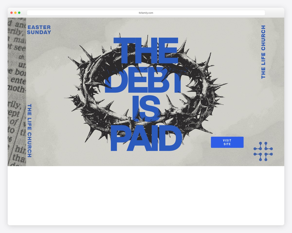
The Life Church San Angelo is a church in Texas. Its website allows you to watch live and older streams online. It also features a prominent CTA button for online donations.
The Life Church San Angelo website uses Squarespace, and they have done an outstanding job at it.
What stands out: It is not important which website builder you choose but how you choose to use it.
26. Church of the Highlands
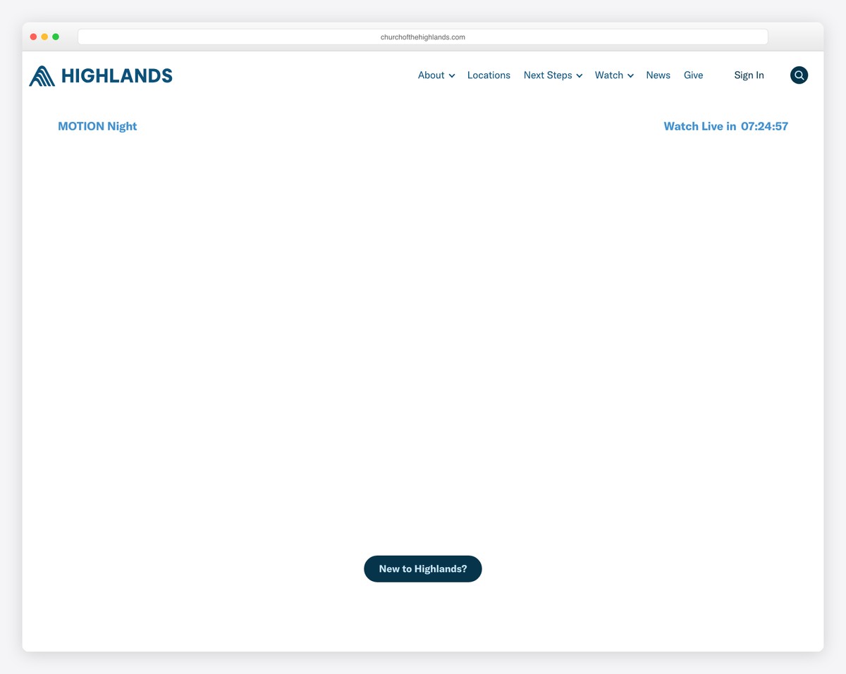
Church of the Highlands is a multi-campus church based in Birmingham, Alabama with locations across the state and into West Georgia. The polished, modern site features a clean design with sermon streaming, campus finder, and event registration that makes it easy for visitors to connect.
The homepage hero rotates between upcoming events and sermon series with bold imagery and clear CTAs. The campus locator with interactive maps helps visitors find their nearest location, while the sermon archive provides on-demand access to messages — extending the church’s reach far beyond physical walls.
What stands out: A campus locator with interactive maps is essential for multi-location churches — it reduces the friction between online discovery and in-person attendance by showing visitors exactly where to go.
Related Posts


Comments (0)