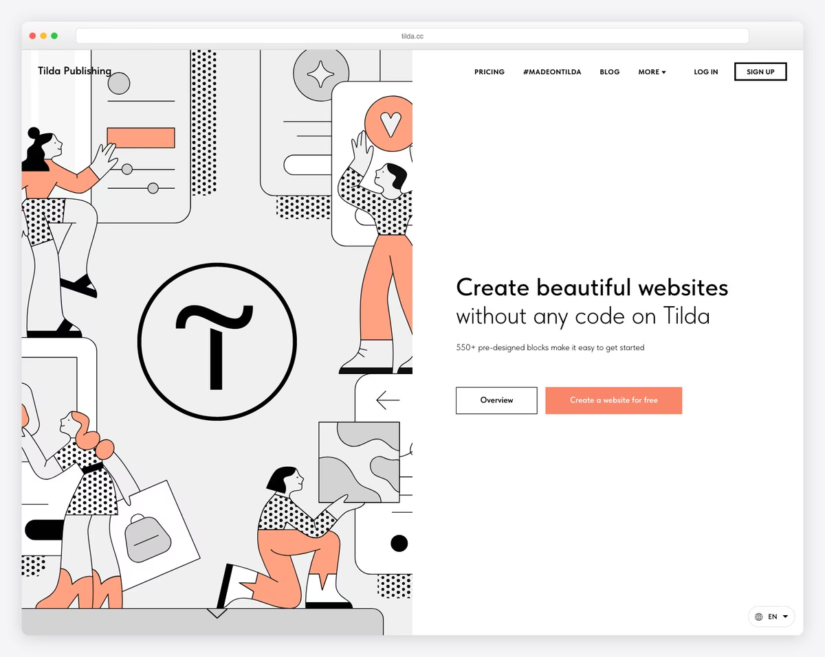
18 Best Tilda Websites (Examples) 2026
Do you want to see the best Tilda websites and great examples to get inspired and hyped for your new page?
We studied over 50 sites built with this easy website builder but found these twenty that rock the best responsive web design.
Tilda equips you with everything to start online in the least amount of time.
Plus, you don’t need any web development and design experience because of its user- and beginner-friendly interface and building process.
Get creative and make your Tilda website version like a PRO.
Best Tilda Websites To Expand Your Creativity
1. Julia Zass
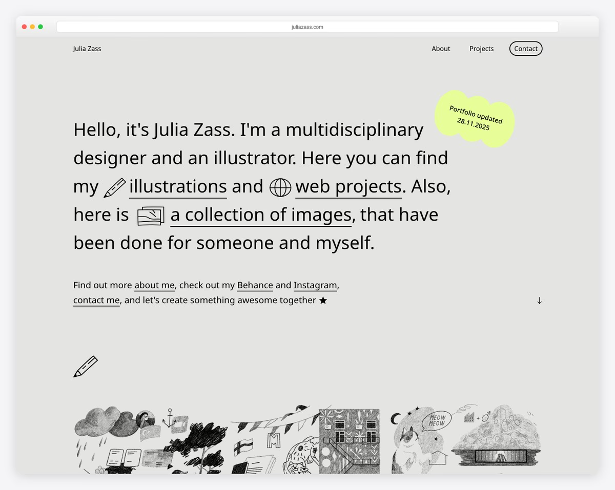
Julia Zass’s Tilda website is modern and creative, with just the right amount of animation to spice things up.
She chose an image-free hero section, including only text with links. Clever.
What’s also unique is that the contact form opens as a full-screen overlay, keeping you on the current page.
What stands out: Build a professional website to promote your services and boost your potential sky-high. (It’s so easy to do with Tilda!)
2. Meedus

One of the most unique features of Meedus is that it doesn’t have a navigation bar. Plus, a simple header appears only on the scroll.
You’ll also find many animations and special effects that make the overall experience more engaging. And if you ever want to scroll back to the top, press the back-to-top button instead.
What stands out: Do things differently with a dark web design and instantly create a more premium feel.
3. Morning Routine
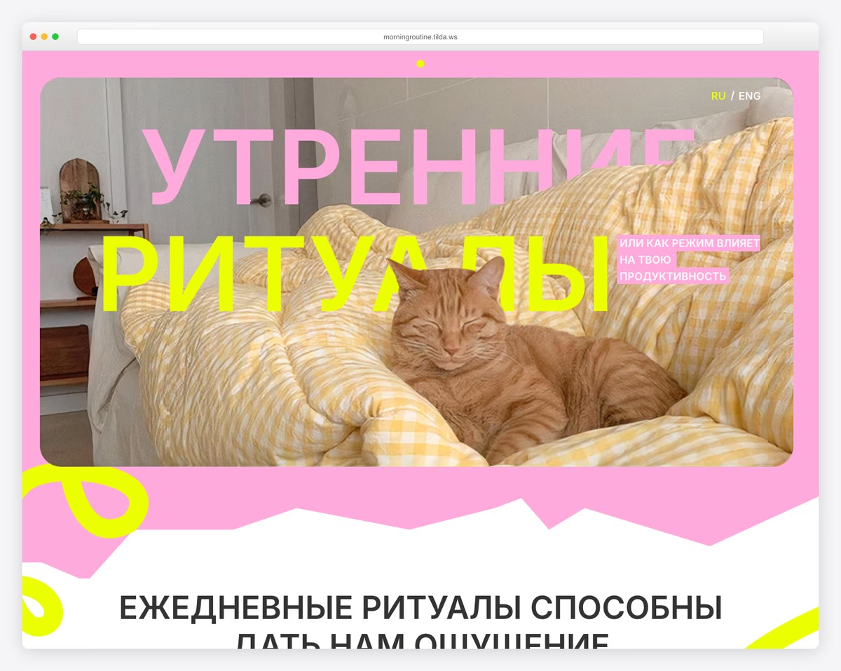
Morning Routine is a bubbly website, similar to Meedus, without the header/menu section. But you can choose between Russian and English languages.
The page’s moving elements make browsing the content more dynamic, keeping you glued to the screen and excited for what’s coming next.
What stands out: Go against the grain with images and content that might not immediately relate to your business/service. (Great attention-grabbing factor.)
4. Oneboost
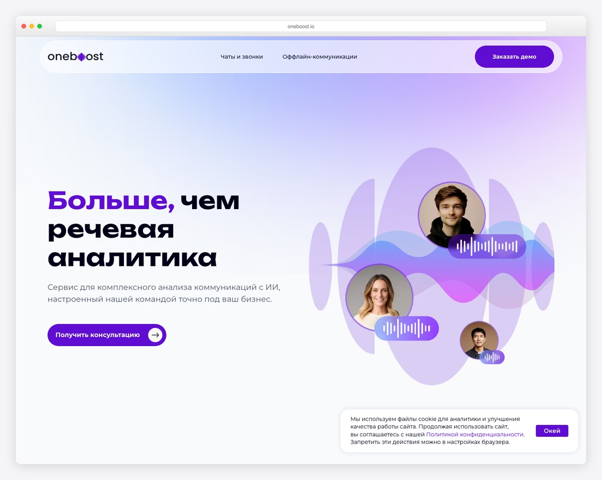
Oneboost is a cool one-page Tilda website with all the elements of a high-quality and professional page.
Sticky and transparent navigation bar, animations, multiple call-to-action buttons and an auto-sliding testimonials/review slider are just some of Oneboost’s specialties.
The FAQ section with accordions gives the website a clean look but still provides the necessary answers users have.
What stands out: Use accordions to minimize the load, especially in the case of frequently asked questions.
5. Seb and Barry

Seb and Barry’s full-screen image background creates a powerful and lasting impact on every visitor. And it immediately wants you to learn more, combined with the title and text.
Seb and Barry’s animated website uses a transparent (and floating header) with epic (scrolling) animations that make you feel like part of the project.
What stands out: Use engaging animations to present your business in a more immersive way.
6. LeadFrog
LeadFrog is a software website that keeps the professional level very high. The above-the-fold section features a cute animation, a CTA button and a swippable client logo slider.
Because it has a one-page layout, the floating navigation is handy for visiting the essential sections without scrolling.
Last but not least, the main LeadFrog features have cool animations that activate on hover, making you want to check what’s up.
What stands out: Make your software website more interesting and entertaining with animated details.
7. Investment Green Card
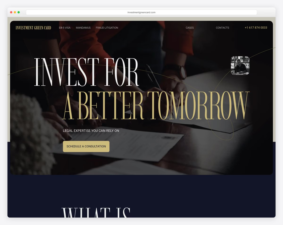
What immediately triggers the attention is Investment Green Card’s choice of large typography (for titles).
Moreover, their card-like sections break things down nicely to keep you focused. And their bold contact details in the footer area are unmissable.
What stands out: Keep your contact details clearly visible, so everyone can easily get in touch via email or phone.
8. Alina Sulina
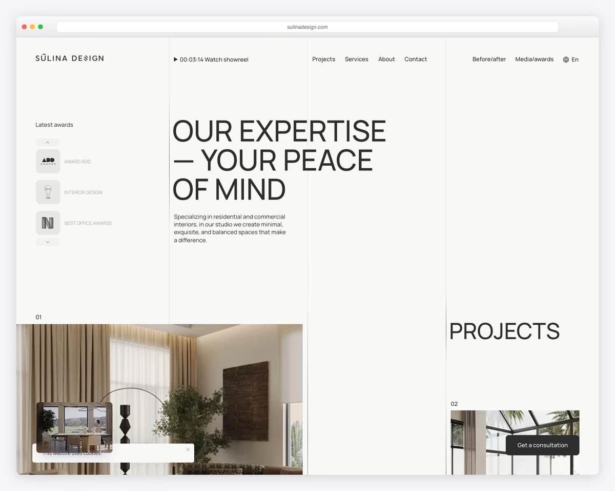
Alina Sulina’s beautiful content reveal function isn’t something you see daily. But it spices the experience up awesomely to keep you around for longer.
Also, the unique grid-style home page has clickable elements if you want to learn more about each project.
The footer section takes quite a lot of screen space, which works so well with the overall website theme.
What stands out: Make your online portfolio website unique with a non-traditional grid.
9. Supercharge
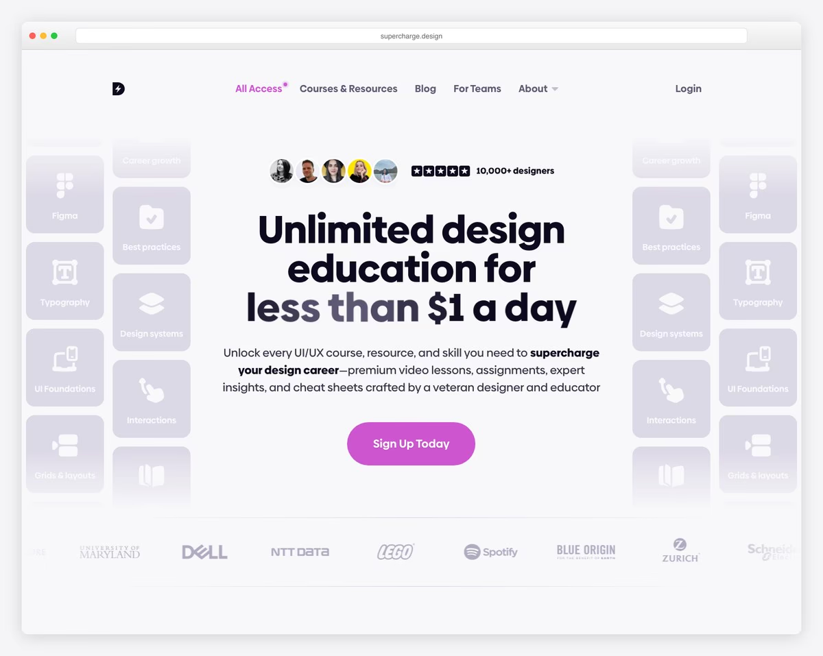
We particularly enjoy Supercharge’s very simple header with a two-part menu section. It takes you to either app’s features or pricing – the most important info. But a CTA button also allows everyone to take instant action.
Plus, they use accordions for an improved UX to give answers to frequent questions.
What stands out: Add a CTA button in the header if you want users to take immediate action.
10. Universal Group
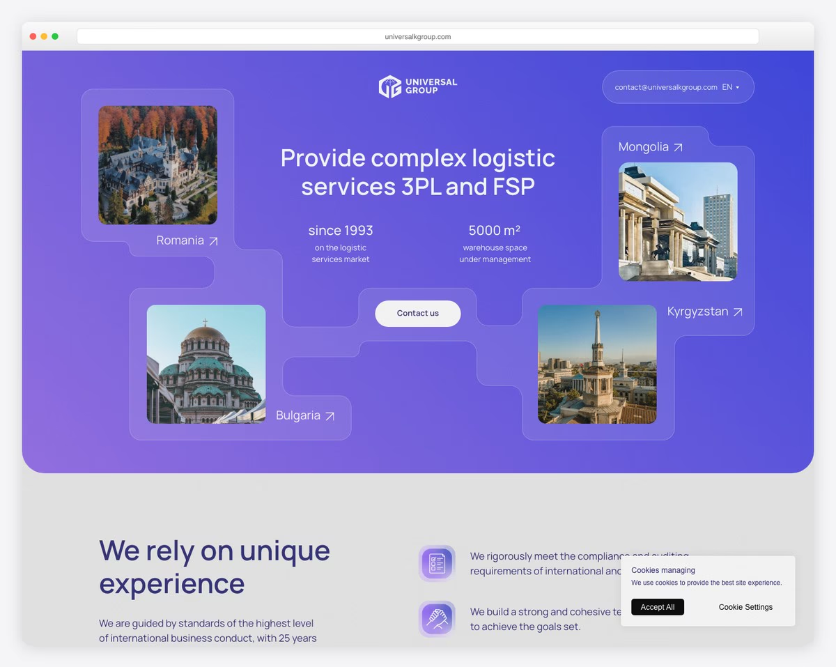
Universal Group uses its website to take you on a journey through its unique services with a modern design and awesome sections that are too good to miss.
The “Contact us” above-the-fold opens a popup with a simple, three-field consultation form that doesn’t waste time.
There’s not much in the header beside the logo, a clickable email and a language picker.
What stands out: Make access to a consultation/contact form available in the hero section if this is your way of doing business.
11. Horomy Studio
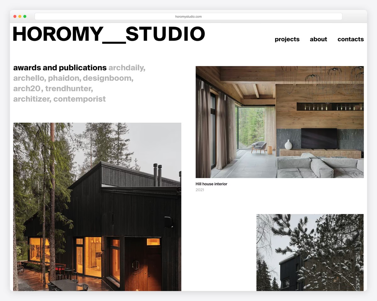
Horomy Studio’s home page is one stunning portfolio of great architectural creations that inspire everyone.
They linked every image to the project page with a complete breakdown, revealing all the details. This allowed them to keep the front page super clean.
Last but not least, the floating header only appears when you start scrolling back to the top.
What stands out: Simplify and beautify your architecture website design with a portfolio of your most epic projects.
12. Premiot

Premiot tells a story with great animations and content that reveals functionality that keeps you engaged throughout the entire scrolling time.
A floating hamburger icon is always present for everyone who wants to learn more, revealing a menu overlay on click.
Premiot’s footer is huge, with a clickable email, phone number, and Google Maps.
What stands out: Integrate Google Maps to showcase your business’s exact location.
13. Creatory

You will find tons of inspiration in Creatory if visual content isn’t your cup of tea. Can a text-heavy website be good? YES!
Creatory doesn’t feel boring at all, thanks to enough white space, text loading on the scroll and animated CTA buttons.
What stands out: Keep it minimalist with a tiny bit of animation for a unique website experience.
14. Real Lingua Club
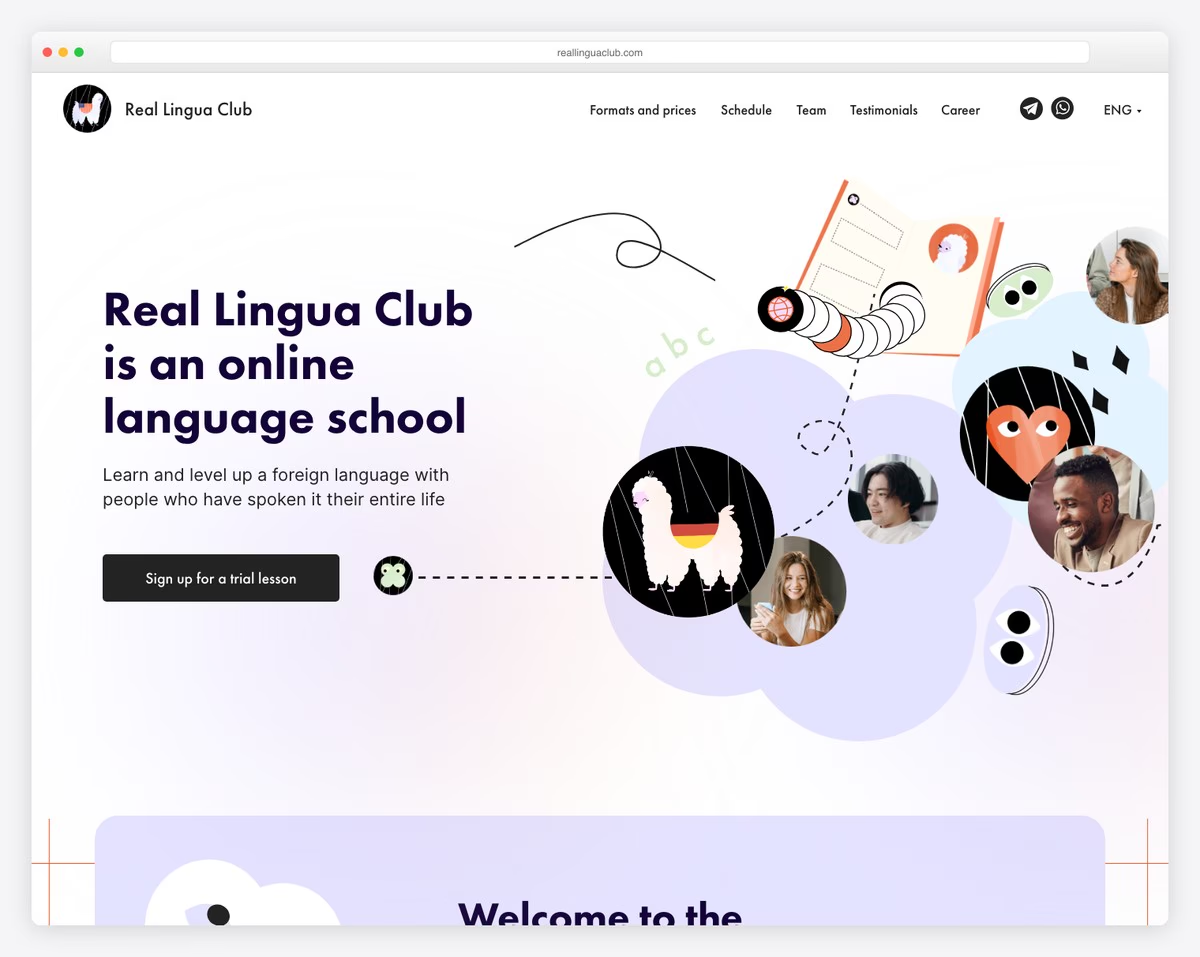
Real Lingua Club’s catchy design grabs everyone’s attention as soon as the website loads. The cool feature is the CTA button that opens a multi-step wizard to sign up for the trial lesson.
While some businesses keep pricing hidden, Real Lingua Club reveals everything. And even though they have multiple options, they stay transparent with it on the front page.
What stands out: Your services and pricing should be available to everyone, even if you offer various options.
15. Fasttrack
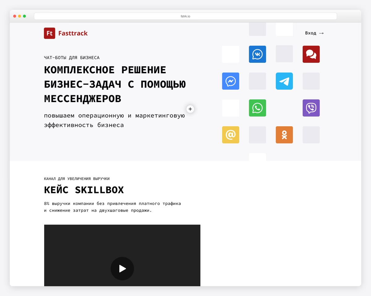
Fasttrack is a chatbot platform offering automated customer engagement, lead generation, and sales through messenger integrations. The Tilda-built landing page uses a clean, modern layout with gradient accents and product mockups to demonstrate the platform’s capabilities.
The single-page design flows logically from problem statement through features to pricing, with animated sections that reveal as you scroll. Clear CTAs and live demo options let visitors experience the product before committing to a plan.
What stands out: A single-page flow that moves from problem to solution to pricing creates a natural sales conversation — visitors don’t need to click around to understand what the product does and what it costs.
16. HeadHunter School
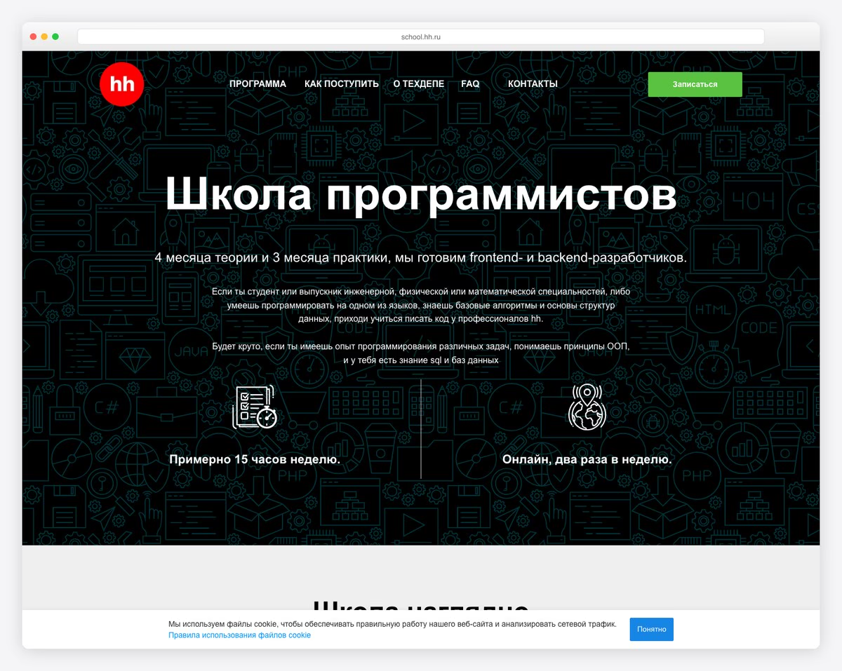
HeadHunter School is a programming school by Russia’s largest job platform, offering intensive developer training programs. The Tilda site features bold typography and a structured layout that clearly presents course options, timelines, and career outcomes.
The design leverages HeadHunter’s brand recognition with prominent placement of the HH logo and employer partnerships. Course pages break down curriculum, schedule, and instructor profiles in an organized format that helps prospective students make informed decisions.
What stands out: Leveraging a parent brand’s job market expertise gives an education platform instant credibility — students know the training aligns with actual employer demands.
17. Bang Bang Education
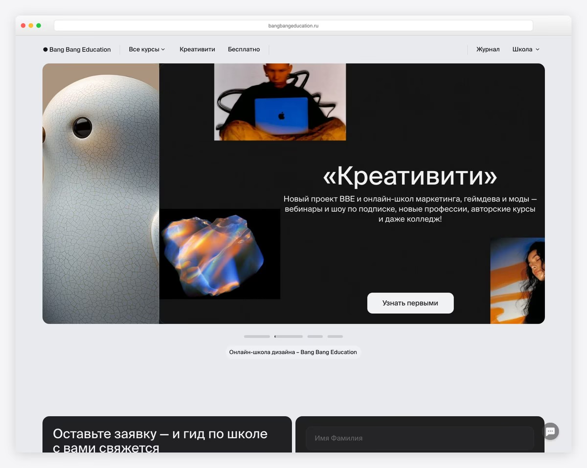
Bang Bang Education is an online design and technology school offering courses in creative disciplines including UX, graphic design, and digital art. The Tilda-built site features a bold, colorful design that practices what it preaches about creative excellence.
The course catalog uses card-based layouts with strong visual hierarchy — each course card features distinctive colors and clear information about duration, level, and pricing. The overall design energy matches the creative audience it serves.
What stands out: A design school’s website serves as portfolio piece #1 — using bold, creative design for the site itself demonstrates the quality of education students can expect to receive.
18. University 2035
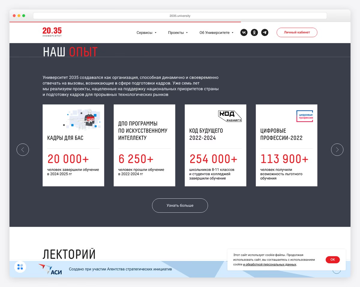
University 2035 is a digital-first university focused on continuous education and professional development in emerging technologies. The Tilda site uses a futuristic design with geometric elements and a modern color palette that signals innovation and forward thinking.
The structured layout presents programs, partnerships, and outcomes in a clean, organized way that builds institutional credibility. The use of data visualizations and statistics about graduate outcomes adds tangible proof of the university’s impact.
What stands out: Using a futuristic, tech-forward design for a digital university reinforces its positioning — the website experience itself signals that this institution is built for the future, not stuck in the past.
Related Posts


Comments (0)