20 Best Black Websites (Examples) In 2026
Looking for black websites examples inspiration? We’ve handpicked the best examples from real websites to help you design something that stands out. Each entry includes what makes it effective and what you can learn from it.
1. Designed By Women
Built with: Craft CMS

Designed By Women is a captivating example of a black website, distinguished by its dynamic and interactive elements.
The site features an animated background that adds depth and engagement, creating a visually stimulating experience.
A prominent “scroll down” button guides users through the content, enhancing user navigation. The website skillfully integrates contrasting light background sections, breaking the dark theme’s monotony and highlighting important information.
Additionally, the site incorporates hover effects that provide interactive feedback, making the UX more intuitive and engaging. Sliding elements further contribute to the site’s dynamism, smoothly transitioning content into view and creating seamless browsing.
What stands out: You can spice a dark layout up with animated and interactive elements, like custom backgrounds and hover effects.
What stands out: Designed By Women has a harmonious blend of dynamic animations, interactive elements, and striking contrast between dark and light sections, creating a visually appealing UX.
2. Vinicius Siega
Built with: Prismic

Vinicius Siega’s website is a remarkable example of a black-themed for its elegant and minimalist design.
It features a full-screen image slider, where each slide smoothly transitions to individual presentation pages on click.
The website’s design is characterized by abundant white space, creating a clean, uncluttered aesthetic emphasizing the content. Despite the small text, it remains legible and practical, contributing to the site’s sleek and modern feel.
A simple menu in the bottom left corner ensures easy navigation without overwhelming the design.
This combination of elements demonstrates how a black website can be functional and aesthetically pleasing.
What stands out: Push your portfolio with an impressive full-screen image (or video) slider on the home page – that’s it!
What stands out: Vinicius Siega’s elegant full-screen image slider, efficient use of white space, and unobtrusive yet functional menu create a sophisticated and user-friendly online presence.
3. Quantox
Built with: Webflow

Quantox’s website showcases a typewriter effect that draws attention to key messages, enhancing user engagement. This Webflow site also features a dynamic video background, adding a layer of visual depth and interest.
Uniquely, the hamburger menu icon is centrally placed at the bottom of the screen, floating elegantly and offering a fresh take on navigation.
The scrolling experience on the site is highly interactive, including horizontal scrolling, which provides a unique way to explore content.
Absence of a traditional header section further emphasizes the site’s modern design approach.
Lastly, the giant but minimalist footer offers essential information without overwhelming the overall design.
What stands out: Create a memorable first impression by incorporating a video background into your black website design.
What stands out: Quantox’s has an original mix of a typewriter effect, video background, innovative navigation, and highly interactive scrolling, creating a modern and engaging site.
4. Darkroom
Built with: Webflow

Darkroom’s website is a prime example of a sophisticated black website featuring several signature elements.
It begins with a cool preloader, setting an engaging tone for the visitor’s journey. The site employs a simple yet effective sticky header, ensuring easy browsing navigation.
Bold typography is a key design aspect, making a striking visual statement and enhancing readability. The animated presentations on the product pages add a dynamic layer, bringing content to life.
The website also boasts a full-screen shopping cart overlay, providing a seamless and immersive shopping experience.
What stands out: Use colorful hover effects to make a more eye-pleasing website.
What stands out: Darkroom mixes seamless integration of a cool preloader, simple sticky header, bold typography, animated presentations, and a full-screen shopping cart overlay, creating an elegant and user-friendly digital experience.
5. Studio Be4
Built with: WordPress

Studio Be4’s website is an exemplary black-themed site celebrated for its sleek design. The header is supersimple, featuring a neatly placed hamburger menu icon, embodying the essence of modern web design.
Accordions are strategically used to present additional content without taking too much space.
The impactful light section will surely capture your attention, which creates a striking visual contrast against the black background.
Moreover, the use of catchy yellow detailing adds a vibrant and energetic touch, enhancing the website’s overall look.
Need more inspiration? Don’t miss the most popular websites using WordPress.
What stands out: If you have a colorful logo, use any colors strategically across your dark site for a fantastic detailing effect.
What stands out: Studio Be4 created a visually compelling website with a minimalist header, handy accordions, striking light sections, and vivid yellow accents.
6. Express Shoe Repair
Built with: WordPress

The Express Shoe Repair website opens with a handy popup notification, immediately providing visitors with essential information.
A key usability feature is the clickable phone number in the navbar, facilitating easy contact for users.
The website also employs a parallax effect, adding depth and a sense of motion to the browsing experience. Testimonials are prominently displayed, instilling trust and credibility in the services offered.
Also, the on-scroll content loading feature enhances the site’s interactivity, revealing content dynamically as the user scrolls.
What stands out: There’s always room for an added touch of creativity and pleasantness with parallax effect.
What stands out: Express Shoe Repair mixes practical features like a popup notification, clickable phone number, parallax effect, and on-scroll content loading, enhancing both user engagement and functionality.
7. Nathan Smith
Built with: Webflow

Nathan Smith’s website is a unique black-themed example, showcasing minimalism and innovation in web design.
The above-the-fold section is elegantly simple, featuring concise text alongside a clickable phone number, email, and Instagram link, facilitating direct communication.
The scrolling effects on the site are highly engaging, adding an interactive dimension to the user experience. A standout feature is the one-of-a-kind endless scrolling, which cleverly rotates the same content, offering a continuous and seamless browsing journey.
The website also features floating header and footer elements that contain only essential links and copyright text, maintaining a clean and uncluttered interface.
What stands out: Do you want to trick your visitors (in a good way)? Then incorporate the “endless” scrolling as Nathan does.
What stands out: Nathan Smith’s website exemplifies the best in black website design with its minimalist layout, engaging scrolling effects, unique endless scrolling feature, and streamlined floating header and footer.
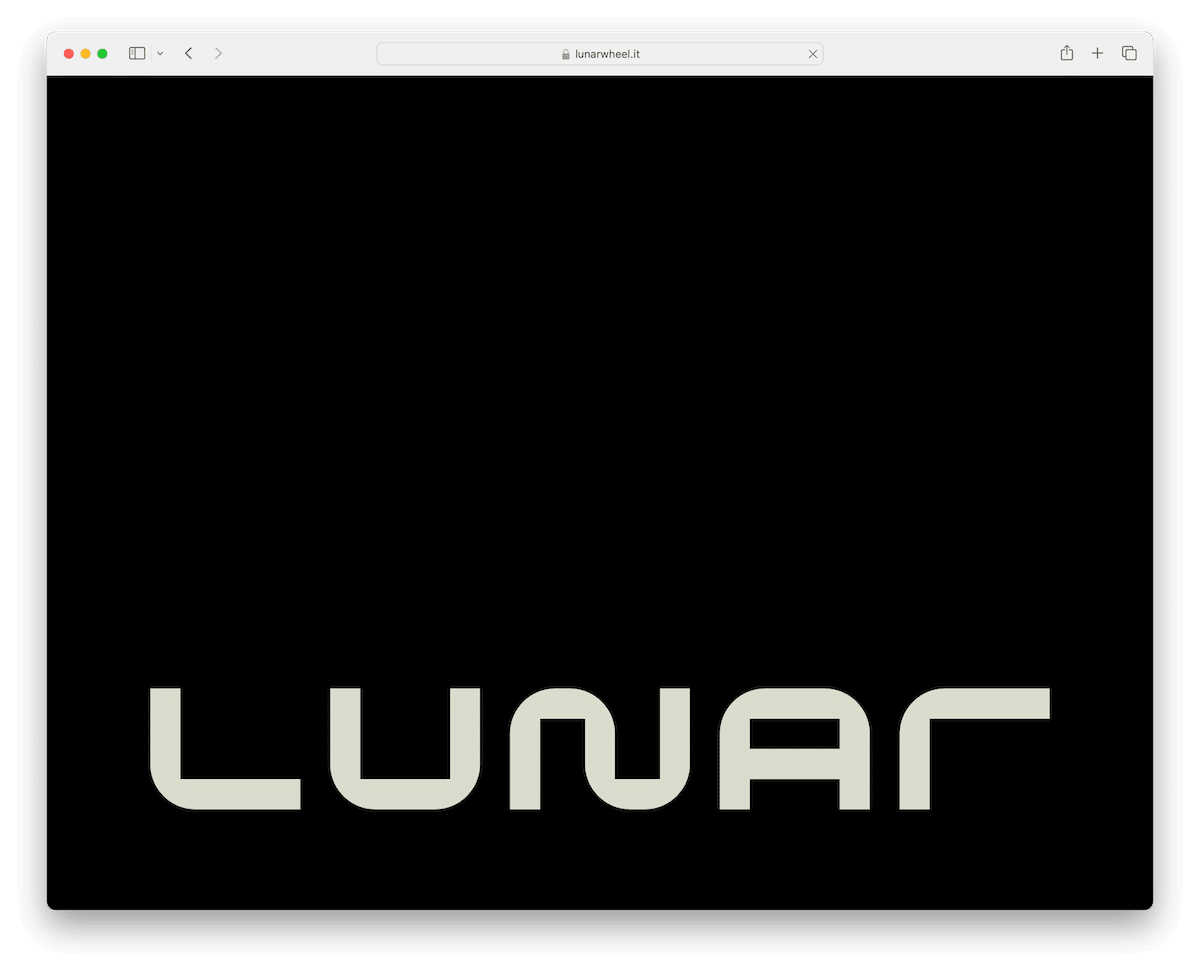
8. Lunar
Built with: WordPress

Lunar’s website is distinguished by its Apple-like super interactive scrolling, which creates a smooth and engaging navigation akin to that of high-end technology platforms.
The site is abundant in animations, adding a dynamic and captivating element to every section, thus enhancing user engagement.
Notably, the website breaks conventional design norms by opting not to have a header, focusing users’ attention directly on the content.
The footer is simple yet modern, providing essential information without distracting from the main content.
This combination of advanced scrolling, lively animations, and a minimalist approach to headers and footers makes Lunar’s website a prime example of how black websites can be technologically advanced and aesthetically pleasing.
What stands out: Create an interactive and immersive scrolling experience that’ll glued visitors to the screen.
What stands out: Lunar’s website has stunning interactive scrolling, vibrant animations, and a minimal yet modern design approach, offering a cutting-edge and visually engaging UX.
9. Twisted Oak Landscaping
Built with: WordPress

Twisted Oak Landscaping’s website contains a full-screen slider above the fold, showcasing stunning images that immediately charm visitors.
A transparent header turns sticky upon scrolling and ensures seamless navigation while maintaining the site’s neat look.
The drop-down menu in the header is well-organized, allowing users to access different sections of the site easily.
Additionally, the categorized portfolio enables visitors to browse various landscaping projects effortlessly.
What stands out: Present your projects, your offerings, or anything else, with a large/full-screen slideshow.
What stands out: Twisted Oak Landscaping’s website is a top example due to its full-screen slider, adaptive transparent-to-sticky header, user-friendly drop-down menu, and well-organized categorized portfolio.
10. The Furrow
Built with: Webflow

At the forefront of The Furrow’s website is a cool animation above the fold, immediately engaging visitors with its dynamic visual appeal.
The site incorporates a sleek hamburger menu, ensuring a clean and minimalist interface while providing easy navigation. The dark and light mode switcher is a distinctive element, allowing users to choose their viewing preference.
Embedded video is seamlessly integrated, adding a multimedia dimension to the content.
Also, the website utilizes a catchy text highlight reveal technique, which cleverly draws attention to the information.
What stands out: Create a sleeker header section with a hamburger menu icon.
What stands out: The Furrow’s engaging animation, convenient hamburger menu, innovative dark/light mode switcher, integrated video, and unique text highlight reveal create a visually stunning atmosphere.
11. Sharam
Built with: Squarespace

Sharam’s website stands out for its straightforwardness and efficiency. The homepage is refreshingly basic, focusing on core content without unnecessary clutter, making it accessible and easy to navigate.
Essential social media and music platform links are prominently displayed, featuring intuitive icons that connect users directly to Sharam’s online presence across various platforms.
The transparent header adds a touch of elegance and modernity, blending seamlessly with the overall design. A strategically implemented floating navigation bar provides constant access to key site sections without intruding on the user experience.
Finally, the basic footer efficiently encapsulates necessary information, maintaining the site’s minimalist aesthetic.
Are you ready for more? Then peek at these awesome Squarespace website examples.
What stands out: You don’t have to feature a ton of content on the home page – incorporate only what is necessary for the ultimate outcome.
What stands out: Sharam’s website has a straightforward design, essential social media links, a plain transparent header, floating navigation, and a minimalist footer, combining to create a clean, user-friendly online look.
12. Carl Cox
Built with: WordPress

Carl Cox’s exceptional black website is characterized by its bold and immersive design.
The site features a striking full-screen background image, prominently displaying the Carl Cox logo and an inspirational quote, instantly conveying his brand’s identity and ethos.
The transparent header maintains the site’s neat style, housing menu links that provide easy navigation to various sections. Social media and search icons neatly integrate into the header, offering quick access to his online platforms and search functionality.
The footer is designed with essential links, ensuring users have all necessary information at their fingertips.
What stands out: Make the header section blend into your website more flawlessly by making it transparent.
What stands out: Carl Cox’s website mixes a captivating full-screen background with a logo, a transparent and functional header, and a well-structured footer, effectively embodying his brand’s essence.
13. Devon Stank
Built with: Squarespace

Devon Stank’s website includes a top bar course notification, immediately alerting visitors to key offerings and updates.
The website starts with a stimulating video background above the fold, engaging users immediately. Additionally, lightbox video functionality enhances the interactive experience, allowing for immersive viewing.
Although slightly small, the typography is excellently chosen, contributing to the site’s lovely appeal.
Pleasant scrolling animations are strategically integrated, adding liveliness to the browsing experience.
Moreover, an Instagram feed is seamlessly incorporated, showcasing the latest updates and maintaining a strong visual connection with the audience.
What stands out: You must pick readable and simple typography for a black website, so it still doesn’t hurt the eyes even if it’s smaller.
What stands out: The combination of a top bar notification, engaging video background, lightbox, well-chosen typography, smooth scrolling animations, and an IG feed create Devon Stank’s website dynamic and visually appealing.
14. Denym Bird
Built with: Carrd

Denym Bird’s website is an exemplary black-themed site, notable for its pleasant split-screen design.
This layout presents an image of Denym on the right side, offering a personal and engaging visual introduction. On the left side, this Carrd website features a concise and informative bio and essential social media, consulting, and contact links, providing visitors with everything they need to know and connect.
The absence of a traditional header or footer contributes to the site’s minimalist and modern aesthetic, focusing the user’s attention solely on the content.
This design choice effectively utilizes space and visual contrast, making Denym’s website a unique and memorable example of how simplicity and creativity can harmoniously blend.
What stands out: Take simplicity up a few notches with a strategic split-screen website layout design.
What stands out: Denym Bird’s website uniquely features a split-screen design with a personal image and bio and eschew traditional headers and footers for a minimalist, focused UX.
15. Anthony Wiktor
Built with: Gatsby

While initially presenting a white background, Anthony Wiktor’s website truly exemplifies a black website with its refined design elements.
The site features a simple, one-link sticky menu, ensuring easy navigation and a clean aesthetic. Portfolio hover effects are a key highlight, adding an interactive layer as users explore his work.
An animated background section adds dynamism and visual interest.
The footer is thoughtfully designed, including social links for connectivity, contact information for accessibility, and a back-to-top button for user convenience.
What stands out: Changing the above-the-fold background color as soon as the user starts scrolling can create a WOW effect.
What stands out: Anthony Wiktor’s website is a premier black website example, blending simplicity with interactive elements and animations, all tied together in a sleek and user-engaging design.
16. Synthese
Built with: WordPress

Synthese’s website makes an instant impression with its active and contemporary design elements.
It features animated objects that add a sense of motion and depth, capturing the visitor’s attention immediately.
Changing text keeps the content fresh and engaging from the start. The site incorporates a hamburger menu for streamlined navigation, complementing its minimalist aesthetic.
The search functionality is uniquely placed on a separate page, complete with popular search recommendations, enhancing UX.
A trendy “timeline” layout presents key information in an interactive and visually appealing manner. Additionally, the feature-rich footer provides comprehensive information without overwhelming the design.
What stands out: Simple animations and special effects (don’t overdo it!) can enhance your site’s UX nicely.
What stands out: Synthese’s website is a top black site example for its engaging animations, dynamic text, user-friendly navigation, and sleek, information-rich layout.
17. Raycast

Raycast is a productivity launcher for macOS and Windows that replaces Spotlight with a supercharged command bar. The website features a striking dark theme with deep blacks and dark blues accented by vibrant neon pinks and greens that create an electric, developer-friendly aesthetic.
The hero section demonstrates the product directly — showing the command bar in action against a dark backdrop. Subtle gradient effects and smooth animations make the dark design feel alive rather than flat, while the neon accents guide the eye to key features and CTAs.
What stands out: Neon accent colors against deep black backgrounds create a “glowing” effect that’s particularly effective for developer tools — it signals technical sophistication and attention to craft.
18. ReelCrafter

ReelCrafter is a portfolio and showreel platform for video professionals, and its dark interface reflects the cinematic world it serves. The deep black background with purple and cyan accents creates a premium, theater-like viewing experience that puts video content in the spotlight.
The homepage features video showreel examples against the dark backdrop, creating a natural “screening room” effect. The gradient color transitions between purple and cyan feel modern and creative without being distracting — perfectly calibrated for a platform serving filmmakers and video editors.
What stands out: A dark “screening room” aesthetic is the perfect design choice for a video platform — it mirrors the experience of watching content in a theater and puts the visual work front and center.
19. Unseen Studio

Unseen Studio is a brand, digital, and motion design studio whose website is a masterclass in dark minimalism. The charcoal background with elegant cream typography creates a refined, high-contrast aesthetic that exudes sophistication and creative confidence.
The site strips away everything unnecessary — centering their name, tagline, and a single navigation element against vast dark space. This bold restraint communicates more about their design philosophy than any portfolio grid could, making the experience itself a showcase of their capabilities.
What stands out: Extreme minimalism on a dark background is a bold design statement — the negative space itself becomes the design, communicating creative confidence and editorial restraint.
20. Superlist

Superlist is a task management and to-do app with a dark navy color scheme accented by vibrant purples, blues, and neon greens. The design feels energetic and modern — a deliberate departure from the clean white interfaces typical of productivity tools.
The homepage uses scroll-triggered animations to progressively reveal features, with each section building on the dark theme with different accent colors. Product screenshots are shown against dark backgrounds that match the app’s own dark mode interface, creating visual continuity between marketing and product.
What stands out: Matching your marketing website’s dark theme to the product’s actual dark mode interface creates seamless visual continuity — visitors experience the product’s aesthetic before they even sign up.
What Makes A Great Black Website?
Let’s unveil the magic behind these stunning black websites by exploring the six key features that make them stand out and captivate users:
- Contrast and legibility: High contrast between text and the black background is essential for readability. Light-colored text on a dark background should be balanced to ensure legibility without causing strain.
- Visual hierarchy: Effective use of size, color, and layout helps create a clear visual hierarchy, guiding the user’s attention to the site’s most essential elements.
- Minimalist design: A clean and minimalist approach works well with black websites, emphasizing content and reducing visual clutter, making the user experience more focused and engaging.
- Imagery and color accents: Strategic use of imagery and color accents can bring a black website to life, adding depth and interest without overwhelming the dark aesthetic.
- Typography: Choosing the right typeface is crucial for black websites. Fonts should be easy to read and aesthetically pleasing against the dark background, enhancing the overall design. Also, designing a website with extra white (or should I say, black) space is beneficial.
- Responsive and fast-loading: As with any website, black websites should be responsive to different devices and screen sizes and optimized for quick loading times to ensure a smooth user experience.
Black Websites FAQs
What is a black website?
A black website typically refers to a website with a predominantly black or dark color scheme. This design choice is often used to create a sleek, modern look, or to reduce eye strain, especially in low-light environments.
Are black websites better for eye strain?
Yes, black websites or dark mode interfaces can reduce eye strain, particularly in dimly lit environments. They reduce the bright light emitted from the screen, which can be easier on the eyes.
Do black websites save energy?
On devices with OLED or AMOLED screens, black websites can save energy because these types of screens turn off pixels to display true black, using less power. However, on LCD screens, the energy saving is minimal.
How does a black website affect readability and user experience?
Black websites can offer improved readability for some users, especially in low-light conditions. However, high contrast between text and background can cause discomfort for others. The user experience can be positive if the website is designed with accessibility in mind, considering factors like contrast, font size, and spacing.
Are black websites popular in web design?
Black websites have gained popularity in web design, especially with the rising trend of dark mode in apps and operating systems. They are often used for artistic, professional, or technology-focused websites to convey a sense of sophistication and modernity.
Related Posts
Comments (0)