25 Best WooCommerce Website Examples 2026
Today, I’m excited to share a curated list of some of the most outstanding WooCommerce website examples.
These aren’t just stores; they’re testaments to WooCommerce’s flexibility, creativity, and robust functionality.
So, if you’re curious about what magic WooCommerce can weave for online shops – you’re in for a treat.
Each website on this list has been selected for its unique approach to eCommerce, showcasing the plugin’s versatility and efficiency.
What stands out: Nearly 30% of all online stores employ WooCommerce.
WooCommerce is a favorite with developers, as it is a malleable, open-source system.
Using extensions that work with the tool, you can extend your store’s functionality. These make it possible to facilitate new features on a website. You can offer bookings, create memberships, manage invoicing, and track the entire delivery process up to your customer’s doorstep.
In short, it is a complete solution for online stores.
Are you ready to explore some really awesome WooCommerce websites?
This post covers:
- Best WooCommerce Website Examples
- 1. Joco Cups
- 2. Porter & York
- 3. Kawaii Box
- 4. Root Science
- 5. Yubico
- 6. April Soderstrom
- 7. Bike-Room
- 8. Terzetto
- 9. Romagnoli
- 10. Terratinta
- 11. American Equus
- 12. Lejasa
- 13. Montvel
- 14. Create Tattoos
- 15. Desi Daru
- 16. Evotion Pro
- 17. Impuzzables
- 18. Next Friday
- 19. Randolph
- 20. Le 7eme Continent
- 21. Garten Eden
- 22. SleepHalo
- 23. Karalyte
- 24. Zeuss
- 25. The Cool Hunter
- How To Make A Website With WooCommerce
- WooCommerce Website FAQs
Best WooCommerce Website Examples
Prepare to be amazed by the versatility and creativity of these online storefronts. Here are some of the best websites using WooCommerce.
1. Joco Cups
Built with: WooCommerce
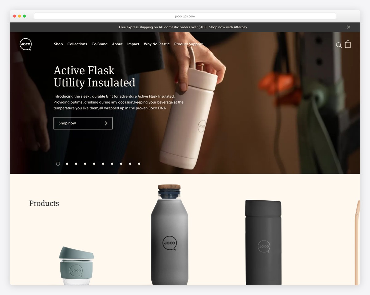
Joco Cups’ WooCommerce site stands out with its sleek design and user-friendly features.
It boasts an engaging slider with clear call-to-action buttons, enhancing user interaction. The site alerts visitors to free shipping through a noticeable top bar notification.
Its transparent header transforms into a solid, sticky one on scroll for easy navigation. The minimalist mega menu offers effortless browsing, while the Instagram feed showcases their community engagement.
Finally, a simple footer with useful links makes site exploration a breeze.
What stands out: Put extra shine on your latest products, special deals or something else with a slider.
What stands out: Joco Cups blends exceptional functionality with an aesthetically pleasing and user-friendly interface.
Revenue: $5.4 million
2. Porter & York
Built with: WooCommerce
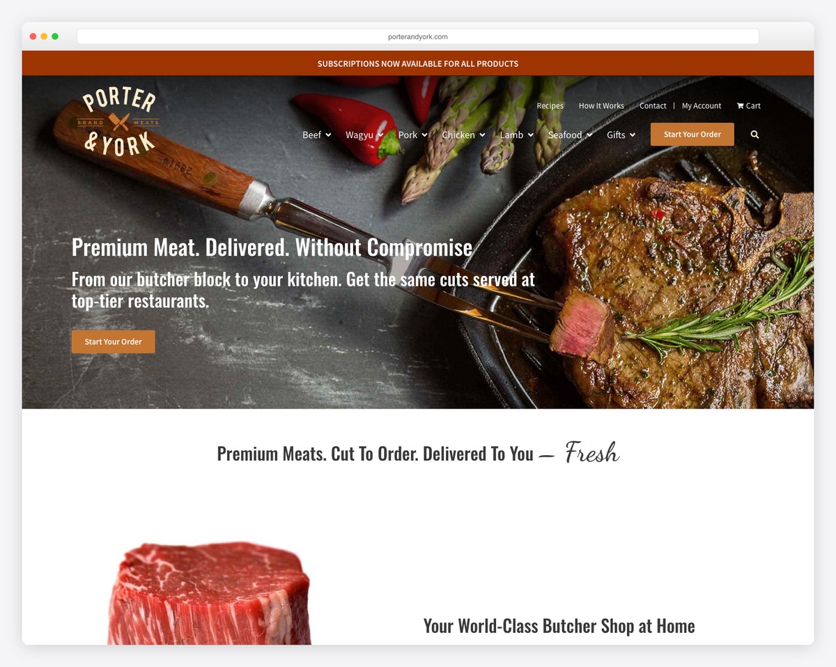
Porter & York’s WooCommerce site captivates with its simplicity and elegance. The streamlined navigation bar features intuitive cart and login icons, ensuring a hassle-free user experience.
A prominent slideshow immediately grabs attention, showcasing their premium products visually appealingly.
The website displays its offerings through a well-organized grid layout, making product selection effortless and enjoyable. This layout highlights each item and enhances the overall look, reflecting the brand’s commitment to quality and style.
What stands out: Create an organized product presentation with a grid layout.
What stands out: Porter & York’s site showcases a perfect blend of elegant design, user-friendly navigation, and handy product presentation.
Revenue: $5M
3. Kawaii Box
Built with: WooCommerce
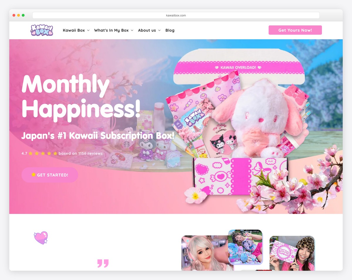
Kawaii Box’s WooCommerce site stands out with its vibrant, colorful design that perfectly captures the brand’s playful essence.
It features an eye-catching top bar notification for promotions and a subscription button, a user-friendly floating drop-down menu for easy navigation, and engaging customer reviews that build trust and community.
A dynamic brand logo slider showcases their diverse range of products, adding visual interest.
Additionally, the transparent pricing plans are clearly displayed, making it easy for customers to make informed choices.
What stands out: A top bar is an excellent way to promote a special deal, free shipping, etc. – especially when it uses a contrasting background.
What stands out: Kawaii Box marries a visually captivating design with user-centric features and transparent pricing, ideal for its niche market.
Revenue: $2-5M
4. Root Science
Built with: WooCommerce
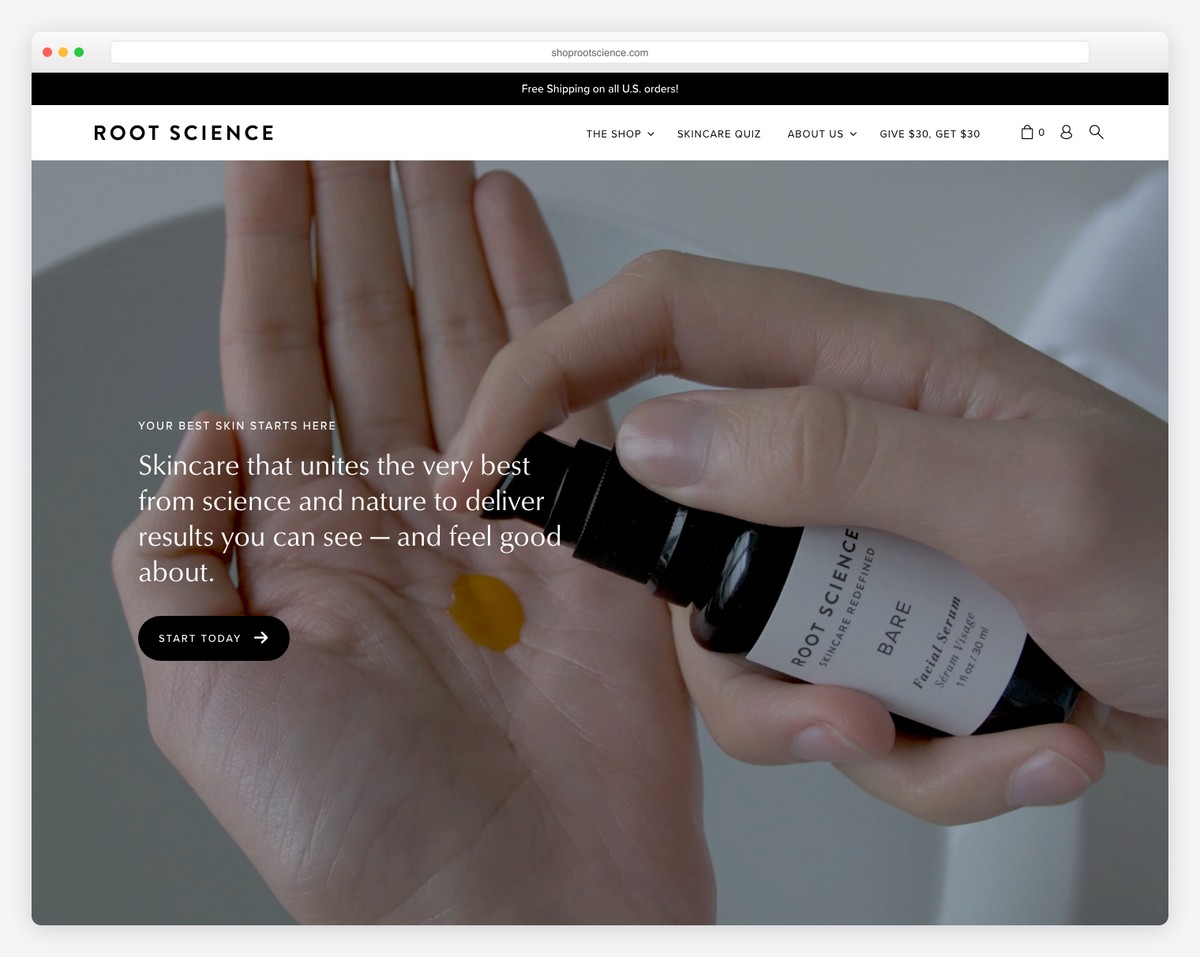
Root Science’s WooCommerce site is a testament to minimalist elegance, featuring a sleek design with plenty of white space that emphasizes its luxury products.
A notification popup offers visitors enticing discounts, while the video background in the above-the-fold section immerses users in the brand’s story and ethos.
The site’s accessibility menu configurator ensures a seamless shopping experience for all users, reflecting the brand’s commitment to inclusivity and thoughtful design in every aspect of its online presence.
What stands out: Expand your user base by integrating an accessibility menu configurator so visitors can adjust your website according to their needs.
What stands out: Root Science’s site combines minimalist design with engaging video elements and enhanced accessibility, setting a high standard in user experience.
Revenue: $2-5M
5. Yubico
Built with: WooCommerce
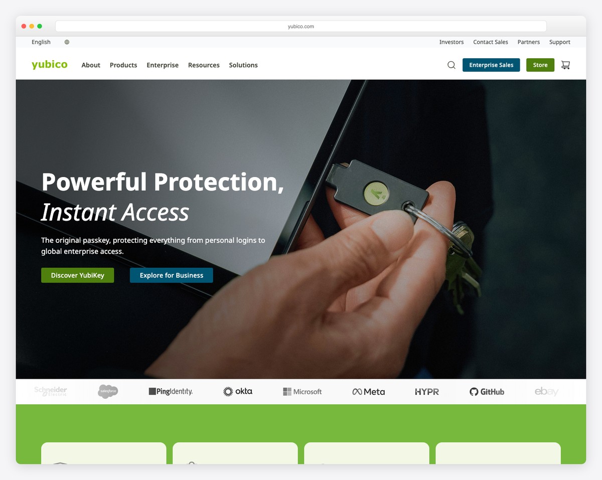
Yubico’s WooCommerce site impressively balances functionality and design, starting with a compelling video presentation above the fold that effectively showcases its products.
The site’s boxed layout brings a structured, professional look, complementing the brand’s tech-oriented image.
Its sticky top and navigation bar ensure constant, easy access to all parts of the site, enhancing user navigation.
And the feature-rich footer is a treasure trove of information, from product categories to helpful resources, making it a comprehensive hub for visitors and customers alike.
What stands out: Incorporate a video above the fold that auto-plays, triggering visitors’ attention right from the get-go.
What stands out: Yubico’s site blends engaging video content with a structured layout and comprehensive navigation for an optimal user experience.
Revenue: $125M
6. April Soderstrom
Built with: WooCommerce
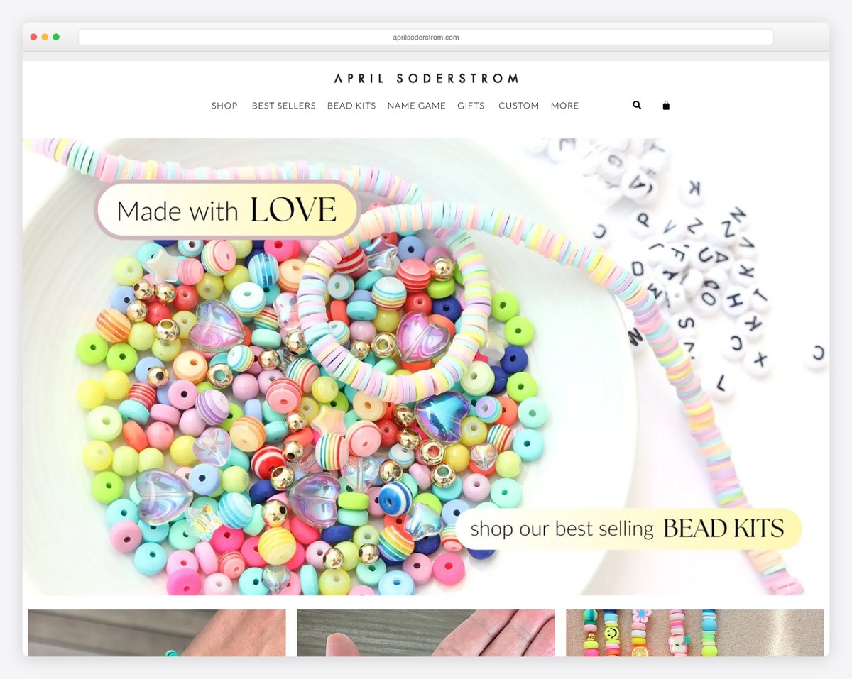
April Soderstrom’s WooCommerce site dazzles with its mix of sophistication and functionality.
The large clickable banner above the fold engages visitors, leading them into a world of exquisite jewelry.
Its minimalist header, featuring a mega menu, provides seamless navigation while showcasing the brand’s elegance.
The website is rich in imagery and utilizes carousels effectively to display products.
Additionally, the footer includes extra handy links, social icons, and a newsletter subscription form, enhancing user engagement and brand connectivity.
What stands out: Integrate a mega menu for a more refined search that boosts the site’s UX.
What stands out: April Soderstrom’s site mixes visual allure with user-friendly features for an engaging and seamless shopping experience.
Revenue: $2M
7. Bike-Room
Built with: WooCommerce
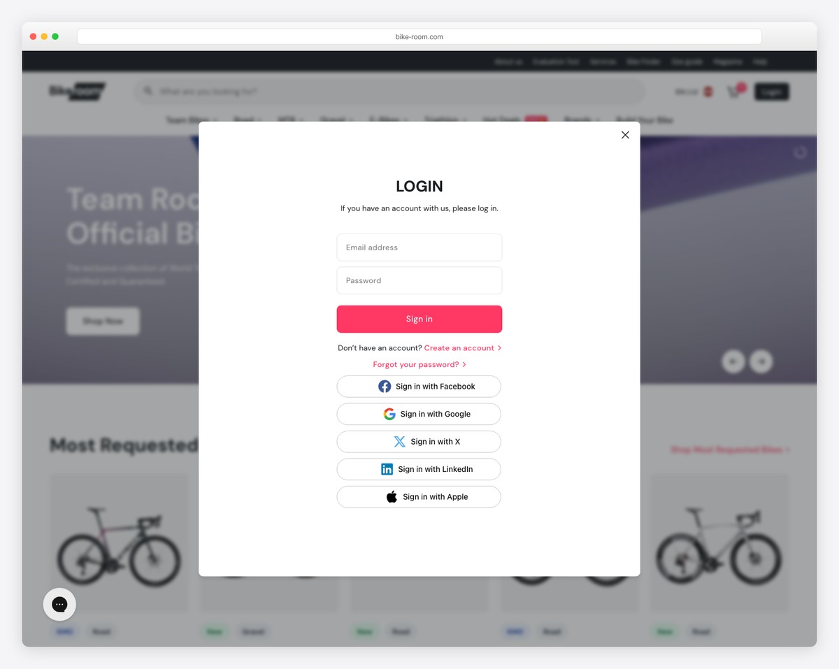
Bike-Room’s site is a paradigm of international customer engagement, starting with a language and currency selector popup, catering to a global audience.
The extensive footer, neatly organizing all product links, ensures effortless navigation. A live chat assistant widget enhances real-time customer support, adding a personal touch.
Moreover, the search bar with live results makes product discovery swift and intuitive.
Video banners add dynamic visual appeal, drawing visitors into the cycling world. These features combine for an outstanding user-centric online shopping experience.
What stands out: An Ajax live search can significantly improve your WooCommerce website’s user experience.
What stands out: Bike-Room exemplifies user-focused features like language selection, comprehensive navigation, and interactive elements, enhancing the global shopping experience.
Revenue: $2M
8. Terzetto
Built with: WooCommerce
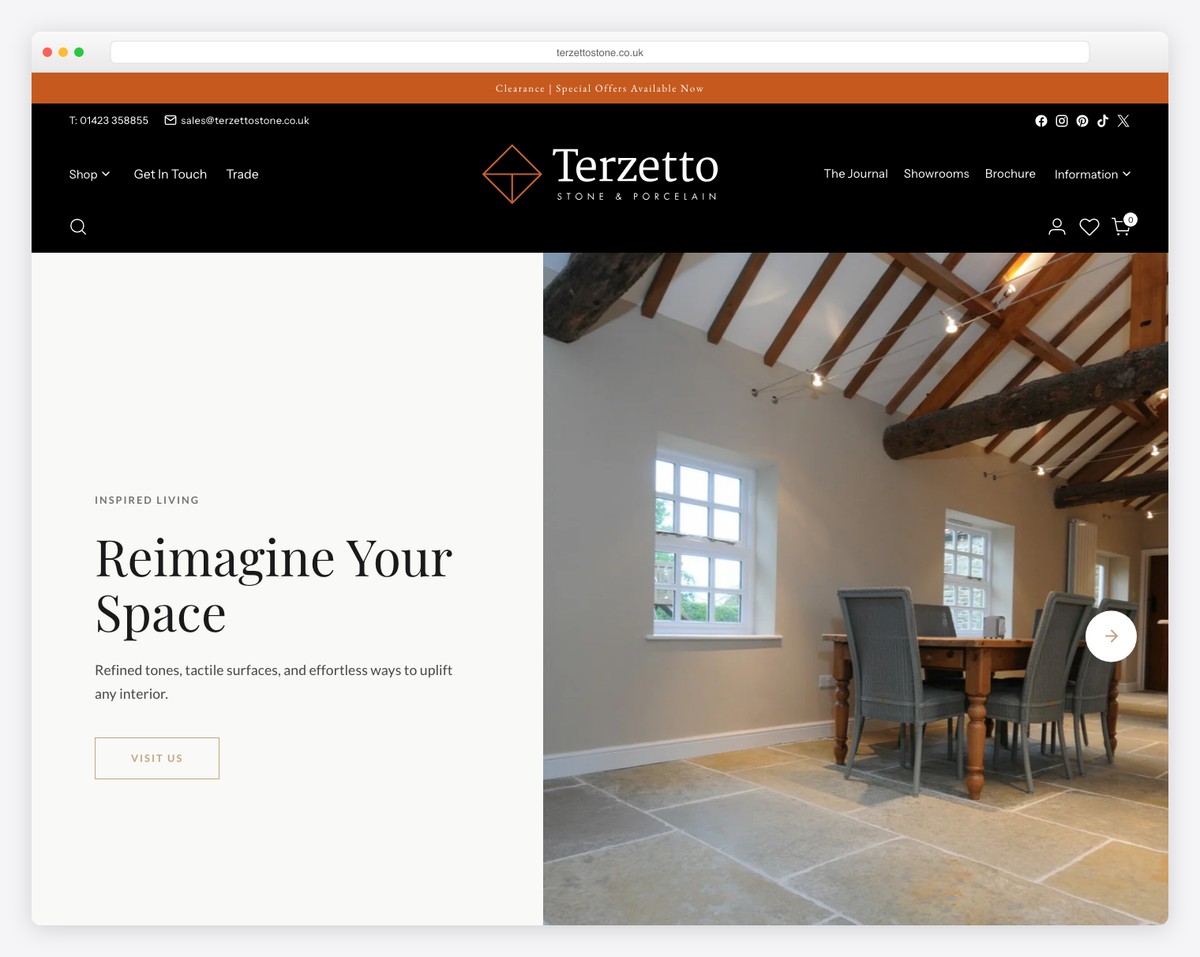
Terzetto’s website captivates visitors with its unique and engaging slider, immediately drawing them into its stylish world.
The top and main navigation bars are cleverly designed to disappear on scroll, reducing clutter, yet reappear on a back scroll for easy access.
Product presentations are enhanced through various carousels, allowing for a dynamic showcase of items.
A testimonial slider adds credibility, while the three-column footer, complete with additional links, social icons, and a subscription form, makes for a comprehensive and user-friendly experience.
What stands out: Ensure your menu is always available with the floating effect. Even better, make the navbar disappear and reappear depending on the scrolling movement.
What stands out: Terzetto’s site has a dynamic user interface, combining innovative navigation solutions and inviting product displays.
Revenue: $3M
9. Romagnoli
Built with: WooCommerce

The Romagnoli WooCommerce site charms with its artistic flair, featuring a cool animated image frame while its background boasts sliding text, adding a dynamic layer to the browsing experience.
A transparent sticky header offers seamless navigation while maintaining the site’s elegant look. In addition to that, the hamburger menu ensures a clutter-free interface.
This combination of innovative animations, minimalist design, and functional navigation makes the Romagnoli site a remarkable example of a creative and user-friendly eCommerce site.
What stands out: You can always add special animations and effects to spice up the experience – just don’t overdo it.
What stands out: Romagnoli’s site incorporates artistic animations and minimalist design for a uniquely attractive and streamlined shopping experience.
Revenue: $40M
10. Terratinta
Built with: WooCommerce
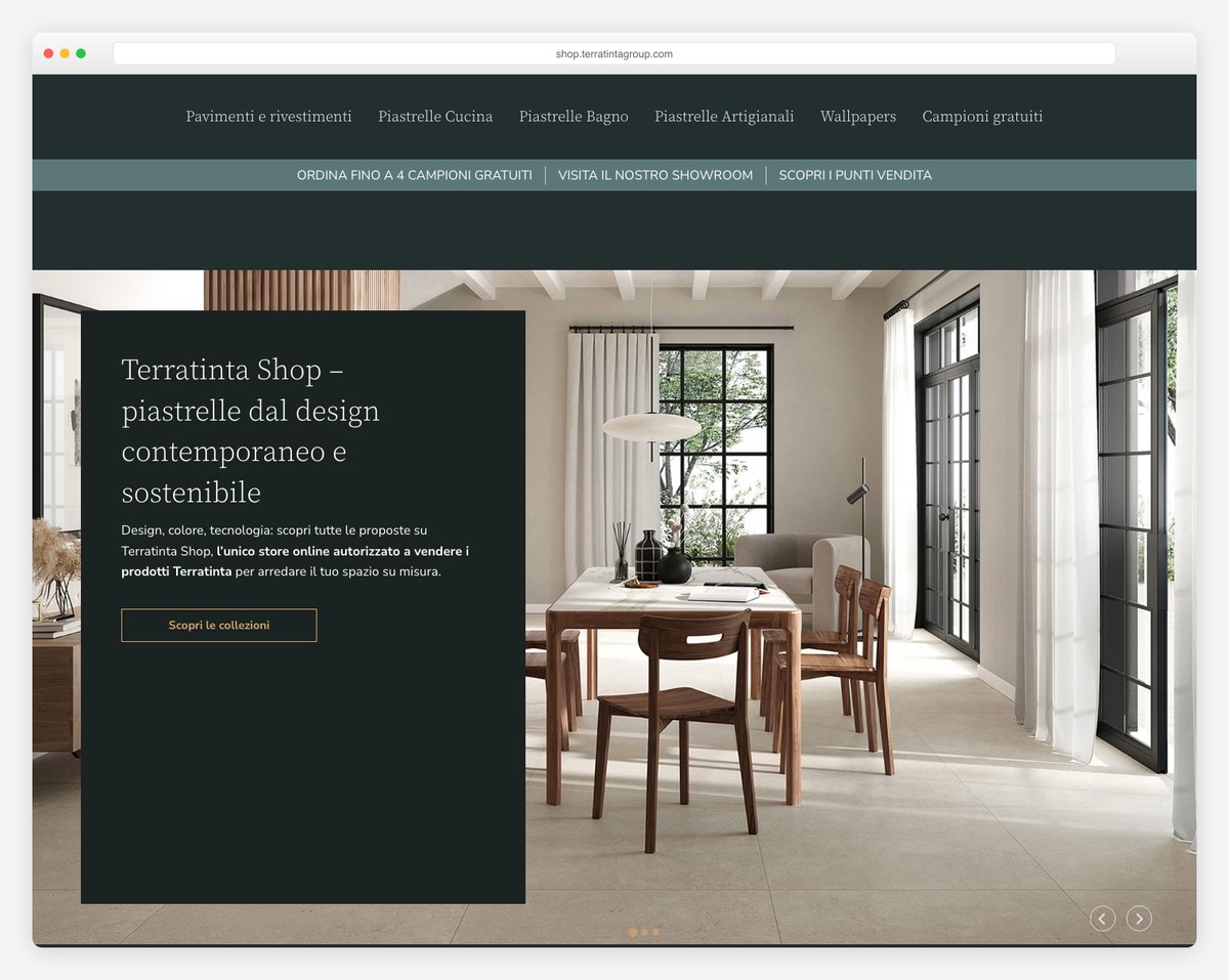
Terratinta’s WooCommerce site strikes a harmonious balance between style and functionality. It features a mega menu for effortless navigation across a wide range of products.
The design is cohesive, maintaining the same color background in the header, base, and footer, which underscores the brand’s identity.
The original split-screen slider above the fold provides an engaging visual experience, while the sticky WhatsApp chat widget ensures constant, convenient customer interaction.
Additionally, the lightbox gallery elegantly showcases their products, enhancing the overall UX.
What stands out: The same background across all sections of your website creates a sleeker appearance.
What stands out: Terratinta’s site displays design coherence and user engagement through its innovative split-screen slider, unified color scheme, and interactive features.
Revenue: $360M (group revenue)
11. American Equus
Built with: WooCommerce
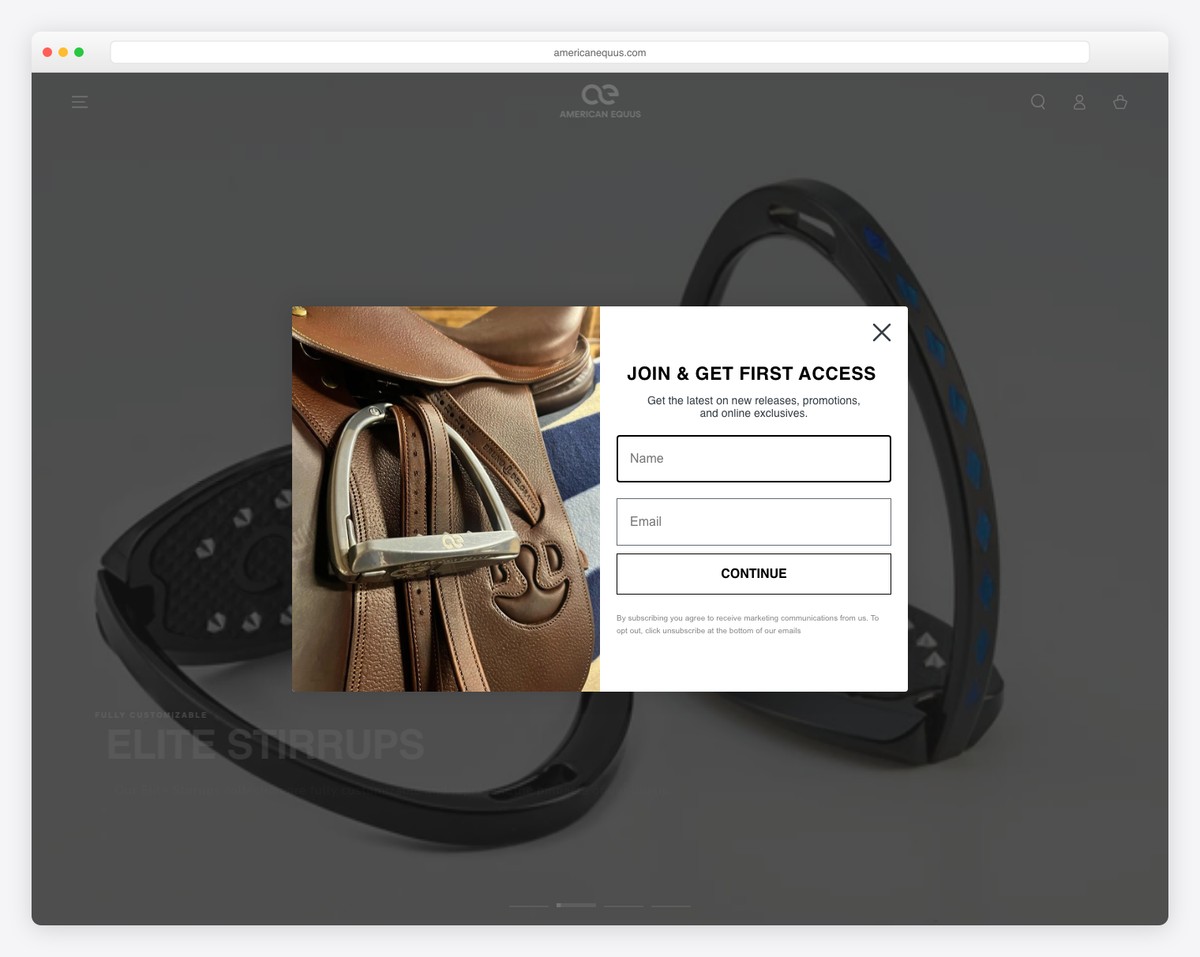
American Equus’ WooCommerce site welcomes visitors with a newsletter subscription popup, encouraging immediate engagement.
The video background adds a dynamic, immersive element, capturing the brand’s essence. Its multi-part header is clean and user-friendly, ensuring seamless navigation.
The full-width layout with large, captivating images showcases their products splendidly.
And a multi-column footer with handy links and business contact details provides all necessary information in a neat, accessible format.
What stands out: Use a popup strategically to capture more visitors’s emails for future campaigns.
What stands out: American Equus fuses a visually rich full-width layout with practical features for lively and user-friendly online shopping.
Revenue: $5.4M
12. Lejasa
Built with: WooCommerce
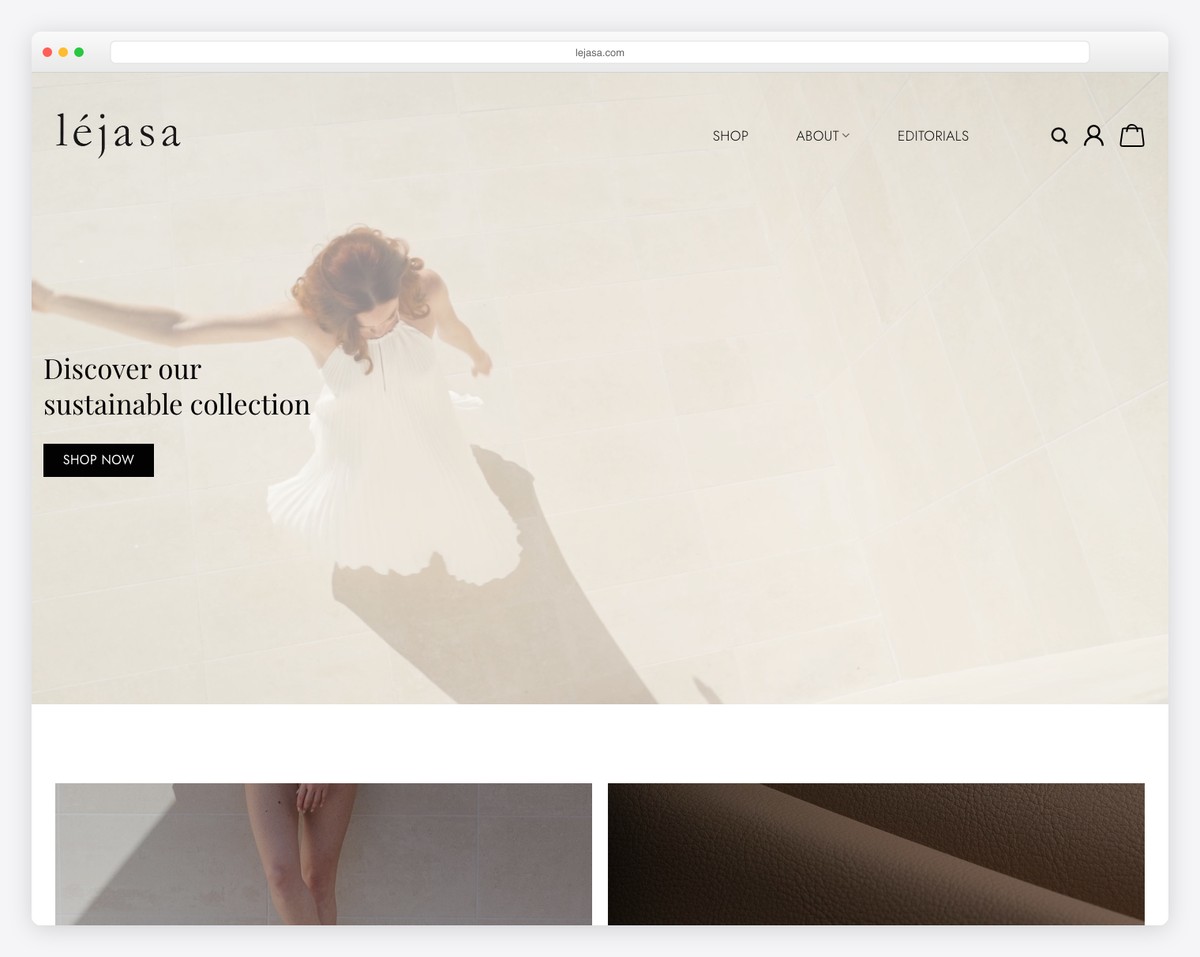
Lejasa’s amazes with a compelling video above the fold, complete with text and a clear call-to-action, instantly engaging visitors.
The transparent header, adorned with a straightforward menu and essential icons for search, profile, and cart, exemplifies elegant simplicity. (And it floats when you scroll.)
Its use of the parallax effect adds depth and a modern touch to the browsing experience.
A convenient back-to-top button and an accessible contact form in the footer enhance user interaction, making the site aesthetically pleasing and functionally robust.
What stands out: Use a back-to-top button so visitors can quickly return to the top (but it might not be necessary if using a floating header).
What stands out: Lejasa’s site shines with a captivating video, a clean design, and user-friendly features, setting a high standard for a modern WooCommerce experience.
Revenue: Under $2M
13. Montvel
Built with: WooCommerce
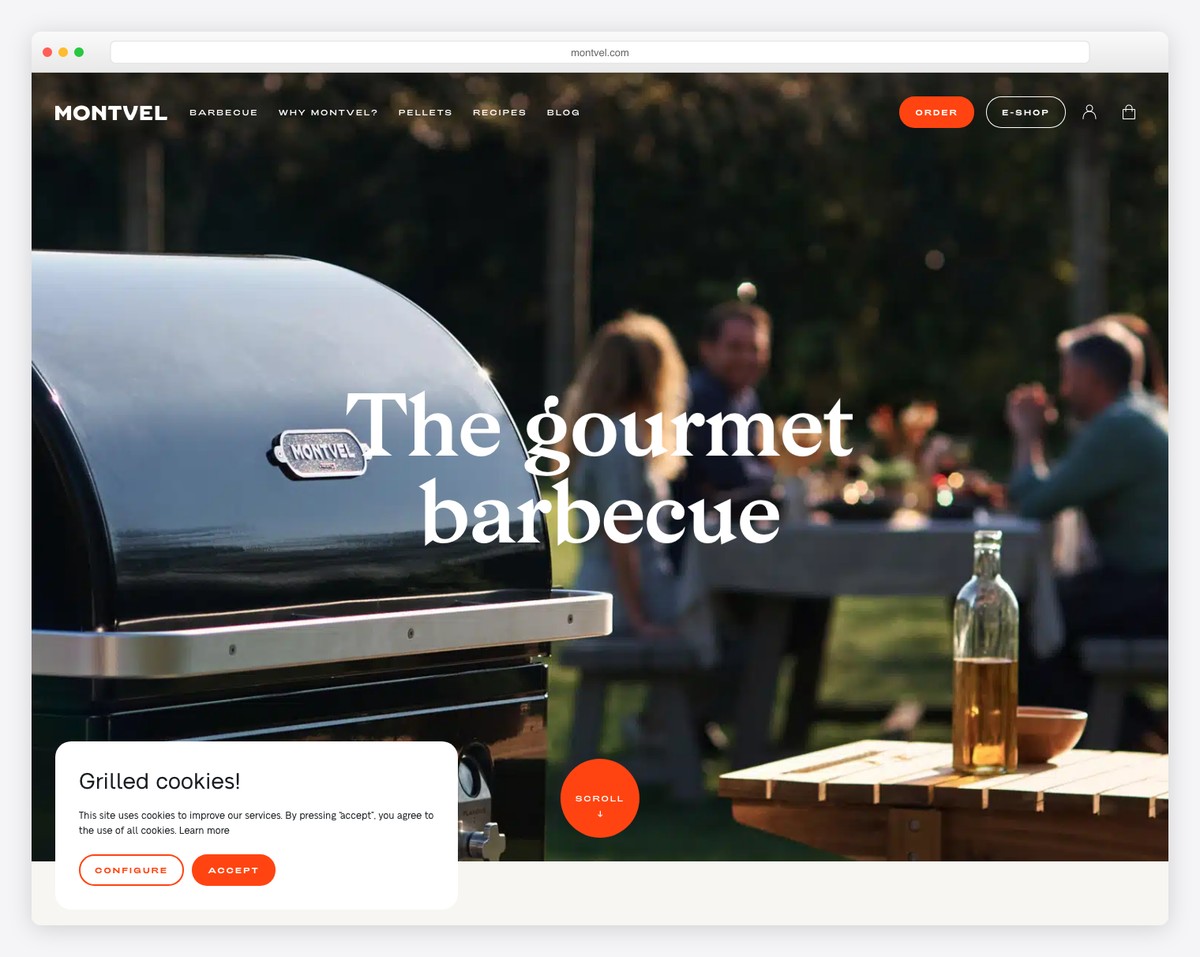
Montvel’s site showcases modern web design, featuring a striking parallax background above the fold that creates a sense of depth and movement.
The contrasting top bar notification catches the eye, while the cleverly designed navigation bar that disappears and reappears enhances the browsing experience.
Scrolling animations add a dynamic touch, and quick video demonstrations provide an engaging way to showcase the product.
Catchy typography and a floating chat widget enhance the site’s appeal, blending style with functionality.
What stands out: Use video to demonstrate the product(s) in use.
What stands out: Montvel’s site seamlessly integrates dynamic design elements like parallax backgrounds and scrolling animations for an immersive and interactive UX.
Revenue: $500,000
14. Create Tattoos
Built with: WooCommerce
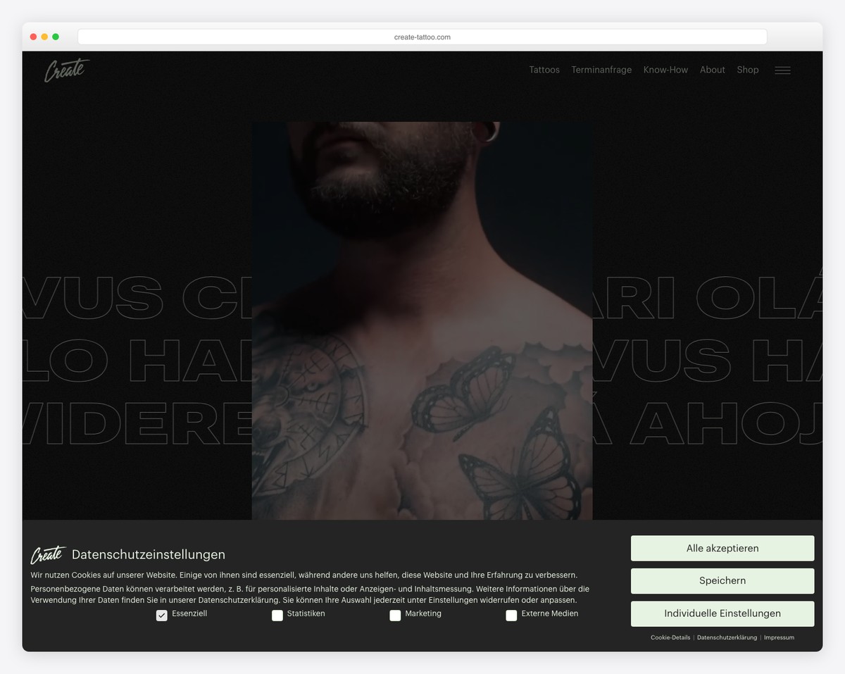
Create Tattoos’ website captures attention with its animated image collage, setting a creative and dynamic tone.
The background features animated text, adding an edgy, artistic flair. Its full-screen hamburger menu reveals a split-screen design, offering a unique and immersive navigation experience.
The site’s impressive dark design stands out, providing a visually striking contrast highlighting their products and brand identity.
In the distinct footer, visitors find neatly organized contact details and links, making information accessible while maintaining the site’s bold aesthetic.
What stands out: If everyone in your industry uses a light website design, it might be time for you to go against the grain with a dark one. (See more fantastic black website examples.)
What stands out: Create Tattoos’ site represents a unique blend of artistic flair and modern design, using animated elements and a bold dark theme.
Revenue: $200,000
15. Desi Daru
Built with: WooCommerce
Desi Daru’s site instantly amazes visitors with a gripping full-screen image above the fold, showcasing the brand’s unique identity.
A notification bar informs customers about free delivery, boosting the shopping experience.
The simple transparent menu adds to the site’s modern and uncluttered feel, ensuring easy navigation.
Moreover, its distinct triangular footer design is both visually appealing and functional, housing essential links and information.
What stands out: Create and strong and lasting first impression by adding a full-screen image above the fold.
What stands out: Desi Daru’s site mixes up an eye-catching full-screen image, user-centric features, and a unique footer design for a distinct and engaging online presence.
Revenue: $300,000
16. Evotion Pro
Built with: WooCommerce

Evotion Pro’s WooCommerce site is a testament to sleek and interactive design. It features an engaging slider at the forefront, seamlessly leading visitors into a product carousel that showcases their popular offerings dynamically.
The website is enhanced with subtle animations that enrich the scrolling experience, adding a touch of sophistication.
A standout dark footer contrasts sharply with the rest of the site, drawing attention to important links and information.
Additionally, the search bar with live results ensures smooth and efficient product finds.
What stands out: Use a carousel to display the most popular, latest, or discounted products without taking up too much space.
What stands out: Evotion Pro’s site skillfully joins interactive elements like sliders and animations with a sleek design for a captivating user journey.
Revenue: $1M+
17. Impuzzables
Built with: WooCommerce
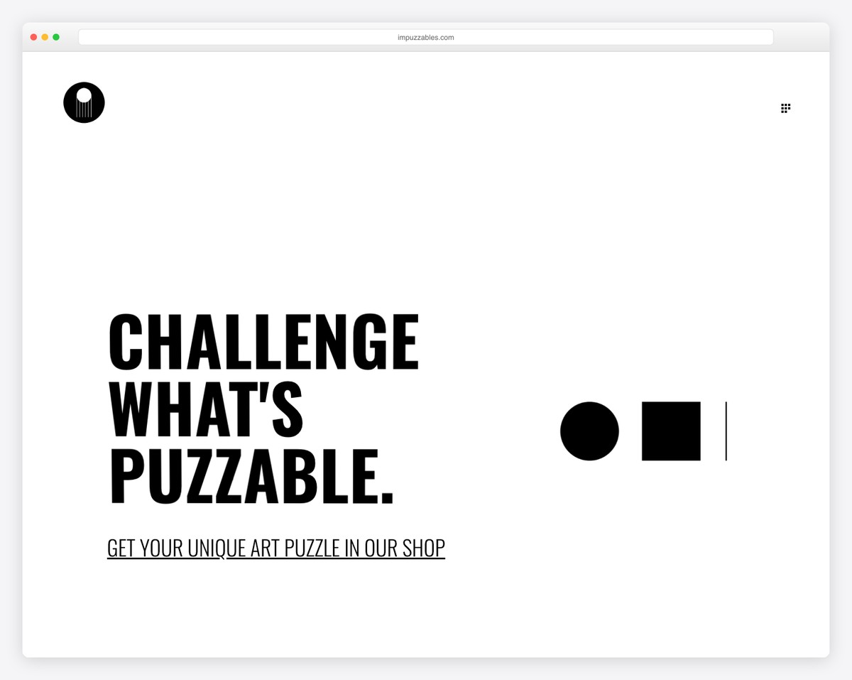
Impuzzables grabs interest with its minimalist design, which uses bold typography and generous white space to create a clean, focused user experience.
The floating Messenger widget adds a layer of real-time customer engagement, while the overlayed hamburger menu contributes to the site’s sleek, uncluttered look.
A large slideshow effectively showcases products in action, capturing visitor interest.
Finally, the contrasting footer sharply differentiates itself from the main content, neatly housing essential links and information, thus balancing class with practicality.
What stands out: You can still create a strong first impression with just text above the fold.
What stands out: Impuzzables impresses with its minimalist design, engaging product showcase, and user-friendly features.
Revenue: $300,000+
18. Next Friday
Built with: WooCommerce

Next Friday’s WooCommerce site is a bold statement in web design, featuring a custom middle-finger mouse cursor that adds a quirky, rebellious touch.
The sliding text beneath a minimal menu captures attention while maintaining a clean look.
Unique frames around sections and elements give the site a cool, edgy aesthetic, distinguishing it from more traditional designs.
Standout call-to-action buttons are strategically placed, ensuring they catch the user’s eye and encourage interaction, all contributing to a memorable and unconventional online shopping experience.
What stands out: While you keep the site design clean and minimal, you can spice it up with a custom cursor.
What stands out: Next Friday’s site’s bold, unconventional design elements with interactive features create a distinct online presence.
Revenue: $100,000+
19. Randolph
Built with: WooCommerce
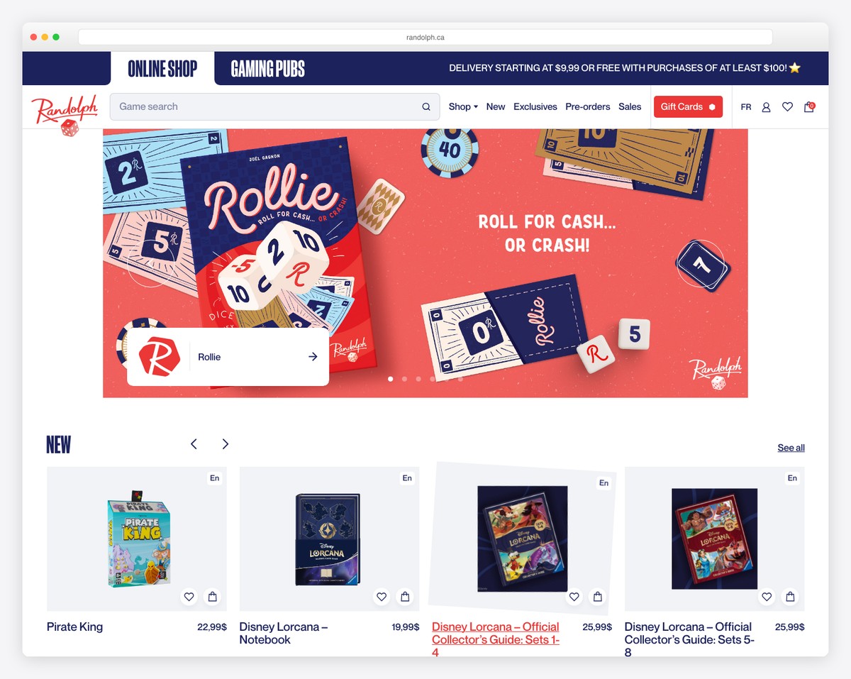
Randolph’s WooCommerce site is a masterclass in organized and stylish design. The two-part menu efficiently separates main business sections from essential elements like the search bar, links, and a prominent CTA button, facilitating seamless navigation.
A sleek slider at the top introduces visitors to key offerings, while multiple carousels elegantly display products, allowing customers to easily browse and select.
The large footer is a resource hub packed with extra links, social icons, and a subscription form, making it functional and engaging for users.
What stands out: Create a main and secondary menu to add an extra layer of organization to your website.
What stands out: Randolph’s site offers a well-structured layout, intuitive navigation, and visually appealing product displays for an optimal online shopping experience.
Revenue: $2.2M
20. Le 7eme Continent
Built with: WooCommerce
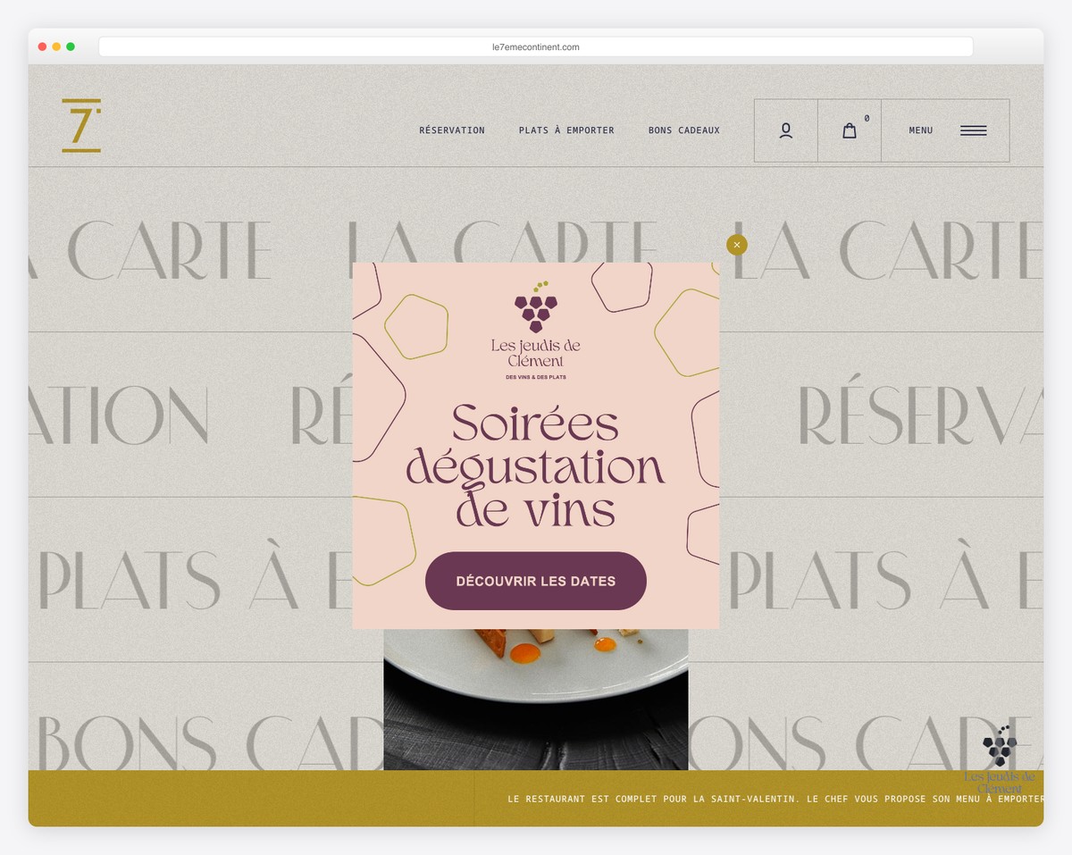
Le 7eme Continent mesmerizes with its striking homepage design, where animated, clickable text comes alive on hover, creating an interactive and engaging user experience.
The main menu is neatly organized, offering straightforward navigation and a convenient, floating hamburger menu for additional options.
Using image and text parallax effects adds depth and a modern touch, enhancing the site’s visual appeal.
What stands out: Add interactivity and liveliness to your website design with hover effects.
What stands out: Le 7eme Continent’s site showcases innovative design with interactive elements like animated text, parallax effects, and liveliness through hover effects.
Revenue: $100,000+
21. Garten Eden
Built with: WooCommerce
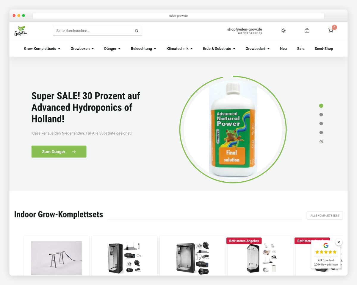
Garten Eden’s WooCommerce site’s user-friendly features and elegant design stand out.
The search functionality with live results makes product discovery effortless and efficient. Plus, a comprehensive mega menu provides easy navigation across various offerings.
Also, essential contact details are thoughtfully placed in the header for quick access.
The site features a smooth slider and various carousels that neatly categorize products, enhancing the browsing experience.
A basic footer wraps up the site, providing necessary links without overwhelming the user.
What stands out: Make your contact info clearly visible by placing it in the header section.
What stands out: Garten Eden’s WooCommerce site has seamless navigation, efficient search functionality, and intuitive product presentation.
Revenue: $500,000+
22. SleepHalo
Built with: WooCommerce
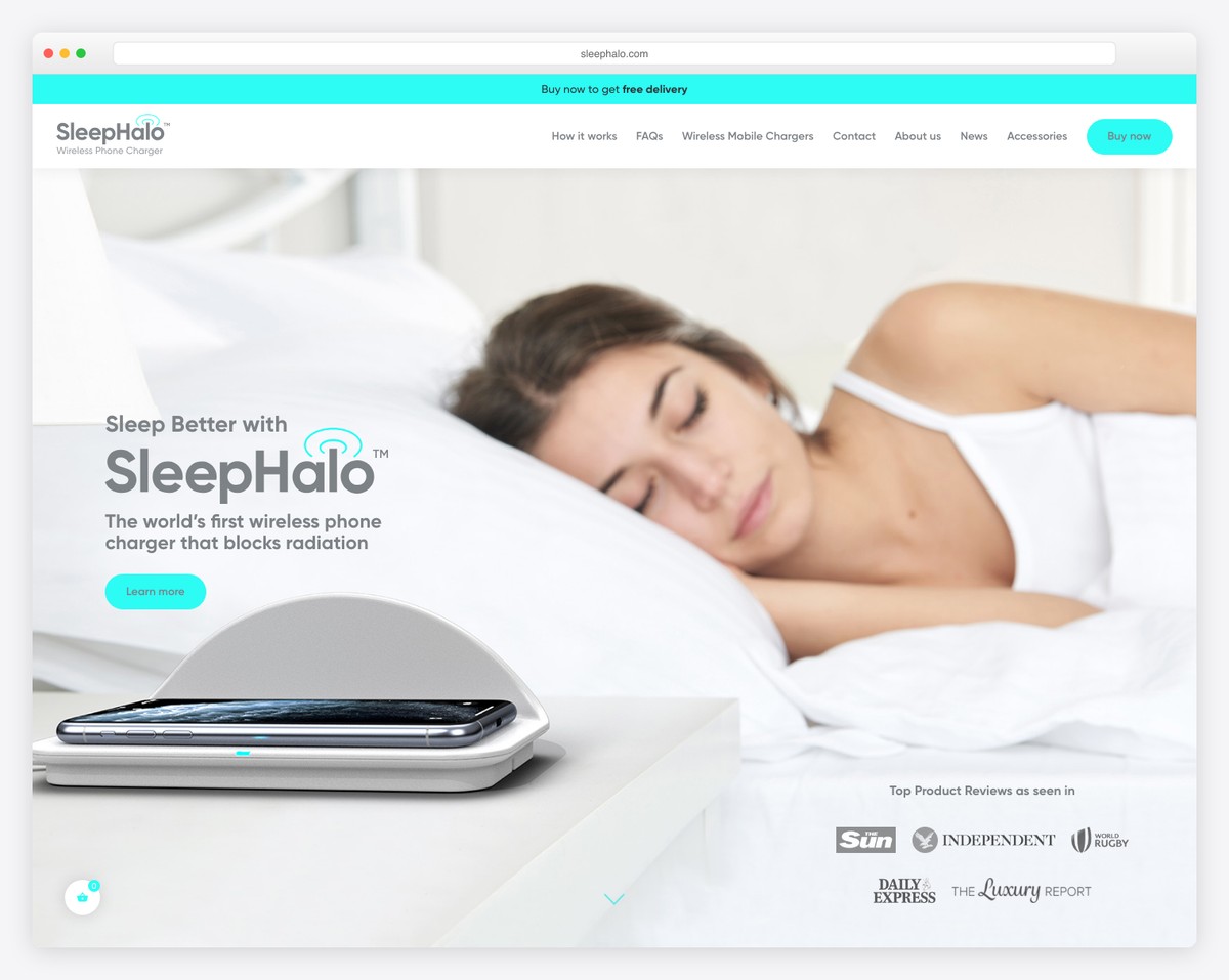
SleepHalo’s WooCommerce site is a marvel of functionality and design. It features a top bar notification for key announcements and a main menu that smartly incorporates a “Buy Now” CTA button, facilitating instant purchasing decisions.
Moreover, a convenient floating widget in the bottom right corner allows for quick product purchases.
The site showcases its products through a detailed slider and an embedded promotional video, providing an immersive experience.
An animated “how-it-works” section effectively communicates the product’s unique features, enhancing customer understanding and engagement.
What stands out: Ensure your “Buy Now” buttons are clearly visible, especially if selling only one product.
What stands out: SleepHalo’s site has strategic CTAs, engaging visuals, and informative animations for an effective and user-friendly online shopping experience.
Revenue: $6.2M
23. Karalyte
Built with: WooCommerce
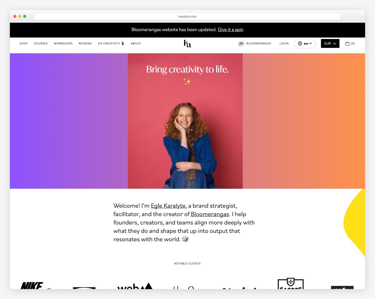
Karalyte’s WooCommerce site impresses with its unique mobile-like design, featuring rounded corners that give it a modern and approachable look.
The simple navbar is cleverly designed to disappear and reappear based on the user’s scrolling, ensuring a seamless browsing experience.
A time-adjusted newsletter subscription popup engages visitors at the right moment.
The clean footer, dominated by a large subscription form and a small bottom bar with social icons and essential links, balances functionality and design, creating a streamlined and user-friendly interface.
What stands out: Creating rounded corners is a simple method to instantly make your website look more modern.
What stands out: Karalyte’s site pops with an innovative mobile-like interface, intuitive navigation, and well-timed engagement features, offering a seamless and contemporary UX.
Revenue: $350,000
24. Zeuss
Built with: WooCommerce

Zeuss’ WooCommerce site welcomes you with a unique split-screen homepage. It allows users to choose between male and female product lines, enhancing the shopping experience with targeted browsing.
Each section cleverly reveals additional categories on hover, streamlining the product search process.
Moreover, the chat widget in the bottom right corner offers immediate customer support.
Also, horizontal and vertical scrolling and content that appears as you scroll create a dynamic browsing journey.
Transparent pricing plans are clearly laid out, ensuring an honest and straightforward shopping experience.
What stands out: Horizontal and vertical scrolling adds life to your website and adds a layer of interactivity with content loading on scroll.
What stands out: Zeuss’s site delivers a unique split-screen approach, intuitive category navigation, and dynamic scrolling for innovative and efficient online shopping.
Revenue: Unknown
25. The Cool Hunter
Built with: WooCommerce
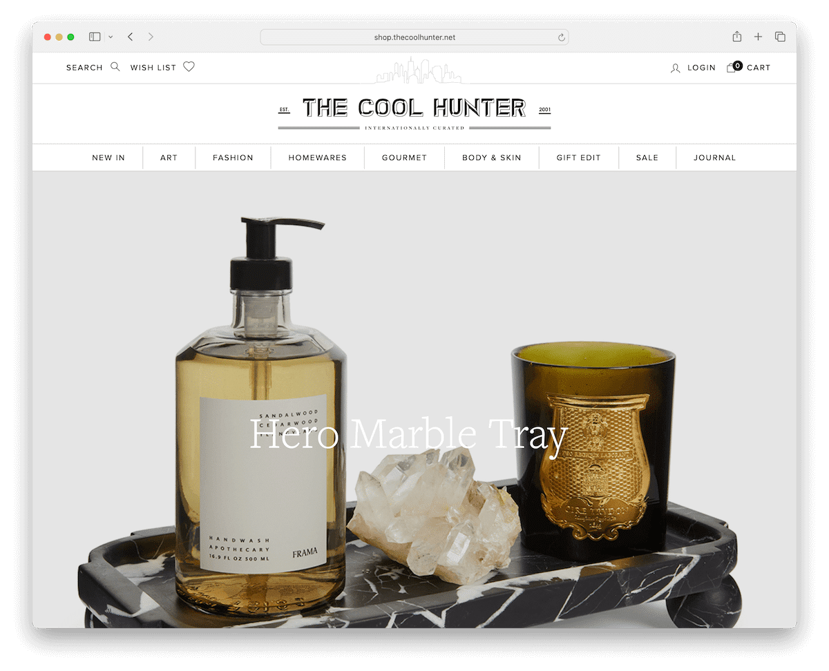
The Cool Hunter’s WooCommerce site example blends sleek design and user-friendly functionality.
Its search bar slides in from the right, offering suggested searches to simplify product discovery. The mega menu provides extensive navigation options with images and links.
Then, a large slider with clickable slides captures attention, while hover effects reveal secondary images, adding an interactive layer to product browsing. (For the slider, we would suggest adding a CTA button to each slide.)
Finally, the clean footer is a trove of information, including business hours, contact details, and social icons, all presented in an accessible format.
What stands out: Ensure search functionality is clearly visible and easy to use – especially on an eCommerce site.
What stands out: The Cool Hunter’s site excels in WooCommerce design, combining an innovative search feature, interactive elements, and comprehensive footer information.
Revenue: Unknown
How To Make A Website With WooCommerce
- Choose a domain name and hosting provider: Select a memorable domain name (use a domain name generator) for your website and choose a reliable hosting provider that supports WordPress and WooCommerce. (Take a peek at these epic WooCommerce hosting providers.)
- Install WordPress: Install WordPress on your hosting account. Many hosting providers offer a one-click installation process for WordPress.
- Select a WordPress theme: Choose a WooCommerce WordPress theme, which will save you plenty of time and effort. You can also start with a free theme, but we recommend it only for super basic stores.
- Install WooCommerce: Install the WooCommerce plugin from the WordPress dashboard. Go to “Plugins” > “Add New” and search for WooCommerce – then install and activate it.
- Set up your store: Follow the WooCommerce setup wizard to configure your store. This includes setting up your location, currency, payment methods, and shipping options.
- Add products to your store: Create product listings by going to the WooCommerce section in your WordPress dashboard and clicking on “Add Product.” Provide details such as product names, descriptions, prices, and images.
- Customize and test your website: Customize your store’s design and layout using your theme’s options and additional plugins. Test your website thoroughly to ensure everything works correctly, including the checkout process, payment gateways, and shipping options.
WooCommerce Website FAQs
What is WooCommerce?
WooCommerce is a customizable, open-source eCommerce platform built on WordPress. It allows users to create and manage an online store with flexibility and built-in features like inventory and tax management, secure payments, and shipping integration.
How secure is WooCommerce?
WooCommerce is considered secure. It regularly updates to address security vulnerabilities and is built on the WordPress platform, known for its robust security features. However, store owners should also implement their own security measures, such as secure hosting, SSL certificates, and regular backups.
Can WooCommerce handle high traffic?
Yes, WooCommerce can handle high traffic, but its performance under heavy load depends on your web hosting service, the efficiency of your site’s code, and the optimization of your database. Using a high-quality hosting service and implementing caching mechanisms can significantly improve performance.
Is WooCommerce SEO-friendly?
WooCommerce is quite SEO-friendly. It inherits many of WordPress’s SEO capabilities. Additionally, numerous SEO plugins for WordPress work seamlessly with WooCommerce, allowing for further optimization of product pages and categories.
Does WooCommerce support multiple payment gateways?
Yes, WooCommerce supports multiple payment gateways, including popular ones like PayPal, Stripe, and credit cards. It also allows for the integration of many other payment options through extensions and add-ons.
Can WooCommerce handle different types of products, like digital or subscription-based products?
Yes, WooCommerce is highly versatile and can handle various product types, including physical goods, digital downloads, and subscription-based products. It offers extensions and plugins to manage different product types effectively, ensuring a seamless experience for the store owner and the customers.



Comments (0)