
19 Best Squarespace One Page Websites 2026
If you’re looking for web design inspiration, especially for projects that need to be concise yet impactful, these best Squarespace one-page websites will do the trick.
It doesn’t matter if you’re building a site for yourself or someone else; these examples are a testament to how you can make a big impression with just a single page.
Keeping it simple sometimes works the best.
From sleek and professional layouts to the more avant-garde and artistic, our roundup has a little something for everyone.
You might just find the motivation you need for your next big project. Let’s do this!
This post covers:
Best Squarespace One Page Websites
Prepare for a dose of inspiration from these examples, which showcase how a combination of simplicity and creativity can create a captivating online space.
1. Upstate Laundromat
Built with: Squarespace
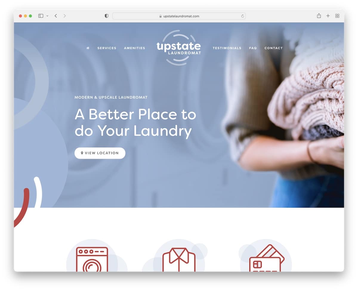
Upstate Laundromat’s Squarespace site is super cool. When you scroll, the header turns from transparent to red and sticks at the top, which looks amazing.
It’s got this light, airy design that makes everything easy to read and find.
Plus, the page has real Google reviews, so you know they’re legit.
The FAQs are in neat accordions, and a Google Map is showing exactly where to go.
Oh, and you can sign up for updates directly from the site.
What stands out: Improve your website’s user experience by creating a floating header/menu.
What stands out: For its clean design, practical features like Google reviews and Maps, and the dynamic, handy header.
2. Kantwon
Built with: Squarespace
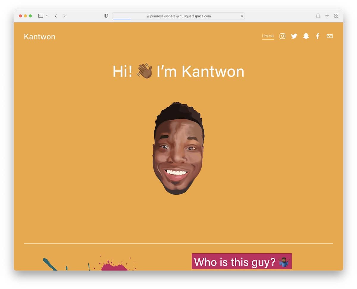
Kantwon’s Squarespace site is a blast. Right from the start, the above-the-fold section grabs your attention – it’s unique and catchy yet very clean and neat.
The header’s super simple, just a home link and social icons, but it works.
Content pops up as you scroll, filled with fun emojis, images, and easy-to-read text.
The design? Colorful and lively. And, oh, the carousels – they conveniently showcase content.
Kantwon’s site is like an online, fun, interactive storybook.
What stands out: Speak your personality through your website design (colors, emojis, animations, etc.).
What stands out: For its vibrant, engaging design combined with user-friendly features and playful content presentation.
3. Sharam
Built with: Squarespace
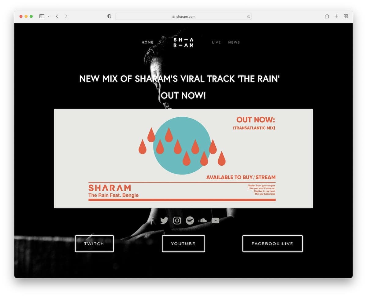
Sharam’s Squarespace site has this bold, dark vibe that’s totally eye-catching. The menu sticks with you as you scroll, so navigation is always available.
Front and center, there’s this huge image hyping up the latest tune – you can’t miss it.
Social icons are right there, making it easy to connect. Plus, there’s a cool news carousel to keep you updated.
The footer is minimalist, with just the essential links (and that’s usually more than enough).
In short, Sharam’s website is a sleek, straightforward, and all about the music site.
What stands out: Create a lasting first impression with a dark/back website look.
What stands out: For its striking dark design, user-friendly navigation, and focused content presentation.
4. Jauz
Built with: Squarespace
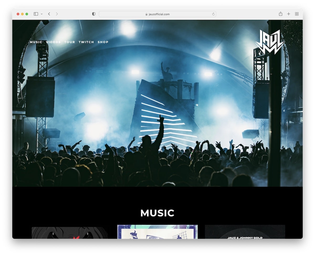
Jauz’s Squarespace site is super slick with its full-width, dark design that just pulls you in.
The header and footer are clean, have no clutter, and are all cool. The awesome parallax image background adds depth.
There’s an embedded YouTube video to catch his latest beats right away.
Plus, you can check out tour dates, peep some merch with a direct link to the store, and even sign up with a subscription form to stay in the loop. It’s all there, super neat.
What stands out: Embed content from 3rd-party platforms directly into your website for more engagement.
What stands out: For its immersive dark design, seamless integration of multimedia, and easy access to key information.
5. Shanley Cox
Built with: Squarespace
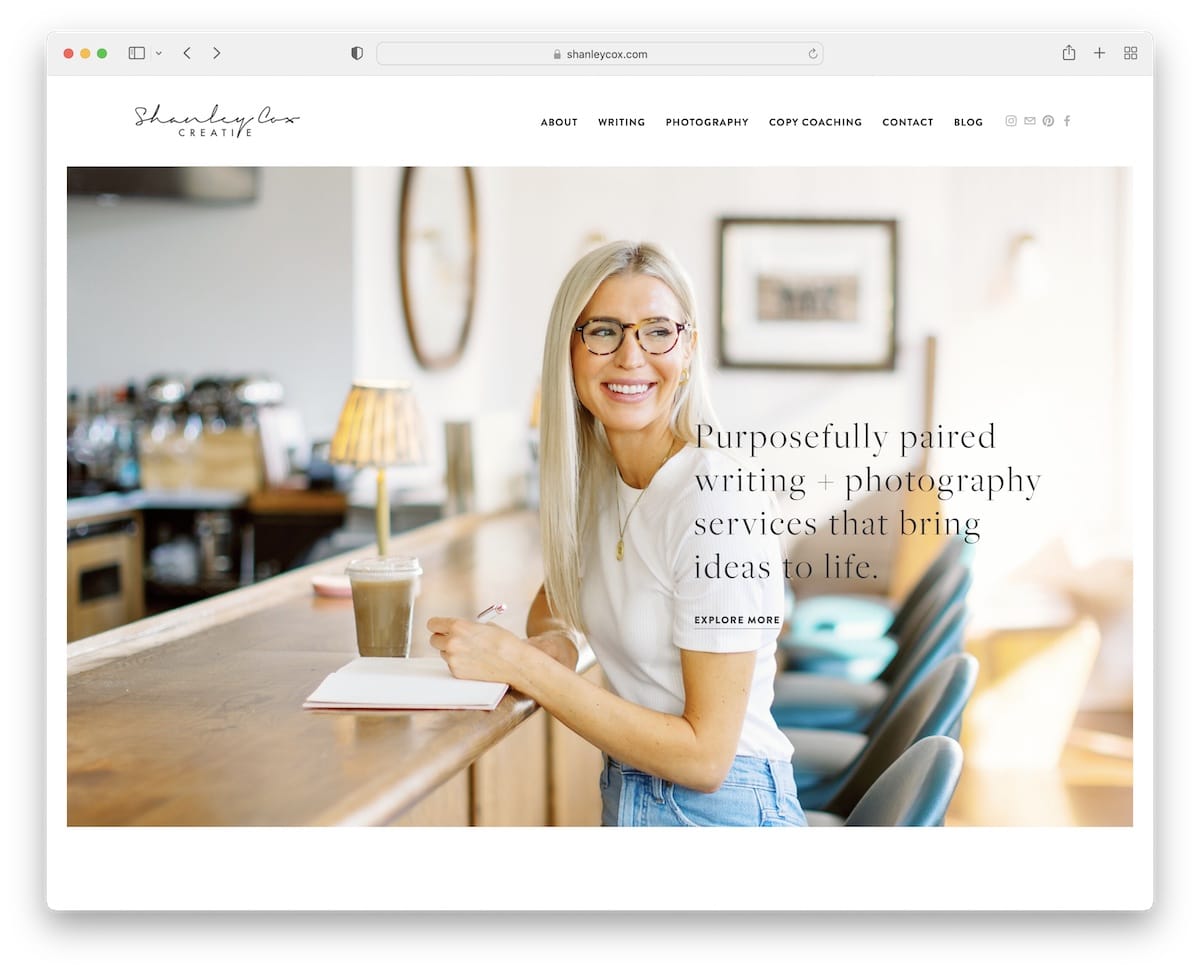
Shanley Cox’s Squarespace site is like a breath of fresh air with its light, minimalist design. The personal hero image of Shanley herself gives it a welcoming vibe.
Moreover, it alternates between light gray and white backgrounds in different sections, keeping things interesting yet clean.
There’s a slider for client testimonials, a contact form, and even her Instagram feed to keep up with her latest.
Plus, a subscription widget in the footer allows you to stay connected.
Shanley’s one page website is personal and professional all at once.
What stands out: Keep a clean and minimalist website design so the necessary content pops more.
What stands out: Its clean, personal design elegantly balances professionalism with a warm, inviting atmosphere.
6. Matt D’Avella
Built with: Squarespace
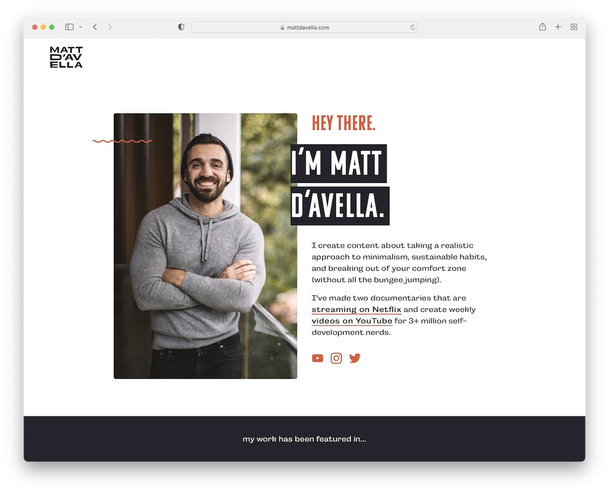
Matt D’Avella’s site immediately hits you with a personal touch. The top section isn’t just welcoming; it also has a subscription form to dive right into the action.
The footer is simple but has everything – essential links, social icons, and this cool animated graphic that adds a bit of flair.
Scroll down, and the header vanishes, creating a distraction-free experience, but scroll up a bit, and it’s back, complete with a CTA button that’s always handy.
What stands out: Start collecting emails as early as possible so you can grow a list and introduce email marketing later.
What stands out: For its clever blend of personal engagement and smooth, intuitive navigation.
7. Toronto Web Designer
Built with: Squarespace
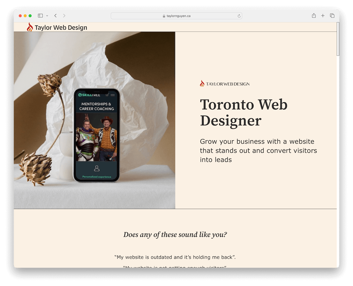
Toronto Web Designer’s Squarespace site is light and feminine. It has no traditional header or footer, making it look modern and chic.
Moreover, the testimonial carousel is bright and inviting, showing off rave reviews in a fun way.
In addition, if you’re looking to book a free consultation, Taylor has a seamless setup through a 3rd-party platform outside the site, making it super easy to move from admiration to action.
What stands out: Build credibility and trust with reviews and testimonials.
What stands out: For its innovative layout and grippy design, blended with straightforward external consultation booking.
Want to build a similar website? Here are the most beautiful Squarespace templates for designers that will get you started in no time.
8. Sustainability Check
Built with: Squarespace

Sustainability Check’s Squarespace site really nails its message with a text-focused design that’s all about clarity.
The earthy color scheme feels like walking through a forest, grounding and calm. The navigation bar is floating, and menu links light up as you hover over them, making it super intuitive.
For those who crave more details, accordions expand with just a click, keeping the page tidy. And the minimalist footer? Just the essentials, keeping everything organized.
What stands out: Achieve a cleaner one-page website look with accordions while still delivering the necessary information.
What stands out: For its focused and informative approach, with an engaging, earth-inspired design.
9. FourFold
Built with: Squarespace

FourFold’s Squarespace site is all about that minimalist magic.
The header plays hide and seek, disappearing as you scroll down and popping back up when needed. It also has four neat menu links and a handy contact button.
There’s a back-to-top button, making navigation a breeze. However, this might not be necessary because of the sticky header.
Content that loads as you scroll keeps the journey interesting. Furthermore, services are neatly tucked into accordions; there’s a straightforward contact form – and the footer.
Just the basics, keeping it clean.
What stands out: A back-to-top button can be handy for improving UX (but not necessarily a must if you use a floating header).
What stands out: For its minimalist design coupled with smart navigation features, providing a consistent UX.
10. IcoNYC
Built with: Squarespace

IcoNYC’s Squarespace one page site is like a visual and auditory adventure.
It mixes dark and light designs, setting a dynamic vibe. Right off the bat, the animated above-the-fold section grabs your attention, complete with a sound option you can toggle on or off – pretty neat, right?
The site dives straight into bold, immersive sections without a traditional header.
And the cool doesn’t stop there; more animations, including an animated grid, bring the entire site to life, making every scroll an experience.
What stands out: Use animations and special effects to spice up the design – but don’t overdo it.
What stands out: For its captivating blend of visuals and sound, coupled with innovative animations.
11. Friends Work Here
Built with: Squarespace

Friends Work Here has this awesome Squarespace one page site that feels like a cozy, creative space online.
It’s set up in a pleasant boxed layout, and the transparent header turns solid as you scroll, sticking right at the top.
A handy sidebar gives you the lowdown on location details – but doesn’t appear as sidebar on mobile.
A grid showcases current members, making the community vibe tangible. Also, there’s an image slider that adds a dynamic touch, an application form for newbies, and a dark, contrasting footer with all the essential info and social links.
What stands out: Use a slider to showcase more content without wasting website space.
What stands out: For its unique blend of community feel, dynamic visuals, and practical guidance.
12. Vicente Pamparo
Built with: Squarespace

Vicente Pamparo’s Squarespace site is a showcase stunner. It’s built around a beautiful grid that brings his work to life with a lightbox function, letting you get up close and personal with each piece.
The site keeps it light with a soft header and footer background, creating a canvas that lets the images shine.
Navigation is super simple, with just two links: one for the portfolio/home and another for Vespere. Plus, there are social icons in the footer to keep connected. And that’s it!
What stands out: If adding a gallery, use the lightbox feature for a more immersive viewing experience.
What stands out: For its elegant presentation and minimalist navigation highlight the artwork beautifully.
13. Lost Lore Tequila
Built with: Squarespace
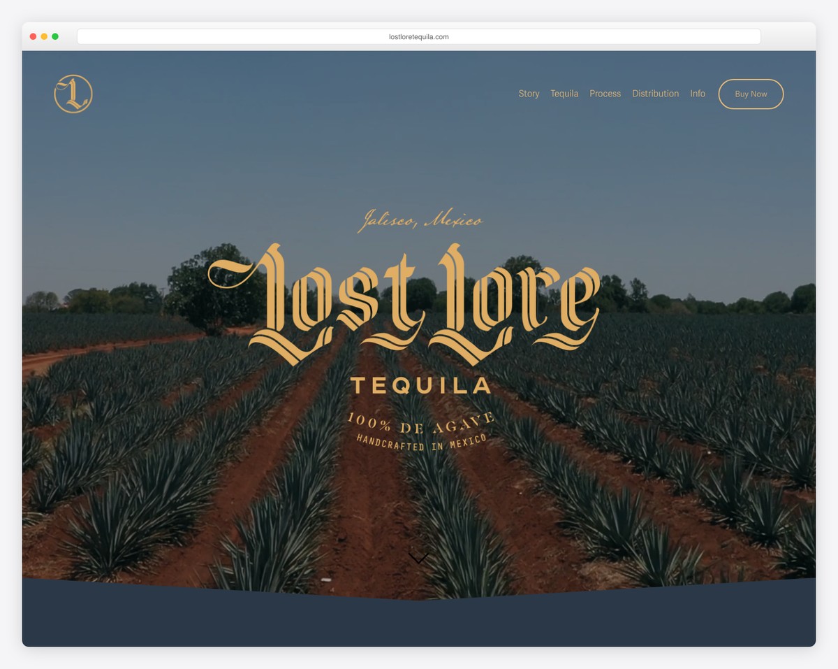
Lost Lore Tequila is a craft spirits brand with a single-page scrolling design featuring sections for their story, three tequila expressions, production process, and distribution information. The warm desert color palette and bold typography mirror the brand’s artisanal identity.
What stands out: Single-page sites work exceptionally well for spirits brands — the scrolling journey mirrors the tasting experience, revealing layers one section at a time.
14. Jiwon Chong
Built with: Squarespace
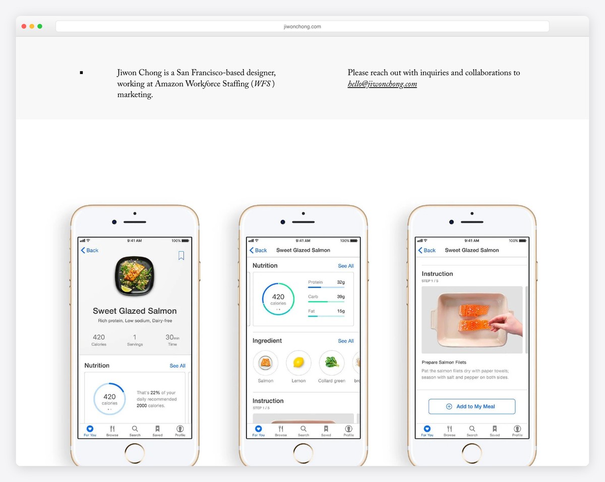
San Francisco-based designer Jiwon Chong’s single-page portfolio showcases branding, packaging, and marketing projects with a clean, minimalist layout. The generous whitespace and large project thumbnails let each piece of work breathe.
What stands out: Designer portfolios benefit from a single-page format — it forces curation, showing only your best work instead of overwhelming visitors with everything.
15. Mark Lange
Built with: Squarespace
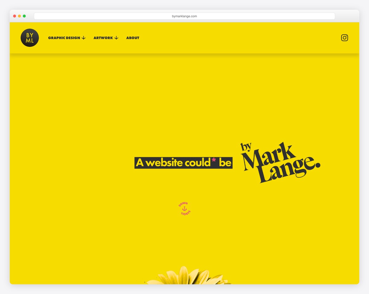
Graphic designer Mark Lange’s one-page scrolling portfolio emphasizes bespoke website design, visual identity work, and art prints with an artistic, hand-crafted aesthetic. The single-page format creates a curated gallery experience.
What stands out: A hand-crafted visual aesthetic on a designer’s portfolio communicates attention to detail — the site itself becomes the strongest portfolio piece.
16. Steeven Salvat
Built with: Squarespace
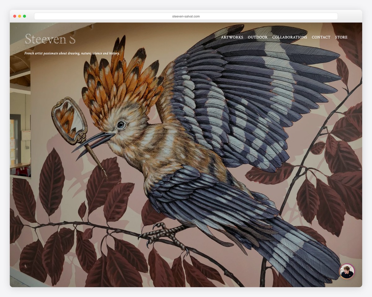
French artist Steeven Salvat’s single-page portfolio features animated slideshows and a product store with a minimalist dark design. The dark background makes the intricate artwork pop while the one-page structure keeps visitors focused on the art.
What stands out: Artists benefit from dark backgrounds that make their work the focal point — the site recedes while the art commands attention.
17. Stef & Phil
Built with: Squarespace
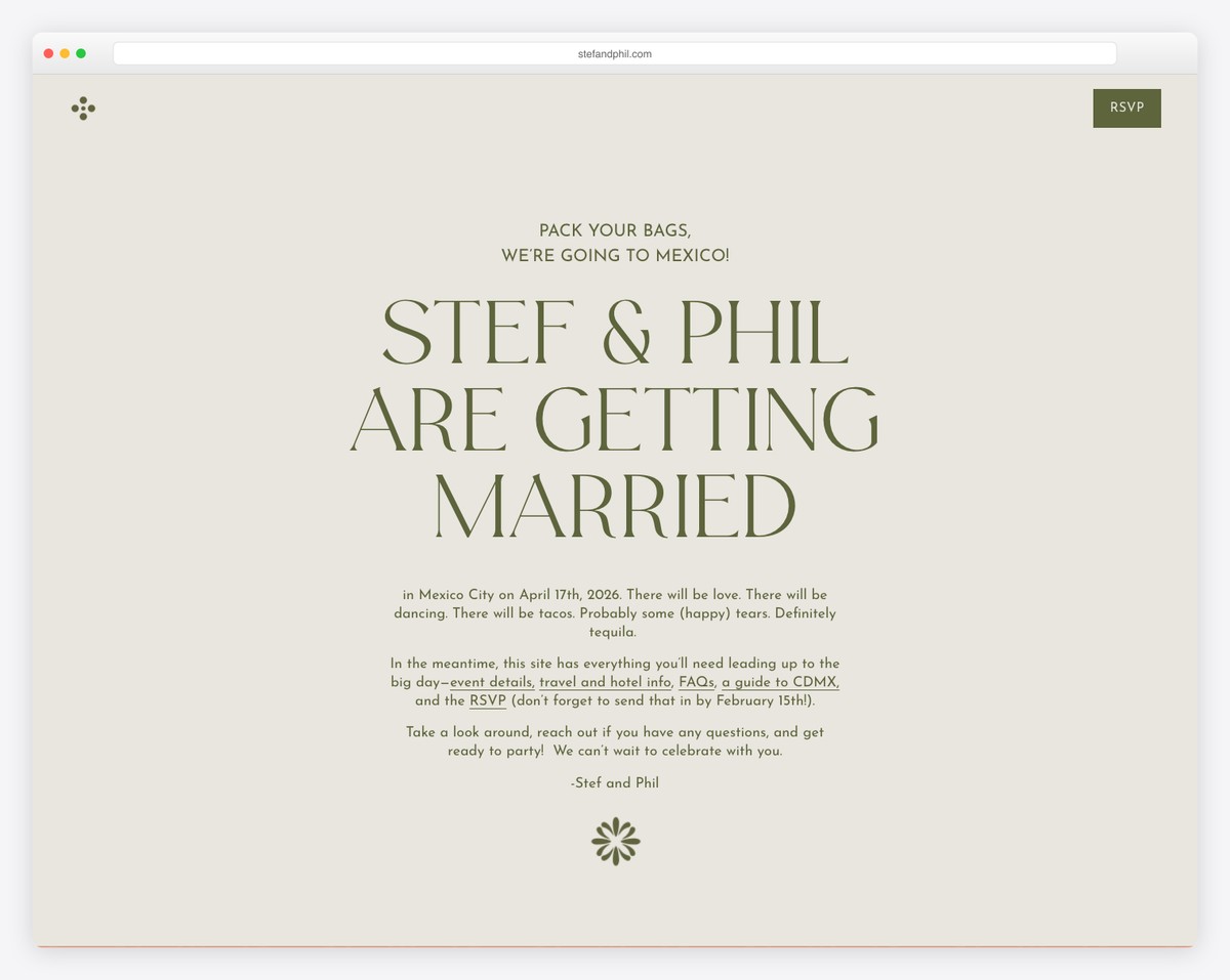
A destination wedding one-page website for a couple getting married in Mexico City, featuring peach and olive green color blocks inspired by Mexican textiles. All event details, travel info, and RSVP are elegantly arranged in a single scroll.
What stands out: Wedding websites are the perfect use case for one-page sites — guests need event details, travel info, and RSVP in one easy-to-navigate scroll.
18. Greylyn & Ryan
Built with: Squarespace
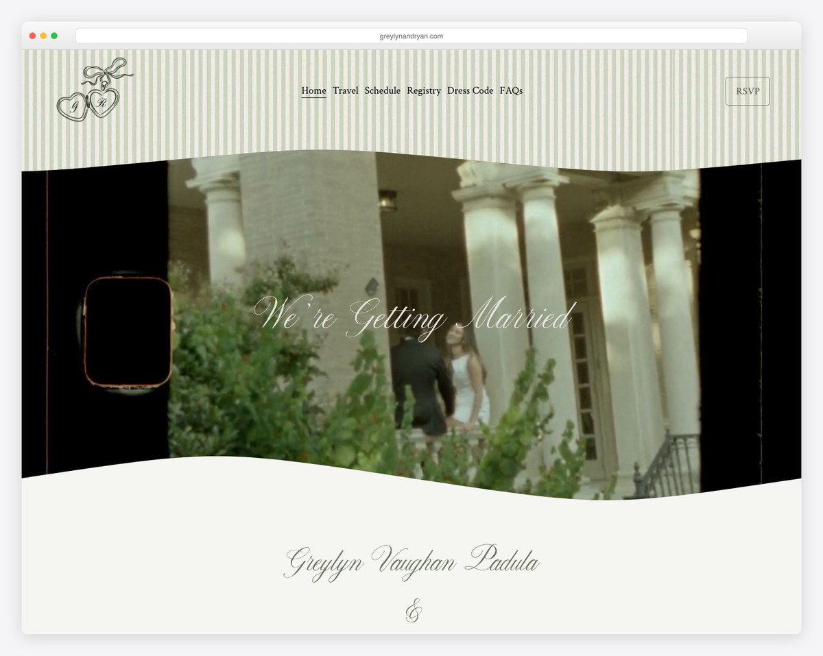
A beautifully designed single-page wedding website for a couple celebrating at a chateau in Provence, France. The elegant typography and muted color palette create a sophisticated invitation that matches the venue’s grandeur.
What stands out: Destination wedding sites should match their venue’s aesthetic — a French chateau wedding deserves elegant, refined design.
19. Claudia & Marijn
Built with: Squarespace
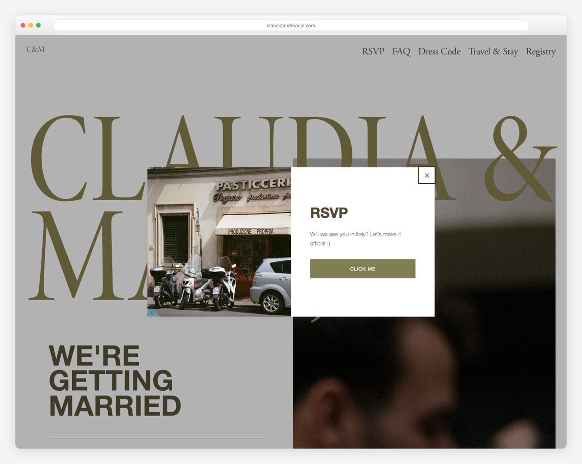
A destination wedding one-page site for a celebration at an Italian castle, featuring schedules, FAQs, dress codes, and travel information. The romantic design with soft colors perfectly captures the Italian wedding atmosphere.
What stands out: Including practical details like dress codes and travel FAQs on a wedding site reduces the number of questions guests will ask — good UX means fewer emails.
How To Make A One Page Website With Squarespace
- Sign up or log in to Squarespace: Visit the Squarespace website and either log in with your existing account or sign up for a new one. Choose the plan that best fits your needs; remember, you can start with a trial to explore Squarespace’s features without any commitment.
- Choose a template: Look for one page Squarespace templates that emphasize a single-page layout or are easily customizable to fit a one page design. Preview a few and select the one you feel best suits your vision.
- Customize your template: Once you’ve chosen it, start customizing it to fit your brand and content. Squarespace’s drag-and-drop editor makes adding sections like About, Services, Portfolio, and Contact easy on a single page. Customize fonts, colors, and images to match your style.
- Add your content: With your sections in place, it’s time to fill them with your content. Keep your text concise and engaging, and use high-quality images (and videos) to capture your audience’s attention. Clarity and brevity are key for a one page site, so prioritize your information and layout for easy navigation.
- Preview, test, and launch: Before going live, use the preview feature to see how your site looks on different devices. Test your navigation, links, and contact forms to ensure everything works without a hitch. Once satisfied, hit the “Launch” button to publish your one page website. (Remember to regularly update your content to keep your site fresh and engaging for visitors.)
FAQs About Squarespace One Page Websites
Can I incorporate an online store into a Squarespace one-page website?
Yes, you can add an online store section to your one-page website on Squarespace. Use the commerce features to showcase products or services directly on your single page, considering the importance of seamless integration and navigation for a smooth user experience.
How do I improve the loading speed of my Squarespace one-page site?
Optimize your images before uploading by resizing them and using compression tools to enhance loading speed. Also, minimize the use of heavy custom codes and 3rd-party plugins. Squarespace automatically optimizes website performance, but these steps can help ensure a faster load time.
Is it possible to have a blog on a Squarespace one-page website?
While a one-page website typically focuses on concise content, you can integrate a blog section within your page. However, for a full-fledged blog, consider linking to a separate blog page or utilizing an external platform to maintain the one-page site’s streamlined user experience.
Can I use custom fonts on my Squarespace one-page site?
Yes, Squarespace allows you to use custom fonts. You can add them through the Custom CSS feature or choose from Squarespace’s wide range of fonts, ensuring your one-page website aligns with your brand identity.
How do I make my Squarespace one-page website mobile-friendly?
Squarespace templates are designed to be responsive, automatically adjusting to mobile devices. To further enhance mobile-friendliness, prioritize simplicity in design, reduce text density, and ensure interactive elements like buttons are easily clickable on smaller screens.
Can I implement SEO strategies on a Squarespace one-page site?
Yes. SEO on a one-page website can be as effective as on multi-page sites. Focus on optimizing your content for relevant keywords, use structured data, and ensure your site has fast loading times. Squarespace provides built-in SEO tools to help you manage these aspects effectively.
Related Posts


Comments (0)