18 Best Webflow Websites (Wow!) 2026
Are you searching for the best Webflow websites to gain inspiration and see what’s possible with this builder?
The first thing we noticed when studying dozens of awesome websites made on Webflow is how creative they are.
Thus, it was really challenging to curate this collection of the best. (We might be adding some more in the future.)
But we managed to pick twenty of the TOP, covering multiple industries for your convenience.
Every website is unique and has cool details that you can apply (and improve) to your own.
Best Webflow Websites For Design Inspiration
1. Anrok
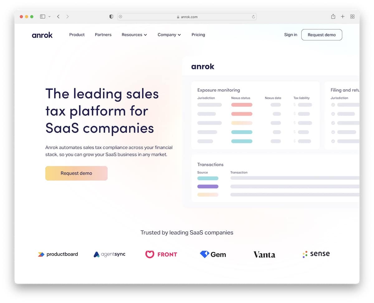
Anrok did a great job of creating a browsing experience that is engaging and informative.
Plus, they use a lot of white space, so users’ eyes are on what’s important (not distractions!).
Note: Create a product presentation, including benefits and “how it works” with cool scrolling animation.
2. The Furrow
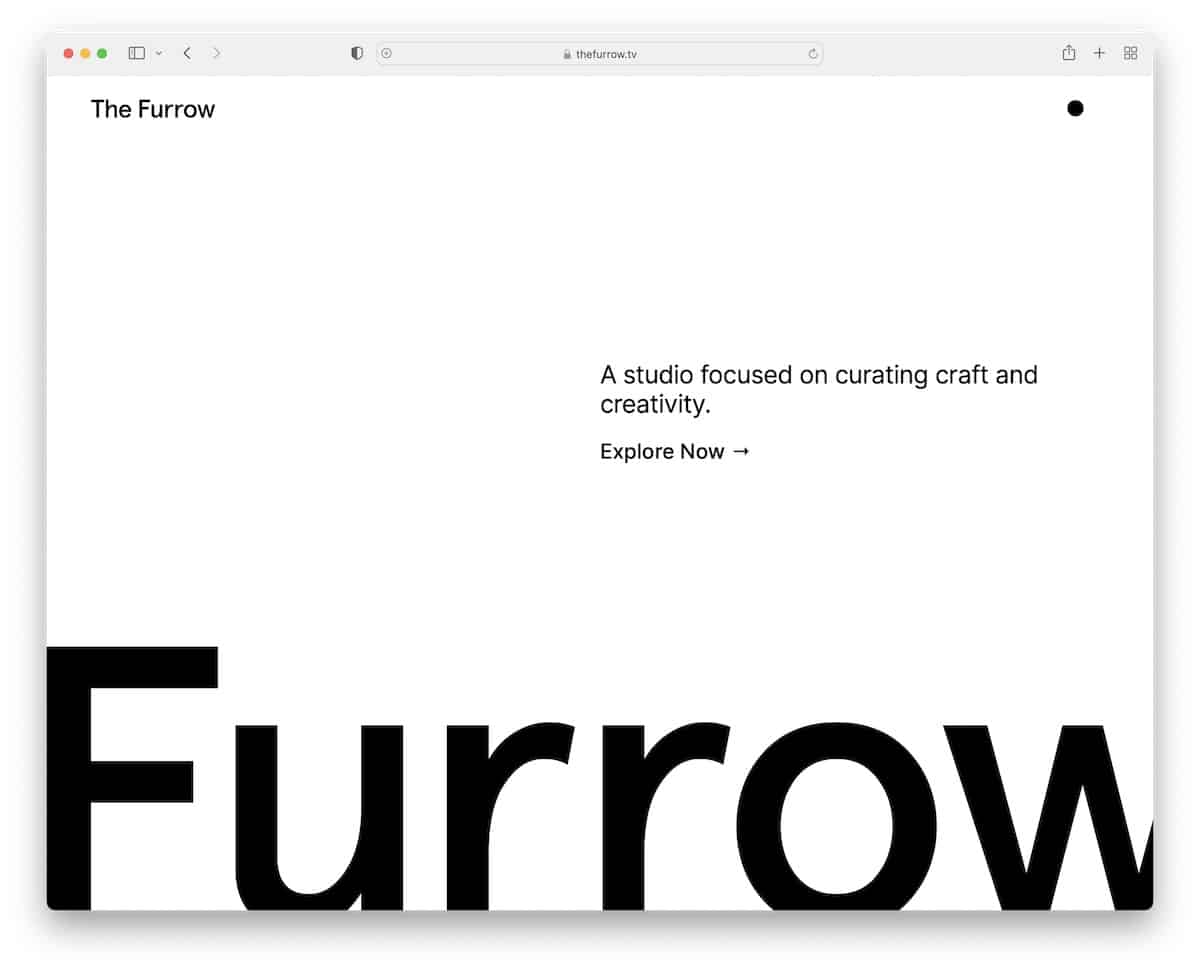
If your business is about design and creativity, ensure your website resembles just that. The Furrow is a fantastic Webflow website with a minimalist above-the-fold section and awesome content distribution once you start exploring it.
We also like the black dot that reveals the menu once you hover over it and the dark/light mode switcher.
Note: If you offer unique services, let your website promote them in a unique way.
3. byPeople
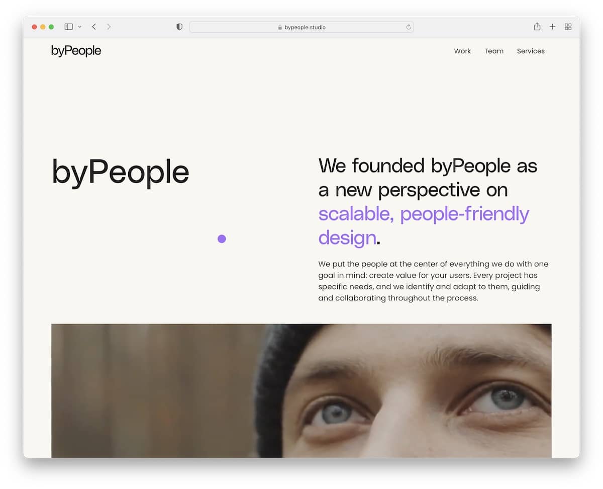
byPeople’s Webflow website captures the user’s attention with two-toned text and auto-played video above the fold.
They also strategically placed the Services section on a dark background to make it stand out.
Finally, the team carousel (with roles and contact details) familiarizes you with the folks behind byPeople.
Note: Text and video work very well together, so feel free to test them for your business.
4. Spark Library
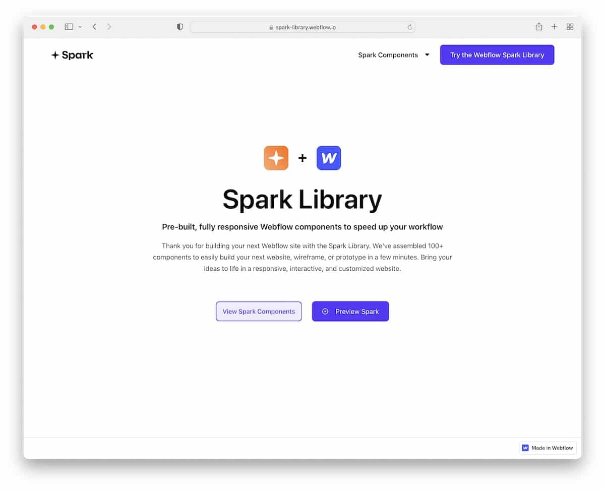
Spark Library boasts simplicity, focusing on one thing only – the product. It keeps the hero section minimalist but with enough text to explain everything.
Next, you’ll find the portfolio of products, featuring a filterable sidebar navigation that displays different categories upon click.
Note: If you have a library of elements, display them with categorized buttons on your home page.
We also have a collection of the best portfolio websites for more creative ideas.
5. The Bakery
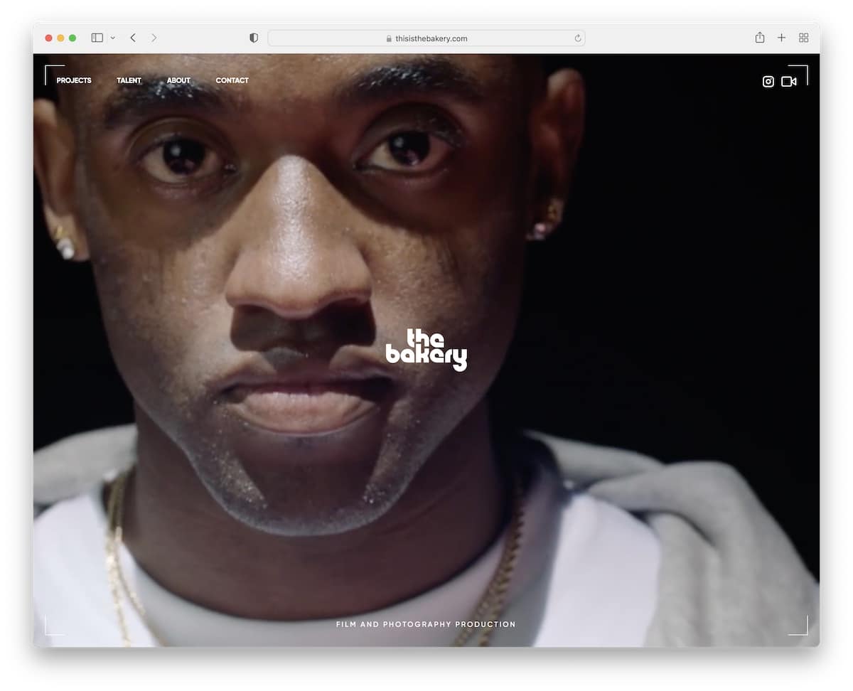
Film and video production companies can learn a lot from The Bakery. The home page is a collage of videos covering the entire screen, regardless of the screen size.
But they also added navigation to visit projects, talent, about and contact sections, and clickable IG and Vimeo icons.
Note: Be bold with a full-screen video presentation/background.
6. AndDan
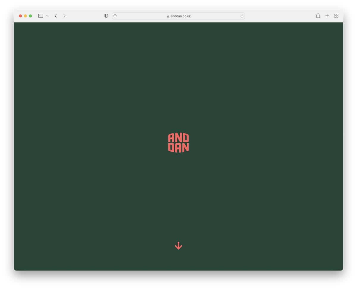
AndDan makes you want to start scrolling because you want to see what happens beyond the logo.
It grows and takes you to other home page sections once you start scrolling. But you can also click the scroll-down button and let it take you on a journey.
We also like the inclusion of FAQ accordions, a testimonial slider and a floating navbar that’s always accessible to visit internal pages.
Note: You don’t always need to reveal everything in your hero section. Let the visitor “play a game” in a similar style as AndDan does.
7. Blott
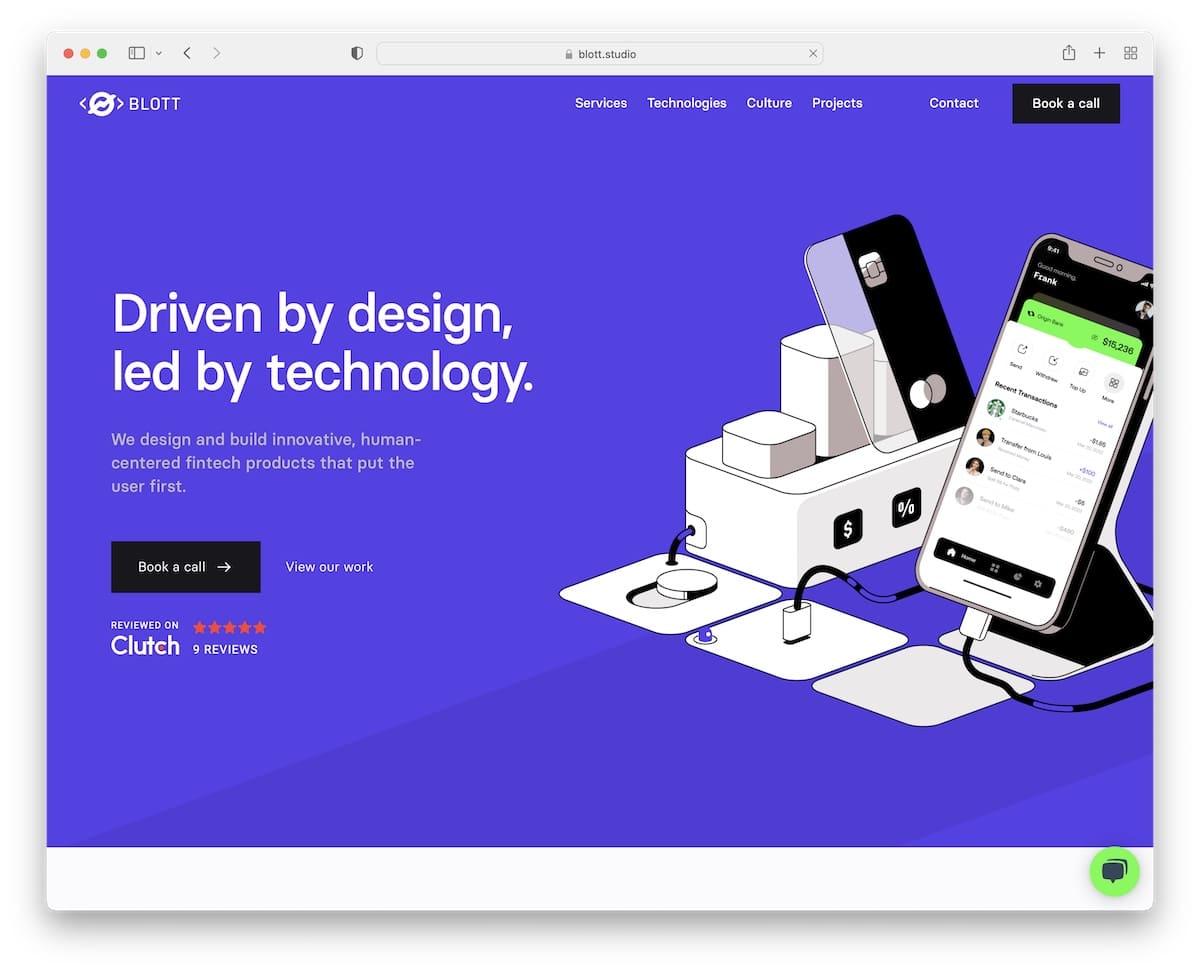
Blott has a modern and practical design that’s simple to view on handheld and desktop devices.
While the entire home page is WELL-DONE, the testimonials section is something you don’t often see (or at all). Instead of text, they included video testimonials that start playing when hovered over.
So. Cool.
Also, if you pay attention to the section with client logos, they randomly change to different business logos they worked with.
Note: Ensure you pay attention to the details of your site, especially if you’re in the design and development space.
8. DTCP
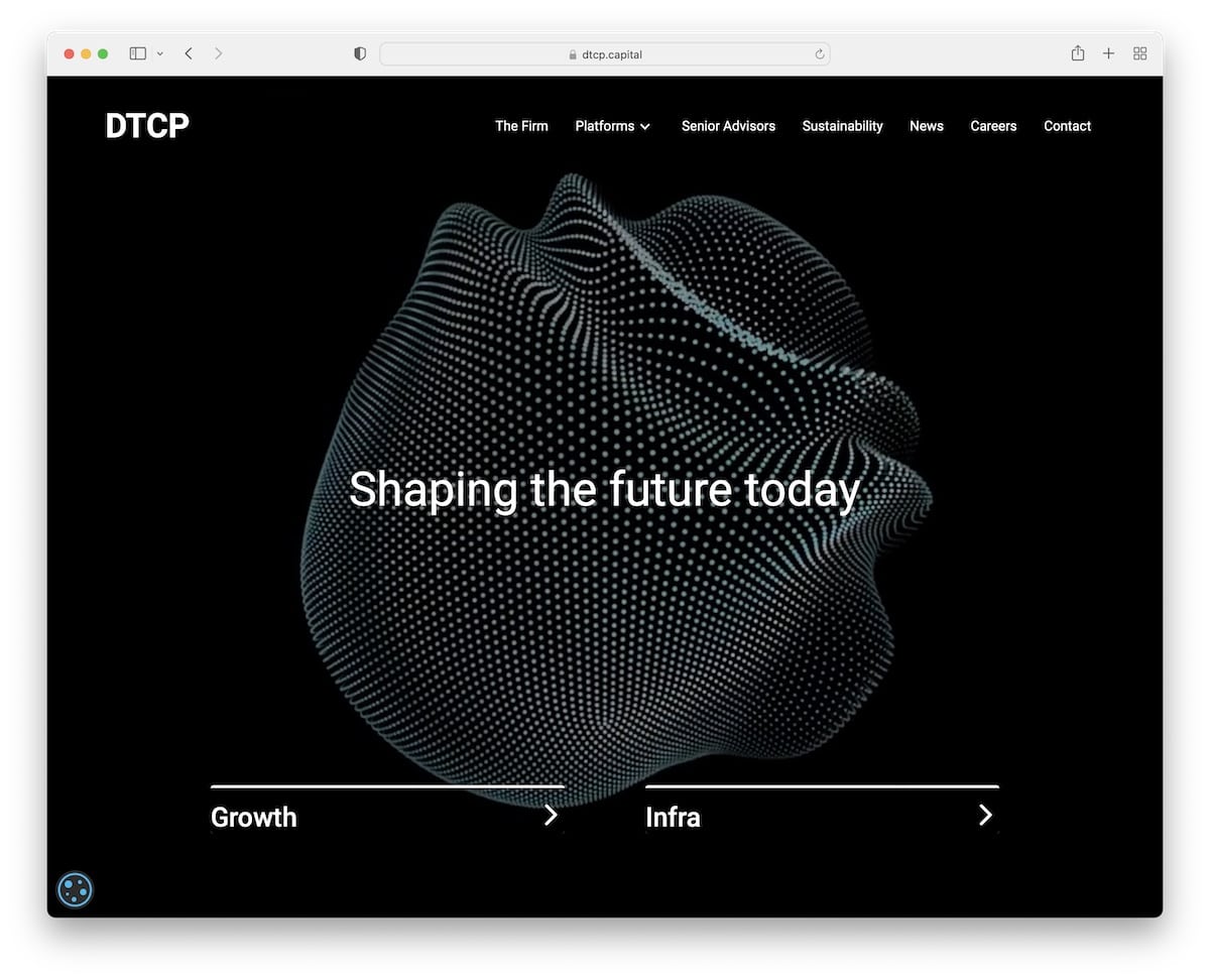
Using an animation in the hero section of your website that showcases what you do is a clever way to welcome potential clients into your world. Just like DTCP does it.
The DTCP home page is non-scrollable, but it features a minimalist navigation bar and two calls to action.
Note: Minimalist design is great, but it gets even better with a touch of smart creativity.
You can also check these great animation websites that will have you WOWing.
9. Hone Naera-Scott
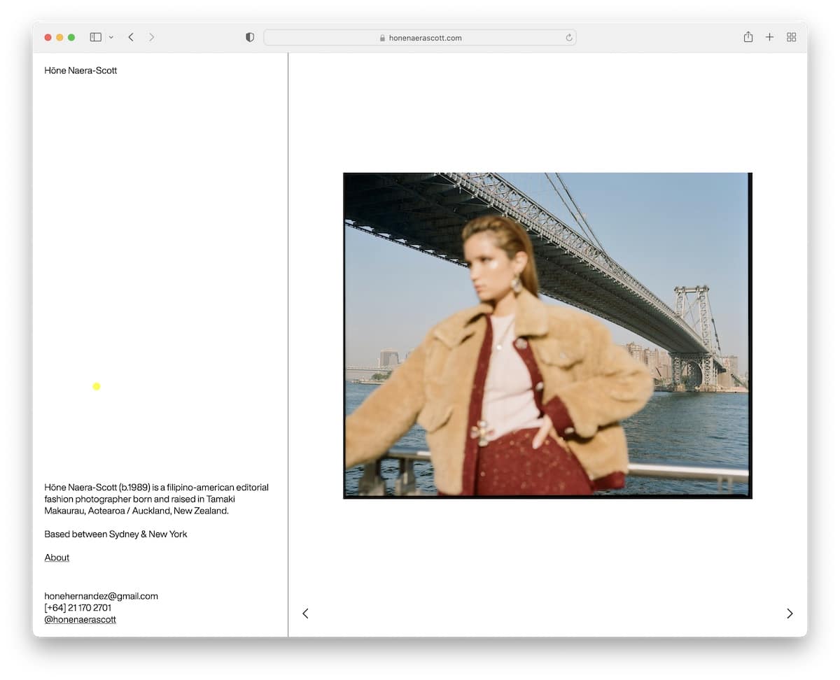
If you’re a minimalist by heart, you can easily create a Webflow website expressing that.
Hone Naera-Scott runs a simple two-page website (home and about) that’s split into two sections: information on the left and a slider on the right.
Note: Give your work extra shine with a split-screen web design.
Hint: Here are some more photography websites that’ll give you more ideas and web design inspirations.
10. Flow Guys
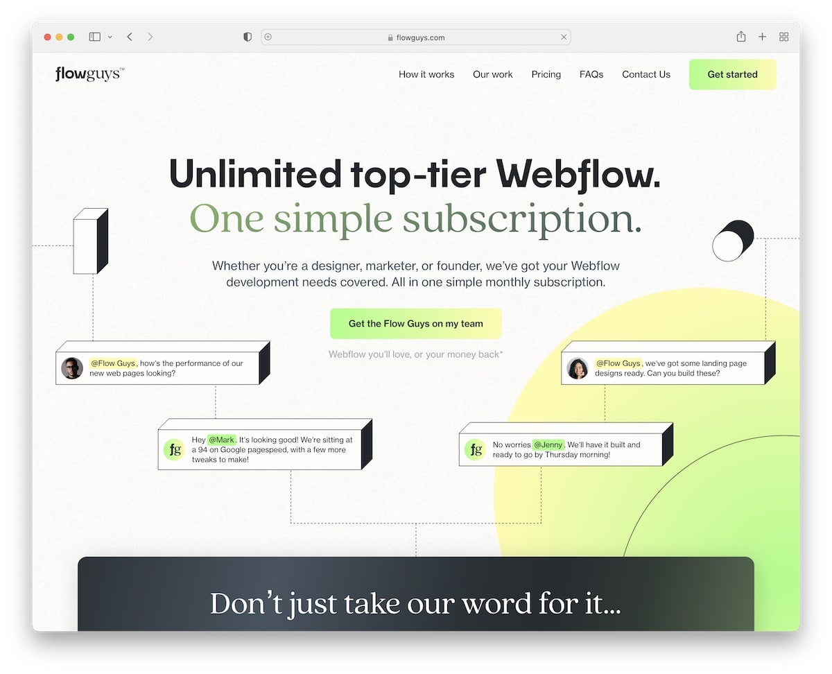
Flow Guys is a one-page Webflow website with these cool “3D elements” that make it very catchy. They also highly feature client testimonials on the home page because they know it builds trust.
Their comparison table is one of the most creative and original we’ve ever seen. (The same applies to pricing plans.)
Note: Even if you think that everything is already done, think again and check Flow Guys’ website.
You may also want to take a look at our list of top landing page examples, which we’re sure will inspire you.
11. Mondays Coffee
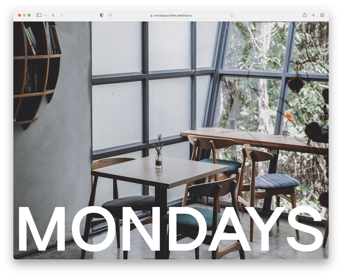
A full-screen image of the coffee shop, featuring a bold name that animates into a header section upon scrolling, is a great feature of Mondays Coffee.
The section that shows you “how to do Mondays” is worth checking out twice. The footer reveal function with a news-ticker-like presentation of their coffee blends is an excellent addition.
Note: Visit your website by making potential customers feel like they’re at your coffee shop.
We also found many more coffee shop websites with exceptional designs, which you must check.
12. Aarland
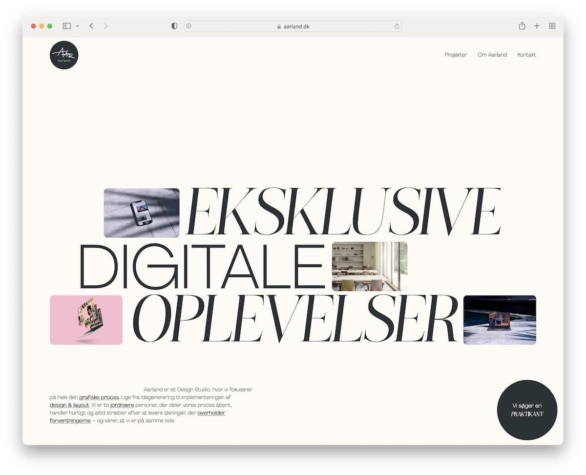
Need inspiration for displaying your digital work on your website? That’s when you need to take a peek at Aarland.
The changeable thumbnails with large text are a great welcome treat. But the treat gets even better with animated scrolling.
We must also mention the reveal of the brand owners’ image that you control with scroll.
Note: Creativity knows no limitations. Aarland, as a website, is a great example of thinking about web design differently.
13. Marta Tchai
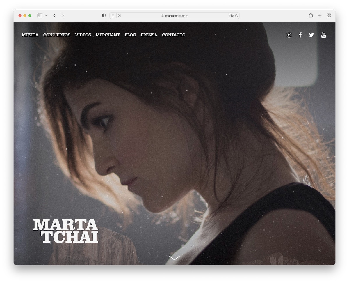
Marta Tchai features a full-screen image with her name on it that spices things up with particle effect.
The scroll-down button reveals more information about her and her work, accompanied by buttons for Spotify and Apple Music. She also added a music video and a list of upcoming concerts.
Another mention is how she separated the footer section only with a line, keeping the background unchanged.
Note: Many artists miss the opportunity a website can bring, so build one.
However, you can also explore other personal website builder options that are great alternatives to Webflow.
14. Ready
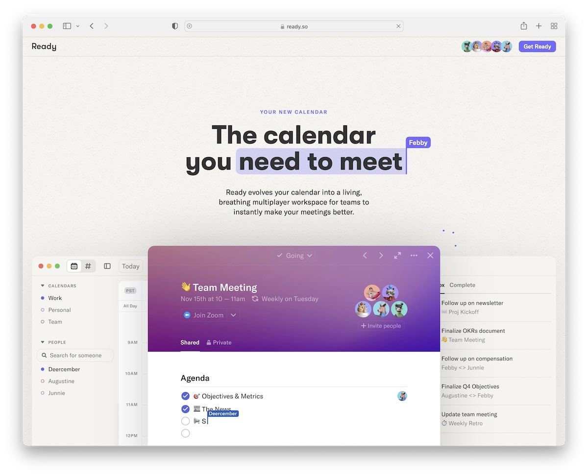
Ready is a one-of-a-kind single-page website featuring numerous creative elements that captivate even the most discerning web designers.
It features a text highlight used for the title, followed by an explanation of what Ready is about, and then it demonstrates the calendar in use.
However, the cool sections don’t end here, providing a fun way to get familiar with Ready.
Note: You can instantly grab users’ attention with great animations and a product demonstration.
15. Nimbble
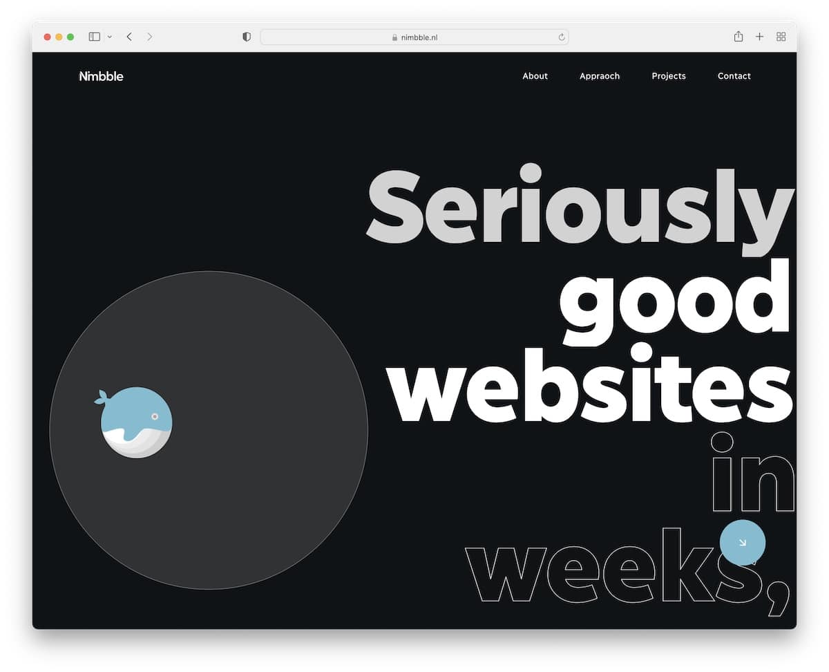
Nimbble is a Webflow website that makes the dark design look extra beautiful. It features an animated whale, bold and outlined text, content that reveals on scrolling, an awesome example/project using a laptop, and more. Nimbble is special.
The navbar also transforms into a menu icon to create a more pleasant viewing experience.
Note: If everyone uses a light web design, you can stand out from the masses by using a dark one.
16. Discord Blog
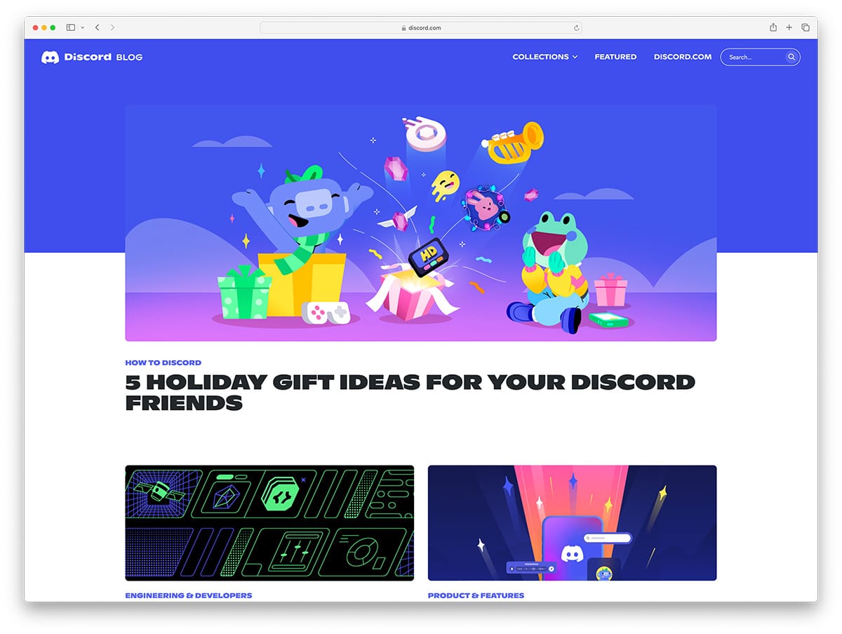
Discord Blog is an engineering blog behind a popular communication platform. It uses bright colors and unmatched graphics. It might look childish, but its content makes up for it big time, which is important.
Note: Bright colors make your website stand out and help you differentiate yourself. It will work with very few niches, and engineering is one of those.
17. Jasper
Built with: Webflow
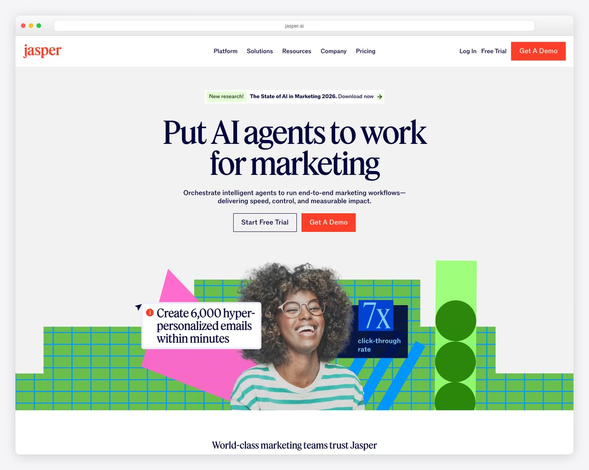
Jasper is an AI marketing platform that helps teams orchestrate intelligent agents for end-to-end marketing workflows. The Webflow-built site opens with a sleek, modern hero section featuring animated product demonstrations that immediately communicate the platform’s capabilities.
The design uses a sophisticated color palette with deep purples and bright accents that feel both tech-forward and trustworthy. Smooth scroll animations, interactive feature sections, and customer logos from major brands build credibility while keeping the experience engaging and dynamic.
What stands out: Showing animated product demos directly in the hero section — rather than static screenshots — gives visitors an immediate feel for the product experience before they even sign up.
18. Guru
Built with: Webflow

Guru is an enterprise knowledge management platform that centralizes company information so teams can find trusted answers instantly. The Webflow site features a clean, approachable design with playful illustrations and clear product messaging that makes complex enterprise software feel simple.
The homepage uses a well-structured progression from problem statement to solution to social proof, with customer logos and testimonials from companies like Slack, Shopify, and Spotify. The bright, friendly color scheme stands out from typical B2B SaaS dark themes.
What stands out: Using playful illustrations and a bright color palette for enterprise software breaks the mold of corporate B2B design — making the product feel approachable rather than intimidating.






Comments (0)