18 Best Site123 Websites (Examples) In 2026
Are you looking for the best Site123 websites to appreciate some good design and gain ideas for your online presence?
We created a collection of the 21 best web creations built with this simple website builder.
You can also create similar sites without coding or design knowledge.
Not just that, but you can make it happen for free.
Site123 is great for a quick solution if you don’t need a too advanced website.
However, you can create an online store, a landing page, an online portfolio, a site for events, photographers, etc.
Our tip: Enjoy these designs first and go from there.
Best Site123 Websites & Design Ideas
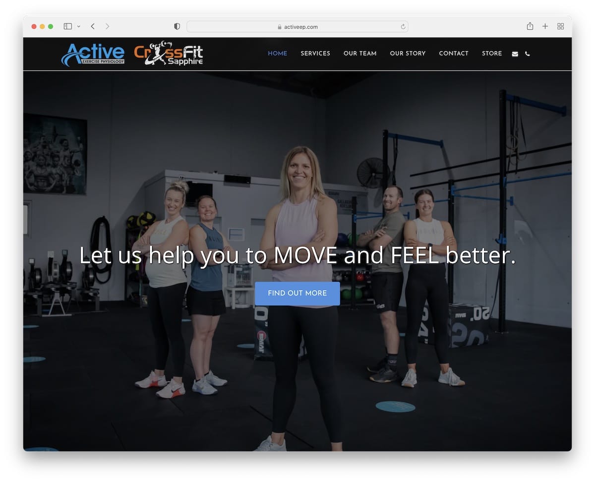
1. CrossFit Sapphire
Made with Site123
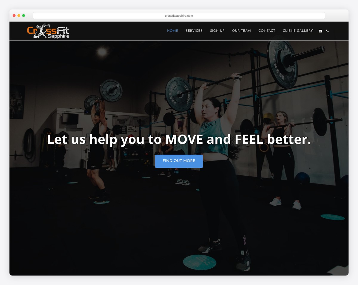
Active welcomes you to the world of sports with a full-screen slider with text and call-to-action (CTA) buttons.
The Simple Services section displays what you can expect, and the Team section includes images, roles, and links to bios.
Moreover, the integrated Google Maps showcase the facility’s location with an address for easy finding.
What stands out: Share the team behind the business with actual images and profiles.
2. Start Up Wise
Made with Site123
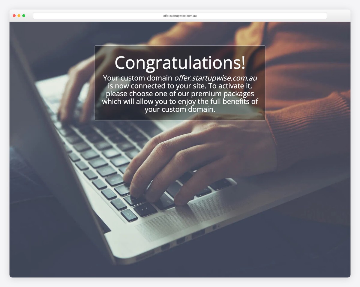
Start-Up Wise is a basic one-page website by Richard Milne promoting his book. It provides a glimpse into the book and includes a sign-up form for users to download the book.
This is also a great strategy to capture leads for future email marketing campaigns.
What stands out: The drop-down menu option keeps the header cleaner but allows for a more refined search.
3. Utility Audit
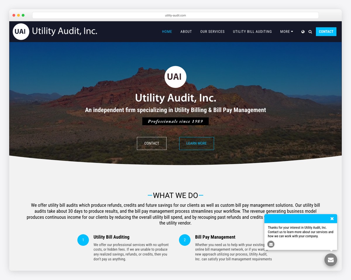
Utility Audit is a somewhat basic Site123 website example for professional services. However, scrolling is enriched with content loading and the hero section contains a beautiful video background.
The business displays its location on Google Maps and features a clickable phone number and a client logo slider for credibility.
What stands out: Special home page sections to explain who you are and what you do are must-haves.
4. Ivy Do Kitchen
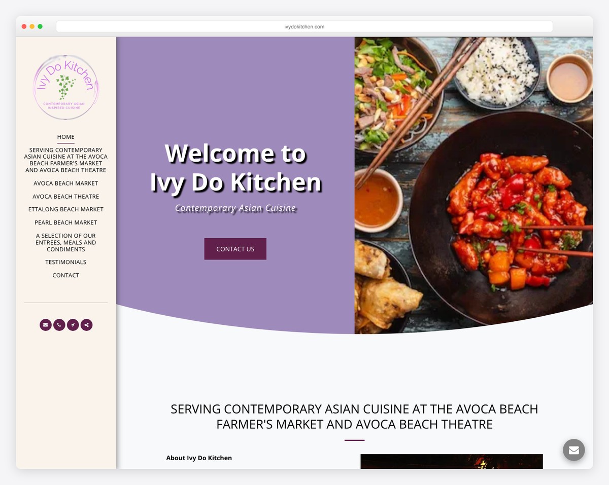
The unique factor of Ivy Do Kitchen is the sticky sidebar menu. It also features a split-screen hero design with text and CTA on the left and a parallax image background on the right.
Ivy Do Kitchen’s one-page layout includes online ordering, a filterable food menu, testimonials, and a contact form.
What stands out: Create a sidebar version instead of going with the traditional top header/menu.
5. Byscapes
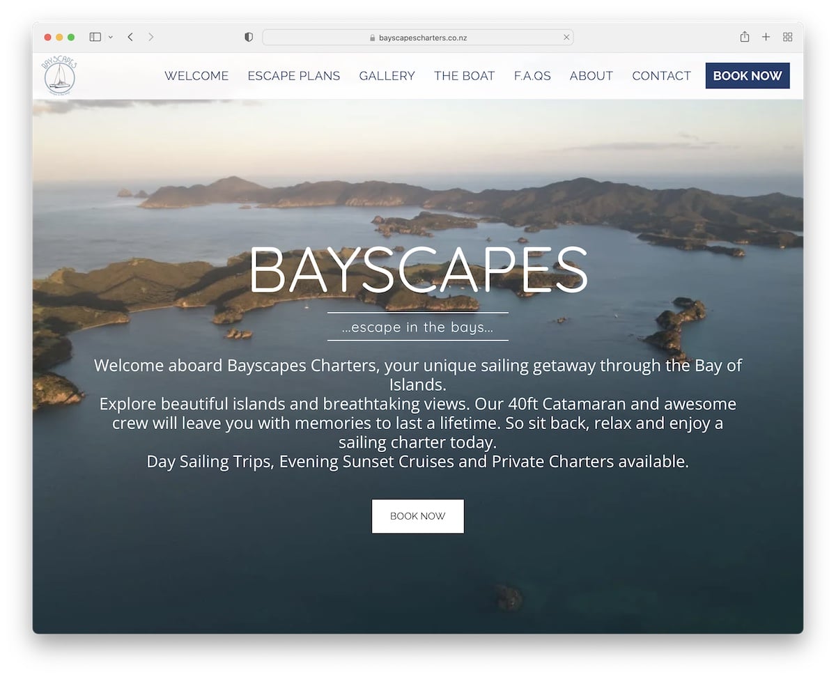
Byscapes’ simple and bold floating header with slight transparency accompanies your while you scroll to learn about the services, view the engaging image slider and read FAQs.
What’s also great is the always present “Book now” button and a Google Maps location marker, so you know exactly where to find them.
What stands out: Add a booking button in the header so everyone can take immediate action.
6. Gabriel Monnet
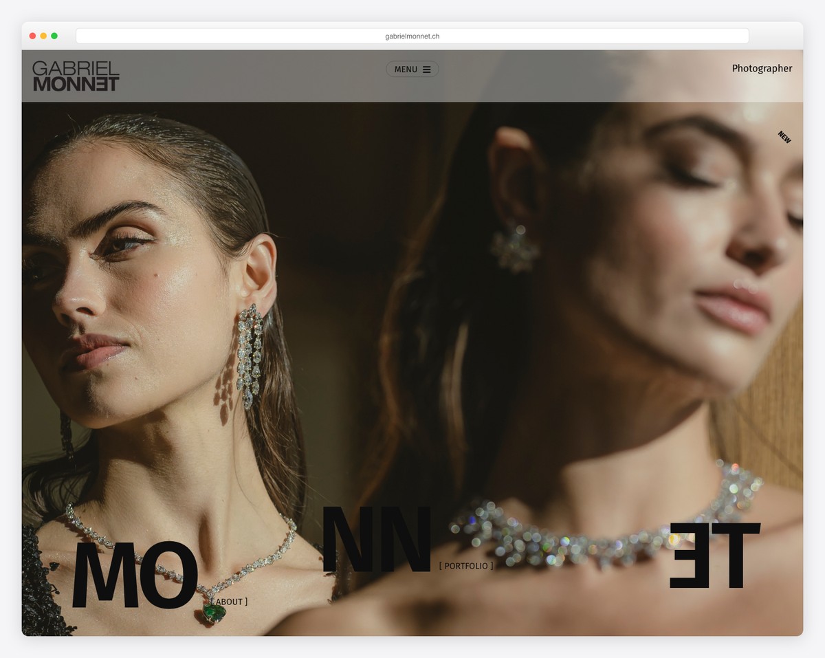
Gabriel Monnet’s online portfolio website is beautiful and clear. The full-screen (parallax) hero image intrigues you to want to see more from Gabriel.
He also dissected his portfolio into multiple filters, making it easier to find what interests you.
What stands out: If you’re passionate about multiple photography styles, use portfolio filters to show them for a better user experience.
7. Celebrate Greece
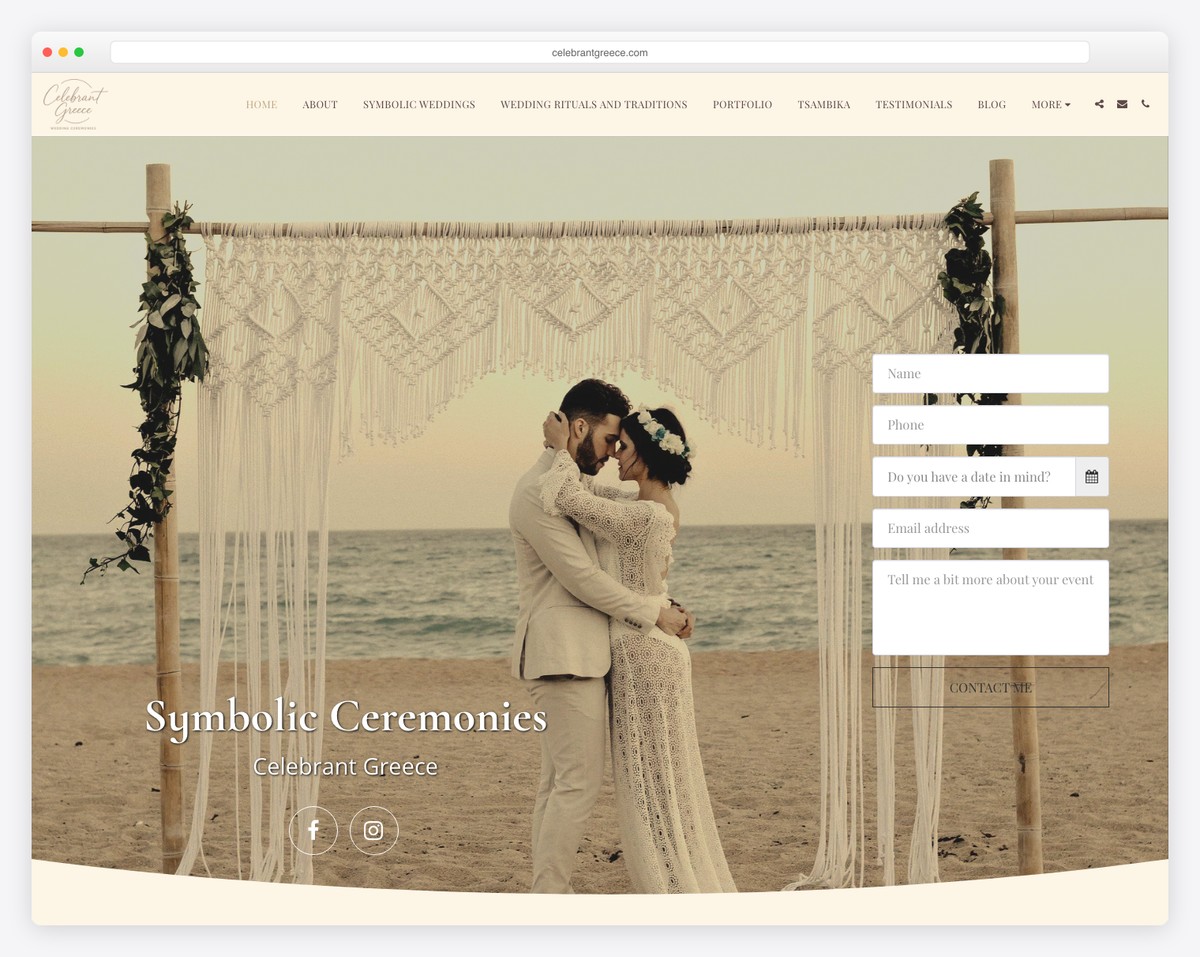
Celebrate Greece is a wedding website with a contact form above-the-fold so potential clients can contact Michaella immediately.
You can also learn more about her, check out the awesome parallax portfolio, and read client testimonials. There’s also a special section for different venues and links to various press publications.
What stands out: If authorities mention you, consider adding excerpts and links to your website as a reference.
8. Pitos Coffee
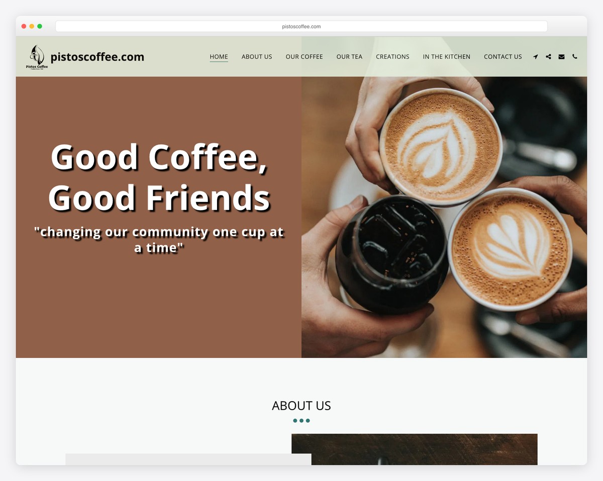
Pitos Coffee is a stunning single-page Site123 website with a floating and transparent navigation bar.
The About Us section uses a cool slider with a text block to enhance the reading experience.
Moreover, all their coffees, teas and creations are presented almost like a timeline with text and images. It’s very insightful.
What stands out: Keep your products and creations at the forefront, so everyone can get a “taste” of them only by scrolling your site.
But here here some more coffee shop websites that’ll expand your design ideas even further.
9. ProjectAide
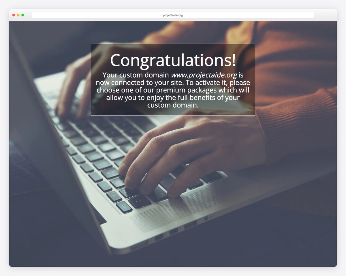
ProjectAide is a simplistic Site123 website with on scroll content loading effect and floating navigation.
It’s a one-page website with multiple sections for a better browsing experience.
We like adding an email icon in the navigation bar that opens the form as a full-screen overlay.
What stands out: Create a personal website that keeps your professionalism high. (Because owning a website will instantly make you stand out.)
10. Treasures of Africa
Built with: Site123
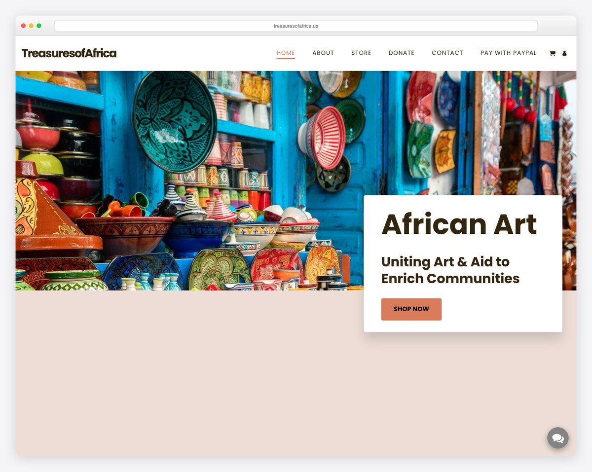
Treasures of Africa Shop is an African artworks e-commerce store built on SITE123, supporting schools and villages in Africa through art sales. The colorful product photography and mission-driven messaging create an emotionally compelling shopping experience.
What stands out: E-commerce sites with a social mission should lead with their impact story — purpose-driven buying is a growing trend.
11. Blue Connect
Built with: Site123
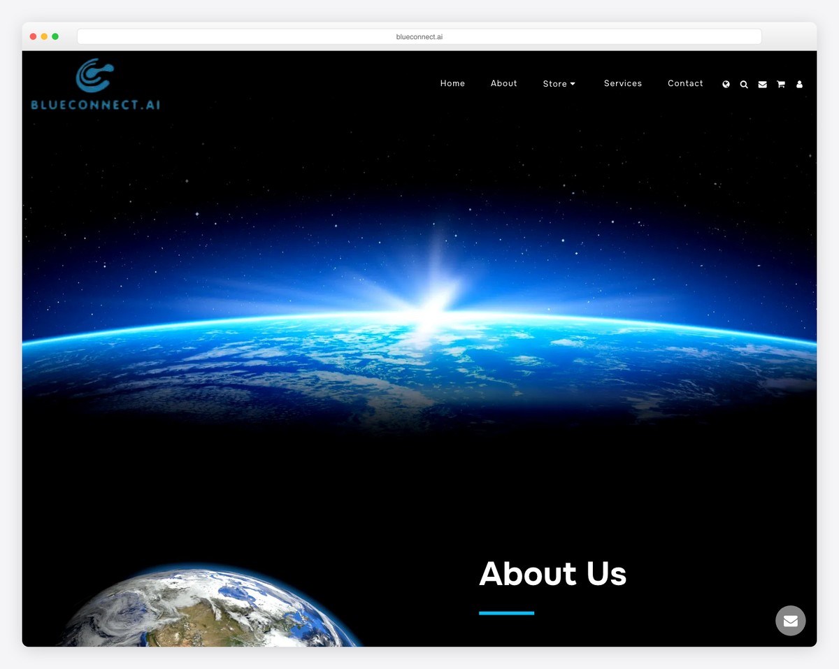
Blue Connect offers automation solutions for space electronics and aviation technology, using SITE123 to present their technical services with a space-themed visual design. The professional layout demonstrates that even high-tech companies can build credible sites with SITE123.
What stands out: Space-themed visual design creates instant differentiation for aerospace companies — themed aesthetics make niche businesses memorable.
12. Echoes Pink Floyd Tribute
Built with: Site123
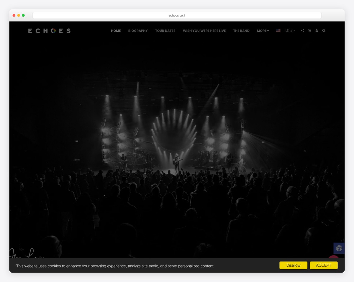
Echoes is a Pink Floyd tribute band using SITE123 to promote their events with ticket sales, seat mapping functionality, and event listings. The site demonstrates SITE123’s capability to handle event-driven businesses with integrated ticketing.
What stands out: Tribute bands and live entertainment acts benefit from integrated ticketing on their website — every click away to a third-party ticketing site loses potential buyers.
13. The Events Lounge
Built with: Site123
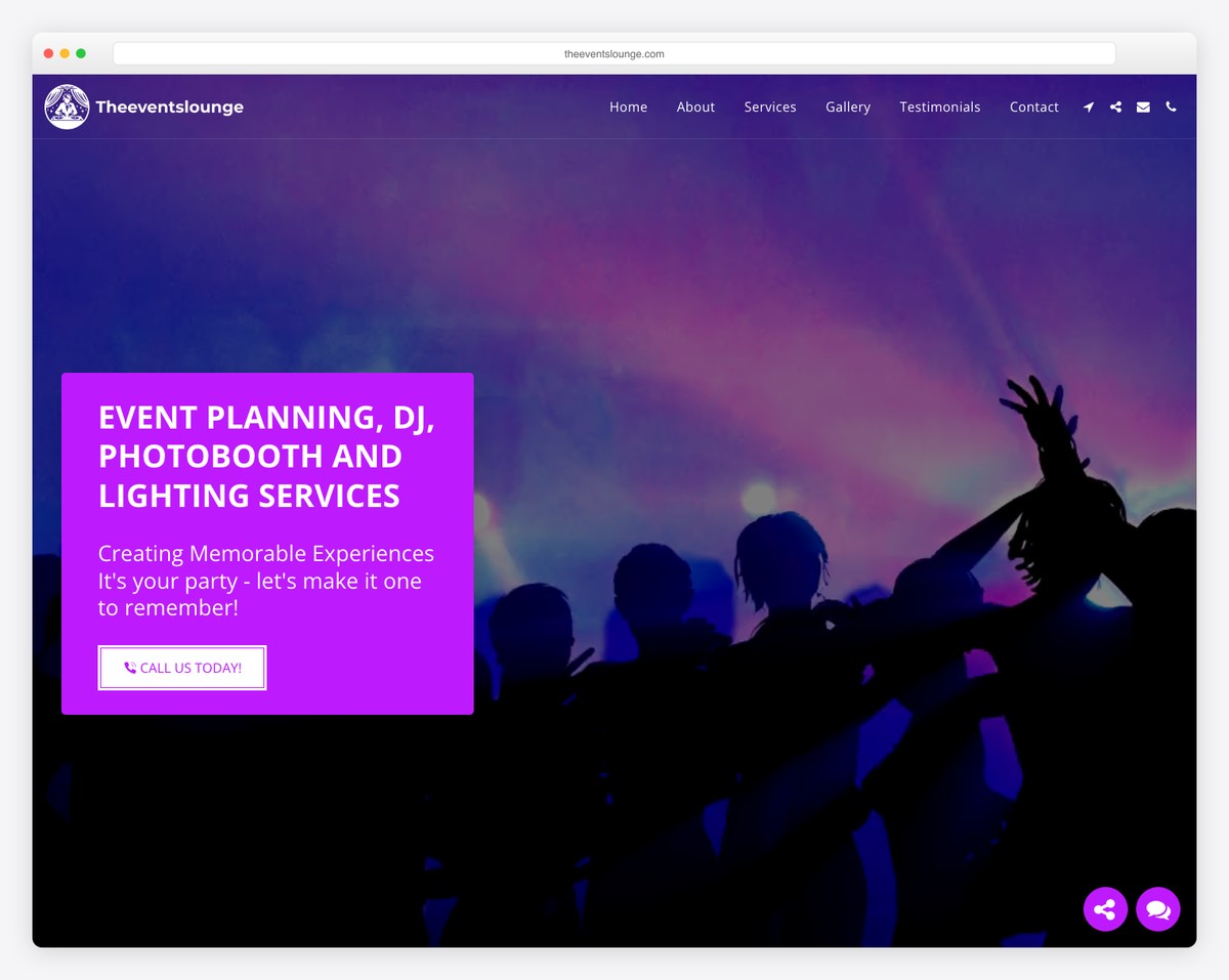
The Events Lounge is a full-service event planning company offering DJ services, photo booth rentals, and professional lighting solutions, all presented on a polished SITE123 site. The service showcase with pricing transparency sets clear expectations for clients.
What stands out: Event service companies that list pricing tiers upfront save time for both parties — clients self-qualify before reaching out, leading to higher-quality inquiries.
14. Decorated Green
Built with: Site123
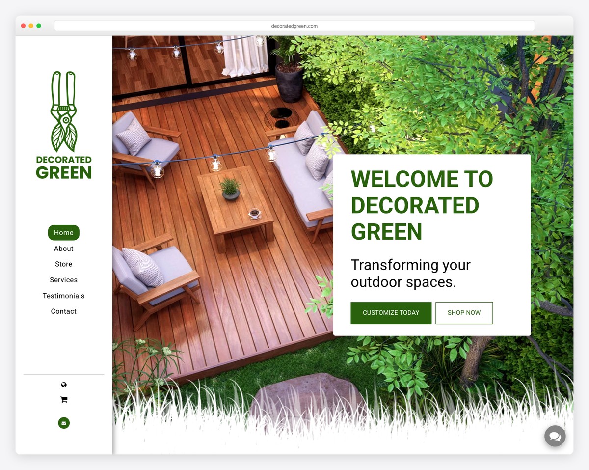
Decorated Green is a plant and greenery shop using SITE123 to showcase botanical products with lush, inviting photography. The nature-inspired design with warm earth tones creates an immersive shopping experience for plant lovers.
What stands out: Plant shops and garden businesses thrive with nature-themed web design — the color palette should feel like stepping into a greenhouse.
15. Sea Shuttle Services
Built with: Site123
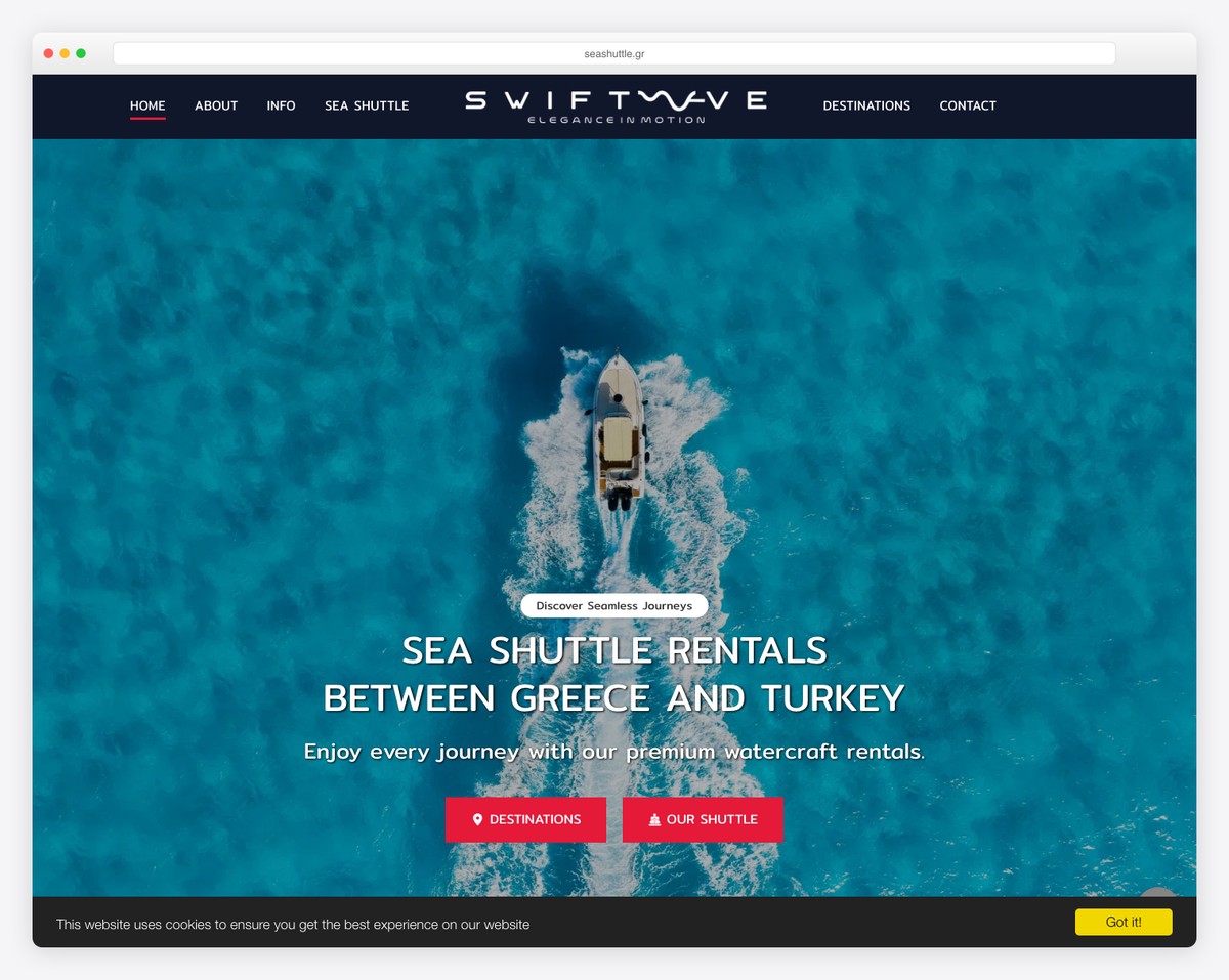
Sea Shuttle Services is a Greek maritime transport company offering boat shuttle services around the Greek islands. The SITE123 site features route information, schedules, pricing, and stunning Aegean Sea photography that captures the beauty of island-hopping.
What stands out: Tourism transport companies benefit from large destination photography — selling the experience of island-hopping is as important as listing schedules and prices.
16. Strive Gym Club
Built with: Site123
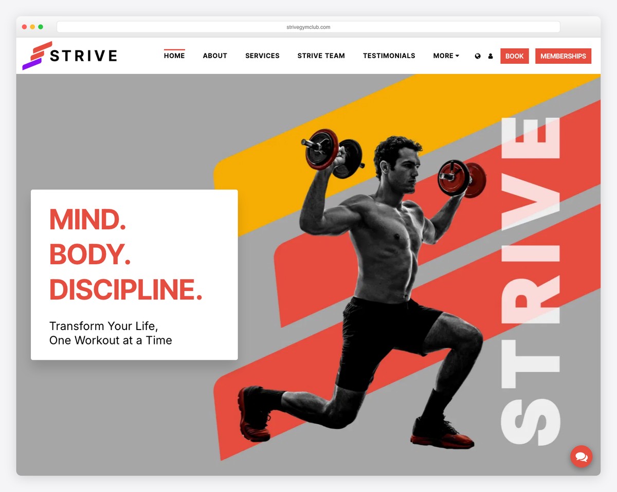
Strive Gym Club uses SITE123 to promote fitness facilities, class schedules, and membership options. The site features energetic imagery of workouts and equipment, membership tier comparisons, and integrated contact forms for prospective members.
What stands out: Gym websites that show real members working out — not stock photos — create a sense of community that motivates visitors to join.
17. Federico’s Food
Built with: Site123
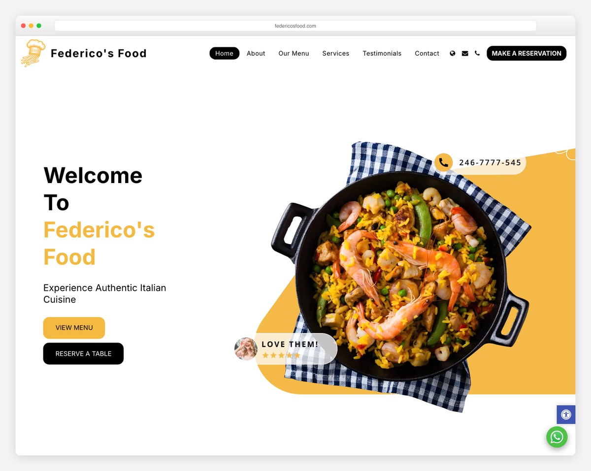
Federico’s Food is a restaurant with a well-structured SITE123 website showcasing menu offerings, dining atmosphere, and location details. The appetizing food photography and organized menu categories make it easy for diners to plan their visit.
What stands out: Restaurant websites should organize menus by category with photos — visual menus get more orders than text-only listings.
18. ByteSphere
Built with: Site123
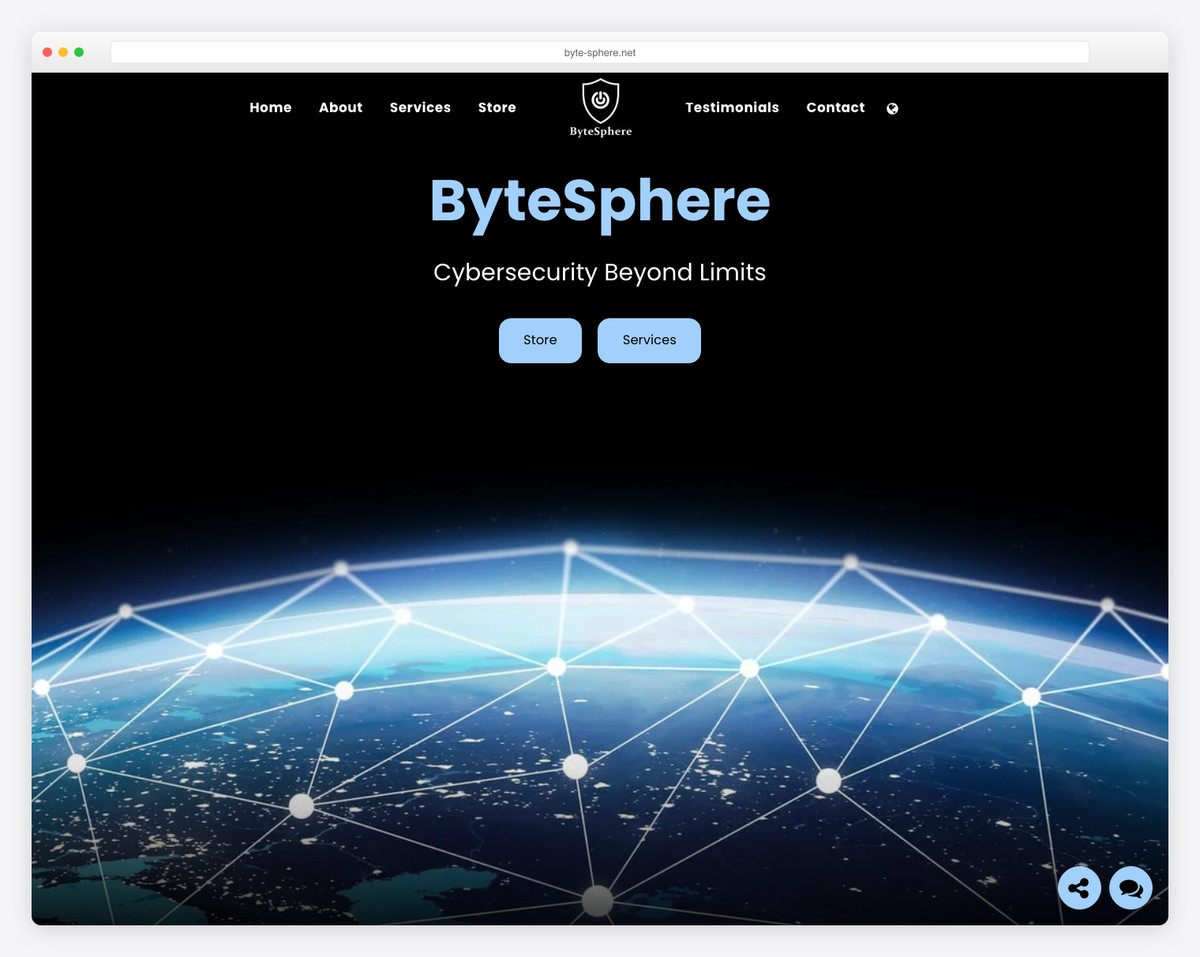
ByteSphere is a technology company leveraging SITE123 to present digital services and solutions. The modern tech aesthetic with clean layouts and service descriptions establishes credibility in the competitive tech space without custom development costs.
What stands out: Tech companies can launch professional websites on SITE123 quickly — speed to market matters more than custom design when you’re validating a new service offering.
Related Posts


Comments (0)