
34 Best Event Planning & Venue Website Examples 2026
One of the thirty-four event websites below asks when your event is. None of them put an enquiry form in the first screen.
These are working event planners and venues, opened in a browser and checked rather than pulled from a design gallery. The list splits almost exactly in half — seventeen planners and seventeen venues — and they turn out to be two different businesses that build two different websites. Every entry reports what the check actually found, including where a beautiful site leaves money on the table.
What we looked for
An event website is not a plumber’s website. Nobody books a venue in a panic at 2am, so the urgent-call checklist does not apply. What a visitor needs instead is to see the work, find out whether the place is free and what it costs, and know how many people it holds. We checked eight things on all thirty-four.
The eight things we checked, split by planners and venues
Measured in a browser at 1280×860. The planner and venue columns are the interesting part: they are not the same business and they do not build the same website.
| What we checked | All 34 | Planners | Venues | What the number tells you |
|---|---|---|---|---|
| Links a gallery or portfolio | 23 | 13/17 | 10/17 | The work is the pitch, and eleven sites still make you hunt for it. |
| Pricing or packages indicated | 14 | 2/17 | 12/17 | The sharpest split on the list. Venues quote; planners refuse to. |
| Enquiry form on the homepage | 7 | 4/17 | 3/17 | Only seven. Most of this industry runs on a contact page and an email address. |
| Availability or tour booking | 6 | 0/17 | 6/17 | Entirely a venue behaviour. No planner offers it at all. |
| Guest capacity stated | 5 | 0/17 | 5/17 | Five venues of seventeen publish the one number that rules them in or out. |
| Phone number above the fold | 6 | 5/17 | 1/17 | Inverted against the trades, where plumbers manage sixteen out of eighteen. |
| Enquiry form asks for the date | 1 | 1/17 | 0/17 | One. In an industry whose first question is always “are you free”. |
| Enquiry form above the fold | 0 | 0/17 | 0/17 | None at all. |
Best Event Planning & Venue Website Examples
Table of contents — all 34 event and venue websites
- Chappelow Events
- Wink Wed
- Fox Events
- Take Heart Events
- LK Events Chicago
- Convectures
- Swank Events Boston
- Oxygen Event Works
- Twenty Three Layers
- Shiloh Events
- Event Tech
- Handy & Dallaire Events
- Nola DMC
- Red Events
- Calder Clark
- Easton Events
- Rafanelli Events
- Almquist Farm
- The Barn at Reynolda Village
- Oakland Farm
- The Laurel
- Lily Farm House
- The Estate
- The Barn at Sitton Hill Farm
- Deep South Farms
- Aerial Mountain Springs
- Curry Estate
- Hickory Bend
- Stelladora
- Blue Blossom Rentals
- Hillbrook Estate
- Casa Sant’Elia
- The Orchard Penrith
- Mankin Mansion
1. Chappelow Events
Built with: Squarespace
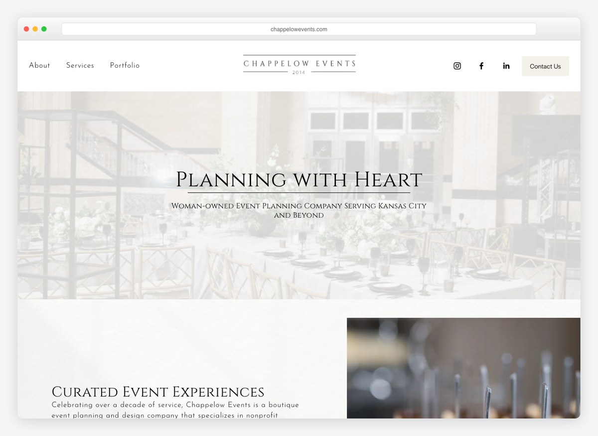
Four items in the menu — About, Services, Portfolio, Contact — and a headline that leads with temperament rather than capability. “Planning with heart” tells a couple what working with this planner feels like, which is closer to what they are shopping for than a list of services. The portfolio has its own top-level item rather than living inside Services, so the work is one click from anywhere.
What stands out: Selling temperament instead of capability. Couples choose a planner on how the process will feel, and the headline answers that first.
2. Wink Wed
Built with: Showit
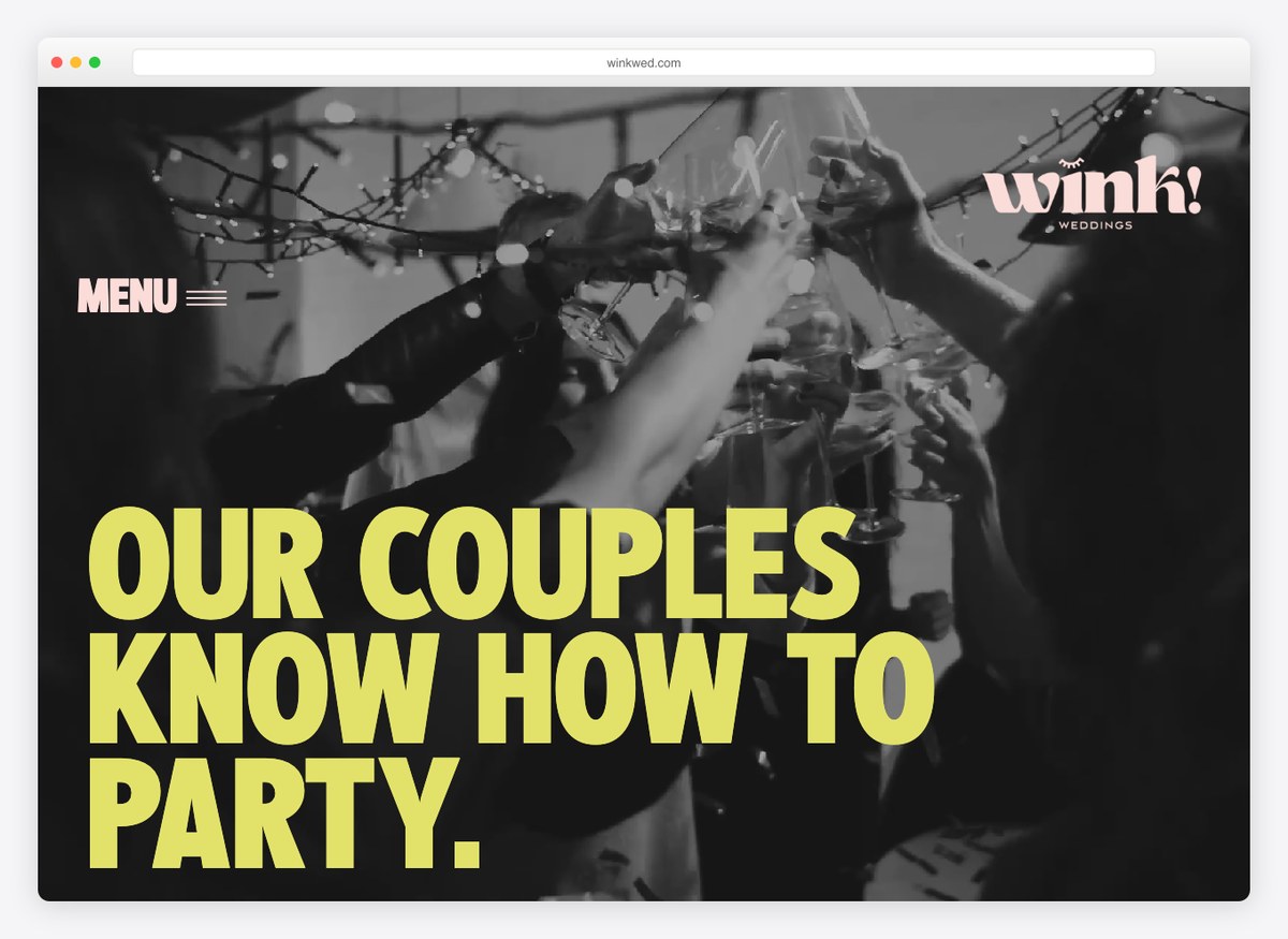
“Our couples know how to party” is the most confident line on this list, and it does real filtering work: it tells a certain kind of client they are in the right place and a different kind that they are not. The site runs on Showit, a builder used almost exclusively by wedding businesses, and it behaves like one — type set as an image, photography at full bleed, nothing that looks like a template.
What stands out: A headline that filters rather than flatters. Repelling the wrong enquiry is worth as much as attracting the right one.
3. Fox Events
Built with: Showit
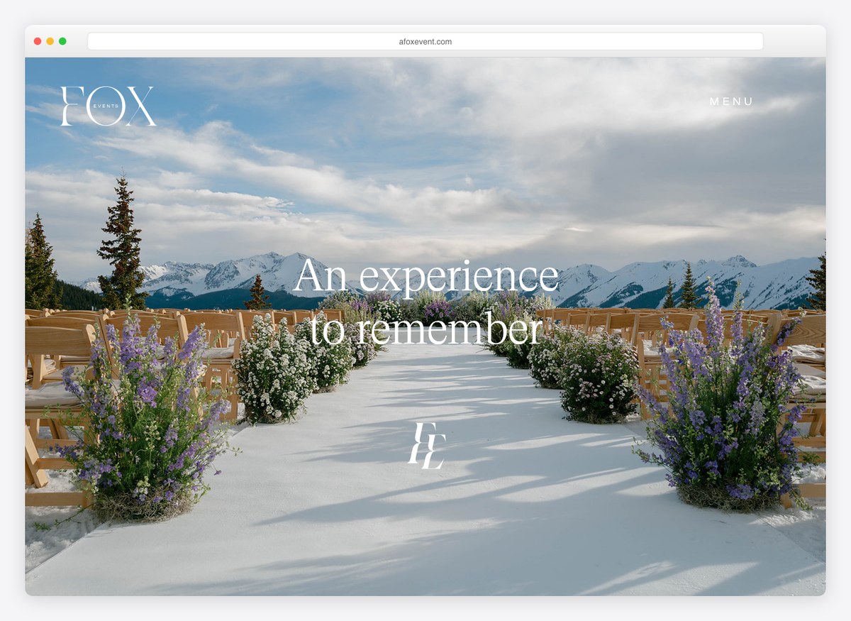
An event planner’s homepage has one job, which is to make you want to scroll through the photographs, and this one gets out of the way and lets you. The headline is four words, there is no navigation competing with the imagery in the opening screen, and the gallery is reachable from the first thing you see. The trade-off is real: there is no enquiry form and no phone number in the first screen.
What stands out: Getting out of the way of the photography. The work is the pitch, so anything competing with it in the hero is a cost.
4. Take Heart Events
Built with: WordPress
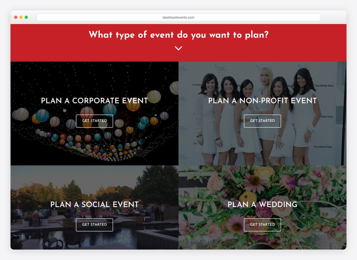
The hero is a question with buttons under it: what type of event do you want to plan, then corporate, non-profit, social or weddings. Those are four genuinely different buyers with different budgets and different worries, and the site routes them apart before anybody reads a word of copy. The menu repeats the same four as separate items, so each one is a page that can rank on its own terms.
What stands out: Segmenting in the hero rather than in the copy. A corporate buyer and a couple want different sites, and this gives them different sites.
5. LK Events Chicago
Built with: Showit
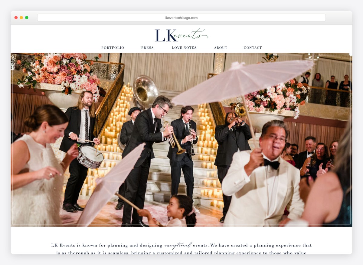
The opening screen is a full paragraph rather than a slogan, describing the planning experience in the planner’s own voice. It is a deliberate trade: it reads slower than a headline and it sells harder, because the thing being bought is somebody’s judgement over eighteen months. It only works because the writing is good, which is the caveat on copying it.
What stands out: A paragraph where everyone else puts a slogan. It sells judgement, which is what a planner is actually selling.
6. Convectures
Built with: WordPress
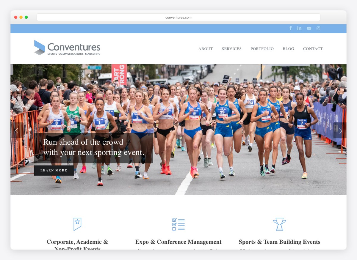
This is what an event site looks like when the client is a corporation rather than a couple. The headline claims a region and a position in it, the services list includes property activation and public relations rather than styling, and the whole page is arranged around credibility instead of romance. The gallery is present but it is not the pitch; the pitch is that the company has done this at scale before.
What stands out: Claiming a region and a rank in the first line. Corporate buyers shortlist on reputation, so the headline does the shortlisting.
7. Swank Events Boston
Built with: WordPress
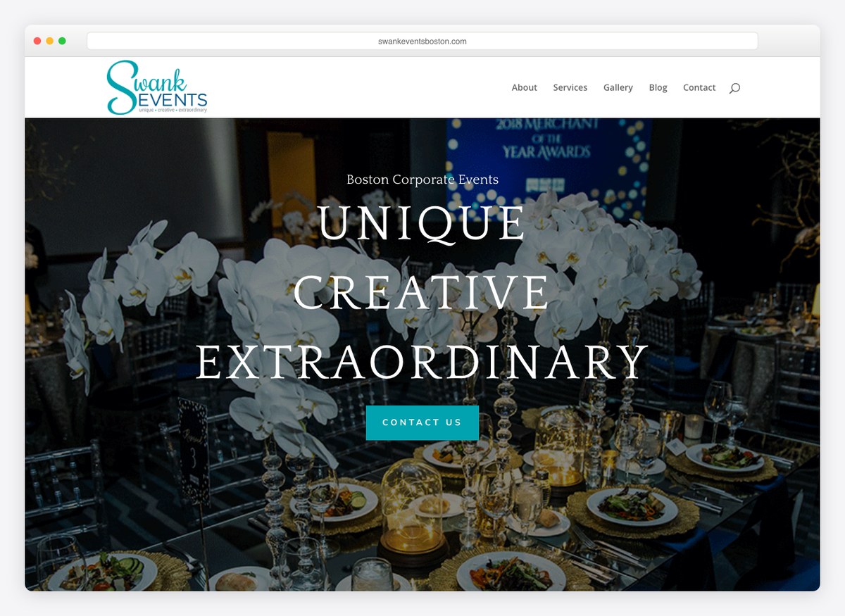
Three words, all caps, no sub-headline. The enquiry form asks two things, a name and an email, which is the shortest ask on this list by some distance and the right instinct for a business where the real conversation happens on a call anyway. Gallery sits in the menu beside Services. The site is doing very little and most of what it does is correct.
What stands out: A two-field enquiry form. Everything past the name and the email can be asked on the phone.
8. Oxygen Event Works
Built with: WordPress
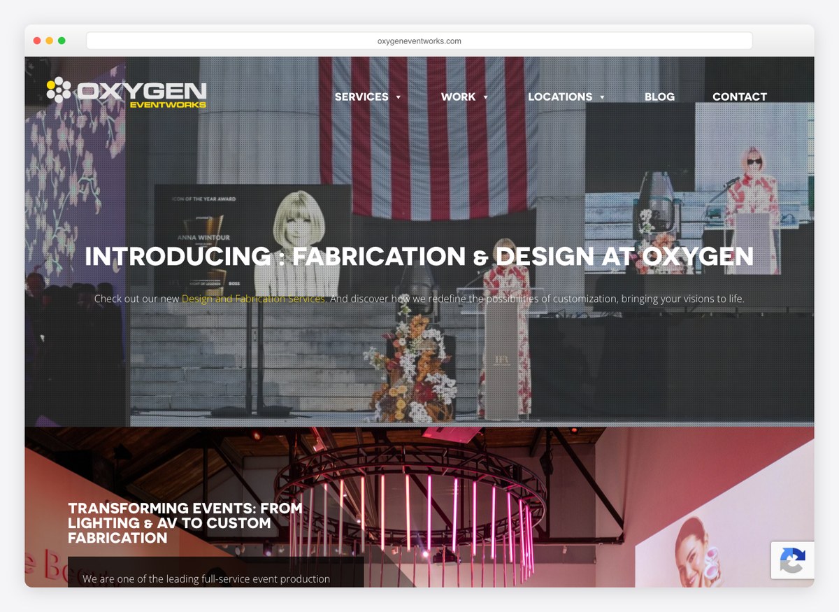
Not a planner but a production company, and the site is honest about it: the menu lists lighting, audio, video, staging and custom fabrication, and Locations is a top-level item because rigging a room in one city is a different business from rigging one three states away. There is no gallery link, which for a company selling visual production is the one obvious gap.
What stands out: Putting Locations in the top-level menu. For a production company the answer to “can you even get here” comes before anything else.
9. Twenty Three Layers
Built with: WordPress
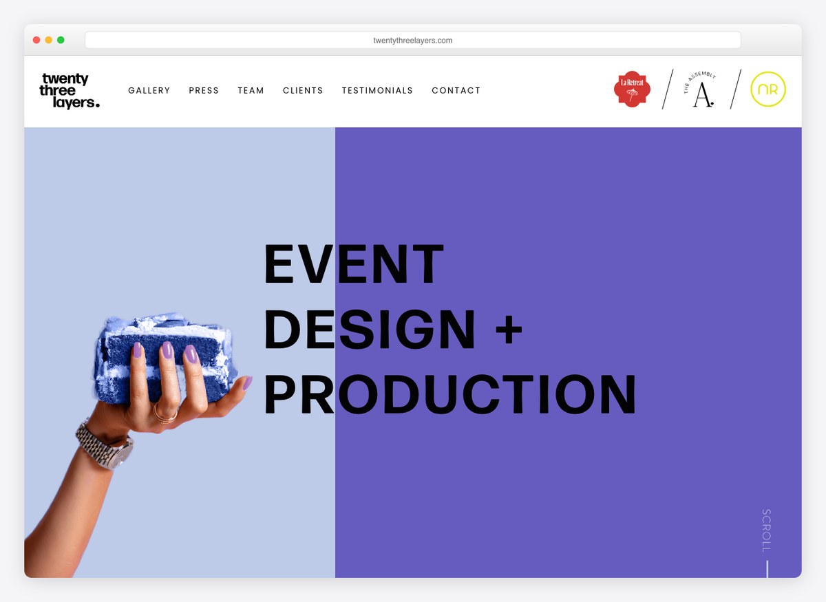
The menu is the argument: gallery, press, team, clients, testimonials, contact. Five of those six are proof and only one is a next step. For a planner working at the top of the market that ordering is right, because the enquiry is not won by describing a service, it is won by being visibly the kind of company that already does this for people the visitor has heard of.
What stands out: A navigation made almost entirely of proof. Five items of evidence to one call to action.
10. Shiloh Events
Built with: WordPress
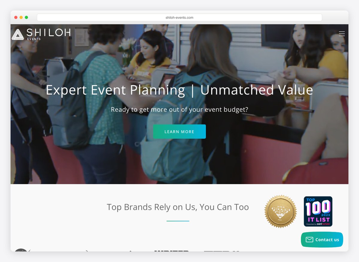
“Top brands rely on us” sits directly under the headline, and both the phone number and the email address are in the header, which is unusual here — most planners hide behind a form. The call to action reads “get your event started” rather than Contact, which describes the outcome instead of the mechanism. Corporate work, and the page is built for a buyer who has a deadline.
What stands out: A call to action written as the outcome. “Get your event started” asks for a decision; “Contact” asks for an errand.
11. Event Tech
Built with: WordPress
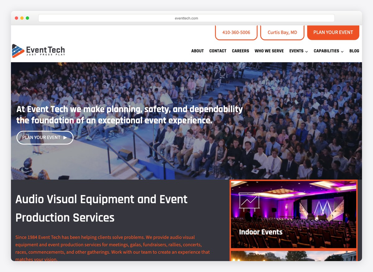
The header carries the phone number and the city, which is a small thing almost nobody else on this list does and which answers the second question a buyer has. The headline names the year the company started and the services in one sentence. “Who we serve” is a menu item, splitting the audience before the services do, and the primary button says plan your event.
What stands out: Phone number and city together in the header. One tells you how to start, the other tells you whether to bother.
12. Handy & Dallaire Events
Built with: WordPress
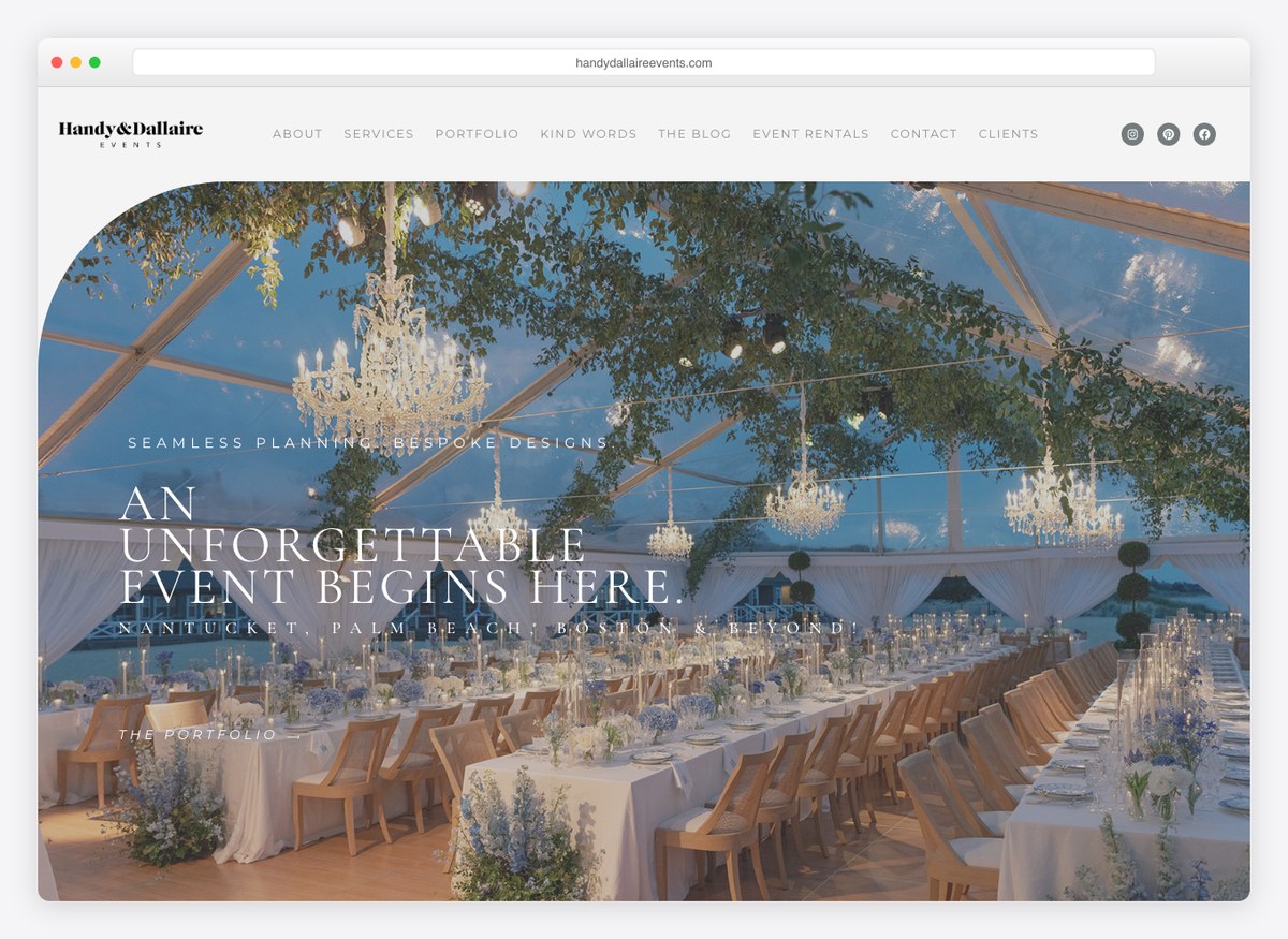
Two menu items here are doing work the others are not: “kind words” instead of Testimonials, which sounds like a person wrote it, and Event Rentals, which is a second revenue line sitting in plain sight. The homepage also describes what the full-service planning package actually includes, where most planners on this list decline to say anything about scope at all.
What stands out: Naming what the package includes. Two of seventeen planners say anything about scope; the rest make you ask.
13. Nola DMC
Built with: WordPress
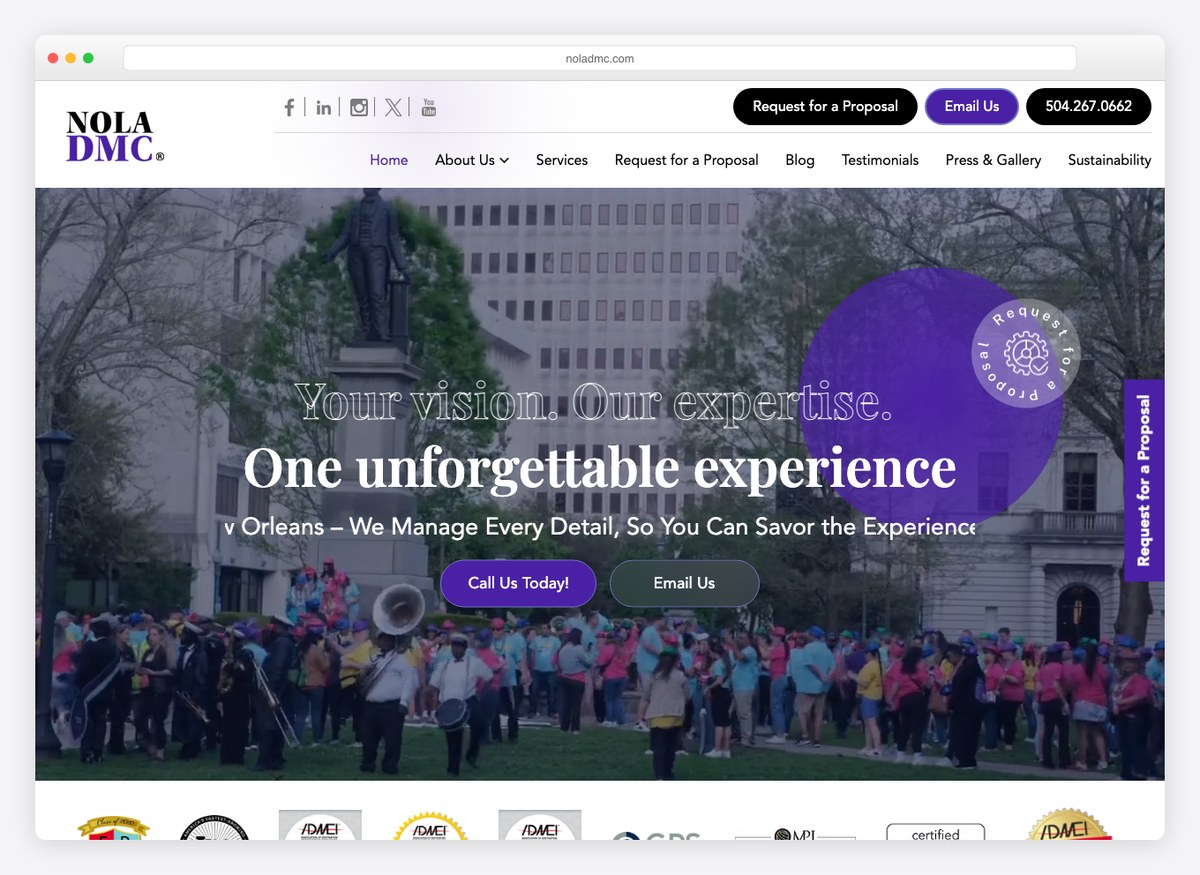
“Request for a proposal” is the first item in the menu and it repeats in the header, which tells you this is a destination management company selling to planners and corporates rather than to couples. The phone number appears twice above the fold. Sustainability has its own menu item, which for corporate event buyers with procurement policies is a qualifying criterion rather than a nicety.
What stands out: Sustainability as a menu item. On corporate work it is increasingly a box that has to be ticked before price is discussed.
14. Red Events
Built with: Wix
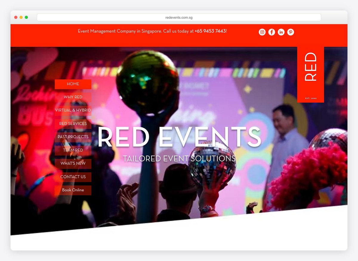
One site in thirty-four asks when your event is, and this is it. The enquiry form asks for a date and the type of event alongside the usual contact fields, which means the first reply can already answer the only question that matters. It costs the visitor one extra field. The form does ask for ten things in total, which is more than it needs, but the date is the one to copy.
What stands out: The only enquiry form on this list that asks for the date. Every other business finds out whether it is even available on the second email.
15. Calder Clark
Built with: Squarespace
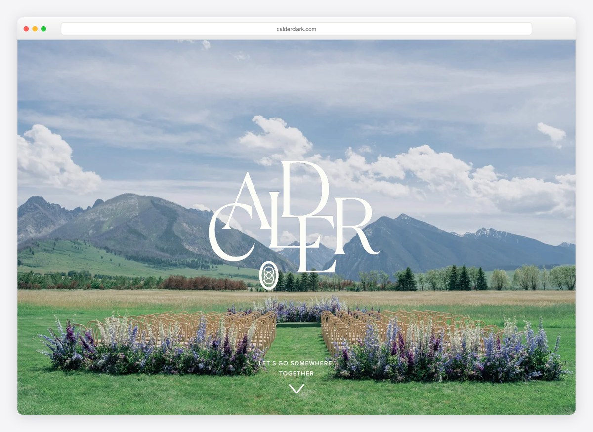
“Offerings” rather than Services, which sounds like a person and not a company, and no headline at all in the opening screen — the photography carries it alone. This is a planner at the luxury end where the enquiry arrives by referral and the site’s job is to confirm a decision rather than win one, and the design is correctly built for that reader.
What stands out: No headline in the hero at all. When enquiries come by referral, the site confirms rather than persuades.
16. Easton Events
Built with: Webflow
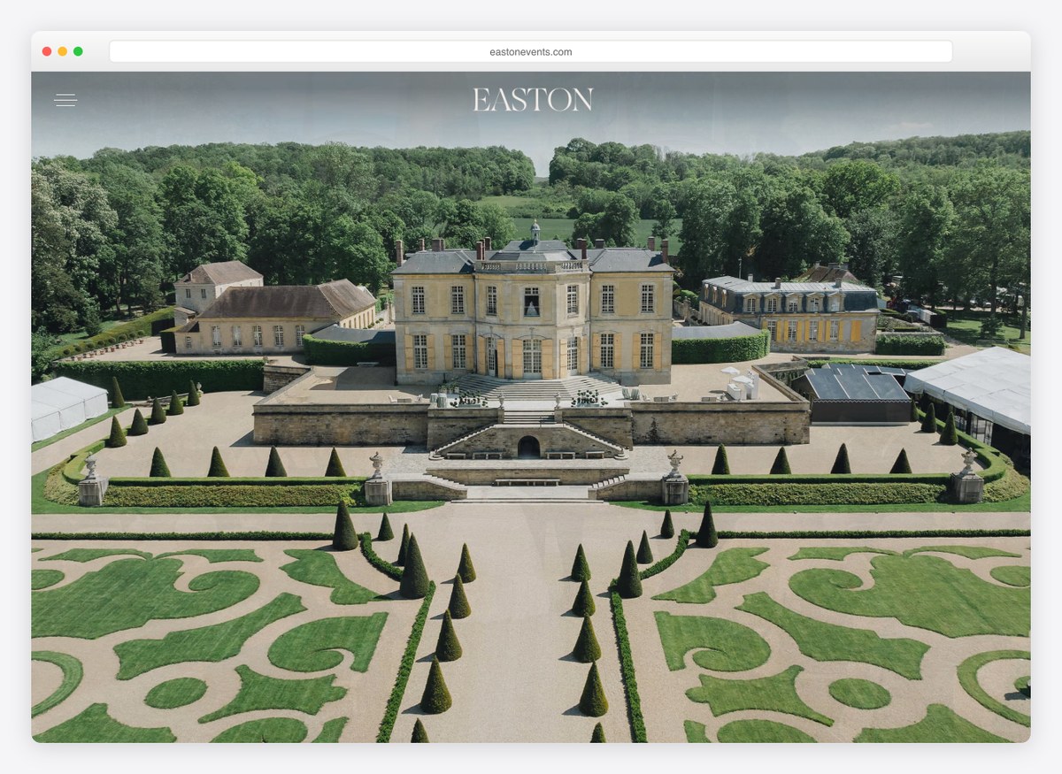
Two menu items reveal a second business: Education and Tech. This is a planner that also sells courses and software to other planners, which is how a name at the top of this industry compounds beyond the number of weddings it can physically staff. The event work itself is presented with almost no copy, on the assumption that anybody serious will recognise it.
What stands out: Selling to other planners as well as to clients. Education and Tech in the menu is a second business hiding in plain sight.
17. Rafanelli Events
Built with: WordPress
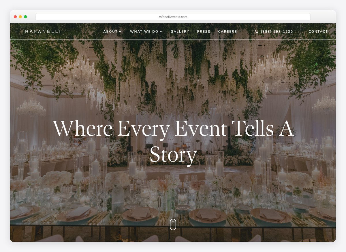
“Where every event tells a story” is the sort of line that usually means nothing, and here it is backed by a menu that splits the work six ways — weddings, non-profit, sports hospitality, social, destination, corporate. Sports hospitality is not a category most planners can claim, and putting it at the same level as weddings is a statement about which rooms this company works in.
What stands out: Six event types as separate menu items. The unusual one, sports hospitality, does more for credibility than the headline does.
18. Almquist Farm
Built with: Squarespace
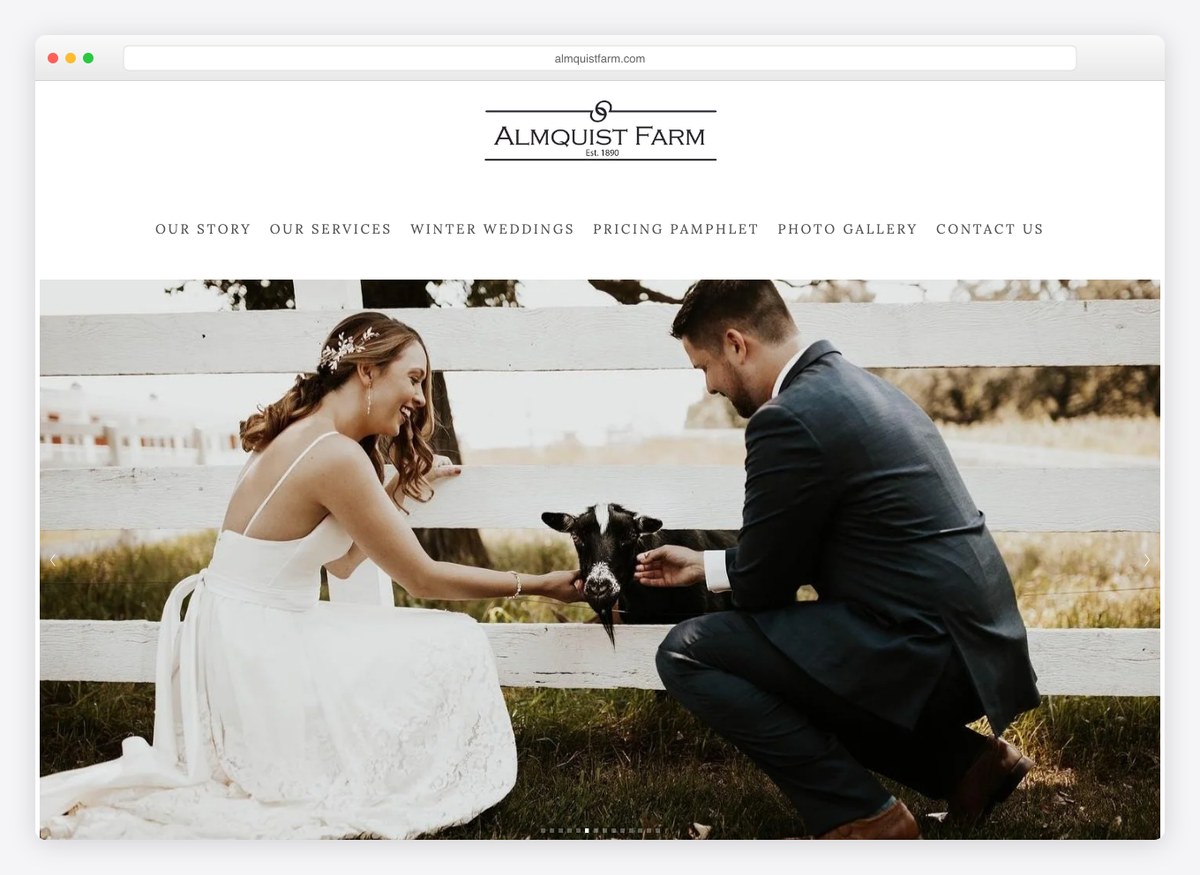
“Pricing pamphlet” is a menu item and a download button, which is the most direct answer to the question every venue visitor has and which twelve of the seventeen venues here handle better than the planners do. Winter weddings gets its own page, because in Minnesota that is a genuinely different product with different photographs and a different price.
What stands out: A whole page for winter weddings. In a climate with a real off-season, that page is the difference between a booking and a bounce.
19. The Barn at Reynolda Village
Built with: Squarespace
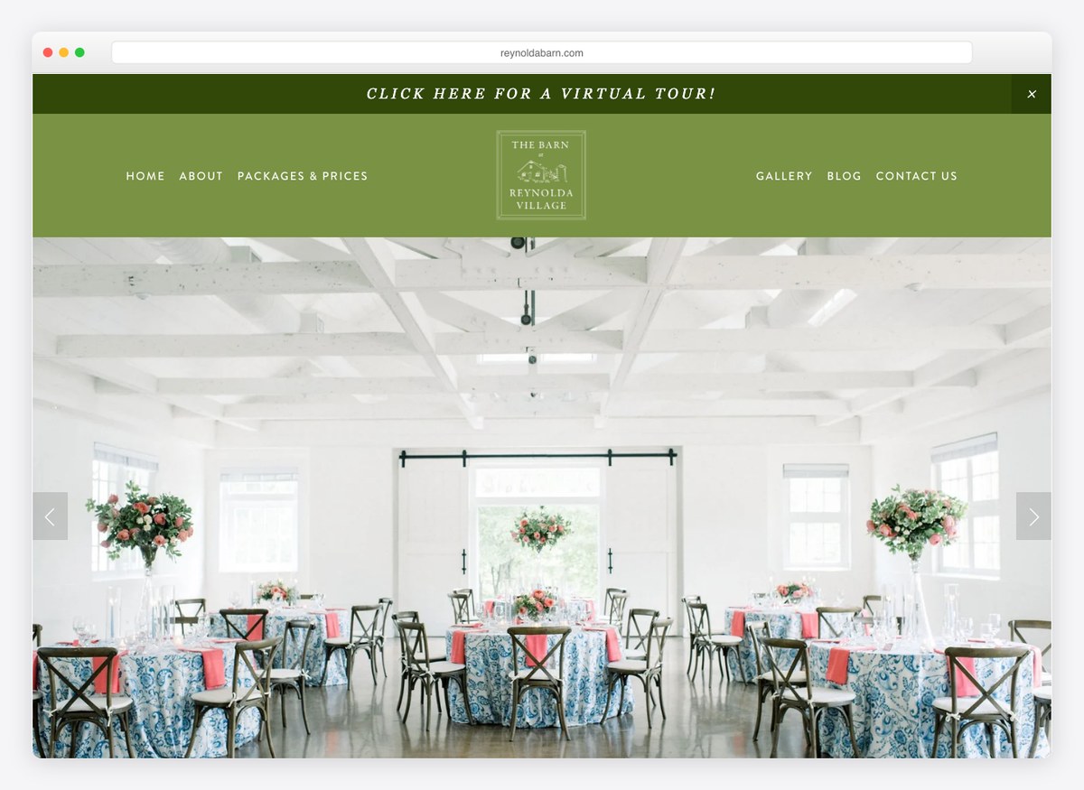
The menu contains floor plans and a virtual tour alongside packages and prices, which between them answer almost everything a couple needs before visiting: what it looks like, how it is laid out, and what it costs. Floor plans in particular are rare and disproportionately useful, because anybody planning seating for a hundred and fifty people needs the shape of the room, not another photograph of it.
What stands out: Publishing floor plans. Photographs sell the feeling; the floor plan is what a planner actually works from.
20. Oakland Farm
Built with: Squarespace
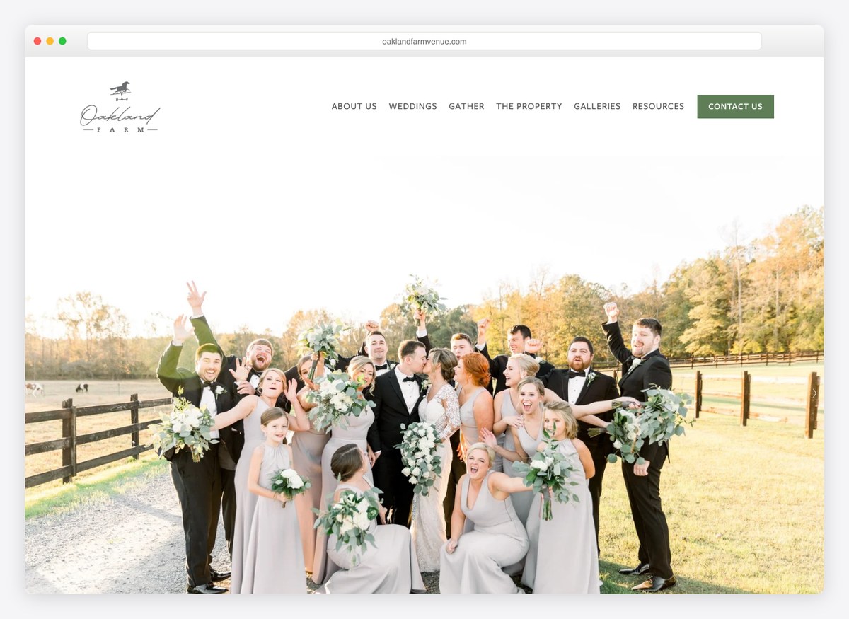
Venue pricing sits in the menu as its own item, and the rest of the navigation splits the building by occasion rather than by feature — weddings, corporate events, holiday parties, and a separate one simply called Gather. Selling the same room four different ways to four different buyers is how a venue fills the days that weddings do not.
What stands out: Selling the same room by occasion rather than by feature. Weddings fill Saturdays; the other pages fill the rest of the week.
21. The Laurel
Built with: Squarespace
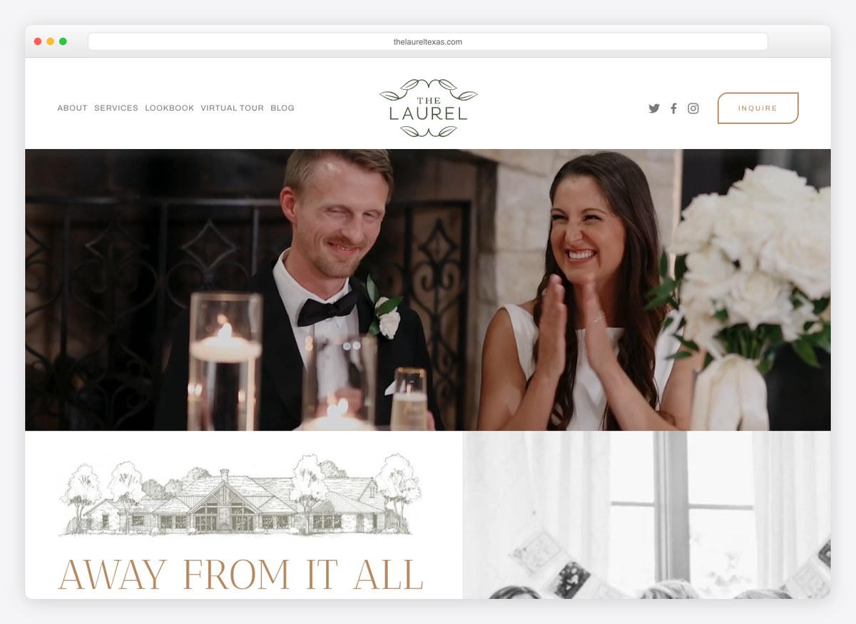
“Away from it all, in the heart of it all” resolves the tension every venue outside a city has to resolve, in nine words. The menu carries a lookbook and a virtual tour, and the call to action is Inquire rather than Contact, which sounds like the industry it is in. Food and beverage gets its own page, which for a venue that caters is a real cost centre and a real objection.
What stands out: A headline that answers the location objection instead of ignoring it.
22. Lily Farm House
Built with: Squarespace
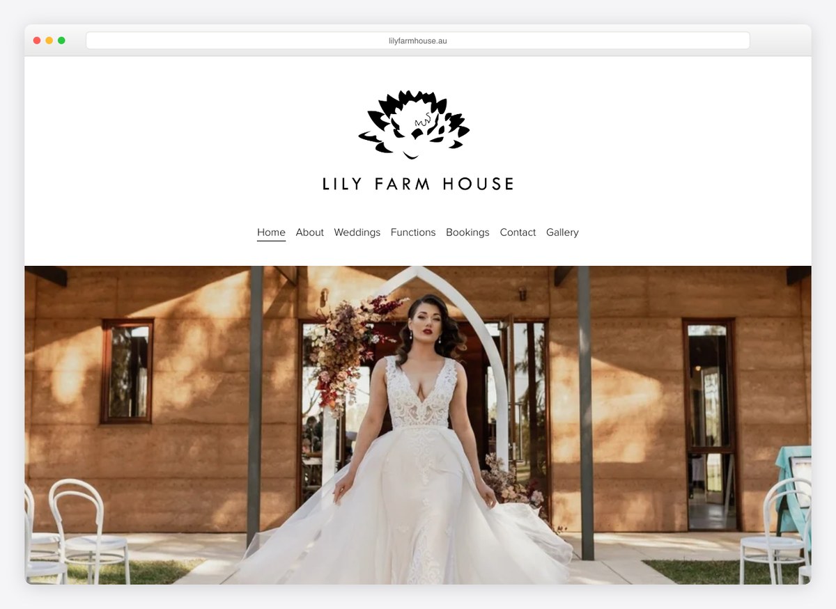
Weddings and Functions are separate menu items, which is the Australian way of saying the room works on weekdays too, and Bookings sits alongside them as a distinct step from Contact. Packages are linked from the homepage rather than gated behind an enquiry, which puts this venue in the majority here and the planners in the minority.
What stands out: Separating Bookings from Contact. One is a question and the other is a decision, and they should not share a page.
23. The Estate
Built with: Squarespace
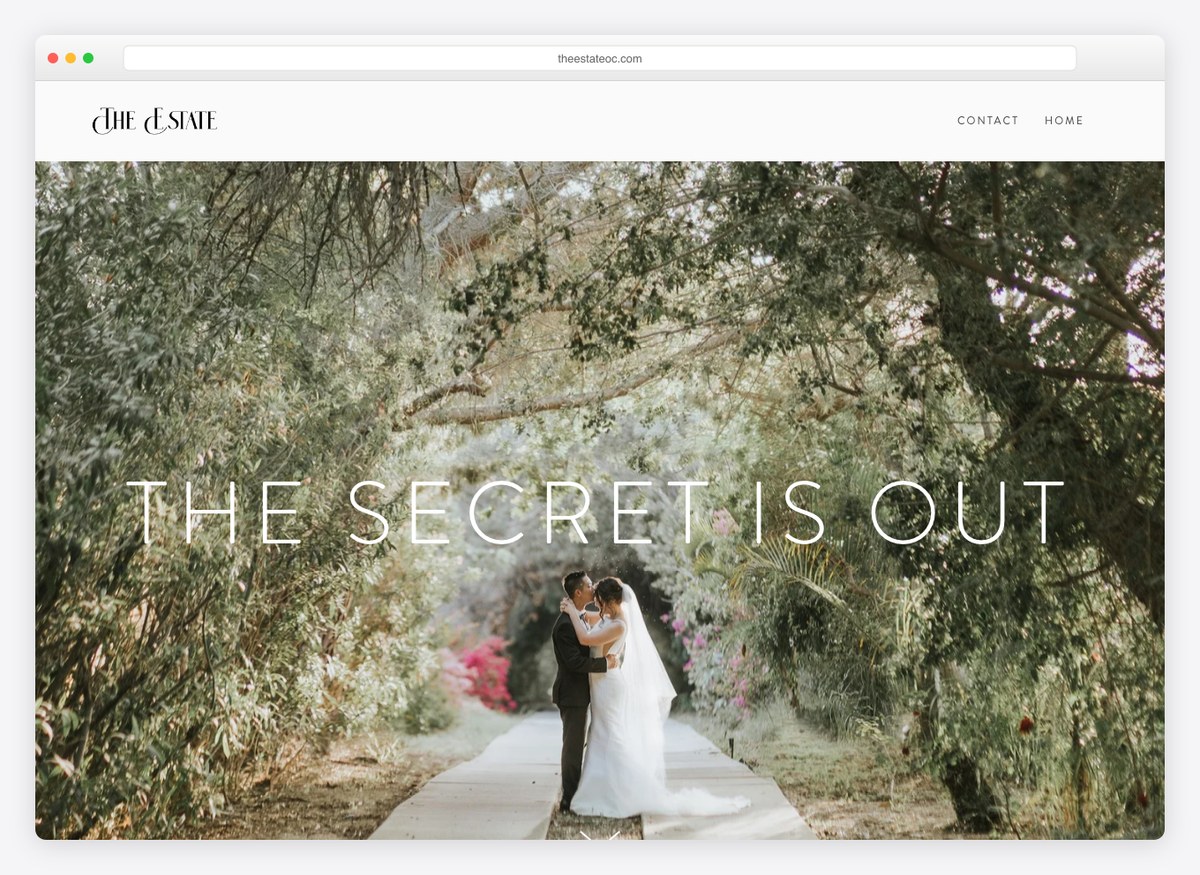
“The secret is out” is a headline doing positioning work — it implies the venue is both good and not yet obvious, which is exactly what somebody planning a wedding wants to have found. The call to action is “get package info now” rather than Contact, and the copy commits to all-inclusive packages, which removes the largest unknown before anybody fills in a form.
What stands out: Committing to all-inclusive pricing on the homepage. It removes the biggest unknown before the enquiry rather than after it.
24. The Barn at Sitton Hill Farm
Built with: Squarespace
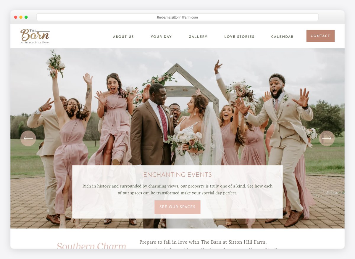
The most complete venue site here. The menu carries schedule a tour, vendors and pricing, a gallery, love stories and — uniquely on this list — a calendar. The copy states the acreage and the guest ceiling in the same breath, so a visitor can rule the venue in or out on capacity without emailing anybody. Every question a couple has in the first ten minutes has a page.
What stands out: A calendar in the main menu. It answers the date question that thirty-three of these thirty-four sites make you ask by email.
25. Deep South Farms
Built with: Wix
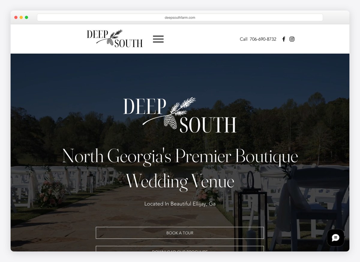
The headline claims a region and a category in six words, and the phone number is one of only two on the venue half of this list to sit above the fold. Packages are linked from the top of the page, the barn’s comfortable capacity is stated in the copy, and a tour can be requested. It is a plain site that answers the three questions in order.
What stands out: Naming the region and the niche in the headline. “Boutique wedding venue” plus a place is what people actually type.
26. Aerial Mountain Springs
Built with: Wix
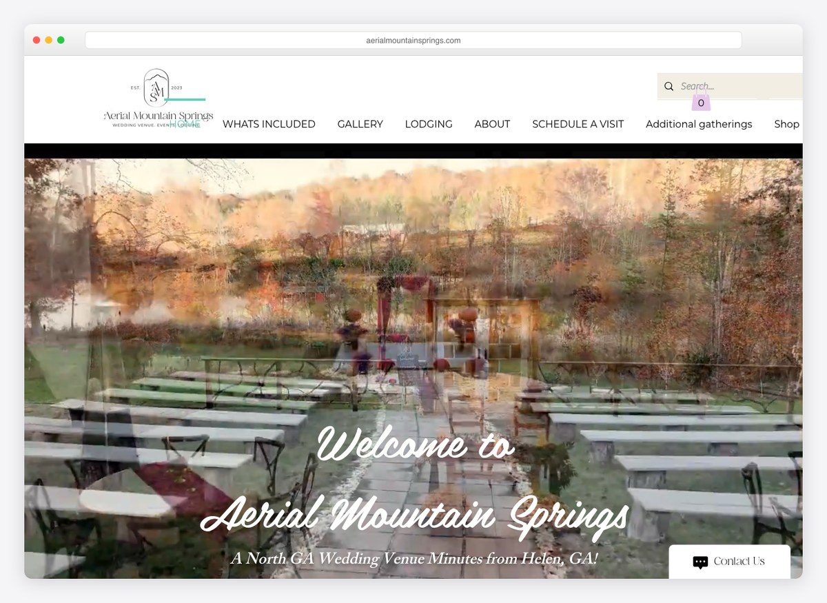
Two menu items are worth stealing outright: “available dates” and “single day investment”. The first answers the question the whole industry avoids and the second prices the thing without using the word price. On-site lodging has its own page, the seated capacity is stated in the copy, and there is a page for the towns nearby — useful, because guests travelling in are the couple’s next problem after the venue.
What stands out: “Available dates” as a menu item. It is the one question every visitor has and almost nobody publishes an answer to.
27. Curry Estate
Built with: Wix
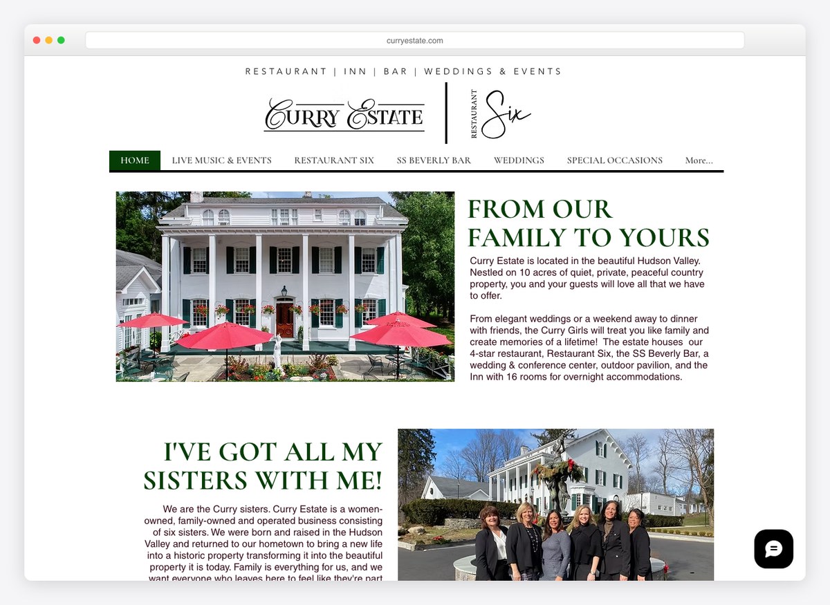
Most of this navigation is a restaurant — dinner, bar, brunch and prix fixe menus, a wine list — because the venue is an estate with a working restaurant and sixteen rooms that also hosts weddings. That is honest, and it is also a warning: a couple arriving from a wedding search has to work to find the wedding pages, and the packages link is well down the homepage.
What stands out: A reminder that a mixed business needs a wedding entrance. The restaurant menus outnumber the wedding pages in the navigation.
28. Hickory Bend
Built with: Wix
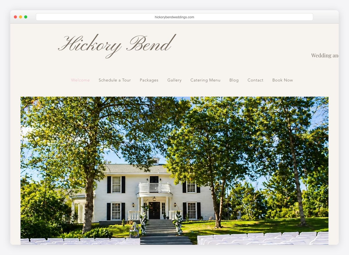
Schedule a tour, packages, gallery, catering menu, book now — five menu items and every one of them is a step in the same decision, in roughly the order a couple takes them. Publishing the catering menu is the unusual one, and it removes a conversation that otherwise happens three emails in.
What stands out: A menu that is the booking process in order. Nothing in it is there for the venue’s benefit.
29. Stelladora
Built with: Shopify
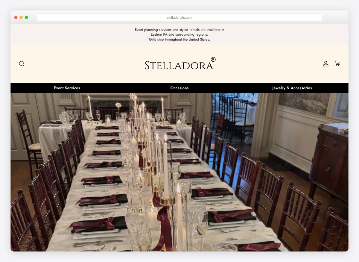
Two of the seventeen venues run on Shopify and this is one of them, which stops looking odd the moment you see what is being sold: planning packages and styled rentals as actual products, with a cart. For a business whose inventory is objects rather than dates, a shop is a better fit than a brochure with an enquiry form on the end of it.
What stands out: Selling packages as products with a cart. When the inventory is objects rather than dates, a shop beats an enquiry form.
30. Blue Blossom Rentals
Built with: Shopify
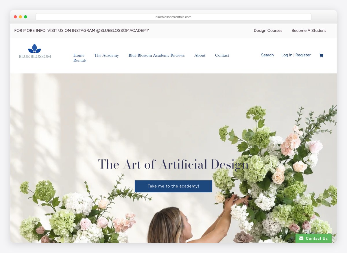
Also Shopify, and also selling something other than a room: the menu carries Rentals and an Academy, the second being a course sold to other people who want to run a rental business. The site is more e-commerce than venue, which is a legitimate answer to a question most businesses on this list never ask, namely what else the audience would buy.
What stands out: An academy alongside the rentals. The audience that hires your inventory will also pay to learn your business.
31. Hillbrook Estate
Built with: Webflow
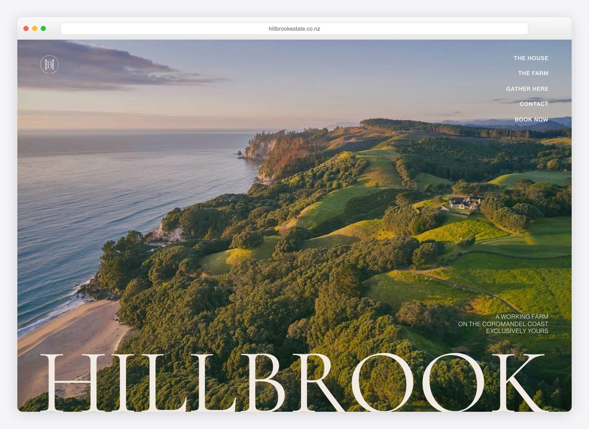
“For up to twenty guests” is the smallest capacity claimed on this list and it is stated plainly, which turns a limitation into a filter. The menu splits the property into the house and the farm and then invites you to gather there, and a booking can be started directly. A venue that knows it is small and says so early wastes nobody’s time.
What stands out: Publishing a small capacity as a headline fact. Stating the ceiling early filters harder than any amount of styling.
32. Casa Sant’Elia
Built with: Webflow
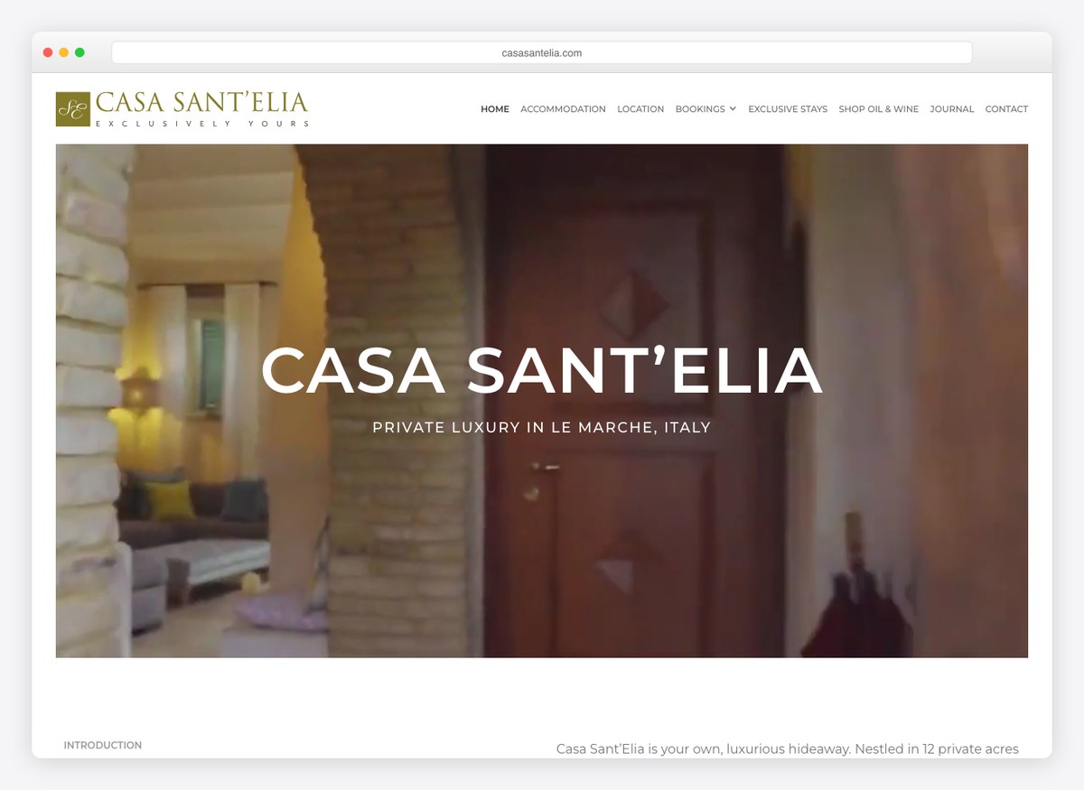
An Italian estate whose menu includes accommodation, exclusive stays, retreats, corporate events and a shop selling its own oil and wine. That last item is the tell: the property is a working estate first and a venue among several other things, and the site is built to sell the place in whichever way a visitor happens to want it. There is no gallery link and no enquiry form in the opening screen.
What stands out: Selling the estate five ways from one menu. The oil and wine shop is a reminder that a venue is a property with more than one revenue line.
33. The Orchard Penrith
Built with: Webflow
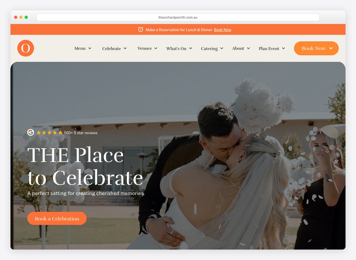
Part of a group rather than a single room, and the navigation shows it: there is a link to view all venues, several food outlets with their own menus, and a Functions section underneath. The events business is one floor of a larger hospitality operation, which is a common structure and an awkward one, because the couple searching for a venue and the family ordering takeaway need different front doors.
What stands out: A group site trying to serve two audiences at once. It is the clearest argument on this list for giving events its own entrance.
34. Mankin Mansion
Built with: Webflow
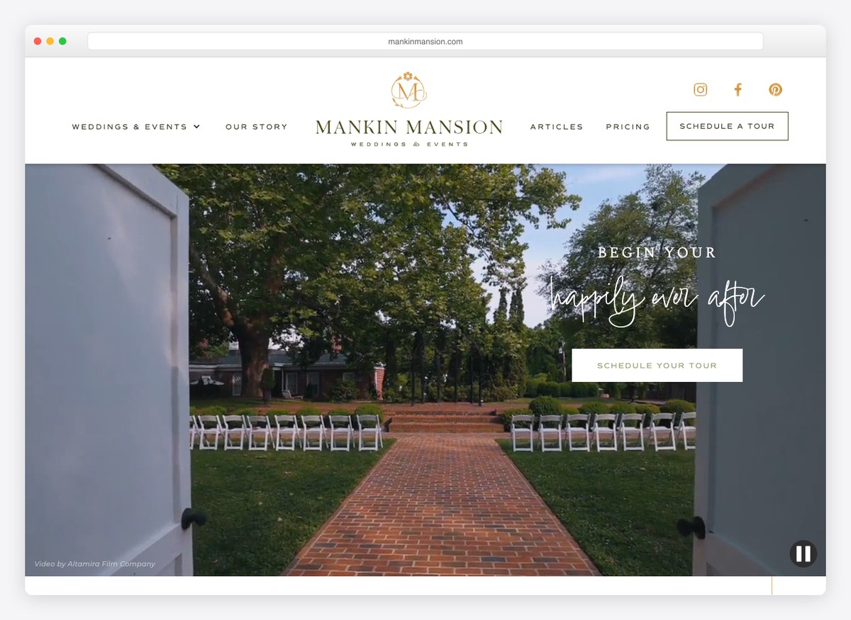
“Begin your happily ever after” with a typographic flourish on the middle words, and a pricing page linked from the homepage that describes packages as making the process worry-free. The menu splits weddings from special events at the top level, and a tour can be requested. It is a conventional wedding-venue site executed carefully, which is most of what this category needs.
What stands out: Splitting weddings from special events at the top level. The same room, two buyers, two paths, and neither has to read past the menu.
What the thirty-four palettes have in common
Every swatch below is sampled from that site’s own screenshot. This is the most restrained colour of any industry we have measured.
The ground — what the page sits on
The accent — where any colour appears at all
This industry has almost no brand colour, and that is the finding. Twenty-four of the thirty-four sit on white or near-white, and twenty carry no chromatic accent at all — the palette is the photography, and everything else gets out of its way. Where a colour does appear it is idiosyncratic rather than conventional — a purple, a teal, a single loud red — because there is no industry colour to conform to. Compare the trades, where a plumber’s page is a white ground with one blue button and an electrician’s is the same in red: those businesses use colour to be found in a hurry, and these use its absence to look expensive.
Building an event or venue website yourself
Not one of the seventeen venues runs WordPress. Every platform here was detected from the site’s own markup and asset hosts, and all thirty-four gave an answer. The venues are entirely on hosted builders — 7 on Squarespace, 4 on Webflow, 4 on Wix and 2 on Shopify — while 10 of the seventeen planners run WordPress — six of them on a page builder, most often WPBakery, and four on a theme with no builder at all. Three planners use Showit, a builder aimed almost entirely at the wedding industry that leaves no fingerprint in the markup at all.
The two Shopify venues are not a mistake. Both sell packages and rentals as products with a cart rather than as an enquiry. If your inventory is objects rather than dates, a shop fits better than a brochure with a form on the end of it.
Then fix the three things almost everybody gets wrong. Ask for the date in your enquiry form: one site in thirty-four does, and it is the only question that decides whether a conversation is worth having. Publish your capacity and your starting price, because a visitor who cannot rule you in will rule you out. And put the gallery one click from the first screen — eleven of these sites bury the only thing a visitor came to see. For a starting point, our roundup of event planner WordPress themes covers the planner half, and the event templates collection covers gallery-led designs on the builders the venues actually use.
How we chose these
Opened every site
Each one loaded in a real browser at 1280×860 and judged from the live page, not from an old screenshot in our media library.
34 checked · 34 re-captured
Used event criteria, not trade criteria
Capacity, pricing, a date field, availability and gallery access — the things this industry is actually judged on.
8 criteria · counted, not rated
Split planners from venues
They are two different businesses. Reporting them together hides the only interesting thing in the data.
17 planners · 17 venues
Detected the platform
Read from each site’s markup and the asset hosts it loads. Showit shows up in neither a generator tag nor a path, only in its CDN.
34 of 34 confirmed
Two things here are judgement rather than measurement. Every site belongs to a business that is actually trading, and the list is ordered planners first, then venues, rather than by rank — a destination management company and a barn in Georgia are not competing with each other.
Browse the other Hospitality, travel & events website examples (9 more collections), or see website examples for every industry.

Related Posts


Comments (0)