
31 Best Conference Website Design Examples 2026
A great conference website does three jobs: it sells tickets, it shows who is speaking, and it gives people a reason to come back after the event. These 31 conference website examples range from WWDC, Google I/O and GitHub Universe to community events like PyCon and CSS Day, design festivals like OFFF and Typographics, and research conferences like SIGGRAPH and NeurIPS. If you need a starting point, browse our event website templates.
We opened every site in a real browser and noted the platform it runs on: seven are built with Next.js, four run on WordPress and four use Webflow or Wix. Since conference sites change with every edition, each description focuses on structure (how the page sells, lists speakers and handles the time after the event) rather than dates or line-ups.
Tech Company Conference Websites
Flagship events run by Apple, Google, GitHub, Stripe, Figma and other tech companies. These sites have big budgets and show every stage of an event’s life, from ticket sales to the on-demand video library afterwards.
1. WWDC
Built with: Custom code · headlines in SF Pro Display
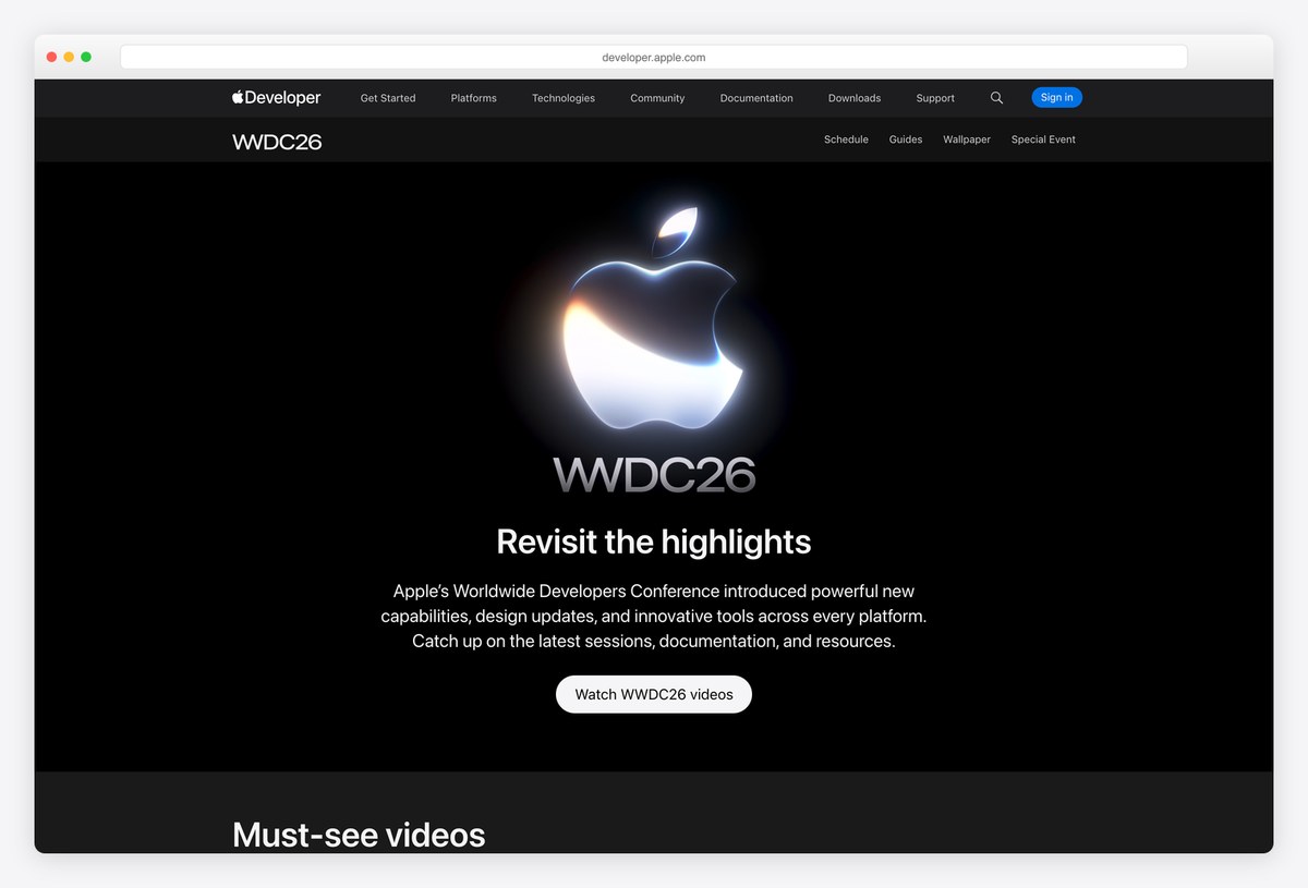
Apple’s WWDC site sits inside the Apple Developer site, with its own sub-navigation for the schedule, guides, wallpapers and the special event. Once the keynote is over, the page turns into a video library of the sessions.
The page we captured shows the after-event version: a glowing Apple logo on black, a short summary and a Watch videos button, then a row of must-see videos with durations. Headlines are set in SF Pro Display. The site is custom-built.
What stands out: The site becomes a video library once the event is over.
2. Google I/O
Built with: Custom code · headlines in Google Sans
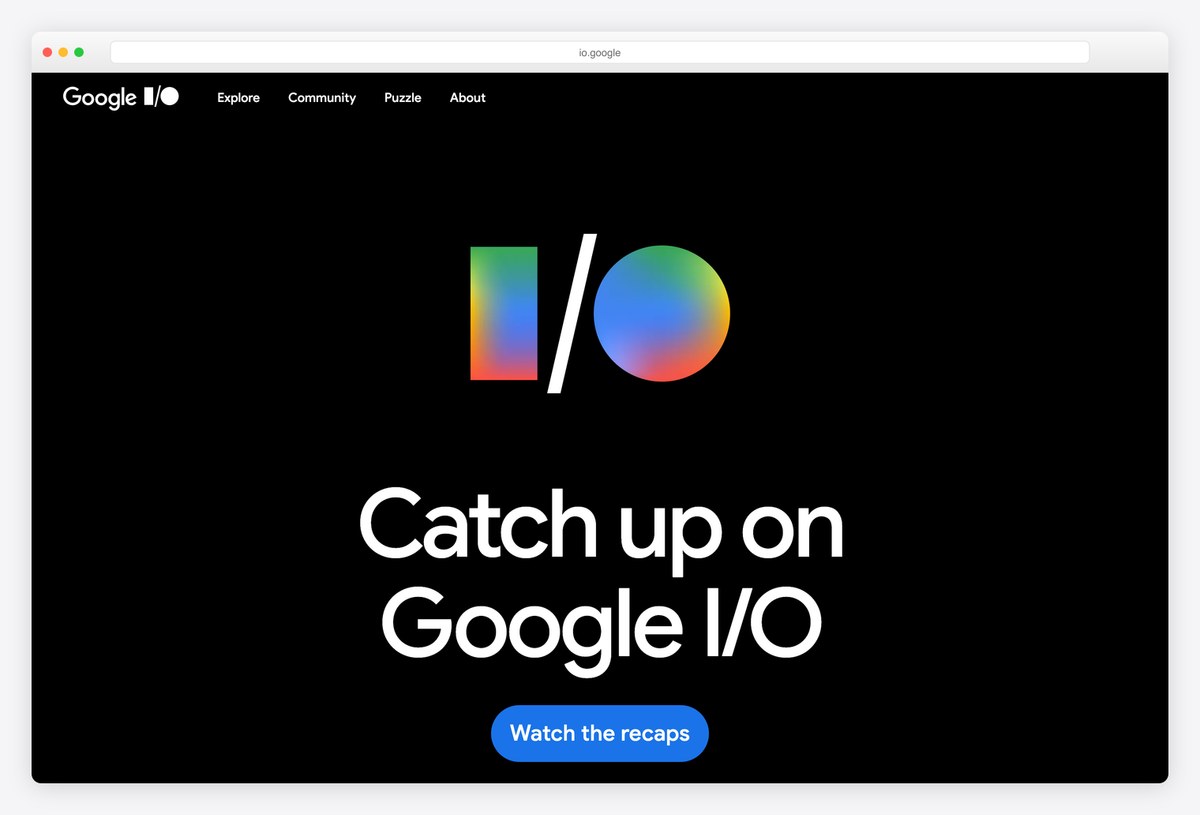
Google I/O keeps its homepage almost empty: the I/O logo in Google’s colours on a black background, one large headline in Google Sans and a single blue button. After the event, that button leads to the keynote recaps and sessions on demand.
A short menu covers Explore, Community, Puzzle and About, and the yearly I/O puzzle is a nice touch that keeps developers engaged before the event. The site is custom-built.
What stands out: One headline, one button and a puzzle to keep developers engaged.
3. GitHub Universe
Built with: Next.js · headlines in Mona Sans
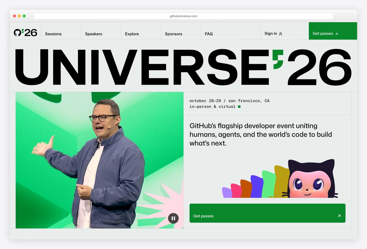
GitHub Universe sets the event name in huge black capitals across the top of the page, with a stage photo on a bright green panel below and the dates, place and a one-line description beside it. A green Get passes button stays in the top-right corner.
Mona, GitHub’s mascot, and a row of coloured shapes add some character. The menu covers Sessions, Speakers, Explore, Sponsors and FAQ. Headlines are set in Mona Sans, GitHub’s own typeface, and the site is built with Next.js.
What stands out: A giant event name and a ticket button that never leaves the screen.
4. Stripe Sessions
Built with: Next.js, Contentful · headlines in Söhne
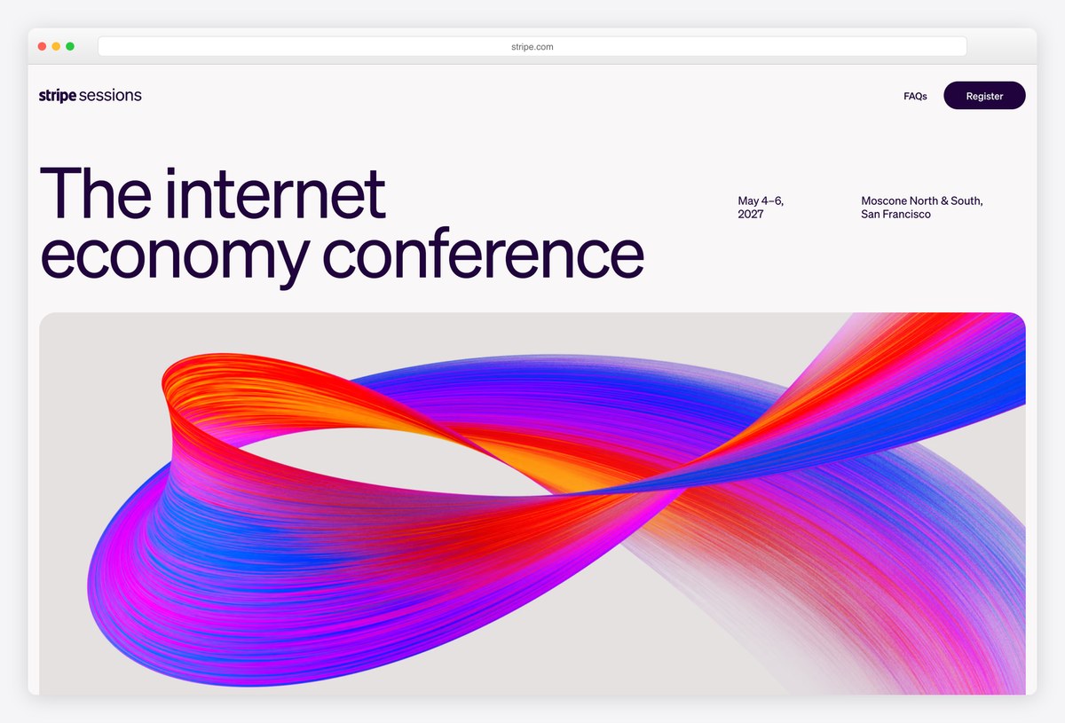
Stripe Sessions describes itself in a single line, “The internet economy conference”, set large in Söhne on a light background, with the dates and venue in small type to the right and a flowing 3D ribbon of colour underneath.
Below, an agenda at a glance lists each day’s keynotes, breakouts and receptions. The header has only FAQs and a Register button. The site is built with Next.js with content from Contentful, and it shows how much calm and white space a premium event can afford.
What stands out: One-line positioning and an agenda you can read at a glance.
5. Vercel Ship
Built with: Next.js · headlines in Geist Pixel
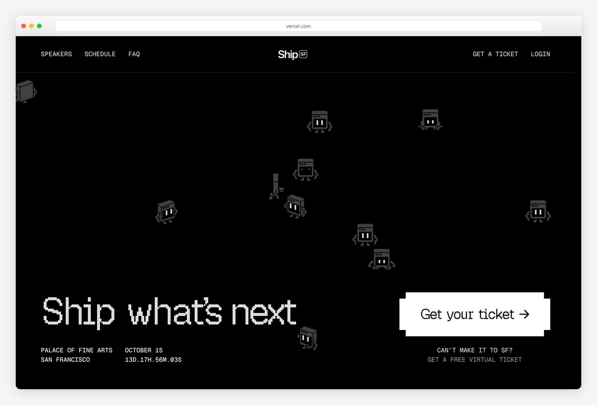
Vercel Ship uses a black page with small pixel-art characters drifting across it, the headline “Ship what’s next” in Geist Pixel and a live countdown to the event next to the venue and date. A white Get your ticket button sits on the right, with a free virtual ticket below it.
Featured speakers and sessions follow in monospaced type. The site is built with Next.js. The countdown and the virtual ticket option are two simple ways to turn visitors into attendees.
What stands out: A live countdown and a free virtual ticket beside the main one.
6. Figma Config
Built with: Next.js, Sanity
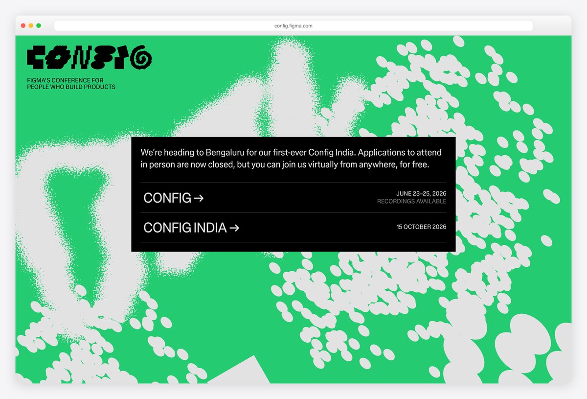
Figma’s Config site uses a bright green background covered in a grainy, generative pattern, with the Config logo in a custom display face in the corner and a black panel that links to each edition of the event.
Between conferences, the homepage becomes a hub of editions and recordings rather than a sales page. It is built with Next.js and its content lives in Sanity. Using one bold colour and a generated pattern gives the event an identity that changes every year without losing its recognisability.
What stands out: A hub for every edition, held together by one bold colour.
7. AWS re:Invent
Built with: Custom code · headlines in Amazon Ember Display
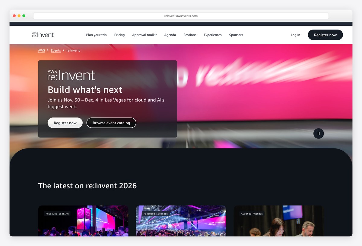
AWS re:Invent uses a full-width video hero with a dark card that holds the logo, the line “Build what’s next”, the dates and two buttons for registering and browsing the event catalogue. The navigation covers trip planning, pricing, an approval toolkit, the agenda and sessions.
The approval toolkit is a clever addition: it helps attendees convince their managers to pay for the trip. Headlines are set in Amazon Ember Display, and the site is custom-built.
What stands out: An approval toolkit to help attendees get budget sign-off.
8. Webflow Conf
Built with: Webflow · headlines in WF Visual Sans
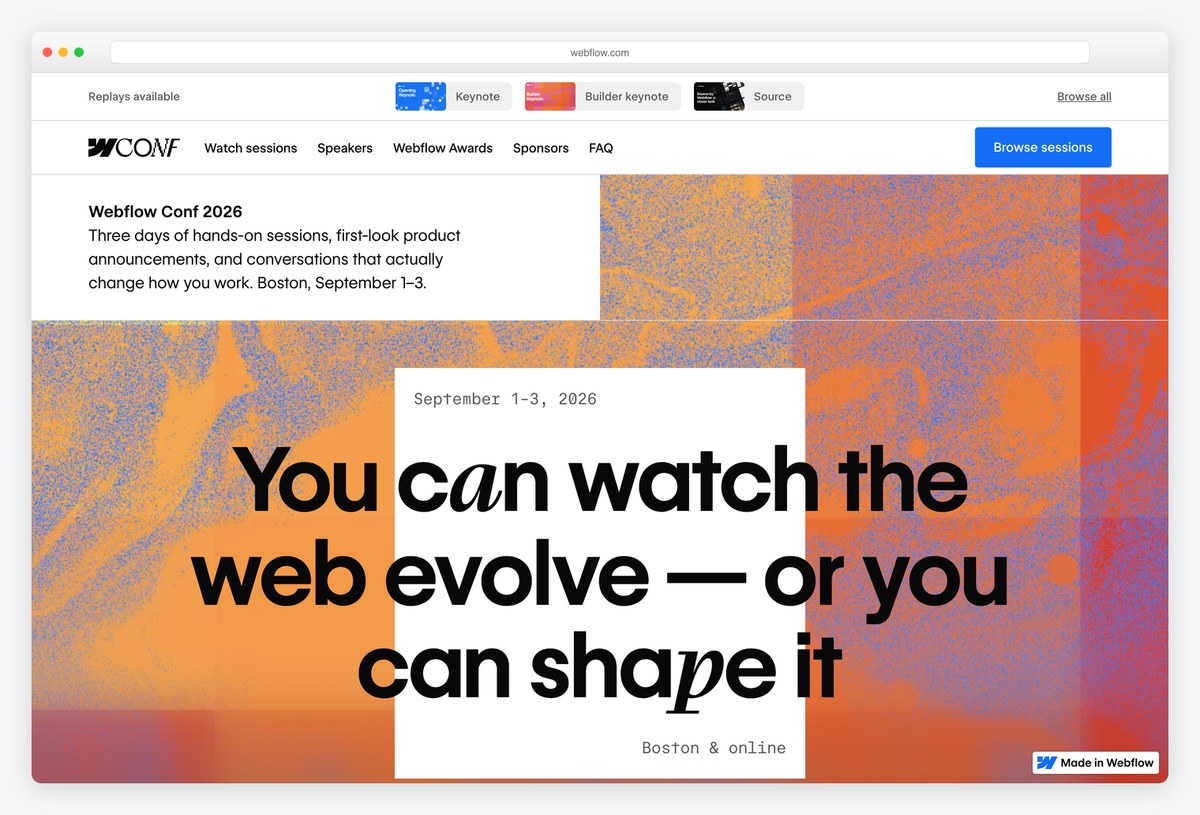
Webflow Conf mixes a warm, abstract orange background with a white card that holds the headline in WF Visual Sans, set with a few letters in italics. A strip of replay thumbnails at the top leads straight to the keynote and session videos after the event.
The menu covers sessions, speakers, the Webflow Awards, sponsors and an FAQ. Unsurprisingly, it is built with Webflow, which makes it a showcase for the product as well as the event.
What stands out: The event site doubles as a showcase for the product.
Developer and Community Conference Websites
Community-run and independent developer conferences, where the website has to sell tickets, find speakers and sponsors, and reflect the culture of the community behind it.
9. PyCon US
Built with: Custom code
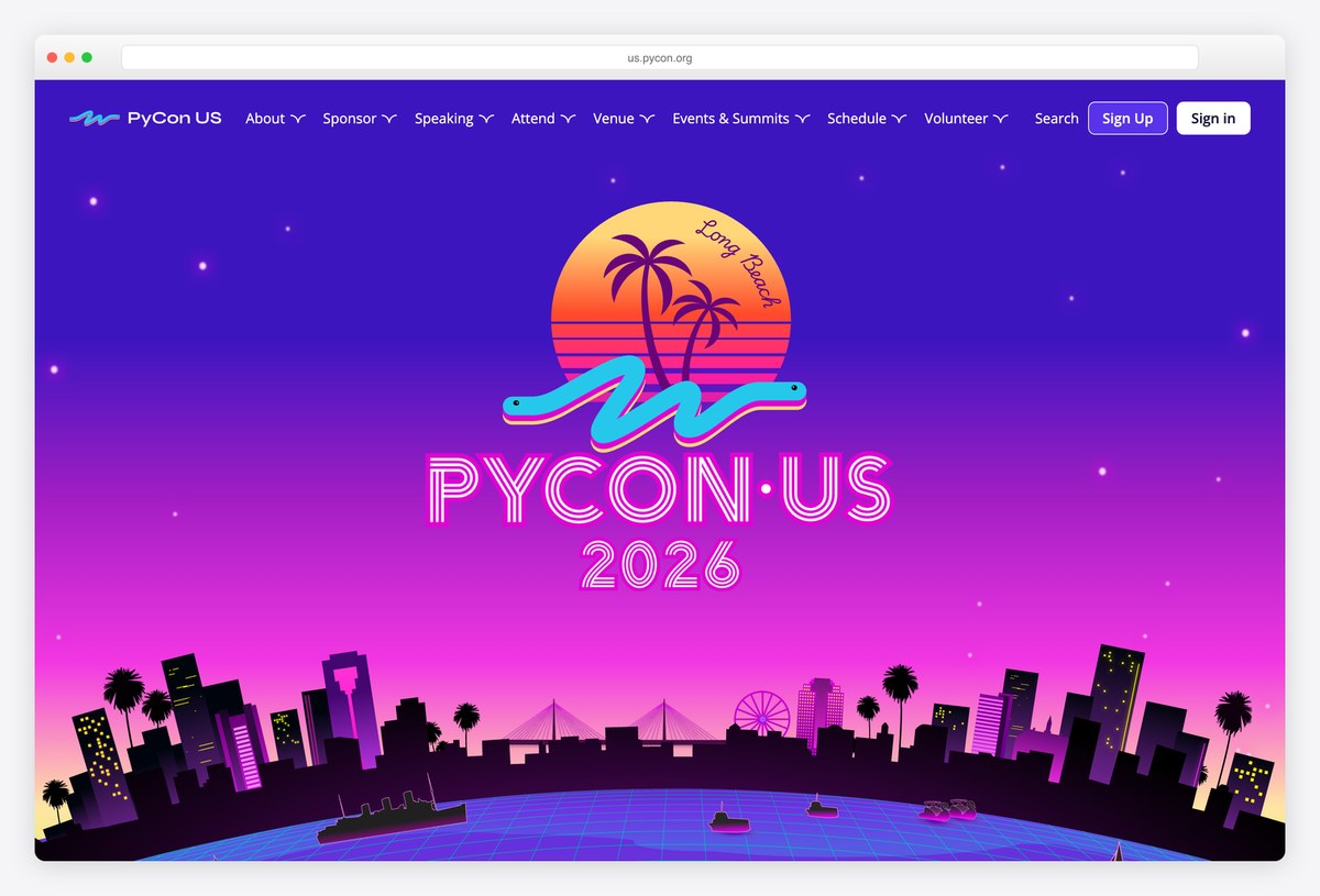
PyCon US gives each edition its own illustration, here a retro sunset with palm trees, a city skyline and the PyCon logo in neon colours, filling the first screen under a full dropdown menu for About, Sponsor, Speaking, Attend, Venue, Events & Summits, Schedule and Volunteer.
Skip links to the content, navigation and footer come first, and a translations notice offers a Spanish version. The site is custom-built. Volunteering and sponsorship in the main menu reflect a conference run by its community.
What stands out: A new illustration every year and volunteers in the main menu.
10. RubyConf
Built with: Custom code · headlines in TBJ Orcherum
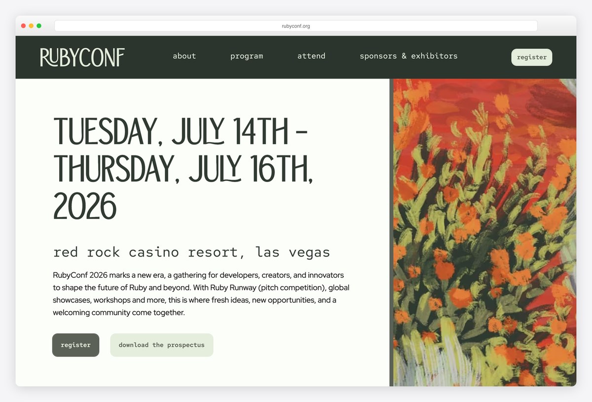
RubyConf splits its first screen in two: the dates set very large in TBJ Orcherum, a condensed display face, with the venue in a typewriter style and a short description on the left, and a painterly illustration of orange flowers on the right.
The menu is in lowercase (about, program, attend, sponsors & exhibitors) with a register button, and a Download the prospectus button for sponsors sits beside it. The site is custom-built and feels more like an arts festival than a tech event.
What stands out: Dates as the headline and a painting as the hero.
11. Laracon US
Built with: Custom code · headlines in Instrument Sans
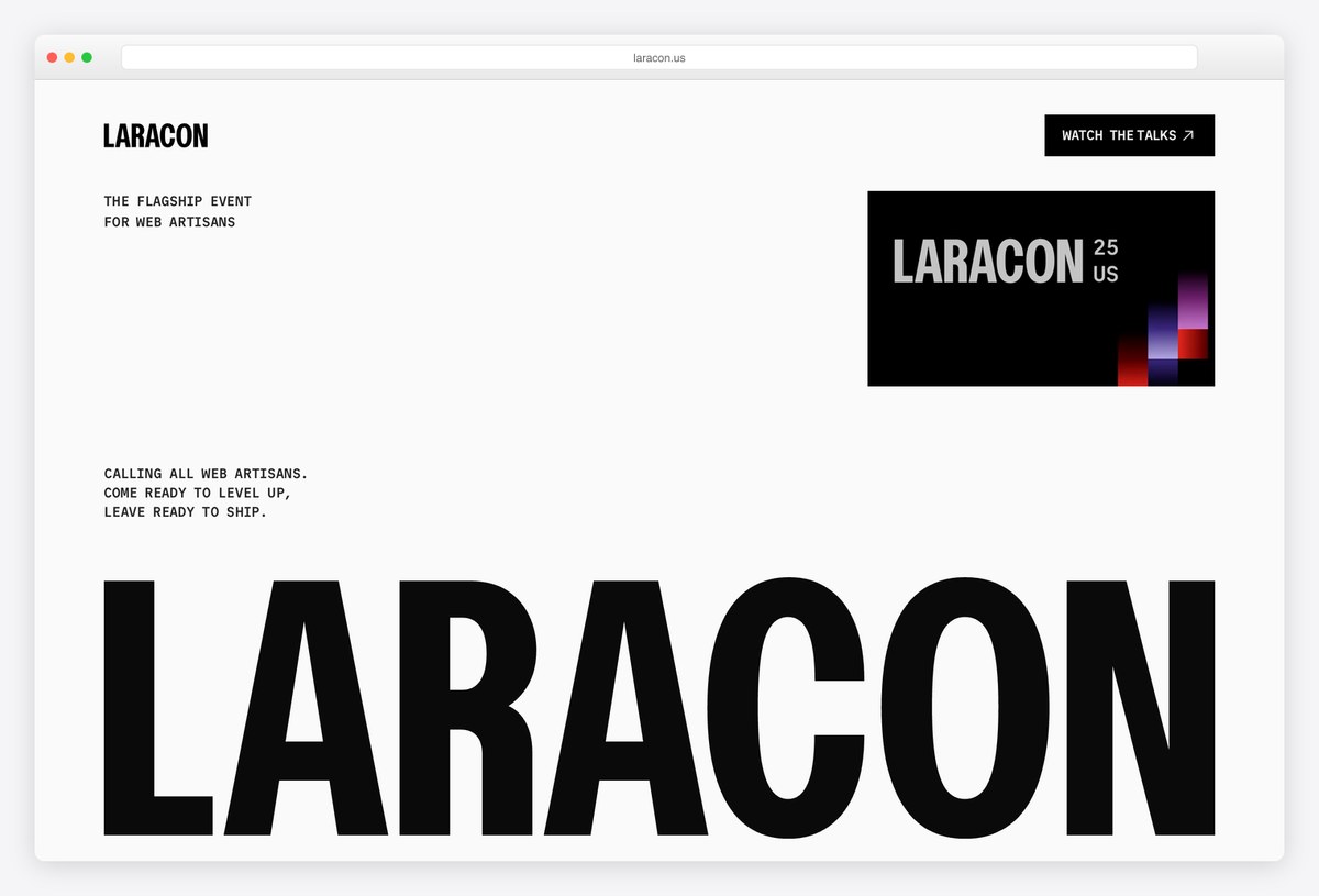
Laracon US, the Laravel conference, uses a white page with the word LARACON in huge black condensed capitals along the bottom of the screen and short lines of monospaced copy above it, including “CALLING ALL WEB ARTISANS.”
A dark badge for the latest edition sits on the right, and Watch the talks is the main link between editions, alongside a sign-up form for news about the next one. Headlines are set in Instrument Sans, and the site is custom-built.
What stands out: Huge type, a talks archive and a waiting list between editions.
12. CSS Day
Built with: Custom code · headlines in Source Code Pro
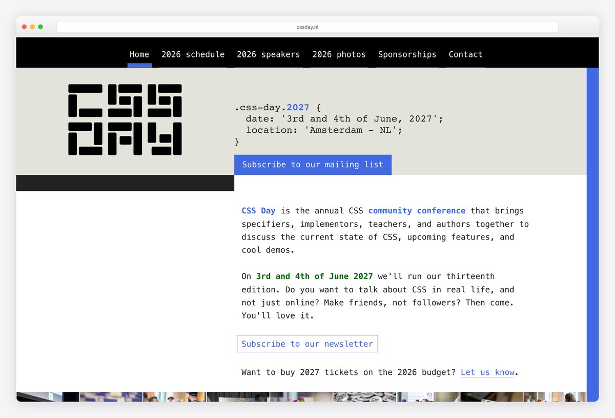
CSS Day introduces itself in CSS: the next edition’s date and location are written as a code block with a selector and properties, in Source Code Pro, next to a pixel-style CSS DAY logo.
A short paragraph explains the conference and asks the reader to subscribe to the mailing list, and the menu links to the latest schedule, speakers and photos. The site is custom-built, and writing the details as code is a perfect joke for its audience.
What stands out: Event details written as a CSS rule.
13. Vue.js Amsterdam
Built with: Nuxt · headlines in Monument
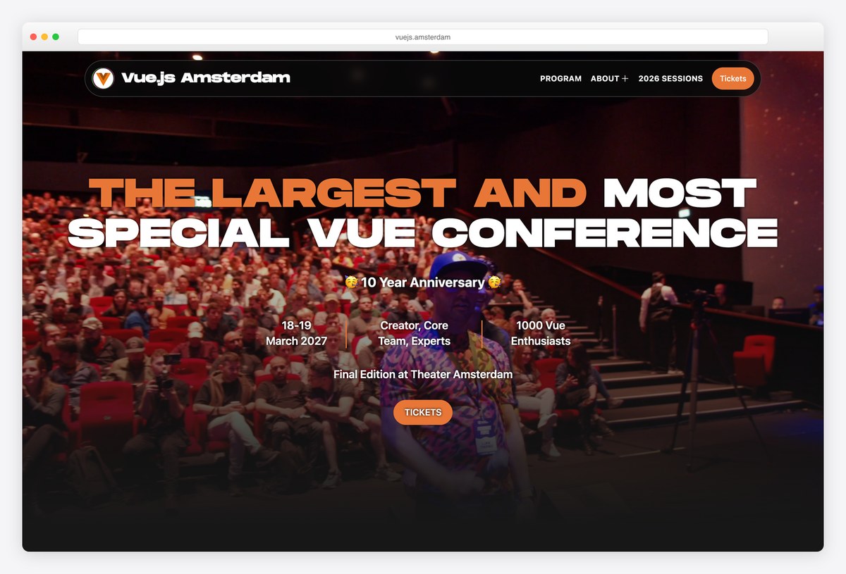
Vue.js Amsterdam fills its hero with a photo of a packed theatre audience and sets its headline in Monument, a wide display face, in orange and white. The dates, the audience size and the venue sit underneath in small columns, with an orange Tickets button.
A scrolling banner announces milestones, and the menu covers the program, past sessions, sponsors, travel and stay. The site is built with Nuxt, the Vue framework, which is a fitting choice for a Vue conference.
What stands out: A packed audience photo that proves the event’s draw.
14. JSNation
Built with: Custom code
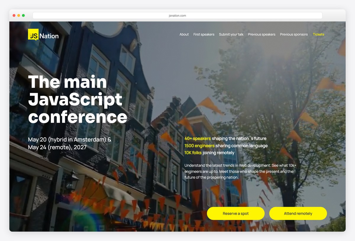
JSNation, one of the GitNation conferences, sets its headline over a photo of Amsterdam’s canal houses, with the dates for the in-person and remote days underneath and a column of numbers on the right: speakers, engineers in the room and people joining remotely.
Two yellow buttons offer to reserve a spot or attend remotely, so the hybrid format is clear from the first screen. The site is custom-built and shares its structure with React Summit.
What stands out: In-person and remote options given equal weight.
15. React Summit
Built with: Custom code
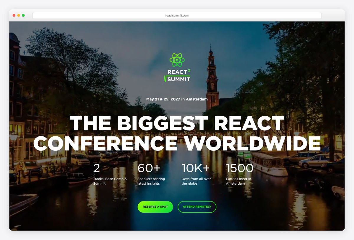
React Summit uses an evening photo of Amsterdam with the React logo, the line “THE BIGGEST REACT CONFERENCE WORLDWIDE” and a row of four numbers for tracks, speakers, remote attendees and people in the room.
A green Reserve a spot button and an outlined Attend remotely button follow. The menu includes Submit your talk and Previous speakers, which helps a conference that sells on its line-up. The site is custom-built.
What stands out: Numbers that make the scale of the event clear.
16. RenderATL
Built with: Next.js · headlines in Mortend
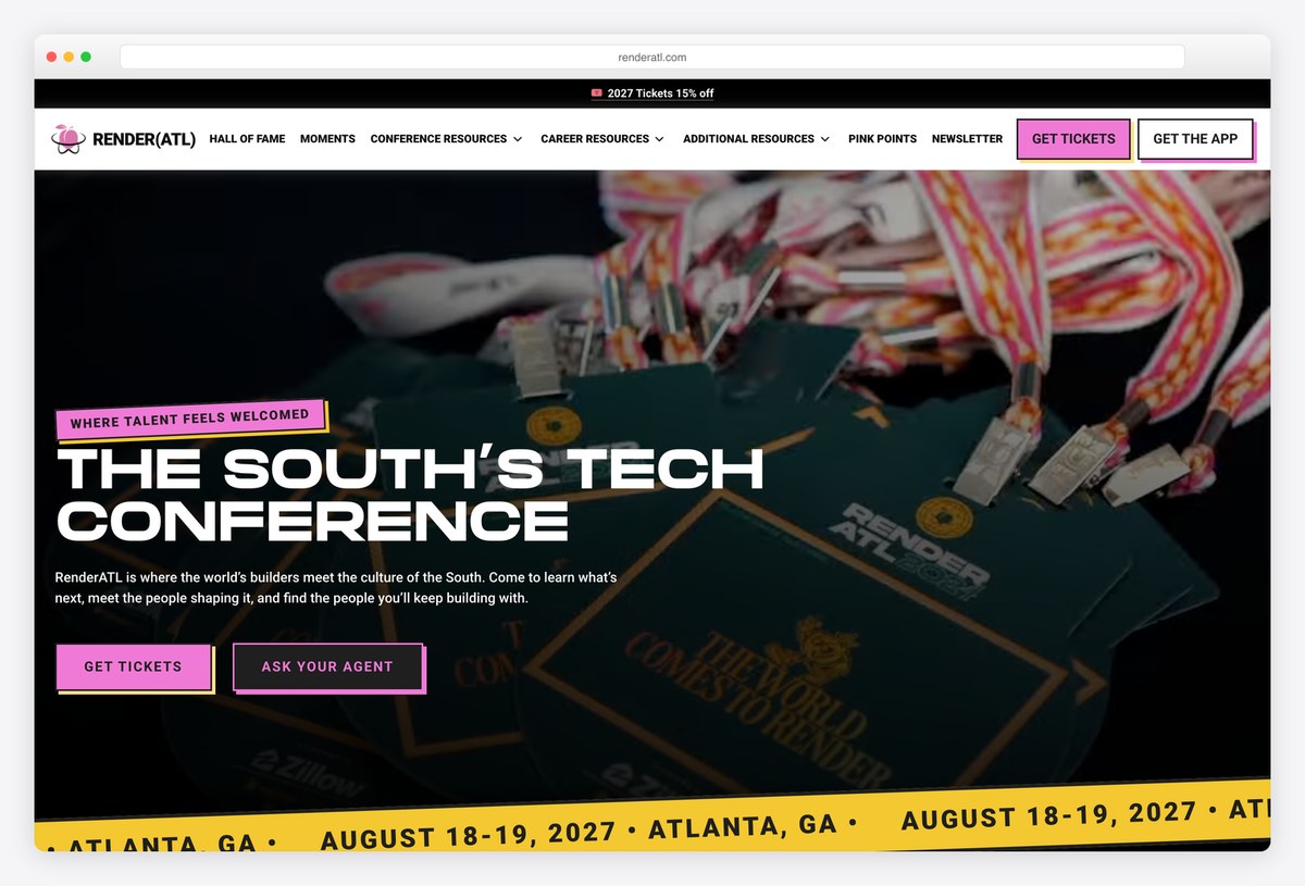
RenderATL sets “THE SOUTH’S TECH CONFERENCE” in Mortend, a wide, heavy display face, over a photo of conference lanyards, with a pink label that says Where talent feels welcomed and pink Get tickets and Ask your agent buttons.
A ticker of dates runs along the bottom of the hero, and the menu adds career resources and a Hall of Fame. The site is built with Next.js. It shows how a regional conference can build a strong identity around place and culture.
What stands out: A strong regional identity built around place and culture.
17. KubeCon + CloudNativeCon
Built with: WordPress
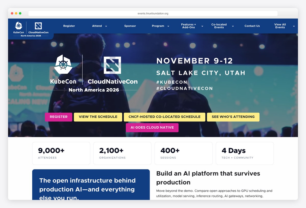
KubeCon + CloudNativeCon puts both event logos, the dates and the city on a blue photo of the audience, with a row of coloured buttons for registering, the schedule, co-located events and the attendee list.
A row of statistic cards for attendees, organisations, sessions and days follows. The site runs on WordPress as part of the Linux Foundation events platform, a good example of a template that serves many events with one design system.
What stands out: One event template shared across a whole family of conferences.
18. dotConferences
Built with: Wix
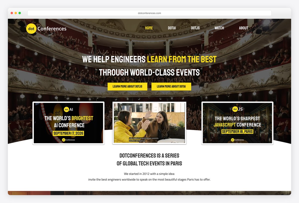
dotConferences, a series of developer events in Paris, uses a photo of a grand theatre as the backdrop for its headline in yellow and white condensed capitals, with buttons for each event in the series (dotJS and dotAI).
Three cards below introduce each event with its own poster-style artwork. The site runs on Wix, showing that a builder can handle a well-designed event series.
What stands out: One brand for a series of events, each with its own poster.
Design and Creative Conference Websites
Design festivals and conferences, where the website is the first piece of work the audience judges, so type, colour and motion carry the brand.
19. OFFF Barcelona
Built with: Wix
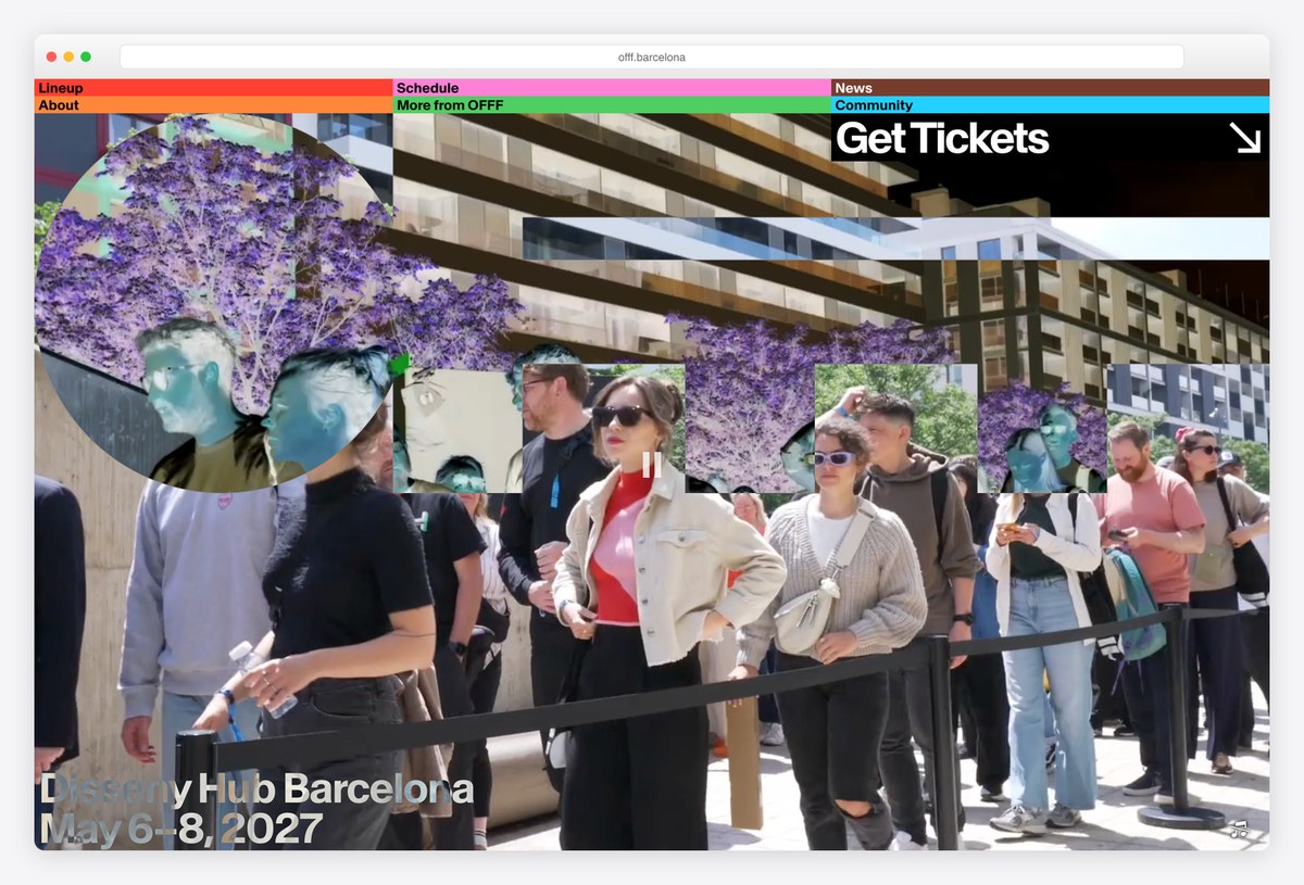
OFFF, the Barcelona festival of visual creativity, opens with a collage of cut-out photos of festival crowds and buildings, with colour-coded menu tabs (lineup, schedule, news) along the top and a big Get Tickets link.
The lineup follows as a numbered list of studios and artists, each with a Start Now link. The site runs on Wix, and its collage hero shows how far a builder site can be pushed by a strong art direction.
What stands out: A collage hero and a numbered lineup of studios.
20. Design Matters
Built with: Custom code · headlines in Anton
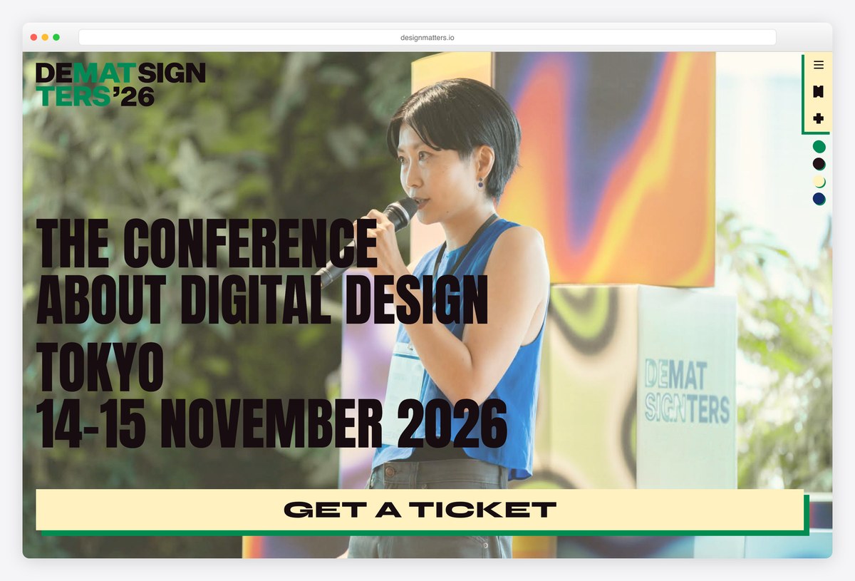
Design Matters, a digital design conference, sets its name in a playful split wordmark and its pitch in tall Anton capitals over a full-bleed photo of a speaker on stage, with a bright Get a ticket bar across the bottom of the hero.
The menu also leads to recordings, a magazine and a podcast, which keep the brand alive between editions. The site is custom-built.
What stands out: Recordings, a magazine and a podcast keep the brand alive all year.
21. Digital Design Days
Built with: Custom code · headlines in Neue Haas Grotesk Display
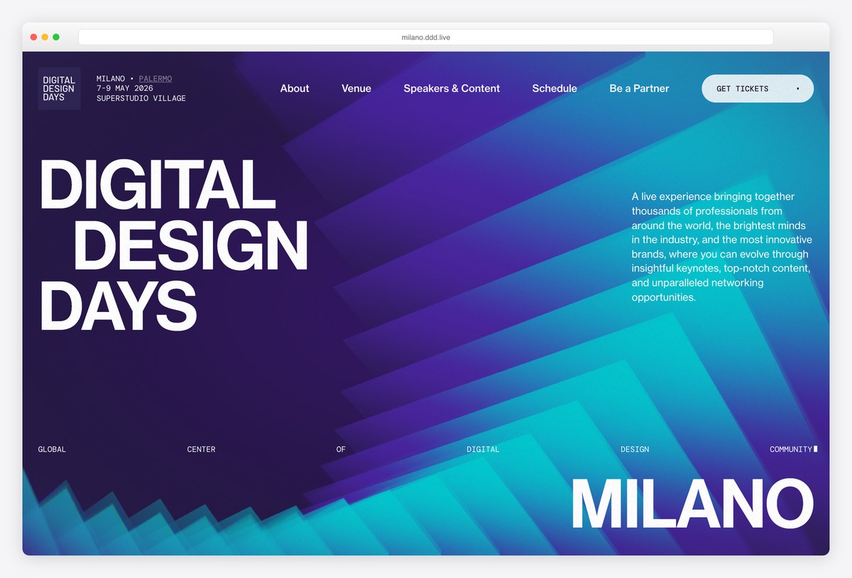
Digital Design Days uses a deep blue gradient of angular shapes with the event name stacked in huge white Neue Haas Grotesk Display, and the host city set equally large in the corner. A short paragraph explains the event on the right.
The menu covers venue, speakers and content, schedule, partners and an FAQ, with a pill-shaped Get tickets button. The site is custom-built, and the strong grid of very large type gives it a poster-like feel.
What stands out: Poster-sized type on a bold gradient.
22. beyond tellerrand
Built with: Custom code · headlines in Lektorat Display
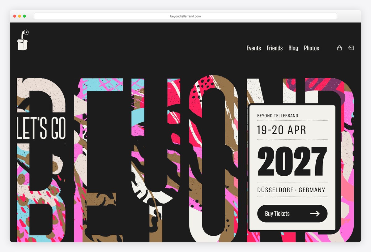
beyond tellerrand fills its first screen with a giant, collage-filled BEYOND wordmark on black, with a white ticket card on top that shows the dates, the city and a Buy tickets button.
The menu is short (events, friends, blog and photos), and the line “Europe’s best loved conference for coders & creatives.” explains the event. Headlines are set in Lektorat Display, and the site is custom-built.
What stands out: A collage wordmark with a ticket card laid over it.
23. Typographics
Built with: Custom code · headlines in Owners
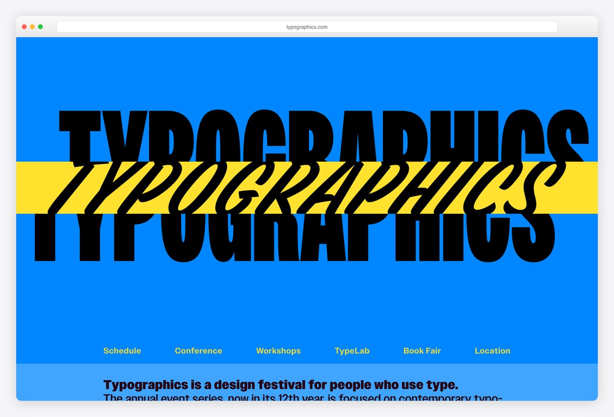
Typographics, a design festival for people who use type, sets its name three times across a blue page in different typefaces and weights, with a yellow band through the middle, so the hero is itself a piece of typography. Headlines use Owners.
The menu covers the schedule, conference, workshops, TypeLab, book fair and location, and each edition gets its own subdomain, which keeps old editions online as an archive. The site is custom-built.
What stands out: The hero is a piece of typography, and every edition keeps its own site.
24. UX London
Built with: Custom code · headlines in OC Format Collage
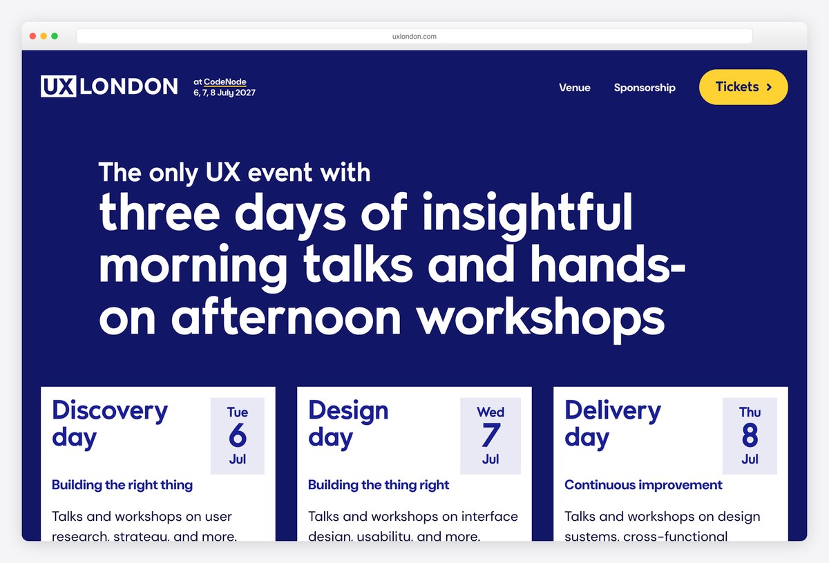
UX London uses a deep blue page with the headline in OC Format Collage and three cards, one for each day, labelled Discovery, Design and Delivery, each with its date and theme.
The format is the pitch: talks in the morning and hands-on workshops in the afternoon, with a ticket for each day or all three. A Reasons to attend page helps people convince their managers. The site is custom-built.
What stands out: Three day cards that explain the format at a glance.
25. Cannes Lions
Built with: Next.js, Contentful · headlines in Riviera Nights
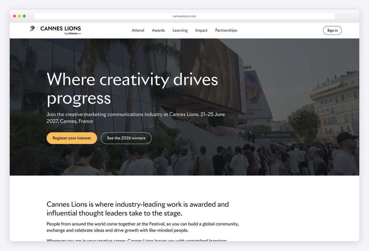
Cannes Lions, the festival of creative marketing, uses a full-width photo of the festival venue with the headline “Where creativity drives progress” in Riviera Nights and buttons to register interest and see the latest winners.
The menu (Attend, Awards, Learning, Impact, Partnerships) reflects a festival that is part conference and part awards show. The site is built with Next.js with content from Contentful.
What stands out: A conference and an awards show in one navigation.
26. ATypI
Built with: WordPress, WooCommerce · headlines in Fraunces
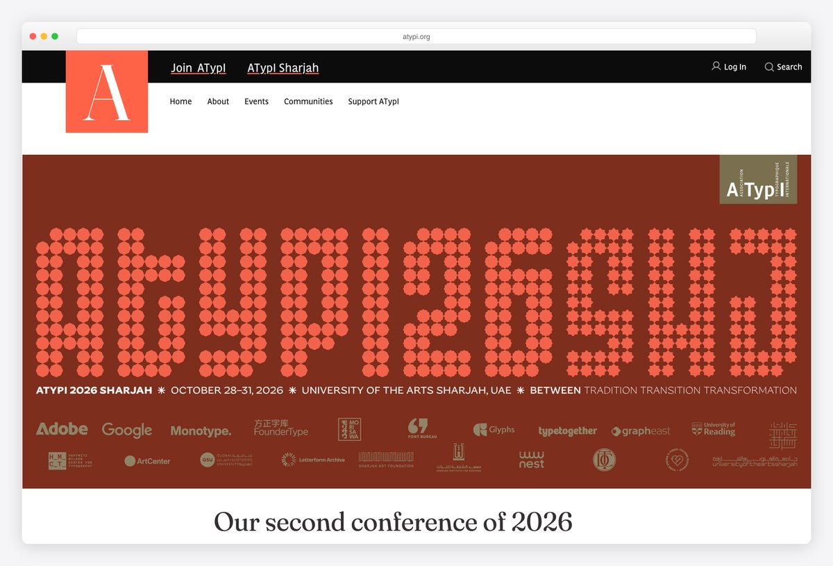
ATypI, the international typography association, builds each conference identity from type: here a huge dotted typeface on a red background fills the hero, with the details in a small line underneath and a strip of sponsor logos.
The menu covers membership, events and communities, with a Join ATypI link at the top. Headlines are set in Fraunces. The site runs on WordPress with WooCommerce for membership and tickets.
What stands out: A custom typeface as the event identity.
Business, Festival and Academic Conference Websites
Very large festivals and research conferences, where navigation and information architecture matter as much as the visual identity.
27. Web Summit
Built with: Next.js
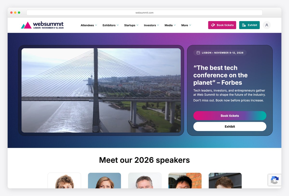
Web Summit uses a gradient frame around a photo of the host city, with a card quoting “The best tech conference on the planet” from Forbes, the dates and two buttons to book tickets or exhibit.
The menu is organised by audience (attendees, exhibitors, startups, investors, media), and the latest speakers follow in a row of portraits. The site is built with Next.js. Organising the navigation by role is the right call for an event with very different visitor types.
What stands out: Navigation organised by the visitor’s role.
28. SXSW
Built with: WordPress, WooCommerce · headlines in Founders Grotesk
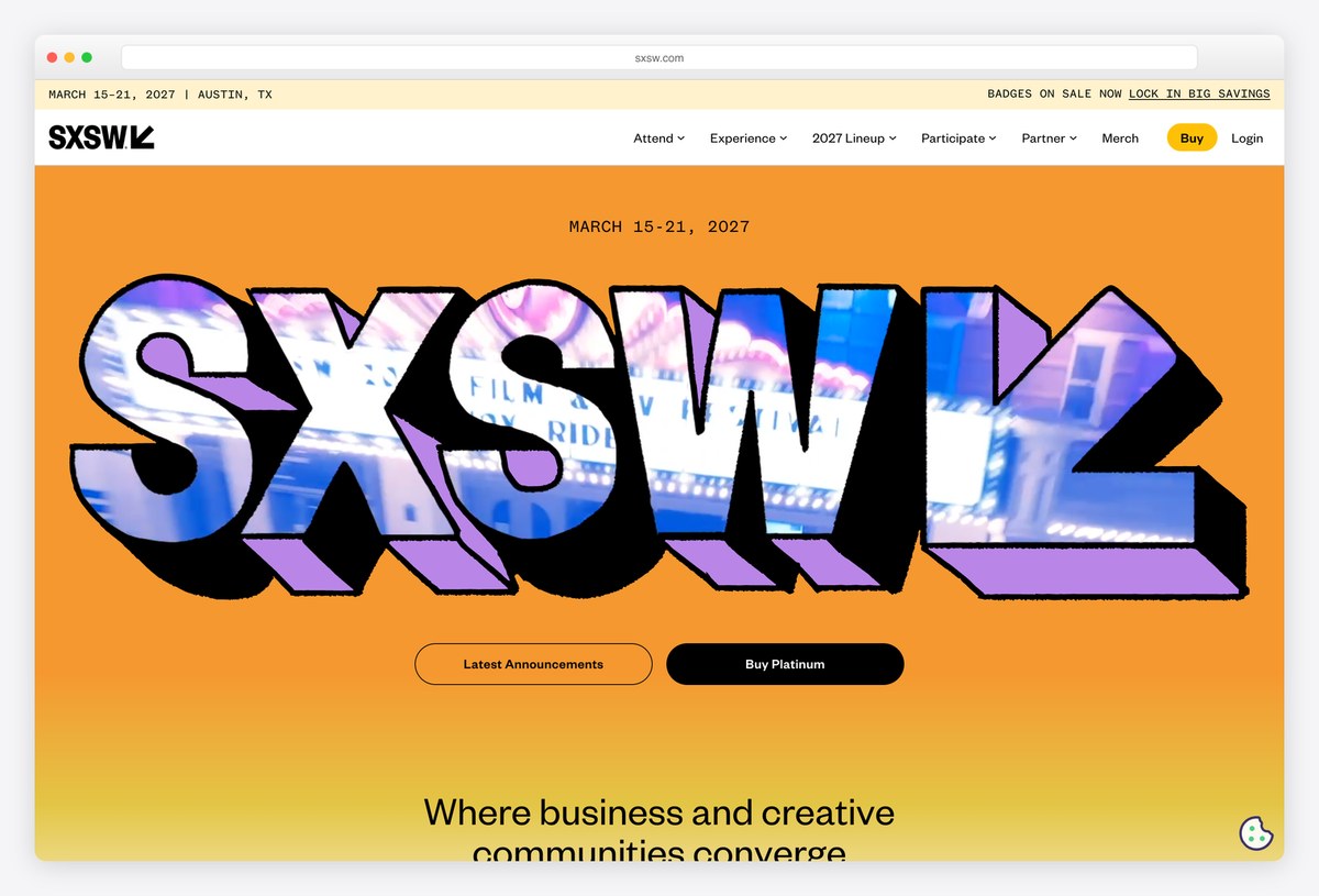
SXSW sets a huge 3D wordmark filled with film imagery on a bright orange background, with the dates and city in a slim top bar and two buttons for the latest announcements and passes. The tagline “Where business and creative communities converge” follows.
Under it, a gallery of photos from past editions, each with its year, sells the festival’s history. Headlines are set in Founders Grotesk, and the site runs on WordPress with WooCommerce for badges and merchandise.
What stands out: Past editions turned into a history gallery that sells the next one.
29. Gramado Summit
Built with: Webflow
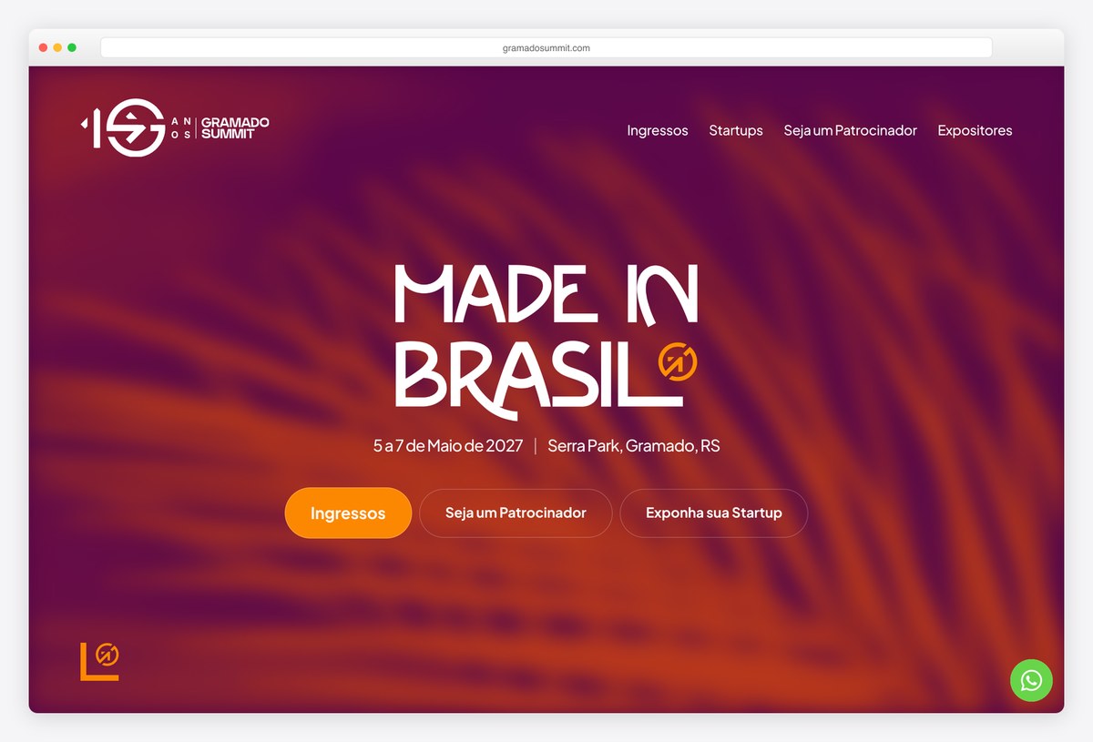
Gramado Summit, a Brazilian innovation conference, uses a warm orange and purple blurred background with the headline Made in Brasil in a custom display face, the dates and venue underneath and an orange Ingressos (tickets) button.
Below, a list of well-known speakers from past editions builds trust. The site runs on Webflow and is entirely in Portuguese, a good example of an event that designs for its local audience first.
What stands out: A custom display face and a local-first identity.
30. SIGGRAPH
Built with: WordPress · headlines in Luxe Uno
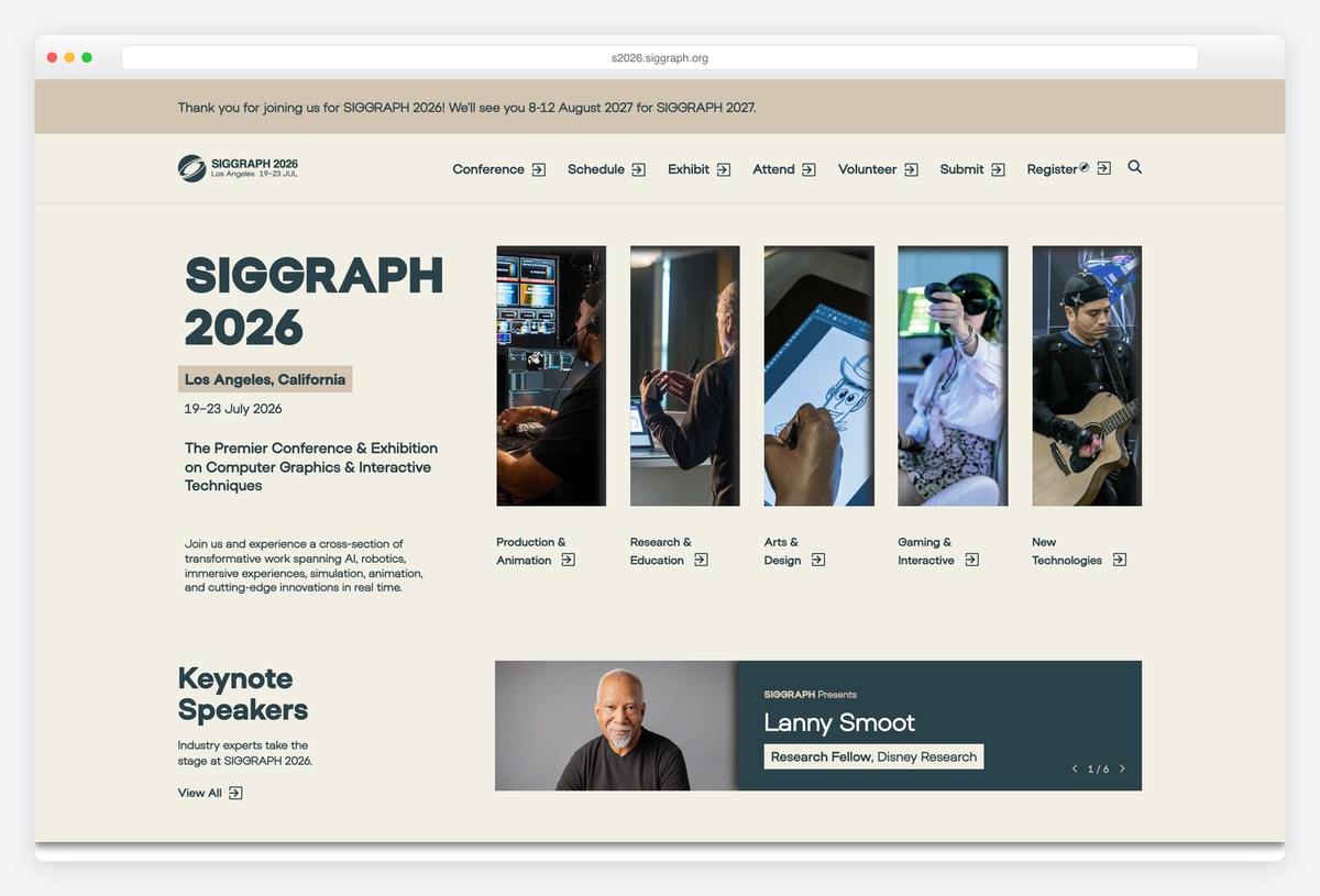
SIGGRAPH, the computer graphics conference, pairs the event name and dates with a strip of tall photos for its programme areas (Production & Animation, Research & Education, Arts & Design, Gaming & Interactive and New Technologies).
A thin banner at the top thanks attendees and announces the next edition, and keynote speakers follow. Headlines are set in Luxe Uno, and the site runs on WordPress, with a new subdomain for each year.
What stands out: Programme areas shown as a strip of tall photos.
31. NeurIPS
Built with: Custom code, Bootstrap 5
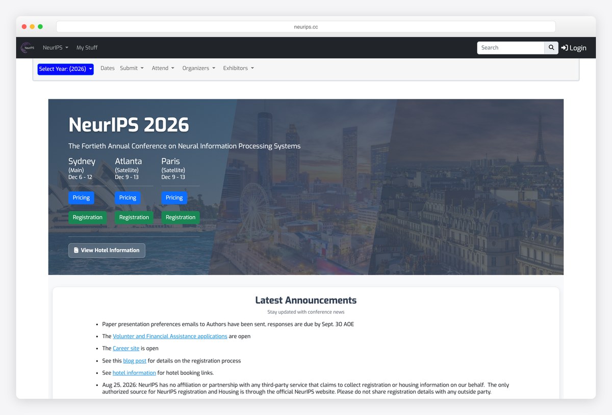
NeurIPS, the machine learning research conference, keeps a functional layout: a year selector, menus for dates, submissions, attendance and organisers, and a hero that lists each host city with its own pricing and registration buttons.
A Latest Announcements list follows, with notices for authors, volunteers and a warning about unaffiliated housing agents. The site is custom-built on Bootstrap 5. It shows what a research conference needs most: clear dates, deadlines and logistics for thousands of authors.
What stands out: Deadlines, logistics and a year selector for thousands of authors.
What Makes a Great Conference Website?
Put the essentials in the first screen. Name, dates, city or online format, and one clear ticket button. Stripe Sessions, beyond tellerrand and RubyConf get all of it into the hero without clutter, and GitHub Universe keeps its Get passes button visible the whole time.
Design for before, during and after. WWDC, Google I/O and Webflow Conf turn into video libraries once the event is over, and Laracon collects sign-ups for the next edition. Plan the post-event page from the start, because that is when most people will find the site.
Show the scale and the people. Speaker portraits, audience photos and a few honest numbers (speakers, attendees, sessions), as on React Summit, Vue.js Amsterdam and KubeCon, convince people faster than adjectives.
Make the format easy to understand. UX London explains its three themed days with three cards, and JSNation gives in-person and remote tickets equal weight. If your event has tracks, workshops or a hybrid option, show the structure visually.
Help people get approval. AWS re:Invent offers an approval toolkit and UX London a Reasons to attend page. Most attendees need a manager to pay for the ticket, so give them the arguments and a ready-made email.
Archive every edition. Typographics and SIGGRAPH give each year its own subdomain, and Config turns its homepage into a hub of editions. Archives keep old talks findable and build credibility for the next event.
Keep it accessible and fast. PyCon starts with skip links to the content, navigation and footer, and the best video heroes here can be paused. Event pages see big traffic spikes when tickets go on sale, so keep them light and test them on mobile.
Frequently Asked Questions
What should a conference website include?
A conference website should show the event name, dates, location or online format and a clear way to buy tickets on the first screen. It also needs a speaker list, a schedule, venue and travel information, ticket options and prices, sponsor information, a code of conduct and an FAQ. After the event, add recordings and photos.
What is the best platform for a conference website?
It depends on the team. Many big tech events here use Next.js, WordPress powers KubeCon, SXSW and SIGGRAPH, and Webflow and Wix power Webflow Conf, Gramado Summit, OFFF and dotConferences. For a small event, a website builder or a WordPress event theme is quickest; large events often use custom builds.
How do you design a conference website that sells tickets?
Put the date, place and a ticket button above the fold, keep that button visible as people scroll, and show speakers and past attendees early. Offer clear ticket tiers, early-bird deadlines and group discounts, and give people material to justify the cost to their employer, such as a reasons-to-attend page.
What should a conference website show after the event?
Turn the site into an archive: recordings of the talks, slides, photos and a short recap, plus a sign-up form for the next edition. WWDC, Google I/O and Webflow Conf all switch to a video library after the event, which keeps the site useful and builds the audience for next year.
Should each conference edition have its own website?
Keeping each edition online is a good idea. Typographics and SIGGRAPH use a subdomain per year, which preserves old programmes and speaker pages for search and credibility. A main domain that always points to the next edition, with links to past ones, gives visitors one stable address.
How do you make a conference website accessible?
Use real headings, good colour contrast and a skip link, as PyCon does. Give video heroes a pause button and captions, add alt text to speaker photos, and make the schedule work with a keyboard and screen readers. Publish accessibility information about the venue too, such as step-free access and quiet rooms.
Wrapping Up
To build your own event site, start with our event website templates, and see our landing page examples for more ideas on hero sections and calls to action.
Browse the other Hospitality, travel & events website examples (9 more collections), or see website examples for every industry.

Related Posts

Comments (0)