21 Best Wix Portfolio Examples In 2026
Are you on the hunt for some jaw-dropping Wix portfolio examples?
Well, you’ve hit the jackpot!
I’m thrilled to share a carefully curated portfolio collection that stands out in online creativity.
From sleek, professional layouts to bold, artistic expressions, each portfolio showcases a unique blend of imagination and skill. They are perfect for sparking a wealth of ideas for your own project.
As you explore these examples, you’ll notice how each artist or professional has used Wix’s flexibility to tell their own story and showcase their work in a way that’s as unique as them.
Whether you’re a photographer, a graphic designer, an artist, or just someone who appreciates good design, these portfolios are bound to inspire and excite you.
So, what are you waiting for? Get inspired now!
1. Ben Kelley Art
Built with: Wix
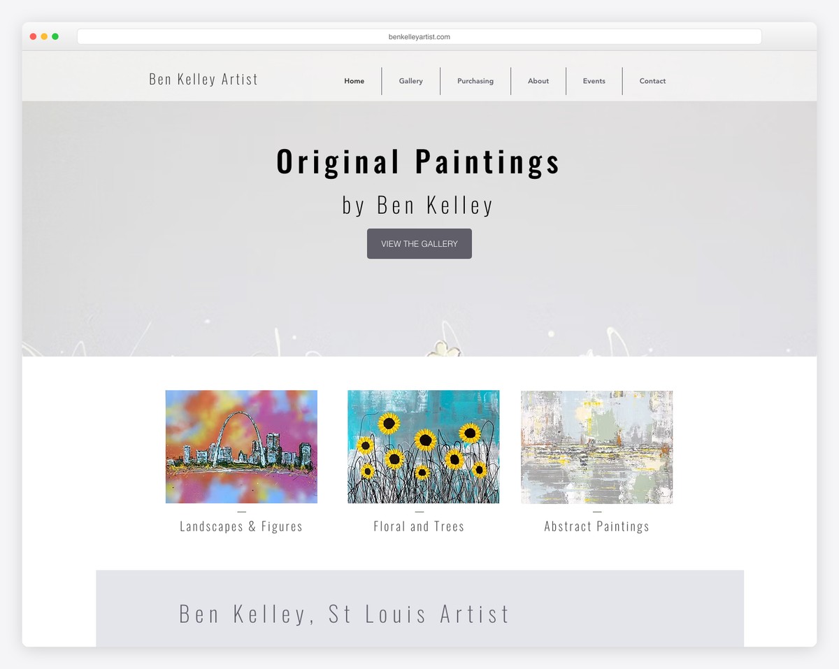
Ben Kelley is a St. Louis-based artist whose Wix portfolio showcases original oil paintings and abstract drip art in a clean gallery-style layout. The site lets the vivid colors and textures of each painting take center stage with minimal design interference.
The built-in shop integration means visitors can browse the gallery and purchase original works or prints without leaving the portfolio experience. The simple navigation — Gallery, Shop, About, Contact — keeps the focus squarely on the art.
What stands out: Integrating a shop directly into an art portfolio creates a frictionless path from admiration to purchase — visitors don’t need to navigate to a separate store to buy what caught their eye.
20+ Wix Portfolio Examples
Feast your eyes on these spectacular Wix portfolio examples, each a testament to creativity and design prowess.
Get ready to be motivated by the boundless possibilities that await your own portfolio!
What stands out: You might also be interested in the best portfolio design trends.
2. Cami Ferreol
Built with: Wix
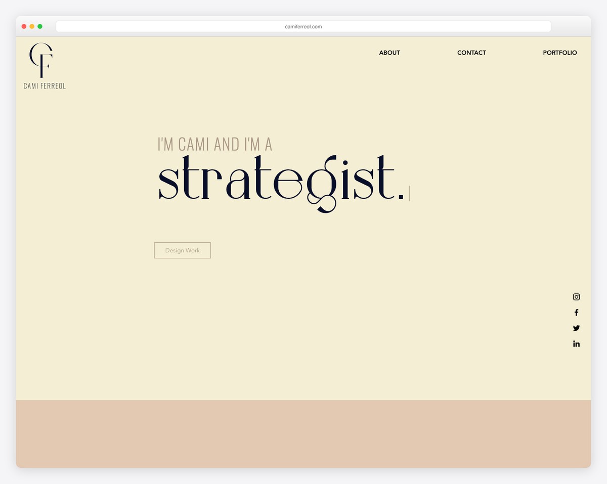
Cami Ferreol’s portfolio website stands out with its elegant simplicity and engaging features. The above-the-fold section captivates with a dynamic typewriter effect, immediately drawing attention.
A transparent, sticky navigation bar offers seamless browsing, while conveniently placed social icons on the right enhance connectivity.
The heart of the site is a large, animated thumbnail grid that showcases Cami’s work in an interactive and visually appealing manner.
This combination of minimalism and interactivity makes the website not just a portfolio, but a memorable experience.
What stands out: Trigger your visitors’ interest with a text-heavy above-the-fold section (with optional typewriter effect).
What stands out: Cami Ferreol’s portfolio is a perfect blend of minimalist design and interactive elements, setting a high standard for engaging and user-friendly online portfolios.
3. Sharon Radisch
Built with: Wix
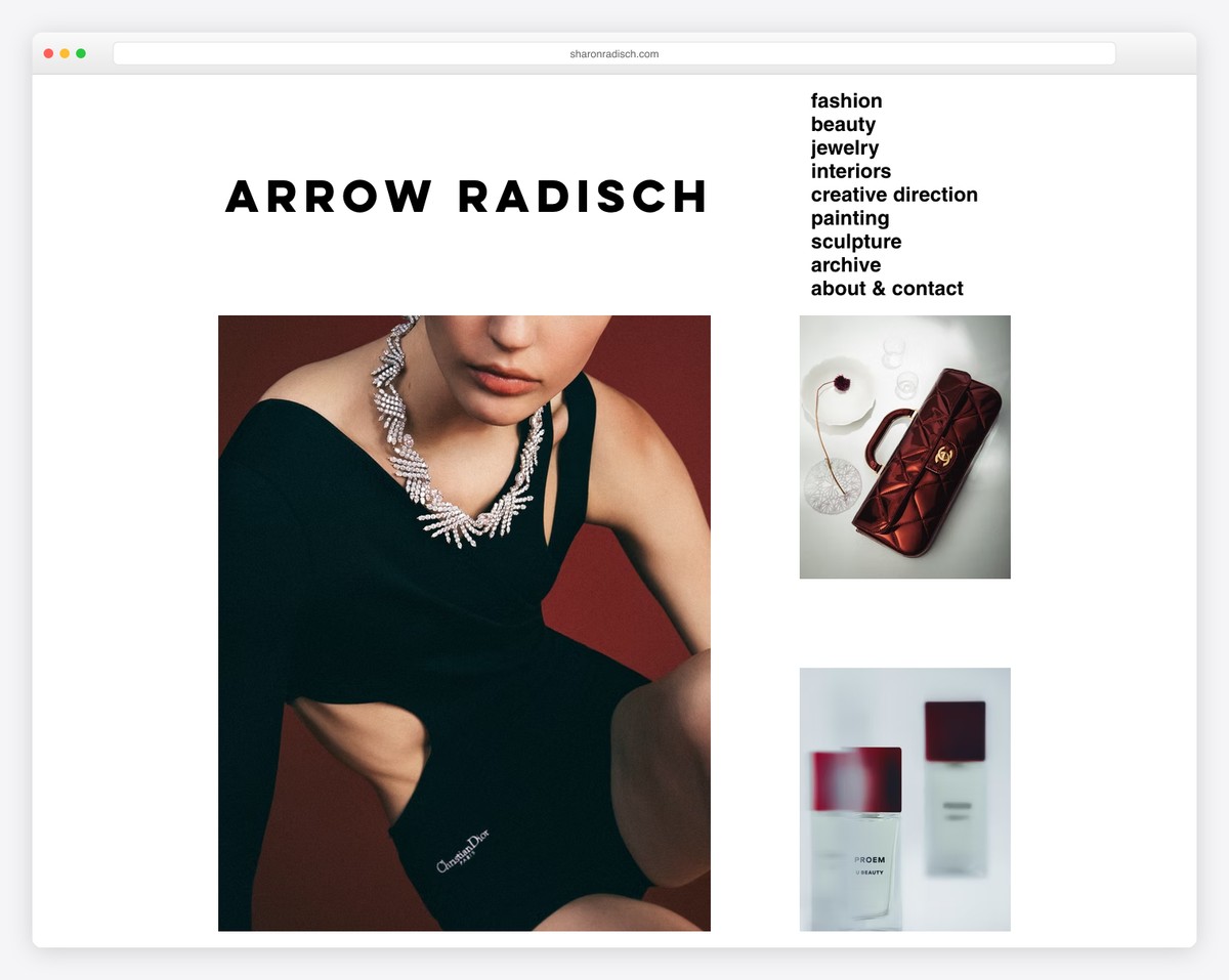
Sharon Radisch’s portfolio website uniquely combines functionality with subtle design elements. It greets visitors with a newsletter subscription popup, seamlessly integrating audience engagement.
The distinct hamburger menu icon, blending into the site’s aesthetic, adds a touch of minimalism while maintaining usability.
The portfolio’s grid layout features a captivating hover effect, adding dynamism to the viewing experience.
A clean, unobtrusive footer anchors the site, providing essential information without detracting from the visual content. This design approach creates an inviting and sophisticated online presence.
What stands out: Simplify the header section with a hamburger menu icon.
What stands out: Sharon Radisch’s portfolio stands out for its elegant interplay of subtlety and interactivity, making it an exemplary model of modern, minimalist web design.
4. Max Montgomery
Built with: Wix
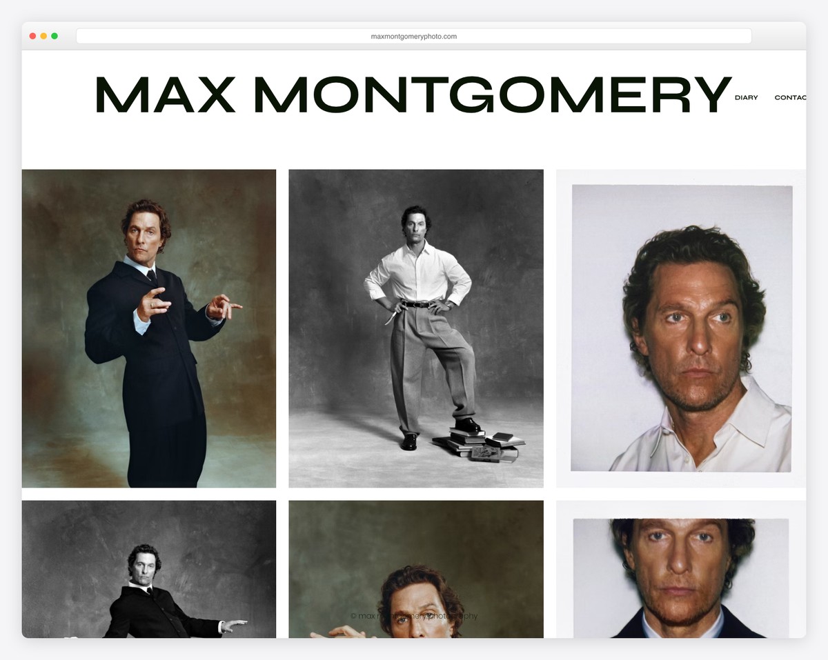
Max Montgomery’s portfolio website breaks the mold with its unconventional design, avoiding traditional headers and footers for a focused, immersive experience.
The site features a grid layout, but with a twist: extra spacing between thumbnails adds a sense of spaciousness and elegance, highlighting each piece distinctly.
A key feature is the lightbox gallery, which allows viewers to explore each work more deeply without leaving the page. This creates an intimate and engaging exploration of Max’s artistry and vision.
What stands out: When creating a portfolio gallery on your website, utilize the lightbox effect for a more immersive experience.
What stands out: Max Montgomery’s portfolio has a bold and clean aesthetic, offering a mesmerizing visual experience through its unique layout and lightbox gallery.
5. The Robin Collective
Built with: Wix
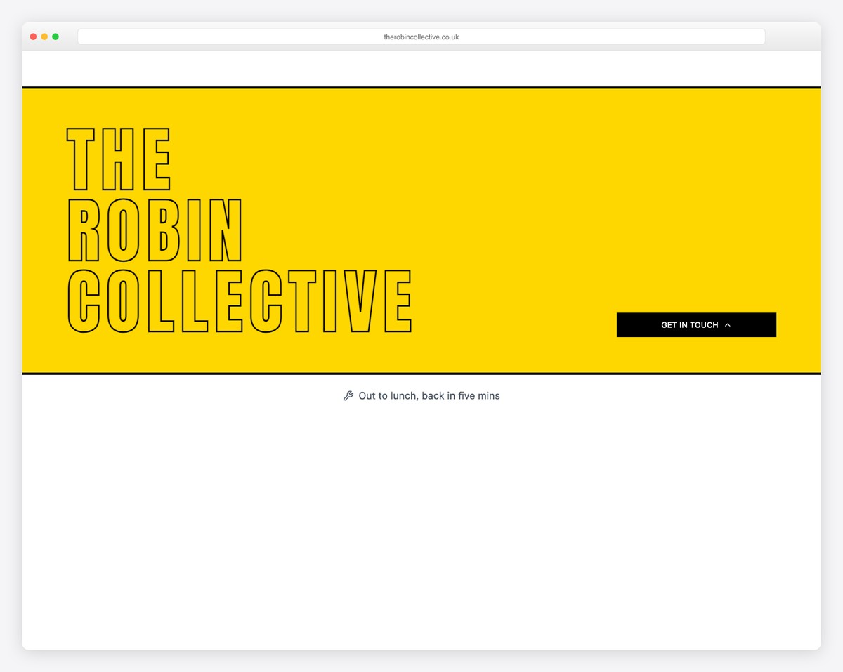
The Robin Collective’s portfolio website example masterfully combines simplicity and functionality.
Its header and footer are pared down to essentials, with the header offering key menu links and the footer presenting business details and social icons.
The site’s core features a grid layout, neatly categorizing their work and case studies, making navigation intuitive and visually pleasing.
Additionally, a dedicated section for a newsletter subscription form smartly engages visitors, encouraging them to stay connected.
What stands out: Keep your fans and (potential) clients up to date by offering them to subscribe to your newsletter.
What stands out: The Robin Collective’s portfolio mixes simple design and strategic use, offering a user-friendly and visually compelling showcase of their work.
6. Dotpigeon
Built with: Wix
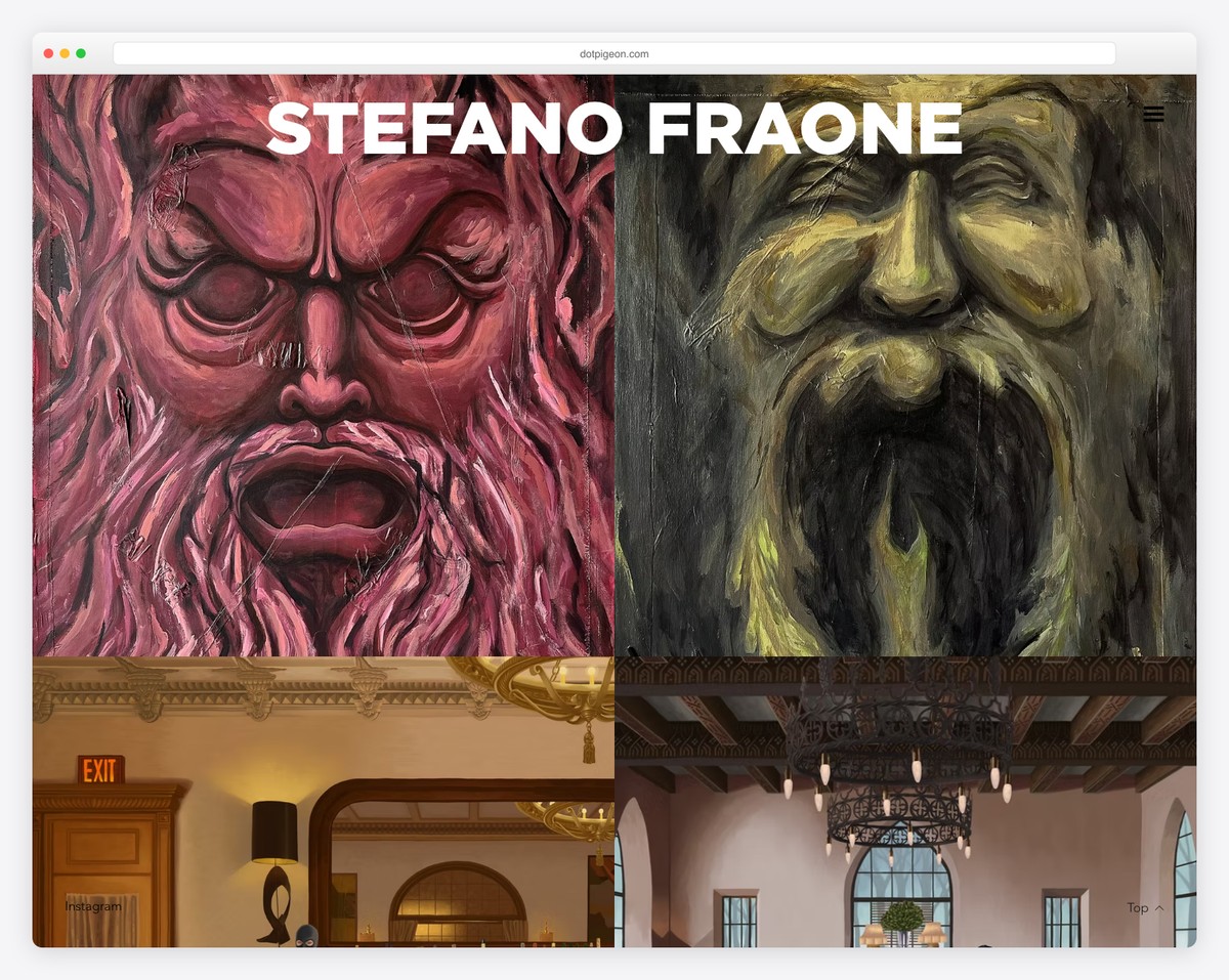
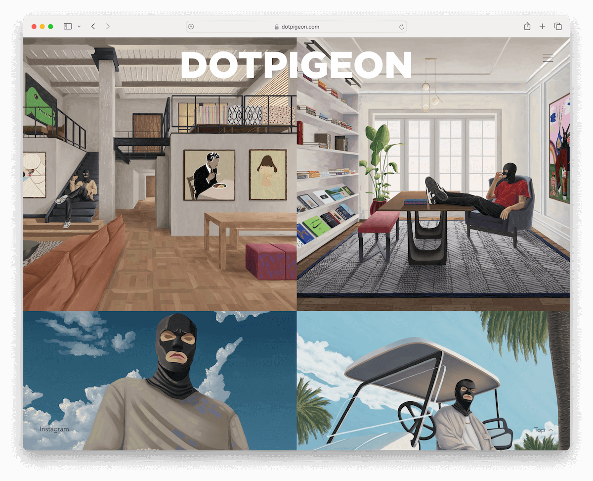
Dotpigeon’s portfolio website is a striking example of bold design meeting practicality. It features a large two-column grid layout that gives each artwork ample space to shine, enhanced by a lightbox gallery for a dazzling viewing experience.
A convenient “back to top” button and a floating “Dotpigeon” text at the top of the screen, which, when clicked, smoothly scrolls the page back to the beginning, provide easy navigation.
The inclusion of an Instagram link in the footer seamlessly connects visitors to their social presence.
What stands out: Make a portfolio grid dominate your website, putting all the necessary shine on each of your works.
What stands out: Dotpigeon’s portfolio is a prime example of modern web design, blending bold aesthetics with user-friendly features for a memorable encounter.
Need more inspiration? Check these neat artist portfolio examples.
7. Sonja Van Dulmen
Built with: Wix
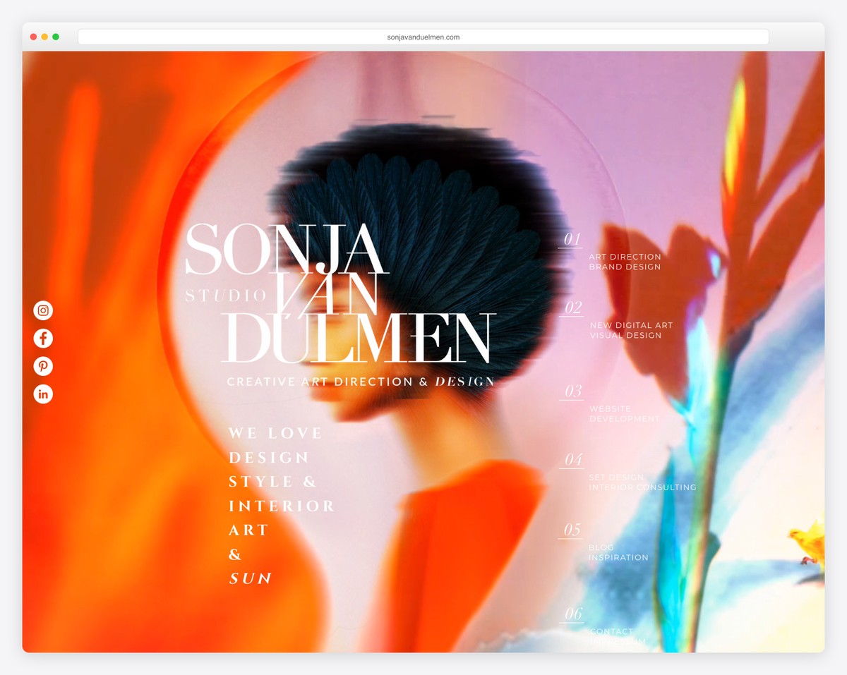
Sonja Van Dulmen’s portfolio website is a masterpiece of digital artistry, showcasing a full-screen background enriched with captivating animations and a parallax effect.
The design includes floating social icons on the left side, ensuring constant accessibility.
Moreover, thumbnails are animated, bringing her work to life and adding an interactive dimension. The large slider is a solid feature, providing a dynamic display of Sonja’s projects.
A contact form at the bottom of the home page invites easy communication, while unique detailing throughout the site enhances its visual appeal and boosts UX.
What stands out: Add depth and immersiveness to your online portfolio with the attention-grabbing parallax effect.
What stands out: Sonja Van Dulmen’s portfolio features artistic animations, parallax effects, and interactive elements, making it a pleasure to scroll through.
8. Hedof
Built with: Wix
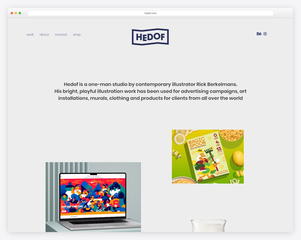
Hedof’s portfolio website epitomizes clean and efficient design. Its streamlined navigation bar features a user-friendly drop-down menu and easily accessible social icons.
The massive slider, occupying a prominent position, showcases clickable slides that draw viewers into Hedof’s work without the distraction of text or CTAs.
The website’s grid layout includes some animated thumbnails, adding a subtle dynamism to the browsing experience.
Finally, a practical four-column footer concludes the site, offering additional information and links in a tidy, organized manner.
What stands out: Adding a slider to your online portfolio is an excellent way to showcase your work.
What stands out: Hedof’s portfolio rocks a user-centric design, combining a large, engaging slider and animated thumbnails with efficient navigation.
9. Calvin Pausania
Built with: Wix
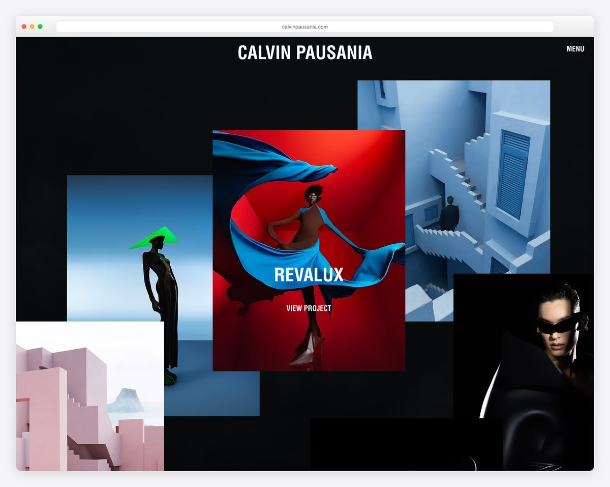
Calvin Pausania’s portfolio website is a digital spectacle featuring an animated background that sets a dynamic tone right from the start.
The website offers a mesmerizing scrolling experience, with content elegantly loading as you navigate through, enhanced by captivating animations that bring projects to life.
A floating transparent header with a minimalist hamburger menu ensures easy navigation while maintaining the site’s sleek aesthetic.
The absence of a footer adds to its modern, uncluttered feel, focusing entirely on the visual journey.
What stands out: Boost your site’s user experience with a floating header and navigation.
What stands out: Calvin Pausania’s portfolio impresses with its dynamic animated background and seamless content loading, offering a visually stunning and appealing UX.
10. Helena Hauss
Built with: Wix
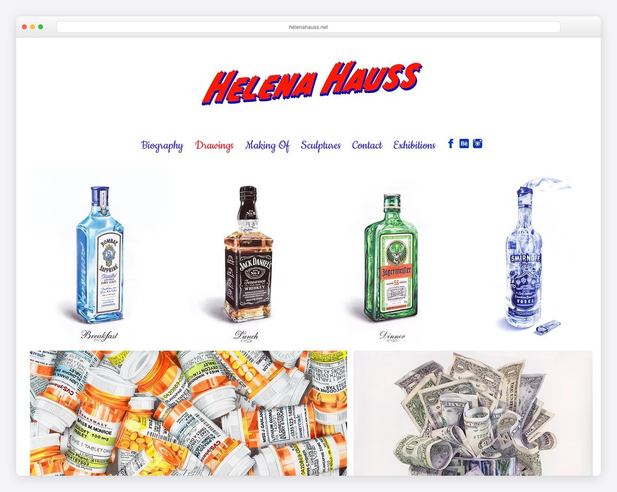
Helena Hauss’ portfolio website is a testament to the elegance of simplicity, featuring a clean, minimalist design that allows her artwork to take center stage.
The site employs a masonry grid layout for her portfolio, providing an aesthetically pleasing and easy-to-navigate work display.
Each work/project page is thoughtfully detailed with plenty of additional images, offering an in-depth look at each piece. This approach highlights her artistic journey and skill in a beautifully understated manner.
What stands out: A masonry grid is a great way to present your works visually interestingly.
What stands out: Helena Hauss’s portfolio promotes minimalist elegance with clean design and comprehensive individual project pages.
11. Mariela Mezquita
Built with: Wix
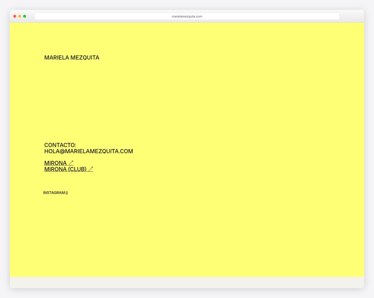
Mariela Mezquita’s portfolio website uniquely blends functionality and artistic flair.
It features a floating header showcasing her email for easy contact, complemented by a handy floating menu on the left side for smooth navigation. The design also includes sticky social buttons at the bottom, ensuring constant connectivity.
Typography-heavy above-the-fold, enhanced with a GIF, immediately captivates visitors.
The site’s intriguing grey sections, which reveal project images on hover, add an interactive layer to the browsing experience and showcase her work in a visually engaging way.
What stands out: You can always enhance your portfolio’s design (even if text-heavy) with catchy GIFs and animations.
What stands out: Mariela Mezquita’s portfolio joins practical navigation elements with visual features, creating an interactive and typographically rich work showcase.
12. Orange You Glad
Built with: Wix
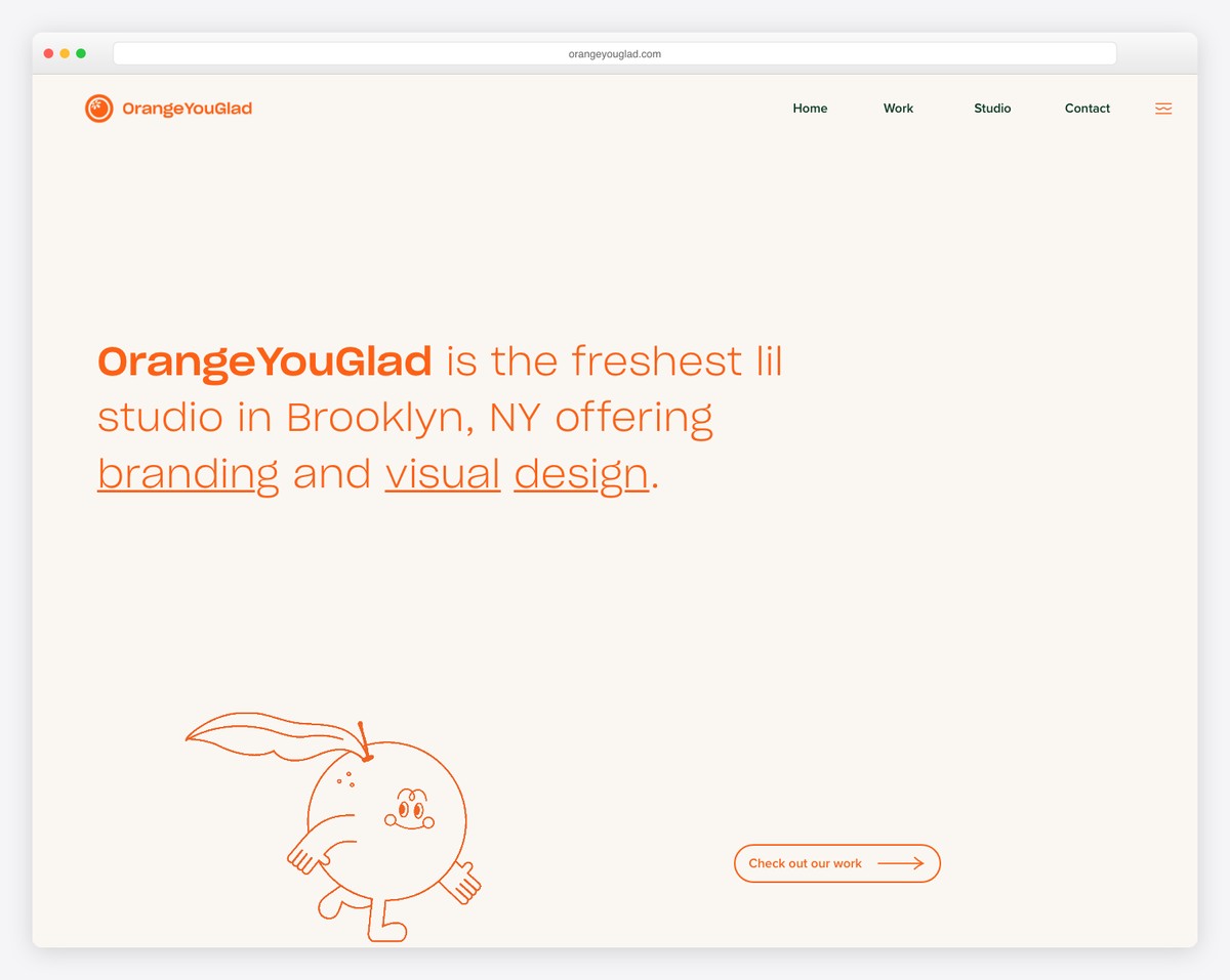
The Orange You Glad portfolio website dazzles with its playful yet professional design.
It boasts a transparent navbar that complements the large, attention-grabbing above-the-fold section, which features engaging text, a clear call-to-action (CTA) button, and a delightfully animated orange.
The site cleverly organizes sections for projects and services, enhancing user navigation.
A standout feature is the large contact section, adorned with a creative “HOWDY” text where each letter amusingly reacts upon hover, adding an element of fun and interactivity to the UX.
What stands out: Ensure you make your services (even pricing) clearly visible, so potential clients know exactly what you offer.
What stands out: Orange You Glad’s portfolio is a fusion of creativity and interactivity, with its playful design and engaging elements like the reactive “HOWDY” text.
13. Wendy Ju
Built with: Wix
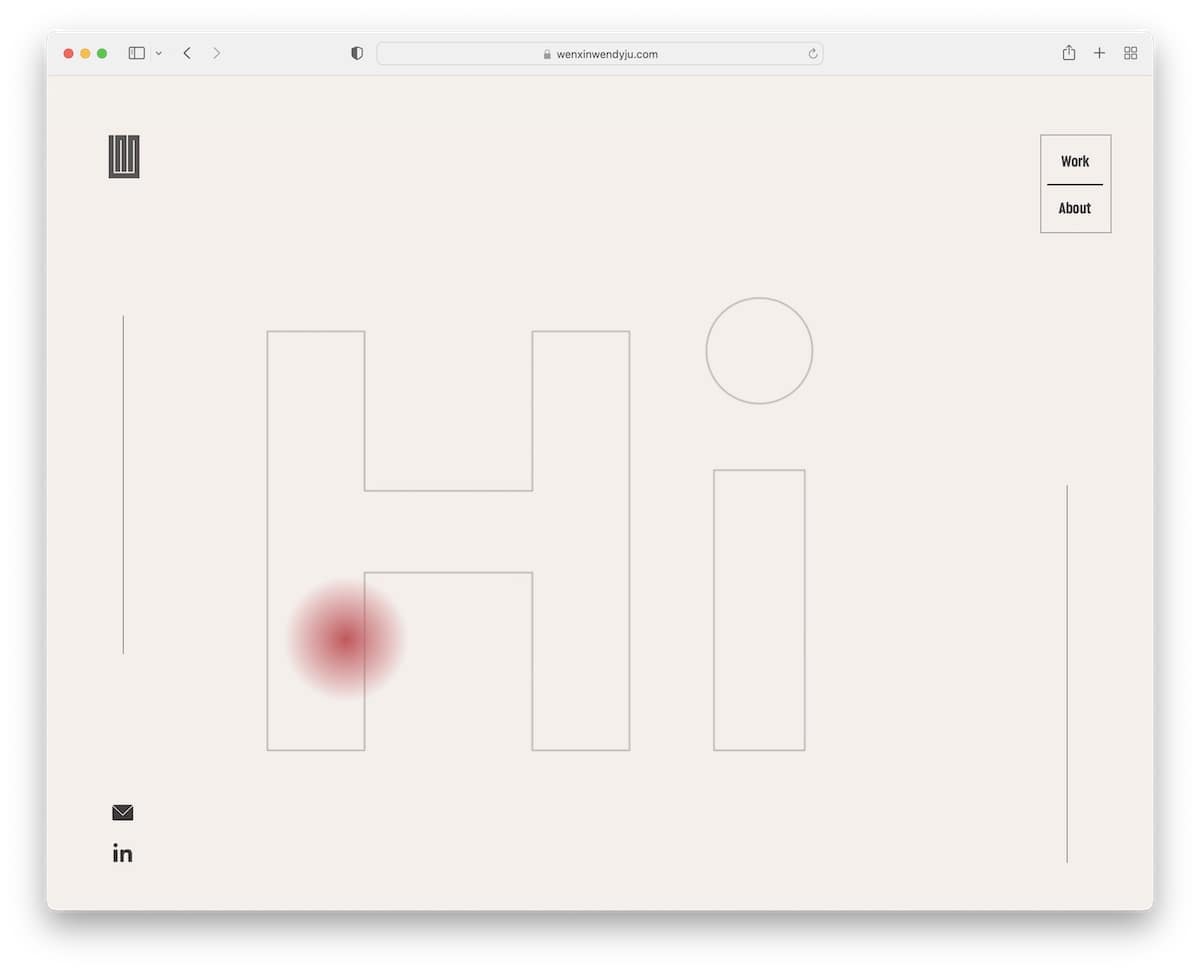
Wendy Ju’s portfolio website features a dynamic header that disappears or reappears based on scrolling, adding a touch of finesse.
The above-the-fold area is text-heavy with an engaging typewriter effect that captivates visitors.
Throughout the site, animated thumbnails bring her work to life, while a custom mouse cursor adds a unique, personal element.
The website’s simplicity is rounded off with a basic footer, including email and LinkedIn icons, ensuring easy professional connectivity.
What stands out: Do you want to enhance a minimalist portfolio website? Why not create a custom cursor?
What stands out: Wendy Ju’s portfolio uses dynamic elements like the disappearing/reappearing header and custom cursor, creating an engaging and memorable UX.
14. Frankie Ratford
Built with: Wix
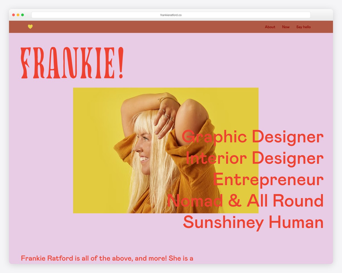
Frankie Ratford’s portfolio website is a delightful fusion of style and functionality. It features a floating hamburger menu icon, adding a modern touch to the navigation experience.
The website is enhanced with a cool parallax effect, creating a dynamic visual appeal as you scroll through.
Pleasant transitions between sections ensure a seamless journey through the content. Furthermore, its vibrant colorway adds energy and personality, while the portfolio grid, linked to clients’ projects, effectively exhibits work.
A minimalist footer caps off the design with understated elegance.
What stands out: The hamburger menu is a great way to keep the header clean and simple while ensuring the necessary navigation.
What stands out: Frankie Ratford’s portfolio blends a dynamic parallax effect, flawless transitions, and a vibrant color scheme.
15. Weddings By Shannon
Built with: Wix
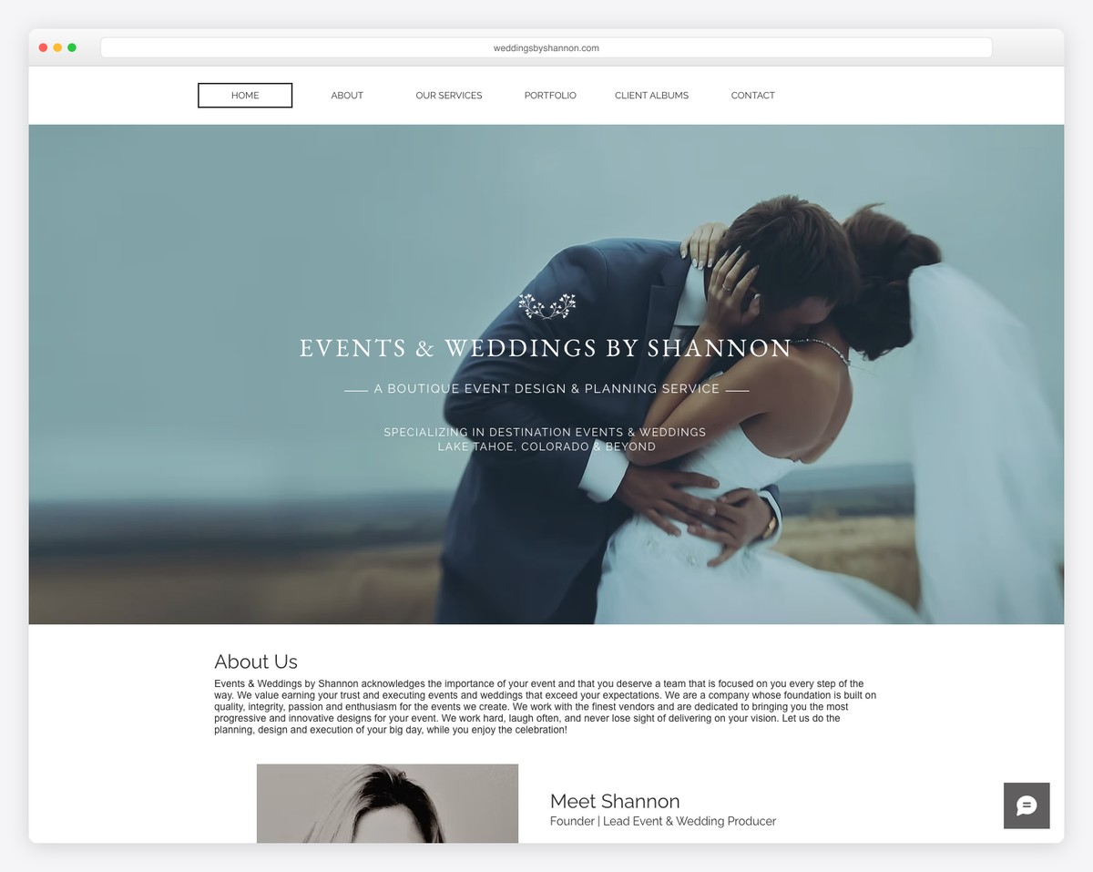
Weddings By Shannon presents a portfolio website that masterfully melds sophistication and practicality.
The full-width image banner with a parallax effect immediately captures attention, creating a sense of depth and movement.
Its simple navigation bar facilitates effortless browsing, while the stunning portfolio grid with a lightbox feature elegantly displays wedding moments.
A floating chat widget offers instant visitor engagement, and a handy back-to-top button ensures smooth navigation.
The contrasting footer background enhances visual appeal, making business and contact details pop.
What stands out: A back-to-top button can be an excellent solution for better UX if you’re not using a floating navigation bar.
What stands out: Weddings By Shannon’s portfolio sports a combination of a full-width parallax banner, user-friendly features, and a beautifully curated image grid.
Don’t miss our ultimate collection of gorgeous wedding websites.
16. Bridge Investment Group
Built with: Wix
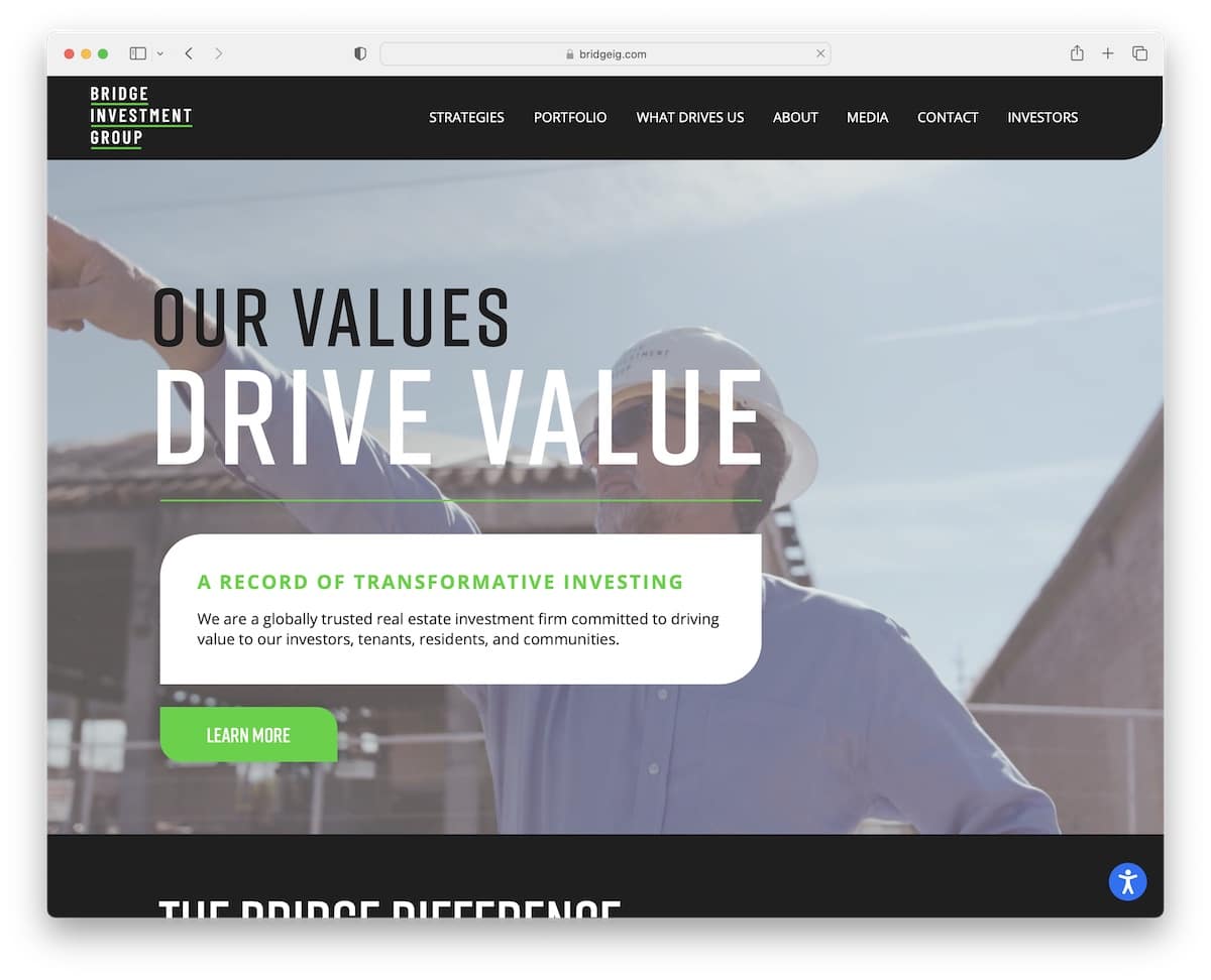
Bridge Investment Group’s portfolio website greets visitors with an inviting video banner above the fold, accompanied by concise text and a clear call-to-action (CTA) button.
Its navigation bar is designed to smartly disappear and reappear based on the user’s scrolling direction, enhancing usability. Plus, the drop-down menu and accessibility configurator further elevate the site’s functionality.
A modern slider effectively presents the group’s strategies, showcasing their expertise engagingly and interactively. (There’s also a back-to-top button, but might not even be necessary because of the reappearing navbar.)
What stands out: Do you want to reach even more people? Integrate an accessibility configurator so everyone can adjust your site’s appearance.
What stands out: Bridge Investment Group’s portfolio integrates visual elements like a video banner and modern slider with smart navigation features, offering an accessible user experience.
17. Bella & Bloom
Built with: Wix
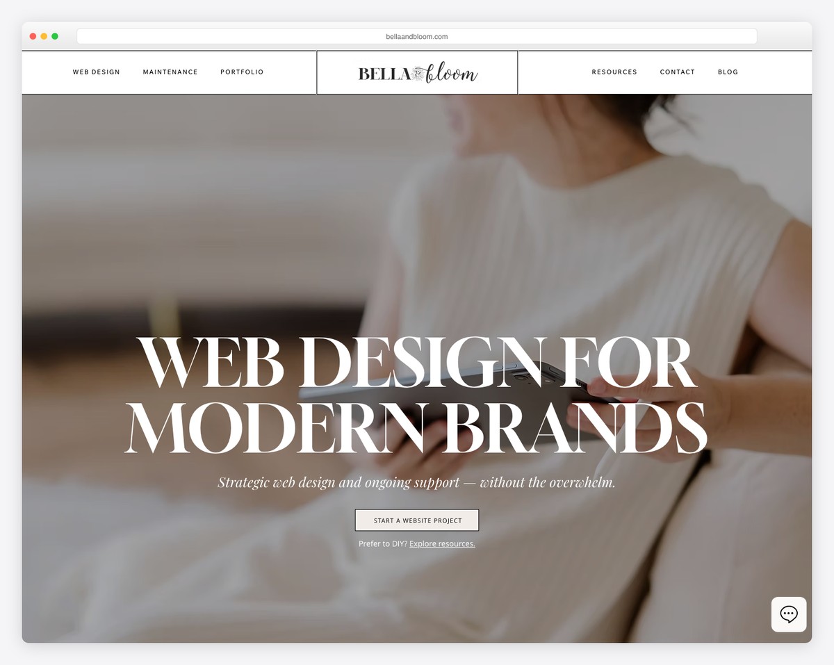
Bella & Bloom’s portfolio website is a beautiful ode to feminine design, boasting a light, airy aesthetic permeating its header, base, and footer.
The site features a floating header that adds a touch of elegance and convenience, ensuring easy navigation.
A sticky chat widget is thoughtfully placed, offering instant interaction for visitors.
Parallax backgrounds throughout the site create a sense of depth and movement, boosting the visual experience.
An Instagram feed elegantly positioned below the footer perfectly integrates social media, showcasing the latest posts.
What stands out: Introduce your personality through your portfolio’s design (colors, typography, etc.).
What stands out: Bella & Bloom’s portfolio catches the eye with its beautifully feminine design, seamlessly integrating elegant features like a parallax background and social media feed.
18. Nathalie Lete
Built with: Wix
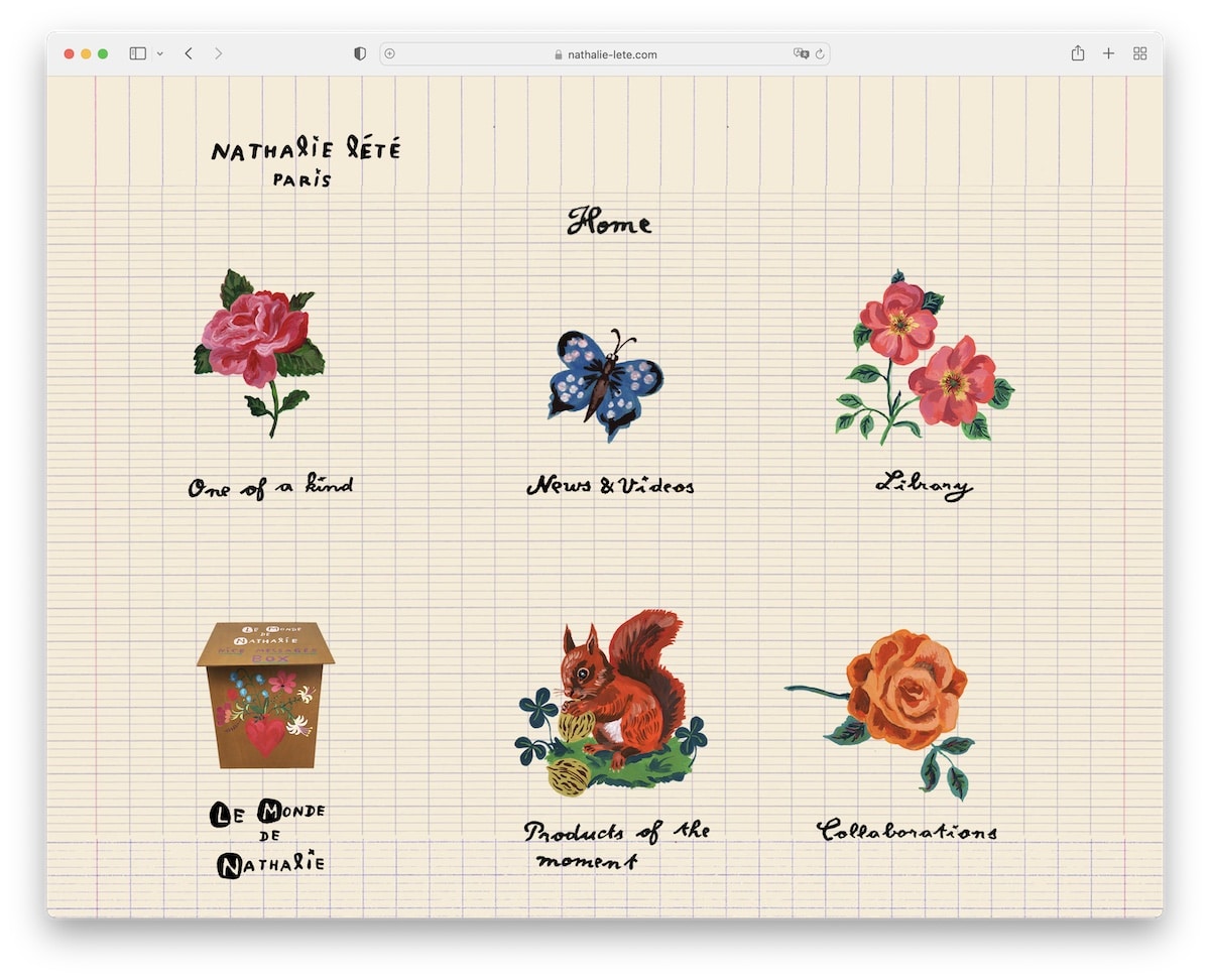
Nathalie Lete’s portfolio website is captivating with its artistic flair, featuring a unique background pattern that sets a whimsical tone.
The homepage is adorned with delightful graphics, doubling as intuitive navigation links, which guide visitors through her world of creativity.
The absence of a traditional header and footer emphasizes the immersive art experience, drawing focus solely on her work.
The lightbox portfolio elegantly displays her pieces, allowing for detailed viewing and appreciation of each artwork, further accentuating the site’s charm and Nathalie’s distinctive artistic style.
What stands out: Take things to the next level by introducing your custom-drawn graphics for an added personal touch.
What stands out: Nathalie Lete’s portfolio uniquely showcases her artistic vision, combining a whimsical background, graphic-based navigation, and a lightbox portfolio.
Don’t forget to check these fantastic art portfolio websites for more stunning examples.
19. Jennifer Xiao
Built with: Wix
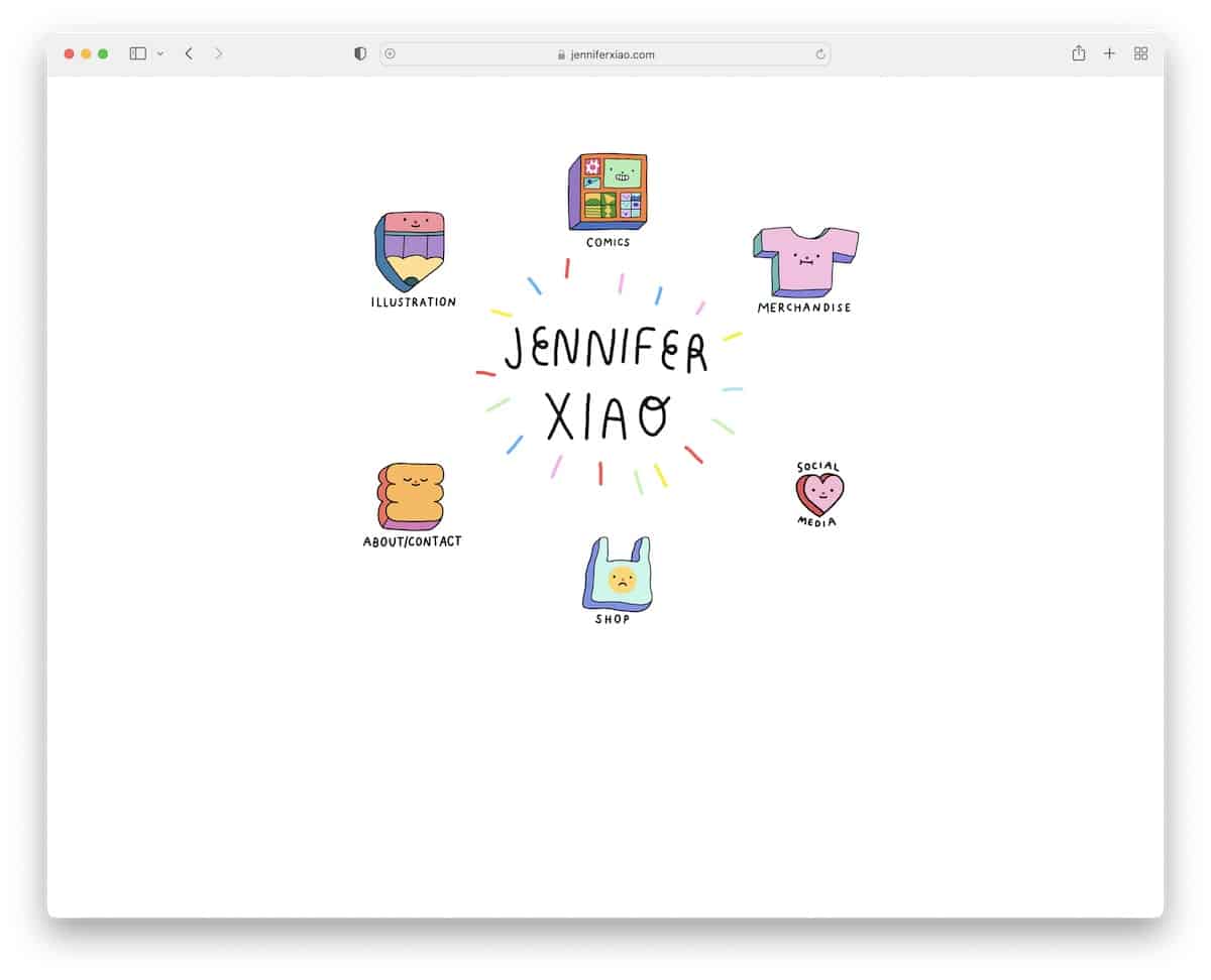
Jennifer Xiao’s portfolio website is a splendid showcase of custom design and interactivity.
The homepage is adorned with bespoke graphics that mimic clickable buttons on hover, adding an engaging, tactile feel to the digital experience. An animated “Jennifer Xiao” text is central to the design, lending a personal and dynamic touch.
The portfolio section features a thoughtful hover effect, revealing the name of each project. This enhances user engagement and provides a neat and organized presentation of Jennifer’s work, reflecting her meticulous attention to detail and creativity.
What stands out: Cool and catchy graphics and animations can work wonders when you don’t overdo it.
What stands out: Jennifer Xiao’s portfolio distinctively fuses custom interactive graphics and elegantly animated text, offering a playful yet informative work showcase.
20. Atelier Tinika
Built with: Wix
Atelier Tinika’s portfolio website starts with a multi-part header that efficiently houses menu links, a language selector, and a shopping cart.
Sticky Instagram and Pinterest icons offer constant social connectivity on the left side. The innovative design features three images blended into a charming banner above the fold, drawing visitors in.
A well-organized blog grid and a heartfelt testimonial section add richness and participation.
The site concludes with a newsletter subscription form in the footer, surrounded by essential links.
What stands out: Stick your social media icons to the top or side of the screen so visitors don’t have to search for them when they want to connect with you.
What stands out: Atelier Tinika’s portfolio combines a multi-functional header, sticky social media, and visually stunning design elements for a comprehensive and captivating web presence.
21. June Digan
Built with: Wix
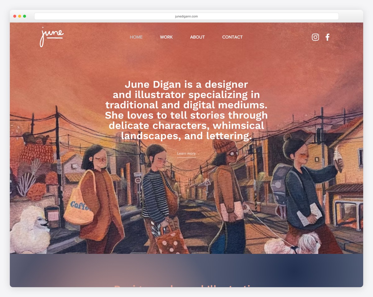
June Digan’s portfolio website features a stunning parallax banner that adds a dynamic layer of depth as visitors scroll.
The transparent header contributes to the site’s neat, modern feel with must-have links and social icons.
The large portfolio grid is thoughtfully designed, with each clickable element leading to individual project pages for detailed viewing. Animated thumbnails bring each piece of her portfolio to life, enticing viewers to explore more.
A basic footer with social media and email icons provides essential contact links, wrapping up the user experience nicely.
What stands out: Use individual portfolio project pages for a more in-depth presentation of your work and process.
What stands out: June Digan’s portfolio joins a dynamic parallax banner, interactive animated thumbnails, and a comprehensive portfolio grid for an engaging and visually appealing showcase.
How To Make A Portfolio Website With Wix
Here’s a straightforward process to create your portfolio:
- Sign up or log into Wix. Simple and quick.
- Choose a portfolio template that fits your style. Don’t overcomplicate it.
- Customize the template. Change colors, fonts, and layouts. Drag and drop elements until it looks right.
- Add your work. Upload photos, videos, documents – whatever showcases your skills best.
- Optimize for SEO. Use Wix’s built-in features to add keywords and meta descriptions. This helps you get found online.
- Preview and test everything. Make sure all links and forms work before going live.
- Publish and share. Once it’s ready, hit publish and spread the word on your networks.
That’s it. No fluff, no BS. Just a straightforward way to get your portfolio online.
FAQ
What’s the best Wix template for portfolios?
It depends on your field and style. Browse their gallery and pick what works for you.
Can I customize my Wix portfolio?
Absolutely. That’s the whole point. Make it yours. But plenty of ready-made templates don’t require any customization unless you want to.
Can I sell my work directly from my Wix portfolio?
Yes, Wix has eCommerce features. If you want to sell, set up a store. Wix offers one of the lowest transaction fees in the market. However, its eCommerce solution is better suited for smaller stores. It is not like you can’t run a large eCommerce website on Wix, but I wouldn’t recommend doing so because of the platform’s limitations.
How do I protect my work on Wix?
Use their security features like disabling right-click or adding watermarks. Nothing’s foolproof, but these help. Adding a watermark is the best option I recommend to my clients.




Comments (0)