19 Best Theater Websites (Examples) 2026
Are you searching for the best theater websites for inspiration and new ideas?
You came to the right place!
We gathered a collection of the most awesome websites with great designs that raise the WOW factor sky-high.
Moreover, we also added the website building platform/CMS that each page uses.
However, you can also use any of the best theater WordPress themes and unlock complete creative freedom for your web presence.
Let’s GO!
Best Theater Websites Of 2026
1. Drang
Built with: Webflow
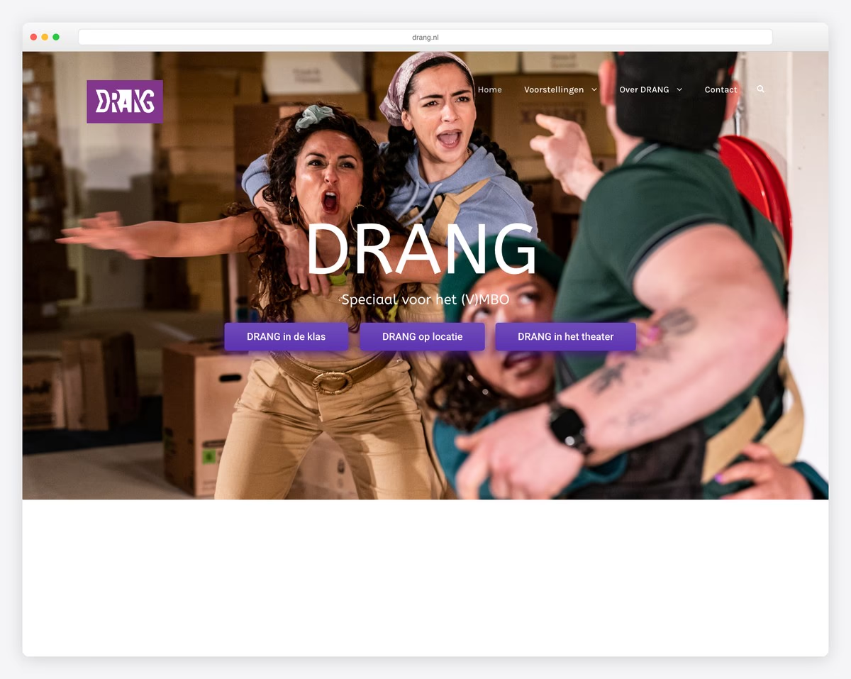
Drang features a black-and-white design with a large slideshow that promotes their current shows.
The header is a floating one that’s always available to the user if he/she wants to visit other internal pages or view Drang’s social profiles by pressing the buttons.
What stands out: Dark mode design is a great way to make your theater website stand out more.
Also, don’t forget to check more epic Webflow websites to see what’s possible with this great website builder software.
2. NieTeatr
Built with: Webflow
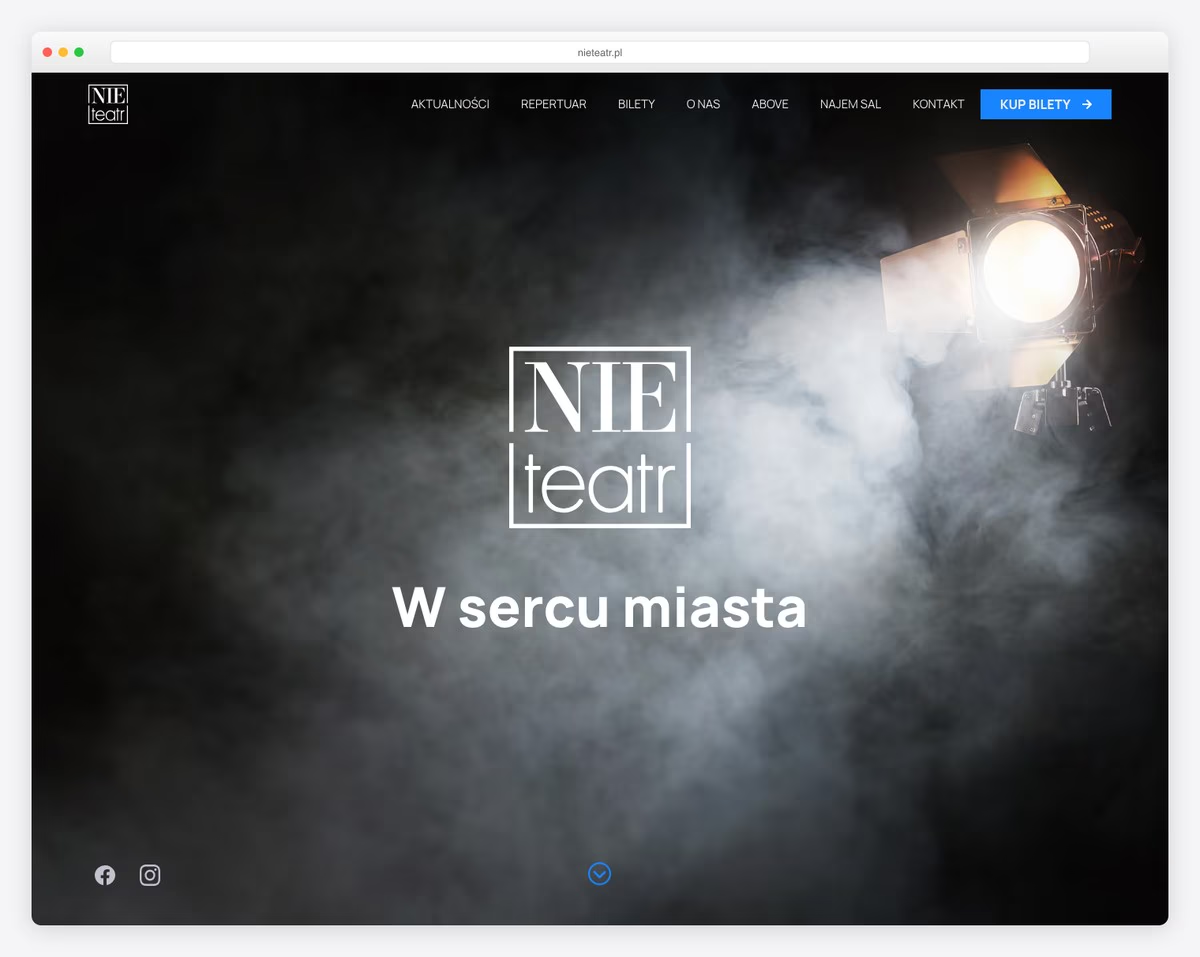
Full-screen image, logo and text keep NieTeatr website very minimalist at first glance. The image opens like a curtain that announces the show’s beginning – with a slideshow in this case.
The more you scroll, the more content and information it reveals, with extra animations for a more immersive experience.
What stands out: Surprise your visitors with the unexpected, just like NieTeatr does.
3. LAByrinth
Built with: Squarespace
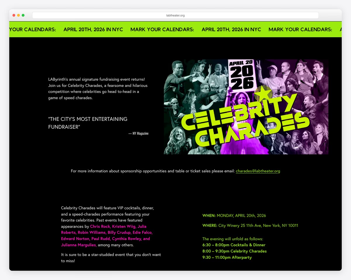
What’s unique about LAByrinth is that the full-screen slider they use only features images – no text, no CTAs – keeping it minimal.
But you can access their drop-down menu for more information because scrolling ends very quickly with a “Donation” button.
What stands out: Your website is a great place if you’d like to raise donations.
Need more ideas? Check these Squarespace website examples that are JUST amazing!
4. Silo
Built with: Craft CMS
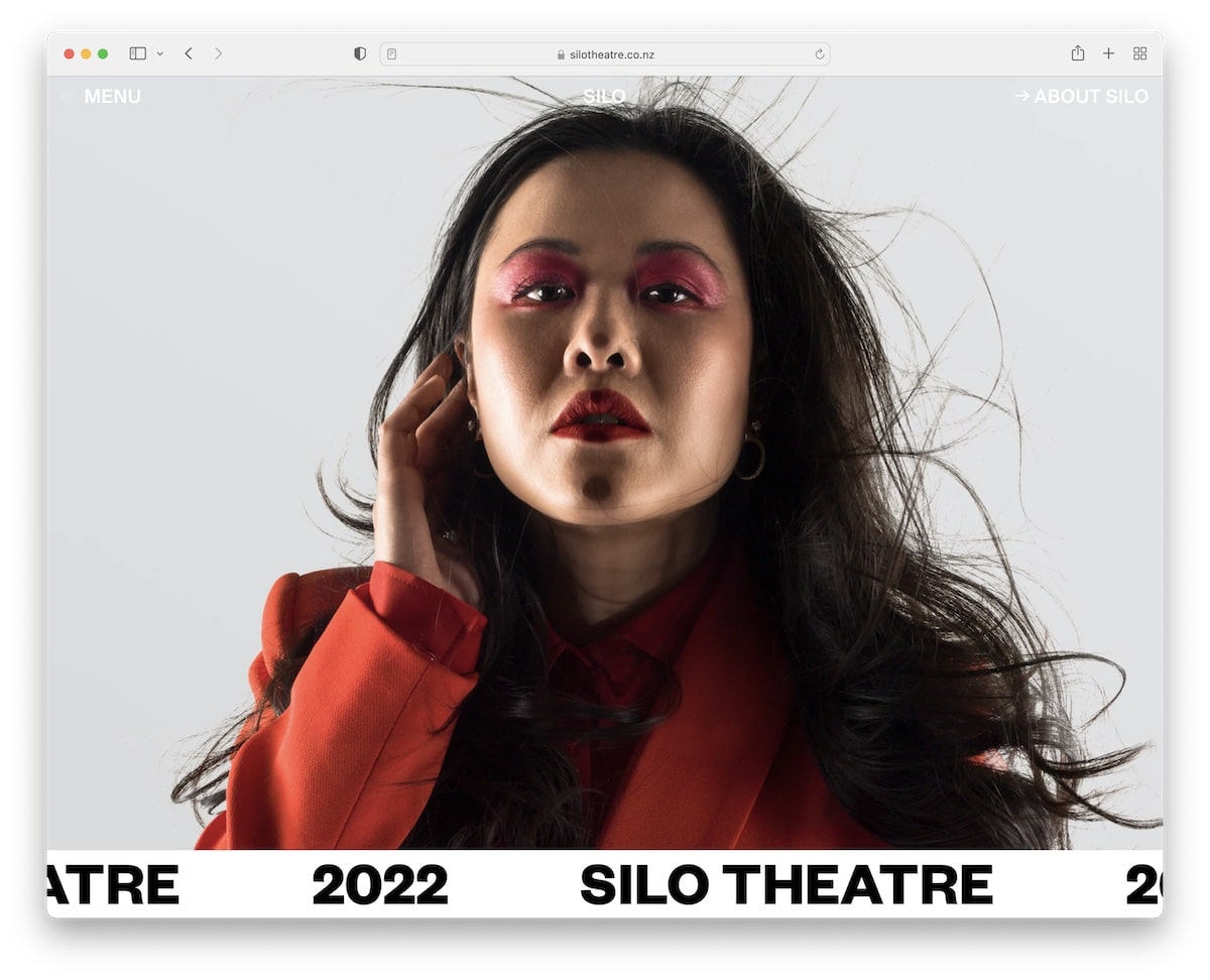
Silo has a beautiful full-screen image background with an auto-sliding “notification” bar that says Silo Theatre 2022.
Their header area is minimalist and transparent, with a menu button that features an animated dot for visibility.
Silo’s scrolling experience is also very engaging, featuring cool animations to keep the visitor intrigued.
What stands out: From a simple hero section to creative scrolling – there’s always a way to spice up your website.
5. Gorki
Built with: Drupal
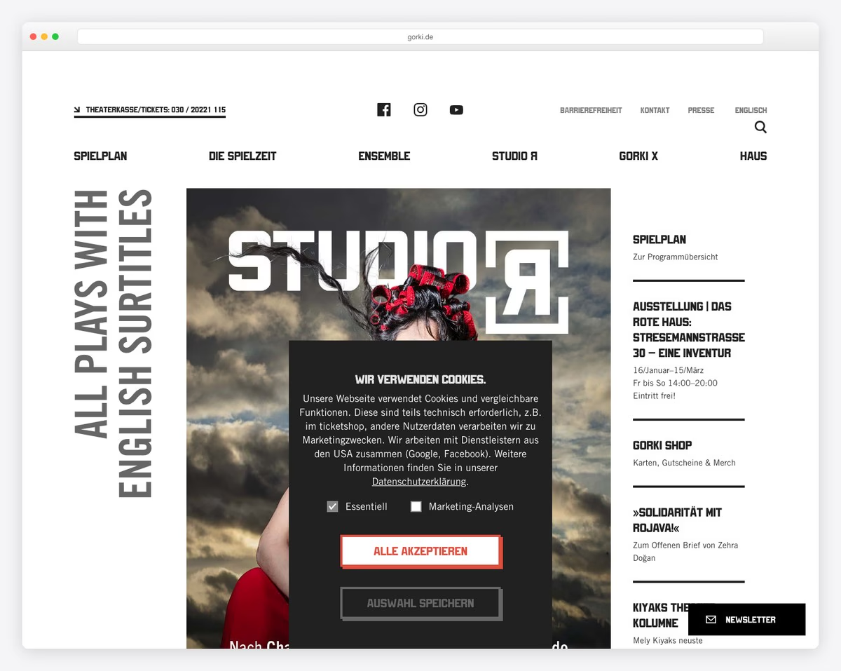
Gorki is a modern theater website that promotes upcoming shows with a large banner in the hero section. But you also get other links if you’re interested in learning more without the need to start scrolling.
The floating header is minimalist, with a hamburger menu button, logo and search icon. The site also features a cool carousel for guests that’s swipe sensitive.
What stands out: Make a unique hero section that will trigger instant curiosity in all your visitors.
6. Sydney Opera House
Built with: Adobe Experience Manager
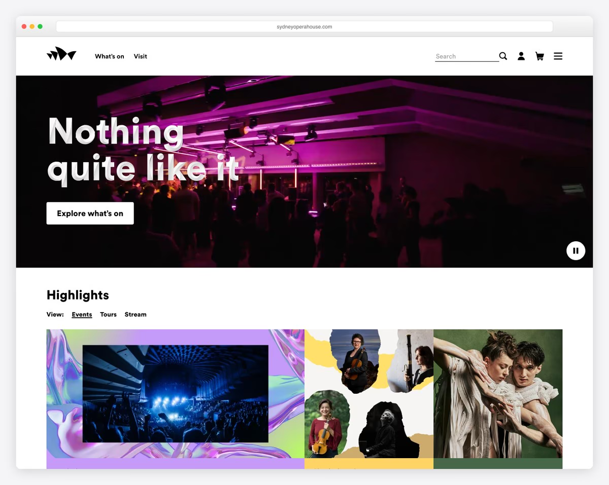
The Sydney Opera House website opted for a video background hero section instead of an image or a slider. It also has a title and a call-to-action (CTA) button.
Their schedule of shows is like a filterable grid portfolio that helps find popular events, streams, articles, and more quickly.
What stands out: Instead of creating a long website, create a portfolio with tags, so users find stuff they like faster.
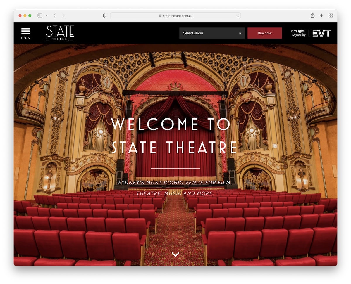
7. State Theatre
Built with: Sage Theme
State Theatre website gives you a welcoming feel with its full-screen image slider. They have one of the most practical header sections that opens a sidebar menu on click and allows you to purchase show tickets with the handy drop-down.
On the other hand, the footer consists of social media icons and a newsletter subscription button.
What stands out: Use your header to find shows and sell tickets directly, saving users’ precious time.
8. Capitol
Built with: Microsoft ASP.NET
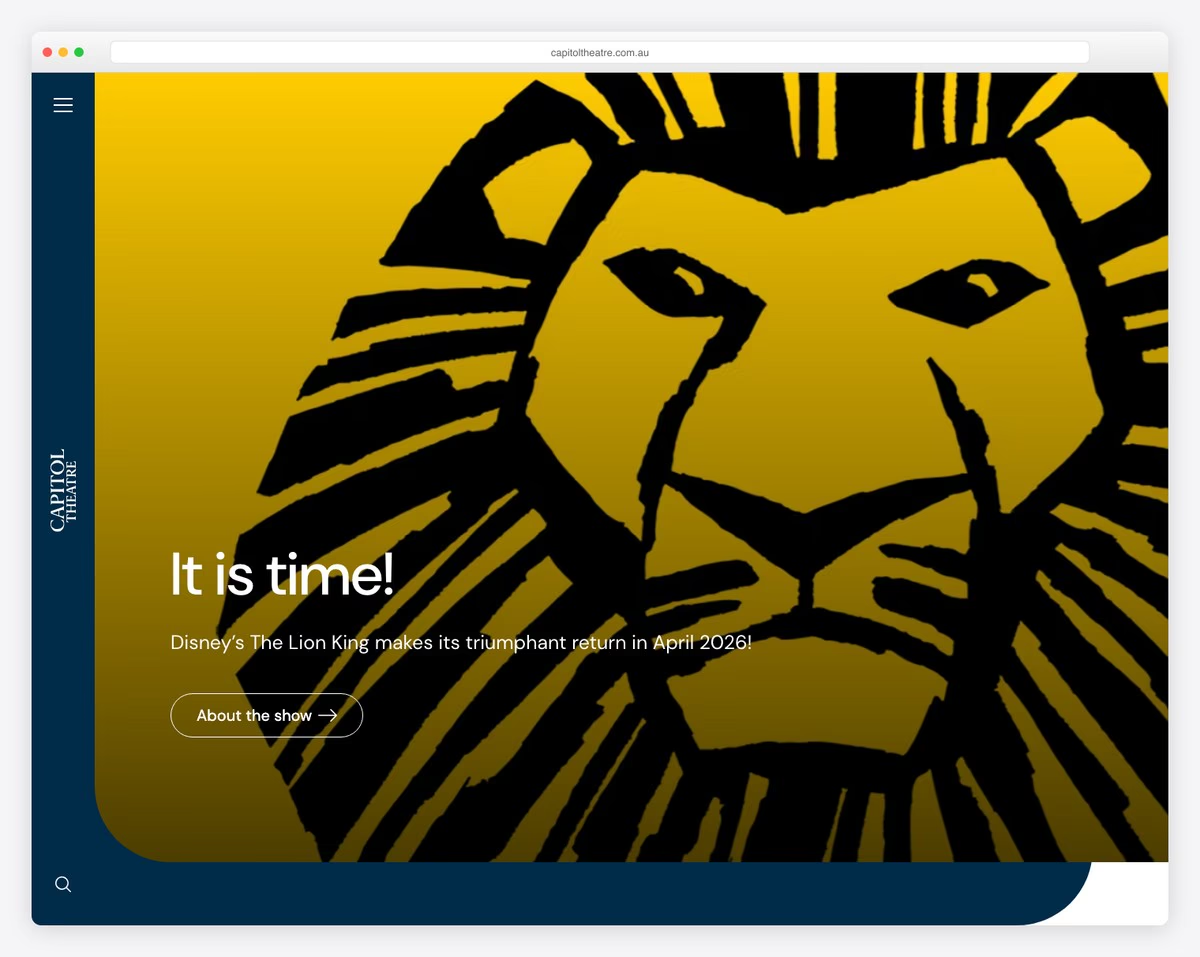
Capitol Theatre website keeps its home page simple and bold with a three-part structure. They promote three of their shows with large images and clickable text with a “jumping” effect between them.
The header is transparent with links to other website pages, using a drop-down menu.
What stands out: Use large images and big text to promote your shows.
9. People’s Light
Built with: Umbraco
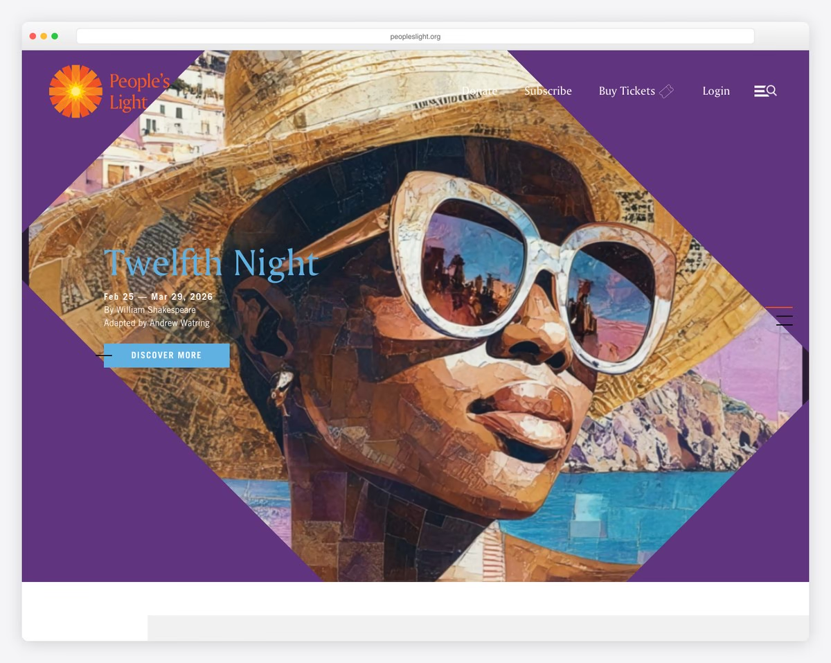
People’s Light has a unique vertical slider you control with scrolling, instantly differentiating this theater website from others.
The page also features a sticky navigation bar, a cool Twitter feed and a large section to promote their email list.
Plus, they have a notification bar at the top to advertise a good cause.
What stands out: Add a top bar if you’d like to push a special sale, new shows or anything else that needs extra attention.
10. Sydney Theatre
Built with: SiteCore
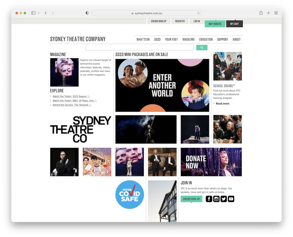
Sydney Theatre has a home page that’s a hero section only (on desktop). But they feature a cool grid layout that promotes some of their shows through images that share more info on hover.
But everyone can also access the “But tickets” button in the top bar or use the navigation bar to browse events, check the magazine, and more.
What stands out: Simple home page with a large search bar can increase your website’s overall user experience.
11. Victorian Opera
Built with: Craft CMS
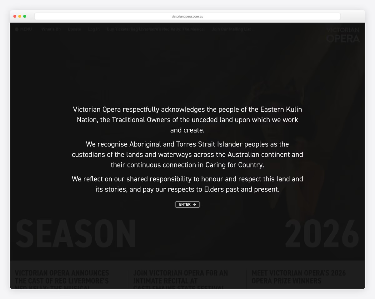
We’ve already seen a bunch of simple theater websites, but none is like Victorian Opera. The home page features only a hero section with a small slider, text and CTA buttons to access the current show or see the upcoming season.
But you can also click on the search or menu icons that equip you with everything to find exactly what you want.
What stands out: Simplicity works every time, especially with a touch of creativity, like in the Victorian Opera’s site case.
12. KUBE
Built with: Drupal
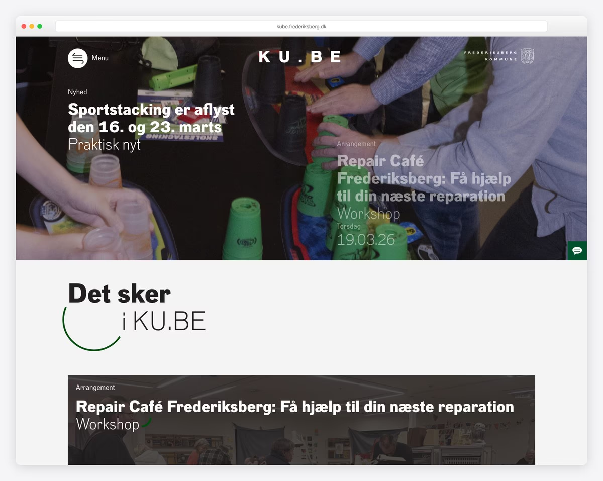
KUBE has a pretty interesting full-width slider with a transparent header that becomes sticky when you start scrolling.
The hamburger menu reveals a full-screen navigation overlay that easily gets you to all information.
There’s also another vertical slider just before the footer with additional details.
What stands out: A full-screen menu overlay is great for experimenting with elements and animations.
13. DDSKS
Built with: Drupal
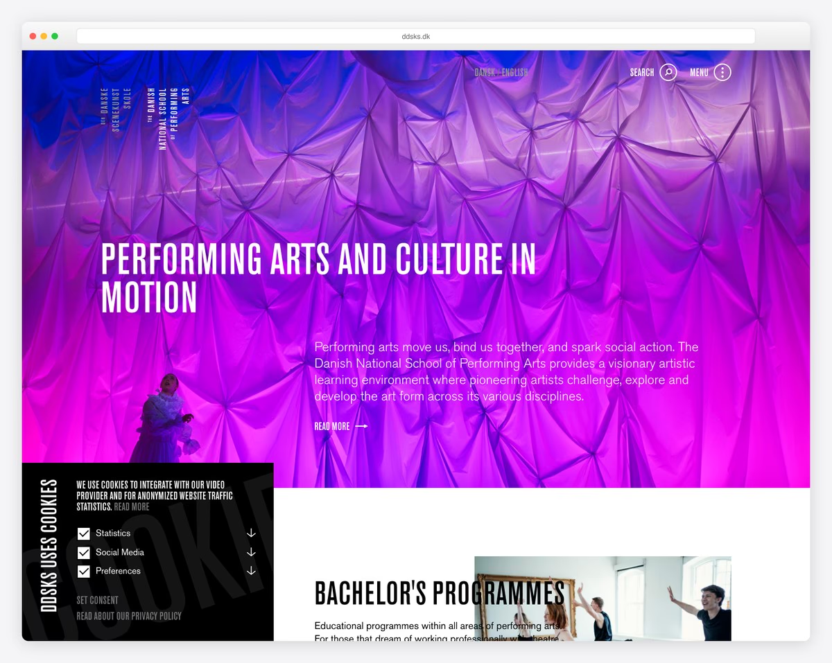
DDSKS is another theater website that adopted the on-scroll content loading method to elevate the scrolling experience.
They also feature a slight variation of the full-screen hamburger menu and include a back-to-top button that only appears toward the bottom of the website.
What stands out: Great use of white space with scrolling animations go very well hand in hand.
14. Dragone
Built with: Elementor
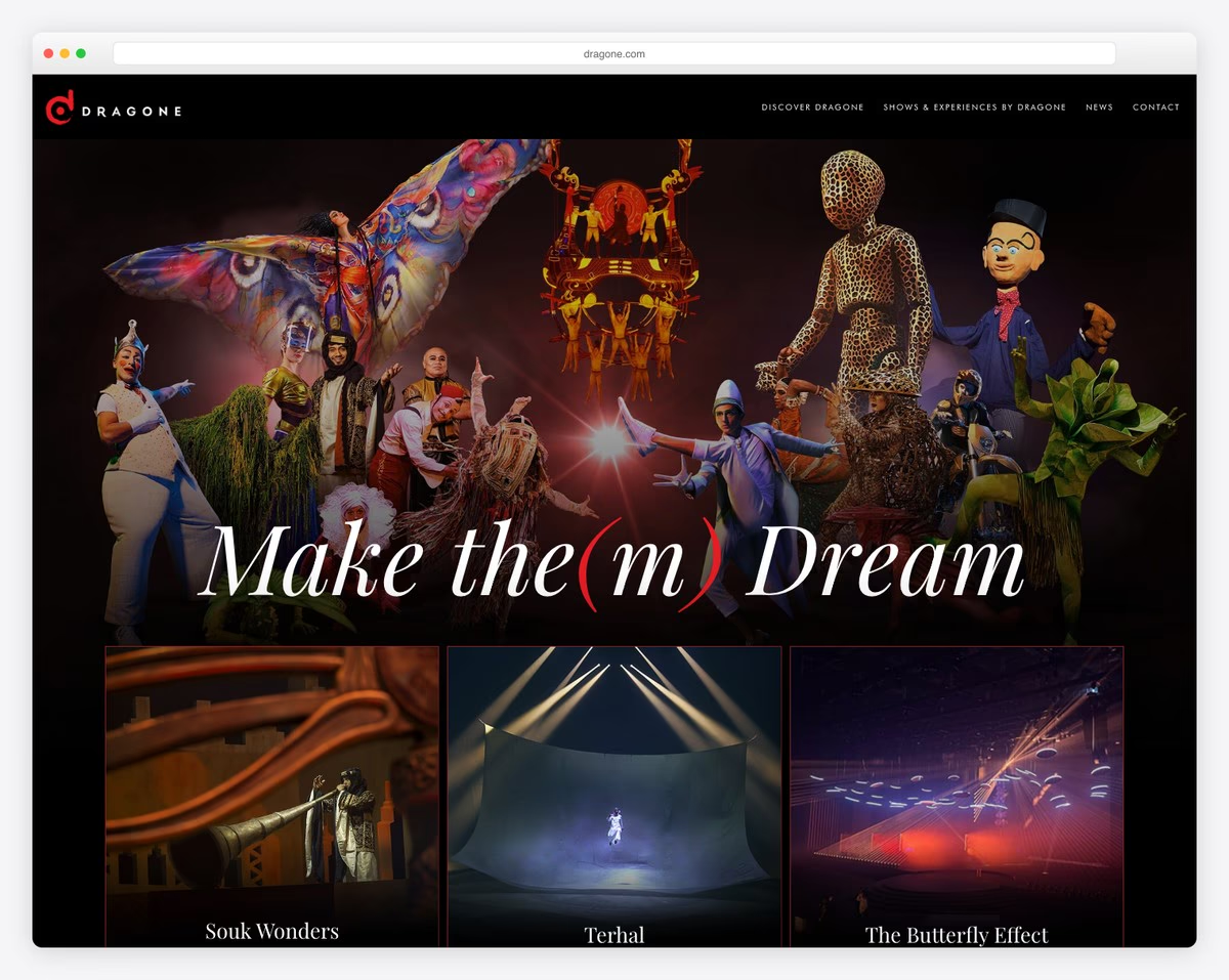
Dragone is a theater website with a dark design, a slider and a flipping 3D hover effect that’s way too cool.
You’ll also find a transparent navigation bar with mega menu functionality on some categories. Also, they keep the four-column footer area very minimalist with additional navigation options.
What stands out: A mega menu can work great for theaters because you can add images and links.
15. Nationale Opera & Ballet
Built with: Drupal
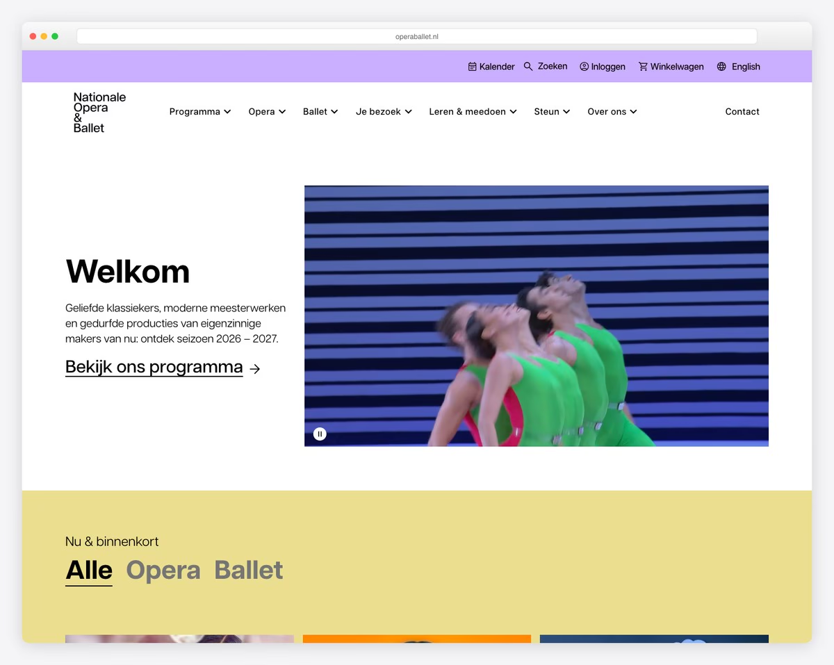
Nationale Opera & Ballet website starts with an interesting hero concept that features an auto-played video with a banner overlay (that includes text and a CTA).
The page also has a two-part header section with icons/quick links in the first row and navigation in the second.
What stands out: If you want to add a video to your website, do it differently, like Nationale Opera & Ballet.
16. Unicorn
Built with: Craft CMS
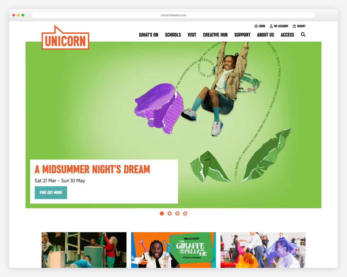
While most theater websites that we added to this list have some creative elements, Unicorn keeps this pretty basic.
A large banner above the fold, a grid-style presentation of shows and a newsletter subscription form are all available on the home page.
The footer section gives you additional theater information with social media links to always be up to date with what’s hot.
What stands out: Your website doesn’t necessarily need animations or special effects. Feel free to keep it basic and static.
17. Headlong
Built with: Squarespace
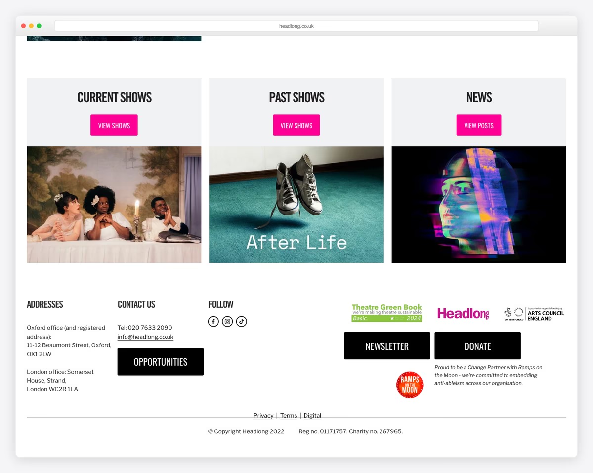
Like the Unicorn website, Headlong doesn’t complicate the home page design. However, the full-screen image presentation of the (current) show with a CTA button is bold and impactful.
Three additional banners below the fold promote current and past shows and their blog.
What stands out: Create a strong first impression with a full-screen image background.
18. Young Vic
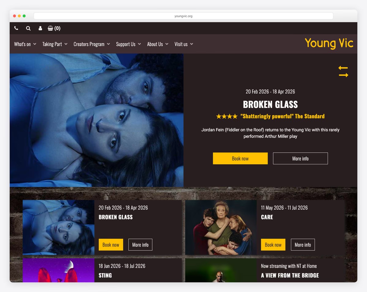
The Young Vic is a leading London theater at 66 The Cut, Waterloo, known for bold, accessible productions and strong community engagement programs. The website features dynamic hero imagery from current productions that immediately draws visitors into the theatrical experience.
The design balances cultural programming with practical booking functionality — a clear “What’s On” section with date filtering, ticket availability, and show details makes planning a visit effortless. The community and education sections reflect the theater’s commitment to accessibility beyond the stage.
What stands out: Leading with bold production photography in the hero section transforms a theater website from an information hub into an emotional invitation — visitors feel the energy of live performance before buying a ticket.
19. Bush Theatre
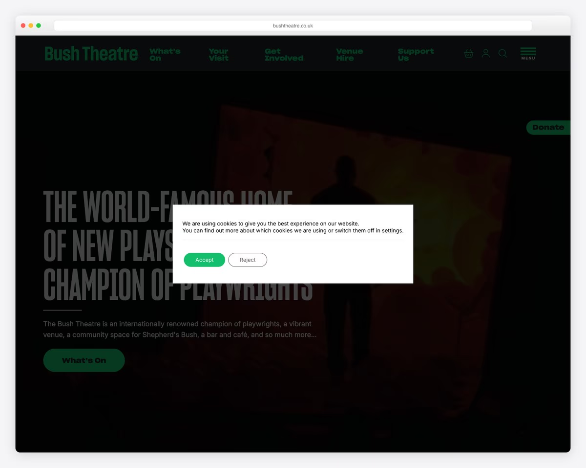
The Bush Theatre in Shepherd’s Bush, London is internationally renowned for championing new playwrights and emerging voices. The website doubles as both a cultural venue listing and community space hub, with a warm, inviting design that includes their bar and cafe offerings.
The clean, modern layout makes it easy to browse upcoming shows, book tickets, and explore the theater’s creative learning programs. The integration of dining options and event spaces alongside the main programming shows how the Bush Theatre functions as a complete neighborhood cultural destination.
What stands out: Presenting a theater as a complete cultural destination — shows, dining, community programs — rather than just a venue expands the audience beyond traditional theatergoers and creates multiple reasons to visit.
Related Posts


Comments (0)