Top 15 jQuery Navigation Menu & Bar Plugins For Websites 2022
Website navigation will be one of the most important features that you implement. It serves as the compass for what is to be found on your site. If there is no navigation, a huge mess establishes itself. Have you ever visited a website with a clear lack of navigation features? Don’t you find that annoying? With the evolution of modern and responsive web, website navigation tools have also evolved rapidly. jQuery now makes it possible to create stunning, unique and authentic navigation effects that will keep users entertained; most importantly, satisfied with the choice of having a website navigation menu.
On-line stores, blogs, content directories, news websites, encyclopedias, and so many other websites depend on good navigations to help users find what they are looking for. That is the primary goal of our collection of the best jQuery navigation menu, bar libraries, scripts and plugins. We will dive deep into what the open-source community has managed to unravel in the form of JavaScript’s potential to optimize your website for the best possible navigation experience dynamically. We will look at modest, but truly modern examples will change the way you look at the navigation menus forever. These options are appealing because you don’t need to be overly experienced with programming to install any of these libraries. On top of that, they all have thorough documentation files available for a quick learning curve.
A solid navigation menu will be one of the best design investments that will quickly make a humongous return in the form of bounce rates, clickthroughs on your content, and general exposure of new users towards existing content. Any of the navigation menus and navigation bars below will give you the necessary boost in content exposure to ensure that none of your content goes unnoticed. Please enjoy at your own pace.
slimMenu
Try out slimMenu, a lightweight solution for creating responsive multi-level menus for your website. Understanding how media queries in CSS work is a challenge in itself. That is why slimMenu hopes to eliminate the need for you to learn difficult CSS syntax and simply give you the bread and butter of a top-notch jQuery plugin. slimMenu also supports tree view (nested) menus that are fully mobile responsive. You can also have many slimMenu widgets within the same page and a precise integration of tap-navigation for mobile devices. These make it easy for mobile users to access sub-menu items. The design is fairly standard, and some little work is going to be required for websites that deal with a lot of colors.
HorizontalNav
In web design, there will be numerous ways that a designer will get frustrated. One of those is working with grids. A website grid is the actual boilerplate layout of a website. Usually, the header grid is an individual container that receives individual styling and markup, requiring individual styling options. When creating navigation menus for the header, we usually run into a fairly common problem: our menu items don’t stretch out across the full width of our page. A very common problem that designers encounter. HorizontalNav is a jQuery library that takes your menu container, and simply allows it to stretch out in full width. Thus, the exposure of each menu item is maximized. So easy to apply to your website, will leave you wondering why you didn’t research this UI pattern before.
SmartMenus
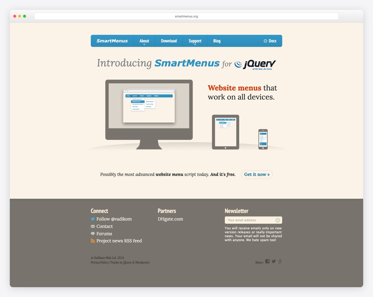
SmartMenus is a world class menu library/platform that promises to provide its users with a modern menu system that will work equally great on all browsers, devices, and platforms. From the moment you open the SmartMenus website, it’s clear that this plugin is based on a modern way. This reassurance that what you are about to start using on your website, is a fully functional library with great support.
Moreover, the navigation menu you see on SmartMenus is amplified with the SmartMenus plugin itself, so you can get a firsthand experience of what this menu library will do to your menus. There are a couple of themes to choose from: blue, clean, mint, and simple, with the option for you to style your own navigation theme for the use on SmartMenus. Modern code and technology means that SmartMenus will support touch-based devices and book readers that allow web access. All the markup is friendly to search engines, so you won’t lose out on any visitors soon. Code is easy to follow, so easy to modify as well.
Drawer
What’s Drawer? Drawer is a jQuery drawer menu plugin that utilizes iScroll and modern CSS3 to create a menu drawer widget. The menu drawer widget acts as a simple button that a user can click that will draw open the site navigation. All your existing menu items occupy the navigation, which also can be nested underneath one another. You can position the menu in all website directions, as you’d expect from such a versatile plugin.
TinyNav.js
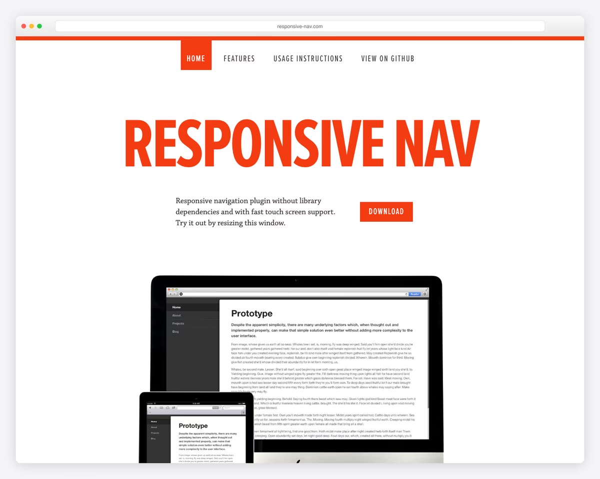
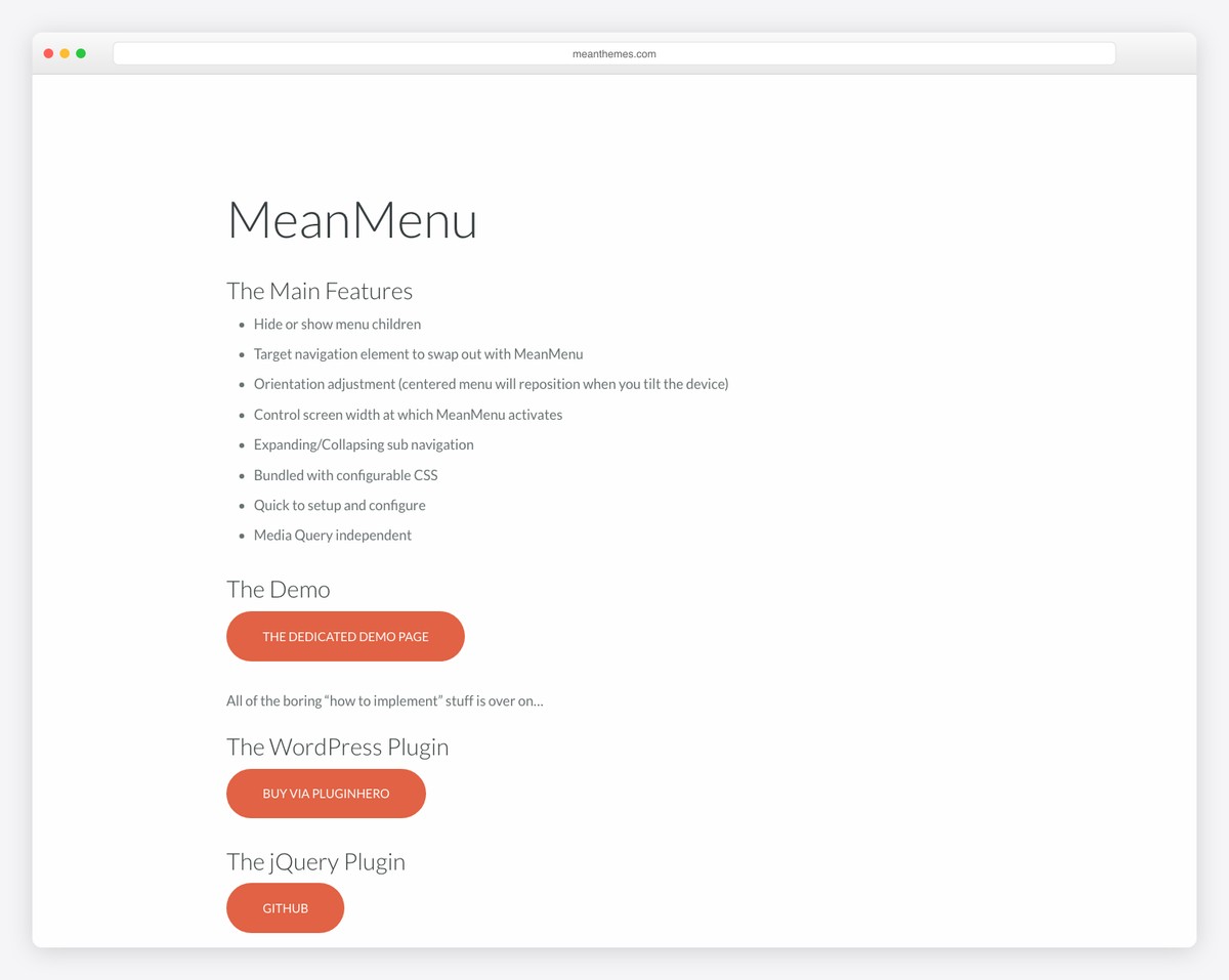
TinyNav transforms the “UL” and “OL” navigation elements to a select form elements for small screen sizes. A WordPress plugin is available. TinyNav is what sparked the development of Responsive Nav, the navigation menu that we outlined one above this one. Evolution happens in web development too, doesn’t it.
scrollNav.js
scrollNav has a slightly more unique purpose. This particular navigation bar works best with projects that need a scrolling navigation that appears on the side of the content area. The uses that come to mind at first is things like a documentation, on-line book, on-line content compilation, and others. The plugin is of course very advanced. The way it works is rather wonderful, you simply specify the individual tag that you wish to be outlined as a navigation option, for example “H2”, but you could also set it to be “H3” or “H1” it doesn’t matter to the plugin. Read the documentation to get a better understanding of the features.
Sidr
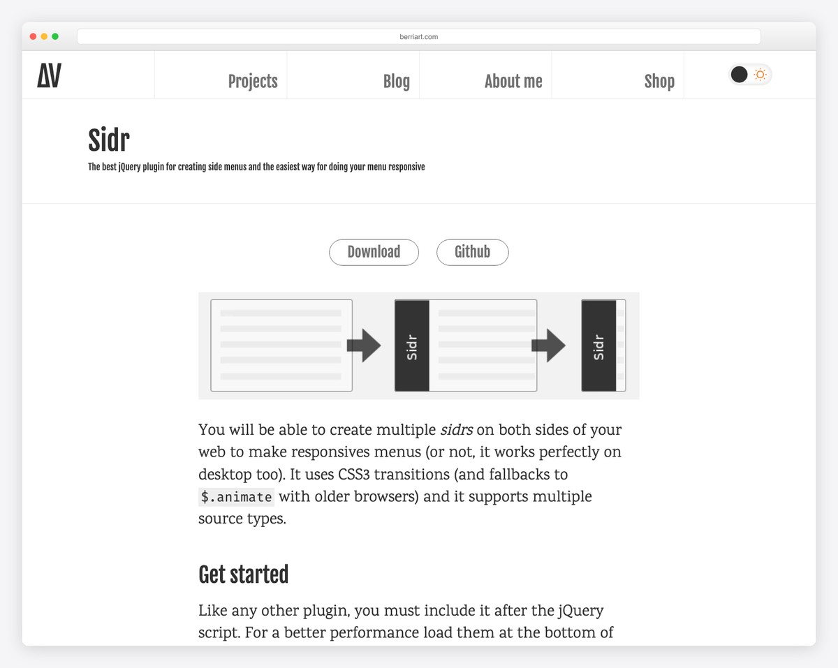
Sidebar menus have grown in popularity in the recent few years. Not having a full-on menu at the page’s header means that there is more room to expose your site’s front page. Instead, use a simple navigation icon on the side of the page that would trigger the full menu. Such approach has become popular even with sites like Google. The right-top icon of the user profile is all you need to access every single part of Google’s products and pages. If you wish to aim for the same effect on your designs, Sidr is one of the best libraries to get the job done.
stickyNavbar.js
At first glimpse, this menu couldn’t make any less sense than it does, but paying attention is important. stickyNavbar is a navigation menu that sticks to the top of the page, once the user has reached the particular container that holds the menu together, this means that you could easily insert a menu in the middle of the page, have the user scroll past that page and then have your menu scroll with him alongside the rest of the page, but of course, if the user scrolls back up, above the menu, it will naturally detach itself from the top of the page. That’s the main functionality of stickyNavbar.
Mega Dropdown
An eCommerce website will inevitably need to have a mega dropdown, well, for as long as this eCommerce website is serving thousands of items. A mega dropdown menu is a menu that can hold huge amounts of selections, without compromising the quality of design. This is one such jQuery extension that will help you achieve the desired result. The mega dropdown lets you create an individual menu item, lets say “Clothing” — then when the user opens Clothing, they are presented with different choices ranging from accessories to shoes. Still, within each selection, there are more subsections, and so on and on. To better help you display the available items you have going on for sale.
In addition, the other mega dropdown menu option in this particular library, is the ability to display gallery items within a menu. This means you could easily advertise individual products using visual content, within the menu. Oh, and if that wasn’t enough, there’s also an option to list your services and discuss them within the menu grid. It will be very hard to find a better mega dropdown menu than this one, it’s a powerhouse, yet provides a simple installation.
Mega menu can be difficult to implement because of so many moving parts. Therefore, we recommend using ready-made WordPress themes with Mega Menu that do all the heavy lifting for you. It has never been easier to build a Mega Menu on your website.
3D Bold Navigation
3D Bold Navigation is a simple folded menu that rolls out with a 3D effect once you click on the menu icon. It’s quite large, and would require a specific design project to be viable for use, explore on your own to get a better feel for it.
Stretchy Navigation
What’s stretchy navigation? It’s a navigation that stretches quite literally. Stretchy Navigation gives you a unique menu icon that once clicked, will stretch out vertically all the items on the menu. The cool part is that the menu items can have a name outside of the container and a menu icon inside the container. Very interesting approach to a menu, and we think you’ll find some good purpose for it.
Secondary Sliding Navigation
A secondary sliding navigation lets you have two menus within a single menu grid. First, you have the default menu with all the default menu items. And then at the end of the menu, you have a selectable menu button that will unfold a secondary menu once you click on it.
3D Rotating Navigation
Another 3D menu; this time, we won’t see a menu jumping in our faces. Instead, the 3D Rotating Navigation will unfold from the top of the page. This gives us a fairly medium-sized menu that supports menu icons and a close icon to close the menu. One of those menu solutions enables us to have more space at the top of our pages as we adapt to using an unfolding menu widget.
Responsive Overlay Menu Navigation
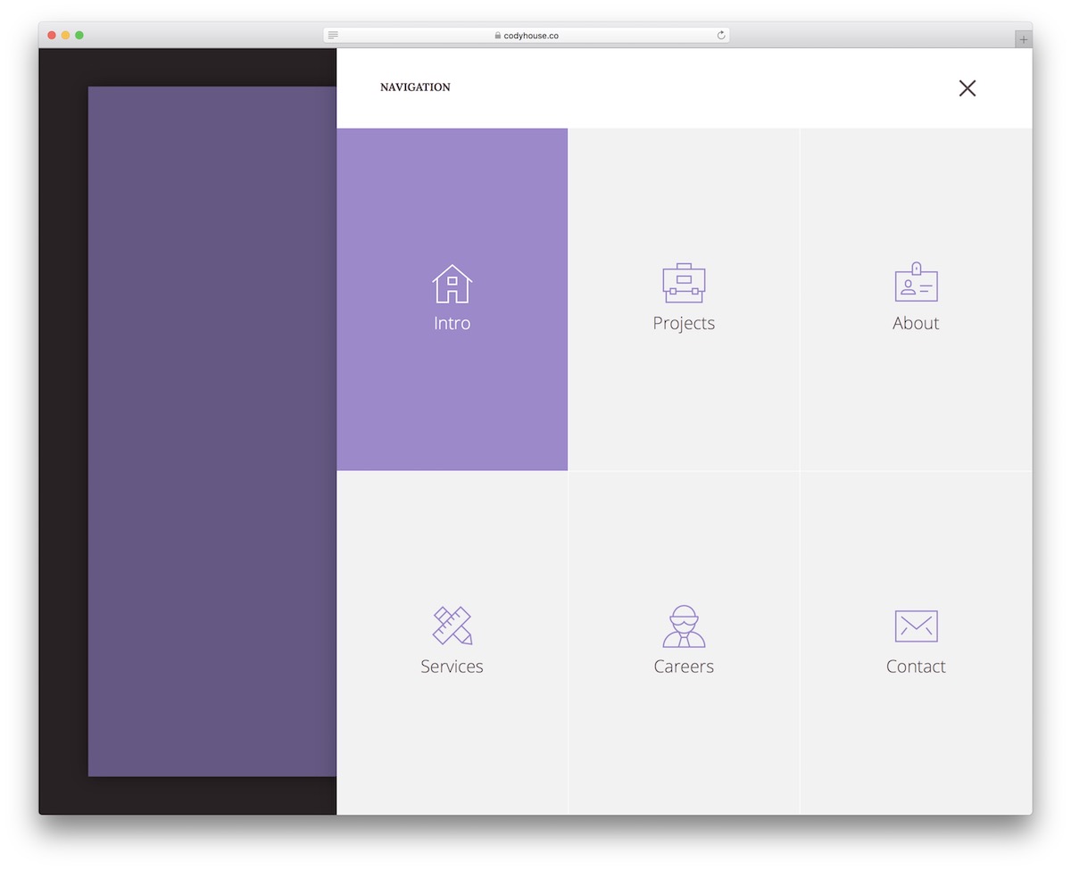
Overlay menus are also gaining momentum. It lets you create a full-page menu that consists of everything there is to know about your business, yourself, the website you are running, and any other additional details. Once you click the little hamburger icon in this demo, the following amazing menu experience will stun you. It is a full-page menu divided into three parts: about, services, and work, with each having their menu items. The bottom of the overlay has enough space for you to showcase your social media availability.
Slide from Top full-screen Overlay Navigation
Just another overlay menu. This one, though, uses a slide from the top approach. Once it does slide open, you can see that there are many ways such a menu could be optimized to include custom things like email subscription forms, custom categories and pages, and other website elements the user would need to be aware of. Although you can customize everything as you like, there’s no limitation.
Twisted Menu jQuery
A cool menu widget that showcases an icon. Once you click the icon, numerous menu icon items unfold around the first menu icon. You can see in the demo snapshot as to how it functions, look at the page to learn more.
Off-canvas Sidebar Menu with a Twist
If twisted wasn’t enough, perhaps a twist will. This stunning off-canvas menu solution will add a unique and dynamic function to the way your website menu is being displayed. Once the user clicks on the menu, the website gets twisted a few angles. Then, the available menu items are unfolded at the bottom-left corner. It’s a one-of-a-kind experience as far as navigation for a website goes. We highly recommend that you explore this one a lot more.
Navigation Menus and Navigation Bars built with jQuery
Would you say that we listed some of the best choices available? If for some reason, the answer is no, we hope that you will take the time to inspire us with more available options. You can do this by leaving feedback on this post.
jQuery is versatile, and a lot is possible using this language; over 15 unique navigation plugins are the true testament. We look forward to what developers will come up with in the future!
Looking to create a beautiful menu for your WordPress website? Here are the best WordPress menu plugins to improve user experience.
Comments (0)