22 Best Handyman Websites In 2026
Are you ready to drill into the world of top-notch handyman websites for serious design inspiration?
Grab your virtual tool belt because we’ll tour the best online spaces where creativity meets craftsmanship.
Whether you’re a savvy DIYer with a knack for nailing the perfect decor, or a digital carpenter looking to chisel out a stunning web presence, this roundup is your go-to guide.
We’ve scouted the digital neighborhood to find the crème de la crème of handyman sites that are functional and stylish.
So, loosen up those lug nuts and let’s get rolling.
Prepare to be wowed by sleek layouts, innovative features, and designs so good you’ll want to whip out your virtual paintbrush.
Get those creative gears turning.
This post covers:
- 20+ Best Handyman Websites
- Handy Tec
- ToddSunn
- Putnam Handyman Services
- HandyMangum
- Fix-It Friend
- Pro Property
- The Britting Group
- Full Circle Lawn Care
- Smith Handyman Service
- P5 Painting
- Zach Of All Trades
- Handyman On Purpose
- New Bern Home Improvements
- Streamline Services
- Handyman Connection
- Cal Pacific Roofing
- Handyman Services In DC
- House Doctors
- Honest Renovators
- The Ultimate Handyman
- Hank’s Handyman
- What Makes A Great Website For Handyman
- FAQs About Handyman Websites
- How should a handyman website be designed for maximum appeal?
- What features are essential for a handyman website?
- How can a handyman website improve customer engagement?
- What’s the best way to showcase services on a handyman website?
- How important is SEO for a handyman website, and how can it be optimized?
- What are the best practices for ensuring a handyman website is user-friendly?
21 Best Examples Of Handyman Website Designs
Ready to be wowed by the best of the best in the handyman digital world?
Here’s our handpicked list of standout handyman sites that will spark your creativity and hype to create an epic website for your business.
1. Handy Tec
Built with: Webflow

Handy Tec stands out with its sleek two-part header, featuring a top bar with essential contact details, a handy search function, and social media icons for easy connectivity. And the main navigation bar, complemented by a prominent call-to-action (CTA) button, enhances the user experience.
Its striking dark design, accented with vivid green details, exudes professionalism and modernity.
The thoughtfully designed footer includes additional business information, useful links, and a convenient booking option, making Handy Tec a distinguished example in the handyman website arena.
What stands out: Break the header into multiple parts, making it more organized with useful links and features.
What stands out: Handy Tec rocks a solid blend of functionality, aesthetic appeal, and user convenience, setting a high standard for handyman website design.
We also have a full collection of epic Webflow websites if this is the builder you plan to use.
2. ToddSunn
Built with: Squarespace

ToddSunn’s website shines with its transparent header, featuring a clickable telephone number for immediate contact.
The site greets visitors with an image of Todd, a concise bio and a clear call-to-action button, fostering a personal connection.
It thoughtfully includes distinct sections for services and heartfelt testimonials, enhancing credibility.
The integration of Google Maps pinpointing Todd’s location adds a practical touch, making it easy for clients to find.
Overall, ToddSunn’s website masterfully balances personal branding with user-friendly design.
What stands out: If you prefer doing business via phone, include a clickable telephone number in a visible spot (or multiple) for easy access.
What stands out: ToddSunn’s website impresses with its personal touch, seamlessly blending approachability with professional service presentation.
Don’t forget to peek at more amazing designs through these superb Squarespace website examples.
3. Putnam Handyman Services
Built with: WordPress
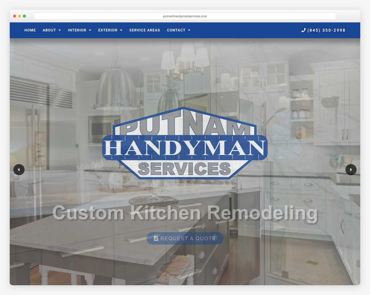
Putnam Handyman Services’ website captivates with a full-screen slider, showcasing engaging text and CTA buttons that immediately draw attention.
The navigation bar, complete with a drop-down menu and prominently displayed phone number, ensures user convenience.
Adding to its functionality, the site includes a newsletter subscription form, keeping clients informed and engaged.
The thoughtful addition of a back-to-top button enhances navigation, while the footer features handy opening hours, making it easy for customers to plan their interactions.
What stands out: Include a drop-down menu to make your site’s navigation more practical. (A multi-level drop-down menu might be even better with lots of content and categories.)
What stands out: Putnam Handyman Services’ website delivers a user-friendly experience with its engaging design (big slider) and practical features (CTAs, a clickable phone number, etc.).
If you build your site with WP, save yourself plenty of time with any of these handyman WordPress themes.
4. HandyMangum
Built with: WordPress
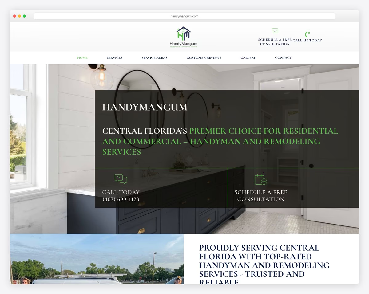
HandyMangum’s website stands out with its practical header, featuring a multi-level drop-down menu that simplifies navigation.
It engages visitors with CTA buttons for immediate contact and quotes, alongside a full-width banner that effectively communicates key messages.
The website smartly organizes its services into a four-part section, providing clarity and ease of access.
Additionally, it illustrates its operation process, building customer trust, and includes a dynamic testimonial slider, showcasing real feedback, thereby swelling its credibility and appeal.
What stands out: Integrating testimonials into your handyman website is an absolute must.
What stands out: HandyMangum’s website expertly combines comprehensive service information, clear operational processes, and engaging design elements.
Need help with WordPress? Then these house maintenance services WordPress themes will do the trick.
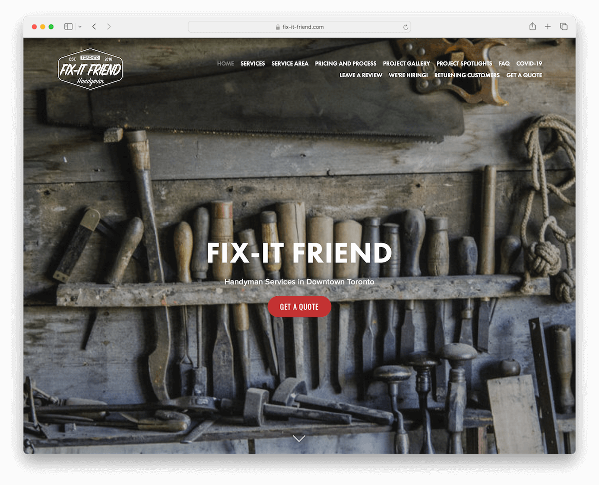
5. Fix-It Friend
Built with: Squarespace
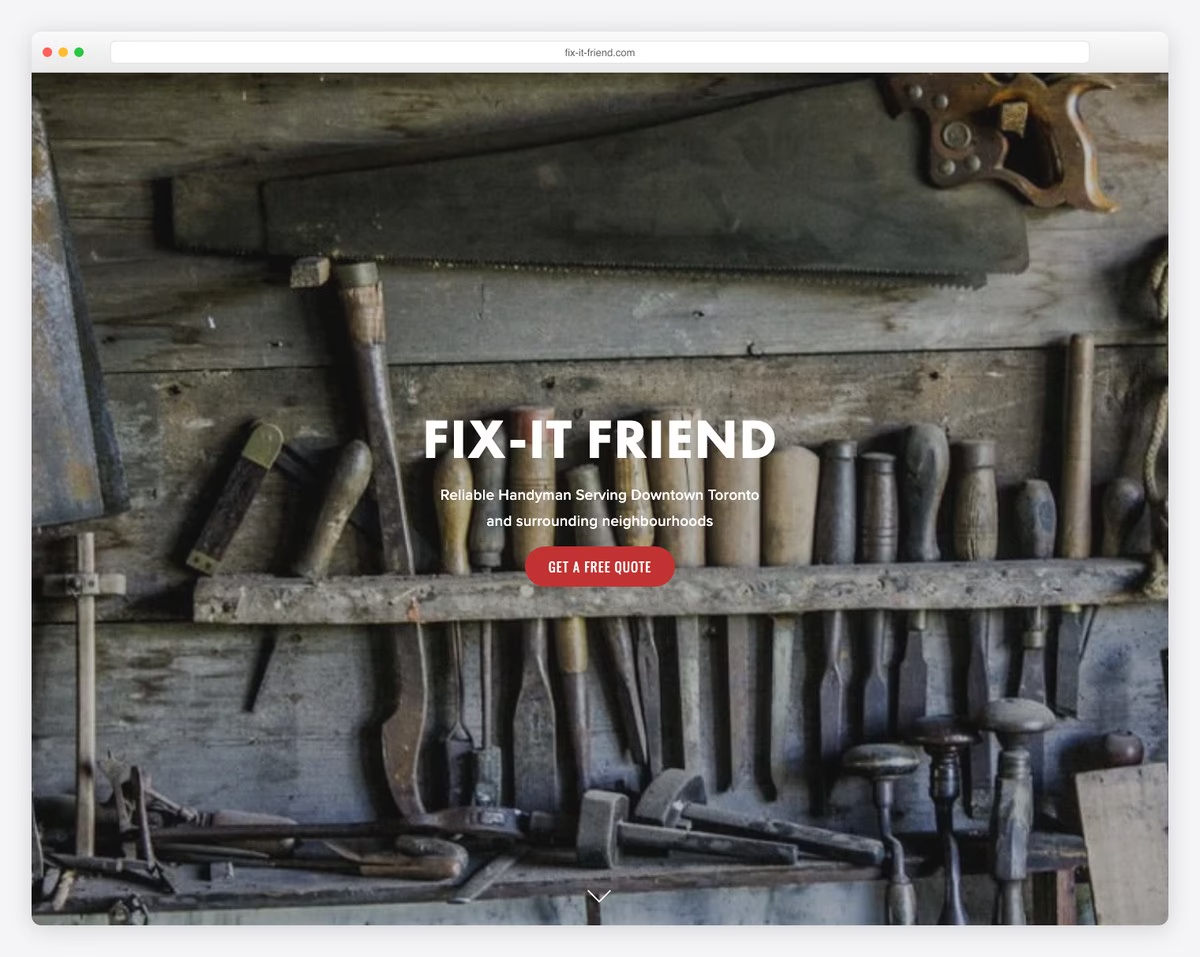
Fix-It Friend’s website captivates with its full-screen image backgrounds featuring a stunning parallax effect, creating a dynamic, immersive experience.
Its transparent header elegantly blends with the site, while a handy scroll-down button seamlessly guides visitors to the content.
The project gallery, complete with a lightbox feature, showcases work in an engaging, interactive manner.
Moreover, the strategic placement of various CTAs across the website effectively prompts user action, enhancing engagement.
These elements combine to make Fix-It Friend’s website both visually appealing and highly functional.
What stands out: Add depth and immersiveness to your website with the catchy parallax effect.
What stands out: Fix-It Friend’s website rocks an engaging and interactive design, leveraging visual effects and strategic CTAs to create a top-notch UX.
6. Pro Property
Built with: Squarespace
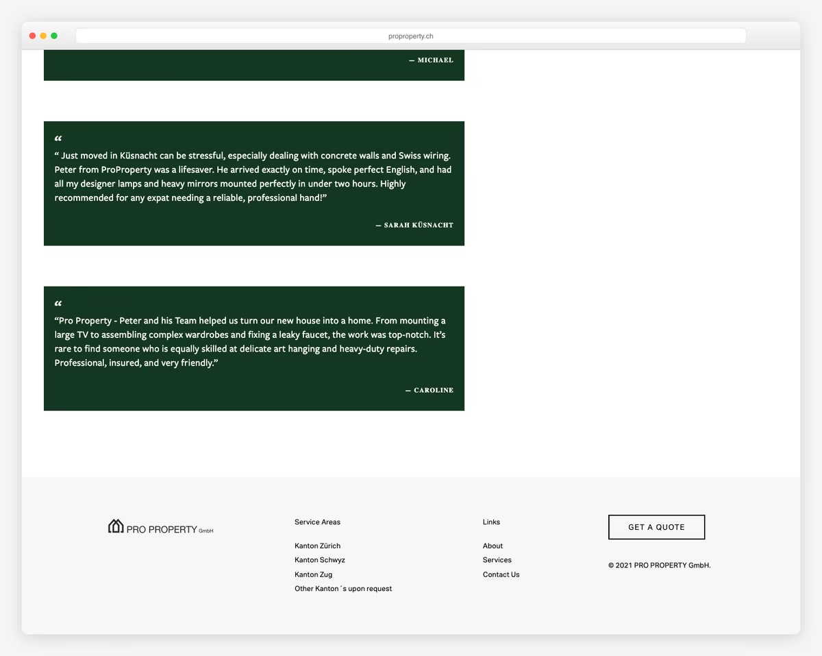
Pro Property’s website has a floating navigation bar, ensuring easy access regardless of scrolling.
Parallax effects add a dynamic, visually engaging layer to the user experience. The site’s content loading upon scrolling keeps it interactive and lively.
The project gallery, featuring a lightbox for detailed viewing, effectively showcases their work. Moreover, testimonials are on contrasting backgrounds, so they pop more, making them very hard to miss.
A clean and organized footer with essential links and a prominent “get a quote” button enhances functionality, making the website aesthetically pleasing and highly practical.
What stands out: Create a project gallery with the lightbox function so visitors can enjoy your work without distraction.
What stands out: Pro Property’s website offers a seamless and visually engaging UX with handy features and a well-organized layout.
7. The Britting Group
Built with: Squarespace

The Britting Group’s website captivates with its light and vibrant appearance, creating an inviting and energetic atmosphere.
Its minimal header, featuring two essential buttons for logging in and getting started, focuses on simplicity and user convenience.
This streamlined approach extends to the equally simplistic footer, adorned with social icons and a newsletter subscription form for easy engagement.
A notable feature is the testimonial slider, which elegantly showcases client feedback, adding authenticity and trust.
What stands out: Add CTA buttons to the header/navigation bar section so they’re easier to reach and click.
What stands out: The Britting Group’s website blends a minimalistic design with vibrant visuals and user-friendly features.
8. Full Circle Lawn Care
Built with: Wix
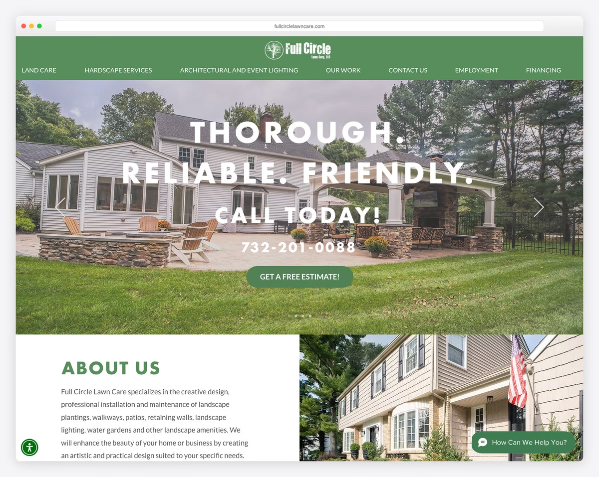
Full Circle Lawn Care’s website has a dynamic slider that instantly engages visitors with compelling text, a telephone number, and a clear CTA button.
Its dedication to accessibility is showcased through a convenient accessibility menu, ensuring a user-friendly experience for all.
The floating chat widget invites instant interaction, enhancing customer service.
Moreover, an Instagram feed adds a personal touch, showcasing real-time updates. At the same time, the integrated Google Maps feature provides a practical tool for locating their services, making the site both informative and interactive.
What stands out: Allow more visitors to get the most out of your website by introducing the accessibility configurator.
What stands out: Full Circle Lawn Care’s website excels in integrating interactive features like a chat widget and social feeds, along with essential tools like Google Maps, offering a highly engaging and user-centric online experience.
Since many enjoy building with Wix, we created a special list of the best websites built on Wix platform for your viewing pleasure,
9. Smith Handyman Service
Built with: WordPress
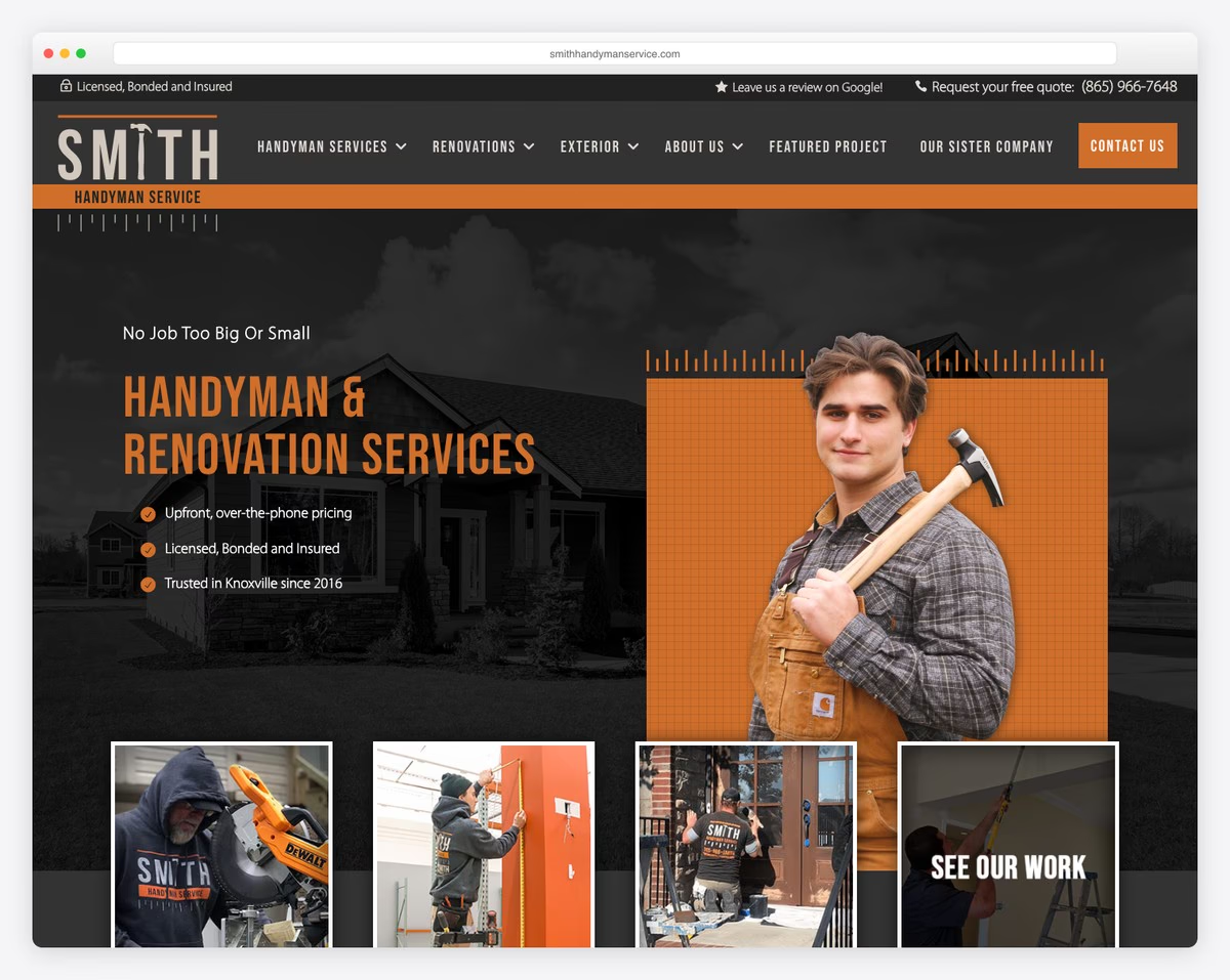
Smith Handyman Service’s website boosts UX with its dynamic header, which intuitively disappears and reappears based on scrolling, enhancing user navigation. The top bar also provides quick access to essential information.
Its before/after project sliders offer a visual testament to their craftsmanship, engaging users effectively.
The inclusion of a blog section adds valuable content, positioning them as industry experts.
A large footer anchors the site, packed with useful links, social media icons, and location details, making it a comprehensive resource for visitors seeking handyman services.
What stands out: A floating header is efficient, but making it disappear/reappear is even better.
What stands out: Smith Handyman Service’s website has dynamic navigation, impactful visual content, and a comprehensive footer, offering an optimal blend of functionality and user engagement.
10. P5 Painting
Built with: Squarespace
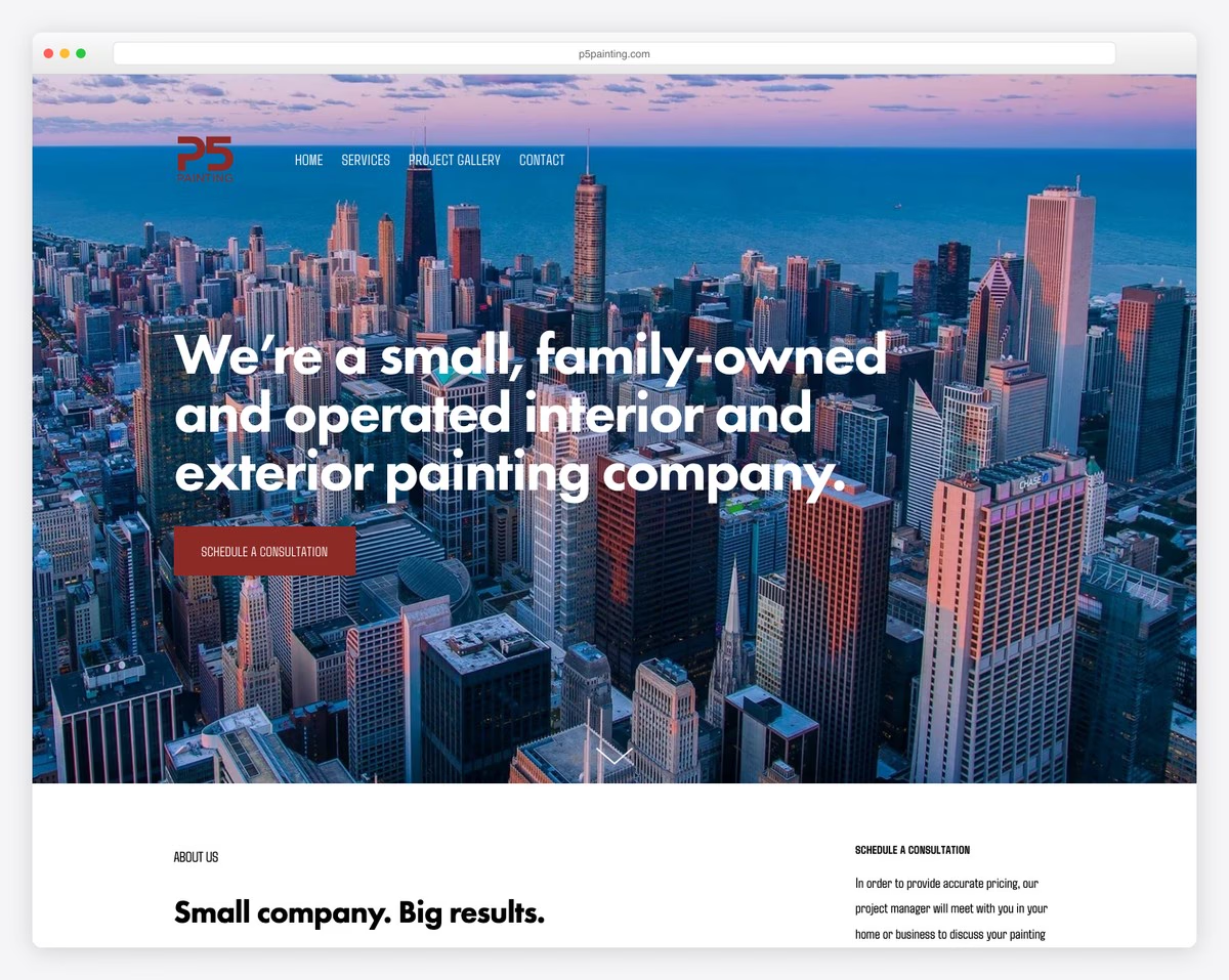
P5 Painting’s website’s clean, light design exudes simplicity and elegance.
The large banner above the fold, combined with a transparent header, immediately captures interest. The succinct text and prominent CTA button effectively communicate key messages and encourage user engagement.
This design approach is balanced by a large, contrasting footer, which provides essential information without overwhelming the user.
These elements together create an appealing and intuitive website, ideal for a modern handyman service.
What stands out: A contrasting footer makes all the content, useful information, links and CTAs stand out more.
What stands out: P5 Painting’s website balances clean and user-focused design, making it a standout example in the handyman web landscape.
11. Zach Of All Trades
Built with: Duda
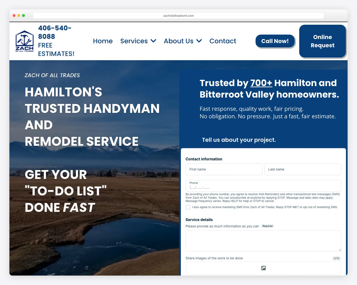
The Zach Of All Trades website excels with its minimalist header, centered around a prominent “Free Estimate” button that invites immediate engagement.
The site smartly integrates Google reviews, lending credibility through real customer feedback.
A transparent four-step process explanation demystifies the service experience, enhancing trust.
Adding a floating project request button ensures constant accessibility, while the before and after images visually showcase the transformational work.
A well-organized four-column footer rounds out the design, providing comprehensive information in a clean, easy-to-navigate structure.
What stands out: Integrated reviews and ratings from 3rd-party platforms, like Google and Yelp.
What stands out: Zach Of All Trades’ website distinguishes itself with a minimalist yet informative design, effectively incorporating customer reviews and clear process explanations for a superb UX.
12. Handyman On Purpose
Built with: WordPress
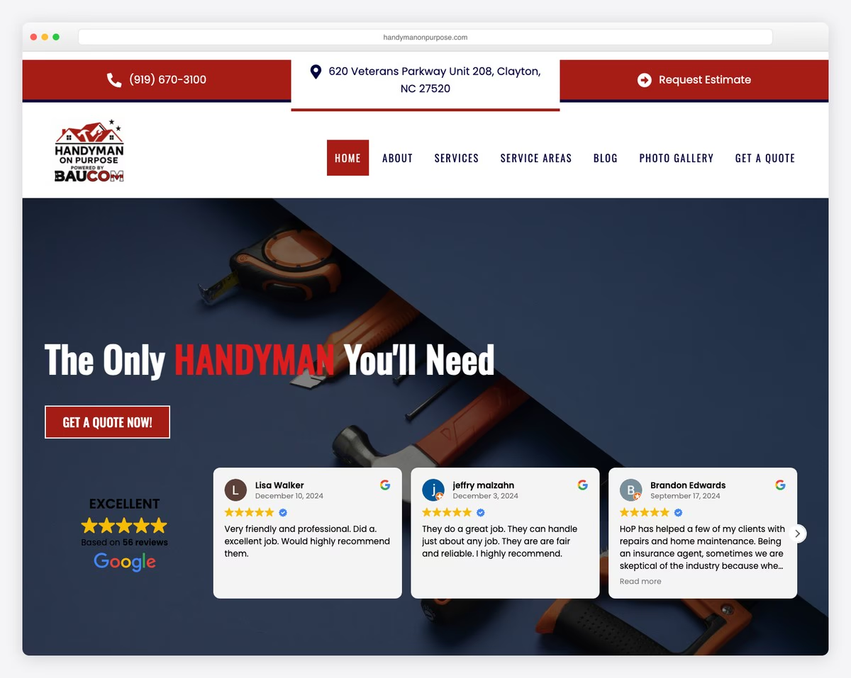
Handyman On Purpose’s website stands out with its bold top bar, featuring a clickable phone number, location that opens Google Maps and “Request Estimate” option, offering immediate connectivity and convenience.
The site skillfully incorporates a slider showcasing Google and Facebook reviews, providing social proof and enhancing credibility.
Its services are presented in an easy-to-navigate grid layout, ensuring clarity and ease of access.
Including a back-to-top button and Google Maps integration for location adds to the site’s functionality, making it well-rounded and user-friendly for handyman services.
What stands out: Showcase the exact location of your business by integrating Google Maps into your handyman website.
What stands out: Handyman On Purpose effectively fuses bold design, social proof through reviews, and practical features ensuring high accessibility and trustworthiness.
13. New Bern Home Improvements
Built with: Squarespace
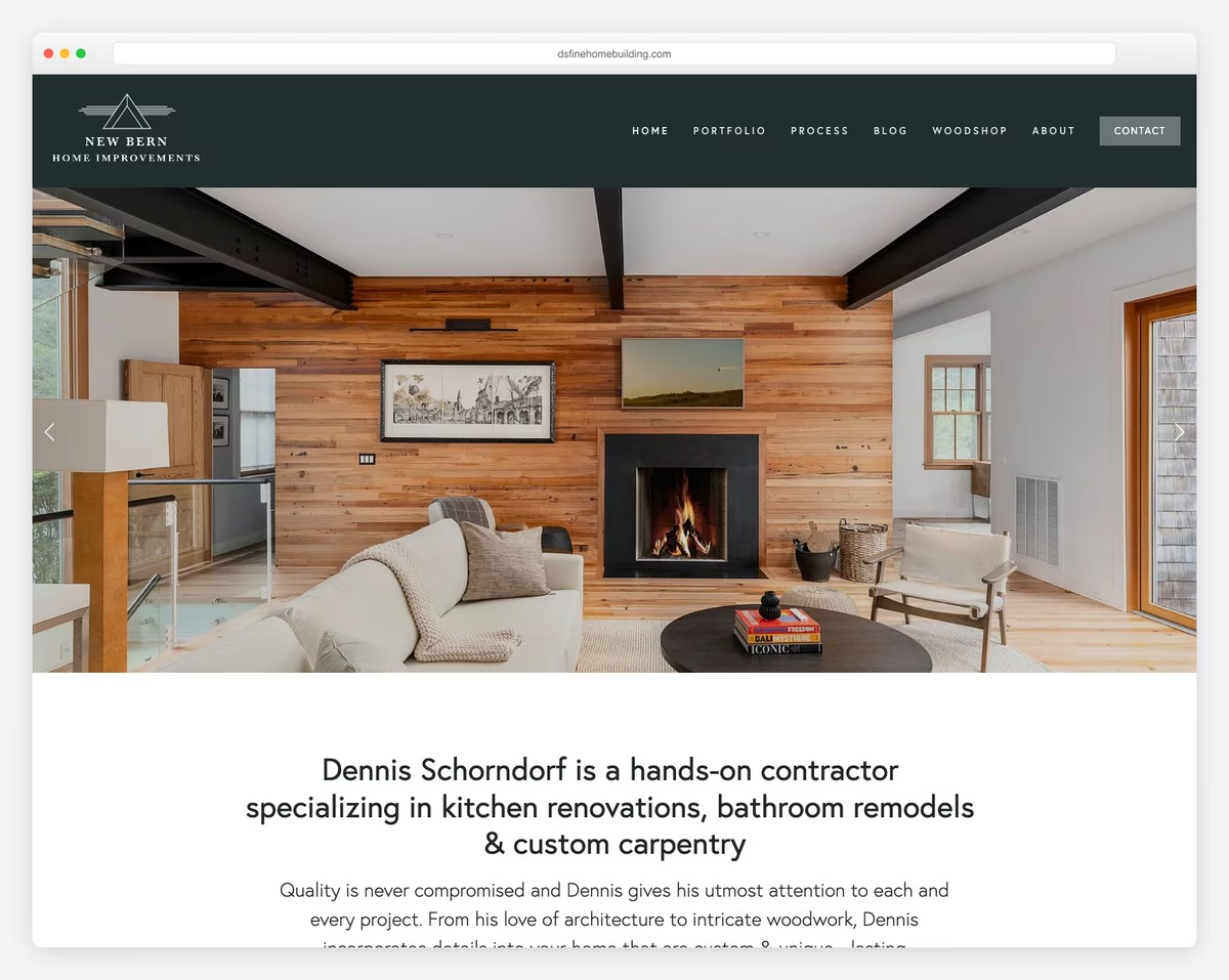
New Bern Home Improvements’ website features a top bar notification feature, which provides timely updates and information at a glance.
The clean navigation bar ensures a smooth, user-friendly experience. It leads to a full-width slider that showcases high-quality images without the clutter of text or CTAs.
The site’s design is characterized by neatness and sufficient white space, creating an uncluttered, professional look.
Individual project portfolio pages offer detailed insights, and the bold footer concludes the site with essential information, encapsulating elegance and efficiency.
What stands out: Have a special announcement or an offer? Create a top bar notification with a vibrant background color.
What stands out: New Bern Home Improvements’ website pushes clean, uncluttered design and focused content, offering an elegant and efficient online experience.
14. Streamline Services
Built with: Webflow
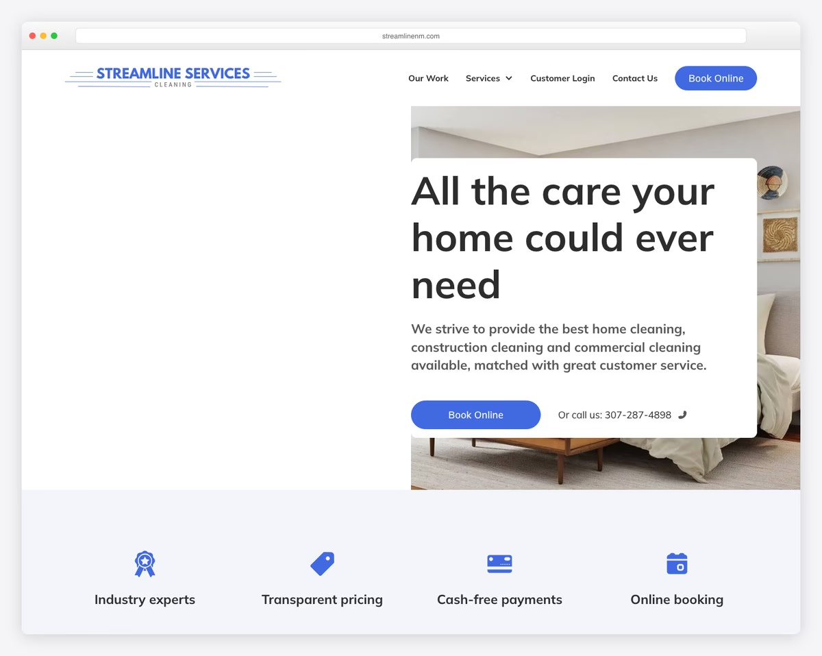
Streamline Services’ website stands out with its modern, minimalist design, offering a visually appealing and easy-to-skim-through interface.
A strategically placed newsletter popup offers visitors a discount, encouraging engagement and subscription.
The header features a prominent CTA button, guiding users smoothly towards their services.
For added convenience, the website includes accordions for FAQs, allowing users to quickly find answers, and an online booking form, simplifying the appointment process.
What stands out: A newsletter subscription popup with a discount is a great way to collect emails for future marketing campaigns.
What stands out: Streamline Services’ website effectively incorporates a minimalist design with functional elements like a newsletter popup and online booking.
15. Handyman Connection
Built with: WordPress
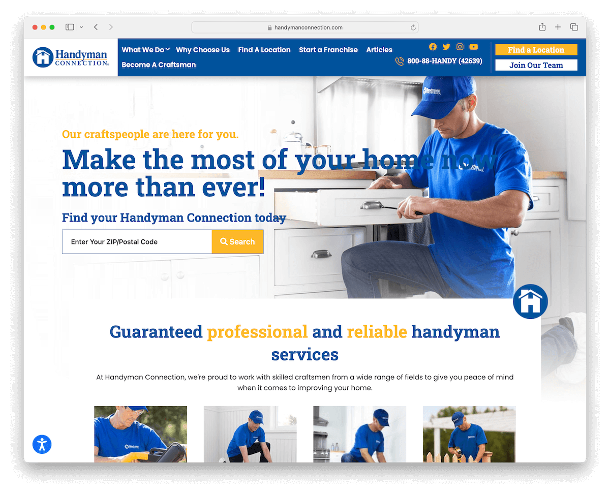
Handyman Connection’s website has a floating header, ensuring easy navigation regardless of page position.
The front-and-center search bar, prominently placed above the fold, offers immediate functionality for ZIP/postal code finds.
A lightbox video feature adds an engaging multimedia element, while a certification logo slider builds trust by showcasing professional endorsements.
The footer is feature-rich, packed with useful links, clear CTAs, social media icons, and contact details, all wrapped in a sleek and user-friendly design.
What stands out: Enhance your handyman website’s user experience with an easy-to-access search bar.
What stands out: Handyman Connection’s website features seamless navigation, multimedia engagement, and a thorough footer.
16. Cal Pacific Roofing
Built with: Webflow
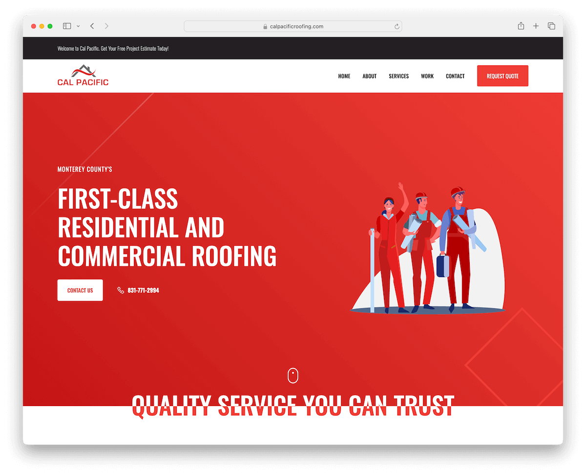
Cal Pacific Roofing’s website is an excellent example of a simple yet effective design, emphasized by firm branding details in red, creating a memorable online presence.
The top bar notification offers a convenient way to relay important information to visitors. And a floating navbar, equipped with a clear CTA, ensures ease of navigation and encourages user engagement.
The site’s unique one-page layout allows for a seamless and straightforward UX, making information accessible with minimal scrolling and clicking.
What stands out: Make potential clients’ lives easier by creating a one-page website layout so all the information is easy to reach.
What stands out: Cal Pacific Roofing’s website impresses with its distinct, strong branding, user-friendly one-page layout, and strategically placed CTAs.
17. Handyman Services In DC
Built with: WordPress
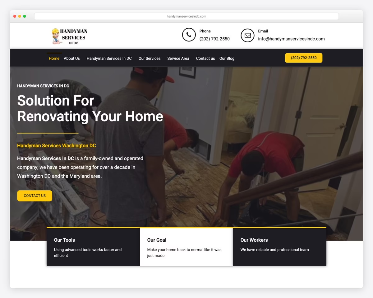
Handyman Services In DC’s website captivates with animated icons for phone and email in the header, enhancing visibility and encouraging interaction.
Its light design, sprinkled with contrasting sections, creates a visually attractive and user-friendly layout.
The inclusion of a blog adds a valuable resource for visitors, offering insights and tips. In addition, the testimonials section, complete with ratings, provides social proof and builds trust among potential clients.
What stands out: Don’t neglect the power of running a handyman blog. Publish quality content and take your business to the next level.
What stands out: Handyman Services In DC’s website sparks interest with its engaging animations, clear contrasts in design, and effective use of testimonials and a blog.
18. House Doctors
Built with: WordPress
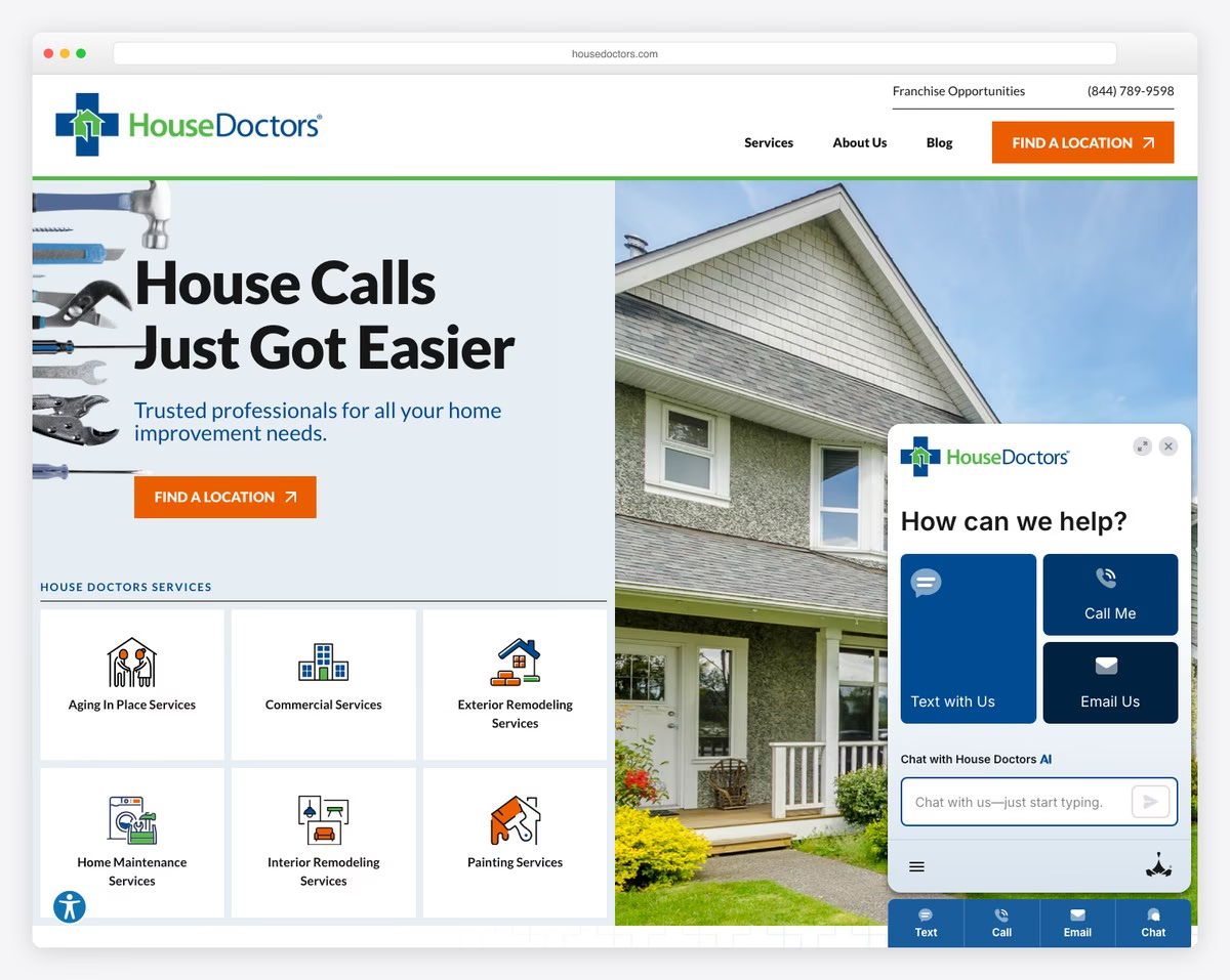
House Doctors’ website distinguishes itself with a floating top bar and main header, ensuring critical information and navigation are always within reach.
The full-width banner, complete with engaging text and a call-to-action, effectively captures visitor attention.
Unique to this site are individual pages dedicated to their services and solutions, offering detailed insights and showcasing their expertise.
Additionally, the integrated Google Maps with a location selector feature provides a practical and user-friendly tool for clients to easily find services in specific areas.
What stands out: Does your business operate in various locations? Create Google Maps to display all the locations with additional business details.
What stands out: House Doctors’ website provides detailed service information and user convenience with its floating navigation and interactive location features.
19. Honest Renovators
Built with: Webflow
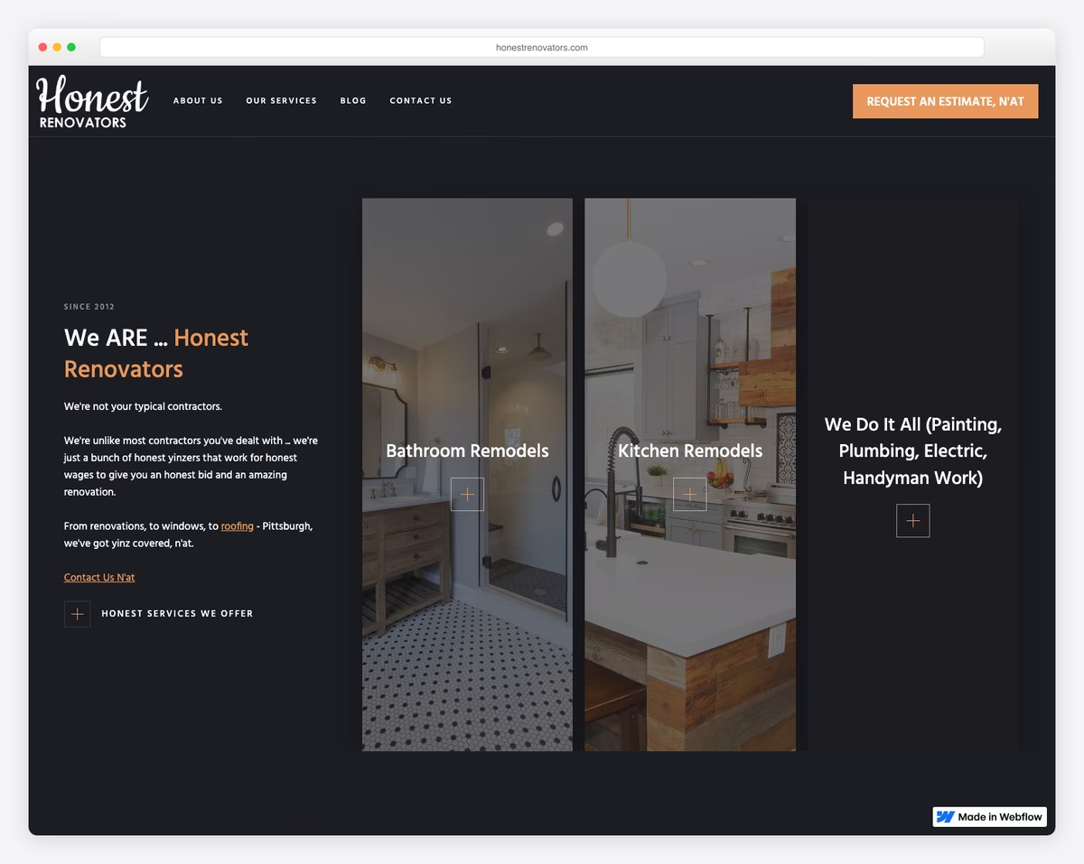
Honest Renovators’ website awes with its striking dark design, offering a cohesive and modern aesthetic by using the same background for the header, base, and footer.
This unique approach is enhanced by elements that load upon scrolling, adding an interactive dimension to the user experience.
A sticky header provides constant navigation access, while a blog article slider showcases their expertise and updates.
The inclusion of an Instagram feed integrates social media seamlessly, giving visitors a glimpse into their projects and day-to-day operations.
What stands out: While a light website design is more common in the handyman industry, go against the grain with a dark or black one.
What stands out: Honest Renovators’ website grabs attention with its cohesive dark design, engaging scroll-triggered elements, and seamless social media integration.
20. The Ultimate Handyman
Built with: Wix
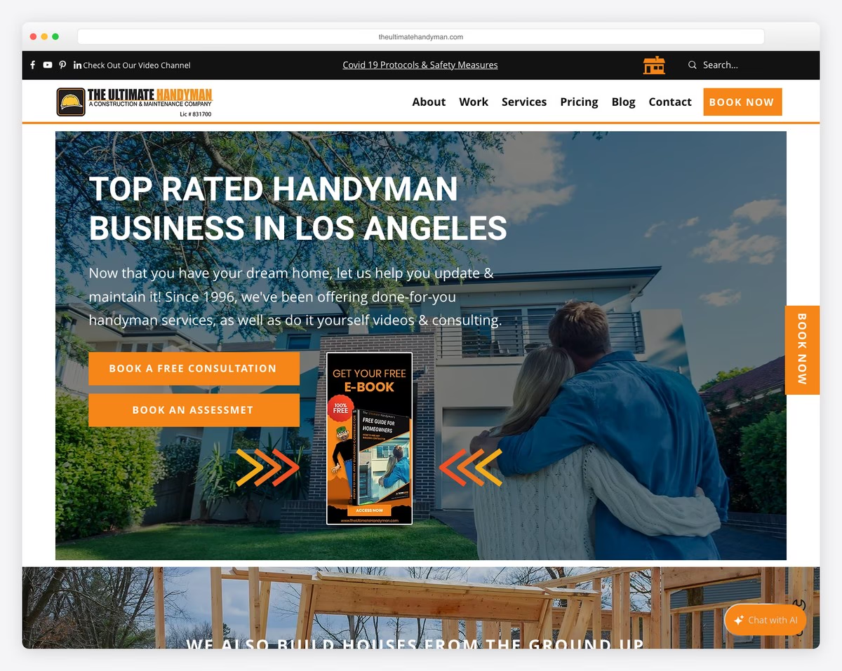
The Ultimate Handyman website captivates with a sliding popup offering a free guide, cleverly encouraging email sign-ups.
Its search bar delivers live results, adding to user interaction and efficiency.
A prominent floating “Book Now” button ensures ease of scheduling services. Furthemore, the four-column footer is thoughtfully organized with links, contact details, and social media, providing in-depth information.
A unique touch is the wrench icon in the bottom right corner, doubling as an inventive back-to-top button, adding both functionality and a playful element.
What stands out: Create and offer a free eBook and cleverly collect your visitors’ emails.
What stands out: The Ultimate Handyman’s website consists of clever engagement strategies, intuitive navigation, and unique design elements.
21. Hank’s Handyman
Built with: WordPress
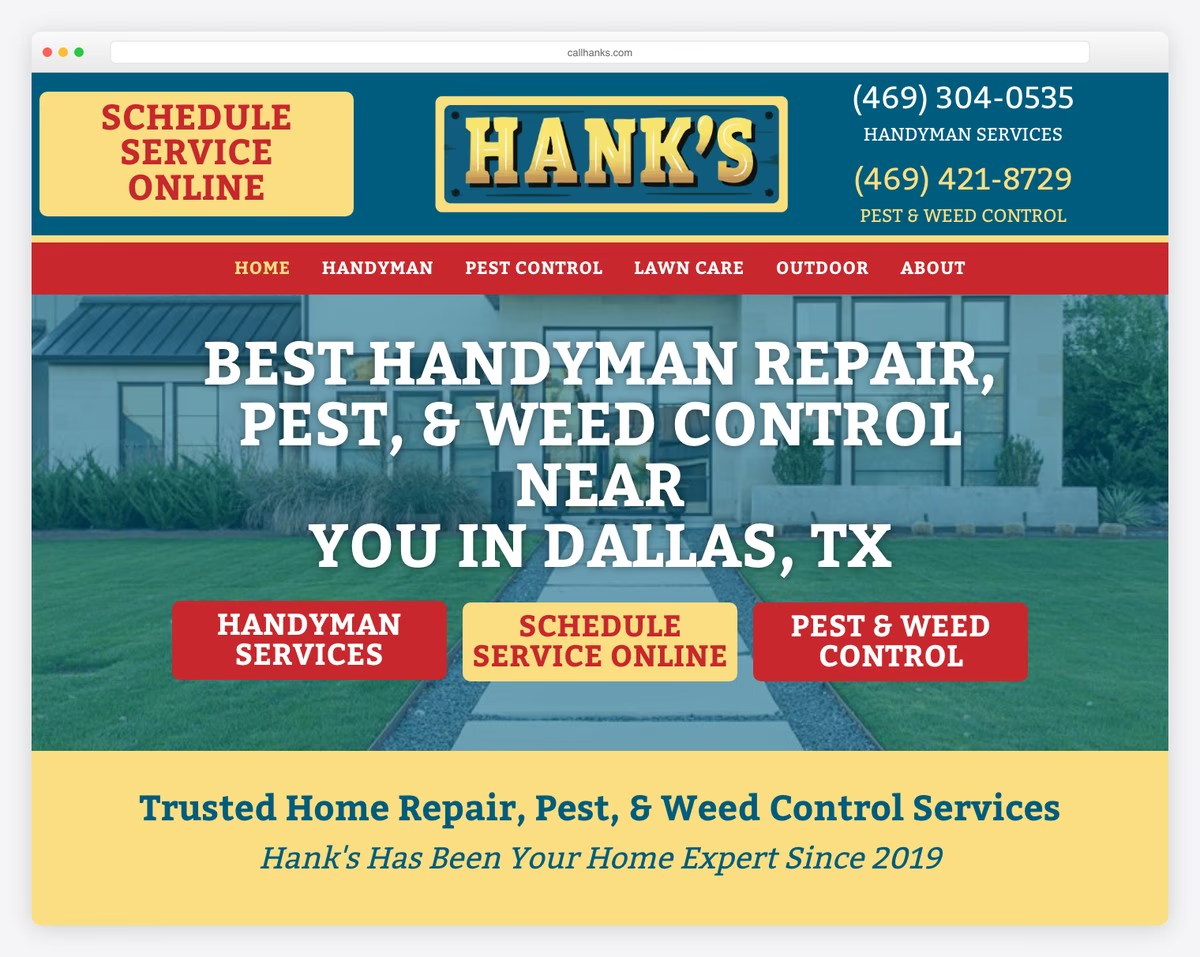
Hank’s Handyman has a header with links, a CTA, and a phone number, so important information is just a click away.
Below the fold on the homepage is a “Schedule Service” form to make it easy and prompt.
The floating Google reviews widget adds trust with real customer reviews.
Rounded edges give it a modern mobile look on both desktop and mobile.
Note: Appointment/booking forms can work great on a handyman’s homepage.
Why we like it: Hank’s Handyman has a service scheduling form and Google reviews widget with a modern mobile look.
If you want to build your own website but don’t know where to start here are the best handyman website templates to get you going.
22. ToddSunn Company
Built with: Squarespace
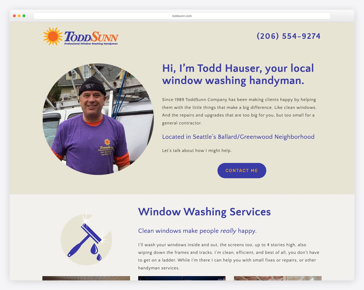
ToddSunn Company is a Seattle-based window washing and handyman service that has been operating since 1989 in the Ballard and Greenwood neighborhoods. The polished Squarespace site features a clean, professional layout with clear service sections and professional photography.
Customer testimonials add credibility for a business that relies heavily on trust, while the straightforward service descriptions and easy contact options make it simple for homeowners to request help. The longevity messaging — serving the community for 35+ years — is a powerful trust signal.
What stands out: Prominently featuring years of service (since 1989) is one of the strongest trust signals a local handyman can display — homeowners want proven reliability, not just a polished website.
What Makes A Great Handyman Website
By using these features and tips you can make your handyman website better.
Get more clients and grow your online presence!
- User friendly navigation: Keep the menu simple and easy to use. Categories should be clearly labeled so visitors can find what they need.
- High quality images and videos: Use before-and-after shots of your work. Videos can be short clips of your work process or customer testimonials.
- Clear and detailed service descriptions: List all services (with pricing) you offer with detailed descriptions. This helps set the right expectations and for SEO.
- Responsive: Make sure your website looks and works great on all devices. Most people search on their phones so a mobile friendly design is a must.
- Strong Call-to-Action (CTA): Use clear CTAs like “Get a Quote”, “Call Now” or “Book an Appointment”. Place them strategically on your site to guide users to take action.
- Testimonials and reviews: Display reviews and testimonials prominently. Real customer experiences adds credibility and trust to your service.
- Contact information and online booking: Make your contact information easy to find. Having an online booking or inquiry form can increase customer engagement and convenience.
Handyman Website FAQs
How should a handyman website look?
A handyman website should be clean and professional with easy navigation. High-quality images of your work, clear service descriptions, and a color scheme that reflects reliability and expertise. A prominent CTA like a contact form or phone number.
What features does a handyman website need?
The must-haves are the services page, contact info, customer testimonials, gallery of past work, about section, and online booking or quote request forms. Mobile responsiveness and fast load times are also essential.
How can a handyman website increase customer engagement?
Engage customers by offering valuable content like DIY tips, blog posts on home repair topics and maintenance advice. Interactive elements like a project cost estimator and a chatbot for instant queries can also increase engagement.
How do I show services on a handyman website?
Services should be listed and described clearly. Use separate pages or sections for each service with images and explanations. Before-and-after shots of past work can show the quality of work.
How important is SEO for a handyman website and how do I optimize?
SEO is key to being visible in search engine results. Optimize with relevant keywords, local SEO (like listing in directories), mobile friendly design, fast load times and regularly updated content like blogs or project galleries.
What are the best practices for a handyman website to be user friendly?
To be user friendly the website should be easy to navigate and have a logical layout. Should load fast, be accessible on multiple devices, have clear CTAs and provide easy ways for customers to contact the handyman or request services.
Related Posts


Comments (0)