21 Professional Author Website Examples That Convert 2026
Are you looking for the best author websites because you want inspiration to create or revamp your own?
Well, welcome, fellow book enthusiasts and aspiring authors.
In this article, we’ll examine a handpicked selection of the best sites by famous and less famous authors.
From sleek designs to captivating content, these websites aren’t just about showcasing books and storytelling.
Whether you’re a seasoned novelist or just starting your writing journey, you’ve come to the right place.
Regardless of your genre, these examples are sure to spark your creativity and help you connect more effectively with your readers.
This post covers:
- Best Author Websites
- What Makes A Great Author Website
- FAQs About Author Websites
- What makes an author’s website stand out?
- How important is it for an author to have a website?
- Should an author’s website include a blog?
- What kind of content should an author include on their website?
- How can authors promote their website?
- Is it necessary for authors to sell books directly from their websites?
Best Author Website Designs
Now that you’re all set, let’s unveil our curated list of exceptional author sites.
Each stands out for its unique approach to design, content, and reader engagement, setting a high standard in the literary world.
1. J.K. Rowling
Built with: WordPress
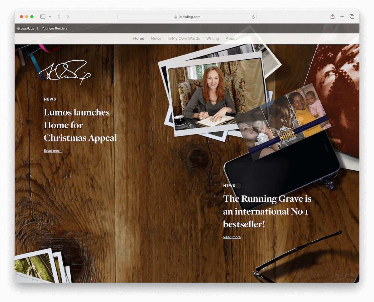
J.K. Rowling’s website, designed using WordPress, captivates with its split-screen homepage: the left side highlights her main site while the right showcases “Stories.”
The site offers a remarkable timeline-style scrolling experience, allowing visitors to journey through her works and updates dynamically and visually engagingly.
The floating header ensures easy navigation, and the transparent footer elegantly presents additional links and social media icons. This makes it a stellar example of how an author’s digital presence can be both functional and creatively inspiring.
What stands out: Use a home page strategically to guide your fans to the right section, such as the blog, shop, etc.
What stands out: J.K. Rowling’s website uniquely blends innovative design with interactive content.
See how to easily make a WordPress website through our step-by-step beginner’s guide. (Help yourself with these best WordPress themes for writers and authors.)
2. Neon Yang
Built with: Squarespace
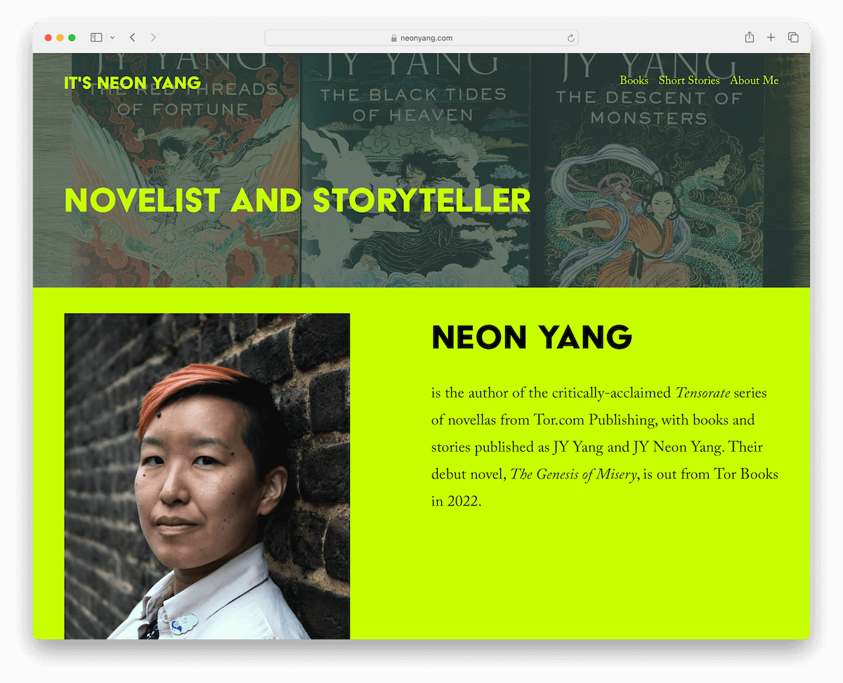
Neon Yang’s author website stands out with its striking green color scheme, creating a visually captivating experience.
It features a dynamic, scroll-triggered content-loading mechanism that unveils information as you explore the site.
Using large, clear typography, complemented by ample white space, ensures excellent readability and a clean aesthetic.
The header and footer are minimalistic, neatly containing essential navigation menus and social media links.
What stands out: Is there a specific color (scheme) that represents your personality? If so, include it on your website!
What stands out: Neon Yang’s Squarespace website excels with its vibrant design, easy navigation, and engaging, dynamic content presentation.
3. Leigh Bardugo
Built with: WordPress
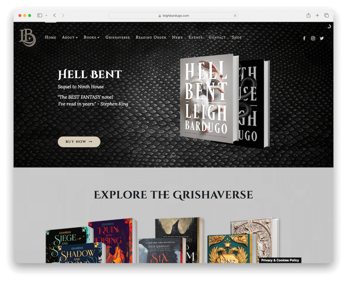
Leigh Bardugo’s author website captivates with its dark-themed design, embodying a sense of mystery and allure.
The transparent navigation bar, complete with a mega menu and social media icons, offers intuitive browsing.
A striking feature is the full-width slider, which combines captivating images, text, and call-to-action buttons to draw visitors deeper into her literary world.
Additionally, the site includes an accessible newsletter subscription form, encouraging reader engagement. Its minimalist footer cleanly wraps up the page, maintaining the site’s elegant and streamlined look.
What stands out: Integrate a slider into your website to promote your must-read works, special offers, etc.
What stands out: Leigh Bardugo’s website shines for its immersive, dark aesthetic and intuitive, engaging features.
4. Rick Riordan
Built with: WordPress
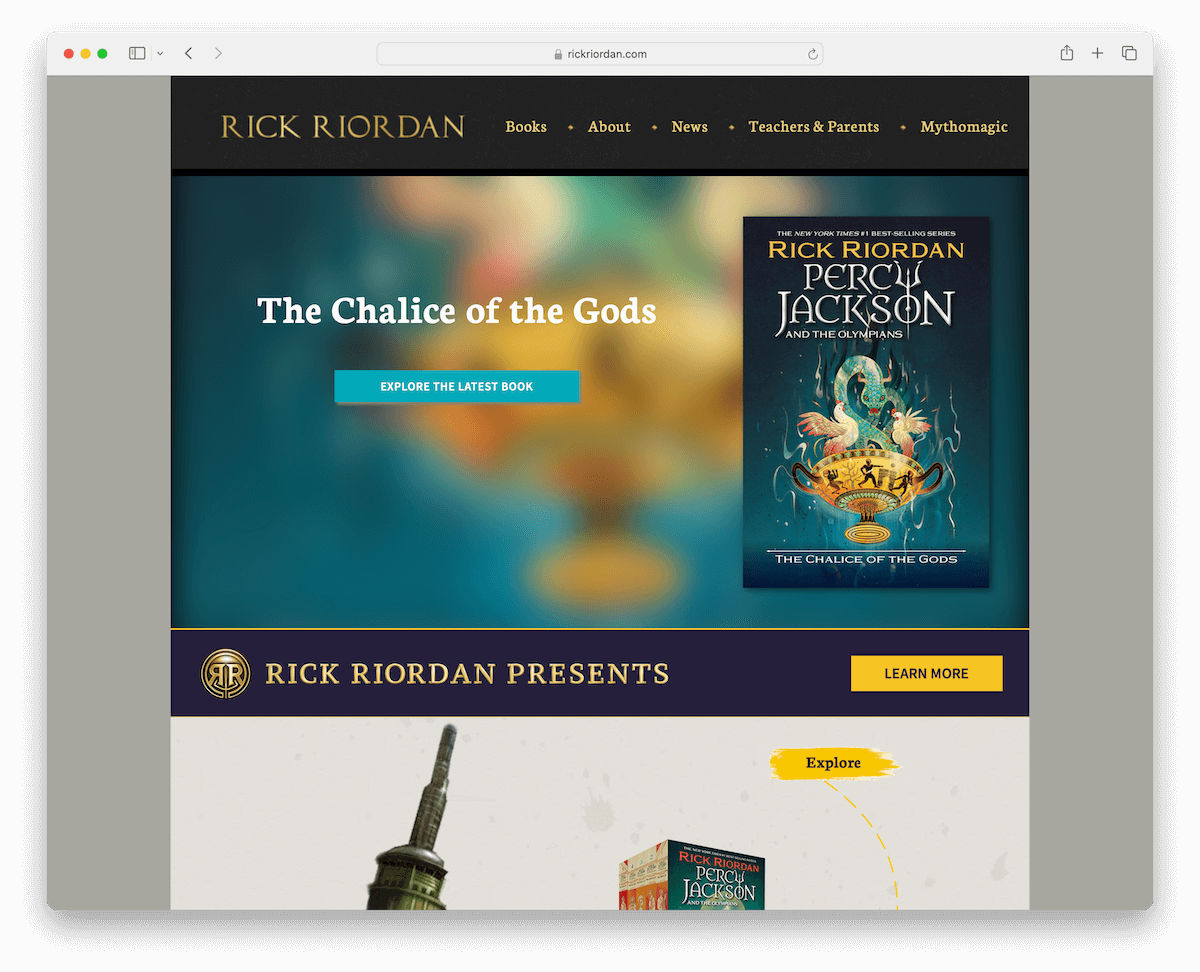
Rick Riordan’s author website is a vibrant showcase of creativity. Its boxed layout neatly organizes content.
The navigation bar is user-friendly, with intuitive drop-down menus for easy exploration.
A standout feature is the cool animated line that guides visitors through his extensive work, adding an interactive storytelling element.
The website’s footer is neatly arranged, offering quick access to menu links and social media icons. This ensures a cohesive and engaging UX for fans and newcomers alike.
What stands out: Add animations and special effects to your author site to boost engagement.
What stands out: Rick Riordan’s website is impressive with its interactive storytelling and friendly design, which perfectly mirrors his literary style.
5. Dan Brown
Built with: WordPress
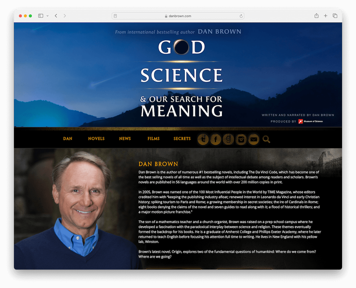
Dan Brown’s author website captures the essence of his mystery-themed novels with its dark and enigmatic design.
The enhanced header features a captivating background and text, leading into a navbar adorned with social buttons, a search feature, and a newsletter subscription icon.
This mystically styled site also includes embedded videos, promoting his special class on writing thrillers. Additionally, the news section keeps readers updated on his latest endeavors.
The overall design superbly reflects the intrigue and suspense characteristic of Brown’s bestselling works.
What stands out: Use your author site’s design to represent your writing style.
What stands out: Dan Brown’s website excels with its mysterious design, reflecting the intrigue of his novels.
6. Helen Hoang
Built with: WordPress
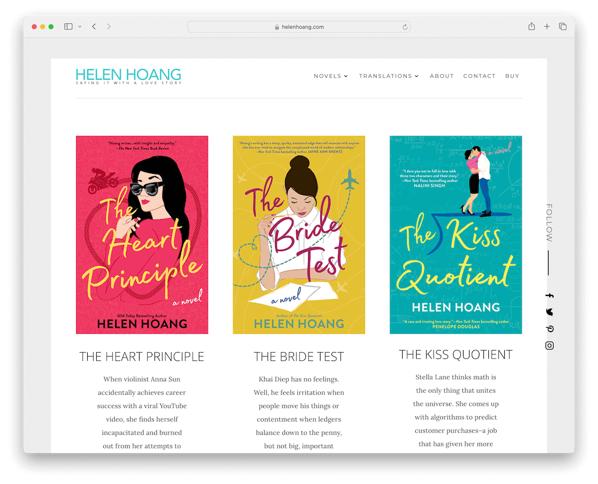
Helen Hoang’s author website is a gem of simplicity and elegance. It features a framed site layout with a clean, structured look. (Check out more clean websites for inspiration.)
The site boasts a straightforward header and a minimal footer, which includes social media links and a newsletter subscription form.
A back-to-top button enhances the user-friendly experience, while floating social icons on the right side provide easy access to her online platforms.
The website showcases her three novels above the fold, followed by a short “About” section inviting readers to explore her world.
What stands out: Display your key works above the fold by displaying them to the front and center.
What stands out: Helen Hoang’s website has an elegant, simple design that effectively showcases her novels.
7. Jennifer Egan
Built with: WordPress
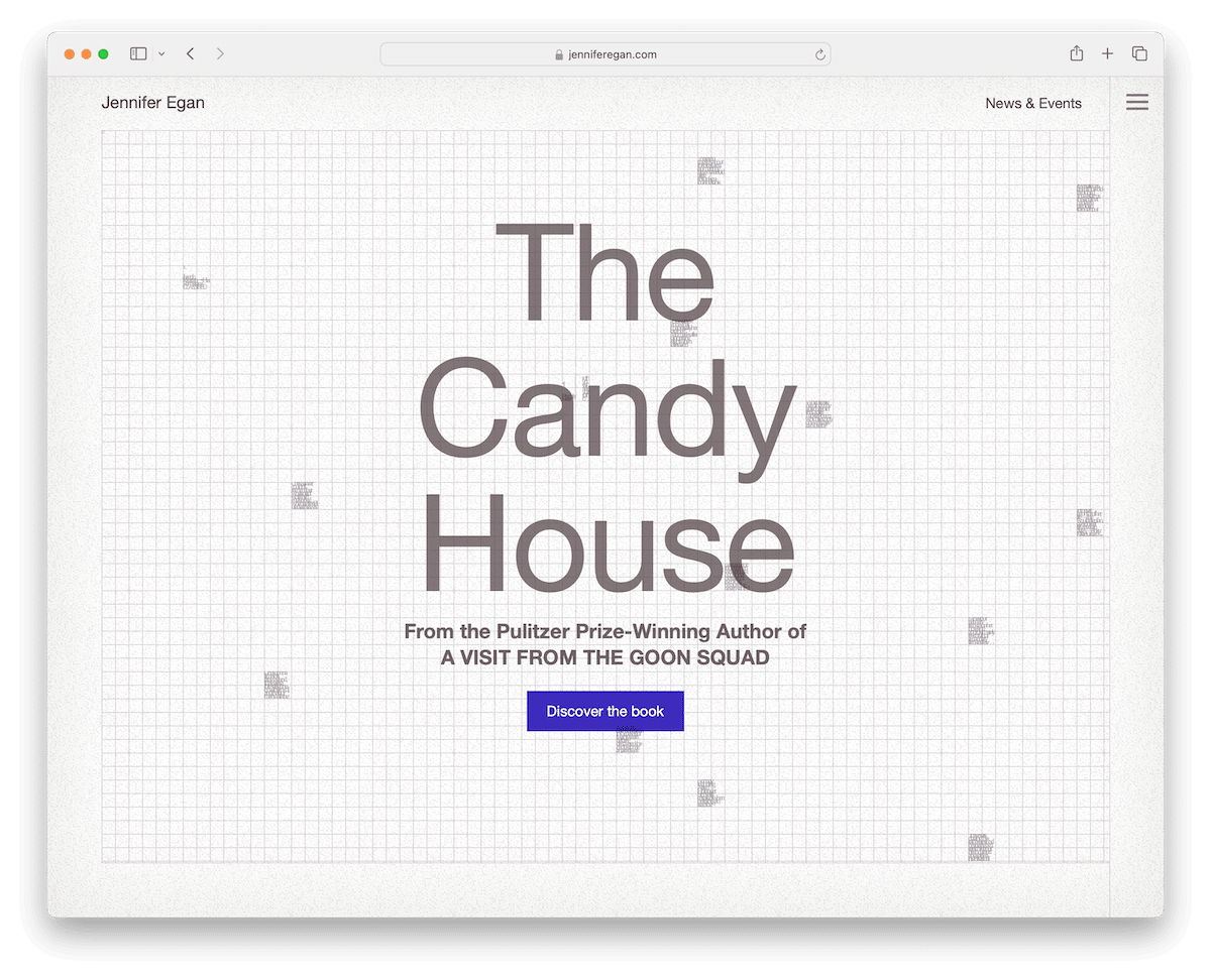
Jennifer Egan’s author website impresses with a unique home page that features cool animations and hover effects, creating an engaging visual experience.
Incorporating a hamburger menu and floating header ensures smooth navigation while maintaining a sleek, uncluttered look.
The website is text-heavy, yet this aspect is thoughtfully designed to enhance the reading experience, aligning with the literary depth of Egan’s work. Also, the absence of a footer adds to the site’s minimalistic charm.
What stands out: Focus on your website’s readability with a clean and minimalist design (white space is essential).
What stands out: Jennifer Egan’s author website rocks a unique design, animations, and user-friendly navigation for a top-notch reading experience.
8. LJ Ross
Built with: WordPress
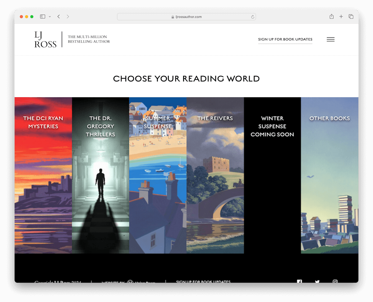
LJ Ross’s author website is a terrific example of sleek and user-friendly design. Its clean header with a convenient hamburger menu overlay offers easy access to books and links.
The homepage is captivating with engaging hover effects showcasing her works. Furthermore, the website excels in presenting comprehensive book information.
With its clean and efficient layout, LJ Ross’s website entices readers and provides a seamless browsing experience, making it a must-visit for all fans.
What stands out: Create a cleaner header section by implementing the convenient hamburger menu.
What stands out: LJ Ross opted for an author website with a clean design, attractive visuals and thorough book information.
9. Kylie Howarth
Built with: Squarespace
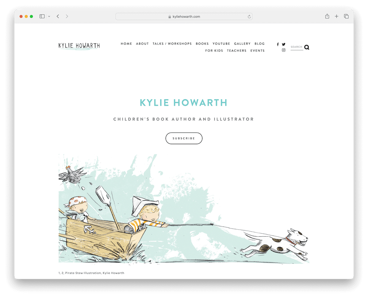
Kylie Howarth’s author website grabs the attention with its charming simplicity.
The minimalistic and adorable homepage features a convenient subscription button, which is surprising when you expect the latest book release or a best seller.
A search bar with live results enhances user experience, while the elegant presentation of her books, complete with purchase buttons linking to 3rd-party platforms, makes book discovery and acquisition seamless.
The straightforward header and footer add to the site’s uncluttered appeal, ensuring a delightful blend of functionality and pleasantness.
What stands out: To build a strong email list, ensure a visible subscription button.
What stands out: Kylie Howarth’s author website promotes easiness, user-friendliness, and seamless book presentation.
10. Christy Anne Jones
Built with: Squarespace
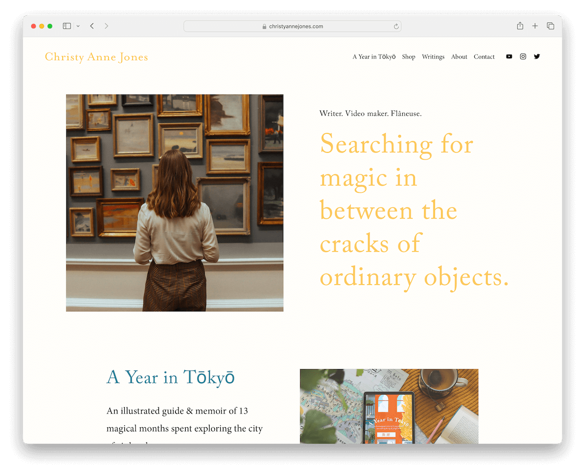
Christy Anne Jones’s author website has a light and cohesive design with consistent background color throughout the header, base, and footer.
This approach creates a clean and harmonious aesthetic, allowing text and images to shine against ample white space.
An embedded video provides a multimedia touch, while the Instagram feed seamlessly integrates social media updates, conveniently opening posts in new tabs.
Christy Anne Jones’s website combines a visually appealing design with user-friendly features, enhancing the overall engagement for her readers and followers.
What stands out: A clean and minimalist design always works regardless of your writing style and genre.
What stands out: Christy Anne Jones’s author website captures attention with its cohesive design, multimedia integration, and foolproof features.
11. Mark Dawson
Built with: WordPress
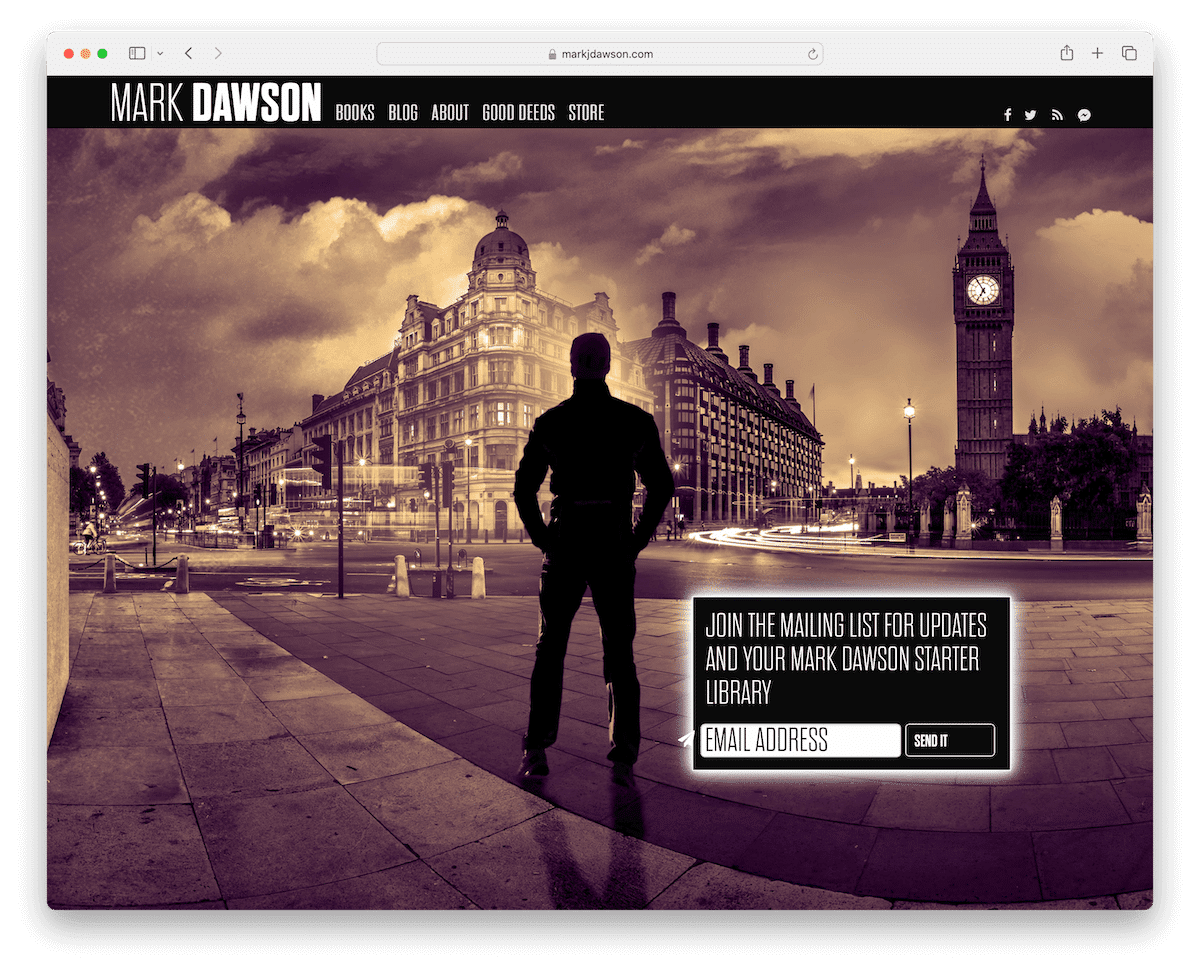
Mark Dawson’s author website boasts a captivating full-screen homepage featuring a sleek dark header and a prominent newsletter subscription form widget.
Its navigation bar provides essential links and easy access to social media profiles.
The “Books” section offers a unique browsing experience with titles elegantly displayed on a black background under the main navbar, utilizing horizontal scrolling for effortless exploration.
Additionally, an online shop adds convenience for readers and fans. Mark Dawson’s website successfully combines style and functionality for a fantastic UX.
What stands out: If everyone in your niche uses websites with a light design – go against the grain with a dark or black one.
What stands out: Mark Dawson’s author website makes an impact with its catching design, user-friendly navigation, and unique book navigation presentation.
12. Kimberly Stuart
Built with: Webflow
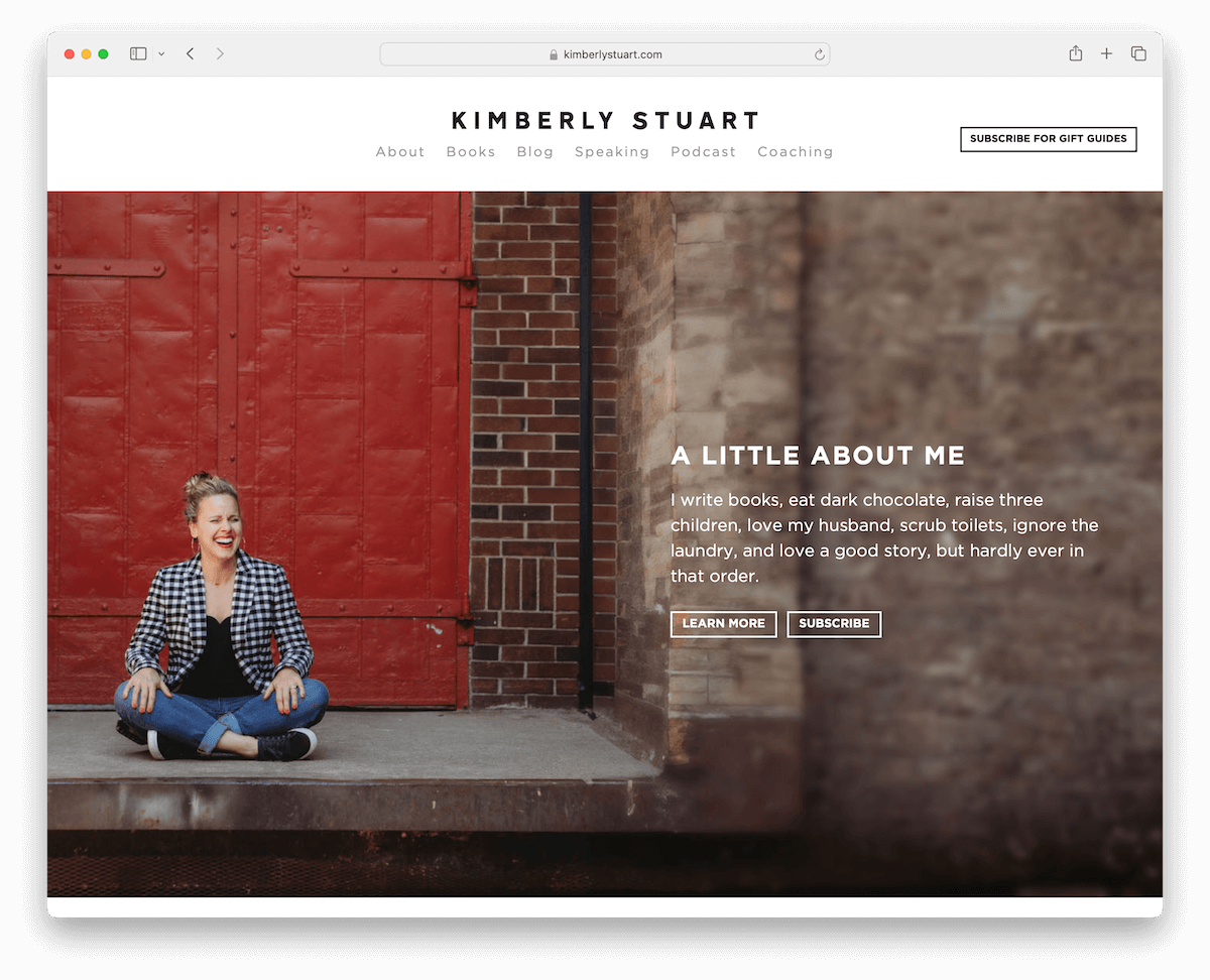
Kimberly Stuart’s author website balances design elements with a light header and dark footer, creating a visually appealing contrast.
The full-width banner at the top of the page offers a concise one-sentence bio and clear CTA buttons, engaging visitors immediately.
A grid layout elegantly showcases her books, while a testimonial slider adds credibility and authenticity.
Kimberly Stuart’s Webflow website provides an inviting and informative platform for readers and fans to explore her work and connect with the author.
What stands out: Display testimonials and reviews on your website for credibility – even those from notable publications.
What stands out: Kimberly Stuart’s author website hooks with its lovely yet clean design, effective book presentation and trustworthiness.
13. Bethan Woollvin
Built with: Wix
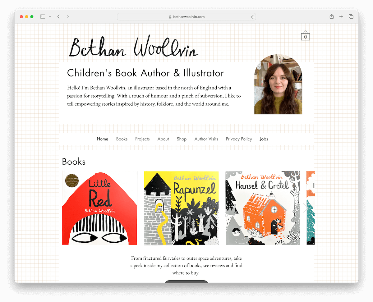
Bethan Woollvin’s author website has a boxed layout with a concise bio and image in the header, enhancing personal connection.
The carousel effectively presents her books, while the portfolio of illustrations uses a lightbox effect for a more immersive visual experience.
The online shop adds handiness, and Ajax technology ensures seamless page transitions, offering a smooth browsing experience where pages load instantly.
What stands out: You might consider the lightbox effect if creating a gallery or portfolio for a more distraction-free experience.
What stands out: Bethan Woollvin’s Wix website strategically fuses simplicity with interactivity for seamless browsing.
14. Claudia Rueda
Built with: Squarespace
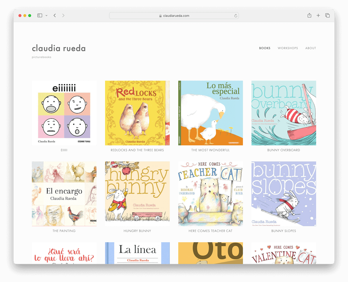
Claudia Rueda’s author website distinguishes itself with its minimalist and user-friendly design.
The homepage’s grid layout elegantly showcases all her books, providing a quick overview for visitors.
The clean header and footer enhance the site’s simplicity, while basic navigation links ensure easy access to essential content.
Book presentation pages offer neat, informative displays featuring extra images and text with convenient prev/next links for seamless exploration.
Claudia Rueda’s website combines a straightforward layout with engaging book details, offering an accessible and informative platform for her audience.
What stands out: Use a three or four column grid to display all your books in just a few scrolls.
What stands out: Claudia Rueda’s author website inspires with its minimalist design and catching book displays.
15. Moyle Sisters
Built with: Squarespace
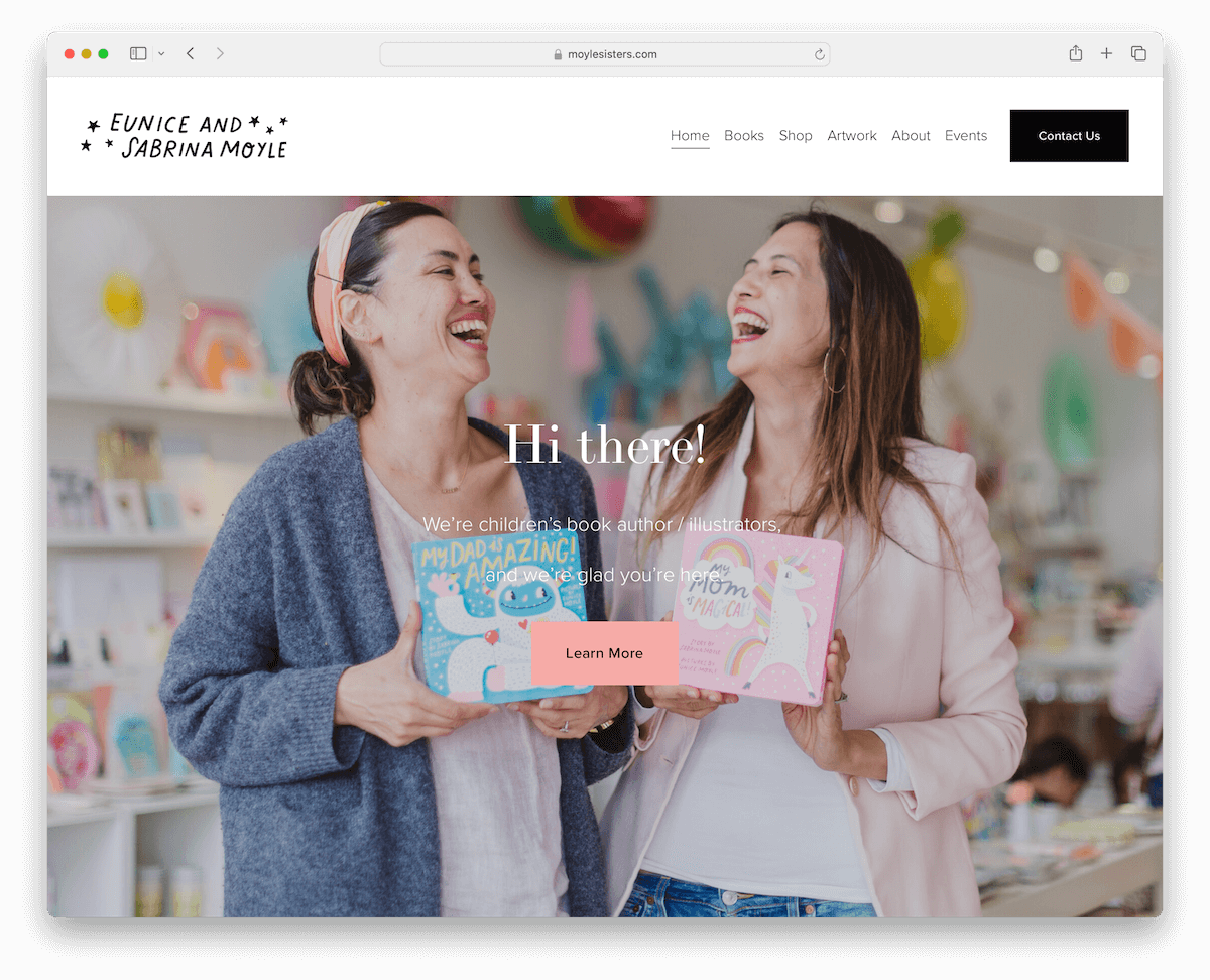
The Moyle Sisters’ author website is uniquely personalized. It features an image of the sisters and text highlighting their impressive book sales.
The minimalist header, which sticks to the top of the screen, and footer provide essential business and contact details, ensuring easy access to key information.
This website’s special touch conveys the authors’ identity and success while maintaining a clean and straightforward design.
What stands out: Create a more personal experience by including images of yourself on your website.
What stands out: The Moyle Sisters’ website, with its clean, straightforward design, skillfully highlights the authors’ identity and success.
16. Paul Meisel
Built with: Squarespace
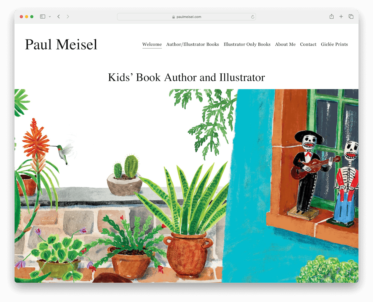
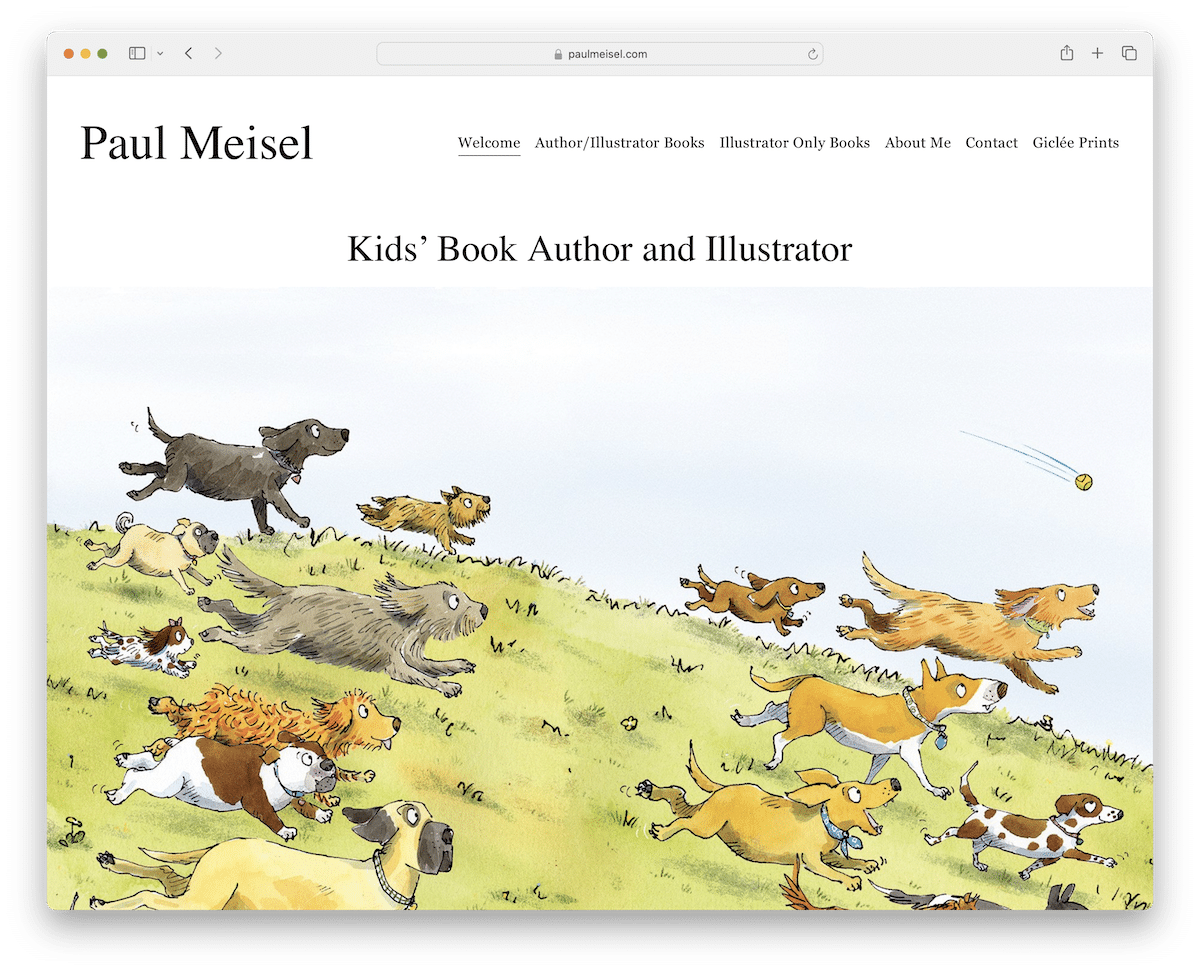
Paul Meisel’s author website is a unique visual experience.
The homepage features a striking, text-free slider that intrigues visitors with its mesmerizing images. While non-clickable, it serves as a stunning gallery for viewers.
The website maintains a clean and simple header with a navbar, offering dropdown options for easy navigation.
Internal pages emphasize delightful images, making it a visual delight for everyone seeking a charming exploration of Paul’s work.
What stands out: You can create a more traditional grid-style gallery with a lightbox effect or spice things up with a large slideshow.
What stands out: Paul Meisel’s author website captivates with strong visuals and simplicity.
17. The Real Stan Lee
Built with: WordPress
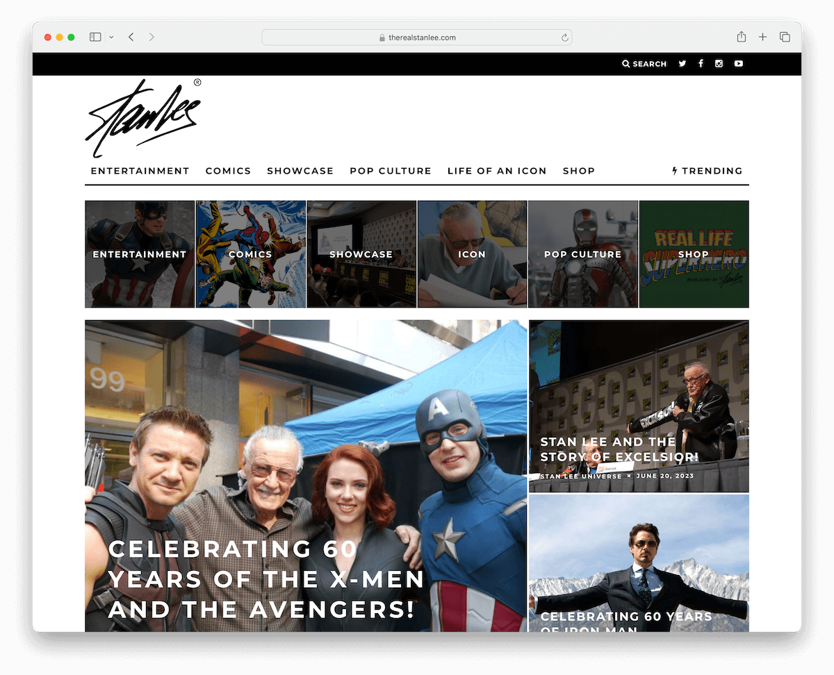
The Real Stan Lee’s author website is reminiscent of a dynamic magazine layout, with a visually engaging homepage.
It features a top bar housing search and social icons for easy access. The mega menu streamlines navigation, while a floating header ensures convenient browsing.
The contrasting dark footer adds visual appeal and professionalism. Moreover, a back-to-top button enhances user experience, and a subscription form collects emails for future marketing campaigns.
The website masterfully mixes pleasant looks and functionality into a striking platform for Stan Lee’s enthusiasts.
What stands out: Create a more organized header with a top bar to display additional info, links, social icons, etc.
What stands out: The Real Stan Lee’s author website’s lovely magazine-like design and seamless interactivity offers a distinctive experience.
18. Rupi Kaur
Built with: Shopify

Rupi Kaur’s author website epitomizes modern web design with its floating transparent header, offering a sleek and unobtrusive browsing experience.
The floating widget in the bottom left corner is a unique feature, which elegantly opens a newsletter subscription popup.
The site employs a parallax scrolling background, adding dynamic depth to the visual experience. An embedded YouTube video allows for engaging multimedia content.
Additionally, the multi-column footer organizes information and links, aligning with Kaur’s contemporary poetic style.
What stands out: Add a popup to your website to capture visitors’ emails.
What stands out: Rupi Kaur’s Shopify website was chosen for its modern, interactive design that beautifully complements her poetic work.
19. Miquel Reina
Built with: Squarespace
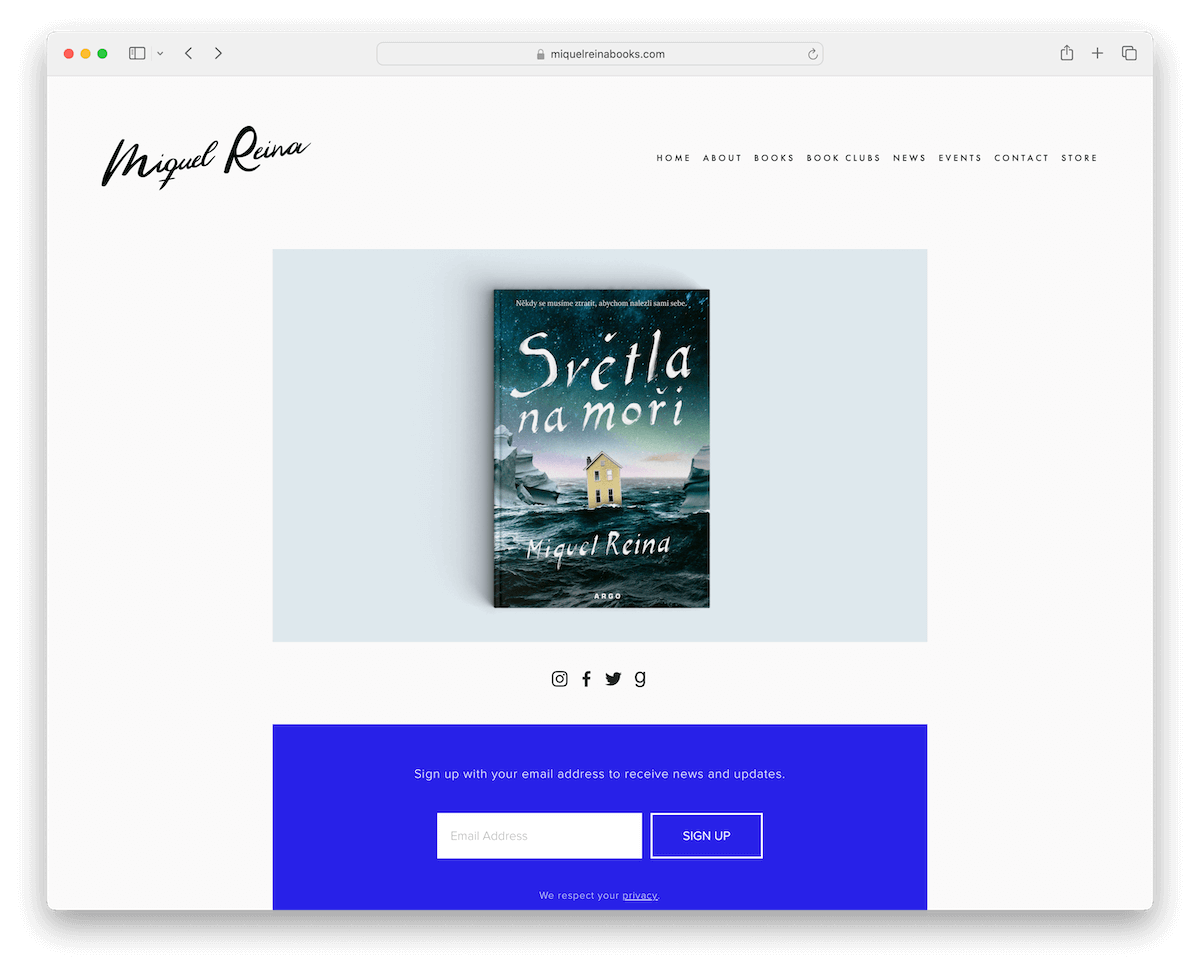
Miquel Reina’s author website emphasizes minimalism, creating a serene and focused online environment.
The simple homepage gracefully features menu links, a slider for highlighting key content, social icons, and a newsletter subscription form, all laid out uncluttered.
This minimalistic approach extends to the internal pages, where the design is stripped back, focusing firmly on the content.
This design choice effectively mirrors Reina’s artistic sensibility, offering a peaceful reading and browsing experience.
What stands out: Let your fans sign up for your newsletter to receive the latest news, offers, and more.
What stands out: Miquel Reina’s website is one of the top picks for its exceptional minimalism and focus on content clarity.
20. Maggie Stiefvater
Built with: WordPress
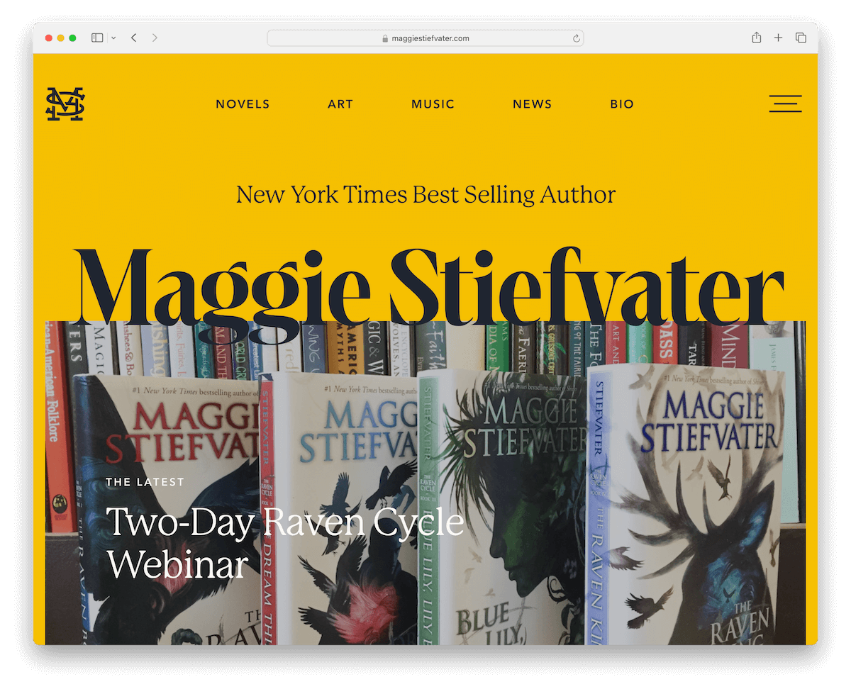
Maggie Stiefvater’s author website dazzles with its distinctive design elements, including a main menu with a unique hamburger menu overlay, setting it apart from typical layouts.
The website has striking yellow details, creating a visually appealing and memorable aesthetic.
Smooth, pleasant animations add a dynamic touch to the browsing experience. A carousel feature elegantly presents her novels, while an Instagram feed seamlessly integrates social media.
Including a subscription form and a footer with menu links and social media ensures functionality and user engagement.
What stands out: Integrate a carousel to display all your works without taking too much website space.
What stands out: Maggie Stiefvater’s website has great color detailing, sweet animations, and effective social media integration.
21. Vashti Harrison
Built with: Wix
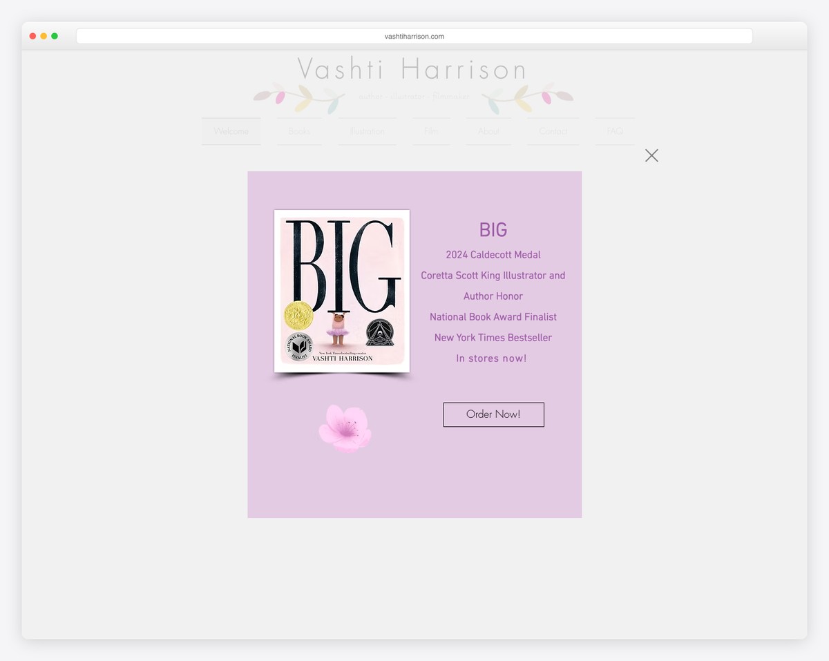
Vashti Harrison’s author-illustrator website opens with a whimsical popup showcasing her Caldecott Medal-winning book “BIG” — 2024 Caldecott Medal, Coretta Scott King Honor, National Book Award Finalist, and New York Times Bestseller. The lavender color scheme and botanical illustrations create a warm, magical atmosphere.
The Wix-built site features delicate navigation (Welcome, Books, Illustration, Film, About, Contact, FAQ) with hand-drawn branch illustrations weaving through the header. This artistic approach perfectly matches her identity as an author and illustrator of children’s books.
What stands out: Leading with your most prestigious award (Caldecott Medal) in a popup creates an unmissable credential moment — visitors instantly understand the caliber of work they are exploring.
What Makes A Great Author Website
Creating a captivating author website goes beyond just listing books and biographies. It’s about crafting an online space that resonates with readers and reflects the essence of your work.
To help you understand what makes a website stand out, we’ve compiled a list of key features that the best author websites often include.
From innovative design elements to interactive content, these features attract readers and keep them engaged and connected with the author’s literary world.
- Appealing design: An aesthetically pleasing, well-organized layout that reflects the author’s style or genre. Pro tip: sticking to simplicity is better than stuffing the site with special effects and animations.
- Clear navigation: Easy-to-use menus, headers, and footers facilitate effortless browsing and finding essential information. If your site has a lot of content, you might even consider a mega menu.
- Book presentation: Effective showcasing of the author’s books with cover images, descriptions, and purchase links. (You can sell books directly on your site or direct your fans to a 3rd-party platform.)
- Multimedia integration: The inclusion of videos, images, or other multimedia elements to enhance the user experience. You can use a lightbox for galleries to deliver a more immersive viewing.
- Contact information: Clear and accessible contact details for readers, publishers, and media inquiries. Make yourself easily reachable.
- Regular updates: Fresh and current content, such as blog posts, news, or events, to keep readers engaged.
- Mobile responsiveness: Ensuring the website is accessible and user-friendly on various devices, including (it’s a MUST these days!) smartphones and tablets.
FAQs About Author Websites
What makes an author’s website stand out?
A standout author’s website typically has a clean, professional design, easy navigation, and prominently showcases their work. It often includes a biography, a catalog of their books with synopses and purchase links, upcoming events, and a blog or news section.
How important is it for an author to have a website?
Having a website is crucial for authors in the digital age. It serves as a central hub for their online presence, helps build a brand, and provides a platform for direct engagement with readers.
Should an author’s website include a blog?
Yes, including a blog can be beneficial. It helps engage readers with interesting content, share updates, and improve search engine visibility. However, it’s essential to update it regularly with relevant content.
What kind of content should an author include on their website?
An author’s website should include their biography, a list of published works with descriptions and links to buy, news about upcoming books or events, a blog, contact information, and testimonials or reviews.
How can authors promote their website?
Authors can promote their website through social media, email newsletters, author profiles on book-related sites, speaking engagements, and by including their website URL in their books and business cards.
Is it necessary for authors to sell books directly from their websites?
It’s not necessary, but it can be advantageous. Selling books directly gives authors more control over sales and potentially earns higher profits. However, it’s also important to provide links to other retailers where readers can purchase their books.





Comments (0)