34 Best About Me Pages (Examples) 2026
Are you looking for the best about me pages to gain inspiration and create the ultimate for your business?
An “about me” or “about us” page is part of almost every website.
It doesn’t matter if you run a personal site, a corporate page, an online store, etc.; it’s a section on your site where you get to introduce yourself, your business, and your team compellingly.
Use the “about me” page to sell yourself and promote your services and business.
However, if you’re unsure how to approach it, you can check these modern and creative designs.
This post covers:
Best About Me & About Us Pages
1. RyuCreative
Built with: Squarespace
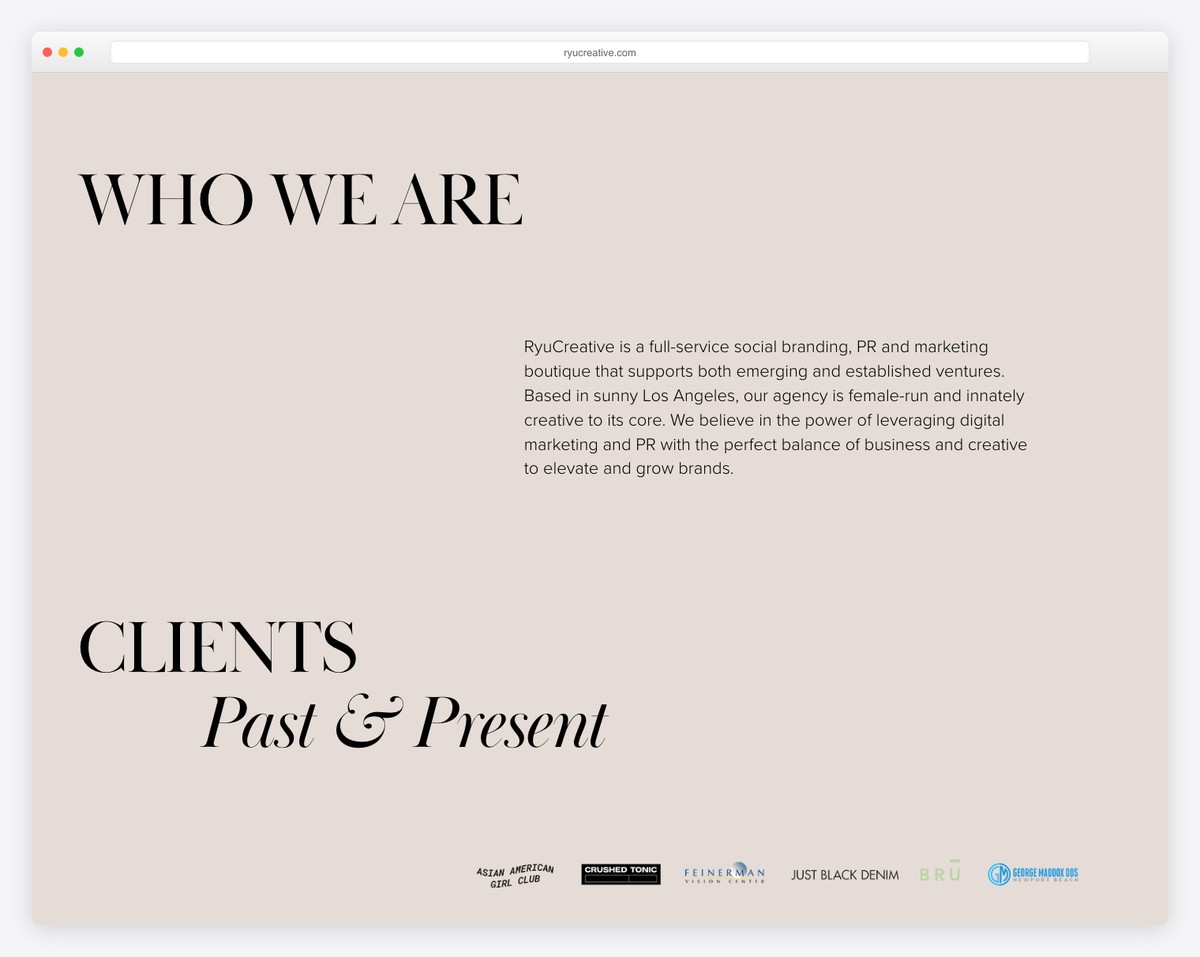
RyuCreative starts with a large title and text explaining what they do, continuing with client logos and a team section with images and bios.
This about me page doesn’t use a footer, just a basic header with three links and an IG icon.
What stands out: Let potential clients get familiar with who’s behind the brand by adding a comprehensive team section.
You shouldn’t miss these gorgeous Squarespace website examples to see how versatile this site builder software is.
2. Millaw
Built with: Squarespace
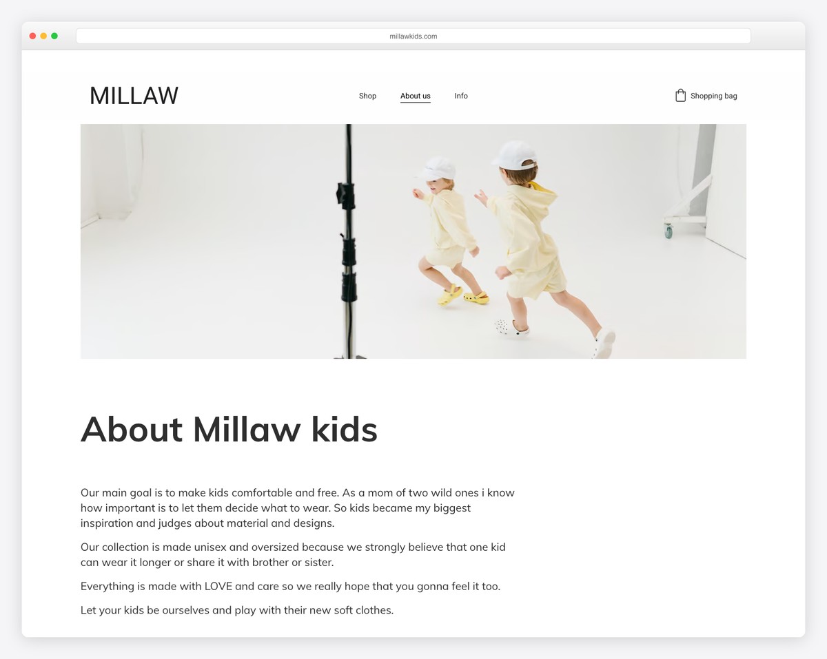
Millaw keeps things image-heavy on their about us page with just enough text to explain what they’re all about.
They also feature an Instagram grid feed, social icons and a catchy solid color background section with a slogan.
What stands out: Don’t feel like writing a ton of compelling text? Use images instead!
3. Yellow Leaf
Built with: Shopify
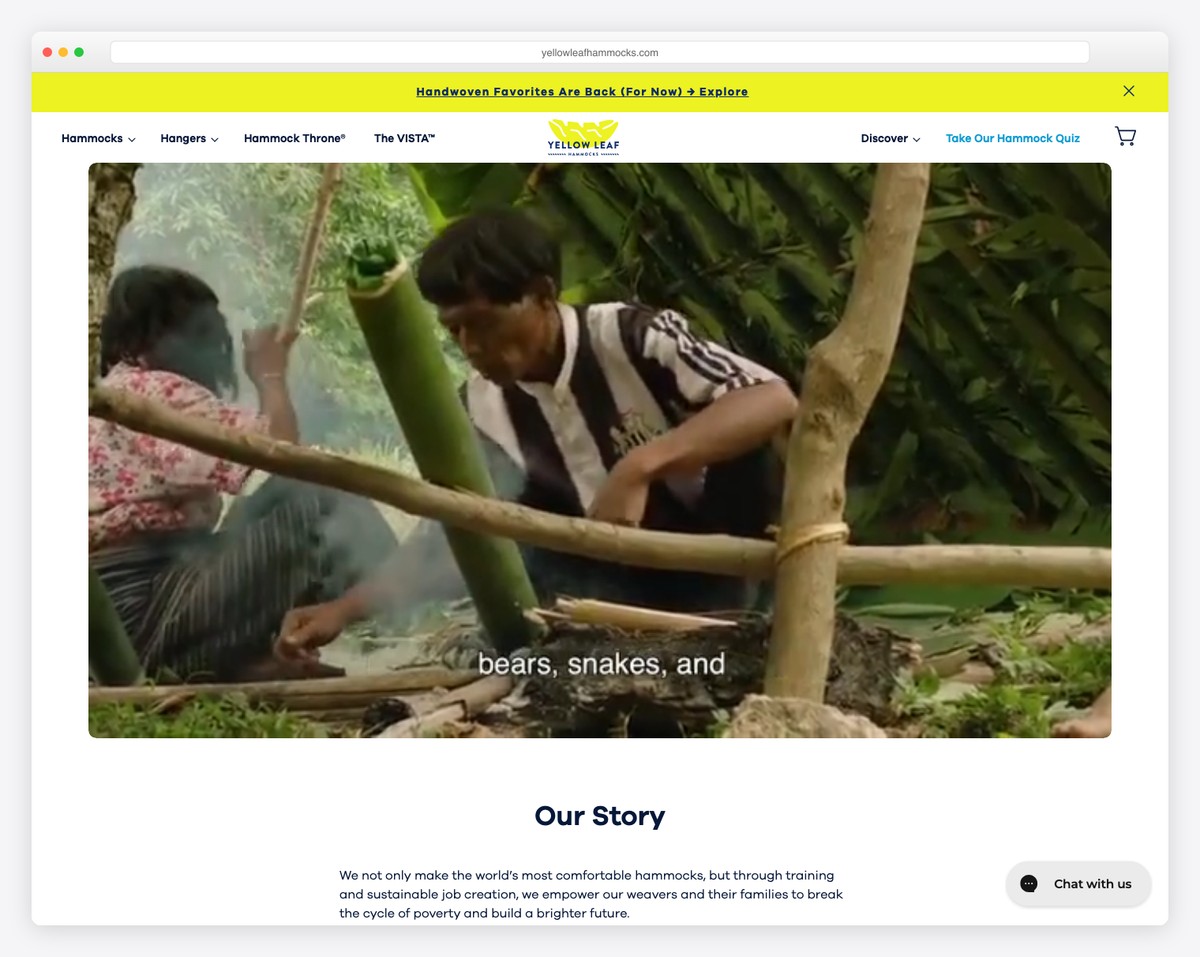
Yellow Leaf starts its about us page with a presentational video that you can pause and play by clicking on it.
Their story section is a mixture of images and text that are easy to skim through. They also added links to more information, a CTA to the shop and a carousel that showcases the workers with an avatar and a short bio.
Interestingly, they also use a section to promote three of their items with buttons linking to product pages.
What stands out: Use a promotional video in the hero section instead of an image or slider or just text to make it more engaging.
4. William Joseph
Built with: Craft CMS
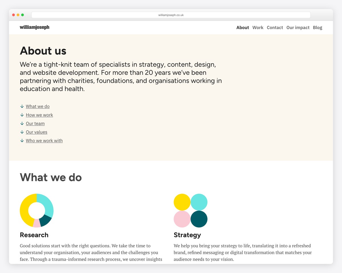
Even though using only text in the hero section is rare, it can work really well. William Joseph’s about us page is a great example of minimalism with really cool animations that spice up the overall clean appearance.
There’s also an extensive section dedicated to the team with headshots, roles and biographies. And the “we work with” section consists of client logos and a drop-down icon that reveals the full list.
What stands out: If you’ve worked with many clients or even some large companies and organizations, be proud of them and showcase them on your website.
5. Anthony Wiktor
Built with: Gatsby
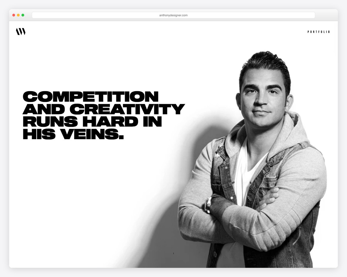
Anthony Wiktor has a unique about me page that switches between light and dark backgrounds overlaying his background image.
The choice of regular and bold typography makes skimming text much faster and the clients’ list is extensive, letting you know that Anthony’s work is high-quality.
The footer is non-traditional, with creative social links, a contact link and a back-to-top button.
What stands out: Make your about section put an extra shine on everything you do – make it promote you!
6. Sean Halpin
Built with: GitHub Pages
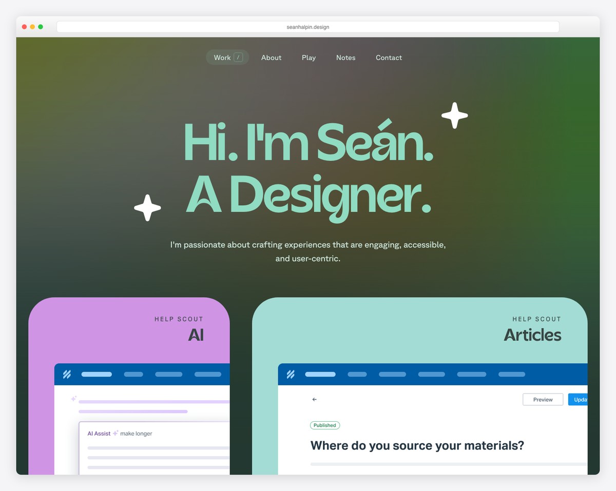
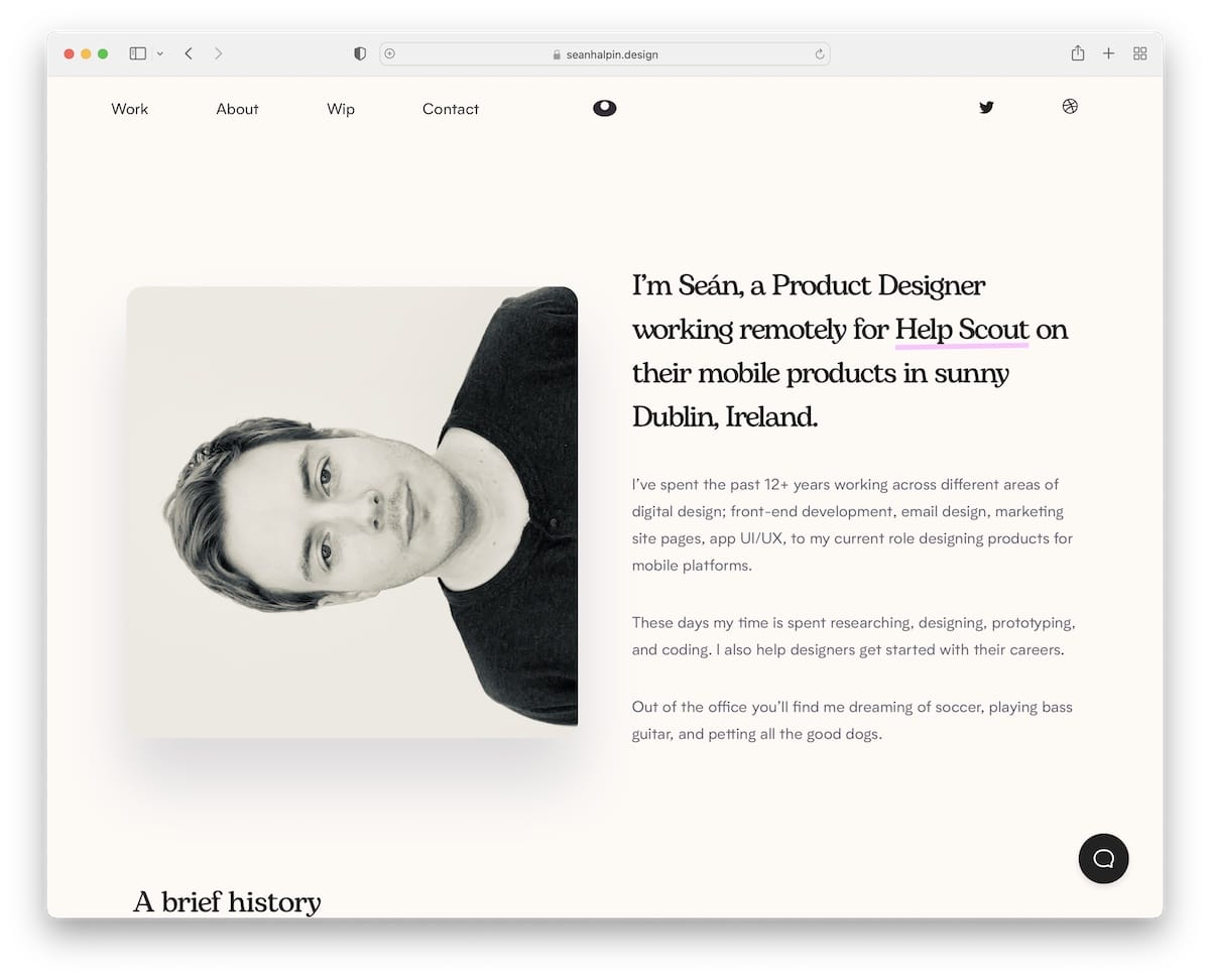
Sean Halpin has an attention-grabbing hero section with a split layout, featuring an image on the left and a short bio on the right.
He also created a cool timeline that showcases his work experience and a section that displays three books he’s currently reading.
And the chatbot is a smart way of getting people to learn more about Sean or hiring him for work.
What stands out: There’s always a way of doing things differently, even if that means rotating your headshot to the left.
Do you want to see more personal and resume websites? Don’t miss our collection!
7. Allbirds
Built with: Shopify
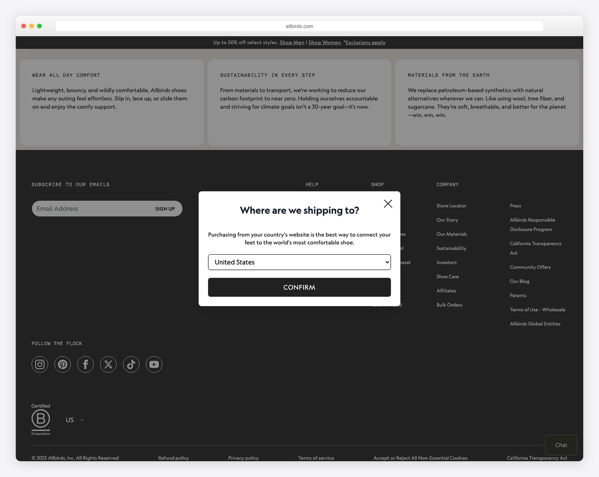
Allbirds leads its About page with “We Make Better Things in a Better Way” — a sustainability-first mission statement backed by large lifestyle imagery of their eco-friendly sneakers. The page walks through their founding story, materials innovation, and carbon footprint commitment with clean visual storytelling.
What stands out: Leading your About page with a clear mission statement immediately tells visitors what your brand stands for — especially powerful for sustainability-focused e-commerce.
8. Gymshark
Built with: Shopify
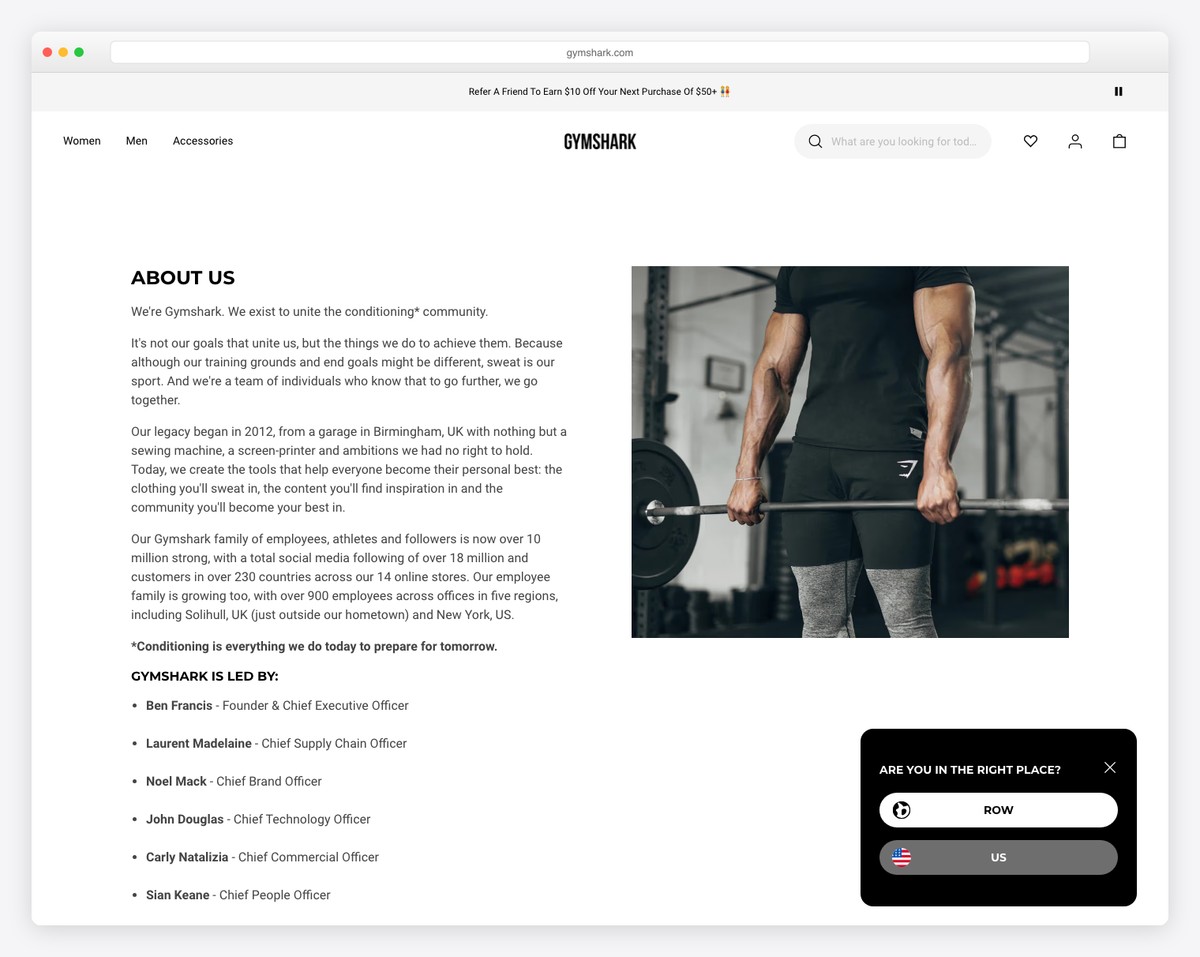
Gymshark’s About page tells the origin story of a 19-year-old sewing fitness clothes in a garage, now a global brand. Bold typography, athlete photography, and a timeline format keep the narrative engaging while community values like inclusivity and innovation are woven throughout.
What stands out: A founder origin story with humble beginnings resonates strongly with audiences — it humanizes even billion-dollar brands.
9. Death Wish Coffee
Built with: Shopify
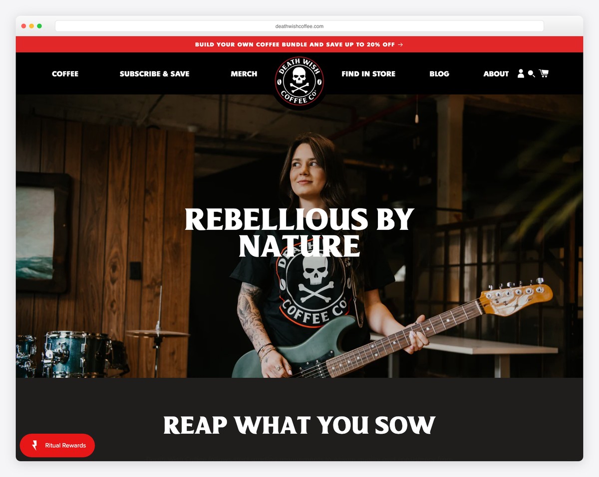
Death Wish Coffee’s About page leans into their rebellious brand identity — skull logos, dark backgrounds, and bold claims about being “the world’s strongest coffee.” The page balances edgy branding with genuine storytelling about their Saratoga Springs, NY origins and fair trade sourcing.
What stands out: A strong brand personality on your About page makes you memorable — Death Wish Coffee proves that bold positioning attracts loyal customers.
10. John Green
Built with: Squarespace
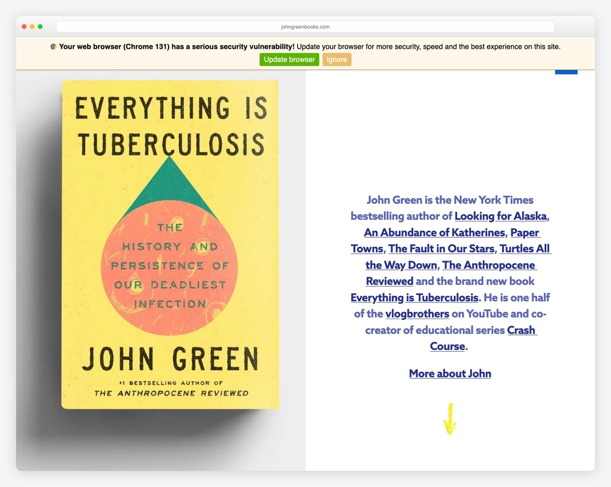
Bestselling author John Green’s Squarespace site features a warm, conversational About section with a striking portrait and personal storytelling that balances literary credibility (The Fault in Our Stars, Turtles All the Way Down) with genuine approachability.
What stands out: Authors and creators benefit from a conversational tone on their About page — it builds the personal connection that turns readers into fans.
11. Jay Acunzo
Built with: Squarespace
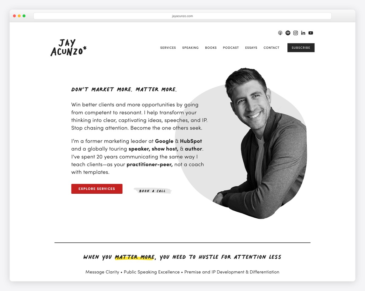
Marketing speaker and author Jay Acunzo uses bold typography and concise storytelling to communicate his creative philosophy. His Squarespace site leads with “I help teams make what matters” — a positioning statement that immediately clarifies his value proposition.
What stands out: A single, powerful positioning statement in large type is more effective than a paragraph of credentials — it gives visitors a reason to keep reading.
12. Andreas Mershin
Built with: Webflow
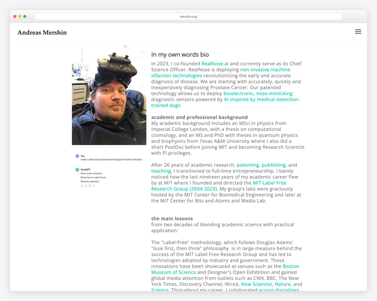
MIT scientist Andreas Mershin’s Webflow-built About page blends academic rigor with creative visual design, presenting complex nanotechnology and biomimicry research in an accessible and visually engaging format that breaks the mold of typical academic sites.
What stands out: Scientists and academics can make their work accessible by pairing credentials with engaging visuals — it attracts both peers and general audiences.
13. Ali Abdaal
Built with: WordPress

YouTube creator and former doctor Ali Abdaal’s About page combines professional credentials, a compelling personal narrative, and massive social proof (millions of subscribers) into a page that works both as an introduction and a credibility showcase for potential collaborators.
What stands out: Leading with subscriber/follower counts provides instant social proof — for creators, these numbers are as powerful as corporate revenue figures.
14. Mailchimp
Built with: Custom

Mailchimp’s About page showcases their evolution from a simple email tool to a full marketing platform, using playful illustrations, bold colors, and employee-focused photography that reflects their famously fun brand personality while establishing enterprise credibility.
What stands out: Featuring real team photos on your About page builds trust — visitors want to see the humans behind the product.
15. Notion
Built with: Custom

Notion’s About page is as minimal and intentional as their product — clean typography, generous whitespace, and a focus on their mission to make software toolmaking universally accessible. The page reflects their design philosophy perfectly.
What stands out: An About page that mirrors your product’s design language reinforces brand consistency and gives visitors a taste of the experience.
16. Figma
Built with: Custom
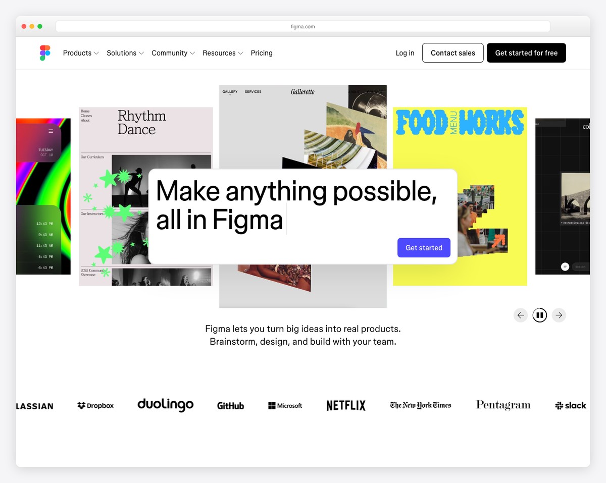
Figma’s About page leads with “Nothing great is made alone” — perfectly capturing their collaborative design tool’s philosophy. The page features dynamic team photography, office culture glimpses, and diversity stats that appeal to both users and potential hires.
What stands out: A mission-driven tagline on your About page is especially effective for B2B products — it positions you as a partner, not just a vendor.
17. Stripe
Built with: Custom
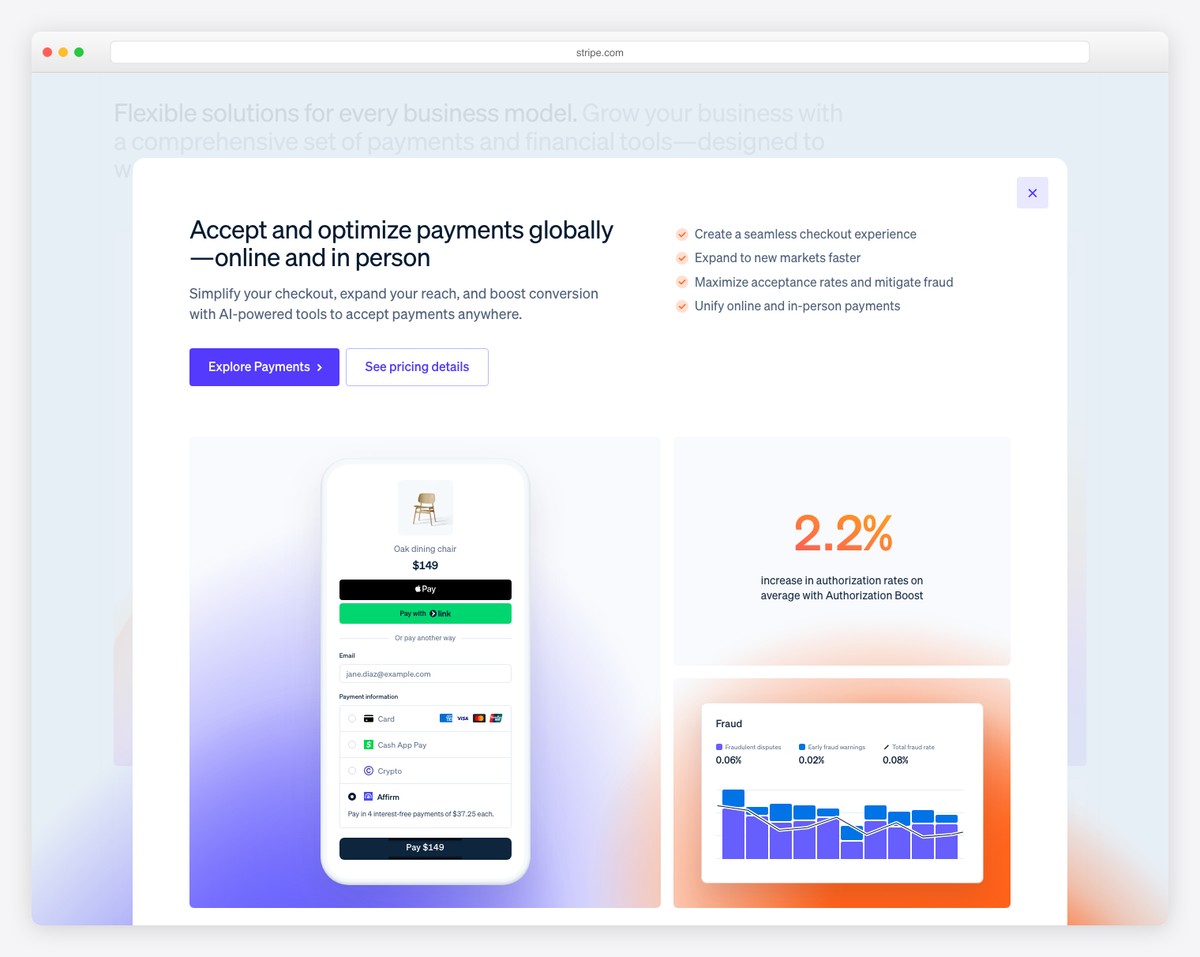
Stripe’s About page demonstrates enterprise-grade design — a clean hero with “Financial infrastructure for the internet,” followed by key statistics, global presence maps, and links to their press kit. Every element serves to establish scale and reliability.
What stands out: For B2B companies, leading with a clear category-defining statement plus key metrics communicates authority more effectively than a brand story.
18. Intercom
Built with: Custom

Intercom’s About page tells their founding story through the lens of customer relationships — explaining how their Irish co-founders set out to make internet business feel personal. Timeline milestones, team culture values, and office photos create a well-rounded company portrait.
What stands out: Connecting your origin story to your product’s purpose gives the About page a narrative arc that readers remember.
19. Basecamp
Built with: Custom
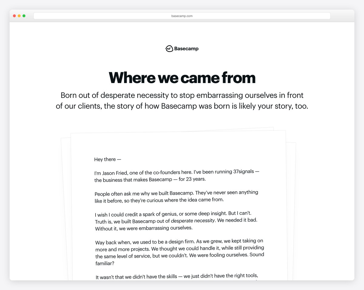
Basecamp’s About page is refreshingly honest — they share their opinionated business philosophy (no VC funding, sustainable growth, calm company culture) alongside team photos. The page reads like a manifesto, which perfectly aligns with their contrarian brand voice.
What stands out: An opinionated About page that shares your business philosophy attracts like-minded customers and repels poor-fit ones — both are valuable.
20. Ahrefs
Built with: Custom
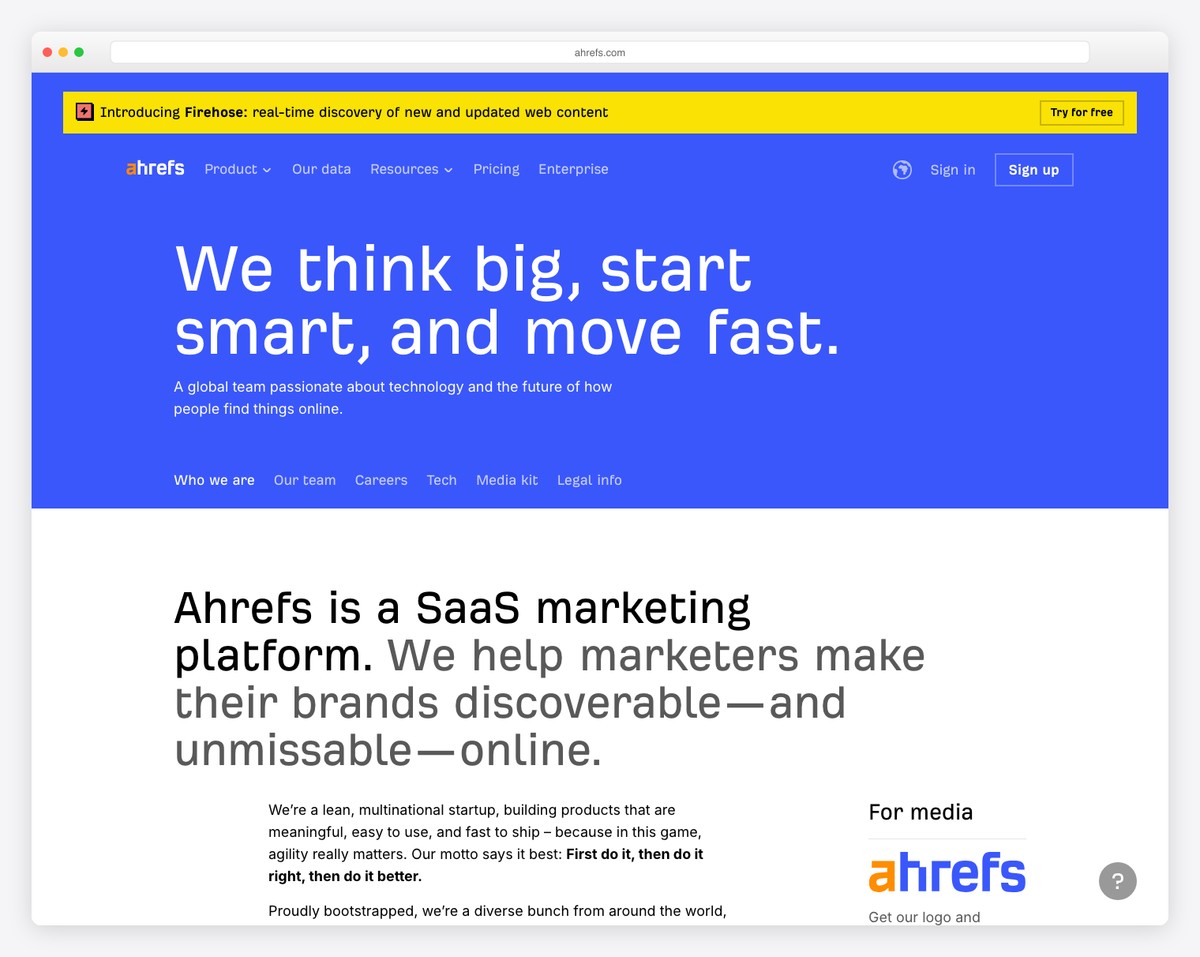
Ahrefs’ About page leads with data — the world’s largest backlink index, 12+ billion web pages crawled daily, trusted by marketers at major brands. The page combines technical credibility with a casual, approachable tone that makes complex SEO tools feel accessible.
What stands out: Leading with impressive data points on your About page immediately establishes authority in technical industries.
21. Allbirds
Built with: Shopify

Allbirds leads its About page with “We Make Better Things in a Better Way” — a sustainability-first mission statement backed by large lifestyle imagery of their eco-friendly sneakers. The page walks through their founding story, materials innovation, and carbon footprint commitment with clean visual storytelling.
What stands out: Leading your About page with a clear mission statement immediately tells visitors what your brand stands for — especially powerful for sustainability-focused e-commerce.
22. Gymshark
Built with: Shopify

Gymshark’s About page tells the origin story of a 19-year-old sewing fitness clothes in a garage, now a global brand. Bold typography, athlete photography, and a timeline format keep the narrative engaging while community values like inclusivity and innovation are woven throughout.
What stands out: A founder origin story with humble beginnings resonates strongly with audiences — it humanizes even billion-dollar brands.
23. Death Wish Coffee
Built with: Shopify

Death Wish Coffee’s About page leans into their rebellious brand identity — skull logos, dark backgrounds, and bold claims about being “the world’s strongest coffee.” The page balances edgy branding with genuine storytelling about their Saratoga Springs, NY origins and fair trade sourcing.
What stands out: A strong brand personality on your About page makes you memorable — Death Wish Coffee proves that bold positioning attracts loyal customers.
24. John Green
Built with: Squarespace

Bestselling author John Green’s Squarespace site features a warm, conversational About section with a striking portrait and personal storytelling that balances literary credibility (The Fault in Our Stars, Turtles All the Way Down) with genuine approachability.
What stands out: Authors and creators benefit from a conversational tone on their About page — it builds the personal connection that turns readers into fans.
25. Jay Acunzo
Built with: Squarespace

Marketing speaker and author Jay Acunzo uses bold typography and concise storytelling to communicate his creative philosophy. His Squarespace site leads with “I help teams make what matters” — a positioning statement that immediately clarifies his value proposition.
What stands out: A single, powerful positioning statement in large type is more effective than a paragraph of credentials — it gives visitors a reason to keep reading.
26. Andreas Mershin
Built with: Webflow

MIT scientist Andreas Mershin’s Webflow-built About page blends academic rigor with creative visual design, presenting complex nanotechnology and biomimicry research in an accessible and visually engaging format that breaks the mold of typical academic sites.
What stands out: Scientists and academics can make their work accessible by pairing credentials with engaging visuals — it attracts both peers and general audiences.
27. Ali Abdaal
Built with: WordPress
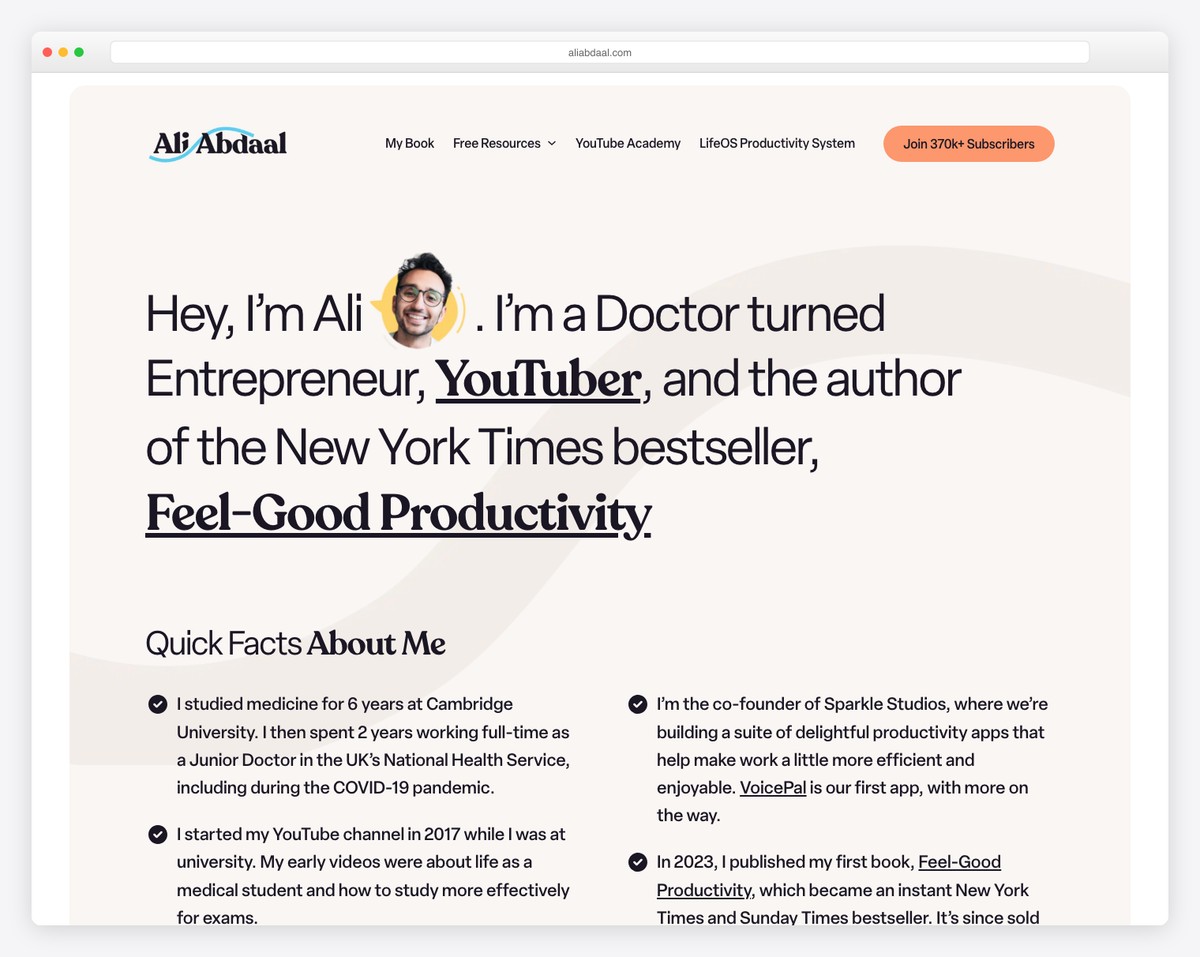
YouTube creator and former doctor Ali Abdaal’s About page combines professional credentials, a compelling personal narrative, and massive social proof (millions of subscribers) into a page that works both as an introduction and a credibility showcase for potential collaborators.
What stands out: Leading with subscriber/follower counts provides instant social proof — for creators, these numbers are as powerful as corporate revenue figures.
28. Mailchimp
Built with: Custom
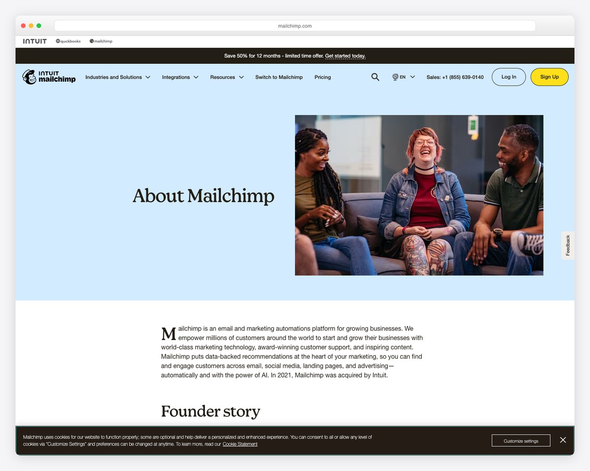
Mailchimp’s About page showcases their evolution from a simple email tool to a full marketing platform, using playful illustrations, bold colors, and employee-focused photography that reflects their famously fun brand personality while establishing enterprise credibility.
What stands out: Featuring real team photos on your About page builds trust — visitors want to see the humans behind the product.
29. Notion
Built with: Custom
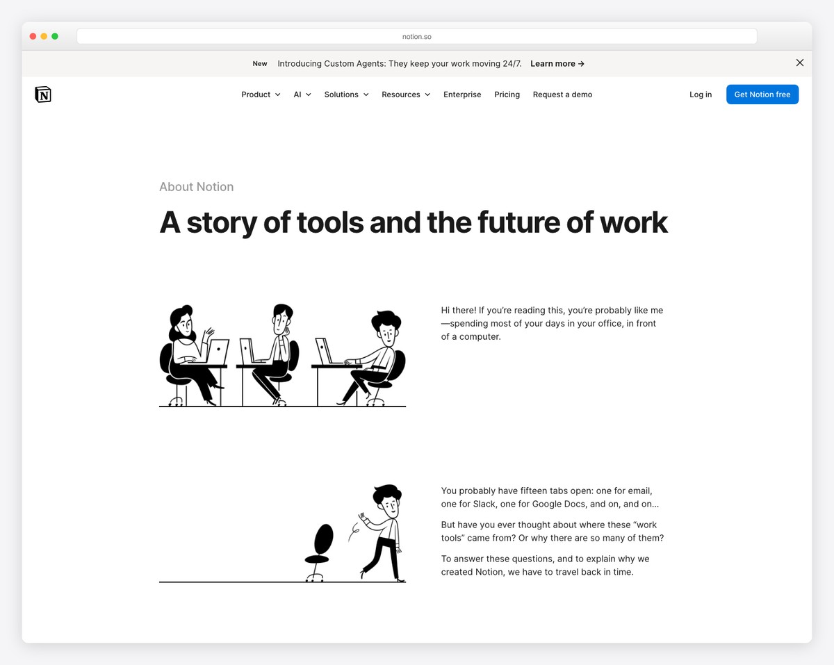
Notion’s About page is as minimal and intentional as their product — clean typography, generous whitespace, and a focus on their mission to make software toolmaking universally accessible. The page reflects their design philosophy perfectly.
What stands out: An About page that mirrors your product’s design language reinforces brand consistency and gives visitors a taste of the experience.
30. Figma
Built with: Custom

Figma’s About page leads with “Nothing great is made alone” — perfectly capturing their collaborative design tool’s philosophy. The page features dynamic team photography, office culture glimpses, and diversity stats that appeal to both users and potential hires.
What stands out: A mission-driven tagline on your About page is especially effective for B2B products — it positions you as a partner, not just a vendor.
31. Stripe
Built with: Custom

Stripe’s About page demonstrates enterprise-grade design — a clean hero with “Financial infrastructure for the internet,” followed by key statistics, global presence maps, and links to their press kit. Every element serves to establish scale and reliability.
What stands out: For B2B companies, leading with a clear category-defining statement plus key metrics communicates authority more effectively than a brand story.
32. Intercom
Built with: Custom
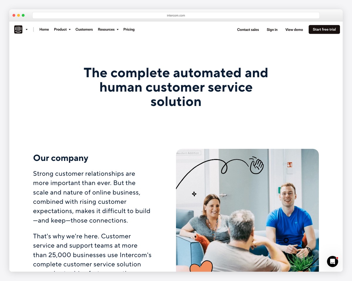
Intercom’s About page tells their founding story through the lens of customer relationships — explaining how their Irish co-founders set out to make internet business feel personal. Timeline milestones, team culture values, and office photos create a well-rounded company portrait.
What stands out: Connecting your origin story to your product’s purpose gives the About page a narrative arc that readers remember.
33. Basecamp
Built with: Custom

Basecamp’s About page is refreshingly honest — they share their opinionated business philosophy (no VC funding, sustainable growth, calm company culture) alongside team photos. The page reads like a manifesto, which perfectly aligns with their contrarian brand voice.
What stands out: An opinionated About page that shares your business philosophy attracts like-minded customers and repels poor-fit ones — both are valuable.
34. Ahrefs
Built with: Custom

Ahrefs’ About page leads with data — the world’s largest backlink index, 12+ billion web pages crawled daily, trusted by marketers at major brands. The page combines technical credibility with a casual, approachable tone that makes complex SEO tools feel accessible.
What stands out: Leading with impressive data points on your About page immediately establishes authority in technical industries.



Comments (0)