
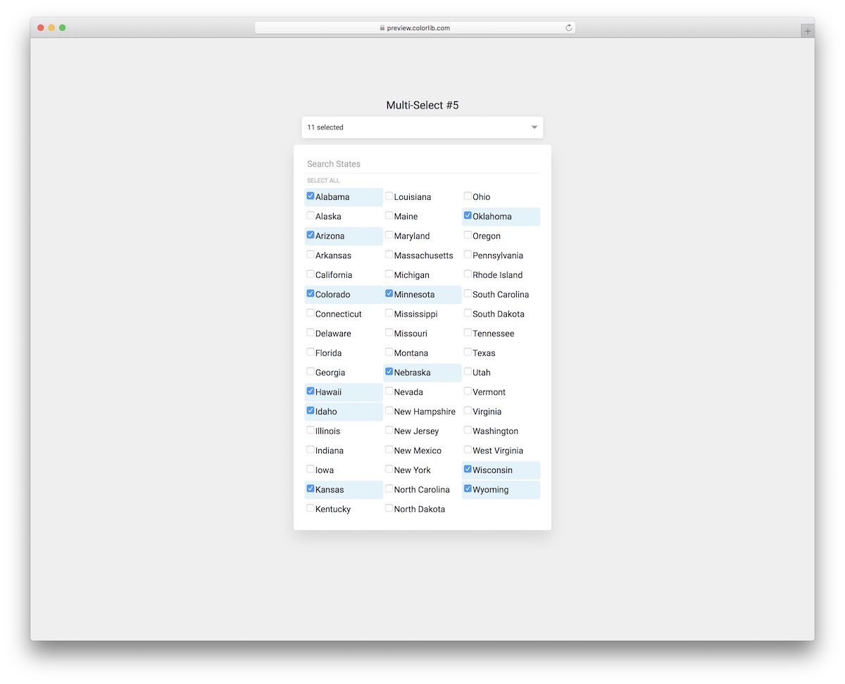
24 Bootstrap Multiselect Dropdown Examples (No Plugin) 2026
These 24 Bootstrap multiselect dropdown examples cover checkbox lists, tag-style pickers, live search, grouped options, “select all” buttons and selection limits. Four 2026 snippets at the end handle multiple choices without a dropdown: topic tiles, filter checkbox groups, feature chips and an availability grid. Each one has a live demo and a free download.
All 24 are Colorlib snippets built as plain HTML, CSS and a few lines of vanilla JavaScript. They load no jQuery, no Bootstrap files and no plugin, work on their own or inside Bootstrap 4, 5 and 6 projects, and are free for personal and commercial use under CC BY 3.0 as long as you keep the credit link.
The classic bootstrap-multiselect plugin asks you to load jQuery first, then Bootstrap’s JavaScript, then the plugin’s own JS and CSS files. The dropdowns below skip all three: you copy the markup, the stylesheet and the few lines of script that come with each one.
Each of the 20 dropdowns keeps a real <select> menu underneath and writes every choice back to it, so the selection submits with the form like any native field. Your options stay ordinary <option> elements with their own value attributes, so you fill the list the same way you would fill a plain select.
If you need a complete site rather than a single widget, browse our Bootstrap 5 website templates.
Best Bootstrap Multiselect Dropdown Widgets
Multiselect V01
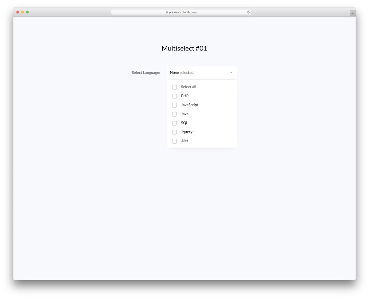
Let’s start with a simple multiselect widget for picking programming languages; the whole download is 61 KB. Before we go any further, you can modify this free snippet to your heart’s content if you would like to use it for something else.
However, the design is very basic and simple, ensuring it works seamlessly with various projects and applications by default.
While users can select different items manually, they can also simply check the ‘select all’ box if everything interests them. Moreover, the main bar displays the user’s selections.
Multiselect V02
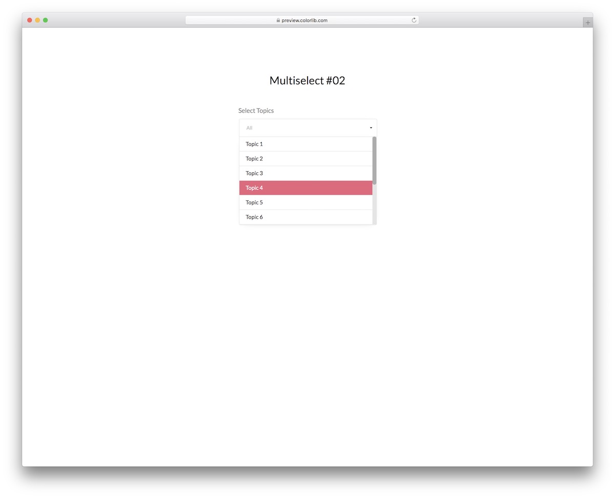
Multiselect V02 makes it easy for users to pick different topics. It appears elegantly on mobile and desktop devices, with or without Bootstrap on the page.
The widget follows a pretty minimalist look, ensuring you don’t need to make any changes to it rather than use it as-is.
When you select the topic, it appears in the display field with an option to click on the X sign to remove it. Whether it’s picking one topic or all, this multiselect supports it.
Multiselect V03
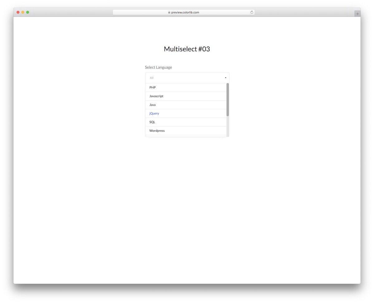
If the multi select dropdown snippet above displays the topic’s name upon selection, this one keeps it very simple with the number of choices.
However, the main specialty of Multiselect V03 is the change in the color of the language’s font. On hover, it turns blue, but it turns blue and bold on click.
The flexible structure also ensures smooth adaptation to mobile, tablet, and desktop devices.
Multiselect V04
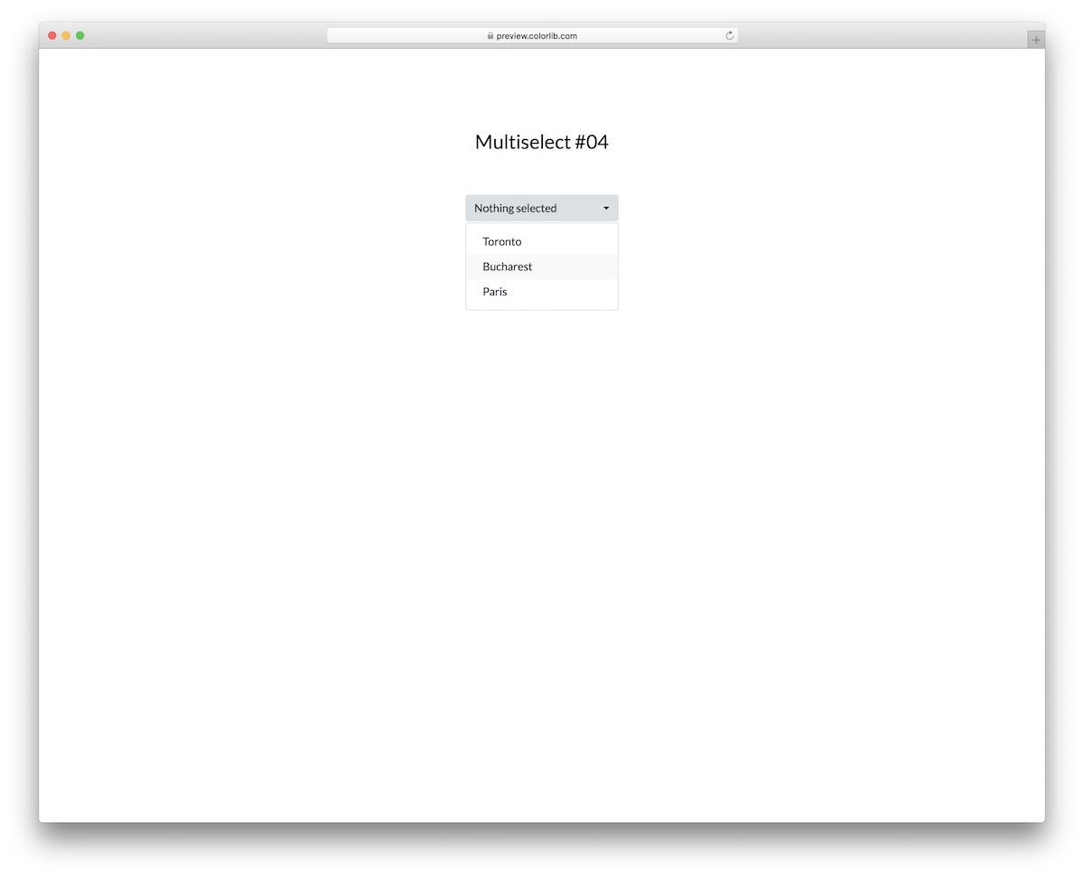
Multiselect V04 is a bar with “nothing selected” and a chevron. Once you click on it, a drop-down menu opens with multiple options to select from.
Once you choose an item, a blue click effect appears with a red checkmark, and the item is displayed in the main bar.
Everyone can select or deselect as many items, topics, or other options as they want, regardless of their device.
Multiselect V05
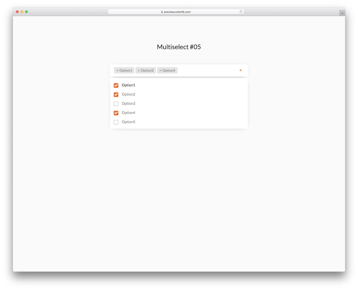
Multiselect V05 is a free snippet that adds multi-selection to your application or website without a plugin.
The main objective of the multi-select does not matter; you can comfortably and effectively utilize this one for everything.
The widget has a slightly wider layout than our other alternatives, making it more convenient to display different selections.
The drop-down also features checkboxes and five options by default. Make it yours, fine-tune it and go from there.
Multiselect V06
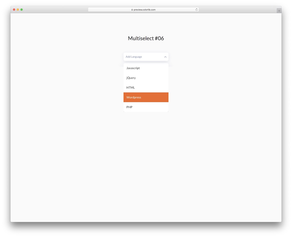
Multiselect V06 may look like any other average multiselect widget, but it’s far from that. This free snippet knows how to spice things up with a modern design and cool animation.
In other words, if you are looking for something unconventional, you will do the right thing by choosing Multiselect V06.
However, you can test it first by visiting the live demo preview (even on a mobile device).
Multiselect V07
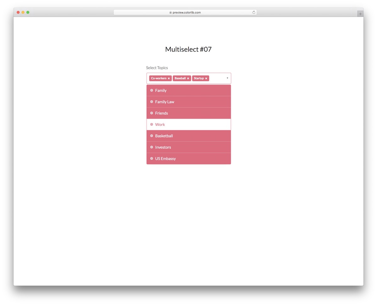
Some multiselects from this collection are minimalist, while some come quite creative. If you prefer the latter, consider examining Multiselect V07’s performance.
It features a field that responds on hover, changing the color of the text and the outline. Once you click it, a bold drop-down appears with different topics that disappear from the drop-down and appear in the main bar on click.
Go ahead and try it yourself.
Multiselect V08
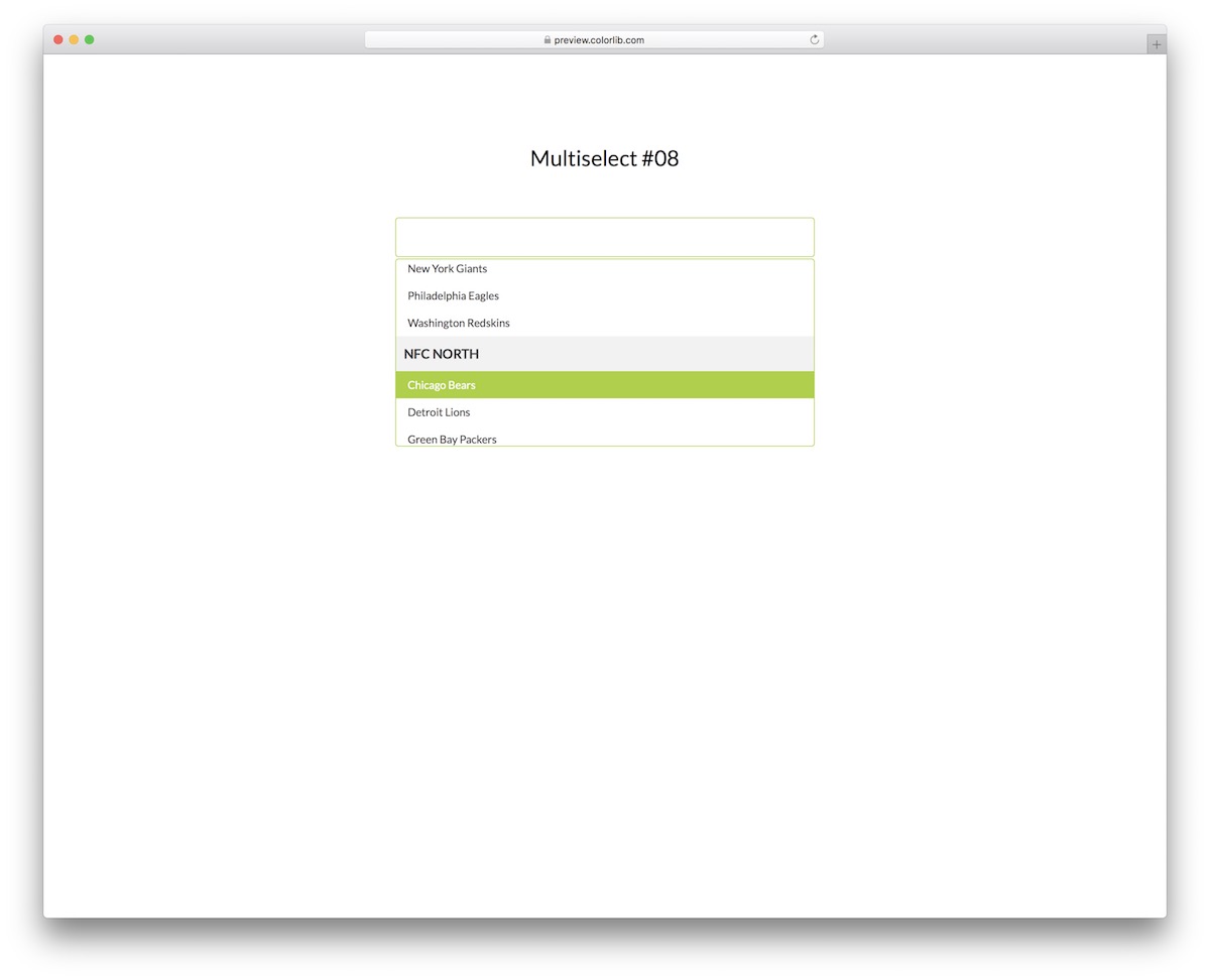
A multiselect dropdown can contain topics or items, but you can also break them down into different categories.
This is especially helpful when there are many items, as it enhances the user experience by facilitating the discovery of what interests them.
Multiselect V08 is a great illustration of that. You can now put it into action and make things happen quickly.
It also features a hover effect and a beginner-friendly code structure, allowing everyone to get the most out of it.
Multiselect V09
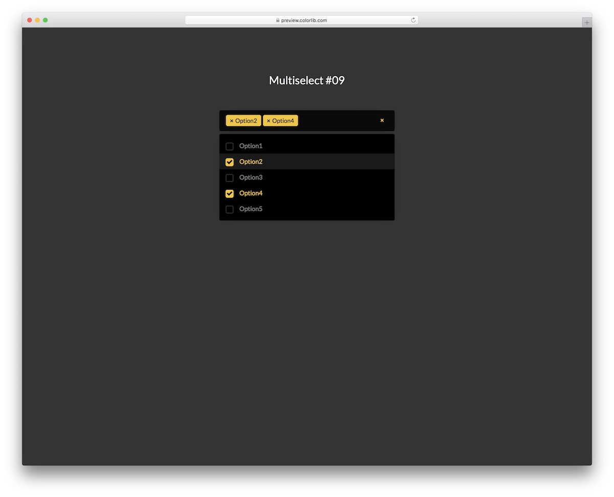
For everyone who came to this collection search for a dark multiselect snippet, do yourself a favor and pick Multiselect V09. It is a modern alternative with everything necessary to get you moving forward immediately.
The tool is optimized for excellent mobile and desktop performance, and includes easy-to-understand code.
Multiselect V09 enhances the presentation with a vibrant yellow tone, making the overall appearance more dynamic and visually appealing.
Multiselect V10
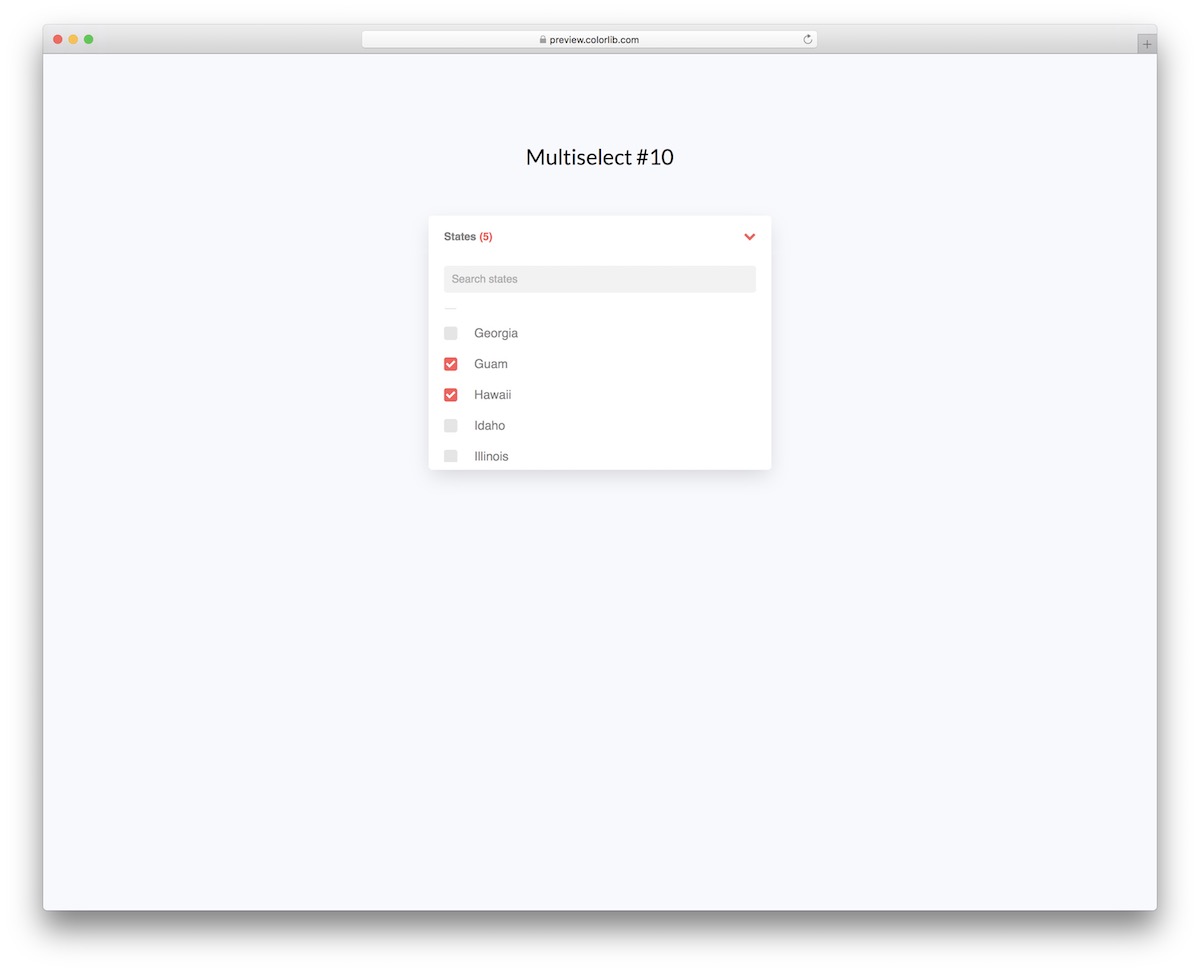
Finding them by scrolling can be very inconvenient for a multi-select with many options. To make the user’s life simpler, here is Multiselect V10.
This free snippet features a practical live search function that reveals results as soon as you start typing.
You can then click the X sign to clear the search bar and begin a new search.
Multiselect V11
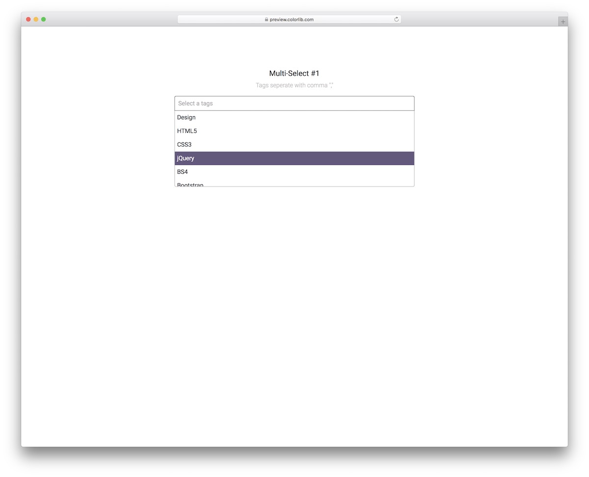
This multiselect offers two methods for selecting items from the drop-down, and like the rest it needs no plugin.
First, you can browse them and choose the ones you like by clicking on them.
Additionally, this multiselect feature allows for selection by typing and separating different options with a comma.
Another notable feature of Multiselect V11 is the live search function, which enables quick research directly from the main bar. The items you pick turn gray for better visibility.
Multiselect V12
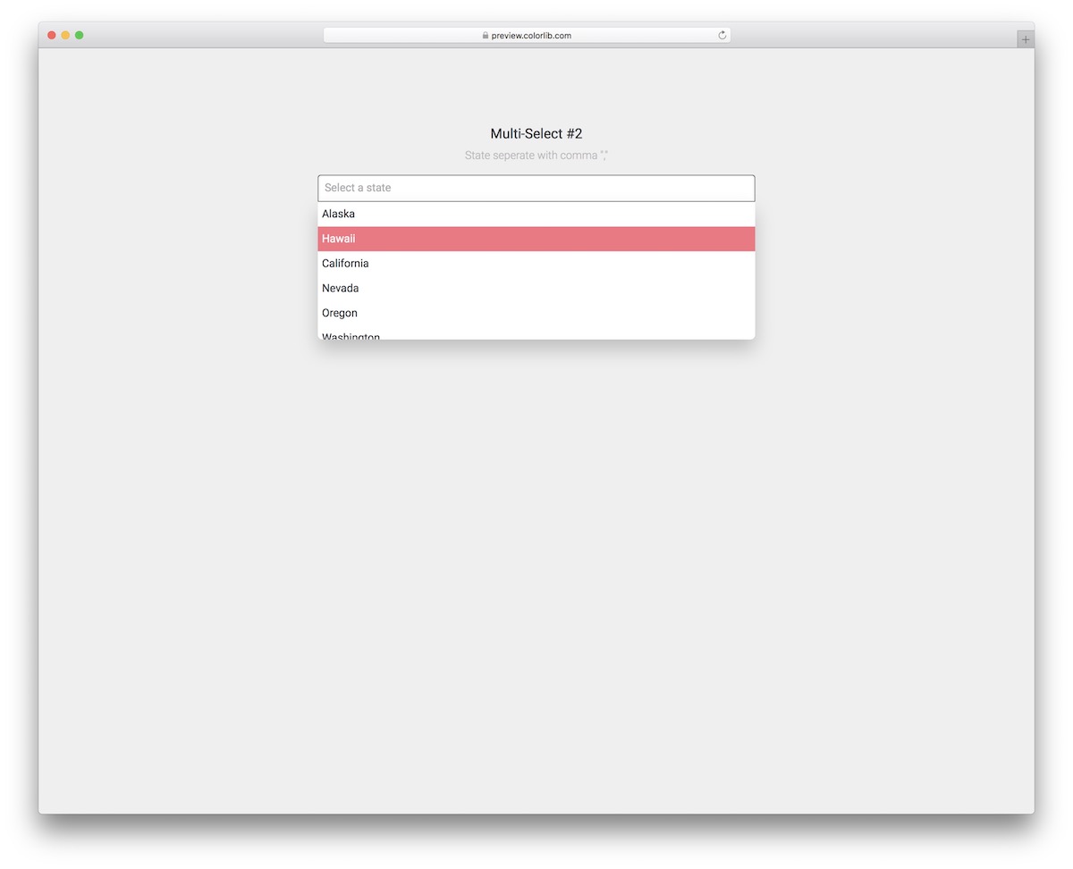
Multiselect V12 knows how to mix simplicity with practicality for a great user experience.
While the free tool focuses on states by default, this multiselect dropdown with a live search function (separate with a comma) is great for anything else.
You can use it to pick topics, items, languages—well, you get the gist of it—everything works.
Multiselect V13
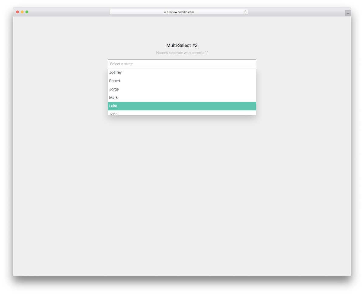
You can even employ a multiselect for names, just like in the Multiselect V13 case. While this free snippet is similar to the one above, its main distinction is the color choice for selections.
This one features a beautiful turquoise tint. The live search, comma-separated item selection, or manual choice from the drop-down are all the goodies that Multiselect V13 offers.
Multiselect V14
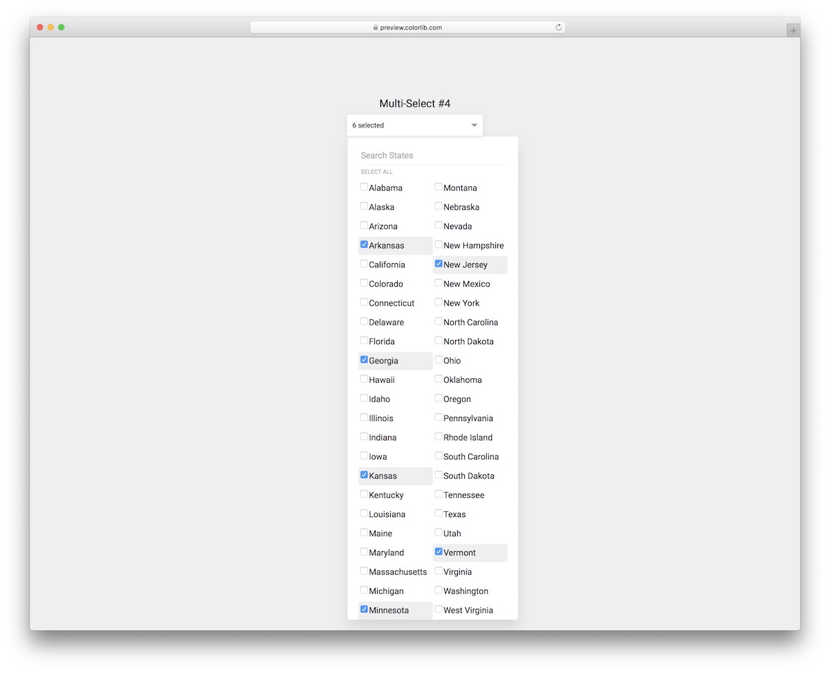
Multiselect V14 is an amazing free snippet for country selection. When you click on the bar, a drop-down opens with fifty states.
While you can select as many or as little as you want, there’s also a quick “select all” button for picking the entire list.
Moreover, up to four names appear in the bar, but anything more than that, the widget displays a number. The layout also reshapes instantaneously for mobile devices.
Multiselect V15
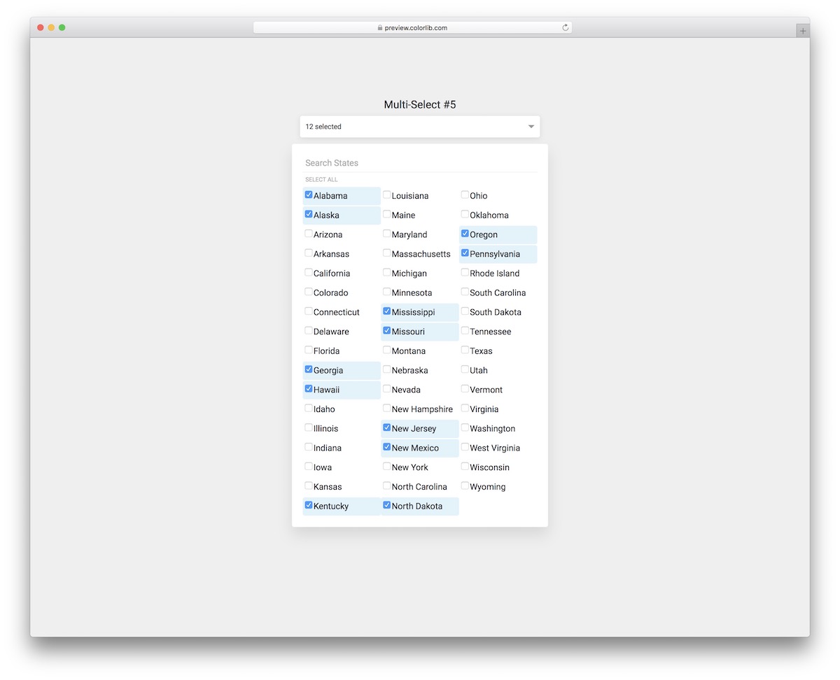
If you are interested in a multiselect dropdown with a style similar to the previous one, Multiselect V15 is a great alternative. It displays fifty states in three columns with similar functionality.
The same style remains intact whether viewed on mobile, tablet or desktop. Moreover, Multiselect V15 features a hover effect, turning selected states blue and indicating them with a checkmark.
You can also choose all with a single click.
Multiselect V16
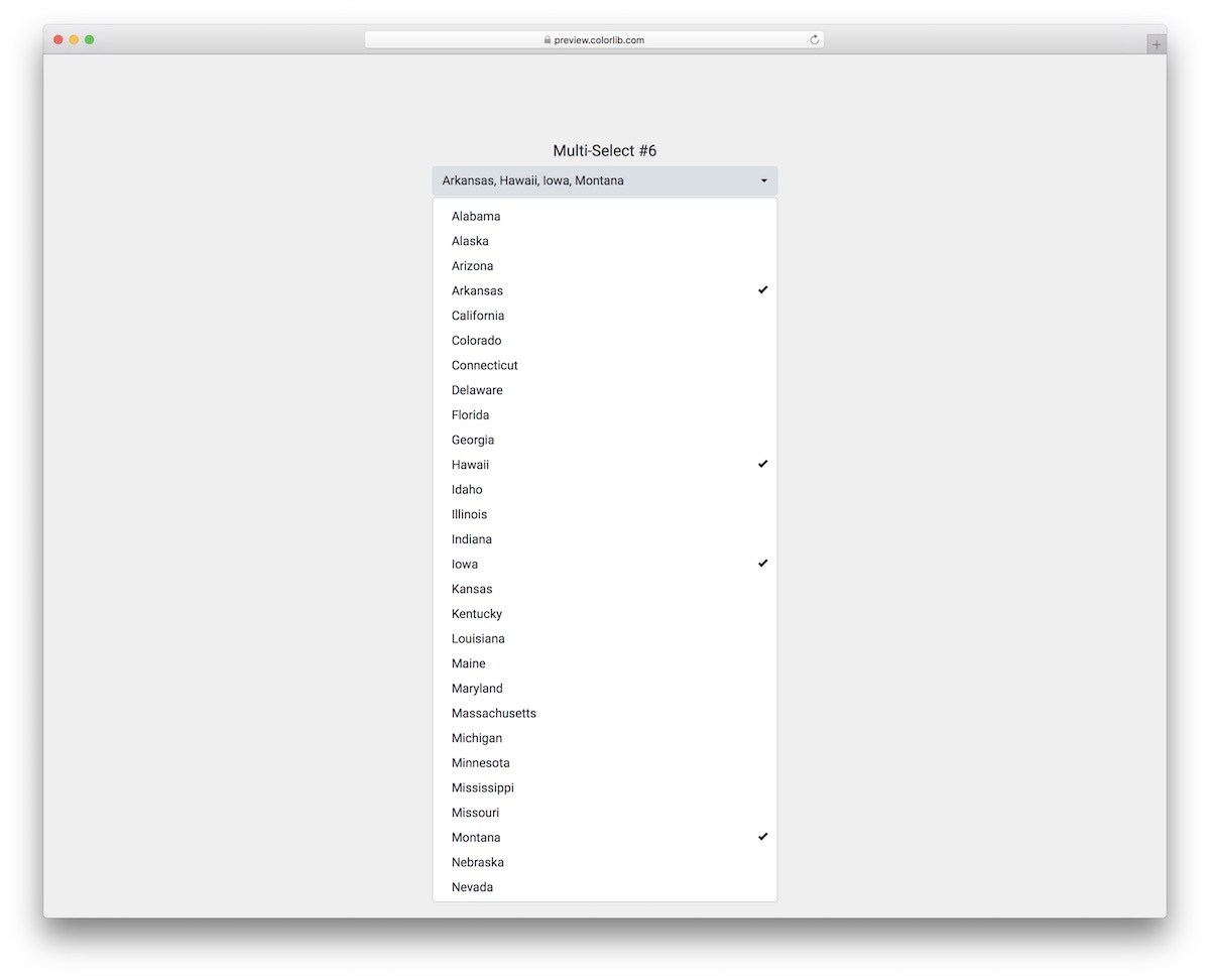
Multiselect V16 is another top-notch multiselect widget, set up for country selection by default. It maintains a modern and minimalist design with a few standout features.
Gray hover effect, click animation, checkmark and quick keyboard shortcut for picking items by alphabetical characters are the core highlights of Multiselect V16.
There’s no “select all” option here, so the user must make all the picks manually.
Multiselect V17
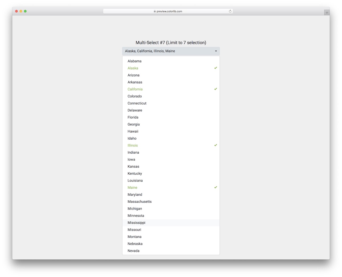
Sometimes, you want to limit the number of selections a user can make. If this is the case, that’s when Multiselect V17 comes into play. This free snippet limits the selection to seven, but you can make alterations if necessary.
Moreover, the states appear in the bar above, and the drop-down choices turn green, featuring a checkmark. The click effect persists even when the limit is met, but the selection does not occur.
Multiselect V18
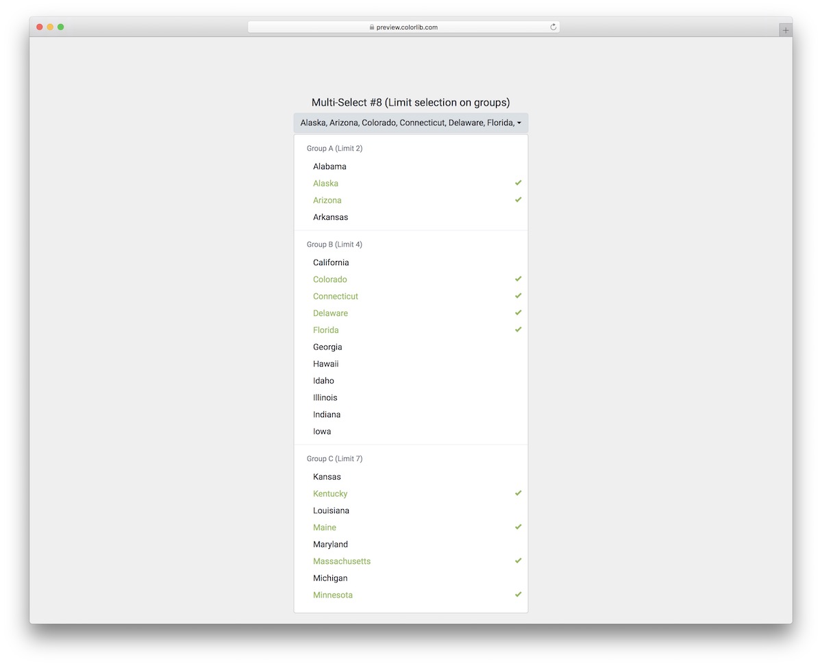
Multiselect V18 is an advanced multiselect dropdown with several features that make it stand out.
First thing’s first, it features groups in the drop-down, breaking things down beautifully to boost user experience. Moreover, each group has an individual limit of choices, like the previous widget.
While this multiselect is for states out of the box, you don’t need to limit yourself, in any way. Use it to your total advantage and save time.
Multiselect V19
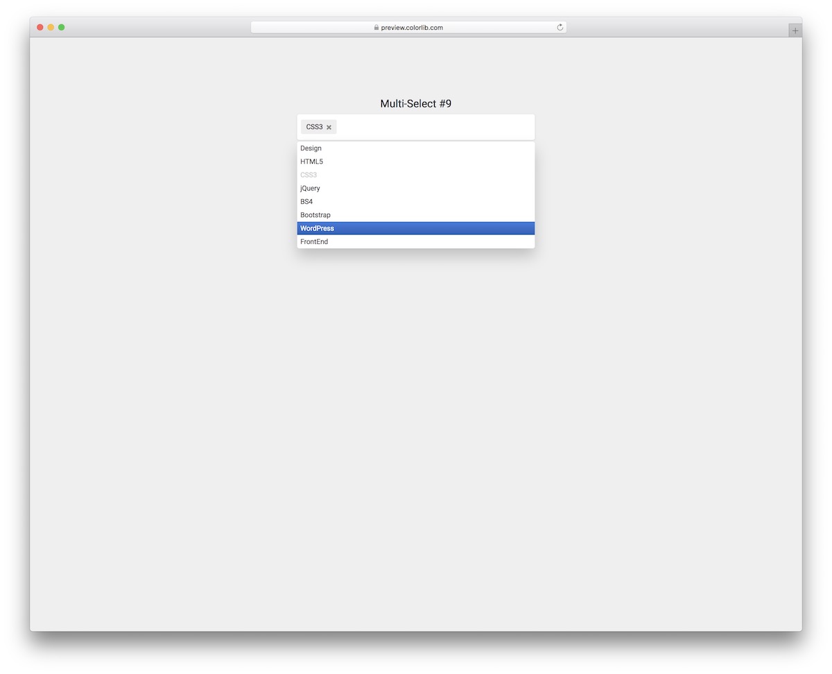
An easy and all-around drop-down with multiselect feature that you can now make yours without spending a dime.
Multiselect V19 is ideal for various selections, as it allows for easy adjustment and customization to suit your specific needs.
When picking different items, you can do it from the drop-down with the mouse cursor or even type it in the bar and hit enter. Furthermore, each selection also turns gray, but you can deselect it by pressing the X button.
Multiselect V20
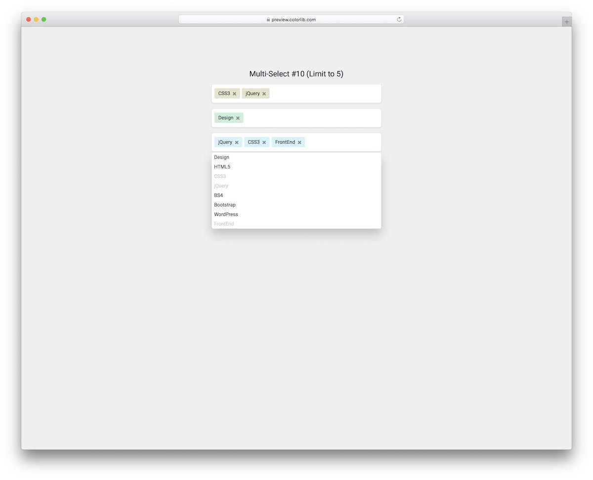
To take things further, choose this three-in-one multiselect dropdown snippet. All three lists write their choices back to real select menus, so they submit with the form.
You can conveniently break things down into different categories and limit the number of items a person can select by multiselect. The selection process occurs by collecting items from the drop-down menu or typing them in and pressing Enter (live search feature integrated).
The widget also uses different colors for different categories/multiselects, which you can improve, too.
More 2026 multi-choice snippets from Colorlib
Other ways to let people pick several options, from our 2026 snippets: topic tiles, filter checkbox groups, feature checkboxes and an availability grid.
Newsletter Form V03: Subscribe card with topic preference tiles
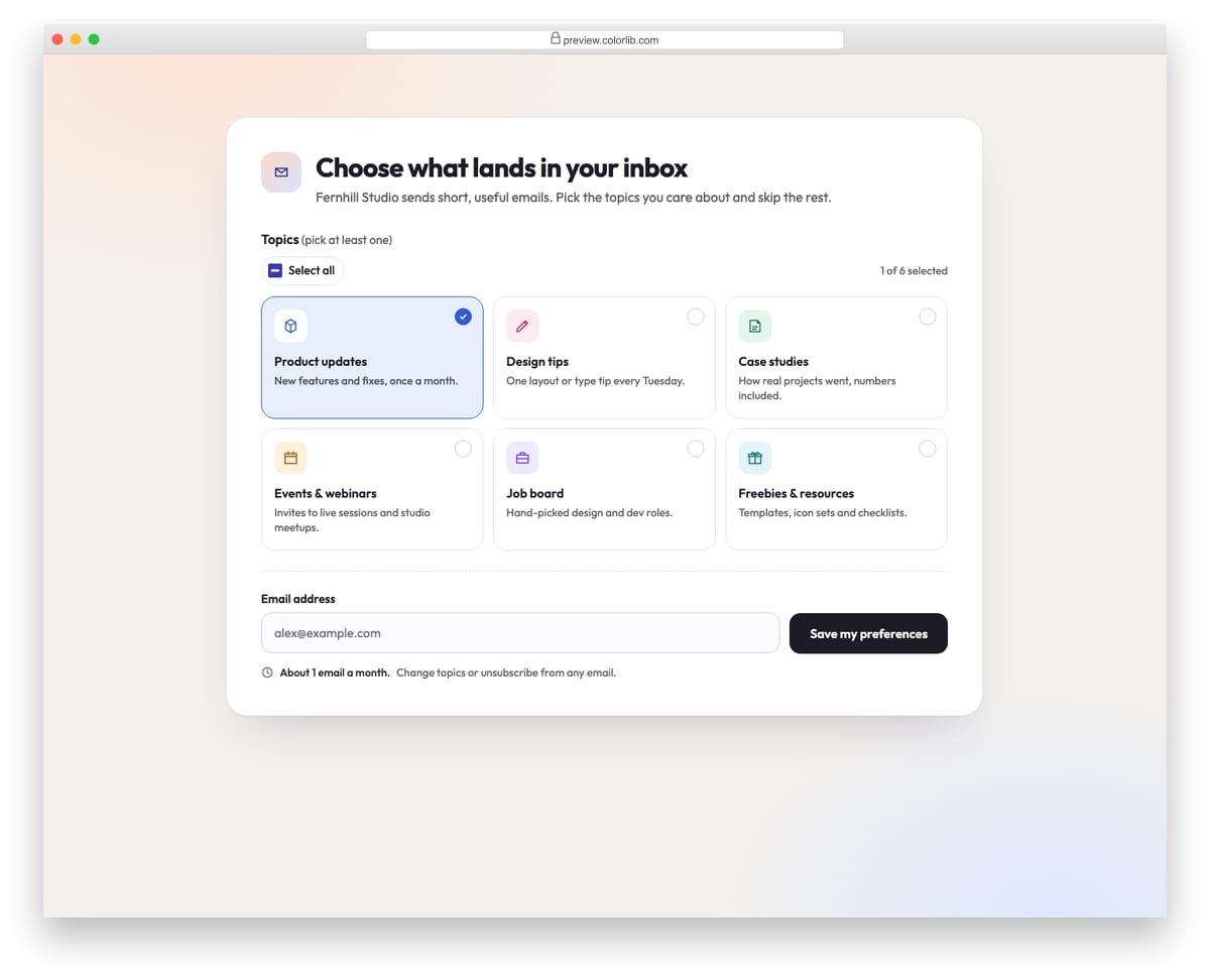
A light subscription card where readers pick which emails they want from six topic tiles, each a real checkbox with an icon, title and short description. A Select all toggle, a live selected count and an estimated emails-per-month hint update as topics change. At least one topic and a valid email are required, and the success state lists the chosen topics.
Best for: email preference centres and newsletter sign-up pages. Plain HTML and CSS with a few lines of vanilla JavaScript, a 194 KB download, and it works on its own or inside a Bootstrap 4, 5 or 6 project.
Offcanvas V04: E-commerce filter panel with checkbox groups and a price range
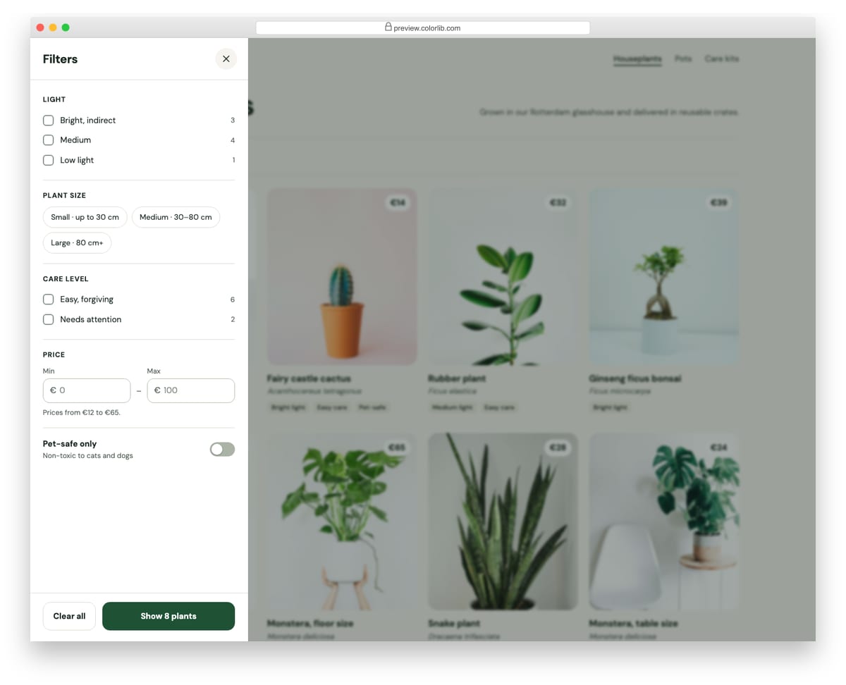
A filter drawer for a plant shop's category page. It has checkbox groups for light and care level, size chips, minimum and maximum price inputs and a pet-safe switch, and the apply button previews how many products match before you commit. Applying filters the product grid, updates the results count and adds removable filter chips to the page.
Best for: shop category pages and product listings on mobile and desktop. Plain HTML and CSS with a few lines of vanilla JavaScript, a 483 KB download, and it works on its own or inside a Bootstrap 4, 5 or 6 project.
Survey Form V04: Product feedback form with emoji reaction scale, feature checkboxes and screenshot upload
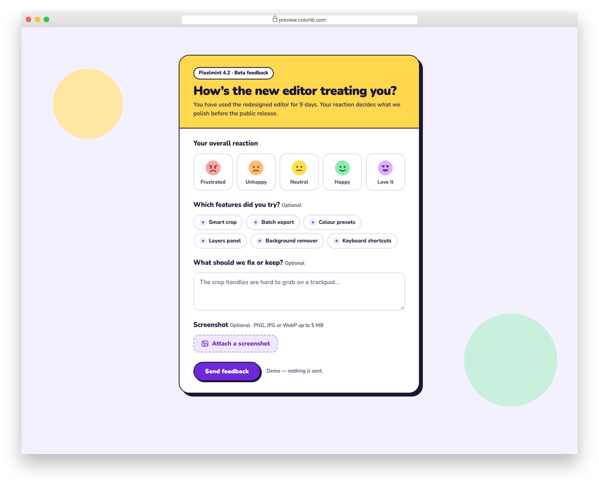
A playful beta-feedback form for a made-up photo editor, with a bold yellow header and hard offset shadow. It asks for an overall reaction on a five-face emoji scale, which features were tried as toggle chips, free-text notes and an optional screenshot. The screenshot is checked for type and size and shown as a thumbnail with a Remove button.
Best for: beta programmes, in-app product feedback and feature launch surveys. Plain HTML and CSS with a few lines of vanilla JavaScript, a 375 KB download, and it works on its own or inside a Bootstrap 4, 5 or 6 project.
Job Application Form V08: Volunteer application with a days by morning/afternoon availability grid
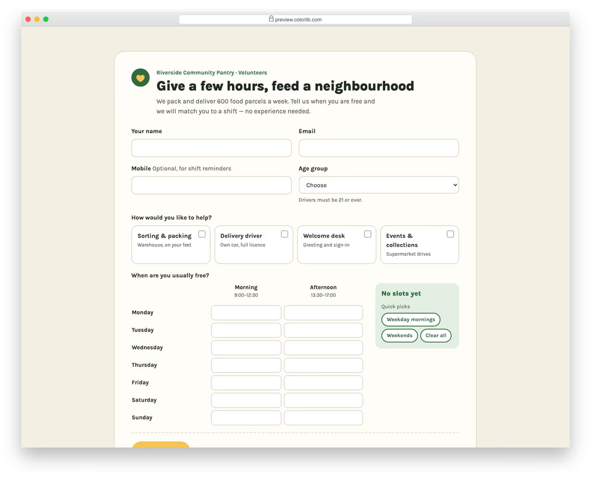
A warm volunteer sign-up form for a made-up community food pantry. After contact details and an age group, volunteers pick the roles they would like as checkbox cards and tick free slots in a weekly grid of days by morning and afternoon. Quick-pick buttons fill weekday mornings or weekends, and a tally shows the number of slots and hours offered.
Best for: charities, community groups, events and shift-based volunteer programmes. Plain HTML and CSS with a few lines of vanilla JavaScript, a 188 KB download, and it works on its own or inside a Bootstrap 4, 5 or 6 project.
How to choose a multiselect dropdown
Match the widget to the length of the list. For about seven options or fewer, plain checkboxes or tiles are quicker than a dropdown, as Newsletter Form V03’s six topic tiles show. Long lists need live search (Multiselect V10 to V13 and V20), and very long ones read better in groups (V08 and V18) or with jump-to-letter typing (V16).
Show what is selected. Tags with a remove button, as in Multiselect V02 and V19, are the easiest to review. When the selection gets long, a count keeps the bar tidy: V14 lists up to four names and then shows a number.
Explain limits before people hit them. If you cap the number of choices, say so in the label, for example “Pick up to 7”. Multiselect V17 stops at seven and V18 limits each group; without a hint, a click that does nothing feels like a bug.
Test with a keyboard. People should be able to open the list, move through options with the arrow keys, toggle one with Space and close the list with Escape. Custom widgets are where this usually breaks, so try it, and a screen reader, before you ship.
Remember the native control on phones. A plain <select multiple> opens a touch-friendly picker on iOS and Android, but on desktop it needs Ctrl- or Cmd-click, which few people know. A custom dropdown fixes the desktop side; check that its touch targets are just as easy to hit on a phone.
Frequently asked questions
Does Bootstrap 5 have a built-in multiselect dropdown?
No. Bootstrap 5 styles a native <select multiple> with .form-select, which shows a scrolling list where people hold Ctrl or Cmd to pick several items. For a dropdown with checkboxes, tags or search you need a widget such as the ones above.
Do these multiselect dropdowns need jQuery or the bootstrap-multiselect plugin?
No. Each one is plain HTML and CSS with a few lines of vanilla JavaScript, so there is no jQuery, Bootstrap JavaScript or plugin file to load.
How do I read the selected values?
Because every choice is written back to a real select menu, read it like any native field: Array.from(select.selectedOptions).map(o => o.value). On submit the browser sends one name and value pair per selected option; if your back end is PHP, name the select with brackets, such as name="topics[]", so the values arrive as an array.
Can I use them in commercial projects?
Yes. Colorlib snippets are free for personal and commercial use under CC BY 3.0; just keep the credit link.
Final thoughts
Start with Multiselect V01 for a simple list with “select all”, Multiselect V10 when the list needs search and Multiselect V18 when options fall into groups with limits. For single-choice menus, see our Bootstrap dropdowns roundup.

Related Posts



why when many selects are close to each other, the grid selection appears hidden under the buttons? how to solve
Most of them are Bootstrap 4 templates. We are working on new sets for Bootstrap 5 but those will feature completely new designs to keep up with the latest trends.