50+ Website Color Statistics: Best Colors for Websites (2026)
Last updated: March 2026
White backgrounds, blue links, and dark mode everywhere — but the data behind website color choices goes much deeper. Here are 50+ website color statistics covering the most popular colors, accessibility failures, brand usage, conversion impact, and design trends for 2026.
Key Website Color Statistics (2026)
- White is the most common background color — used by 76% of websites (W3Techs)
- Blue is the most popular link and CTA color on the web
- 82% of users prefer dark mode when available (Android Authority)
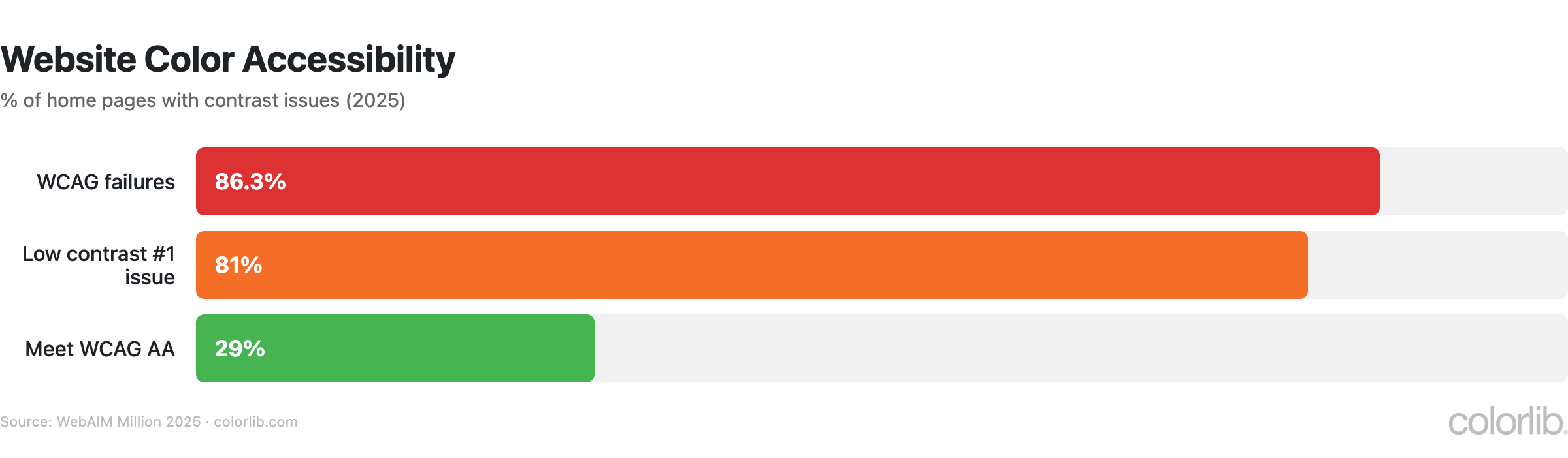
- 86.3% of home pages fail WCAG 2 color contrast requirements (WebAIM)
- 46% of consumers judge credibility by website design — color is the #1 factor (Stanford)
- Google tested 41 shades of blue for links — the winner generated $200 million in extra revenue
Most Popular Website Colors
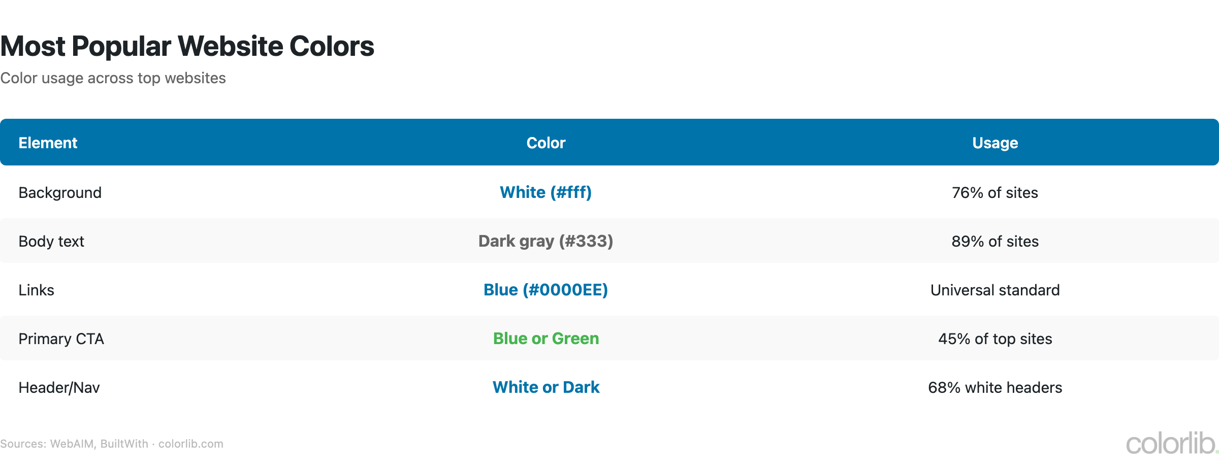
| Element | Most Common Color | Usage |
|---|---|---|
| Background | White (#FFFFFF) | 76% of websites |
| Text | Dark gray/Black | 90%+ of websites |
| Links | Blue | Web default since 1993 |
| Primary CTA buttons | Blue, Green, Orange | Varies by industry |
| Navigation | White or Dark | Split ~50/50 |
| Footer | Dark gray/Black | 70%+ of websites |
Brand Color Usage on Websites
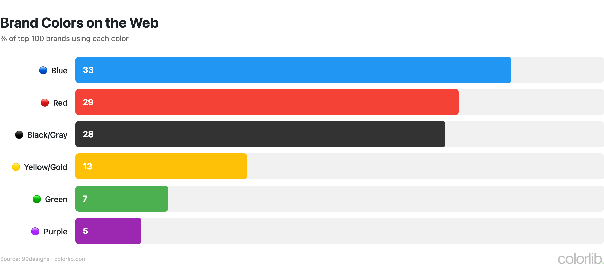
| Color | % of Top 100 Brands | Industry Dominance |
|---|---|---|
| 🔵 Blue | 33% | Finance, tech, healthcare |
| 🔴 Red | 29% | Food, retail, entertainment |
| ⚫ Black/Gray | 28% | Luxury, fashion, automotive |
| 🟡 Yellow/Gold | 13% | Energy, fast food, optimism |
| 🟢 Green | 7% | Health, organic, environment |
| 🟣 Purple | 5% | Luxury, creativity, wellness |
- 95% of top brands use only 1-2 colors in their logo
- Consistent brand colors increase revenue by up to 23% (Forbes/Lucidpress)
- Color increases brand recognition by 80% (University of Loyola)
- 75%+ of major banks use blue; fast food chains use red + yellow
- Black logos perceived as 50% more luxurious (Reboot)
Dark Mode Statistics
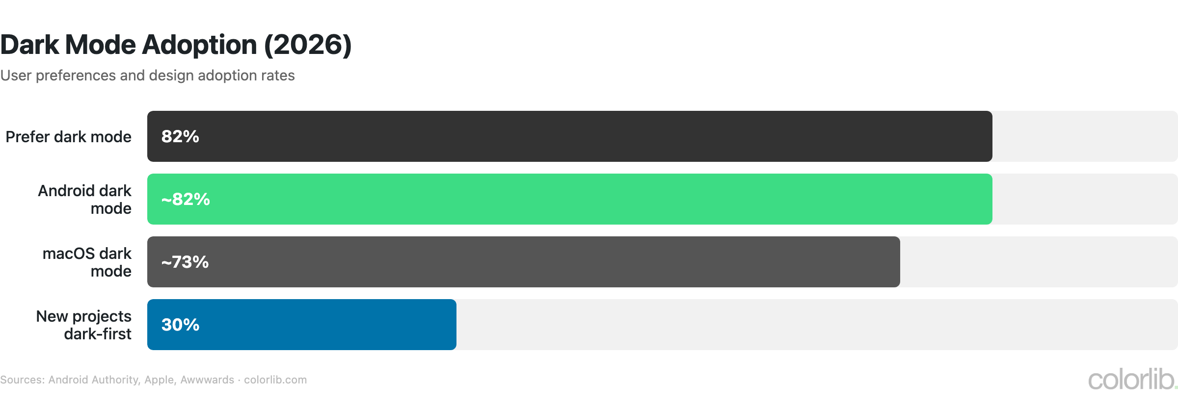
| Statistic | Value | Source |
|---|---|---|
| Users who prefer dark mode | 82% | Android Authority |
| New web projects specifying dark mode-first | 30% (up from 8% in 2021) | Awwwards |
| macOS users with dark mode enabled | ~73% | Apple analytics |
| Android users with dark mode | ~82% | Google I/O 2023 |
| OLED screens showing pure black | 0 watts per pixel (energy saving) | Display technology specs |
| Battery savings with dark mode on OLED | Up to 39-47% | Purdue University |
Color & Conversion Rates
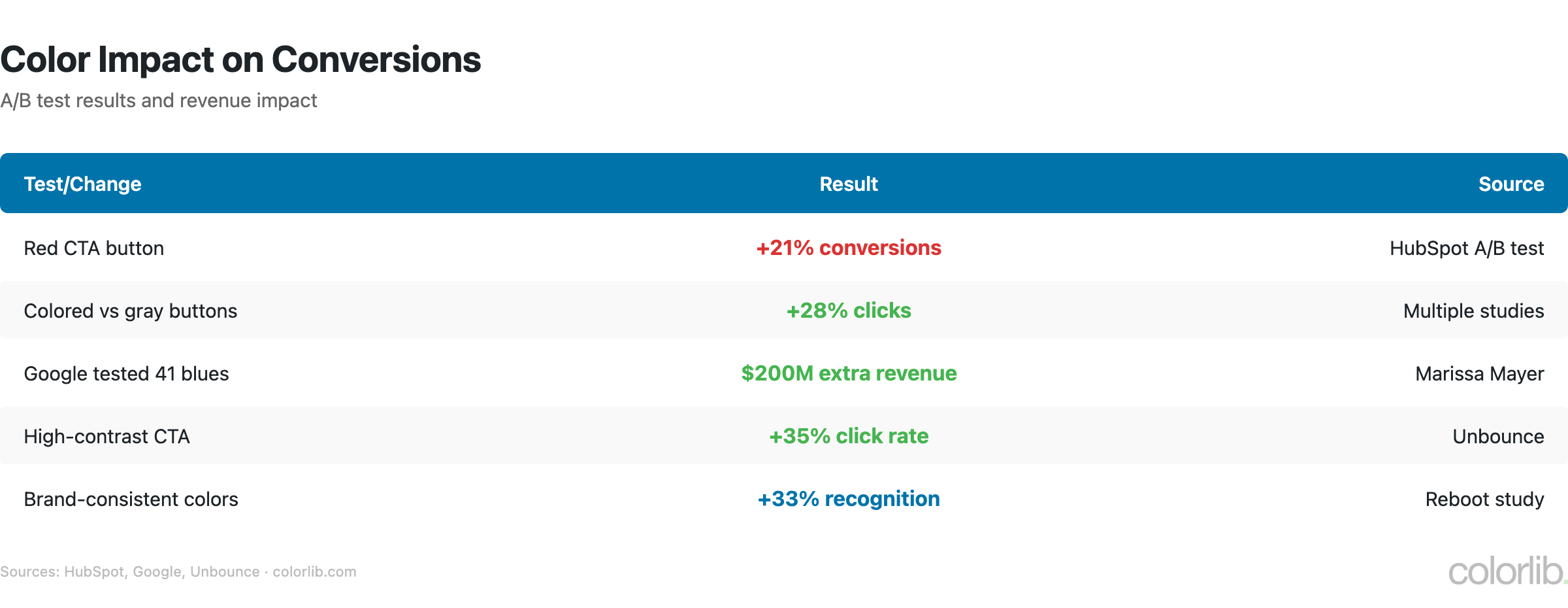
| Test / Finding | Result | Source |
|---|---|---|
| Red CTA button vs green | +21% conversions | HubSpot |
| Google’s 41 shades of blue test | $200 million extra revenue | The Guardian |
| Color ads vs black & white | +42% readership | Xerox |
| Colored email buttons vs text links | +28% CTR | Campaign Monitor |
| Green “free shipping” badge vs red/blue | +14% conversions | Baymard |
| High-contrast combinations | +40% readability | W3C WCAG |
| Poor aesthetics causing site abandonment | 39% stop engaging | Adobe |
| Design as #1 credibility factor | 46% of consumers | Stanford |
Color Accessibility Statistics
| Statistic | Value | Source |
|---|---|---|
| Home pages with WCAG 2 failures | 86.3% | WebAIM Million 2025 |
| Low contrast text as #1 issue | 81% of pages | WebAIM Million 2025 |
| Sites meeting WCAG AA contrast | Only 29% | WebAIM Million 2025 |
| People with color vision deficiency | 300 million worldwide | Color Blind Awareness |
| Men with color blindness | 8% (1 in 12) | NEI |
| Women with color blindness | 0.5% (1 in 200) | Color Blind Awareness |
| WCAG minimum contrast ratio (AA) | 4.5:1 for normal text | W3C |
Design takeaway: Never rely on color alone to convey information. Use labels, patterns, and icons alongside color. Test with a color blindness simulator before launching.
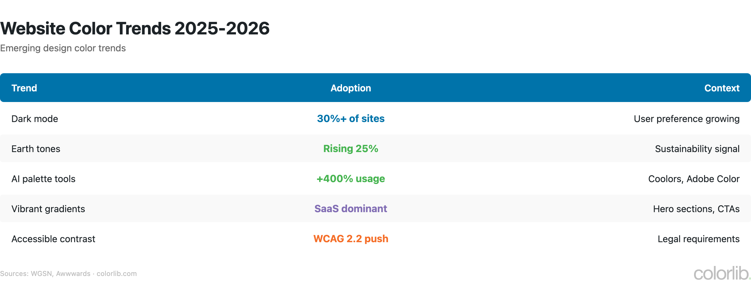
Website Color Trends 2025-2026
| Trend | Adoption / Growth | Source |
|---|---|---|
| Dark mode-first design | 30% of new projects | Awwwards |
| Earth tones & natural palettes | Dominant in 2025-2026 | Shutterstock |
| Pantone 2025: Mocha Mousse | Warm brown trending | Pantone |
| Digital Lavender | Top tech interface color | WGSN |
| AI color palette tools | +400% usage growth | Coolors |
| Gradient resurgence | Instagram/Stripe-style gradients | Design industry trend |
| Neon/bold accents on dark BG | Growing in SaaS & tech | Design industry trend |
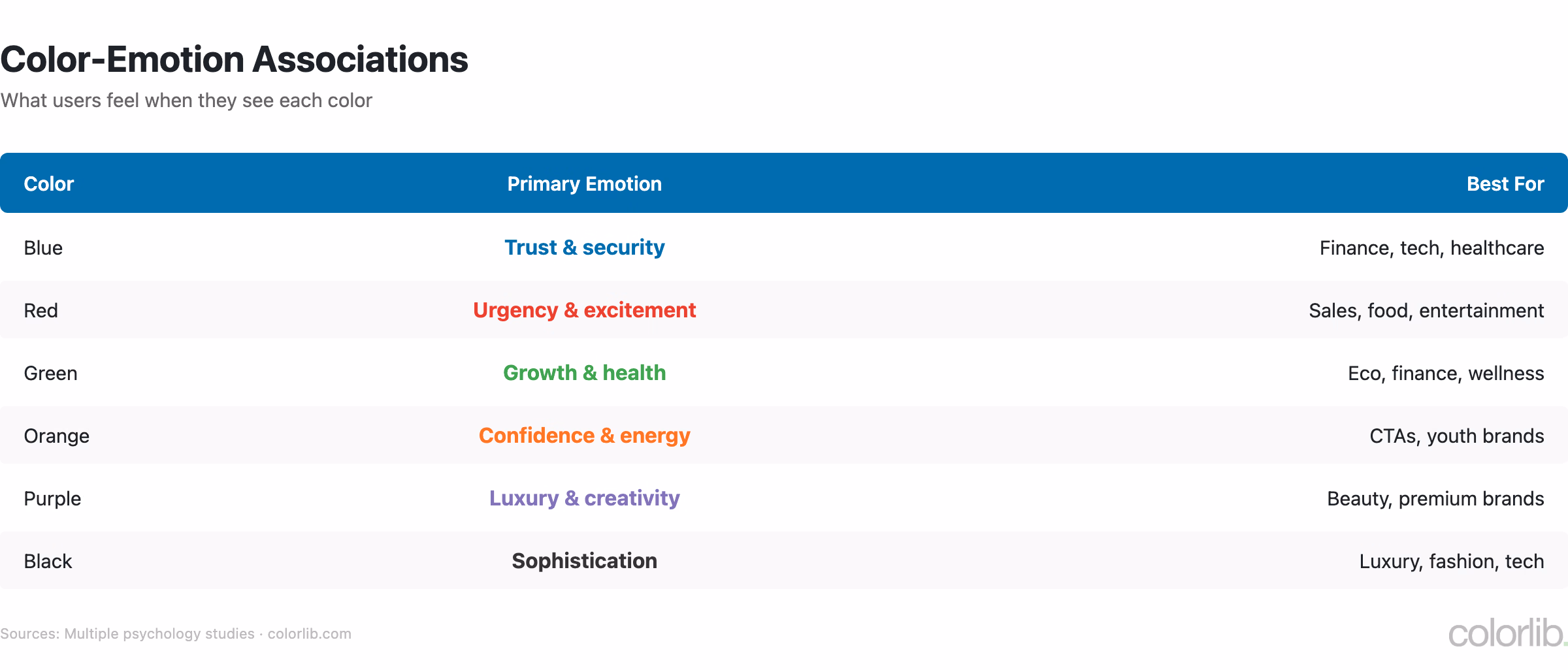
Color Psychology for Websites
| Color | Emotion / Association | Best For |
|---|---|---|
| 🔵 Blue | Trust, security, calm | Finance, tech, healthcare, SaaS |
| 🔴 Red | Urgency, passion, appetite | Food, sales, CTAs, clearance |
| 🟢 Green | Growth, health, nature | Organic, wellness, finance, eco |
| 🟡 Yellow | Optimism, attention, warning | Accents, notifications, highlights |
| 🟣 Purple | Luxury, creativity, wisdom | Beauty, premium brands, education |
| 🟠 Orange | Energy, friendliness, urgency | CTAs, ecommerce, entertainment |
| ⚫ Black | Elegance, power, sophistication | Luxury, fashion, photography |
| ⬜ White | Clean, minimal, spacious | Backgrounds, healthcare, tech |
For a deeper dive into how color affects behavior and purchasing, see our Color Psychology Statistics article with 70+ sourced stats.
Key Takeaways
- White + blue is the web’s default palette — and for good reason. White backgrounds maximize readability, blue links maximize trust and clicks.
- Dark mode is no longer optional. 82% prefer it. Support both light and dark or lose a significant portion of your audience.
- Color accessibility is a crisis. 86.3% of websites fail basic contrast checks. 300 million people have color vision deficiency. Fix this before anything else.
- Small color changes drive big results. Google made $200M from finding the right shade of blue. Test your colors, don’t assume.
- Consistency pays 23% more. Use your brand colors everywhere — website, email, social, ads.
Sources
- WebAIM — The WebAIM Million 2025
- 99designs — Brand Color Analysis
- Colorcom — Why Color Matters
- Stanford Persuasive Technology Lab
- HubSpot — Button Color A/B Test
- Pantone — Color of the Year 2025
- W3C — WCAG 2.1 Contrast Requirements
Frequently Asked Questions
What is the best color for a website background?
White is used by 76% of websites and provides the best readability. However, with 82% of users preferring dark mode, offering both light and dark options is becoming essential.
What color gets the most clicks?
Blue consistently gets the most clicks for links and CTAs. Google tested 41 shades and found the optimal one generated $200 million in extra ad revenue. For buttons, red can outperform green by 21% depending on context.
What percentage of websites fail color accessibility?
86.3% of home pages have detectable WCAG 2 failures, with low contrast text being the #1 issue on 81% of pages. Only 29% of websites meet WCAG AA color contrast requirements.
Should I use dark mode on my website?
Yes — 82% of users prefer dark mode when available. 30% of new web projects now specify dark mode-first design. On OLED screens, dark mode saves up to 39-47% battery life.
For more design insights, see our Color Psychology Statistics, Web Design Statistics, and browse our free WordPress themes for color inspiration.
Related Posts


Comments (0)