18 Best Wix Ecommerce Store Examples (In 2026)
Are you interested in starting an eCommerce website and need to see the best Wix store examples first?
We just finished analyzing 100 websites to curate a collection of the 19 best.
These cover a wide variety of web designs for your convenience with one goal in mind: To create a strong impression on potential buyers.
The best part is that creating an online store like the ones below (with your added tweak) is easy with Wix.
But if you’d like to experience other great options, then check our lists of the best eCommerce WordPress themes and eCommerce website builders. (We recommend a WP theme if you want the ultimate freedom.)
Best Wix eCommerce Store Examples
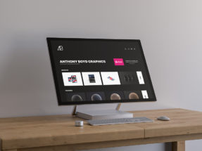
1. Copper & Brass
Built with: Wix
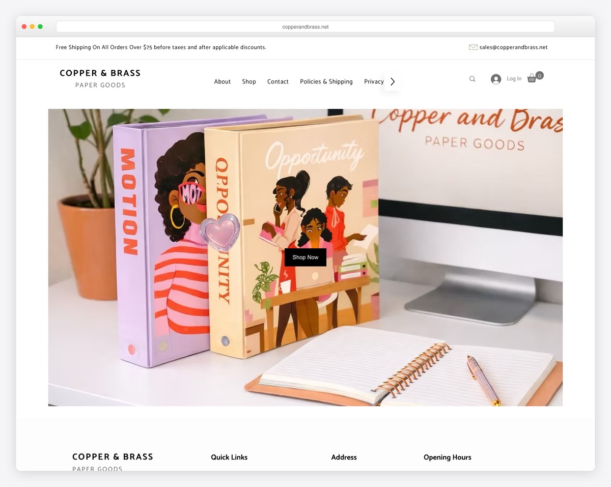
Copper & Brass is a clean and modern eCommerce website with a top bar notification and a header with a drop-down menu, a shopping cart icon, and a search bar. Both are at the top of the screen.
It has a welcoming hero image and text and a newsletter subscription form promoting a discount on your next order.
You’ll also find a floating chat widget in the bottom right corner and an average store rating for social proof.
Note: Add a top bar to promote a special offer, free shipping, etc.
You might also want to check these superb clean websites if simplicity matters to you.
What stands out: Parallax scrolling adds visual depth and encourages visitors to keep exploring.
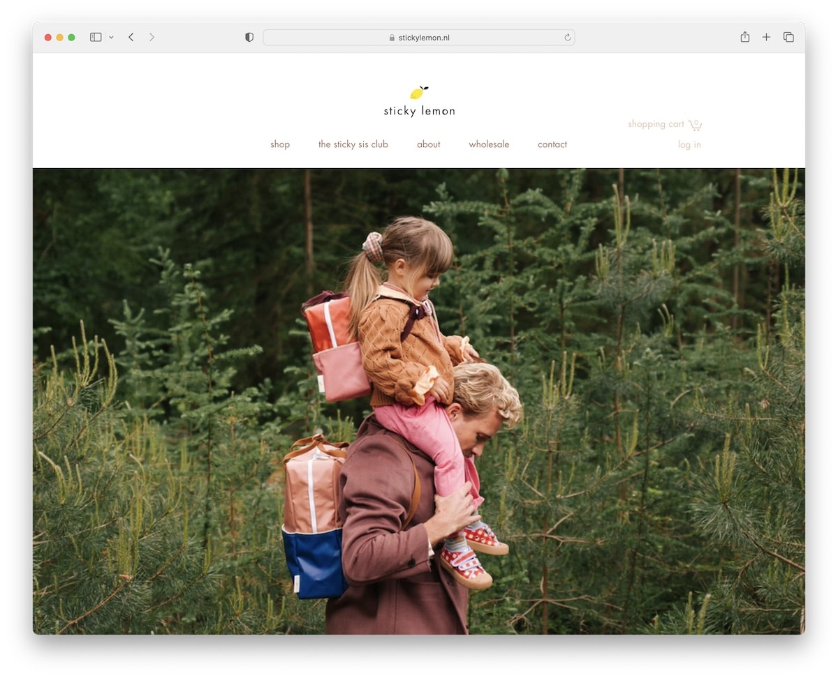
2. Sticky Lemon
Built with: Wix
Sticky Lemon creates a solid first impression with a large image slider without text and call-to-action buttons. It’s for pure enjoyment.
This Wix store example also includes an embedded video that auto-plays and an Instagram feed with lightbox functionality.
The header and the footer are minimalist, with the necessary quick links, social media and a subscription form.
Note: Create a big slideshow to capture potential customers’ attention without being too salesy.
What stands out: Scroll-triggered animations guide the eye through each section without overwhelming the visitor.
3. Vivi Et Margot
Built with: Wix
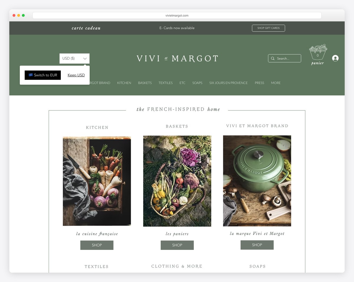
Vivi Et Margot uses a popup to promote a discount in exchange for your email, but you can also click “no thanks.”
Besides the navbar, the header has a search with live results/recommendations to make finding items quicker.
Moreover, the Instagram grid has a “load more” button to view more image and video posts. If you click any of the thumbnails, a lightbox opens to view entire posts without leaving the current page.
Note: Embedding an IG feed is a great way to add more content to your Wix store. (This can also help grow your profile.)
What stands out: Layered parallax effects create a sense of movement that makes scrolling feel dynamic.
4. Izzy Wheels
Built with: Wix
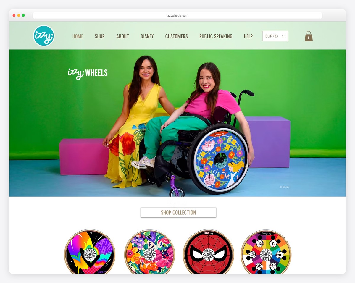
Izzy Wheels is a vivid Wix store example with an image-heavy home page and a transparent floating header.
The latter has a navigation bar, a cart icon and a currency switcher for a better user experience.
Instead of customer testimonials, Izzy Wheels features authority mentions to build trust, with an additional banner of big publishers’ logos.
Note: You can ensure a better online shopping experience with a sticky header because of quicker navigation.
What stands out: The dark color scheme gives the site a sleek, modern feel that makes imagery pop.
5. Gay’s The World
Built with: Wix
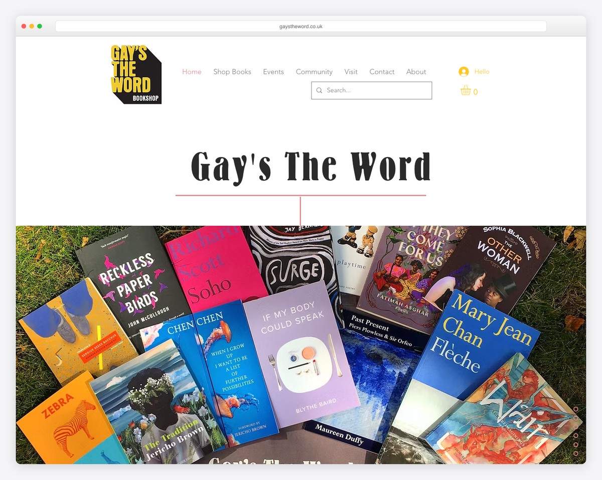
Gay’s The World is a Wix store website that sticks to simplicity but spices things up with vivid colors. It also has a slider and a vertical “pagination” in the bottom right corner to jump from section to section more easily.
The footer stands out with its yellow background, highlighting social icons, location, quick links and newsletter subscription form.
Note: Instead of using animations and special effects to enliven your web shop, create an energizing website color scheme.
What stands out: A hero slider showcases multiple offerings at a glance, giving visitors quick access to key content.
6. Indian Summer
Built with: Wix
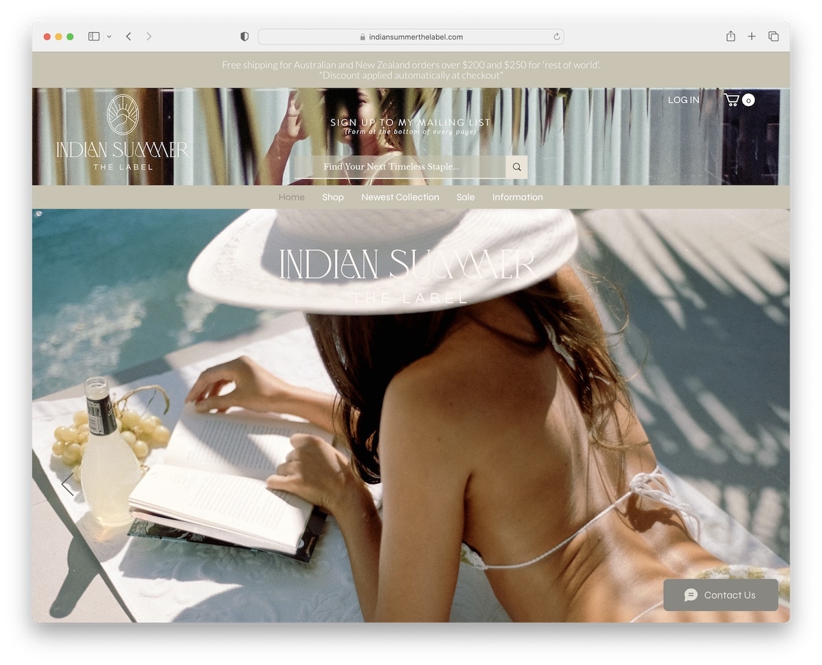
Indian Summer is a parallax scrolling website that ensures more engaging scrolling and shopping. The header has a background image with a live search recommendation, but you can enjoy a broader search using the navigation bar.
Indian Summer’s entire Instagram profile is embedded on the home page, and a “see more” button loads past posts. You can also always send them a message via the sticky chat widget.
Note: Add depth to your Wix store with a parallax effect, making it more immersive.
What stands out: The background video creates an immersive first impression that immediately sets the mood.
7. Coal And Canary
Built with: Wix
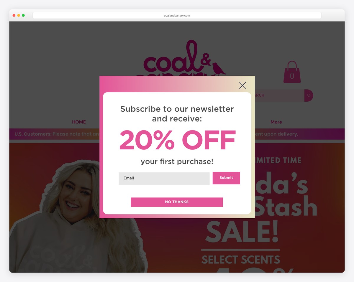
Coal And Canary is all about the details and branding while keeping the main design simple and easy, so all the content and items come more front and center.
It has integrated reviews and ratings to build trust and an IG feed to easily connect with the brand on social media. The notification bar at the top has sliding text, and the hero section has an image slider.
Last but not least, the footer contains a language switcher that translates the page with a button click.
Note: If you have many foreign customers, add language and currency switchers for a more personalized online shopping experience.
What stands out: The image carousel keeps the above-the-fold area dynamic without requiring visitors to scroll.
8. Evolve
Built with: Wix
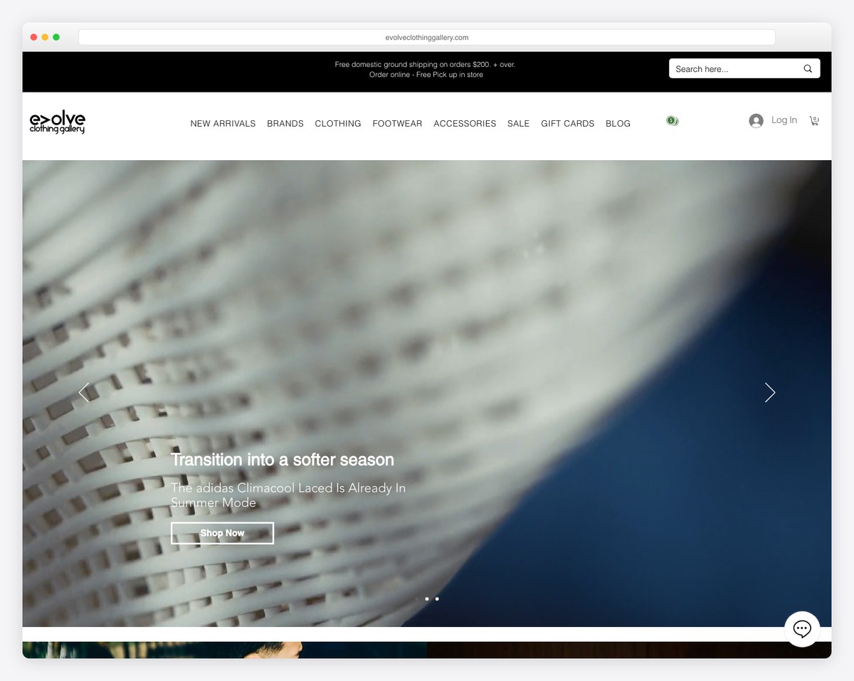
Evolve’s eCommerce web design is full-screen, with a parallax hero image to capture attention and make scrolling more enjoyable.
But one of the main features separating this Wix store example from the rest is the dark look. It instantly creates a more premium feel.
Multiple sections for a more organized structure, product carousels, hover effects and a sticky top bar and header are all available to examine further.
Note: If you want to do something different but don’t know what that might be, create a dark online shop.
What stands out: Full-screen video on the homepage draws visitors in before they even start scrolling.
9. Celiab
Built with: Wix
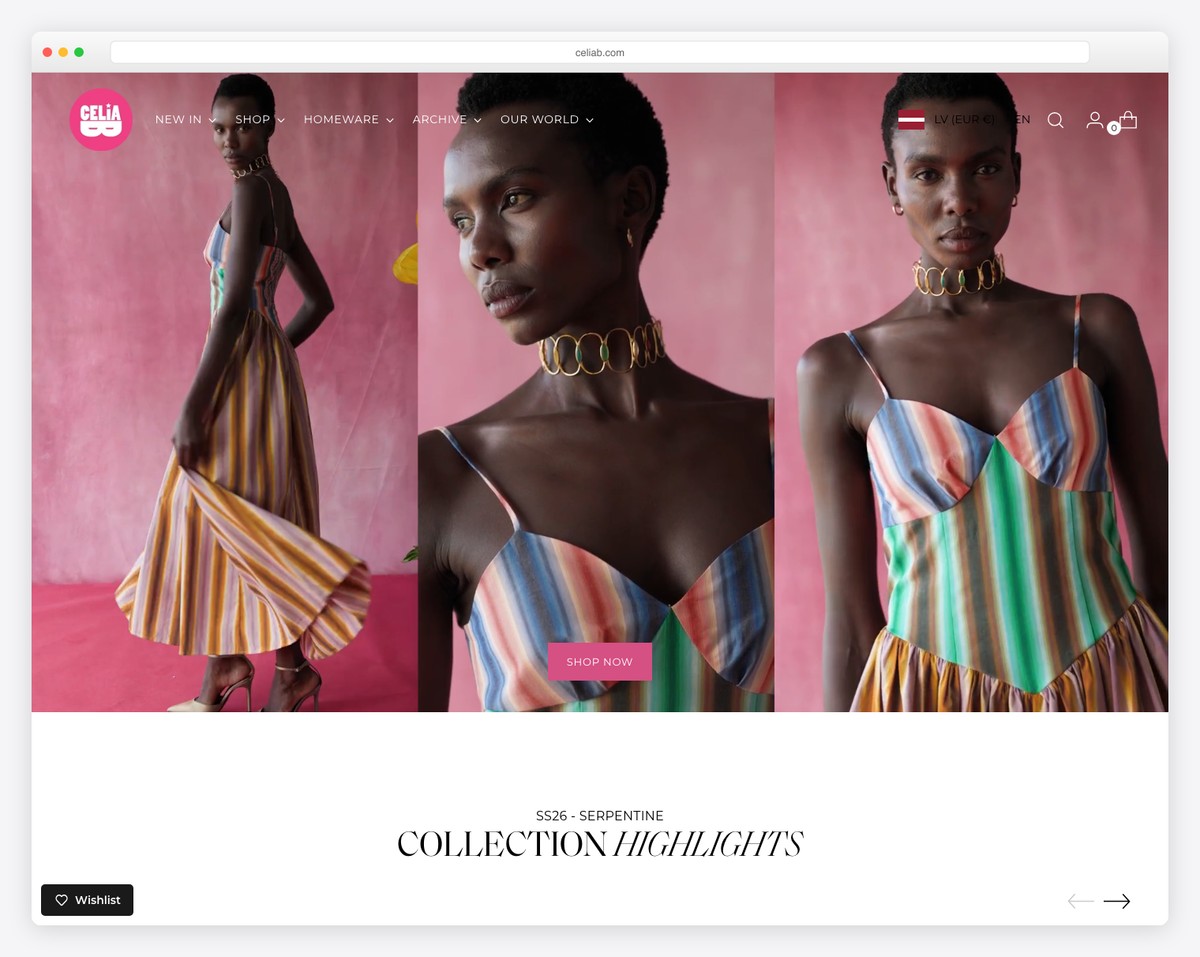
Instead of an image or a slideshow, Celiab uses a video above-the-fold to spark interest. And to not distract your viewing experience, there’s only a small CTA button at the bottom, with a hover effect to make it more clickable.
The other cool thing about Celiab is the large header that hides when you go down and shows when you go back up. (Otherwise, that massive header would be too distracting.)
Additionally, the simple footer has a subscription form, contact details and social buttons.
Note: Deliver your message quickly and appealingly with a hero video background.
What stands out: A dark background paired with bold accent colors creates striking visual contrast.
10. Valeria Monis
Built with: Wix
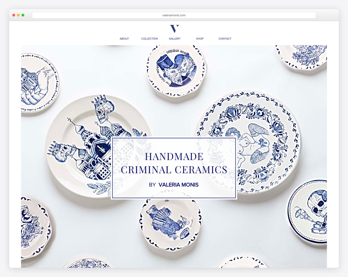
Valeria Monis is an elegant Wix store example with a minimalist appearance. The hero image has a parallax effect to create a stronger first impression.
The header has a white background like the rest of the website, which makes the overall look much neater. Plus, it sticks, so menu links are always at your disposal.
Note: Creating a minimalist webshop design is one way to make your products stand out more.
What stands out: Built-in booking functionality turns the website into a 24/7 appointment scheduler.
11. Michal Oren Jewelry
Built with: Wix
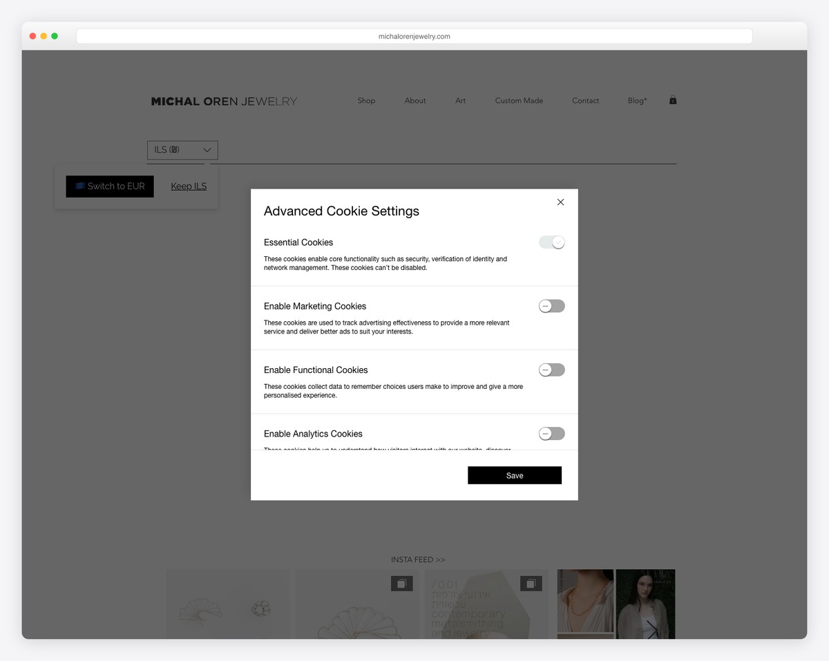
Michal Oren Jewelry’s online store has a boxed layout with a light scheme, except for the footer, which is dark.
It has an organized and structured look that draws visitors’ attention to the content and products. You can choose between three currencies in the header and enjoy an IG post slider with a direct link to the profile.
The shop page has a grid layout where thumbnails show a secondary image on hover for interactivity.
Note: Maintain consistency and a clean look with a boxed website frame.
What stands out: Integrated appointment booking removes friction between browsing and converting.
12. Black Sheep
Built with: Wix
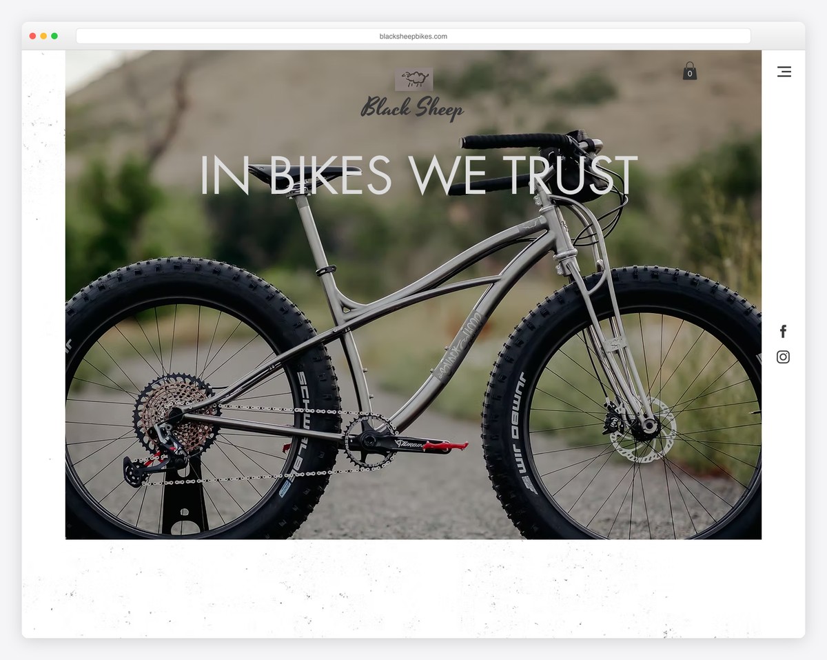
Black Sheep has three floating elements following you around; a hamburger menu icon, FB and IG buttons and a “let’s chat” widget.
The navigation opens a full-screen hamburger menu with jump links. Remember, Black Sheep is a one-page website, displaying all the content just a few scrolls apart.
Note: Improve your customer service with a live chat widget so potential buyers can get quick answers.
What stands out: Seamless e-commerce integration lets visitors go from browsing to buying without leaving the site.
13. Zelie For She
Built with: Wix
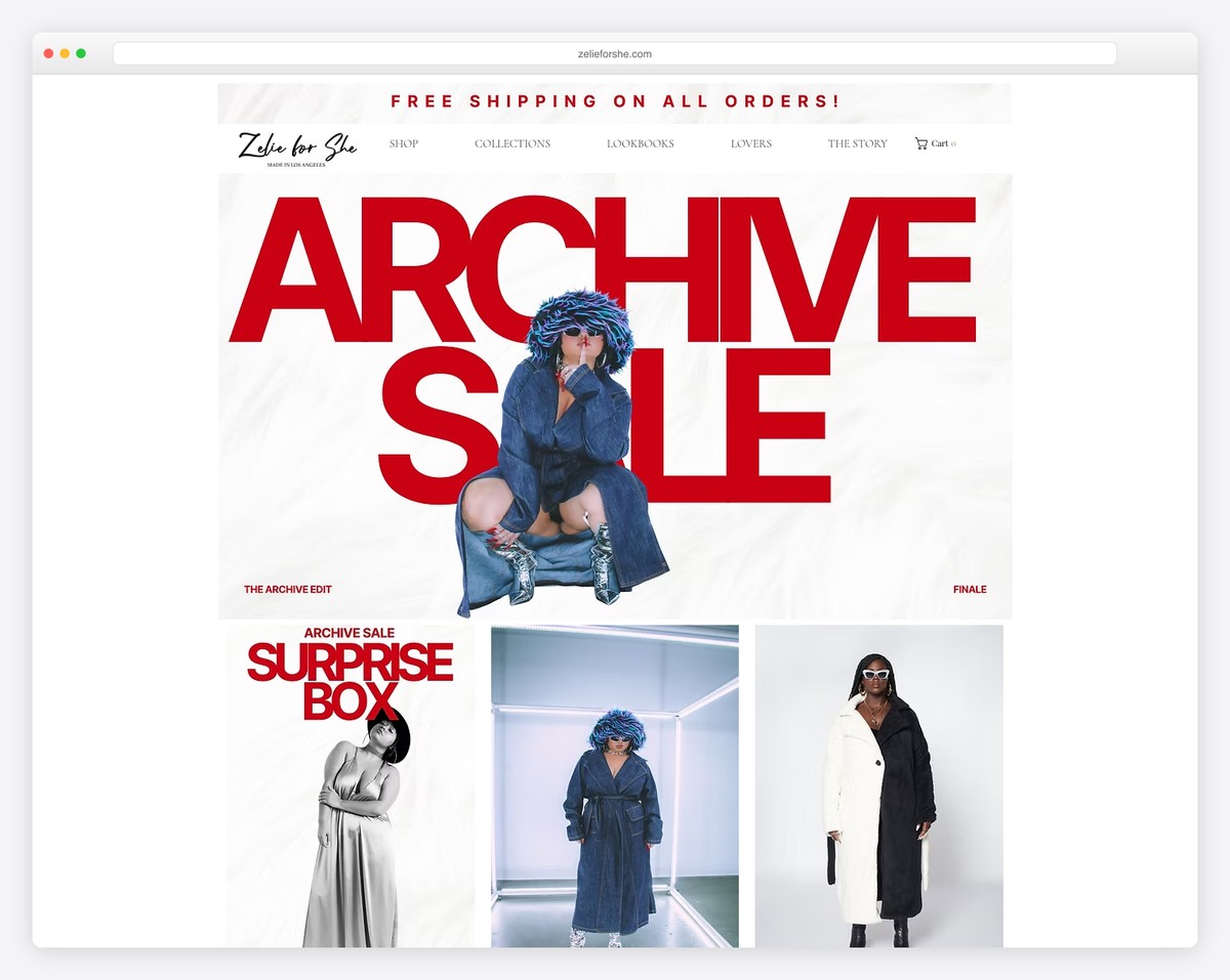
Zelie For She has a strong impact on all its visitors with a full-screen layout and large images (including the parallax effect).
The header and the top bar both float, so everyone can easily access shop pages, shopping cart, and more.
On the other side of this Wix store is a clean footer with outlined columns and a sign-up form. And to ensure Zelie For She is easily reachable on social media, FB, Twitter and IG icons stick on the right side of the screen.
Finally, the shop has a quick view function to check and add to the cart each item without leaving the current page.
Note: Make adding products to visitors’ shopping carts quicker with the quick view feature.
What stands out: Product listings with clear pricing and add-to-cart buttons simplify the purchase flow.
14. Studio Chocolate
Built with: Wix
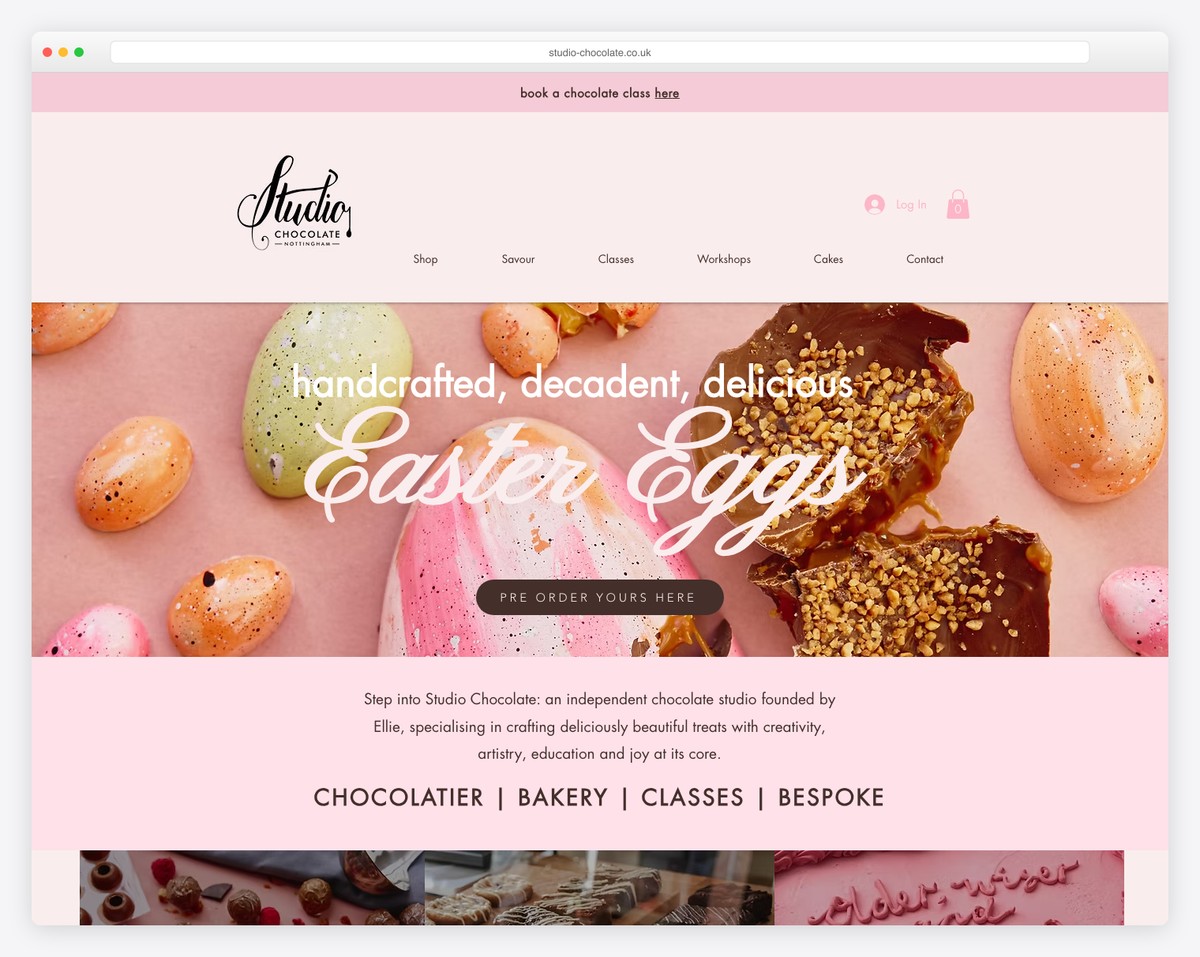
Studio Chocolate looks tasty from top to bottom. It has a floating header with a search bar (with autocomplete function) and a drop-down menu.
Below the header is a slideshow promoting services and products with overlayed text and call-to-action links.
The home page product grid has a “see more” button that loads more items without opening a new page.
Note: You can use a “see/load more” button instead of pagination to display more products on the current page.
What stands out: Intuitive navigation makes the site easy to explore even for first-time visitors.
15. Bonsie
Built with: Wix
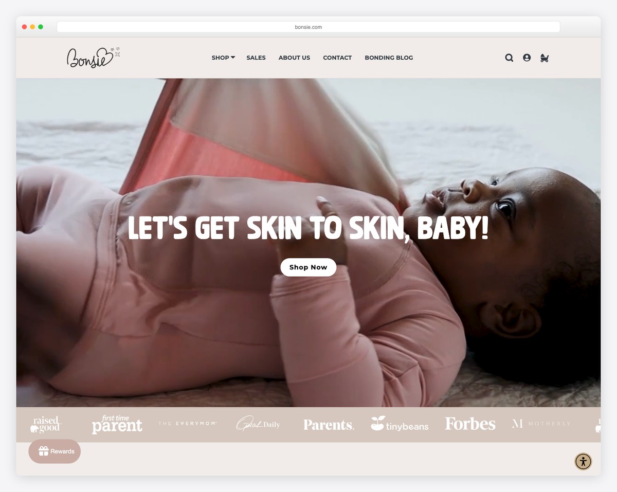
Bonsie has a big hero video with a CTA button that reacts on hover, making it more clickable. One unique feature of this Wix store example is the accessibility menu so visitors can configure and personalize the look.
Moreover, Bonsie creates a pleasant scrolling experience with content loading, catchy animations and graphics.
Note: Allow potential customers to modify your online shop’s look with the accessibility configurator.
What stands out: A prominent search function helps visitors find exactly what they need without scrolling through pages.
16. The Cloth Shop
Built with: Wix
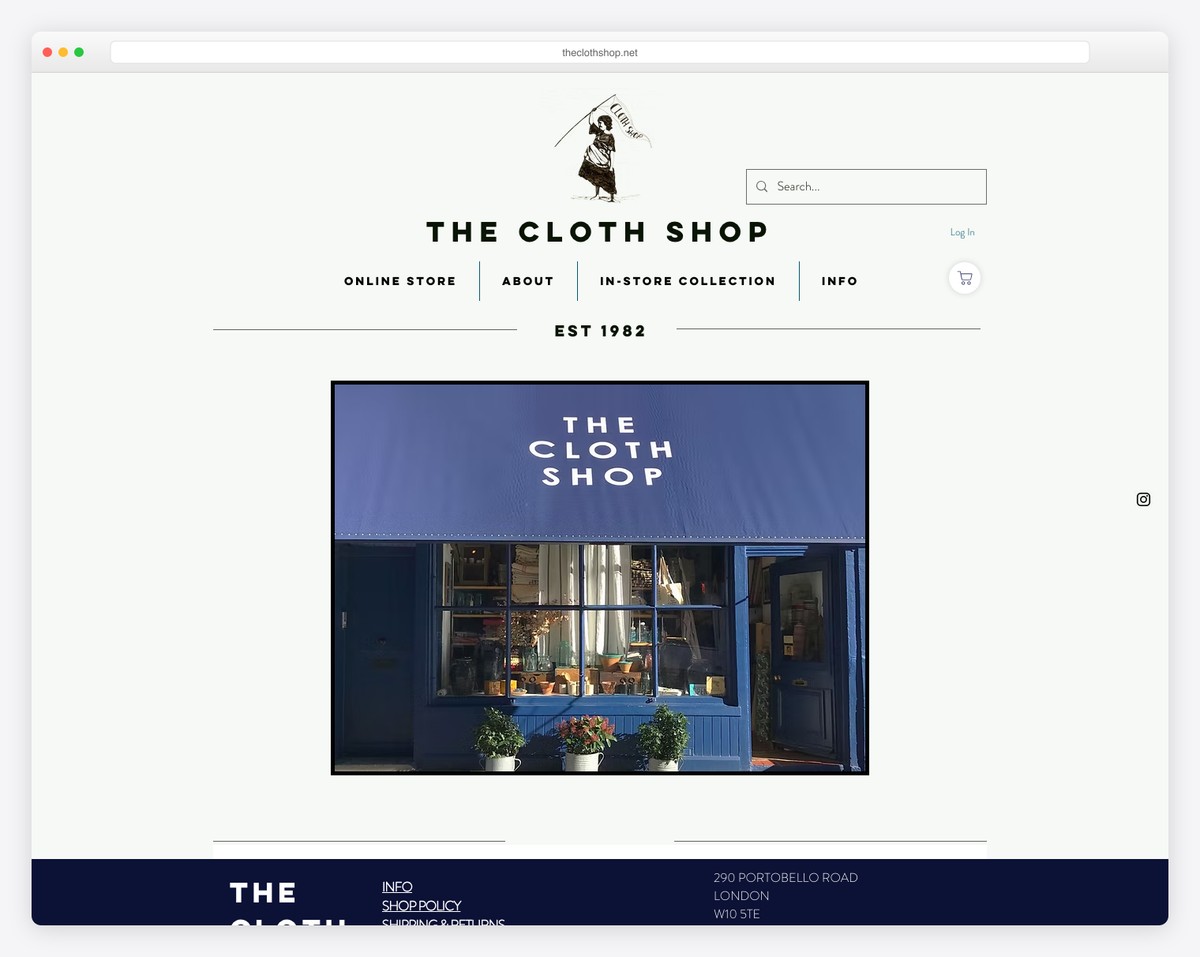
The Cloth Shop has a neat home page with a slider, a clean header and a contrasting footer with additional business details.
We’ll pay attention to the contact page, where you can find Google Maps with the exact location marker, making finding the shop much easier. (They also have transport recommendations—just in case.)
Note: If you have a brick and mortar, integrate Google Maps with your location and a “directions” link.
What stands out: The minimalist design keeps the focus on what matters most — the content itself.
17. Hair Comes The Bride
Built with: Wix
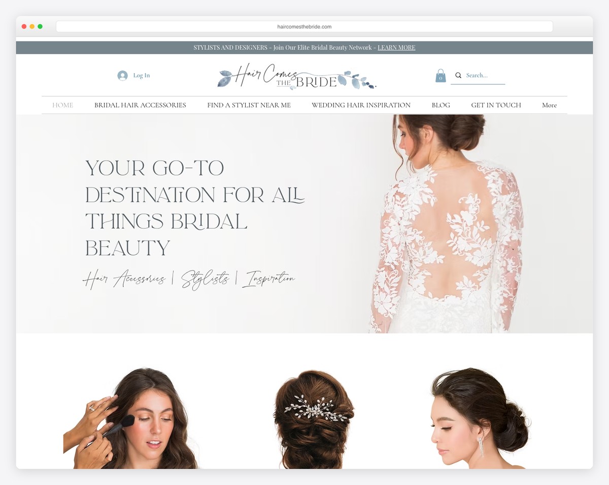
From parallax video to parallax image, Hair Comes The Bride has it both for maximum engagement.
The simple, light site design ensures products and services stand out nicely when you scroll the page, so your focus doesn’t get distracted.
We also like the blog section, where folks behind Hair Comes The Bride share tips, tricks, and more.
Note: Take your Wix store to the next level with a regularly updated blog (and enjoy more organic traffic).
Wix is not limited to just eCommerce. You can build membership and even community websites with it. Here are some Wix forum examples to see what other things can be made.
What stands out: A masonry grid layout organizes content attractively while maximizing screen real estate.
18. Haig’s of Rochester
Built with: Wix
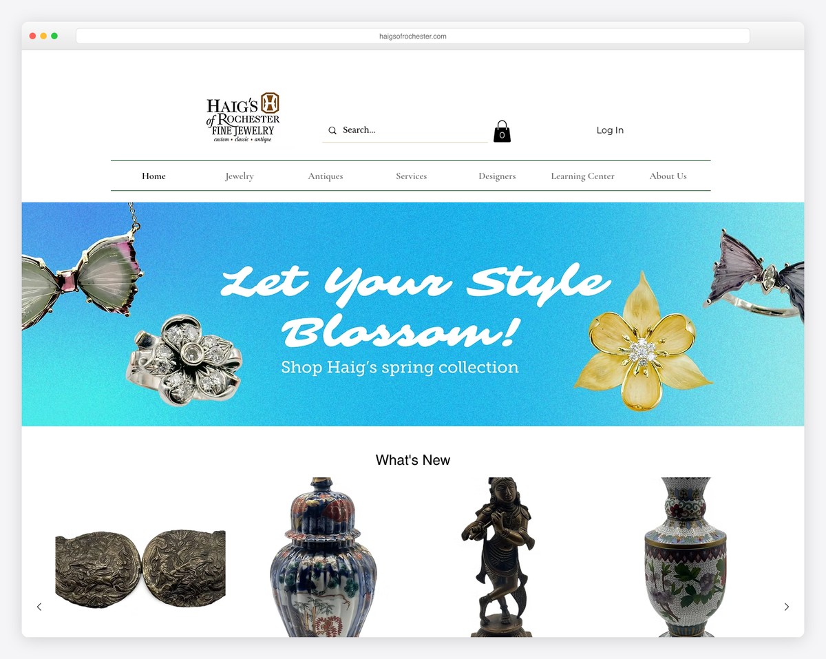
Haig’s of Rochester is a fine jewelry and antique store in Downtown Rochester, Michigan, selling curated estate jewelry, vintage pieces, and antique objects of art. The Wix store features elegant product photography against clean backgrounds that let the craftsmanship of each piece shine.
The store design balances a luxurious feel with accessible navigation — categories like Estate Jewelry, Antiques, and New Arrivals make browsing intuitive. The integration of curbside pickup and local delivery options shows how brick-and-mortar shops can extend their reach through Wix’s ecommerce features.
What stands out: For luxury and antique retailers, clean product photography on white backgrounds with detailed descriptions builds the trust needed for high-value online purchases where customers can’t hold items first.
Related Posts


Comments (0)