21 Best Premium Squarespace Templates 2026
Do you need the best premium Squarespace templates to elevate your website from regular to extraordinary?
That’s when this list comes into play.
If you’re looking for the perfect blend of aesthetics and functionality, we have something that will surely catch your attention.
These premium templates cater to diverse needs, whether you’re setting up an online store, launching a portfolio, or creating a hub for your community.
Not only that, but they also ensure your site stands out in the digital crowd.
With a focus on design, usability, and cutting-edge features, each template we’ve handpicked embodies the essence of Squarespace’s sleek and user-friendly ethos and brings something unique to the table.
We’re here to guide you through the best of the best, helping you make an informed decision that aligns with your vision.
This post covers:
- Best Premium Squarespace Templates
- How To Easily Make A Website With Squarespace
- FAQs About Squarespace Templates
- What makes premium Squarespace templates different from free ones?
- Can I switch templates on Squarespace after I’ve built my site?
- Is Squarespace suitable for eCommerce websites?
- Can I use a custom domain name with Squarespace?
- Does Squarespace provide SEO tools?
- Are Squarespace websites mobile-friendly?
Best Premium Squarespace Templates
Dive into our curated selection of the finest Squarespace templates, each a masterpiece of design and effectiveness.
Discover the perfect template that resonates with your brand and sets the foundation for your online success.
1. Cedar

The Cedar template shines with its text-heavy design, embracing a minimalist aesthetic that captivates through simplicity.
Its sections are set apart by contrasting backgrounds, guiding the eye smoothly from one area to the next.
Animated text elements add a dynamic touch, while the template maintains a basic header for undistracted navigation.
The expansive footer is thoughtfully designed, housing essential links, social media icons, and a subscription form.
Cedar is an ideal choice for content-focused websites seeking elegance and functionality.
More info / Download Demo2. Reseda
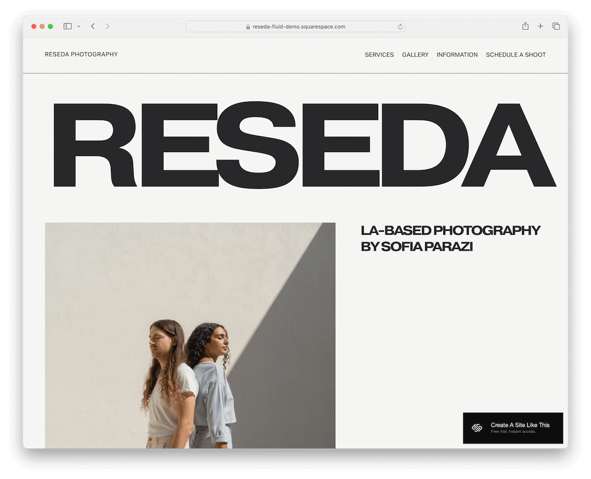
The Reseda premium Squarespace template is a testament to modern simplicity. It strongly emphasizes vivid imagery and generous use of white space, creating a serene user experience.
Its floating header offers seamless navigation, while thin lines delicately mark each section, adding to its elegant layout.
The contrasting black footer anchors the design, providing a visually striking conclusion. (Check these website footer examples. for more inspiration)
Unique to Reseda is the integrated “Schedule a shot” booking form, which makes it ideal for photographers and visual artists who want to book sessions effortlessly.
Note: See more amazing examples of simple websites.
More info / Download Demo3. Mariana
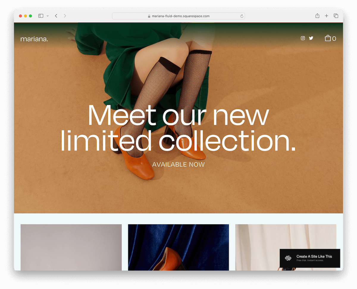
The Mariana template grips with its dynamic content loading, revealing more as you scroll, keeping users engaged.
Its transparent sticky header blends seamlessly with any content, enhanced by convenient social and shopping cart icons for a cohesive online presence.
The minimal footer ensures the focus remains on the content. At the same time, the elegant lightbox gallery feature beautifully showcases images.
Mariana is perfect for online stores, portfolios, and creatives seeking sophistication and interactivity.
More info / Download Demo4. Bloom
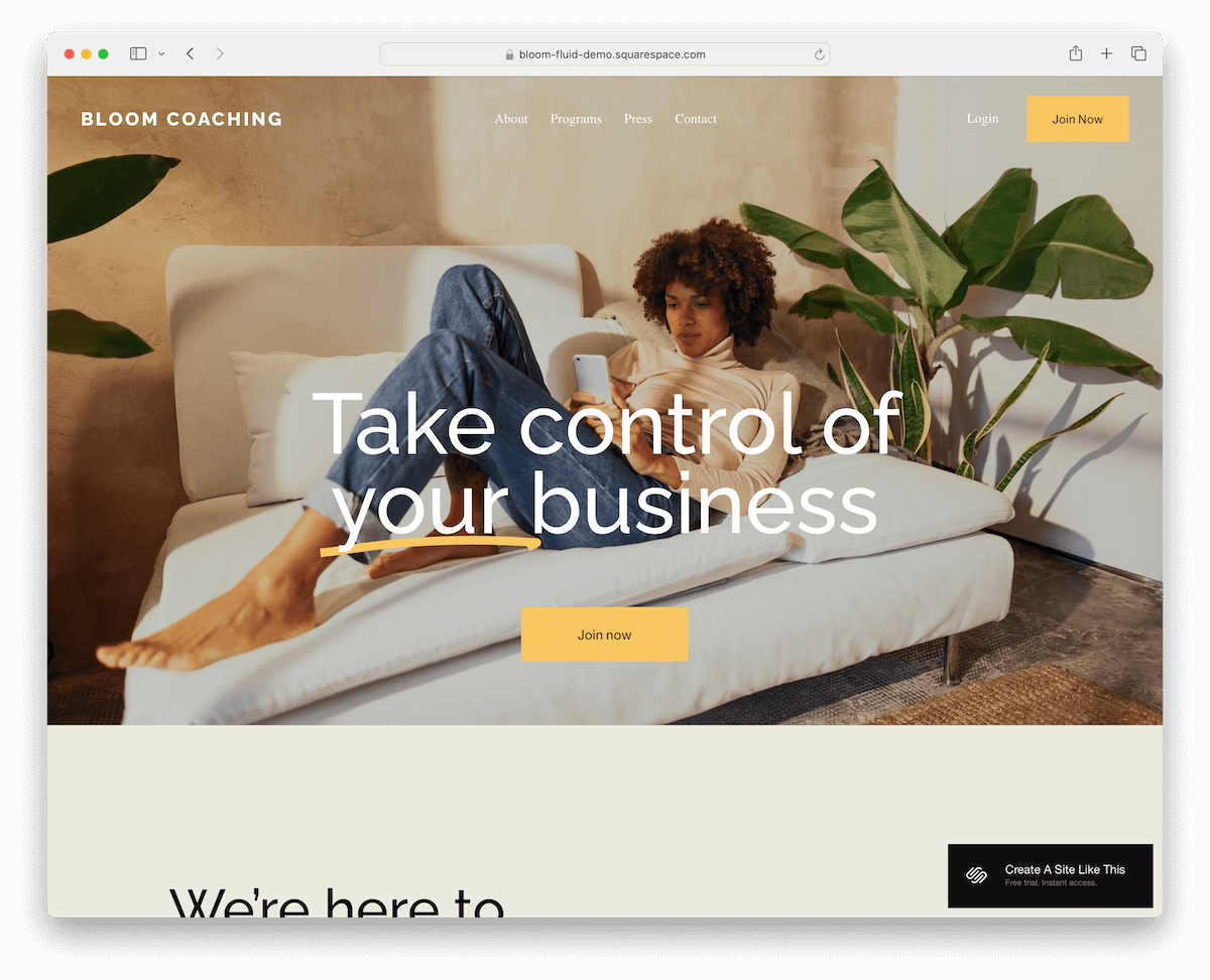
Bloom stands out with its fetching full-width image background section, setting a striking tone right above the fold.
Its transparent header merges seamlessly with the vibrant visuals, complemented by a prominent CTA button in the navbar for immediate engagement.
The template features a distinctive testimonial section, adding a personal touch and credibility.
A simple footer with essential links rounds off the design, ensuring a clean, uncluttered UX.
Bloom is for businesses aiming to make a strong visual impact.
More info / Download Demo5. Klipsan
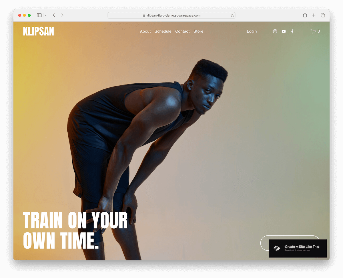
Klipsan WOWs with its full-screen image background, creating an immersive experience right from the get-go.
The template’s transparent header transitions to a solid, sticky format upon scrolling, offering aesthetics and functionality.
Its dark design, punctuated by a brightly lit section, infuses the layout with a dynamic contrast.
The integrated “Schedule a visit” form, complete with a date picker, alongside well-crafted About, Contact, and Shop pages, makes Klipsan ideal for businesses seeking a bold online presence.
More info / Download Demo6. Forma
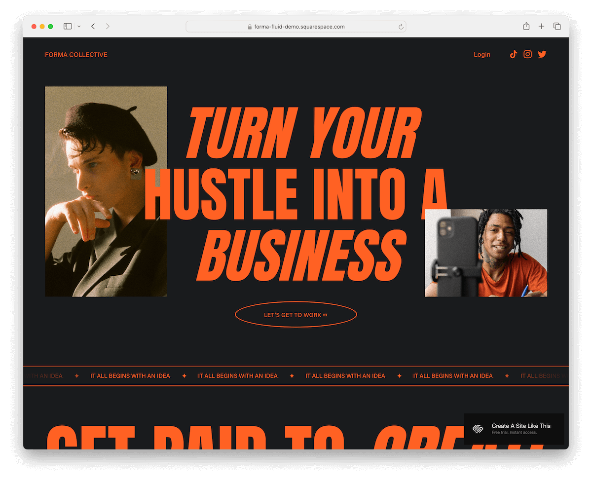
Forma shines with its sophisticated dark design, emphasizing bold typography and well-defined sections for a compelling visual narrative.
Animated text and on-scroll content loading add a dynamic layer, engaging visitors as they explore the one-page layout.
Its inclusion of neatly organized pricing packages offers clarity for services, while the seamless integration of a contact form invites easy inquiries.
Forma’s cohesive design is perfect for businesses and freelancers looking to present their offerings in a sleek, modern, and interactive manner.
Note: Take a peek a these impactful black websites to boost inspiration.
More info / Download Demo7. Oranssi
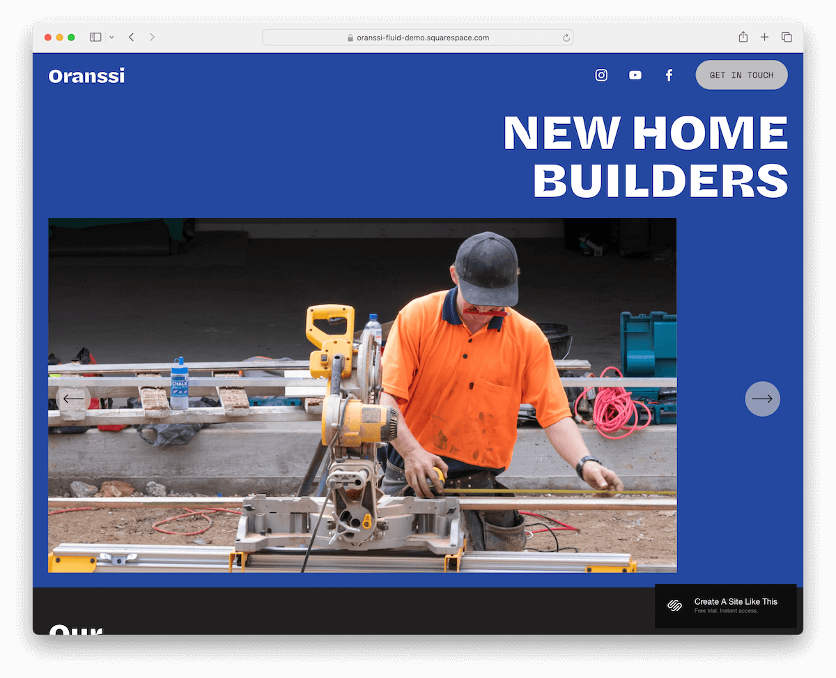
Oranssi makes a hit with its unique color palette, blending black, blue, and light grey for a visually striking impact.
Its floating header, adorned with social icons and a CTA button, ensures essential links are always within reach.
Above the fold, a slider showcases key content, while a project carousel and testimonial slider add dynamic elements to the user journey.
The footer, with its cool, animated background, rounds off the design, making Oranssi perfect for those looking for a template that combines professionalism with a touch of flair.
More info / Download Demo8. Selene

Selene masterfully balances large images with concise text, enhanced by ample white space for optimal readability.
Its innovative header vanishes as you scroll down, maintaining focus on content, yet reappears when scrolling up for easy navigation.
The template boasts a testimonial slider, adding a personal touch and credibility.
A feature-rich footer completes the design, offering quick access to links, contact details, and a subscription form.
Selene is for those who need a visually spacious yet content-rich online presence.
More info / Download Demo9. Clove
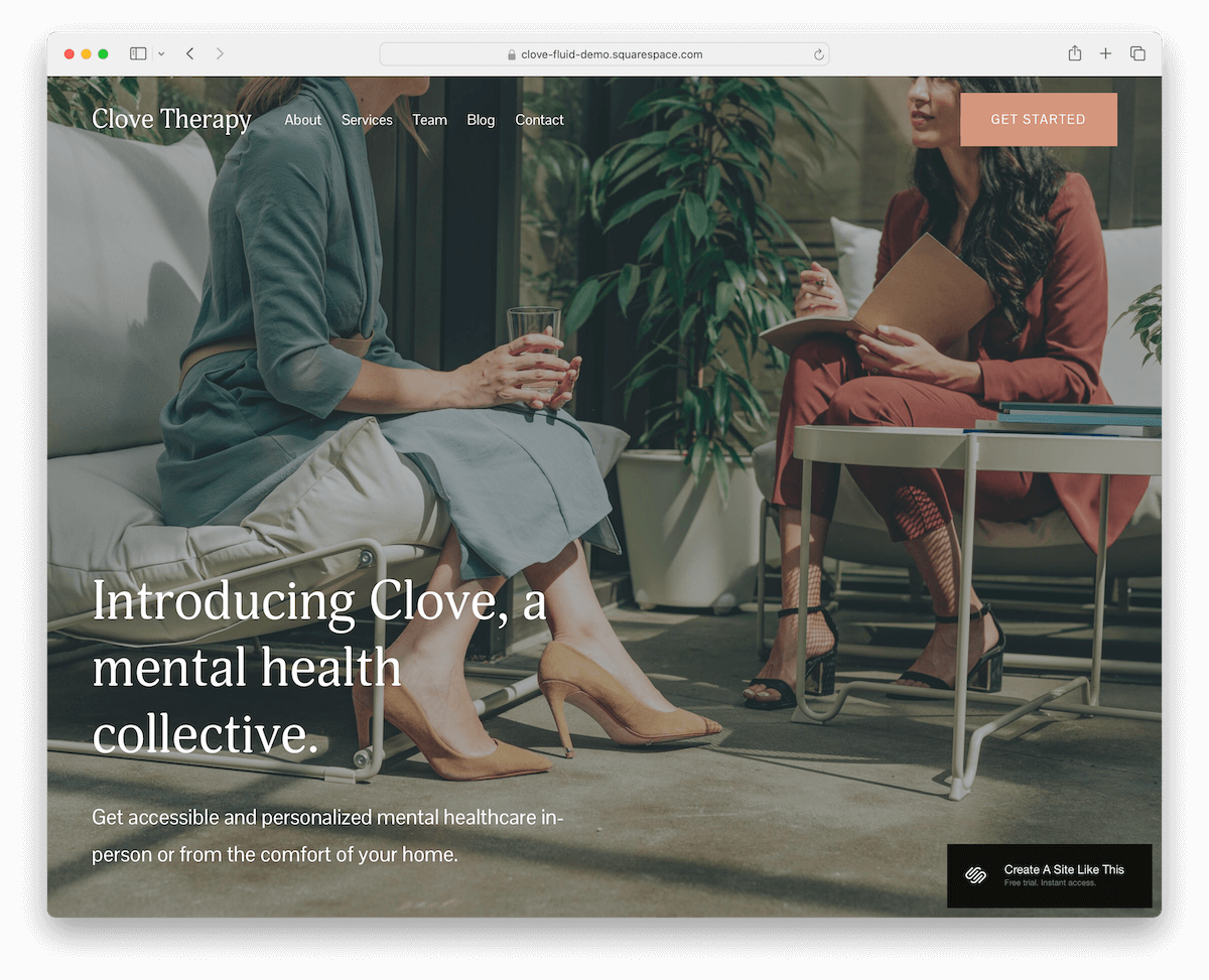
Clove dazzles with its full-screen image background above the fold, complemented by a transparent header and elegantly overlayed text for immediate punch.
Google Maps integration ensures effortless location visibility, boosting user experience.
The template’s light design promotes clarity and focus, while a dedicated services page with clear pricing guides potential clients.
An online consultation booking form simplifies engagements, and the four-column footer efficiently organizes information.
Clove is ready for businesses prioritizing aesthetics, functionality, and customer interaction.
More info / Download Demo10. Wesley
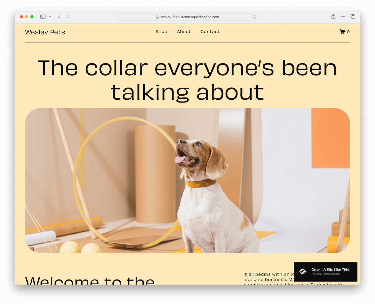
Wesley has a vivid design, where dark typography contrasts sharply against lighter backgrounds, ensuring content truly pops.
Including a product carousel showcases offerings dynamically, while a testimonial slider lends credibility and personal insights.
A contact form featuring a drop-down selector facilitates tailored inquiries, enhancing user interaction.
The footer is thoughtfully designed with a subscription widget, essential links, and social media icons.
Wesley is an excellent choice for businesses that want to blend vibrant aesthetics with functional depth.
More info / Download Demo11. Rotate
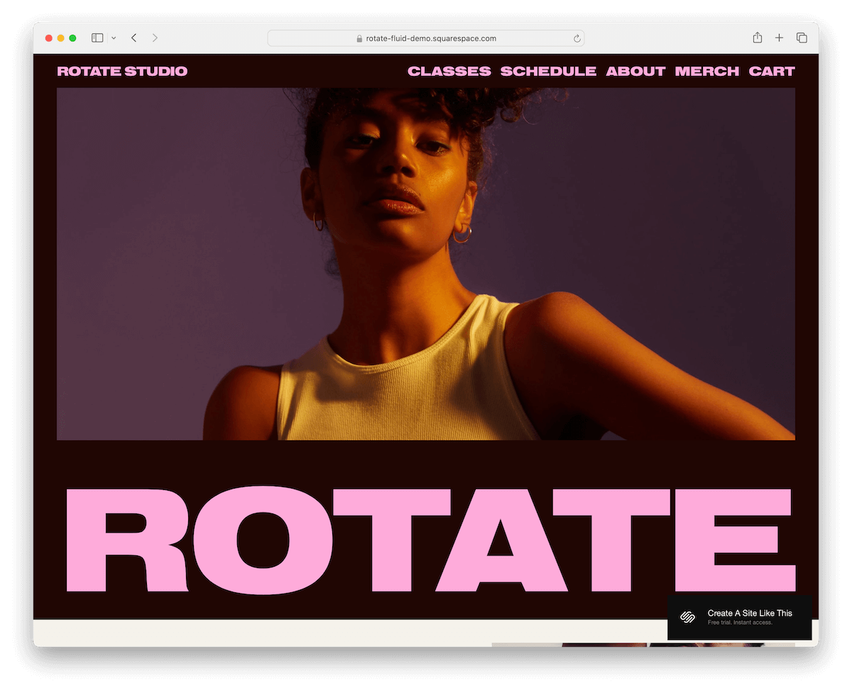
Rotate is a premium Squarespace template that captivates with its bold design, where strong typography takes center stage. Still, it retains a minimalist vibe that appeals to contemporary tastes.
The template is thoughtfully structured with predefined internal pages tailored for classes, about, and merchandise, ensuring a cohesive user journey.
An online appointment form simplifies bookings, enhancing service accessibility, while the integrated shopping cart eases the purchasing process.
More info / Download Demo12. Montclaire

Montclaire thrives with its minimalist light layout, embodying elegance and clarity.
The text-only above-the-fold section commands attention with its simplicity, leading to a meticulously arranged grid portfolio, distinguished by extra spacing for a breath of visual ease.
A sticky header ensures seamless navigation, while the dedicated eCommerce section invites effortless browsing and purchasing.
The contact section is thoughtfully designed with clickable phone numbers and emails, enhancing user interaction.
Montclaire is an example of sophistication, ideal for showcasing portfolios and products with a refined touch.
More info / Download Demo13. Myhra
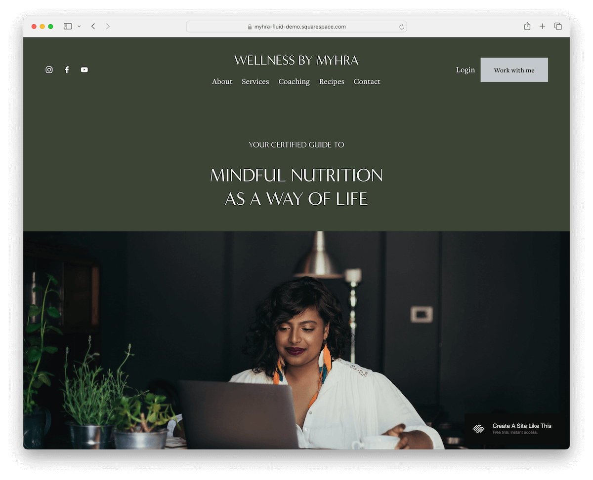
Myhra enchants with its soothing green color scheme, evoking tranquility and connection.
The transparent header, adorned with social icons, menu links, and a CTA button, blends flawlessly into the design, ensuring functionality meets aesthetics.
The containing footer, complete with a subscription form, anchors the site, while a contact form with checkboxes encourages tailored inquiries.
The standout recipes page features categorically organized delights, with background images that shift upon hover, adding an interactive element.
An online booking form further enhances Myhra’s appeal, making it perfect for wellness, culinary, or lifestyle sites seeking a serene yet engaging online presence.
More info / Download Demo14. Emmeline

Emmeline triggers interest with bold sections, each uniquely designed to stand out while maintaining a clean look.
The floating header ensures navigation is always accessible, improving the UX. Additionally, image background sections add depth and visual interest, drawing visitors into the content.
The three-column footer is meticulously organized, featuring opening hours, business details, and menu links for easy access alongside social media icons for enhanced connectivity.
Emmeline is for creating a strong, clean online presence with a touch of uniqueness.
More info / Download Demo15. Hales
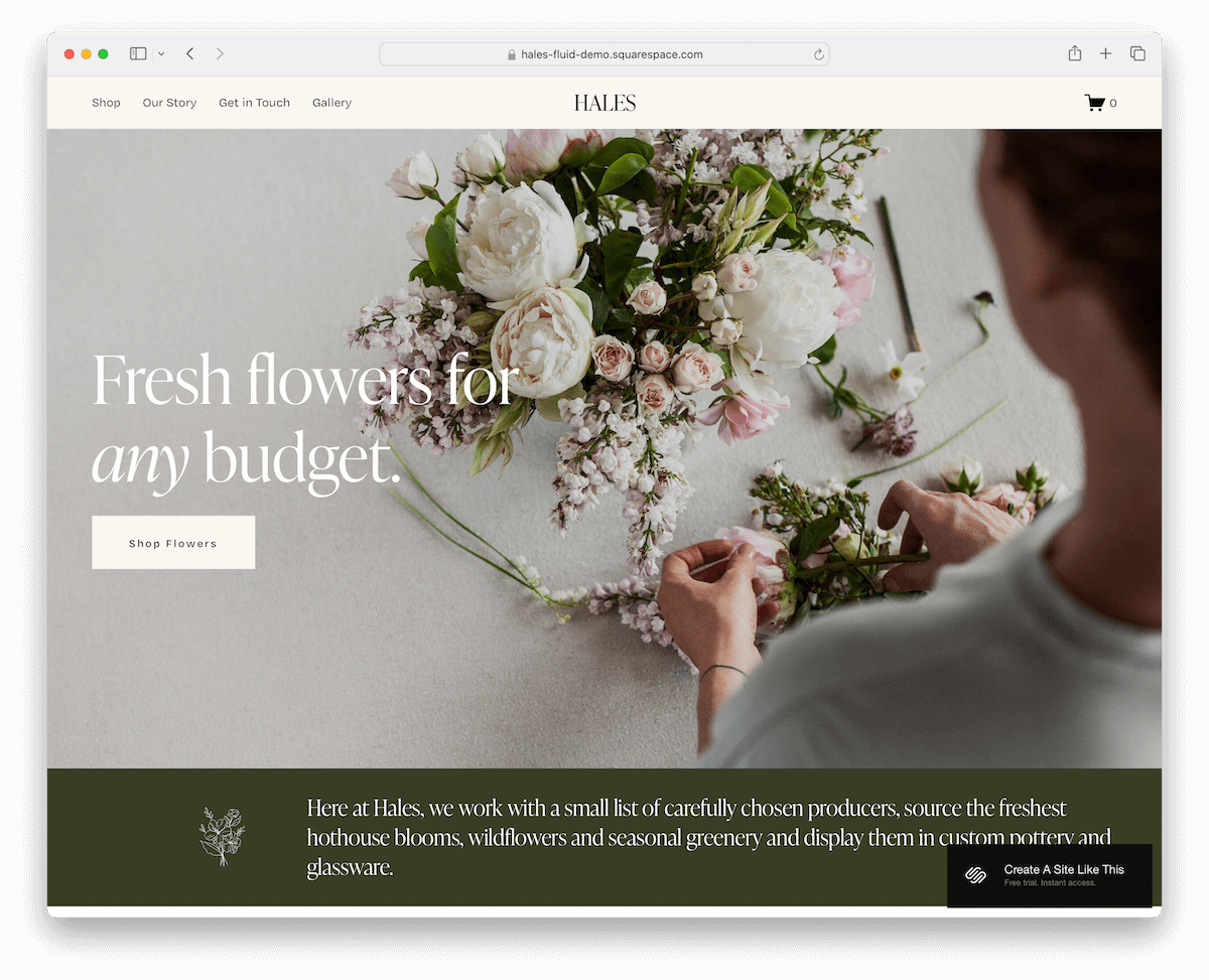
Hales has a compelling above-the-fold section featuring a stimulating image background, concise text, and clear call-to-action. (This instantly engages visitors!)
The header’s sticky design ensures seamless navigation, staying fixed at the screen’s top as users scroll.
A neat product carousel showcases items dynamically, while the masonry grid gallery page presents visual content in an attractive, organized fashion.
Including a contact form with a drop-down menu facilitates communication, making Hales great for a stunning yet user-friendly website.
More info / Download Demo16. Crosby

Crosby mesmerizes with its earthy design palette, resonating the serene and natural, complemented by a full-screen image that seduces visitors upon arrival.
Its ingenious header gracefully disappears and reappears, ensuring a seamless browsing experience without compromising accessibility.
Animated thumbnails add a dynamic touch, bringing life to the content, while a dedicated newsletter subscription section helps build an email list.
The template’s product pages are thoughtfully designed with galleries, allowing for a detailed showcase of offerings.
Crosby is a top choice for brand sites that blend organic aesthetics with interactive elements.
More info / Download Demo17. Altaloma
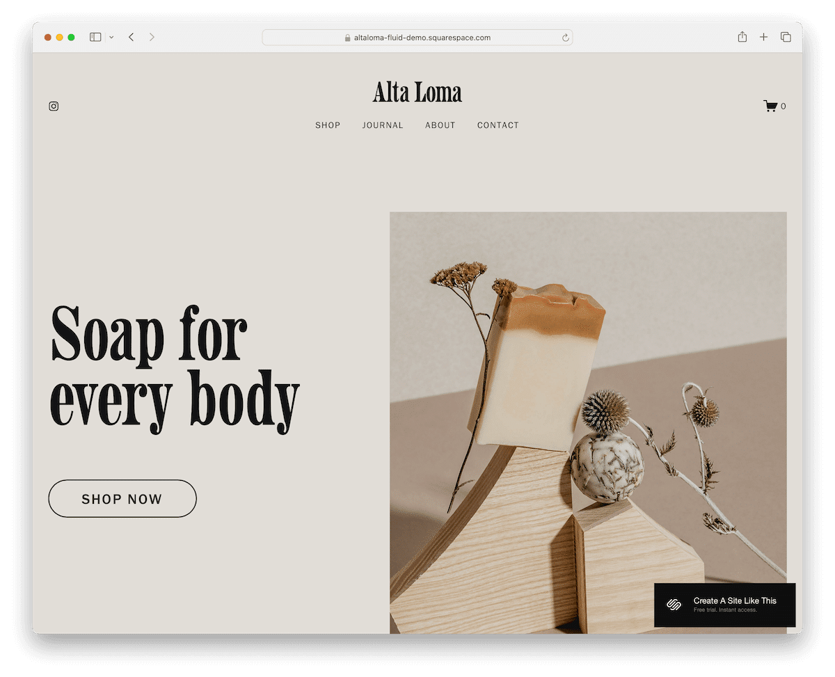
Altaloma grips with its beautiful, minimal, full-width design, offering elegance and simplicity.
The split-screen design above the fold masterfully combines imagery on the right with compelling text and a call-to-action on the left, setting a balanced tone.
As users scroll, content gracefully appears, enhancing engagement.
The practical footer includes Instagram links, a menu, and a subscription widget, fostering connectivity and community.
The large two-column shop page layout and detailed product pages make Altaloma ideal for showcasing and selling with style and clarity.
More info / Download Demo18. Ortiz
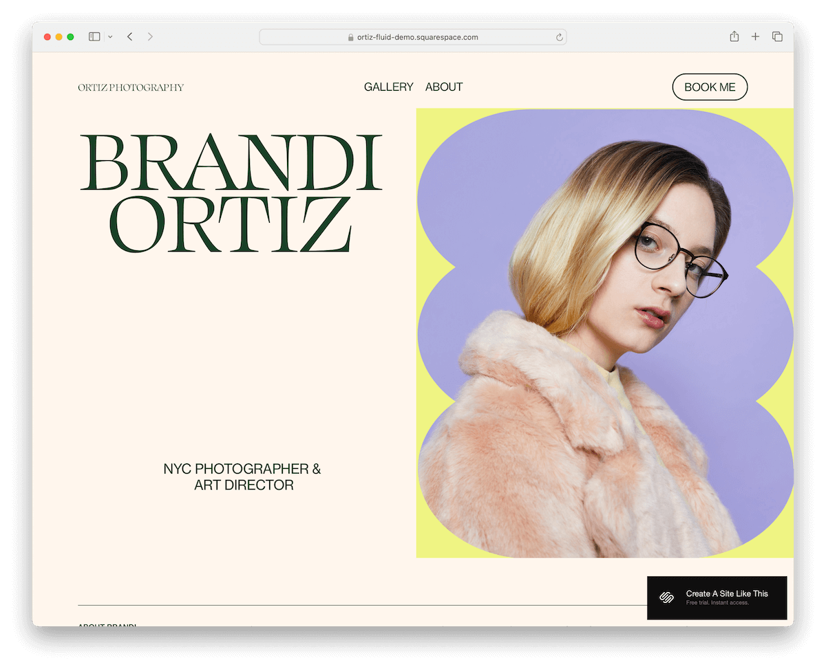
Ortiz excels with its minimalist layout, infused with a touch of trendiness that appeals to contemporary tastes.
The clean lines of the header and footer contribute to the template’s sleek atmosphere, while sliding text elements add a dynamic touch.
Its gallery, featuring a lightbox for detailed viewing, alongside thoughtfully crafted about pages, narrates your story with taste.
A prominently placed booking button in the navbar leads to a form with a drop-down menu, making appointment scheduling more accessible.
Do you need to build a stylish yet functional online presence? Go Ortiz.
More info / Download Demo19. Cimen
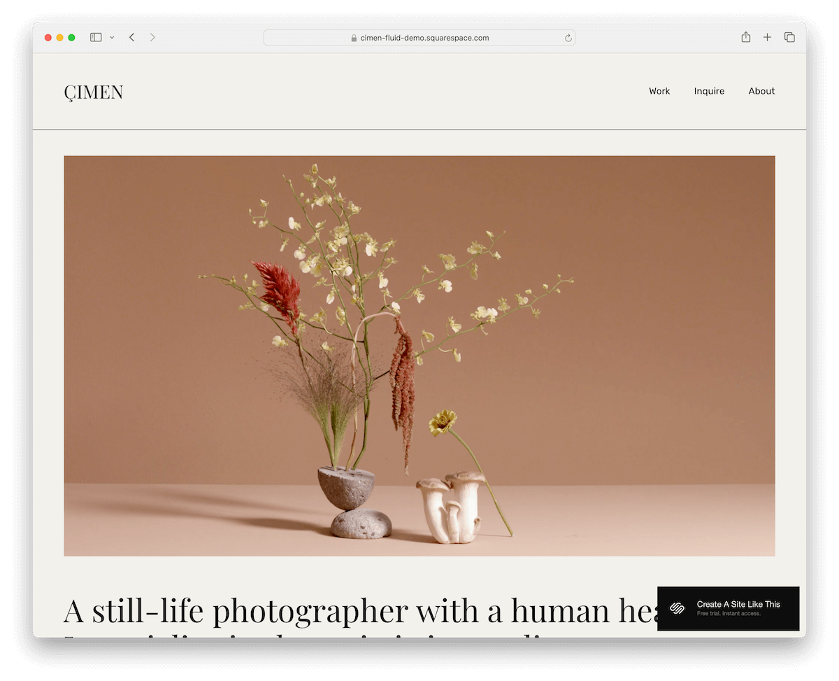
Cimen hooks immediately with an autoplay video above the fold, setting a dynamic tone for the visitor’s journey.
Its cohesive design unifies the header, base, and footer with the same background color, creating a seamless visual experience.
Large typography and imagery, paired with abundant white space, emphasize content clarity and aesthetic appeal.
The work portfolio page, bettered with a lightbox feature, showcases projects elegantly, while an accordion section neatly organizes additional information.
The advanced contact form facilitates detailed inquiries, making Cimen ideal for creatives and art-related businesses.
More info / Download Demo20. Lexington
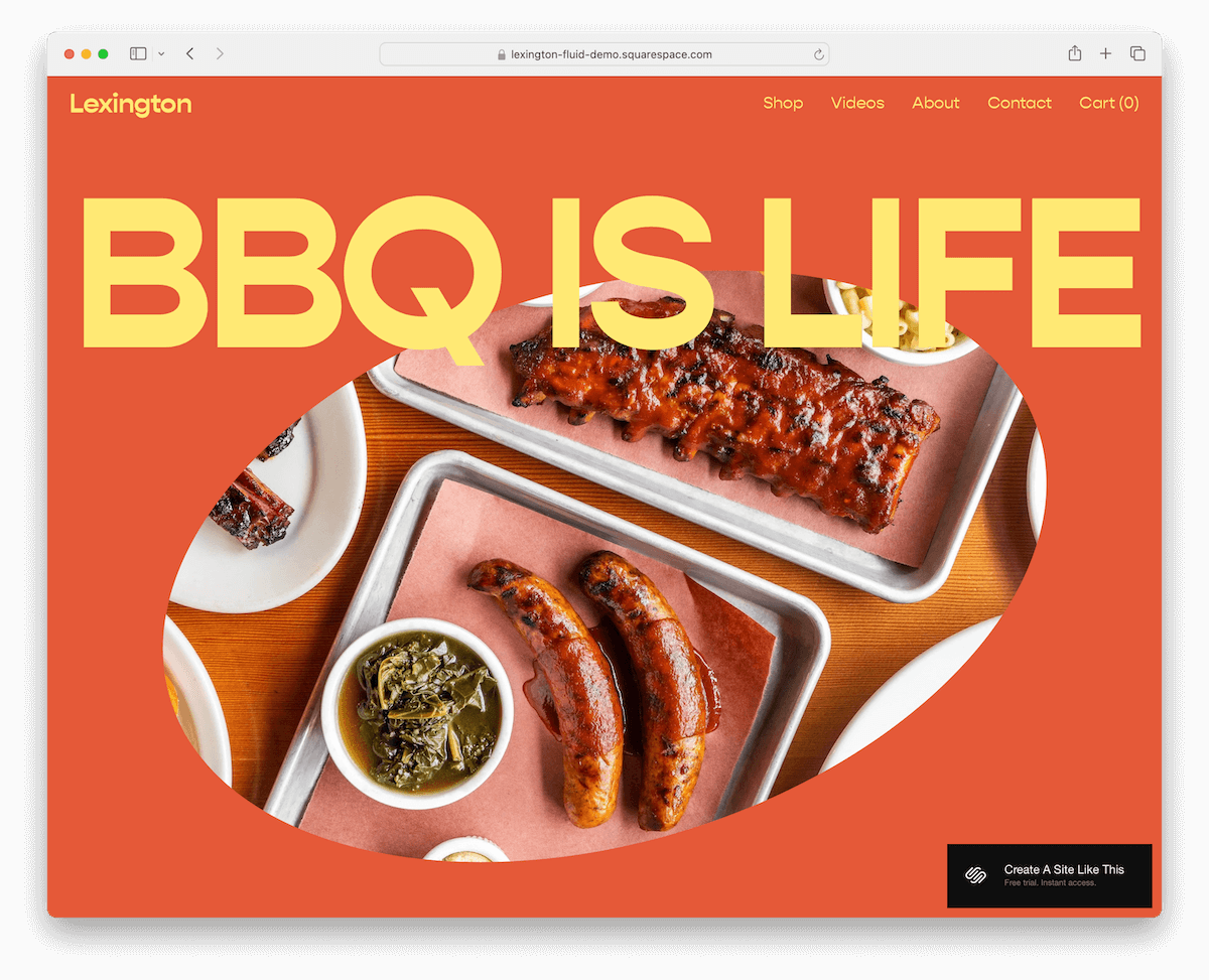
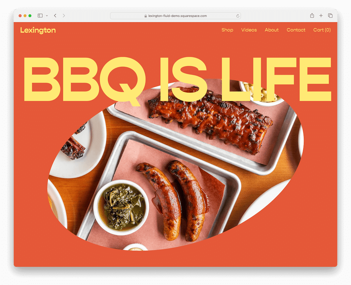
Lexington dazzles with its bold and engaging design, capturing attention with a massive title and a uniquely shaped image above the fold.
Its product carousel invites exploration, while support for animated/video thumbnails adds a dynamic layer to the presentation.
The dark, contrasting footer, structured with multiple columns, anchors the design, offering a pleasant counterbalance.
Embedded videos enrich the narrative, making Lexington perfect for brands and creators looking to create a powerful statement and connect deeply with their audience.
More info / Download Demo21. Quinn

Quinn blows away with its polished grey background, accented by striking red typography for a daring contrast that captures the eye.
The floating header adds a layer of sleek navigation, while generous white space ensures readability and flexibility for text-rich content.
A dedicated section showcases a client list, adding credibility and connection.
The simple footer, featuring a logo, email, and social media links, ends the design, offering a clean, uncluttered finish.
More info / Download DemoHow To Easily Make A Website With Squarespace
Creating a website with Squarespace is a quick process that combines intuitive design tools with powerful features.
Here’s a simple seven-step guide to get you started:
- Sign up: Visit the Squarespace website and sign up for an account. Choose the plan that best suits your needs, but remember, you can start with a free trial to explore the platform before committing.
- Choose a template: Browse through the above Squarespace library of templates. Find designs tailored to your website’s purpose, business, portfolio, blog, or eCommerce. (Note: While you can use the template as-is, you can also customize it to your heart’s content.)
- Customize your template: Once you’ve selected a template, start customizing it. Click on “Design” in the sidebar to edit site elements like fonts, colors, and page configurations to match your brand identity.
- Add content: Navigate to the “Pages” section to add or edit pages. Use Squarespace’s drag-and-drop editor to insert text, images, videos, and other content blocks to build your pages.
- Set up your domain: Choose a domain name for your website. You can purchase a new domain through Squarespace or connect an existing one.
- Optimize for SEO: Access SEO settings in the “Marketing” section. Add relevant keywords, meta descriptions, and custom URLs to improve your site’s visibility in search engine results.
- Publish your site: Review your website to ensure everything is as you want. Then, click “Settings” and navigate to the “Site Availability” section to publish your site.
FAQs About Squarespace Templates
What makes premium Squarespace templates different from free ones?
Premium Squarespace templates often offer more advanced features, unique designs, and customization options than free templates. They provide a more sophisticated and tailored experience for your website.
Can I switch templates on Squarespace after I’ve built my site?
Yes, you can switch templates on Squarespace at any time. The platform is designed to allow flexibility, though you may need to reconfigure some elements to fit the new template’s layout and features.
Is Squarespace suitable for eCommerce websites?
Yes. Squarespace offers robust eCommerce capabilities, including inventory management, secure checkout, customer account creation, and various payment gateway integrations.
Can I use a custom domain name with Squarespace?
Yes, you can connect your custom domain name to your Squarespace site. You can transfer an existing domain or purchase a new one directly through Squarespace.
Does Squarespace provide SEO tools?
Squarespace includes built-in SEO tools that help optimize your site’s content for search engines. These include page titles, meta descriptions, custom URLs, and more to enhance your site’s discoverability.
Are Squarespace websites mobile-friendly?
Yes, all Squarespace templates are designed to be responsive. They automatically adjust to look great on devices of all sizes, from desktop monitors to mobile phones, for a seamless user experience.



Comments (0)