19 Best Portfolio Design Trends (In 2026)
Are you ready to take the presentation of your creative work to the next level by implementing the best portfolio design trends?
Instead of wandering around, unsure about what approach to take, we compiled a list of nineteen epic examples you shouldn’t miss.
These, in combination with your personal touch, will help you grab the attention of your visitors and leave a lasting impression.
From minimalist aesthetics and interactive grids to captivating animations and immersive experiences, we included something for everyone.
Buckle up and join us on this exhilarating design expedition!
Note: Help yourself with these user-friendly portfolio website builders if you’re creating one for yourself (no coding experience necessary).
Best Modern Portfolio Design Trends
1. Curated Portfolio Home Page
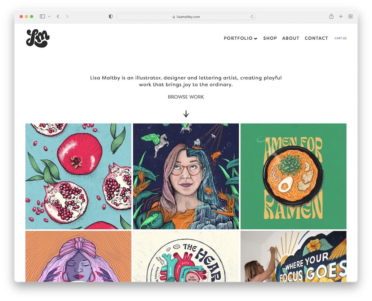
Instead of wasting your visitors’ time and effort by making them click (too many times) to get to your best works and projects, a curated home page can do the trick.
It allows you to highlight your proudest client and hobby works in a visually appealing manner. In Lisa’s example, what makes the projects stand out even more is animations. These are completely optional but can spice things up nicely (just don’t overdo it).
A potential client can find more about your work style through a curated portfolio home page in just a few scrolls. This creates a user-friendly yet focused representation of your work that no one wants to miss.
Need more design inspiration? Then go view these fantastic illustrator portfolios.
What stands out: A gallery-driven layout lets the creative work speak for itself with minimal distraction.
2. Personalization
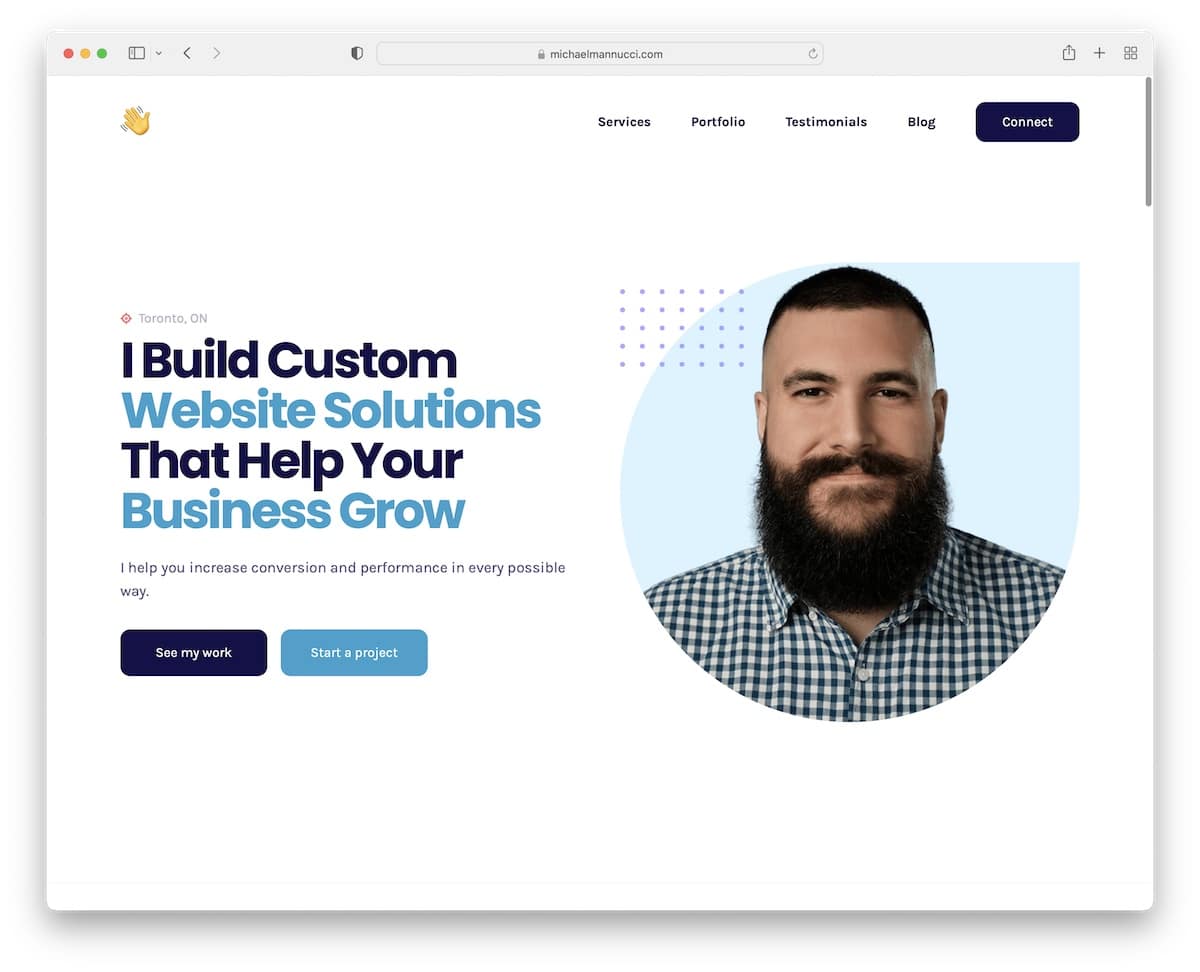
Make your online portfolio the extension of who you are through personalization.
This could be through adding a headshot (large or small) in the above-the-fold section and using colors and typographies that best represent your personality.
Also, if you’re into minimalism, let your portfolio design be minimalistic. Or, if you have a bubbly personality, make your portfolio colorful and enhanced with cool graphics and animations/effects.
In short, use personalization to express your creativity and personality – how YOU want it!
What stands out: A vibrant color palette creates energy and personality that sticks in visitors’ minds.
3. Minimalism (Always Works)
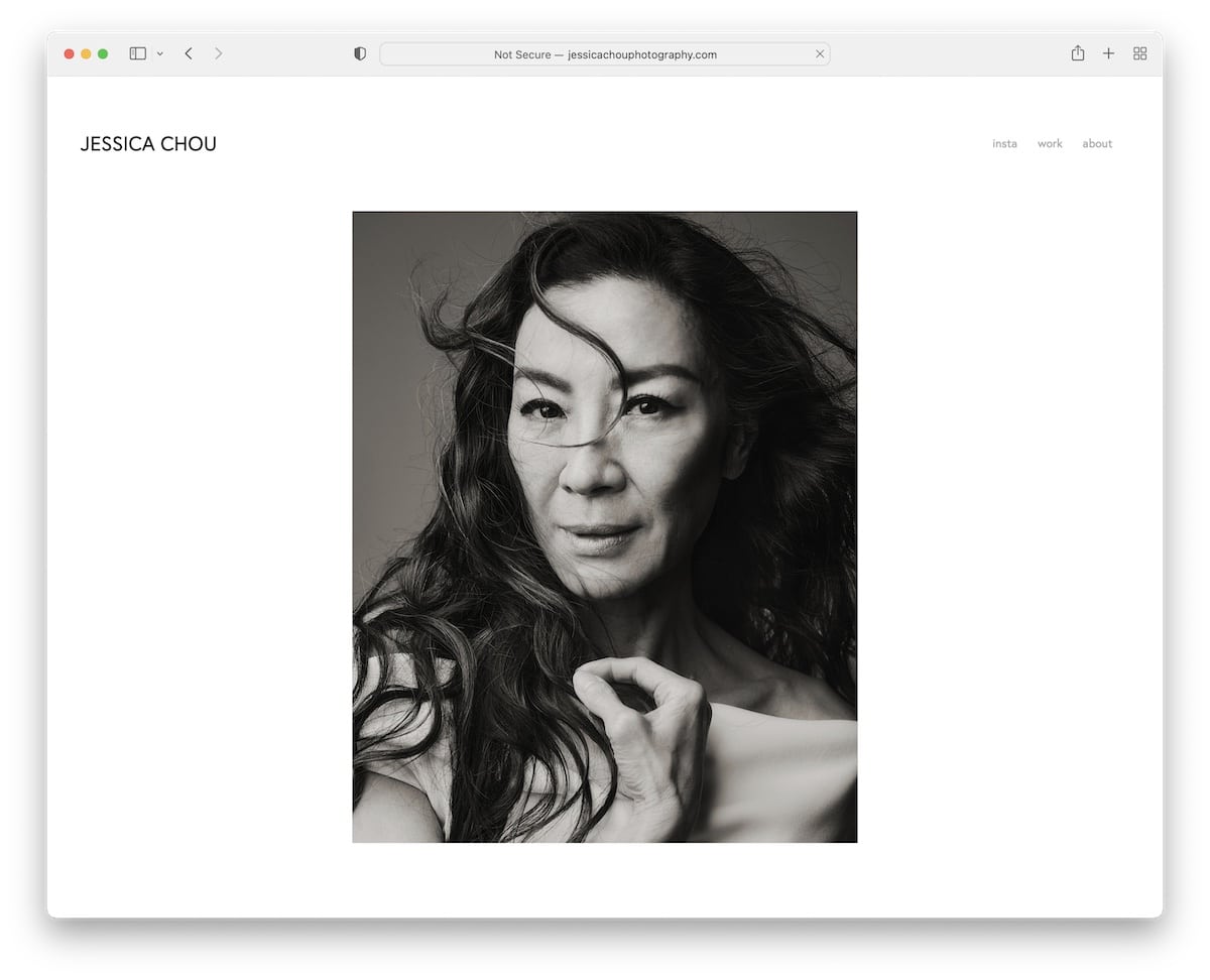
There’s one portfolio design trend that’s timeless and always works: Minimalism or simplicity, whatever you want to call it.
Why?
It suits anyone, any niche, any work and any industry. Whether you’re a painter, a web designer, a wedding photographer, a developer or a writer, it doesn’t matter – a minimalist portfolio is for everyone because of its incredible versatility and adaptability.
You can use it to showcase your work in a clean and streamlined way and put all your portfolio elements front and center.
What’s also great about the minimalist portfolio design is that it will more likely offer the ultimate user experience both on desktop and mobile.
Thus, if you’re in doubt, choose the minimalist look.
Here are the best minimal website & portfolio examples to see how designers have approached this trend.
What stands out: A gallery-driven layout lets the creative work speak for itself with minimal distraction.
4. Layered Elements
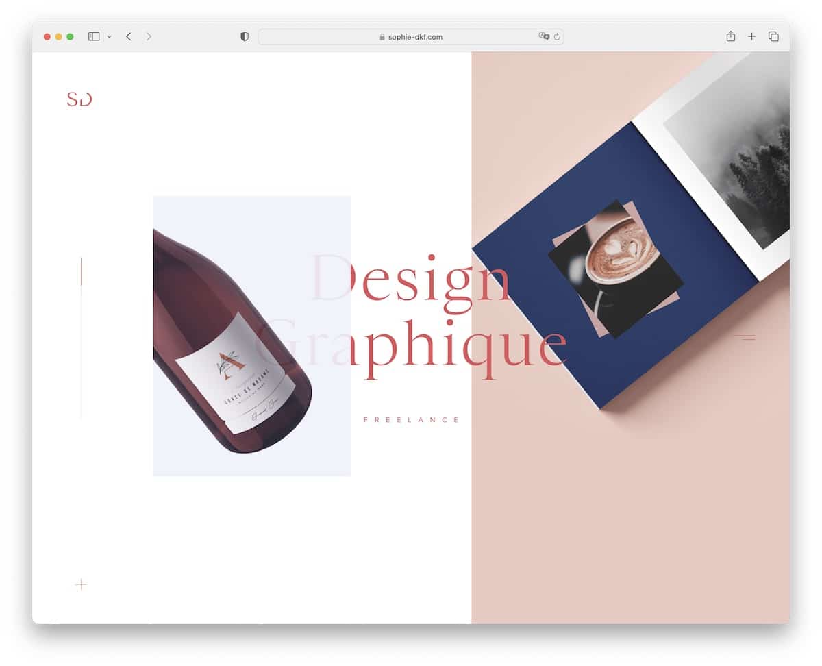
But if minimalism doesn’t fit your style, you can include layered elements (images, fonts, graphics, etc.) for a more visually enhanced appearance.
Layered elements add depth and dimension to the portfolio design for a more engaging and exciting presentation. By stacking the elements, you create a sense of deepness that makes the online appearance more immersive and dynamic. (Especially if you combine them with the parallax effect).
A layered structure can also benefit you through a visual hierarchy. You can guide the viewer’s attention and prioritize important content by strategically arranging and stacking elements. In other words, make the elements you want to emphasize and highlight some more through layers.
What I also like about a portfolio design with layered elements is the contextual storytelling you can achieve. Create a narrative flow and guide viewers through a specific sequence of content that tells a story.
What stands out: A gallery-driven layout lets the creative work speak for itself with minimal distraction.
5. CV/Resume Style Layout
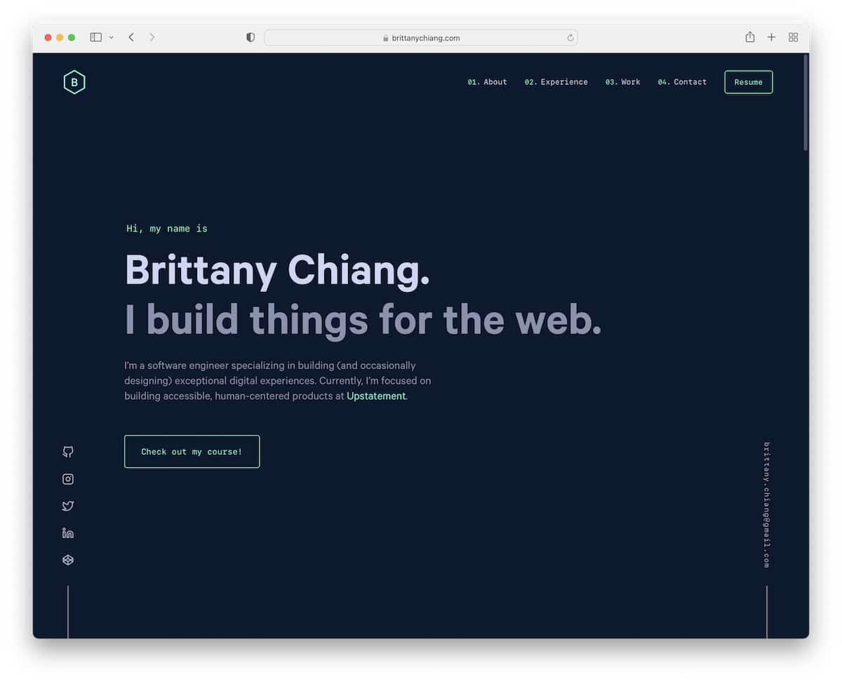
This one may be ideal for freelancers actively seeking clients or job seekers. Instead of having a CV or a resume on a separate page (some add it to the about page) or as a downloadable file, stick it right to the home page.
The potential client and employer is most engaged the first few seconds after landing on your portfolio. And since they took the time to check you out, you might just want to give them access to your key information immediately.
Create a CV/resume style home page to present your professional history in a visually catchy and well-designed format so that visitors can understand your experience and expertise in seconds. This will help them connect your past and current portfolio for a greater chance of winning them over.
What’s also practical about this approach is that you can tailor the home page for specific opportunities by highlighting relevant skills, experiences and accomplishments that align with the needs of a particular client or employer.
What stands out: A gallery-driven layout lets the creative work speak for itself with minimal distraction.
6. Dark Look
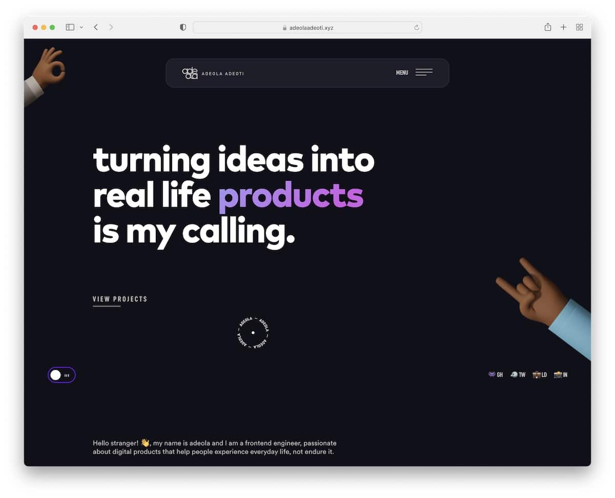
Dark looks are becoming increasingly popular among website and app owners, and the same applies to portfolio designs.
However, because it’s still somewhat rare, it can be a great approach to stand out from the masses. Differentiation and uniqueness are pivotal characteristics of such a portfolio.
A dark color scheme can create a visually impactful portfolio that highlights all your content (text, images, and other multimedia).
Another superb benefit of the dark look is an added layer of elegance and sophistication, with an immersive and “atmospheric” experience.
Best practice: If you create a dark portfolio, it’s wise to integrate a dark/lide mode switcher. Give your visitors a chance to view your content how they prefer it best.
What stands out: A gallery-driven layout lets the creative work speak for itself with minimal distraction.
7. Large Slider
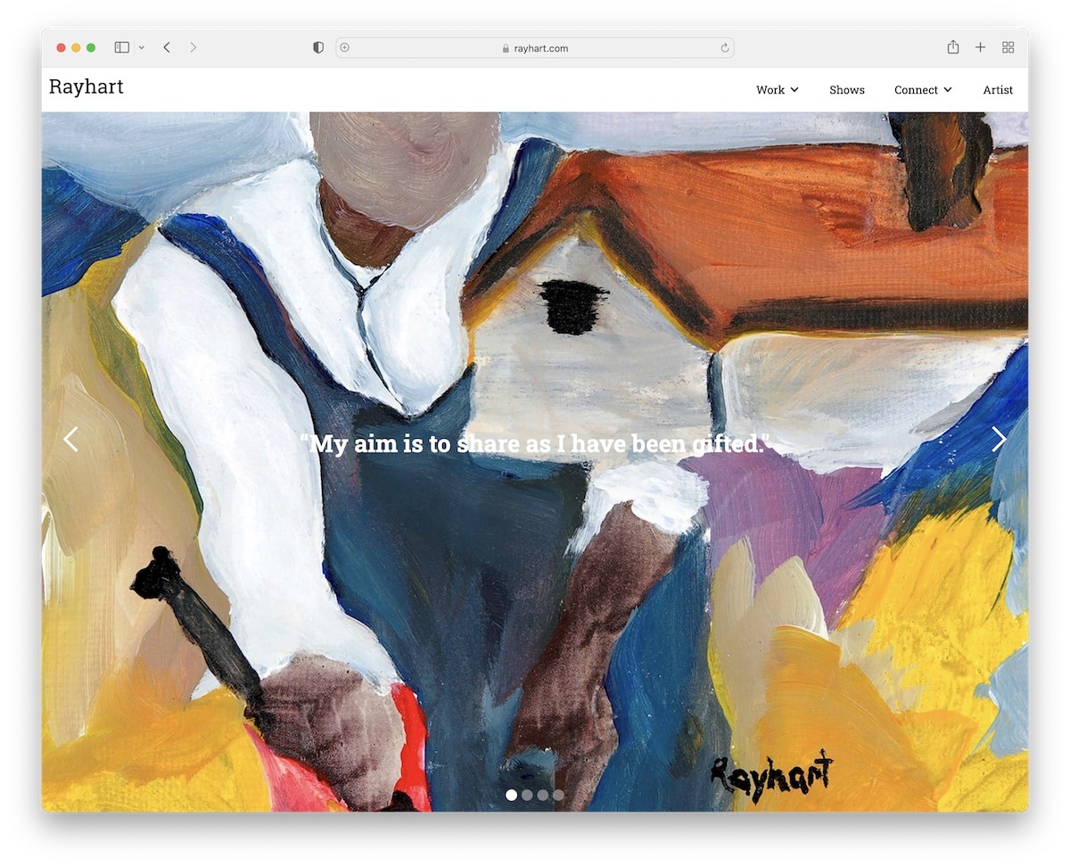
While it doesn’t have to be a full-screen slider, any large slideshow creates a strong visual impact that grips the visitors immediately. Hey, first impression matters!
Using a slider allows you to showcase multiple projects in a cohesive format without sacrificing the website’s real estate. This allows the visitor to quickly skim through your works without scrolling or navigating different pages.
0 clicks, 0 page loads.
Finally, using high-quality images in a full-screen slider makes reviewing the content more pleasurable because of all the little details that a smaller display cannot correctly exhibit.
Friendly tip: Don’t add too many slides to the slider. Plus, optimize your images first because they can slow down your portfolio’s performance otherwise.
We also have a curated list of the best artist portfolio websites that will indeed stimulate your creativity.
What stands out: A gallery-driven layout lets the creative work speak for itself with minimal distraction.
8. Video Background
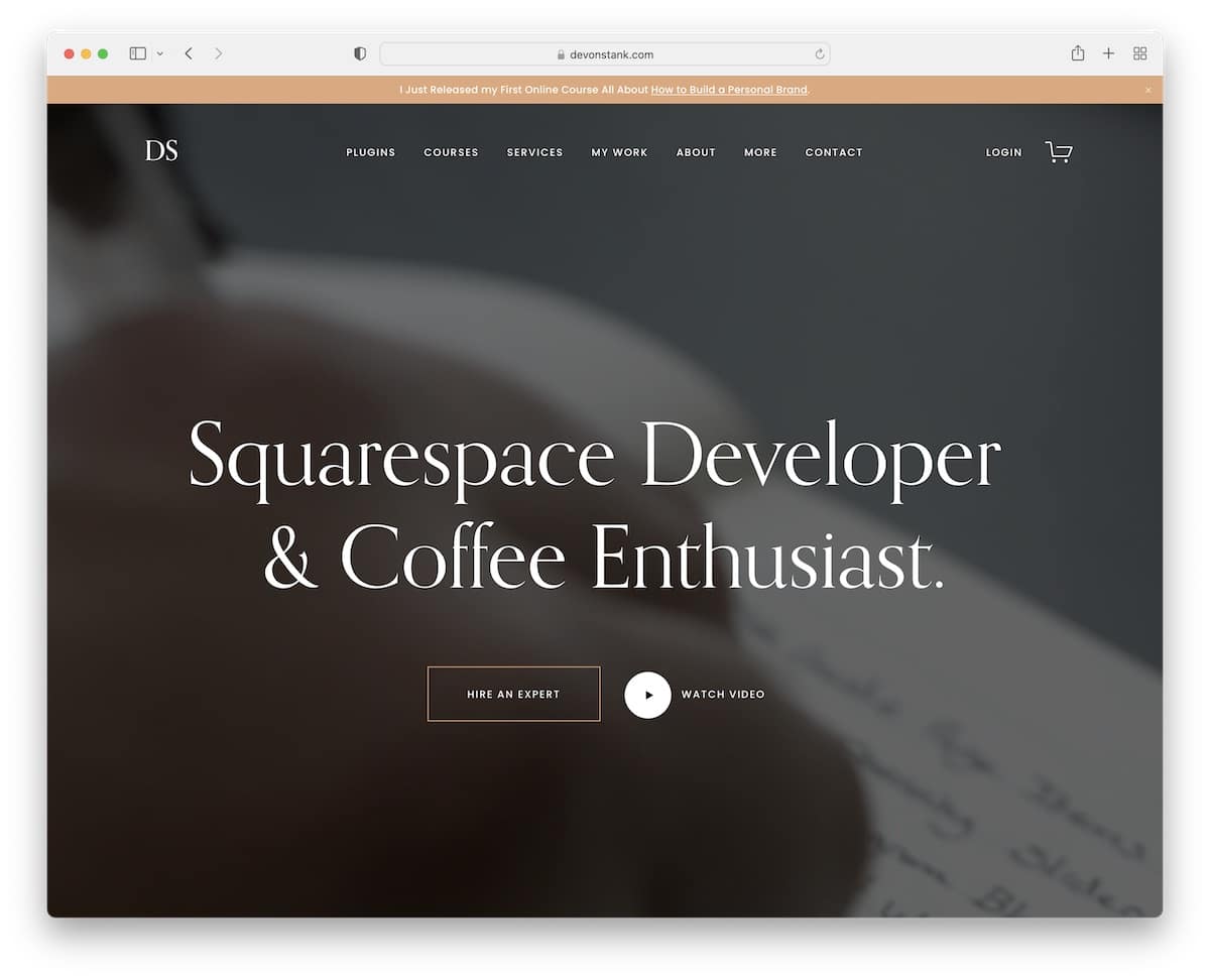
They say video is the future of the internet. And because video is so popular, one of the portfolio design trends is using it as a background to enhance visitor engagement.
This usually happens above the fold, but you can include it in your other portfolio site sections. However, remember that adding too many video backgrounds can be overwhelming and encourage visitors to leave your site early.
Do it tastefully.
Use the video to showcase your work in action, evoke emotions and for storytelling. And even if you don’t specialize in video creation, you can still showcase the behind-the-scenes, create a short documentary-style video, or even make a collage of your projects in a video format.
Help visitors connect with your work on a deeper level – through video.
What stands out: A gallery-driven layout lets the creative work speak for itself with minimal distraction.
9. Text Heavy
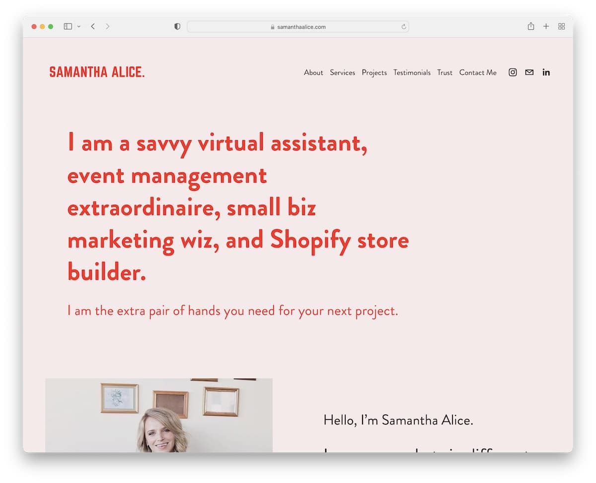
If everyone prioritizes visual content, wouldn’t it be something special if you prioritize text?
This newer portfolio design trend is catching the attention of many freelancers and professionals.
Sure, the image may be worth a 1,000 words, but opting for a text-heavy layout empowers you to focus on information and details through clear communication. It can show your professionalism and attention to detail, which your potential client or employer might primarily focus on.
And as a website owner, SEO probably matters to you, right? Having more text than visual content offers you to incorporate relevant keywords, phrases and descriptions that can improve your search engine visibility.
I recommend you use this portfolio design trend to emphasize your writing skills.
You may also want to check out these fantastic writer portfolio examples for design inspiration.
What stands out: A gallery-driven layout lets the creative work speak for itself with minimal distraction.
10. GIFs And Emojis
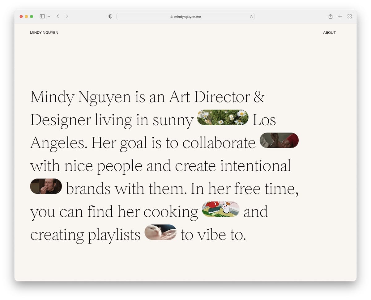
Our conversations are becoming a collection of emojis (and GIFs) because it’s way faster than writing the text down.
You can also use this approach to add playfulness and creativity to your portfolio.
Not necessarily so much to replace words with graphics but to enhance the expressiveness and emotion that emojis and GIFs can add to your online presence.
Moreover, they can provide additional context or convey sentiments that may be challenging to express solely through text. Plus, if you have a strong social media presence (or want to appeal to younger audiences), these little inclusions make sense – and can make your content more shareable.
Keep in mind to maintain balance and ensure emojis and GIFs align with your overall branding and professionalism.
What stands out: A gallery-driven layout lets the creative work speak for itself with minimal distraction.
11. Interactive Grid
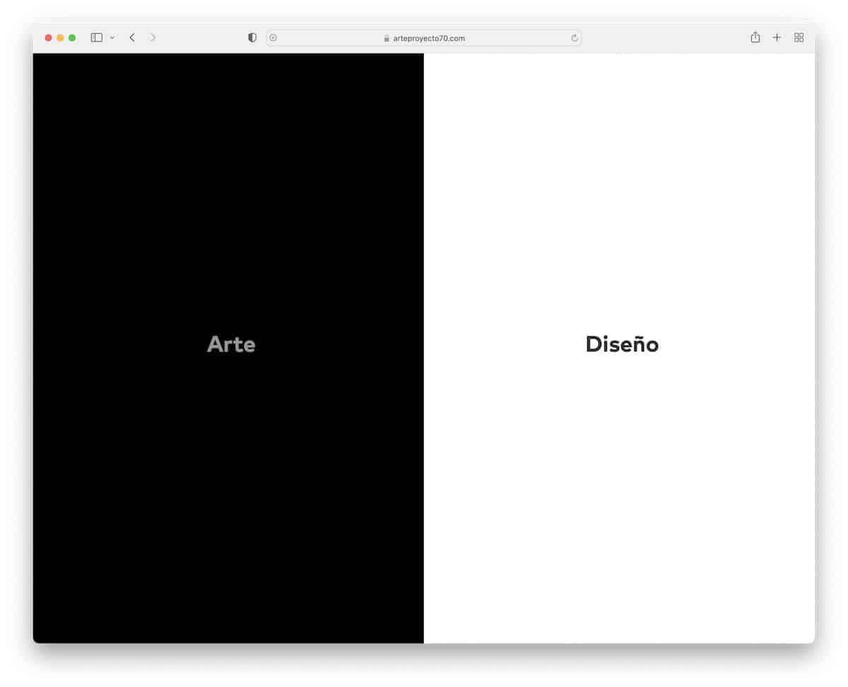
Grids and portfolios go hand in hand very well. But instead of keeping everything static (and boring), add some interactivity to the grid to boost user experience.
Arte Proyecto 70 does this nicely with the three-part home page grid that reacts on hover. Each grid element takes you to a specific page with a corresponding background color for more efficient exploration.
Adding (some) animation to your portfolio can work wonders.
What stands out: A gallery-driven layout lets the creative work speak for itself with minimal distraction.
12. Interactive And Animated
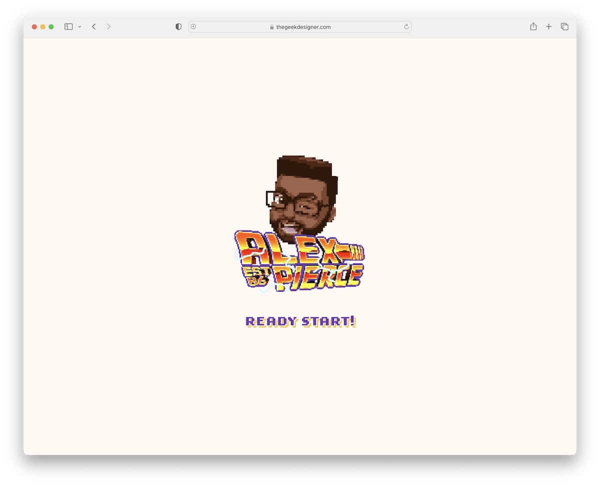
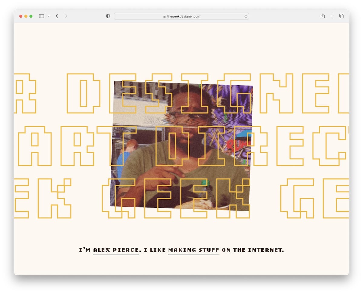
If all the portfolio design trends so far are too dull for you, then this example of interactiveness and animation will surely capture your attention.
To some extent, Alex is almost overdoing it with “flashiness,” but that’s his style, which creates a strong and memorable first impression. It’s how he approaches expressing his creativity and personality that’s far from being anything close to serious.
While visual engagement, storytelling and even focus can be strong on an interactive and animated portfolio, it’s easy to mess things up, creating total chaos.
So pay close attention to how much animation and special effects you want to include – starting slow is better than going all in.
What stands out: Hover effects on portfolio thumbnails add interactivity without breaking the clean aesthetic.
13. Unique Endless Scrolling
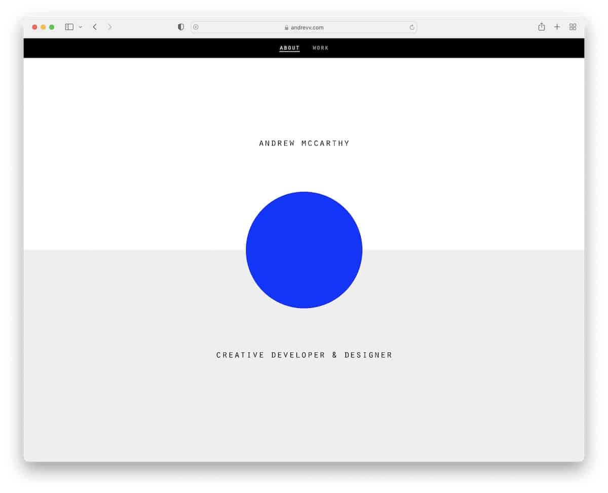
Endless or infinite scrolling isn’t a new trend, but I saw many began using it for their online portfolio websites.
BUT!
What Andrew did is not your traditional infinite scroll function that keeps loading more content as your scroll, so you don’t have to jump from page to page.
Andrew has seven sections that “play” over and over again. What makes it tricky is the changing overlayed element that may take some time before you realize it’s the same content repeating – it took me!
Anyway, using an infinite scroll helps you keep visitors on your portfolio for longer because they “aren’t aware” they’re viewing multiple pages, and the compelling content makes them want to scroll some more.
Or maybe that’s just me?
What stands out: Case study pages add depth by showing process, not just polished outcomes.
14. Black And White
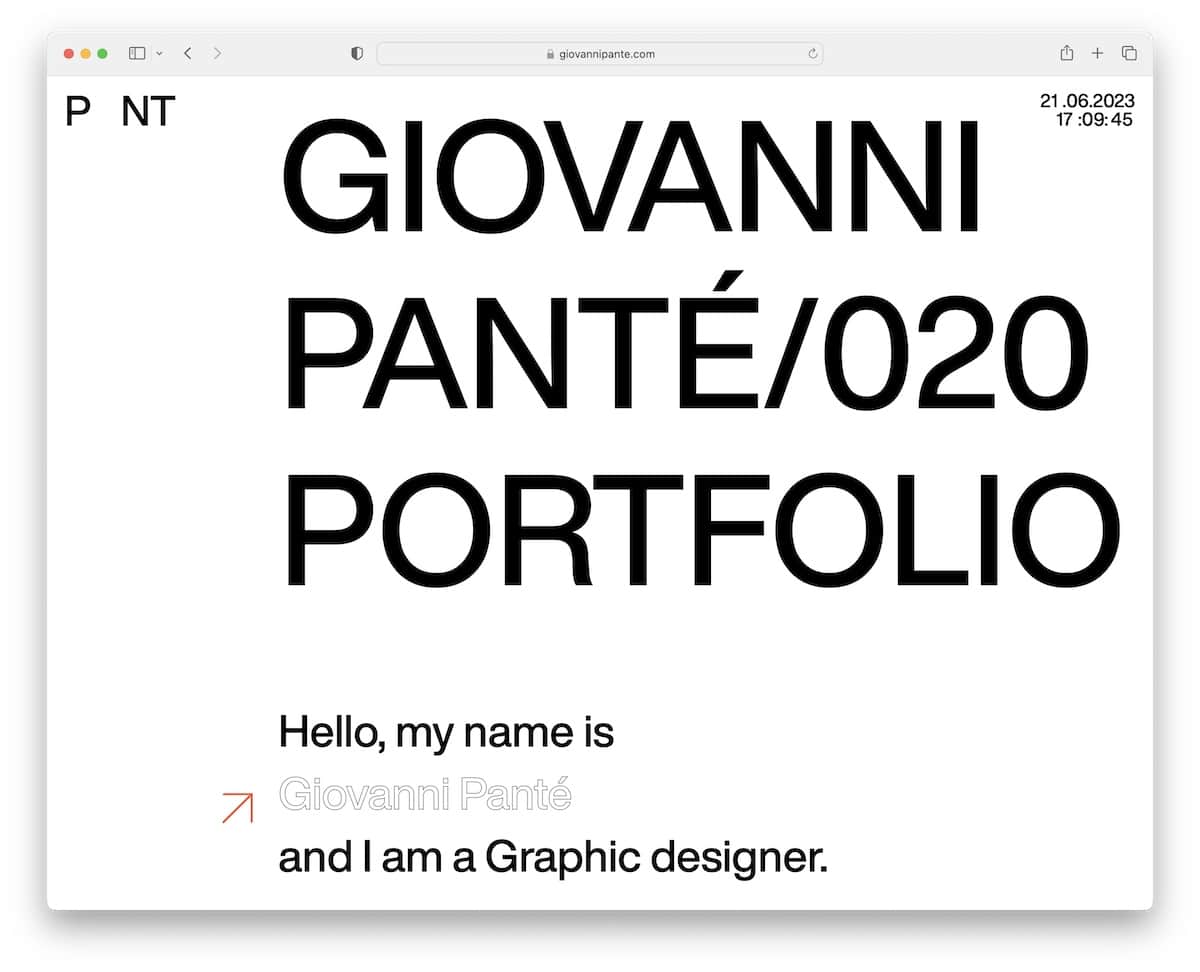
Black and white is a timeless portfolio design trend that will never go out of style. Improved contrast and clarity can enhance visual impact, simplicity, and focus.
The B&W portfolio look makes it easier to distinguish different elements so visitors can easily absorb the information and appreciate the finer details of your superb work.
A clever use of black and white or other grayscale elements can add depth and visual interest without compromising the simplicity and elegance of the color scheme.
When creating a black and white portfolio, it’s essential to consider typography, whitespace and visual hierarchy to guarantee a practical layout and effective user experience.
What stands out: A gallery-driven layout lets the creative work speak for itself with minimal distraction.
15. Large Typography
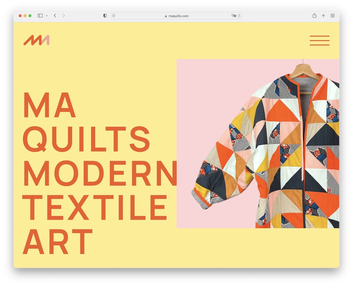
If you don’t feel like adding much text to your portfolio, one interesting design strategy is to use large typography.
It’s a tested and proven way of drawing immediate attention and establishing a clear visual portfolio ordering. Not just that, but larger fonts also make your website more readable and accessible so that everyone can get the most out of it.
When using larger typography, you’ll (obviously) have less text with an aim to call attention to your key messages and statements. Also, if you want to guide your visitors toward specific actions (call-to-actions), larger typography and buttons will encourage visitor participation – make them click.
Combining large typography (choose readable fonts), visual content and white space can call for an unforgettable portfolio experience.
What stands out: Strong visual storytelling makes browsing feel more like flipping through a curated magazine.
16. Split-Screen Design
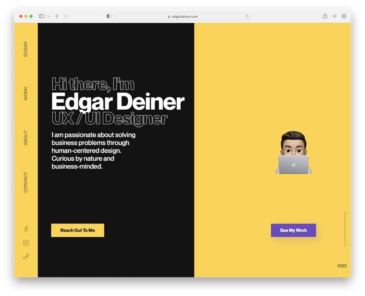
A split-screen design is a portfolio trend that can 1) turn one page into “two” and 2) ensure the viewer takes in more content because of the contrasting vertical sections.
Edgar did a great job choosing a black-and-yellow color scheme, making the left and right sides pop more while still using enough white space so everything is easily digestible.
A split-screen layout supplies “more” space to showcase multiple projects or styles or highlight a single project by adding text on one side and visual content on the other.
It creates a more transparent information architecture by organizing content into distinct sections.
Pro tip: Double-check that the split-screen design appears correctly on mobile and desktop for the best viewing experience.
You may also want to check other great developer portfolios to see what’s possible.
What stands out: High-quality photography does the heavy lifting, making the content feel premium.
17. Cool And Catchy Animated Navigation
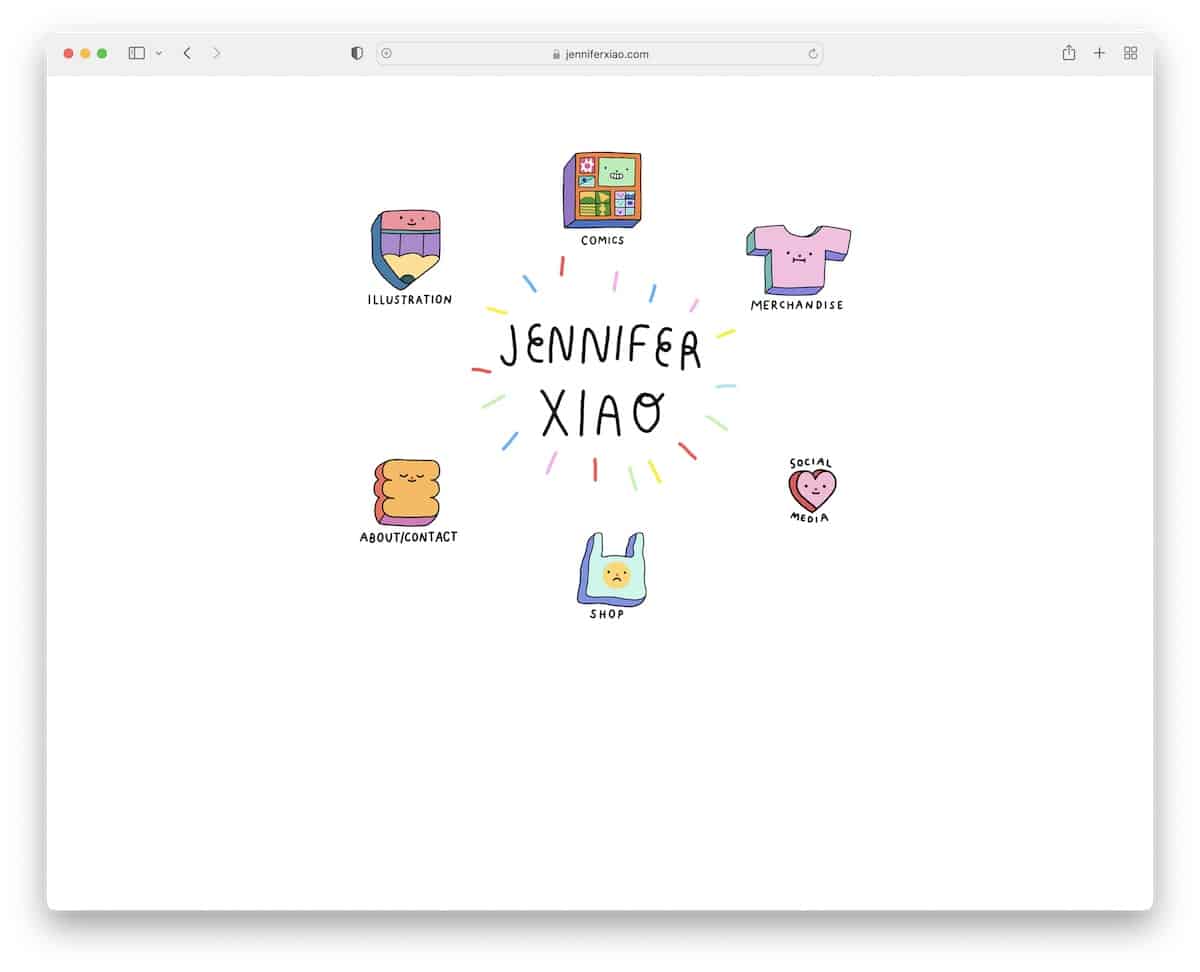
Navigation is one of the essential elements of a great user experience – even of an online portfolio. Why not speak your personality through the navigation, as Jennifer does?
Using cool and catchy (and animated) navigation makes the elements easily visible and more clickable, contributing to an enjoyable user experience.
Animated navigation can incorporate micro-interactions, such as hover effects, click animations, or loading spinners, which add a delightful and polished feel to the site.
Enhance navigation visibility and provide a more intuitive and enjoyable journey through your portfolio – with animated navigation.
What stands out: Intuitive navigation makes the site easy to explore even for first-time visitors.
18. Grid Layout With Hover Effects
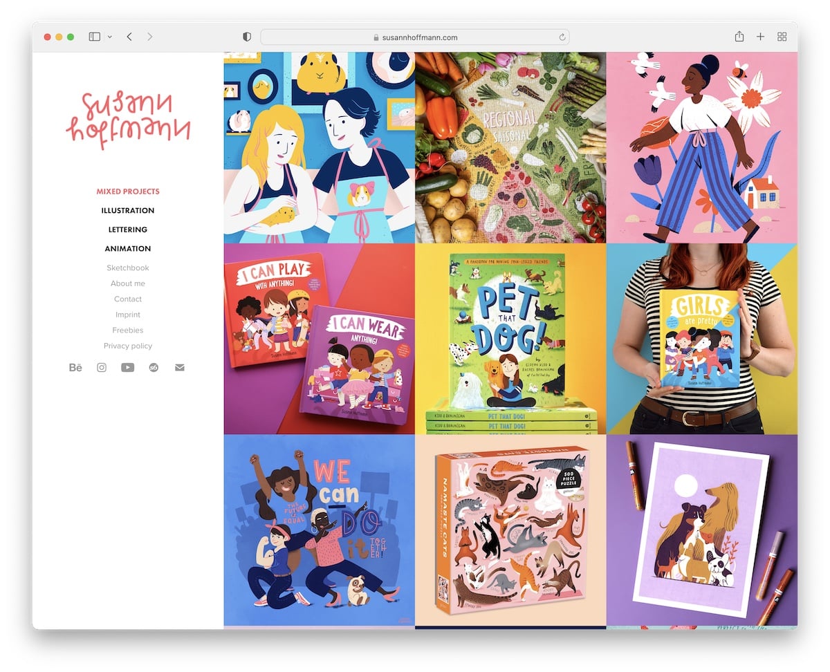
The combination of grid layout and hover effects adds a touch of creativity and interactivity that can elevate your portfolio’s visual impact and overall UX.
It’s a great strategy to display many projects in a clean and organized way while revealing additional information (e.g., a preview, a brief description, key details, an additional image, etc.) on hover, like in Susann’s case.
This portfolio design trend is somewhat similar to the curated home page style mentioned above but with more context.
By implementing hover effects to your portfolio grid, you invite your visitors to interact more dynamically with your portfolio.
What stands out: A clean, uncluttered layout lets visitors find information without visual noise.
19. White Space
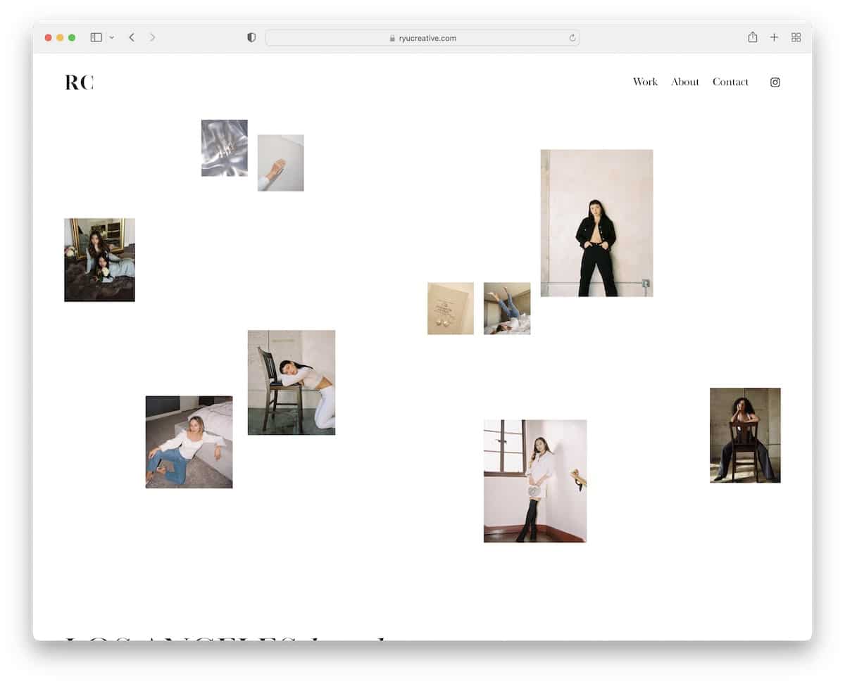
Using white space is a common portfolio design trend that’s been around for a while and will not disappear anytime soon.
White or negative space benefits the viewer in many ways. It makes the website more readable and boosts the focus on the content.
By removing the bloat, you make room to spotlight your key content so the visitors don’t accidentally overlook critical details.
Whether you prefer a clean and minimalistic approach or want to create a sense of luxury and exclusivity, white space can easily achieve the desired outcome.
What stands out: The minimalist design keeps the focus on what matters most — the content itself.
Conclusion
The world of portfolio design trends offers endless possibilities for showcasing your creative works and projects.
Embrace these trends, infuse them with your unique style and create a portfolio that captures attention and reflects your personality.
Craft a conversation-sparking portfolio that opens doors to new opportunities whether you’re a freelancer or a job seeker – heck, even an agency.
The future is yours to shape (with the help of these portfolio design trends)!


Comments (0)