30 Beautiful Example Websites Using Bridge Theme 2026
Let’s look at the best websites built using the Bridge WordPress theme.
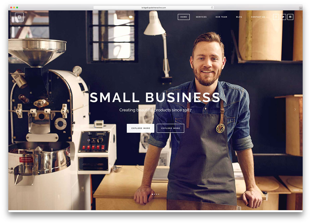
Bridge is a stellar Creative Multipurpose WordPress theme from Qode. It has over 210,000 sales and a 5-star rating in ThemeForest. It is the bestselling theme of 2026 and has been recently updated. This theme gives you a great start for a professional-looking website and an innovative web presence.
The theme is a virtual invitation to play, combine and invent to get a unique online identity. With regular lifetime auto-updates completed with a click and super professional support, you just can’t go wrong with Bridge.
Bridge is compatible with the free WooCommerce plugin and perfectly coded in HTML5, CSS3, and jQuery. It is your go-to theme if you want an impressive website. Bridge features many widget areas available for use depending on your site layout. This will help engage viewers, and you can create or sell anything with Bridge.
Let us check out how some example websites have innovatively used the Bridge theme features.
Bridge WordPress Theme Website Examples
Gratitude 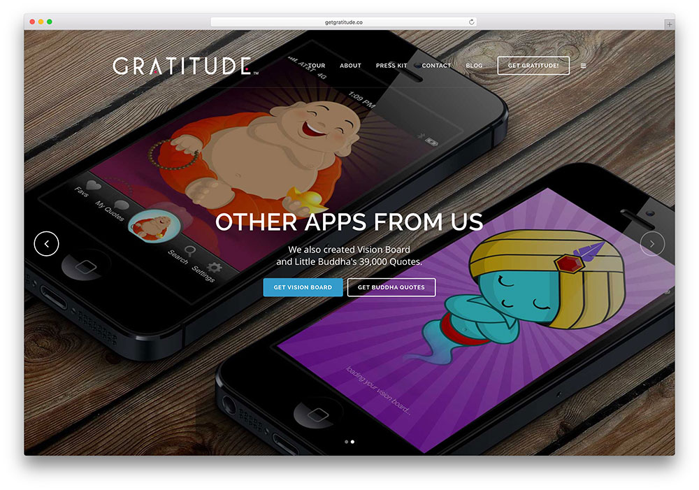
Carla White started Gratitude with the stated objective of making gratitude a daily habit. From the middle of farm country, USA, Carla has used the Bridge theme to reach a worldwide audience. Her website features a full-screen Qode Slider and the client’s carousel.
Garlic Media Group
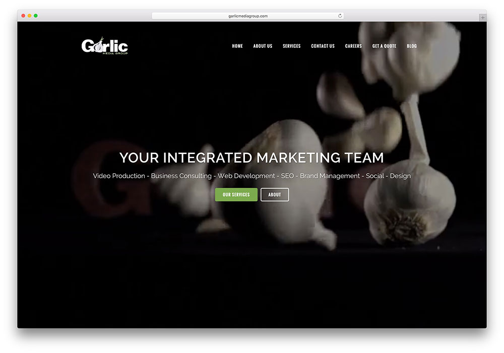
Garlic Media Group’s homepage features a video and a transparent overlay describing its services in short. The transparent sticky header turns monochrome as you scroll down, allowing the menu options to remain visible, helping visitors navigate the marketing company’s site.
Chocolate Arts

Chocolate Arts believes that fine chocolates are handmade and can convince you if you visit their website. You can see tempting displays of their work of art in portfolio format. Chocolate Arts uses the Bridge theme with added WooCommerce plugin.
Embrace Wellness

Embrace Wellness is a wellness and acupuncture healing center. They have a colorful, well-organized and functional website.
Code Creations

Code Creations is a small digital media business. Their services are shown neatly on their website with a pick from the two icons – Font Awesome and Font Elegant. The client carousel from Bridge has also been put to good use.
Wooster’s Garden
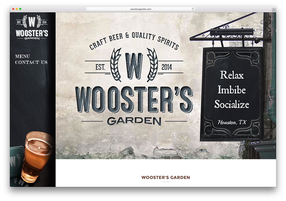
Wooster’s Garden serves beer and cocktails to lift the spirit. The website’s color scheme is designed to remind you of the bonhomie of sharing a glass with friends. The header is vertical, and social media icons are visible.
We Eat
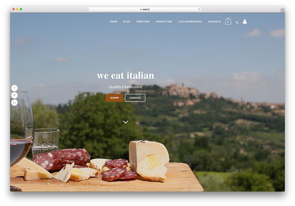
We Eat Italian displays the products of family businesses that protect their traditions, mostly food-related. The homepage supports background video. The website is in Italian, and here, the translation tool from Bridge comes in handy.
Wild About Wellness
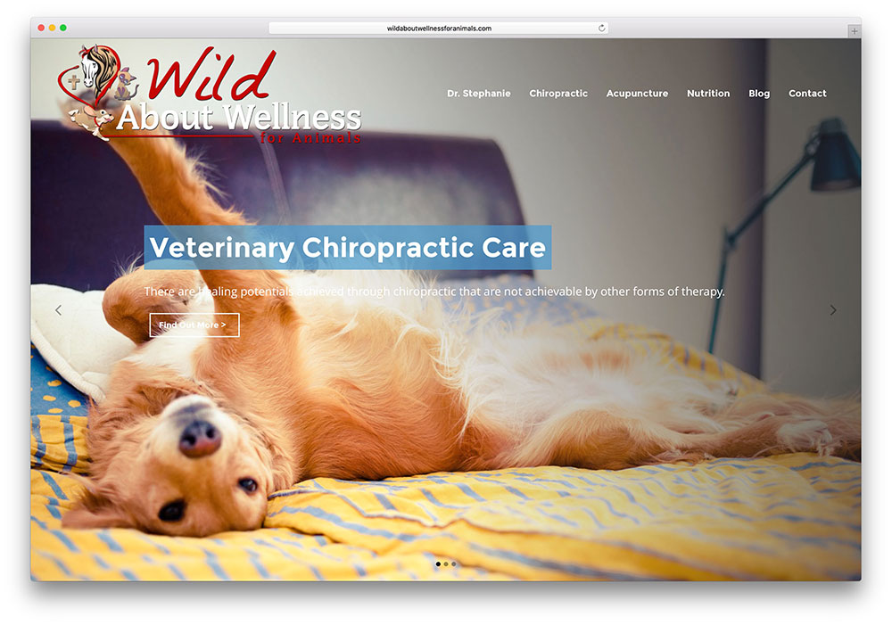
Wild About Wellness is Dr. Stephanie’s website, which provides holistic support for cats, dogs, and horses. It is based on Bridge. The LayerSlider and portfolio layout options from this theme are evident on the homepage.
Robin Gillon
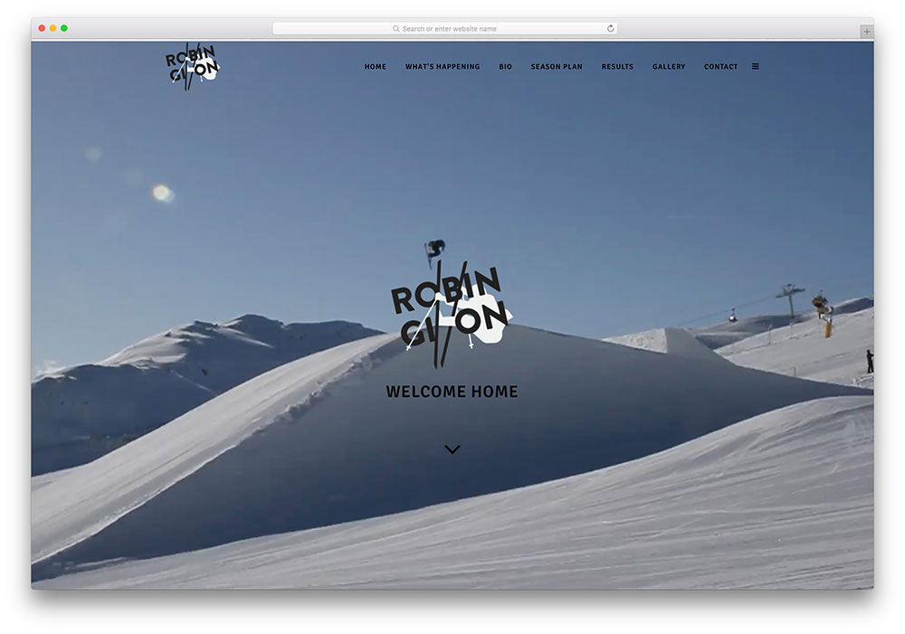
Robin Gillon, a ski instructor has used Bridge very interestingly, inviting you to take a leap. The background video catches all the action and just in case you have missed it, you can see it again in the portfolio displayed lower down. The footer is revealed from bottom upwards, even as you scroll down.
Cairn Expe

Cairn Expe is an adventure tourism company that has used the Gallery Greyscale feature from Bridge to show us the thrilling places it has visited.
Pharmacy
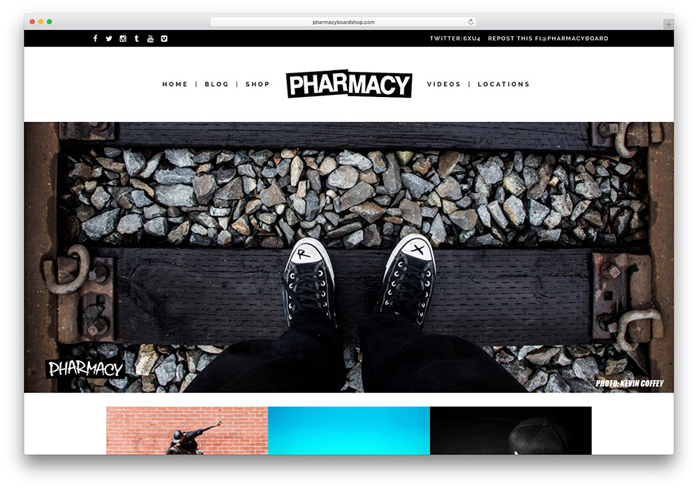
Pharmacy is a shop that sells quality skateboards. Just above the header, you can see the rotating tweets in action.
Church Apps
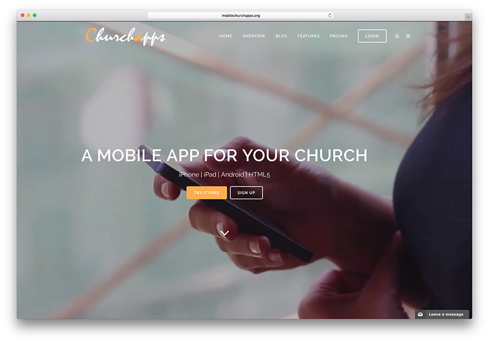
Church Apps uses apt icons from the Font Awesome and Font Elegant icon set from Bridge to inform visitors of their services /features. The pie chart with the icon option explains how they can build apps for your church and manage and promote it. They build apps to connect church leaders to the mobile generation.
In case you are looking to build a website for your Church you might want to check this versatile theme collection.
Kidstudio
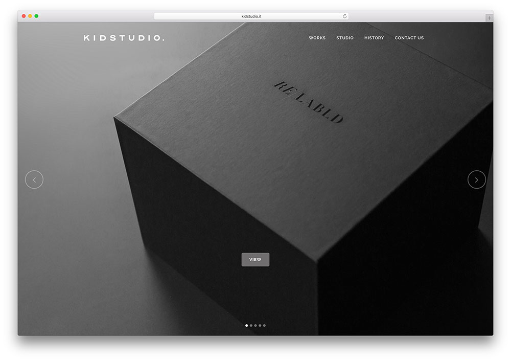
Kidstudio is engaged in branding, photography, web design, typography, and publishing. The website’s homepage uses LayerSlider, themed on Bridge. The client carousel moves up to reveal the footer.
Heather Bilyeu

Heather Bilyeu is a luxury real estate agent and has chosen Bridge to showcase her services. The Header has been made a little darker, which serves as a good contrast to the bright homes featured.
RepTheMidWest

RepTheMidWest is a community website. It supports a video from Vimeo on its homepage and more videos with animated elements. Icons picked from the Font Awesome / Font Elegant icon set have been placed against events to give a nice touch.
The Startup Guys
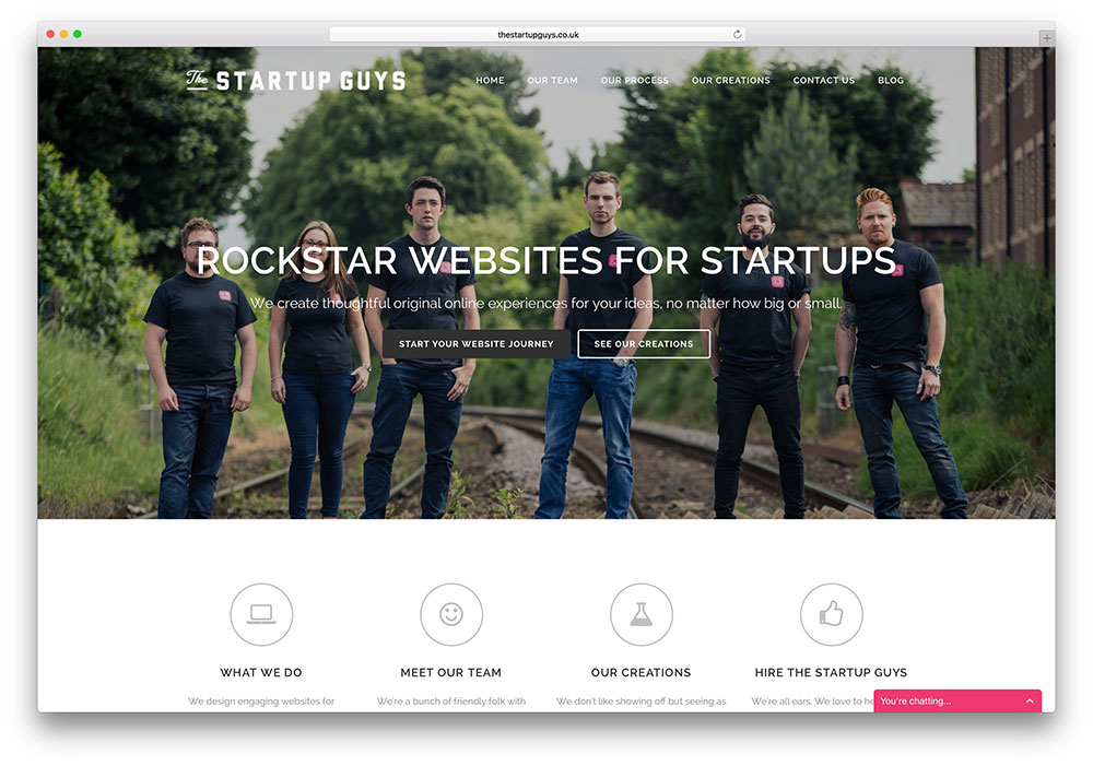
The Startup Guys promises to make your dream a reality by increasing online sales and helping you connect with your customers. In designing their website with Bridge, they have used font options, interactive counter elements, and the Greyscale gallery format.
Mimetico

The Mimetico website leaves no doubt that they are in the business of animation. Their LayerSlider contains animated images, and even their logo in the header contains interactive animated elements taken from Bridge.
Elusio
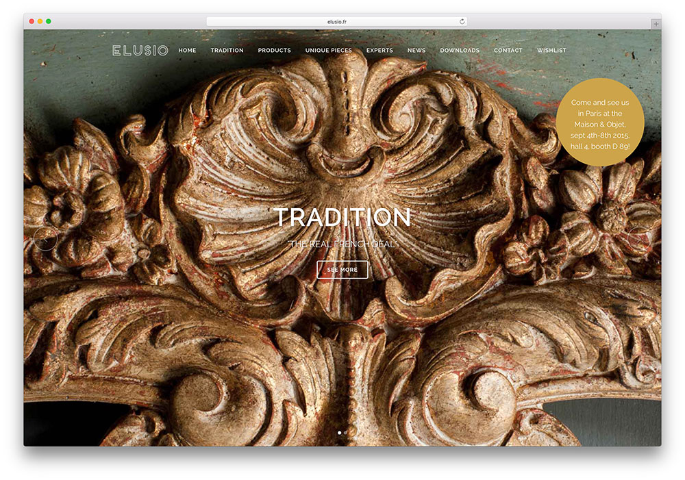
Elusio renovates and restores art objects and makes beautiful art pieces, drawing inspiration from 17th—and 18th-century France. Its website highlights beauty and tradition, and Bridge proves to be apt for this purpose. The number counters on the site advertise their success.
PawPark
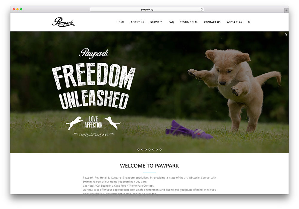
PawPark is a pet boarding facility in Singapore. The LayerSlider and the smooth transitions from Bridge show visitors how pets are pampered.
Angle Orange
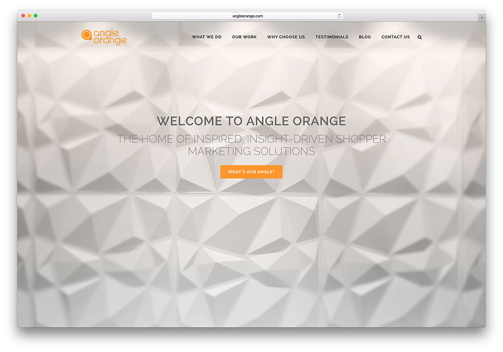
Angle Orange builds brands and drives brand power. They have showcased their services using Bridge, delving into its wide range of fonts, including Font Awesome and Font Elegant. Their homepage carries posts from recent blogs, and small blog pictures have been included, making the site attractive.
SchawelColes
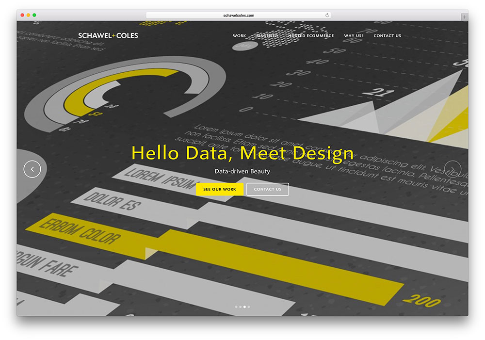
SchawelColes describes itself as your partner in eCommerce and combines data and design to deliver a great user experience. The LayerSlider on their homepage, constructed on Bridge, surprises a visitor when it moves from images to a video in one of the layers.
Claurus
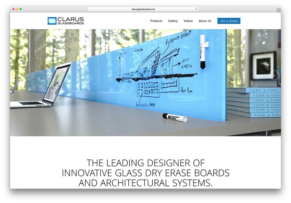
If you want transparency, you get it. Claurus uses colors to portray the range of glass boards it offers. It uses the drag-and-drop page builder and Visual Composer from Bridge to highlight the product details.
BaobaoDigital

BaobaoDigital is a digital agency based in Vietnam that develops web applications and has launched the first social fashion platform, Zoco, in Vietnam. Their bridge-based website is minimalistic, with a vertical header on the left and a portfolio display that appears when scrolling down.
Sticky Wrapper

Sticky Wrapper is a brand marketing company. This website has optimized the portfolio options and carousel display from Bridge theme imaginatively to display their clientele visually.
Aspire3
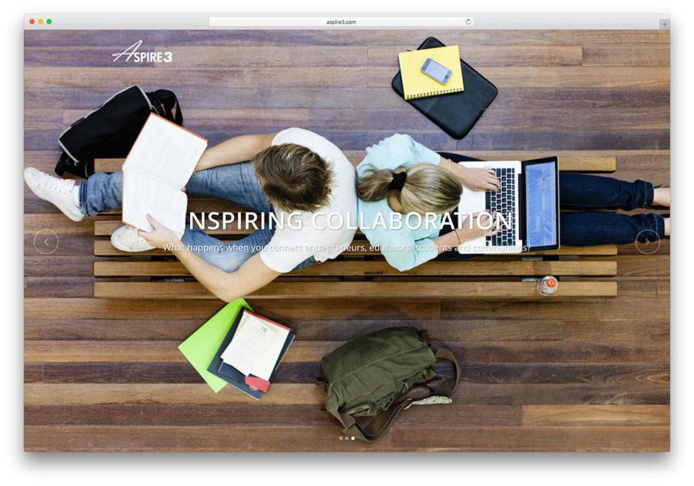
Aspire3 works to unlock potential, especially among students, and accelerate innovation. The interactive zero counter element from the Bridge theme shows how far they have succeeded in this endeavor.
Eric Mok

Eric Mok offers creative strategy, digital branding, and design services. His example website is based on the Bridge theme.
23 Lemons
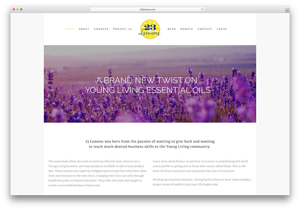
23 Lemons combines two goals: imparting business skills courses to the young community and donating about half of the proceeds to the deserving through essential oil donations. They use their website to market both their courses and essential oils.
Bar Pop
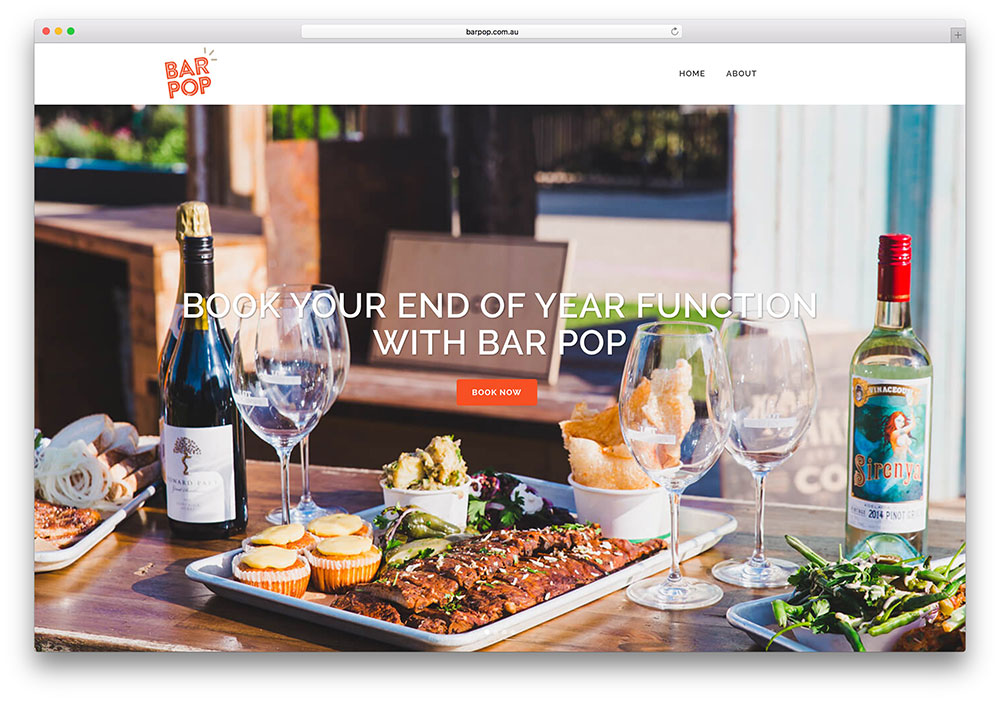
Bar Pop is a team of caterers who organize parties in cool locations. Bar Pop has used short, less-than-a-minute videos on their homepage to inform of forthcoming events. The interactive zero counter element from Bridge helps them keep track of numbers.
The Design Bootcamp
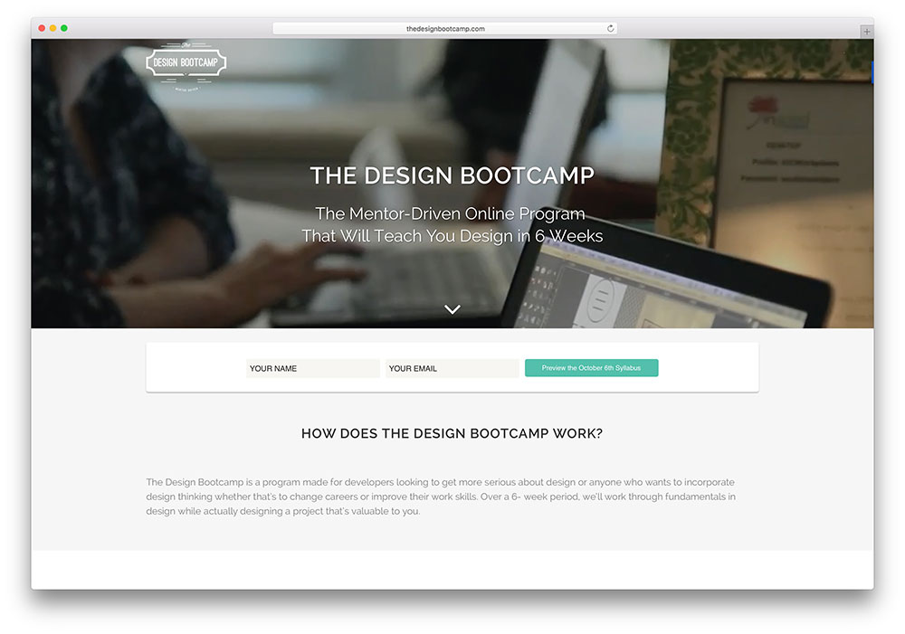
The Design Bootcamp is a mentor-driven online program to teach design within 6 weeks. That is a huge task, but Design Bootcamp has explained how they will accomplish it with interesting icons from Bridge.
Slovenia Incentives
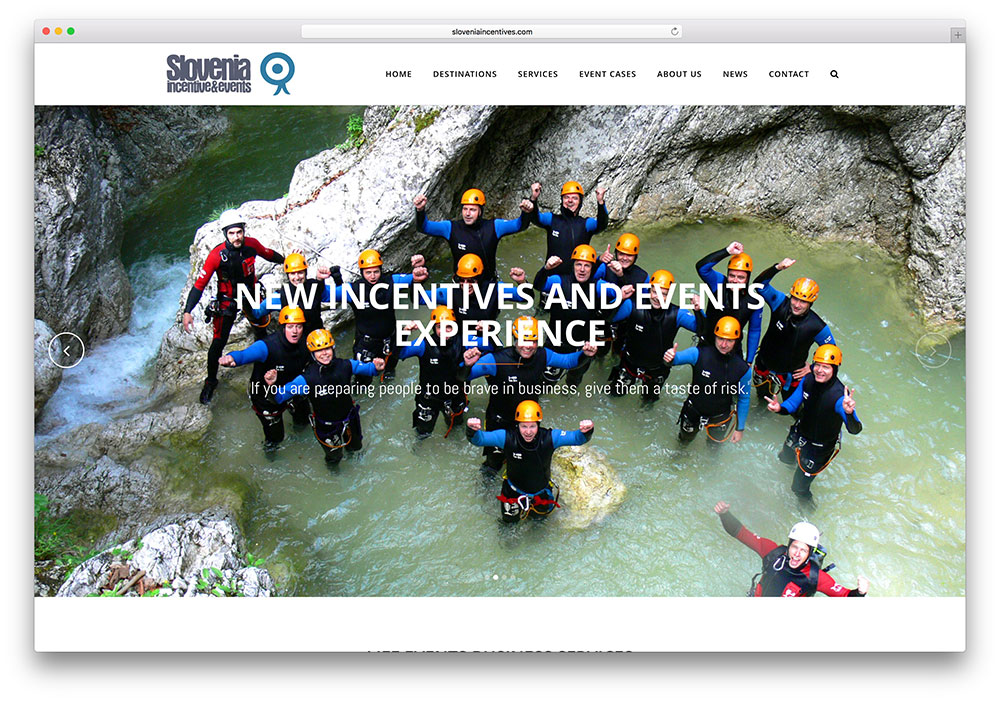
Slovenia Incentives picks interesting icons, expandable sections, LayerSlider, and portfolio options from Bridge to showcase the events it has organized and its services.
Notable Bridge WordPress Theme Features
The features that make Bridge very popular include:
- 24 layout concepts and 2000+ options.
- Packed with over 100 demos, all of which can be easily imported.
- Free WPBakery Page Builder or Elementor
- Free multi-layered LayerSlider plugin with more than 200 preset 2D and 3D slide transitions and an easy-to-use interface. Fade in/out animations and slide/fade transitions.
- The full-screen Qode slider supports background videos and images, with or without a parallax effect.
- 80+ custom codes.
- Extensive collection of page and site layouts.
- Woocommerce compatible. Online shop can be set up instantly with the free WooCommerce plugin.
- Responsive, with the option to disable this function.
- Full control of text. Different styles are possible for different text areas, and many styles are available.
- Large selection of fonts.
- Customizable Google Maps, where you can add multiple addresses and custom map pins.
- Full set of social media icons to enable easy sharing. You can even upload your social icons.
- 2 full sets of font icons – Font Awesome and Font Elegant.
- CSS3 animations for a smooth and seamless experience.
- Amazing parallax effects that can be applied to individual sections of the layout.
- Separate header skins for each slide or section. 10 separate header types.
- Ajax page transactions make full page reloads quite redundant.
- Large collection of blog and portfolio layouts.
- A landing page template that can be used to notify visitors about downtime or upcoming events.
- Multiple logo versions and an optional separate logo for the full menu.
- It supports multilingual sites as it is compatible with the WordPress Multilingual plugin.
- The translation is ready as it is equipped with PO & MO files.
And Finally
Most of the example Bridge theme sites picked out here have some elements in common – WooCommerce plugin, call-to-action buttons, contact forms, and social icons, all of which provide a great online shopping experience and keep up the virtual footfalls. Bridge is a good fit for eCommerce companies and online retail. The Qode options panel is packed with many user-friendly and useful options to help configure all settings, and it is possible that you can use this multi-purpose theme for other websites as well.
It would be great if we could know how you have used Bridge!
Purchase Bridge Now!




I use Bridge theme and I love it!
Thanks for these examples. It is a source of inspiration ^^
Bridge is amazing. We are looking for Developers who use Bridge specifically. Let me know if anyone is interested. Thanks
Great examples! Awesome sourcing. Thanks.
Adding a link to each website would be very helpful though.
I use it quite a lot and its quite flexible.
Love the bridge theme. I have used lots of different themes and now only use this one!
We love Bridge and recommend it to all of our clients!
Very nice bridge but too much code.
Doesn’t work very well with SEO