20 Best Free Bootstrap UI Kits 2023
Coming up with game-changing ideas is the dream of almost any programmer out there. Many achieve this feat spontaneously, meaning they create something game-changing without thinking about it. It’s the little things that make those big waves of change, and Bootstrap was one such change that has transformed the ecosphere of developing and prototyping websites. The biggest adaptation purpose, of course, is integrating all devices regardless of their type, something that’s crucially important to a successful, modern website. The designs from this framework have been utilized by some of the most highly regarded startups.
The components of Bootstrap have been one of the iconic reasons why people rely so much on this framework, the components include (but not limited to): icons, buttons, navigation bars, input forms, breadcrumbs, pagination, labeling, badges, thumbnails, page alerts, progress bars, media related objects, lists, responsive media, and plethora more. Everyone gets access to individual CSS and JavaScript components, which is also the defining structure of the framework, and why such robust and highly scalable websites can be built.
But, there is one tiny little problem, well..problem for those who see it that way; perhaps limitation is a better word. Bootstrap relies on a single design, which means that anything that you will be building will look almost exactly the same, as far as appearances and colors go. Unsurprisingly, some experienced developers are making fun of the framework – a parody of how every single Bootstrap website looks exactly the same. We won’t disagree because in many ways it is true, a lot of Bootstrap websites do look the same, but we also know that this can be solved through simple means: UI kits.
UI kits, or User Interface kits, are a collection of components and elements that use a specific framework as the core — in this case Bootstrap — but build on top of the style of elements with different color choices, shapes, objects, and custom items. All this can significantly enhance your Bootstrap experience because suddenly you’re getting access to more elements you can play with, but still maintain the known Bootstrap structure.
At Colorlib, we embrace Bootstrap and know how much of our community members and the wider web community adore the functionality of Bootstrap. Some of our best Bootstrap posts have been: Bootstrap WordPress themes, Bootstrap landing page templates, and Bootstrap eCommerce website templates. The benefits of using Bootstrap could go on for hours, but we will spare that discussion this time, and instead focus on why you are here because you want to explore some kick-ass Bootstrap UI kits!
Get Shit Done Kit

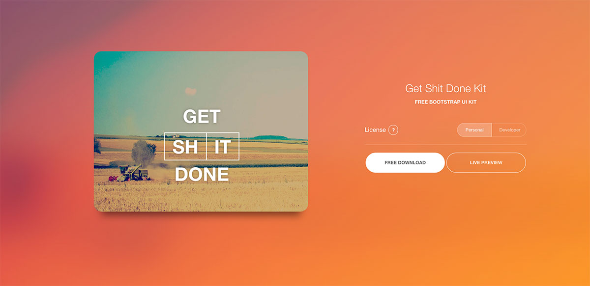
This UI kit is approaching 20k+ downloads fast. Frameworks, and also UI kits of course, are all about getting things done more efficiently, without the need to ponder and brainstorm each part of the design individually. With a framework/uikit, we have access to a grid-style design that can be plugged with components and custom snippets. The Get Shit Done UI Kit is a modern, clean, and features a stunning user interface that so many have fallen in love with. The good news is, the pro version of the kit has more than 150+ components, the bad news.. the free version has only 20+. But, all of them are built organic, so they’re completely unique to anything else you’ve seen on the market. The quality of design is truly smooth and authentic.
Bootflat
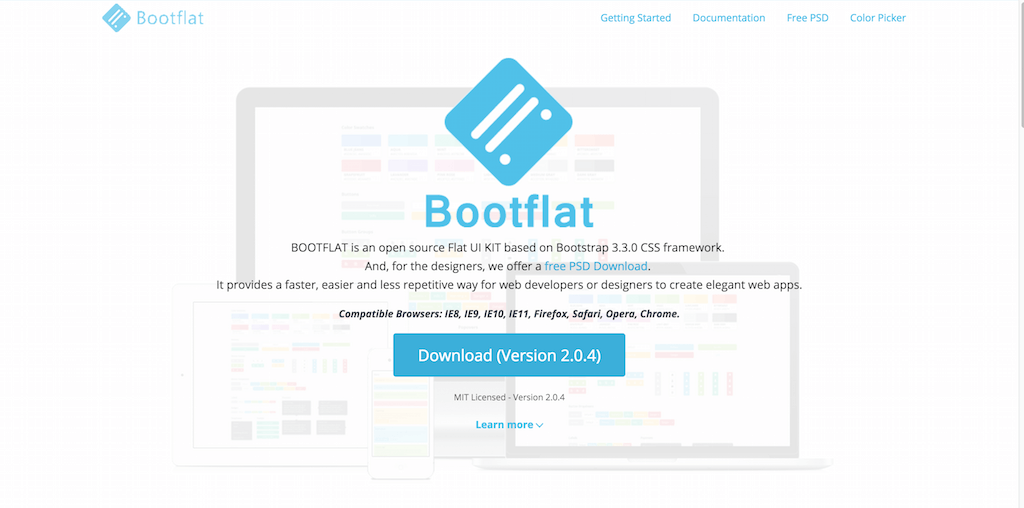
Welcome to Bootflat! Bootflat is a modern UI components pack for Bootstrap users. The pack contains components that can be used to bootstrap a startup website, platform, or application for Android / iOS. Straight away, Bootflat shines with its ability to work independently with all of its components, so you can just use what you need and leave the rest out; best part though, the components use the same design style (as they would in a ui kit), so anything that you do put together looks authentic and original. Bootflat gives you the necessary space to save coding time, and give you all the little gadgets to prototype a business/startup website in minutes. Buttons, forms, headers and footers, timelines, pricing tables, calendars, content areas, comments areas, individual content boxes, and so many more components to pick from.
Material Design for Bootstrap
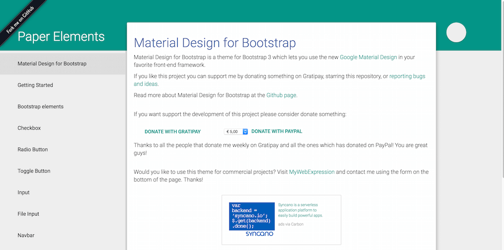
Bootstrap developers/designers don’t need to feel like they are being left out when huge design standards are introduced, such as one of the most recent ones: Material Design. Thanks to the active community involvement, some developers have taken their time to ensure that Bootstrap users can also get access to the new standard. The beauty of Bootstrap is that the framework itself acts as a grid for building a website, and the components are merely solutions to make your website look fancy, but Bootstrap allows custom editing of components and encourages it.
Because of that, we now can download this Material Design UI Kit for Bootstrap and have our Bootstrap websites transformed into material design experience instantly. Of course, there are the news of Bootstrap 4 being in development, we know this, and so does the author of this kit. The V4 kit is in active development, alongside the development process of actual Bootstrap 4. Various plugins are also added to this kit that you should check out to ensure they’re compatible with your designs.
Tron
There are so many reasons why we love to report on these kinds of downloads, but perhaps the most valuable of them all is to be able to learn for ourselves about the kind of work that developers and designers are putting together to bring about such magnificent downloads for everyone.
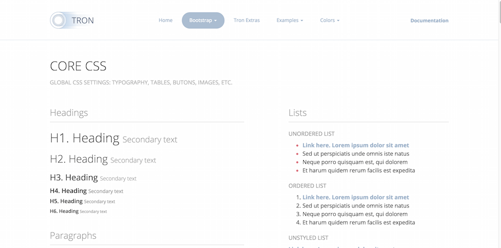
Tron is a modern Bootstrap UI Kit that’s built with the support of LESS (a CSS pre-processor) — allowing the ui kit to become that much more extendable and flexible; LESS allows you to quickly change size, shape and colors of any each component/element. Tron’s design scheme is FLAT — your designs will begin to feel modern without the need to enforce it. Because Bootstrap is already fully responsive to mobile devices, so is Tron, with the exception of adding touch-friendly features to extended the mobile usage. Apart from all the traditional and default Bootstrap components that you get with the framework, Tron has a few extras and surprises up their sleeve, just to ensure that the UI kit is authentic.
Drunken Parrot Lite
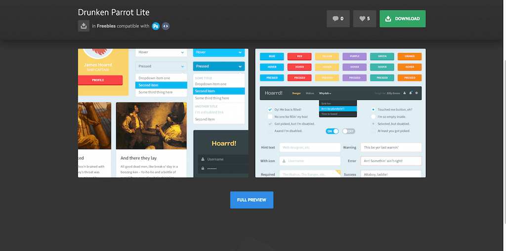
Drunken Parrot Lite is a very, very appealing transformation kit for your Bootstrap designs. The first impressions are clear, the kit will add more stability to your designs, the texture of the component designs becomes more mature, and in turn more modern and appealing. Buttons feature many different sizes, but also many different variations that would find their home in any design.
Something about the design style makes this ui kit so appealing. The extras in the Lit package include a profile widget, a login page widget, and a toolbar widget; both vertical and horizontal. When we say Lite, we want to point out that this is the free ui kit version of the full pro version that’s available on the creator’s website. The full version has many new and interesting features added to it, that could perhaps complete your search if you’re looking to create attractive websites for both startups, and clients of all fields.
Web Flat Gui

Flat designer lovers, Web Flat GUI is for You! A mellow UI Bootstrap kit that has some neat components attached to it. We love the minimal calendar that has no additional borders, and we like the simplistic login widget that focuses on getting the user inside of the platform straight away. As matter of fact, much of this UI kits components are very minimal in their style, allowing for a minimal-design development. Some interesting widgets include a tags cloud, a friends cloud, and a table that can be extended to display data. Take what you like, leave the rest on the table, and create a design of your dreams.
User Interface Ui kit
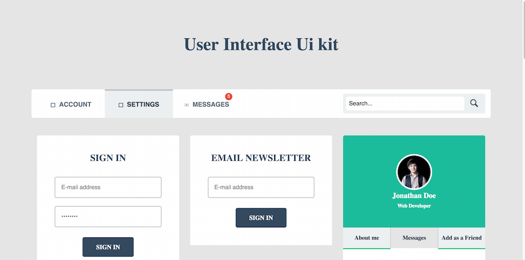
First thought that appears when opening this design demo is Semantic UI. Awfully similar, with a few extra differences here and there. The navigation is meant to be used for sites that deal with use profiles, and need a concise solution for integrating community aspects into the design. A simple email newsletter widget is available too, for collecting those emails and building that huge email list of yours.
The profile widget has a tabbed approach, meaning that Abut, Message and Follow Me are all divided by tabs. Something that many other kits have lacked so far is a social media following widget that would display the social media websites you are on, and show the number of followers you have; this kit takes care of that. It also lets you use a component for displaying your latest tweets in modern and stylish fashion. Quite a few other unique ideas are being included in this one, we will let you explore those on your own.
Food and Drink UI Kit

UI kits can have different themes, styles, and general allocations. As we move deeper into our post, we’ll explore some category specific ui kits for industries such as food and drinks, as can be previewed in this example. We have been very impressed with this ui kit and the way it flows with modern design components. A beautiful toolbar menu caught our attention as one of the first things we noticed. The menu features food-icons that could resemble a food menu, and then once a user hovers over each of the icons, additional menu items come out; which could serve as the actual food items on the menu.
A recipes card exists that features ratings, time required to cook, nutrition information, a picture, and a link to the actual recipe. An ingredients widget exists to help display the required ingredients for each individual meal. A wonderful Events calendar lets you create events for each particular day and hour to keep you in check about your food requirements. A shopping list widget will help you and your customers to arrange their shopping lists as they use your store to purchase fresh produce. Please do remember, these are only components, and while they do provide all the design aspects of a functioning form, all the development and coding is still required to be done by you.
Summer Sale UI Kit
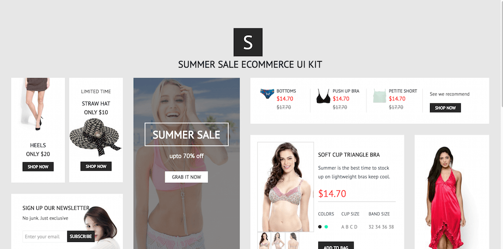
Summer is once again approaching, so more and more websites will be planning huge redesigns for the summer season to outline deals, sales and offers. This UI Kit has everything related to making the shopping experience easy and flexible. A banner component to promote specific sales categories, a product widget to discuss product appearance, colors, sizes, and more. A detailed shopping bag component to make the checkout process convenient for the customers.
Material Mobile UI Kit
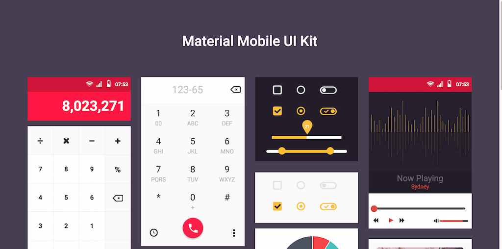
We aren’t done with material design just yet, here’s another spectacular kit featuring material design, but this time specifically for mobile applications. The components include: a calculator, a phone call display, progress bars and switches, a music player, a messaging interface, an analytics widget, a pie chart, content display, a clock, keyboard design, a calendar, gallery preview and forms input. You could be working on an existing material design concept, and require some unique components — you could try and find them amongst the components in this kit, otherwise just keep looking, we’re sure there’s something that you like available out there.
FLATTO UIKIT
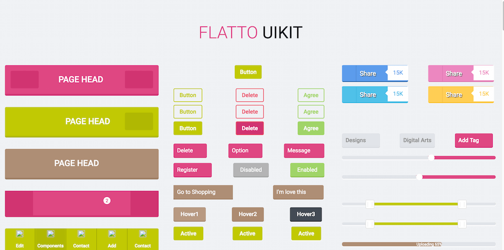
We will let you gues what kind of design standard Flatto uses, of course FLAT! The style/scheme of the components here will make for a great website that girls, and female communities will enjoy. Flexible, predictable and practical components that can help in crafting a stunning design within a few hours, here’s the full list: page navigation headers (mobile style), variety of buttons for doing action calls, social media sharing buttons, tick boxes and switches, tags widget, progress bars, loading bars, a social media follower widget to display follower data, a messaging form, a video player, visual content slider, music player, profile card including send a message form, weather widget, statistics, content, and others.
Flatastic Mega Mobile UI Kit
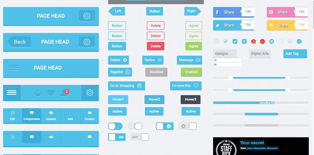
Flatastic is actually the sister-style to Flatto, both share the exact same components, but the difference is in the coloring. Explore both and pick the one that’s most appealing to you. We know that changing colors isn’t all that difficult with Bootstrap oriented kits, but some don’t have the capacity to do the work, so alternatives such as Flatastic come in handy really quick.
Superminimal — Flat Designed UI Kit
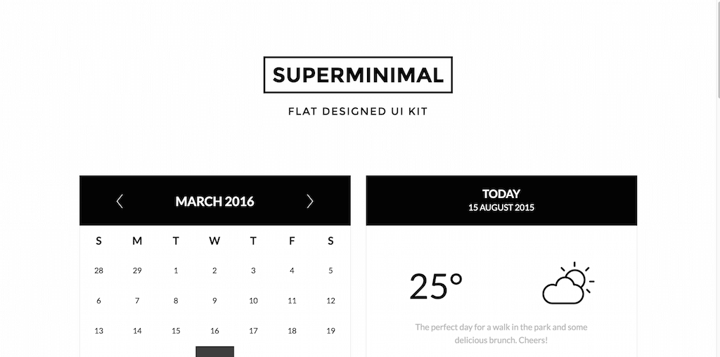
When someone says minimal, you know what to expect, but what if someone says “superminimal”? Well, it gets even more minimal than anticipated. Superminimal is a black+white combination of web components, ready for full integration in your next design project. The components consist of: calendar, weather, progress bar, login form, slider bar, percentage chart, media player, content excerpt, download archive, search bar, and to-do list form.
Interface Ui Kit

Interface UI Kit is a lightweight Bootstrap UI Kit for integration as additional components to an existing design. Bootstrap users who operate with WordPress could find use for these, as they match everything that WordPress is about. The components are: unfolding navigation menu, login form, profile card, floating social bar, buttons, pagination navigation, weather boxes, progress sliders, and analytics chart. Design is grayish, but fairly mellow.
Cyan Flat UI KIT
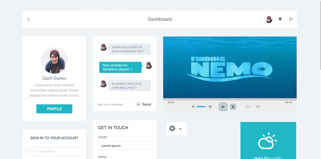
Cyan Flat UI KIT has modern design on its mind. Also, this kit’s strictly focused around community sites that would offer user signups, so in turn having a component that acts as a navigation menu for users. There’s a sleek messaging interface concept for instant messaging solutions, an interactive and dynamic video player, modern contact form, a successful submission box card, a Twitter profile widget that can display your latest tweets, a media player for audio, a widget for showing/displaying social media buttons, and individual card for displaying song information.
Social Summer UI KIT
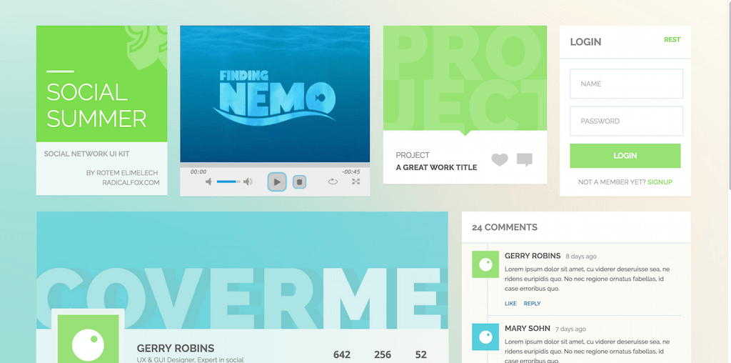
Social Summer, as the name suggest, has something to do with social media. While not so overly social component populated, one great and unique component we did find with this ui kit is the comments widget. The design of the comments widget is perfect to be incorporated into a WordPress blog, but also any other dynamic website that deals with user feedback on frequent basis. It’s a modern and minimal execution of how the community comments should flow. There’s a huge component for displaying user information as well, similar to what we get as the header grid on our Facebook profiles; profile photo, header photo, and profile stats. Guess there are some social aspects attached to the idea of Social Summer after all.
Metro Foods UI Kit

Metro Food is another ui kit for food lovers, and food webmasters. This time we have a huge navigation header with navigation icons. We have a recipe widget for showcasing the final look of the item we are cooking. We also have all the ingredients and their appropriate volumes. The developers integrated this with a slider to help promote recipes and other food related items. There’s a tiny component to show how many calories a particular meal has, and also how big of a percentage of a particular food item is in the meal. For example, how much beef is there within a roast beef meal, etc,. Contact form widget is also available to make sure that users can quickly reach out to you with their burning questions about food.
Transparent UI Kit
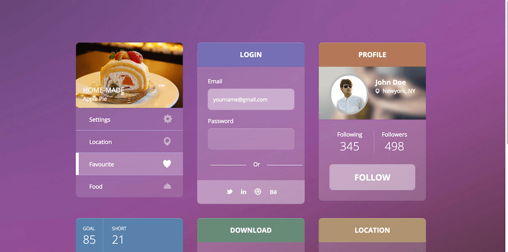
Transparent design hasn’t really caught up with modernism, but perhaps this is what makes it so authentic, and so unique. To perfect a transparent design, a lot of thought has to go into the overall display of a design. You also need to convey your message to the user clearly. The feel we get from the demo, is once again about food, but the examples here could be limitless. Perhaps, it’s the mobile market that could benefit from this ui kit the most.
Blog Magazine UI Kit

As for our last free Bootstrap UI Kit, we have included the Blog / Magazine UI kit. It’s the all-in-one solution for creating a Bootstrap Blog or Magazine using modern, stylish and elegant components. The list of components includes absolutely everything that you would need to prototype a blog/magazine website. That includes social features, forms, comments, button’s, content areas and content display types, and much more.
Conclusion: Bootstrap UI Kits
The progress of Bootstrap has been very clear. The community gets excited for the release of Bootstrap 6. In line with this, there is still plenty of time and opportunity to learn the framework from the ground up. It is more than likely that the majority of these UI kits get a Bootstrap 6 update. As soon as the official release hits the shelves, developers will indeed to release updates. We’re excited for the future of Bootstrap. We hope that you were able to find some new and exciting toys to play around with.



So what happened to these being “35 free” themes?
Matthew,
Most of these UI kits are absolutely free. We decided to add additional section at the end of section that also showcases premium ones. You can see a dividing title in the article that clearly states that from there remaining ones are premium.
The divide is not actually clear. It looks the same as the headings for each of the free UI listings, so it just blends in. Whoever runs this website might consider making the divide stand out more so it is clearer to the reader.