
34 Bootstrap Hero Section & Jumbotron Examples 2026
This list has 34 Bootstrap jumbotron and hero section examples: 12 new Colorlib heroes and 22 classic jumbotrons with background images, video, gradients and parallax.
Bootstrap 5 no longer ships a jumbotron component, so most sites now build the same large opening block as a hero section. We designed the 12 Colorlib heroes at the top this year for SaaS, app, product, event, restaurant and travel pages. Each is a free download with a live demo, written in plain HTML and CSS with vanilla JavaScript only where needed, such as a mobile menu or a countdown, and each works on its own or inside a Bootstrap 4, 5 or 6 project.
Many of the 22 CodePen jumbotrons below were written for Bootstrap 4, and one uses Bulma. Treat them as references for the classic patterns: a full-screen background image, a video background, a gradient and a slider inside the jumbotron.
If you need the whole page and not just the hero, browse our Bootstrap 5 website templates.
Free Colorlib Bootstrap Hero Sections
Bootstrap 5 dropped the jumbotron component, and most sites now open with a hero section instead. We designed these 12 in 2026: SaaS, agency, app, product, event, restaurant and travel heroes, each with its own header and a designed mobile layout. Each is a free download with a live demo.
Hero V01: SaaS split hero with a CSS-built product dashboard
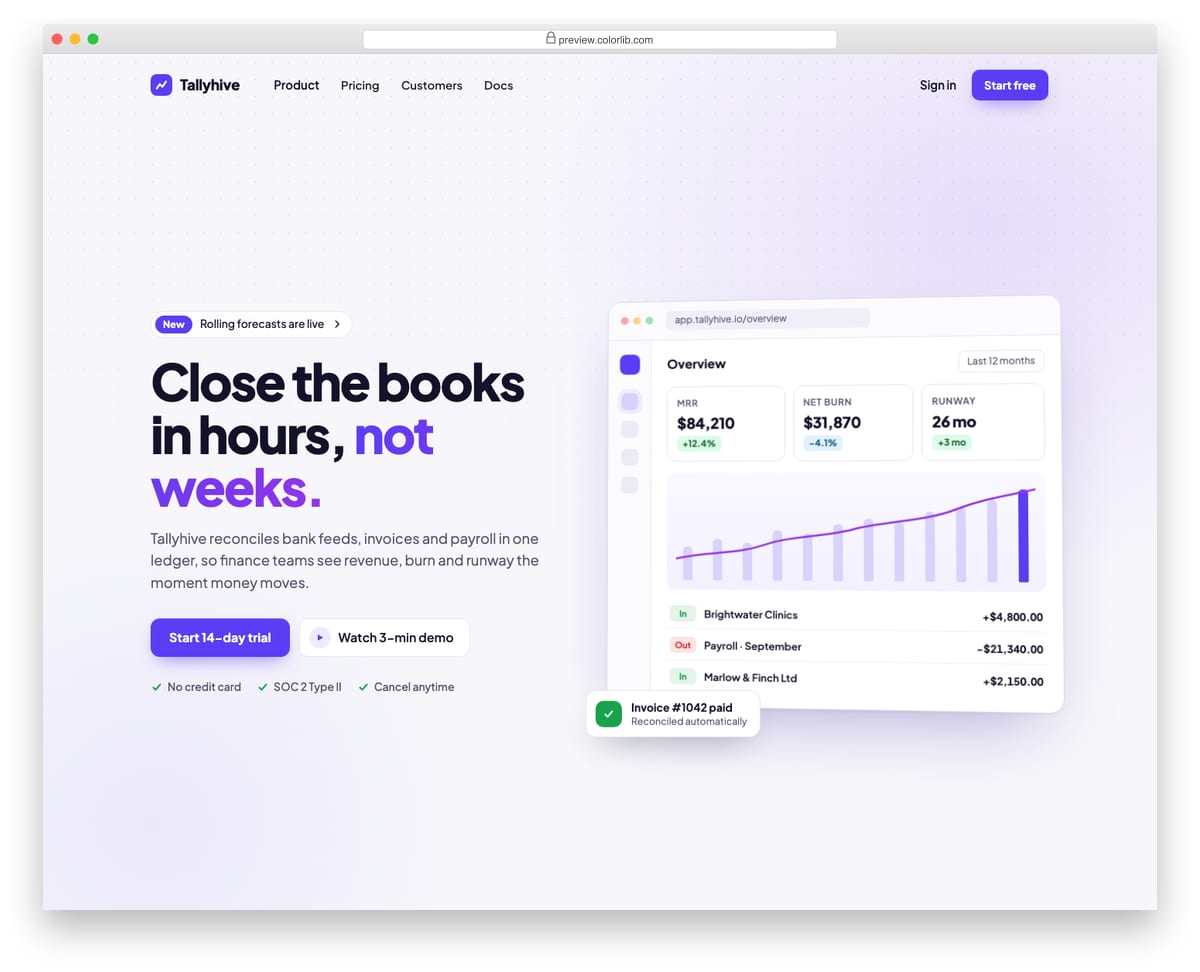
A split landing-page hero for a finance software product, with an announcement pill, headline, supporting copy, two calls to action and a short trust list on the left. The right side is a product dashboard drawn entirely in HTML and CSS, with KPI tiles, a bar and line chart and recent transactions, so there is no screenshot to replace. A top bar with logo, links and sign-in collapses into a menu button on phones.
Best for: SaaS, fintech and B2B product landing pages. Plain HTML and CSS with a few lines of vanilla JavaScript, a 250 KB download, and it works on its own or inside a Bootstrap 4, 5 or 6 project.
Hero V02: Centred hero on an animated gradient mesh with a logo cloud
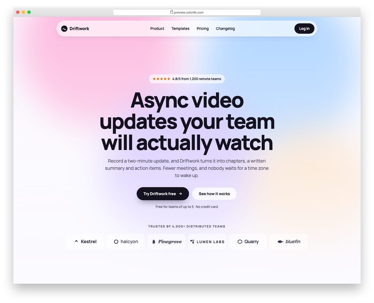
A centred landing-page hero for a remote-work video product, set on a soft gradient mesh made of four blurred shapes that drift slowly. It has a rating pill, a balanced multi-line headline, two calls to action and a logo cloud of six invented company wordmarks drawn with inline SVG. The glass top bar turns into a round menu button on phones, and the mesh stops moving when reduced motion is requested.
Best for: product launches, startup homepages and waitlist pages. Plain HTML and CSS with a few lines of vanilla JavaScript, a 204 KB download, and it works on its own or inside a Bootstrap 4, 5 or 6 project.
Hero V03: Editorial agency hero with oversized serif typography
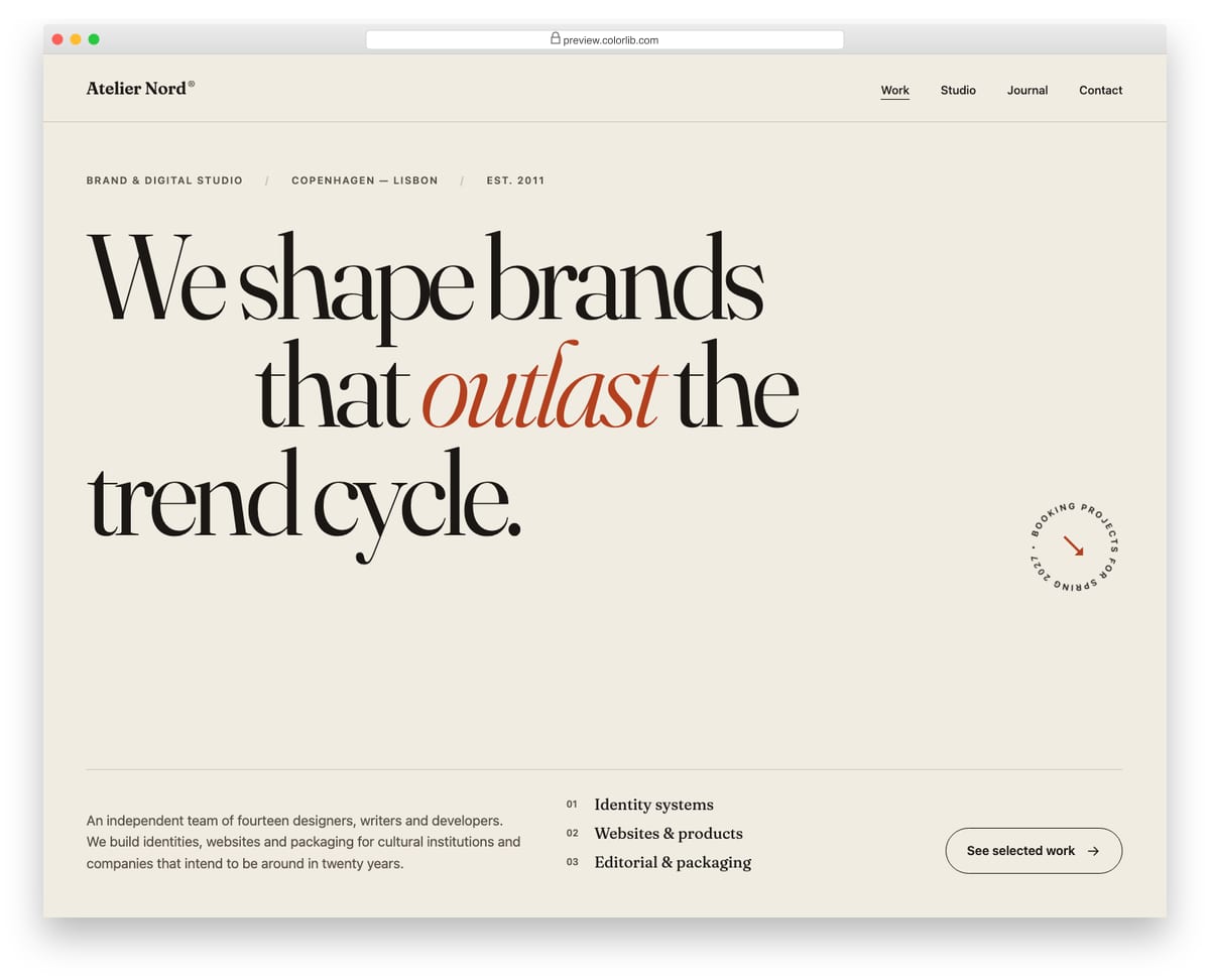
A minimal, type-led hero for a design studio, built around a very large serif headline with an indented middle line and an italic accent word. A thin rule separates the headline from a footer row with a slowly rotating circular availability badge, a short studio introduction, a numbered service list and a link to the work. It needs no JavaScript: the four navigation links stay visible at every width and simply move under the logo on phones.
Best for: design agencies, studios and creative portfolios. Plain HTML and CSS, no JavaScript, a 280 KB download, and it works on its own or inside a Bootstrap 4, 5 or 6 project.
Hero V04: App download hero with CSS phone mocks and store buttons
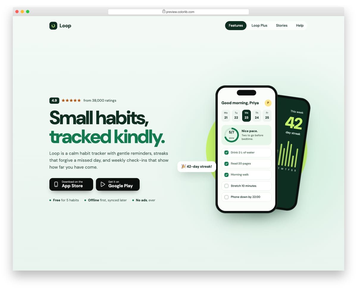
A mobile-app landing hero for a habit tracker, with a rating line, a two-tone headline, short copy, two generic store download buttons and three quick facts. The right side shows two phones built entirely in HTML and CSS: today's habit list with a conic-gradient progress ring, and a tilted stats screen behind it. On phones the layout centres, the store buttons go full width and a single phone mock remains.
Best for: mobile app launches and app marketing pages. Plain HTML and CSS with a few lines of vanilla JavaScript, a 376 KB download, and it works on its own or inside a Bootstrap 4, 5 or 6 project.
Hero V05: Newsletter email-capture hero with inline validation
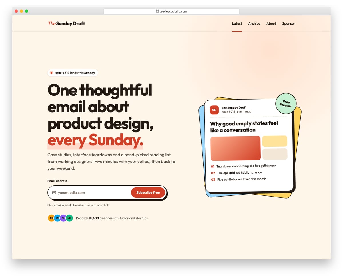
A landing hero for a weekly design newsletter, built around one inline email field and a subscribe button. The form uses the browser's own constraint validation, shows a plain-language error under the field with aria-invalid set, and swaps to a success message in a live region when the address is valid. A stack of offset cards previews the latest issue beside the copy.
Best for: newsletters, waitlists and pre-launch pages. Plain HTML and CSS with a few lines of vanilla JavaScript, a 239 KB download, and it works on its own or inside a Bootstrap 4, 5 or 6 project.
Hero V06: E-commerce product hero with colour swatches that switch the photo
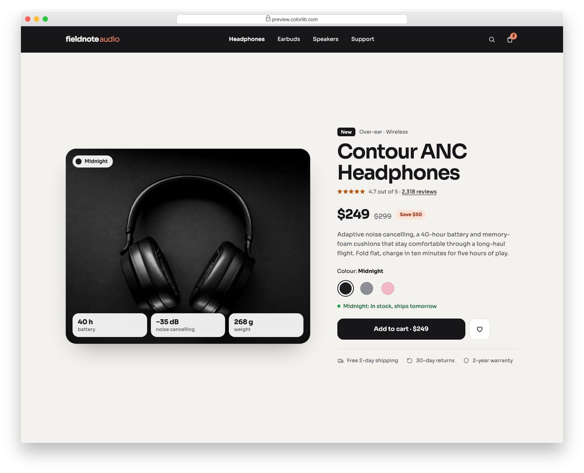
A product hero for an online audio shop, pairing a large product photo with the headline, rating, sale price, description and buying options. Three colour swatches are native radio buttons, so arrow keys work, and choosing one swaps the photo, its alt text, the colour label and the stock line with a short cross-fade. It also includes a wishlist toggle, spec badges over the photo and shipping perks.
Best for: product launch pages, single-product stores and shop homepages. Plain HTML and CSS with a few lines of vanilla JavaScript, a 342 KB download, and it works on its own or inside a Bootstrap 4, 5 or 6 project.
Hero V07: Conference hero with date, venue and a live countdown
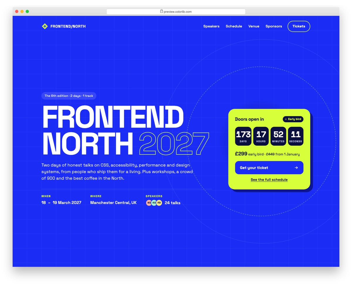
A bold event hero for a two-day front-end conference, with an oversized uppercase title, an outlined year, the dates, venue and speaker count in a description list. A lime ticket card counts down the days, hours, minutes and seconds to the opening and holds the ticket price and call to action. The countdown uses a role="timer" region with a readable label and switches to a doors-open message when the date passes.
Best for: conferences, meetups, festivals and product launch events. Plain HTML and CSS with a few lines of vanilla JavaScript, a 171 KB download, and it works on its own or inside a Bootstrap 4, 5 or 6 project.
Hero V08: Restaurant hero on a full-bleed food photo with opening hours
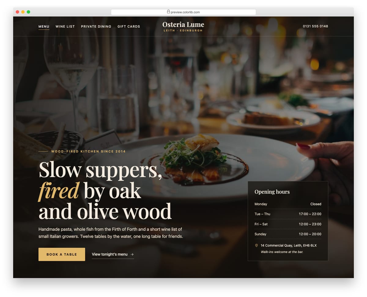
A full-screen restaurant hero with a dining-room photo under a layered dark overlay, a centred serif wordmark and navigation split around it. The headline, a short introduction and a gold Book a table button sit bottom left, and a translucent card lists opening hours, the address and a walk-in note. On phones the photo stays at the top, the overlay deepens and the hours card stacks under the copy.
Best for: restaurants, cafes, bars and hospitality venues. Plain HTML and CSS with a few lines of vanilla JavaScript, a 298 KB download, and it works on its own or inside a Bootstrap 4, 5 or 6 project.
Hero V09: Personal portfolio intro with avatar, availability badge and social links
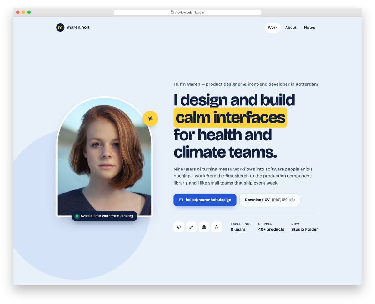
An introduction hero for a freelance designer's portfolio, with an arched portrait, a pulsing Available for work badge and a small rotating sticker. The copy side has a greeting line, a highlighted headline, a short bio, an email button, a CV download link, four icon links and a row of quick facts. It uses no JavaScript, and on phones the portrait centres above the text.
Best for: personal portfolios, freelancer sites and about pages. Plain HTML and CSS, no JavaScript, a 468 KB download, and it works on its own or inside a Bootstrap 4, 5 or 6 project.
Hero V10: Dark developer-platform hero with a stats row on a grid background
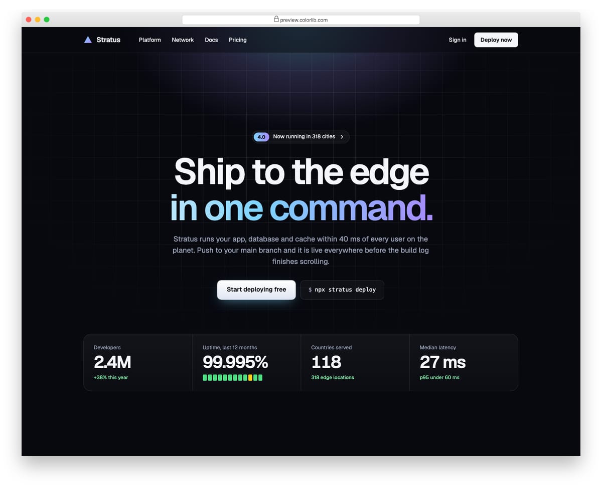
A dark, centred hero for a cloud hosting platform, set on a faint line grid that fades out with a radial mask under a slowly breathing glow. It has an announcement link, a two-line headline with a gradient second line, a primary button beside the install command, and a four-column stats band for developers, uptime, countries and latency. The stats are a description list and fold into a two-by-two grid on smaller screens.
Best for: developer tools, infrastructure and API product homepages. Plain HTML and CSS with a few lines of vanilla JavaScript, a 188 KB download, and it works on its own or inside a Bootstrap 4, 5 or 6 project.
Hero V11: Video-style hero with a looping CSS scene and a play button that opens a dialog
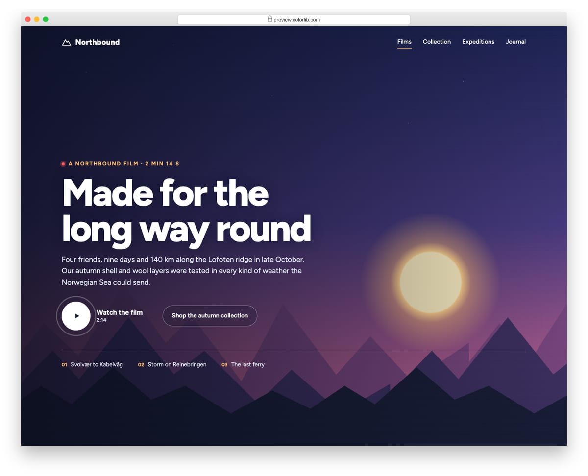
A cinematic hero for an outdoor brand film that looks like a video background but is made entirely in CSS: a shifting dusk sky, twinkling stars, a setting sun and three mountain ranges panning at different speeds. A large play button opens a native modal dialog holding a 16:9 placeholder player that you swap for a video element or embed. The dialog traps focus, closes with Esc, the close button or a backdrop click, and returns focus to the play button.
Best for: brand films, product videos and campaign landing pages. Plain HTML and CSS with a few lines of vanilla JavaScript, a 159 KB download, and it works on its own or inside a Bootstrap 4, 5 or 6 project.
Hero V12: Split travel hero with a stay search bar overlapping the photo
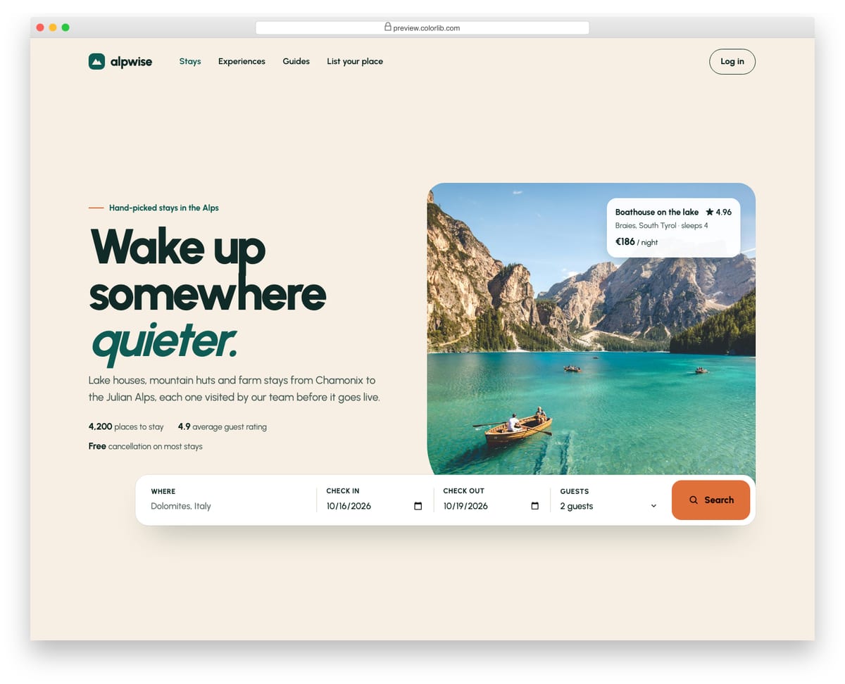
A split hero for a holiday-rental site, with the headline, intro and three proof points on the left and a large alpine lake photo on the right. A white search bar for location, check-in, check-out and guests overlaps the bottom of the photo and uses native text, date and select inputs with visible labels. Script prefills sensible dates, keeps check-out at least one night after check-in, validates with the browser and reports the search in a status region.
Best for: travel, holiday rental, hotel and real estate homepages. Plain HTML and CSS with a few lines of vanilla JavaScript, a 364 KB download, and it works on its own or inside a Bootstrap 4, 5 or 6 project.
Best Free Bootstrap Jumbotrons
Build a Tribute Page
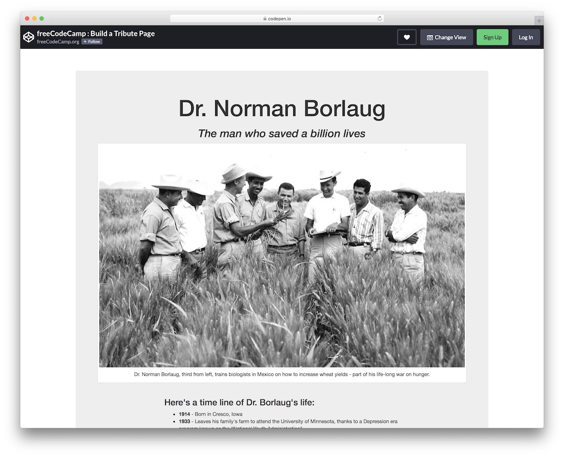
As the name implies, Build a Tribute Page allows you to inject an entire page into a web application you work on. You can utilize this one for anything and everything you want, but it specializes in a tribute page.
By default, it features a biography/timeline of Dr. Norman Borlaug, but you can alter it to some other person or even go entirely against the grain.
The jumbotron has a nice gray background with an option to insert images, links, text, you name it. You can configure it from within CodePen’s editor and go from there.
Bootstrap 4 Hero Section
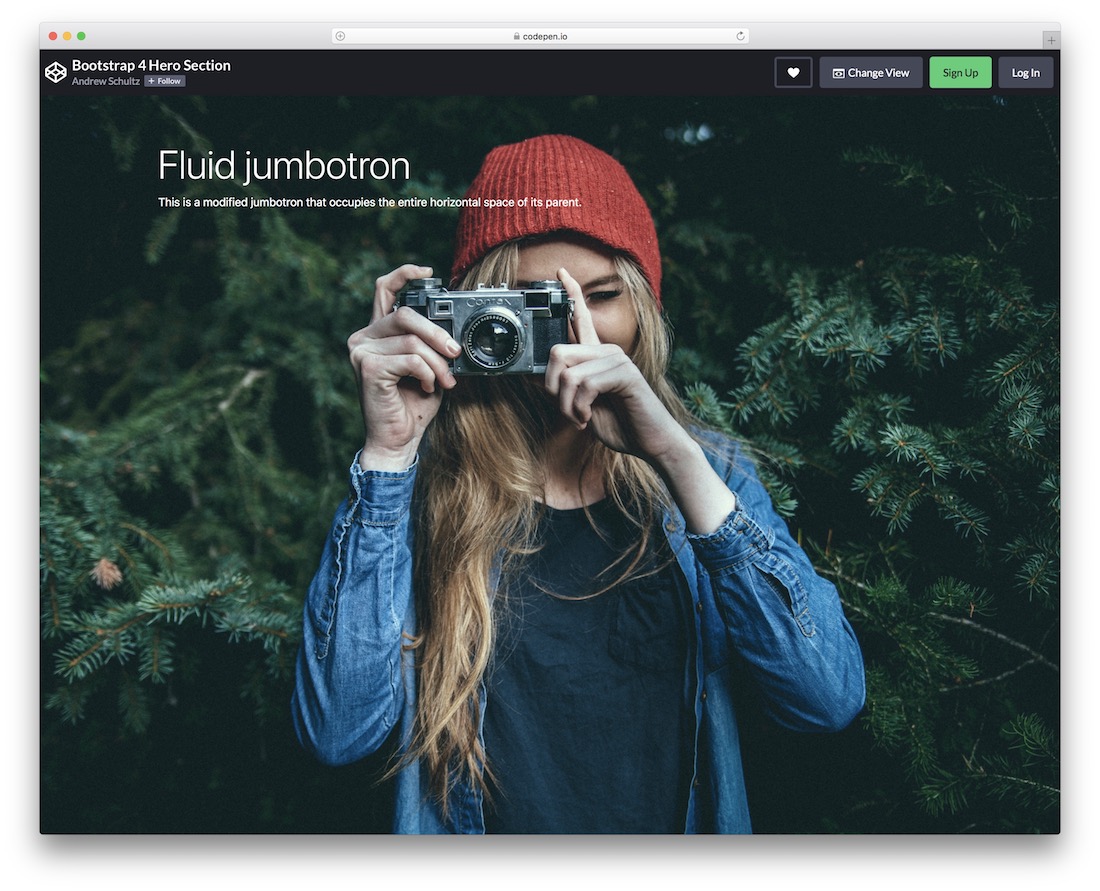
Create a powerful, engaging, jaw-dropping hero section without needing to forge it from the ground up. You can employ the Bootstrap 4 Hero Section on your home page or any other part of your website.
It is easy to work with, using clean code to swiftly improve and adjust to your needs and regulations.
This template also features a title and text, which you can modify effortlessly, along with the main image background.
If you haven’t used CodePen before, you can make changes straight from the web platform; no need to use any software.
Angular Bootstrap Colorpicker
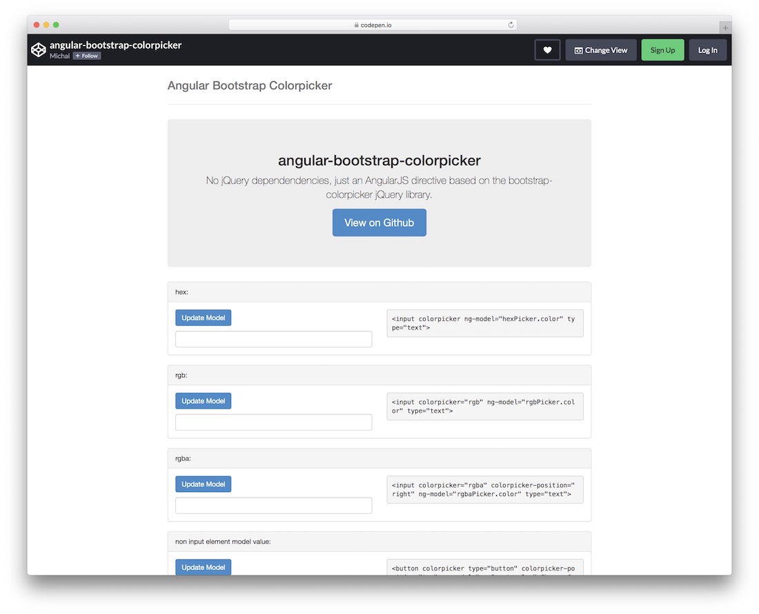
This is a little different – hence the name – a free snippet unlocking multiple styles of color pickers. Four different approaches to selecting colors exist, so you can use all or just one.
It does not feature jQuery dependencies, contains native AngularJS, and is based on the popular Bootstrap Framework. With the Angular Bootstrap Colorpicker widget, offer your users a convenient way to select colors.
Bulma Hero image
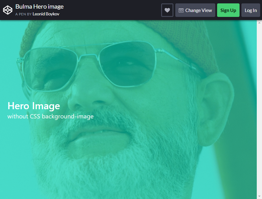
Let’s kick things off with the simple Jumbtrons you usually see with the modular design style. These sites aim to have a minimalistic feature that is responsive to user navigation.
Most designs nowadays are divided into distinct blocks and sections that separate the webpage’s content, which can be confusing for some.
This design style offers full attention-grabbing detail by emphasizing the full-width hero images that most websites use, allowing users and visitors to focus more on the image’s context.
This layout, for example, uses a singular and striking image combined with simple text, neither too flashy nor dull.
Bootstrap 4 Jumbotron Slider
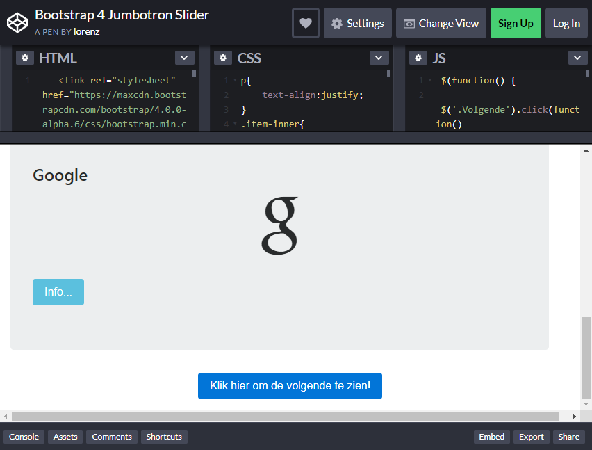
Not all websites go for the slideshow-like background, but little do they know that these types of designs are what some are searching for. It remains debatable whether a slider is a viable design element.
However, many successful web designers have always relied on this type of background design for Bootstrap Jumbotrons. They have done a great job using it to advertise products and call the user’s attention.
This layout automatically slides images or “clickable” scrolls from one beautiful high-resolution image to another. You can use this to advertise your website or business’s services and products.
Accompany that scrolling background with some BEAUTIFUL text, and visitors will be begging to take control of that experience themselves.
Web Portfolio
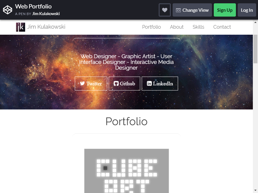
This Jumbotron layout has a pleasing illusion in store for users. It utilizes the parallax scrolling effect to create depth and a sense that the text is floating within the image.
Parallax scrolling is still growing and is widely used for designing the Jumbotron of a website or mobile page.
It has proven to be the perfect place to apply this sort of pleasing visual “illusion” in the web design industry, and premium businesses tend to use this type of design for their webpages.
You can be unique and add a little bit of transformation by giving this parallax scroll a transformative edge, surprising your site’s visitors with the unexpected result of the scroll.
The layout is FULLY customizable to suit your website’s theme!
Jumbotron with Wistia Embed Video Background Bootstrap 4
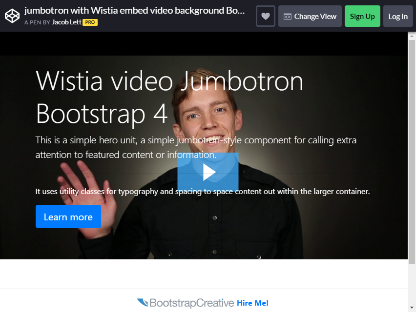
Are you more into motion and less into still images? Do you want to embed some of your famous videos on your website’s pages? Well, with this layout, YOU CAN! The video background design has been widely used as a design element.
Another recent trend that works great as a form of bootstrap Jumbotron is the light-faded video background combined with striking and easy-to-read text. Then, you will have a recipe for a successful Jumbotron design.
You can set the mood for your website by showcasing a couple of videos that highlight its offerings.
Bootstrap 4 Jumbotron Full Screen

These designs are commonly seen on websites viewed on mobile devices, where they were normally intended, but now you can use the same layout in your web pages.
No design out there can compete with the beauty of nautical minimalism. The menu buttons or navigation buttons can be easily embedded on the Jumbotron’s background image, it is just up to you and your imagination on how you can make it stand out some more!
The layout is completely customizable, so feel free to experiment with colors and arrange the details to your preference. The colorful background is fine, but EXPERIMENT and try to craft something better!
Your users will immediately draw more focus to the exciting visuals and they’ll have no troubles navigating through because the buttons are right where they are looking.
Gradient Image Background Bootstrap Jumbotrons
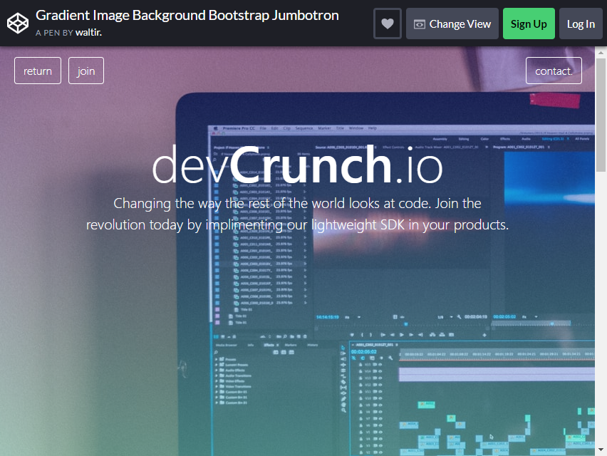
When you want traffic to your site, you can do a lot. For example, you can incorporate a stunning Jumbotron with a theme that resonates with your audience.
This layout is the design you want when you want a section on your page to introduce visitors to your site. What better way to start things off than by introducing them to the site’s beautiful interface?
If your site offers various services and products, showcase them with this Jumbotron with a CLEAN design.
Jumbotron

Nothing speaks louder than a beautiful text with a simple background. A great deal can be done to give your site’s typography a wonderful look and feel. It doesn’t always have to be choosing the fanciest cursive font to shove into people’s faces.
People desire a look that complements the background and fits the area it occupies. You don’t have to overdo it by showering your Jumbotron with a barrage of texts; just use this layout, which is already pre-made for you!
Customize the text to share your message to the users and amaze them with this simple yet elegant look. Remember it is NOT ALWAYS about the number of details you throw in.
You aim to convey a clear and concise message. The font size you used for the main idea of your message makes it eye-catching.
Full Page Background Using Bootstrap Jumbotron
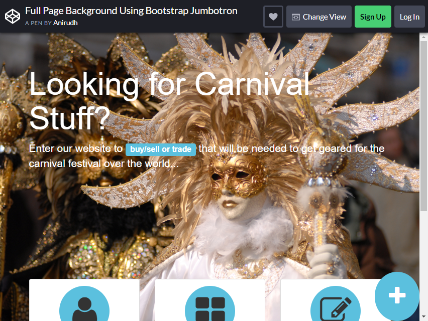
This layout is ideal for websites that prioritize delivering content and services. Its primary focus is on delivering thousands of pieces of content to visitors or adding personalized links to the website’s services.
Below the Jumbotron, embedded links direct users to the site’s registration, ads, and posting features, as shown in the example.
This is a content-first strategy for emphasizing the services rather than the message. You can use the layout’s pre-built design, modify the colors slightly, and add a beautiful background image.
This is one of the Bootstrap Jumbotrons. It also contains buttons that you can embed links on to divert users to the content you want to show them.
People have come to your site to read your interesting content. They are more interested in your readings and don’t want to be bogged down by additional texts on your site’s page.
Designil.com CSS Button Tutorial 1
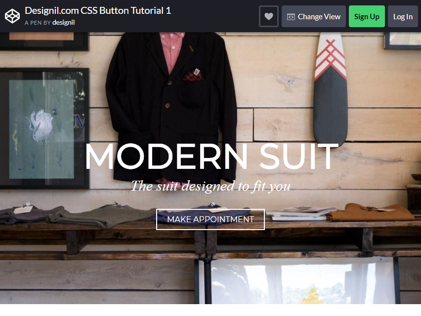
Like the previous layout, this design is best suited for e-commerce sites that don’t require using catchy text and fonts or providing a video presentation about the business or the site.
The Jumbotron features a background that showcases the site’s products, allowing visitors to understand the purpose of their visit. It is a simple marketing strategy; rather than having the text catch your readers’ attention, why not just use your services and items instead?
Unlike with the content-focused layout, this product layout can be used by business websites to prime their merchandise or show off their top-selling products or new releases to ENTICE your users to scroll around your eCommerce shop!
Transparent Jumbotron and Particles

What’s better than a beautiful still image? Well, a moving one! Animations bring life to your Jumbotron, giving it a livelier and spontaneous look. Still images are fine for your Jumbotron’s background design, especially if you want the focus to be drawn to the message.
However, having moving images draws more focus to the still frame (in this case, the text or message that you want your readers to read).
Remember to keep the animations simple and elegant, so that no distractions will hinder your users from reading the message or taking the intended action.
Animations are the best and wisest choice for websites that want to be unique and different from other sites. For example, this layout utilizes moving particles to accentuate the transparent background and solid-filled text.
It’s dynamic and yet simple.
CodeBrainery.io
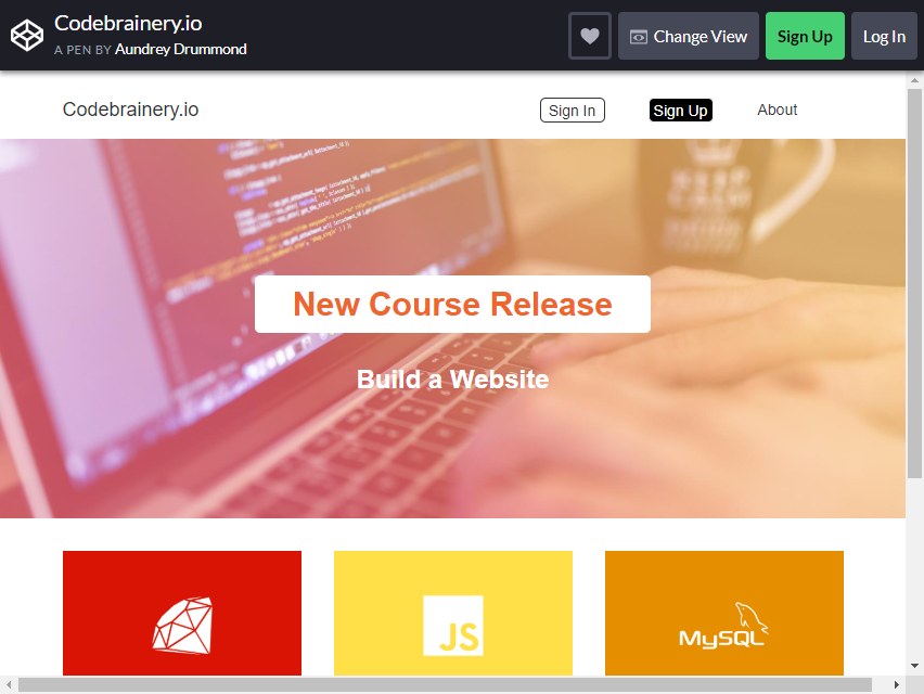
If you want your website to be presented in an interesting way and to share its message with readers, going for beautiful and vibrant color gradients is the way to do it.
This layout features a vibrant palette and striking logos to highlight the site’s partners. It also features a minimalist design to keep things simple and easy to navigate.
The Jumbotron’s design uses vibrant colors, layers, and gradients to draw the reader’s attention.
This simple and elegant approach will keep the layout from being cluttered or overcrowded with information. This is one of the best Bootstrap Jumbotrons for websites that prioritize color, making the webpage more energetic and visually pleasing.
You can also customize the call-to-action buttons to be embedded on the Jumbotron or create a button that can be used for entire blocks on the website, for a more colorful and texturized look.
MusixMatch API
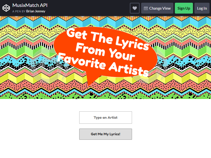
Feel funky and groovy with this themed layout for an online music sharing platform! Who said shapes are too stale and boring?
If you want to add a practical and simple feature to your web page that will capture a user’s attention, why not opt for a background with vibrant colors and geometric shapes?
This layout features a colorful aesthetic with a background image, complemented by amazing shapes that bring the design together. The plain, solid fill quotation bubble also plays an important role in EMPHASIZING your message!
Website Header Playground
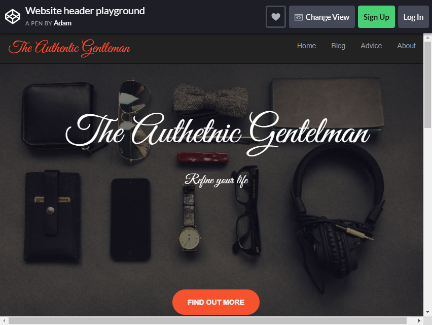
Here is an experimental Jumbotron design that will surely be a hit! The key to this layout is to avoid being outlandishly strange and unusual throughout the entire image and text.
Those approaches will be too distracting and hard for users to focus on. Call your users’ attention not by striking fonts or colors, but by having a classy and premium look that creates an unexpected effect, surprising them.
This can be caused by the simple movements or animations of the Jumbotron, such as in this layout, where the Parallax scrolling effect is implemented.
Bootstrap Jumbotron Modified

If you need a simple Jumbotron, but need some animations to go with it, this is the one for you! A simple solid fill background and a white fill box to house the text is perfect for the minimalistic look.
The layout also has a bordered finish with wave-like animations. Add your message and customize the colors a bit, and you are good to go. You can also change the speed of the wave animations of the border.
Bootstrap 4.1.3 Navbar and Parallax
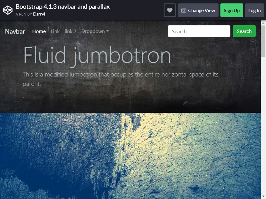
Now that we’ve discussed simple designs, how about something more diverse? This layout takes the Parallax scrolling effect to a whole new level!
The Jumbtron is filled with magnificent pictures depicting different sceneries, and as you scroll through the page, each picture will have a Parallax effect. The navigation bar also gets a spot on the stage; it gets highlighted when you scroll through the page.
SURPRISE and WOW your users with this amazing effect and utilize it on your webpage!
Animating Down HW
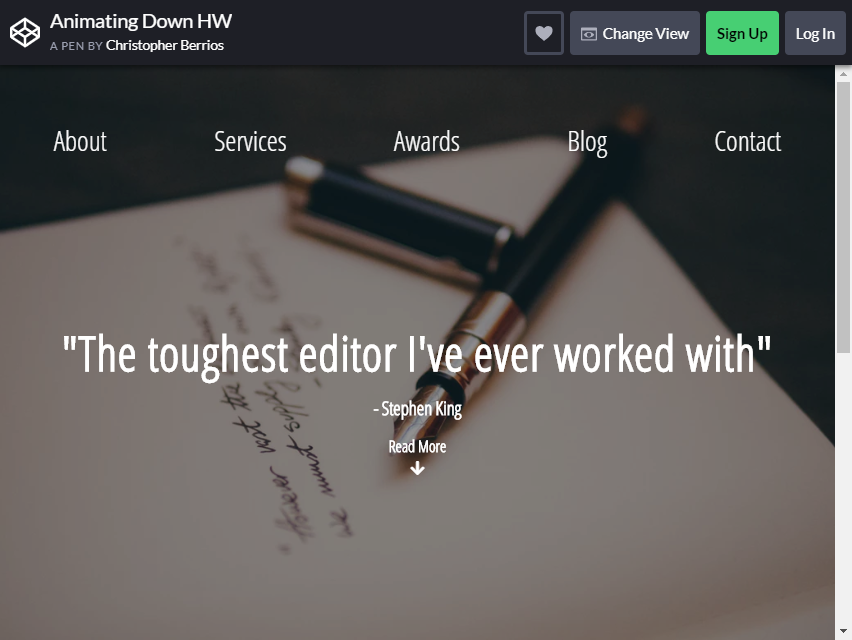
As we discussed the amazing designs throughout this list, this layout combines beautiful typography with a colorful interface and a highlighting navigation bar all into one.
This is the WAY TO GO if you want a professional and impressive-looking Jumbotron. The image is slightly blurred to make the text stand out, allowing users to read it more easily.
It’s simple, elegant, and attractive, one of the best Bootstrap Jumbotrons out there!
Using Bootstrap 4 Album Template
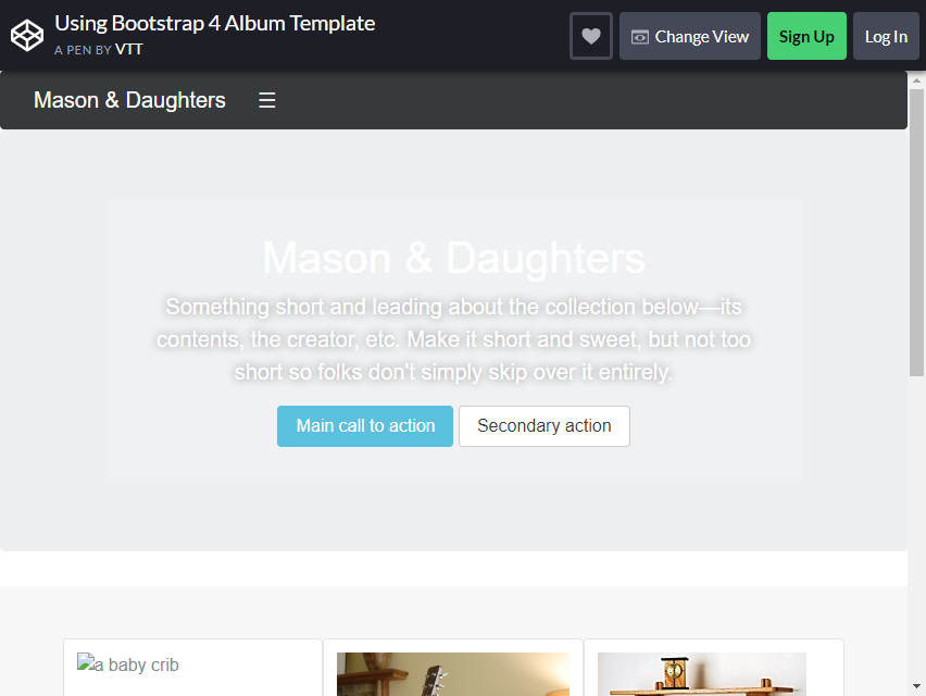
This is a default Bootstrap Jumbotrons design. Why include it in the list? Well, it is very versatile in every aspect you use it on.
It is also suitable for professional and blogging websites, allowing you to experiment with the combination of elements in this pre-built layout.
The embedded call to action button also comes in handy for users, as it is centered in the Jumbotron, so they won’t have a hard time navigating through the page!
Bootstrap 4 Jumbotron – Image

This is another simple yet stunning Jumbotron design. Use an image with enough space for your message to be readable by your target audience.
Use a high-resolution image to bring out those vibrant colors! This is a classical layout that most sites use because of its simple and effective design.
Customize it to add more elements and change some fonts and textures to make the design stand out more!
Portfolio

Lastly, this Jumbotron outclasses the previous ones. Its readable font with a decent size will truly draw the readers’ or users’ attention and your message will be heard entirely.
This design utilizes the background image in a unique and distinctive way. It is somewhat blurred and lacks color, yet it still works so effectively.
The design’s combination of space and simplicity is not too painful, yet it is pleasing to see!
A lot of your users will surely be astonished with this layout!
What makes a good hero section or jumbotron
Keep text readable on photos. A background image needs an overlay behind the text, and on phones, where the text covers more of the photo, the overlay often has to be darker. Hero V08 uses a layered dark overlay that deepens on small screens.
Design the phone layout, not just a smaller one. Hero V04 centres its content, makes the store buttons full width and keeps a single phone mock on small screens, and Hero V03 moves its navigation links under the logo instead of hiding them.
Watch the weight of video backgrounds. A background video adds megabytes before anyone presses play. Hero V11 gets a cinematic look from a CSS-only scene and opens the real video in a dialog only when the visitor clicks play.
Respect reduced motion. Hero V02 stops its gradient mesh from moving when the visitor has asked for reduced motion. Apply the same rule to particle, parallax and slow-zoom effects like the ones in the CodePen examples.
Frequently asked questions
Does Bootstrap 5 still have a jumbotron?
No. The .jumbotron class was removed in Bootstrap 5. You can rebuild it with utility classes, for example <div class="p-5 mb-4 bg-body-tertiary rounded-3">, which is how the official Bootstrap 5.3 jumbotron example does it, or start from one of the hero sections above.
How do I add a background image to a jumbotron?
Set background-image on the jumbotron element with background-size: cover and background-position: center, then add a semi-transparent overlay so the text stays readable. Hero V08 shows the finished result with a full-bleed photo and a layered overlay.
Do the Colorlib heroes need Bootstrap or jQuery?
No. They are plain HTML and CSS, ten of them add a few lines of vanilla JavaScript, and they look the same on their own or inside a Bootstrap 4, 5 or 6 project.
Can I use them in commercial projects?
Yes. The Colorlib heroes are free for personal and commercial projects under CC BY 3.0, as long as you keep the credit link. The CodePen jumbotrons belong to their authors and carry their own licences, so check each pen first.
Hero V01 is the quickest start for a SaaS landing page and Hero V08 for a photo-led site. To build out the rest of the page, see our Bootstrap navbar and Bootstrap cards collections.

Related Posts


Comments (0)