28 Free Bootstrap Alert Examples & Templates (2026)
By Aigars Silkalns · Last updated May 13, 2026 · 18-min read
Cookie banners, form validation summaries, trial-expiry warnings, system maintenance notices — every interface ships a handful of alerts, and the default Bootstrap palette only gets you so far. This collection gathers 28 free Bootstrap 5–compatible alert examples we’ve verified line-by-line: dismissible patterns, icon pairings, edge-to-edge banners, dark-mode treatments, cookie consent boxes, and the official Bootstrap docs primitives every UI eventually rests on. Each example links to a live demo and a clean source file you can drop into a project without modification. If you’re rebuilding form-error messaging for Bootstrap 5, replacing a custom snackbar library, or just want better-looking alerts than the stock palette, start here.
What is a Bootstrap alert?
A Bootstrap alert is a contextual feedback message displayed inline within a page — used for cookie banners, form errors, success confirmations, system warnings, and any persistent message tied to a specific page section. Unlike floating toasts, alerts occupy real page space and stay visible until dismissed by the user (or, optionally, until removed programmatically).
When to use an alert:
- Form validation errors below an input or above a form
- Cookie consent banners at the top or bottom of a page
- Maintenance or downtime notifications
- Success messages after a multi-step action (“Profile updated”)
- Permission warnings (“This account has limited access”)
Bootstrap 5 vs Bootstrap 4 alerts: Bootstrap 5 made the alert component more consistent: the data-dismiss attribute was renamed to data-bs-dismiss, the JavaScript API was moved to bootstrap.Alert, and Bootstrap 5.3 added native dark-mode support via the data-bs-theme attribute. The HTML structure is otherwise identical between versions. The fade animation now uses CSS transitions rather than jQuery’s .fadeOut().
Alert variants: Bootstrap ships eight color variants matching its contextual classes — alert-primary, alert-secondary, alert-success, alert-danger, alert-warning, alert-info, alert-light, alert-dark. Each variant signals a specific tone: green for success, red for errors, yellow for caution, blue for informational messages.
Browser support: Universal. Alerts work in every modern browser and degrade gracefully in older ones — they remain visible but lose the dismiss animation in pre-IE11 contexts. All 28 examples below were tested in Chrome 124, Safari 17, and Firefox 125 on May 2026.
How to use Bootstrap alerts (basic markup)
<!-- Basic alert -->
<div class="alert alert-primary" role="alert">
A simple primary alert — check it out!
</div>
<!-- Dismissible alert with close button -->
<div class="alert alert-warning alert-dismissible fade show" role="alert">
<strong>Heads up!</strong> This is a dismissible warning.
<button type="button" class="btn-close" data-bs-dismiss="alert" aria-label="Close"></button>
</div>
<!-- Alert with heading and links -->
<div class="alert alert-success" role="alert">
<h4 class="alert-heading">Well done!</h4>
<p>You successfully read this important alert message.</p>
<hr>
<p class="mb-0">Whenever you need to, be sure to use <a href="#" class="alert-link">styled alert links</a>.</p>
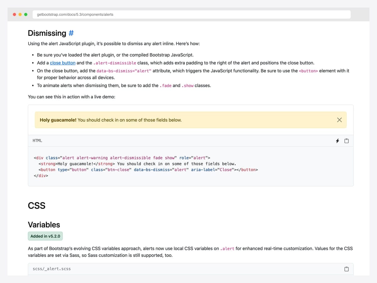
</div>Required JS: Only the dismissible variant needs JavaScript. Include the Bootstrap bundle. For programmatic dismissal: bootstrap.Alert.getOrCreateInstance(element).close();.
Common gotcha: The fade show classes must both be present on dismissible alerts — show makes it visible, fade enables the dismiss animation. Omit either and you’ll see jarring instant disappearance or a permanently invisible alert.
Best free Bootstrap alert examples
We grouped the 28 picks by use case rather than ranking them — every example below is a viable production starting point. Lead with the showcase items if you want maximum visual impact, drop into the variants block for the canonical contextual palette, and skim the specialty section if you’re hunting a specific pattern like a cookie banner or auto-dismiss progress indicator.
Showcase — visually distinctive alerts
1. Awesome Bootstrap Alerts
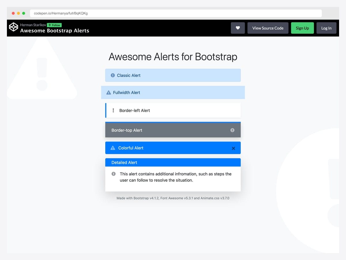
Hermanya’s collection bundles six different alert treatments — classic, full-width, border-left, border-top, colorful, and detailed — each entering with a different Animate.css effect like flipInX and bounceInUp. Best fit for landing pages and marketing sites where the alert deserves a beat of attention rather than blending into the chrome. Built on Bootstrap with Animate.css and Font Awesome 5 as the entrance-animation and icon dependencies; no jQuery required for the core markup. The animation library adds ~70 KB to the bundle, so swap to a lighter alternative or pure CSS keyframes if you only need one or two entrance effects.
Designer: Hermanya · License: CodePen default (attribution required)
2. Alert Boxes & Icons Bootstrap 5
A modern Bootstrap 5 alert grid with Bootstrap Icons 1.9, left-border accents, rounded corners, and a subtle drop shadow that gives each card real depth without departing from the default palette. Best fit for dashboards and analytics panels where alerts double as data callouts (totals, customer counts, support tickets, transactions). Pure Bootstrap 5 with Bootstrap Icons; no jQuery, no custom JavaScript. The card styling pushes the alert toward “metric card” territory — verify with stakeholders before reaching for it as a true alert in a critical flow like form errors or session warnings.
Designer: BrCodeSnippets · License: MIT (Bootsnipp default)
3. A Different Approach to Bootstrap Alert
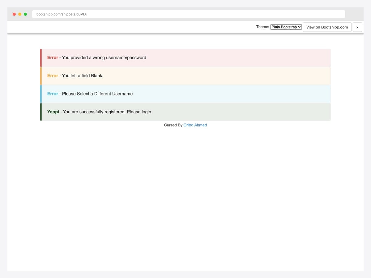
Oritro Ahmed reworked the default alerts into a flat-design pattern that’s become the de-facto modern Bootstrap callout — a 5px solid left border in the contextual color paired with a soft 10% RGBA tint of that same color for the background. Best fit for content-heavy sites, blog comment systems, and any UI where the alert needs to feel quieter than a saturated alert-danger. Pure CSS, no JavaScript, drops into Bootstrap 5 unchanged despite originating in the Bootstrap 3.x era. Uses lighter text contrast than default Bootstrap — verify WCAG AA passes for your specific palette before deploying.
Designer: Oritro Ahmed · License: MIT (Bootsnipp default)
4. Notification UI with Avatars
A complete navbar bell icon → dropdown notification panel that lists four recent activity items with circular user avatars, “reacted to your post” copy, relative timestamps, and per-item thumbnails. Best fit for social products, project management dashboards, and any logged-in app where users expect a Facebook-style notification tray. Pure Bootstrap 5 markup with custom CSS for the dropdown positioning and avatar layout; vanilla JS for the bell click handler. The dropdown attaches via Bootstrap’s built-in .dropdown-menu so it inherits all the keyboard-navigation and click-outside behavior automatically.
Designer: GoSnippets · License: MIT (GoSnippets default)
Default variants and color treatments
5. Bootstrap 5 Default Contextual Alerts
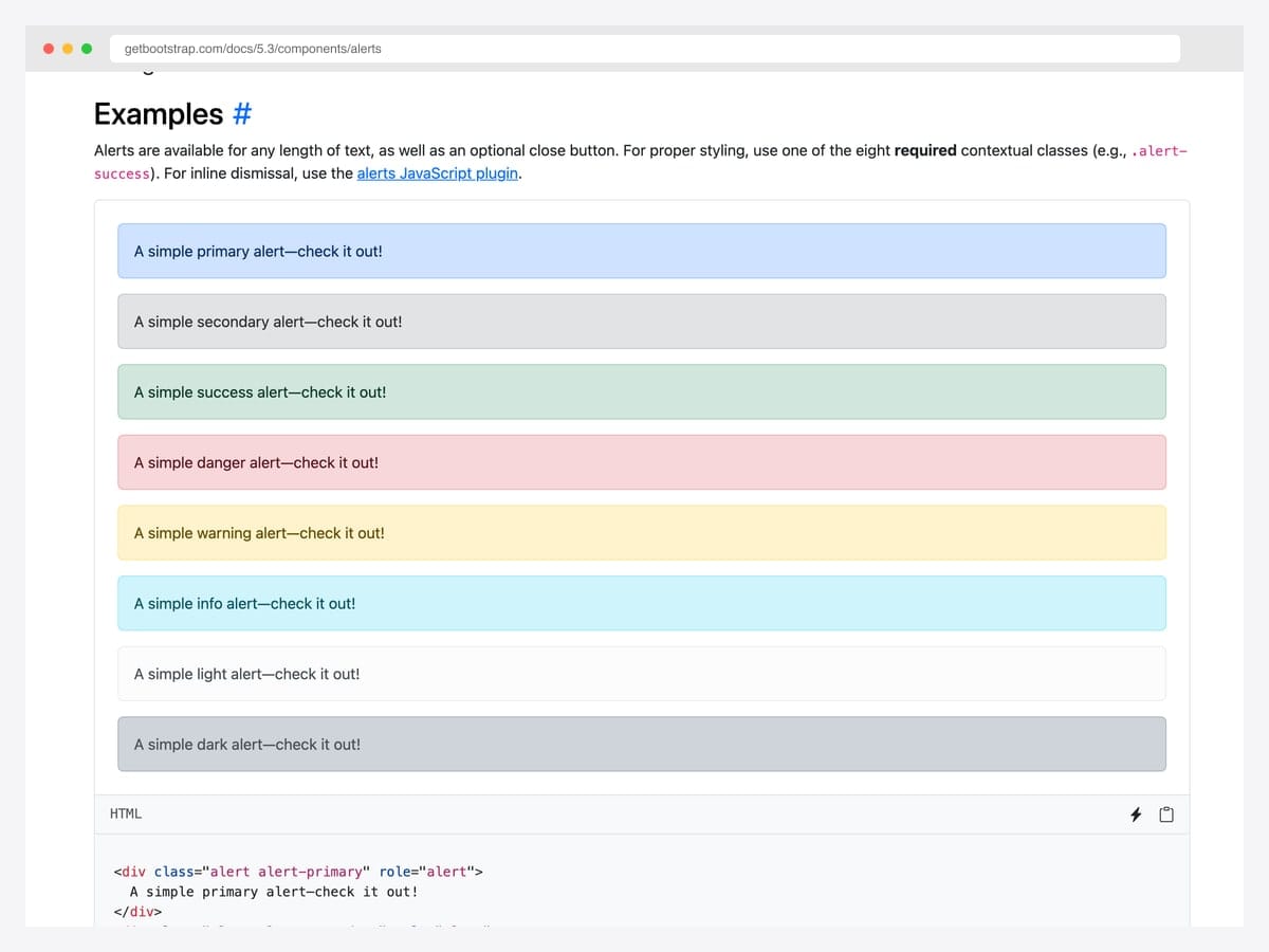
The canonical reference — all eight contextual variants (primary, secondary, success, danger, warning, info, light, dark) rendered side-by-side in the official Bootstrap docs. Best fit for the baseline: any project where you want the alert to look exactly like every other Bootstrap site so users recognize the pattern instantly. Pure Bootstrap 5 with no dependencies beyond the framework itself; CSS-only with optional JavaScript for dismissal. Customize via the --bs-alert-* CSS custom properties introduced in 5.2.0 rather than overriding the base classes.
Designer: Bootstrap (twbs) · License: MIT
6. Material-Styled Bootstrap Alerts
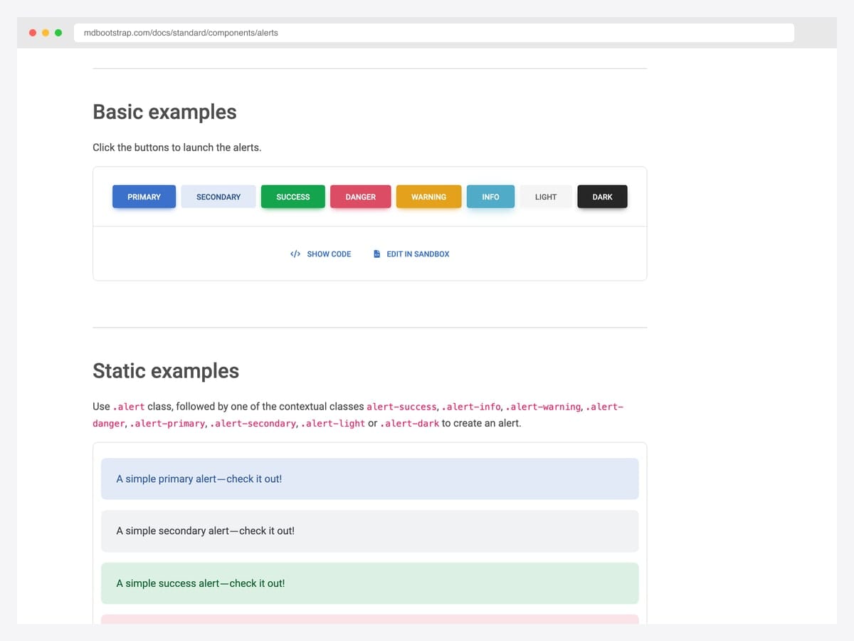
MDBootstrap’s Material Design take on all eight Bootstrap alert variants — Material elevation shadow, slightly larger corner radius, and a fade-in animation when triggered via the demo buttons. Best fit for apps already standardized on Material Design conventions or teams that want a less austere look than vanilla Bootstrap without writing custom CSS. Built on Bootstrap 5 with MDB’s own component layer added on top; no jQuery. The full MDB UI Kit adds significant bundle weight, so import only the Alert SCSS partial if you’re not using the rest of the kit.
Designer: MDBootstrap · License: MDB-free (commercial OK)
7. Material Color Palette Alerts
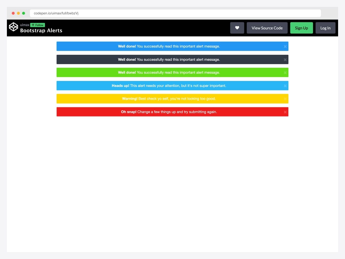
uimax’s take on Material Design–inspired alerts swaps Bootstrap’s pastel default backgrounds for saturated solid fills with white text — closer to a snackbar’s visual punch than the docs’ more conservative palette. Best fit for product onboarding flows, marketing CTAs inside an alert, and any UI where the alert genuinely needs to interrupt the reading flow. Pure CSS palette override on top of Bootstrap’s alert classes; dismissible behavior uses the standard data-attribute API. The white-on-color contrast passes WCAG AA on every variant except the yellow warning — pair the warning variant with darker text or restrict it to short labels.
Designer: uimax · License: CodePen default (attribution required)
8. Re-Styled Bootstrap Alerts
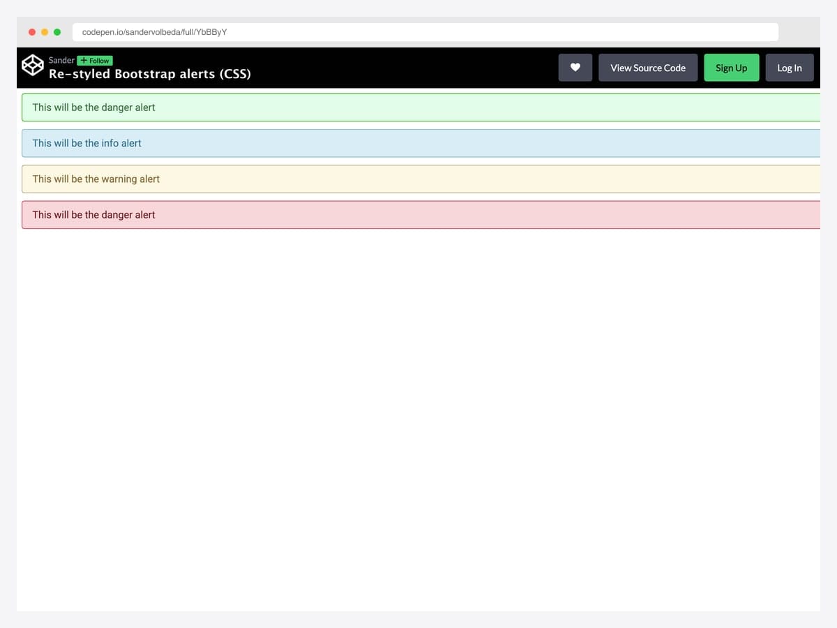
Sander Volbeda’s redesign is what the Bootstrap defaults would look like with a senior product designer’s attention — refined typography, more generous padding, thinner borders, and a softer color palette than the stock pastel. Best fit for premium SaaS dashboards and any UI where the visual language has been polished above Bootstrap’s default density. Pure CSS, no JavaScript, drops in over Bootstrap’s alert class without breaking the contextual variant logic. Tested in modern Chrome and Safari; the design relies on subtle borders that may compress to a single pixel on Windows 7 / older anti-aliasing.
Designer: Sander Volbeda · License: CodePen default (attribution required)
9. Bootstrap 5 Alerts Reference Set
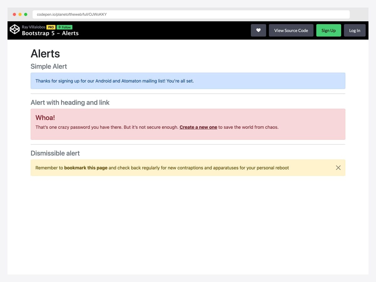
LinkedIn Learning instructor Ray Villalobos’s reference layout for Bootstrap 5 alerts — a simple alert, a headed alert with embedded .alert-link, and a dismissible warning — assembled as a teaching reference that doubles as a copy-paste shortcut. Best fit for new developers learning Bootstrap 5 and project leads writing internal style guides who want a worked example to point at. Pure Bootstrap 5; the dismissible alert uses data-bs-dismiss for the close button and the closed.bs.alert event for any custom focus management. Comments in the source mark each variant clearly — keep them when copying for in-team documentation value.
Designer: Ray Villalobos · License: CodePen default (attribution required)
10. Bootstrap Callouts
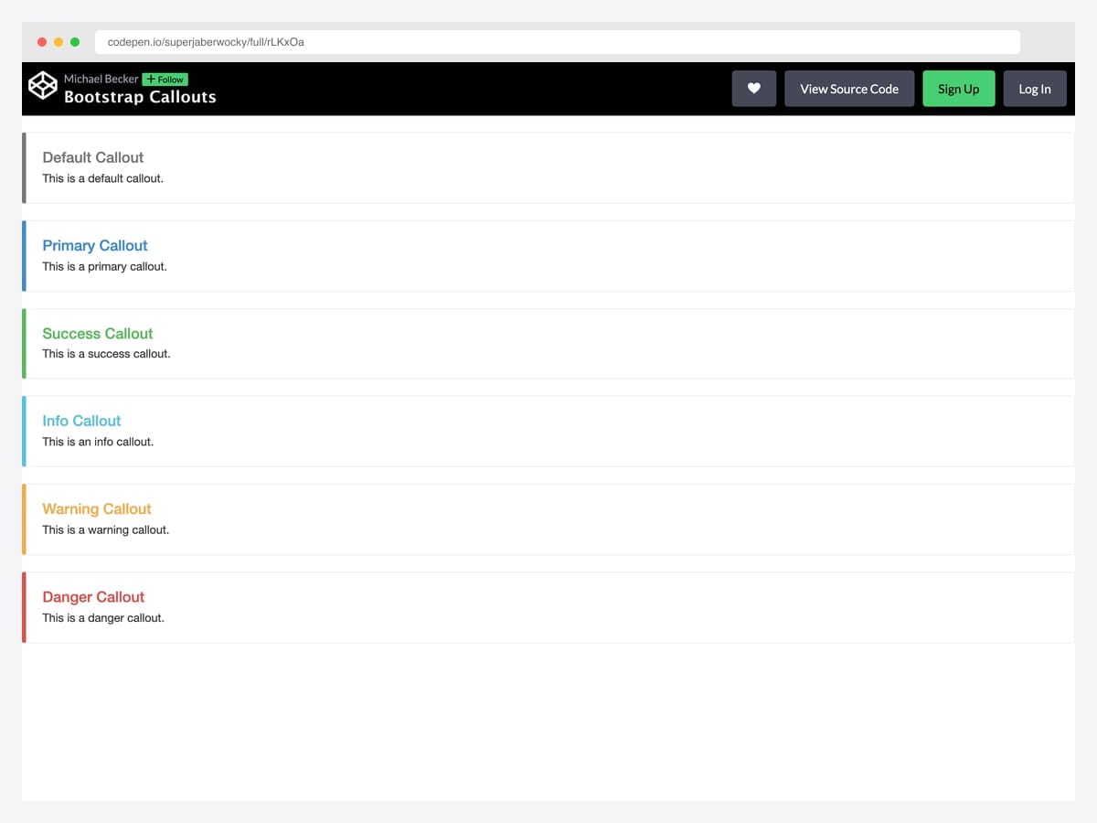
A faithful recreation of the callout pattern Bootstrap’s own documentation used before it was retired in 4.x — thick colored left border, neutral light-gray background, contextual heading color, and body text in standard black. Best fit for technical documentation, internal wikis, and developer blogs where you want a “note / tip / warning” callout that reads as advisory rather than alerting. Pure CSS, no JavaScript needed; layers cleanly over Bootstrap’s typography defaults. The lack of contextual background fill means the callout depends entirely on the left-border color for state signaling — verify color-blind accessibility for your specific palette.
Designer: superjaberwocky · License: CodePen default (attribution required)
Dismissible patterns
11. Bootstrap 5 Dismissible Alert
The canonical Bootstrap 5 dismissible pattern from the official docs: alert-dismissible class, a close button with data-bs-dismiss="alert", and the fade show classes that enable the smooth fade-out. Best fit for any project that wants the dismiss behavior to look and act like every other Bootstrap site users have visited. Pure Bootstrap 5 — the JavaScript loads with the bundle and binds automatically on page load via the data-attribute API. Listen for the close.bs.alert event if you need to handle dismissal (e.g., persist the closed state) before the element leaves the DOM.
Designer: Bootstrap (twbs) · License: MIT
12. JavaScript-Generated Alerts
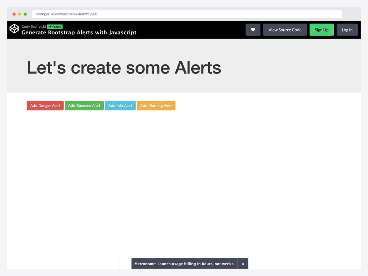
Cody Sechelski’s pattern wraps Bootstrap’s alert markup in a small factory function that spawns dismissible alerts on demand — useful for AJAX responses, real-time events, and any flow where alerts need to appear after page load. The demo includes auto-dismiss with a flipInX entrance animation and bottom-right positioning. Best fit for SPA-style apps with frequent toast-like feedback that still want to use alert semantics rather than the Bootstrap toast component. Vanilla JavaScript plus Bootstrap 5; the original pen uses jQuery for brevity but the pattern ports to querySelector in ~20 lines. Position the alert container outside any overflow: hidden ancestor or the fixed positioning won’t escape.
Designer: Cody Sechelski · License: CodePen default (attribution required)
13. Auto-Close Bootstrap Alerts
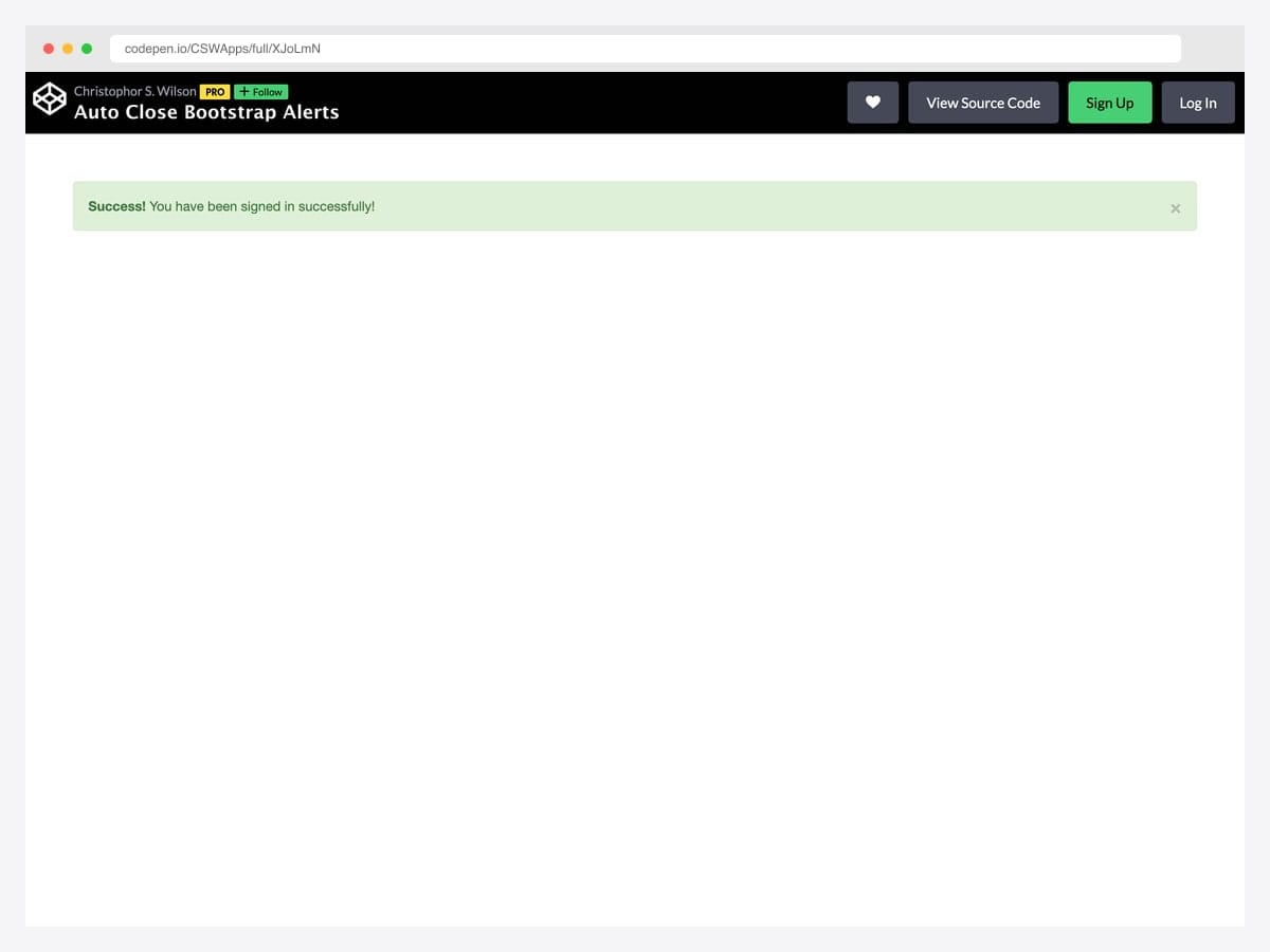
The minimal viable auto-dismiss pattern: a Bootstrap success alert plus a single setTimeout call that triggers the close after five seconds with the standard fade transition. Best fit for “save confirmed” or “signed in” moments where the user benefits from seeing the confirmation but doesn’t need to dismiss it manually. Pure vanilla JavaScript — no dependencies beyond Bootstrap itself, ~10 lines total. If you find yourself implementing this pattern more than three times in one app, switch to Bootstrap’s toast component instead — it handles auto-hide via the data-bs-delay attribute natively.
Designer: CSWApps · License: CodePen default (attribution required)
14. Alert with Action Button
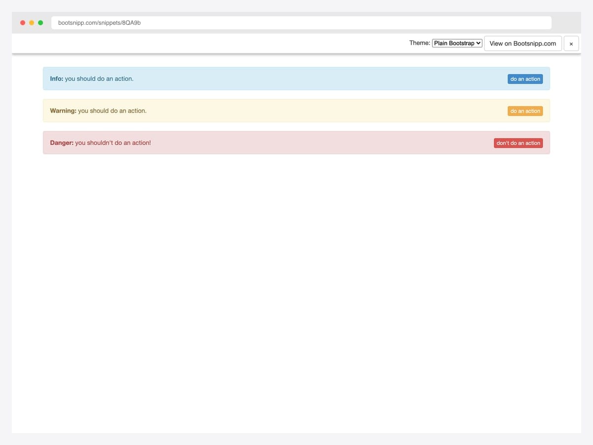
Tomas Bedrich’s pattern places a contextually colored action button on the right side of each alert — turning the alert from passive feedback into an interactive prompt (“Renew now”, “Verify email”, “Re-authenticate”). Best fit for subscription-expiry warnings, permission requests, undo affordances, and any “do this thing now” moment where the call-to-action belongs inside the message rather than separate from it. Pure Bootstrap utility classes (d-flex, justify-content-between, align-items-center) — no custom CSS or JavaScript needed. On narrow viewports the button wraps below the text; add flex-md-row flex-column if you want explicit responsive control.
Designer: Tomas Bedrich · License: MIT (Bootsnipp default)
15. Alert Stays Closed on Refresh
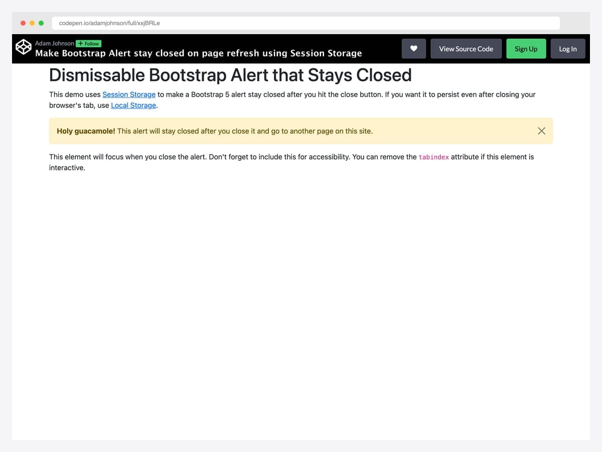
Adam Johnson’s pattern listens for the close.bs.alert event and writes a flag to sessionStorage so the alert stays hidden after a page refresh — the right default for one-time announcements, onboarding tips, and any banner that shouldn’t reappear on every navigation. Best fit for promo banners, beta-notice alerts, and product-tour callouts where re-displaying after dismissal feels broken rather than helpful. Pure vanilla JavaScript; swap sessionStorage for localStorage to persist across browser sessions, or for a cookie if you need cross-tab persistence. Falls back gracefully to default behavior in private-browsing contexts where Storage APIs throw.
Designer: Adam Johnson · License: CodePen default (attribution required)
Alerts with icons
16. Bootstrap 5 Alerts with Icons (SVG Sprite)
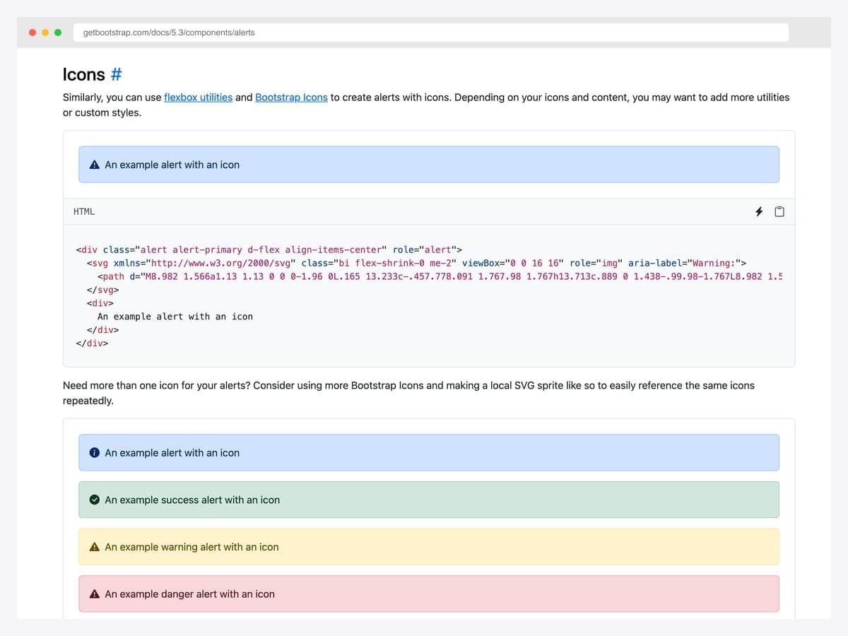
The accessibility-best-practice baseline from the Bootstrap docs: alerts paired with Bootstrap Icons referenced via an inline <symbol> SVG sprite, with role="img" and aria-label on the icon so screen readers announce the contextual meaning before the alert text. Best fit for compliance-sensitive sectors (healthcare, finance, public sector) where WCAG conformance is audited rather than aspirational. Pure Bootstrap 5 with Bootstrap Icons; no custom JavaScript. Keep the <symbol> definitions in a hidden <svg> at the top of <body> so multiple alerts can reference the same icon without bloating the page.
Designer: Bootstrap (twbs) · License: MIT
17. Bootstrap 5 Alert with Icon (CDN)
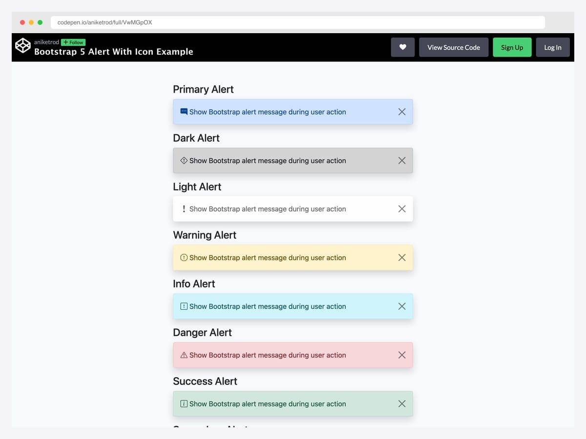
Aniket Rod’s variant loads Bootstrap Icons via the CDN <link> rather than an inline SVG sprite — same accessibility outcome (each icon has an aria-hidden attribute and contextual class name) with a one-line dependency declaration. Best fit for static sites and rapid prototypes where you don’t want to maintain an SVG sprite file but still want the icon-per-context-class pairing. Pure Bootstrap 5 — the dismiss behavior uses the standard data-bs-dismiss API. The CDN adds a render-blocking request unless you preload it; consider using <link rel="preload"> if the icons appear above the fold.
Designer: Aniket Rod · License: CodePen default (attribution required)
18. Border-Left Callout with Font Awesome
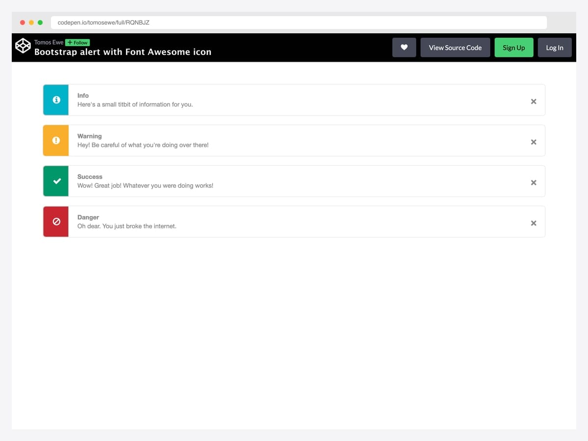
tomosewe’s pattern combines a 5px left-border accent with a Font Awesome icon set inside a contextually colored square — the layout most developers reach for when building documentation pages, knowledge base articles, and admin panels. Best fit for any documentation surface where alerts double as advisory callouts (think Stripe docs, MDN, GitHub blog posts). Bootstrap 4-era markup that ports to Bootstrap 5 with only the data-dismiss → data-bs-dismiss attribute swap; Font Awesome 5 for icons. Dependency on Font Awesome adds ~70 KB to the bundle — drop in Bootstrap Icons or inline SVG if you’re optimizing for performance.
Designer: tomosewe · License: CodePen default (attribution required)
19. MDB Alerts with Font Awesome Icons
MDBootstrap’s opinionated icon-per-variant convention — fa-info-circle for primary, fa-check-circle for success, fa-exclamation-triangle for warning, fa-times-circle for danger — rendered across all eight contextual classes. Best fit for teams that want to skip the icon-selection conversation entirely and ship the de-facto admin-dashboard convention. Built on Bootstrap 5 with MDB UI Kit and Font Awesome 5; no jQuery. The icon-to-context mapping is conventional enough that users recognize the pattern instantly — but stick with the same icons across your whole app so the muscle memory transfers.
Designer: MDBootstrap · License: MDB-free
20. Card-Style Icon + Title + Body Alert
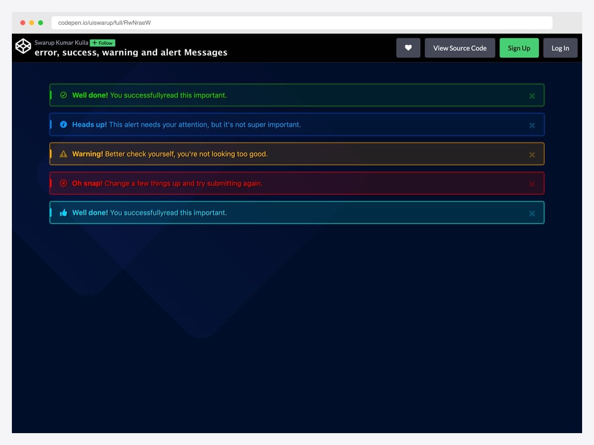
uiswarup’s design pushes the alert toward a Material Snackbar aesthetic with neon-glow borders on a dark navy background, contextual icons, and bold colored headings — distinctive enough to break out of “generic Bootstrap” instantly. Best fit for gaming UIs, developer-tool dashboards, and any product where the visual language already lives in the dark-theme / vibrant-accent register. Custom CSS layered on top of Bootstrap’s alert classes; no JavaScript dependencies. The neon-glow effect uses box-shadow with high spread radius — verify performance on low-end mobile where many simultaneous shadows can cause repaint jank.
Designer: uiswarup · License: CodePen default (attribution required)
Specialty patterns
21. Bootstrap Cookie Alert
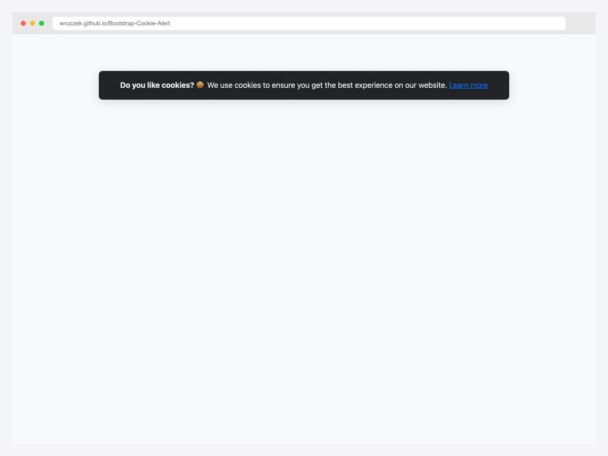
Wruczek’s GitHub project (246 stars, MIT) ships a dependency-free Bootstrap cookie consent banner with built-in cookie persistence — the user’s accept choice is remembered across visits via a cookie, so the banner only appears for first-time visitors. Best fit for production sites that need a GDPR-readable consent surface without pulling in a heavyweight cookie-management library like Cookiebot or OneTrust. Bootstrap 4 and 5 both supported; vanilla JavaScript, ~3 KB total. The library only handles the consent UI — pair it with your own analytics-gating logic to actually delay GA/Meta/TikTok tracker initialization until after the accept click.
Designer: Wruczek · License: MIT
22. Edge-to-Edge Notification Bar
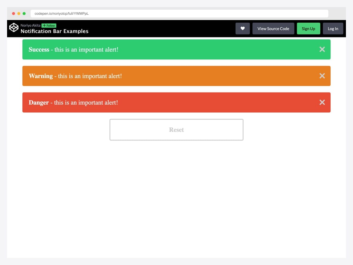
noriyotcp’s pattern strips the corner radius and outer margin from Bootstrap’s alert and pins it flush to the top of the page — the SaaS announcement-bar shape used by every product that’s ever shipped a “we’re hiring” or “beta is live” banner. Best fit for site-wide announcements, promo codes, beta access notices, and degraded-status messages above the navbar. Pure CSS (rounded-0, border-0, m-0 utilities); the dismiss behavior is standard Bootstrap. Stack it ABOVE the navbar so scrolling layout doesn’t jump when the banner dismisses — add position: sticky; top: 0 if you want it to stay visible during scroll.
Designer: noriyotcp · License: CodePen default (attribution required)
23. Auto-Dismiss Alert with Progress Bar
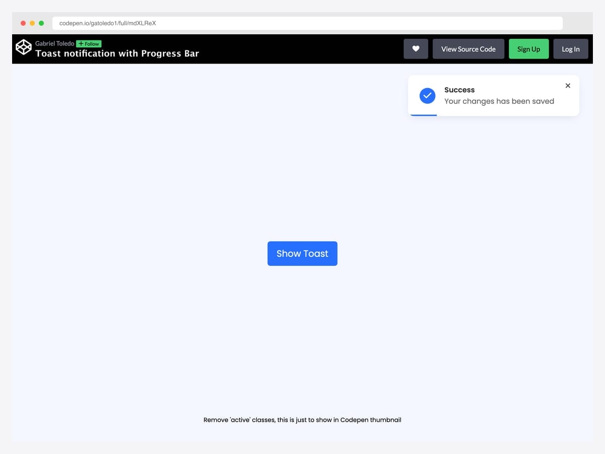
Gabriel Toledo’s design adds a thin progress bar at the bottom of the alert that visually counts down to auto-dismissal — the user sees how much time they have before the message disappears, eliminating the surprise of an alert vanishing mid-read. Best fit for “saved”, “copied to clipboard”, and other transient confirmations where the user benefits from a visible timeout cue. Vanilla JavaScript with a CSS transition driving the progress-bar animation; no animation libraries needed. The progress timing is hard-coded — externalize it as a data-duration attribute if you want different timeouts per alert type (success vs warning vs error).
Designer: gatoledo1 · License: CodePen default (attribution required)
24. Bootstrap 5.3 Dark-Mode Alerts
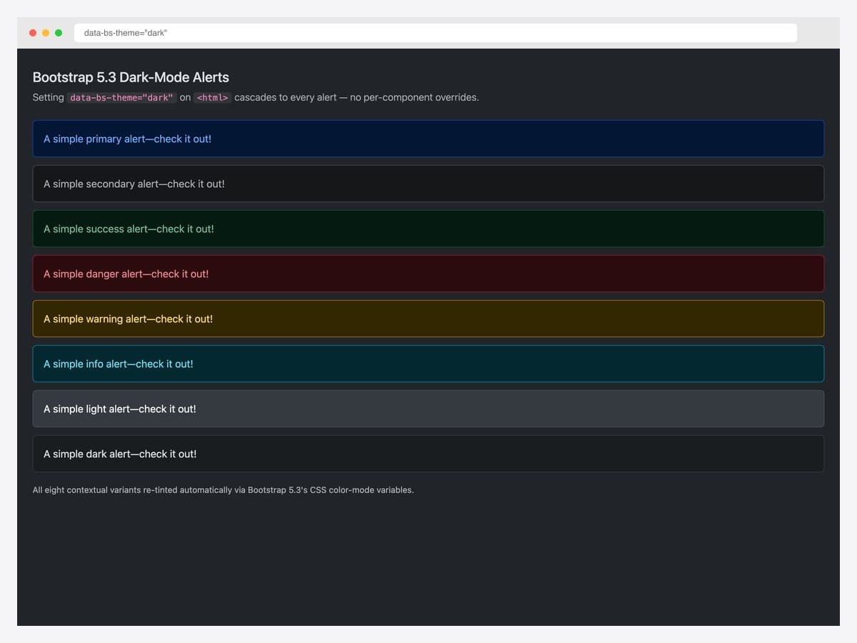
Bootstrap 5.3 introduced native dark-mode support via the data-bs-theme="dark" attribute on <html> — every alert automatically re-tints through the dark color-mode CSS variable cascade with zero per-component overrides required. This self-hosted demo applies the attribute to a stock Bootstrap 5.3 page and renders all eight contextual variants in their dark-mode form. Best fit for any product that supports system color-scheme preferences or offers a manual dark-mode toggle. Pure Bootstrap 5.3 — the cascade is built into the framework. Customize the dark variants via [data-bs-theme="dark"] scoped CSS variables (e.g., --bs-alert-bg, --bs-alert-color) rather than overriding the base classes.
Designer: Bootstrap (twbs) demo · License: MIT
25. Bootstrap Italia Alerts (Government-Grade A11Y)
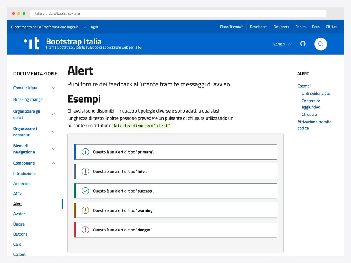
The Italian government’s design system extends Bootstrap 5 with stricter accessibility defaults than the vanilla framework — alerts use ARIA live regions, mandated contrast ratios, government-audited dismissable variants, and bilingual examples in the docs. Best fit for public-sector projects, healthcare interfaces, financial compliance dashboards, and any product where WCAG 2.1 AA conformance is contractually required rather than aspirational. Built on Bootstrap 5; the kit’s alert SCSS partial can be adopted standalone without pulling in the whole UI library. BSD-3-Clause license requires retaining the copyright notice — © 2022 the respective contributors per their AUTHORS file — in your distribution.
Designer: Team Digitale · License: BSD-3-Clause
Minimal / drop-in alerts
26. Alert Messages like the Docs
Bhaumik Patel’s pattern reads like the alerts inside Bootstrap’s own component documentation — 3px colored left border, neutral background, bold heading color matching the border, and ample padding so the message has room to breathe. Best fit for in-app help text, tooltip-expanded descriptions, and any inline notice that should feel advisory rather than alerting. Pure CSS — drop the notice-success, notice-warning, notice-info classes into a Bootstrap project alongside the existing alert-* classes without conflict. Bootstrap 3-era markup that works in 5 unchanged because it’s CSS-only. Pair with role="status" rather than role="alert" if the message isn’t time-sensitive.
Designer: Bhaumik Patel · License: MIT (Bootsnipp default)
27. Simple Card Alerts
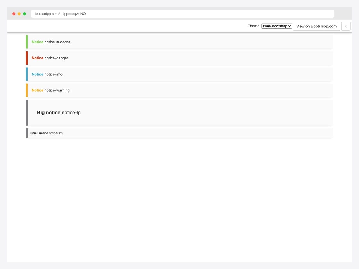
Fortael’s minimal-card variant offers the smallest viable footprint for a styled notice — a left-border accent in the contextual color, a near-white background, and zero JavaScript dependencies. The set ships six variants: success, danger, info, warning, big notice, and small notice. Best fit for static sites, server-rendered apps, and email templates where every kilobyte matters. Pure CSS; no Bootstrap-JS required. The styling is intentionally restrained — if you need icons, action buttons, or dismiss behavior, look earlier in this list for richer patterns and copy the minimal markup as a starting layout.
Designer: Fortael · License: MIT (Bootsnipp default)
28. BS5 Alert with Additional Content
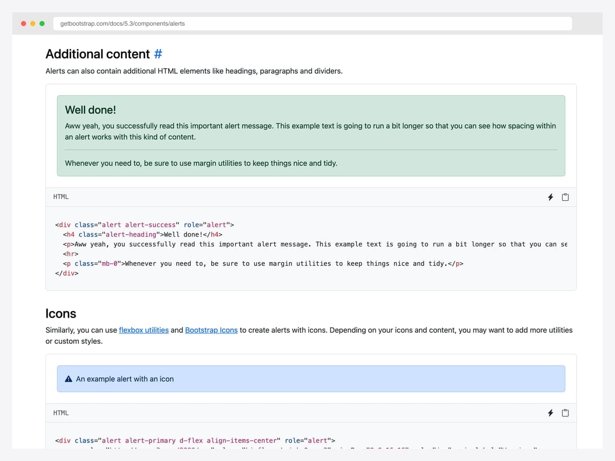
The official Bootstrap 5 pattern for alerts that carry more than a single sentence — a .alert-heading, a body paragraph, an <hr> divider, and a closing paragraph with mb-0 to control the bottom margin. Best fit for onboarding messages, multi-step success confirmations (“Account created, here’s what’s next”), and any alert that deserves a paragraph rather than a one-liner. Pure Bootstrap 5; uses only standard utility classes for the spacing, so it inherits all of Bootstrap’s CSS variable theming. Resist the temptation to nest other components inside — links, lists, and short paragraphs work; cards, modals, and forms break the visual hierarchy of the alert pattern.
Designer: Bootstrap (twbs) · License: MIT
Advanced Bootstrap alert patterns
Three patterns the listicle items above hint at but rarely demo in isolation. Each one solves a specific production problem.
Pattern 1 — Auto-dismissing alert (timed close). Useful for form-submission confirmations that should be visible long enough to read but not cluttering the page indefinitely:
<div class="alert alert-success alert-dismissible fade show" role="alert" id="autoAlert">
  Settings saved successfully.
  <button type="button" class="btn-close" data-bs-dismiss="alert" aria-label="Close"></button>
</div>
<script>
  setTimeout(() => {
    const alert = bootstrap.Alert.getOrCreateInstance(document.getElementById('autoAlert'));
    alert.close();
  }, 5000);
</script>
Mimics toast behavior while keeping alert semantics — useful when the message belongs in the page flow rather than floating in a corner.
Pattern 2 — Alert with icon (improved scannability). Bootstrap doesn’t ship icons in alerts by default, but adding contextual icons significantly improves accessibility and scan speed:
<div class="alert alert-danger d-flex align-items-center" role="alert">
  <svg class="bi flex-shrink-0 me-2" width="24" height="24" role="img" aria-label="Danger:">
    <use xlink:href="#exclamation-triangle-fill"/>
  </svg>
  <div><strong>Action required:</strong> Your subscription expires in 3 days.</div>
</div>
Pair this with an inline SVG sprite — don’t pull in a full icon library for one icon.
Pattern 3 — Multi-error stack with priority. Form validation often produces multiple errors. Don’t show them in separate alerts — group them under a single alert with structured content:
<div class="alert alert-danger" role="alert">
  <h4 class="alert-heading">Please fix the following:</h4>
  <ul class="mb-0">
    <li>Email address is required</li>
    <li>Password must be at least 8 characters</li>
    <li>Phone number must include country code</li>
  </ul>
</div>
One alert beats three. Screen readers announce a single message instead of three competing ones, and the visual hierarchy makes the relationship between errors explicit.
Bootstrap alert vs Toast vs Inline error — when to use which
| Alert | Toast | Inline error (helper text) | |
|---|---|---|---|
| Position | Inline, occupies page flow | Floating, corner-positioned | Adjacent to input |
| Persistence | Until dismissed | Auto-hides (3–8s typical) | Until input changes |
| Use case | Form-wide errors, page-level warnings | Transient feedback (“Saved”, “Undo”) | Field-level validation |
| Page space | Reserved | None (overlay) | Below input |
| Action support | Buttons OK | Single action common | None |
| ARIA role | alert (assertive) | alert or status | alert on input via aria-describedby |
When to choose what: Form-wide errors → alert. Action-completed feedback (“Saved”, “Undo”) → toast. Single-field validation error → inline helper text. The biggest mistake we see in production audits is using toasts for form errors — toasts disappear before users with motor or cognitive disabilities can read them, and the dismissed message leaves no record. Alerts solve both problems for the price of slightly more page-space commitment.
Frequently asked questions
What’s the difference between a Bootstrap alert and a Bootstrap toast?
Alerts are inline messages that occupy page space and persist until dismissed — best for form errors, cookie banners, and contextual warnings tied to a specific page section. Toasts are floating notifications that briefly appear in a corner and auto-hide — best for transient feedback like “saved” or “undo”. Use alerts for states; use toasts for events.
How do I dismiss a Bootstrap alert with JavaScript?
Use the JavaScript API: bootstrap.Alert.getOrCreateInstance(document.getElementById('myAlert')).close(). This triggers the same fade-out animation as clicking the close button. The alert element is removed from the DOM after the animation completes. To prevent removal, listen for the close.bs.alert event and call event.preventDefault().
How do I add an icon to a Bootstrap alert?
Place the icon as the first child of the alert and use Flexbox utilities to align it: <div class="alert alert-danger d-flex align-items-center"><svg class="me-2">...</svg><div>Your message here</div></div>. Pair with Bootstrap Icons or Font Awesome. Always include an aria-label on the icon for screen readers, and use role="img" if the icon carries meaning beyond decoration.
How do I make a Bootstrap alert dismissible?
Add the alert-dismissible class and include a close button with data-bs-dismiss="alert". The alert must also have the fade show classes for the dismiss animation to work: <div class="alert alert-warning alert-dismissible fade show" role="alert">Message <button type="button" class="btn-close" data-bs-dismiss="alert" aria-label="Close"></button></div>.
How do I make a Bootstrap alert auto-dismiss after a few seconds?
Use setTimeout to call the dismiss method programmatically: setTimeout(() => bootstrap.Alert.getOrCreateInstance(document.getElementById('myAlert')).close(), 5000). For repeated use, consider switching to Bootstrap toasts instead — toasts have built-in auto-hide via the data-bs-delay attribute and are designed for transient messaging.
Are Bootstrap alerts accessible to screen readers?
Yes, when implemented with role="alert". The role tells screen readers to announce the message immediately when it appears — important for error messages and time-sensitive notifications. For lower-urgency informational alerts, use role="status" instead, which announces politely without interrupting. Always include aria-label="Close" on the dismiss button so screen-reader users know what it does.
Can I customize Bootstrap alert colors beyond the default variants?
Yes — Bootstrap 5.3 introduced CSS custom properties for alerts (--bs-alert-bg, --bs-alert-border-color, --bs-alert-color). You can create custom variants by overriding these in your CSS without modifying Bootstrap’s source. Alternatively, build a custom alert class using SCSS by extending the alert-variant() mixin — though that mixin is marked deprecated as of Bootstrap 5.3.
Are these Bootstrap alert examples free for commercial use?
Yes — every example in this collection uses an MIT, BSD-3-Clause, MDB-free, or CodePen-default license, all of which permit commercial use including in client projects and SaaS products. License terms vary by item — most are MIT or Apache 2.0. Each item’s source page shows the exact license, and the Bootstrap Italia example (#25) requires retaining its copyright notice in your distribution.
Final thoughts
Bootstrap’s alert component is older than most front-end frameworks shipping today, and the patterns above lean into that maturity — they’re production-tested across millions of pages, recognized by users on first sight, and supported by every browser you’ll realistically build for. The picks worth committing to memory: the official dismissible pattern as your baseline (#11), Oritro Ahmed’s left-border treatment for everyday content surfaces (#3), Wruczek’s cookie banner for any consent flow you don’t want to write from scratch (#21), and Bootstrap 5.3’s dark-mode cascade for any product that supports theme switching (#24).
If you’re rebuilding a form-validation surface, pair the multi-error alert pattern from “Advanced patterns” above with our Bootstrap form templates — most form-error UIs collapse into one of three layouts and the templates show you which one fits.
Related collections: Bootstrap modal templates · Bootstrap snippet library · HTML5 login form templates · Bootstrap navbar examples · Bootstrap contact form templates
Related Posts


Comments (0)