21 Best Service Websites (Examples) 2026
Are you working on a business page and need the best service websites and examples to warm up your creativity?
That’s why we compiled this modern and responsive web design list to save you time.
We’ve reviewed 100 websites and found that some designs start to repeat.
For this reason, we settled with these 21 that combine minimalism, creativity and originality.
Something for everyone.
Best Examples Of Service Websites
1. RyuCreative
Built with: Squarespace
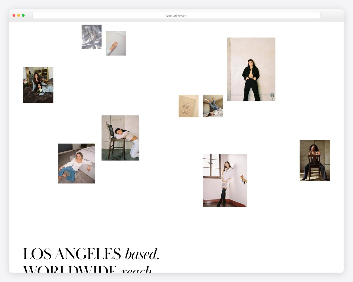
RyuCreative is a modern, minimalist website with one of the coolest hero sections. In addition to the collage of images, it features a simple header with a logo on the left and a three-part menu with an IG icon on the right.
There’s also a services section and a clean Instagram feed instead of a footer area.
What stands out: Minimalism and creativity go great together.
Lastly, explore these great Squarespace website examples to discover the amazing features this website builder software offers.
2. Gretel
Built with: Squarespace
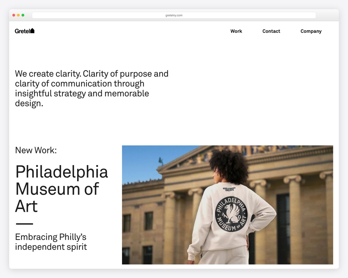
Instead of directly addressing the visual content, Gretel welcomes you with a brief explanation of what they are all about.
But this service website then showcases some of the projects/works animatedly to spice things up.
What stands out: Let your awesome website start with text explaining your business’s specialty or simply what you offer.
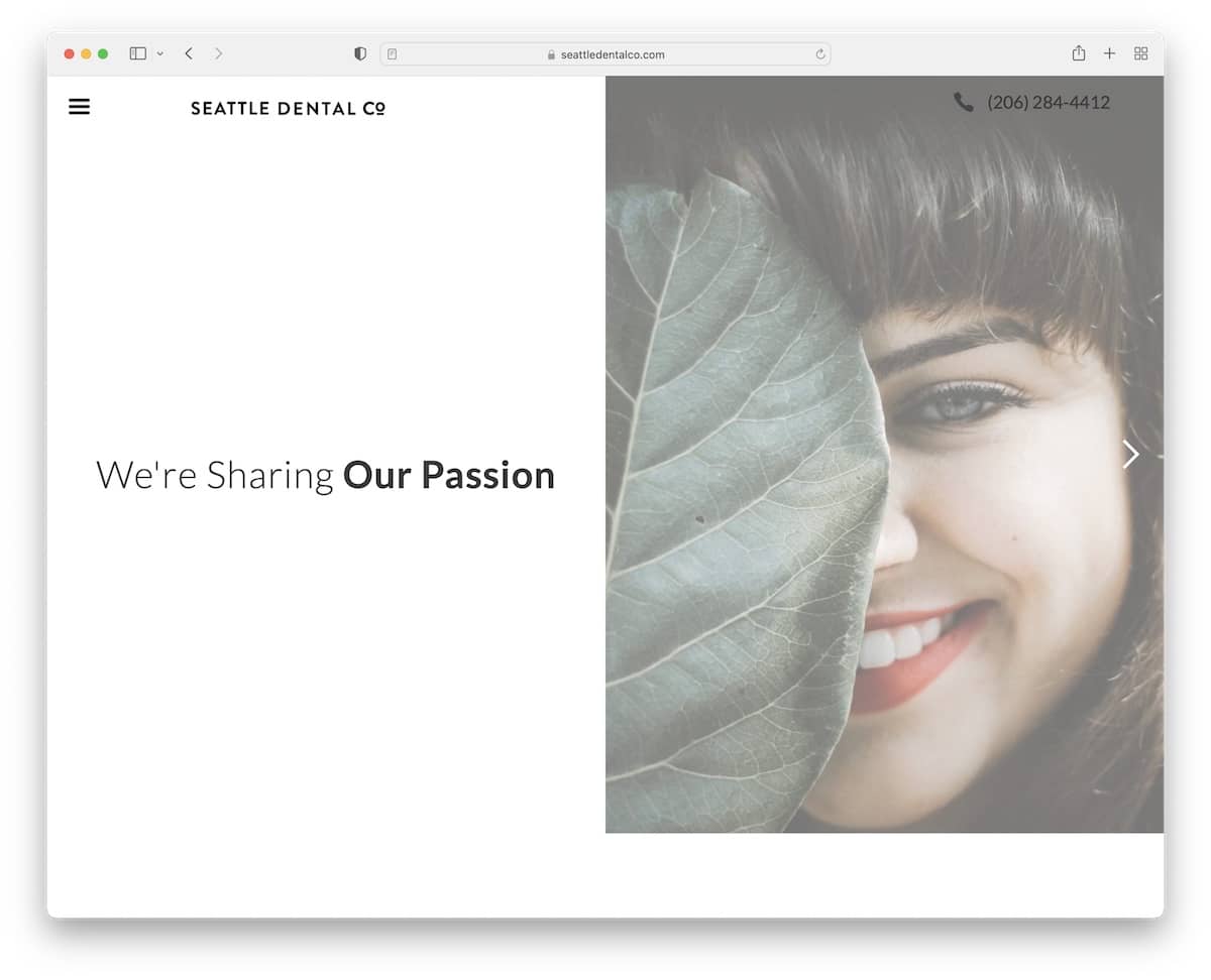
3. Seattle Dental Co
Built with: Webflow
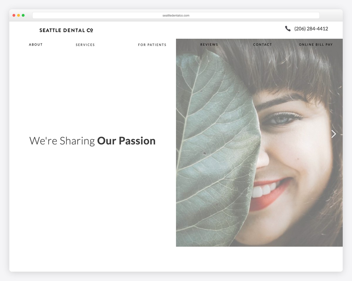
This service website features a split-screen hero section with text on the left and a slider on the right. The floating header features the company’s name, clickable phone number and menu icon.
They also added a client testimonials slider and Google Maps in the footer area, showcasing the exact location.
You can also take a peek at more dentist websites for even more design inspiration.
What stands out: If you prefer to conduct business and accept appointments by phone, consider sharing your phone number on your website and making it clickable.
For more ideas, you may also want to check our all-around collection of the best Webflow websites.
4. Harper Construction
Built with: Squarespace
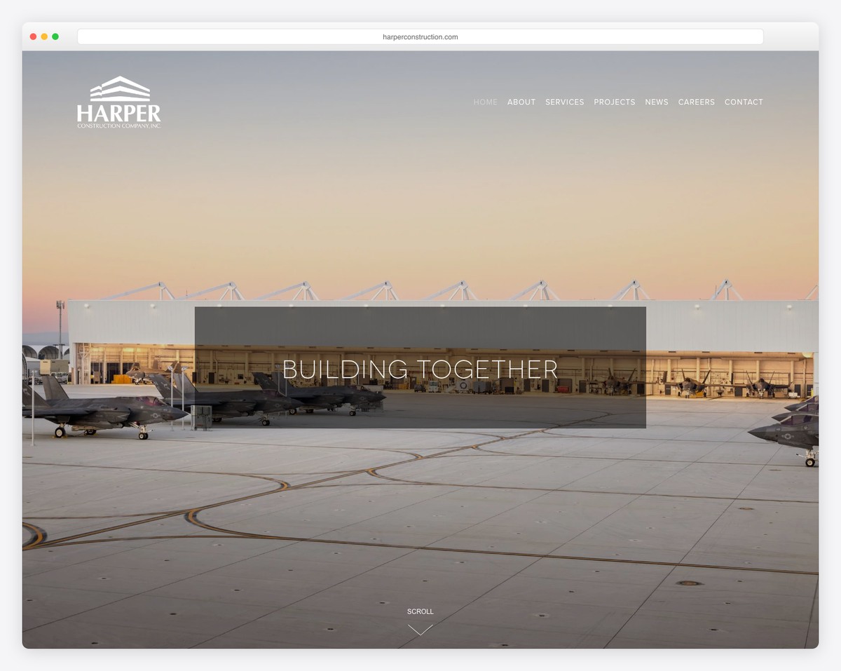
Harper Construction’s service website is a great example of how any building business can create a fantastic online presence—even if it’s simple-looking.
The parallax image background with the transparent header gives an awesome welcoming feel. They also added two snippets that give you a glimpse of the company’s history and services (with a portfolio of some of their works).
What stands out: Make the header transparent for a more flawless feel.
5. Chris Boyer
Built with: Squarespace
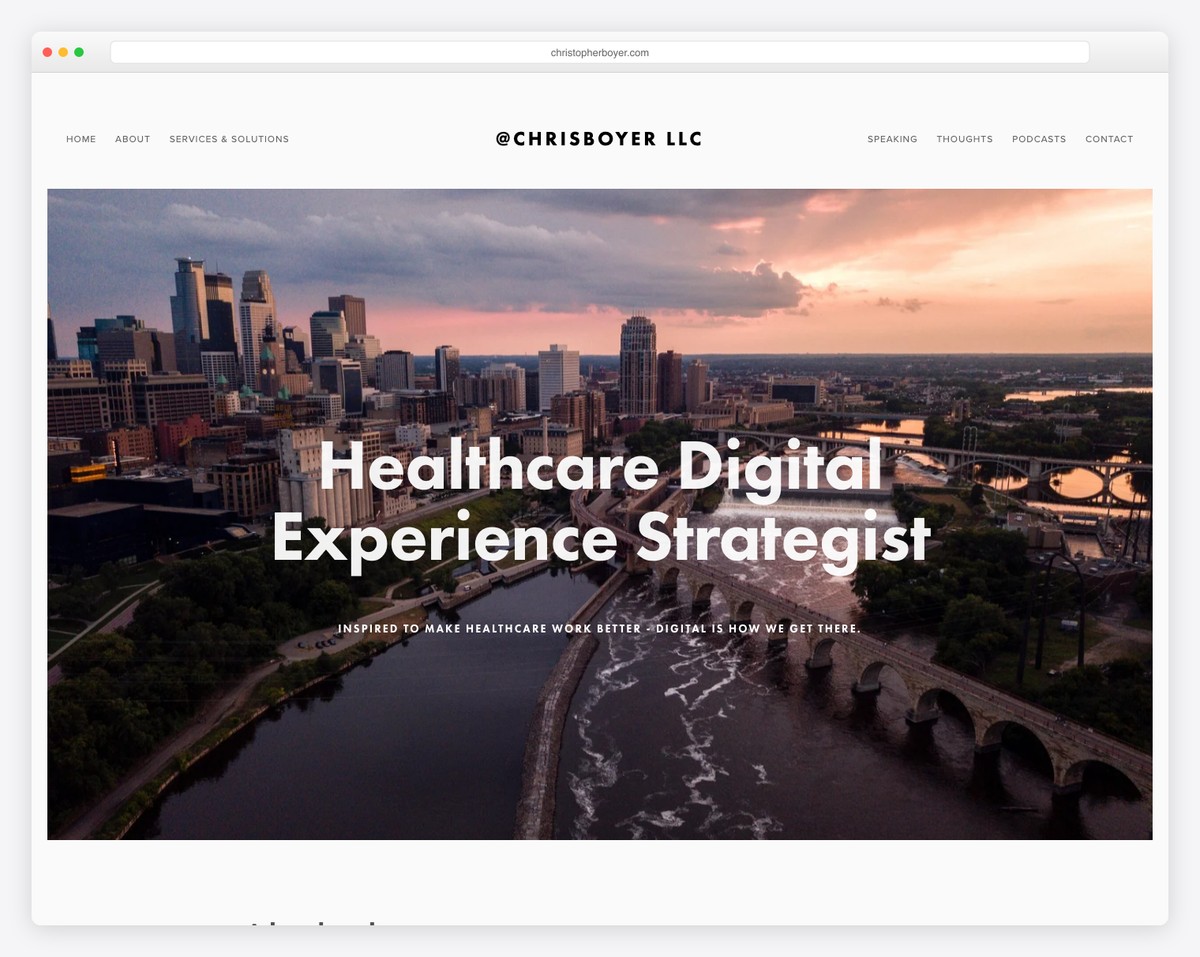
What’s great about Chris Boyer’s website is that even though he has a large chunk of text sandwiched between two large parallax images, it still gives a great experience checking his stuff.
You can access his services from the navigation bar, where he also has links to other important information and a contact page.
What stands out: Compensate text with images for a more pleasant experience.
6. Kelsey O’Halloran
Built with: Squarespace
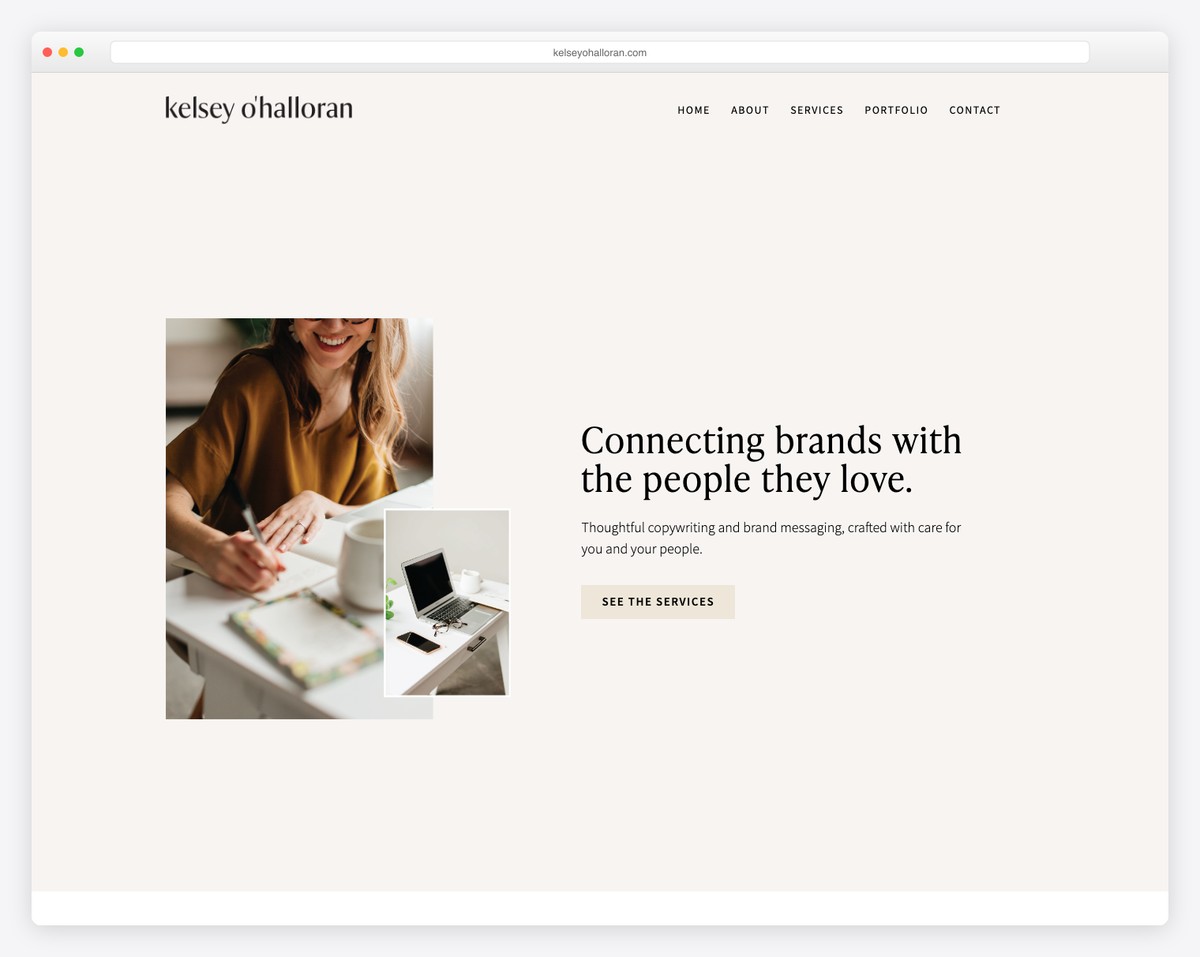
Kelsey O’Halloran’s business website gives you a very personal feel through her images and catchy text.
But she also means seriousness with service presentations, client stories, and call-to-action (CTA) buttons.
What’s interesting is how much information Kelsey added to the footer section – but it works.
What stands out: You don’t always need to make your business website SO serious – have some fun, and people will feel your presence more.
7. Shanley Cox
Built with: Squarespace
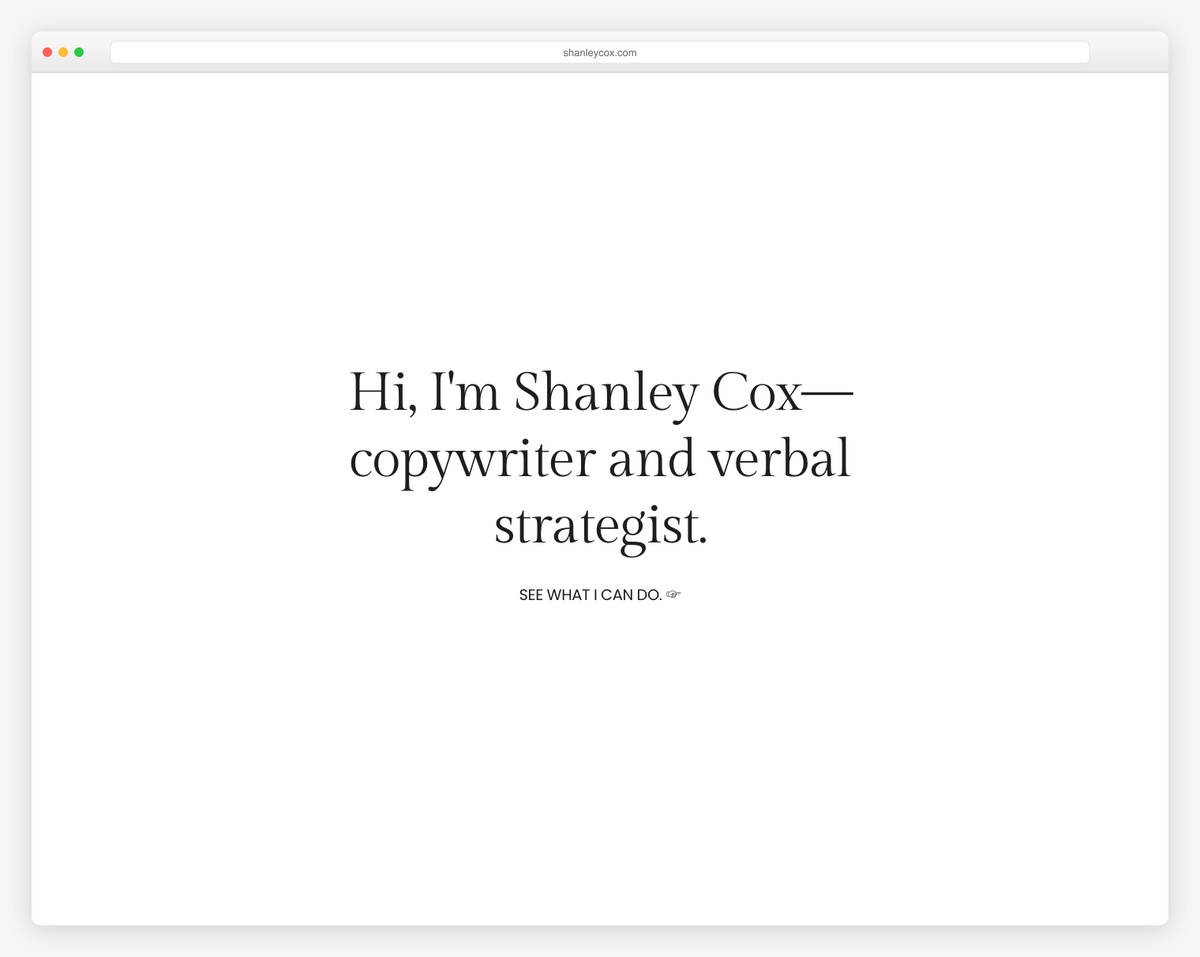
Shanley Cox’s home page acts almost like a one-page site where you can find everything, from her services, testimonials, and about her portfolio, contact form, and IG feed.
The responsive web design is minimalist, with feminine touches that create a pleasant atmosphere.
All this gives you a feeling of knowing Shanley personally, although you two nhave ever met.
What stands out: Use your website to express yourself, giving potential clients the feeling that they know you.
8. La Playa
Built with: Squarespace
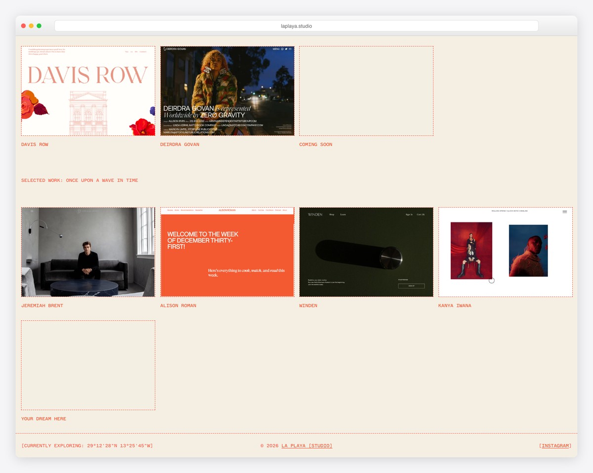
La Playa is a great service website example with a grid-style home page and sticky right sidebar navigation.
All the portfolio elements react on hover by highlighting one and dimming the rest. The sidebar navigation is very clean and has drop-down functionality.
What stands out: Let your portfolio link to actual (live) projects for everyone to see and examine in great detail.
9. Jessica Manning
Built with: Squarespace
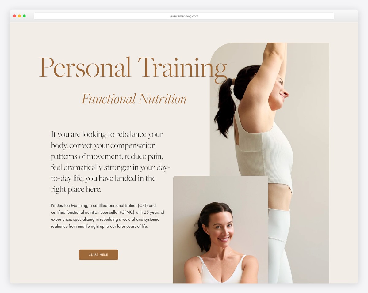
Jessica Manning has an awesome and beautiful personal website that effectively promotes her services without coming across as promotional.
This service website’s great elements/sections include a full-screen image background, a transparent header, a full-screen slider, and a bold testimonial section.
What stands out: Promote your services without being too salesy.
10. Mindy Nguyen
Built with: Squarespace
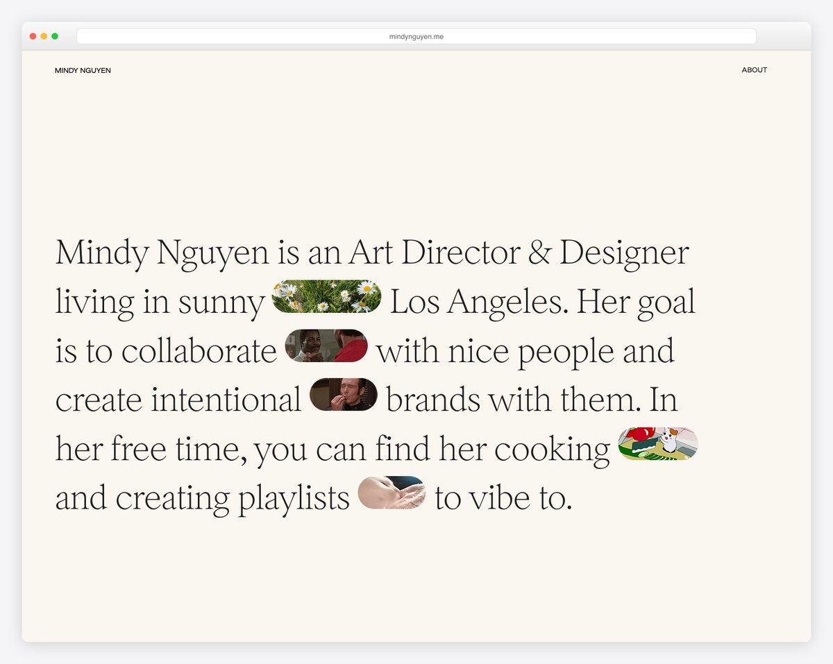
We’ve already seen a couple of text-only hero sections, but none does it like Mindy Nguyen. You also get cool GIFs besides the text that trigger instant curiosity and make reading an even better experience.
Moreover, the home page also features descriptions and links to various projects.
What stands out: Instead of writing only compelling text, add animations or emojis to make it cooler.
Don’t miss these animation websites that offers a whole bunch more great examples to practice your creativity.
11. In8love Wellness
Built with: Squarespace
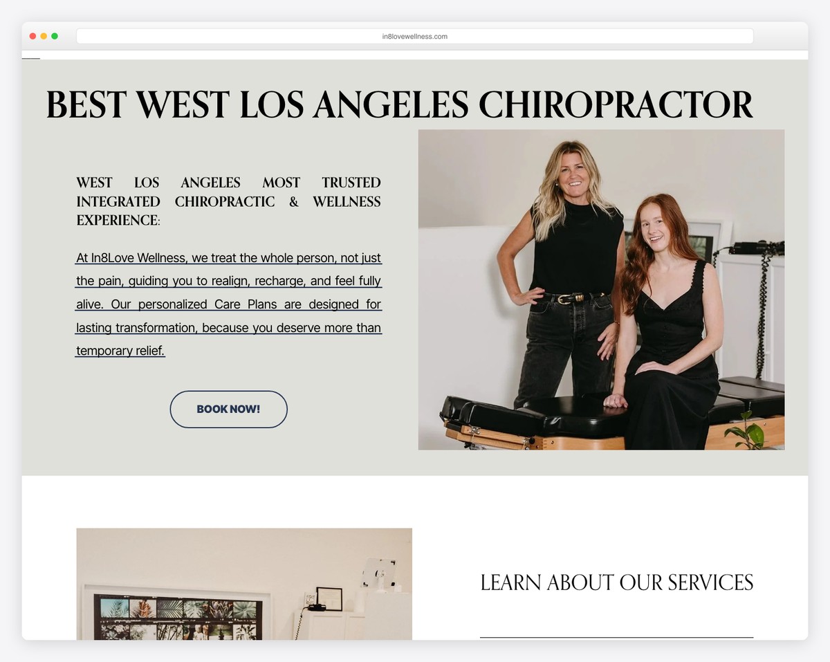
A beautiful image/video background can be a great way to showcase what your business is all about to every visitor. This is exactly what In8love Wellness does with a transparent header and three CTA texts for booking, services, and online shop.
The only other section below the fold is a footer area with additional business details and a newsletter subscription form.
What stands out: You don’t always need a lot of content on the home page—make it simple but impactful.
12. Pack Up + Go
Built with: Squarespace
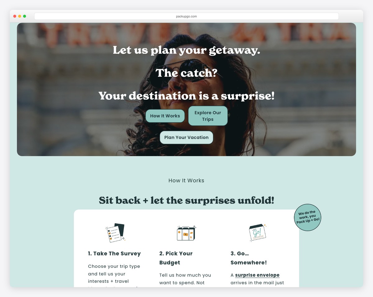
Pack Up + Go is a cool service website example with a parallax hero section, simple header, and text. It also uses a notification bar that you can freely close or visit the link.
Pack Up + Go’s home page has a one-page feel, but the drop-down navigation leads to other internal pages.
They also have an embedded podcast playlist and a “Hot of the press” section with mentions from various authorities.
What stands out: Give visitors a reason to scroll with awesome content!
13. Weddings By Lisa Nicole
Built with: Squarespace
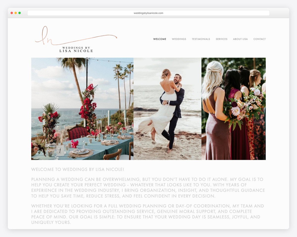
After her website loads, you immediately know what Lisa does. The wedding images and the questions with answers that reveal information/services are more than enough.
The home page has only the header without the footer, keeping things clean. But the navbar guides you to more wedding images, testimonials, contacts, and more.
What stands out: Let the stunning images of your services do the talking.
14. Sean Halpin
Built with: GitHub Pages
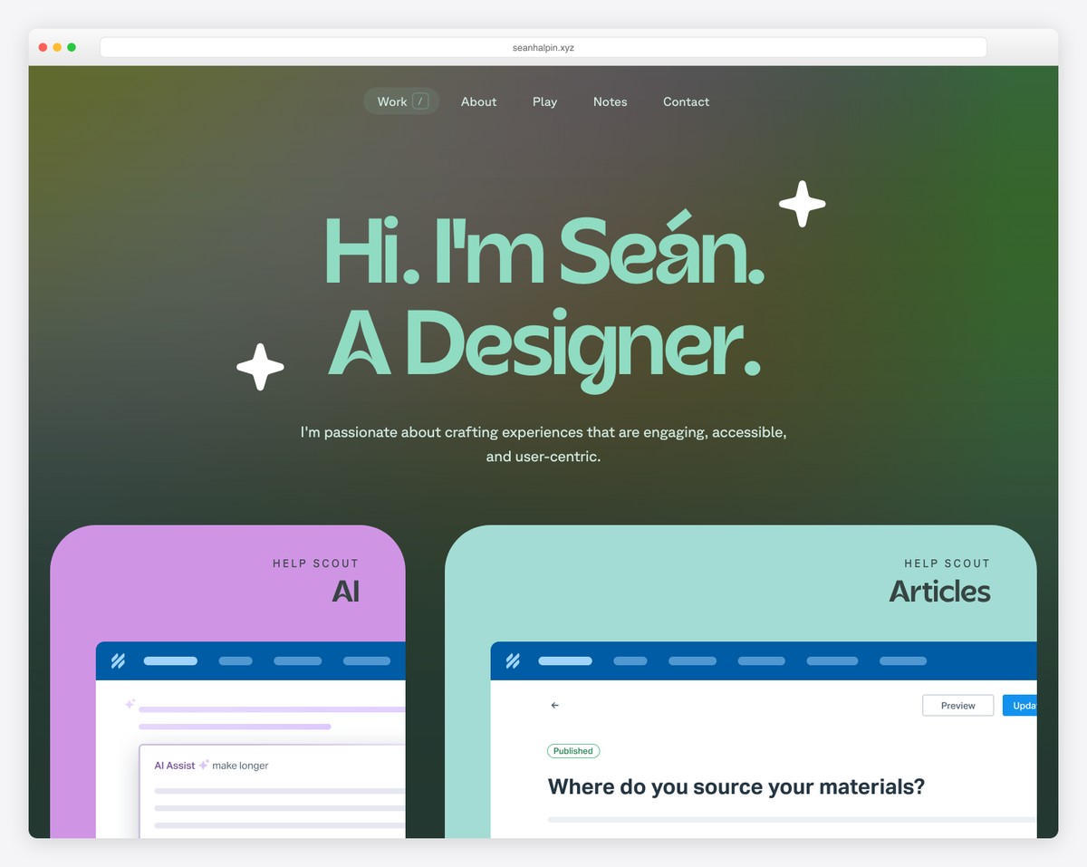
Sean Halpin’s website couldn’t be more designer-ish, with the coolest “stalking” eye animation.
This entire service website is done creatively but still maintains a minimal feel, making the overall experience even better.
A feature you don’t see often is the Contact link in the navigation bar, which opens a live chat. This is the only way to contact Sean.
What stands out: Don’t be afraid to give the website your creative twist; that might be its biggest selling factor.
15. Matt D’Avella
Built with: Squarespace
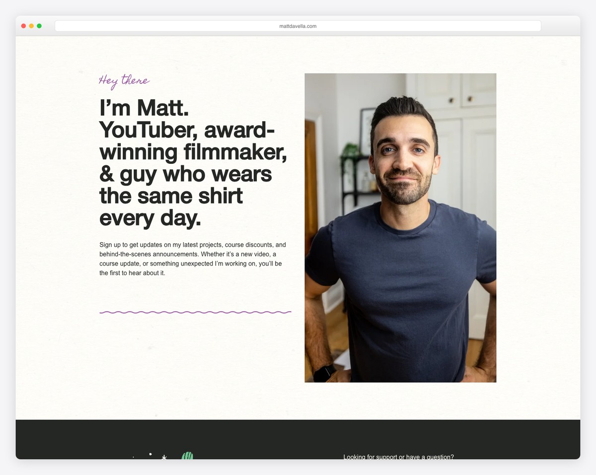
You only need to see the above-the-fold section to learn Matt D’Avella, what he does, and more. Below the hero section are a few of the huge client logos he worked with, so you immediately know Matt is a serious deal.
What’s unique about this service website is that it doesn’t have navigation, but the one-page layout is structured to make you want to scroll.
What stands out: If you have a great strategy for structuring your single-layout website, remove the navbar and give your website a spotless look.
16. Olga Miljko
Built with: Squarespace
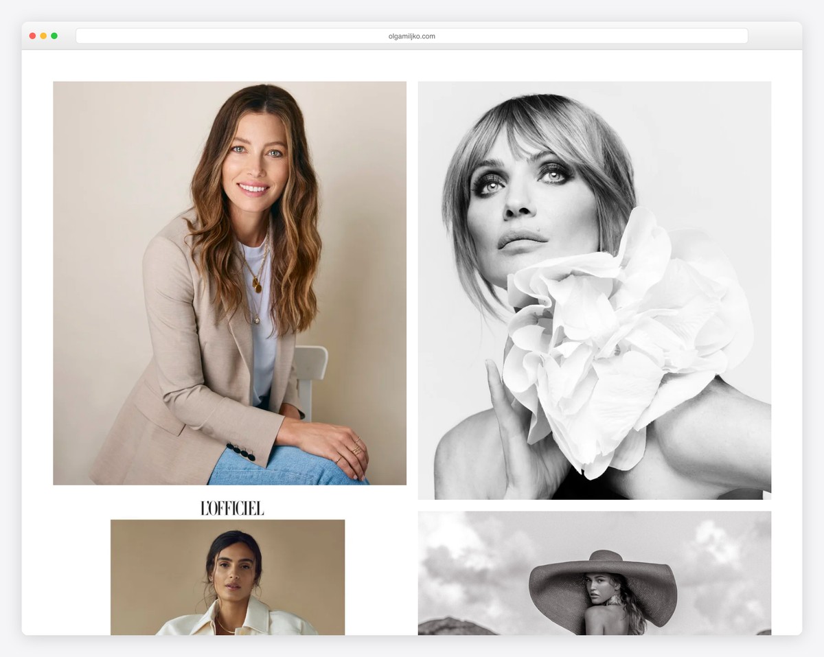
Olga Miljko’s home page is a large collage of gorgeous images that load on scroll, making the visitor hungry to see “what’s next.”
The header disappears when you start scrolling down but reappears on the back scroll, keeping the website much cleaner. And this is where you find all the links, the IG icon and a CTA button.
What stands out: Turn your website’s front page into a portfolio of your amazing work.
17. Seatrend Strategy
Built with: Squarespace
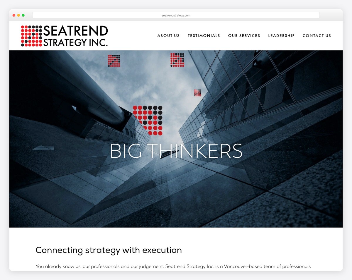
Seatrend Strategy features a vertical slider-like page layout. You can scroll through it or use the sidebar navigation, starting with the scroll-down button.
Interchanging sections between parallax images and information give this service website a better experience.
Moreover, Seatrend Strategy has a floating header, so there’s no need to scroll all the way to the top to visit other pages.
What stands out: Make a big and bold statement in the hero section to create a lasting first impression.
18. Gina Kirlew
Built with: Squarespace
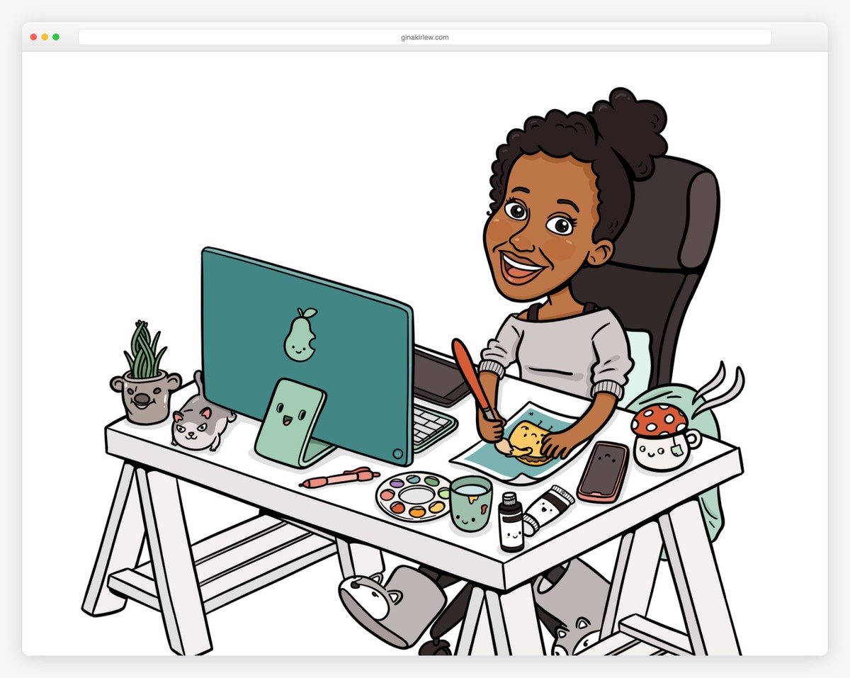
Gina Kirlew’s website will definitely make you smile, which is something she wanted to achieve – and succeeded!
Her home page features a cute illustration of her behind her drawing board, a short description, and social media icons. However, the navigation bar also contains links to her arts, shop, events, etc.
What stands out: Let your art speak for itself, including when it comes to the image of yourself.
Do you need some more art websites and examples? We have a collection just for you!
19. Solo Salon
Built with: Squarespace
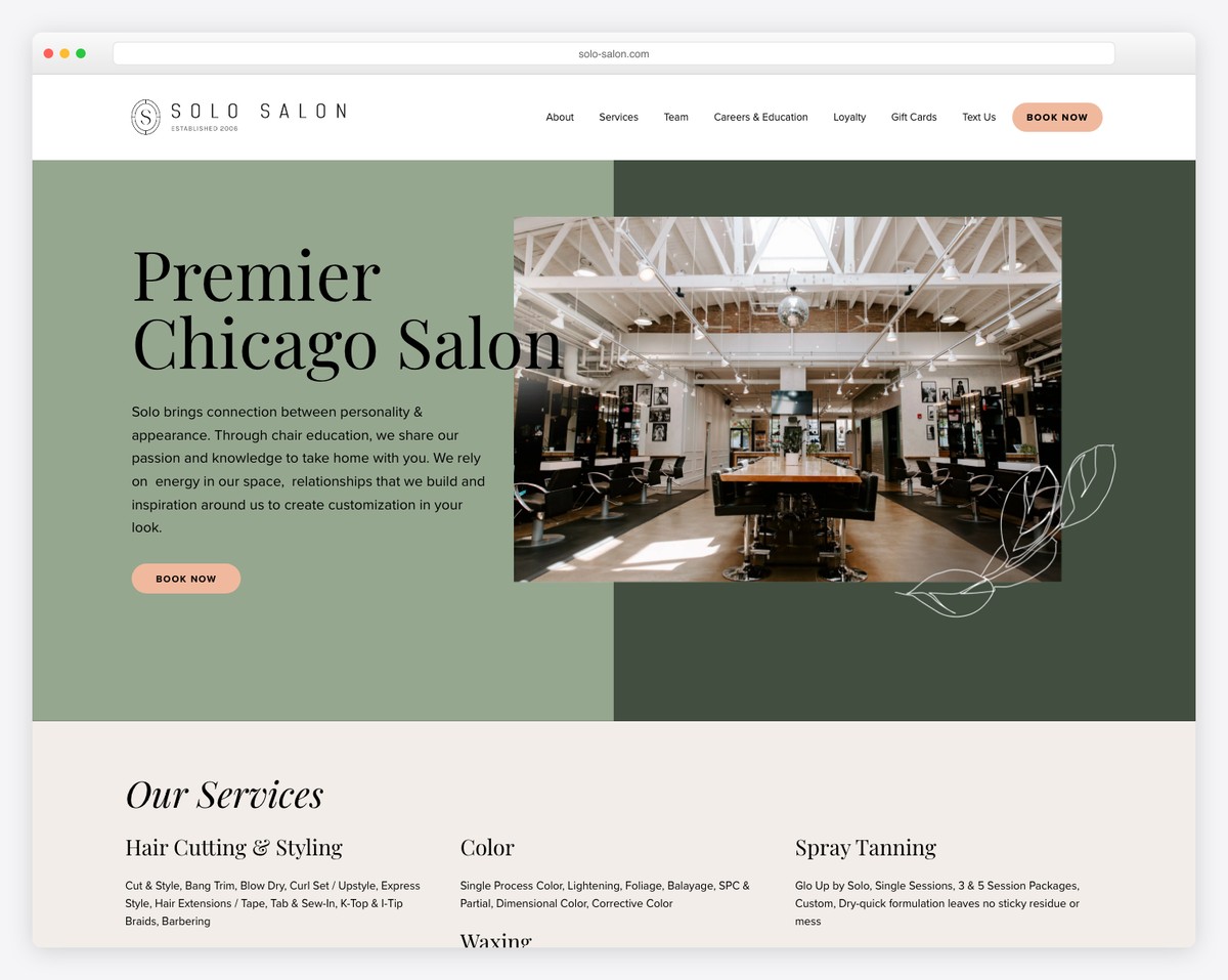
Solo Salon’s website showcases a premier Chicago hair salon with a sophisticated design. The sage-green hero section with elegant serif typography creates an immediate sense of luxury, while interior photography shows off their stunning space.
The site organizes services clearly (Hair Cutting & Styling, Color, Spray Tanning, Waxing) and includes multiple “Book Now” touchpoints. Additional sections for Team, Careers, and Loyalty programs show a well-established business.
What stands out: Prominent booking CTAs throughout a service website reduce the steps between discovery and conversion.
20. Earthbound Designs
Built with: Squarespace
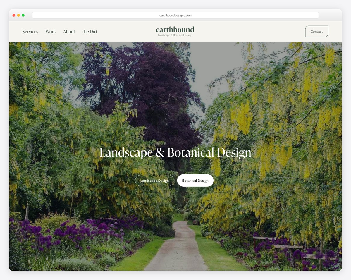
Earthbound Designs presents their landscape and botanical design services through stunning full-width nature photography. The hero image of a manicured garden pathway immediately communicates the quality of their work.
The dual service buttons (Landscape Design / Botanical Design) help visitors find the right offering, while the minimal five-item navigation and “Contact” button keep the experience focused.
What stands out: For service businesses with visual portfolios, letting high-quality photography dominate the homepage tells a more compelling story than text.
21. Drybar
Built with: Shopify
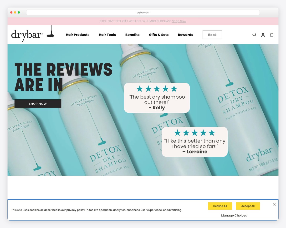
Drybar’s website perfectly balances their dual identity as both a blowout bar service and a hair product brand. The signature pink and turquoise color scheme is instantly recognizable, while the “Book” button in the navigation ensures the service offering is always one click away.
The hero showcases customer reviews alongside product imagery, using social proof to build trust. The navigation (Hair Products, Hair Tools, Benefits, Gifts & Sets, Rewards) covers both in-salon and at-home experiences.
What stands out: Integrating a booking CTA directly into the navigation bar ensures service businesses capture appointment-ready visitors on every page.
Related Posts


Comments (0)