21 Best Node.js Websites (Examples) 2026
Do you want to see the greatest Node.js websites because you want to gain inspiration before starting your project?
We worked on this list over the past few weeks, examining 150 web designs to create a batch of the absolute best.
Every page has something special and unique that you can use for yours.
From various special effects and truly distinct looks to minimalism and cleanness, we ensured this collection has something for EVERYONE.
If you’re particularly into creating a visually dynamic animated website, then these Node.js site examples are perfect.
Take notes!
Best Examples Of Node.js Websites
1. Square

Square has a beautiful, light responsive web design with an actionable hero section featuring a title, text and two call-to-action (CTA) buttons.
Instead of using floating navigation, Square’s sticky header features two CTA buttons, so you can take action at any time you want.
We also like the rounded edges, which make this Node.js more modern and mobile-like.
Note: Include CTA buttons above the fold (and in the floating header) to encourage visitors to take immediate action.
What stands out: The background video creates an immersive first impression that immediately sets the mood.
2. Banco Pichincha

Banco Pichincha’s page starts with a top bar that has a language selector, followed by a two-part header section with navigation, a search bar and a contact CTA button. Also, the header and the top bar stick to the top of the screen.
This Node.js site has a slider, carousels and a multi-column footer. The latter features additional links and social media icons to connect with the business easily.
Note: Sticky header and navigation raise your website’s UX.
What stands out: A hero slider showcases multiple offerings at a glance, giving visitors quick access to key content.
3. Parallel

Parallel is a creative and catchy page with awesome details that we’re sure will inspire many of you.
Instead of making a visual hero section, Parallel approached it differently – with text and a search bar.
The page has two carousels for trending jobs and top companies, FAQs accordions and a newsletter subscription widget in the footer.
Light and dark background sections make the experience a lot more dynamic.
Note: Use a strong message (in large font) to welcome everyone to your website.
What stands out: Full-screen video on the homepage draws visitors in before they even start scrolling.
4. Farm To People
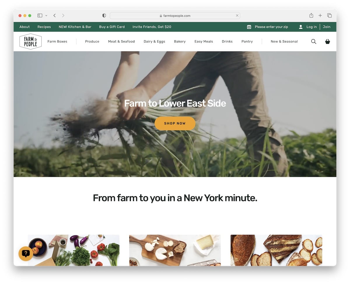
Farm To People takes a completely different approach than Parallel, using a video in the hero section to raise the engagement factor.
This Node.js website is clean, with a catchy color scheme and animations to spice things up.
The top bar is handy for displaying additional links, including account login and registration. But only the main navigation with a drop-down menu follows you around, so you don’t have to scroll back to the top to access it.
Note: Use a top bar for links and info that don’t fit in the main header/menu section.
What stands out: Built-in booking functionality turns the website into a 24/7 appointment scheduler.
5. Zuplo

Dark, light and vivid colors make Zuplo stand out nicely, especially with the rounded edges and cool background.
The floating header is basic, with a CTA button, while the footer provides extra links, social media icons and a newsletter subscription form.
The above-the-fold area also has a lightbox video that shows you Zuplo in action (without needing to leave the current page).
Note: Let your sticky header feature a CTA so visitors can take action when they feel the timing is right.
You can create a similar website using these Node.js templates that are designed for all purposes.
What stands out: The clean layout and intuitive navigation create a professional user experience that builds trust.
6. Due Lune
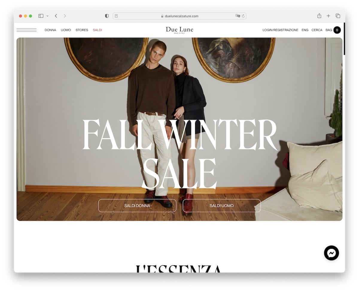
Due Lune is elegant and bold simultaneously, with a touch of minimalism that makes all the content and products shine more.
This eCommerce website has a basic navigation bar with a language switcher, plus a hamburger icon for extra menu links.
They also have a Facebook messenger in the bottom right corner, so you can get in touch on the spot.
What’s pretty interesting is the massive footer section, which you don’t see daily.
Note: Improve your customer support with a “live” chat widget.
What stands out: Scroll-triggered animations guide the eye through each section without overwhelming the visitor.
7. Kinross House

Kinross House’s full-screen video background above-the-fold is so gripping you want to watch it to the end.
The header is transparent and simple, with a hamburger icon and two CTA buttons, so they don’t distract the watching experience.
Moreover, the smooth scrolling experience creates a pleasant atmosphere that makes you want to investigate the page further.
Note: Use a video background to capture your visitors’ attention (and have them around for longer).
What stands out: Subtle entrance animations add polish without slowing down the browsing experience.
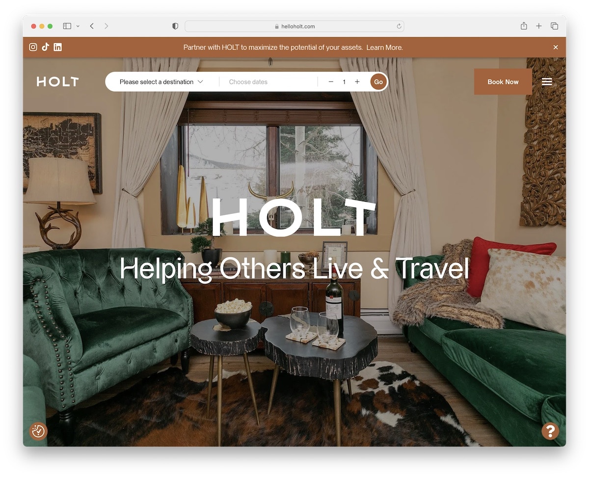
8. Holt
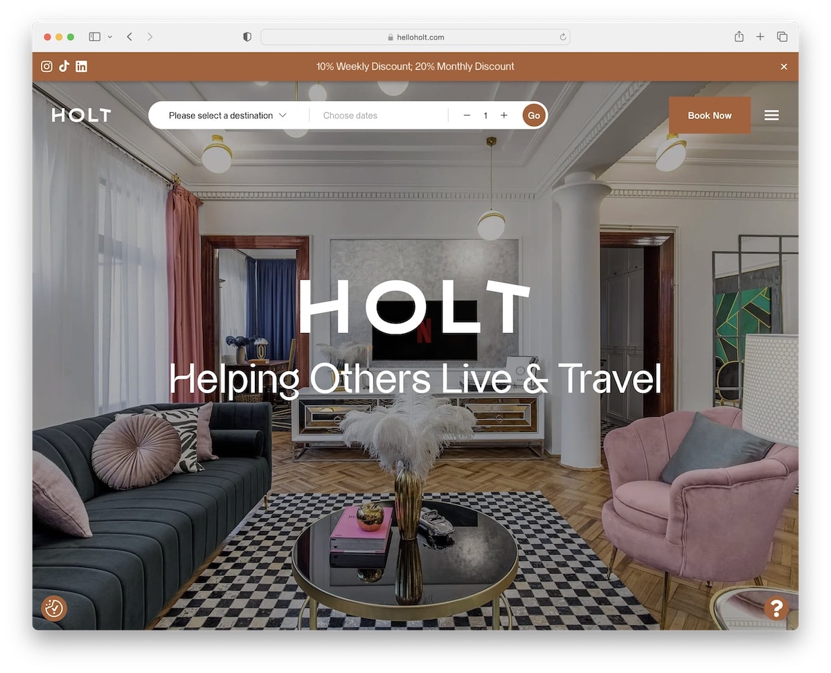
Holt creates a strong impression on everyone with its full-screen image slider. It warms you up for the place before you take action by clicking on the booking button in the header.
This Node.js website has a top bar notification with social media icons that you can close anytime.
The scrolling is very Apple-like, creating a mesmerizing experience. The black background makes all the content pop nicely, and the parallax effect is nice icing on the cake.
Note: Let your images do the talking by using a full-screen slideshow.
What stands out: The dark color scheme gives the site a sleek, modern feel that makes imagery pop.
9. Wild
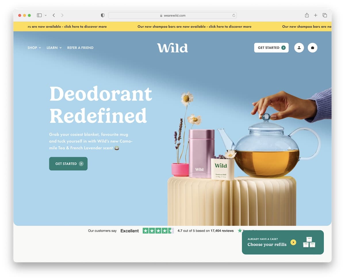
Wild is a bright, vibrant business website with sliding text in the top bar and a transparent header with a cool drop-down menu.
Moreover, the header disappears on the scroll but reappears as soon as you start scrolling back. This makes the website look neater when scrolling.
The only element always present is the “button” in the bottom right corner for everyone who already owns the product.
Note: Create a sticky element if you’d like to promote something or make your visitors’ lives easier.
What stands out: A dark background paired with bold accent colors creates striking visual contrast.
10. The Pleasure Pursuit

The Pleasure Pursuit has a catchy preloader that’s the beginning of an animated Node.js website that you haven’t seen before.
The “scrolling” experience is as distinct as it could be, taking you to a video-game-like encounter that makes you forget about time.
Also, The Pleasure Pursuit plays audio in the background, which you can pause (and play again).
Note: Create an animated website that everyone will recommend to others.
What stands out: A well-structured homepage guides visitors through key information without overwhelming them.
11. NXTide
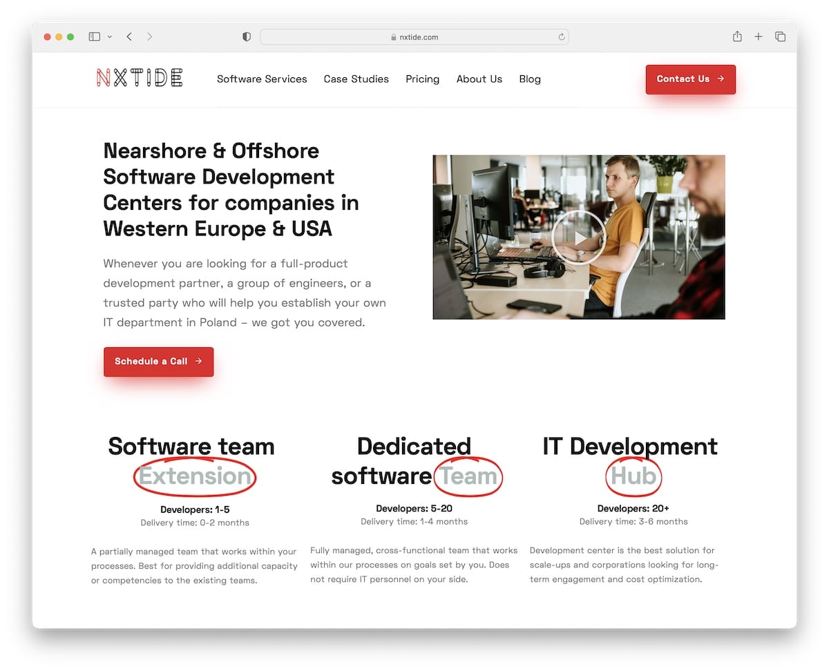
NXTide is a light and minimalist website with a basic floating header, with navigation and a CTA button. The multi-column footer has heaps of quick links, which is handy because this page doesn’t use a search bar.
The simple details in a few animations make NXTide livelier and likable to skim through.
What stands out: Minimalism with a touch of creativity (simple animations, effects, etc.) is a winning combo.
12. Etuk Josiah Benjamin

Etuk Josiah Benjamin has a bold and original home page with a cool “shadow” that follows your cursor.
The content loads when you scroll, while the floating header has a hamburger menu that opens an overlayed menu to other page sections.
This Node.js website also has a dark mode (day & night switcher), so visitors can customize their experience.
Note: Dark/light mode switcher is a cool addition worth trying out for night owls (if your default look is light).
What stands out: A vibrant color palette creates energy and personality that sticks in visitors’ minds.
13. Morefont

The animated grid on Morefont’s home page will grab your attention, combined with the overall minimalist yet special design.
The base of the home page has a dark background, while the footer is light to make it more dynamic. But you can also switch the look by clicking on the dark/light mode button in the top right corner.
Additionally, Morefont has integrated custom Google Maps to showcase the exact business location.
Note: Instead of writing down the address, use Google Maps (with a custom look and marker).
What stands out: The image carousel keeps the above-the-fold area dynamic without requiring visitors to scroll.
14. Pavia

Pavia almost feels like you’d be watching a video you control with scrolling. It’s an animated Node.js website with a 100% transparent header with a hamburger menu (full-screen overlay) and a basic footer.
What’s also handy is the circular progress bar in the bottom right corner, which shows you how far you’ve come.
Note: Web browsing has no boundaries or limitations, and Pavia is a great example to follow.
What stands out: Intuitive navigation makes the site easy to explore even for first-time visitors.
15. Brocoders

Brocoders is a Node.js with a hero video background, a title, text and a CTA button to go straight to the contact form.
Other goodies include a floating header, client reviews, an online booking calendar and a cool, personalized video widget in the bottom right corner that works as a chat function with a twist.
Note: Offer potential clients to book a call via an online booking calendar built into your website.
What stands out: Integrated appointment booking removes friction between browsing and converting.
16. EcDev Studio

EcDev Studio is very text-heavy yet simple website that keeps its design low-key, with enough white space to ensure excellent readability.
The header reacts to the scrolling movement, disappears and reappears depending on whether you scroll down/up.
What’s more, the client testimonials slider with avatars, client positions and star ratings is an excellent trust-builder.
Note: Build social proof by including client testimonials and reviews on your website.
What stands out: Client testimonials placed prominently on the homepage build trust before visitors even explore the services.
17. Romagnoli
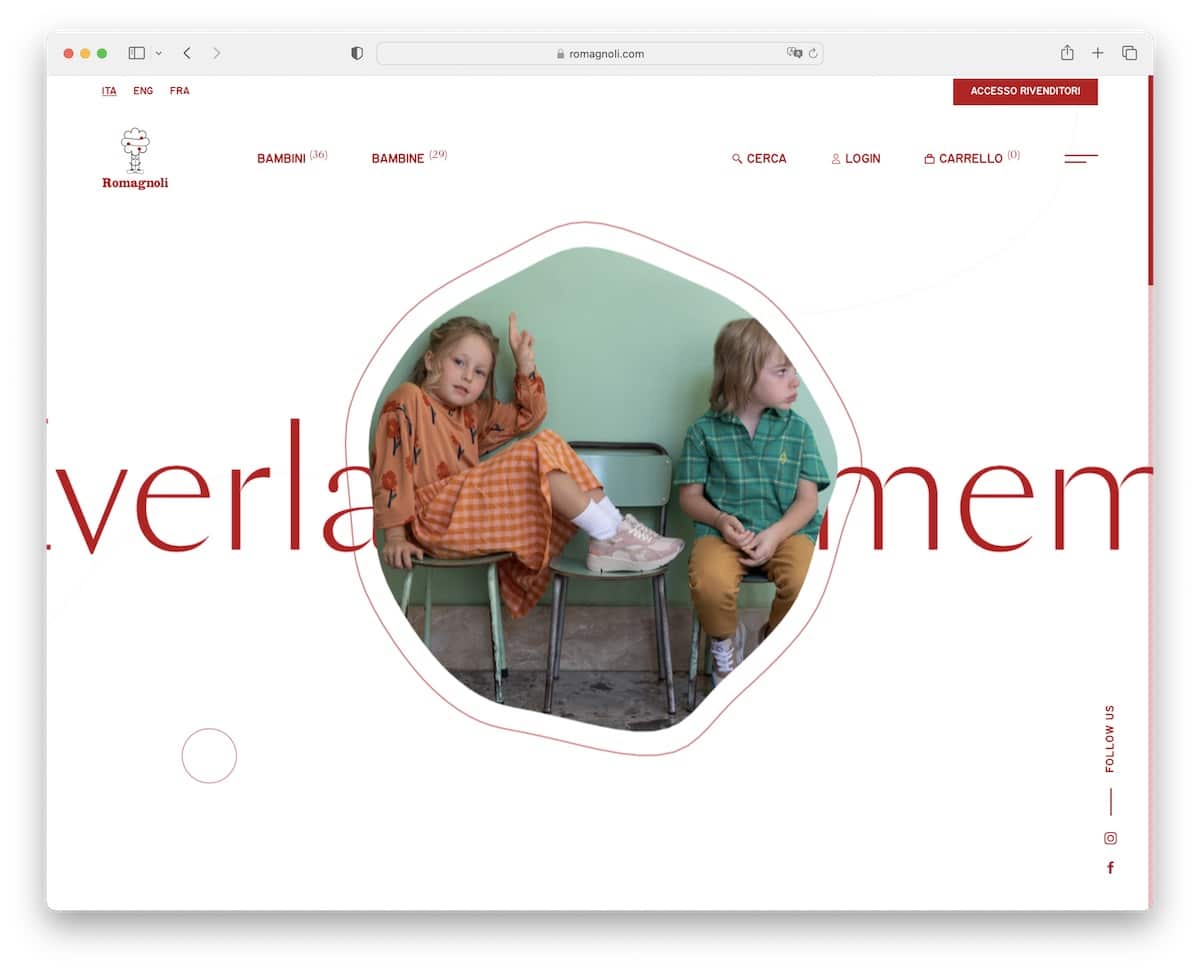
While Romagnoli is an online store, the home page doesn’t feel so. It’s completely unintrusive with its clean site design, displaying products using a distinct grid layout that feels enjoyable to scroll.
The header is transparent with the basic links and a hamburger icon that reveals more quick links and a language switcher.
The minimalism really shines throughout this entire shoe website, including the footer.
Note: Move the selling part on the product pages, and keep the home page experience-focused.
What stands out: Seamless e-commerce integration lets visitors go from browsing to buying without leaving the site.
18. Magnetism

Magnetism is the minus and you’re the plus, connecting perfectly through an awesome web design.
Its clean header is probably our favorite thing, but it gets even better as soon as you start scrolling.
There’s also a terrific two-column online portfolio, various hover effects and a red dot that follows the mouse cursor.
Note: Combine text and visuals uniquely, like Magnetism.
What stands out: The minimalist design keeps the focus on what matters most — the content itself.
19. Grover
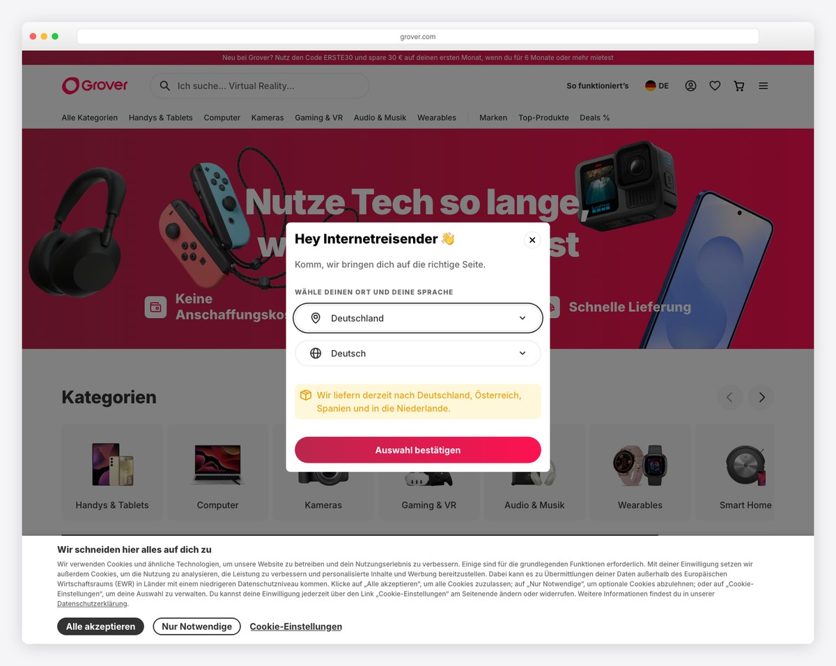
Grover is a German tech rental platform built on Next.js that lets consumers rent electronics like laptops, smartphones, and gaming consoles on a monthly subscription. The clean, conversion-focused design features prominent pricing displays and responsive product grids.
The sophisticated visual system uses gradient CTAs to guide users through the subscription flow, while server-side rendering ensures fast initial page loads even with rich product imagery. The layout balances product discovery with clear rental terms and pricing transparency.
What stands out: Using Next.js for server-side rendering on a product-heavy rental platform ensures that product pages load fast and are fully indexable by search engines — critical for a marketplace competing on organic traffic.
20. Pitch
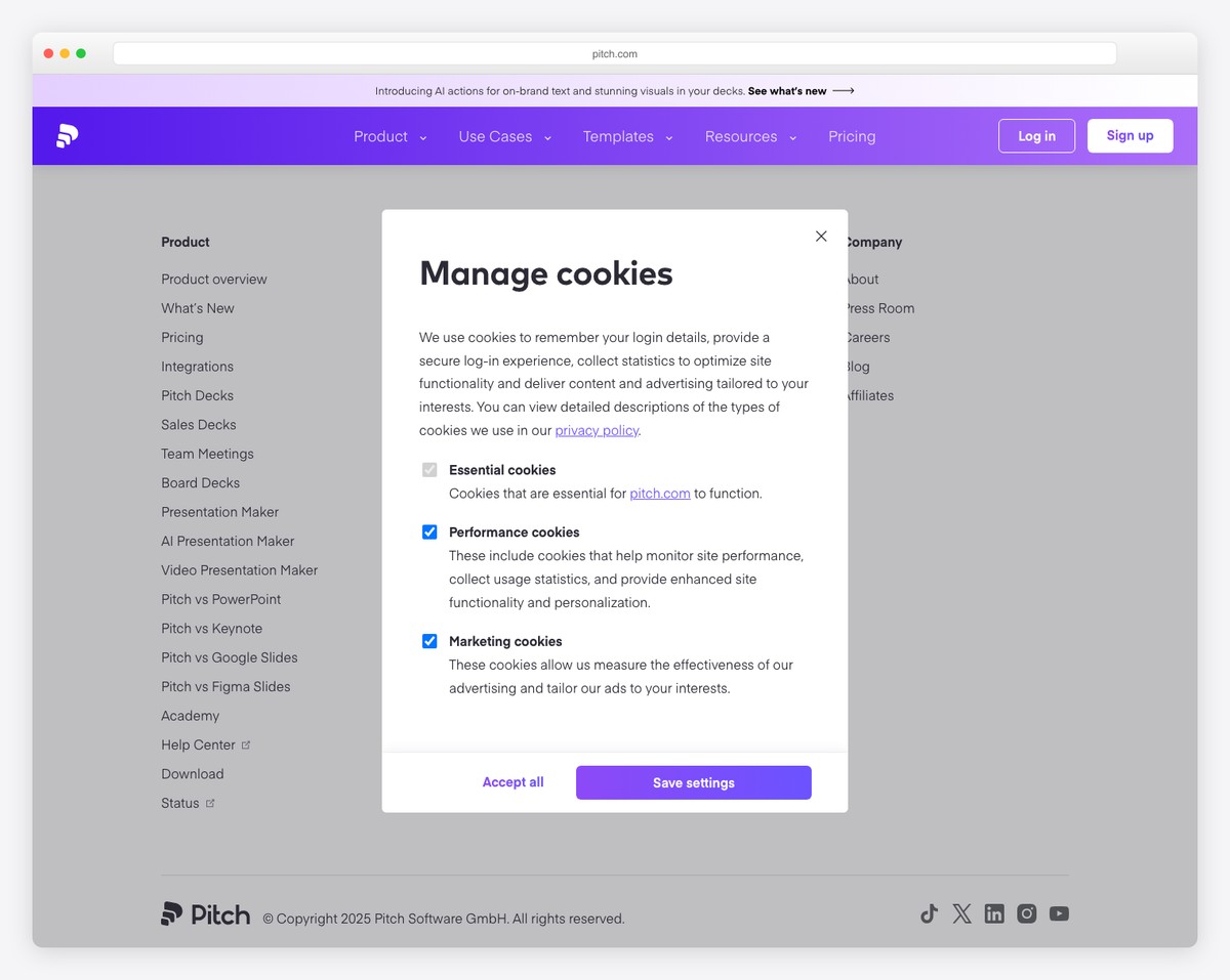
Pitch is an AI-powered collaborative presentation platform built with Next.js. The polished SaaS marketing site delivers a premium experience with abundant whitespace, embedded product demos, and a clear visual hierarchy that guides visitors from features to signup.
Interactive carousel galleries showcase real presentation templates, while user testimonials and integration logos (Slack, Notion, HubSpot) build credibility. The design prioritizes showing the product in action rather than just describing it — a smart approach for a visual tool.
What stands out: Embedding interactive product demos directly on the marketing site lets visitors experience the tool before signing up — for a presentation platform, showing beats telling every time.
21. N26
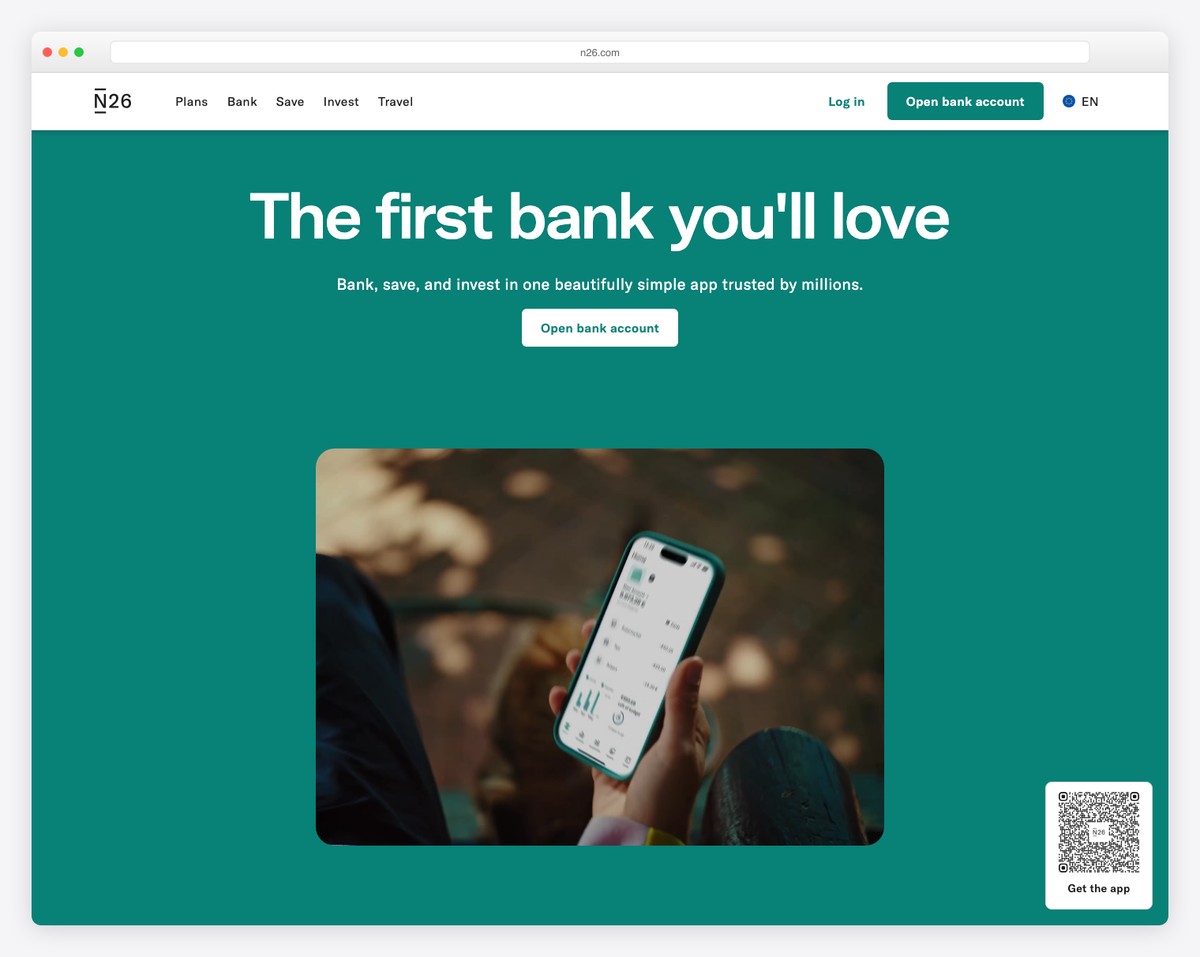
N26 is a European mobile bank serving 24 markets, built on Remix (a Node.js React framework). The sophisticated design uses a teal and cream color palette with high-quality lifestyle photography to convey trust and modernity simultaneously.
Server-side rendering ensures fast page loads across all markets, while the clean layout makes complex banking products feel simple and approachable. The tagline “the first bank you’ll love” is reflected in every design choice — from the friendly typography to the inviting product screenshots.
What stands out: A banking website that feels warm and approachable rather than corporate and cold breaks the mold — N26’s design proves that financial services don’t have to look boring to be trustworthy.
Related Posts

Comments (0)