21 Examples Of Bad Websites 2026
Are you ready to see some of the best examples of bad websites?
While this list was actually more challenging to curate than not, we finally made it happen.
Surprisingly, there are still very many websites with the absolute worst design.
It’s hard to believe that these types of websites even exist these days, with the availability of amazing WordPress themes and convenient mobile-friendly website builders.
When reviewing pages to create a collection of the worst websites, we paid special attention to design, user experience, loading time, content, and readability.
Bad Websites (So You Don’t Make The Same Mistake)
1. Pacific Northweast X-Ray Inc.
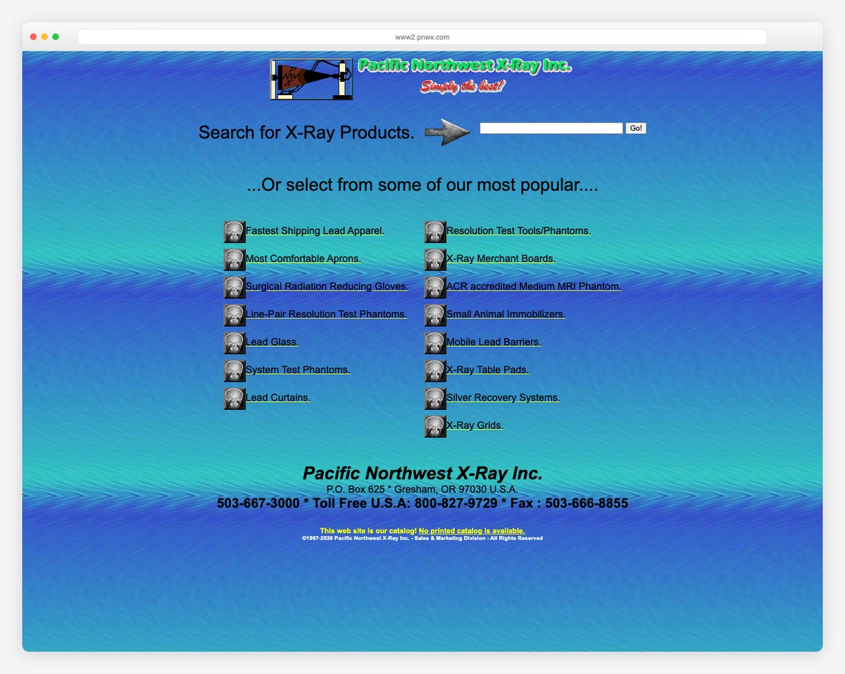
Pacific Northweast X-Ray is one of the lowest-quality websites we stumbled across. You don’t really know what the website/business is about, and there is no reason to learn more.
The page is as old-school as possible, making you want to leave it as quickly as possible without bothering to type in your search query or click any links.
What stands out: Despite the design flaws, the site serves as a learning example of what to avoid in modern web design.
2. Blinkee
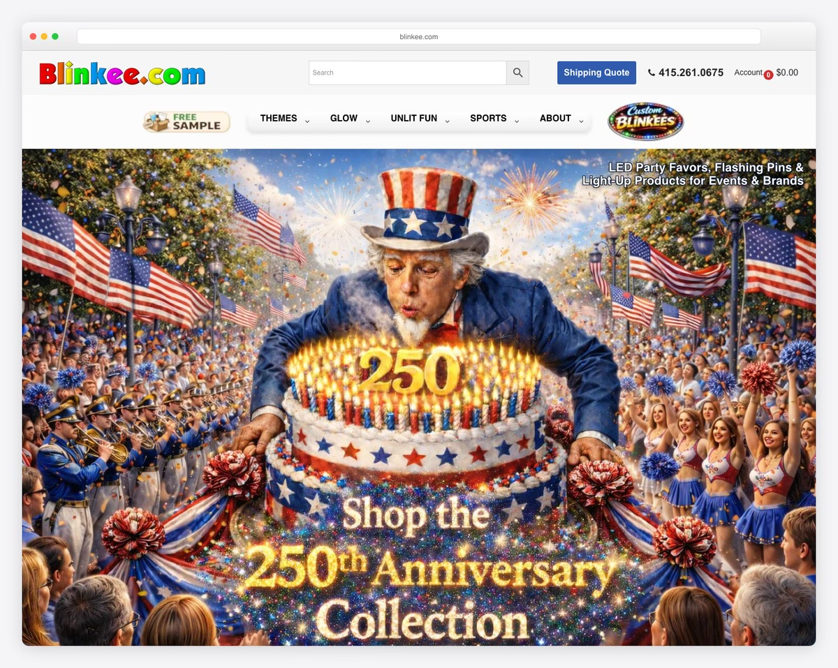
While Blinkee’s desktop version is okay (at best), its mobile user experience is terrible.
The hero section is a bit beginner-friendly, and it would be much better if the elements were static. Also, the branding and colors are off and don’t follow any patterns.
The only good things about Blinkee are the live chat function and the decent multi-level drop-down menu.
What stands out: The dark color scheme gives the site a sleek, modern feel that makes imagery pop.
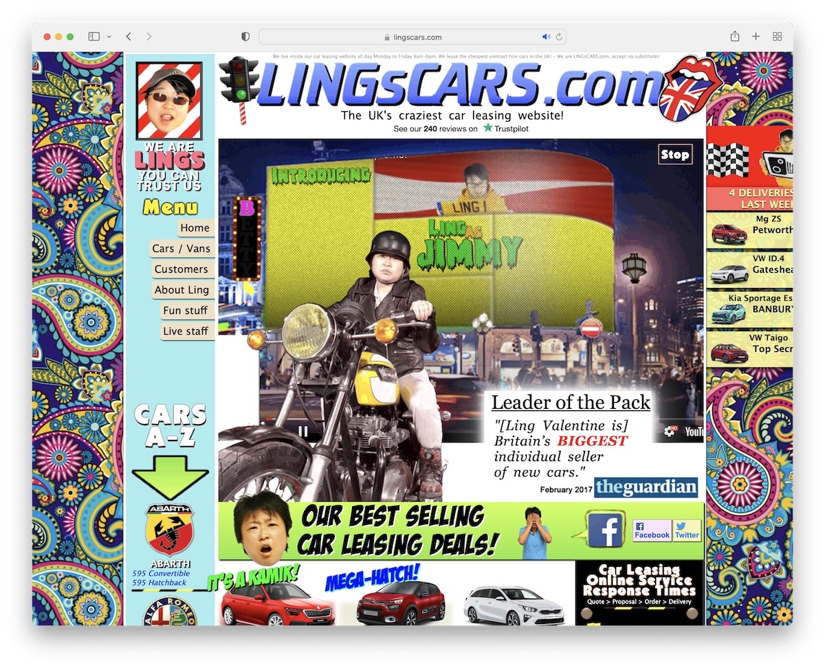
3. Ling’s Cars
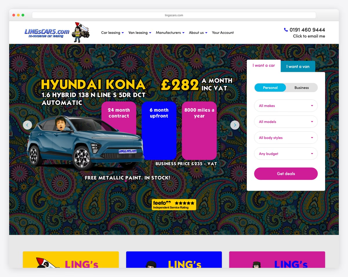

Ling’s Cars’ extreme flashiness makes you unsure of what to look at. It’s way too distracting (but sometimes Asian/Japanese websites are exactly like that). Also, the layout is not responsive, making it hard to find the information and items on mobile.
The video gets completely lost in all the animations, so it’d be much better off without it.
What stands out: A hero slider showcases multiple offerings at a glance, giving visitors quick access to key content.
4. The Big Ugly Website
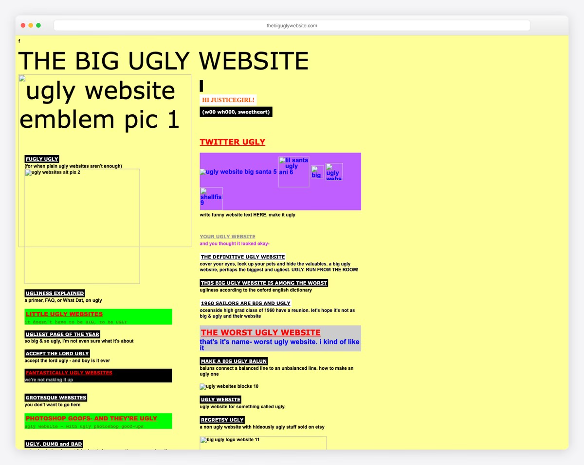
I’m not sure what the purpose of The Big Ugly Website is, but they nailed it if they wanted to show what a really bad website looks like. And things get even worse when you start clicking links.
This one-page website lacks overall design due to its color choices, and the mobile view is nonexistent.
Lastly, the little “f” icon in the top left corner isn’t clickable.
What stands out: The layout choices highlight common pitfalls that even experienced designers should be mindful of.
5. Arngren
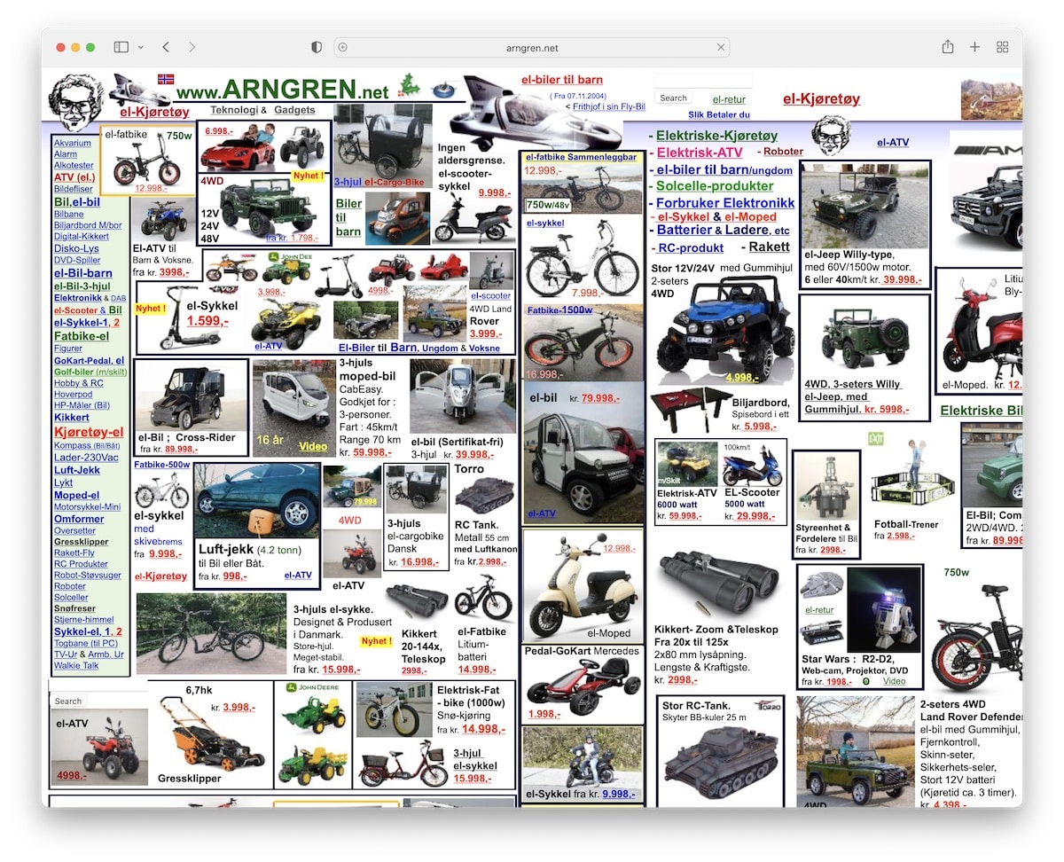
Are we looking at an old-school yellow page or a website? Arngren is a bad example of a website that put 0 thought into creating a good user experience.
The collage of images with tiny fonts doesn’t change shape on mobile. On the desktop, you even need to scroll it left and right (unless you’re using a really large screen).
Even if you would like to skim through it quickly, you can’t.
What stands out: High-quality photography does the heavy lifting, making the content feel premium.
6. Tag Team Signs
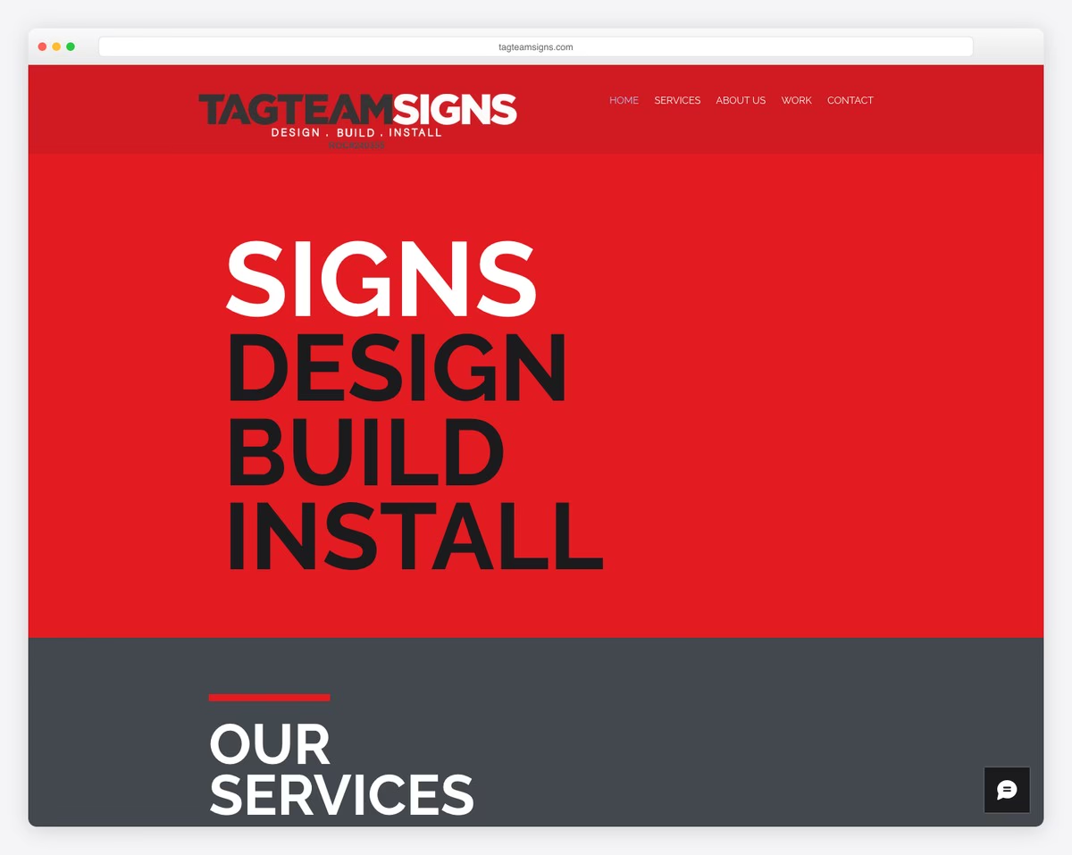
While a bold web design can work well, Tag Team Signs didn’t pull it off. The choice of colors, typography, and background images doesn’t show the slightest sign of professionalism—and that comes from people who design signs.
Doesn’t make sense to me.
The only good page element is the “Get in touch” section, which includes a clean contact form and company details (but you won’t see all of it on mobile).
What’s most surprising about this website is that it was built using Wix, an amazing website builder. You would need to try hard to create something this bad.
What stands out: Parallax scrolling adds visual depth and encourages visitors to keep exploring.
7. Goodreads
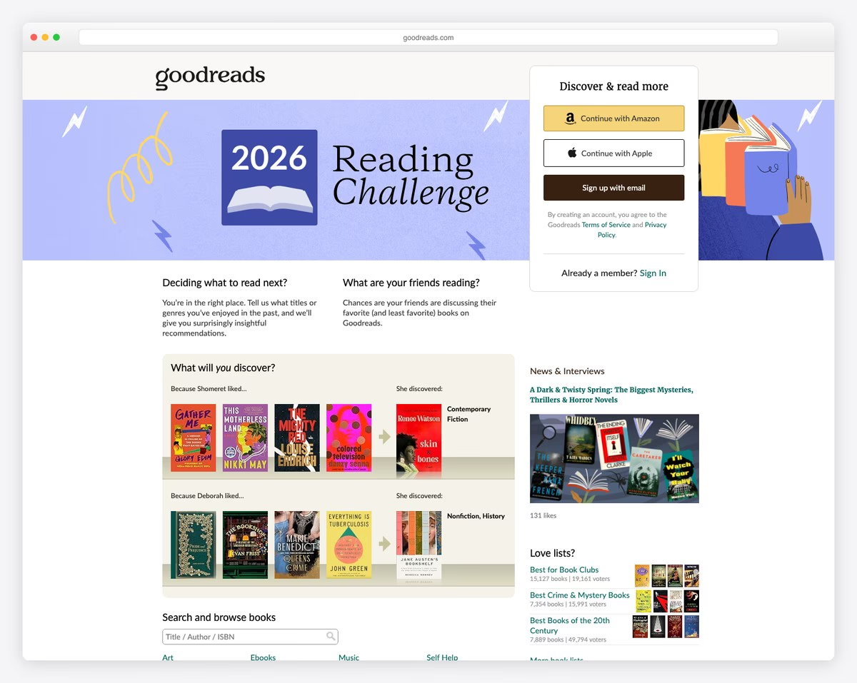
It’s hard to believe that Goodreads’s desktop design and user experience are so poor. Hey, we’re speaking of a huge business.
Even though it’s far from the worst on this list, it has a way-too-basic design and terrible navigation.
Luckily, the mobile layout is much better, but it’s still better to download the app to get the most out of the platform.
What stands out: Intuitive navigation makes the site easy to explore even for first-time visitors.
8. Bella De Soto
Yikes! You want to avoid a website that automatically downloads files. I’m not saying they mean to harm your device, but it’s just a bad practice (hey, spammers, thanks for ruining our trustworthiness).
But that’s not the only bad thing about Bella De Soto’s website. Content on top of content, poor-quality animations, hard-to-find navigation – this is all bad.
Responsiveness? Lost in space.
What stands out: Client testimonials placed prominently on the homepage build trust before visitors even explore the services.
9. Suzanne Collins
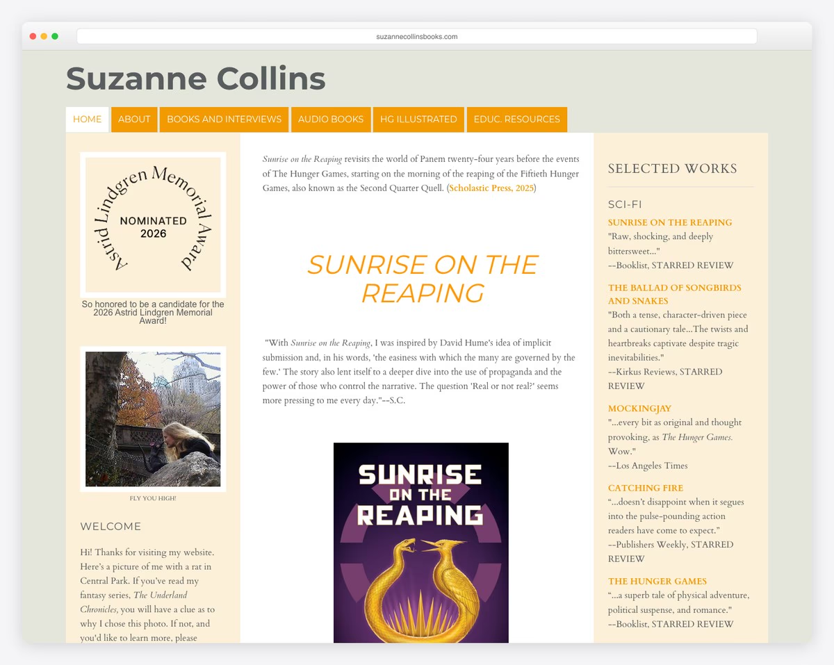
Suzanne Collins’ website isn’t necessarily an example of a bad website, but a basic one without giving you any reasons for what to do with it.
The website could be improved in both its design and performance. (This is something we shouldn’t even be discussing when it comes to an author like Suzanne Collins.)
And when it comes to her books, there aren’t any call-to-action (CTA) buttons where you can get them. But the testimonials from many authorities are great.
What stands out: The dated layout and lack of visual hierarchy serve as a reminder that even bestselling authors need professional web design.
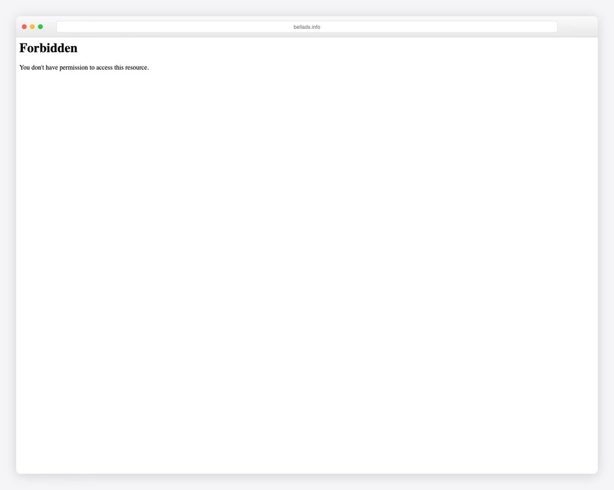
10. Berkshire Hathaway
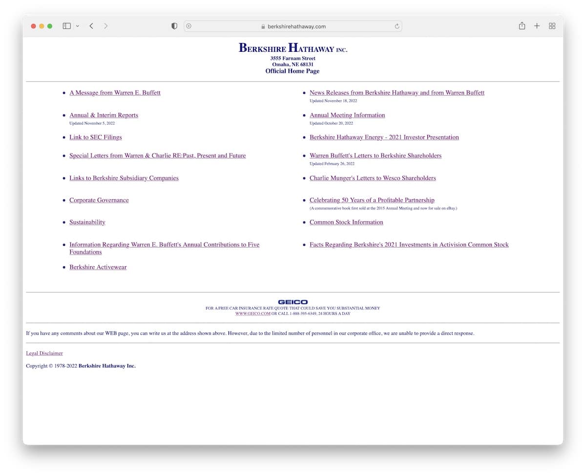
Berkshire Hathaway gives a feel of a directory with a poor look, no images, just hyperlinks.
This website may be useful only to those who know exactly what they’re looking for and are already familiar with Berkshire Hathaway.
Surprisingly, it performs okay on mobile, but it’s hard to find anything.
Berkshire Hathaway is an exception. For example, you can reach 1 trillion (yes, trillion) in market capitalization without having a proper web presence.
What stands out: Strong visual storytelling makes browsing feel more like flipping through a curated magazine.
11. Yale School Of Art
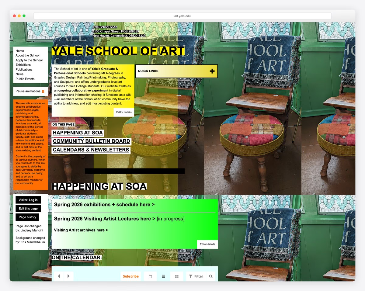
I hardly believe that I’m adding Yale School Of Art to the list of the worst websites (in the world). If they relied only on the website, the school wouldn’t be as popular as it is.
The background, color choices, content formatting, and painful navigation are too outdated to meet modern standards.
And while the website is mobile-friendly, the experience is not.
What stands out: Built-in booking functionality turns the website into a 24/7 appointment scheduler.
12. Life Action Revival
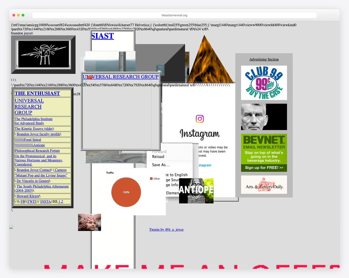
We’ve seen the practice of placing content on top of content before, and here’s another example.
Life Action Revival is a bad website design that shouldn’t exist in this day and age.
If nobody told you what they’re all about, you couldn’t figure it out by visiting the page.
Furthermore, while the choice of elements is useless, the code snippets/broken code make it even worse.
What stands out: This example illustrates how small design decisions can significantly impact user experience.
13. Hacker News
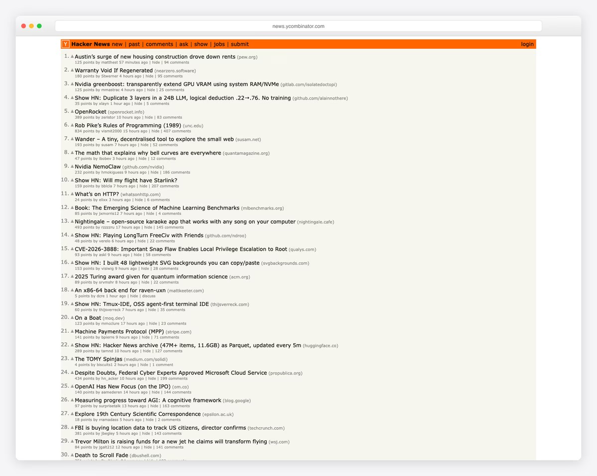
If it were 20+ years ago, I’d be completely fine with Hacker News—but not today!
An old-school forum/message-style page that has no navigation or header to tell you more information about it.
Also, links redirect you to another website (and don’t open in a new tab), which decreases the likelihood of returning to Hacker News.
What stands out: This example illustrates how small design decisions can significantly impact user experience.
14. Penny Juice
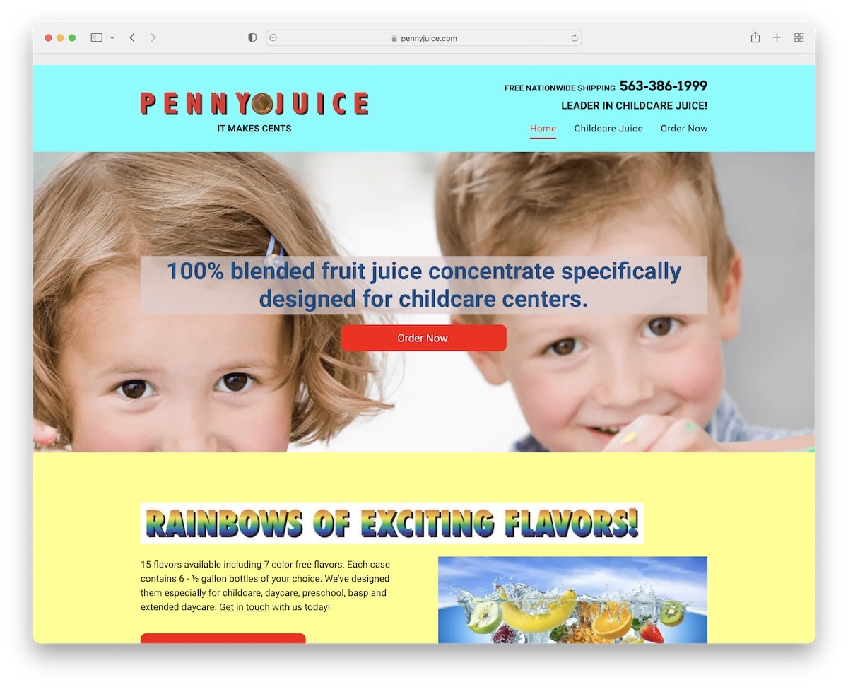
Penny Juice is a great example of a bad and unprofessional website. And if it weren’t for the name, you’d have difficulty figuring out what this business does.
There’s a lot of room for design improvement, from header to footer to the choice of images (stock images are a no-no) and mobile performance – it’s all low-grade.
What stands out: The cluttered design and overwhelming use of color demonstrate how too many elements competing for attention can hinder usability.
15. Drudge Report
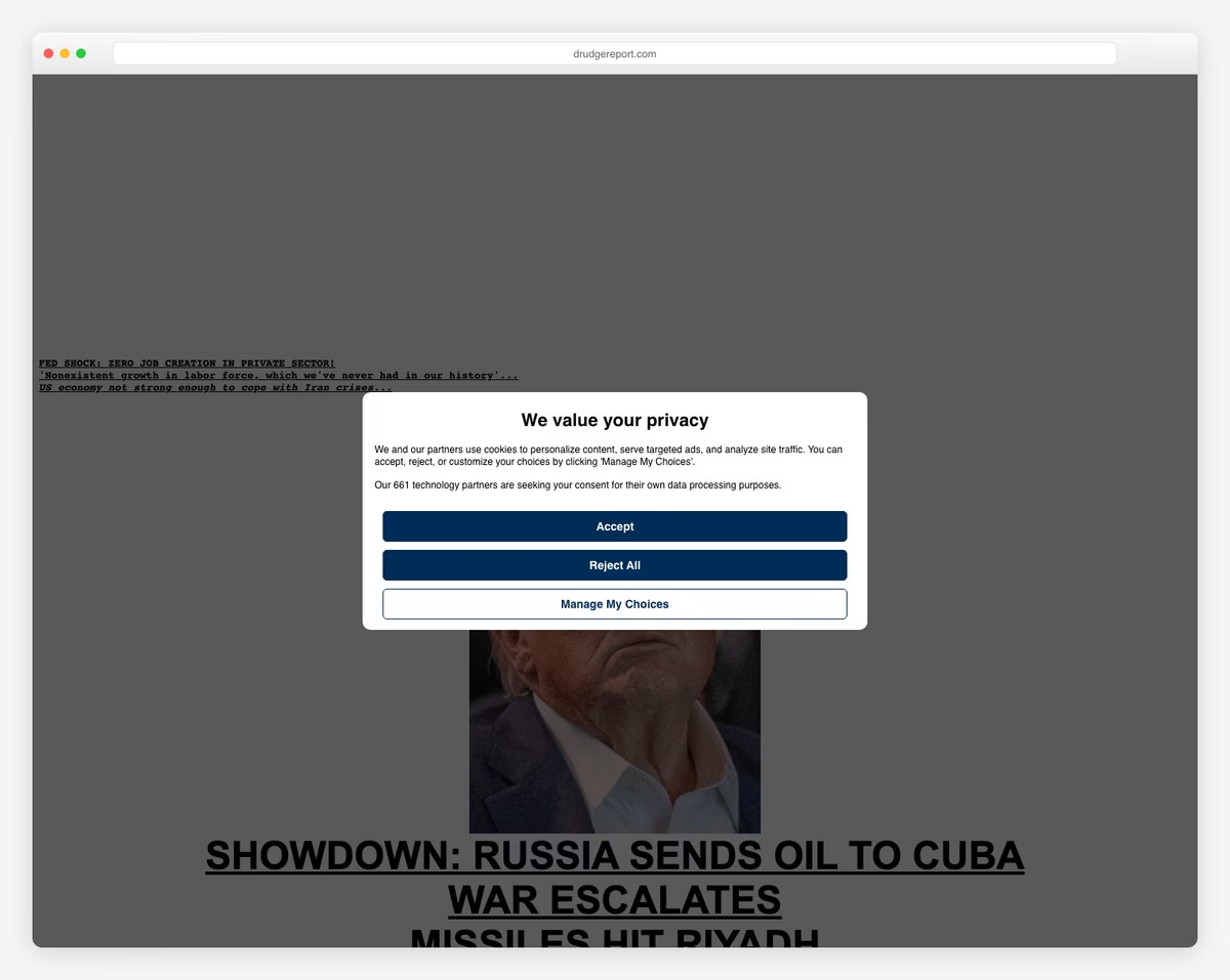
The Drudge Report has been around for a very long time, and while it publishes new content regularly, its design seems to be from the year it launched.
The design is a great example of a bad website without navigation and a hard-to-find search bar.
In short, if you’re unaware of what the Drudge Report is about, it’ll be challenging to find anything (and the tiny text size contributes to that greatly).
What stands out: This example illustrates how small design decisions can significantly impact user experience.
16. Toronto Cupcake
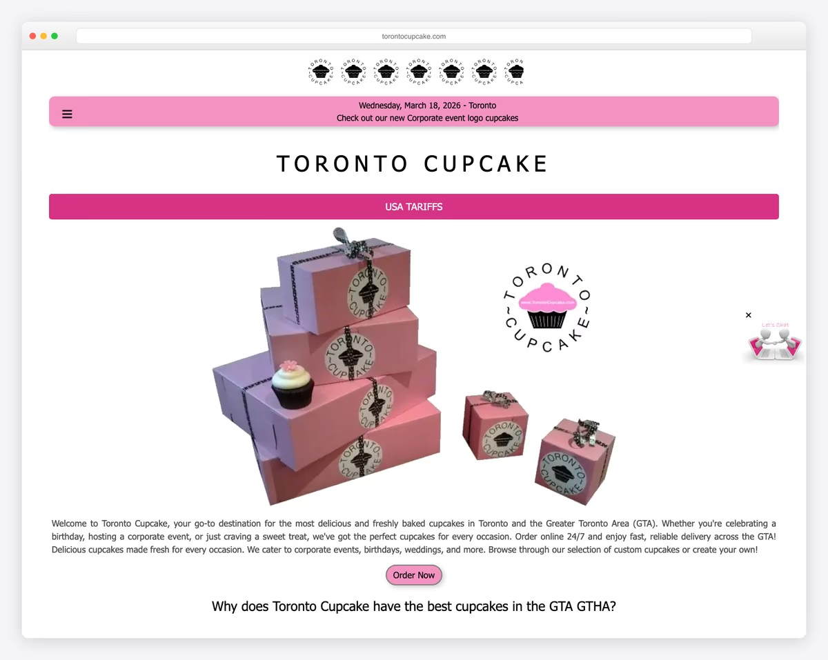
While food images often make dishes look tastier than the actual product, I doubt that’s the case for Toronto Cupcake. And that’s just one factor that makes this a bad example of a website.
The web design also feels vintage (not in a good way), with a super basic product page and cart. It’s not appealing; it’s discouraging, even though it could be so fun and engaging.
What stands out: This example illustrates how small design decisions can significantly impact user experience.
17. Lipton
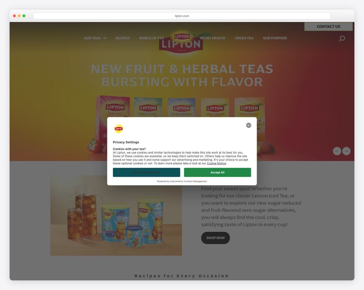
Lipton is a major brand, but you don’t get that impression from its website. The poor-quality product and stock images should all be redone or retaken, as they reflect poorly on the brand.
It’s not a bad website per se, but it is a great example of how even the largest businesses in the world can lack a strong online presence.
There’s always room for improvement.
What stands out: A dark background paired with bold accent colors creates striking visual contrast.
18. Yahoo!
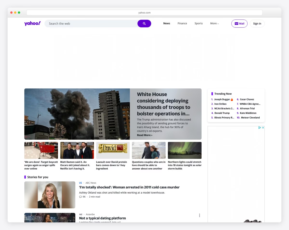
I’ve never been a fan of the Yahoo! website. It’s just stuffed with so much material that browsing its content is unpleasant and disturbing.
They’re certainly working to improve the overall design and UX, but it’s taking them too long. However, it’s one of the rare bad websites that works much better on mobile than on desktop.
What stands out: A prominent search function helps visitors find exactly what they need without scrolling through pages.
19. Craigslist
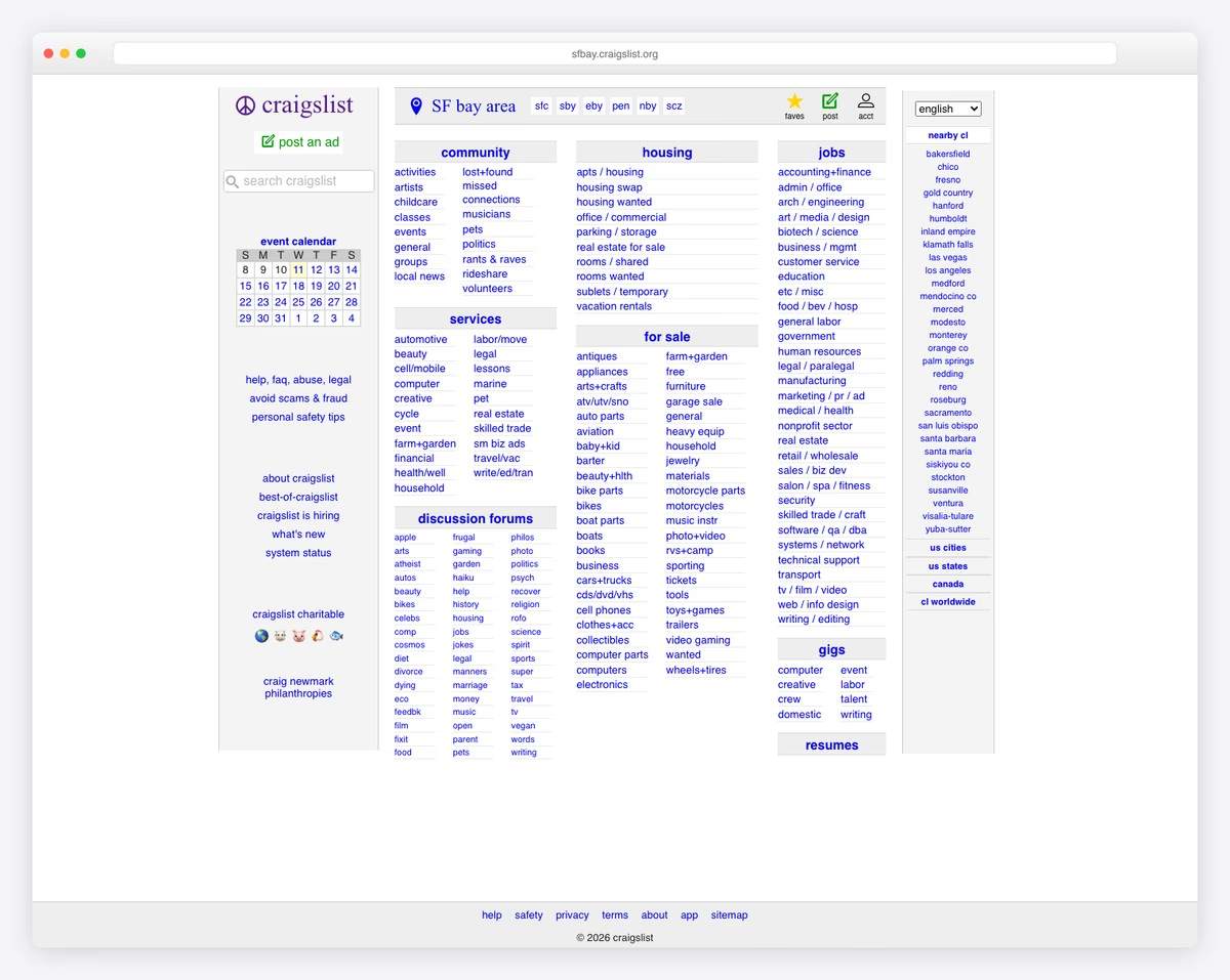
Craigslist is the ultimate paradox of web design — a site that handles millions of daily transactions worth billions of dollars while looking like it was last redesigned in 1999. The SF Bay Area homepage is a wall of blue hyperlinks organized into categories (Community, Housing, Jobs, For Sale, Services, Gigs, Resumes) with zero images, minimal CSS, and an event calendar widget that feels lifted from a different era.
The navigation relies entirely on text links — no icons, no images, no cards, no hover effects. Despite this, Craigslist remains one of the most-visited websites in the world because its utility is undeniable. It proves that design does not equal success, but also that better design could make an already popular platform even more accessible.
What stands out: Craigslist proves that a bad design can still succeed if the utility is strong enough — but imagine how much better the experience could be with even basic modern design principles.
20. Real Ultimate Power
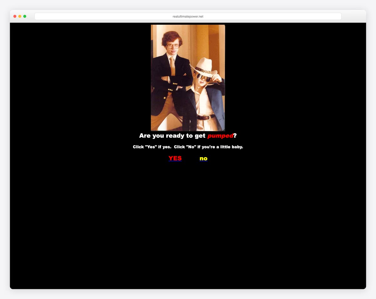
Real Ultimate Power is a legendary 2000s internet artifact — “The Official Ninja Webpage” that made millions laugh with its deliberately amateur design and over-the-top content about how ninjas are “totally sweet.” The Times New Roman text on a plain white background with random images and ALL CAPS headings is a time capsule of early internet culture.
The site breaks every design rule — inconsistent fonts, random bold text, clip art-quality images, and navigation that feels like an afterthought. But it is also a perfect example of how the early web was built by enthusiasts who prioritized fun over polish, creating a raw authenticity that modern sites struggle to replicate.
What stands out: Early internet sites like Real Ultimate Power remind us that the web was once a place of pure creative expression — no design systems, no brand guidelines, just unfiltered enthusiasm.
21. Windows 93
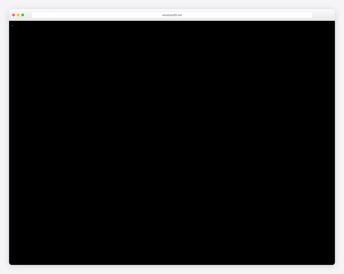
Windows 93 is a fully interactive browser-based operating system parody that recreates a fictional Windows version that never existed. The retro UI features pixelated icons, a Start menu, draggable windows, and a desktop filled with bizarre apps — from a virtual cat piano to corrupted file generators.
While technically impressive (it runs entirely in the browser), the deliberate ugliness of CRT-style rendering, system error popups, and gaudy color schemes makes it a masterclass in nostalgic bad design. It is simultaneously a love letter to 1990s computing and an example of everything modern UI design has moved away from.
What stands out: Windows 93 proves that “bad” design can be an art form — the retro aesthetic is intentionally awful yet endlessly entertaining, blurring the line between bad design and brilliant satire.
What’s next?
Now that you have seen the worst websites, how about browsing creepy and scary websites? Once you are done there, make sure to check out the weirdest websites ever.
What Makes A Good Website?
Here are just a few of the key characteristics that you need to follow to create an awesome site that’ll make visitors want to return:
- Mobile and speed optimization: One of the first things you must ensure when building any type of website is excellent performance. You achieve this with a responsive, fast-loading page that delivers a top-notch user experience. Plus, you’ll get a lot more Google juice.
- Simple and clean look: Aim for a simple, minimalist web design rather than a heavily creative one filled with animations and special effects (unless you know exactly what you want). White space is also important and will contribute to better UX.
- Navigation: Give your website or blog great navigability with a practical menu and search bar.
- Quality images/content: Never use poor-quality visual content on your website, or overused stock images and videos. Preferably, create your own content.
- Reliable web hosting: Great hosting with an SSL certificate is a must-have if you’d like to achieve the success you want. Hosting also plays a big part in making your website load fast.
- Branding: Enrich your page theme with the branding you use (or at least use branded detailing) to keep reminding everyone of your business.
These days, you have endless options for creating a website.
You can either opt for a multipurpose WordPress theme or pick website builder software, both offering you all the resources you need to build a great website.
Of course, without coding and design knowledge!
Related Posts


Lings website is the best thing i have ever seen i bought 8 cars just because of the website
This is just perfection
Ling’s website gives me great joy!
I thought the nuclear missile truck was a photoshop job till I saw him drive it into a river an make a three point turn. This is hilarious, the dude has even been featured in national newspapers for his antics. I’d say the web design is a perfect fit!