Best Angular UI Component Libraries: 16 Options Compared (2026)
Last updated: March 2026
Angular remains one of the most popular frameworks for enterprise web applications, and the right component library can save hundreds of hours of development time. From Google’s official Angular Material to commercial powerhouses like Syncfusion and Kendo UI, the ecosystem offers options for every budget and project type. This guide compares 16 Angular UI component libraries side-by-side by popularity, component count, licensing, and what each one does best — so you can choose the right foundation for your next Angular project.
Key Highlights
- Angular Material is the official component library backed by Google, with 25K+ GitHub stars and deep integration with Angular’s ecosystem
- PrimeNG offers the largest free component set — 80+ components — making it the most feature-rich open-source option
- Syncfusion provides a free community license for individuals and small businesses (under $1M revenue), covering 80+ enterprise-grade components
- AG Grid is the dominant data grid solution, processing millions of rows with virtual scrolling — used by 80% of Fortune 500 companies
- Angular adoption remains strong in enterprise: 17% of professional developers use Angular, and it powers applications at Google, Microsoft, Samsung, and Deutsche Bank
- The Angular team released Angular 19 in late 2025 with standalone components as default, signals, and improved hydration — all libraries on this list support Angular 17+
Angular UI Component Library Comparison (2026)
| Library | GitHub Stars | npm Downloads/wk | Components | License | Best For |
|---|---|---|---|---|---|
| Angular Material | 25K+ | 2.5M+ | 35+ | MIT (free) | Official Google design system |
| PrimeNG | 10K+ | 800K+ | 80+ | MIT (free) / Commercial | Most components, free tier |
| NG-ZORRO | 9K+ | 150K+ | 70+ | MIT (free) | Enterprise (Ant Design) |
| Syncfusion | 3K+ | 100K+ | 80+ | Free community / Commercial | Enterprise with free tier |
| Clarity | 6K+ | 40K+ | 30+ | MIT (free) | Enterprise design system |
| Nebular | 8K+ | 25K+ | 40+ | MIT (free) | Eva Design System |
| Kendo UI | N/A (commercial) | 80K+ | 100+ | Commercial ($1,099+/yr) | Most components (commercial) |
| DevExtreme | N/A (commercial) | 70K+ | 70+ | Commercial ($899+/yr) | Data-heavy dashboards |
| Taiga UI | 3K+ | 20K+ | 50+ | Apache 2.0 (free) | Growing open-source option |
| ng-bootstrap | 8K+ | 600K+ | 20+ | MIT (free) | Bootstrap for Angular |
| NGX-Bootstrap | 5K+ | 350K+ | 20+ | MIT (free) | Alternative Bootstrap integration |
| Angular CDK | (part of Angular) | 2.5M+ | 20+ primitives | MIT (free) | Low-level building blocks |
| PrimeBlocks | N/A | N/A | 400+ blocks | Commercial ($99+) | Pre-built page layouts |
| Onsen UI | 8K+ | 15K+ | 30+ | Apache 2.0 (free) | Mobile-focused apps |
| AG Grid | 13K+ | 1.5M+ | 1 (data grid) | MIT (free) / Commercial | Data grid specialist |
| Ignite UI | N/A (commercial) | 25K+ | 60+ | Commercial ($1,295+/yr) | Enterprise (Infragistics) |
1. Angular Material
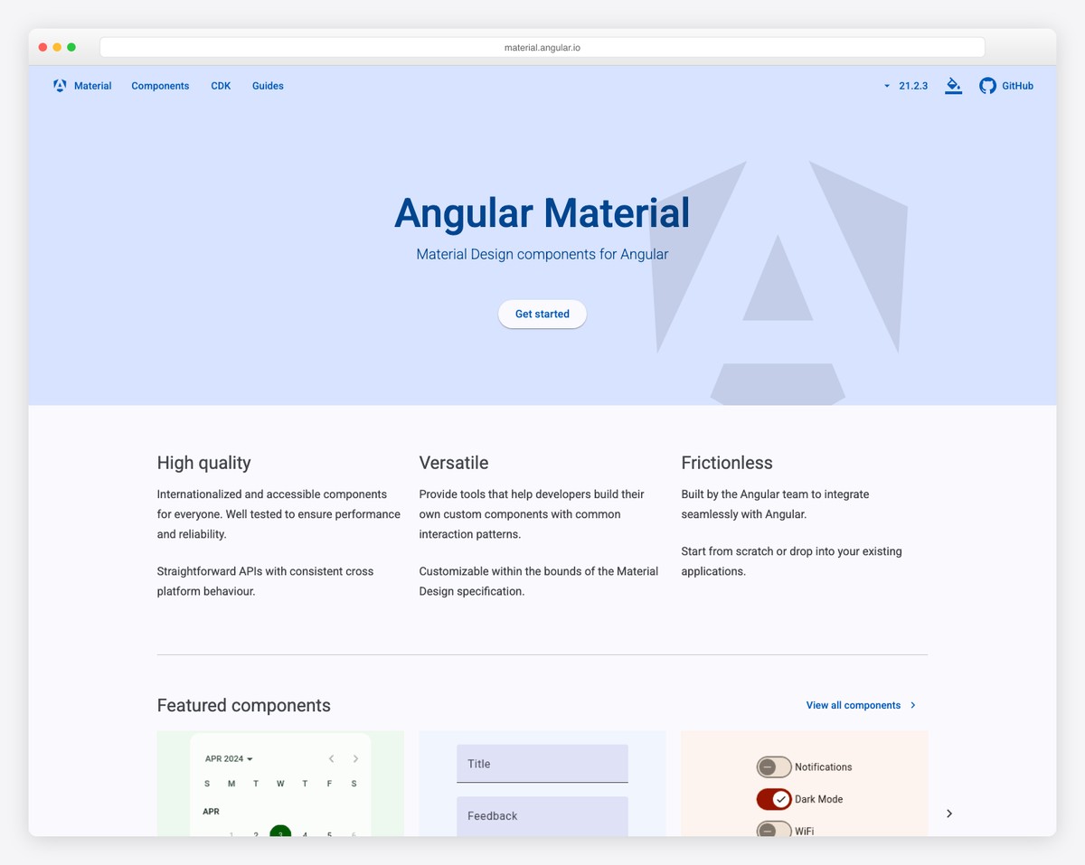
Angular Material is the official component library built and maintained by the Angular team at Google. It implements Google’s Material Design specification with 35+ components including buttons, forms, dialogs, tables, tabs, sliders, date pickers, and navigation elements. With over 2.5 million weekly npm downloads, it is the most widely used Angular component library by a significant margin.
The library is deeply integrated with Angular’s architecture. Components use Angular’s CDK (Component Dev Kit) as a foundation, support Angular’s forms system natively, and work seamlessly with Angular’s animation and routing modules. Theming is built on a powerful SCSS system that lets you create custom themes with consistent typography, color, and density settings. Angular Material also supports the newer Material 3 (Material You) design tokens.
Angular Material’s limitation is its component count — at 35+ components, it covers the essentials but lacks advanced widgets like rich text editors, charts, schedulers, or advanced data grids that enterprise applications often need. The Material Design aesthetic is also opinionated — if your project requires a different visual style, extensive theming is required. For applications that follow Material Design and need reliable, well-documented components, Angular Material is the safest choice. For richer component sets, PrimeNG or commercial options fill the gaps. Check our web development statistics for more on framework adoption.
2. PrimeNG
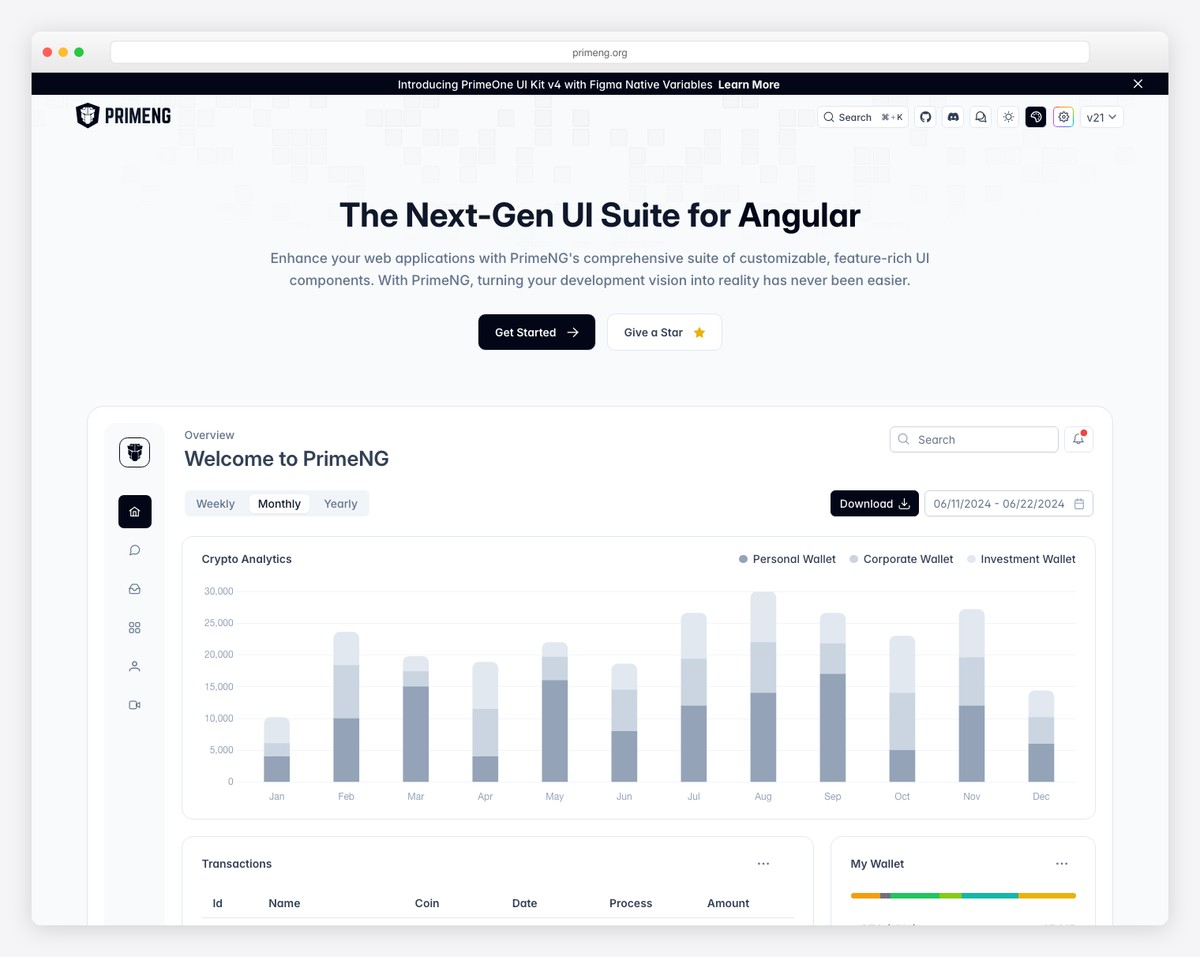
PrimeNG is the most feature-rich open-source Angular component library, offering over 80 components under the MIT license. The suite includes everything Angular Material provides plus advanced components: data tables with virtual scrolling, tree tables, schedulers, charts, editors, file uploaders, drag-and-drop, and even a terminal emulator. For teams that need a comprehensive widget library without commercial licensing, PrimeNG is the default choice.
PrimeTek (the company behind PrimeNG) also offers PrimeFlex (CSS utility library), PrimeIcons, and PrimeBlocks (pre-built page templates) that extend the ecosystem. The theming system provides over 30 built-in themes, and the Theme Designer tool lets you create custom themes visually. PrimeNG is actively maintained with regular releases that track Angular’s update cycle.
The trade-off is that PrimeNG’s components, while numerous, sometimes lack the polish of Angular Material or the depth of commercial alternatives like Kendo UI. The data table, while capable, does not match AG Grid for performance on massive datasets. Documentation is solid but can lag behind the latest releases. For projects that need 40-80 component types without commercial licensing costs, PrimeNG delivers the best breadth-to-price ratio in the Angular ecosystem.
3. NG-ZORRO (Ant Design for Angular)
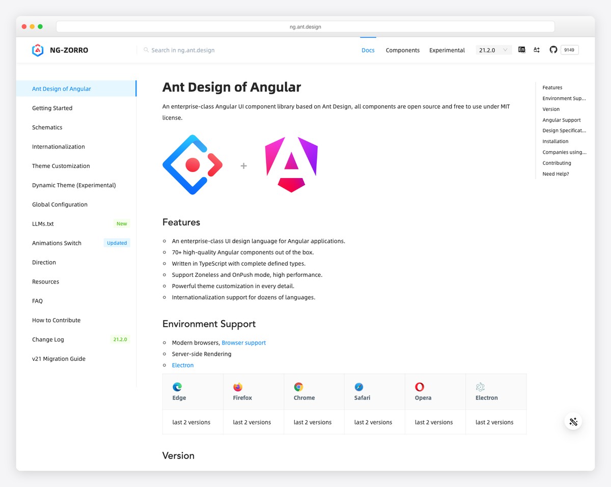
NG-ZORRO brings Alibaba’s Ant Design system to Angular with over 70 enterprise-grade components. The library follows Ant Design’s specifications — a clean, professional aesthetic that has become the de facto design language for Chinese and many international enterprise applications. Components include data tables, tree views, form controls, layouts, feedback elements, and data display widgets.
The library is particularly strong for enterprise data applications. The table component supports virtual scrolling, tree data, editable cells, and server-side operations. Form handling is comprehensive with support for dynamic forms, validation, and complex layouts. NG-ZORRO also includes internationalization (i18n) support with over 70 languages built in, which matters for global enterprise deployments.
NG-ZORRO is fully MIT licensed, actively maintained, and backed by Alibaba’s design team. The documentation is thorough with live examples for every component. The main consideration is the Ant Design aesthetic — while customizable, it has a distinct visual identity that may not align with all brand guidelines. For enterprise Angular applications, especially those serving international markets, NG-ZORRO is a mature, well-supported choice that competes directly with PrimeNG on component depth.
4. Syncfusion
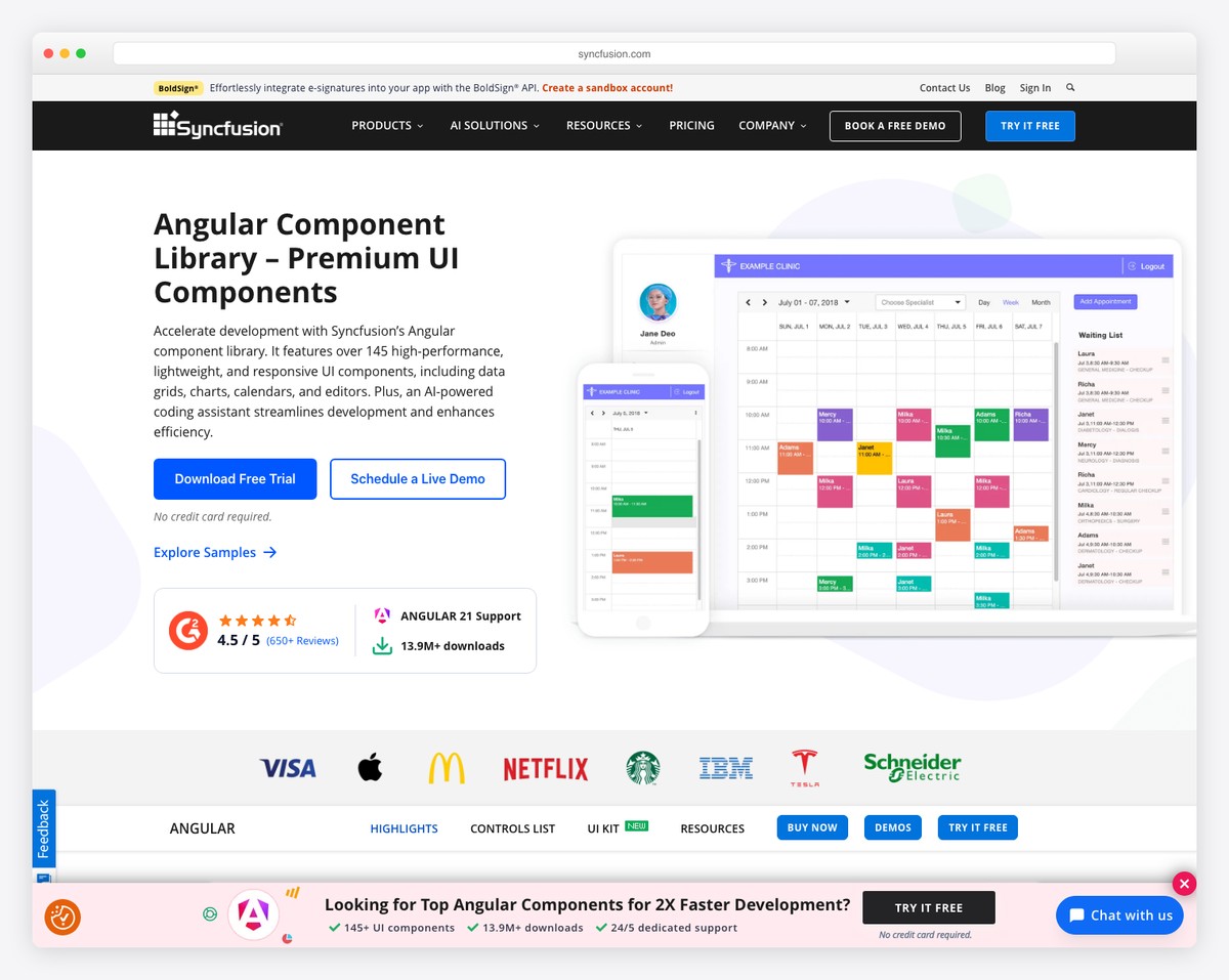
Syncfusion offers 80+ Angular components with a unique licensing advantage: a free community license for individual developers and small businesses generating less than $1 million in annual revenue. This makes enterprise-grade components — including advanced data grids, schedulers, Gantt charts, rich text editors, PDF viewers, and diagram builders — accessible to startups and independent developers at no cost.
The component quality is commercial-grade. Syncfusion’s data grid handles millions of rows with virtualization, supports Excel-like filtering and editing, and includes export to Excel, PDF, and CSV. The scheduler supports multiple views (day, week, month, timeline), drag-and-drop events, and resource allocation. These are components that would take months to build from scratch, provided free under the community license.
For larger organizations, commercial licenses start at around $995/developer/year, which includes support, updates, and a broader component set. Syncfusion also provides Blazor, React, Vue, Flutter, and .NET MAUI libraries, making it attractive for organizations that standardize on one component vendor across technology stacks. The community license makes it uniquely accessible — if your revenue is under $1M, Syncfusion provides commercial-quality components for free.
5. Clarity (VMware/Broadcom)
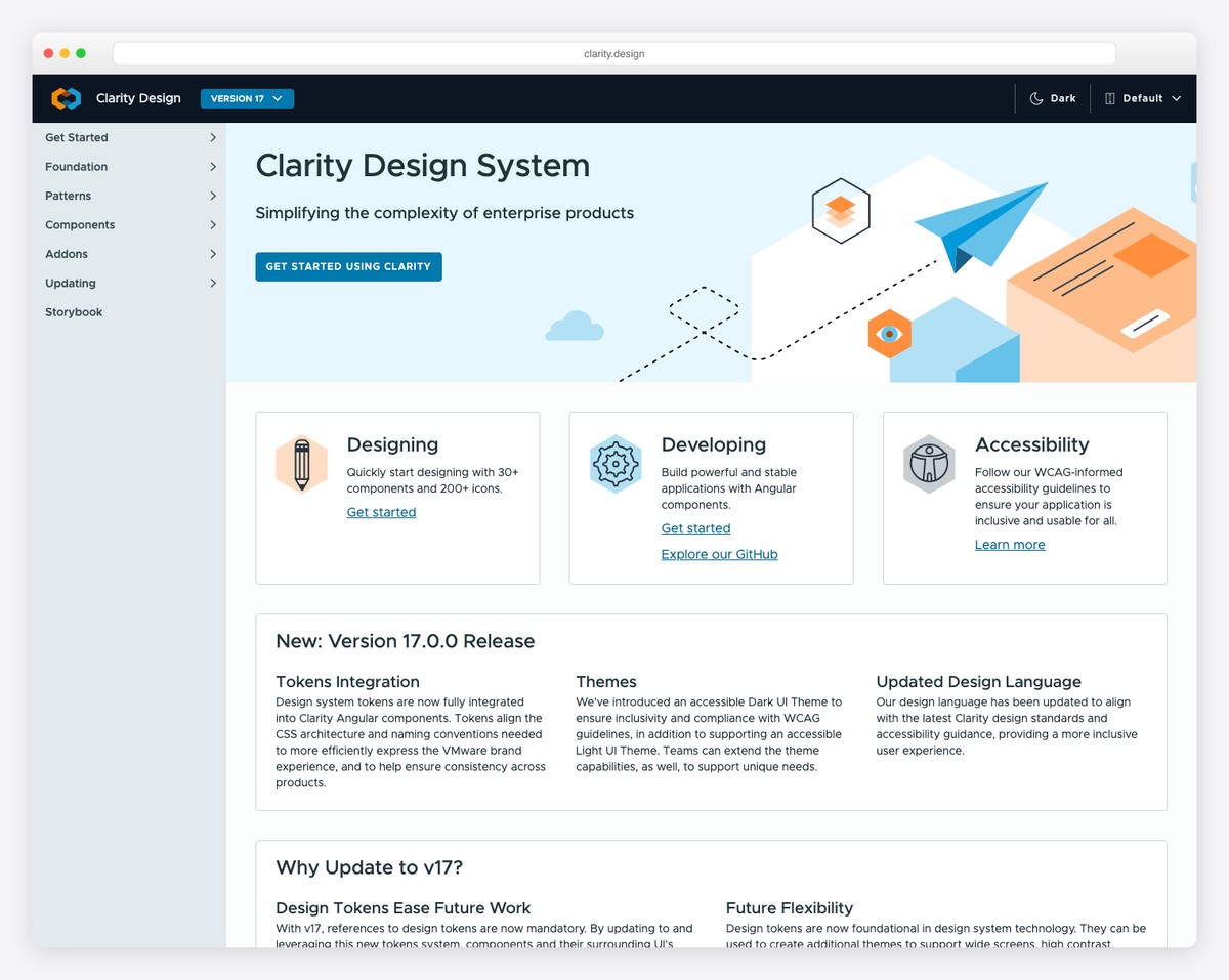
Clarity is an open-source enterprise design system originally developed by VMware and now maintained by Broadcom. It provides 30+ components along with a comprehensive design language, UX guidelines, and accessibility standards specifically tailored for enterprise and developer-facing applications. Clarity components follow the Clarity Design System specifications, which prioritize information density, consistency, and usability in data-heavy interfaces.
Core components include a highly capable data grid (datagrid with filtering, sorting, pagination, expandable rows), forms, wizards, modals, alerts, and navigation patterns. Clarity also provides a set of unique components like the timeline, signpost (contextual help), and stack view that address common enterprise UI patterns. The library ships with both Angular components and a web component version for framework-agnostic use.
Clarity’s design system approach means you get more than just components — you get opinionated UX guidance on how to build enterprise applications. This is valuable for teams without dedicated UX designers but can feel restrictive if your design requirements diverge from Clarity’s patterns. For enterprise applications, internal tools, and admin dashboards where the Clarity aesthetic fits, the library provides a cohesive, well-tested foundation. For consumer-facing applications, the enterprise-oriented design may need significant customization.
6. Nebular
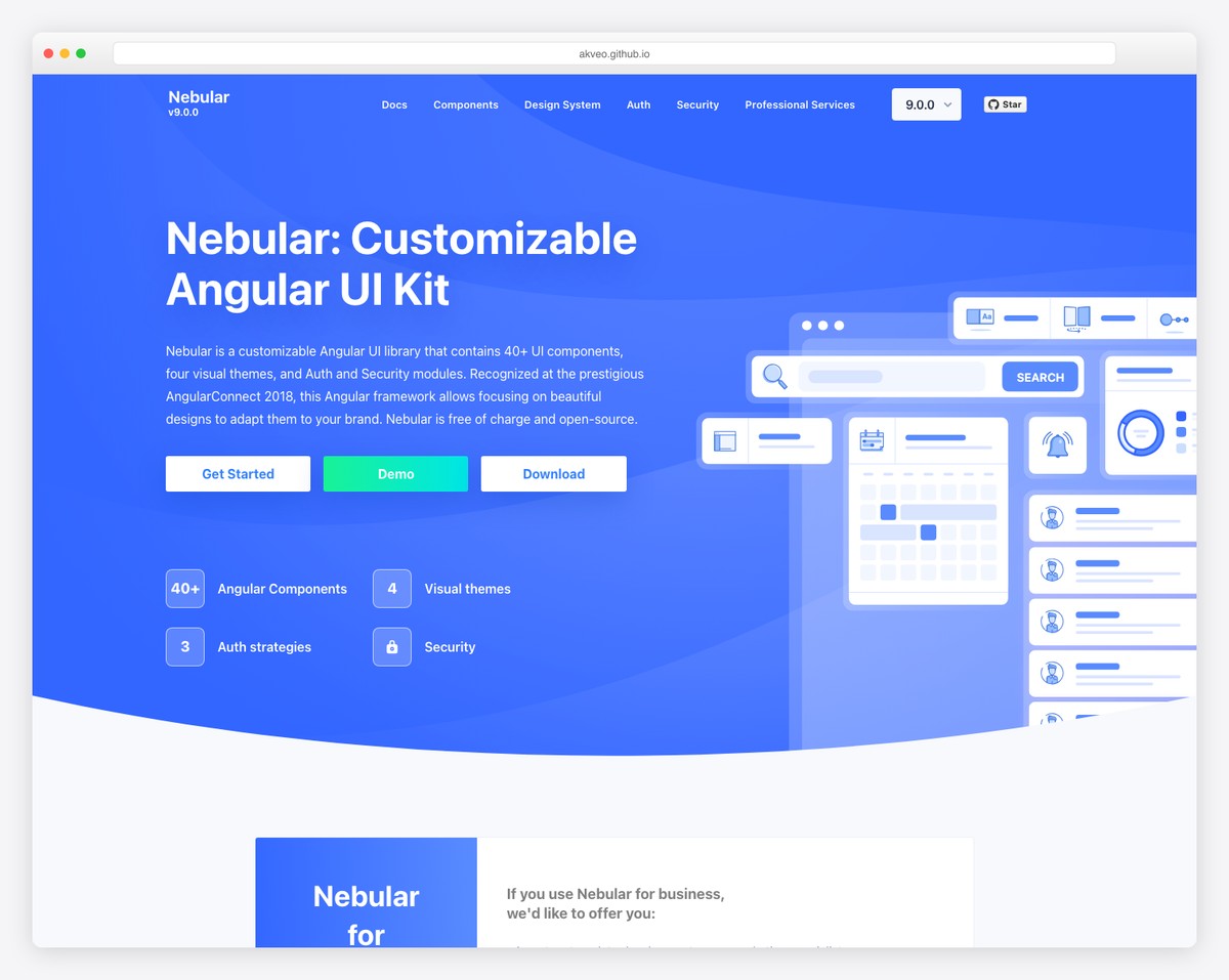
Nebular is an open-source Angular UI library based on the Eva Design System, created by Akveo (the company behind ngx-admin). With 8K+ GitHub stars and around 40 components, Nebular provides a modern, customizable foundation for Angular applications. It includes four built-in themes (default, dark, cosmic, corporate) and a powerful theming engine that supports unlimited custom themes.
Components cover layout (sidebar, header, footer), navigation (menu, tabs, stepper), forms (inputs, selects, datepicker), feedback (toastr, dialog, spinner), and authentication (login, register, forgot password pages). The authentication module is particularly useful — it provides pre-built auth flows with JWT integration that save significant development time for new projects.
Nebular’s component count is smaller than PrimeNG or NG-ZORRO, and the library does not include advanced widgets like data grids, charts, or rich text editors. It works best as a foundation that you extend with specialized libraries (like AG Grid for data tables or Chart.js for visualizations). For admin panels, dashboards, and internal tools — especially if you are starting from the ngx-admin template — Nebular provides a solid, well-themed base. For applications needing comprehensive out-of-the-box components, PrimeNG or Syncfusion offer more breadth.
Kendo UI for Angular
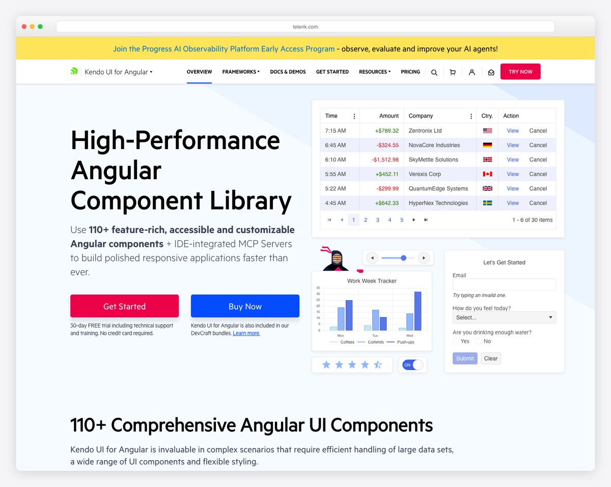
Kendo UI by Progress is a premium commercial library with over 100 Angular components — the largest component set of any Angular library. It covers standard UI elements plus specialized components like spreadsheets, PDF processing, barcode generators, task boards, signature pads, and a complete office-style editor. Licenses start at $1,099/developer/year, which includes support, updates, and access to all Kendo UI frameworks (Angular, React, Vue, jQuery).
Kendo UI’s components are built natively for Angular (not wrapper-based), which ensures optimal performance and deep integration with Angular’s change detection, forms, and routing. The data grid is enterprise-grade with Excel-like editing, grouping, aggregates, frozen columns, virtual scrolling, and export capabilities. The scheduler, charts, and editor components are among the most feature-complete in any UI library.
The cost is the obvious barrier. At $1,099+/year per developer, Kendo UI is a significant investment for small teams. Progress justifies the price with dedicated support (including guaranteed response times), regular updates tracking Angular releases, and professional documentation with extensive examples. For enterprise teams with budget for commercial tools, Kendo UI’s component depth, support quality, and track record (20+ years in the UI component market) make it a safe, if expensive, choice.
DevExtreme Angular
DevExtreme by DevExpress focuses on data-intensive applications — dashboards, analytics platforms, and enterprise tools where tables, charts, and forms dominate the interface. The library provides 70+ components with particular strength in its data grid, pivot grid, charts, and scheduler. Commercial licenses start at $899/developer/year.
The DevExtreme data grid is the library’s flagship — it supports server-side operations, virtual scrolling for millions of rows, master-detail views, tree lists, cell editing, and export to Excel and PDF. The pivot grid provides drag-and-drop data analysis similar to Excel’s PivotTable. The chart library includes 30+ chart types with real-time data streaming support. For applications where data visualization and manipulation are the core requirements, DevExtreme’s specialization is its advantage.
DevExtreme supports Angular, React, Vue, and jQuery from the same codebase, which is valuable for organizations with mixed front-end stacks. The theming system includes Material Design, Fluent (Microsoft), and generic themes. Documentation is comprehensive with an interactive widget gallery. Compared to Kendo UI, DevExtreme has fewer total components but arguably deeper data-focused features. For dashboard and analytics applications, DevExtreme’s grid and chart components are among the best available at any price.
7. Taiga UI
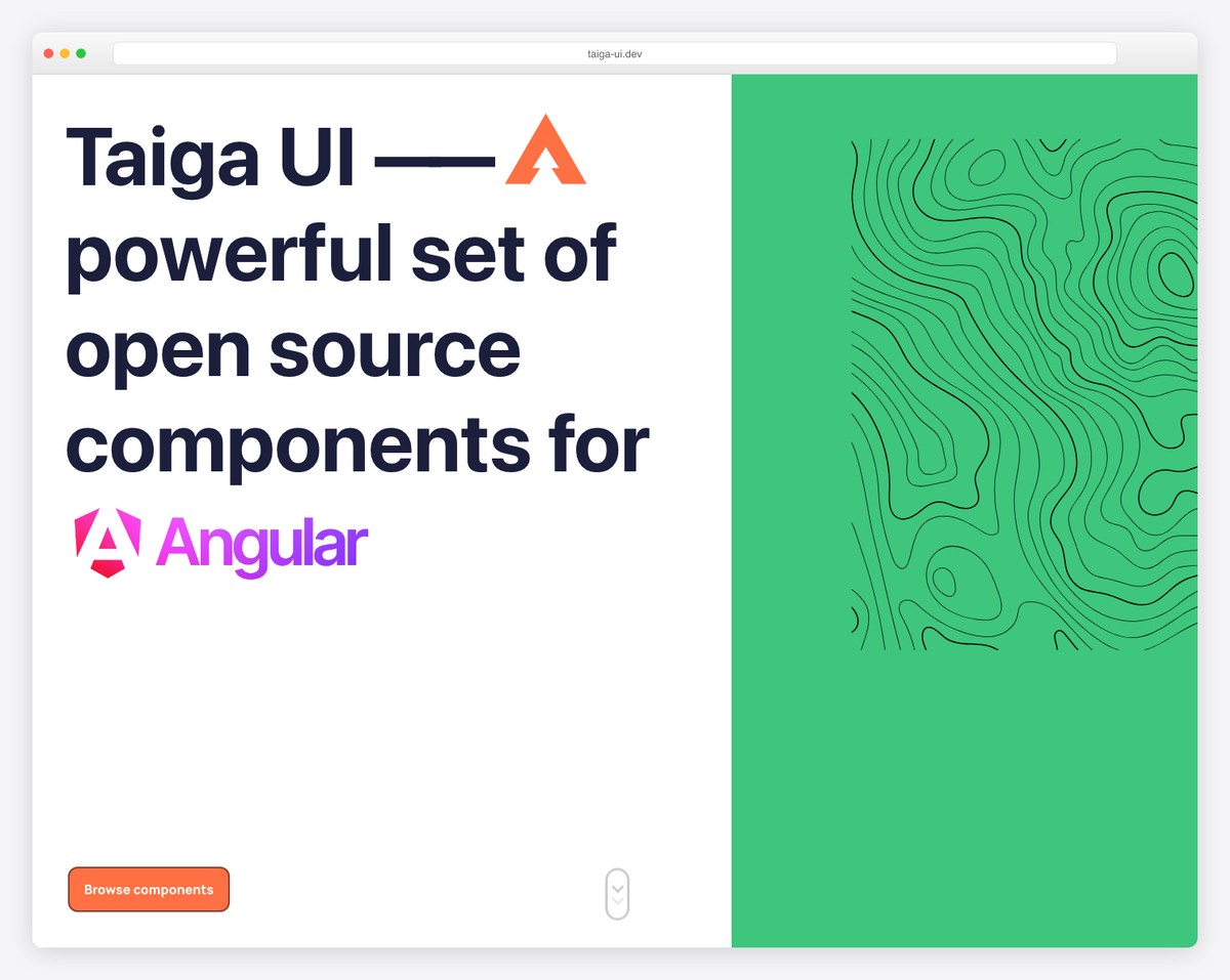
Taiga UI is a relatively new open-source Angular component library from Tinkoff (a major Russian digital bank) that has been gaining traction internationally. With 3K+ GitHub stars and 50+ components, it emphasizes customization, accessibility, and modern Angular patterns. All components are built with standalone components and signals in mind, making Taiga UI one of the most “modern Angular” libraries available.
The library includes standard components (buttons, inputs, selects, tables, tabs) plus some uncommon ones like input masks, phone number formatting, currency inputs, and rating controls. Taiga UI’s theming engine uses CSS custom properties exclusively, making theme customization as simple as overriding CSS variables. The library also provides its own CDK with reusable utilities for building custom components.
Taiga UI is still growing and has a smaller community than Angular Material or PrimeNG. Documentation is improving but can be sparse for some components. For teams who want a modern, well-architected open-source library that embraces Angular’s latest patterns (standalone, signals, zoneless), Taiga UI is worth evaluating — especially for projects that start fresh without legacy code constraints.
8. ng-bootstrap
ng-bootstrap provides Bootstrap components built natively for Angular — no jQuery dependency. With 8K+ GitHub stars and 600K+ weekly npm downloads, it is the most popular Bootstrap-Angular integration. Components include accordion, alert, carousel, datepicker, dropdown, modal, navbar, pagination, popover, progressbar, rating, tabs, timepicker, toast, tooltip, and typeahead.
The library requires Bootstrap 5 CSS (included separately) and replaces Bootstrap’s JavaScript with Angular-native implementations. This means all components work with Angular’s change detection, reactive forms, and template-driven forms. The datepicker and typeahead components are particularly well-implemented, with extensive configuration options and keyboard accessibility.
ng-bootstrap’s component count (~20) is the smallest of any general-purpose library on this list, limited to what Bootstrap itself provides. It does not include data grids, charts, editors, or other advanced widgets. For projects that already use Bootstrap for styling and need Angular-native versions of Bootstrap’s interactive components, ng-bootstrap is the standard choice. For projects needing more components, combine ng-bootstrap with specialized libraries or use PrimeNG/NG-ZORRO instead. See our roundup of free Bootstrap admin dashboard templates for project starters.
9. NGX-Bootstrap
NGX-Bootstrap is an alternative Bootstrap component library for Angular, developed by Valor Software. With 5K+ GitHub stars and 350K+ weekly downloads, it offers a similar component set to ng-bootstrap — modals, datepickers, dropdowns, tabs, tooltips, and more — but with some implementation differences that developers may prefer.
NGX-Bootstrap supports both Bootstrap 4 and Bootstrap 5, which can be useful for projects migrating between versions. The library provides comprehensive documentation with live examples and StackBlitz integration for quick testing. Each component is independently importable, keeping bundle sizes small when you only need a few components.
The choice between ng-bootstrap and NGX-Bootstrap often comes down to team preference and specific component needs. ng-bootstrap has more downloads and a tighter integration with Bootstrap 5, while NGX-Bootstrap offers some additional configuration options and Bootstrap 4 backward compatibility. Both are solid, well-maintained choices for Angular projects built on Bootstrap. For new projects, ng-bootstrap’s larger community and closer tracking of Bootstrap 5 make it the more common default.
10. Angular CDK
The Angular CDK (Component Dev Kit) is not a component library in the traditional sense — it is a set of low-level building blocks for creating your own components. Developed by the Angular team alongside Angular Material, the CDK provides unstyled primitives for accessibility (a11y), bidirectionality, clipboard, drag-and-drop, layout, overlay, portal, scrolling, stepper, table, text field, and tree.
For teams building custom design systems, the CDK is invaluable. Instead of building accessible focus management, virtual scrolling, or overlay positioning from scratch, you use CDK’s tested, production-ready implementations. Angular Material itself is built on top of the CDK, which demonstrates its capability and stability. The CDK’s overlay system, in particular, is used by almost every Angular library that needs popups, tooltips, or dropdown positioning.
The CDK is free, included with Angular Material’s npm package, and has no visual opinion — it provides behavior and accessibility without styles. For teams that need pre-styled components, the CDK alone is not sufficient; you still need a component library or custom styling. But for organizations building their own component libraries or needing specific low-level behaviors, the Angular CDK is an essential foundation that every Angular developer should know.
11. PrimeBlocks
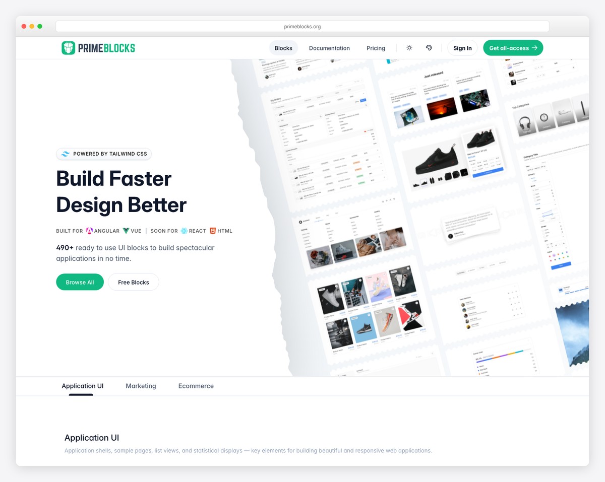
PrimeBlocks is a commercial product from PrimeTek that provides 400+ pre-built page blocks and templates using PrimeNG components. Rather than individual UI widgets, PrimeBlocks offers complete page sections — hero areas, pricing tables, feature grids, team sections, dashboards, login pages, and more — ready to copy into your project and customize.
Blocks are organized by category (marketing, application, ecommerce) and come in multiple variants and themes. Each block is built with PrimeNG components and PrimeFlex CSS, ensuring consistency and maintainability. The free tier includes a small selection of blocks, while the full library ($99+ one-time) provides access to all blocks and templates, plus a Figma design kit for designer-developer handoff.
PrimeBlocks is not a component library — it is a productivity tool that sits on top of PrimeNG. It accelerates the early stages of development when you are building standard page layouts. The value is highest for agencies and freelancers who build many similar Angular applications and want to skip the repetitive layout work. For unique, custom designs, PrimeBlocks provides starting points rather than final solutions.
Onsen UI for Angular
Onsen UI is a mobile-focused UI framework that provides Angular components optimized for iOS and Android-style interfaces. With 8K+ GitHub stars, it offers components like page stacks, tab bars, side menus, lists, action sheets, and pull-to-refresh — patterns that mobile users expect but web component libraries rarely implement well.
The library automatically adapts its visual style to match the platform — iOS components look native on iPhone, and Material Design components render on Android. This cross-platform visual consistency is Onsen UI’s core value proposition for teams building hybrid mobile apps or progressive web apps (PWAs) that need to feel native.
Onsen UI’s focus on mobile patterns means it lacks desktop-oriented components like data grids, complex forms, or dashboard layouts. It works best with Cordova, Capacitor, or as a PWA framework. For traditional web applications, other libraries on this list are more suitable. But for Angular teams building mobile-first applications that need native-feeling navigation and interaction patterns, Onsen UI fills a niche that general-purpose component libraries overlook.
12. AG Grid
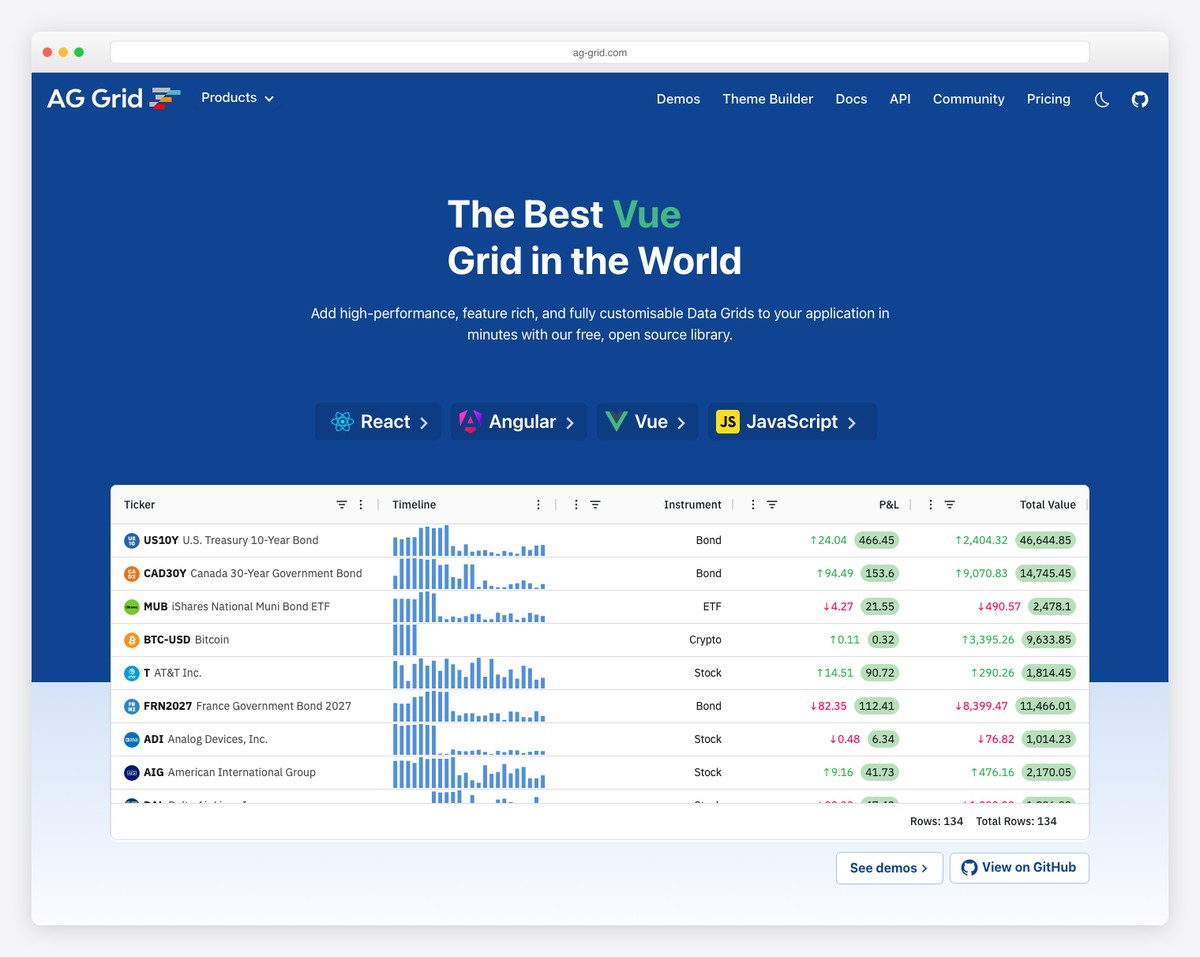
AG Grid is the most popular data grid component in the JavaScript ecosystem, used by over 80% of Fortune 500 companies. While it is a single component (a data grid) rather than a full library, its specialization makes it the dominant choice when your Angular application needs to display, sort, filter, group, and edit tabular data at scale. The community edition is free and MIT-licensed; the enterprise edition ($999+/developer) adds advanced features.
AG Grid’s free edition includes sorting, filtering, pagination, row selection, cell rendering, and basic grouping — sufficient for most data table needs. The enterprise edition adds pivoting, tree data, master-detail rows, server-side row models (for millions of rows), Excel-style status bar, integrated charts, and clipboard operations. Performance is exceptional — AG Grid handles 100,000+ rows with smooth scrolling on the community edition and millions with server-side mode.
AG Grid integrates cleanly with Angular, React, Vue, and vanilla JavaScript. The Angular version uses Angular components for cell renderers, editors, and filters, making customization feel native. For applications where the data grid is the primary interface — admin panels, financial dashboards, inventory systems, CRM tools — AG Grid’s depth is unmatched. Most teams use AG Grid alongside a general component library (Angular Material or PrimeNG) to cover the rest of the UI.
Ignite UI for Angular
Ignite UI by Infragistics is a commercial Angular component suite with 60+ components aimed at enterprise application development. Licenses start at $1,295/developer/year, positioning it as a premium option alongside Kendo UI. The library includes data grid, charts, maps, gauges, schedulers, spreadsheet, dock manager, and pivot grid — a comprehensive toolkit for data-rich enterprise applications.
Infragistics differentiates through its App Builder — a low-code tool that generates Angular code from visual designs. Designers create layouts in the App Builder (or import from Figma/Sketch), and the tool generates production-ready Angular code using Ignite UI components. For organizations with separate design and development teams, this workflow can significantly reduce the gap between design mockups and implemented code.
At $1,295+/year, Ignite UI is the most expensive option on this list. It competes directly with Kendo UI and DevExtreme on features and support. The App Builder tool is the key differentiator — if your workflow benefits from visual-to-code generation, Ignite UI’s integrated tooling provides value beyond the components themselves. For teams evaluating commercial options, compare Ignite UI, Kendo UI, and DevExtreme through trial versions to determine which component set and developer experience best fits your specific application requirements.
FAQ
What is the best free Angular component library?
PrimeNG is the best free Angular component library for breadth, with 80+ components under the MIT license. Angular Material is the safest choice for long-term support since it is maintained by the Angular team at Google. NG-ZORRO is the best free option for enterprise applications, especially those following Ant Design patterns. For teams under $1M revenue, Syncfusion’s free community license provides commercial-quality components at no cost.
Angular Material vs PrimeNG — which should I choose?
Choose Angular Material if your application follows Material Design, you want official Google support, and you only need 35 basic component types. Choose PrimeNG if you need more components (80+), want multiple built-in themes, or need advanced widgets like data tables, charts, editors, and schedulers that Angular Material does not include. Many teams use Angular Material as the base and add PrimeNG components where Angular Material falls short.
What is the best Angular component library for enterprise?
For free options, NG-ZORRO (Ant Design) and Clarity (VMware/Broadcom) are specifically designed for enterprise applications. For commercial options, Kendo UI (100+ components, $1,099/yr) and Syncfusion (80+ components, free community license available) are the leading choices. The right choice depends on component needs, budget, and whether your team is under Syncfusion’s $1M revenue threshold for the free community license.
What is the best Angular library for dashboards?
For data-heavy dashboards, DevExtreme excels with its data grid, pivot grid, and charting components. AG Grid (free or enterprise) is the best standalone data grid for performance-critical tables. For free dashboard foundations, PrimeNG plus AG Grid (community edition) provides a comprehensive widget set. Nebular with the ngx-admin template offers a ready-made dashboard starting point. See our free admin dashboard templates for pre-built options.
Key Takeaways
- Angular Material is the safest default choice with official Google backing, but its 35 components may not cover all enterprise needs — use it as a foundation and supplement with specialized libraries.
- PrimeNG offers the most components (80+) for free under MIT license, making it the best breadth-to-cost option for teams that need a comprehensive widget set without commercial licensing.
- Syncfusion’s free community license is a hidden gem — 80+ enterprise-grade components at no cost for individuals and companies under $1M revenue.
- For data-intensive applications, AG Grid is the specialist choice that most enterprise Angular teams end up using regardless of their primary component library.
- Commercial libraries like Kendo UI ($1,099/yr) and Ignite UI ($1,295/yr) justify their cost through comprehensive component sets, dedicated support, and — in Ignite UI’s case — visual design-to-code tooling.
Related Posts


i need pinterest clone and can you give some suggestion for this or please send any github url for that ?
I need help in angular 4.
how can I use canves in angular 4 for edit image.
I am trying to make online photo editor so I need a function like
set brightness, black and white effects,
blur effects
add text to the image
and save this pic to local disk.
thanks
Hi,
For cookies, I recommend you @ngx-toolkit/cookies: https://www.npmjs.com/package/@ngx-toolkit/cookie
How can you miss the @angular/flex-layout library 🤔
Thank you for your suggestion!
Great content!
One suggestion would ag-Grid, leading Angular 2 Datagrid. An extensive set of features and built to deal with large data sets(100k rows) with ease.