
20 Dashboard Design Examples & Best Practices 2026
Good dashboard design puts the few numbers that matter at the top, shows how they are changing, and makes the next question one click away. These 20 dashboard design examples are all live and open without signing in: analytics dashboards like Plausible and Matomo, monitoring views like Grafana and Cloudflare Radar, public data dashboards like Our World in Data and the UK Health Security Agency, and UI kits you can build on.
We opened each one in a real browser and checked which library draws its charts. Ten of the 20 draw their own SVG or canvas charts rather than using a charting library, and the rest use Recharts, ApexCharts, Chart.js, Highcharts, ECharts, uPlot, MapLibre or deck.gl. If you need a starting point for an admin panel, see our Bootstrap admin dashboard templates.
Web Analytics Dashboards
Analytics tools are the best place to study dashboard design: the same few numbers (visitors, pages, sources) presented in very different ways, and several of them publish a live demo.
1. Plausible
Charts drawn with: Custom SVG charts
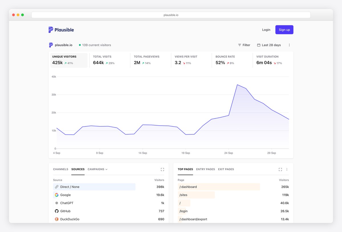
Plausible publishes its own website’s analytics as a live demo, and it is a model of a one-page dashboard. Six headline numbers (unique visitors, visits, pageviews, views per visit, bounce rate and visit duration) sit in a row, each with its change against the previous period, above a single large line chart.
Below, compact panels list sources, channels and campaigns, and top pages, with a faint bar behind each row showing its share. A live count of current visitors and one Filter button complete a page that never needs a second screen to be useful.
What stands out: Everything important on one screen, nothing in tabs.
2. Simple Analytics
Charts drawn with: Custom SVG charts
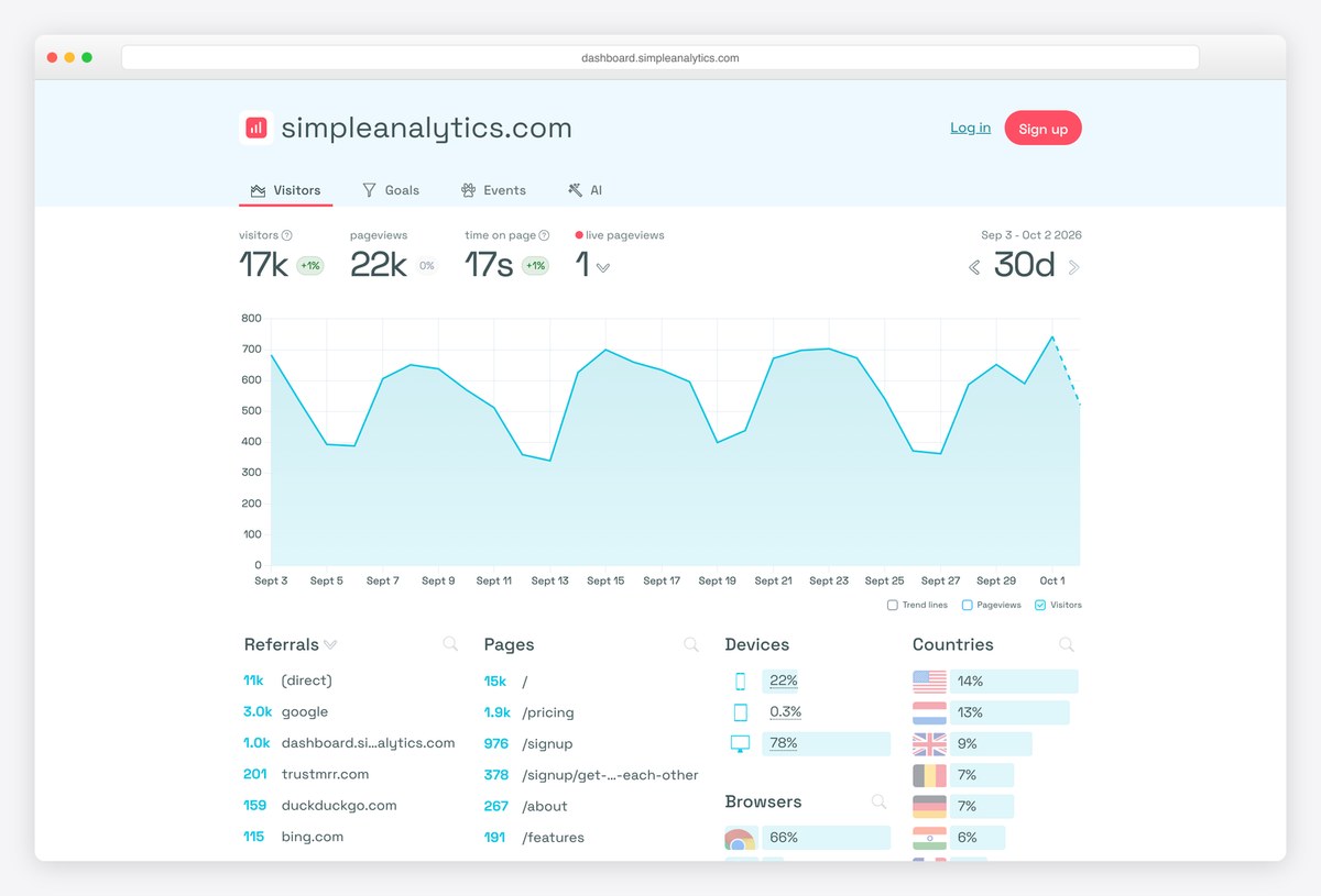
Simple Analytics also shares its own dashboard publicly. Four key numbers (visitors, pageviews, time on page and live pageviews) sit above an area chart with optional trend lines, and a 30-day selector sits on the right.
Underneath, four columns list referrals, pages, devices and countries, each row with a thin inline bar for its share. It shows how far plain lists with small bars can go before a dashboard needs more chart types.
What stands out: Lists with inline bars instead of extra charts.
3. Fathom Analytics
Charts drawn with: Highcharts
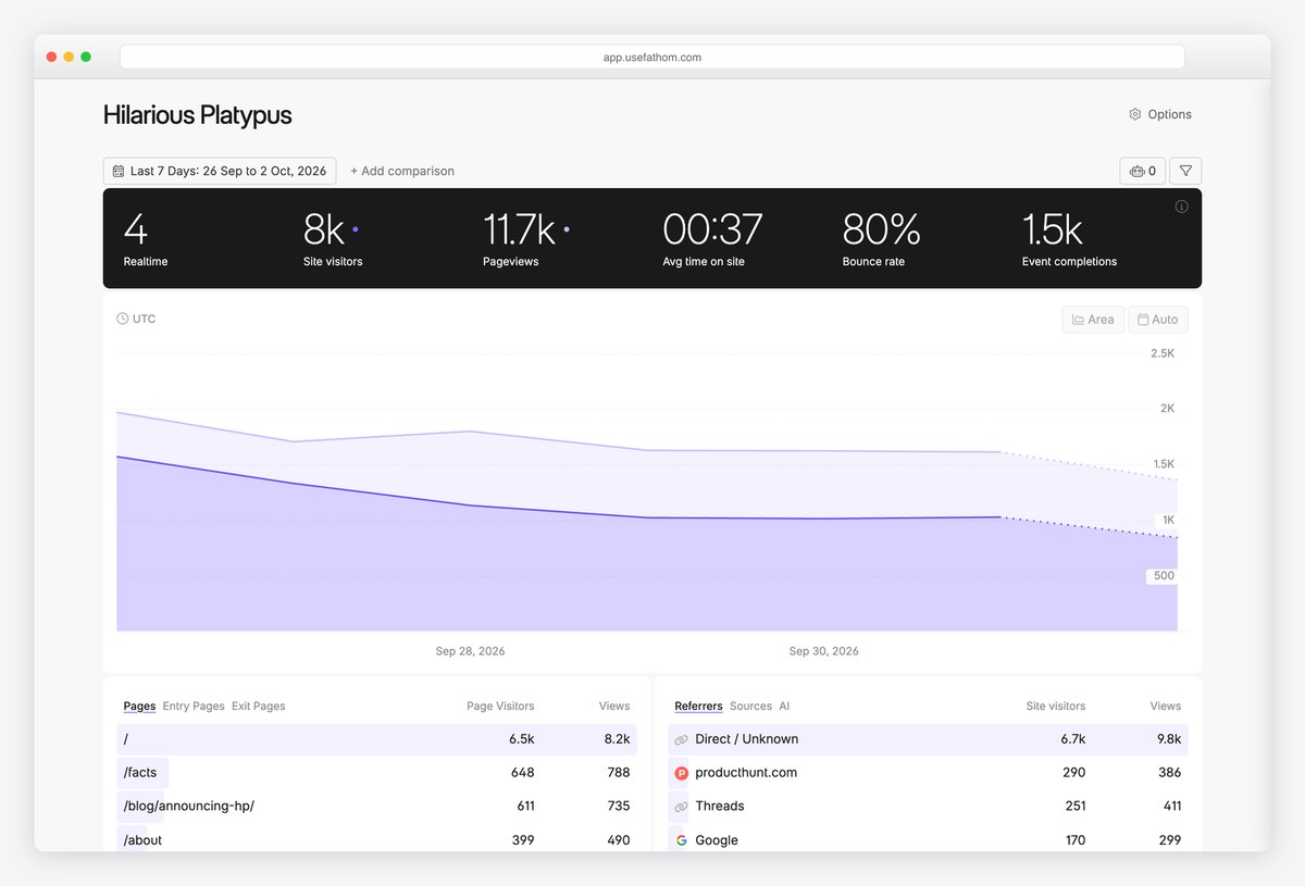
Fathom’s live demo opens with a dark band of six headline figures (realtime visitors, site visitors, pageviews, average time on site, bounce rate and event completions), then a large purple area chart with an Add comparison option for a second period.
Tables for pages, entry pages and referrers follow, each with visitors and views. The dark summary band sets the key numbers apart from the detail, a simple trick for a clear hierarchy. Charts are drawn with Highcharts.
What stands out: A dark summary band that separates numbers from detail.
4. Matomo
Charts drawn with: Custom canvas and SVG charts
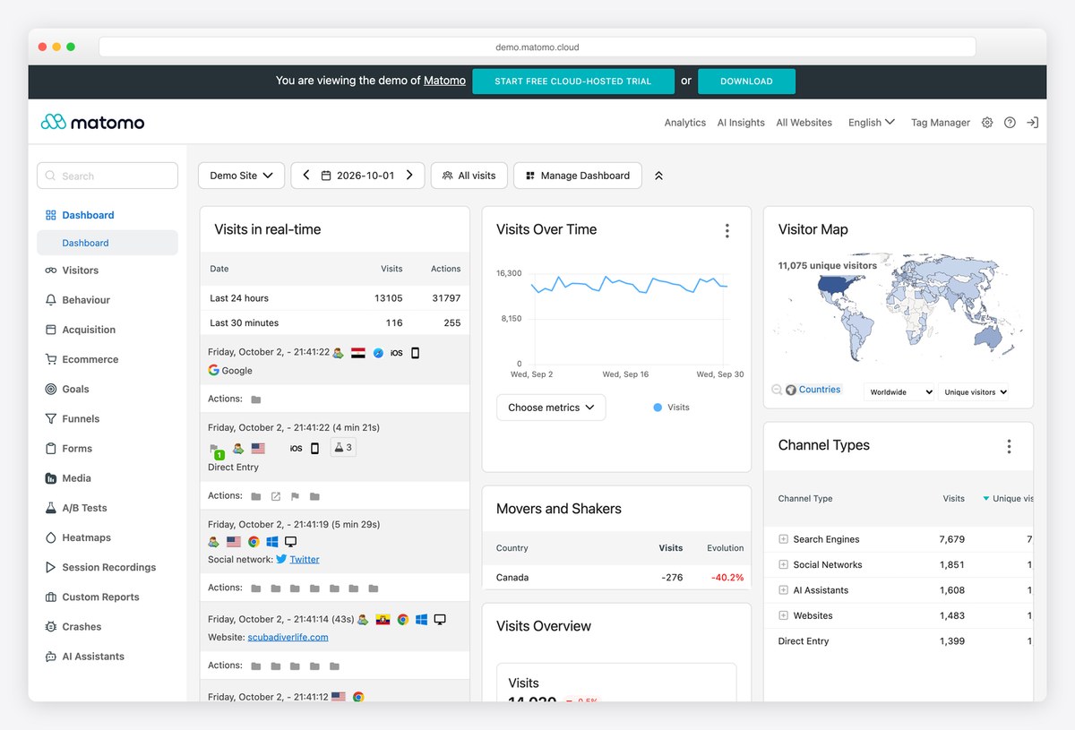
Matomo’s demo takes the opposite approach to Plausible: a fully customisable dashboard made of widgets (visits in real time, visits over time, a visitor map, channel types, movers and shakers) arranged in columns, with a Manage Dashboard menu to add and move them.
A long left menu leads to dedicated reports for visitors, behaviour, acquisition, ecommerce, goals, funnels, heatmaps and session recordings. It is a good reference for power-user dashboards where every analyst wants a different view.
What stands out: A widget dashboard each user can rearrange.
5. GoatCounter
Charts drawn with: Custom canvas sparklines
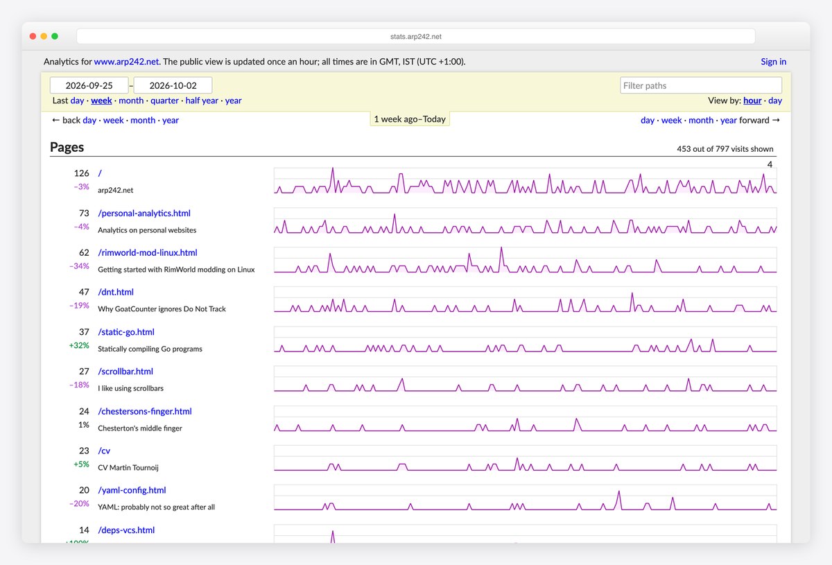
GoatCounter, a small open-source analytics tool, shows how minimal a useful dashboard can be. Its public view is a list of pages, each with a visit count, a percentage change and a small sparkline across the full width, so trends are visible at a glance.
Date ranges are plain text links (day, week, month, quarter, half year, year), and a note says the public view is updated once an hour. There is almost no chrome, and nothing is lost.
What stands out: Sparklines per page, almost no interface.
Monitoring and Status Dashboards
Operational dashboards answer one question first (is everything working?) and only then offer the detail. Status pages are the simplest form of the idea.
6. Grafana Play
Charts drawn with: uPlot (Grafana panels)
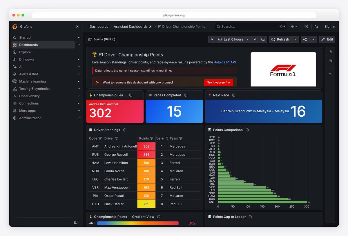
Grafana Play is Grafana’s public sandbox, and its featured F1 Driver Championship Points dashboard shows the classic Grafana layout on a dark theme: coloured stat panels for the championship leader, races completed and the next race across the top.
Below, a standings table colours each driver’s points from red to green, a horizontal bar chart compares totals, and further panels show the points gap to the leader. Every panel has its own title and info icon, and the time range and refresh controls sit in the toolbar.
What stands out: Stat panels, a heat-coloured table and a time picker.
7. Cloudflare Radar
Charts drawn with: Custom SVG charts
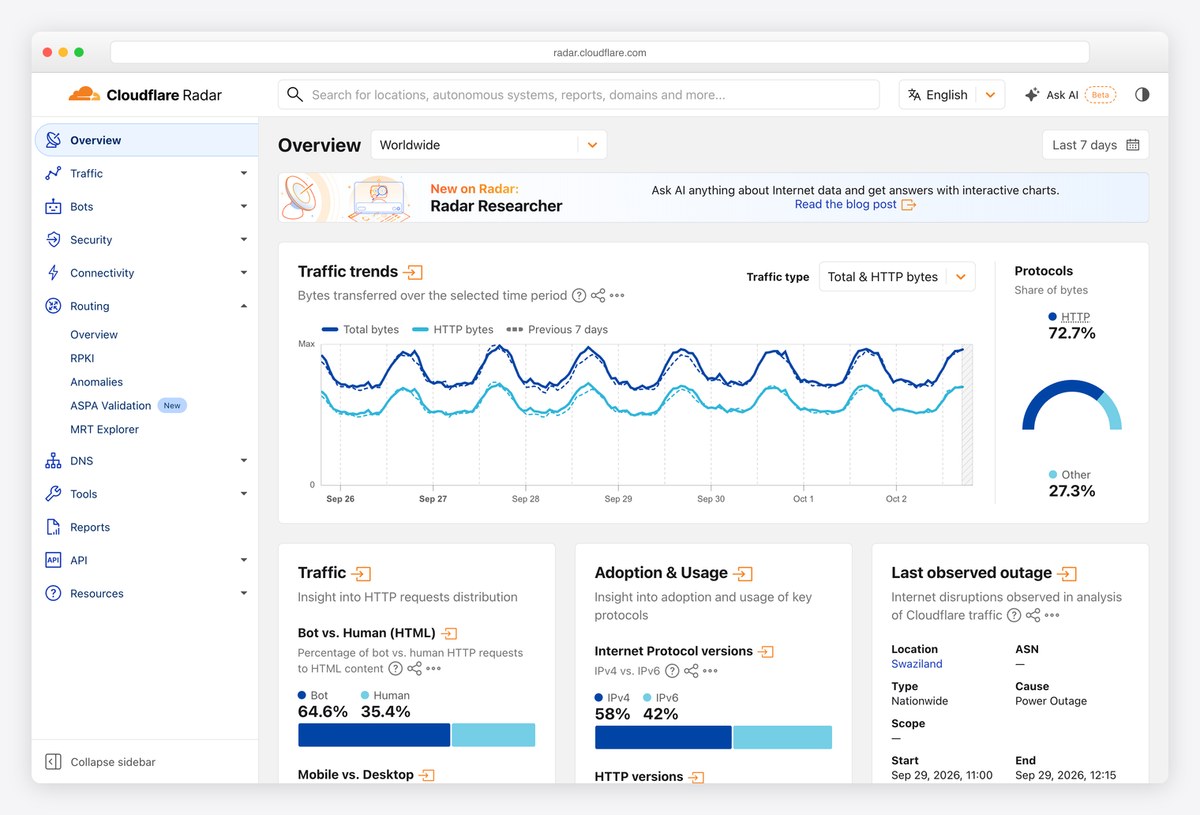
Cloudflare Radar is a public dashboard of global internet traffic and attacks. A left navigation groups dozens of views (traffic, AI insights, bots, security, connectivity, routing, DNS), and the overview opens with a traffic trends line chart with selectable traffic types and a gauge for protocol share.
Smaller cards follow for bot versus human traffic, protocol adoption and the latest observed outage, and an Ask AI search sits at the top. It is a good model for a dashboard that has to serve both a quick look and deep research.
What stands out: A quick overview with a deep menu behind it.
8. GitHub Status
Charts drawn with: SVG uptime bars
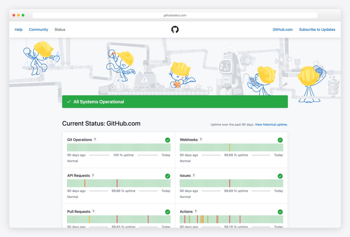
GitHub’s status page is a dashboard reduced to one question. A green All Systems Operational bar sits under an illustration of Octocats, then each service (Git operations, webhooks, API requests, issues, pull requests, Actions, Packages, Pages) gets a strip of 90 daily bars and an uptime percentage.
The design makes problems visible instantly as a change of colour, which is exactly what a status dashboard is for.
What stands out: Ninety days of uptime in one row per service.
9. OpenAI Status
Charts drawn with: SVG uptime bars
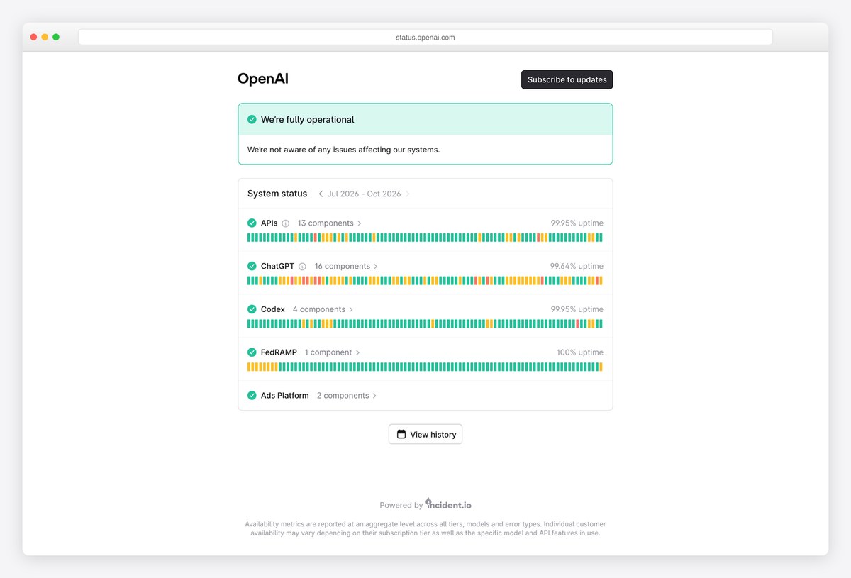
OpenAI’s status page keeps the same idea even simpler: a green We’re fully operational card, then one row per product (APIs, ChatGPT, Codex, FedRAMP and more) with the number of components, a strip of daily bars and an uptime percentage.
A View history link leads to past incidents, and a note explains how availability is measured. It is a clean example of a hosted status page (it is powered by incident.io) that still feels like part of the brand.
What stands out: One card for the answer, one row per product for the detail.
Public Data Dashboards
Dashboards built for the public, where the audience has no training and the design has to explain the data on its own.
10. UKHSA data dashboard
Charts drawn with: Custom SVG charts
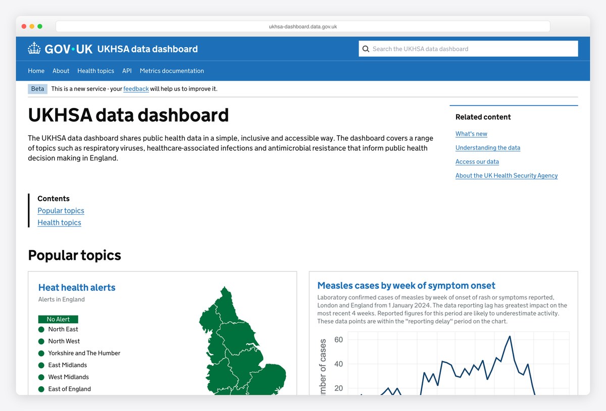
The UK Health Security Agency’s data dashboard is built on the GOV.UK design system and opens with a plain explanation: it shares public health data in a simple, inclusive and accessible way. A Beta banner invites feedback.
Popular topics follow as cards, such as heat health alerts shown on a map of English regions and weekly case charts, and the menu links to an API and metrics documentation. For public dashboards, explaining the data matters as much as charting it.
What stands out: Plain language, accessible charts and an open API.
11. Our World in Data
Charts drawn with: Custom SVG charts
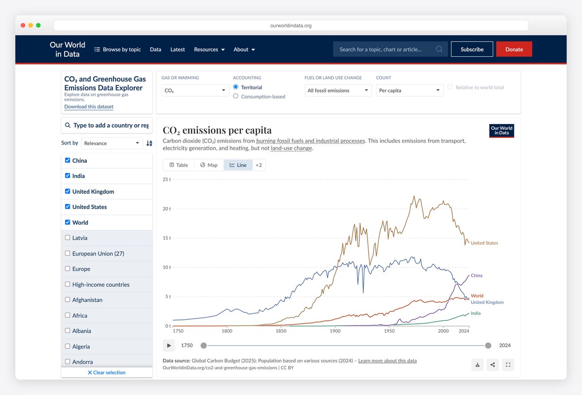
Our World in Data’s CO₂ emissions explorer is a data dashboard for the general public. Controls along the top switch the gas, the accounting method, fossil or land-use emissions and the measure (per capita, per country, cumulative), and a list of countries with checkboxes runs down the left.
The line chart labels each line directly at its end instead of using a legend, and tabs switch between table, map and chart views, with a link to download the full dataset.
What stands out: Lines labelled where they end, not in a legend.
12. Electricity Maps
Charts drawn with: MapLibre
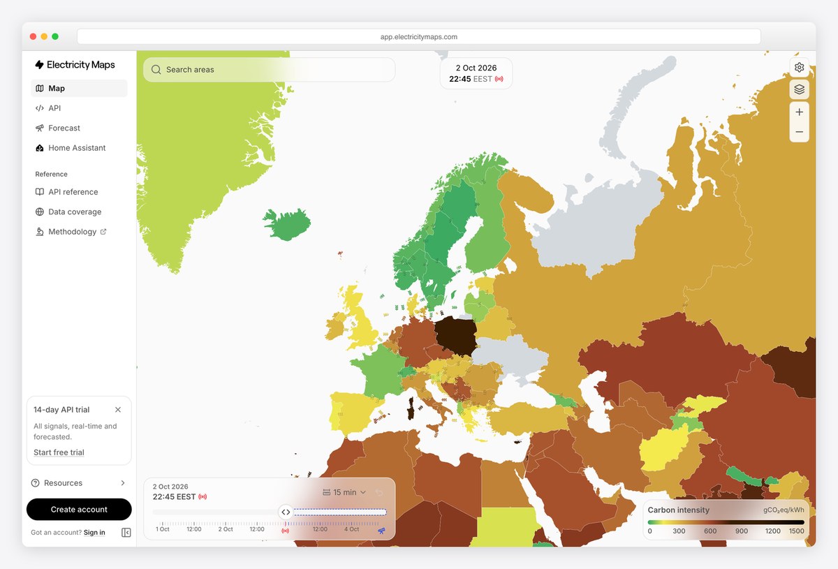
Electricity Maps shows the carbon intensity of electricity as a full-screen map, with every country or grid zone coloured on a scale from green (low carbon) to brown (high), and a legend in grams of CO₂ per kilowatt-hour.
A time slider along the bottom replays recent hours. The map is drawn with MapLibre. When the data is geographic, the map can be the whole dashboard.
What stands out: The map is the dashboard.
13. Google Trends
Charts drawn with: SVG sparklines
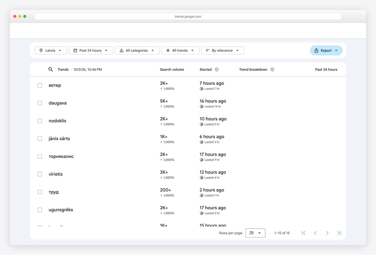
Google Trends’ Trending Now page is a dashboard in table form: each row is a rising search with its search volume, percentage increase, how long ago it started and a small trend line, and a status shows whether it is still active.
Filters for location, time window, category and sort order sit above the table, with an Export button for the data. Not every dashboard needs charts; a well-sorted table with sparklines can be the clearest view.
What stands out: A sortable table with sparklines instead of charts.
14. DefiLlama
Charts drawn with: ECharts
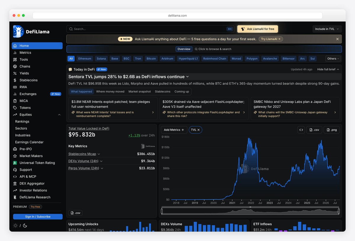
DefiLlama is a dense, dark crypto analytics dashboard. A long left navigation covers chains, yields, stablecoins and more, a row of chain filters sits at the top, and the main view leads with total value locked as one large number with its daily change.
A large area chart with a time-range brush, a list of key metrics and cards of recent news fill the rest. The charts are built with ECharts. It shows how a data-heavy dashboard stays readable with a dark theme and a strict grid.
What stands out: Dense data kept readable with a strict dark grid.
15. Flightradar24
Charts drawn with: deck.gl
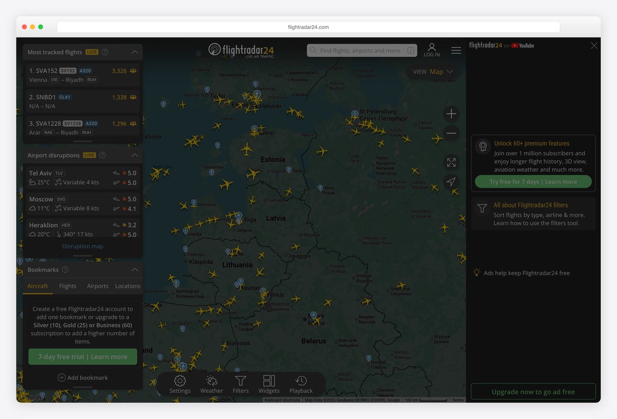
Flightradar24’s live flight tracker is a real-time dashboard laid over a map: thousands of aircraft icons move across a dark map, and a side panel lists the most tracked flights with route, aircraft type and number of people watching.
Weather, filters, widgets and playback controls sit along the bottom. The aircraft layer is rendered with deck.gl, the WebGL framework built for drawing large datasets on maps.
What stands out: Thousands of live objects on a map, still readable.
Dashboard UI Kits and Templates
Ready-made dashboard designs you can open, inspect and build on. They are useful references for layout, spacing and chart styling, even if you build your own.
16. shadcn/ui dashboard
Charts drawn with: Recharts
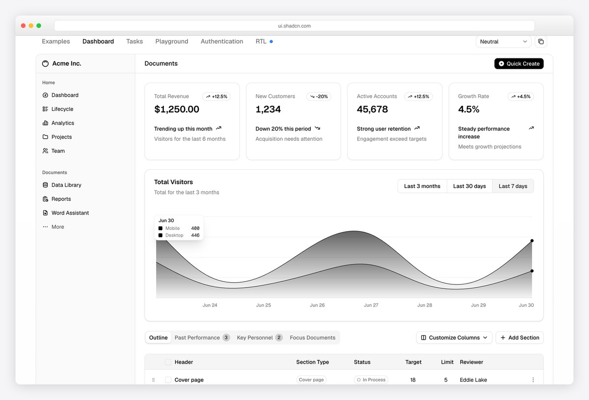
The shadcn/ui dashboard example is a reference layout many React teams now start from: a collapsible sidebar, four KPI cards that pair a number and a trend badge with one line explaining what changed, and an area chart with a toggle for the last three months, 30 days or 7 days.
A tabbed data table follows. The charts are built with Recharts, and every part is copy-paste code you own and restyle. It is a good example of explaining a number in words right next to it.
What stands out: KPI cards that explain the number in one line.
17. Tabler
Charts drawn with: ApexCharts
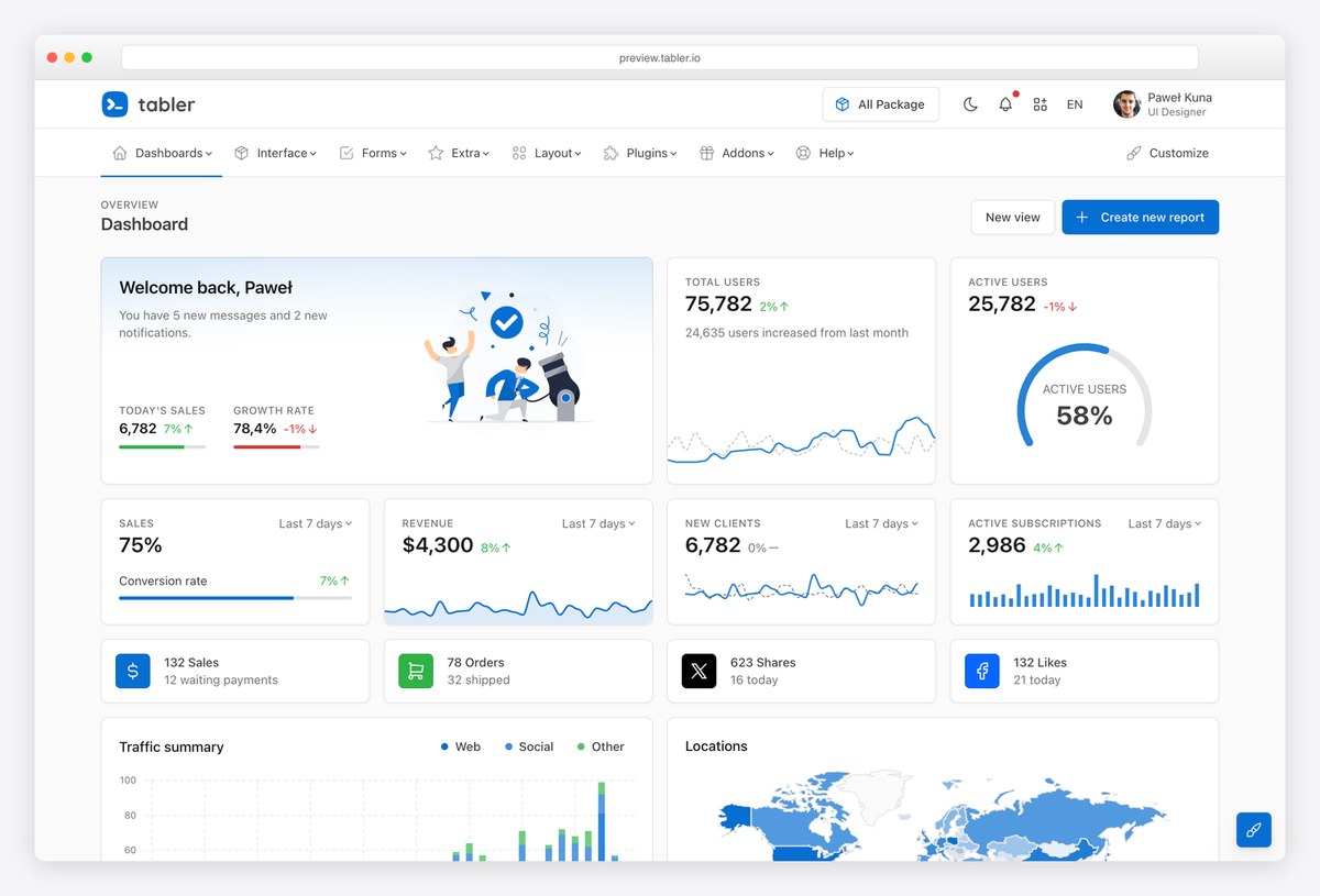
Tabler is a popular open-source Bootstrap dashboard kit. Its default dashboard opens with a welcome card and illustration, then rows of KPI cards with small sparklines and progress bars, followed by a traffic summary bar chart and a world map of locations.
The charts use ApexCharts, and the kit covers many page types beyond the dashboard. It is a good reference for spacing and card design in a Bootstrap-based admin.
What stands out: Card spacing and sparklines done well in Bootstrap.
18. TailAdmin
Charts drawn with: ApexCharts
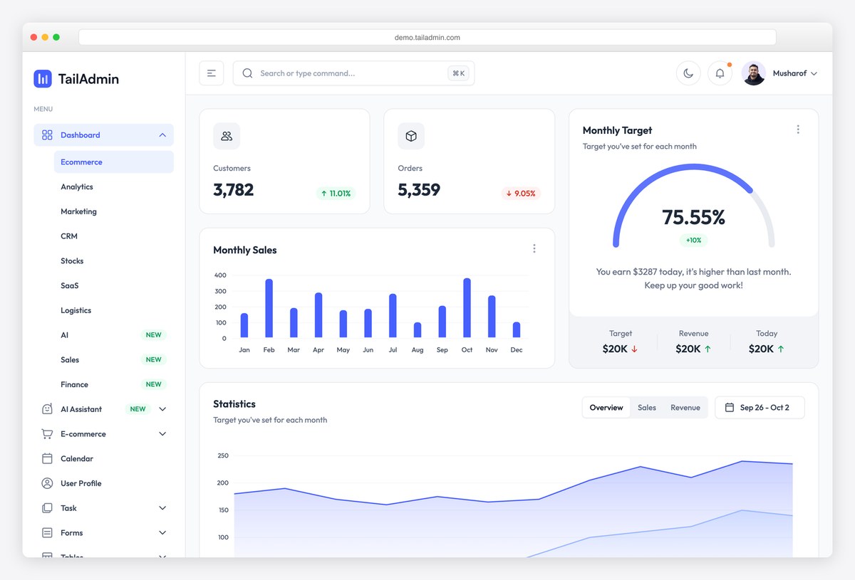
TailAdmin is a Tailwind CSS admin template whose ecommerce dashboard pairs KPI cards (customers and orders, each with a percentage badge) with a monthly sales bar chart and a radial gauge showing progress toward a monthly target.
A statistics area chart with tabs follows, and the sidebar lists many ready dashboards (analytics, marketing, CRM, stocks, SaaS, logistics). Charts are drawn with ApexCharts. The target gauge is a good pattern for any goal-driven metric.
What stands out: A target gauge for goal-driven numbers.
19. CoreUI
Charts drawn with: Chart.js
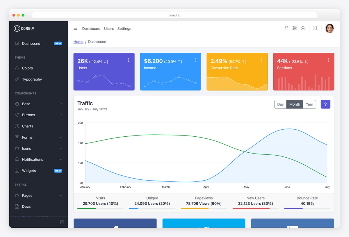
CoreUI’s free Bootstrap admin shows a classic admin dashboard: four brightly coloured stat cards, each with a small line or bar chart, above a traffic chart with Day, Month and Year toggles.
Progress bars under the chart summarise visits, unique users, pageviews, new users and bounce rate. Charts use Chart.js, and the dark sidebar keeps navigation separate from data. It is a dependable starting point when you need a conventional admin.
What stands out: A conventional admin layout that still reads clearly.
20. AdminLTE
Charts drawn with: Chart.js
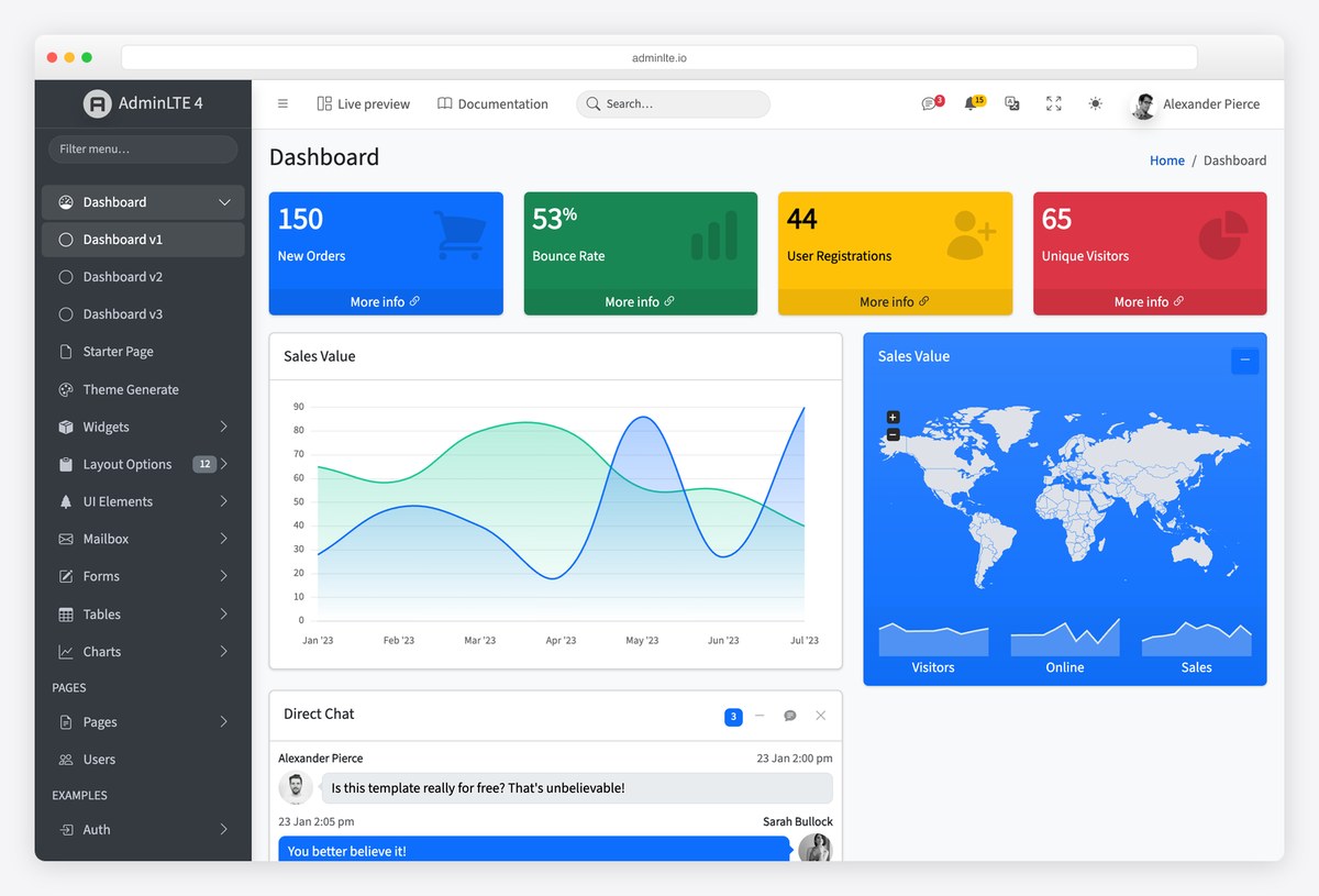
AdminLTE, the long-running open-source Bootstrap admin template from the team behind Colorlib, opens with four coloured summary boxes (new orders, bounce rate, user registrations and unique visitors), then a sales chart, a world map card and a direct chat widget.
The fourth version is built on Bootstrap 5 with a dark mode, and its charts use Chart.js. Its small coloured summary boxes are probably the most copied pattern in admin dashboards.
What stands out: The summary-box pattern many admins borrowed.
Dashboard Design Best Practices
Start with the question, not the data. Every good dashboard here answers one main question first: how many visitors (Plausible), is everything working (GitHub Status), how clean is the grid right now (Electricity Maps). Decide who the dashboard is for and what they need to know in five seconds.
Put the key numbers on top, with a comparison. A number alone means little. Plausible, Fathom and shadcn/ui show each figure with its change against the previous period, and shadcn adds a line of plain language explaining it.
Pick the chart for the job. Lines for change over time, bars for comparing categories, a map only when location matters, and a table with sparklines when people need exact values (Google Trends, GoatCounter). Avoid pie charts with more than a few slices.
Use colour for meaning, not decoration. Green and red for status (GitHub Status), one sequential scale for intensity (Electricity Maps, Grafana’s points table) and a neutral palette for everything else. Check that the meaning survives for colour-blind users.
Label directly and cut the chrome. Our World in Data labels each line where it ends instead of in a legend, and GoatCounter shows that gridlines, borders and boxes can mostly go. Every element should earn its place.
Give people control over time and detail. Date-range pickers, comparison periods, filters and drill-down links (Fathom, Grafana, Cloudflare Radar) let one dashboard serve a quick check and a deeper investigation.
Design every state, and make it accessible. Plan for loading, empty and error states, real-time updates and small screens. The UKHSA dashboard is a good model for public data: plain language, the GOV.UK design system’s accessible components and a documented API for anyone who needs the raw numbers.
Frequently Asked Questions
What makes a good dashboard design?
A good dashboard answers its main question at a glance: the most important numbers sit at the top with a comparison to a previous period, followed by one or two charts that explain the change. It uses colour only for meaning, labels data clearly, offers date and filter controls, and keeps everything else out of the way.
What should be on a dashboard?
Start with the three to six metrics your audience checks most often, each with its trend or target. Add one main chart over time, a breakdown such as top sources or regions, and links to detailed reports. Anything that does not help someone decide or act belongs on another page.
What is the best layout for a dashboard?
Most effective dashboards follow the same reading order: a row of key numbers across the top, a large chart below them, then smaller panels or tables with the detail. A left sidebar holds navigation in larger products. Put the most important information top-left, where people look first.
Which chart library is best for dashboards?
It depends on the stack and the data. The dashboards on this list use Recharts (React), ApexCharts and Chart.js (simple, popular), Highcharts and ECharts (feature-rich), uPlot (fast time series), and MapLibre or deck.gl for maps. Several of the most polished, such as Plausible, draw their own SVG charts instead.
How many charts should a dashboard have?
Fewer than you think. Most of the best examples here show one main chart on the first screen, supported by numbers, lists and small sparklines. If a dashboard needs a dozen charts, it is usually several dashboards for different audiences, or it needs filters instead of extra panels.
Should a dashboard have a dark mode?
It helps for dashboards people watch for long periods or in dim rooms, such as monitoring and trading screens, which is why Grafana and DefiLlama default to dark. Offer both if you can, test chart colours in each, and make sure contrast and status colours still read correctly.
Wrapping Up
Ready to build one? Browse our Bootstrap admin dashboard templates, Tailwind CSS dashboard templates, dark mode dashboard templates and SaaS dashboard templates for ready-made layouts that follow these practices.

Related Posts




Comments (0)