21 Best Artist Portfolio Websites (Examples) 2026
Do you need extra inspiration and want to check the best artist portfolio websites?
That’s OK! We always look around for new web designs to expand our creative thinking.
After analyzing over 60 portfolio websites, we narrowed our selection to the top 20.
These are simple, clean, minimal, creative, animated, etc. By covering different art website styles, we ensure that we cater to all your tastes.
You may also be wondering how to build such a website. The fastest and most beginner-friendly way is to use a WordPress theme for artists.
On the other hand, you can also pick a website builder for artists (which is an all-in-one online software).
Best Artist Portfolio Websites For Your Inspiration
1. Jennifer Xiao
Built with: Wix
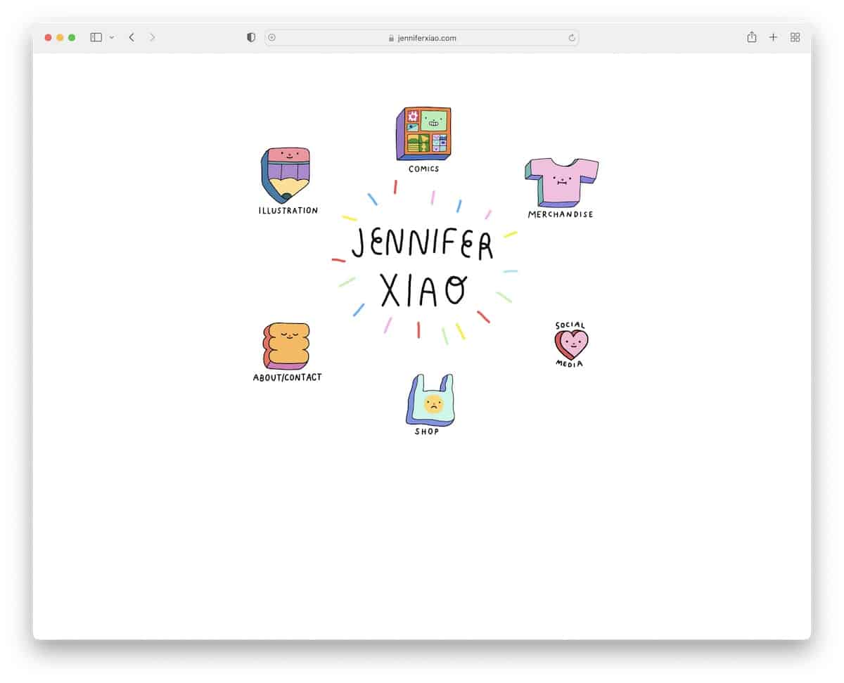
Once you land on Jennifer Xiao’s website, the COOL effect is very high. Besides the center animation, all the graphics feel like you’d be pressing a button once you hover over them.
You’ll also notice there’s no header or footer. The minimalist level is also quite high, so you can enjoy the coolness even more.
What stands out: Give your website a personalized touch with your unique, creative elements.
2. Mindy Nguyen
Built with: Squarespace
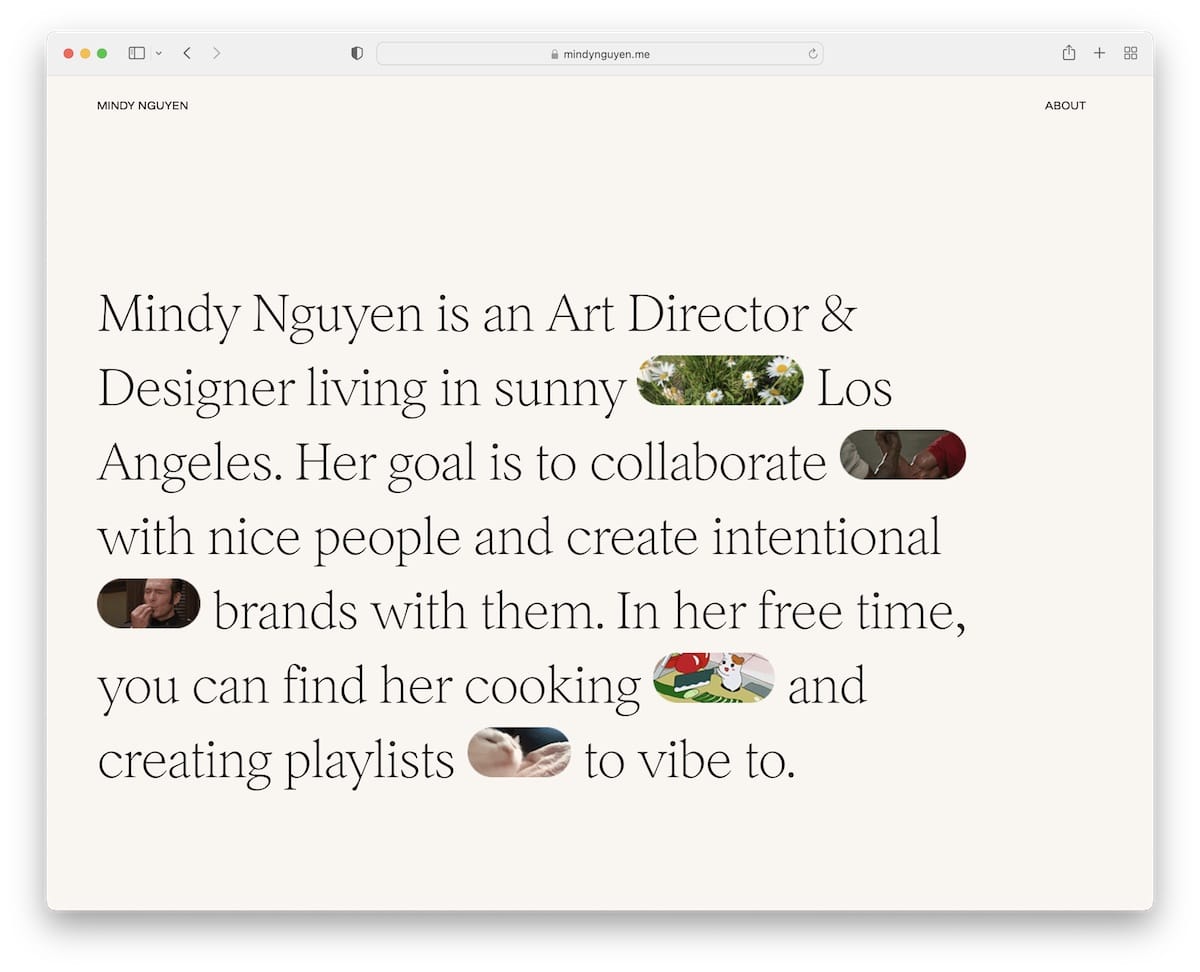
Mindy Nguyen’s interesting hero section approach can inspire new ideas. Instead of using images, videos, or a slider above the fold, Mindy features text mixed with GIFs—nope, not something you see daily.
The minimalist header and footer have the same background color as the page’s base to achieve a neater appearance.
We also appreciate that instead of showcasing her works on her page, Mindy links to live projects, allowing you to experience them firsthand.
What stands out: Besides creating an online portfolio website, add links to live projects so potential clients can have a better feel of the quality of your work.
3. Gina Kirlew
Built with: Squarespace
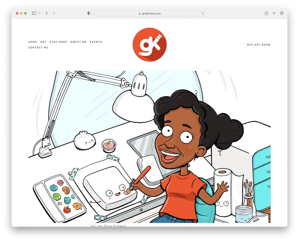
Gina Kirlew knows how to blend a minimalist web design with her vibrant art to create an exceptional viewing experience.
She’s also keeping her home page very simple, with a header, a footer (that’s only three social icons) and a cartoon-ish presentation of herself.
What stands out: A minimalist artist portfolio website will pop the works more.
4. Nathalie Lete
Built with: Wix
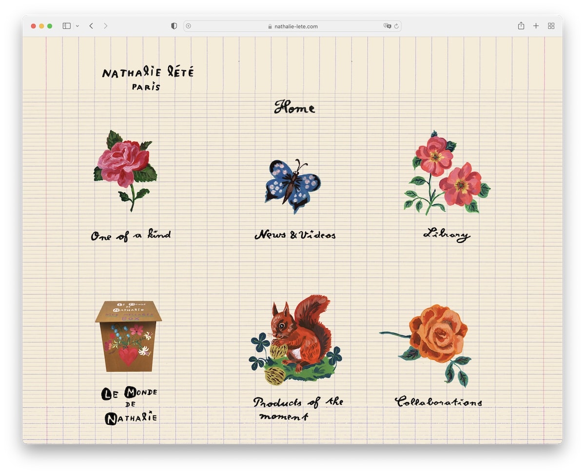
Nathalie Lete’s website is one of the more unique ones we’ve seen while researching the best examples.
It has a very original home page with hand-crafted graphics and text that work as navigation through her website.
Furthermore, the header is basic, with a “logo,” the name of the current page, and a home button. However, there’s no footer to maintain an uncluttered feel.
What stands out: Creativity knows no bounds, and Nathalie Lete’s site is excellent proof.
Need more ideas? Then take a peek at these websites built on the Wix platform.
5. Darren Hughes
Built with: Wix
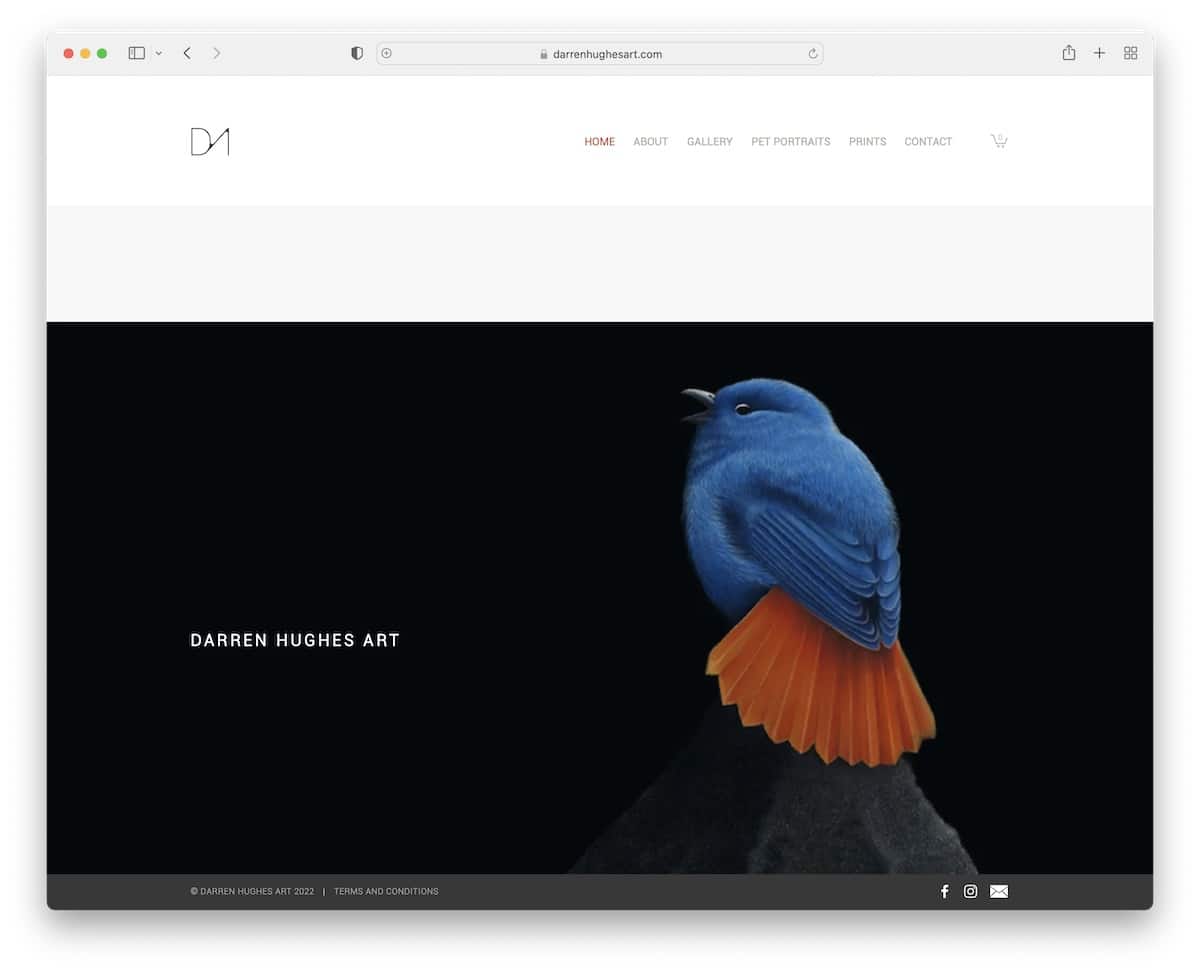
Darren Hughes’s artist portfolio website rocks a basic home page with a large image and a minimalist header.
Interestingly, the sticky footer bar ensures Facebook, Instagram and email icons are always visible.
Darren also uses his website to sell prints and has a newsletter subscription form that offers a discount in exchange for an email.
What stands out: Add a newsletter subscription form to your website and grow your email list.
6. Alex Fisher
Built with: Webflow
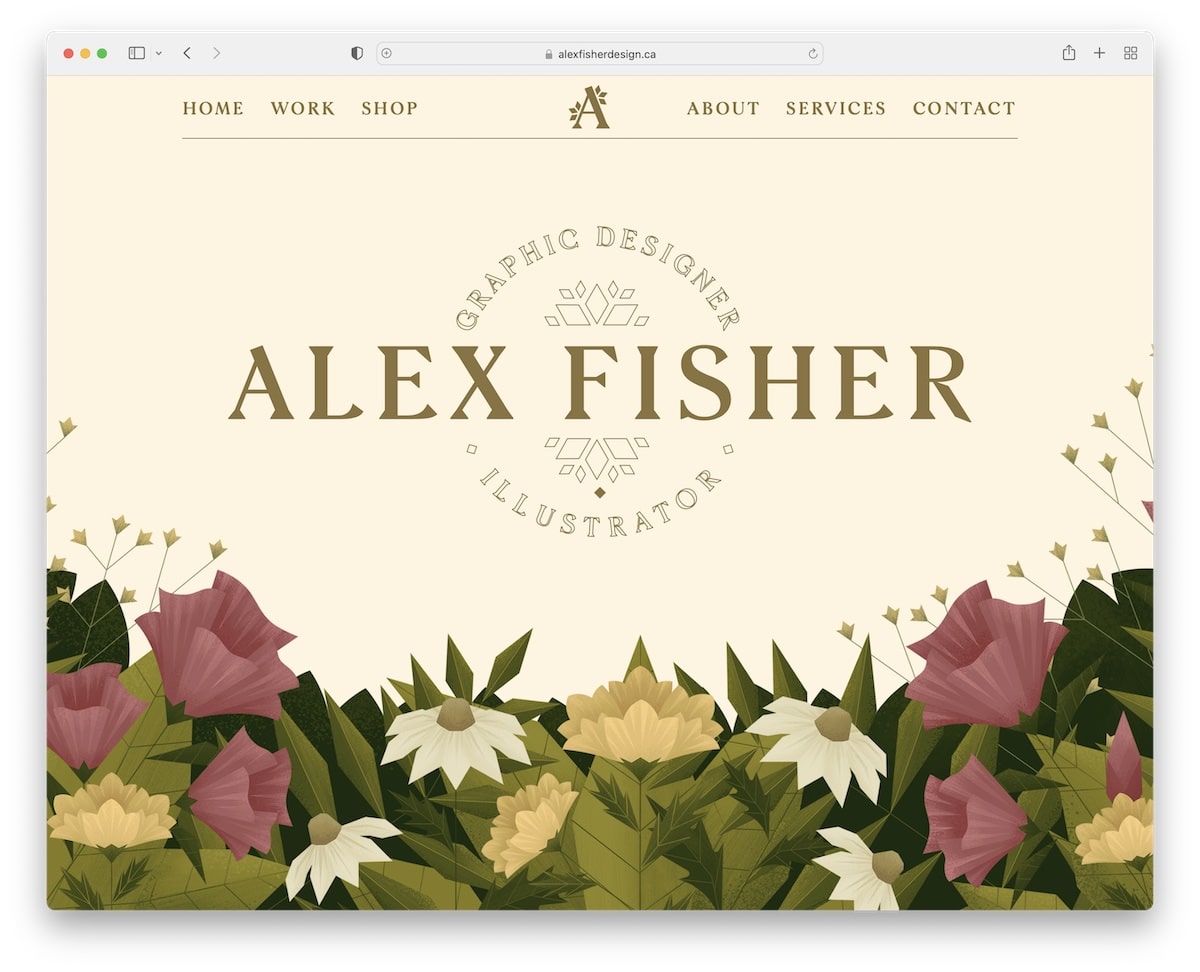
Alex Fisher is an artist portfolio website example with a creative hero section, a parallax effect, and a floating header.
The sliding carousel showcases some of her work, featuring a “More Work” button that opens the full portfolio on a new page.
Alex Fisher’s home page also features a contact form and a beautiful preloader.
What stands out: Consider adding a contact form to the home page to make yourself even more accessible.
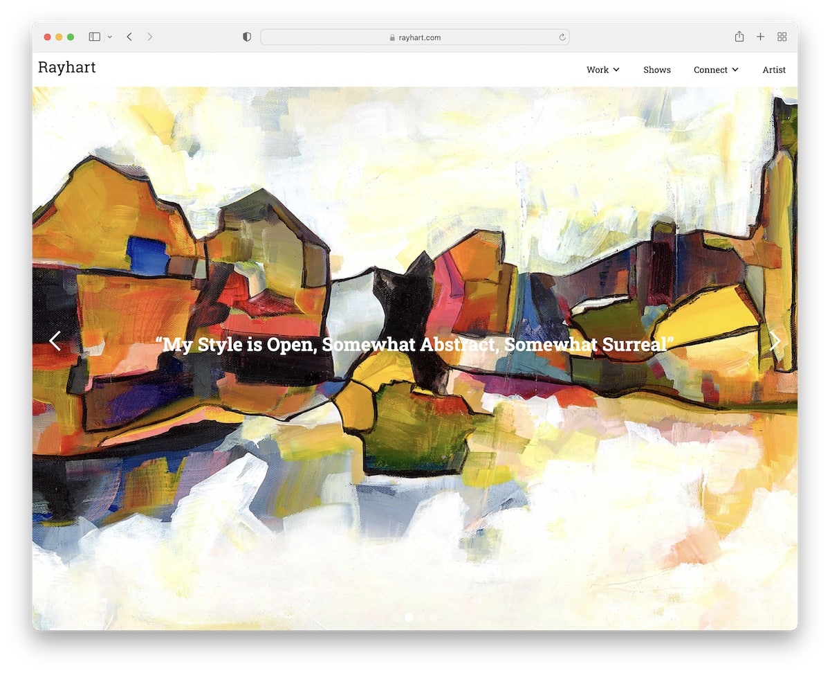
7. Ray Hart
Built with: Webflow
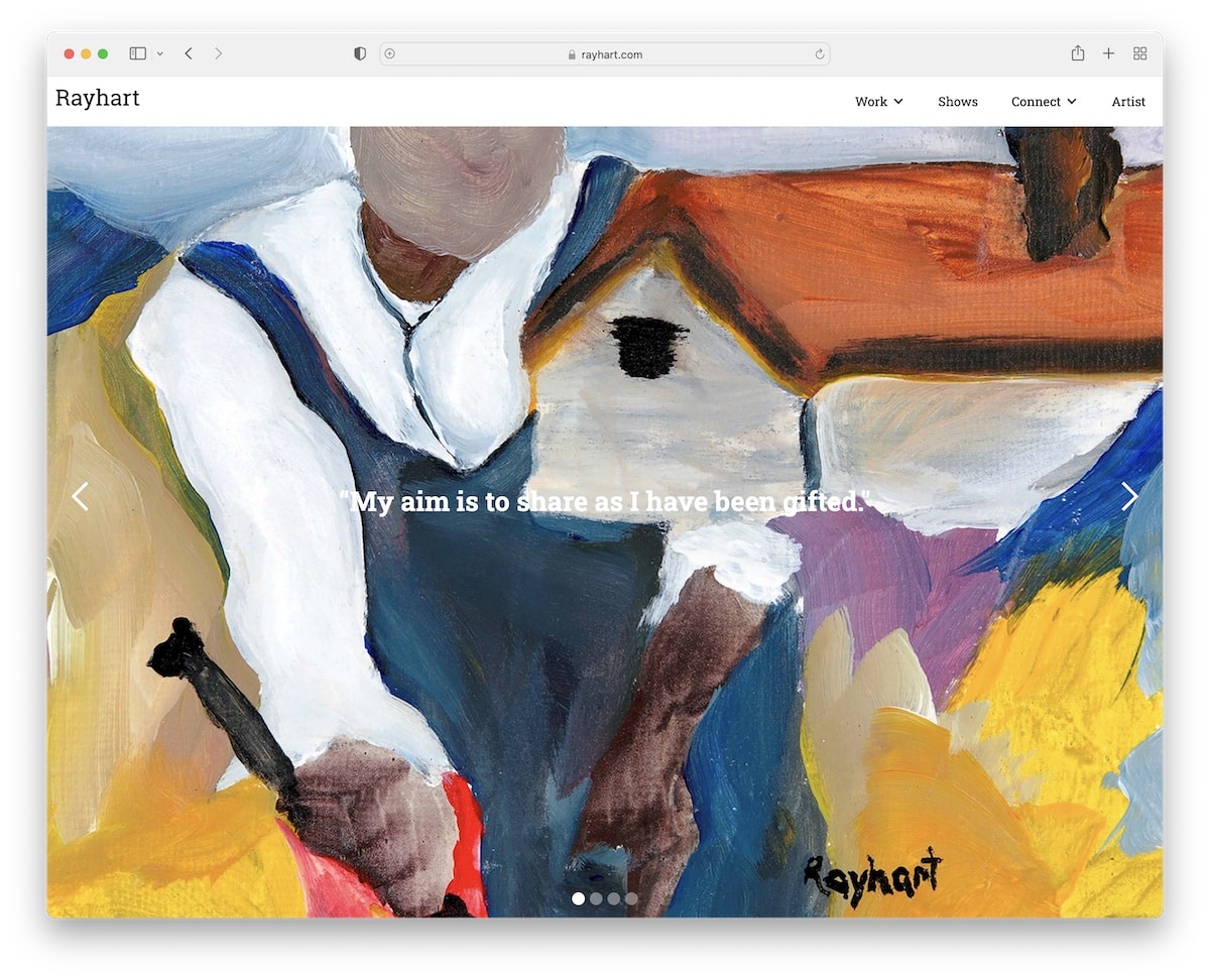
Ray Hart’s website features a full-screen image slider with text overlay and a sticky header that includes a drop-down menu. Besides that, the only other element on the front page is a search bar, but it’s positioned below the slideshow, which is unusual.
The rest of the pages are pretty minimalist, which works so well to emphasize the works more.
What stands out: Use a large slideshow to display your works in all their glory.
8. MA Quilts
Built with: Webflow
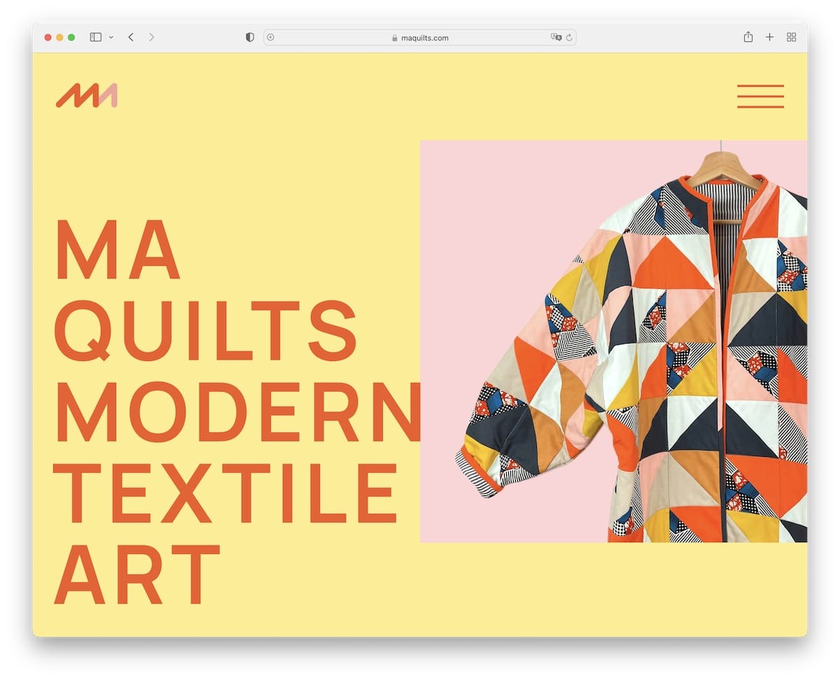
MA Quilts has a minimalist and creative layout with large text, plenty of white space and a sticky element. The hamburger menu icon opens navigation on the right sidebar, while the footer doesn’t feel like a footer.
We also really like the catchy background graphics that add a nice touch.
What stands out: Mixing simplicity with uniqueness can work wonders.
9. Pierrick Calvez
Built with: Webflow
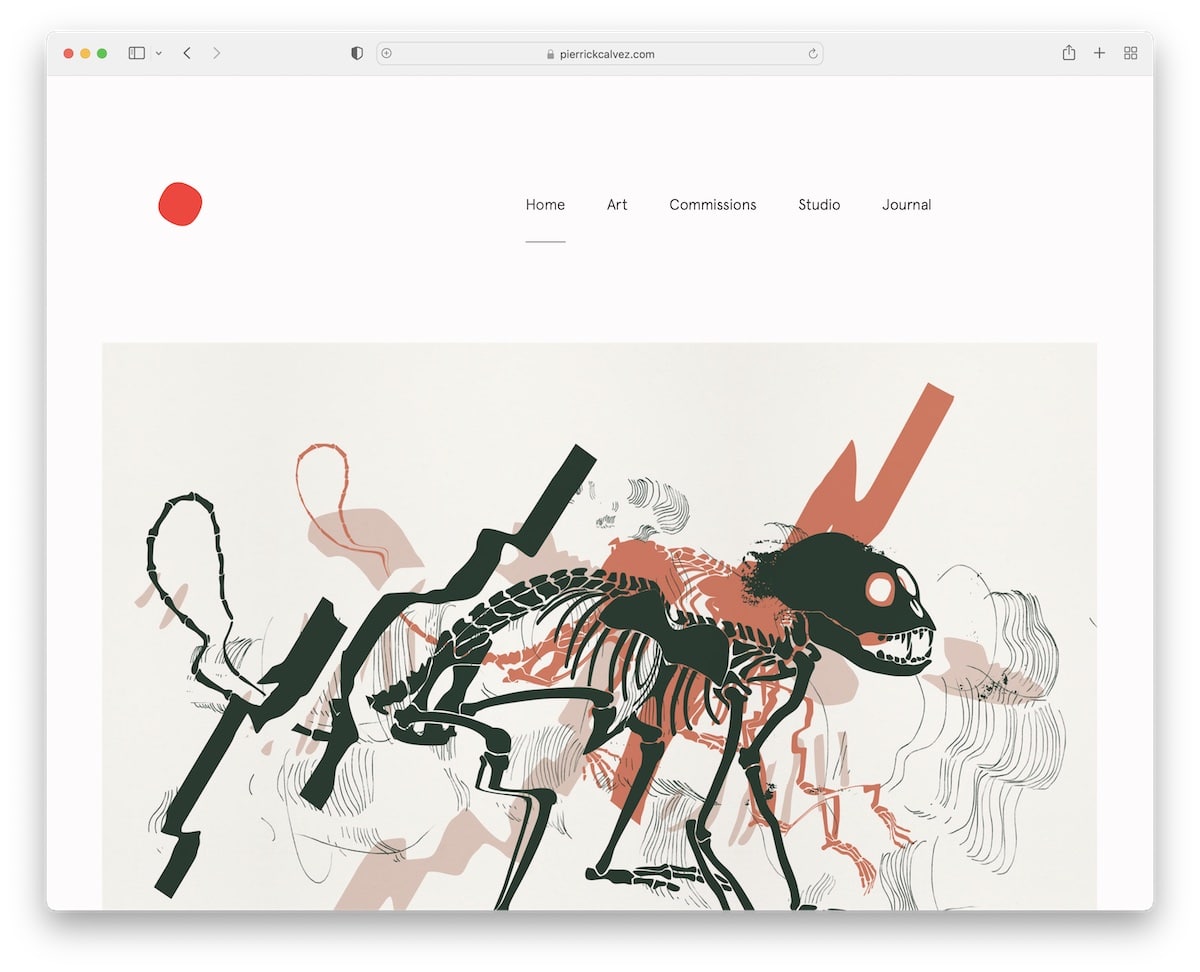
Pierrick Calvez’s artist portfolio website has a massive but simple header with clean navigation. The page has a lot of images and little text, and it is very well-detailed. This enhances the overall viewing experience on both mobile and desktop devices.
Before the footer section is a large newsletter subscription form that’s impossible to miss.
What stands out: Introduce a newsletter subscription form and grow your email list.
10. Arte Proyecto 70
Built with: Webflow
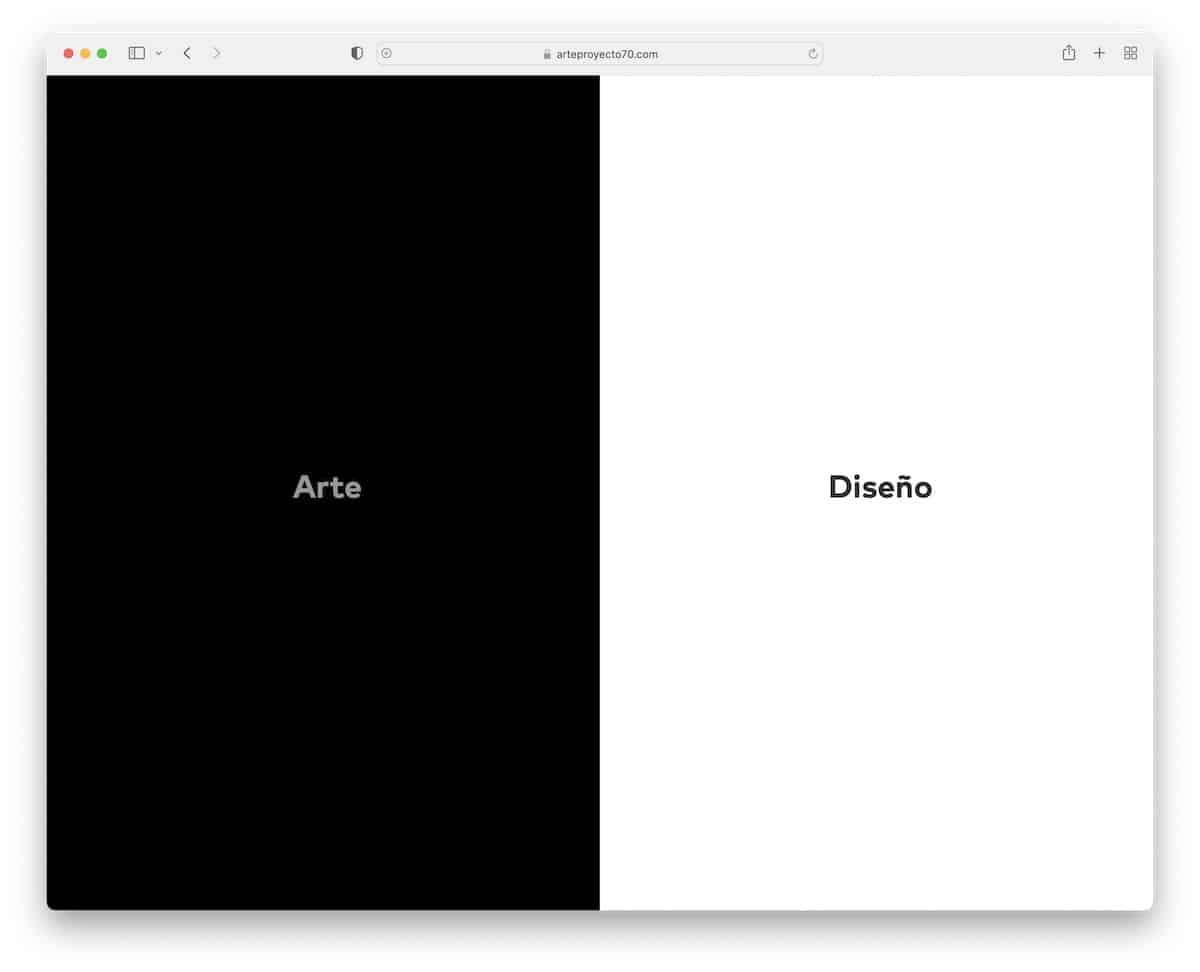
Arte Proyecto 70 features a unique split design, with dark tones on the left and light tones on the right. Switching from one page to another is very easy with the sidebar button, which stays on the screen, either on the left or right side.
Both pages have a two-column grid, a minimalist header and a basic footer. Individual posts have featured images and a sidebar gallery that opens images in a lightbox.
What stands out: Use dark and light designs to make your website more dynamic.
11. Rina Maimon
Built with: Webflow
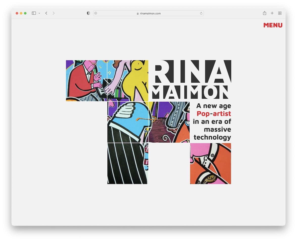
Rina Maimon is an artist portfolio website with a collage-like home page, a hover effect, and a menu icon that opens hamburger navigation.
All internal pages, including the front page, are designed to maintain a consistent flow. What’s unique about Rina Maimon is that the site doesn’t have a header or a footer.
What stands out: You don’t always need to use a header or footer – feel free to omit them.
12. Sean Halpin
Built with: GitHub Pages
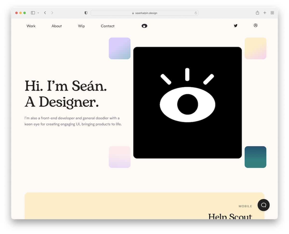
Sean Halpin has a creative portfolio website with a catchy animation above-the-fold that triggers everyone’s interest.
The header features a drop-down menu, social media icons, and an interactive eye following the mouse cursor.
Another specialty is the live chatbot that floats at the bottom right corner of the screen. This widget also opens when you click the contact link in the navigation bar.
What stands out: Introduce a live chat function, but ensure it’s clear that it’s a bot if you won’t be responding to messages yourself.
You may also want to check these animation websites if you like special effects.
13. Lisa Maltby
Built with: Squarespace
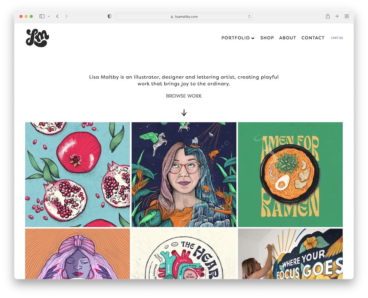
Lisa Maltby’s bold portfolio grid homepage features both static and animated elements to add visual interest.
The page also begins with text to inform everyone about the latest updates. The header features an animated logo on the left, a drop-down navigation on the right, and a cart icon.
Furthermore, although enriched with gorgeous images, the page maintains a simple and clean appearance.
What stands out: Maintain a minimalist design throughout your website to emphasize your works.
By the way, don’t forget about our extensive collection of the best Squarespace website examples.
14. Adam Halls
Built with: Pixpa
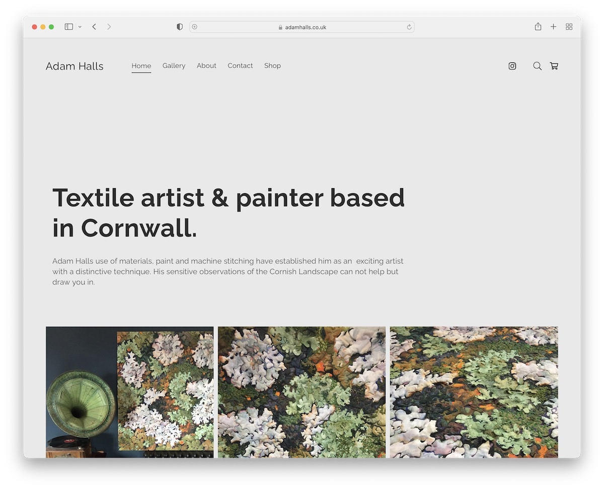
Adam Halls begins his artist portfolio website with a title and text, followed by a grid portfolio featuring a handy lightbox to enhance the viewing experience of each image.
This page features a sticky header, eliminating the need to scroll back to the top to access other internal pages. This also gives you constant access to the search bar, which opens as a full-screen overlay.
What stands out: Utilize a floating header/navigation bar to enhance your page’s user experience.
15. Alicia Haberman
Built with: Pixpa
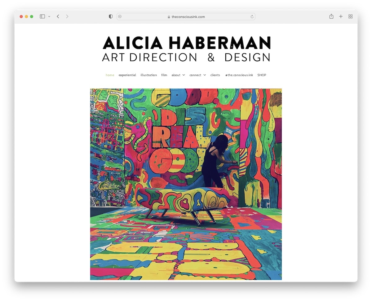
Alicia Haberman’s website immediately conveys that she’s an artist, thanks to the title, drop-down navbar, and large image of her in action.
The footer section is small, featuring social icons and a social share function to help her expand her profiles and encourage others to share the word.
And lightbox galleries ensure you have a better experience examining her works in great detail.
What stands out: Use the lightbox function so people can view the content without leaving the current page.
16. Darren Cranmer
Built with: Pixpa
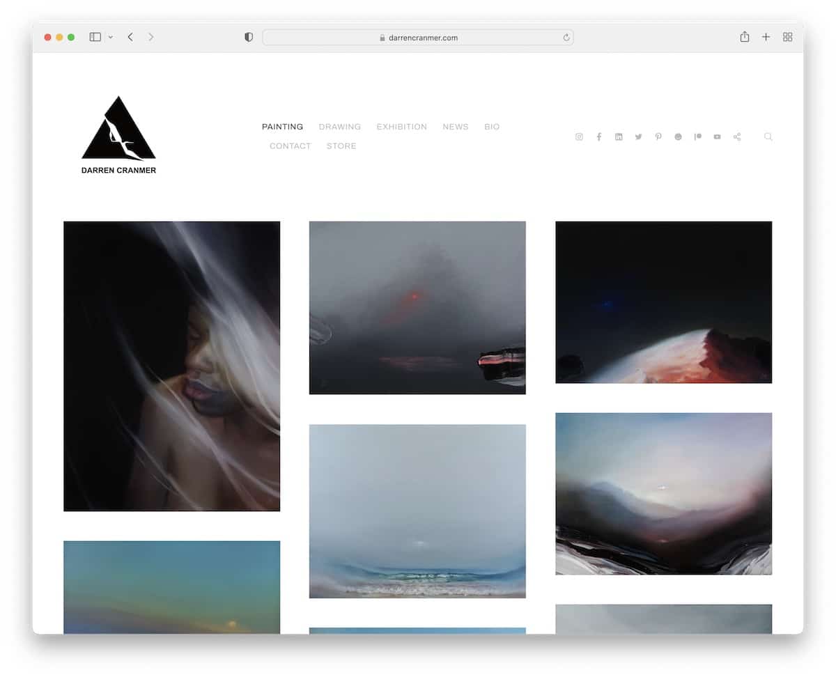
Darren Cranmer quickly glances at his work just by visiting his home page. The grid has extra spacing between clickable elements that take you to individual pages with additional content.
The header takes up a significant amount of real estate but maintains a low profile to preserve the minimalist appearance. Darren also achieved this by using the same background color for the header, the footer, and the website’s base.
What stands out: For a more refined style, make the header and footer backgrounds match the rest of the site.
17. Susann Hoffmann
Built with: Adobe Portfolio
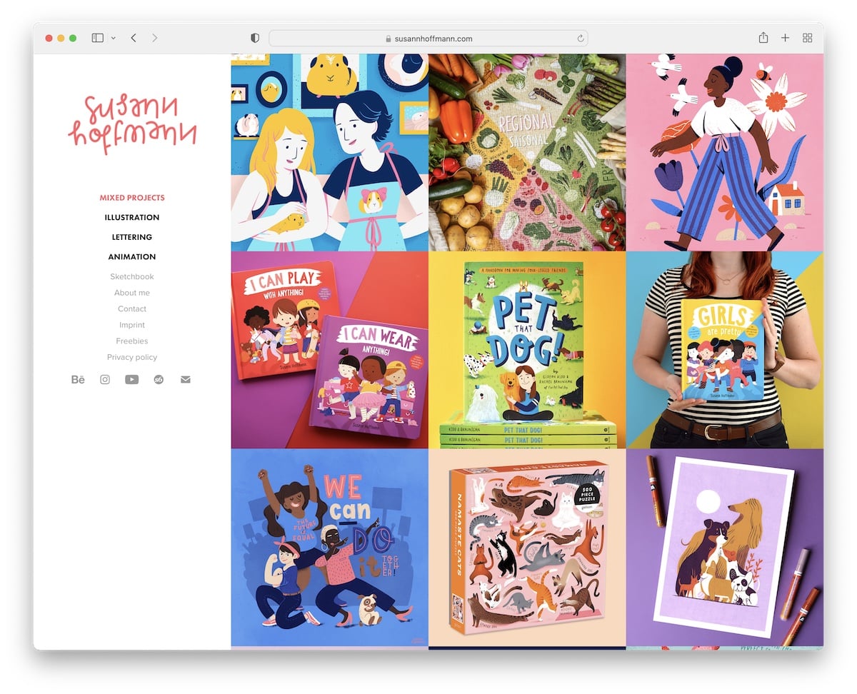
Instead of the classic header, Susann Hoffmann uses a sidebar version with menu links and social media buttons.
The right part of this artist portfolio website is a three-column grid without spacing but with a hover effect that reveals the project name. Individual project pages feature a lightbox gallery, allowing you to view the images distraction-free.
What stands out: Do you want to do something different but unsure how to make it happen? Move the header to the side.
18. Essi Kimpimaki
Built with: Cargo
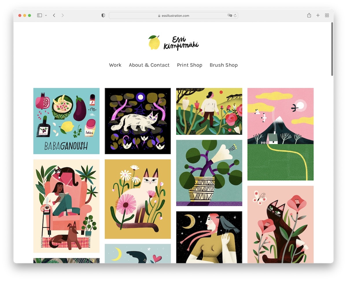
We really like Essi Kimpimaki for its simplicity and choice of larger typography, which creates a pleasant experience browsing the works.
The header features a logo and a four-link navigation, while the footer maintains a clean design with social media icons.
Moreover, the portfolio items have a hover effect with the name of the artwork (opening a bigger image on an individual page).
What stands out: Larger fonts work great with a minimalist responsive web design.
19. Nona Inescu
Built with: Invisible Folio
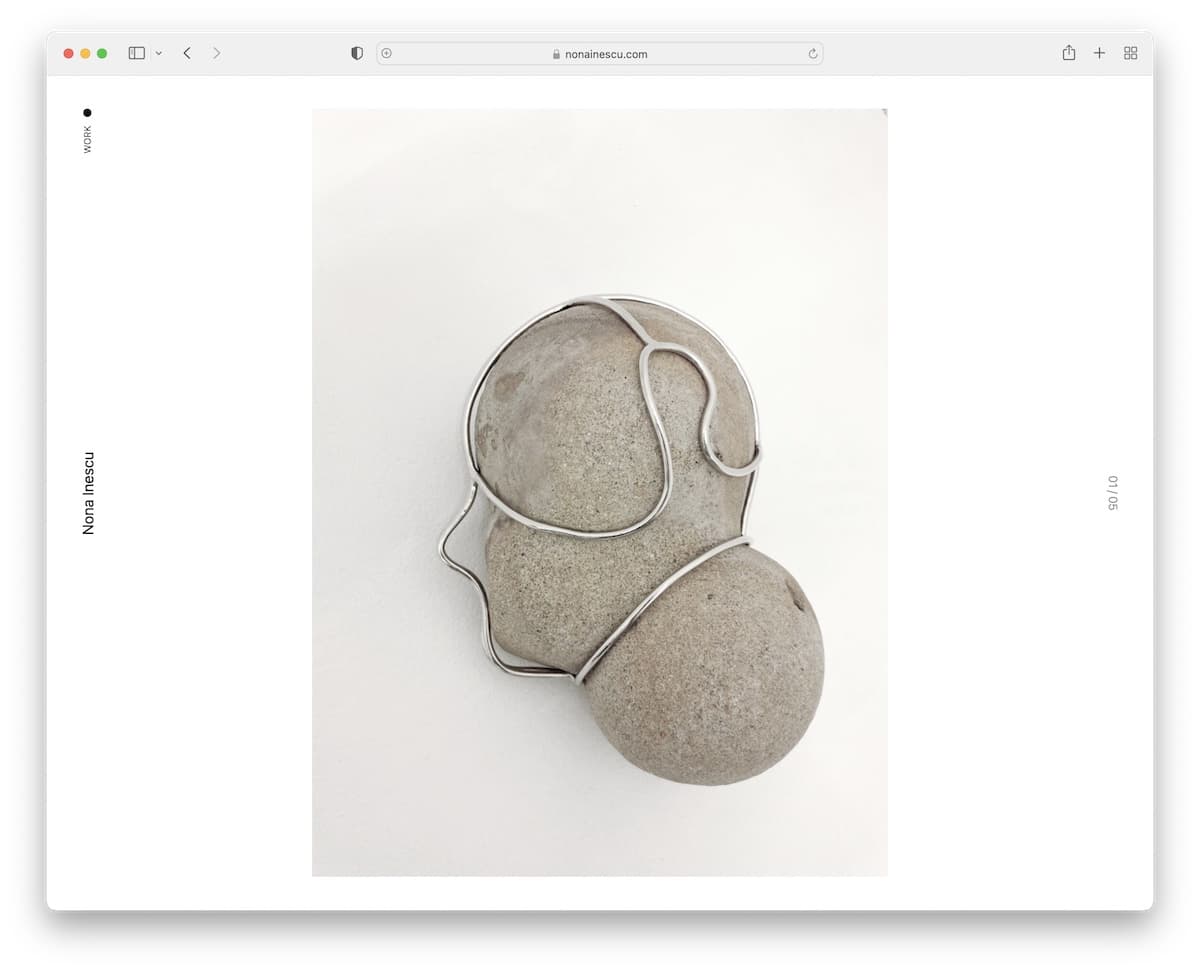
Nona Inescu is a one-of-a-kind artist portfolio website featuring a massive slider on the homepage and a cleanest sidebar “header” we’ve seen.
Another unique feature is the list of works, where each gives you a sneak peek on hover, making it easier to find what appeals to you.
What stands out: Create your home page as a single, large slideshow, allowing the images to speak for themselves.
20. Fernanda Cortina
Built with: Squarespace
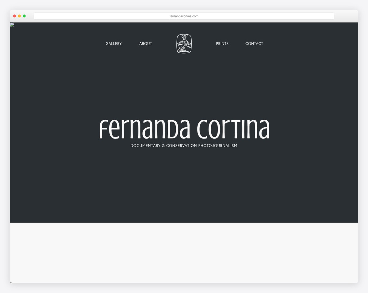
Fernanda Cortina’s documentary photography portfolio takes a bold, minimalist approach — her name in a distinctive custom typeface fills the dark charcoal hero, with “Documentary & Conservation Photojournalism” as the subtitle. The hand-drawn logo icon adds an artisanal touch.
The navigation (Gallery, About, Prints, Contact) is centered around the logo, keeping the focus entirely on the work. The dark, moody palette signals seriousness and artistry befitting a conservation photojournalist.
What stands out: A dark, typography-focused hero can create intrigue and draw visitors deeper into the portfolio — sometimes less imagery up front means more impact when the work is revealed.
21. Ela House Studio
Built with: Squarespace
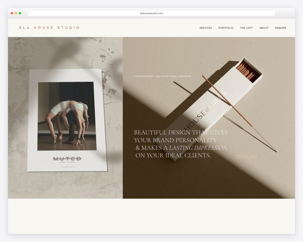
Ela House Studio’s website is a stunning showcase of their branding work. The split hero layout pairs a dramatic editorial photograph (for client “Muted the Label”) with a styled product shot of matchbox packaging for “House of Nines” — both demonstrating their ability to create cohesive brand identities.
The “Beautiful Design That Gives Your Brand Personality & Makes a Lasting Impression on Your Ideal Clients” headline is perfectly positioned over the work itself. The neutral, earthy color palette and elegant spaced-out logo typography reinforce their premium positioning.
What stands out: Showing real client work in the hero section is the most powerful form of social proof for creative studios — it proves the quality before the visitor even scrolls.
Related Posts


Comments (0)