Skip to content
Our free WordPress themes are downloaded over 7 MILLION times. Get them now!
Startup website examples featured image with accent colours sampled from all twenty sites
Colorlib content is free. When you buy through links on our site, we may earn an affiliate commission. Read our affiliate disclosure

20 Best Startup Website Examples 2026

Eight of the eleven software companies here publish a price. One of the four retailers does. None of the five services does.

That is the most useful thing on this page, and it only appears once you stop treating “startup website” as one thing. These twenty sites are three different businesses wearing the same label — software sold by subscription, physical products sold by the box, and services sold by conversation — and a single checklist misjudges most of them. Below, every hero headline is quoted exactly as it appears, so you can judge the writing yourself.

What we looked for

A startup homepage has one job before any other: tell a stranger what this is. Everything else — the price, the sign-up, the logos — only matters once that has happened. So the first screen is read for whether it names a concrete product category, and the headline is recorded word for word rather than graded, because “vague” is a judgement and a count is not.

13/20 customer logos in the first screen 12/20 names a concrete category 12/20 a conversion call to action 10/20 has a login 9/20 pricing reachable 8/20 claims customers in words 6/20 only offers a conversation 5/20 pricing from the first screen 5/20 a free tier or trial 3/20 docs or an API 2/20 no call to action at all

What the first screen actually tells you

What a visitor can establish from the first screen alone, across all twenty sites.

01
13/20 show that somebody else already uses it
02
12/20 say what the product actually is
03
12/20 offer a way to act, not just to enquire
04
10/20 have a login, so the product demonstrably exists
05
5/20 link a price from the first screen

Proof arrives before explanation. More of these sites show you a customer logo (13) than tell you what the product is (12) — which is the wrong way round for anyone arriving cold from a search. And only five link a price from the first screen. The pattern is a homepage written for someone who already knows the company: reassurance for the returning visitor, very little orientation for the new one.

All 20 first screens, side by side

Read in a browser at 1280×860. The headline column is quoted exactly as it appears — judge it yourself.

StartupHeadlineModelThe askPriceLogos
Consolto“AI Chatbot to Video Call With Customers. One Streamlined Flow”softwareBook a demoyesno
AdYouNeed“Powerful Ads Made Effortlessly”softwareGet Startedyesyes
Shadowmap“Global Interactive 3D Sunlight Simulation”softwareLaunch free appyesyes
Lightyear“Power sustainable mobility”serviceenquiry onlynono
Apothékaryno headlineretailORDER NOWnono
MikMak“Growing the World’s Leading Brands, Real-Time”retailenquiry onlynoyes
January“Build better health experiences without building the infrastructure beneath them”softwareenquiry onlyyesyes
Practipago“Optimiza en 90% la gestión del pago a tus proveedores y comisionistas”softwareenquiry onlynoyes
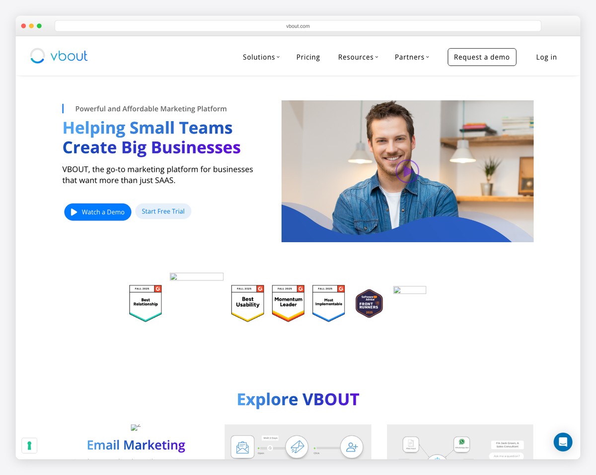
VBOUT“Helping Small Teams Create Big Businesses”softwareRequest a demoyesyes
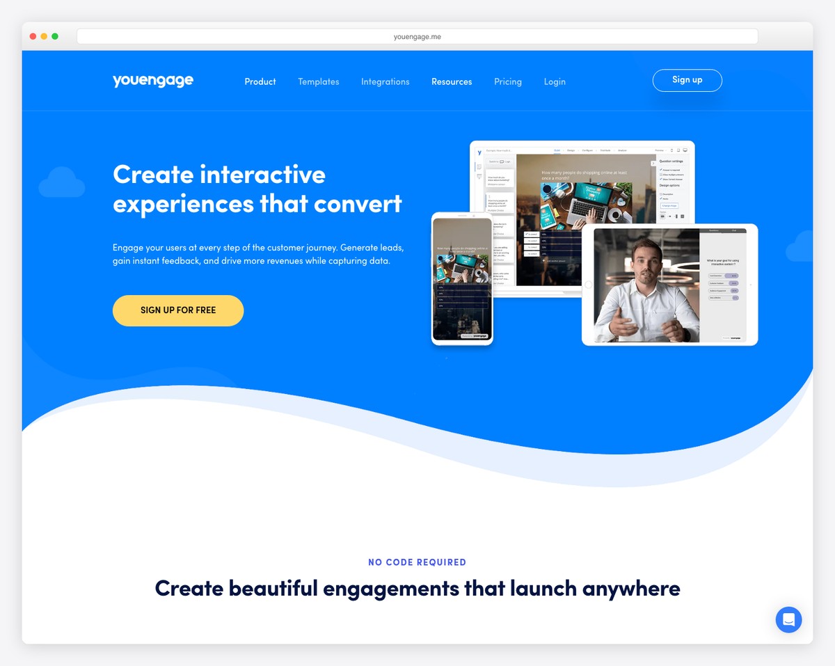
YouEngage“Create interactive experiences that convert”softwareSign upyesyes
Upstate Laundromatno headlineserviceenquiry onlynoyes
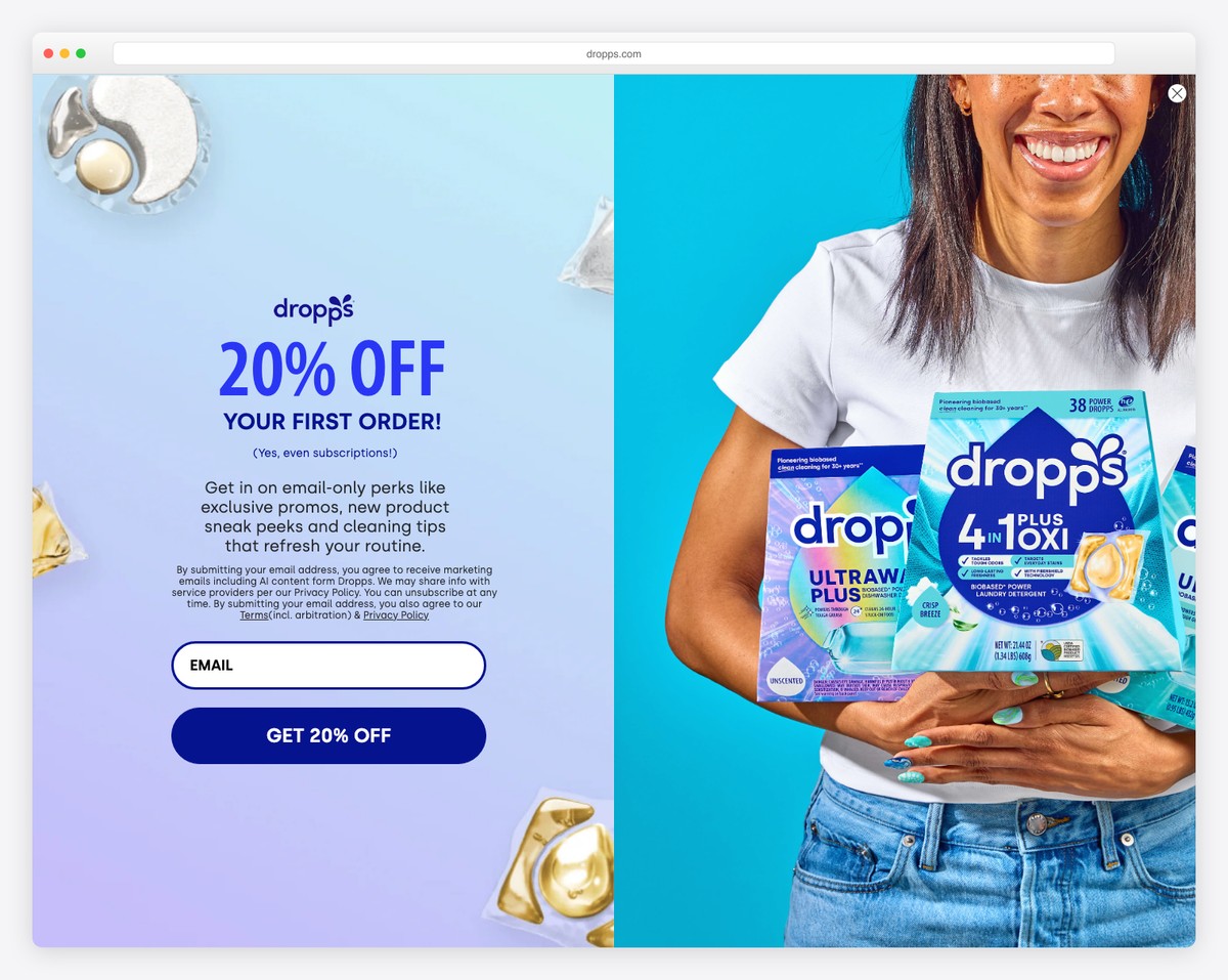
Dropps“Odor Eraser, On The House.”retailSHOP ALLyesyes
Knapsack Creative“Rank Higher. Convert Better. Grow Faster.”softwareGET STARTEDyesyes
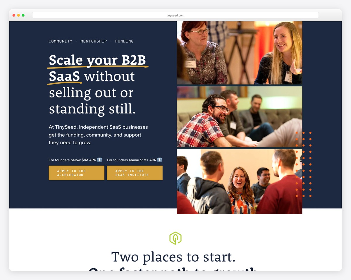
TinySeed“Scale your B2B SaaS without selling out or standing still.”servicenonenono
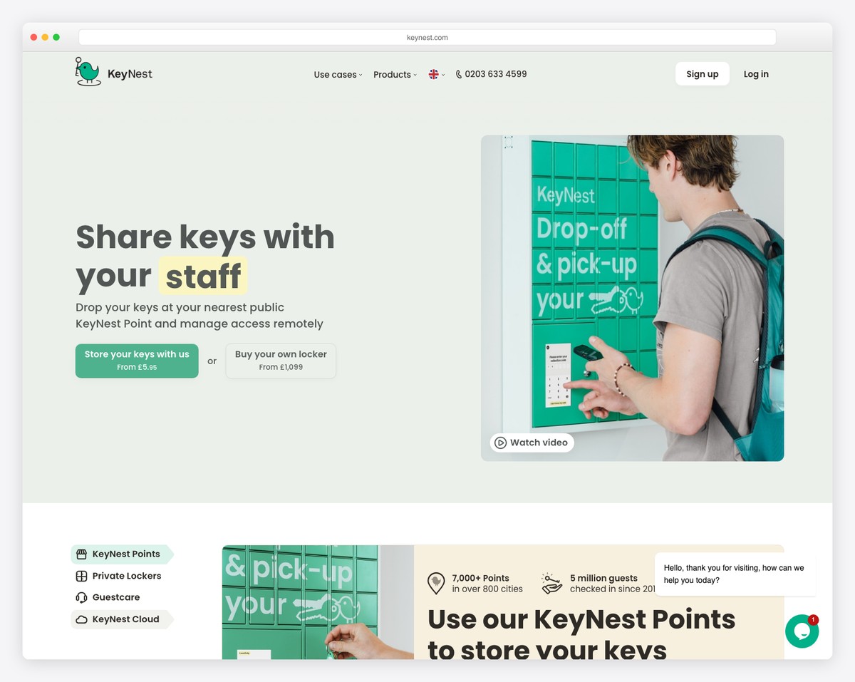
KeyNest“Share keys with your friends”softwareenquiry onlynoyes
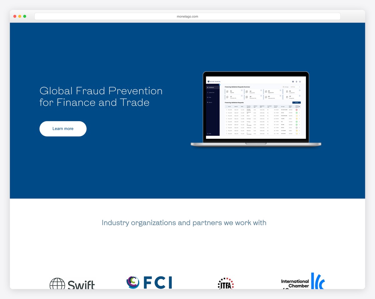
MonetaGo“Digital public infrastructure for finance and trade”softwarenonenoyes
ebulletins“Delivering the hottest industry content directly to your inbox.”serviceSubscribe Nownono
AchieveMore“79% das empresas admitem que seu plano de RV não é eficaz.”serviceDiagnóstico gratuito →nono
Feastablesno headlineretailSHOPnoyes
Passionfroot“The Agentic Marketing OS for the AI era”softwareGet accessyesno

Read the price column against the model column. 8 of the eleven software companies publish a price, 1 of the four retailers, and none of the five services.

Best Startup Website Examples

Table of contents — all twenty startup websites
  1. Consolto
  2. AdYouNeed
  3. Shadowmap
  4. Lightyear
  5. Apothékary
  6. MikMak
  7. January
  8. Practipago
  9. VBOUT
  10. YouEngage
  11. Upstate Laundromat
  12. Dropps
  13. Knapsack Creative
  14. TinySeed
  15. KeyNest
  16. MonetaGo
  17. ebulletins
  18. AchieveMore
  19. Feastables
  20. Passionfroot

1. Consolto

Built with: WordPress

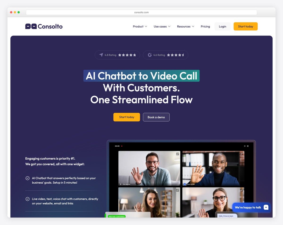
Consolto startup website homepage
Palette#FFFEFE#2D2755#FDAC0D
The first screen“AI Chatbot to Video Call With Customers. One Streamlined Flow”Book a demopricing published

The headline names the product and the problem in the same breath — a chatbot that becomes a video call — and a demo booking sits beside it. Pricing is a click away, which for a tool sold to small teams is the right amount of friction.

What stands out: A headline that describes the mechanism, not the outcome.

2. AdYouNeed

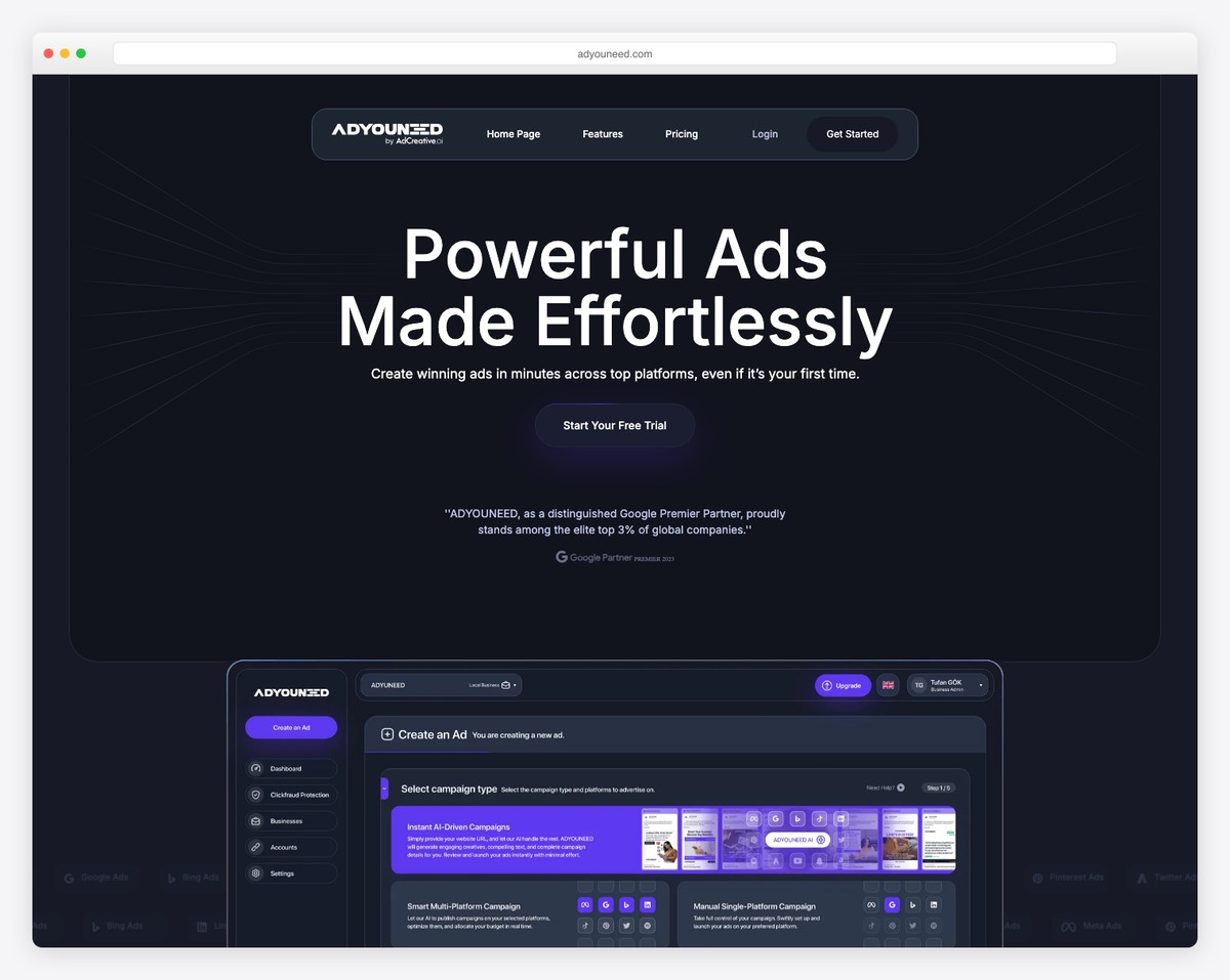
AdYouNeed startup website homepage
Palette#FEFEFE#1D2432#5D3AF1
The first screen“Powerful Ads Made Effortlessly”Get Startedpricing publishedcustomer logos

Four words that promise a result and name no category: you cannot tell from the first screen whether this is software, an agency or a marketplace. The customer logos and a free tier do the reassurance the headline does not.

What stands out: A hero that sells the outcome and leaves the reader guessing what the thing is.

3. Shadowmap

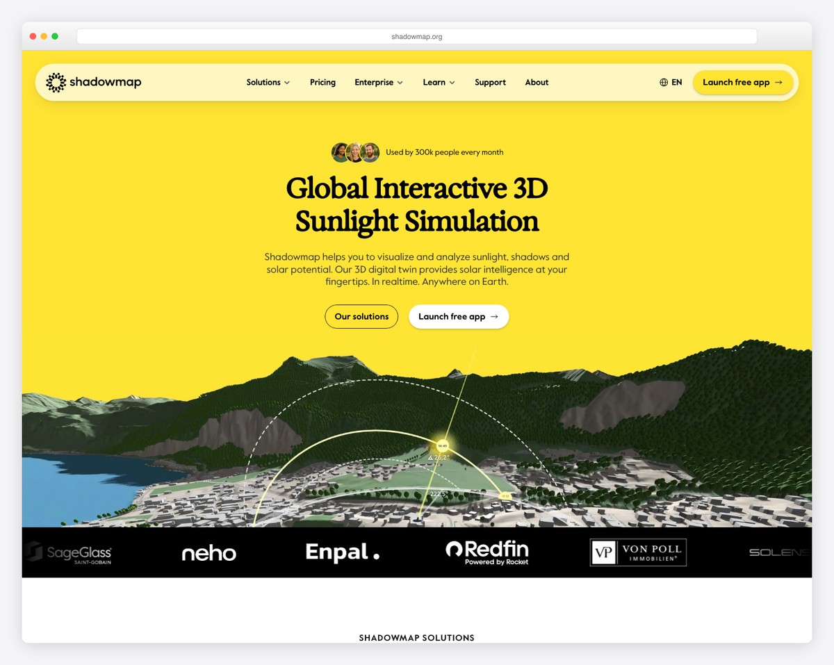
Shadowmap startup website homepage
Palette#000000#FFE433#FEF7C1
The first screen“Global Interactive 3D Sunlight Simulation”Launch free apppricing publishedcustomer logos

The most literal headline on this list — a 3D sunlight simulation, stated as such — with a user count beside it and a free app to launch. When the product is genuinely novel, describing it plainly beats any amount of positioning language.

What stands out: Describing an unfamiliar product in six concrete words.

4. Lightyear

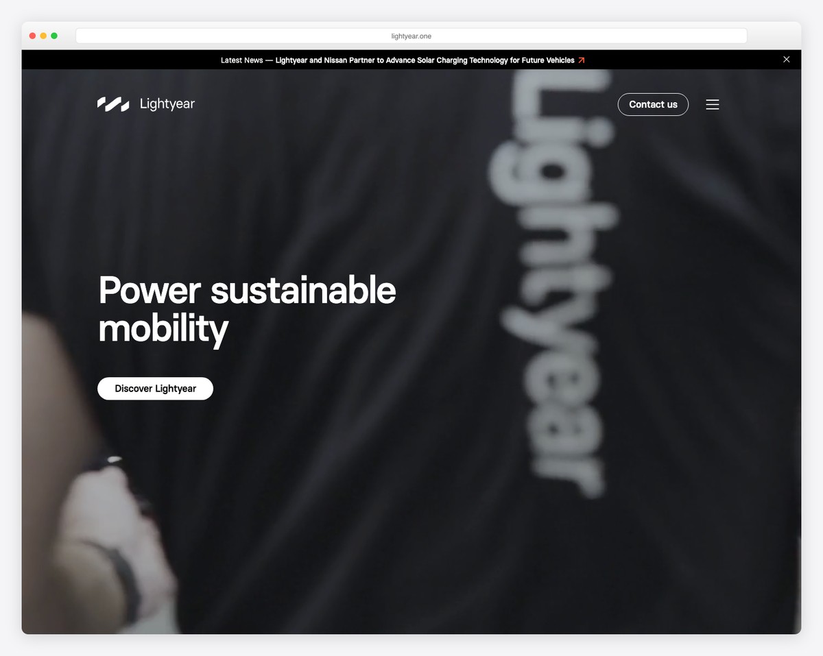
Lightyear startup website homepage
Palette#AAAFB2#7A5D23#010101
The first screen“Power sustainable mobility”only Contact usno price anywhere

Three abstract words over a page with no price, no product category and no proof. This is a hardware company with a real engineering story, and the homepage gives a visitor almost nothing to hold on to before the news feed starts.

What stands out: The clearest example here of abstraction where a description belongs.

5. Apothékary

Built with: Shopify

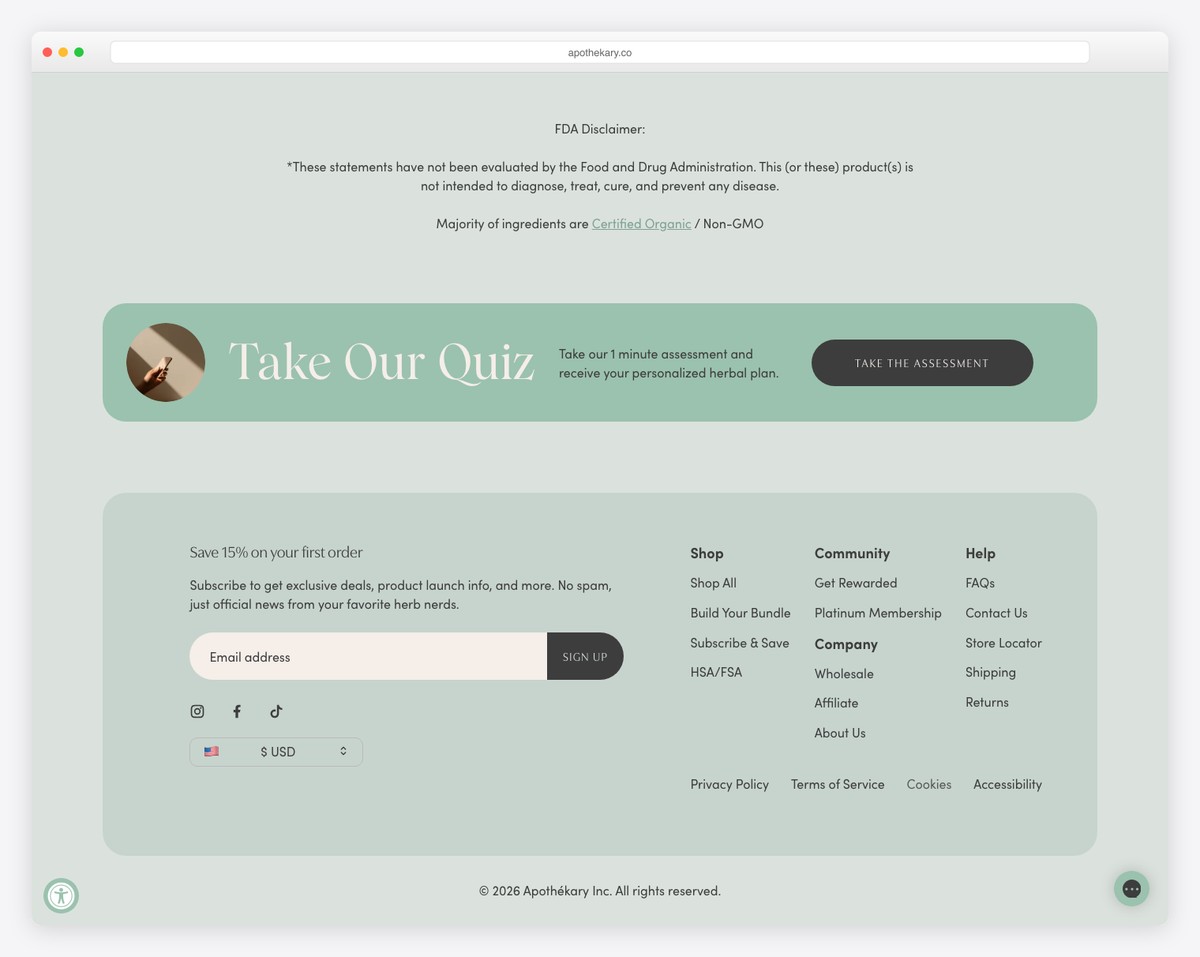
Apothékary startup website homepage
Palette#DBE1DD#9BC2AF#FEFBAD
The first screenno headline at allORDER NOWno price anywhere

No H1 at all: the first screen is a promotional bar, a product grid and a rewards link. That is normal for direct-to-consumer retail, where the products are the argument, and it is worth knowing that the rules change entirely once you are selling objects rather than subscriptions.

What stands out: A retail homepage that dispenses with a headline altogether.

6. MikMak

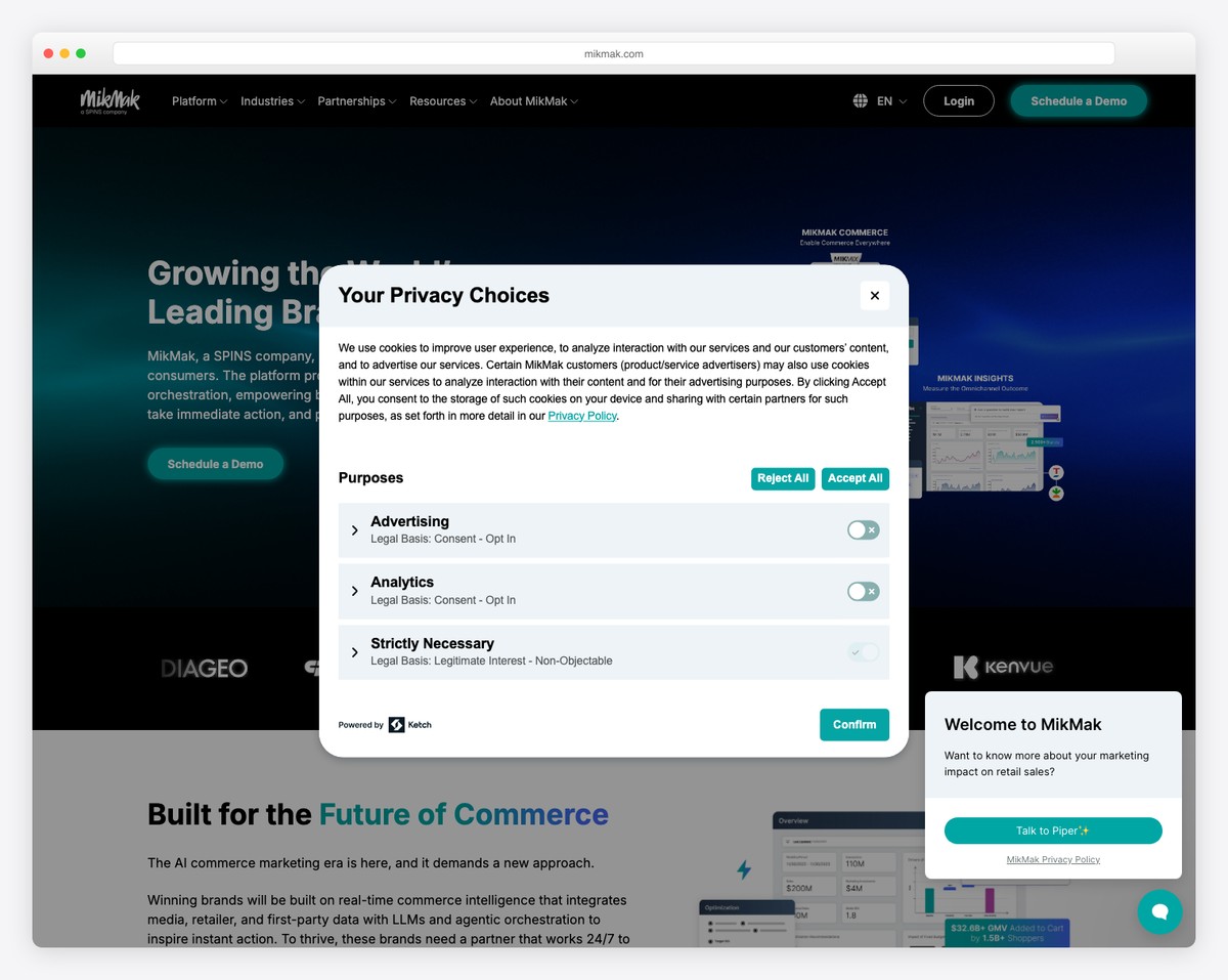
MikMak startup website homepage
Palette#FFFFFF#201559#011344
The first screen“Growing the World’s Leading Brands, Real-Time”only Why MikMakno price anywherecustomer logos

Customer logos carry the first screen and the headline claims the outcome rather than the mechanism. The route in is a demo request, which places this firmly at the enterprise end — nobody signs up for this on a Tuesday evening.

What stands out: Enterprise positioning stated honestly: the only way in is a conversation.

7. January

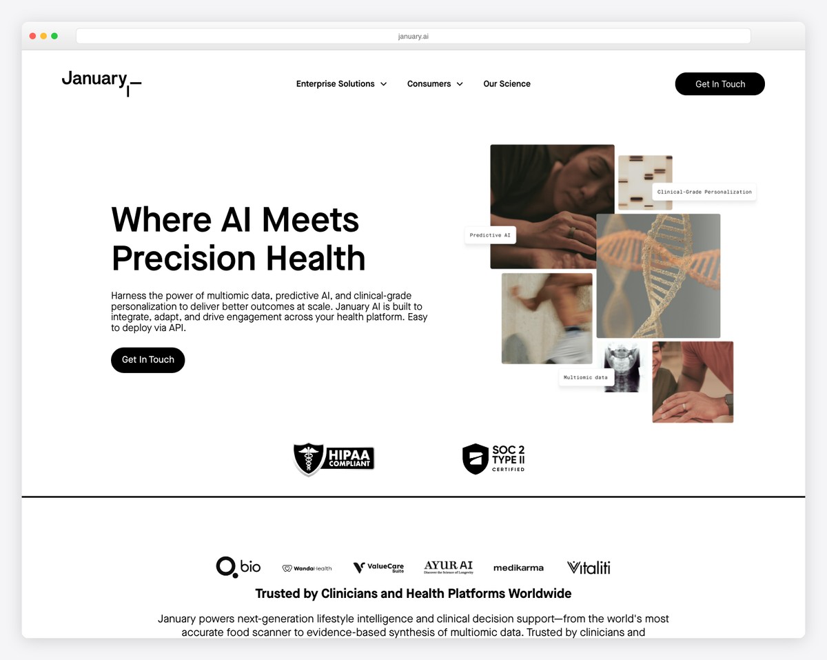
January startup website homepage
Palette#FAF9F4#EAEA6B#1B1E23
The first screen“Build better health experiences without building the infrastructure beneath them”only Contact salespricing publishedcustomer logos

A headline that names the customer’s alternative — building the infrastructure yourself — and offers not to. Docs, pricing and customer proof are all reachable from the first screen, which is the full self-serve pattern done properly.

What stands out: Positioning against the build-it-yourself option, which is what the buyer is really weighing.

8. Practipago

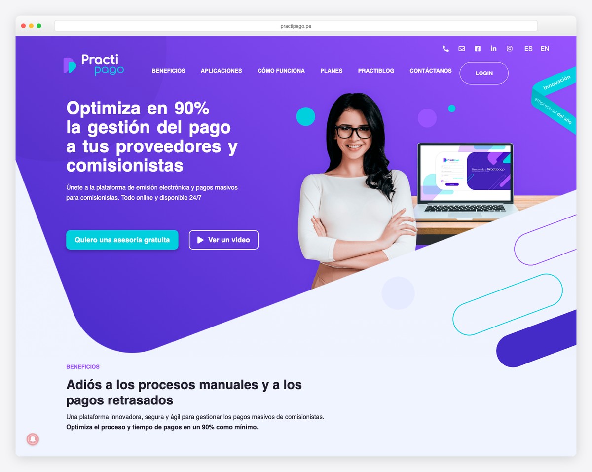
Practipago startup website homepage
Palette#EFF3FE#5C35D5#01CEDC
The first screen“Optimiza en 90% la gestión del pago a tus proveedores y comisionistas”only CONTÁCTANOSno price anywherecustomer logos

The only headline here that leads with a number: a ninety per cent reduction in the time spent paying suppliers. Spanish-language, with the plans page in the navigation and customer proof on the page.

What stands out: Putting the measurable result in the headline, where most put an adjective.

9. VBOUT

Built with: WordPress

VBOUT startup website homepage
Palette#FFFFFF#2A5EC1#E2D5CA
The first screen“Helping Small Teams Create Big Businesses”Request a demopricing publishedcustomer logos

Positioning aimed squarely at the buyer’s identity rather than the product’s function, with pricing, a free tier, docs and customer logos all present. Everything a self-serve product needs is on the page even though the headline says nothing about what it does.

What stands out: Complete self-serve plumbing behind a headline about the customer.

10. YouEngage

YouEngage startup website homepage
Palette#FFFFFF#0080FF#FED96B
The first screen“Create interactive experiences that convert”Sign uppricing publishedcustomer logos

A verb-first headline that names the format and the goal — interactive experiences that convert — with pricing linked and customer logos beneath. For a tool whose output is visual, the demo carries more weight than the copy.

What stands out: Naming both the artefact and its purpose in five words.

11. Upstate Laundromat

Built with: Squarespace
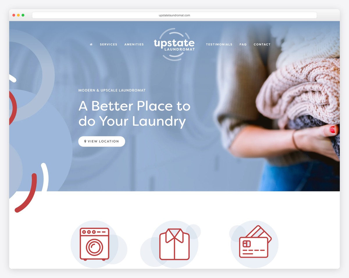
Upstate Laundromat startup website homepage
Palette#FEFEFE#93ABCC#EBD3DB
The first screenno headline at allonly VIEW LOCATIONno price anywherecustomer logos

A laundromat, on a list of startups, and a useful inclusion for it: no H1, a services and amenities navigation, and a location as the primary call to action. When the product is a physical place, the job of the homepage is directions and hours, not positioning.

What stands out: A reminder that a local business homepage has a completely different job.

12. Dropps

Built with: Shopify

Dropps startup website homepage
Palette#FFFFFE#C9DEFD#64E6DE
The first screen“Odor Eraser, On The House.”SHOP ALLpricing publishedcustomer logos

A headline built on a pun and a product benefit, over a retail grid. Pricing is inherent — the products carry it — which is why the retail sites here score so differently from the software ones on the same checklist.

What stands out: Retail pricing, which needs no pricing page because every product shows one.

13. Knapsack Creative

Built with: WordPress

Knapsack Creative startup website homepage
Palette#FEFEFE#253D3F#162949
The first screen“Rank Higher. Convert Better. Grow Faster.”GET STARTEDpricing publishedcustomer logos

Three outcomes in three clipped sentences, with pricing linked and client logos below. For an agency selling to small businesses this is the conventional shape, executed cleanly.

What stands out: The agency triad — rank, convert, grow — delivered without padding.

14. TinySeed

Built with: WordPress

TinySeed startup website homepage
Palette#FEFEFE#1D2941#D4A13C
The first screen“Scale your B2B SaaS without selling out or standing still.”no price anywhere

An accelerator rather than a product, and the headline is aimed at founders deciding whether to raise: scale without selling out. There is no price because the offer is investment, and the call to action is a community rather than a purchase.

What stands out: A funding pitch where the reader is the supplier, not the customer.

15. KeyNest

KeyNest startup website homepage
Palette#EBF0EA#F7F0DE#E3EDEC
The first screen“Share keys with your friends”only Other use casesno price anywherecustomer logos

Six plain words describing a physical service — sharing keys with friends — and an API for partners in the navigation. The gap between the domestic-sounding headline and the developer documentation is the most interesting thing on the page.

What stands out: A consumer headline over a platform business, visible only if you read the nav.

16. MonetaGo

Built with: Squarespace

MonetaGo startup website homepage
Palette#FFFFFF#CCD8E4#02283F
The first screen“Digital public infrastructure for finance and trade”no price anywherecustomer logos

Infrastructure language for an infrastructure product, aimed at banks and trade financiers rather than at anyone who might sign up. No price, no login, and a case-study navigation: the whole site is built for a long procurement cycle.

What stands out: A homepage designed for a procurement committee, not a visitor.

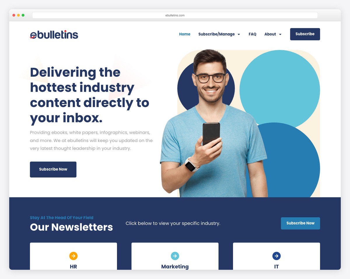
17. ebulletins

ebulletins startup website homepage
Palette#FFFFFF#253863#62C5DA
The first screen“Delivering the hottest industry content directly to your inbox.”Subscribe Nowno price anywhere

The headline states the delivery mechanism and the format list follows immediately — ebooks, white papers, webinars. Subscription is the only action offered, which is consistent for a business whose product is the mailing list itself.

What stands out: One product, one action, no distractions.

18. AchieveMore

Built with: WordPress

AchieveMore startup website homepage
Palette#010202#0C331D#43F186
The first screen“79% das empresas admitem que seu plano de RV não é eficaz.”Diagnóstico gratuito →no price anywhere

Opens with a statistic about the reader’s problem rather than a claim about the product: most companies admit their variable-pay plan does not work. Portuguese-language, with a free diagnostic as the way in.

What stands out: Leading with the prospect’s failure rate instead of the vendor’s promise.

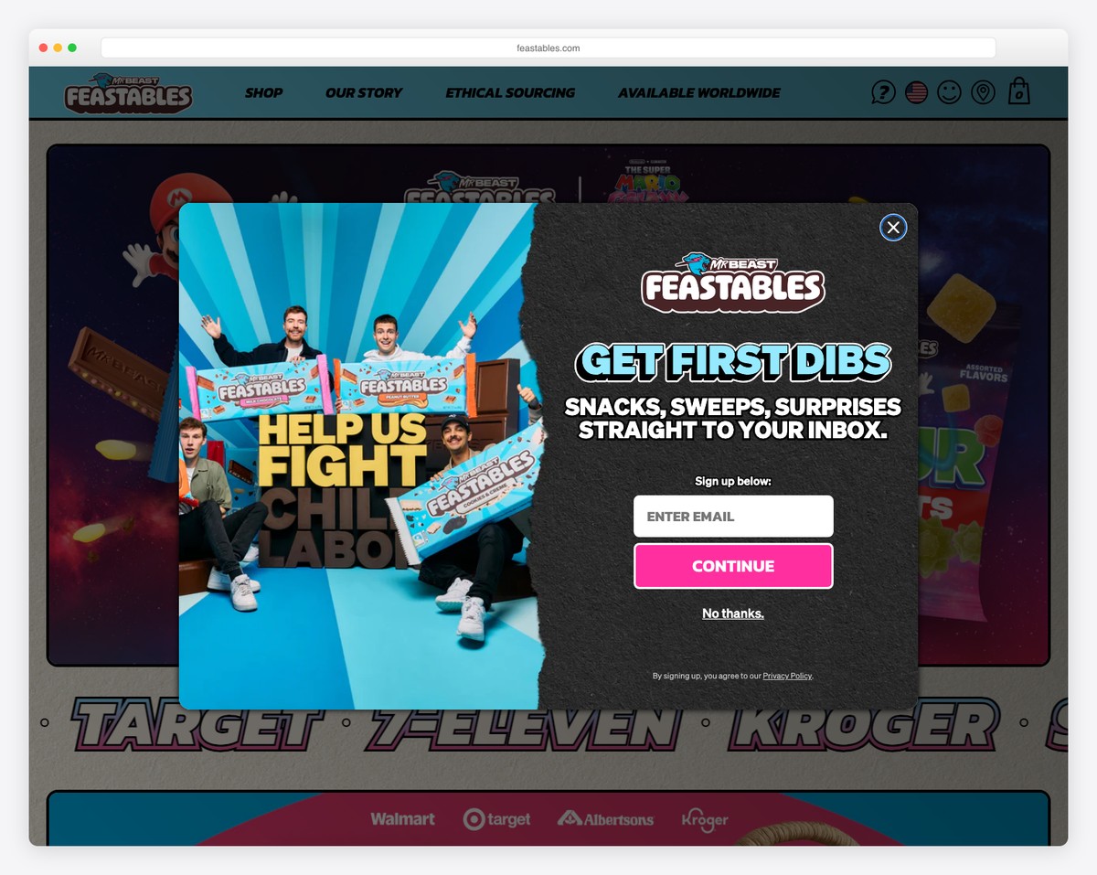
19. Feastables

Built with: Shopify

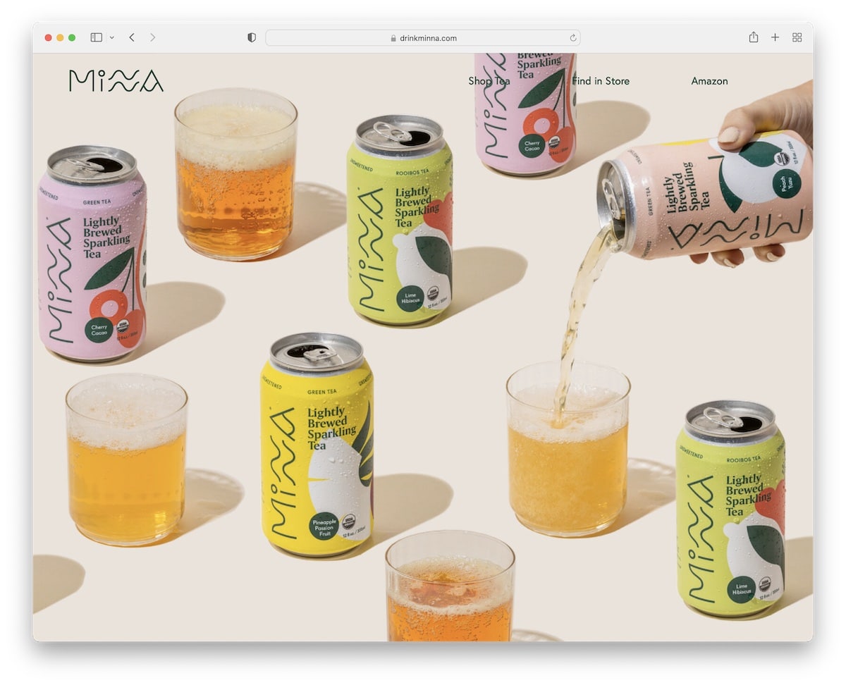
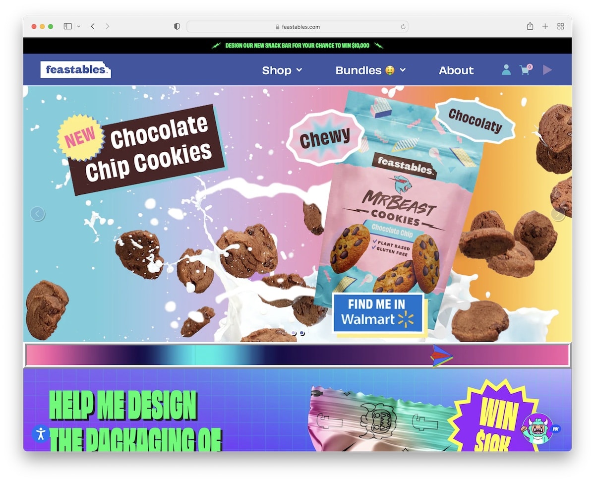
Feastables startup website homepage
Palette#040303#492525#73E2FE
The first screenno headline at allSHOPno price anywherecustomer logos

No H1, a product grid and a notice that online sales are moving to another domain. A celebrity consumer brand run as pure retail, included because it shows how little the software-startup checklist applies once the product is a chocolate bar.

What stands out: A retail homepage where the brand does the work a headline would.

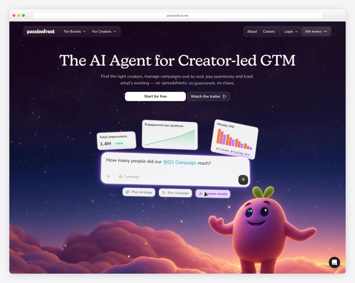
20. Passionfroot

Built with: Webflow

Passionfroot startup website homepage
Palette#F6F3EA#1A1334#23152C
The first screen“The Agentic Marketing OS for the AI era”Get accesspricing published

Category language of the moment — an agentic marketing operating system — over a founder’s quote. Pricing is linked and access is gated behind a request, which is the shape of a product still choosing its customers.

What stands out: A hero built from a founder story rather than a product description.

What the twenty palettes have in common

Every swatch below is sampled from that site’s own screenshot above, not from a brand guideline.

The ground — what the page sits on

16sit on white or near-white
3sit on near-black
1sit on a neutral grey

The accent — where colour actually appears

2use a red or orange accent
15use blue or teal
2use green
8use yellow
2use purple

There is no startup palette, and that is the finding. Unlike the trades — where plumbing is blue, roofing warm and chiropractic deliberately calm — these twenty share no family at all, because they share no industry. What they do share is restraint: almost every one is a near-white or near-black ground with a single accent, and the accent is spent on the one button that matters. When the product is abstract, the page has nothing to be a colour about, so the discipline goes into the type instead.

What a startup website needs

Counted across all twenty sites, then split by business model, because the same row means different things depending on what is being sold.

What we checkedSitesWhat the number says
Customer logos in the first screen13/20The most common element on the page.
Names a concrete product category12/20Eight sites leave a cold visitor guessing.
A conversion call to action12/20Something you can press and act on.
Has a login10/20Quiet proof that a product exists behind the marketing.
Pricing reachable anywhere9/20Eleven publish no price at all. See the split below.
Claims customers in words8/20“Trusted by”, a user count, a named figure.
Only offers a conversation6/20“Contact us” or “Learn more” and nothing stronger.
Pricing from the first screen5/20A quarter.
A free tier or trial5/20Lower than the self-serve reputation suggests.
Docs or an API3/20Only relevant to the technical products, and all three have them.
No call to action at all2/20Two sites offer a visitor nothing to do.

Now split it by what is being sold. Software publishes prices (8 of 11), retail mostly does not need a pricing page because every product carries one (1 of 4), and services publish nothing — zero of 5. That last number is not an oversight. A price on an agency homepage sets an anchor before the scope is known, so the whole category has decided the conversation is worth more than the click. Whether that is right for you depends on whether your buyer is comparing three vendors or three tabs.

And three sites have no headline at all — no H1 in the first screen. All three are direct-to-consumer retailers whose homepage is a product grid, which is a legitimate choice and a reminder that the advice in most startup-website articles quietly assumes you are selling software.

Building a startup website

The platform split follows the business model, not the ambition. The retailers run Shopify, the marketing-led companies run WordPress, Squarespace or Webflow, and several of the software companies serve a hand-built front end in front of the product itself. None of that is a decision you need to agonise over: the homepage is marketing, and every one of these platforms can carry it.

Spend the effort on the sentence instead. The single measurable difference between the strongest and weakest pages here is whether the first screen names what the product is. “Global interactive 3D sunlight simulation” and “AI chatbot to video call with customers” can be understood by a stranger in one read. “Power sustainable mobility” and “Powerful ads made effortlessly” cannot — they describe an effect and leave the category unstated.

For the build itself our website builder comparison covers the hosted options, and marketing agency website examples measures the services end of the same spectrum in more depth.

Startup website questions, answered

What should a startup website include?

Before anything else, a sentence that tells a stranger what the product is. Only 12 of these twenty sites manage it in the first screen, and it is the difference between a visitor who understands you and one who leaves.

After that, in the order these sites actually prioritise them: proof that somebody else uses it (13 of 20), something to press (12), a login if there is a product (10), and a price (9).

Should a startup show pricing on its website?

It depends entirely on what you sell, and the split here is stark: 8 of the eleven software companies publish a price, and none of the five service businesses does.

For self-serve software, hiding the price mostly costs you the visitor who was ready to buy. For a service where scope drives cost, a published number anchors a negotiation before anyone understands the work — which is why that whole category has chosen the conversation instead.

What makes a good startup homepage headline?

Naming the thing. Compare two from this list: “Global Interactive 3D Sunlight Simulation” tells you exactly what you are looking at, while “Power sustainable mobility” could belong to a battery maker, a bus operator or a policy institute.

12 of 20 name a concrete category in the first screen. The strongest of the rest earn it a different way — one opens with the statistic that most companies admit their variable-pay plan fails, which is a problem the reader recognises even before the product is named.

Do startup websites need customer logos?

They are the single most common element here: 13 of 20 put customer logos in the first screen, more than describe the product itself.

That ordering is worth questioning. Logos reassure a visitor who already knows what you do; they do nothing for one who does not. If you only have room for one, describe the product and put the logos immediately beneath.

What colours should a startup website use?

There is no startup palette. Unlike a trade — plumbing is blue, roofing runs warm — these twenty share no colour family, because they share no industry.

What they do share is restraint: a near-white or near-black ground with one accent, spent on the button that matters. When the product is abstract there is nothing for the palette to be about, so the discipline moves into the typography instead.

How we chose these

1

Opened every site

Each one loaded in a real browser at 1280×860 and judged from the live page, not from an old screenshot in our media library.

20 checked · 20 re-captured

2

Measured the first screen

Phone links, licence wording, service area, gallery access and every form with its field count — read from the region above the fold, because a number in the footer is not a number a visitor sees.

20 sites · 6 shared criteria

3

Checked the machine against the screenshot

Recorded every headline verbatim rather than grading it. A first attempt to score “vague language” by keyword found none at all — real vagueness does not use the words you expect — so the judgement is left to the reader and only the countable part is counted.

20 headlines quoted, not rated

4

Sampled the colours from the captures

Palettes are quantised from each site’s own screenshot and then curated, so the swatches describe the page you can see rather than a published brand palette.

20 palettes · sampled, not quoted

Twenty companies, three business models, one label. Every site was opened in a browser at 1280×860 and the first screen read as a visitor sees it; headlines are quoted verbatim rather than graded, because whether a sentence is vague is a judgement and this page only counts what can be counted. One entry from the previous version of this list was removed: it was not a startup website but an affiliate link to a website builder.

Was this article helpful?
YesNo

Rok is a professional content creator, WordPress developer and enthusiastic marketer who spends most of his day behind the screen, working on ULTIDA, client projects and listening to black metal. But he never misses a daily workout to get the blood flow going.

Comments (0)

Leave a Reply

Your email address will not be published. Required fields are marked *

Back To Top

Download this template

Enter your email to get the free download link. We'll also send you occasional updates about new templates.

If you wish to withdraw your consent and stop hearing from us, simply click the unsubscribe link at the bottom of every email we send or contact us at [email protected]. We value and respect your personal data and privacy. To view our privacy policy, please visit our website. By submitting this form, you agree that we may process your information in accordance with these terms.