
29 Best Car Dealer Website Examples 2026
We opened a car on 23 of these twenty-nine dealer sites. Every single one showed a price. Only 7 showed a monthly payment, and just 10 published the VIN.
Roundups of dealer websites describe the hero slider and move on. Nobody opens a car. So we walked all twenty-nine sites the way a buyer does — homepage, then the stock list, then an actual vehicle page — and the useful finding is not that dealers hide prices. They do not: “call for price” is effectively dead. It is what happens after the price that separates these sites.
What we looked for
A dealer website is a search box over a stock list, so it gets measured on different things than a trade or a services site. Nobody needs a licence number here; they need to find the car, see what it costs, and know it is a real car sitting on a real forecourt. The homepage checks are below; the vehicle page is measured separately, because that is where the sale is won or lost.
What is actually on the vehicle page
These are the 23 sites whose vehicle pages we could open, and each rung is a question a buyer asks in order. six sites are excluded rather than scored zero — their inventory could not be walked automatically, and a failed read is not a finding.
They all price the car. Far fewer describe it, and hardly any prove it. Mileage appears on 13 of 23 and the VIN on 10 — which matters, because the VIN is what turns “a silver estate” into a specific vehicle a buyer can check independently. Only 7 show a monthly figure despite most cars being bought on finance, and exactly one links a history report. The gap between pricing a car and evidencing it is the widest opportunity on this list.
Every vehicle page we opened, side by side
Read in a browser at 1280×860, walked from the homepage through the stock list to a single vehicle, then checked against a screenshot of each page. 6 sites whose inventory could not be walked automatically are listed at the foot and excluded from the counts.
| Dealer | Price | Monthly | VIN | Mileage | Photos | Platform |
|---|---|---|---|---|---|---|
| Fletcher Jones Motorcars | $45,520 | yes | yes | yes | 61 | Dealer Inspire, DealerSocket / DealerFire |
| Arnold Clark | yes | yes | no | yes | 19 | — |
| Big Motoring World | £1,000 | yes | no | yes | 44 | — |
| Park Place Dealerships | $37,050 | no | no | no | 13 | Dealer.com (Cox), Autotrader |
| Sytner Group | £38,995 | yes | no | yes | 53 | — |
| Rusnak Auto Group | $44,695 | no | yes | no | 13 | Dealer Inspire |
| Ken Garff | $22,460 | no | yes | no | 19 | Dealer Inspire |
| TrustFord | £29,527 | yes | no | no | 111 | — |
| Lexus of Las Vegas | $68,988 | no | yes | no | 18 | Dealer Inspire |
| Marshall Motor Group | £5,700 | no | no | yes | 5 | — |
| Hendrick Automotive | $28,895 | no | no | yes | 0 | Dealer.com (Cox) |
| Mercedes-Benz of Manhattan | $67,178 | no | yes | no | 13 | Dealer Inspire |
| JCT600 | £37,750 | no | no | yes | 21 | — |
| South Infiniti | $60,235 | no | yes | yes | 15 | Dealer Inspire |
| Vertu Motors | £2,483 | yes | no | yes | 7 | — |
| Jim Ellis Automotive | $58,454 | no | no | yes | 13 | Dealer.com (Cox), Dealer Inspire |
| Stratstone | £8,690 | no | no | yes | 3 | — |
| Volvo Cars Manhattan | $57,985 | no | no | no | 3 | Dealer.com (Cox) |
| Braman Miami | $100,025 | no | yes | no | 15 | Dealer Inspire |
| Bill Luke | $55,065 | yes | yes | no | 19 | Dealer.com (Cox), Dealer Inspire |
| Evans Halshaw | £3,310 | no | no | yes | 3 | — |
| Findlay Automotive | $51,935 | no | yes | yes | 132 | — |
| Galpin Motors | $25,931 | no | yes | no | 2 | — |
| Sewell Automotive | vehicle page could not be reached automatically — excluded rather than scored zero | |||||
| Prestige Imports | vehicle page could not be reached automatically — excluded rather than scored zero | |||||
| Swansway Motor Group | vehicle page could not be reached automatically — excluded rather than scored zero | |||||
| Hendy Group | vehicle page could not be reached automatically — excluded rather than scored zero | |||||
| Peter Warren Automotive | vehicle page could not be reached automatically — excluded rather than scored zero | |||||
| Ancira Auto Group | vehicle page could not be reached automatically — excluded rather than scored zero | |||||
Photography is where the field diverges most. The same table runs from a couple of images to 132 on a single car, with a median of 15. That is not a quality gap so much as a business-model one: a used car is unique and has to be shown, while a new car has manufacturer imagery and needs its price explained instead.
Best Car Dealer Website Examples
Table of contents — all twenty-nine car dealer websites
- Fletcher Jones Motorcars
- Arnold Clark
- Sewell Automotive
- Big Motoring World
- Park Place Dealerships
- Sytner Group
- Rusnak Auto Group
- Ken Garff
- TrustFord
- Lexus of Las Vegas
- Marshall Motor Group
- Hendrick Automotive
- Mercedes-Benz of Manhattan
- JCT600
- South Infiniti
- Vertu Motors
- Jim Ellis Automotive
- Stratstone
- Prestige Imports
- Volvo Cars Manhattan
- Swansway Motor Group
- Hendy Group
- Braman Miami
- Bill Luke
- Peter Warren Automotive
- Evans Halshaw
- Findlay Automotive
- Galpin Motors
- Ancira Auto Group
1. Fletcher Jones Motorcars
Website platform: Dealer Inspire
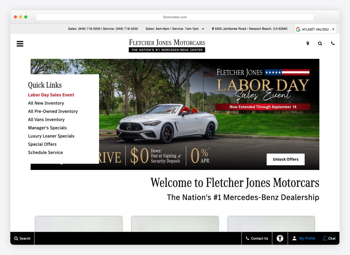
Sixty-one photographs of a single Mercedes, a monthly payment beside the cash price, and a VIN and mileage on the same screen — this is the most complete vehicle page on the list. The homepage is otherwise almost colourless: white, black and one line of gold, letting the cars supply every other hue.
What stands out: It answers the four questions a buyer has — what is it, what does it cost, what will it cost per month, and which exact car is it — without a second click.
2. Arnold Clark
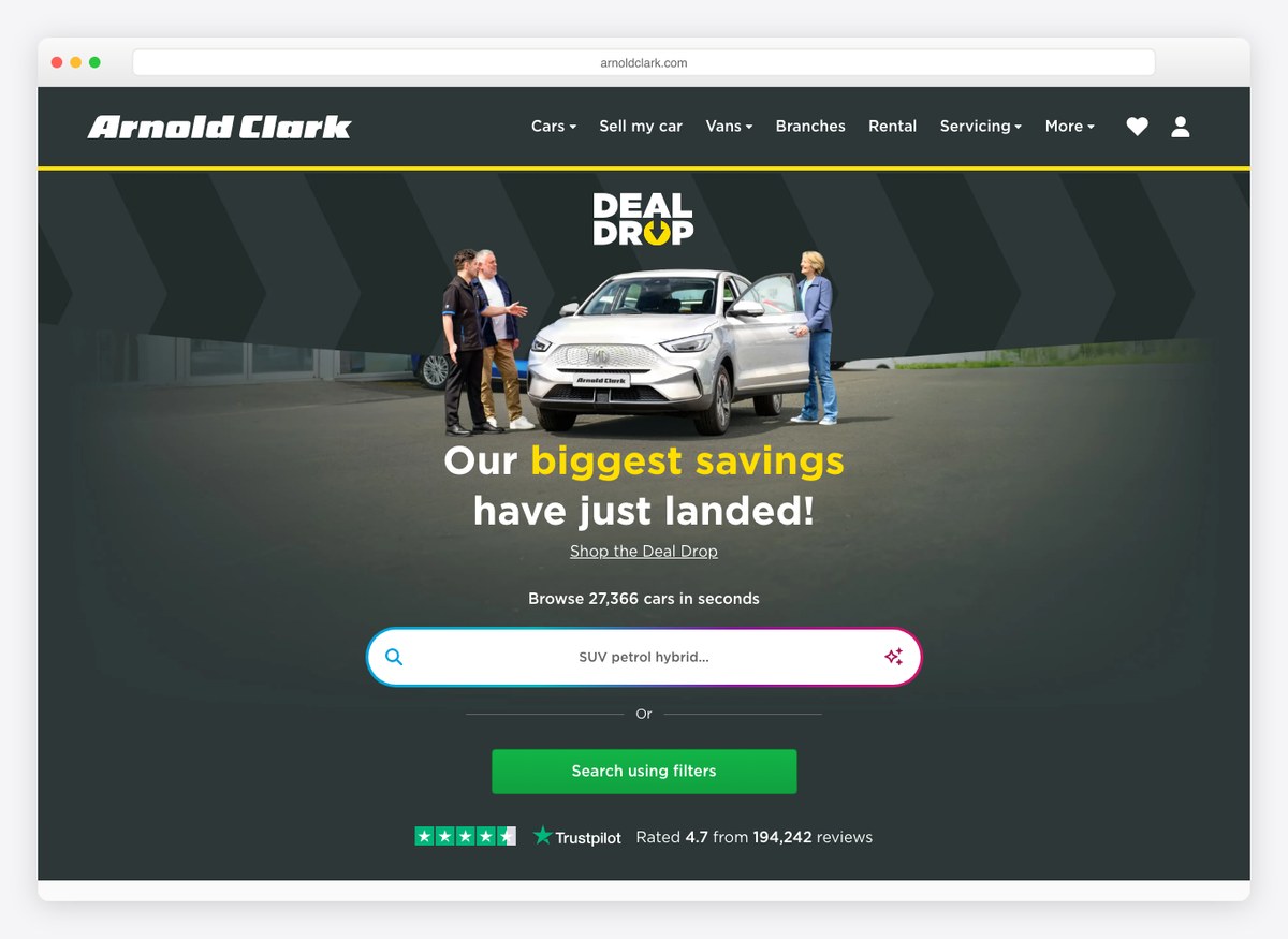
The largest stock figure on the list is stated as an invitation rather than a boast: browse twenty-seven thousand cars. The listing pages carry a cash price and a monthly figure together, and a deposit and reservation fee are named up front instead of appearing at checkout.
What stands out: Naming the reservation deposit on the vehicle page, before anybody has committed to anything.
3. Sewell Automotive
Website platform: DealerOn, Dealer Inspire
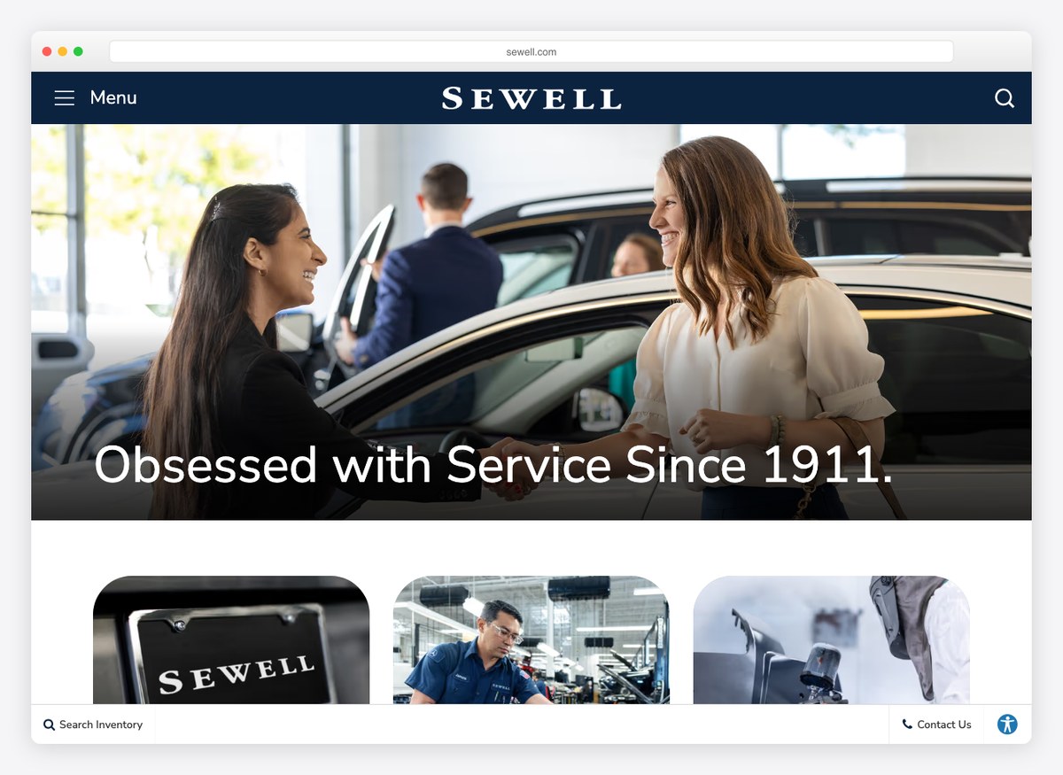
A dealership that has been trading since 1911 and leads with that, not with stock. The homepage sells the relationship rather than the inventory — the word it uses about itself is “obsessed” — and the search sits behind a link rather than in the opening screen.
What stands out: Leading on a century of trading in a category where everyone else leads on price.
4. Big Motoring World
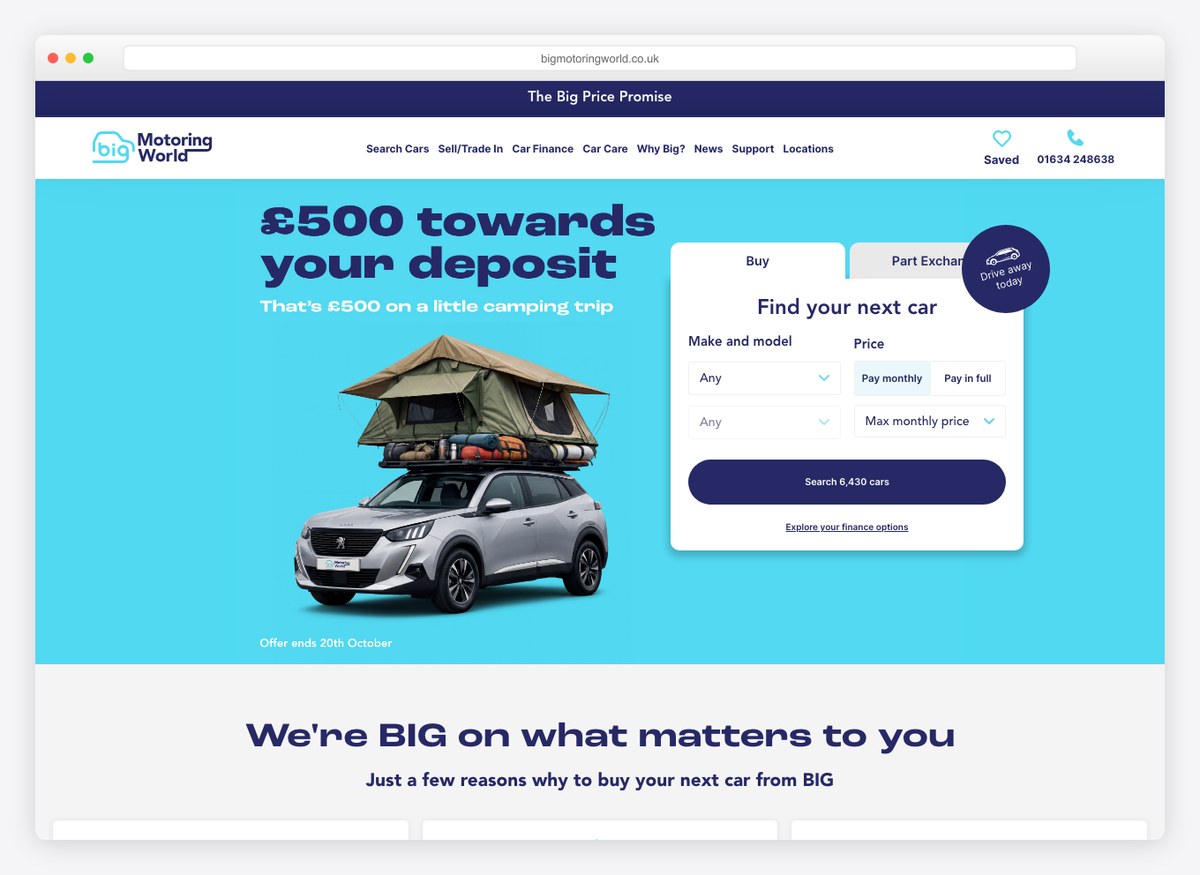
A cyan that nothing else here would attempt, filling a third of the opening screen, with the search built into the hero rather than linked from it. The offer is stated as a number — five hundred pounds toward a deposit — instead of as an adjective.
What stands out: The brightest palette on this list, aimed squarely at the value end of the market.
5. Park Place Dealerships
Website platform: Dealer.com, Autotrader
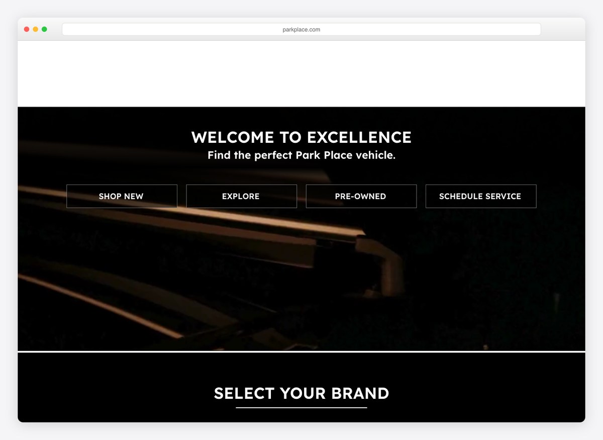
Sixty-eight per cent of the opening screen is black, and there is no chromatic accent anywhere on it — the only site here of which that is true. Four words of navigation, four brands, and a photograph. It is the most confident page on the list and the least informative.
What stands out: A deliberate refusal to sell: no price, no stock count, no phone number in the first screen.
6. Sytner Group
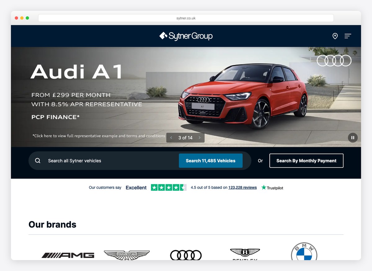
A specific car with a specific monthly figure as the hero — an Audi A1 from a named price per month at a stated APR — rather than a generic showroom shot. The stock count sits inside the search button, so the scale of the operation is stated by the control you are about to press.
What stands out: Putting the finance representative example in the hero, where the regulator would normally push it to the footnotes.
7. Rusnak Auto Group
Website platform: Dealer Inspire
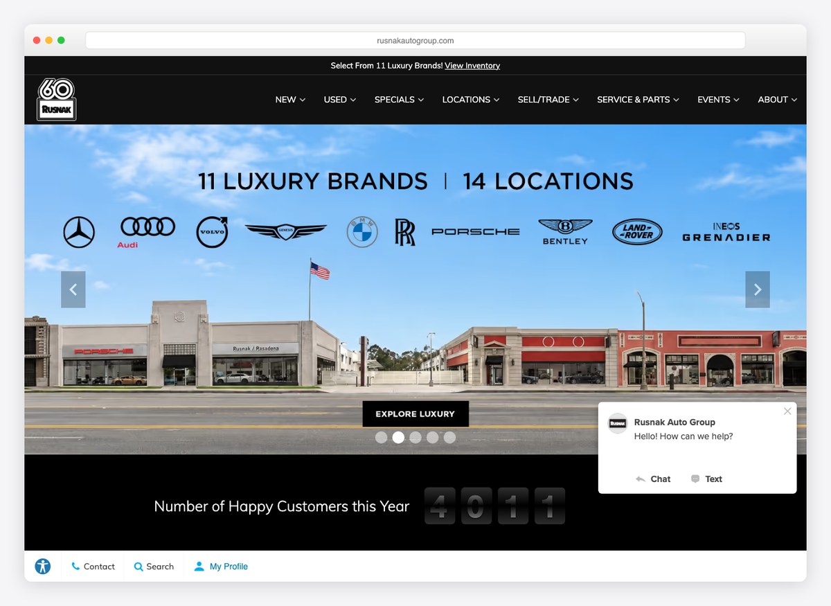
The vehicle page prices the car three times over: sticker, then the dealer discount, then the price this dealership will actually take. Showing the subtraction rather than just the result is unusual, and it is more persuasive than either number on its own.
What stands out: Publishing the discount arithmetic instead of only the final figure.
8. Ken Garff
Website platform: Dealer Inspire
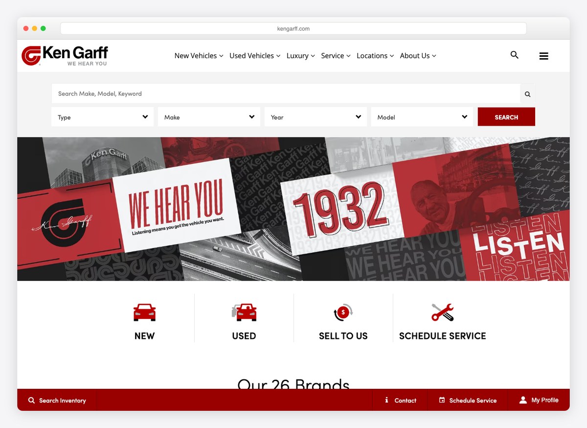
A group site that behaves like a publisher, with news and community stories carrying the same weight as inventory. That is a defensible strategy for a name that has been in the same market for decades, and it means the cars are further from the front door than anywhere else here.
What stands out: Editorial content treated as a first-class part of the site rather than an SEO afterthought.
9. TrustFord
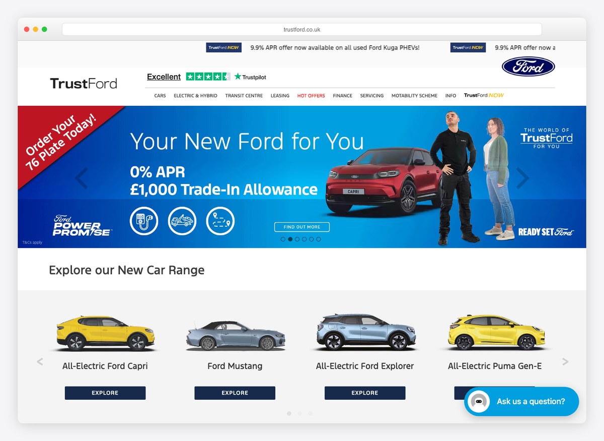
A hundred and eleven photographs of one used Ford, which is more than any other site on this list attempts, alongside a cash price and a monthly figure. For a used car, where every example is genuinely different, that volume of imagery is the closest a website gets to standing on the forecourt.
What stands out: Photographing a used car as thoroughly as a manufacturer photographs a new one.
10. Lexus of Las Vegas
Website platform: Dealer Inspire
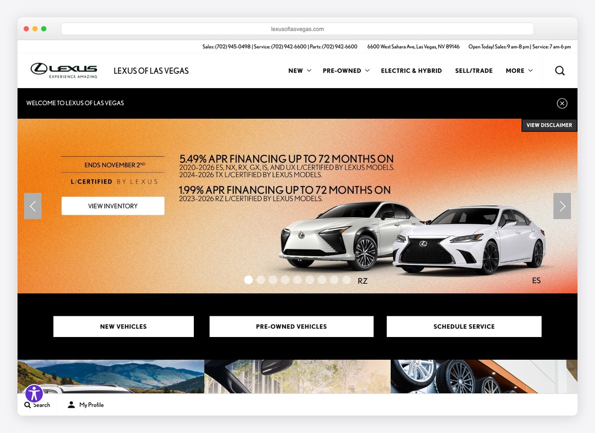
Black, white and a single warm note, with the price built as a running total: sticker, then each add-on, then your price. The tappable phone numbers sit in the first screen, which only nine other sites here manage.
What stands out: An itemised price that adds up in front of you rather than appearing whole.
11. Marshall Motor Group
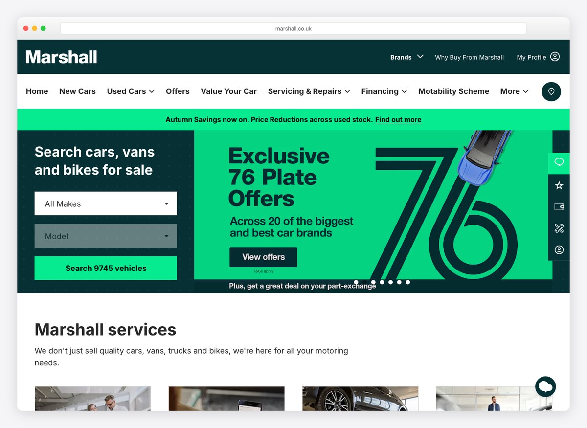
The cash price and the monthly payment are given equal typographic weight, with the discount from the previous price shown beside them. Green is used for one thing only, and the stock figure is written into the search control.
What stands out: Treating the monthly figure as a headline price rather than as small print.
12. Hendrick Automotive
Website platform: Dealer.com
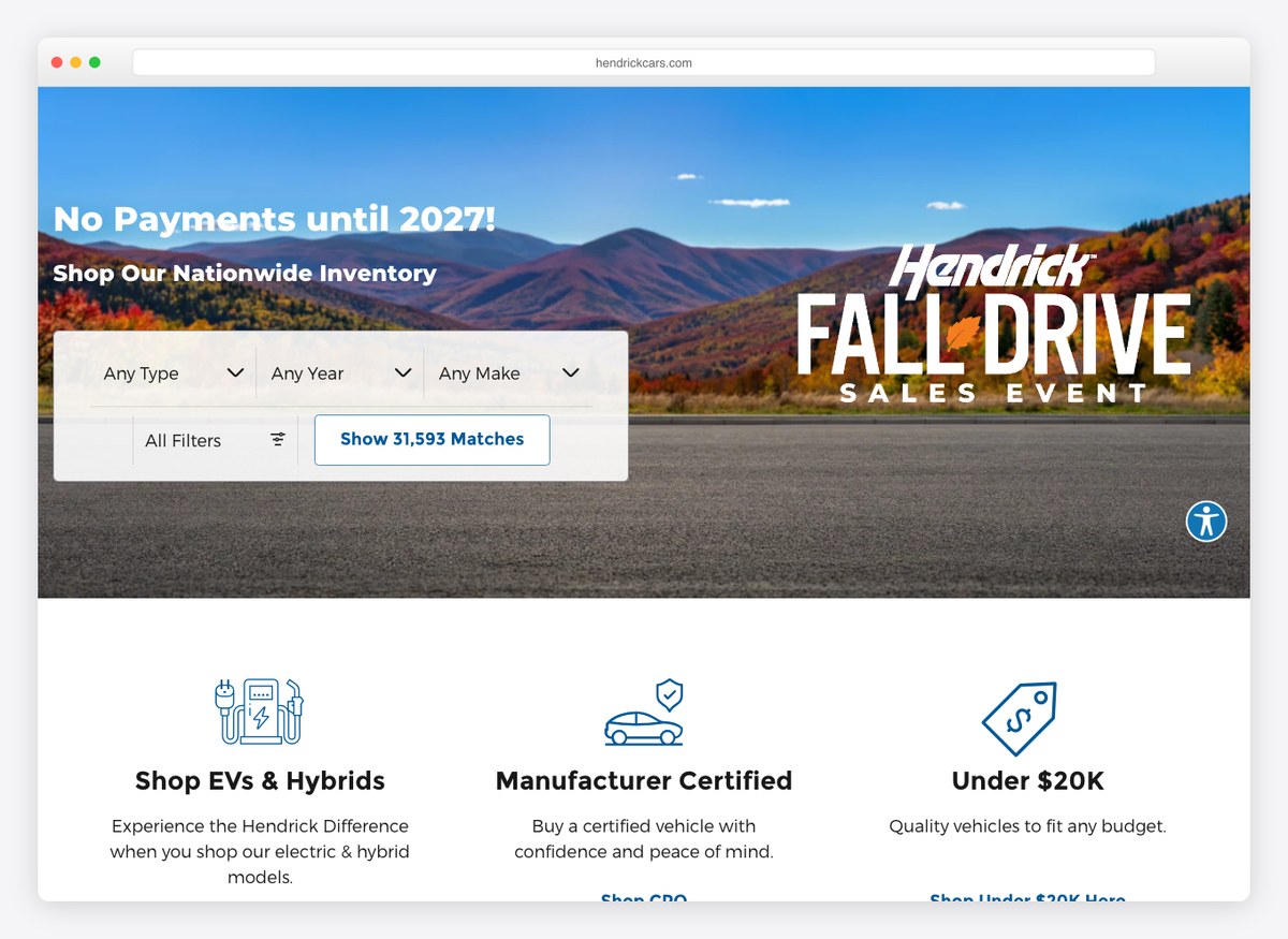
The largest inventory on the list — more than thirty-one thousand vehicles — and the site says so in the filter control itself. The homepage sorts by how people shop rather than by brand: electrified, certified, and everything under twenty thousand dollars.
What stands out: Segmenting the homepage by budget and fuel type instead of by manufacturer.
13. Mercedes-Benz of Manhattan
Website platform: Dealer Inspire
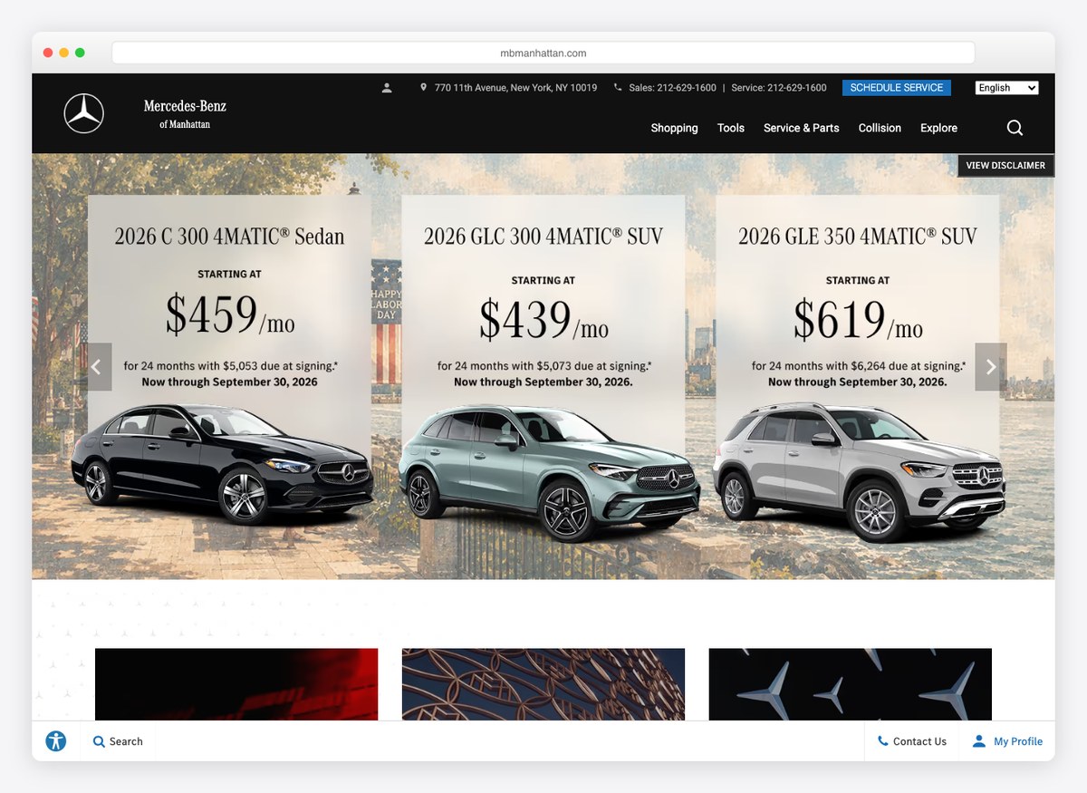
Three cars, three monthly payments, above the fold, with the lease terms stated beneath each. For a metropolitan dealership whose customers are comparing monthly outgoings rather than sticker prices, that is the right number to lead with.
What stands out: The homepage is a price list, not a brochure.
14. JCT600
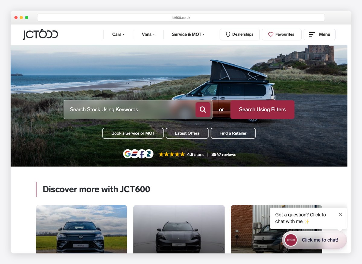
Search by keyword sits ahead of search by filter, which is a bet that people arrive knowing roughly what they want and would rather type it than click through six dropdowns. The palette is unusually warm for the category.
What stands out: A keyword-first search box where the rest of the industry offers dropdowns.
15. South Infiniti
Website platform: Dealer Inspire
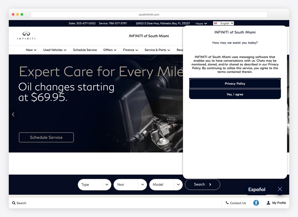
The purchase price is shown after the discounts have been applied, with the sticker crossed through above it, and the phone numbers sit in the top bar rather than the footer. Service pricing is on the homepage — an oil change with a figure attached — which almost nobody else here does.
What stands out: Publishing a service price on the homepage, where the rest of the trade says “contact us”.
16. Vertu Motors
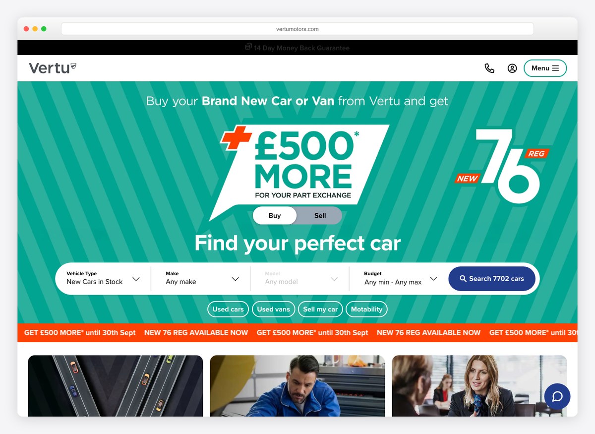
One of only three sites here that puts real make-and-model controls in the first screen rather than a link to a search page. Teal and orange together is a braver combination than anything else on this list, and the offer is a number rather than a claim.
What stands out: Actual search filters in the opening screen, which twenty-six of these twenty-nine do not offer.
17. Jim Ellis Automotive
Website platform: Dealer.com, Dealer Inspire
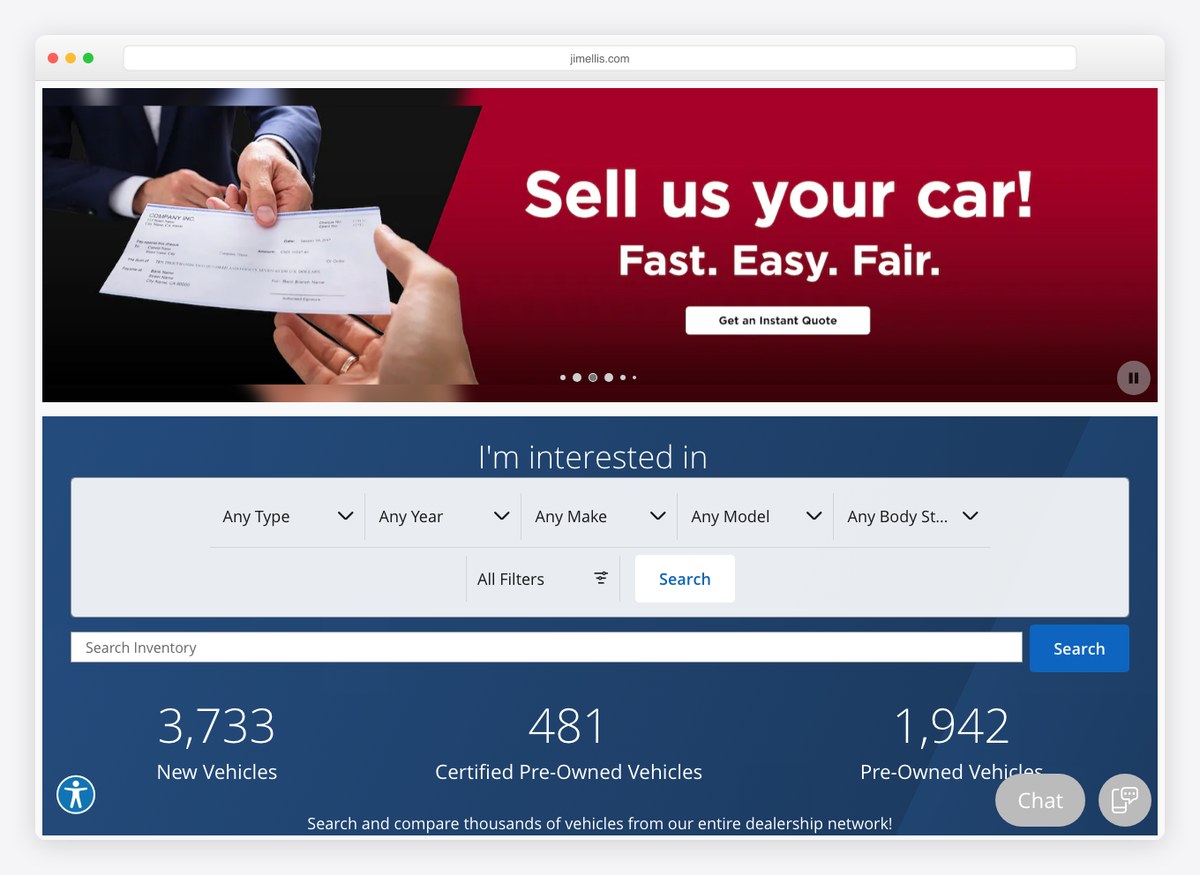
The homepage leads with buying your car rather than selling you one, and the three counters underneath state new, certified and pre-owned stock separately. Splitting the number that way is more useful than a single total, because those are three different shopping trips.
What stands out: Leading with the trade-in, on the theory that the customer with a car to sell is the one worth catching.
18. Stratstone
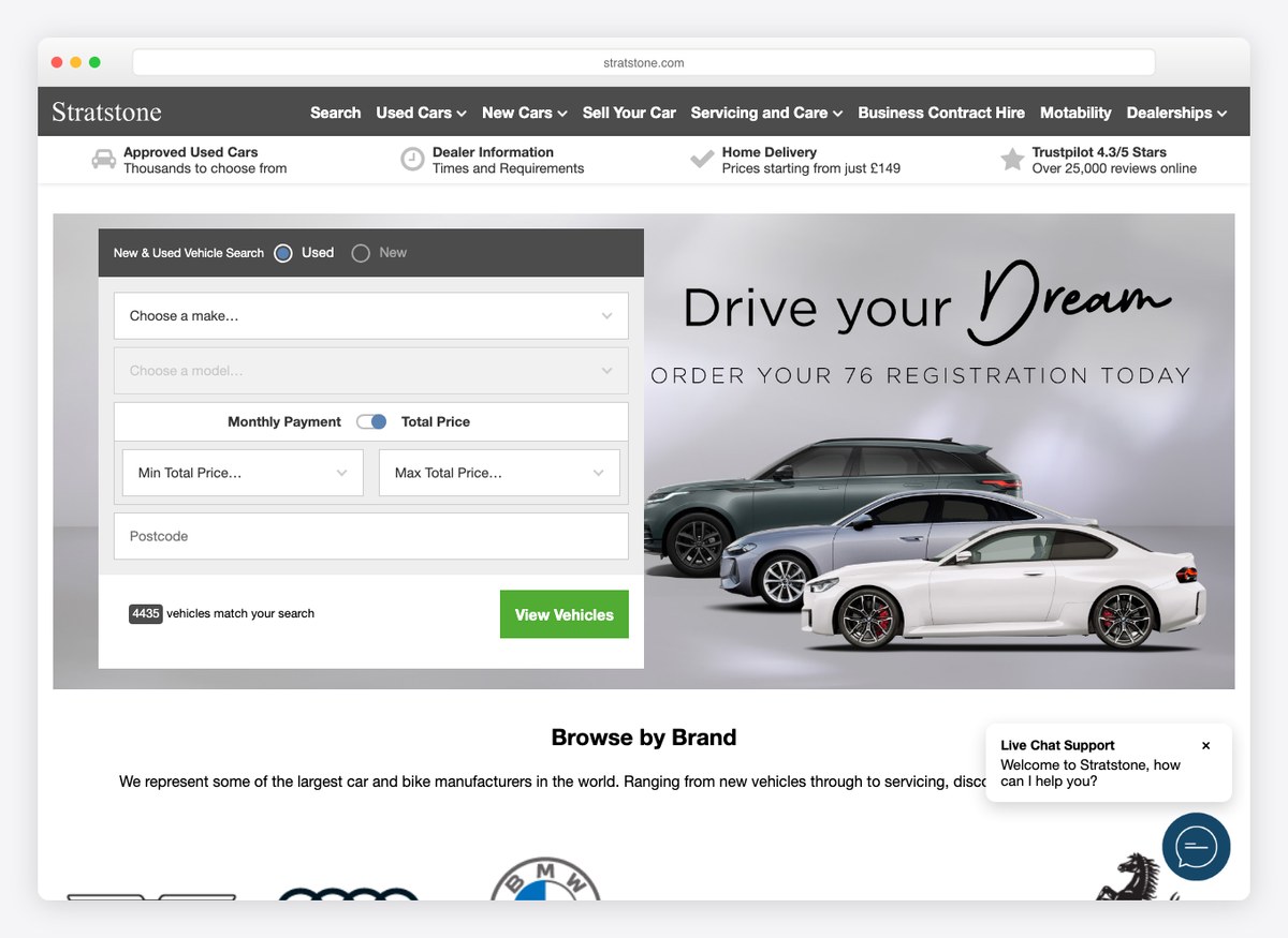
A used Mercedes with a cash price, a mileage figure and a list of what the inspection covered, all in the first screen of the vehicle page. The site is restrained to the point of plainness, which suits a group selling approved used prestige cars.
What stands out: Publishing the inspection checklist beside the price rather than behind a link.
19. Prestige Imports
Website platform: Dealer Inspire
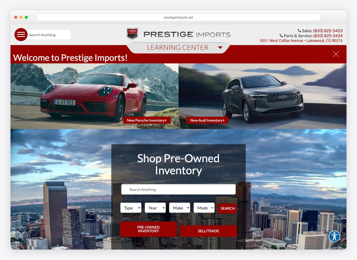
A learning centre sits in the main navigation alongside the inventory, and it is genuine explanatory writing rather than keyword filler. Three real search filters in the opening screen, the most of any site here.
What stands out: The most search controls in the first screen of anyone measured.
20. Volvo Cars Manhattan
Website platform: Dealer.com
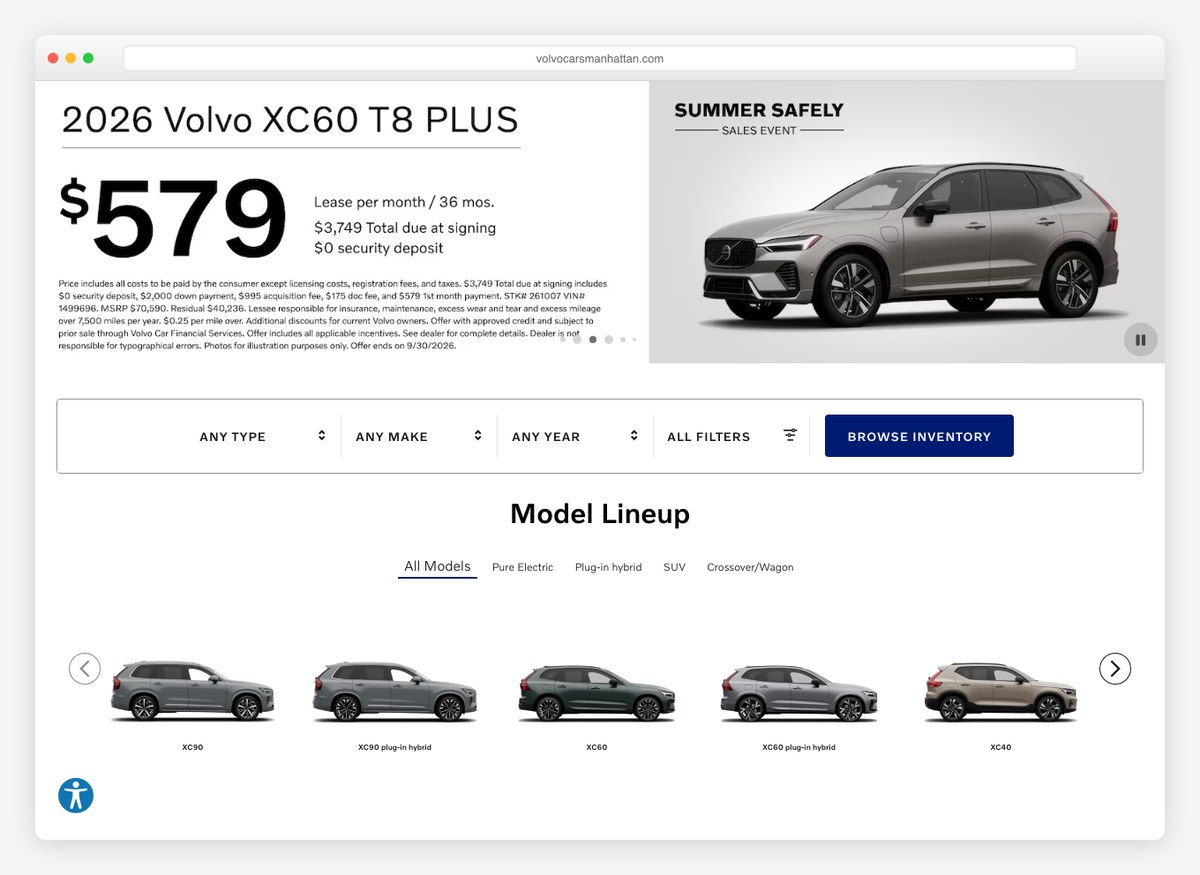
Restrained to the point of austerity: white, near-black, and a single blue. The vehicle page states the sticker, the courtesy-vehicle allowance and the resulting price, which is a more honest sequence than most.
What stands out: A commercial-vehicle allowance shown as a line item on the price.
21. Swansway Motor Group
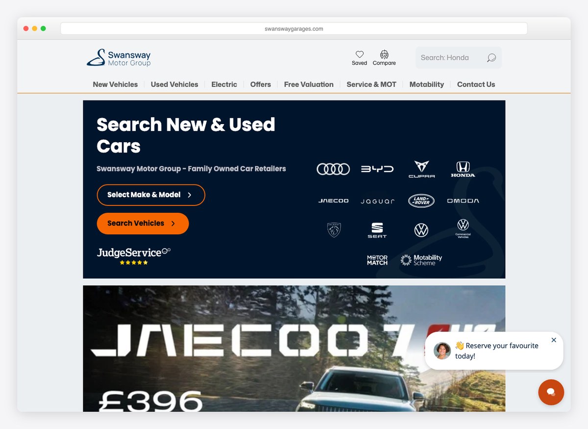
The site is organised around budget before brand — the route in is a price ceiling, not a manufacturer — and the used listings carry forty-four photographs each. Orange against a warm off-white is a friendlier register than the category norm.
What stands out: A homepage entry point built around what you can spend rather than what you like.
22. Hendy Group
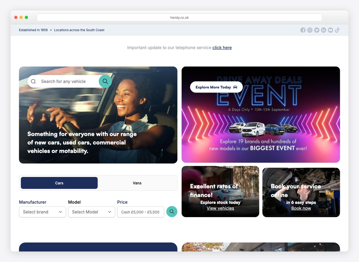
A group site that puts a vehicle finder in the opening screen and keeps the rest of the page unusually quiet. Blue and red are used sparingly against white, and the navigation is short enough to read in one pass.
What stands out: Restraint: a short navigation and one control, where most group sites offer thirty links.
23. Braman Miami
Website platform: Dealer Inspire
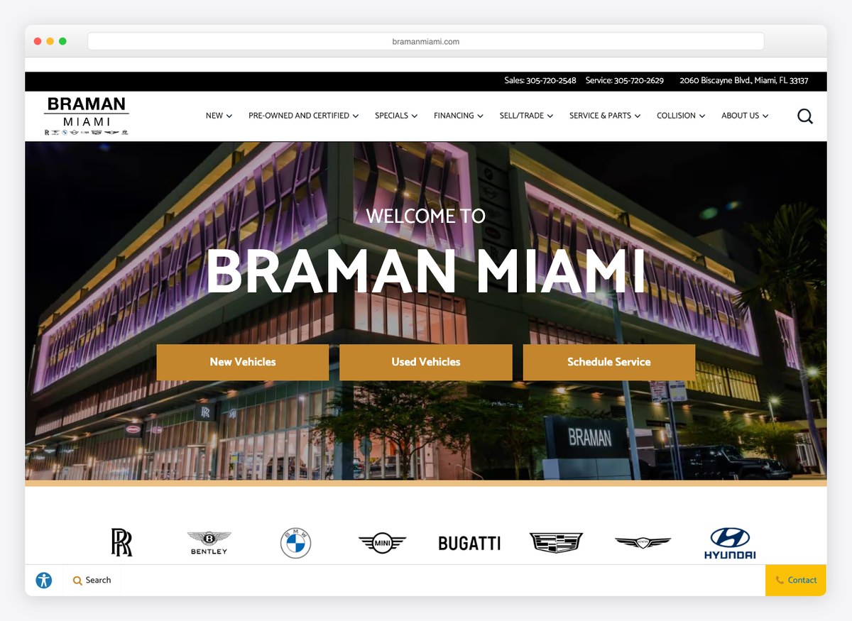
The sticker price is published in full and then a button offers to unlock a better one. That is the clearest example on this list of a pattern worth understanding: nobody hides the price any more, but plenty of dealers keep a second, lower price behind an email address.
What stands out: Two prices — one printed, one behind a form — stated openly enough that you can see the mechanism working.
24. Bill Luke
Website platform: Dealer.com, Dealer Inspire
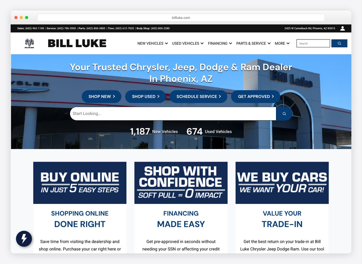
Five tappable phone numbers in the first screen, more than any other site here, and a vehicle page that shows the dealer discount, the manufacturer rebate and the resulting price as separate lines with an estimated monthly figure beneath.
What stands out: Contact treated as the primary call to action rather than the fallback.
25. Peter Warren Automotive
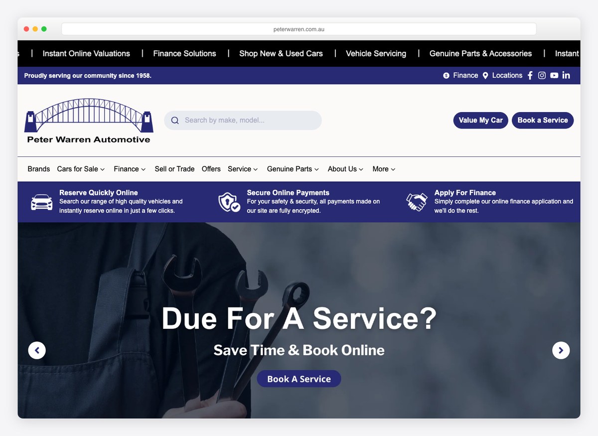
A reservation flow that takes a refundable deposit online and says so plainly, with the amount and the refund terms stated on the same screen. For a market where the deposit is the moment of commitment, putting the number in front of the customer early is the right instinct.
What stands out: A named, refundable deposit rather than a vague “reserve now”.
26. Evans Halshaw
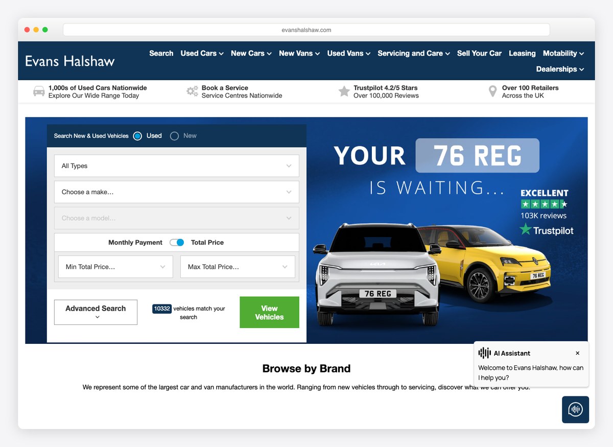
A used hatchback at a four-figure price, with the mileage, the fuel type and the inspection promises all in the first screen. This is the plainest vehicle page on the list and one of the easiest to read.
What stands out: Everything a used-car buyer asks first, answered without scrolling.
27. Findlay Automotive
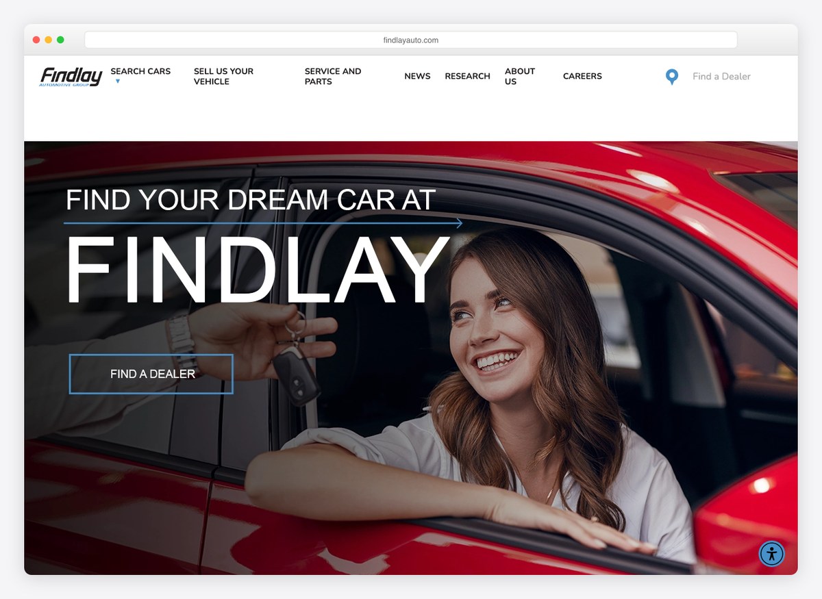
A hundred and thirty-two photographs on a single vehicle page, the most of anything measured here, with the VIN in the URL itself. The homepage routes by budget, and the filters live on the inventory page rather than the front door.
What stands out: A VIN-addressed URL, which makes every vehicle page independently linkable and indexable.
28. Galpin Motors
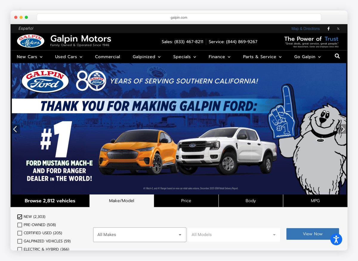
A black opening screen with the stock figure written into the browse control, and a vehicle page that states the sticker, the fees and the dealership’s own price as three separate lines. The photography is sparse where others are exhaustive.
What stands out: An itemised price with the fees shown rather than folded in.
29. Ancira Auto Group
Website platform: Dealer Inspire
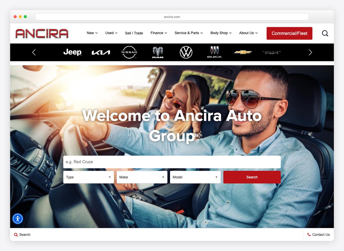
A group that sells commercial vehicles alongside retail and gives the fleet buyer a route of their own from the first screen. Red against near-white, with brand logos doing the navigation.
What stands out: A separate front door for fleet and commercial buyers.
What the twenty-nine palettes say about what they sell
Every swatch below is sampled from that site’s own screenshot above, not from a brand guideline.
The ground — what the page sits on
The accent — where colour actually appears
The palette splits cleanly by what the dealer sells. The luxury and prestige groups go monochrome — one site here devotes sixty-eight per cent of its opening screen to black and carries no chromatic accent at all, the only site of the twenty-nine of which that is true — and let the cars supply the colour. The volume and used-car end does the opposite: a cyan filling a third of the screen, a teal-and-orange pairing, a green call to action. If you are choosing colours for a dealership, the question the evidence poses is not which hue but how much: the more the car is the product, the quieter the page.
What a car dealer website needs
Counted across all twenty-nine sites we could read, ordered by how many actually do it. The bottom of this table is where a single dealership can beat a national group in an afternoon.
| Feature | Sites | Worth doing? |
|---|---|---|
| Finance or payment tooling | 25/29 | Effectively standard. Table stakes. |
| A route into the stock list from the first screen | 22/29 | Yes — but see the next row, because most of these are a link, not a search. |
| Trade-in valuation | 21/29 | Yes. The customer with a car to sell is the one worth catching. |
| Live chat | 18/29 | Common. Worth it only if somebody answers. |
| A tappable phone number anywhere | 11/29 | Eighteen sites have none. For a business people visit in person, that is hard to defend. |
| Phone number in the first screen | 10/29 | Cheap, and most of the field skips it. |
| States how many cars it has | 9/29 | Yes. Scale is the one thing a big dealer can claim that a small one cannot. |
| Book a test drive online | 8/29 | A real gap. Three quarters of these make you ring up. |
| Real search filters in the first screen | 3/29 | The biggest gap of all. Almost everyone links to a search instead of offering one. |
The search finding deserves care, because it is easy to misread. Twenty-two of these sites give you a way into the stock list from the opening screen — a button, a link, a toggle. Only three put actual make, model and year controls there. One large franchise site carries five such controls and none of them in the first screen; the fold has a magnifying glass that opens a modal. Whether that is a mistake depends on whether your visitor already knows what they want, and the honest answer is that most of this industry has never tested it.
Building a dealer website
Dealer websites are not built the way other small-business websites are built. There is no WordPress-and-a-theme answer here: fifteen of the twenty-nine sites we could read run on a dedicated automotive platform, and the two that dominate are Dealer Inspire (12 sites) and Dealer.com (5). DealerOn, DealerSocket and Autotrader’s tooling appear alongside them.
That is because the website is the least of it. A dealer site has to ingest a live inventory feed, keep VIN-level pages in sync as cars arrive and sell, price finance, and push leads into a CRM. General-purpose builders do not do that, which is why the search results for “car dealer website builder” are full of automotive-specific vendors rather than the usual names. If you are a single-rooftop dealer, the practical choice is which of those platforms to use, not whether to use one.
What you control regardless of platform is everything in the table above. Putting a phone number in the first screen, stating your stock count, offering a test-drive booking and publishing the VIN are content decisions, not engineering ones, and the measurements here show most of the field leaving them undone. For the surrounding site, our website builder comparison covers the general-purpose options, and auto repair website examples looks at the service side of the same trade.
Car dealer website questions, answered
What should a car dealership website include?
Measured across the twenty-nine sites here, the near-universal features are finance or payment tooling (25 of 29), a route into the stock list from the first screen (22) and a trade-in valuation (21).
The gaps, and therefore the opportunities, are a tappable phone number (11 of 29 have one anywhere), online test-drive booking (8) and genuine search filters in the opening screen (3). On the vehicle page itself, publish the mileage and the VIN — only 13 and 10 of the 23 pages we opened do.
Do car dealers still hide prices online?
Essentially no. Every one of the 23 vehicle pages we opened showed a price, so “call for price” has largely gone.
What has replaced it is subtler: several dealers publish the sticker price and then put a lower one behind a button — “unlock instant price”, “confirm today’s price”, “set e-price”. The price is not hidden, but the best price still costs you an email address.
What is the best platform for a car dealer website?
Unlike most industries, this one has purpose-built options and they dominate: fifteen of the twenty-nine sites we could read run on an automotive platform, most often Dealer Inspire or Dealer.com.
The reason is inventory. A dealer site must ingest a live feed, generate a page per VIN, keep it in sync as stock moves, and pass leads to a CRM. A general-purpose website builder does none of that, so the realistic choice is between the automotive vendors rather than between them and a generic builder.
How many photos should a car listing have?
The range across the pages we opened runs from a couple to 132, with a median of 15. The high end is where used-car specialists live, and the logic is sound: every used car is genuinely different, so photography is the closest a website gets to standing on the forecourt.
For new cars the calculus is different, because the manufacturer’s own imagery already exists and one example is much like another. If you sell used, photograph exhaustively; if you sell new, spend the effort on price clarity instead.
What colours work best for a car dealership website?
On the evidence of these twenty-nine palettes, it depends what you sell rather than on any single hue. The prestige and luxury groups run close to monochrome and let the cars carry the colour — one is sixty-eight per cent black with no chromatic accent at all.
The volume and used-car end is markedly brighter: a cyan across a third of the screen, teal with orange, a green call to action. The rule the data suggests is about restraint, not colour: the more expensive the car, the quieter the page.
How we chose these
Opened every site
Each one loaded in a real browser at 1280×860 and judged from the live page, not from an old screenshot in our media library.
29 checked · 29 re-captured
Opened a car on every one
Walked the way a buyer does — homepage, then the stock list, then a single vehicle page — and read the price, the monthly figure, the VIN, the mileage and the photograph count.
23 vehicle pages opened
Checked the machine against the screenshot
Every landing page was captured and reviewed on a contact sheet. Six turned out not to be vehicle pages at all — a news article, two blog posts, two search-results pages and a checkout — and were excluded rather than counted.
29 pages verified by eye
Sampled the colours from the captures
Palettes are quantised from each site’s own screenshot and then curated, so the swatches describe the page you can see rather than a published brand palette.
29 palettes · sampled, not quoted
The list is ordered for range rather than rank, mixing single-rooftop stores with national groups across the United States, the United Kingdom and Australia, because the useful lessons are not all at one scale. Sites were opened in a browser at 1280×860 and measured on the same criteria; where a vehicle page could not be reached — a search page behind a bot challenge, an inventory grid that exposes no links to an automated reader — that site is excluded from the vehicle-page counts rather than scored zero.

Related Posts







Comments (0)