
30 Best Charity Website Examples 2026
All 29 of the charities below put a donate control in the first screen. Only 9 of them pre-select the monthly option, and just 2 let you cover the processing fee.
Every roundup of charity websites describes the hero slider. None of them clicks Donate. So we did — on all thirty sites, one hop from the homepage button into the real giving form — and the interesting part is not the design. It is that the sector has solved getting the ask onto the page and then stopped. The button is always there. What happens after you press it is where the money is left behind.
What we looked for
A charity site is not judged on the things a trade site is judged on. Nobody needs a licence number or a service area; they need to know where the money goes and how little effort it takes to send some. So the checks below run in two halves: what the homepage does to earn a gift, and what the giving form does to collect it.
What happens when you actually click Donate
Each rung below is only reachable once the one above it is true, so these are nested groups rather than six separate percentages. Twenty-nine of the thirty sites solicit donations at all — the exception is a grantmaking foundation, which is the last entry and is here on purpose.
The collapse happens after the click, not before it. Getting a donate button into the first screen is now universal; using the form to raise the average gift is not. Twenty-two sites offer monthly giving, which is the single biggest lever a charity has over lifetime value, but only nine start the form there. And two let the donor absorb the card fee — a change that takes an afternoon and adds roughly three per cent to every gift that takes it.
Every giving form we opened, side by side
Read in a browser at 1280×860, one hop from the homepage donate control, then checked against the screenshot of each form. One of the thirty sites do not solicit gifts at all and are listed at the foot.
| Charity | Preset amounts | Monthly | Tribute | Fees | Platform |
|---|---|---|---|---|---|
| charity: water | $40$80$120$240 | yes | yes | no | Stripe |
| Trussell | £5£10£25 | pre-selected | yes | no | — |
| GiveDirectly | $40$60$100$200$300$500 | pre-selected | yes | no | Stripe |
| Save the Children | $27$60$99 | pre-selected | no | yes | Pin Payments |
| The Trevor Project | $200$300$500$750$1,000$2,000 | yes | yes | no | Stripe |
| Choose Love | €10€16€20€25€50€100 | pre-selected | yes | no | — |
| St. Jude Children’s Research Hospital | $20$25$50$75$100 | pre-selected | yes | no | PayPal |
| Watsi | $20$60$120$250 | yes | yes | no | Stripe |
| Best Friends Animal Society | $50$100$200$500$750$1,000 | yes | no | no | Fundraise Up |
| CHU Sainte-Justine Foundation | none shown | no | no | no | — |
| International Rescue Committee | $60$110$150$200$500 | yes | yes | no | Fundraise Up |
| Magic Breakfast | €8€30€60 | pre-selected | yes | no | Fundraise Up |
| Human Rights Watch | none shown | no | no | no | EveryAction |
| Room to Read | $12$25$45$65$130$250 | pre-selected | yes | no | Fundraise Up |
| Medecins Sans Frontieres | none shown | no | no | no | — |
| Akshaya Patra | ₹4,500₹9,000₹13,500₹18,000₹24,000₹30,000₹37,500₹45,000₹60,000₹75,000₹90,000₹1,05,000 | yes | no | no | — |
| The Ocean Cleanup | €10€25€50 | pre-selected | no | no | — |
| Feeding America | $25$50$100$250$500$1,000 | yes | yes | no | EveryAction |
| Planned Parenthood | $15$25$35$50 | pre-selected | yes | yes | EveryAction |
| Movember | €15€20€30€50 | no | no | no | — |
| The Felix Project | £10£20£50 | no | no | no | — |
| Thirst Project | $25$50$100$500 | yes | no | no | Classy |
| Jackie Robinson Foundation | $30$42$100$250 | no | no | no | Stripe |
| NRDC | $35$50$100$250$500 | yes | no | no | Stripe |
| Hashtag Lunchbag | $1$5$10$25$50$100$250$1,000$2,500$5,000 | yes | no | no | PayPal |
| Cancer Research Foundation | $30$60$120$250$500 | yes | yes | no | GiveWP |
| AMA Foundation | $75$100$150$250$500$750$1,000 | yes | no | no | Blackbaud |
| Ovo Foundation | none shown | yes | no | no | — |
| World Vision International | none shown | no | no | no | — |
| Broad Foundation | no donate control anywhere — a grantmaking foundation, not a fundraiser | ||||
The cheapest way in varies 4500-fold. The lowest preset on offer runs from $1 at Hashtag Lunchbag to ₹4,500 at Akshaya Patra. There is no consensus figure to copy, which is the useful finding: the number is a decision about who you are asking, not a convention.
Best Charity Website Examples
Table of contents — all thirty charity websites
- charity: water
- Trussell
- GiveDirectly
- Save the Children
- The Trevor Project
- Choose Love
- St. Jude Children’s Research Hospital
- Watsi
- Best Friends Animal Society
- CHU Sainte-Justine Foundation
- International Rescue Committee
- Magic Breakfast
- Human Rights Watch
- Room to Read
- Medecins Sans Frontieres
- Akshaya Patra
- The Ocean Cleanup
- Feeding America
- Planned Parenthood
- Movember
- The Felix Project
- Thirst Project
- Jackie Robinson Foundation
- NRDC
- Hashtag Lunchbag
- Cancer Research Foundation
- AMA Foundation
- Ovo Foundation
- World Vision International
- Broad Foundation
1. charity: water
Giving platform: Stripe
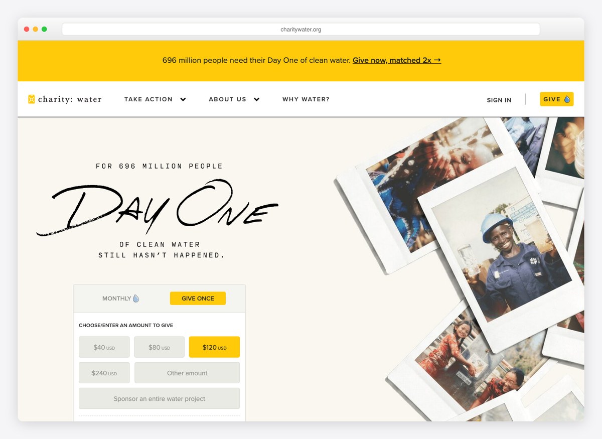
The giving form is the homepage. Monthly sits beside one-off before you scroll, and each suggested amount is annotated with what it buys — one person’s clean water at the bottom of the ladder, a family further up. The whole page rests on a single promise, that public donations fund water rather than overheads, and the independent seals sit in the footer instead of the hero.
What stands out: Every preset is labelled with an outcome, so the donor picks a result rather than a number.
2. Trussell
Built with: Drupal
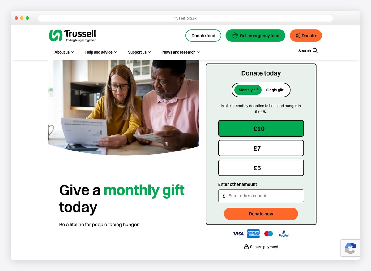
Three separate calls share the header: donate money, donate food, and get emergency food. Serving supporters and the people who need the food banks from the same navigation is the hardest problem a UK charity site has, and Trussell solves it by naming all three plainly rather than filing the help under an About menu.
What stands out: The person in crisis and the person who wants to help get equal billing in the top navigation.
3. GiveDirectly
Built with: WordPress · giving platform: Stripe
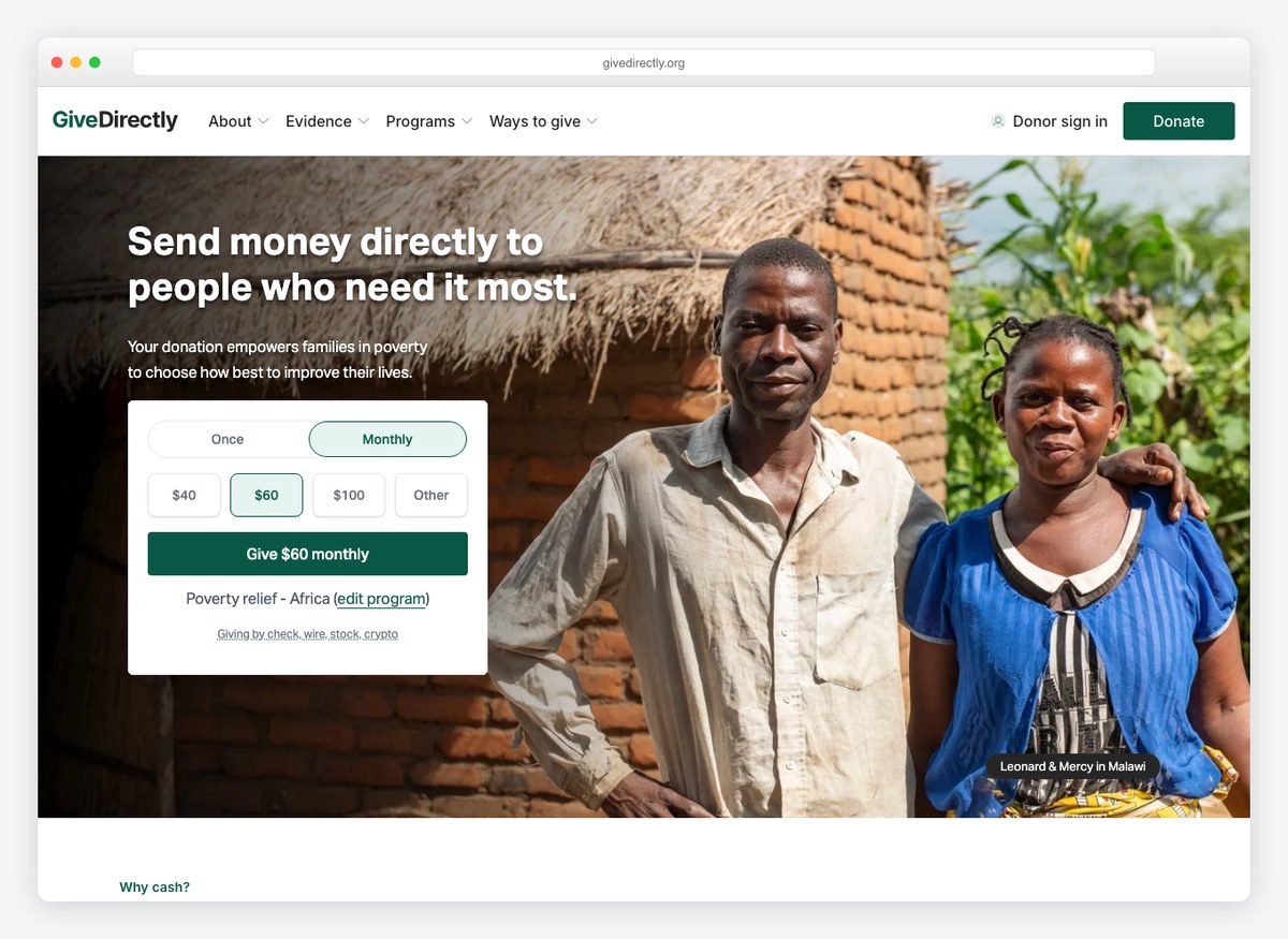
Financials is a top-level navigation item, sitting between Team and Blog rather than in the footer, which is a level of confidence almost nothing else here shows. The hero doubles as the giving form — frequency, amount and programme all chosen before you scroll — and the submit button restates the choice as a sentence.
What stands out: Putting Financials in the main navigation and a CharityWatch rating on the page beside it.
4. Save the Children
Giving platform: Pin Payments
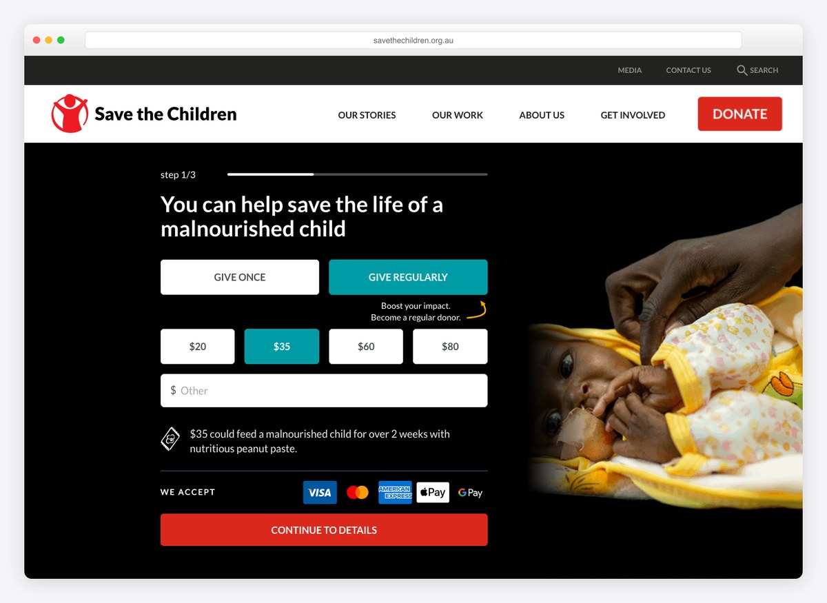
The donation page numbers itself: step one of three, before it asks for anything. Each preset carries its own line of explanation about what that amount feeds and for how long, and the share of expenditure reaching programmes is published as a plain percentage rather than buried in an annual report.
What stands out: Numbering the steps, so a donor knows how much form is still ahead of them.
5. The Trevor Project
Built with: WordPress · giving platform: Stripe
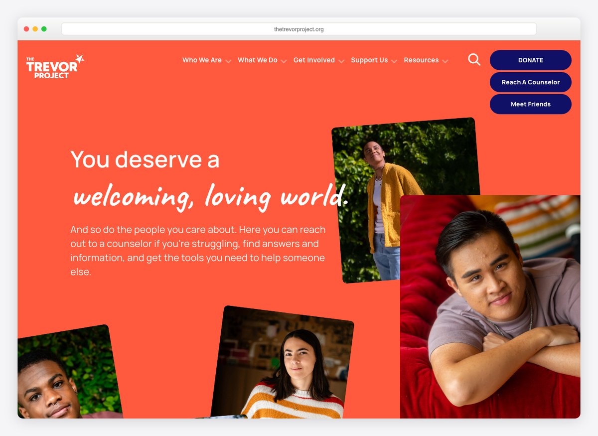
The first thing offered is a counsellor, not a donation. For a crisis line that is the right order and the design holds to it: the route to help sits ahead of the giving link, and the support control is plain text rather than the loudest thing on the screen. The suggested amounts are the highest on this list, which suits an audience of committed supporters rather than passers-by.
What stands out: The service comes before the ask, and the layout does not fight that decision.
6. Choose Love
Built with: WordPress
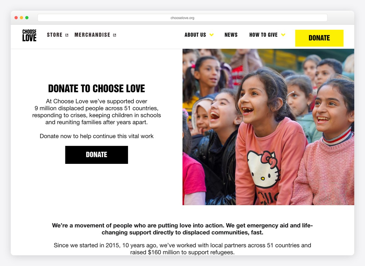
A yellow that stops just short of hazard tape, spent on one control and nothing else, against otherwise plain type. The opening lines are counts — people supported, countries reached, years running — and the shop sits in the navigation as a second, lower-friction way in for people who will not hand over cash.
What stands out: Merchandise treated as a real giving channel rather than an afterthought.
7. St. Jude Children’s Research Hospital
Giving platform: PayPal
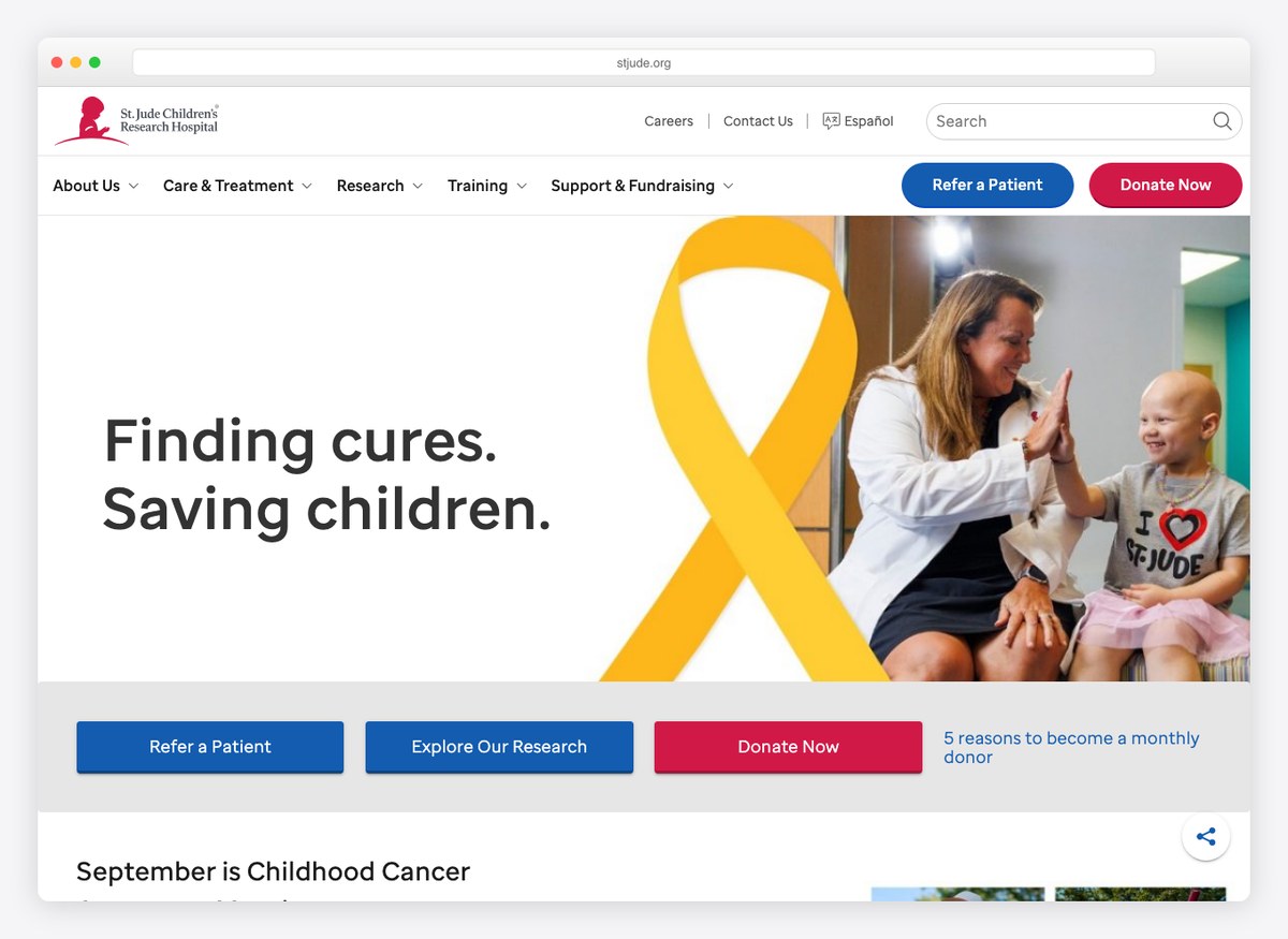
The giving form opens on Monthly rather than one-off, with every amount written per month, and the homepage runs a piece making the case for regular giving beside it. It is the clearest example here of a site designed around what a supporter is worth over years instead of what they will give today.
What stands out: Monthly is pre-selected and then justified with its own explainer.
8. Watsi
Giving platform: Stripe
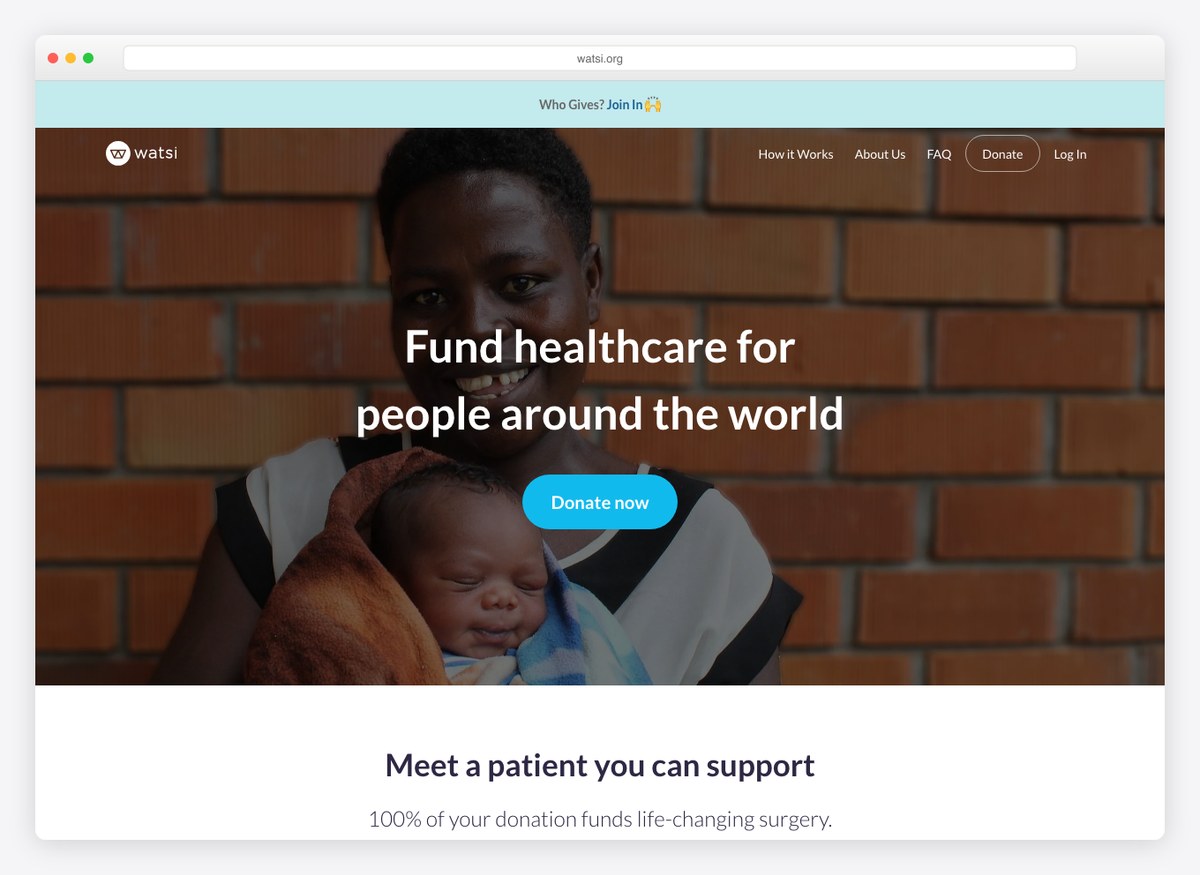
You meet a named patient with an age, a country and a specific operation before you are asked for anything, and the page shows exactly how much of that person’s surgery is still unfunded. Two independent ratings sit near the top, which this model rather demands: a claim that every donated dollar reaches treatment only carries weight if somebody else has checked it.
What stands out: Individual patients, named and costed, instead of an aggregate need.
9. Best Friends Animal Society
Built with: Drupal · giving platform: Fundraise Up
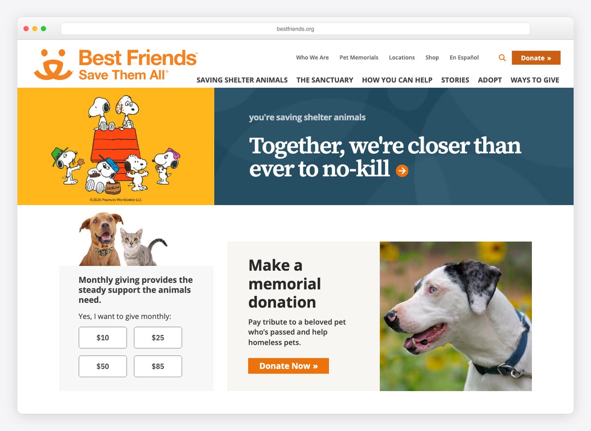
Six separate routes to the financials from a single homepage — annual report, financial statements, financial information — which is more than anything else here offers. Pet Memorials sits in the top navigation, giving tribute donations their own front door instead of a checkbox halfway down a form.
What stands out: Tribute giving promoted to a navigation item rather than hidden in the giving flow.
10. CHU Sainte-Justine Foundation
Built with: WordPress
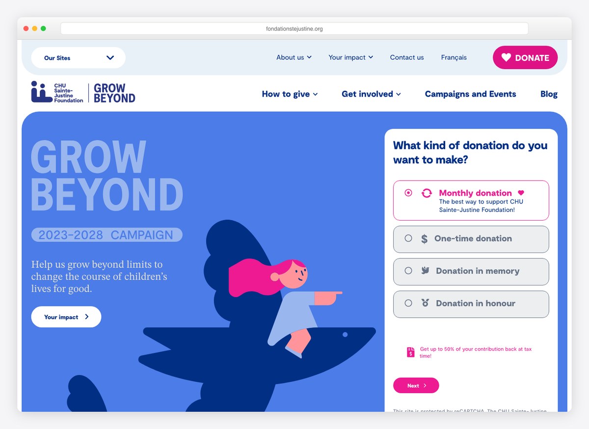
The donate link opens on a question rather than a form: monthly, one-off, in memory, or in honour, with monthly marked as the recommended route. Splitting the four intentions before asking for a number means the memorial donor and the regular giver never have to read each other’s fields.
What stands out: Asking what kind of gift this is before asking how much it is.
11. International Rescue Committee
Built with: Drupal · giving platform: Fundraise Up
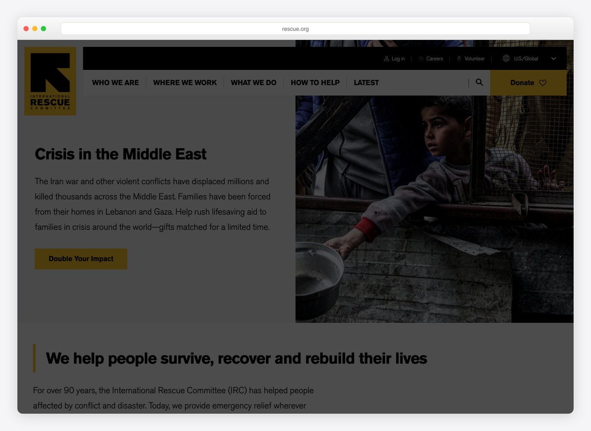
The homepage leads with the emergency rather than the organisation, and the giving page opens on a matched-gift offer with a three-step progress bar above it. Programme spend and the independent rating are written on the page as figures rather than linked to as a report.
What stands out: The rating and the programme percentage stated as text, not as a badge graphic.
12. Magic Breakfast
Built with: WordPress · giving platform: Fundraise Up
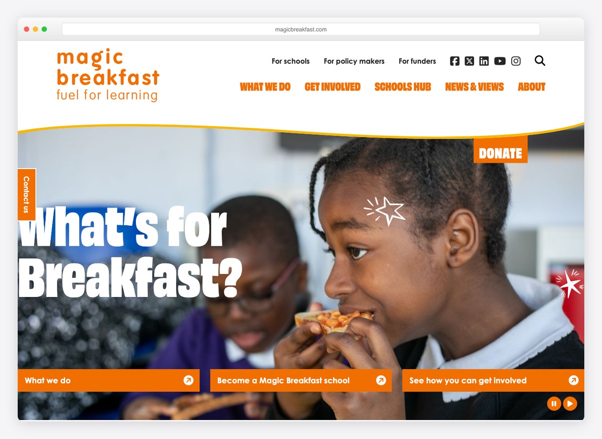
One number carried through the whole page — the children reached each morning — and a headline that asks a question any parent recognises instead of describing a programme. The giving form is among the shortest here, which suits a charity whose ask is measured in the cost of a breakfast.
What stands out: Each suggested amount is written as what it feeds: a month, a term, five classes.
13. Human Rights Watch
Built with: Drupal · giving platform: EveryAction
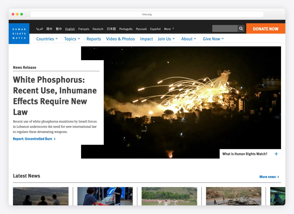
The homepage is a newsroom. The lead item is a report rather than an appeal, and the research is the argument for giving. The single saturated control on an otherwise editorial page is the donate button, which is how it stays visible against a screen of headlines.
What stands out: Publishing the work itself as the fundraising pitch.
14. Room to Read
Giving platform: Fundraise Up
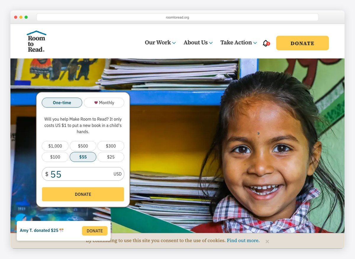
The giving form is the hero, with the reach figure stated once rather than split across a row of counters, and a line explaining that a dollar puts a book in a child’s hands. A ticker in the corner names recent donors and what they gave, which is the only live social proof on this list.
What stands out: A running feed of real donations, used as encouragement rather than decoration.
15. Medecins Sans Frontieres
Built with: Drupal
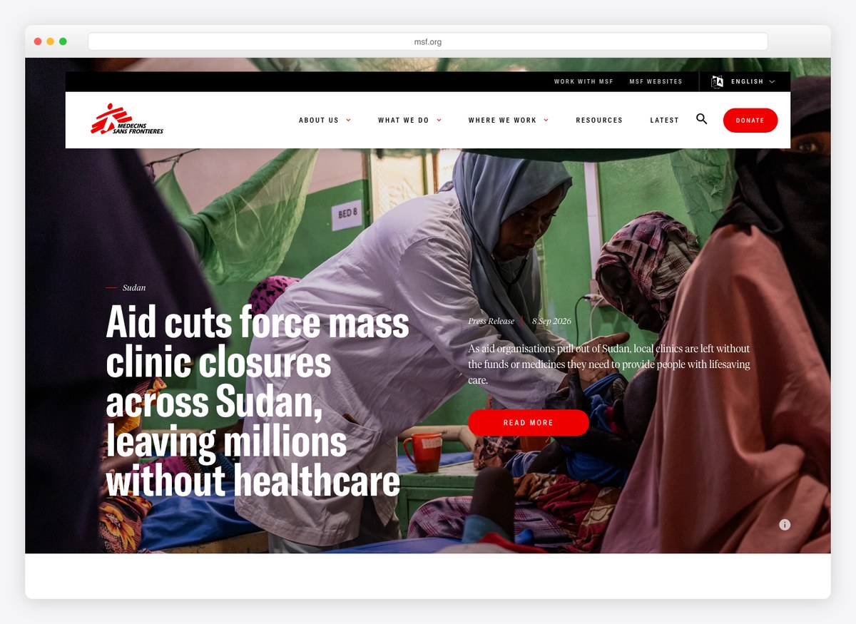
Three operational figures sit at the top of a page that otherwise reads like a wire service: patients admitted, countries, staff. Red is spent on the donate control and nothing else, which is the only way a single accent survives a page this dense with photography.
What stands out: Operational numbers used as the masthead instead of a slogan.
16. Akshaya Patra
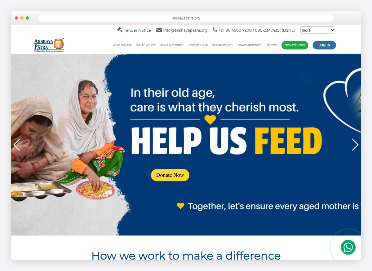
The header carries a country switch and a list of Indian states before the navigation even begins, because the tax receipt differs in each. The giving form offers more suggested amounts than anything else here, laddered upward from the cost of feeding one child for a year.
What stands out: A preset ladder built from the cost of a single school meal, so the smallest gift still maps to something real.
17. The Ocean Cleanup
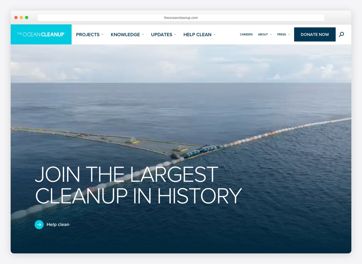
An impact dashboard sits in the main navigation beside the research and the publications, so the case for giving is a live data page rather than a claim. The giving form estimates what a monthly gift removes over a year, and the donate control is deliberately quiet — this is an engineering programme rather than an emergency.
What stands out: The form converts your chosen amount into an estimate of plastic removed.
18. Feeding America
Built with: Drupal · giving platform: EveryAction
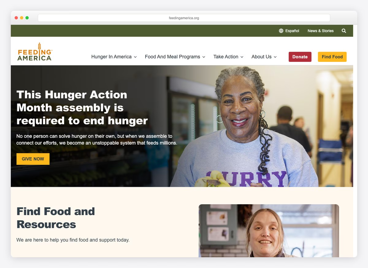
Two numbers carry the page: what a single dollar buys in meals, and the share of donations reaching programmes. Find Food sits in the navigation beside Donate, so somebody who needs a food bank is not made to read a fundraising appeal first.
What stands out: A dollar-to-meals conversion stated plainly enough that people quote it.
19. Planned Parenthood
Giving platform: EveryAction
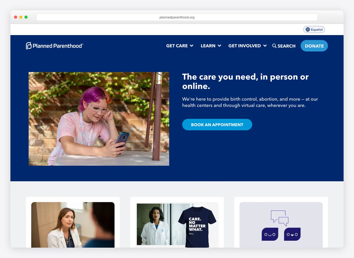
A healthcare site before it is a fundraising one: book an appointment, find a centre, get care. The giving form then defaults to monthly and explains why in a single line beside the toggle, and offers to let the donor cover the processing fee with the resulting total spelled out.
What stands out: Monthly is pre-selected and the reason is written next to the control, not buried in a FAQ.
20. Movember
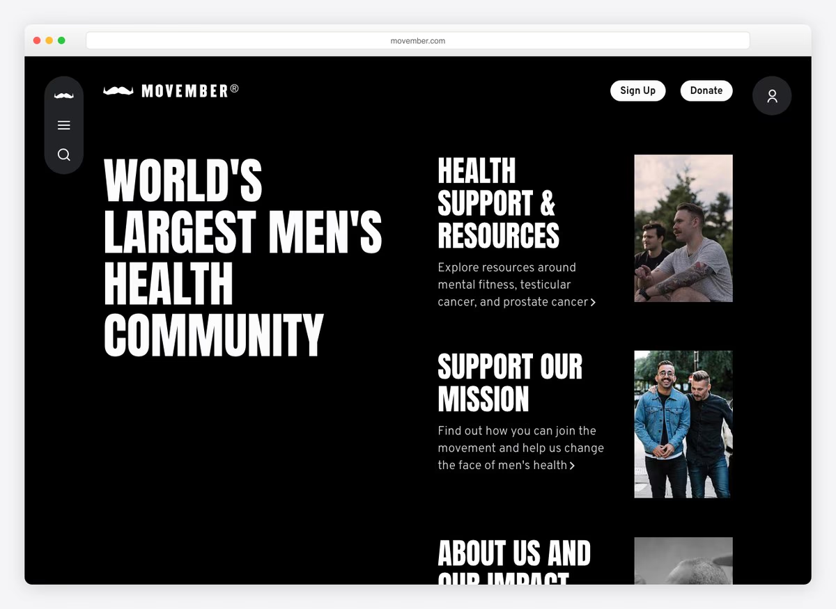
Sign Up sits ahead of Donate, because the model is people raising money rather than people giving it. The site is organised around joining a campaign, and the health resources get their own space instead of being used as bait for the ask.
What stands out: Recruiting fundraisers rather than soliciting donations, and ordering the navigation to match.
21. The Felix Project
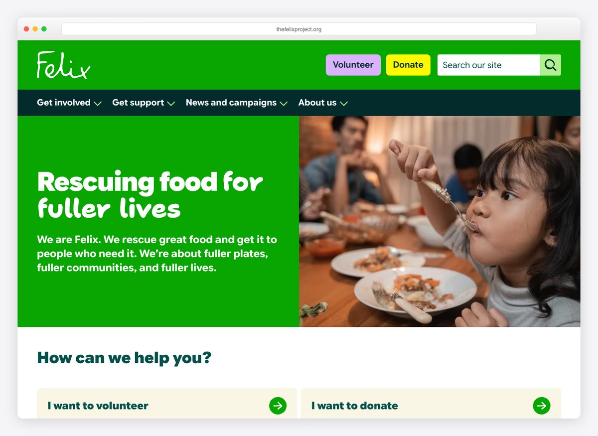
Volunteer comes before Donate in the header, and the figures on the page are volunteers and meals rather than money. The yellow is close to pure, set against near-black type, and it is the only colour used anywhere on the first screen.
What stands out: Leading with the volunteer count, because that is the currency this charity actually runs on.
22. Thirst Project
Built with: WordPress · giving platform: Classy
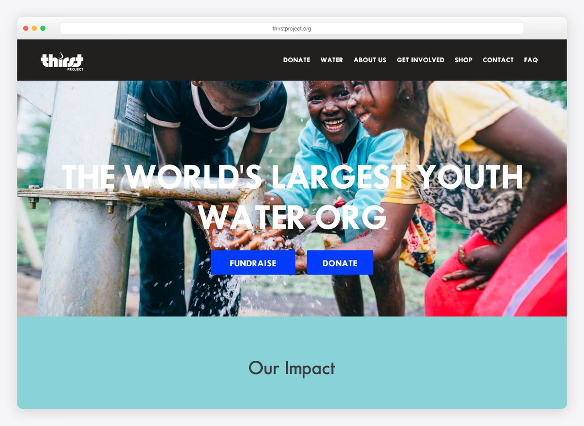
Three counters sit directly beneath the headline — projects, people served, countries — with Fundraise given the same weight as Donate. For an organisation built on student chapters, that ordering is the strategy rather than a layout preference.
What stands out: Fundraise and Donate presented as equals, side by side.
23. Jackie Robinson Foundation
Built with: WordPress · giving platform: Stripe
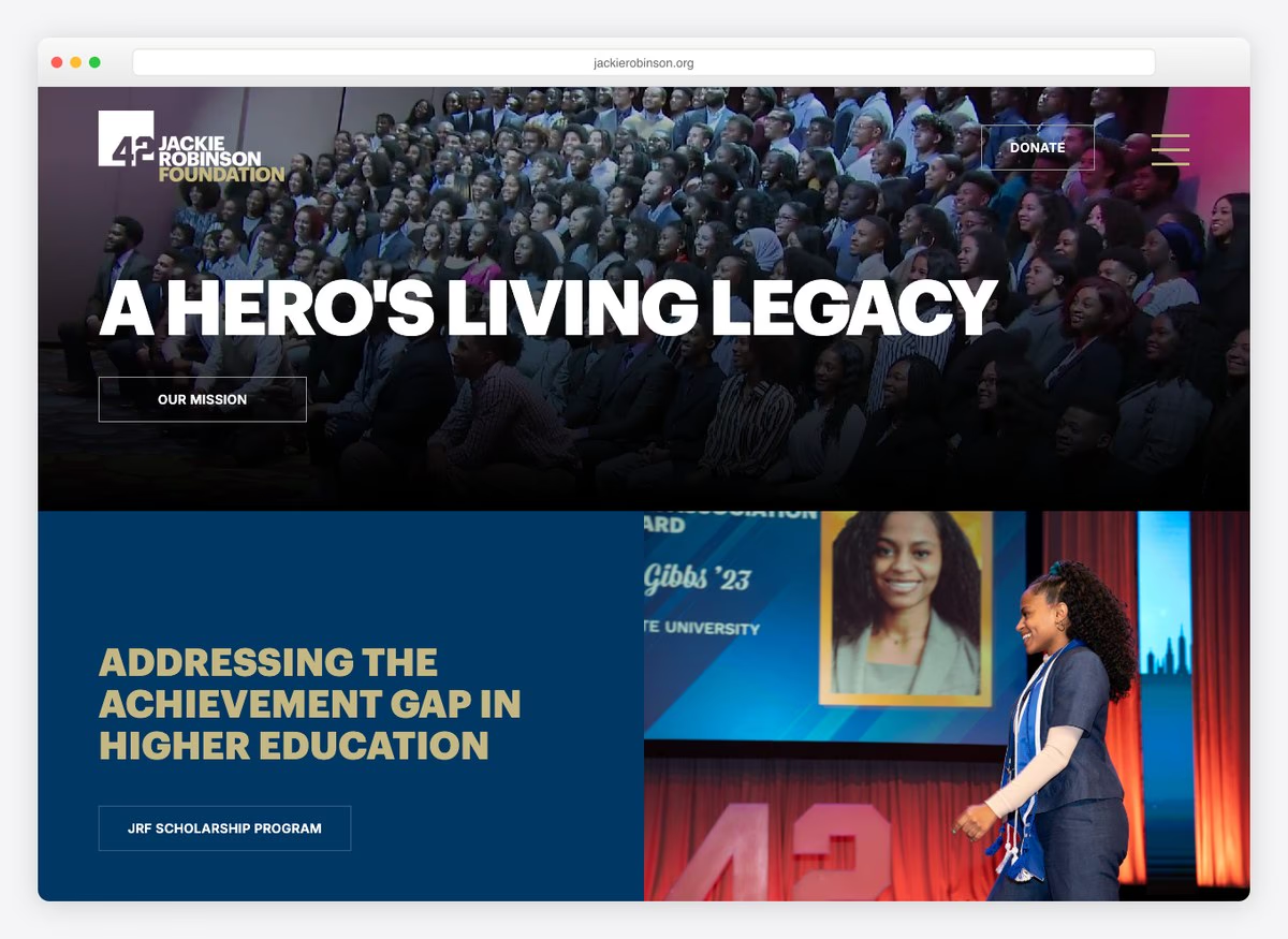
The suggested amounts are thirty dollars, forty-two, one hundred and two hundred and fifty. The forty-two is his jersey number, retired across the whole of baseball, and it is the best piece of copywriting on this list: a suggested donation that means something to the person being asked before they have read a word of the case.
What stands out: A preset amount that is also a reference the donor already recognises.
24. NRDC
Built with: Drupal · giving platform: Stripe
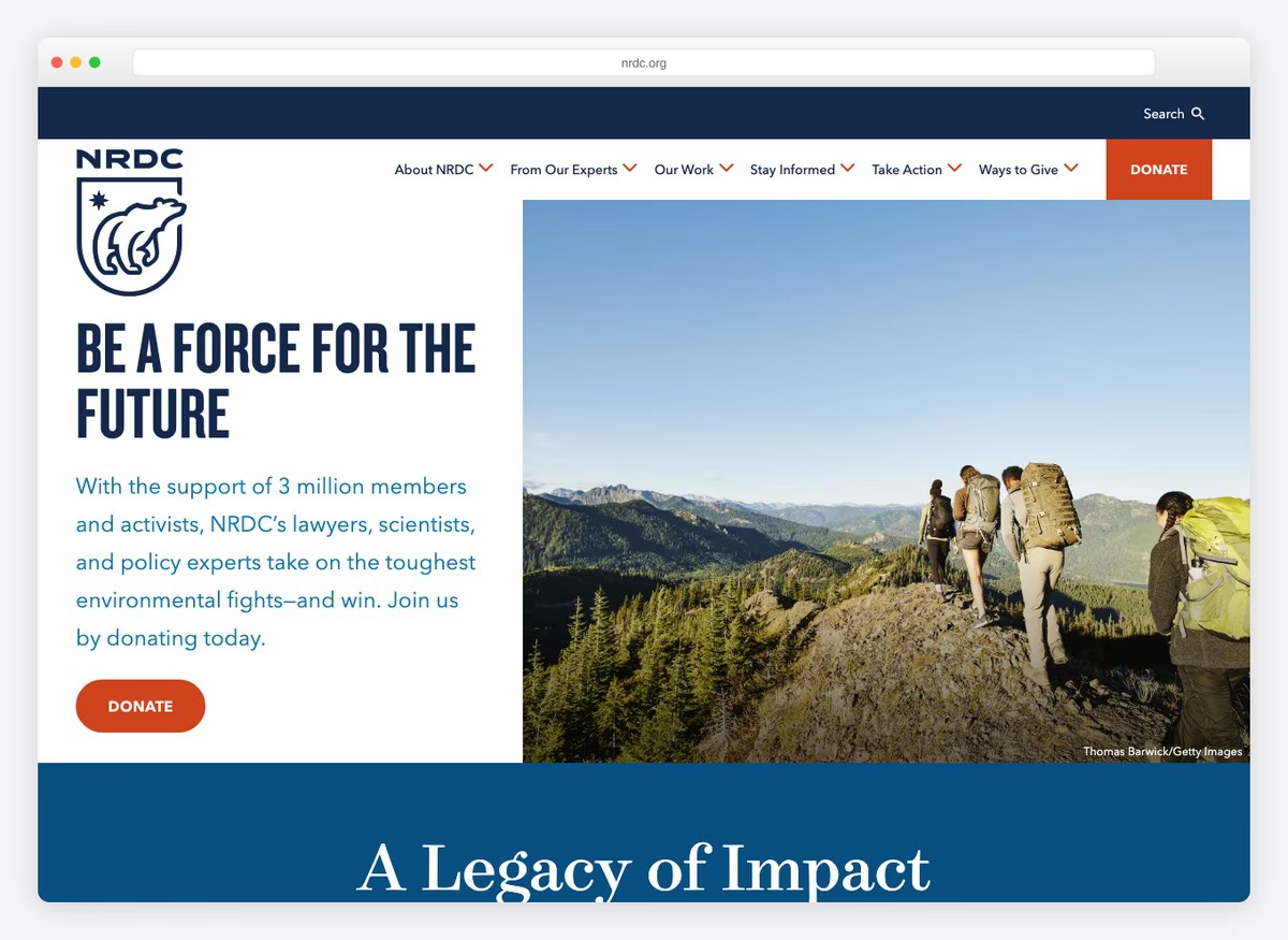
The top of the page is a live matched-gift offer with a ceiling and a multiplier attached to whatever is in court that month. The main control says Ways to Give rather than Donate, which reads softer and gives the membership, legacy and stock routes somewhere to live.
What stands out: A matched-giving offer with a real number and a real deadline, refreshed against current work.
25. Hashtag Lunchbag
Built with: NationBuilder · giving platform: PayPal
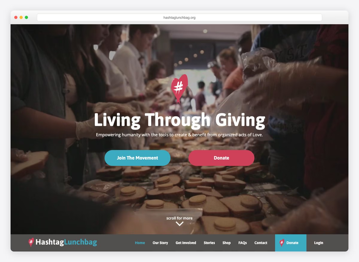
The ladder starts at a single dollar and runs to five thousand, the widest range here, because the ask is aimed at somebody organising a lunch-making session as much as at an institutional donor. Host an Event sits in the navigation next to Donate.
What stands out: A one-dollar entry point, which nothing else on this list offers.
26. Cancer Research Foundation
Built with: WordPress · giving platform: GiveWP
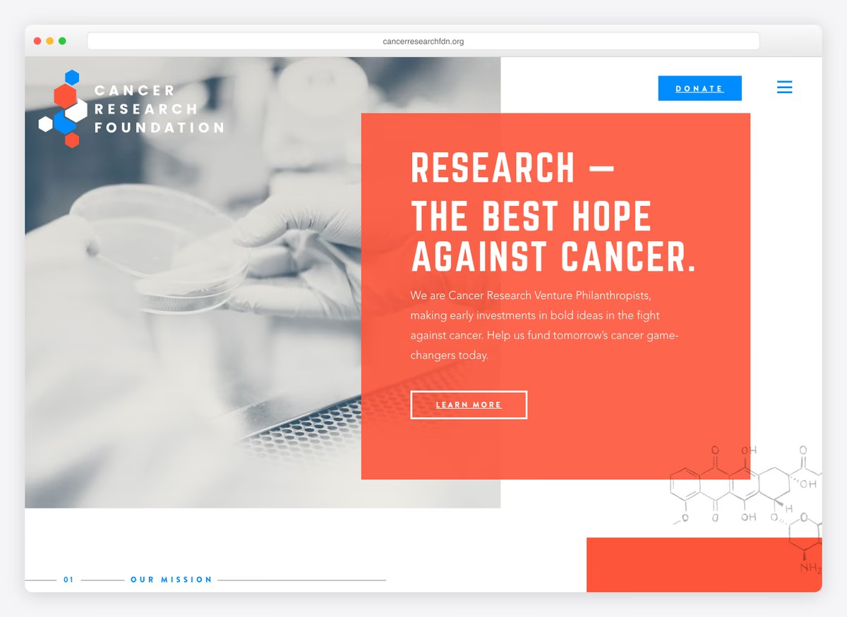
A saturated blue control against a monochrome photograph, and a headline built from the year’s projected diagnoses rather than the charity’s own results. The giving form runs on a WordPress plugin, sits directly on the homepage, and offers tribute donations without a second page.
What stands out: Framing the ask with the scale of the problem instead of the size of the organisation.
27. AMA Foundation
Built with: Squarespace · giving platform: Blackbaud
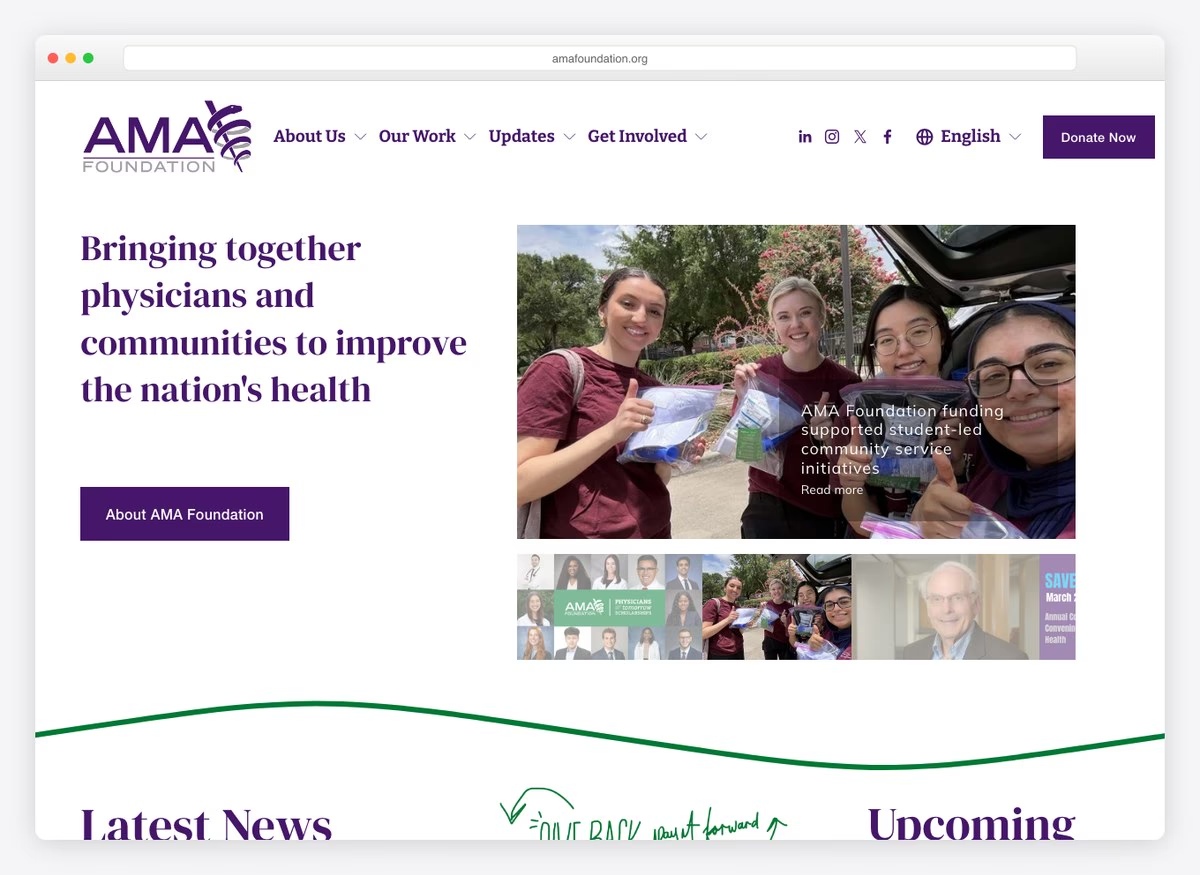
The highest entry price on this list: the lowest suggested amount is seventy-five dollars, which is defensible for a foundation whose donors are physicians. Deep purple carries the whole page, and the giving form arrives from a fundraising platform layered on top of an off-the-shelf site build.
What stands out: A preset ladder pitched at a professional audience rather than the general public.
28. Ovo Foundation
Built with: WordPress
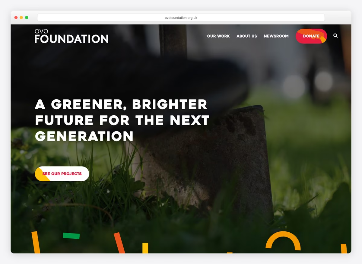
The donation page leads on a monthly figure rather than a one-off one — a pound a month — setting the expectation before any form appears. The rest of the site reads like a grant-maker’s, giving the projects it funds more space than the ask.
What stands out: Anchoring the whole appeal on a monthly amount in the headline.
29. World Vision International
Built with: Drupal
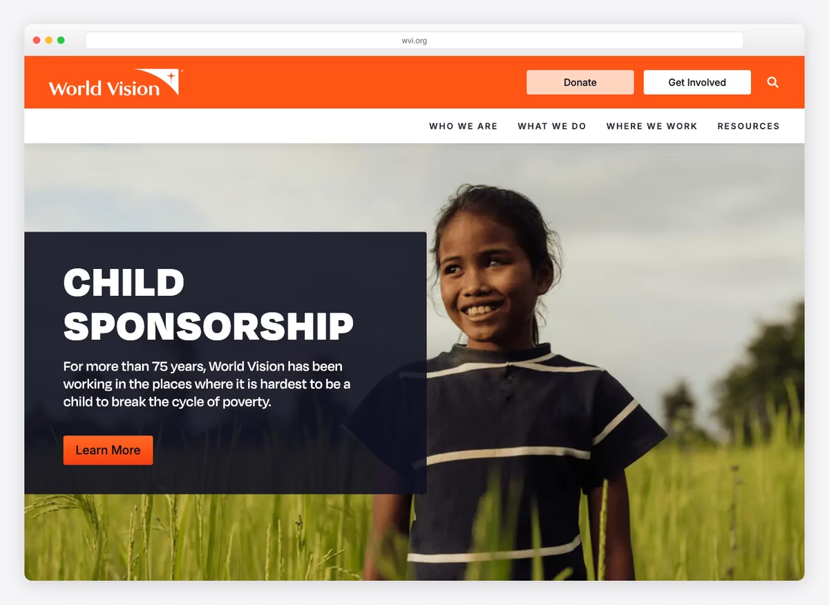
The donate control leads to a country selector before any amount can be chosen, because giving is handled by national offices. It is an honest reflection of how the organisation is structured and a real obstacle for anybody who arrived ready to give.
What stands out: A structural constraint made visible: you choose a country before you can choose an amount.
30. Broad Foundation
Built with: WordPress
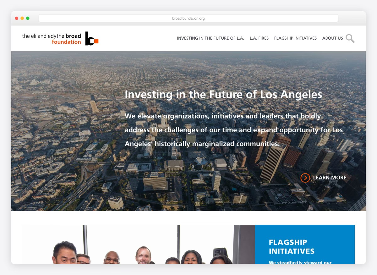
There is no donate button anywhere on this site, and that is correct. A grantmaking foundation distributes its own endowment rather than raising money, so the homepage is addressed to grantees and partners instead of donors. It is here as the contrast: if a site looks like this and the organisation does need donations, the model and the design have come apart.
What stands out: The absence of an ask, done deliberately.
What the thirty palettes have in common
Every swatch below is sampled from that site’s own screenshot above, not from a brand guideline.
The ground — what the page sits on
The accent — where colour actually appears
Charity websites are the most colourful category we have measured. Where a plumber’s page is white with a blue button and a contractor’s is white, black and a photograph, these run to saturated yellow, orange and red, and several hand the whole opening screen to a brand colour rather than an image. The pattern behind it is practical rather than decorative: the donate control has to win against a photograph of a person, and a warm high-contrast fill is what survives that. If you are looking for the safest colour for a charity donate button, the answer these thirty give is a warm one — yellow, orange or red — on a plain ground, used for nothing else on the page.
Essential charity website features
Not a wishlist. Every figure below is a count across the twenty-nine sites here that ask for money, ordered by how many actually do it — so it doubles as a running order for what to build first and what almost nobody bothers with.
| Feature | Sites | Worth doing? |
|---|---|---|
| A donate control in the first screen | 29/29 | Universal. Table stakes, not a differentiator. |
| Financial reports linked from the homepage | 25/29 | Near-universal and cheap. The strongest versions put it in the main navigation rather than the footer. |
| Suggested donation amounts | 24/29 | Yes. The ladder is the single biggest influence on gift size. |
| A monthly giving option | 22/29 | Yes — a regular donor is worth several one-off ones. |
| Legacy or bequest giving | 19/29 | Free to add as a page. Disproportionate value per enquiry. |
| Tribute or in-memory giving | 13/29 | Yes. It reaches donors who would not otherwise be giving at all. |
| Impact stated as a number in the first screen | 12/29 | The biggest gap. Most sites ask before they argue. |
| Donate is the loudest control on the screen | 11/29 | Situational. Crisis services deliberately lead with help instead. |
| Monthly pre-selected on the form | 9/29 | Yes, if monthly is offered at all. A one-line change. |
| An independent rating displayed | 5/29 | Only if you have one worth showing. |
| Share of spend reaching programmes, stated | 4/29 | Rare, and persuasive where it appears. |
| Donor can cover the processing fee | 2/29 | Almost nobody does this. Most giving platforms ship it as a checkbox. |
Read the bottom of that table, not the top. The first four rows are things the sector has already agreed on. The last four are where a small charity can beat organisations a hundred times its size this month, because the work is a checkbox and an afternoon rather than a redesign.
Building a charity website yourself
There is no house platform for charities, and the biggest names mostly built their own. eight of the thirty run Drupal — a far higher share than any trade we have measured, where it barely appears at all — and ten run WordPress. The remaining ten give off no off-the-shelf signal whatsoever, and they are the household names on the list.
The WordPress detail matters more than the headline. Of the ten WordPress sites, only two use a page builder; the rest run bespoke themes named after the organisation. That is the reverse of every trade we have measured, where nearly everything is a builder. It is not a reason to avoid a builder — it is a reminder that these are organisations with agencies, and that copying their structure is free while copying their build is not.
The giving platform is the decision that actually affects income, and it is separate from the CMS. Every fee-cover option, monthly default, tribute field and employer-match lookup on this list comes from the payment layer rather than the website: Fundraise Up, Classy, Blackbaud, GiveWP, EveryAction and Stripe all appear here, sitting on top of whatever the site happens to run. A small charity can put a modern giving form on an ordinary WordPress site this week and match most of what the large organisations here offer.
For a starting point on the site itself, our free charity WordPress themes cover the build, and nonprofit website examples looks at the same problem from the organisational rather than the fundraising side. If you would rather not touch code at all, the website builder comparison covers the hosted options, and there are Squarespace nonprofit templates for that route specifically.
Charity website questions, answered
How do you make a charity website?
Put the four things above the fold that this measurement shows matter, then worry about design. In order: a donate control in the first screen, one sentence of what you do with a real number in it, a link to your accounts, and a giving form with suggested amounts and a monthly option.
Mechanically, the shortest route is a content management system for the pages and a separate giving platform for the money. Trying to build the donation form yourself is the common mistake — the platforms handle card processing, recurring billing, tax receipting, tribute gifts and fee-cover as standard, and rebuilding that badly costs income.
What features does a charity website need?
Measured across the twenty-nine fundraising sites here, the features that are effectively standard are: a donate control in the first screen (29 of 29), financial reports linked from the homepage (25), suggested donation amounts (24) and a monthly giving option (22).
The ones most sites skip, and where a small charity can gain quickly, are stating impact as a number on the first screen (12 of 29), pre-selecting monthly (9) and letting the donor cover the processing fee (2).
What are the best colours for a charity website?
On the evidence of these thirty palettes, a warm accent on a plain ground. Yellow, orange and red dominate the donate controls, and they are used for the giving control and nothing else on the page, which is what makes them read as a button rather than as decoration.
The reason is contrast rather than symbolism: a charity homepage almost always carries a photograph of a person, and a warm saturated fill is what stays visible against one. Cooler brand colours appear here too, but where they do, the ground is usually kept white so the control still separates.
How much should suggested donation amounts be?
There is no convention to copy, and that is the finding. Across the ladders we opened, the lowest suggested amount runs from one dollar to two hundred — a two-hundred-fold spread between charities doing broadly similar work.
What the strongest examples share is not a number but a translation. The best ladders here annotate each amount with what it delivers: one person’s clean water, a child’s breakfast for a term, a book in a child’s hands. Set the bottom rung at the smallest unit of your work that is worth describing, and let the ladder climb from there.
What is the best website builder for a charity?
The question splits in two, and only the second half affects income. For the pages, the sites here are spread across Drupal, WordPress, Squarespace and bespoke builds, and no option is doing anything the others cannot — pick whichever your team can maintain.
For the money, use a dedicated giving platform rather than a generic form or a payment button. Fundraise Up, Classy, Blackbaud, GiveWP and EveryAction all appear on this list, and they are what supply the monthly defaults, tribute gifts, fee-cover options and employer-match lookups that separate the strong forms here from the weak ones.
Do charity websites need to show their finances?
Not legally in most places, but it is close to universal practice: 25 of the twenty-nine fundraising sites here link financial reports directly from the homepage. Only 5 display an independent rating and only 4 state the share of spend reaching programmes as a figure.
The strongest treatments put it in the main navigation rather than the footer. One site here has Financials as a top-level menu item beside Team and Blog, which converts a compliance document into an argument.
How we chose these
Opened every site
Each one loaded in a real browser at 1280×860 and judged from the live page, not from an old screenshot in our media library.
30 checked · 30 re-captured
Clicked Donate on all of them
One hop from the homepage control into the real giving form — usually a third-party iframe — then read the presets, the monthly option and what else it offers.
29 giving forms opened
Checked the machine against the screenshot
Every form was captured and reviewed on a contact sheet. Three detection faults surfaced that way and were corrected; donate-form field counts were dropped because they proved not to be comparable.
29 forms verified by eye
Sampled the colours from the captures
Palettes are quantised from each site’s own screenshot and then curated, so the swatches describe the page you can see rather than a published brand palette.
30 palettes · sampled, not quoted
The list is ordered for range rather than rank. A grassroots operation running lunch-making events and a hospital research foundation are not competing with each other, and both are here because the useful lessons are not all at one scale. Sites were opened in a browser, measured on the same criteria, and their giving forms checked one by one against the captures; where a form could not be read — a bot wall, a country gate, a redirect that needs JavaScript — that is recorded as a failed read rather than counted against the charity.
Browse the other Nonprofit, church & community website examples (3 more collections), or see website examples for every industry.

Related Posts
Comments (0)