
23 Best UX Portfolio Examples 2026
The best UX portfolios lead with results, not process diagrams. These 23 portfolios come from UX and product designers, researchers and a content designer, from bootcamp graduates to a staff design-systems lead, and every one has at least one case study you can read without a password.
We opened each site and read its case studies before including it. More than a quarter of the portfolios cited in other “best UX portfolio” roundups we checked were dead, password-locked or taken over by spam, so every example here is live.
Best UX Portfolio Examples
1. Jessica Goldman
Built with: Framer
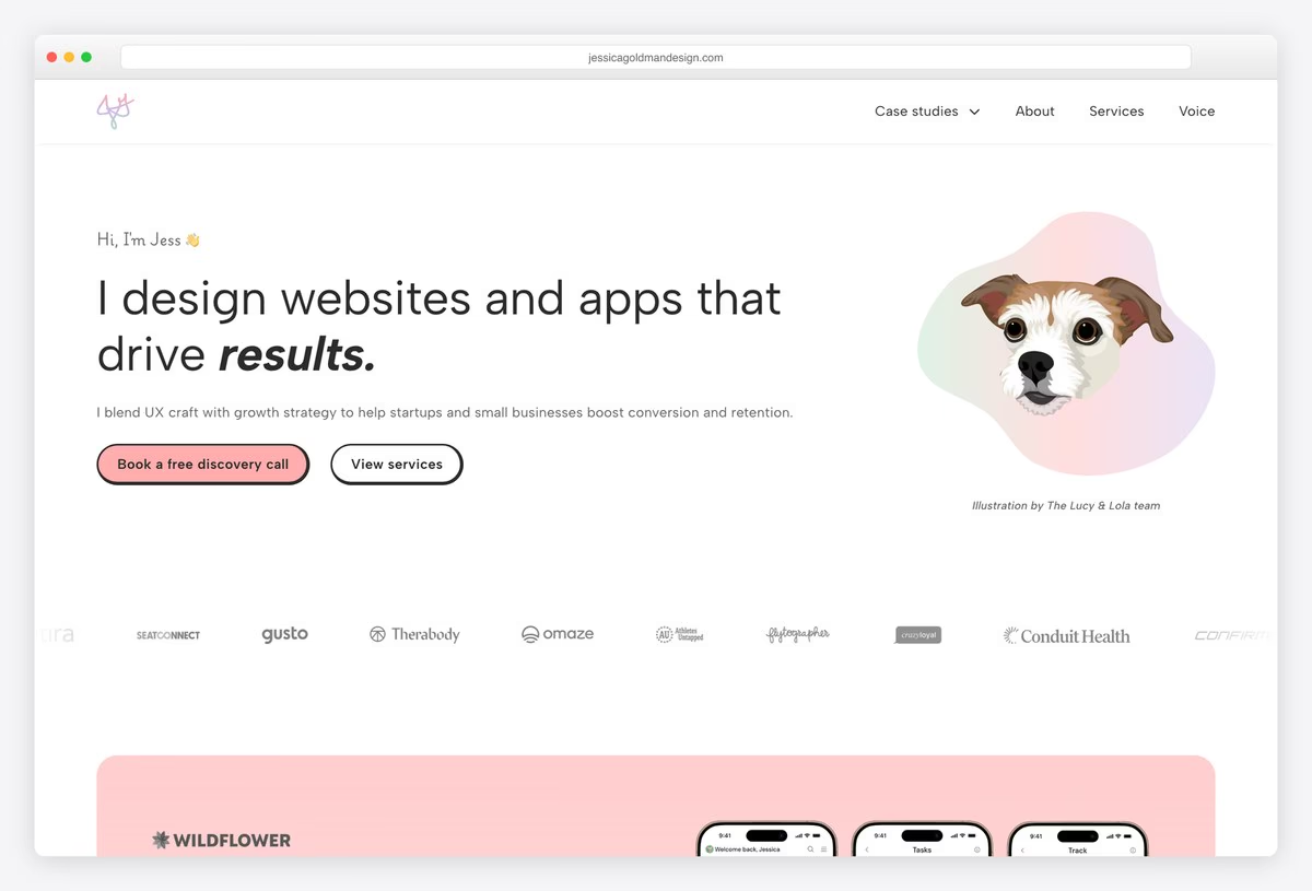
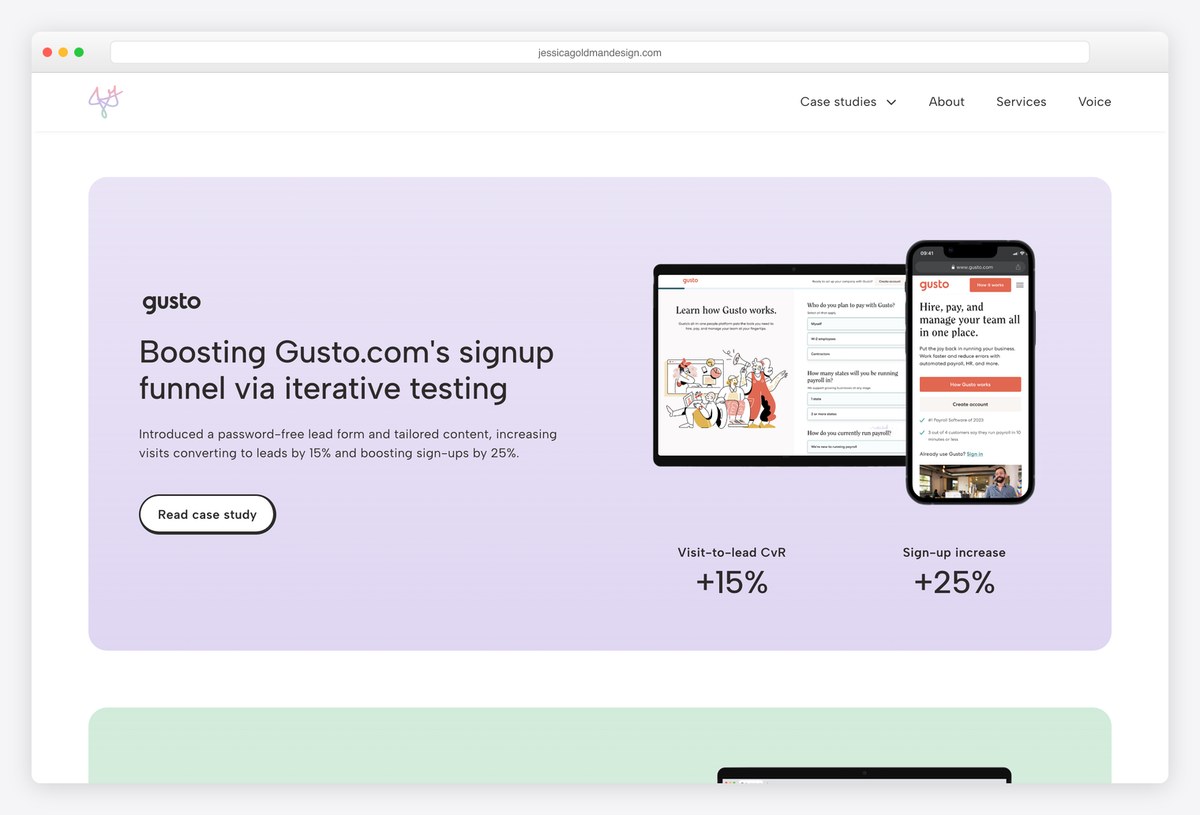
Jessica Goldman is a freelance UX designer who works on growth and conversion, and her portfolio reads like a sales page in the best sense. Every case-study title leads with the business number it moved: one redesign is credited with $580K in revenue, another with a 15% lift in a signup flow.
She came into UX from agency copywriting through a bootcamp, and says so plainly. A Services page publishes package prices, and a discovery-call button sits in the first screen.
What stands out: Put the result in the case-study title, not at the bottom of the page.
2. Layor (Mubarak) Salami
Built with: Custom code
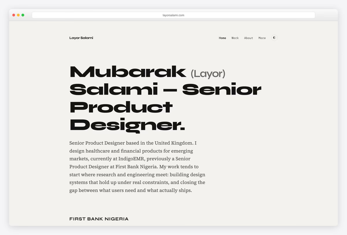
Layor Salami leads design at a healthcare company and has built fintech products for users in Nigeria and Kenya, many of them entering their details into software like this for the first time. That context, rare in UX portfolios, runs through every case.
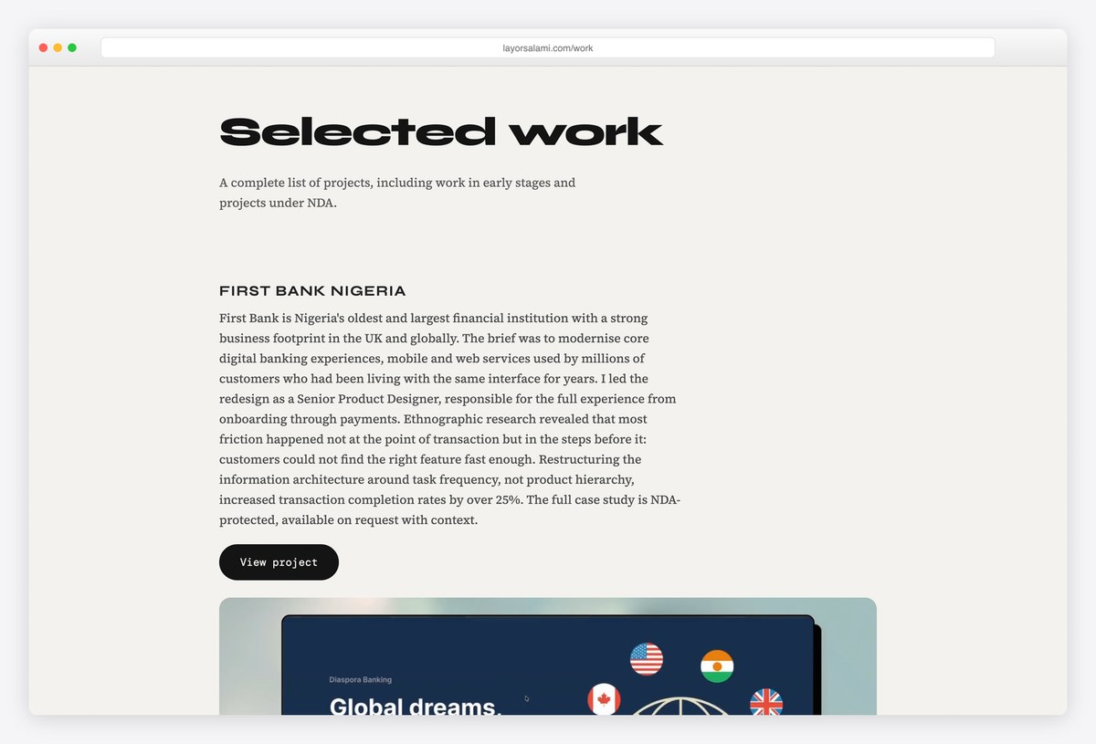
Each section heading states the finding itself, such as one noting that 281 people opened an account through the website and concluding that the problem wasn’t marketing, so a case can be skimmed in seconds. NDA projects are listed with a one-line outcome and offered on request.
What stands out: Write headings as findings, and describe NDA work instead of locking it away.
3. Nicole Roberts
Built with: Framer
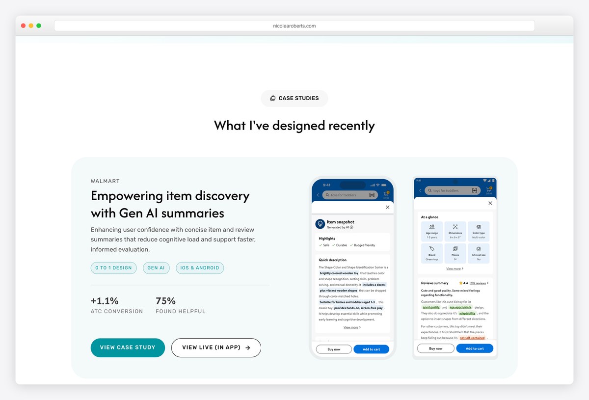
Nicole Roberts designs e-commerce and generative-AI features and has done so for more than a decade. Her strongest move is the case-study card itself: the Walmart project states what it did, shows the screens and prints its results, including a lift in add-to-cart conversion, before you click anything.
Another case frames the problem against an industry benchmark before any design work starts. Email, LinkedIn and a résumé link are all reachable from the first screen.
What stands out: A case-study card that carries its own results.
4. Zoë Sinner
Built with: Custom code
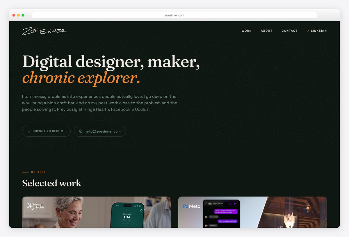
Zoë Sinner has more than eleven years in product design, from social features in VR to a pain-relief device at Hinge Health, which makes her one of the few portfolios here showing hardware alongside software. Her case headings carry the argument rather than naming a process step.
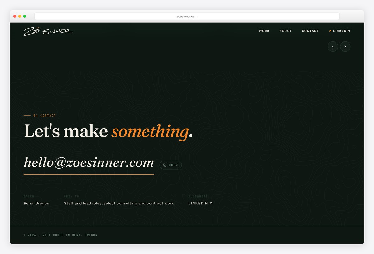
The first screen is practical: download-résumé and copy-email buttons appear before the work, and a contact block spells out exactly what she is open to, from staff and lead roles to select consulting.
What stands out: Say precisely what kind of work you want next.
5. Andrew Webb
Built with: WordPress
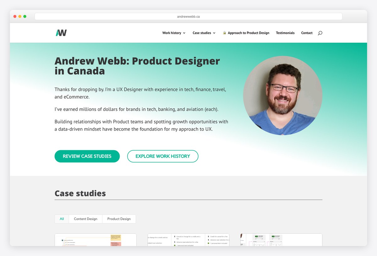
Andrew Webb is a content designer and product designer in Canada, and his banking case is titled with its result: a 150% increase in mortgage renewals. The case then does something few portfolios risk, devoting a whole section to rebuilding a difficult stakeholder relationship.
Case studies can be filtered by content design or product design, which helps a hiring manager looking for one discipline. It is one of the clearest examples of content design presented as product work.
What stands out: Show the messy part of the project, not only the screens.
6. Devayani Gadgil
Built with: Custom code
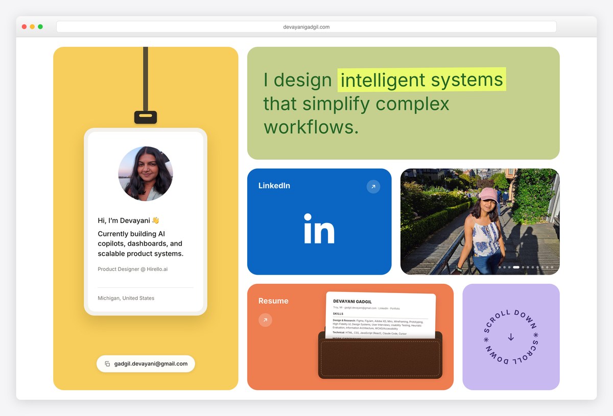
Devayani Gadgil is an early-career AI product designer, and her homepage does something senior portfolios could copy: each project card already shows the problem, the solution and three or four numbers, so the gist lands without a click.
She is candid about limits too. A VR usability study reports three participants and a below-average usability score, then explains what it still taught her. Her résumé is written into the homepage rather than hidden in a PDF.
What stands out: Problem, solution and numbers on every card, even as a junior.
7. Ryan Breault
Built with: Hand-coded HTML
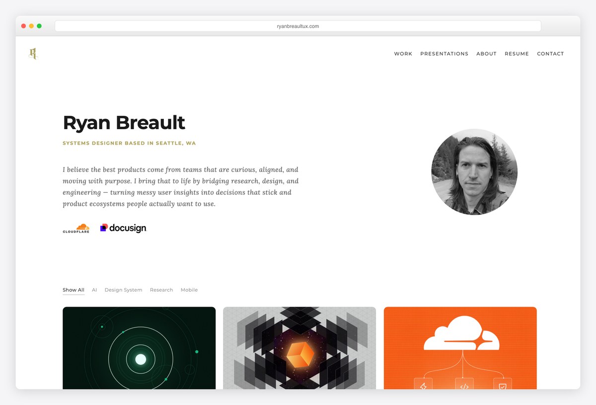
Ryan Breault is a staff designer specialising in design systems, with work for Cloudflare, Docusign and AWS. His ten case studies follow a consistent structure that ends in measured results, such as up to a 98% increase in design speed for common page types.
The work grid filters by AI, design systems, research and mobile, and a dedicated case traces his systems thinking across five companies. Separate pages cover the workshops and presentations he uses to teach it internally.
What stands out: Show the thread that connects years of work, not just the latest project.
8. Katie McCurdy
Built with: Squarespace
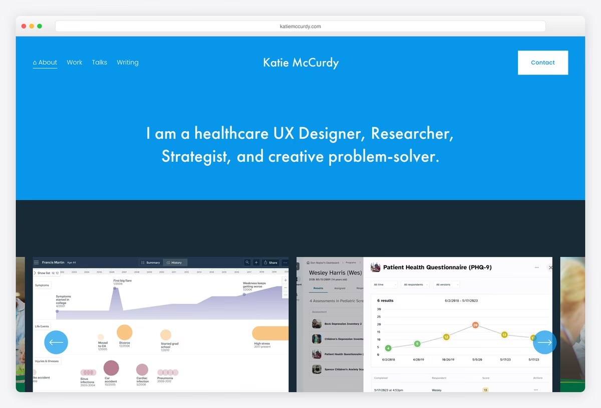
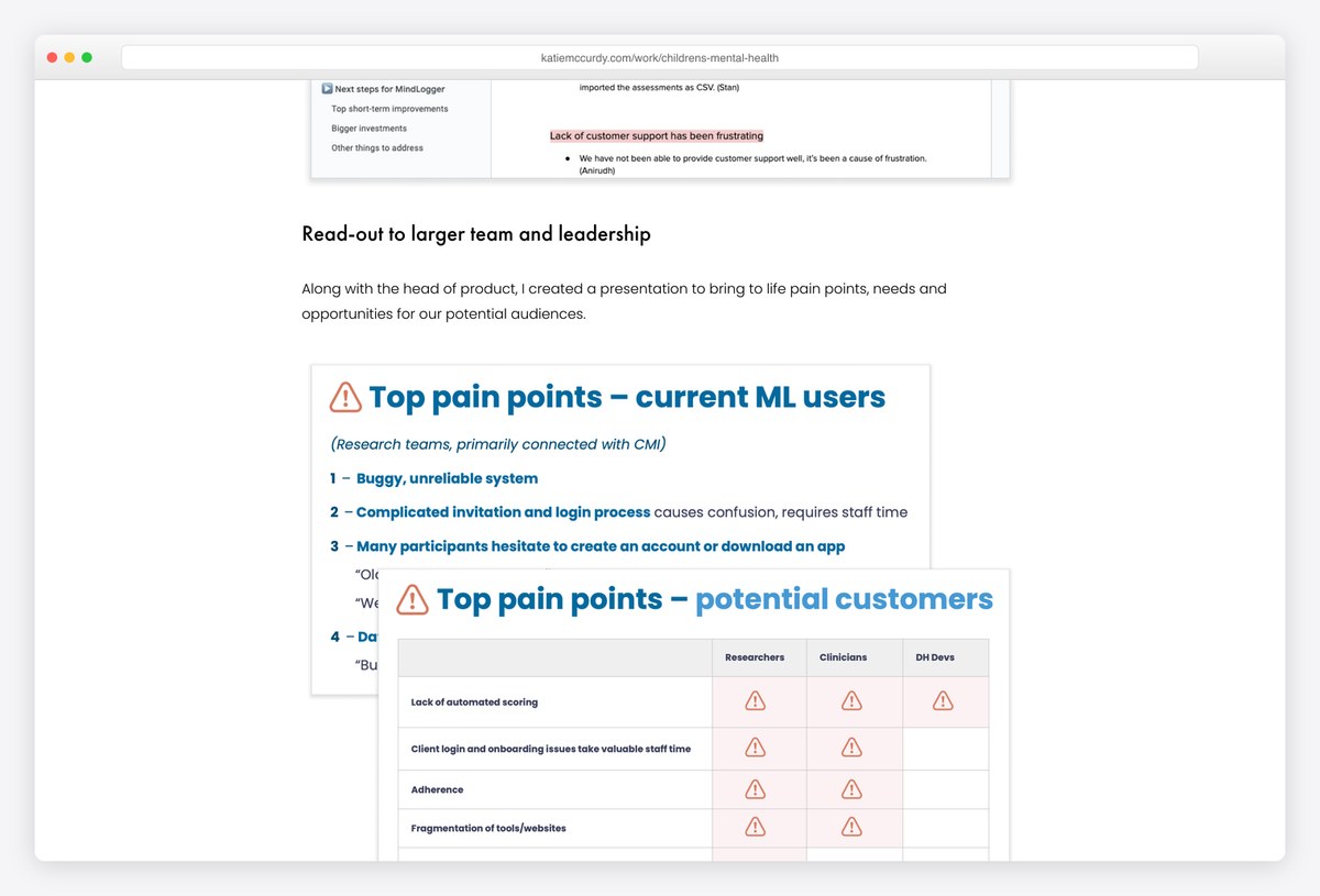
Katie McCurdy is a healthcare UX designer and researcher, and her own startup, Pictal Health, is one of her case studies, followed from service pilot to paying users. Patient questionnaire charts fill the first screen beneath a one-line description of what she does.
Her research cases name their scale, such as interviews with 15 patients and caregivers and 10 providers, and show what happened next: read-outs to leadership, design principles, prototypes and testing.
What stands out: Research cases that continue past the findings.
9. Xhulia Frroku
Built with: Framer
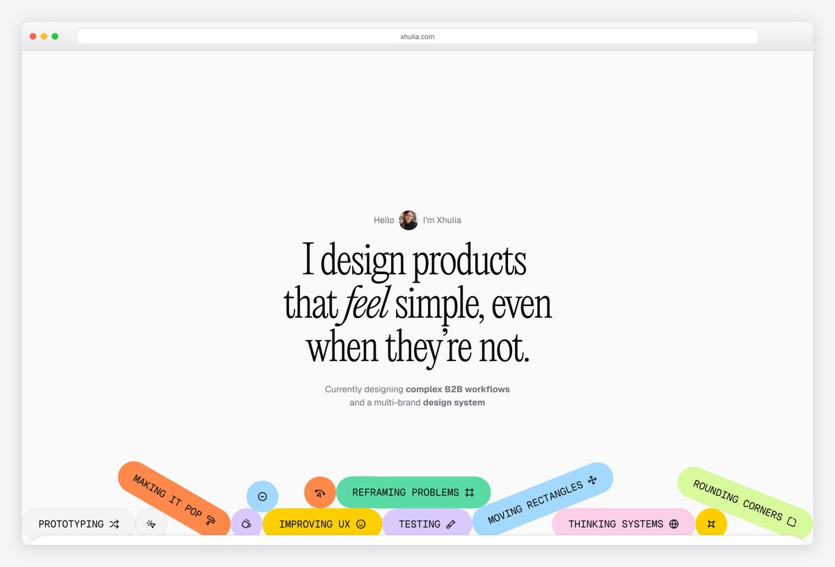
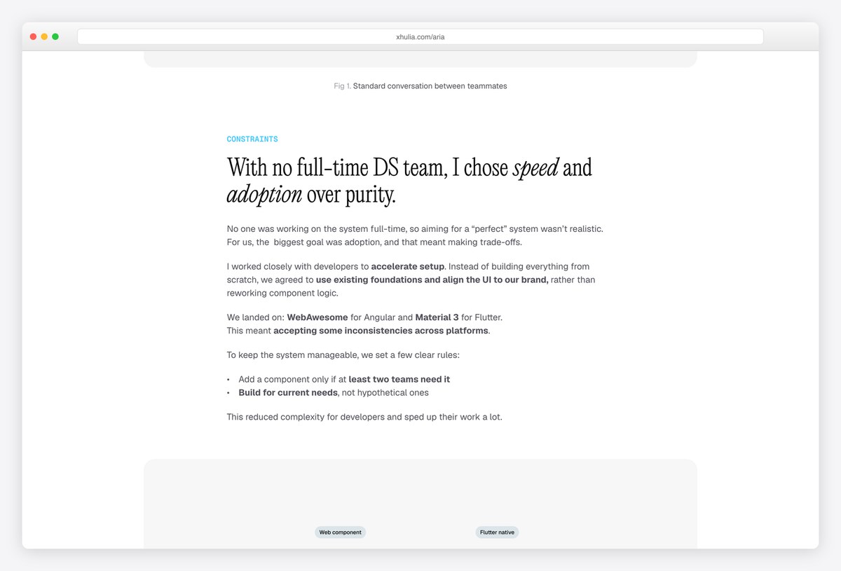
Xhulia Frroku designs B2B workflows and design systems, and her case headings read as decisions with reasons, such as choosing speed and adoption over purity when there was no full-time design-system team. Read the headings alone and the reasoning is already there.
Titles are outcomes, including a design system that helped four product teams ship faster. A playful skills cloud on the homepage offsets the serious work, and her CV is one click away.
What stands out: Headings that record decisions and trade-offs.
10. Elly Hsieh
Built with: Next.js
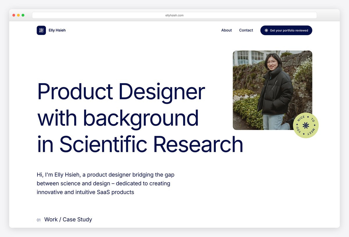
Elly Hsieh moved into product design from scientific research and puts that in her headline rather than apologising for it. Her B2B SaaS cases open with a key-results block before any process, including a two-factor authentication rollout measured by adoption.
She also writes about her route in, from a six-month job hunt to teaching herself usability testing, and offers portfolio reviews, a useful signal for anyone following the same path.
What stands out: Use a career change as the headline, not a footnote.
11. Julia Costa
Built with: Squarespace
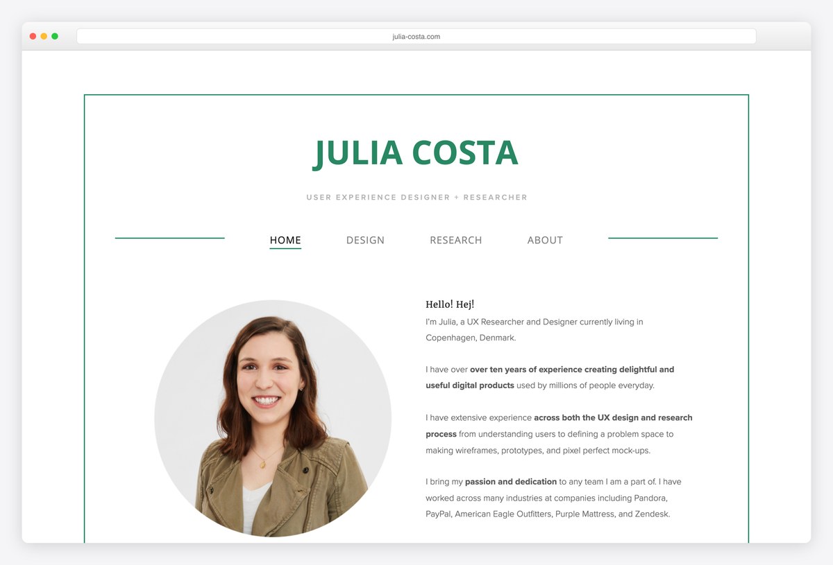
Julia Costa is a UX researcher and designer in Copenhagen with more than ten years of retail and enterprise work. Separate Design and Research menus let a reader choose the lens, and each research case states its scale, such as 60 customers in a remote journaling study.
What sets her apart is the section on journey-map socialisation, which shows how the findings were shared and used across the business, the part most research portfolios leave out.
What stands out: Show what happened to the research after the report.
12. Mohamad Safi
Built with: Squarespace
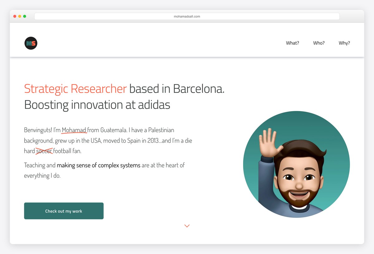
Mohamad Safi is a strategic researcher at adidas in Barcelona, and his navigation is just three questions: What, Who and Why. Case titles tell the story on their own, such as moving from out of stock to in stock through foundational research.
Each case explains why the client needed help, what he did, including workshops, diary studies and interviews across three markets, and what was delivered. A personal introduction makes his cross-cultural research background credible.
What stands out: Navigation that answers a reader’s questions directly.
13. Anurag Dommeti
Built with: Squarespace
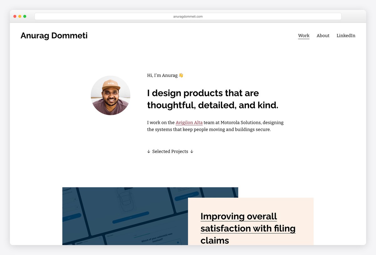
Anurag Dommeti is a senior designer whose portfolio centres on accessibility and design systems. His accessible design-system case lists concrete criteria, including text that resizes to 200% and content that reflows at 400% zoom, instead of promising accessibility in general terms.
An insurance claims case numbers its problems before proposing anything and reports the result, a rise in web filing. He notes on his About page that he is looking for his next role.
What stands out: Specific accessibility criteria instead of a vague promise.
14. Nate Bauer
Built with: Next.js
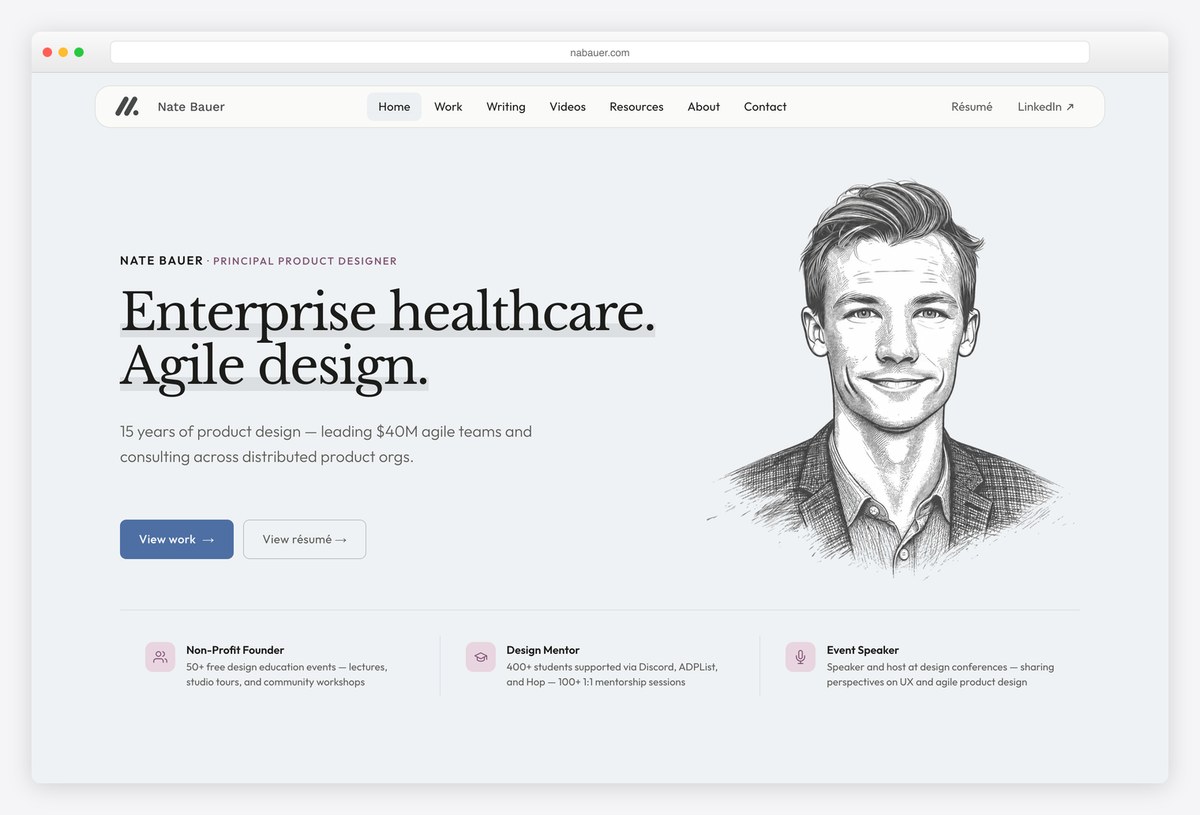
Nate Bauer is a principal designer with fifteen years in enterprise healthcare. A stats row in the first screen covers his teaching as well as his design work, including more than 50 free design education events and mentoring 400+ students.
His recovery case puts success measures before the design work and frames the stakes in money, a process costing millions each year. He also runs a weekly live portfolio and résumé review, noted on his About page.
What stands out: Define how success will be measured before showing the design.
15. Suleyman Sarigoz
Built with: WordPress
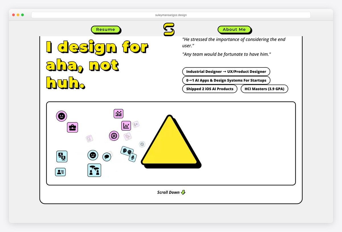
Suleyman Sarigoz moved from industrial design into UX and positions himself with the line ‘I design for aha, not huh’. Each homepage card opens with a one-line hook and names the role he played, such as UX designer or UX writer.
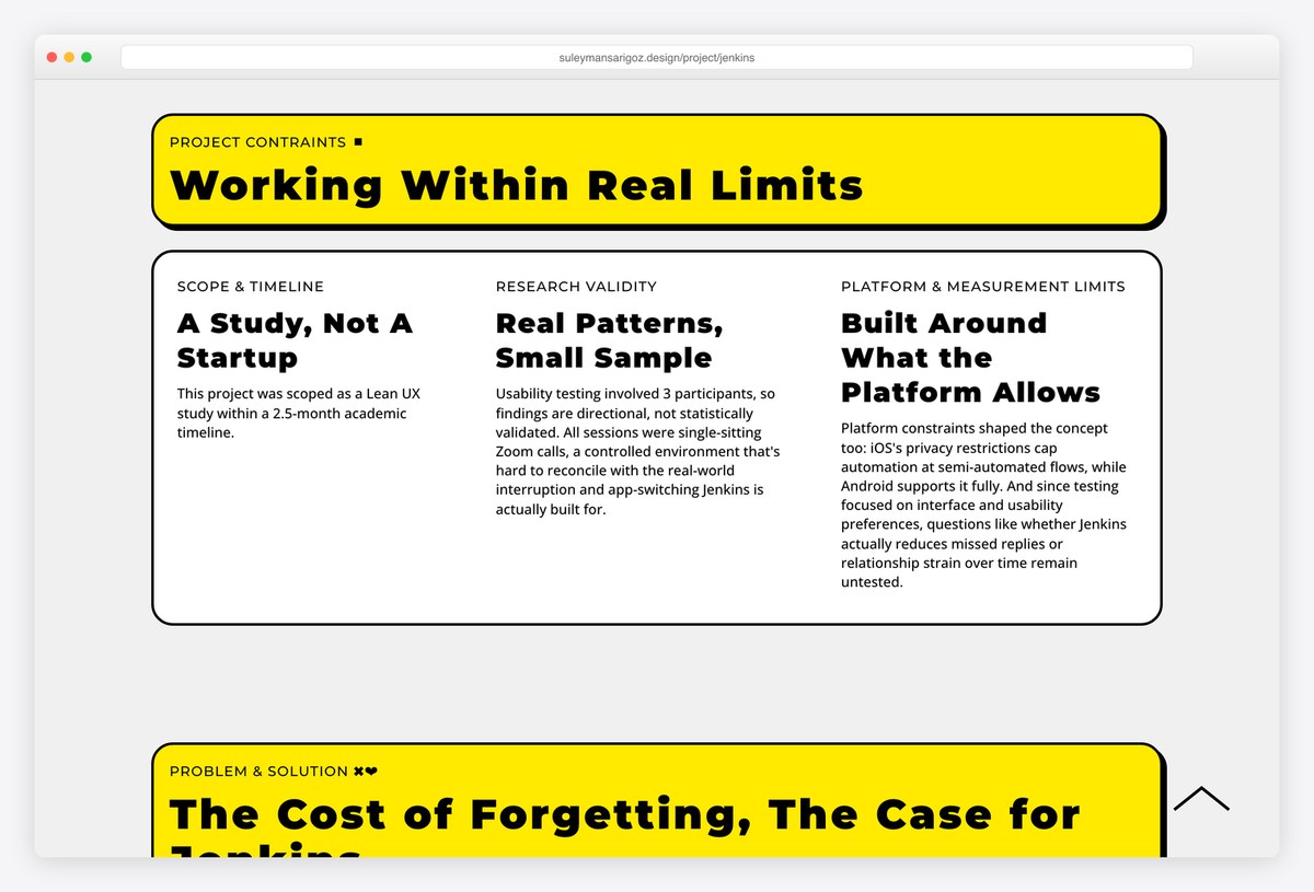
His case studies are honest about scale. One states that usability testing involved three participants, so the findings are directional rather than statistically valid, which reads as more credible, not less.
What stands out: Admit the limits of your research.
16. Ellen Covey
Built with: Webflow
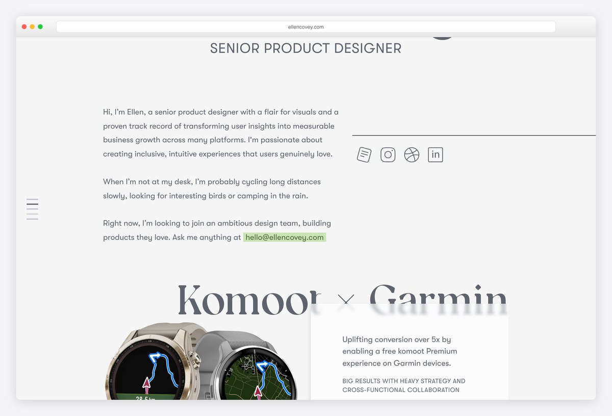
Ellen Covey is a senior product designer whose availability is the first thing you read: a scrolling ticker across the top says she is looking for her next adventure. Her cases are hypothesis-driven, including a sign-up flow charted by where users abandoned it, before and after.
One result is stated plainly: over 30% more users starting a trial. A restricted case is labelled ‘Access the full story’ rather than hidden.
What stands out: Make availability impossible to miss.
17. Daniel Autry
Built with: Custom code (React)
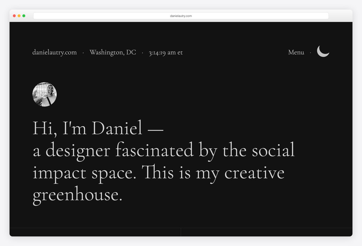
Daniel Autry designed election coverage for The Washington Post, and his site feels like a newsroom page, with a live local clock beside Washington, DC in the header. The case studies repeat the same structure for each election year and report results such as a 31% rise in state-page views.
A mental-health project opens with large statistic tiles. His About page explains the route from computer science and front-end engineering into design.
What stands out: A consistent case structure that makes years comparable.
18. Havana Nguyen
Built with: Squarespace
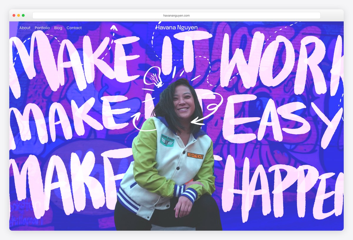
Havana Nguyen designs healthcare and clinical-trial experiences, and her first screen is her own hand-lettered artwork. She is also a comic artist and runs the Atlanta chapter of Ladies that UX.
Case titles are framed as questions, such as whether clinical trials could recruit more participants by making consent easier. The eConsent case includes an accessibility-first interface section and reports a 98% task success rate in moderated usability studies.
What stands out: Personality in the first screen, rigour in the case studies.
19. Diana Agronov
Built with: Framer
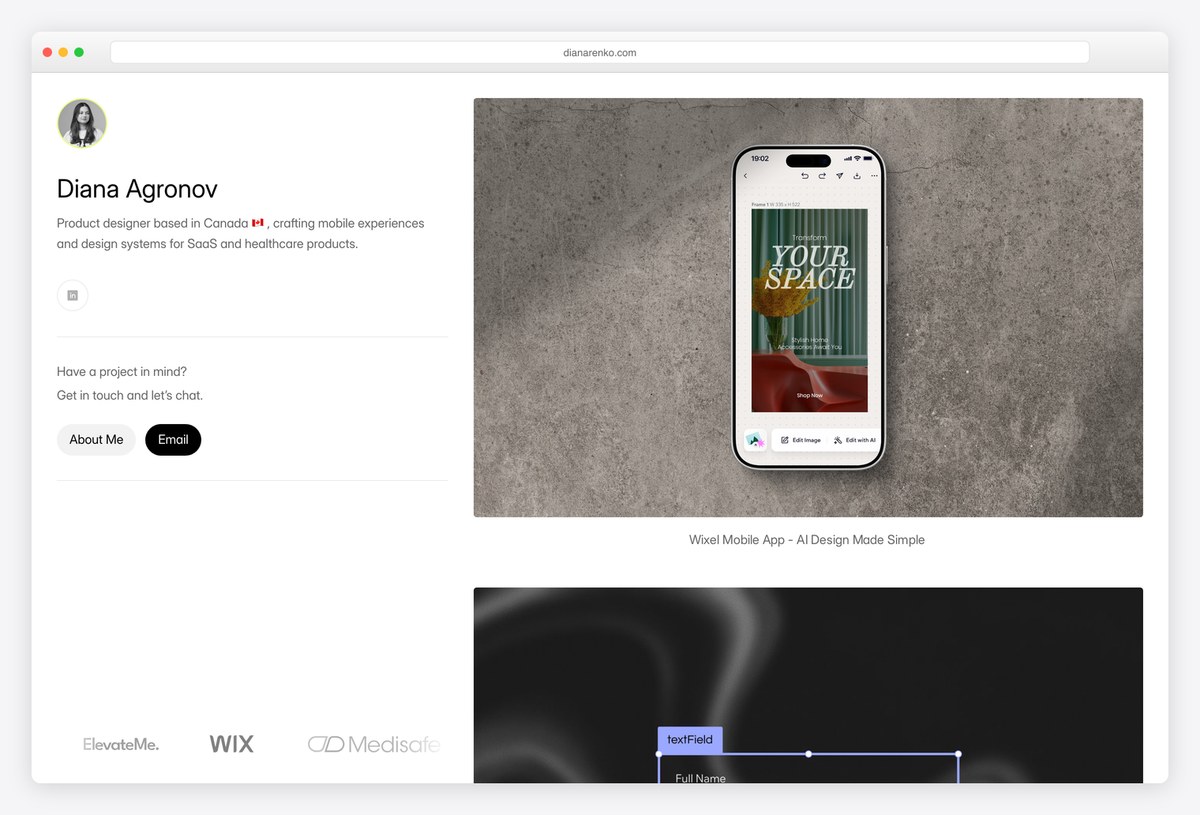
Diana Agronov designs mobile apps and design systems for SaaS and healthcare. Her layout is split from the first pixel: bio, email and LinkedIn on the left, large project imagery on the right, so the work is visible immediately.
The design-system case shows before-and-after comparisons of the components affected and has been updated with an accessibility compliance section, a quiet sign that the portfolio is maintained. Her About page says she is available for work.
What stands out: A portfolio that is visibly kept up to date.
20. Gloria Ha
Built with: Webflow
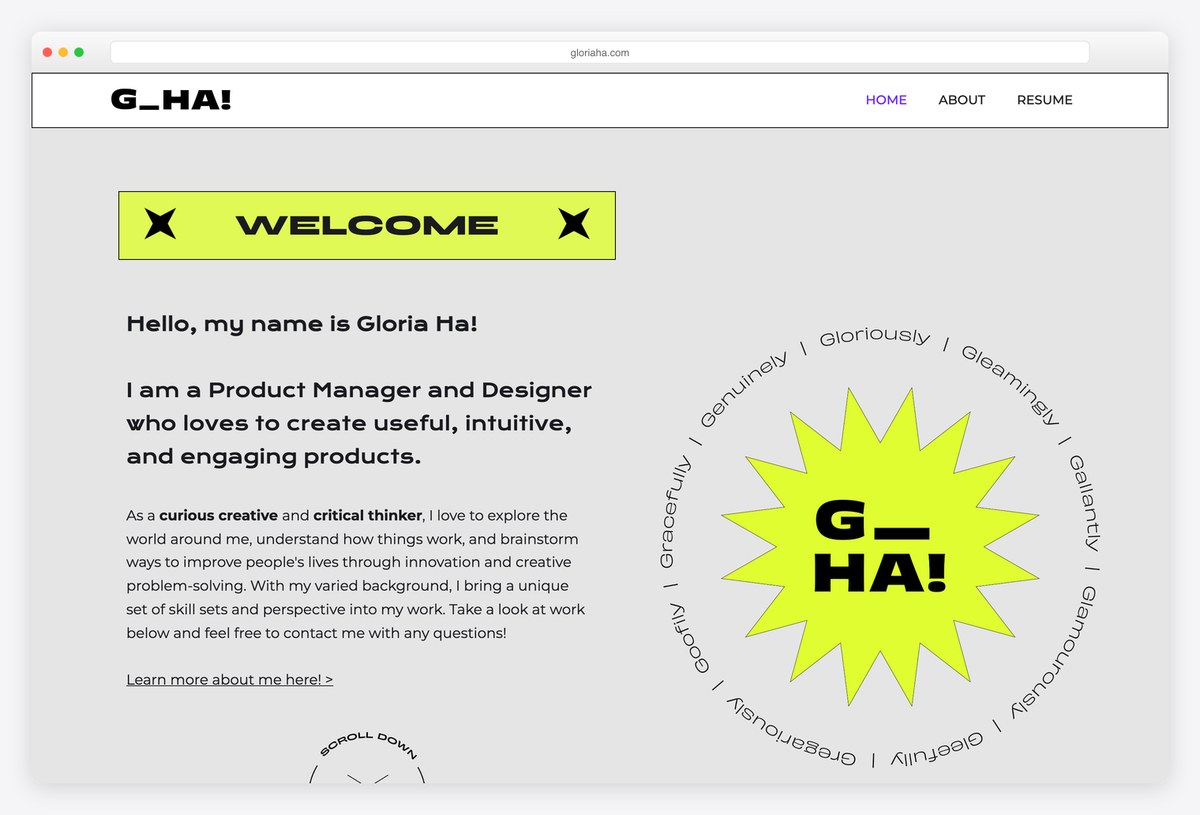
Gloria Ha is a career changer who studied sociology, and her portfolio shows how to present bootcamp work honestly. One project is labelled up front as a fictitious scenario completed during a course, and each case lists the hours invested.
Findings are reported with the number of participants behind them, and the design-thinking stages are done thoroughly rather than named and skipped. A résumé link sits in the navigation.
What stands out: Label concept projects honestly.
21. Gloria Lo
Built with: Webflow
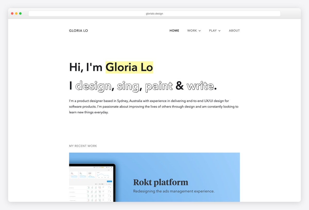
Gloria Lo is a self-taught product designer in Sydney, and her kinetic headline says she designs, sings, paints and writes, with a separate menu for artwork and music. The first real case, a platform redesign for Rokt, appears directly beneath the introduction.
That case makes prioritisation and scope-cutting explicit steps and reports interview findings as shares of a small group, a clear way to show judgement on a limited sample.
What stands out: Show how you decided what not to build.
22. Caleb Ixca
Built with: Custom code
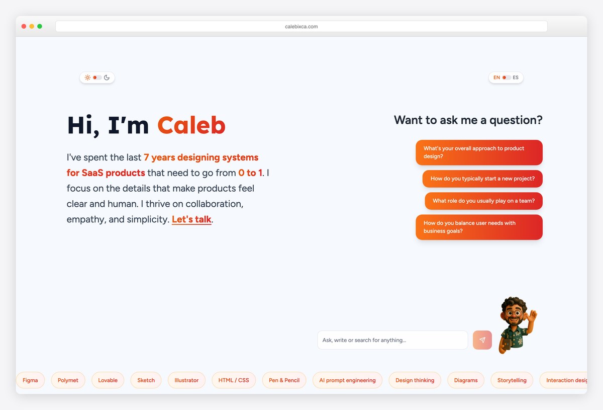
Caleb Ixca is a senior designer with startup, fintech and nonprofit education work, and his homepage includes a question-and-answer widget where a visitor can ask how he approaches a new project. The whole site switches between English and Spanish.
Case studies open with the problem, the solution, the timeline and the team before separating the business problem from the user problem. A booking link and email sit behind a Let’s talk button in the first screen.
What stands out: Let visitors ask you questions directly.
23. Moritz Oesterlau
Built with: Webflow
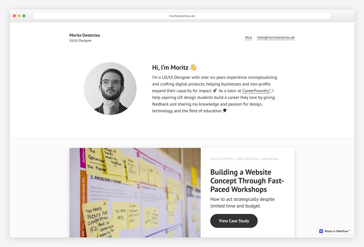
Moritz Oesterlau designs for nonprofits and education in Germany and tutors UX students on the side. His donation-page case uses a scroll heatmap to justify moving the ask, since only about 60% of visitors scrolled far enough to see it.
Another case documents fast-paced workshops used to agree a website concept, showing facilitation as a design skill rather than just the final screens. His email address sits in the header.
What stands out: Use real behaviour data to justify a design decision.
What the best UX portfolios have in common
The result is in the title or on the card. Jessica Goldman titles a case with the revenue it drove, Andrew Webb with a 150% rise in mortgage renewals, and Devayani Gadgil’s cards show problem, solution and numbers before a click. A reader skimming the homepage already knows what you achieved.
Headings tell the story. Layor Salami and Xhulia Frroku write each section heading as a finding or a decision. Generic headings such as Empathize, Define and Ideate hide the reasoning a hiring manager is looking for.
Honesty about scale builds trust. Suleyman Sarigoz calls a three-person test directional, Gloria Ha labels a course project as fictitious, and Devayani Gadgil reports a below-average usability score. Overclaimed numbers are easy to spot and hard to forgive.
NDA work is described, not hidden. A one-line outcome with an offer to walk through it on request, as Layor Salami does, beats a password wall across every case study.
Availability and contact are easy to find. Ellen Covey’s ticker, Zoë Sinner’s open-to block and Caleb Ixca’s booking link remove the guesswork about whether and how to get in touch.
Research portfolios show method, sample and what happened next. Julia Costa, Mohamad Safi and Katie McCurdy follow their findings into roadmaps and read-outs rather than stopping at personas.
The platform does not decide the quality. These examples run on Squarespace, Framer, Webflow, WordPress and hand-written code. What they share is upkeep; case studies saved as images or slide carousels are also invisible to screen readers and search engines.
Frequently Asked Questions
What should a UX portfolio include?
Three or four case studies that each show the problem, your role, how you worked and what changed as a result, plus a short introduction, a résumé link and an obvious way to contact you. Put the outcome where it is seen first, in the title or on the project card, and keep at least some work readable without a password.
How many case studies should a UX portfolio have?
Three to four strong case studies is typical among the portfolios above, and quality matters far more than count. Ryan Breault shows ten because he is presenting a decade of design-system work; a junior designer is better served by three well-explained projects than a grid of thin ones.
Should I password-protect NDA work in my UX portfolio?
Only if you must, and never all of it. Hiring managers rarely request passwords. Describe protected projects with a one-line outcome and offer to walk through them on a call, and make sure at least one full case study is open to anyone.
What is the best platform for a UX portfolio?
Framer, Webflow and Squarespace are the most common choices here, alongside WordPress and hand-coded sites. Pick the one you will actually keep updated. Avoid building case studies as images or slide decks, because screen readers and search engines cannot read them.
How do I make a UX portfolio with no experience?
Use concept, bootcamp or volunteer projects, label them honestly as such, and show your process and reasoning in detail. Gloria Ha and Suleyman Sarigoz do this well. If you are changing careers, make the previous field part of your headline, as Elly Hsieh does with scientific research.
Should a UX portfolio show metrics?
Yes, when you have real ones, and state where they came from. Business results such as conversion or revenue carry the most weight, but research counts, such as the number of participants, also build credibility. Never invent or inflate a number; reviewers check.
Wrapping Up
A UX portfolio is judged in a minute, so the strongest ones make that minute count: a clear line about what you do, results where they are seen first, and case studies that show your reasoning.
For more inspiration across roles, see our best portfolio website examples, web designer portfolios, graphic design portfolio examples, developer portfolios and student portfolios. Ready to build your own? Start from our portfolio website templates, the best portfolio WordPress themes or a free portfolio website builder.

Related Posts

Comments (0)