16 Best Squarespace Portfolio Templates 2026
If you’ve been hunting for the perfect Squarespace portfolio templates to showcase your work, look no further!
I’m excited to walk you through some of the best designs that work for photographers, artists, designers, or any creative.
Finding the right template can feel like searching for a needle in a haystack. But don’t worry – I’ve got you covered.
Squarespace is a go-to for creatives who want to build a professional online presence without the headache of complicated web design.
With an array of stunning templates tailored for portfolios, you’ll find the perfect backdrop to let your work shine.
From minimalist layouts that let your work do the talking to dynamic designs that make your website pop, there’s something for every style and need.
Are you ready?
Best Squarespace Portfolio Templates
Below, I’ve curated a list of the top Squarespace portfolio templates that combine aesthetics, functionality, and simplicity to help you stand out.
Note: Check these Squarespace portfolio examples for an inspiration boost.
1. Hales
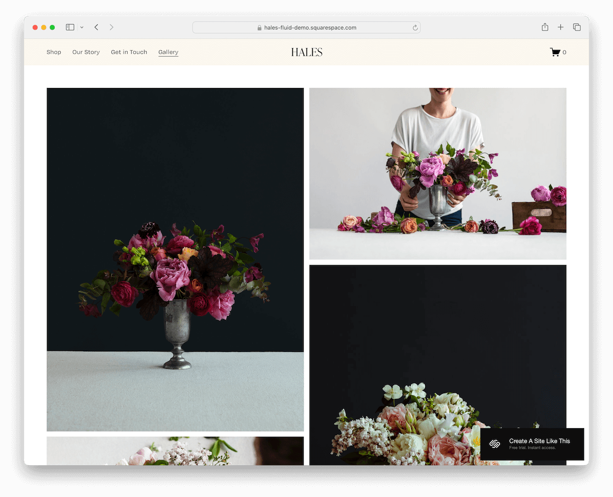
The Hales Squarespace template is a minimalist’s dream with a sleek, floating header that stays with you as you scroll.
Content loads seamlessly, making browsing a breeze. The layout is a chic masonry grid showcasing large thumbnails that pop.
And the footer is spacious yet tidy, packed with quick links, social media icons, and a handy subscription form.
Hales is everything you need for a portfolio that’s as functional as it is beautiful.
More info / Download Demo2. Kusa
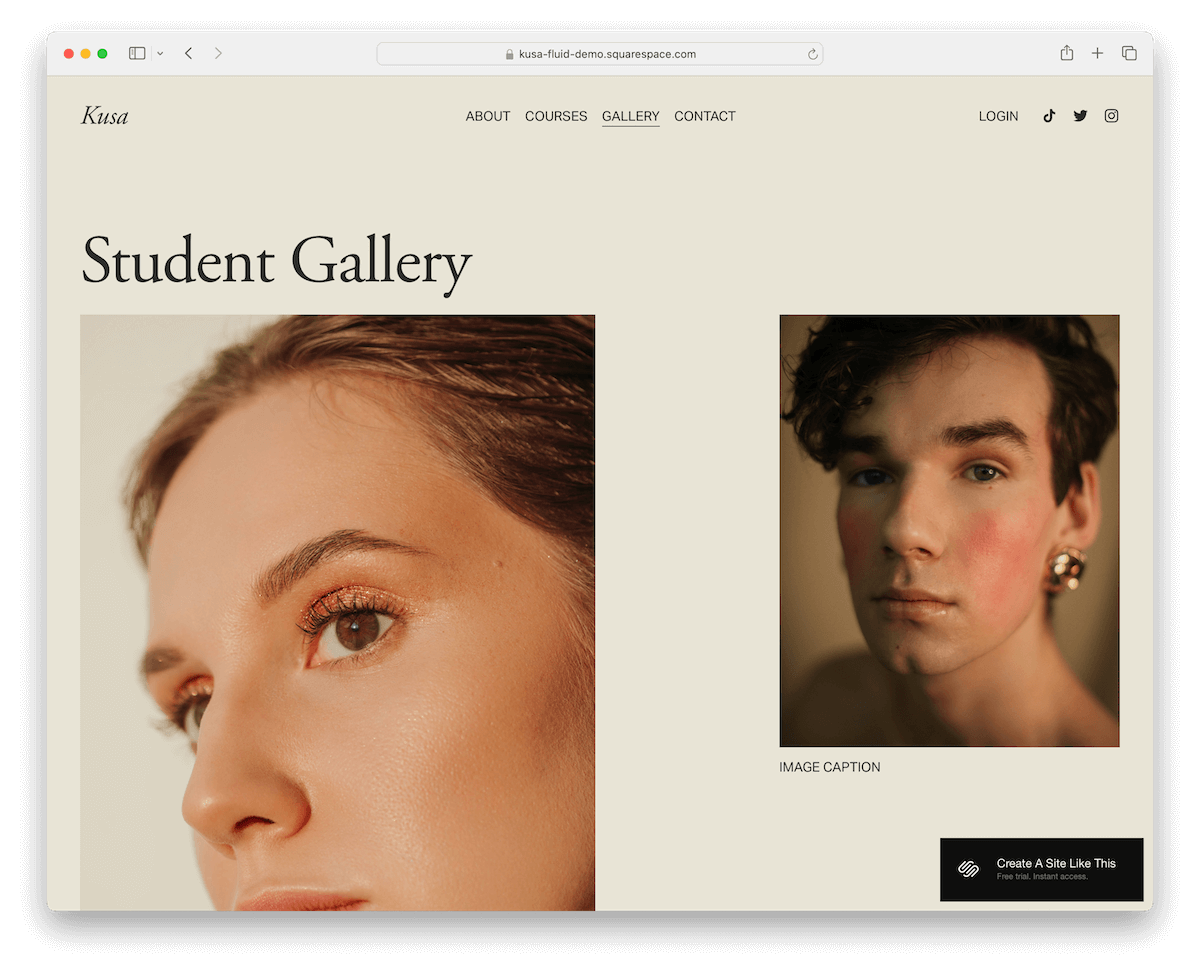
Check out the Kusa Squarespace template featuring this cool uniform background color for the header and base, creating a sleek, cohesive look. But the footer stands out with a contrasting color, adding a nice pop.
Social icons and a login link in the navigation bar make it super user-friendly.
Moreover, the portfolio layout is original and airy, with tons of white space, ending with a catchy CTA button.
The multi-column footer is packed with everything you need: menus and social links and a subscription widget.
More info / Download Demo3. Condesa

The Condesa Squarespace template brings color and a modern touch to your portfolio. Its rounded edges give off a cool, mobile-like vibe, making it super inviting.
What’s super convenient is the contact button right in the header.
The portfolio boasts large, readable typography, so your work’s details are front and center, both written and visual.
Finally, the footer is huge, filled with quick links and a contact form, making it easy for anyone to contact you.
More info / Download Demo4. Selene
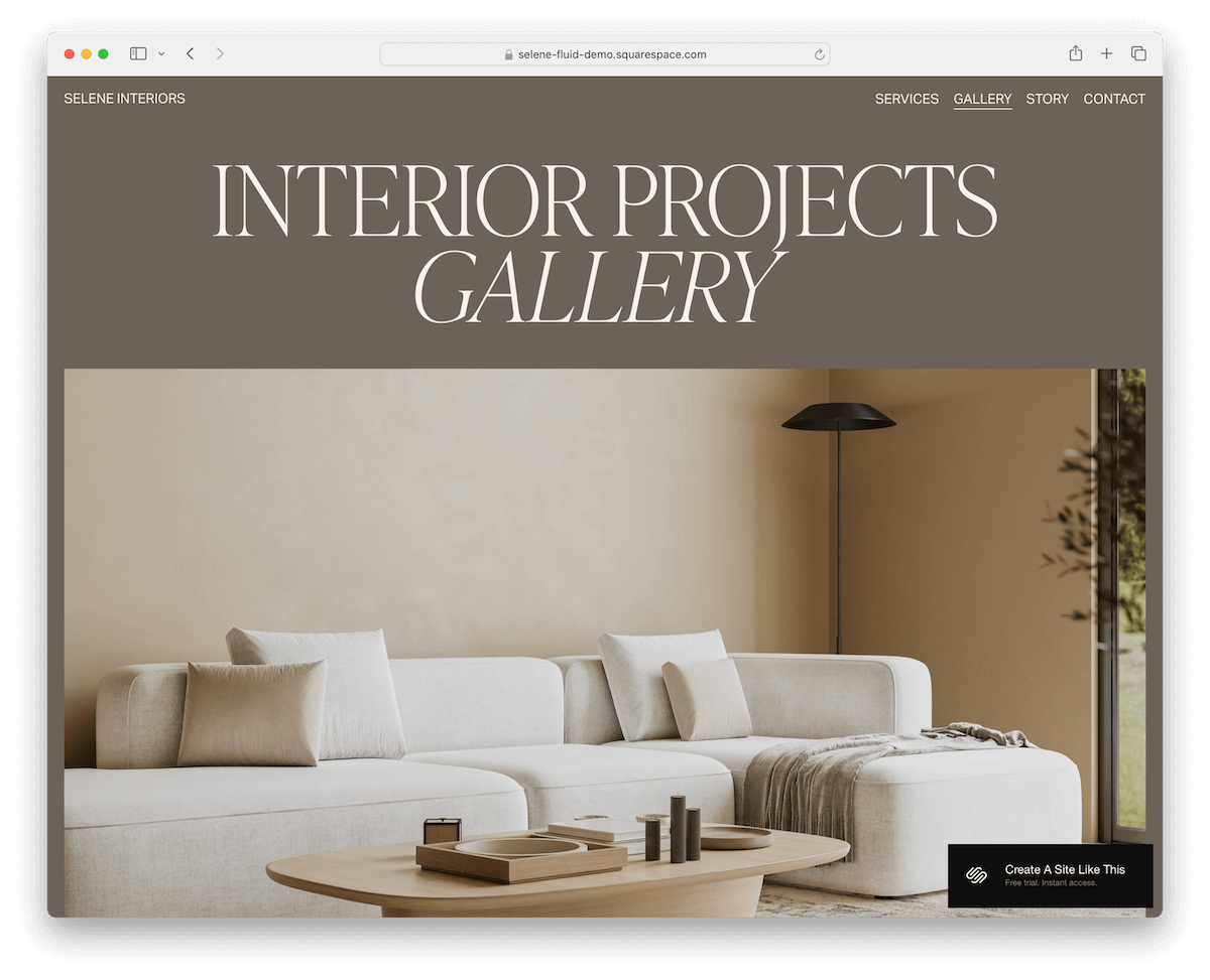
The Selene Squarespace template is clean and simple, ensuring it puts all the emphasis on your content.
It has a header that vanishes when you scroll down, only to reappear when you’re back at the top – a neat trick that can improve UX.
Dive into its lightbox gallery to view works in full glory without distraction. Need to get in touch? The contact form has extra fields for all the details.
The footer takes a pretty significant site space, packed with business and contact info, quick links, and a subscription form.
More info / Download Demo5. CIMEN

The CIMEN Squarespace template is the epitome of clean design.
I like that the header, base, and footer all share the same background color, creating a seamless flow. Each section is also delicately divided by a thin line, adding just the right touch of definition.
The portfolio is a neat three-column grid layout with a lightbox function to give your work the spotlight it deserves.
Last but not least, the footer is minimalist, featuring a large logo sitting above quick links and an Instagram icon.
More info / Download Demo6. Reseda
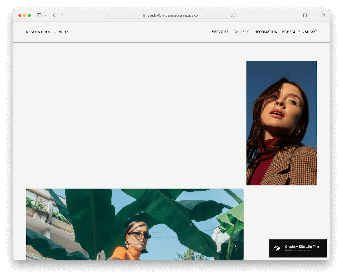
Reseda is a Squarespace template with a light design, but then it surprises you with a dark, contrasting footer.
The portfolio layout is kind of scattered, giving it a really distinct touch – like your work is just casually hanging out on the page.
But there’s enough spacing for a pleasant viewing experience. What’s more, each piece pops open in a lightbox so that viewers can get up close with each work.
The floating header is slick, and the footer is stuffed with a subscription form, sitemap, and social media links.
More info / Download Demo7. Quinn

Quinn is minimalist with a twist. The design is this cool light gray, but then bam! The red typography stands out, giving it some oomph.
Furthermore, the header floats at the top, with the logo on the left and links on the right, always there when needed.
The portfolio layout is organized, with images on the right, making them the star, and titles on the left.
The footer is simple, blending seamlessly with the rest of the layout. There are no hard separations here, like a different background color, line, or other design element dividing things.
More info / Download Demo8. Ortiz
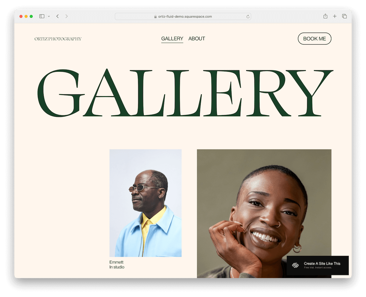
Ortiz is the definition of a sleek and straightforward Squarespace portfolio template.
The header and footer are unfussy, letting the modern layout do all the talking. There’s even a CTA button right in the navbar, catching your eye.
As you scroll, the portfolio elements load gracefully, each ready to pop into a lightbox with just a click.
What’s cool is the green contrasting footer, where you’ll find a subscription widget and social media icons, adding a splash of color and connectivity.
Ortiz is all about making a statement – effortlessly.
More info / Download Demo9. Parisian
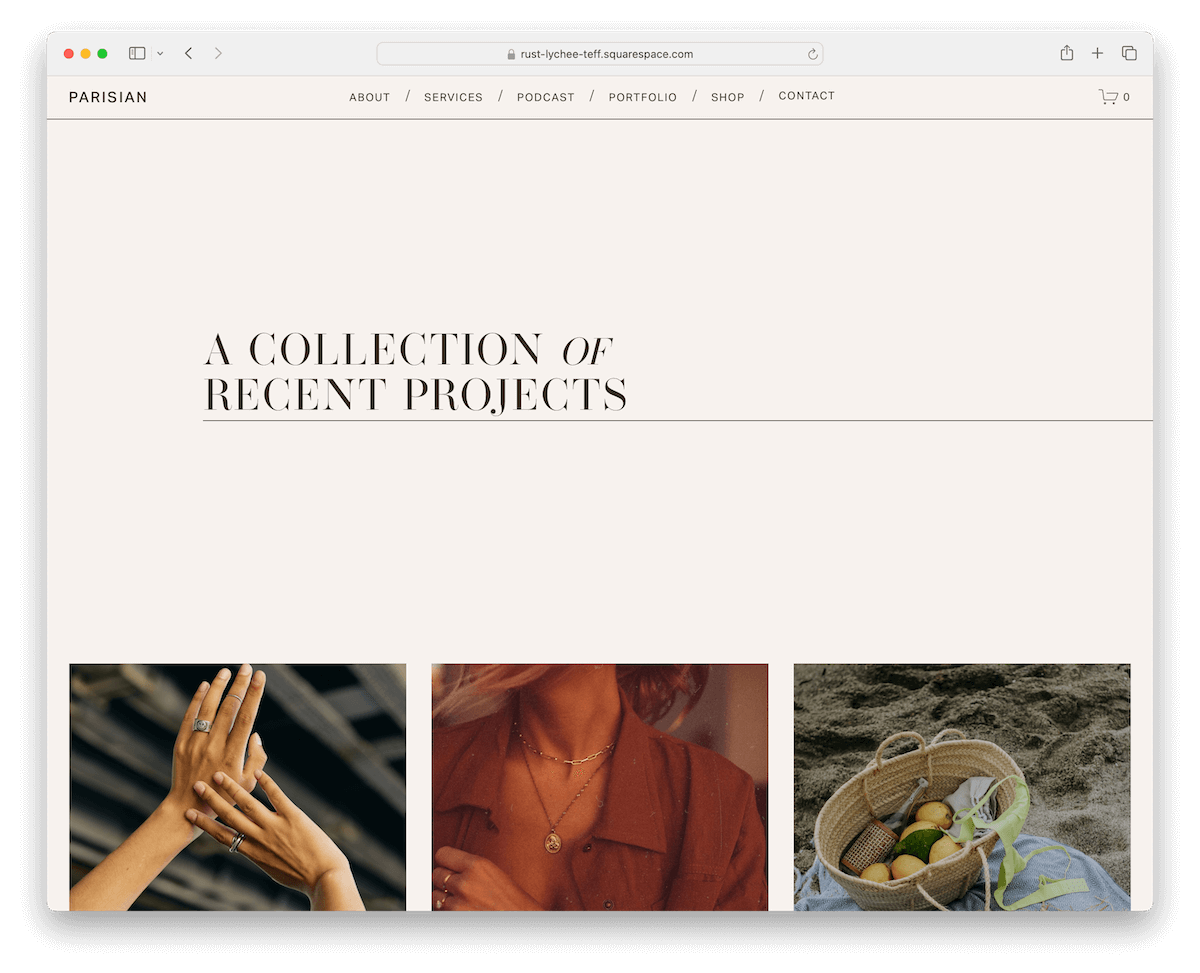
The Parisian Squarespace template cleverly covers simplicity and sophistication.
Its thumbnails are just the beginning – they hide the project titles, revealing them only when you hover over them, adding a layer of intrigue.
When you click, you get to individual project pages with sleek sliders that let work do the talking.
Plus, each project page has pagination, making jumping to the previous or next project easy.
It’s like a seamless gallery walk through your portfolio, all from the comfort of your screen.
More info / Download Demo10. Arlie

Arlie is a superb Squarespace template for establishing a pleasant online portfolio and making your work shine.
You’ll notice immediately the custom “dot” cursor, which makes scrolling and clicking even more exciting.
Another fantastic element I like is the full-screen animated/video background section promoting services. (But you can use it for something else, too.)
Additionally, Arlie has flawless individual project pages with title and text and the top, followed two-column grid layout.
More info / Download Demo11. Persona
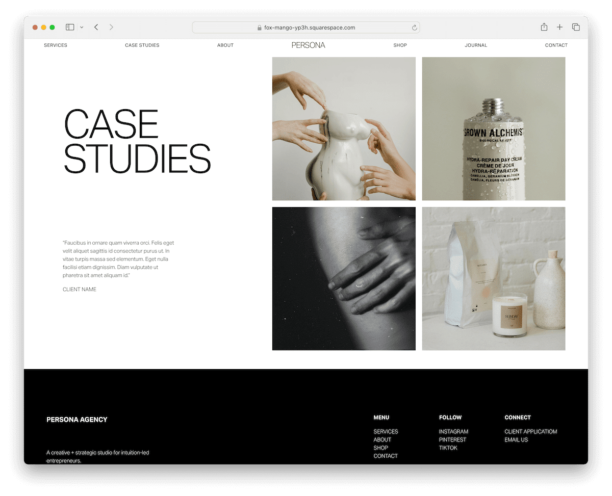
Persona keeps it very simple with the portfolio page, featuring text on the left and a portfolio grid on the right.
Each thumbnail is clickable, revealing more about individual works with a minimalist layout and a slideshow.
While the header and the base have a light background, the footer area pops nicely with its black background.
Make a strong and pleasant first impression with Persona.
More info / Download Demo12. Modern Day Creative

Modern Day Creative has a transparent header with a drop-down menu and social media icons. It doesn’t float, so scrolling back to the top is necessary.
Moreover, the portfolio page has categories with clickable images that reveal more work in a slick grid layout.
Scrolling past the portfolio, you get to the subscription form, followed by a catchy footer with quick links, contact details, and an Instagram feed.
More info / Download Demo13 Leon

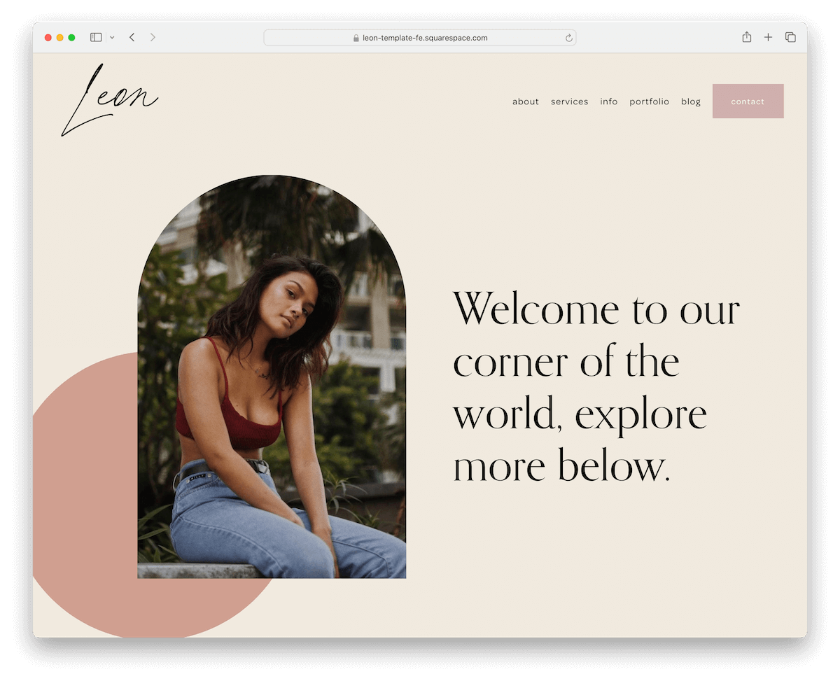
The Leon template starts with a floating, transparent header equipped with menu links and a contact button—everything you need is right at your fingertips.
The color scheme is utterly soothing, making your portfolio a tranquil space to explore.
Dive into the main portfolio, and you’ll find a neat two-column grid. This leads to individual project pages showcasing your work in large, stunning images.
But wait, there’s more.
The footer includes an IG feed, social icons, a subscription form, and extra menu links.
Leon’s got it all, making your portfolio a showcase and an experience.
More info / Download Demo14. Trove
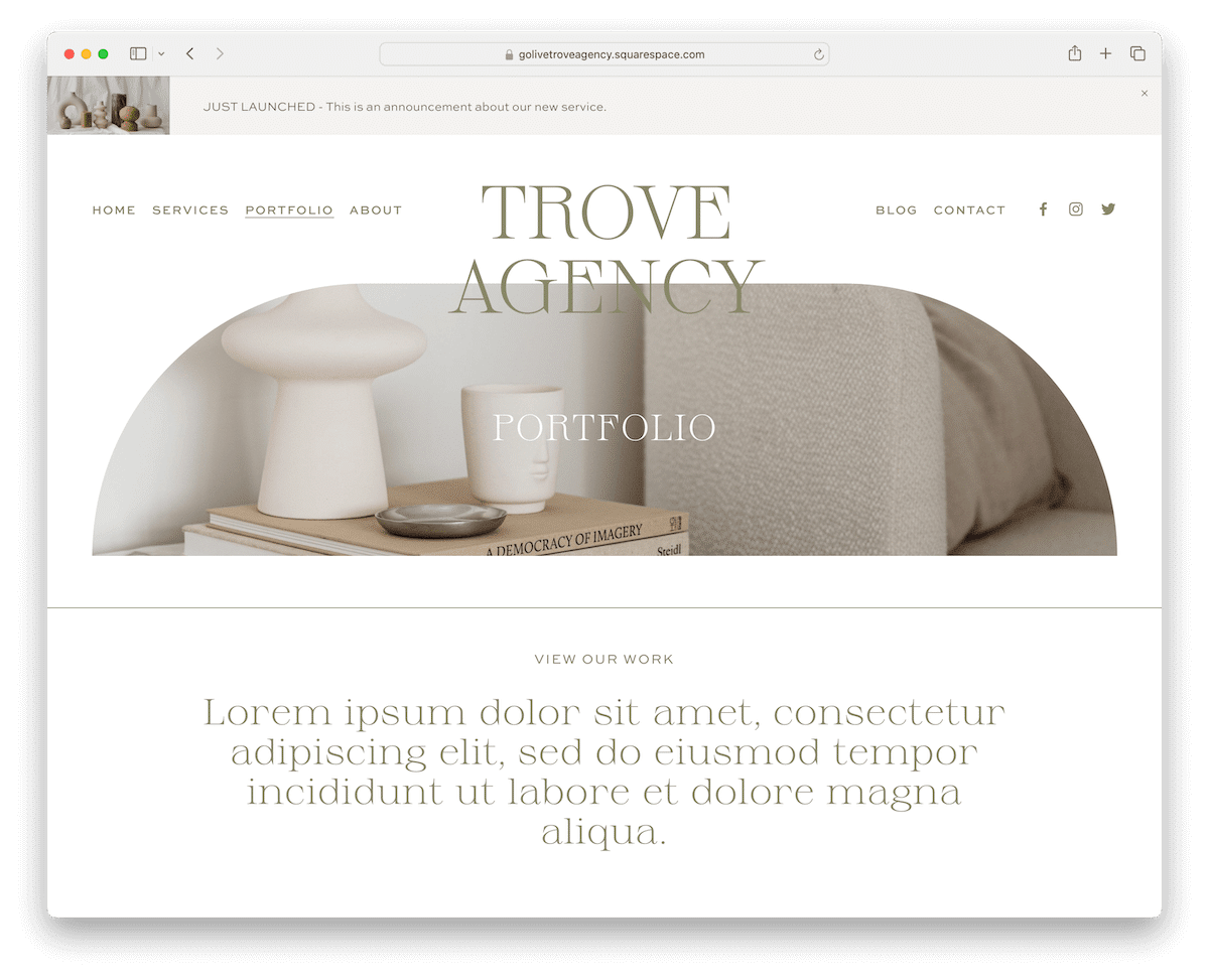
Trove is modern and elegant, an excellent Squarespace template that will take your project showcase to the next level.
From minimalist structure to great detailing, this tool has it all for your convenience.
In addition to the header, you’ll also find a top bar, which you can use for special announcements, new published projects, etc.
Single portfolio pages have a featured image with a parallax effect for added engagement and a grid layout with a lightbox. There are also accordions for displaying extra information while keeping it clean.
More info / Download Demo15. Signify

Signify knows how to strategically mix opulence with cleanness and modernism in a Squarespace portfolio template. (The dark sections make it something special.)
The portfolio grid is a mosaic of your projects, each piece waiting to be discovered. And when you dive into an individual page, the parallax effect adds depth and movement, making each visit memorable.
Need more details? Accordions unfold with more project info at a click. Navigating through your masterpieces with previous and next project links is a breeze.
More info / Download Demo16. Theory
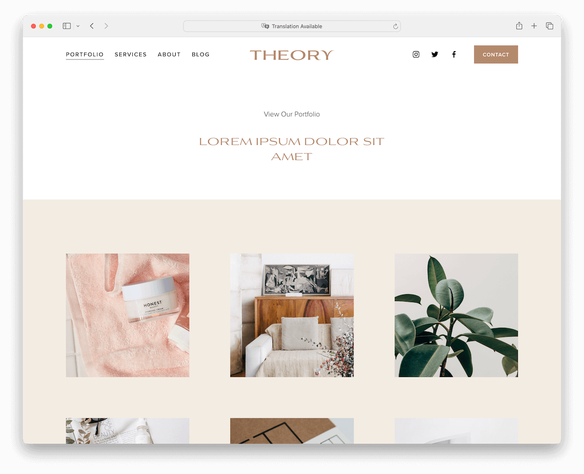
Theory has a clean design with a grid layout with plenty of spacing so one thumbnail doesn’t bother the other.
Below the grid are testimonials, helping you build trust and credibility.
Individual portfolio pages deliver more written and visual content for you to go in-depth with the presentation.
It doesn’t matter where on the template you are; as soon as you start scrolling back to the top, the header appears to ensure a more pleasant browsing and searching experience.
More info / Download Demo






Comments (0)