15 Best Tools for Responsive Web Design 2024
Responsive Web Design (RWD), while an easy to grasp a concept for most webmasters and devs today, still requires a concise understanding of the core functions that browsers use to render the responsive design for display, and ignoring those functions can lead to the development of badly coded responsive websites that will hinder user experience, and cause issues with website performance. Besides HTML5, which has helped to define the direction of responsive web design, developers also need a great understanding of CSS3 without which responsive design is simply impossible to accomplish. Media queries, for example, is the standalone solution for defining particular pieces of content for particular device screen sizes and types. But even then, that kind of function touch only the very tip of the iceberg of everything that responsive design is capable of.
Mobile-friendly is another sensitive topic that will reconstruct and reorganize how responsive design is perceived. There’s clear indication that mobile itself is moving towards a more specific approach of displaying content, which comes in the form of mobile applications and frameworks. All these growth concepts require a thorough investigation of the future of design, and how your current tactics can be modified for future growth.
With the understanding of where web design is headed, we’ve compiled a list of some truly practical and handy responsive web design tools that will fit just great into your existing toolkit, surely some of these will have already found their way to your heart. Still, some might be completely new to you. From direct front-end frameworks to mobile testing tools, and plenty of inspirational design pattern resources will help you build better, more responsive, and more engaging websites from now on — grab a cup of tea and begin your excursion down this stellar roundup.
Best Responsive Web Design Tools
1. Squarespace
Most beautiful responsive website design tool

Squarespace is the most beautiful website builder. It is fully responsive and they have gone as far with mobile support that you can even build your website using a smartphone. You can’t go wrong choosing this tool over anything else on the market.
2. Wix
Most popular site-building tool with millions of users.
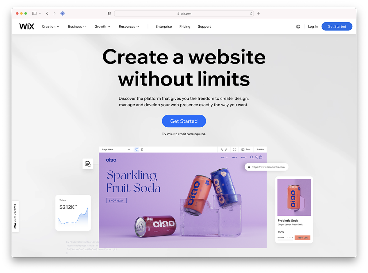
Wix is the most popular responsive website building tool with millions of websites worldwide. Its success comes from great functionality, design and very aggressive marketing practices. Wix has hundreds of amazing website templates you can use as a base for your website or start with a blank canvas, whatever you prefer.
3. Hostinger
Best website building tool for beginners building their first website.
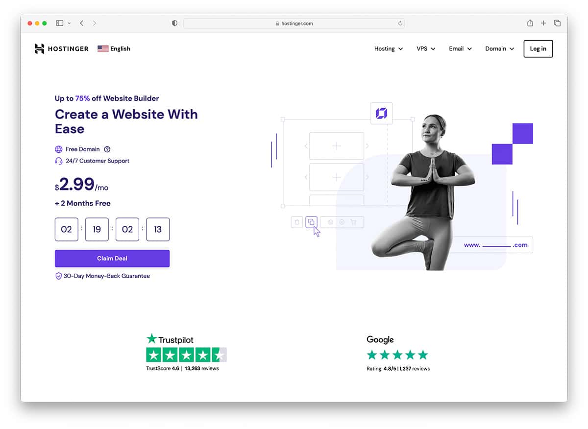
Hostinger is an up-and-coming responsive site builder by Hostinger. It is a brand new tool but has shown that it can compete against Wix and Squarespace. It features a sleek design and thousands of templates to crate the website of your dreams.
4. Bootstrap
Most popular frontend framework made for experienced developers.
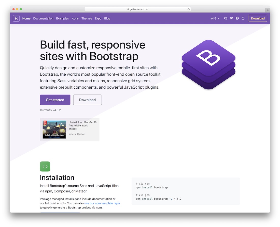
Starting out with front-end website building has never been more convenient. Frameworks like Bootstrap make the process of bootstrapping a functional business website truly an effortless task. And since Bootstrap follows the latest web standards, all features are also compatible with responsive design. What makes Bootstrap so successful is highly attributed to its vast collection of components. Take the standard Bootstrap grid design and apply any free components to quickly bootstrap a modern website.
Components such as buttons that can be customized in shapes, colors and sizes, and navigation bars that you can yourself modify to integrate with custom JavaScript features. Browsers have also leaped very far into the future to support responsive design, for example — embedding videos or images can be configured to automatically resize in accordance to the device size that your visitors are accessing from. This makes the user experience modern, smooth, and reliable. In the big picture, Bootstrap is the framework that will help you create a website, then you can move forward with many of the other responsive design tools we will mention to further extend the experience.
5. Webflow
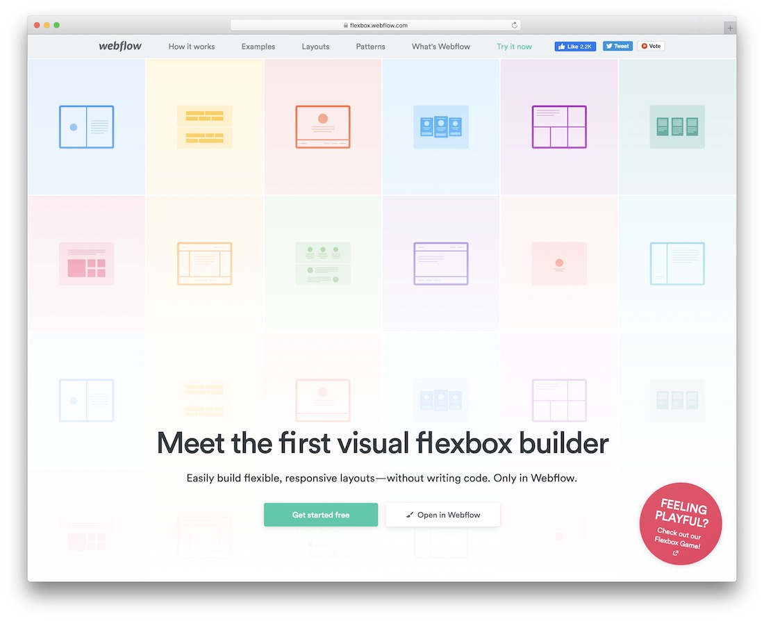
Flexbox is perhaps the most talked-about feature of modern web design and development, and has spurred countless topics written by veteran developers in the last year alone. Flexbox’s basic definition is a robust layout tool that solves common issues in responsive web design. What’s Webflow? It’s a platform that integrates Flexbox design into a visual builder, save hours of development and opt for an easy UI that you can build responsive layouts with.
So anyway.. Why Flexbox? Part of the reason why Flexbox is so popular, is that it solves complex design issues that would otherwise require unproductive design patterns. To give you the basic rundown of Flexbox — you can effectively create complex design patterns with only a few lines of code. For example, creating equally aligned modal elements that continue to remain aligned despite the font sizes that you use for headlines, or sub-headlines. With Flexbox you can create layouts like feature outlines, or customer reviews and align them to provide a remarkable user experience. Even mundane things like pricing tables that you relied on native CSS3 to help you outline, can now be integrated in your designs using Webflow’s Flexbox features. Full-on website grids can be built to accelerate the speed at which a website comes into fruition.
6. Responsinator
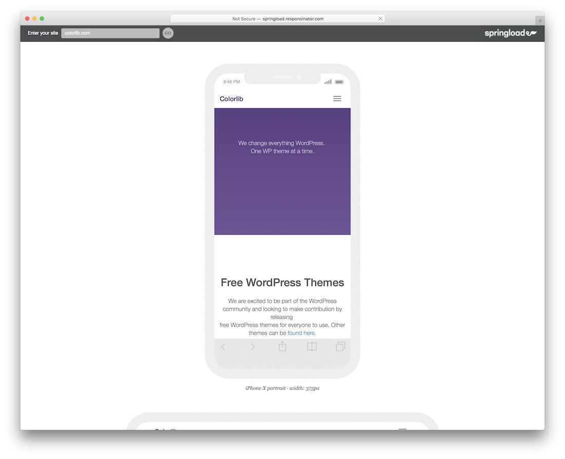
Long have gone the days when you had to check the compatibility of a website design through multiple physical devices. Indeed, such times existed. But due to software evolution, you can now check a website’s responsiveness on a large set of devices. You can do this by entering your website URL into a tool such as Responsinator. It’s truly a remarkable feat of design technology, and will save you tons of time in design process. Now you can load up your website and test it against the most popular and modern smart devices. Now, you will be able see if at any point, you can do improvements to your site.
7. Imagify
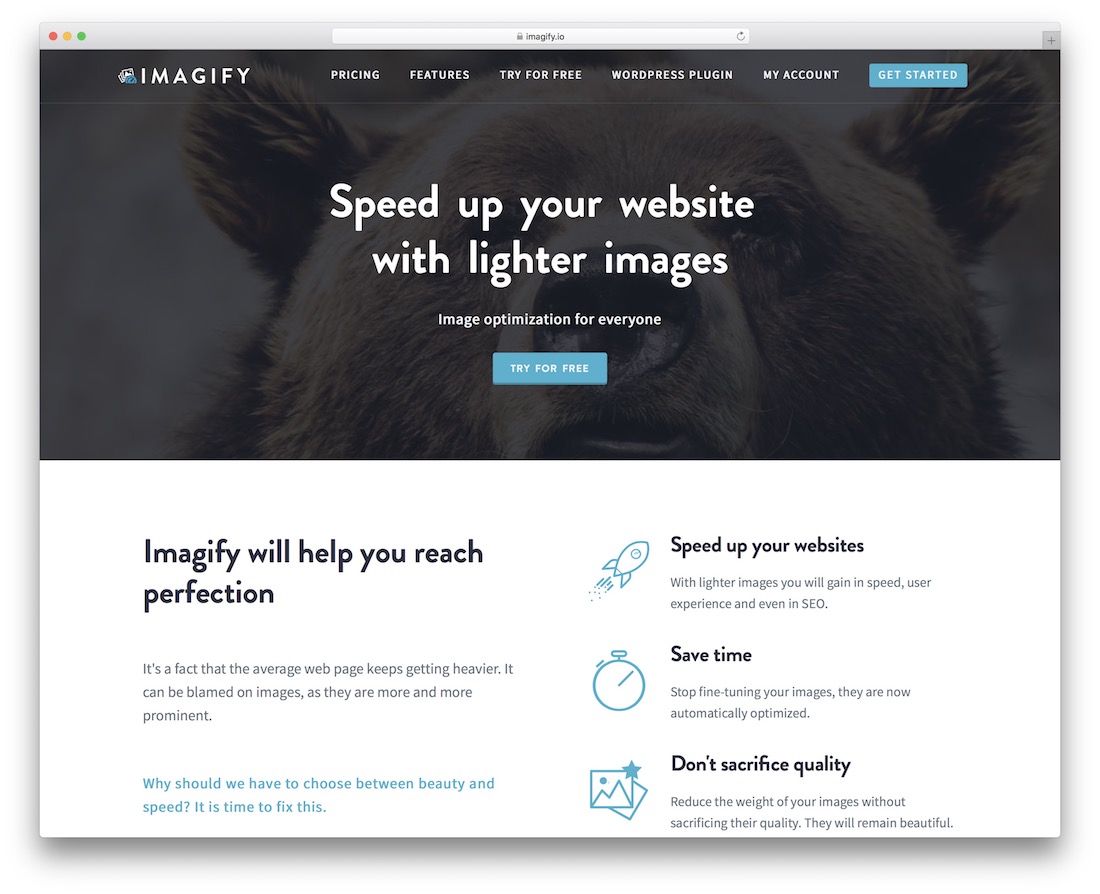
Images is another highly favorable topic in responsive design. After all, you wouldn’t want to be serving the same exact image to visitors who comes from tablet devices, or from their smartphones. The device resolution will always be different. While CSS3 features maintain some sort of balance between the image sizes and types that different devices are downloading, improving image quality and their size is still a very strong topic. HTTP/2 will bring forth some great changes for developers worldwide, but the next 5 years will still be fairly tough for the web.
HTTP Archive reports that in 2010 — on average, the size of a single web page was roughly 700kb, whereas in 2016 — that number has grown to 2.2mb! And majority of those megabytes is taken up by visual content; images. So.. you have to ask yourself, am I compromising the performance of my pages due to irresponsible decisions in terms of image optimization? That’s where you can learn about Imagify, a service/platform that sort of wants to answer that question for you, and give you the right tools to get on with image optimization, as a fully automated process.
A WordPress plugin is made available so that you can optimize all your existing and future uploads on the fly. Unless you directly look into the problem, it can often seem like it’s not a problem at all, but if corporations like Google encourage users to improve their website performance in exchange for better rankings.. you know that there’s no going back from that.
8. The Data Visualisation Catalogue
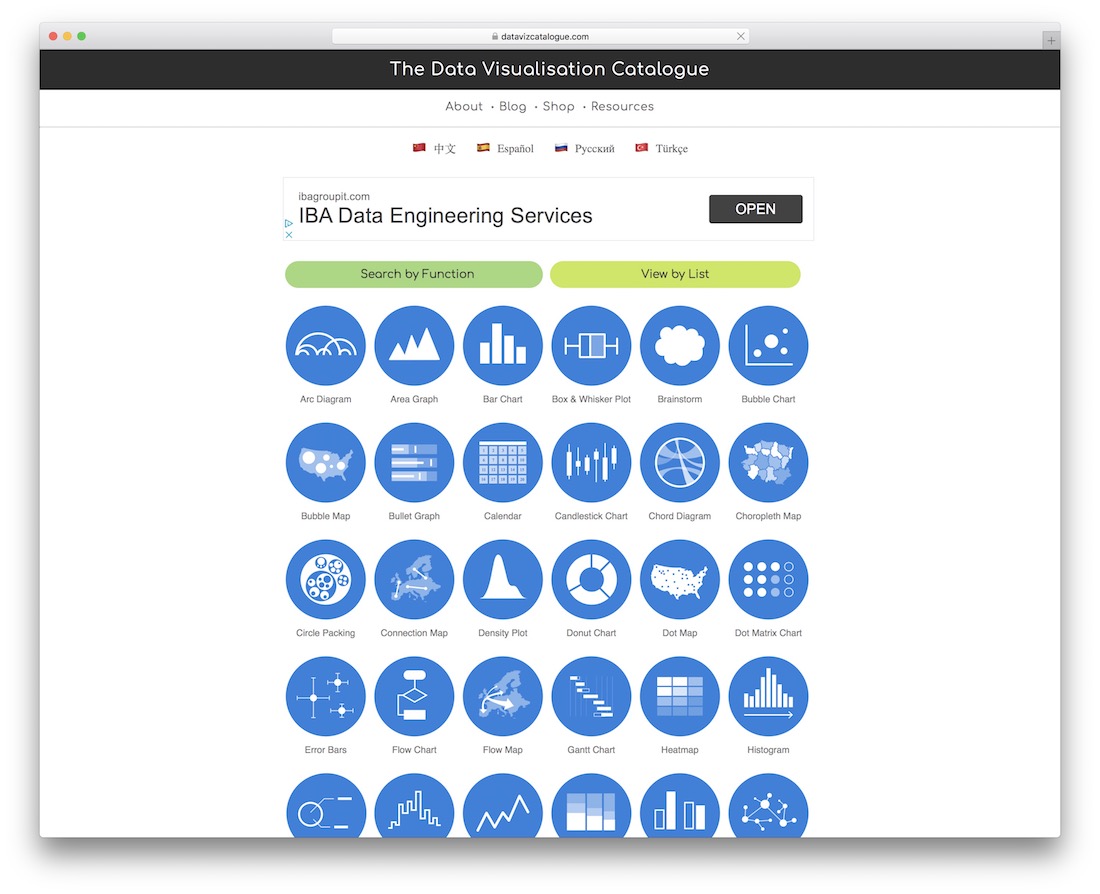
The thing with responsive design is, you can work all day and night on perfecting the layout you’re after, but even after the layout is done. There’s more work to be done, and that usually comes down to the way that you can integrate interactive and dynamic content into your designs. Sure, WordPress made it easy to plug-up the content with exciting plugins that somewhat cater to the responsive device. Still, truly native responsive websites are a much tougher cookie to crack, and one of the things you find in content the most is charts, graphs, and other data visualizations that depict the story through numbers. New York Times is a great example of how a responsive websites will need a responsive set of tools to create dynamic visualizations for the latest election results.
That’s why we’re sharing more about The Data Visualization Catalogue — a wonderful collection of data visualization patterns and functions that each have a unique page, a unique description, a preview of what the chart/graph/visualization is going to look like, and most importantly — a recommendation of the most stable latest tools that can be used to recreate such a diagram, or visualization. A lot of work has gone into this project, and it would be a fairly ignorant idea to avoid using this to help yourself understand responsive data visualization better. There is a great deal of examples available, such as — arc diagrams, area graphs, bar charts, brainstorm clouds, bubble charts and maps, bulletin graphs, calendars, connection maps, flow maps, histograms, line graphs, spiral plots and countless other creative ways to display your data, on a responsive website.
9. Boxy SVG Editor
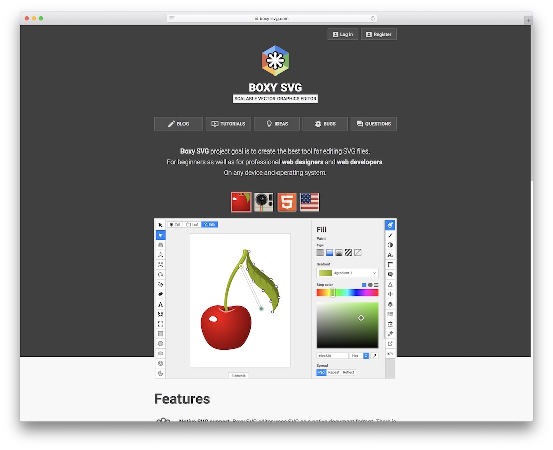
Boxy is a new way to manipulate vector graphics directly in the browser. Up until now, graphic designers were heavily dependent on using tools like Sketch, and Adobe Illustrator to conclude common tasks focused around vector graphics. Still, with Boxy SVG — you can now create illustrations, icons, banners, mockups, charts, buttons and other custom SVG elements directly from your favorite browser. It’s astonishingly functional, and certainly useful. SVG’s are already the future of responsive designs, and tools like Boxy will ensure that it stays that way. The benefits of integrating SVG graphics into your designs are invaluable. They’re impeccably useful for performance, scalability, and beautiful user experience.
10. UXPin
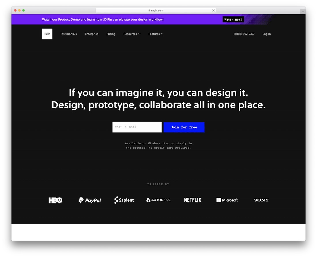
If you have an idea for web design, you can realize it with the amazing and flexible UXPin. It is a solution that does not know any limitations. Your imagination is your only boundary, so let loose and create the exact masterpiece you are after. With UXPin, you can make simple and complicated things a reality sooner rather than later.
Again, whether you are setting up a prototype or a full-blown project, there are no boundaries for UXPin, as you can utilize it for whatever.
As for the features, there are very many. From built-in libraries, like Material Design and Bootstrap, to HTML import, tons of components, interactive form elements and vector drawing tools, all this and heaps more is what you get with UXPin. Get ready for an immediate difference with the impressive UXPin now.
11. Lighthouse (by Google)

Nowadays, it is of utmost importance that your website or blog is fully compatible with all devices. In short, your page must be mobile-ready. If you are interested in checking out the flexibility of your site, you better not miss trying Google’s very own Lighthouse. While it comes part of the Search Console, you can also test things out even if you do not have an account.
You either add your URL or code to examine how fluid your website or blog layout is. Once you hit the test button, Mobile-Friendly Test will cover all the rest. After it analyzes the page, Lighthouse will then provide the result, as well as if there are any errors and whatnot.
12. Origami
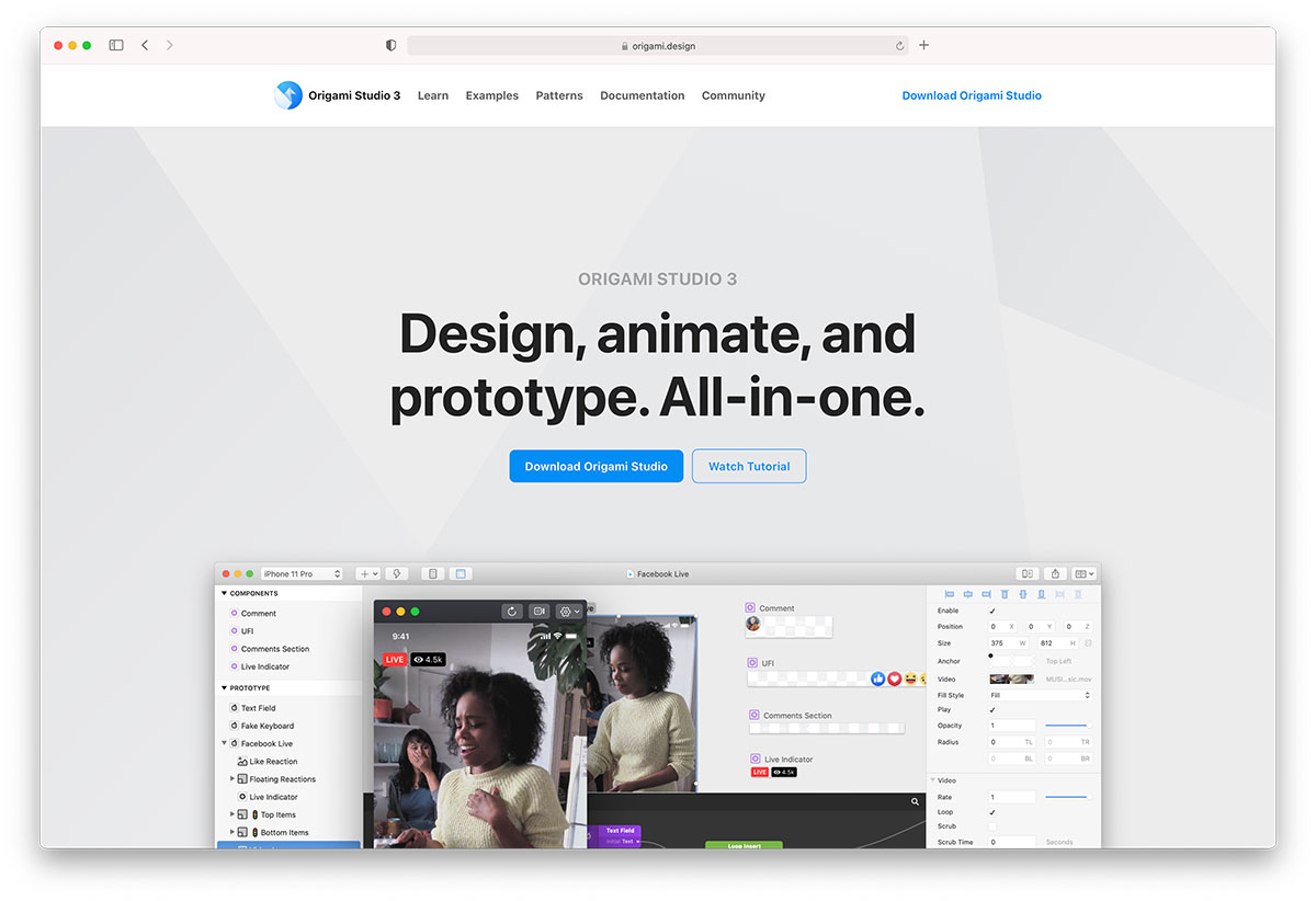
We won’t hide that quite a few of these tools are for prototyping design interfaces, particularly user interfaces. It seems that the door to the market has opened in the last few years, and now companies like Google and Facebook follow suit to cater to the needs of professional graphics designers. Origami is a design prototyping library that Facebook builds.
Origami has already seen use in popular platforms like Instagram, and Facebook Messenger, and now anyone with access to their development toolkit can recreate some of those famous interface patterns using Origami. The modern components is what makes Origami’s back-end so favorable. Scrolling, swiping, and tapping elements have all been carefully designed and crafted to reflect the possibilities of state of the art technology. As a native application, Origami will let you import your Sketch designs directly into Origami so that you can preview what your designs would look like live in the browser. And yes, Origami works for desktop prototyping as well. In many ways — it is a universal tool.
13. Microsoft Flow
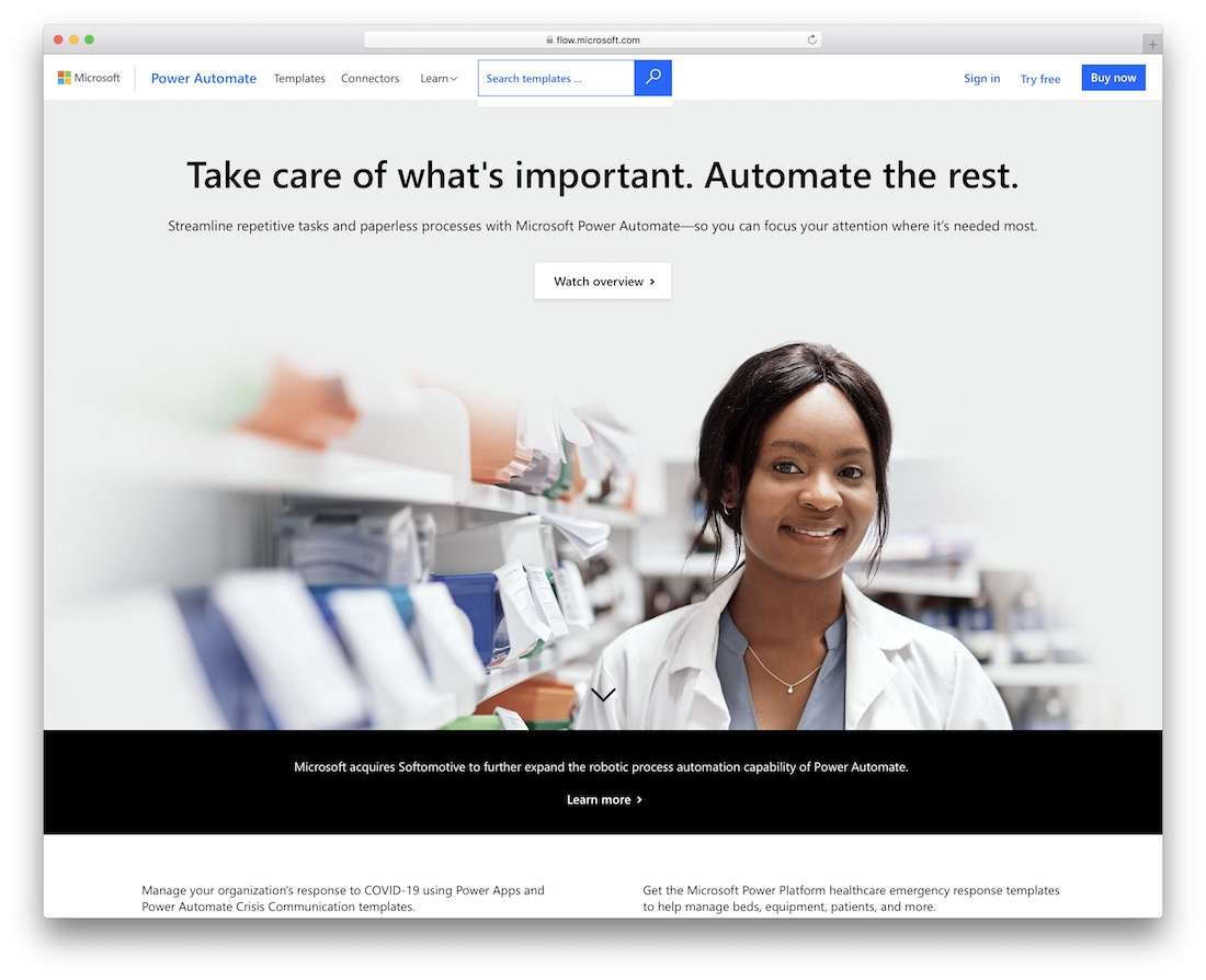
With Microsoft Flow we’re stepping into a more enterprise-level design development. Flow is for building workflows that can automatically do several tasks on behalf of your own development process. Why would this be useful in design? Well, for one, it helps with synchronizing data across many devices. Second,it has a neat notifications system that you can use to setup alerts and more. This way, your team, and your bottom line remains intact when it comes to being up to speed with what is happening across the overall design structure.
What makes Flow so appealing as well, is the number of services it can connect to — Twitter, Dropbox, Slack, GitHub, Google Drive, to name a few. There are more than 30 readily available service integrations from writing this. And that’s not it either. The custom templates will help to explain how Flow can become a useful addition to your existing design workflow, or development — we won’t judge. Each template is designed for a specific purpose such as sending you a text message when your boss emails you, adding Twitter leads to CRM, or backing up your files. These templates are just the tip of the iceberg and are intended to inspire you to create flows customized to your desired processes.
14. Adaptive Images
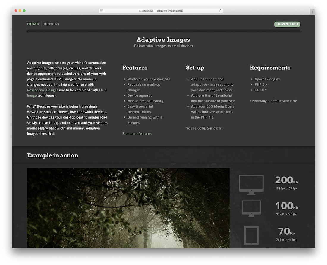
We already learned quite a few things about responsive images; the most important of which was that images need to be optimized for all device types, and minified to provide the best possible user experience, without the expense of website performance. Just think of how much faster the web would be if every single website started to deliver performance-optimized visual content to its visitors?
The overall web traffic would drop by a staggering amount, but unless this is going to be enforced natively, we won’t see a change like this happening for a long time still. However, alternatives exist. One of which, is Adaptive Images. The Adaptive Images algorithm can detect the type of a device that a user is accessing your pages with, and deliver to that user a more specifically crafted image that would respond to the requirements of a device that’s much smaller in screen size. Adaptive Images stands out because it integrates seamlessly with popular content management systems, without causing pages to break. So, there aren’t many reasons NOT to use Adaptive Images.
15. Wirefy
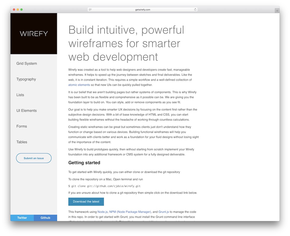
Wirefy fills the role of going from a design sketch, to a full prototype implementation. To achieve desired result, there needs to be a way of putting together UI elements quickly. That’s where Wirefy fits in the best. Wirefy is the layer that you can build on top of. Take the layout, and manage per your own requirements. Be it removing components, or managing the style capabilities. Building a prototype that a client can interact with, is going to give you a reasonable amount of “extra points” for the effort.
Responsive web design tools for front-end developers
How was that for a good refresh of memory and understanding? We covered some jaw-dropping tools, yet the market for responsive design tools is growing. Sometimes it’s not just about the tools that gives us direct code tips, or a framework to work with. The tools inspire us to make our apps and website more responsive where design is truly concerned. User experience always comes first; there’s no better way to improve user experience than by improving the user interface. This is the very thing that becomes the experience of what you’re building. Have you found some new ideas from this list? We’d love to have you share them with us, always inspiring to read what others are coming up with!
Related Posts


hi Alex
Nice article publish. really too many tools new add in my list. Now already use Adobe Edge Reflow CC .
But after ready your article i like all tools. Try Testing all tools.
Thanks
Keep it buddy