
21 Best Nonprofit Website Examples 2026
Fourteen of these twenty-one nonprofits put a donate control in the first screen. Every one of the twenty-nine charities we measured the same way did.
That gap runs through everything below. We opened all twenty-one sites, followed the donate control one hop into whatever sits behind it, and then set the results beside the identical measurement run across 29 charity websites. Nonprofits and charities are treated as the same thing by almost every list of this kind. On the evidence, they behave quite differently.
What we looked for
A nonprofit site is not judged on what a trade site is judged on — no licence, no service area. What matters is whether a stranger can tell what the organisation does, whether they can see where the money goes, and how much friction sits between wanting to give and having given. The giving form is measured properly rather than taken on trust.
What happens when you click Donate
Each rung is only reachable once the one above it holds, across all twenty-one organisations.
The collapse is at the last step and it is the same one charities get wrong, only worse. Fifteen offer suggested amounts and fifteen offer a monthly gift — then only three pre-select it. A regular donor is worth several one-off ones, and the default is a single line of configuration on every platform in use here.
All 21 nonprofits, side by side
Read in a browser at 1280×860, then the donate control followed one hop into whatever sits behind it.
| Organisation | Donate | Presets | Monthly | Financials | Platform |
|---|---|---|---|---|---|
| GlamourGals | above the fold | no | no | 1 | Stripe |
| FutureMap | none | no | no | 1 | — |
| World Wild Life | above the fold | 7 | pre-selected | 3 | PayPal, Stripe, Chariot (DAF), Double the Donation |
| Habitat | above the fold | no | no | none | Blackbaud |
| Gates Foundation | none | no | no | none | — |
| Wikimedia Foundation | above the fold | 7 | yes | none | — |
| National Geographic Society | above the fold | 6 | yes | none | — |
| Girls Who Code | above the fold | 4 | yes | 1 | Classy, Stripe |
| Doctors Without Borders | above the fold | 4 | yes | 6 | Classy, Stripe, EveryAction (Bonterra) |
| Malala | above the fold | 4 | yes | 4 | Give Lively |
| World Help | above the fold | 1 | yes | 8 | — |
| Neverthirst | above the fold | 6 | yes | 1 | Fundraise Up, PayPal, Stripe |
| BeLoved Atlanta | above the fold | 6 | yes | none | Stripe, card gateway (unbranded), Chariot (DAF) |
| Kiva | below the fold | 4 | pre-selected | none | Chariot (DAF) |
| Single Parent Project | below the fold | 5 | yes | none | Stripe |
| Ping Pong For Good | none | no | no | none | — |
| East West Food Rescue | above the fold | 3 | pre-selected | 2 | Stripe, Double the Donation |
| HomeAid | above the fold | no | yes | 3 | — |
| Team Rubicon | above the fold | 4 | yes | 1 | Classy, PayPal, Stripe, Chariot (DAF), Double the Donation |
| The Nature Conservancy | below the fold | 7 | yes | 8 | Stripe, Chariot (DAF) |
| DonorsChoose | below the fold | 6 | no | 7 | — |
The financials column is the one to read. One organisation offers 8 separate routes to its accounts from a single homepage; eight link none at all. That is a claim about homepage prominence rather than about transparency — several of the eight publish detailed accounts, just not from the front page.
Nonprofits ask differently from charities
We ran this identical measurement across 29 charity websites, which makes the two directly comparable. The postures are not the same.
| The same check | Nonprofits | Charities |
|---|---|---|
| Donate control in the first screen | 14/21 | 29/29 |
| Donate is the loudest control | 4/21 | 11/29 |
| Financials linked from the homepage | 13/21 | 25/29 |
| Suggested amounts on the form | 15/21 | 24/29 |
| Monthly giving offered | 15/21 | 22/29 |
| Monthly pre-selected | 3/21 | 9/29 |
| Share of spend to programmes stated | 0/21 | 4/29 |
Nonprofits ask less insistently, and prove less. Every charity we measured put a donate control in the first screen; seven of these twenty-one do not. Charities are twice as likely to make donate the loudest thing on the page and three times as likely to pre-select the monthly option. And not one nonprofit here states what share of its spending reaches its programmes, where four charities do.
Neither posture is automatically right. A nonprofit whose income is grants, contracts or membership has less reason to shout at a first-time visitor than a charity living on public donations. But if public giving is any part of your funding, the charity column is the benchmark you are being measured against, and on this evidence most nonprofits are not close to it.
Best Nonprofit Website Examples
Table of contents — all twenty-one nonprofit websites
- GlamourGals
- FutureMap
- World Wild Life
- Habitat
- Gates Foundation
- Wikimedia Foundation
- National Geographic Society
- Girls Who Code
- Doctors Without Borders
- Malala
- World Help
- Neverthirst
- BeLoved Atlanta
- Kiva
- Single Parent Project
- Ping Pong For Good
- East West Food Rescue
- HomeAid
- Team Rubicon
- The Nature Conservancy
- DonorsChoose
1. GlamourGals
Built with: Squarespace
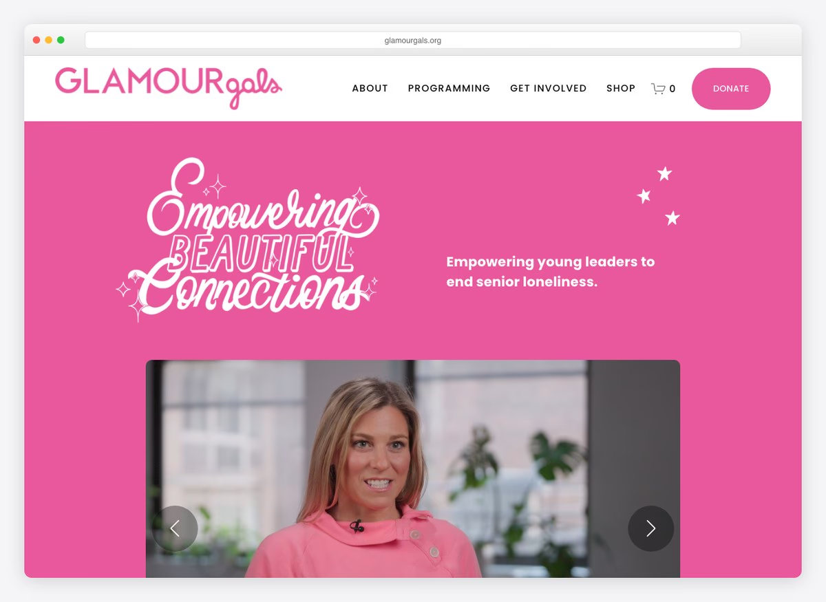
A single sentence states the mission and the beneficiary in the same breath — young volunteers, older women, loneliness — and the shop sits in the navigation as a second way to contribute. Two decades of operation is stated as a fact rather than implied by a logo.
What stands out: Naming both the people served and the people doing the serving in one line.
2. FutureMap
Built with: Squarespace
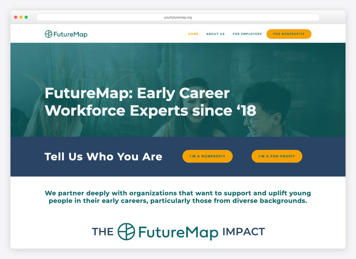
The homepage asks who you are before it tells you anything: nonprofit or for-profit, two buttons. That is an unusual amount of confidence for an organisation this size, and it means the rest of the site can speak to one audience at a time.
What stands out: Segmenting the visitor at the door instead of writing for everyone.
3. World Wild Life
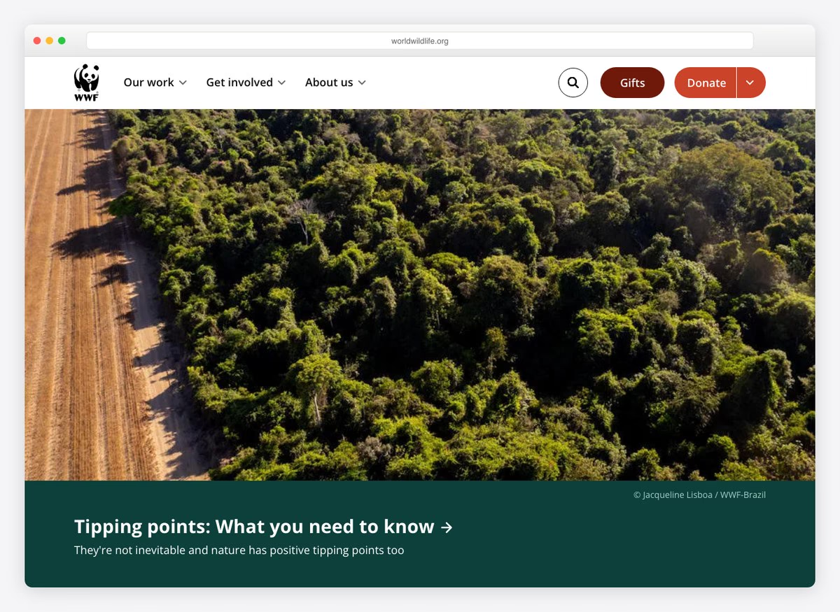
Seven suggested amounts, a monthly option already selected, tribute giving and an offer to cover the transaction fee — the most complete giving form measured here, matching what the largest charities do. The homepage itself leads with reporting rather than with the ask.
What stands out: A giving form with every option the sector offers, behind a homepage that leads with journalism.
4. Habitat
Built with: Drupal
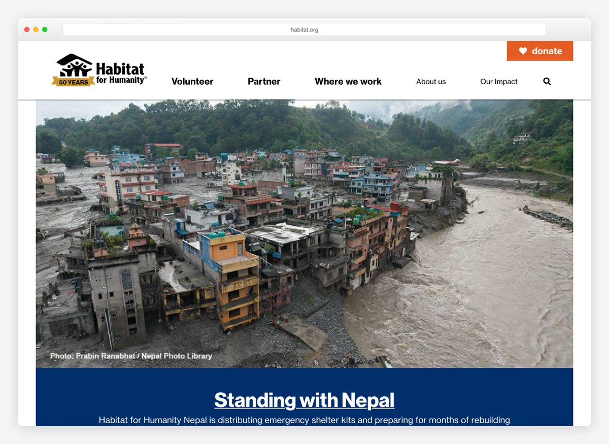
Volunteering is the first item in the navigation and the donate control is the loudest thing on the page — one of only four here that manages that. The trip schedule and destinations are given their own pages, which suits an organisation whose product is participation.
What stands out: Treating volunteering as the headline act and donation as the loud one.
5. Gates Foundation
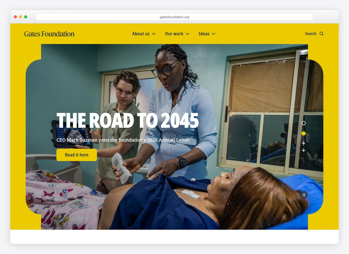
A goal statement rather than an appeal: every child, wherever born, reaching their potential. There is no donate control in the first screen and no financials linked from the homepage, which is coherent for a foundation that distributes an endowment rather than raising money.
What stands out: A grantmaker’s homepage — no ask, because there is nothing to ask for.
6. Wikimedia Foundation
Built with: WordPress
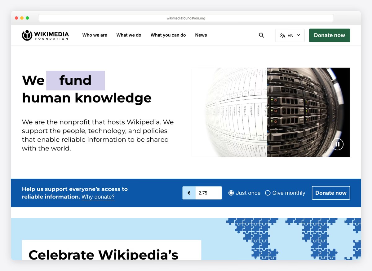
An animated headline that cycles through verbs — fund, support, protect — over a donate control that is the loudest element on the page. Four impact figures sit in the first screen and the giving form offers seven amounts with a monthly option.
What stands out: A headline that changes its own verb, which is the only piece of motion here doing real work.
7. National Geographic Society
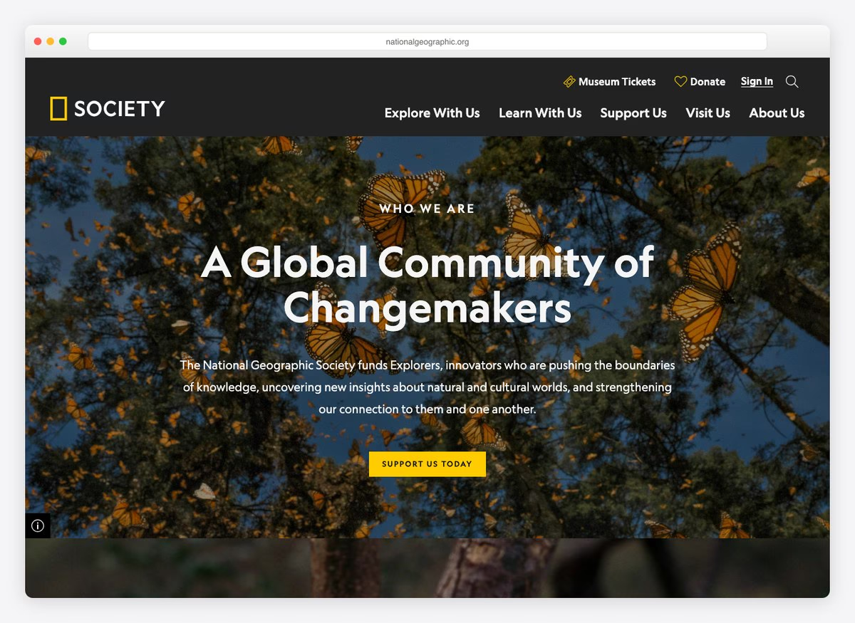
A membership framing rather than a donation one: a global community of changemakers. Six suggested amounts, a monthly option and a fee-cover offer sit behind the join control, but no financial reports are linked from the homepage.
What stands out: Selling membership where the rest of the sector sells donation.
8. Girls Who Code
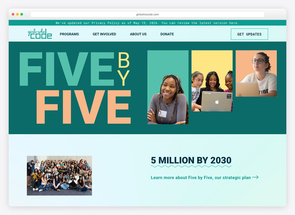
Three impact figures in the first screen and a programme-led navigation — clubs, college pathways, challenges — with the giving form offering tribute donations. The organisation’s work is legible before any ask appears.
What stands out: Explaining the programmes first, so the donation has something to attach to.
9. Doctors Without Borders
Built with: Drupal
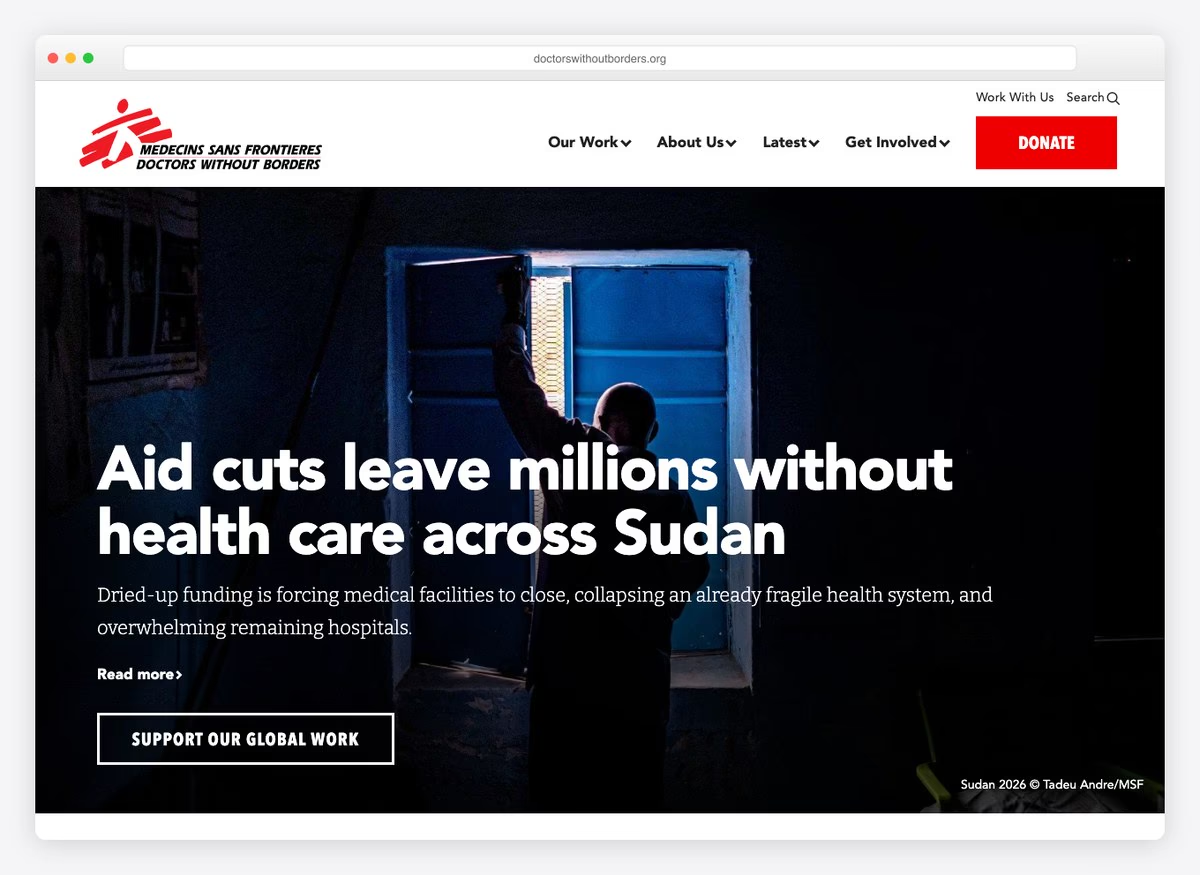
The homepage is a newsroom: the lead item is a field report from Sudan, not an appeal. Six separate routes to the financials, a donate control that dominates the page, and a giving form with tribute options. This is the most complete site here on every axis measured.
What stands out: Leading with the reporting and still making the ask impossible to miss.
10. Malala
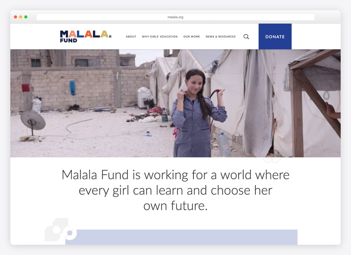
Four routes to the financials and a plainly stated mission — every girl able to learn and choose her own future. The giving form runs on a platform built for small nonprofits and offers tribute donations.
What stands out: Four separate routes to the accounts, from an organisation whose credibility is its founder.
11. World Help
Built with: WordPress
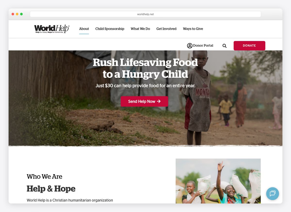
Eight separate links to financial accountability from one homepage, more than any other organisation measured here, including named third-party reviewers. For a faith-based charity asking for recurring child sponsorship, that volume of proof is the entire proposition.
What stands out: Eight routes to the accounts — the most transparent homepage on this list by a distance.
12. Neverthirst
Built with: Shopify
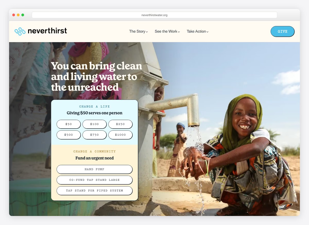
The suggested amounts are annotated with what they buy: fifty dollars serves one person. Six presets, a monthly option, and a headline that states the outcome rather than the organisation. Runs on a commerce platform, which is unusual here and suits the give-as-purchase framing.
What stands out: Every preset annotated with what it delivers, which almost nobody else here does.
13. BeLoved Atlanta
Built with: Squarespace
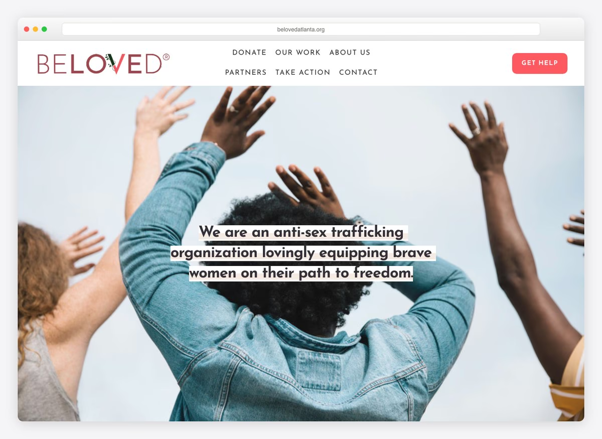
Six suggested amounts behind a donate control and a first line that names exactly what the money does — fuel the day-to-day work. No financials are linked, which is the common gap among the smaller organisations here.
What stands out: Asking for the unglamorous thing: everyday operating costs, named as such.
14. Kiva
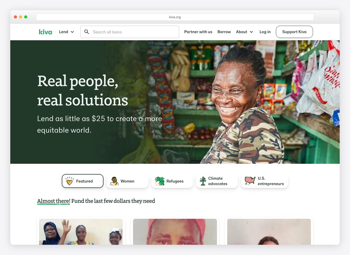
A lending model rather than a giving one, and the site says so: you choose a borrower and the money returns. The giving form still offers four amounts with the monthly option pre-selected, which is one of only three here to do that.
What stands out: A repayment model explained plainly enough that the donation still feels like one.
15. Single Parent Project
Built with: Squarespace
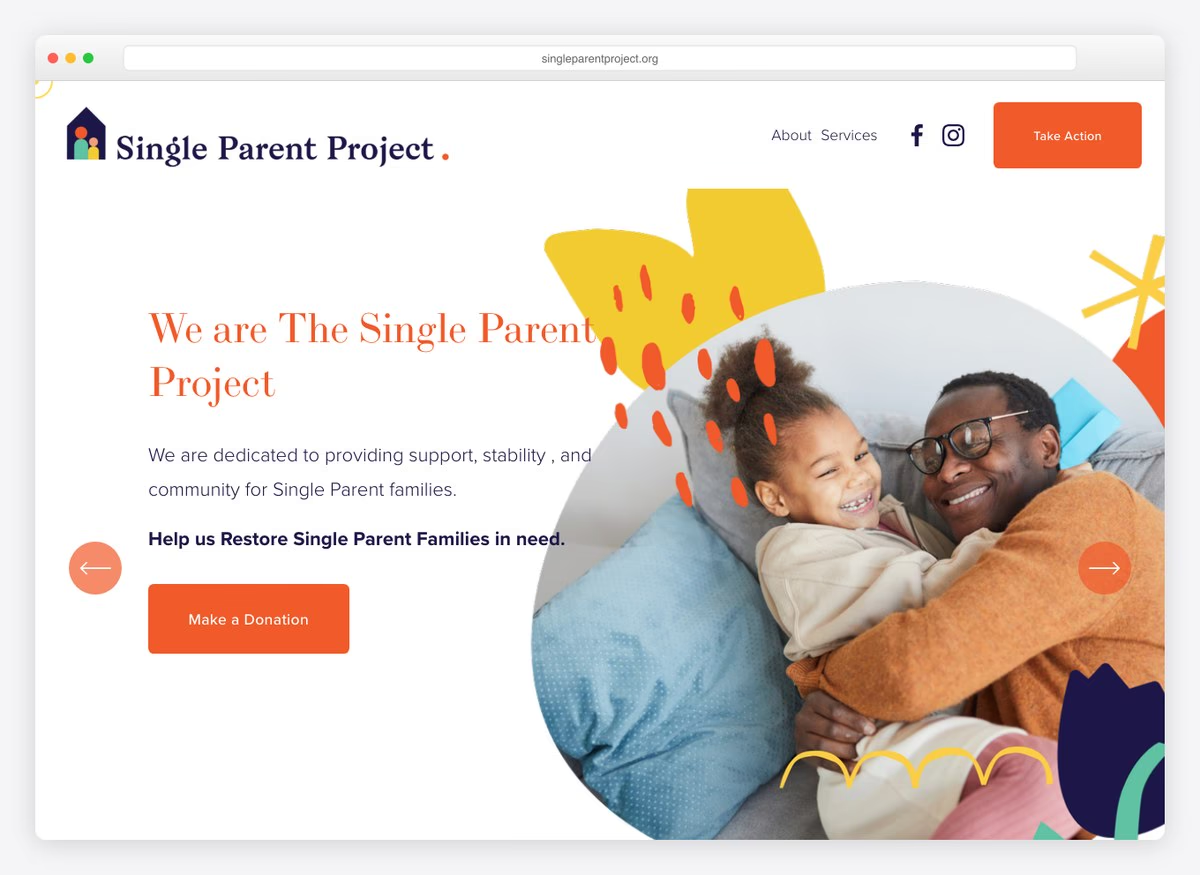
The mission is stated in the first person plural and the services are listed before any ask. Five suggested amounts and tribute giving behind the donate control, though there is no donate control in the first screen and no financials linked.
What stands out: Leading with services rather than with need, which reframes the organisation as a provider.
16. Ping Pong For Good
Built with: Squarespace
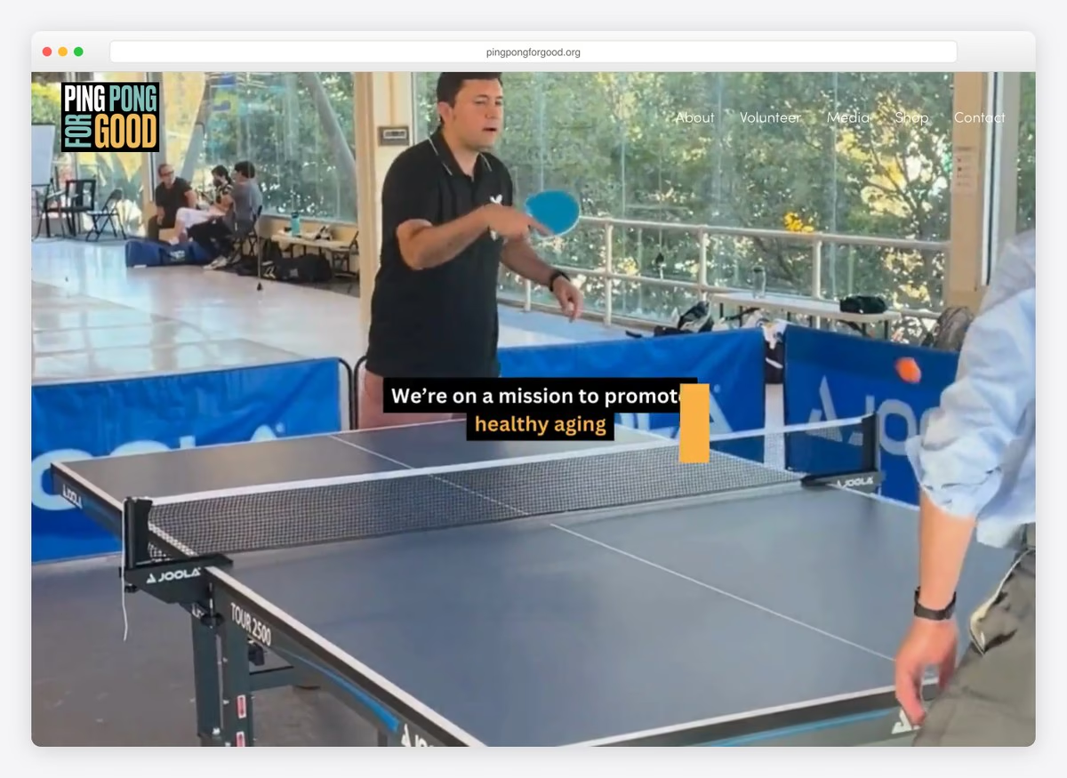
A movement framing for brain health built around a sport, with volunteering and a shop ahead of any donation in the navigation. There is no donate control in the first screen at all — the ask here is participation.
What stands out: An organisation whose primary ask is to turn up and play, not to give.
17. East West Food Rescue
Built with: Wix
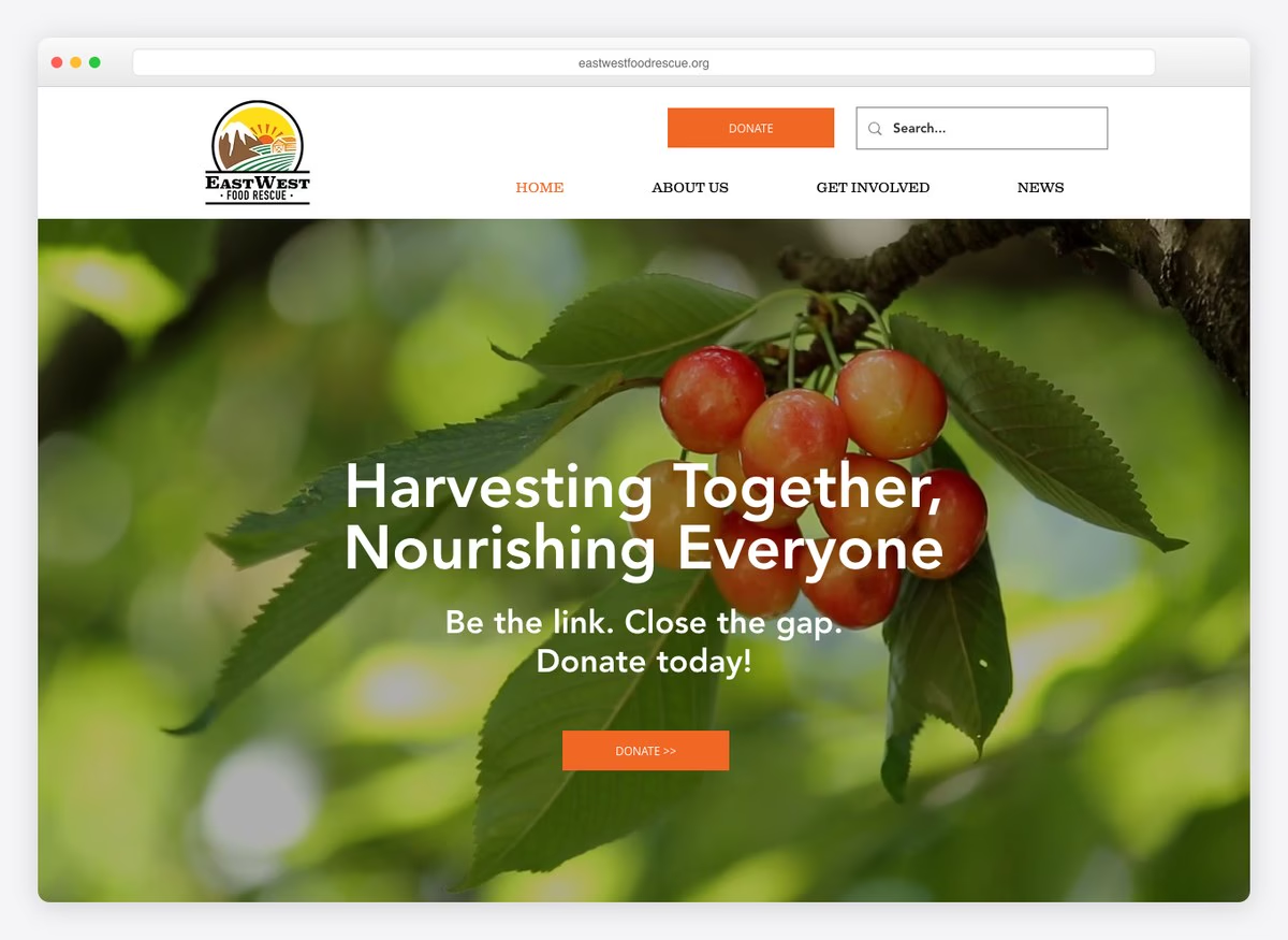
The donate control is the loudest element and the monthly option is pre-selected, one of three here to do it. Three suggested amounts, tribute giving and a fee-cover offer, behind a headline about harvesting and nourishing rather than about hunger.
What stands out: Pre-selecting monthly, which only two other organisations here attempt.
18. HomeAid
Built with: Squarespace
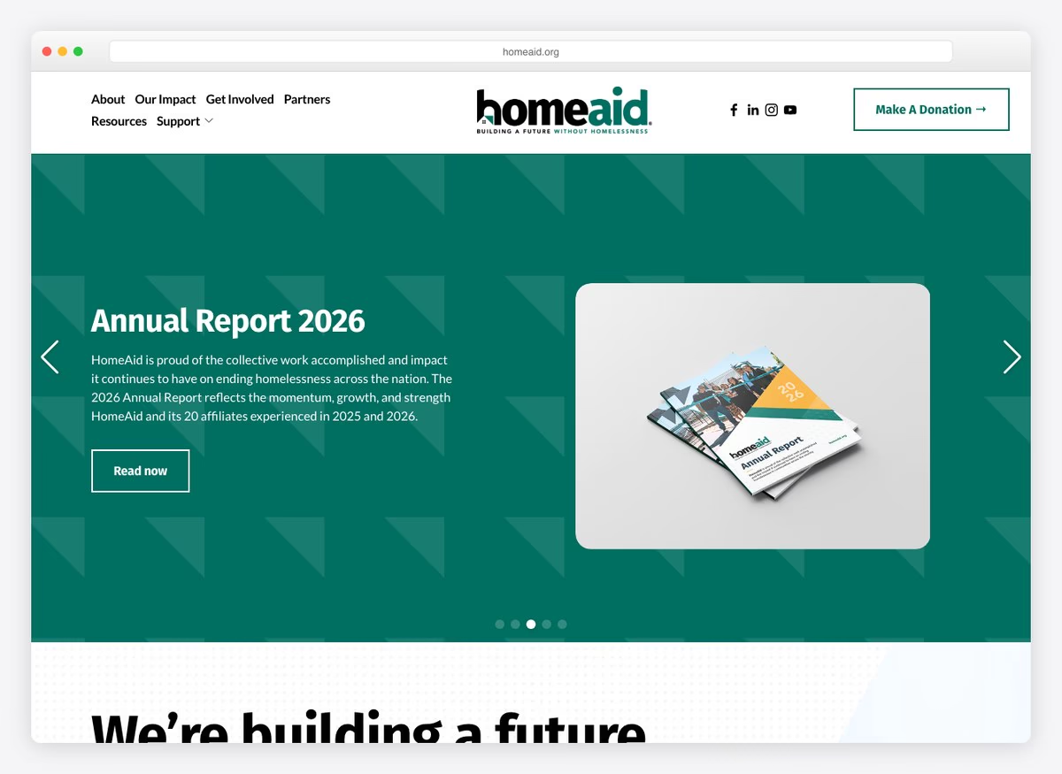
An immediate-help link sits above everything else, before the navigation begins — the right order for an organisation whose visitors may be in housing crisis rather than looking to give. Three routes to the financials and a monthly option behind the donation control.
What stands out: Putting help for people in need ahead of the ask for people with money.
19. Team Rubicon
Built with: WordPress
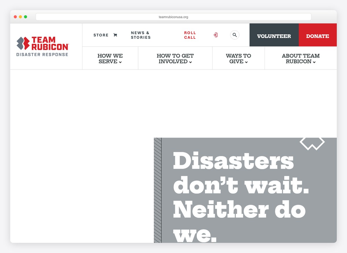
A dismissable banner announces the current deployment and links straight to the appeal, which is the most direct use of a live emergency on this list. Four suggested amounts, monthly giving, and a giving stack that includes donor-advised funds and employer matching.
What stands out: A live deployment banner that turns the news into the appeal.
20. The Nature Conservancy
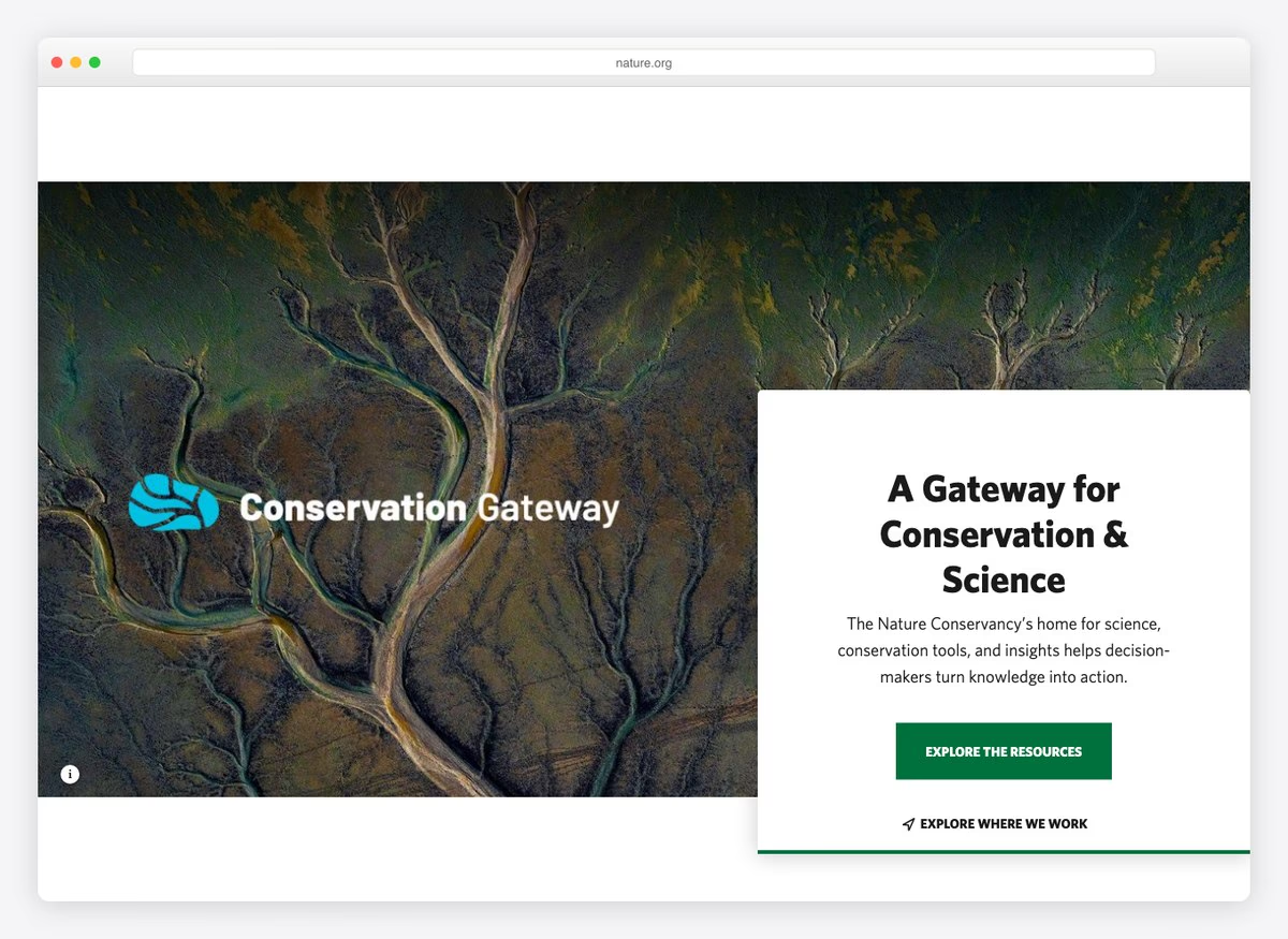
Eight routes to the financials and three impact figures, with seven suggested amounts and a fee-cover option behind a giving form that also accepts donor-advised funds. The homepage itself leads with science and tools rather than with the ask.
What stands out: Matching the most transparent site here while leading with research.
21. DonorsChoose
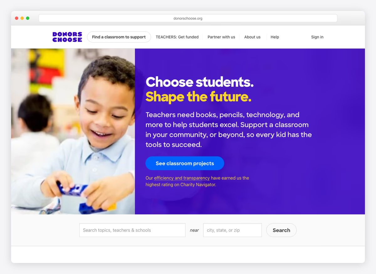
The proposition is the mechanism: choose a specific classroom and fund it. Seven routes to the financials, six suggested amounts, and a homepage that asks you to browse projects rather than to give in the abstract.
What stands out: Making the donor pick the thing they are funding, which is the whole product.
What the twenty-one palettes have in common
Every swatch below is sampled from that site’s own screenshot above, not from a brand guideline.
The ground — what the page sits on
The accent — where colour actually appears
Nonprofits are cooler than charities, and it is a deliberate difference. Blue and teal dominate these palettes where the charity set ran to saturated yellow, orange and red. The reason is what the page is for: a charity homepage has to make a stranger act now, and warm high-contrast fills survive against a photograph of a person. A nonprofit homepage more often has to establish that an institution is credible and permanent, and cool blues do that job. Where a warm accent appears here it is almost always on the one donate control.
What a nonprofit website needs
Counted across all twenty-one organisations. The lower rows are where the sector is weakest, and each is a change measured in minutes rather than months.
| What we checked | Sites | What the number says |
|---|---|---|
| Suggested amounts on the giving form | 15/21 | The single biggest influence on gift size. |
| Monthly giving offered | 15/21 | Standard, and worth several one-off gifts. |
| Donate control in the first screen | 14/21 | Six organisations make a willing donor scroll. |
| Financials linked from the homepage | 13/21 | Ranges from eight routes to none. |
| Impact stated as a number, first screen | 10/21 | Half of them ask before they argue. |
| Tribute or memorial giving | 6/21 | Reaches donors who were not otherwise giving. |
| A live appeal or matched gift | 5/21 | The strongest versions attach it to current news. |
| Donate is the loudest control | 4/21 | Situational — a grantmaker has no reason to shout. |
| Donor can cover the processing fee | 4/21 | A checkbox on every platform here. |
| An independent rating shown | 4/21 | Only if you have one worth showing. |
| Monthly pre-selected | 3/21 | A one-line change almost nobody makes. |
| Share of spend reaching programmes | 0/21 | Not one organisation states it. |
The last row deserves attention. Not one of these twenty-one organisations publishes what proportion of its spending reaches its programmes, though four of the 29 charities do. It is the first question a sceptical donor asks and the one most likely to be answered by a third-party rating site instead of by you — which means somebody else is framing the answer.
Building a nonprofit website
The website platform barely matters; the giving platform does. These sites run on Squarespace, WordPress, Drupal, Wix and Shopify in roughly the proportions you would expect, and none of it predicts whether the giving form works. What does is the payment layer: Fundraise Up, Classy, Blackbaud, Give Lively, EveryAction and Stripe all appear here, along with Chariot for donor-advised funds and Double the Donation for employer matching.
Every gap in the table above is a setting, not a rebuild. Pre-selecting monthly, enabling fee cover, turning on tribute giving and publishing your programme percentage are all things you can do this week on the platforms already in use across this list. A small organisation can match the largest one here on all four.
For the site itself, our free charity WordPress themes cover the build, charity website examples runs this same measurement across 29 organisations that live on public donations, and the website builder comparison covers the hosted options.
Nonprofit website questions, answered
What should a nonprofit website include?
Measured across these twenty-one organisations, the near-standard elements are suggested donation amounts (15 of 21), a monthly giving option (15) and a donate control in the first screen (14).
The gaps are where a small organisation can gain quickly: impact stated as a number in the first screen (10), a fee-cover option (4), monthly pre-selected (3) and the share of spend reaching programmes, which none of them publishes.
What is the difference between a nonprofit and a charity website?
Measured side by side, the difference is how hard they ask. Every one of the 29 charity sites we measured put a donate control in the first screen; 14 of these twenty-one nonprofits do. Charities are roughly twice as likely to make donate the loudest control and three times as likely to pre-select monthly giving.
That is coherent rather than lazy: a nonprofit funded by grants, contracts or membership has less reason to press a first-time visitor than a charity living on public donations. But if public giving funds any part of your work, the charity benchmark is the one you are being compared against.
Should a nonprofit website show its financials?
13 of these twenty-one link financial reports from the homepage, and the spread is extreme — one organisation offers eight separate routes to its accounts while eight link none at all.
Note what that measures: homepage prominence, not transparency. Several of the organisations linking nothing publish detailed accounts elsewhere. But a donor deciding in thirty seconds does not go looking, and if you do not answer the money question somebody else’s rating page will.
How much should suggested donation amounts be?
There is no convention worth copying, and the useful pattern is not the number but the annotation. The strongest example here tells you that fifty dollars serves one person with clean water; the amount stops being a figure and becomes an outcome.
Set the lowest rung at the smallest unit of your work that is worth describing, and write what it buys next to it.
What colours suit a nonprofit website?
Cooler ones than a charity would use. Blue and teal lead across these twenty-one palettes, where the charity set ran to saturated yellow, orange and red.
The difference follows the job: a charity homepage has to make a stranger act now, and a warm high-contrast fill survives against a photograph of a person. A nonprofit homepage more often has to establish that an institution is credible and permanent. Where warmth appears here, it is spent on the donate control alone.
How we chose these
Opened every site
Each one loaded in a real browser at 1280×860 and judged from the live page, not from an old screenshot in our media library.
21 checked · 21 re-captured
Clicked Donate on all of them
One hop from the homepage control into the real giving form — usually a third-party iframe — then read the presets, the monthly option and what else it offers.
21 giving forms opened
Checked the machine against the screenshot
Every form was captured and reviewed on a contact sheet. Three detection faults surfaced that way and were corrected; donate-form field counts were dropped because they proved not to be comparable.
21 forms verified by eye
Sampled the colours from the captures
Palettes are quantised from each site’s own screenshot and then curated, so the swatches describe the page you can see rather than a published brand palette.
21 palettes · sampled, not quoted
Every organisation here was opened in a browser at 1280×860 and its donate control followed one hop. Three entries from the previous version of this page were replaced: two organisations that also appear in our charity examples, because duplicating them across two lists helps nobody, and one whose homepage announces that it closes at the end of this year. A fourth serves a bot challenge to any automated reader and was excluded rather than scored, since a site that cannot be measured is not evidence.
Browse the other Nonprofit, church & community website examples (3 more collections), or see website examples for every industry.

Related Posts

Comments (0)