19 Best Clean Websites (Examples) 2026
These clean websites are the perfect examples for acquiring additional ideas for your simple and minimal page.
For this collection, we reviewed each website’s use of white space, colors, fonts, and creative elements.
A clean design doesn’t necessarily mean that less is better. But it must be simple and easy to skim through (read, no distractions).
Here’s a simple rule: If you don’t know how to approach web design, just keep it simple!
One very easy way to create a minimal and simple website is to use a clean WordPress theme.
Best Clean Websites For Design Inspiration
1. Kristina Plummer
Built with: Squarespace
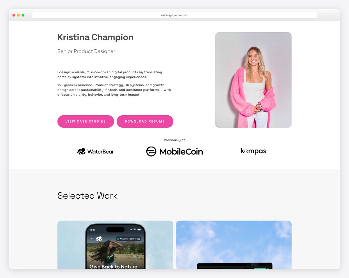
Kristina Plummer’s home page is very minimalist. To spice things up, she greets her visitors with a typewriter effect.
The header is super clean, and the resume button only has a pink outline that becomes solid on hover. The rest of the page keeps the same light flow, ensuring great readability.
What stands out: Minimalism with a touch of animation go very well hand in hand for a resume website.
Don’t miss our dedicated collection of the ultimate Squarespace website examples.
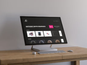
2. Anthony Wiktor
Built with: Gatsby
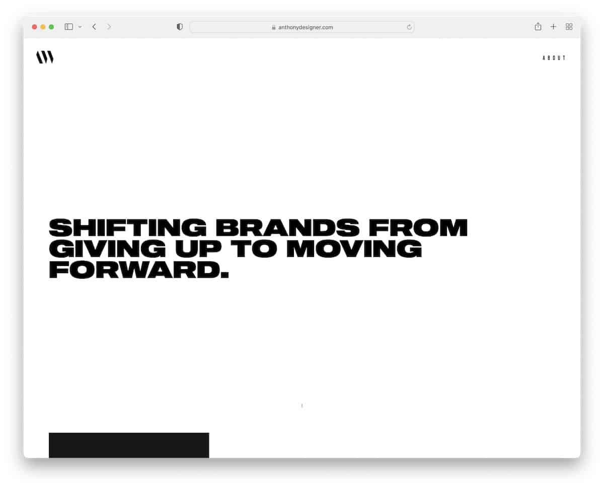
Anthony Wiktor’s page has a clean light and (mainly) dark look that appeals to the eye. The transition from the white hero background to the black base makes the overall experience much more pleasant.
What’s also unique about Anthony’s page is that portfolio elements turn the whole website into a different color (specific to the project) on hover.
What stands out: A combination of light and dark design gives the website a very premium feel.
Need more inspiration? Check these great portfolio websites.
3. Scope Copenhagen
Built with: Elementor
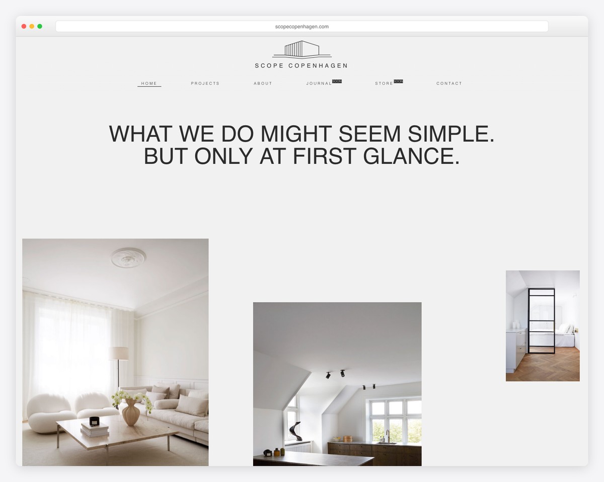
Scope Copenhagen’s clean home page gives you a glimpse at some projects with a floating header that’s always available to visit other sections.
The large and full-width images are an excellent addition to give a better view of the works, and the transition between pages gives a soothing experience.
What stands out: Instead of using sharp transitions between internal pages, use a smooth one, like Scope Copenhagen.
4. Andrew McCarthy
Built with: GitHub Pages
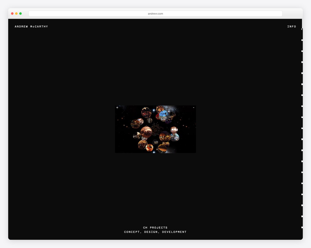
Andrew McCarthy’s online presence is clean, creative, and tricky. The infinite scrolling effect repeats the same seven sections with changing overlayed shapes.
But even if you scrolled for some time before realizing it, the menu reappears with links to the about and work pages as soon as you start scrolling back.
What stands out: There’s always room to do things differently and stand out, just like Andrew.
5. And Then Jupiter
Built with: Craft CMS
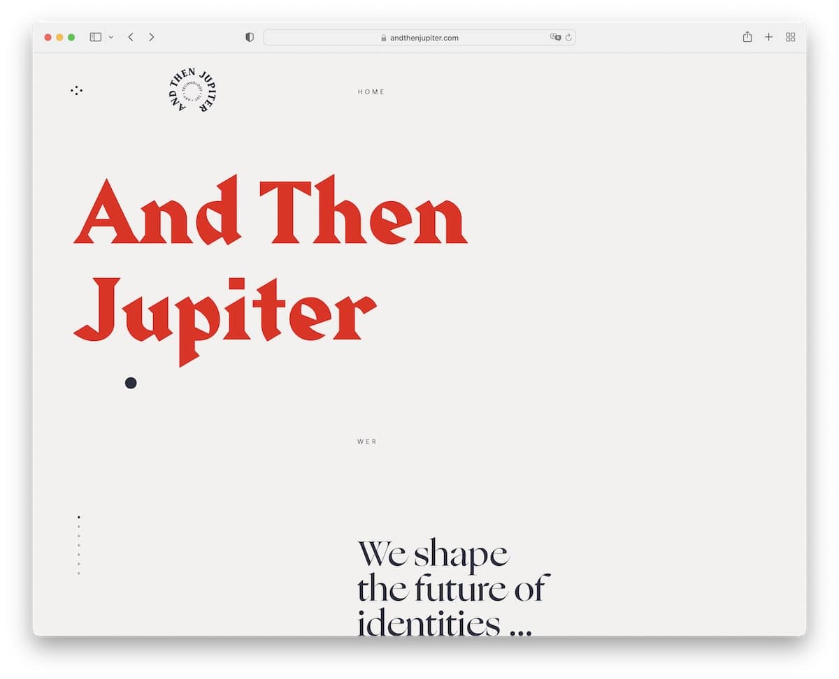
And Then Jupiter is a unique, text-heavy website with a lot of white space and a tiny bit of animation for a pleasant user experience.
This clean site has a floating header with home and menu buttons. It features a full-screen menu that displays its elements in a circular motion, unlike anything we’ve seen while curating this collection of examples.
What stands out: If everyone uses a lot of visual content on their website, create a text-only version and differentiate it from there rest.
6. Habitat
Built with: Craft CMS
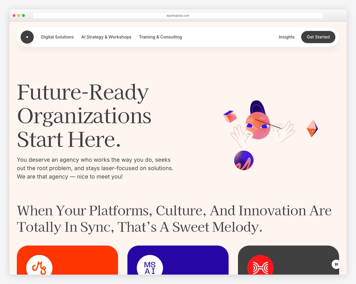
Habitat is a great example of a clean one-page website with a navigation bar that takes you directly to the desired section without scrolling.
The website also uses a sticky “Start a conversation” button that opens the contact form without leaving the current page.
What stands out: Always have access to the contact form with a cool floating button.
Don’t miss checking out these great one-page website builders to create an epic online presence.
7. MinRims
Built with: Webflow
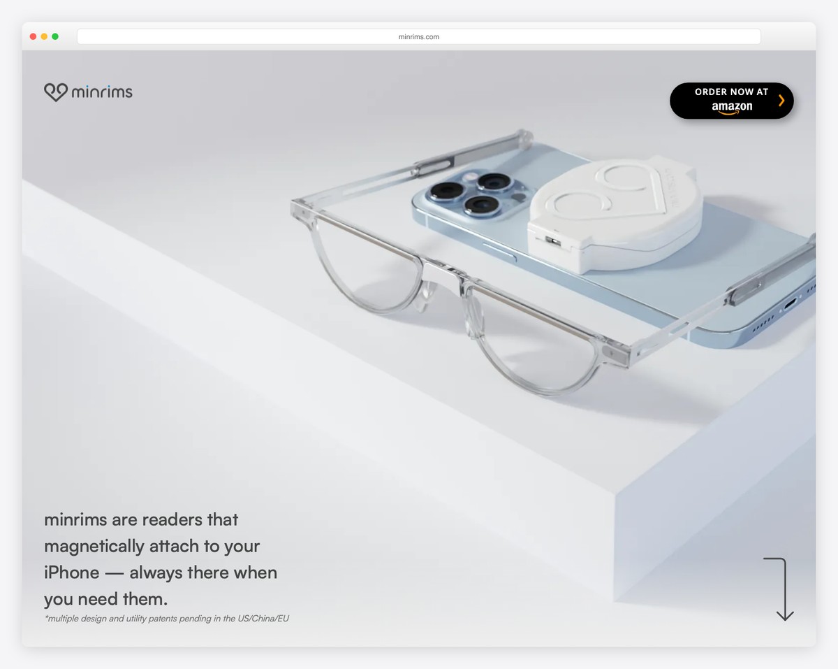
MinRims is a clean and interactive website that creates an immersive browsing experience when presenting its product.
The landing page doesn’t feature a header but has a sticky “Join the waitlist” button to collect leads.
What stands out: Create an immersive presentation of a product that showcases all the ins and outs of it with a clean design.
Finally, we’re sure you’ll gain a lot of inspiration from these Webflow websites.
8. OrangeYouGlad
Built with: Wix
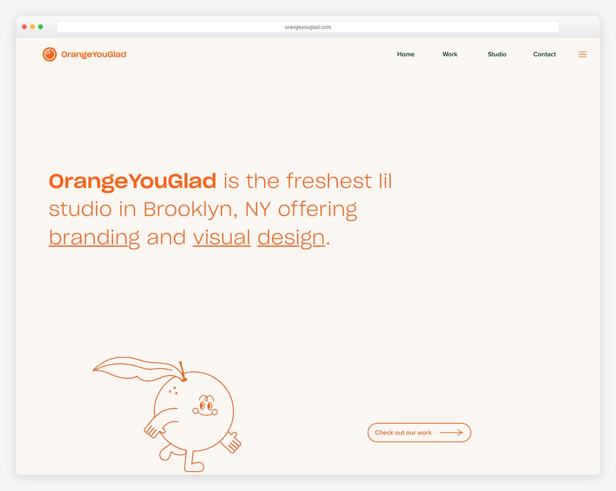
OrangeYouGlad’s website feels like you’d be scrolling a vertical slider with cool sections and catchy elements that keep engagement at an all-time high.
The header and footer are very minimalist for a flawless look. What’s unique is the sticky icon that reveals the header/menu on hover, which you don’t see daily.
What stands out: A bubbly design can be clean, too!
We also have a lot more top-class examples of websites built on Wix platform.
9. Zunc Studio
Built with: Webflow
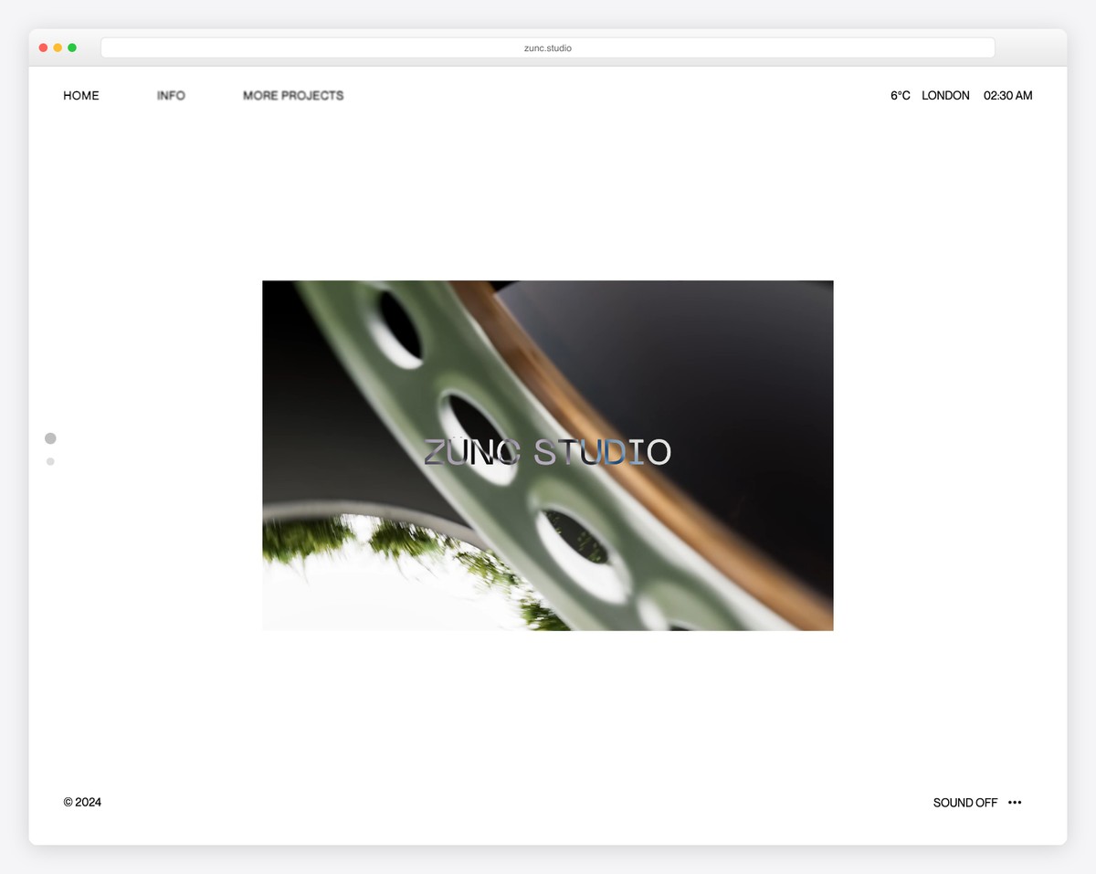
Zunc Studio has a very interesting take on a video presentation that we haven’t seen before.
Also, once the video ends, it automatically scrolls to the second part of the page, which has some text with one of the more unique hover effects.
You can also turn the sound on or off.
What stands out: You can achieve a lot cleaner website look with hover effects like Zunc Studio uses.
One thing I wouldn’t recommend is to have a custom scroll bar. It just looks strange and out of place.
10. Youssri Rahman
Built with: Webflow
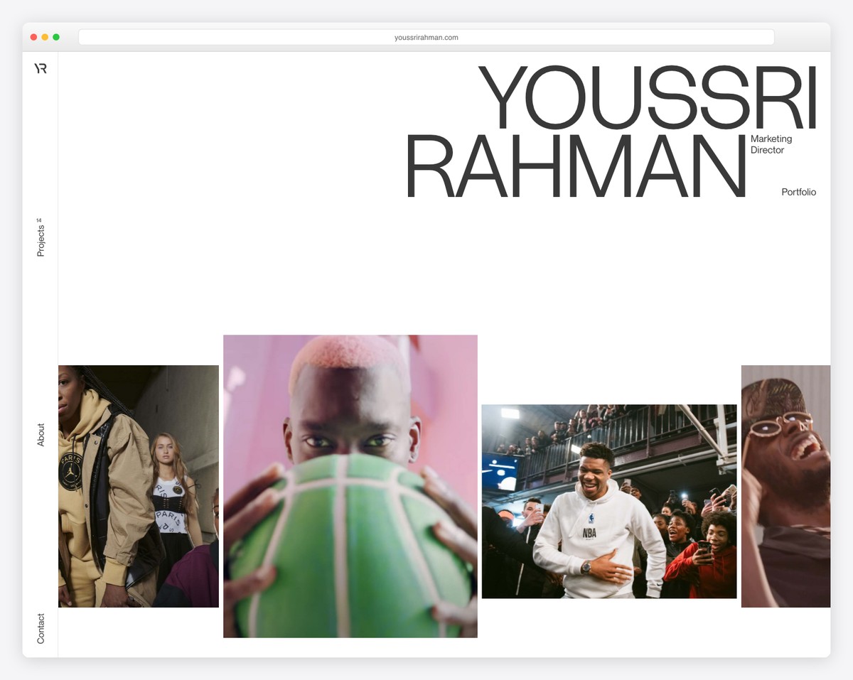
Youssri Rahman’s website is very refreshing with its one-of-a-kind (not) image slider. The thing is, once you hover over an individual slide, a video starts playing. So clever.
What also makes this clean site different from others is the sidebar header and the awesome About page.
What stands out: If you plan to use a slider, dare to make it different, unlike everyone else.
11. Israel Ramirez
Built with: Webflow
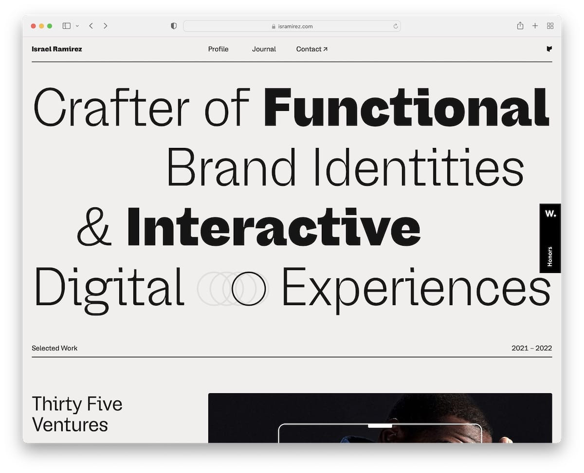
With the addition of the circular animation, the large and bold text in Israel Ramirez’s website’s hero section grabs everyone’s attention.
You’ll also find a simplistic floating header, an awesome portfolio of selected works and a footer reveal function with massive “Get in touch” text.
What stands out: Inform everyone of what you do with large text above the fold instead of using visual content.
12. Magazzino
Built with: ProcessWire
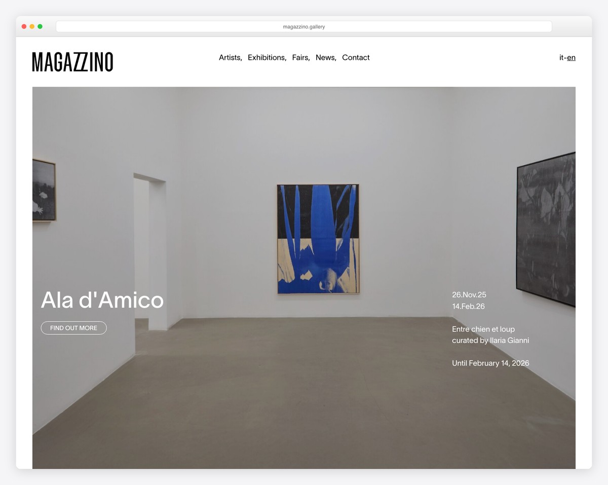
Magazzino has a beautiful parallax image that promotes its latest events, followed by a grid-style news/fairs section.
The header is 100% transparent and floating, and the footer blends with the base of the website and doesn’t feel like a footer.
What stands out: The parallax effect accompanies a clean web design nicely.
13. Ethan Suero
Built with: Webflow
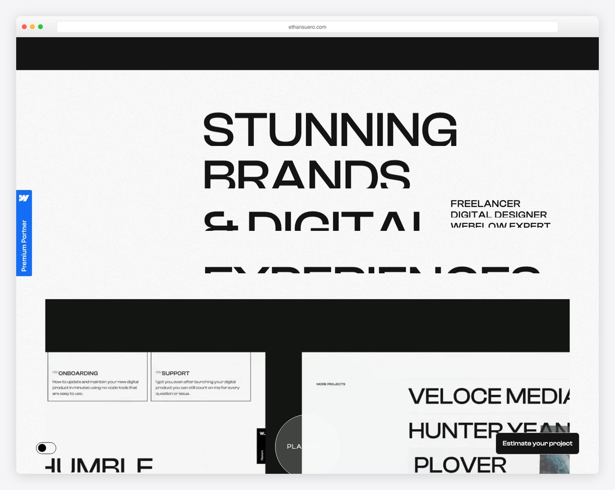
Ethan Suero’s website has an interesting “preloader” that first tells you what he specializes in and then shows his image.
The single-page website layout has various scrolling animations with a disappearing/reappearing header depending on whether you scroll down or up.
The footer’s dark/light or night/day mode switcher is unique to Ethan Suero.
What stands out: You can play with adding dark/light mode if you’re running a dark website (or light).
14. Wild
Built with: DatoCMS
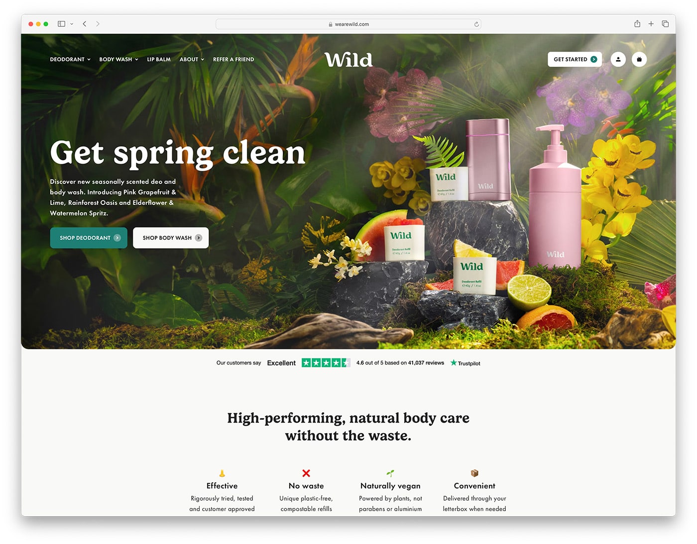
Wild is another online store we wanted to add as a great clean website example. Even though a lot is happening on the home page, all the elements distract you positively because of the simple design with enough white space.
But the “How it works” section is our favorite, which you could copy for your product(s).
What stands out: When focusing on readability, white space, a clean look, pleasant typography, and color combos can allow you to display a lot of information, even animations.
15. Earthbound Designs
Built with: Squarespace
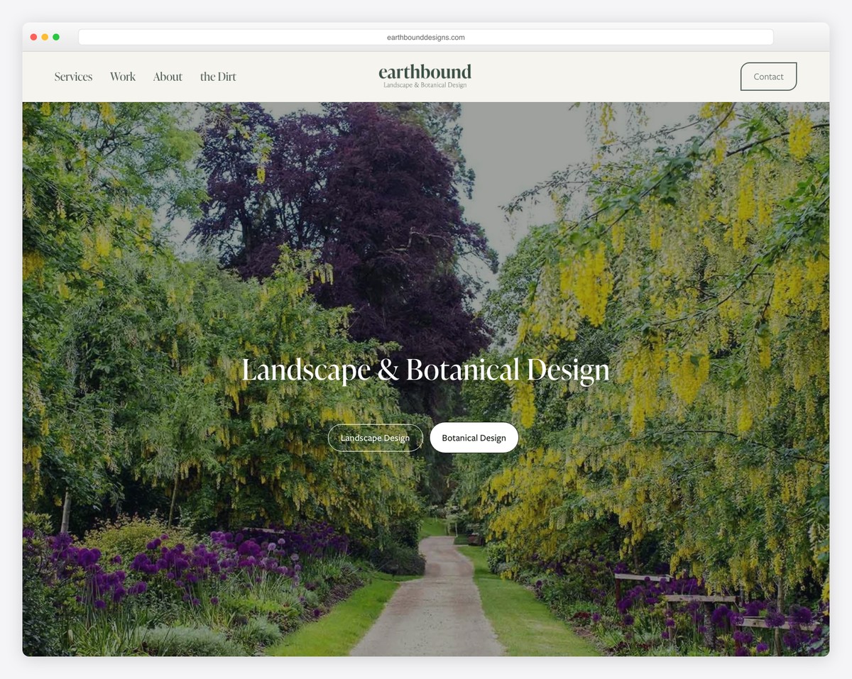
Earthbound Designs’ website opens with a breathtaking full-width hero image of a lush garden pathway, immediately establishing their expertise in landscape and botanical design. The centered overlay text is clean and uncluttered.
The navigation is refreshingly minimal — just five items plus a Contact button — and the dual CTA buttons (Landscape Design / Botanical Design) help visitors self-select their interest. The overall design lets nature do the talking.
What stands out: Letting stunning imagery dominate the hero section while keeping navigation and text minimal creates a powerful clean design.
16. Studio Neat
Built with: Squarespace
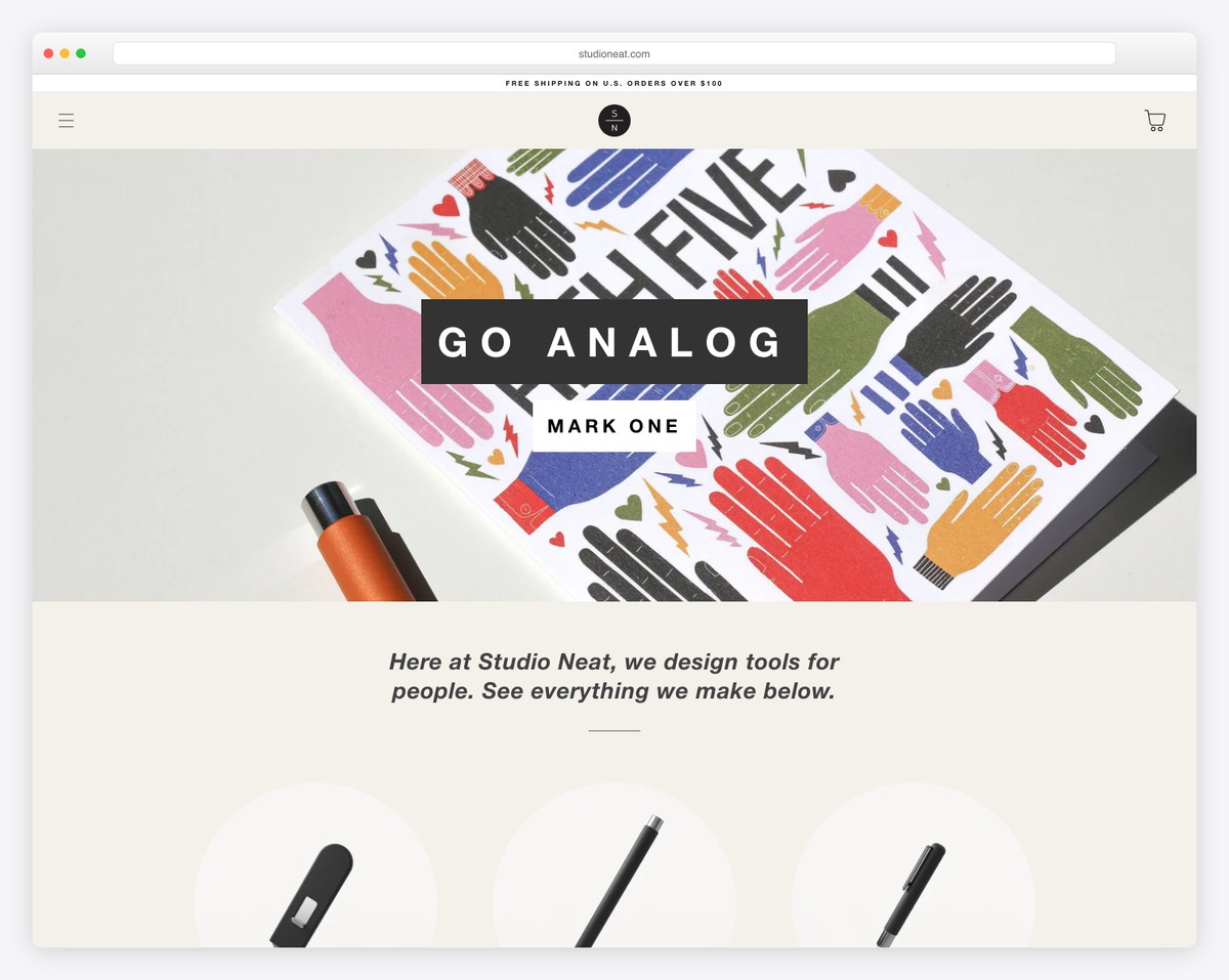
Studio Neat’s website embodies their “Go Analog” philosophy with a clean, product-focused design. The warm beige background and centered product imagery create a calm, inviting browsing experience that mirrors their physical goods.
The minimal navigation (just a hamburger menu and cart icon) keeps the focus squarely on the products. The tagline and product name are displayed in bold, simple typography that reinforces the brand’s design-forward identity.
What stands out: A monochromatic warm palette with centered product shots creates an e-commerce experience that feels curated, not cluttered.
17. Mariannan
Built with: WordPress
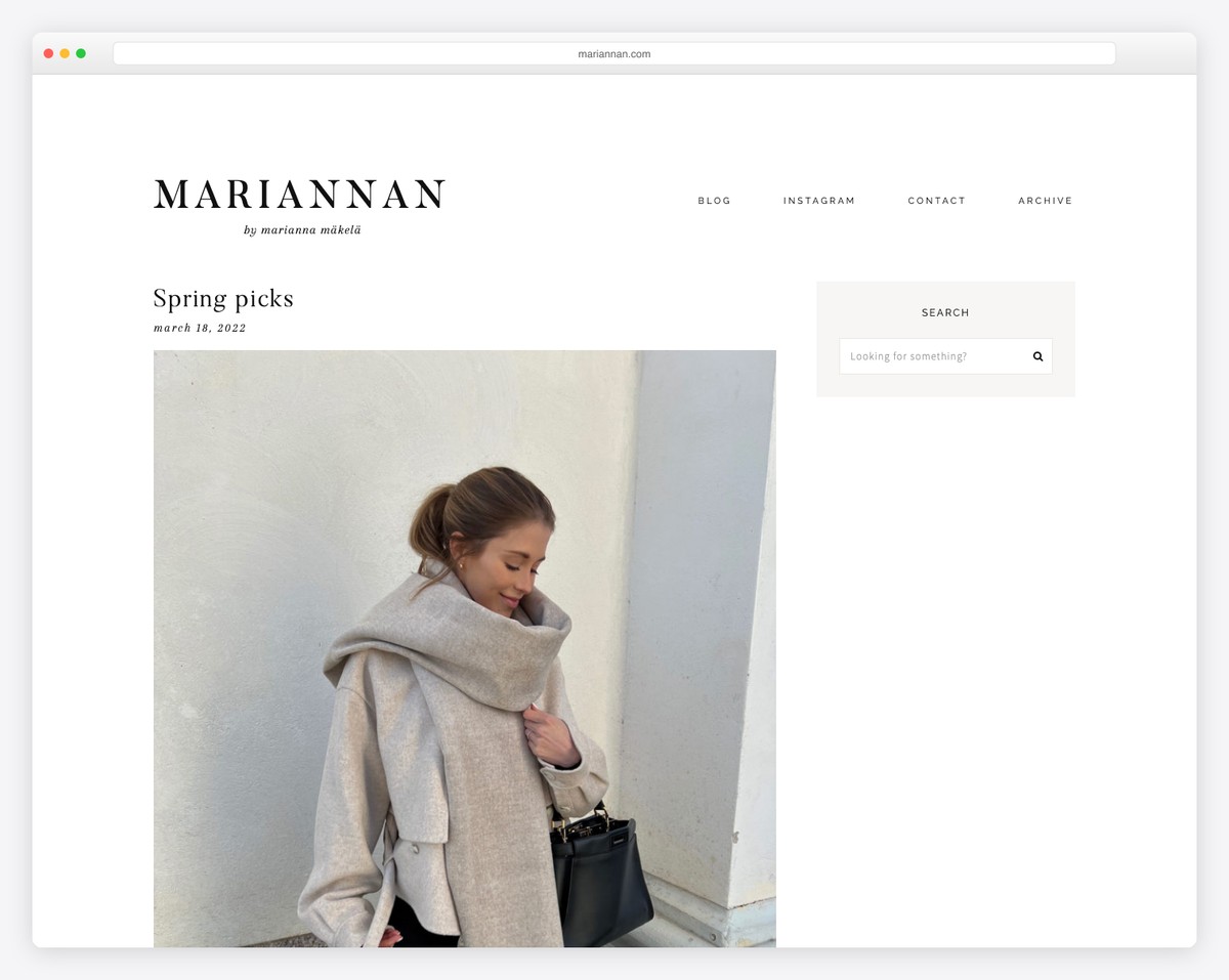
Mariannan, the fashion and lifestyle blog by Marianna Mäkelä, embodies clean design with its generous white space, elegant serif typography, and a simple four-item navigation. The layout puts all focus on the beautiful editorial photography.
The sidebar is refreshingly minimal — just a search bar — and the blog post layout uses large, full-width imagery with understated date and title formatting. It’s a textbook example of letting content breathe.
What stands out: Maximum white space with minimal navigation creates a gallery-like browsing experience that lets photography shine.
18. Ugmonk
Built with: Shopify
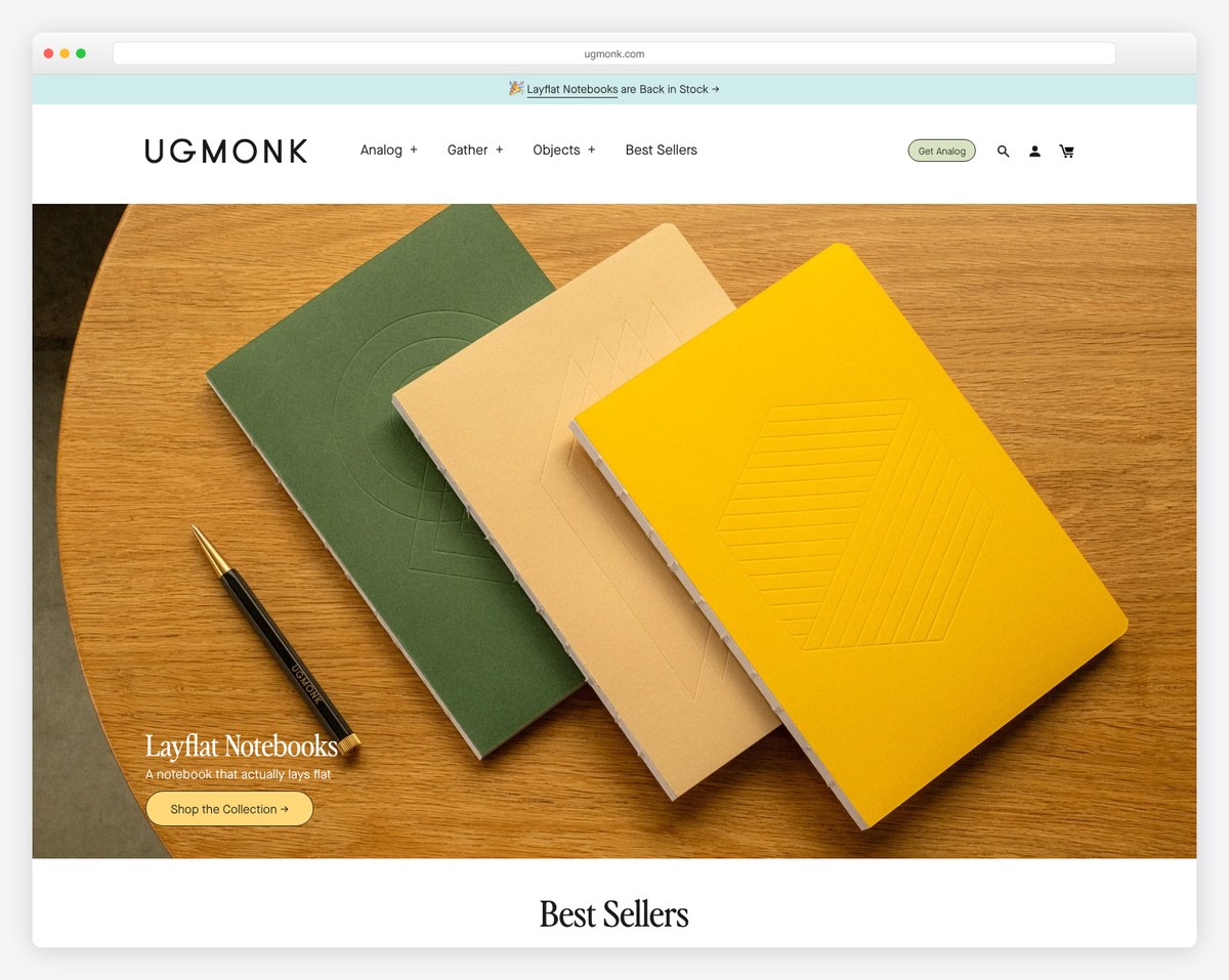
Ugmonk’s website perfectly reflects their “analog” design philosophy. The warm, natural product photography of their Layflat Notebooks against a wooden surface creates an inviting, tactile feel that mirrors the physical products they sell.
The navigation is thoughtfully categorized (Analog, Gather, Objects, Best Sellers) with a distinct “Get Analog” CTA button. The clean typography and earthy color palette create a cohesive brand experience throughout.
What stands out: Warm, natural photography with earthy tones can make an e-commerce site feel more like a curated boutique than an online store.
19. Kinfolk
Built with: Custom
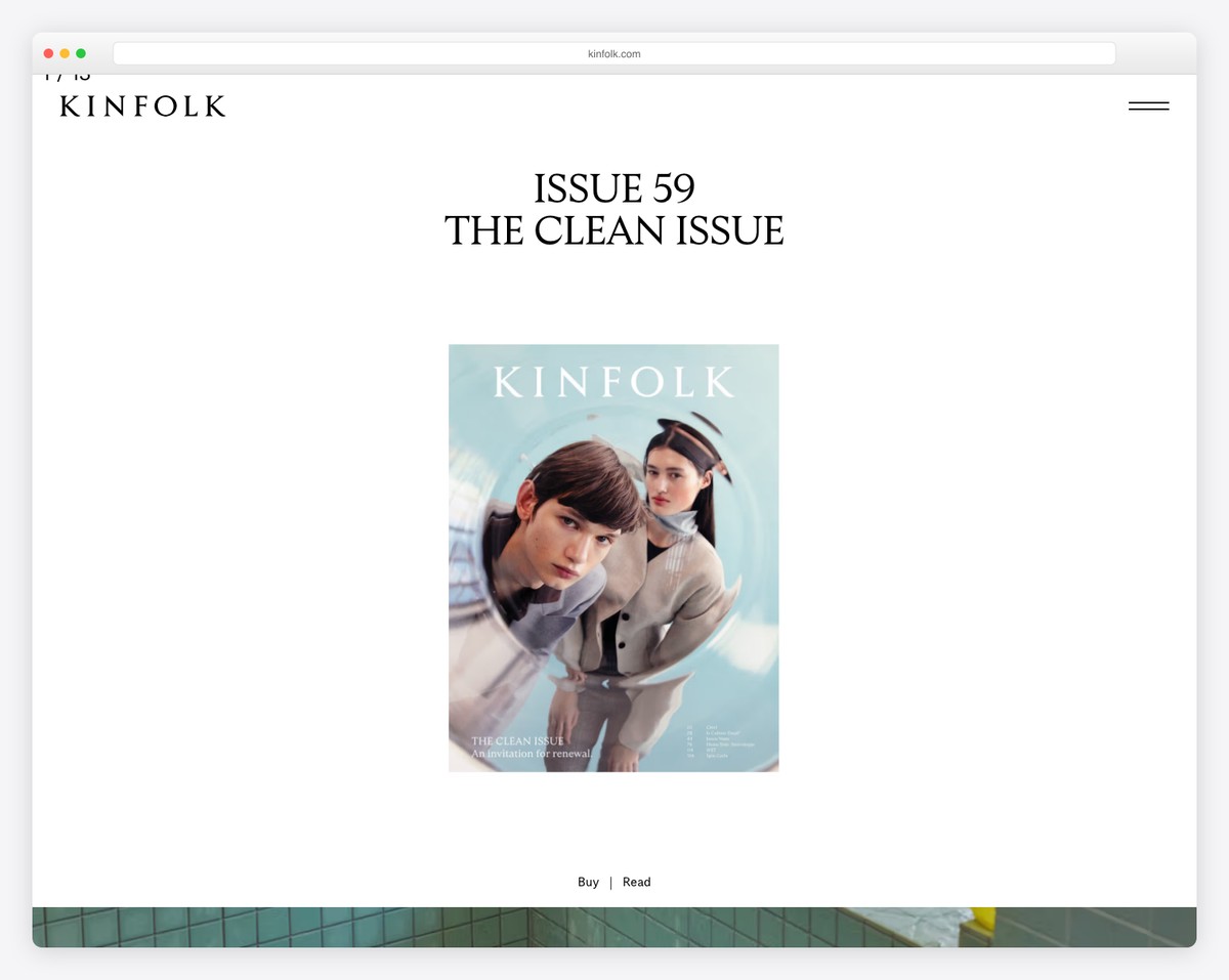
Kinfolk magazine’s website is the epitome of clean design — a single centered magazine cover on a pure white background with just the brand name and a hamburger menu. No clutter, no distractions, just art direction at its finest.
The “Issue 59: The Clean Issue” presentation with minimal “Buy | Read” links below demonstrates supreme confidence in editorial design. The site proves that sometimes the most powerful design choice is what you leave out.
What stands out: A single hero image on a white background with near-zero navigation can be the ultimate expression of clean web design.
Related Posts


Comments (0)