21 Best Squarespace Blog Examples (2026)
Are you searching for a collection of the best Squarespace blog examples?
Your search ends now with our extensive list of gorgeous designs you can learn from before building your own.
Two characteristics of all these blogs are simplicity and creativity. They all ensure that the content pops nicely and delivers excellent readability.
Whether you want to start a blog or expand your website with one, take notes as you review these and create your own unique version.
Remember, in addition to Squarespace, you can use other website builders for blogs or a WordPress theme to achieve this.
Best Squarespace Blog Examples
1. A Fork & A Pencil
Built with: Squarespace
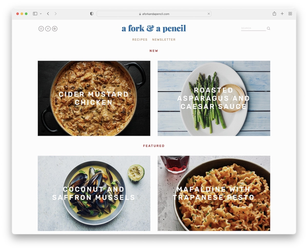
A Fork & A Pencil features a clean grid layout with parallax sections, making scrolling more engaging and exciting.
The header and footer are minimalist, with the latter offering multiple quick links. Moreover, an Instagram feed and a newsletter subscription are integrated into the home page to make it more actionable.
What stands out: Displaying posts in a grid is a common practice to showcase more content in less space.
Don’t forget to check more awesome recipe blogs if this is the niche you’re interested in.
2. Meiwen See
Built with: Squarespace
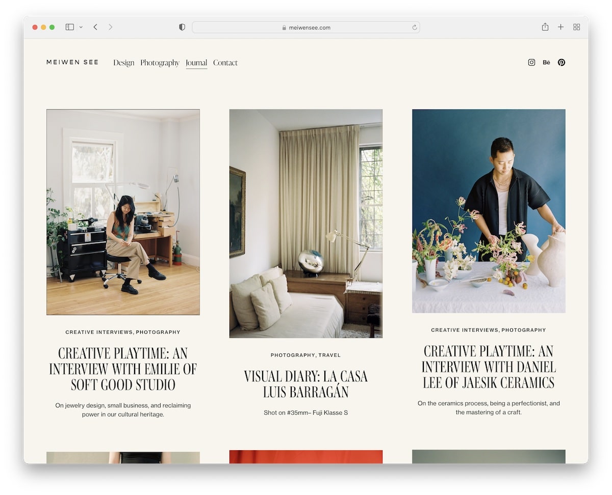
Meiwen See has a simple layout, with some post thumbnails being static and some animated for interactivity.
We also like the header that disappears as you scroll and reappears when you return to the top.
While the header takes little space, the footer is large but features ample white space.
What stands out: Create a better user experience with a disappearing/reappearing header (so readers don’t need to scroll to the top to access menu links).
3. Sprouted Kitchen
Built with: Squarespace

Instead of using the more traditional top-screen header, Sprouted Kitchen places it in the left sidebar. It also floats, so all links and social media icons remain visible.
Moreover, Sprouted Kitchen has a sticky top-bar notification that you can close if you’re not interested.
But there’s another sticky element – banner advertisement in the right sidebar to improve click-through rates.
What stands out: Create sticky elements to highlight something special (or even improve blog monetization).
4. One Mag
Built with: Squarespace
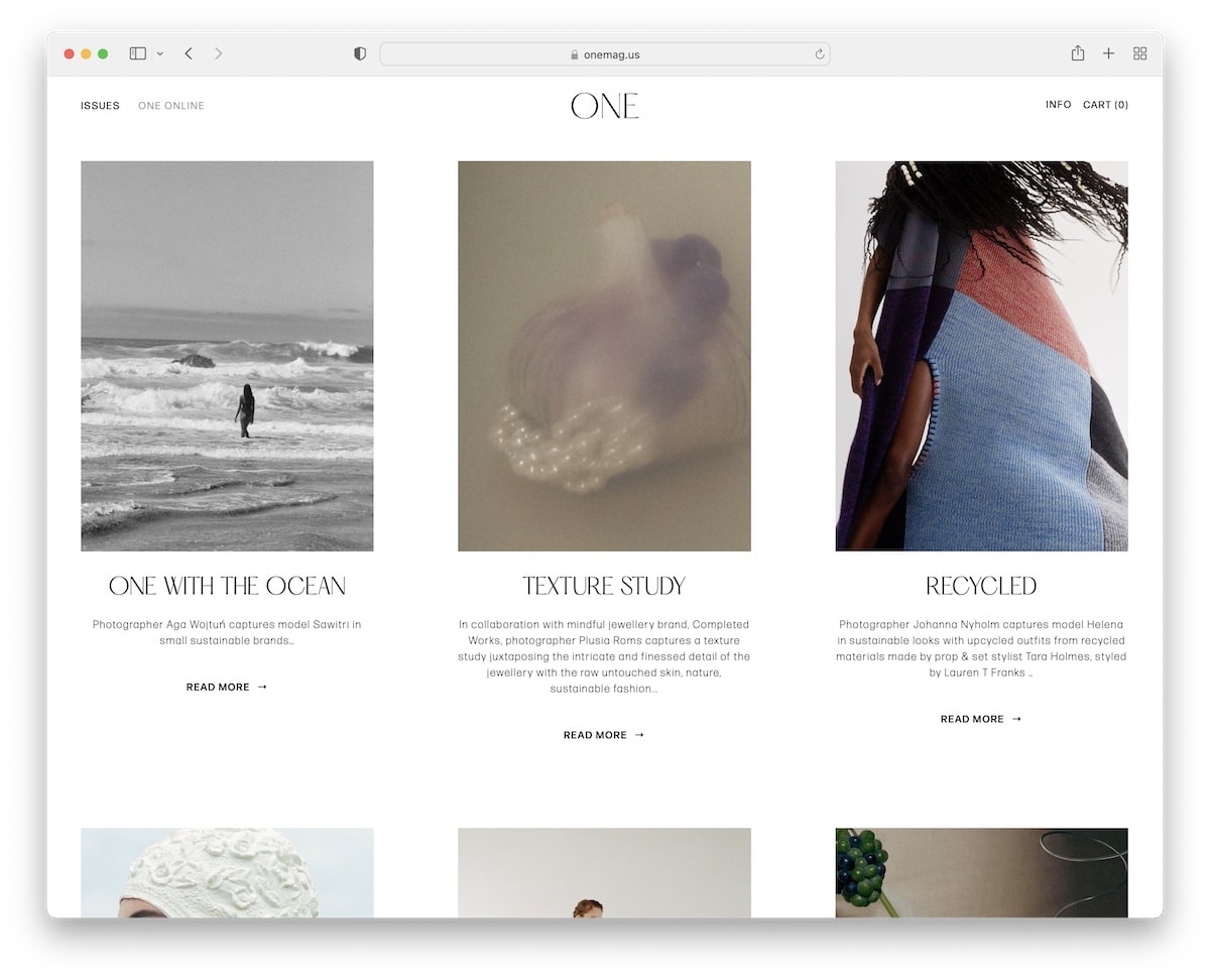
One Mag has a minimalist grid layout with titles, excerpts, and “read more” buttons. Instead of pagination at the bottom, it uses “newer” and “older” links to search through posts.
What also makes this responsive web design neater is the use of a consistent background color across the header and footer.
What stands out: Creating a clean, distraction-free blog design is an effective way to make your content stand out.
5. My Name Is Yeh
Built with: Squarespace
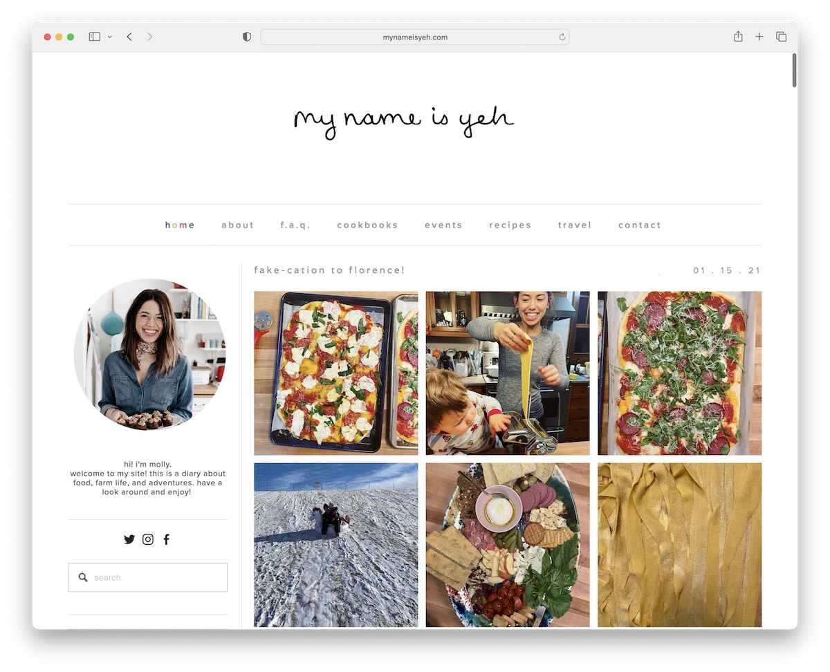
My Name Is Yeh is an excellent Squarespace blog example with a large header, navigation with a hover effect and a left sidebar. The sidebar features various widgets for “about me,” search, social icons, a subscription, recent recipes, etc.
Moreover, instead of using excerpts with a “read more” button, My Name Is Yeh displays entire posts, so you don’t need to open them on a new page.
What stands out: You can add a sidebar to your site to provide valuable information, quick links, forms, and more, including product and post promotions.
Want to create a similar blog? Here are the best Squarespace blog templates that will get you started.
6. Deem Journal
Built with: Squarespace
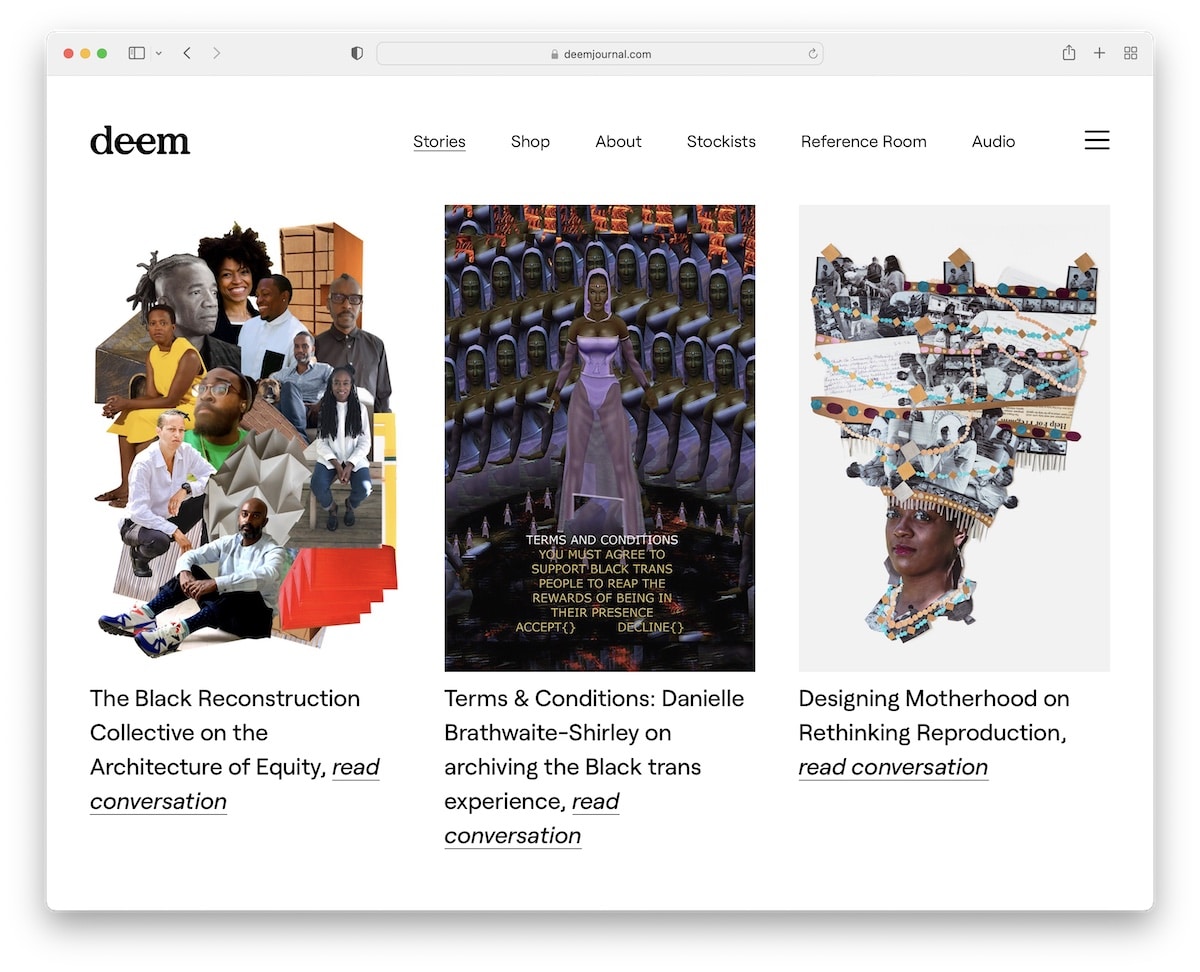
Deem Journal is another blog with a header that reacts to scrolling—scroll down, and it disappears; scroll up, and it reappears.
It also includes a hamburger menu icon next to the main links, which slides in from the right. If you click the search icon, it expands to cover the entire screen.
Finally, this blog has no footer for a cleaner view.
What stands out: Use hamburger menu functionality for a fresher look.
7. Concept Kicks
Built with: Squarespace
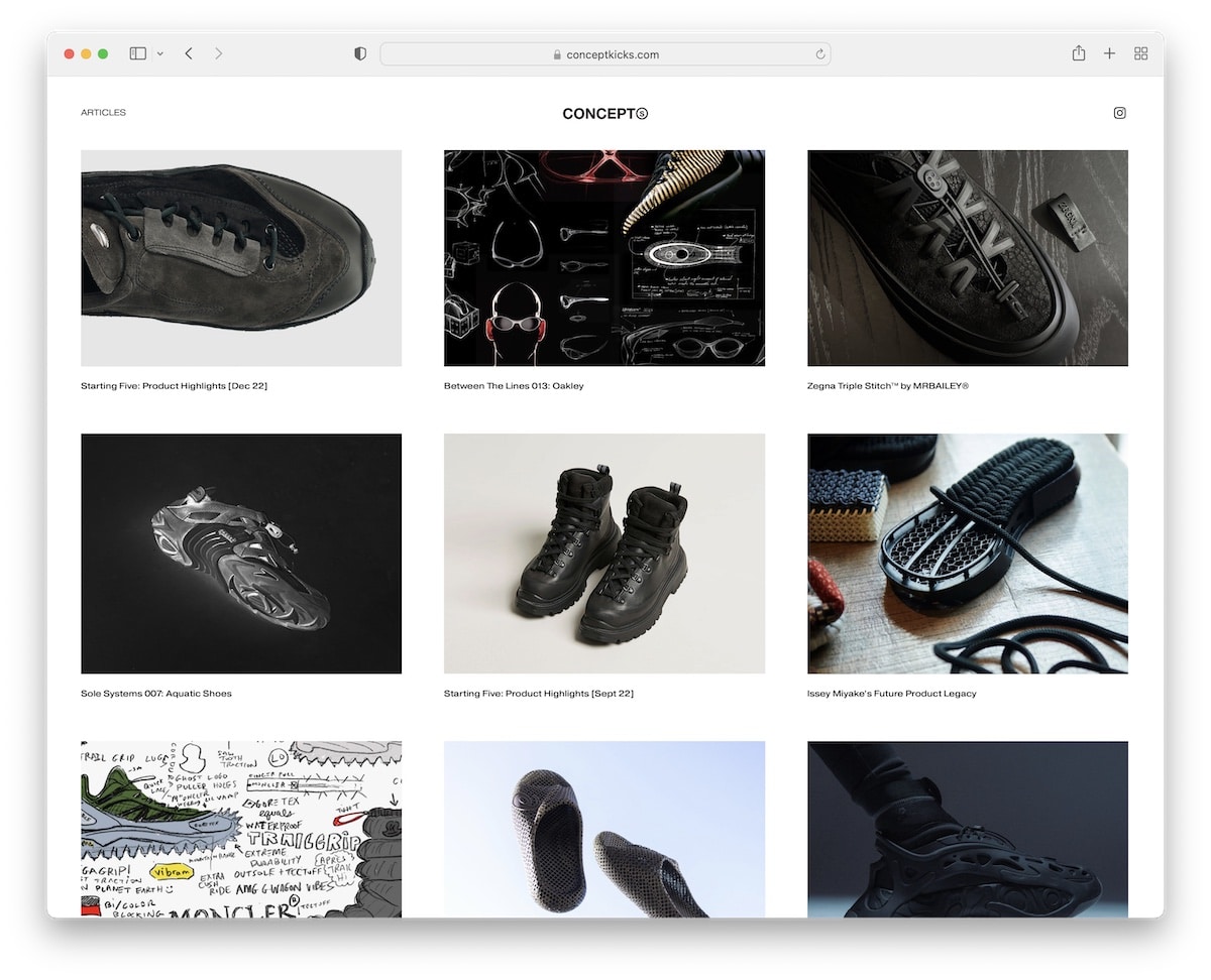
Concept Kicks created the ultimate minimalist Squarespace blog to ensure excellent content distribution. The posts don’t have sidebars, so it’s all about the visuals and texts.
The same applies to the header and footer, with the former sticking to the top of the screen for better UX.
What stands out: If you’re unsure how to approach your blog’s design, keep it simple (you can always add new elements and features later).
8. Traveling Mitch
Built with: Squarespace
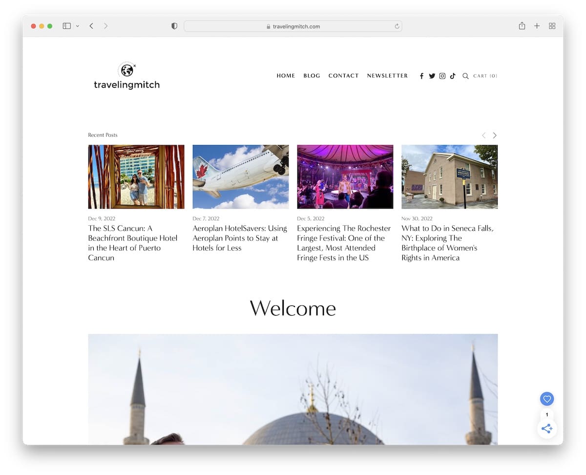
Traveling Mitch is a superb Squarespace blog example, featuring a hero section with a recent post carousel.
Mitch also showcases numerous winner/nomination badges and the “as seen on” section, featuring logos from multiple notable authorities.
You’ll also see a newsletter popup appear in the lower right corner, which he uses to promote new content.
What stands out: Email marketing isn’t dead. Use a subscription form to grow your email list and, consequently, your blog.
9. The Good Trade
Built with: Squarespace
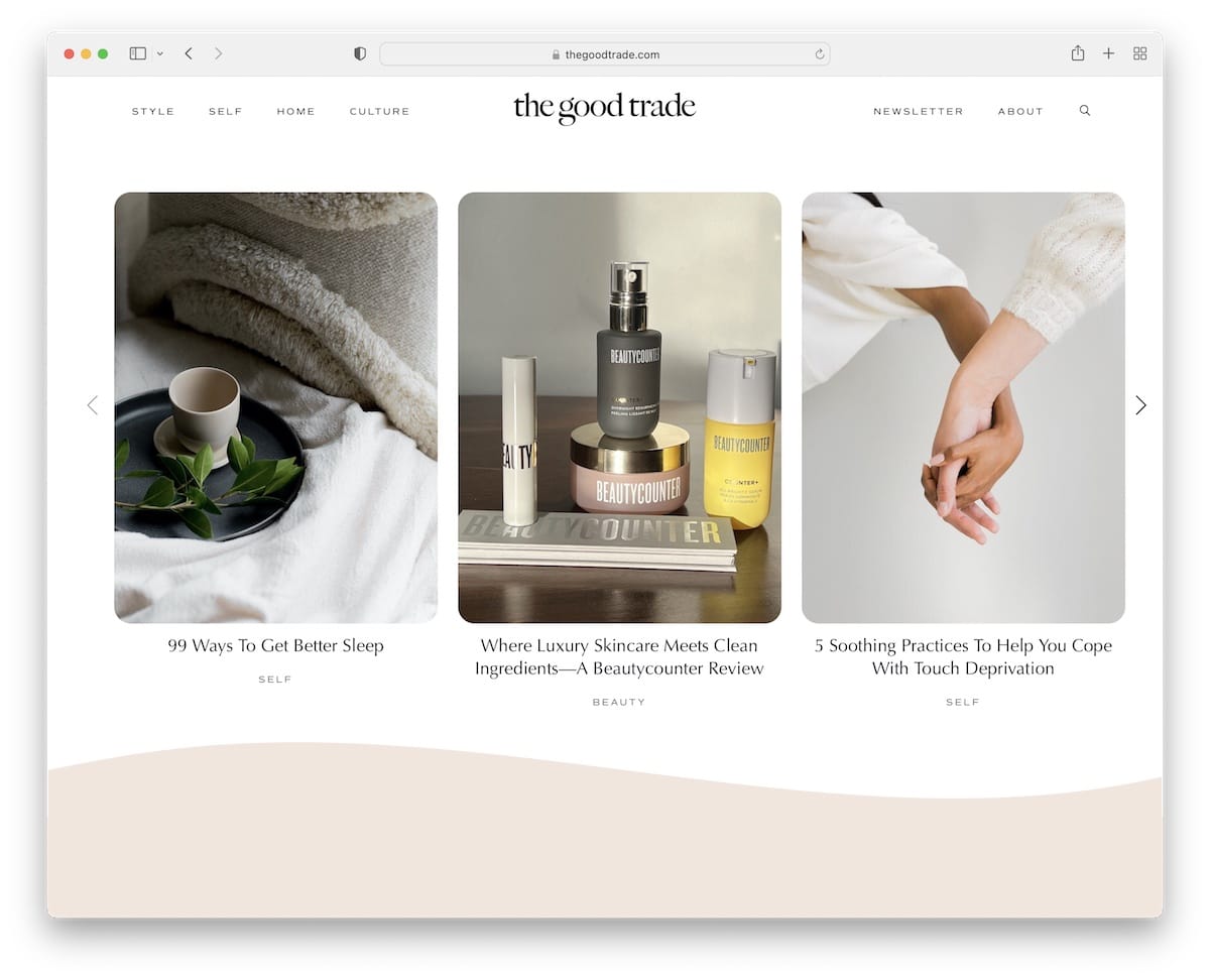
The Good Trade’s modern, somewhat mobile-like environment (because of the rounded edges) creates a pleasant vibe.
The blog uses a floating header with a drop-down menu and a search icon that opens the bar on a new page.
The Good Trade uses hover effects for interactivity and carousels to display more posts and reviews without wasting too much space.
What stands out: If most of your viewers are on mobile, you may want to adjust the design to use rounded edges.
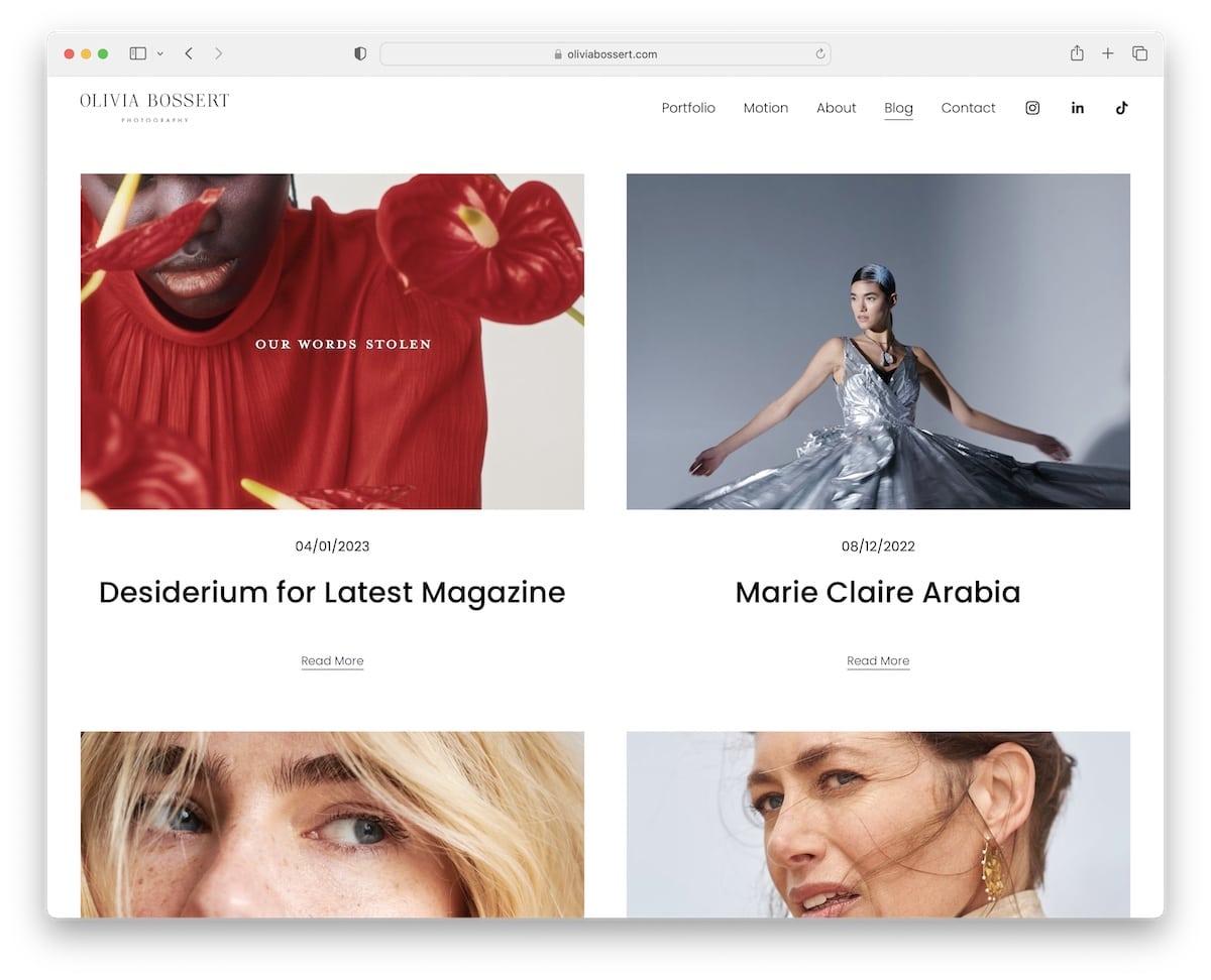
10. Olivia Bossert
Built with: Squarespace
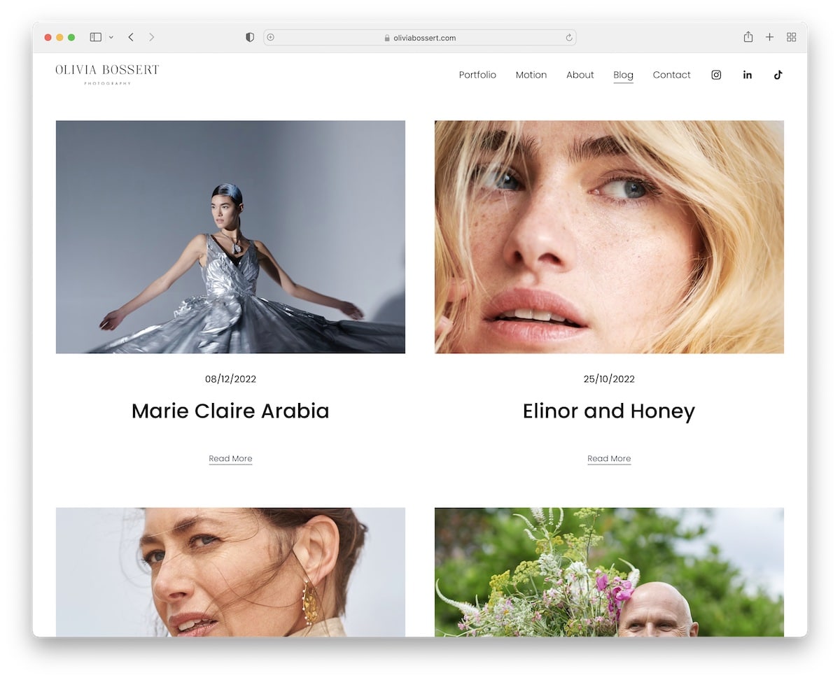
Olivia Bossert’s blog has a long list of blog posts in a neat two-column grid layout. Each post has a thumbnail, a date, a title and a “read more” link. Also, all content loads as you scroll, keeping you focused (since it makes you want to see what will load next).
Each post uses a boxed layout without sidebars, with links to the previous and next posts at the bottom.
What stands out: Create a blog that loads content as users scroll, so readers aren’t easily distracted.
11. All The Pretty Pandas
Built with: Squarespace
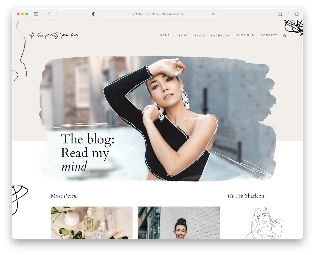
All The Pretty Pandas is a great Squarespace blog example with a background parallax effect to enhance the experience.
You’ll see a two-column grid (thumbnail, title and date of each post) with a right sidebar, an about section and a newsletter subscription form.
After the posts, a carousel displays the most popular posts, followed by an Instagram feed with a link to follow the profile.
Note: Integrating an IG feed is one practical way of adding more content to your blog (and it can also help you grow your account).
What stands out: Parallax scrolling adds visual depth and encourages visitors to keep exploring.
12. Benedict Evans
Built with: Squarespace
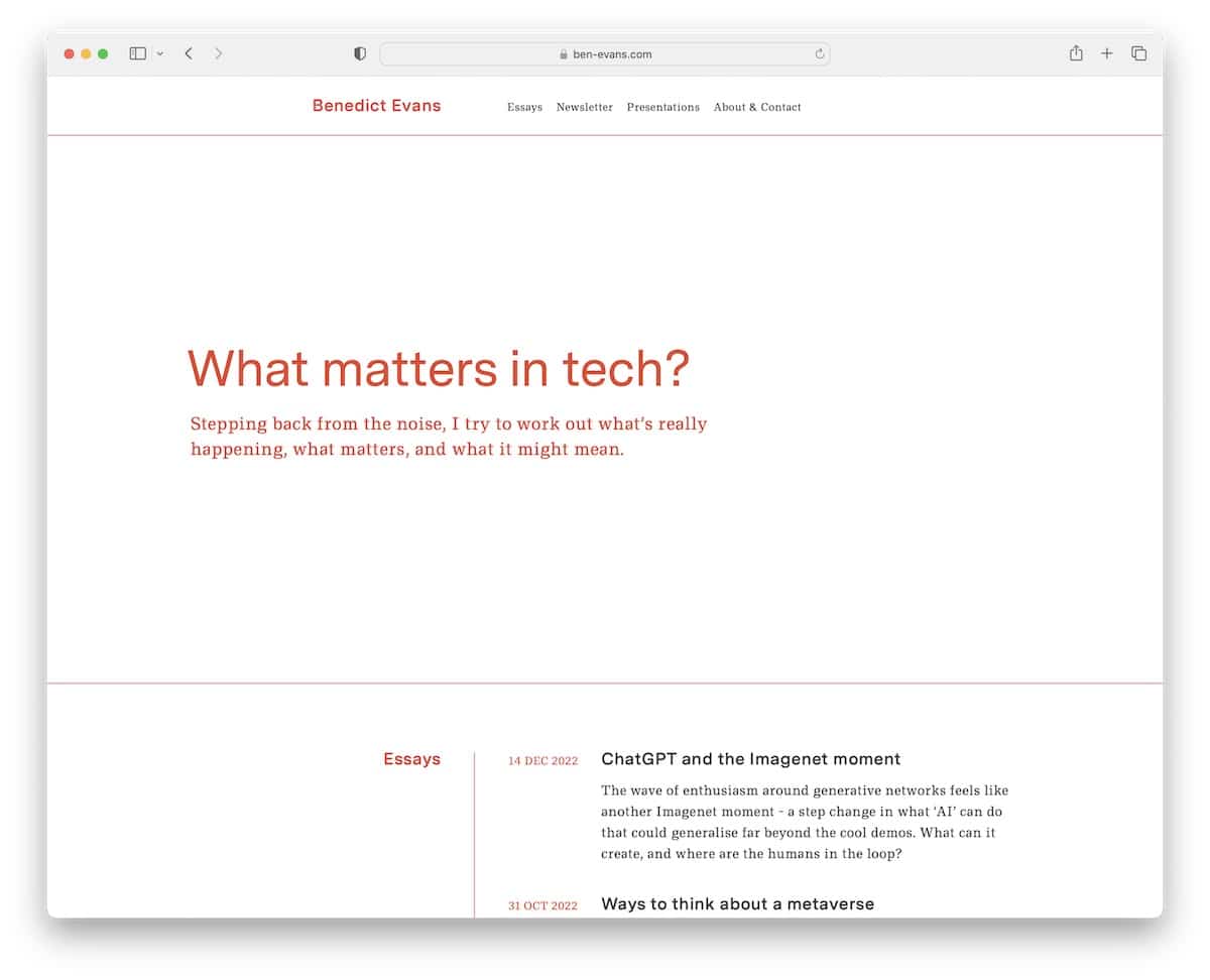
Benedict Evans runs a text-heavy blog that grabs the attention with a question and text above the fold – and plenty of white space.
The structure resembles a timeline, a unique approach that makes skimming posts much faster.
However, we would increase the font size to improve readability. Still, it’s a tech blog, so the readers are used to this style.
Note: Adapt your blog to your niche, which means you can comfortably defy the general “web design rules” and do your thing.
What stands out: Layered parallax effects create a sense of movement that makes scrolling feel dynamic.
13. Kelsey O’Halloran
Built with: Squarespace
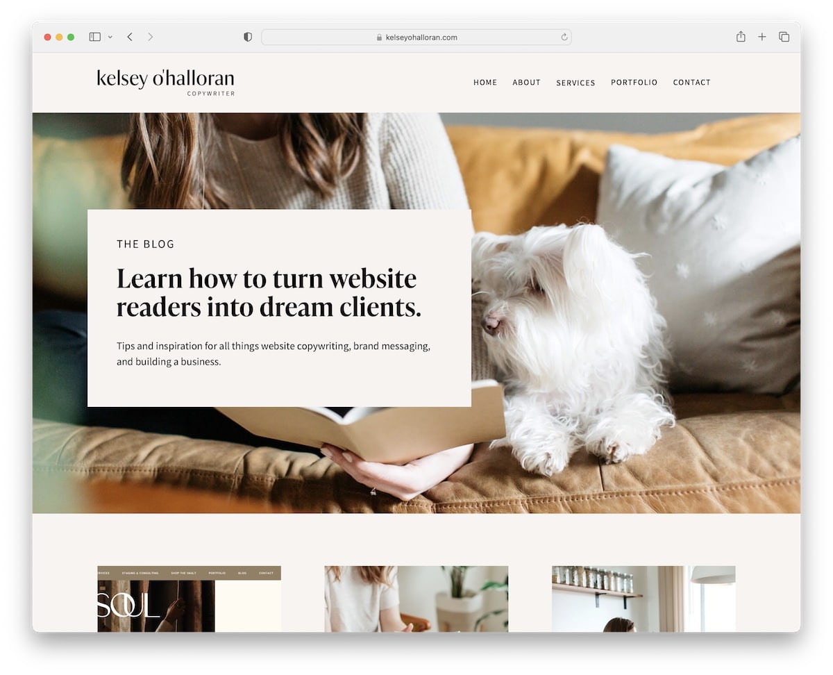
First, Kelsey O’Halloran’s website features a terrific color scheme that’s visually appealing and almost soothing.
Second, the cool banner image with overlaid text supports great storytelling.
The grid layout with extra white space highlights each element (thumbnail and title) clearly, allowing you to review all posts quickly.
Note: Use your own images (of yourself and your pet) to instantly create a more personal vibe.
What stands out: Seamless e-commerce integration lets visitors go from browsing to buying without leaving the site.
14. Supernatural
Built with: Squarespace
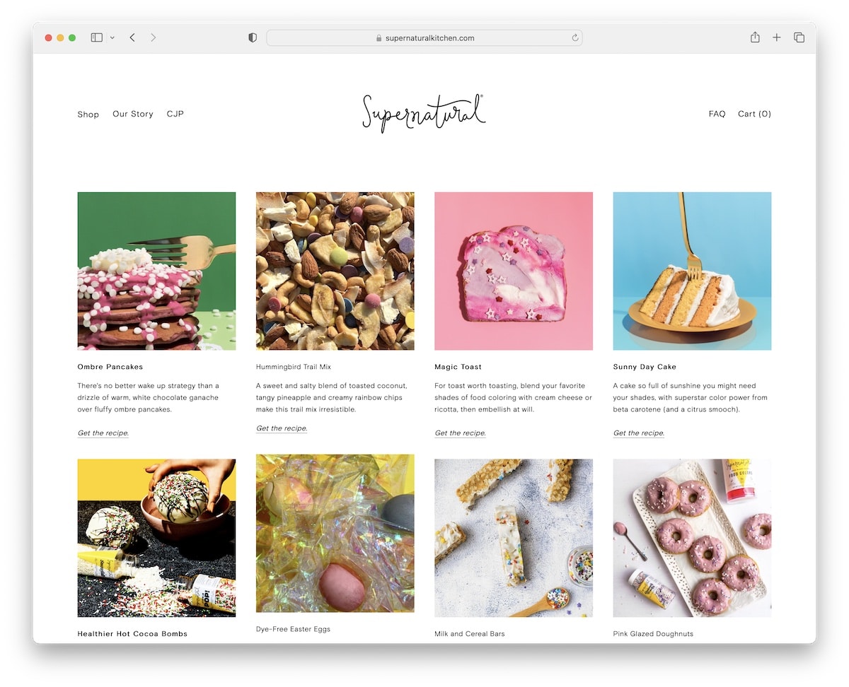
Although Supernatural doesn’t have a traditional blog, it features a few recipes with gorgeous photography.
The header is white and the footer is yellow, reinforcing the brand so you know you’re viewing Supernatural content.
Furthermore, featured images on blog posts use a parallax effect to create a more engaging start to the recipe.
Note: Parallax scrolling adds depth to your blog and improves the user experience.
What stands out: Product listings with clear pricing and add-to-cart buttons simplify the purchase flow.
15. AAKS
Built with: Squarespace
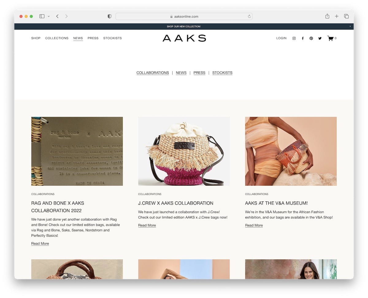
In addition to the header navigation, AAKS includes quick category links in the hero section to help users find the right news content faster.
Each blog category page loads posts while you scroll with thumbnails, titles, excerpts and “read more” buttons.
Moreover, the article is a whole blog post without sidebars, but it includes previous/following post links.
Note: Ensure quick links are easily reachable if your blog has multiple categories.
What stands out: A masonry grid layout organizes content attractively while maximizing screen real estate.
16. Create & Cultivate
Built with: Squarespace
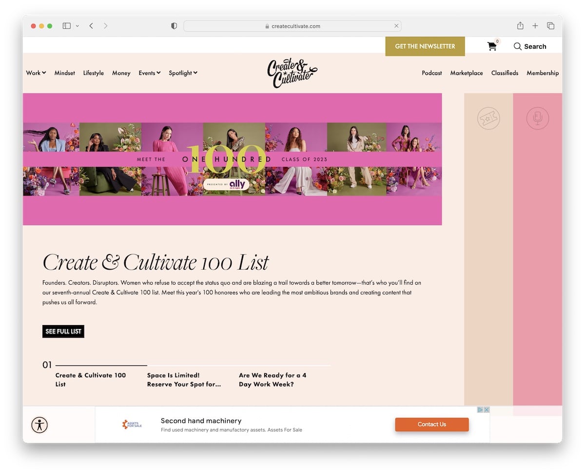
Create & Cultivate is a popular Squarespace blog example with an original design that keeps your attention on the screen.
Along with bold titles, thumbnails, and other creative elements, Create & Cultivate also features sections with video backgrounds to enhance engagement.
Finally, you’ll see an accessibility menu icon in the bottom-left corner, allowing readers to customize their interaction with your blog.
Create & Cultivate also uses Google AdSense to monetize its content. We don’t see this often with Squarespace blogs, but it’s worth considering to earn extra income.
Note: Ensure everyone gets the most out of your blog with the accessibility menu/configurator.
What stands out: A hero slider showcases multiple offerings at a glance, giving visitors quick access to key content.
17. Kendra
Built with: Squarespace
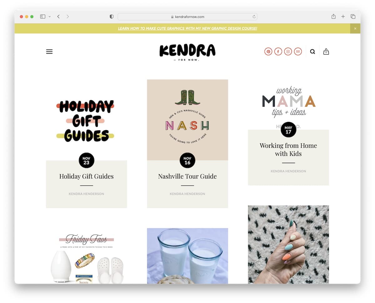
Regardless of how much you scroll, you never need to scroll back to the top to reach Kendra’s header because it stays at the top of the screen. This is a UX booster, if you will.
Kendra’s post grid layout has a “load more” button at the bottom to enjoy more articles without leaving the current page.
Lastly, this Squarespace blog has an IG feed and a shop feed lightbox gallery with affiliate links.
Note: Make a sticky header, so readers don’t have to scroll back to the top every time.
What stands out: The grid-based gallery makes it easy to scan a large collection at a glance.
18. Olivia Bossert
Built with: Squarespace
Olivia Bossert’s blog’s simplicity speaks for itself. It’s very comfortable to scroll through, and the same applies to individual posts, where images and embedded videos enliven them.
The footer and header maintain the same minimalist look, with a white background. We prefer a simple blog layout that doesn’t separate the header and footer from the body. It creates a classier appearance.
Note: Blog posts without sidebars call for a better, distraction-free reading experience.
19. Hotel Weekend
Built with: Squarespace
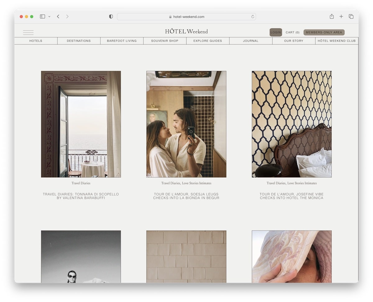
Hotel Weekend’s design is elegant and straightforward, making its content front and center. This Squarespace blog example has two floating elements: the header at the top and the notification bar (which you can close) at the bottom.
The footer is a two-in-one that organizes quick links and the subscription form.
Note: Integrate a floating notification bar to get more eyeballs on something special.
What stands out: The clean Squarespace layout demonstrates how the platform handles whitespace and typography by default.
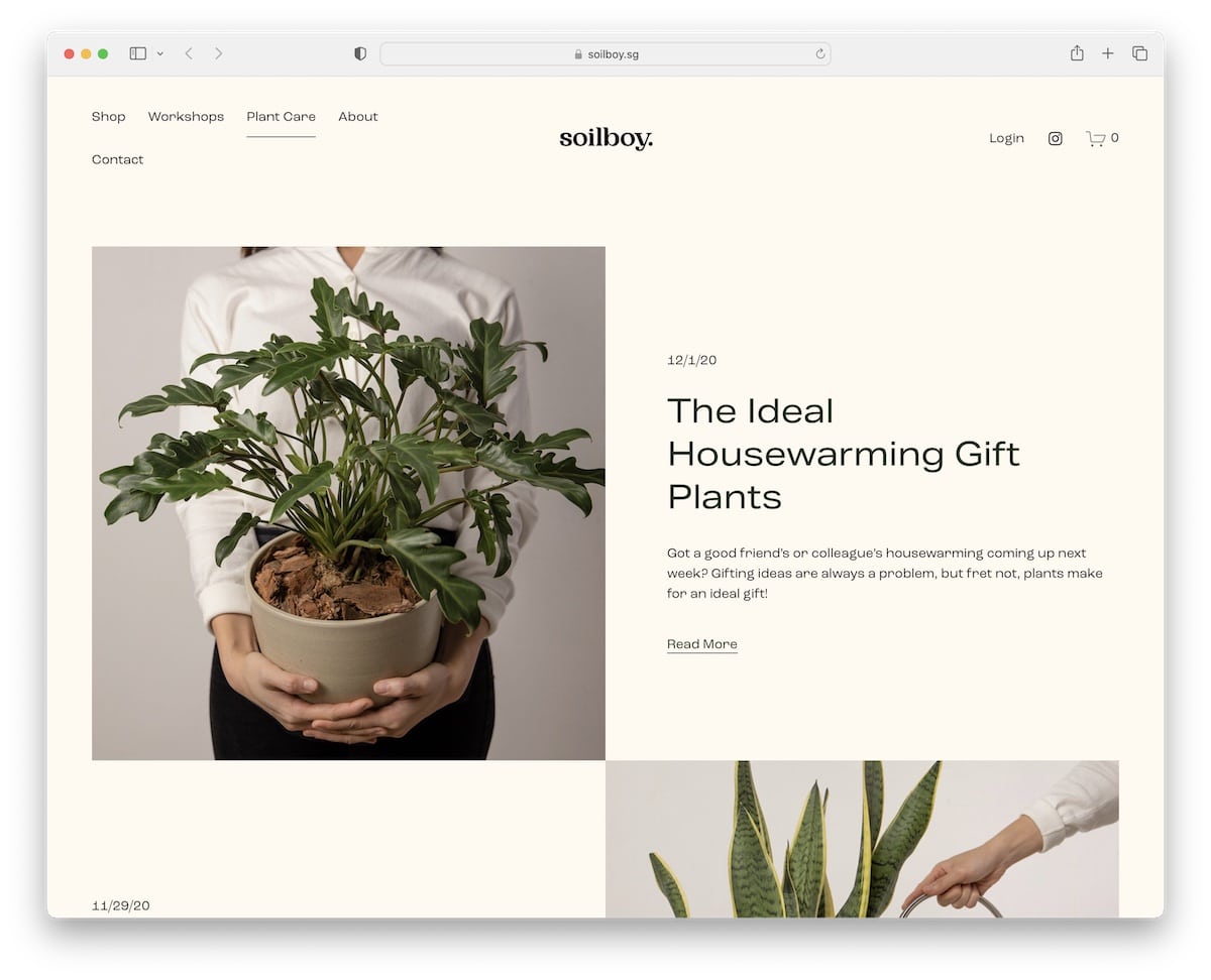
20. Soilboy
Built with: Squarespace
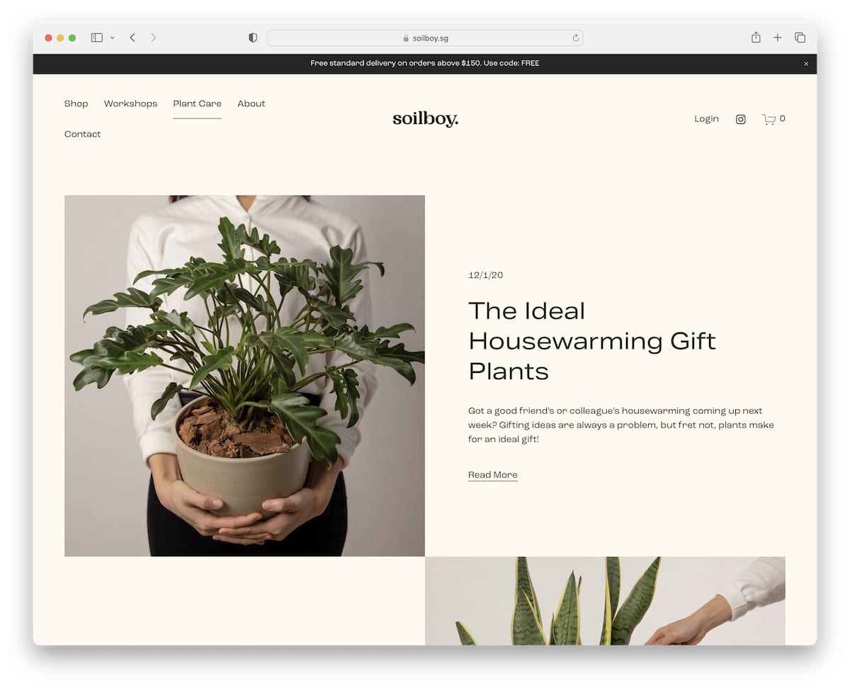
Soilboy displays images and brief post details interchangeably and loads them on scroll.
The top bar and header also disappear when scrolling, but return when you scroll to the top. The color palette gives Soilboy an earthy feel that complements the plant niche.
Surprisingly, the posts lack images, yet the seamless structure still makes them easy on the eyes.
Note: Use a color palette that blends with your niche and industry for a better ambiance.
What stands out: High-quality photography does the heavy lifting, making the content feel premium.
21. Finding Paola
Built with: Squarespace
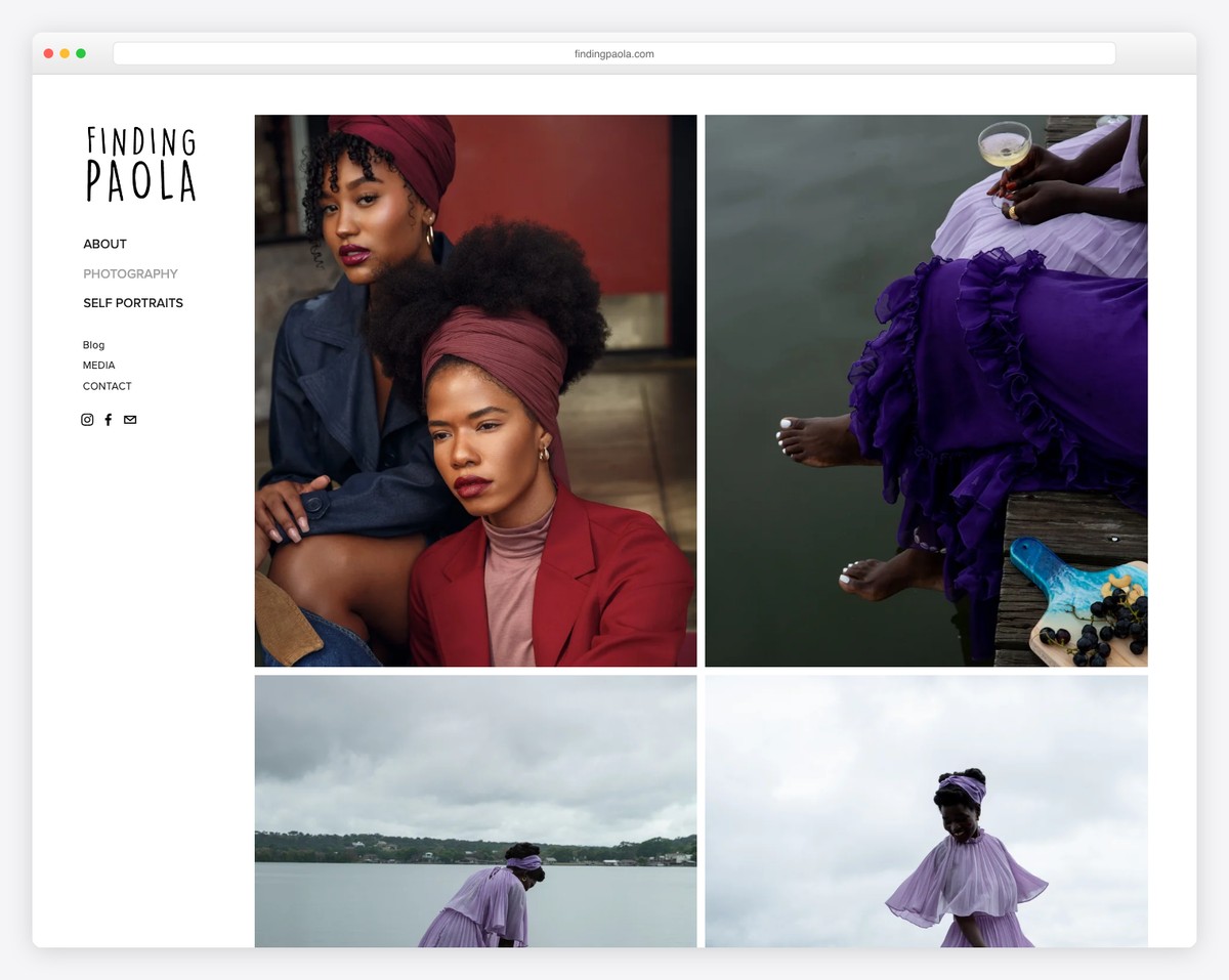
Finding Paola is a lifestyle blog curated by Paola Mathé that weaves together fashion, culture, personal style, and Haitian heritage into a vibrant editorial experience. The Squarespace-built site opens with bold, colorful photography and a clean grid layout that puts the visual storytelling front and center.
The navigation is refreshingly simple — Style, Culture, Beauty, Travel — letting visitors dive straight into content. The typography choices feel intentional and elevated, with serif headings that give the blog a magazine-quality polish while keeping the personal, approachable voice intact.
What stands out: Using large-format editorial photography as the primary design element transforms a personal blog into something that feels like a digital magazine — aspirational yet authentic.
Related Posts


Comments (0)