19 Best Wix Blog Examples In 2026
So, you’re into blogging but want to see all the top-notch Wix blog examples before launching yours?
I feel you.
Thus, our team spent many hours researching the web for the best examples and came up with the magic number 21.
If you have something in mind, you’ll probably experience it by checking these blogs (so you can see what it looks like in real-time).
You can then choose a website builder for blogs or a WordPress blog theme to create your unique version, or you can just go with Wix.
Get inspired now!
Best Wix Blog Examples For Everyone
1. Zion Adventure Photog
Built with: Wix
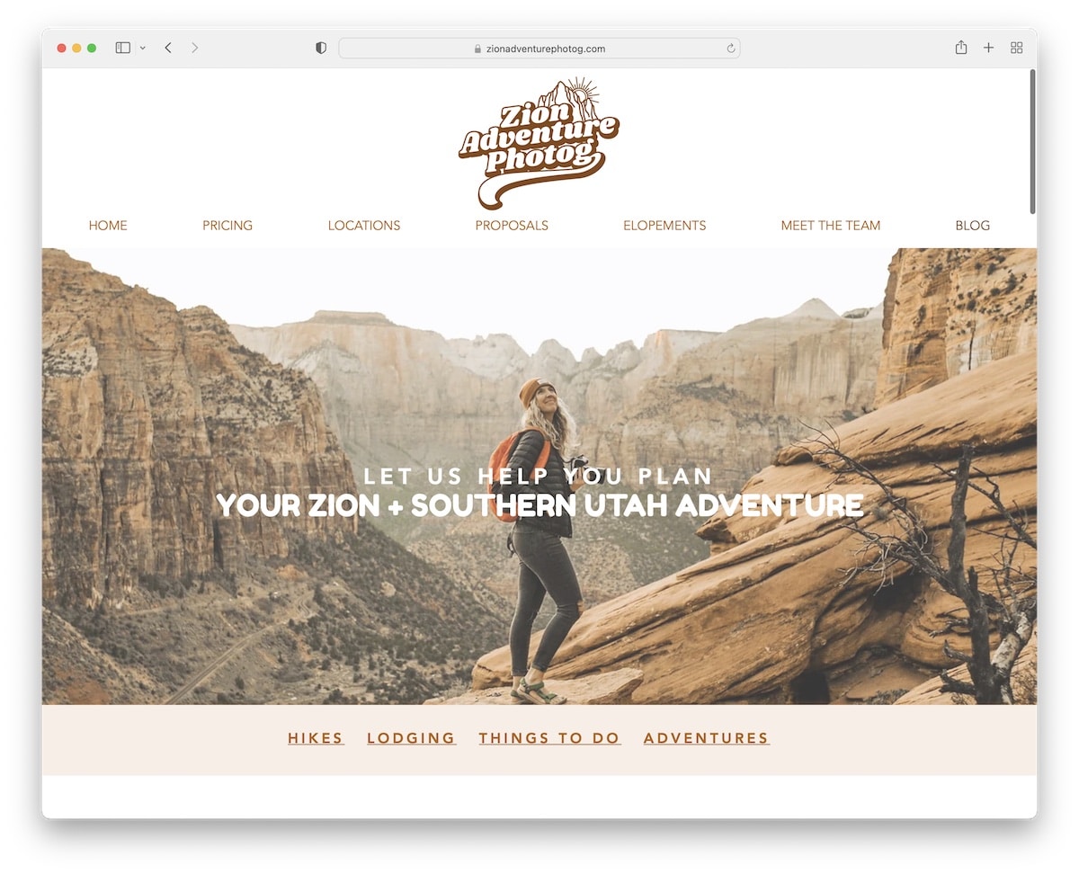
Zion Adventure Photog is a great example of a blog with a popup opt-in form to collect new subscribers in exchange for a free guide.
The parallax hero image creates a strong first impression sandwiched by menu links at the top and additional category links at the bottom.
Besides displaying a post grid and services, Zion Adventure Photog has an Instagram feed that opens posts in a lightbox for easier viewing.
Note: Grow your email list and potentially your business with a newsletter subscription popup.
What stands out: The dark color scheme gives the site a sleek, modern feel that makes imagery pop.
2. Hair Comes The Bride
Built with: Wix
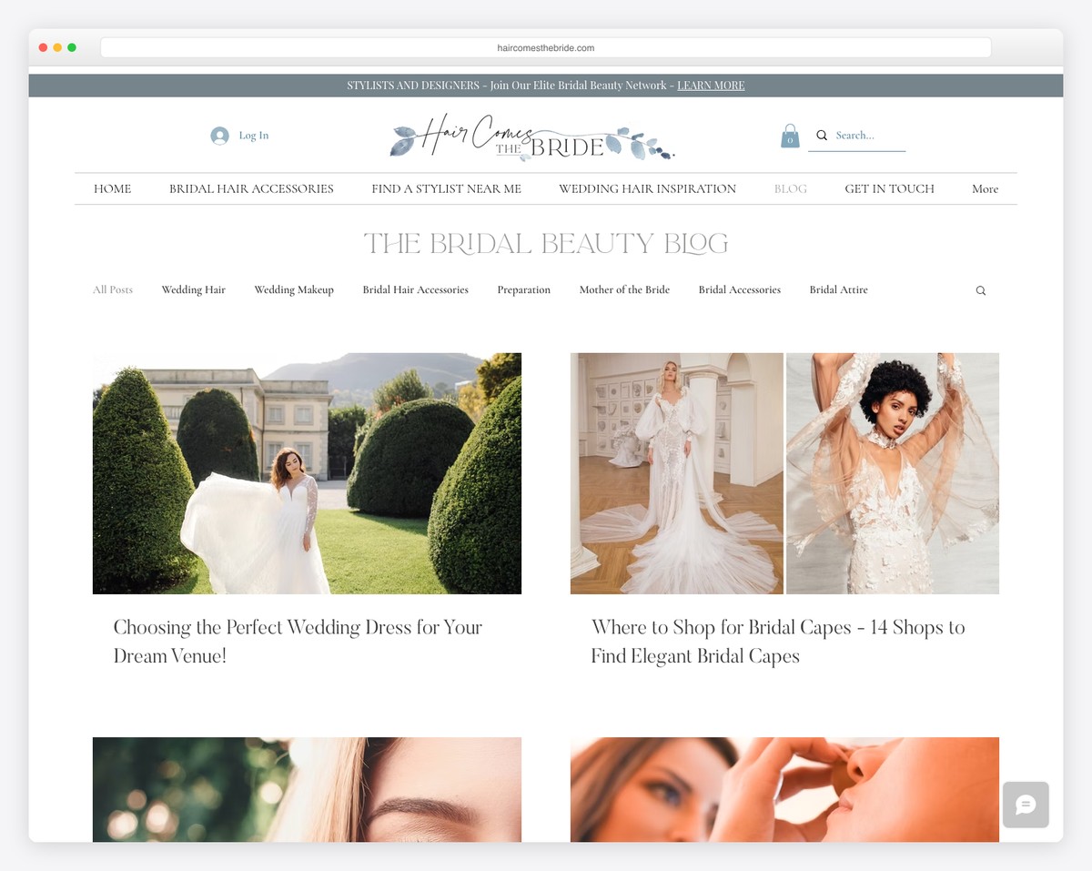
Hair Comes The Bride’s blog is elegant and minimal, with a secondary navigation and search bar to browse through categories or find something more specific faster.
The header, the footer and the base all have a white background, which gives Hair Comes The Bride a cleaner appearance.
Note: Create a menu with links to categories and add a search bar to ensure a better user experience.
What stands out: A dark background paired with bold accent colors creates striking visual contrast.
3. Bonsie
Built with: Wix
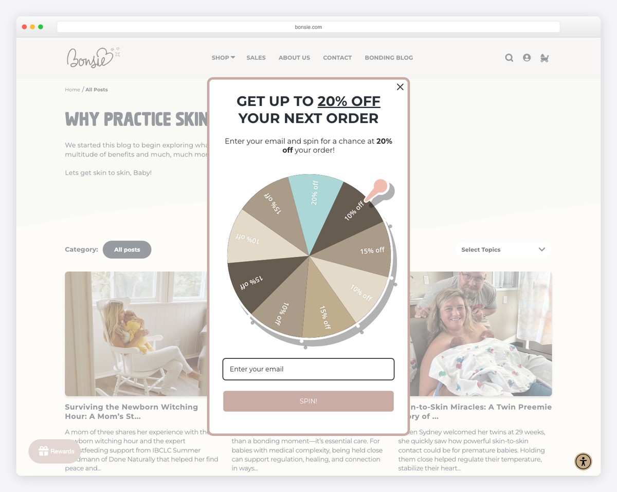
Bonsie’s Wix blog is minimal and creative, with great attention to detail. It has a sticky top bar notification and header, so you never need to scroll back to the top to navigate other pages.
One handy element of Bonsie is the accessibility menu, which allows everyone to configure the look of their website or blog.
Note: Integrating the accessibility configurator means that even visitors with disabilities can get the most out of your page.
What stands out: A hero slider showcases multiple offerings at a glance, giving visitors quick access to key content.
4. Seasons In Colour
Built with: Wix
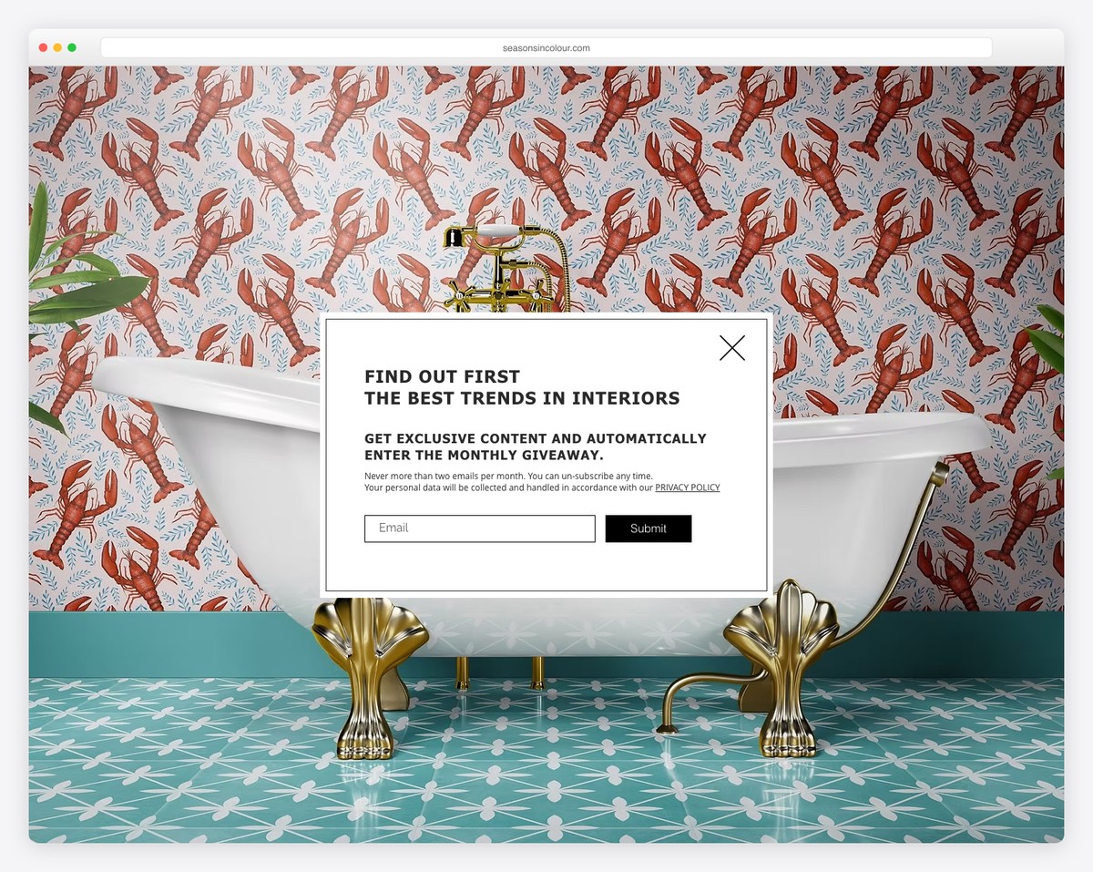
Seasons In Colour is a boxed, two-column grid Wix blog with infinite scrolling and a flawless light design.
It has a header with the main navigation and a secondary blog navigation with a drop-down, so all the categories are easily reachable.
Blog posts have a view counter, lightbox feature and images with a Pinterest icon to save them. At the bottom of each post are more ways to share the article or continue with one of the recent posts.
Note: Add a secondary menu for the blog so finding the correct categories and topics becomes much more manageable.
What stands out: Parallax scrolling adds visual depth and encourages visitors to keep exploring.
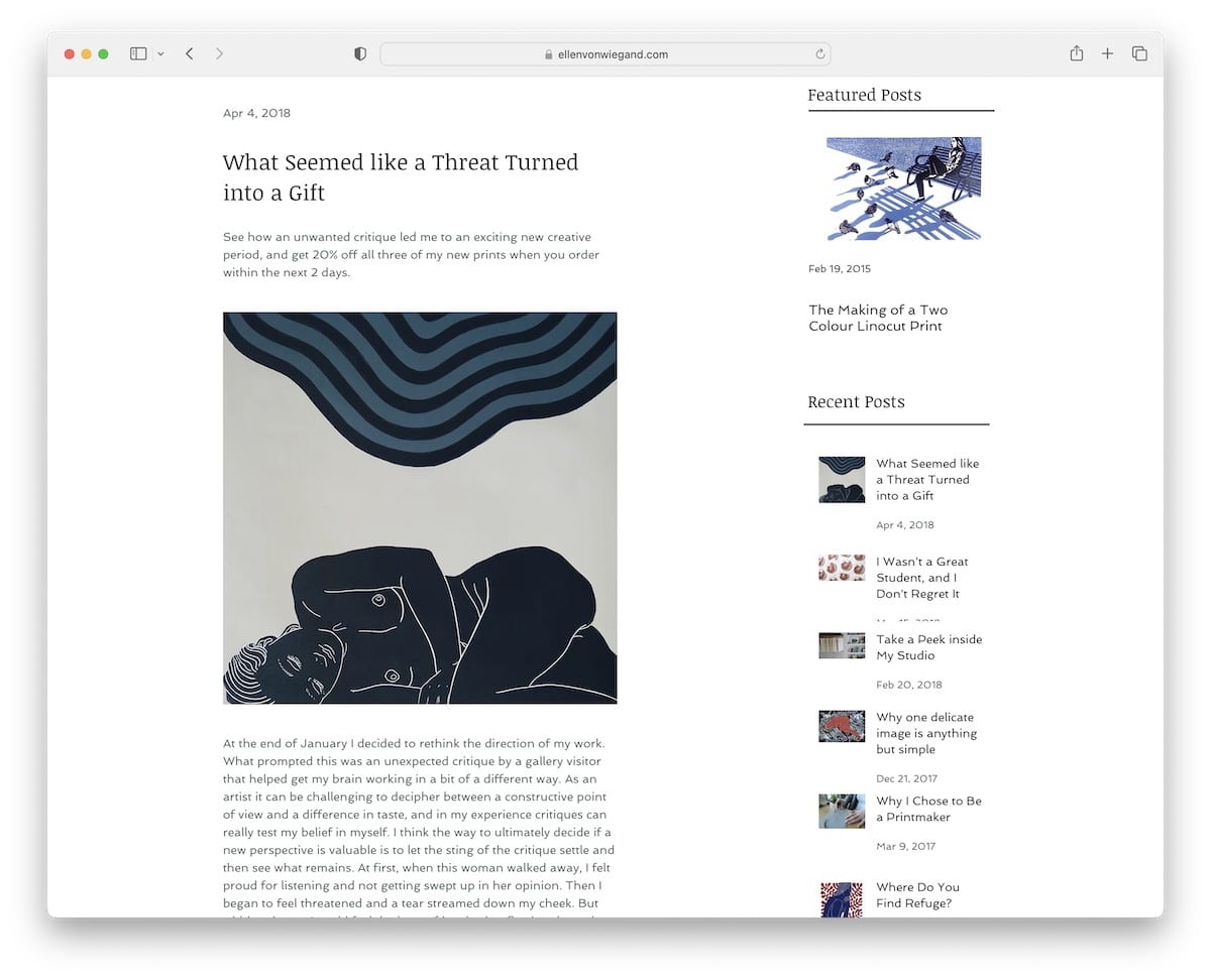
5. Ellen Von Wiegand
Built with: Wix
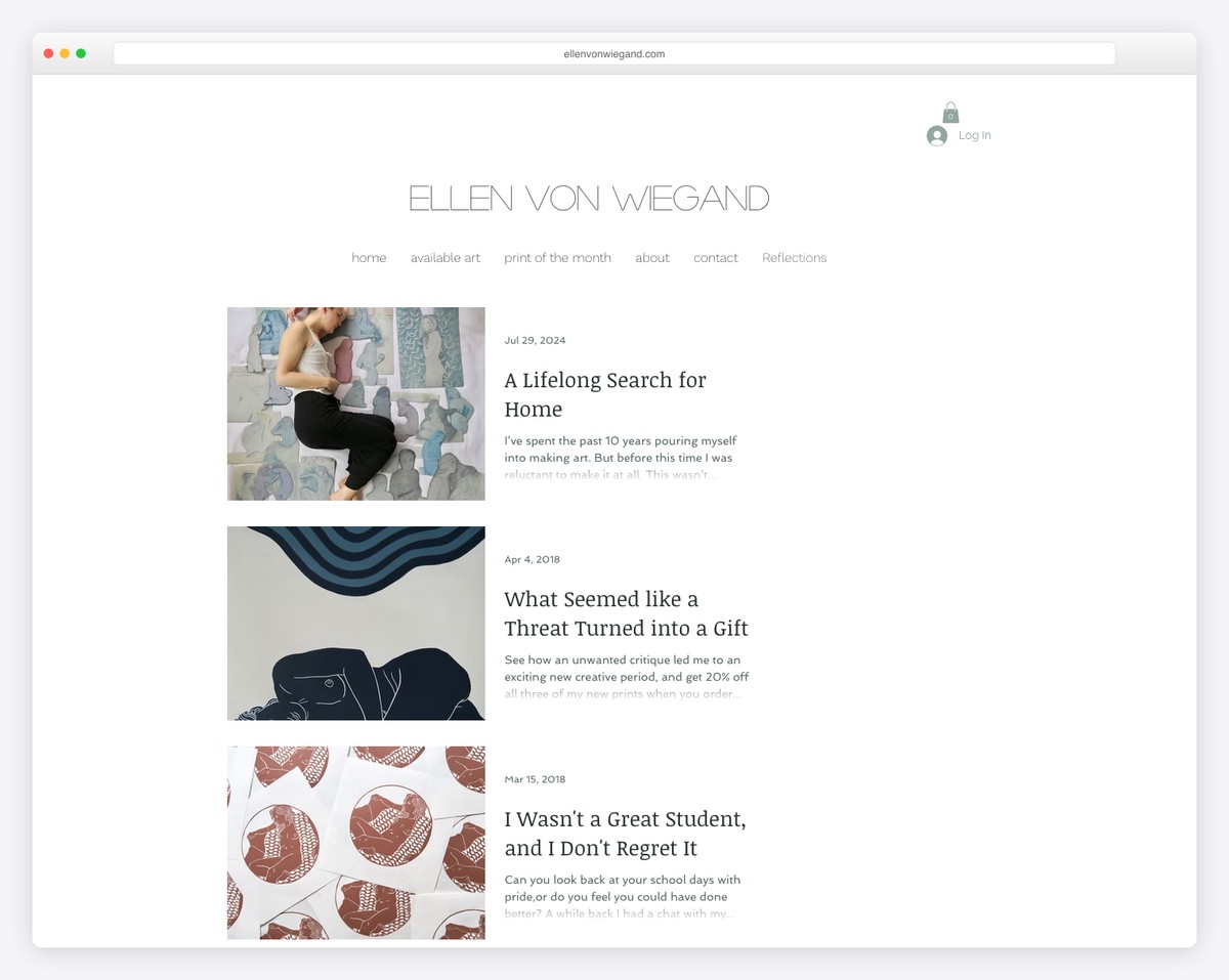
Ellen Von Wiegand is a neat Wix blog example with a single column and a right sidebar. The latter contains multiple widgets for finding other posts and social media icons.
Note: Use a sidebar for featured posts, recent posts, social media, subscription form, etc.
What stands out: Layered parallax effects create a sense of movement that makes scrolling feel dynamic.
6. OK Drugs
Built with: Wix
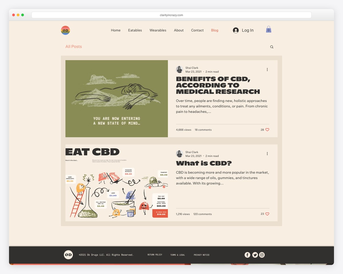
OK Drugs has a unique framed blog layout with a hover effect. In the top right corner of each post are three dots, which reveal social sharing options.
Furthermore, individual posts have a boxed structure with an image background to spice things up. OK Drugs mixes simplicity with creativity tastefully.
Note: Give your boxed blog layout more personality with an image background instead of using a solid color.
What stands out: The image carousel keeps the above-the-fold area dynamic without requiring visitors to scroll.
7. Sonja Van Dülmen
Built with: Wix
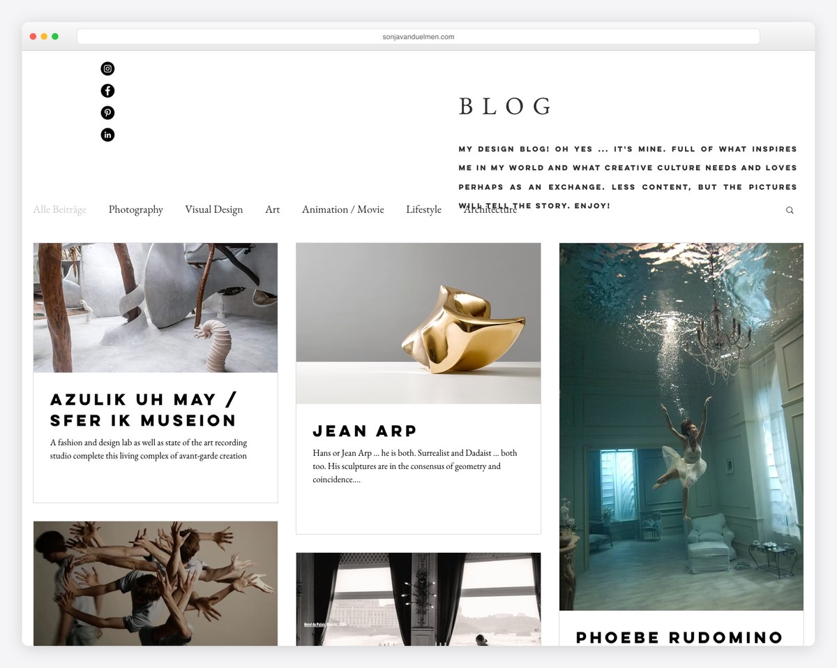
Sonja Van Dülmen’s multi-column post-grid layout ensures interaction with animated and static thumbnails. The header and the footer are minimalist, in the same style as the rest of the website.
Below the header are a navbar and a search bar, so you can easily browse through categories or find something specific. Moreover, some posts have a lightbox gallery, some GIFs and some embedded videos for versatility.
Note: Mix different styles of visual content besides the text to make posts more engaging.
What stands out: A masonry grid layout organizes content attractively while maximizing screen real estate.
8. Bella And Bloom
Built with: Wix
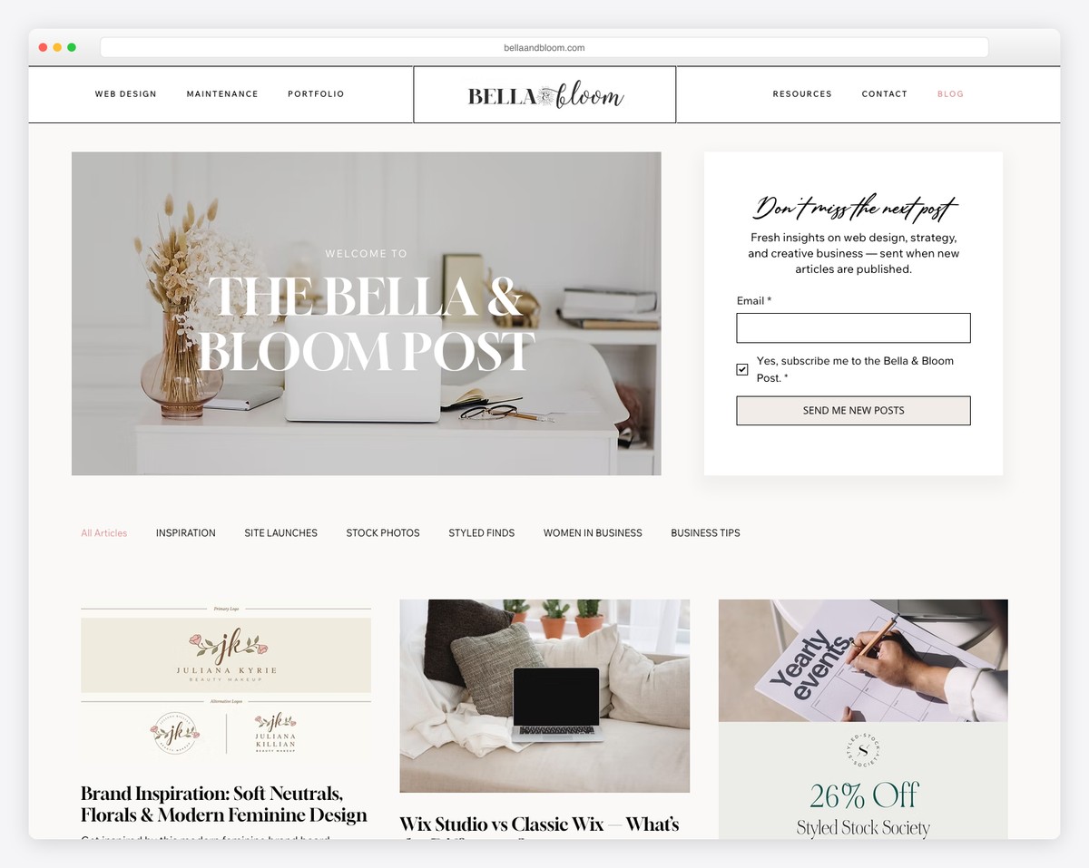
Bella And Bloom is a gorgeous Wix blog example with a light and feminine touch that creates a pleasant vibe.
The hero section has a catchy horizontal “parallax” effect, followed by categories and a featured article.
Before the list of blog posts starts is also a newsletter subscription section with a dark background that makes it pop more. Finally, the footer area is pretty large, with quick links, social media and an IG feed.
Note: Add more content to your blog and simultaneously grow your profile by building an IG feed into it.
What stands out: The grid-based gallery makes it easy to scan a large collection at a glance.
9. All The Food
Built with: Wix
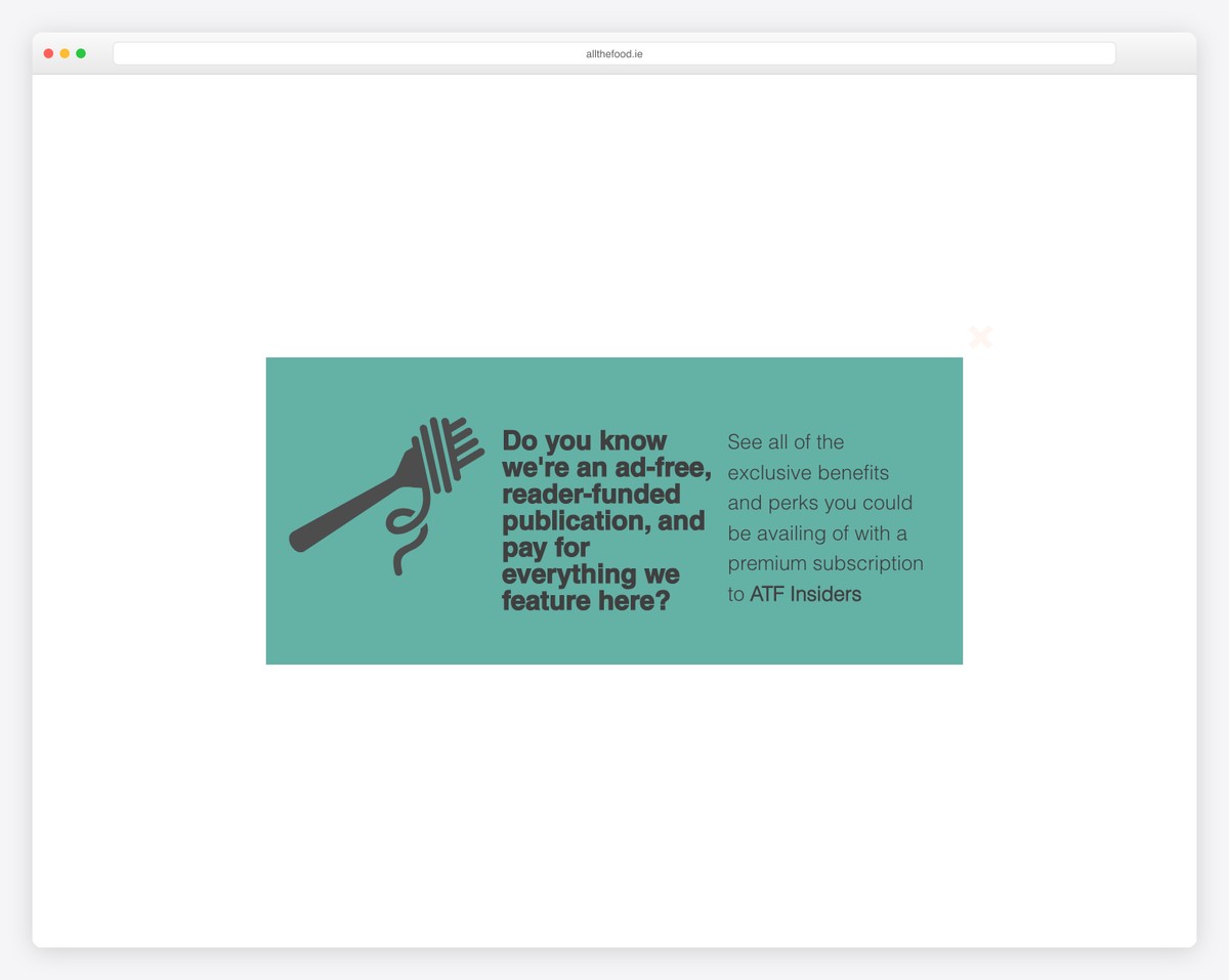
All The Food has a more magazine-like layout, with a top bar and a header with a CTA button and a multi-column drop-down menu.
The blog uses various hover effects for links and buttons to make them more clickable. Moreover, there’s also a product carousel, a subscription form and multiple call-to-actions that invite you to join the premium membership service.
Note: The header is an excellent area for adding a CTA button, so more blog readers notice it.
What stands out: Built-in booking functionality turns the website into a 24/7 appointment scheduler.
10. The Wine Tails
Built with: Wix

The Wine Tails is serious about growing the email list with a subscription form in the header section. Below is a navigation bar, a search icon and a log-in/sign-up button.
But only the logo/name of this Wix blog sticks to the top left corner, which takes you back to the home page if you click it.
Finally, like the blog’s home page, individual posts also don’t have a footer to create an even cleaner appearance.
What stands out: Ensure your subscription form is visible to everyone (add it to the header) if email marketing gives you the best results.
11. Brit Dot Design
Built with: Wix
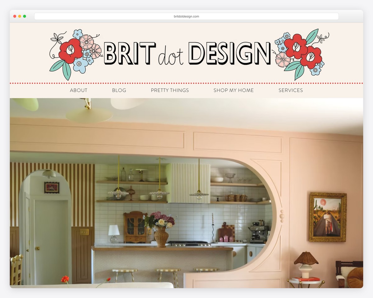
Brit Dot Design is another Wix blog example. Its massive header features quick links and social, email, and cart icons.
The hero area includes a short introduction/bio, a popular posts slider and a subscription form. Only then does the blog start with an option to view all posts or category-based ones.
This blog uses pagination instead of infinite scroll, an IG lightbox gallery, and a back-to-top button.
Note: A back-to-top button can improve the user experience (UX), especially if your header/menu doesn’t float.
What stands out: Integrated appointment booking removes friction between browsing and converting.
12. Life As We Explore
Built with: Wix
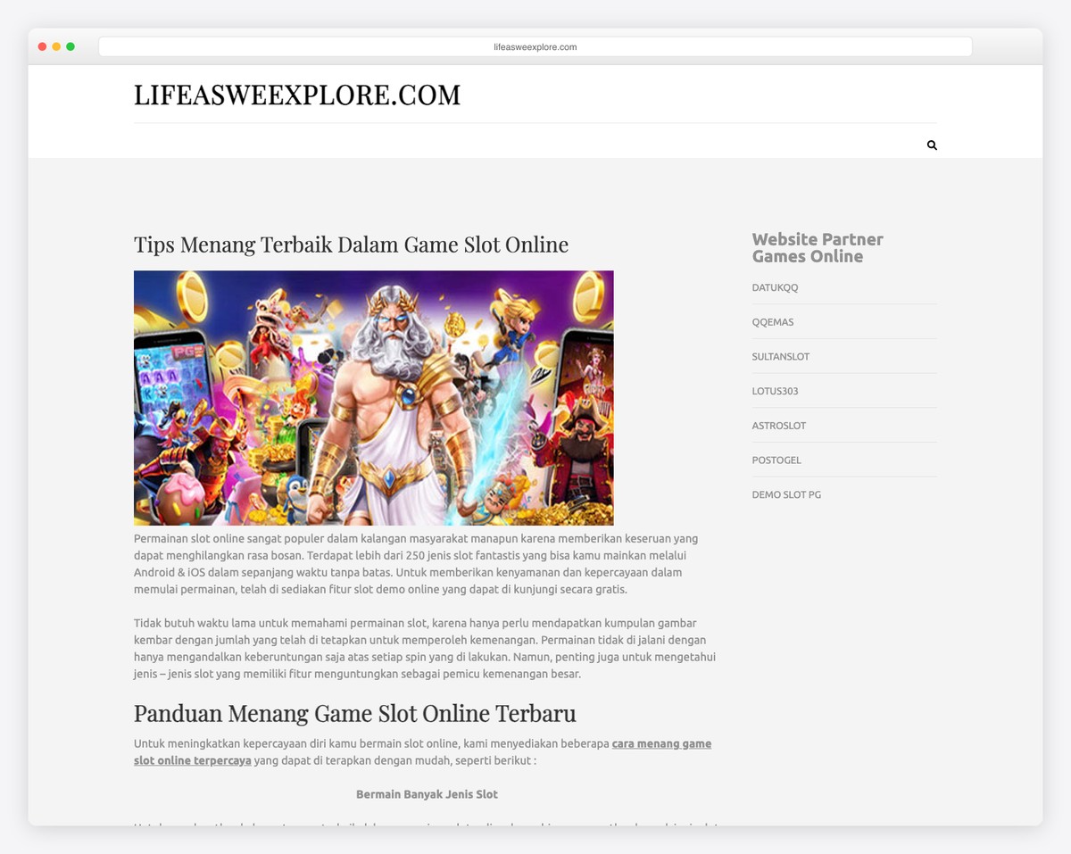
Life As We Explore uses global navigation for the website and a secondary menu for the blog to help you quickly access your preferred content. You can also search for articles or enjoy all posts, which load infinitely while you scroll.
Posts have a lightbox gallery, embedded videos, social sharing, a view counter, comments and a related posts widget, contributing to a lower bounce rate. And the footer only has IG and YouTube icons to stay connected.
Note: End posts with a “related posts” section, so readers can enjoy more content without leaving too early.
What stands out: A prominent search function helps visitors find exactly what they need without scrolling through pages.
13. Urban Roots
Built with: Wix
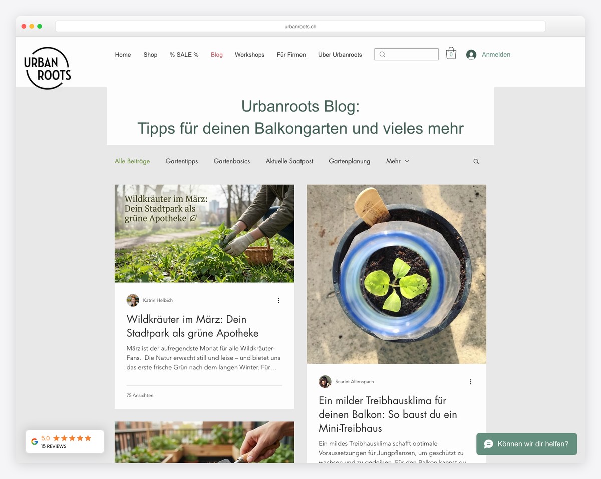
Urban Roots has a two-column post-grid layout with a boxed structure and a floating header. Although there’s a secondary menu, only the main one sticks to the top of the screen.
The second navbar gives you instant access to different blog categories, so you won’t be overflown with articles you might not be interested in.
What’s more, while the header and the base are light, the footer is dark and features additional business details, contacts, social icons, and quick links.
Note: Make your handy footer section stand out with a contrasting (ex., dark) background.
What stands out: Seamless e-commerce integration lets visitors go from browsing to buying without leaving the site.
14. The Sofia Log
Built with: Wix
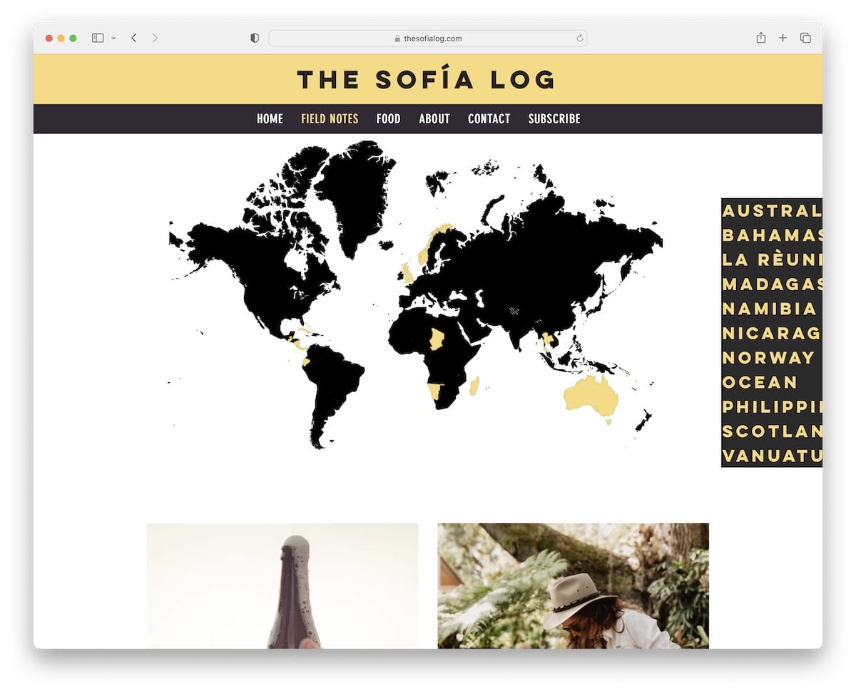
The Sofia Log has a very cool navigation through categories that fits a travel Wix blog oh so well.
Below the header (menu links highlight on hover) is a world map with clickable countries, but you can also use the hamburger-style country selection on the right.
Like the navbar, the footer has a dark background and contains social links and a newsletter subscription form.
Note: Have some fun and create more interactive blog navigation, like The Sofia Log.
What stands out: Intuitive navigation makes the site easy to explore even for first-time visitors.
15. Ravin
Built with: Wix
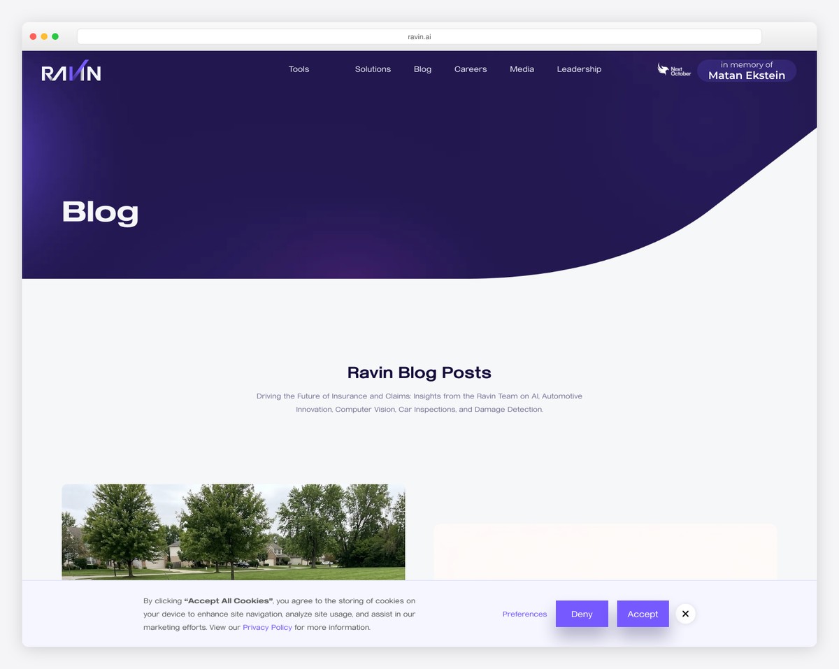
Ravin’s three main characteristics are minimalist, creative, and professional. This fantastic Wix blog example has a clean, above-the-fold section introducing the content.
The header with a drop-down menu and a CTA button floats, so all the links are always available.
In addition to that, the footer has a contact form, which isn’t something many webmasters use, but it can be a great practice. Ravin then uses a “book your demo” CTA that makes you jump straight to the form.
Note: Integrate a contact form into your footer and then use a “jump” button in the navbar to access it.
What stands out: Scroll-triggered animations guide the eye through each section without overwhelming the visitor.
16. Terra Living
Built with: Wix
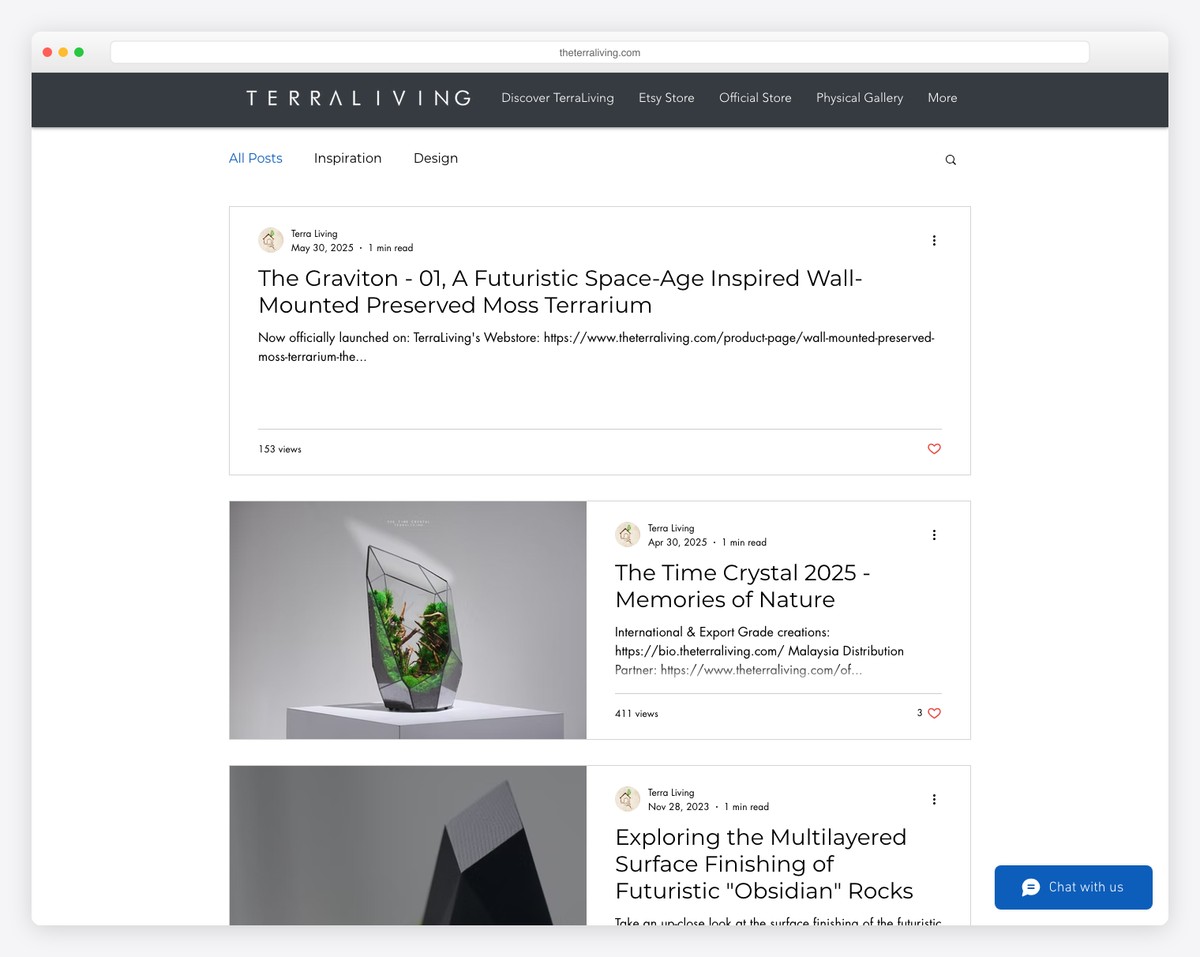
Terra Living uses a practical header that disappears when you scroll down and reappears when you go back. This creates a cleaner browsing experience.
Furthermore, while most post thumbnails are images, some are videos, which start playing once you hover over them. So cool.
Terra Living also has infinite scroll, loading three posts at a time, and a footer with multiple social media icons.
Note: Create static and video/animated thumbnails for interactivity.
Wix is incredible when building all sorts of websites, including blogs. However, did you know that you can create a community website with it? Here are some cool forum examples made with Wix.
What stands out: Product listings with clear pricing and add-to-cart buttons simplify the purchase flow.
17. Mom Boss Life
Built with: Wix
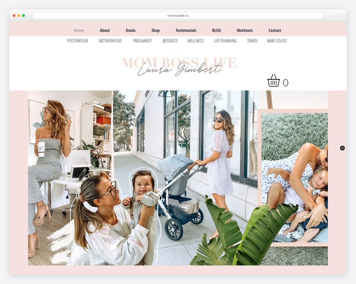
Mom Boss Life is a lifestyle and entrepreneurship blog by Laura Gimbert that offers resources and inspiration for women balancing motherhood with building their own businesses. The Wix-built site features a warm, inviting design with soft colors and clean typography that makes the content feel approachable.
The blog layout balances personal storytelling with practical business advice, featuring categories like Business, Lifestyle, and Motherhood. The homepage hero section with a strong personal photo and clear tagline immediately establishes trust and relatability with the target audience.
What stands out: Leading with a personal photo and clear positioning statement (“for moms who boss”) creates instant connection with the target audience — visitors know within seconds if this blog is for them.
18. The Wine Tails
Built with: Wix
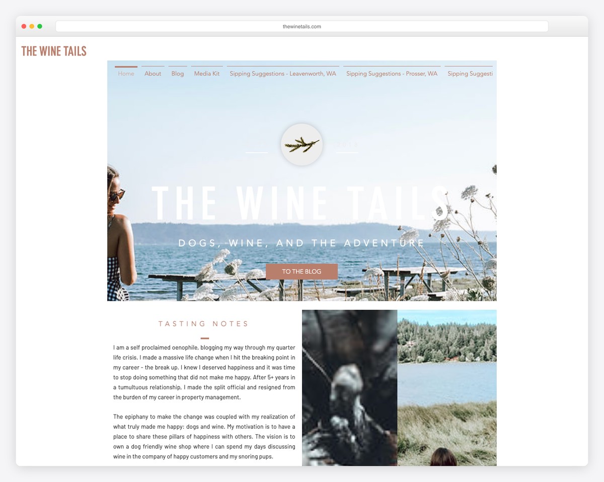
The Wine Tails is a Washington State wine and lifestyle blog documenting Pacific Northwest wine adventures, tasting recommendations, and dog-friendly winery reviews. The Wix design uses warm photography and a clean grid layout to showcase wine country experiences.
The blog structure is well-organized with categories covering different wine regions, tasting guides, and travel tips. The personal, dog-inclusive branding (hence “tails”) gives the blog a distinctive personality that sets it apart from more formal wine publications.
What stands out: Combining a niche interest (wine) with a unique angle (dog-friendly adventures) creates a memorable brand identity that’s instantly shareable and distinctive in a crowded content space.
19. Angelina Darrisaw
Built with: Wix
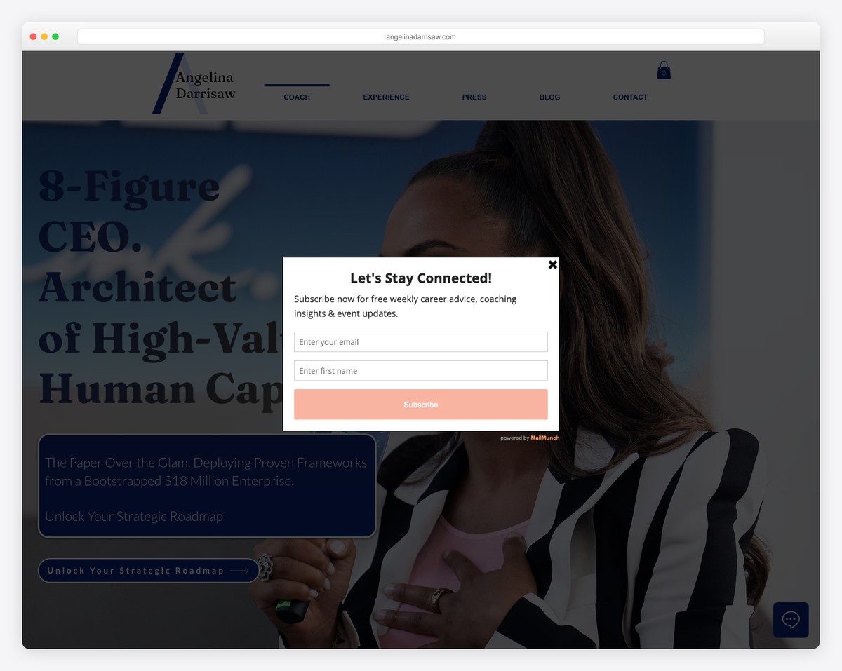
Angelina Darrisaw is a career coaching and professional development platform by the founder of C-Suite Coach. The Wix-built site features insights on leadership, business growth, and workplace inclusion with a polished, professional design that matches her executive coaching brand.
The site effectively blends personal brand building with service promotion — featuring media appearances, speaking engagements, and coaching programs alongside blog content. The clean navigation and strong calls to action guide visitors from content consumption to booking consultations.
What stands out: Integrating media logos (“As Seen In”) and speaking credentials prominently on the homepage builds immediate authority — essential for coaches and consultants selling high-ticket services.
Related Posts


Comments (0)