21 Best Squarespace Artist Websites 2026
Welcome to our colorful journey through the world of art and creativity, where we spotlight the most stunning Squarespace artist websites.
Squarespace, known for its sleek design and intuitive interface, has become a popular platform for artists to showcase their work, tell their stories, and connect with their audience.
In this article, we’ve curated a list of artist websites that stand out for their breathtaking art and exceptional web design.
From captivating visual galleries that draw you into the artists’ worlds to seamless navigation that guides you through their creative journeys, each website on our list is a masterpiece in its own right.
If you’re looking for inspiration to build your own website, you’re in for a treat.
This post covers:
Best Squarespace Artist Websites
Below, you’ll find our handpicked selection of Squarespace artist websites that embody the perfect blend of artistic flair and digital elegance.
1. Lisa Maltby
Built with: Squarespace
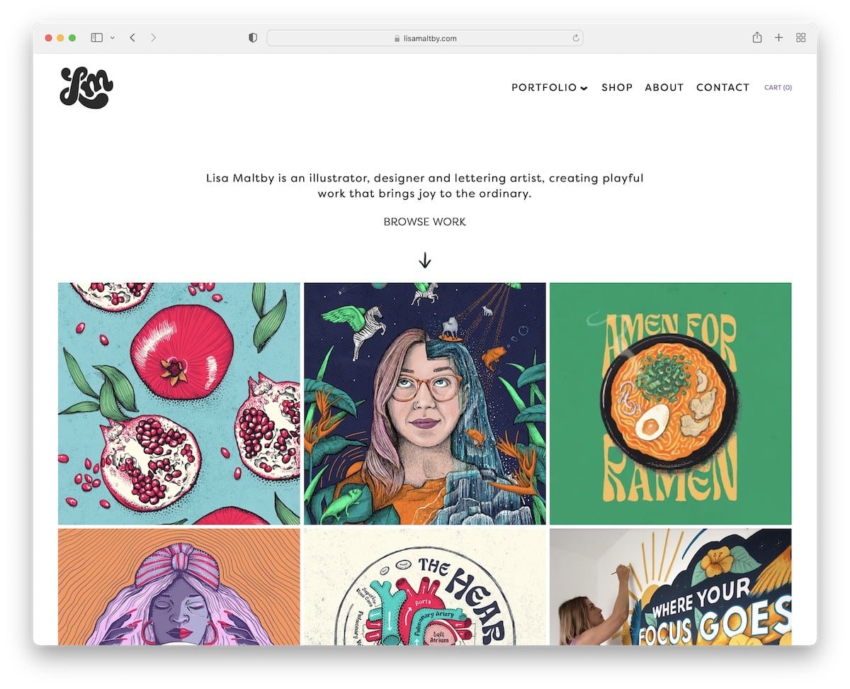
Lisa Maltby’s Squarespace artist website stands out with its elegant full-screen sections that immerse viewers in her artistry.
The transparent header elegantly blends with each page, complemented by a sleek drop-down menu for easy navigation.
Shoppers will appreciate the convenient shopping cart icon in the navbar, enhancing the purchasing experience.
The site also features a drop-down button, engaging parallax sections, and animated grid thumbnails that come to life as you scroll, offering a dynamic exploration of Lisa’s captivating portfolio.
Note: Use full-screen page sections for a more immersive atmosphere.
Why we chose it: For its seamless combo of functionality and aesthetic appeal.
2. Mindy Nguyen
Built with: Squarespace
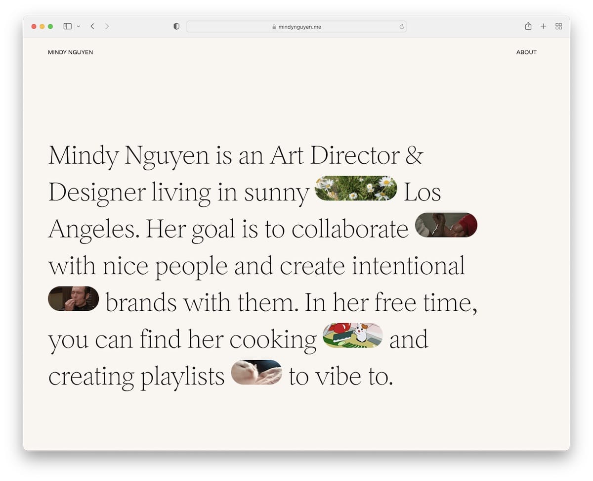
Mindy Nguyen’s Squarespace artist website captivates with a text-heavy above-the-fold section, enriched by cool GIF detailing that brings her narrative to life.
The minimalist header sets a tone of refined simplicity, directing focus to her single-column project presentation.
What we find really awesome is the inclusion of links to actual live sites, offering a direct view of her work.
A simple footer rounds off the experience, providing a straightforward way to contact her and connect via social media.
Note: Provide links to your actual projects so potential clients can see your work in real-time.
Why we chose it: For its combination of narrative and visual engagement with a straightforward project showcase.
3. Gina Kirlew
Built with: Squarespace
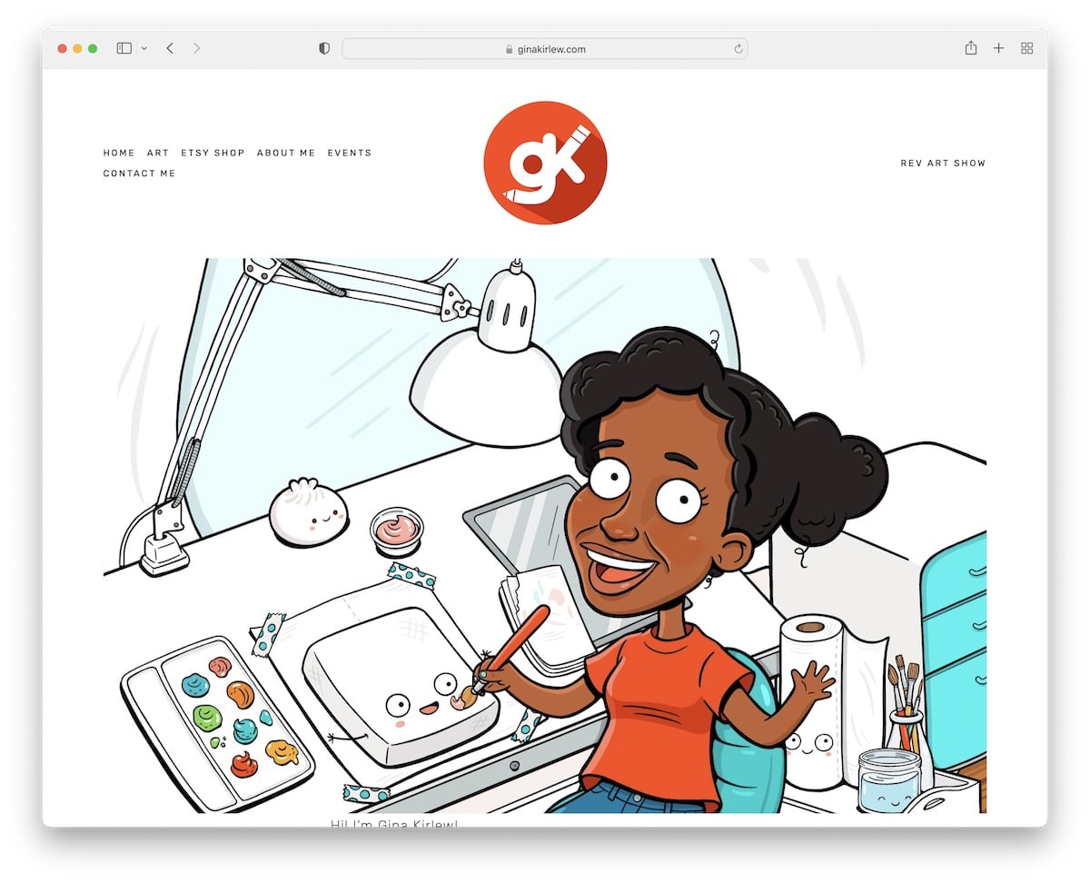
Gina Kirlew’s Squarespace artist website shines with a light yet vibrant design that embodies her artistic spirit.
The site features a clean white background across the header, base, and footer, creating a canvas that brings her colorful art to the forefront.
Its navigation bar elegantly highlights links on hover, guiding visitors through her visually rich art portfolio, which is enhanced with a lightbox feature for detailed viewing.
A basic yet functional contact page ensures effortless communication, completing the site’s welcoming and user-friendly ambiance.
Note: Use a clean, light and minimalist design to make your art pop more.
Why we chose it: For a clean, vibrant look that beautifully displays artwork.
4. Clara De Lorenzi
Built with: Squarespace
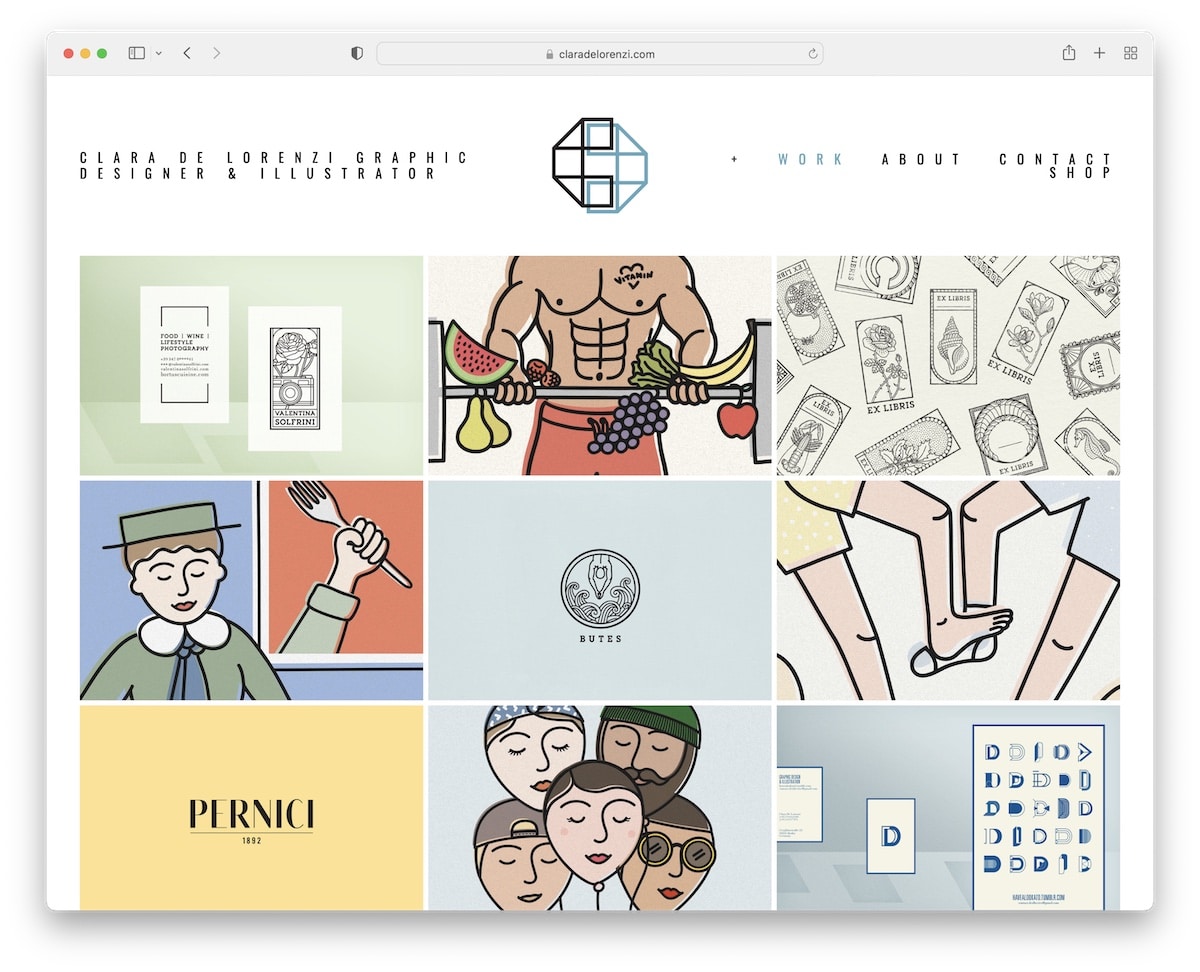
Clara De Lorenzi’s Squarespace artist website is a masterclass in minimalist design. It features a homepage that presents her work in a three-column portfolio grid, inviting exploration.
Clean project pages focus on her art, complemented by large imagery for an intimate viewing experience.
The addition of an online shop section integrates seamlessly, offering visitors the chance to own a piece of her artistry.
Throughout, the site maintains a minimalist exhibition, ensuring that Clara’s work remains the star of the show.
Note: Include large images of your masterpiece so every detail comes front and center.
Why we chose it: For its elegant simplicity, which creates a smooth and focused work showcase.
5. Ashley Idell
Built with: Squarespace
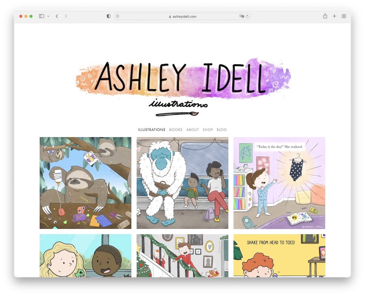
Ashley Idell’s Squarespace artist website has a three-column grid layout featuring lightbox functionality. The latter allows visitors to enjoy a more comprehensive experience of each project.
A sticky left sidebar ensures quick navigation through her site, seamlessly connecting users to her About and Blog pages for deeper engagement.
A clever store link redirects to her Etsy shop, facilitating purchases.
At the same time, the sidebar “footer” social media buttons encourage connection, blending functionality with her distinctive artistic style for a memorable browsing experience.
Note: Use a lightbox for a distraction-free content viewing experience.
Why we chose it: For its intuitive design and flawless integration of Ashley’s personal touch.
6. Ann Gagliano
Built with: Squarespace
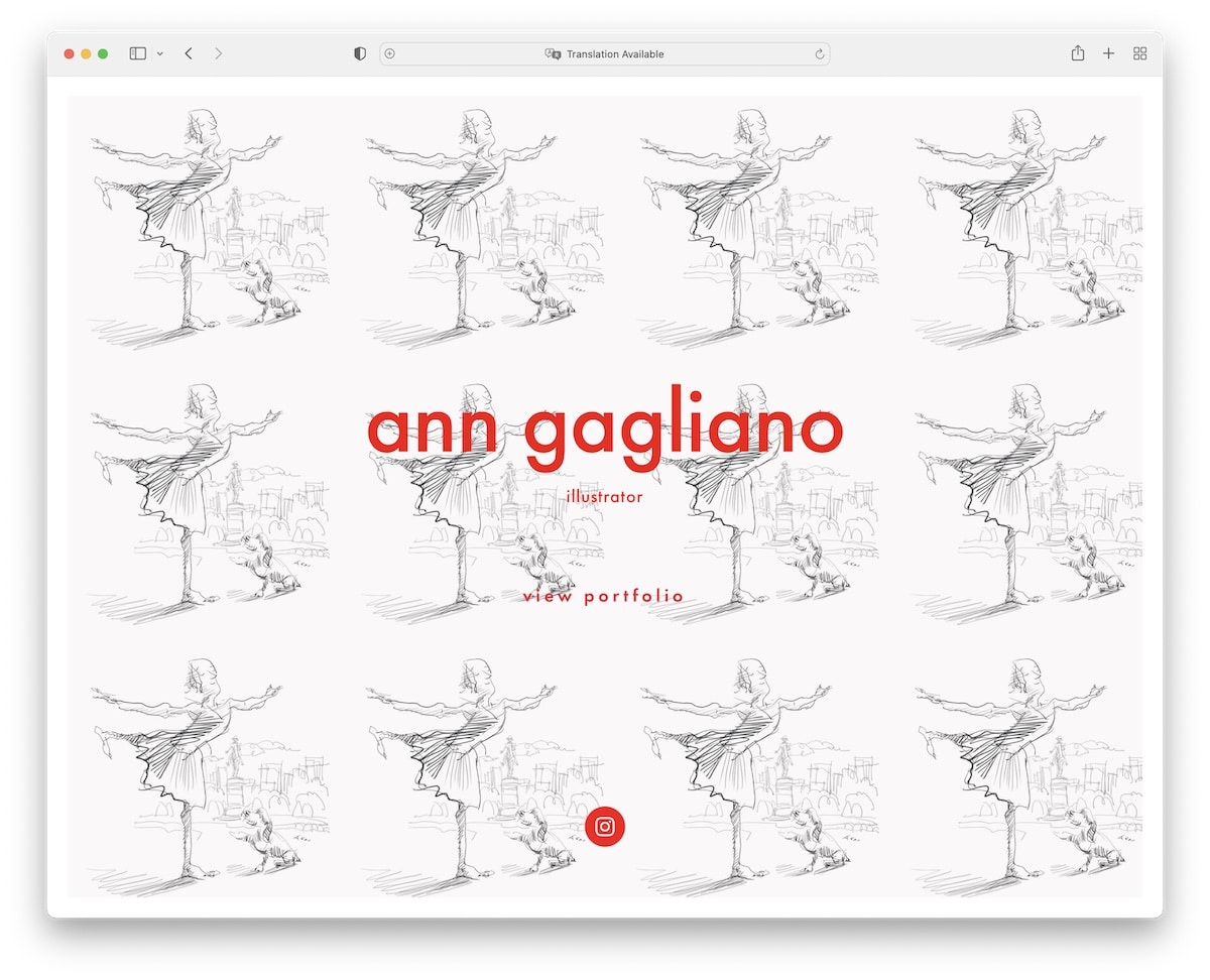
Ann Gagliano’s Squarespace artist website captivates with a full-screen homepage. It sets the stage for her art with a direct link to her portfolio and a prominent Instagram icon for connection.
The site boasts a gallery slideshow that showcases her works in a fluid, dynamic display.
Structured as a concise four-page website, it offers simplicity and easy navigation.
The footer maintains a clean look with “Powered by Squarespace” text and an additional Instagram button, reinforcing her online artistic community.
Note: Integrate a slider to show your beautiful work without wasting site space.
Why we chose it: For its simplicity and practical display of content.
7. Rachel Sanson
Built with: Squarespace
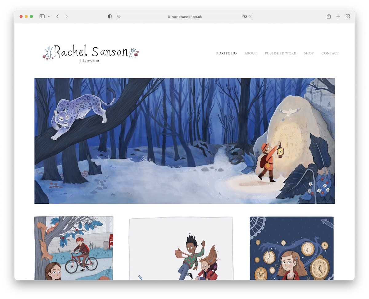
Rachel Sanson’s Squarespace artist website is a beautifully orchestrated digital canvas, with a homepage portfolio layout that invites visitors to dive into her art world.
Each artwork is enriched with a lightbox preview, allowing for individual appreciation in stunning detail.
An About section offers insight into Rachel’s creative journey, while a dedicated page for published work highlights her professional achievements.
The site’s light design and simple header and footer create an airy, welcoming atmosphere.
Note: Showcase prints, books and other published work on your website.
Why we chose it: For its harmonious balance of practicality and pleasant appearance with accessible and elegant presentation.
8. Luke Adam Hawker
Built with: Squarespace
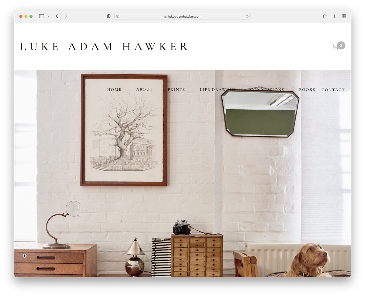
Luke Adam Hawker’s Squarespace artist website greets visitors with a top bar notification for announcements.
It continues into a navigation bar enhanced with drop-down menus for comprehensive browsing.
A massive, captivating banner above the fold, complete with compelling CTAs, draws visitors deeper into his space.
The footer is thoughtfully designed with essential links and a subscription form, fostering engagement.
A detailed contact page features a form alongside Google Maps integration, and an eCommerce section offers a seamless shopping experience, making it a fully integrated digital showcase of Luke’s artistry.
Note: Use a top bar for special announcements, free shipping, etc.
Why we chose it: For its engagement, visual storytelling and effective marketing and selling.
9. Samantha Keely Smith
Built with: Squarespace
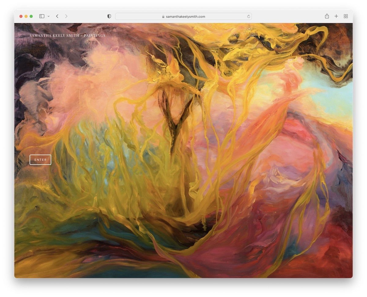
Samantha Keely Smith’s Squarespace artist website mesmerizes with a unique layout.
It has a light sidebar on the left for seamless navigation, paired with a large, captivating slider on the right that showcases her stunning artworks.
Each slide transitions into a new page, revealing more details about the work in the bottom left corner, enriching the viewer’s experience with depth and context.
The consistent use of a white background across all site sections amplifies its clean, serene aesthetic.
Note: Add menu links, social media and more in the sticky sidebar that’s always visible for a boost in UX.
Why we chose it: For its elegant interface that mixes simplicity with depth.
10. Flower Shop Collective
Built with: Squarespace

Flower Shop Collective’s Squarespace artist website excels with its impactful dark design, creating a catchy backdrop highlighting its content.
A transparent header elegantly frames the site, leading to a compelling text above the fold complemented by a clear CTA button, immediately engaging visitors. Below, an image unfolds the visual story.
Informative accordions reveal more about their offerings, while a “featured in” section adds credibility.
A subscription form fosters community, and the integrated online store offers a seamless shopping experience, making it a comprehensive digital destination.
Note: Make a bold and memorable first impression with a black website design.
Why we chose it: For its dark, striking and strategic layout that combines engagement, info and eCommerce.
11. Grace Design
Built with: Squarespace

Grace Design’s Squarespace artist website exudes a feminine charm, marrying minimalist aesthetics with functional elegance.
Its header is a study in simplicity, leading the eye to a four-column footer that encapsulates a one-sentence bio, menu links, and an Instagram icon, weaving personal branding with social engagement.
The extensive About page offers a deep dive into who Grace is, while innovative navigation features, including drop-down and mega menus, facilitate a seamless exploration.
Note: Don’t neglect the footer! Use is strategically to display business info, contact details, menu links, social icons, etc.
Why we chose it: For the elegant fusion of feminine design, handy navigation and welcoming setting.
12. Alice X. Zhang
Built with: Squarespace

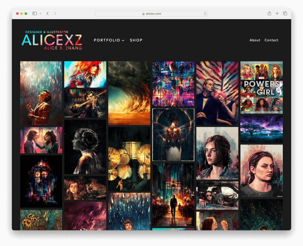
Alice X. Zhang’s Squarespace artist website is a visual spectacle featuring an impressive dark design that sets a dramatic stage for her masonry portfolio grid.
This grid beautifully showcases her vivid artworks, creating an engaging, infinite canvas of color and emotion. Moreover, a drop-down menu neatly categorizes her diverse portfolio for easy access.
A handy header provides effortless navigation, though notably, the site eschews a traditional footer, directing full attention to the art.
An online shop section offers fans a direct avenue to own a piece of her work.
Note: Have some fun with portfolio grid layouts – pick a masonry look or something non-traditional.
Why we chose it: For its amazing visual impact, streamlined UX and easily navigable online gallery.
13. Mark Lange
Built with: Squarespace

Mark Lange’s Squarespace artist website is a vibrant digital canvas. It mesmerizes with its unique sections and captivating parallax effects, creating a dynamic sense of depth as you scroll.
Thoughtfully placed social icons in the navbar ensure connectivity is just a click away, fostering engagement across platforms.
The inclusion of a contact form in the footer invites inquiries without leaving the current page.
Additionally, an accessibility configurator enhances user experience, ensuring the website is welcoming and navigable for all visitors. (Anyone can make configurations according to their needs.)
Note: Opt for an accessibility menu if you want more users to enjoy your website to the fullest.
Why we chose it: For its modern design, offering a visually stunning experience that prioritizes accessibility and engagement.
14. Lucy Blooms
Built with: Squarespace

Lucy Blooms’ Squarespace artist website is a masterfully crafted digital garden. It begins with a top bar notification that immediately captures attention.
The large header section blooms with vibrant imagery, and strategically placed CTA buttons guide visitors to explore further.
An Instagram feed integrates social media, providing a lively glimpse into her latest creations.
The insightful services section, complete with transparent pricing, offers clarity and convenience.
At the same time, the online shop invites visitors to bring a piece of Lucy’s world into their own.
Note: Let your site’s color scheme resonate with your personality.
Why we chose it: For its aesthetics and practicality that beautifully showcases Lucy’s talent and services.
15. Vee Talbert
Built with: Squarespace

Vee Talbert’s Squarespace artist website pops up with its audacious black homepage. It sets a dramatic stage for the bold, typography-heavy design that commands attention.
This stark, captivating entrance contrasts with the light, airy internal pages that embody fine minimalism, creating a dynamic UX.
An online resume page provides a comprehensive look at Talbert’s professional journey, while the contact page features a clickable telephone number and email.
This blend crafts a memorable digital presence that mirrors Talbert’s artistic vision.
Note: Instead of sending your clients or employers your CV in a PDF form, have it always visible on your website.
Why we chose it: For its contrast between the bold homepage and minimalist internal pages, offering a unique viewing experience.
16. BD Feliz
Built with: Squarespace

BD Feliz’s Squarespace artist website epitomizes clean, modern design. Its refreshing digital environment places art center stage.
The site’s grid layouts come alive with animated thumbnails that beckon visitors to explore further.
Furthermore, the integration of a lightbox feature allows for an immersive viewing experience of each piece.
A thoughtfully composed footer anchors the site, housing essential links, social icons, and basic information.
Visitors have easy access to all they need while navigating through this elegantly simple yet profoundly engaging online space.
You can create a simpler website using these beautiful Squarespace portfolio templates.
Note: Spice things up with animations and special effects.
Why we chose it: For its mixture of modernity and interactive elements and captivating showcase.
17. Just Joey Rose
Built with: Squarespace

Just Joey Rose’s Squarespace artist website draws you into a mesmerizing world with its full-screen parallax background above the fold. Plus, it sets a dramatic tone with its dark design.
This moody ambiance contrasts with a vibrant red footer, adding a bold splash of color and personality.
An Instagram grid feed integrates seamlessly, offering a lively peek into Joey’s creative process and more.
A prominently large subscription section encourages visitors to stay connected, making it a compelling digital hub for engagement and artistic exploration.
Note: Add more content to your website by integrating an Instagram feed.
Why we chose it: For its use of full-screen parallax and bold color contrasts that vividly showcase artistic identity.
18. Elissa Medina
Built with: Squarespace

Elissa Medina’s Squarespace artist website is a masterclass in minimalist elegance. It’s split into a two-page format that focuses on her work and how to connect with her.
That’s it! (But that’s more than enough.)
The homepage is organized into a three-column grid, where each piece pops nicely with decent spacing. Thus, the art has a chance to speak volumes in a serene digital space.
An Instagram icon in the menu section bridges the gap to her social media, inviting deeper interaction.
A simple yet effective contact form on the contact page ensures accessibility and ease for inquiries.
Note: A two-page website, heck, even a single-page version, is sometimes more than enough.
Why we chose it: For its minimalist elegance and straightforward design.
19. Morton Court Publishing
Built with: Squarespace

Morton Court Publishing’s website exemplifies sophistication, featuring a consistent light grey background that unifies all page sections. This creates a harmonious visual experience, if you will.
Black typography stands out for its clarity and ease of reading, ensuring visitors absorb every word.
Thin lines subtly separate (some) sections, adding to the site’s elegant design without overwhelming the content.
The integration of eCommerce capabilities alongside an Instagram feed links functionality with visual storytelling
Note: Do you want to sell your art? Do it through your Squarespace website – it’s totally doable.
We chose it: For its plainness, effortless content, and commerce integration.
20. Malene Barnett
Built with: Squarespace

Malene Barnett’s Squarespace artist website captures attention with an embedded video above the fold.
Using dark contrasting sections and large typography crafts a bold, impactful look that communicates strength and creativity.
The innovative header enhances navigation by disappearing on the scroll yet reappearing when scrolling up. This ensures easy access to the menu at all times. (Read: better UX.)
The inclusion of a mailing list form, social links in the footer, along with dedicated shop and blog pages, rounds out this functional digital presence.
Note: Videos can significantly improve your artist websites’s user experience.
Why we chose it: For its dynamic use of video and bold design elements that create a memorable experience.
How To Make An Artist Website With Squarespace
Creating an artist website with Squarespace is an exciting journey to showcase your work with style and sophistication.
Here’s a simple six-step tutorial to get you started:
- Sign up, choose your plan: Visit the Squarespace website and create an account. Browse the various plans to find one that suits your needs, considering factors like page limits, eCommerce capabilities, and advanced features.
- Select a template: Squarespace templates offer unique designs and layouts. Choose a template that aligns with your style and the work you want to showcase. (Remember, you can customize the template later to fit your needs.)
- Customize your template: Dive into the template editor and start modifying your template. You can adjust colors, fonts, and page configurations to match your artistic identity. Use the drag-and-drop interface to add elements like image galleries, text blocks, and contact forms to your pages.
- Upload your artwork: Create galleries or individual pages to showcase your artwork. Upload high-quality images of your work, and consider adding descriptions or stories behind each piece to engage your visitors further.
- Add essential pages: Beyond your artwork, include essential pages such as an “About Me” page to share your journey and background, a “Contact” page for potential clients or fans to reach out, and possibly a blog to share updates, events, or your creative process.
- Preview, rest, launch: Before going live, preview your website to see how it looks on different devices. Test all the links, forms, and functionalities to ensure everything works as expected. Once satisfied, click the “Publish” button to launch your artist website.
Fun fact: Have you seen these Squarespace statistics? (Do you know how many websites use Squarespace?)
Further reading:
FAQs About Squarespace Artist Websites
How customizable are Squarespace templates for artist websites?
Squarespace templates are highly customizable, allowing artists to adjust layouts, colors, fonts, and page structures to match their unique style. The platform’s intuitive design tools and drag-and-drop interface make it easy to personalize your site without coding skills.
Here are the best Squarespace website templates for artists ranked by experts.
Can I sell my artwork directly from my Squarespace website?
Yes, you can sell your artwork directly from your Squarespace website by utilizing its integrated eCommerce capabilities. You can set up an online store, manage inventory, process payments, and track orders.
Is it possible to optimize my artist website for mobile devices using Squarespace?
Yes. Squarespace templates are designed to be responsive, meaning they automatically adjust to look great on any device, including smartphones and tablets.
How can I improve my website’s SEO on Squarespace to attract more visitors?
Squarespace provides built-in SEO tools to help improve your website’s visibility in search engine results. This includes customizable page titles and descriptions, clean URLs, automatic sitemaps, and more. Additionally, consistently updating your site with new content and using relevant keywords can boost your SEO.
Can I integrate social media into my Squarespace artist website?
Yes, Squarespace makes integrating your social media profiles into your website easy. You can add social media links, embed feeds from your social accounts, and even use the Social Links Block to encourage visitors to connect with you on platforms like Instagram, Facebook, and Twitter.
How can I track visitor engagement and traffic on my Squarespace artist website?
Squarespace includes built-in analytics tools that monitor your website’s traffic, visitor behavior, and engagement metrics. These tools can help you understand which artworks are most popular, how visitors find your site, and where they come from.
21. Laura Berger
Built with: Squarespace
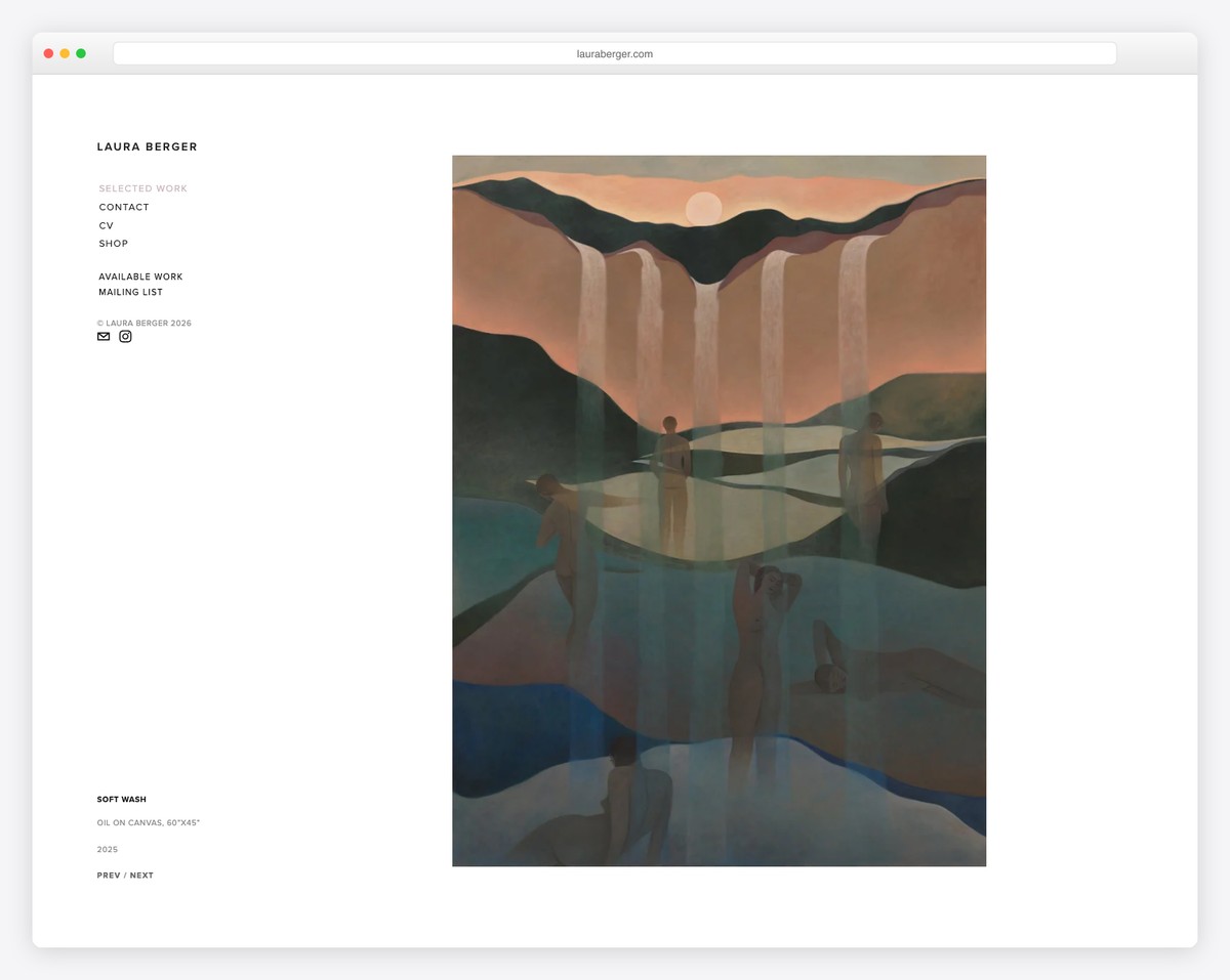
Laura Berger is a painter and sculptor whose Squarespace portfolio showcases colorful, figurative oil paintings exploring themes of human connection and emotion. The intertwined human forms in her work create a distinctive visual language that’s immediately recognizable.
The site’s clean white background lets the vibrant colors of each painting pop, while the simple grid layout creates an organized viewing experience. Separate sections for Paintings, Sculpture, and Prints make it easy for collectors and galleries to find exactly what they’re looking for.
What stands out: A white gallery-style background is the perfect choice for colorful artwork — it eliminates visual competition and lets the art’s own color palette create all the visual impact needed.





Comments (0)