20 Best Scary & Creepy Websites In 2026
Welcome to the shadowy digital corners, where the best scary and creepy websites lurk, waiting to send a shiver down your spine.
As a connoisseur of web design, you know that creating an atmosphere of fear and unease is no small feat.
These websites, masters in digital dread, weave together chilling graphics, haunting audio, and unnerving narratives to create experiences not for the faint of heart.
From ghostly encounters to psychological horrors, the design elements of these sites are as varied as the nightmares they inspire.
However, if I’m 100% honest, I thought I’d find even scarier websites, but I had no luck.
Anyway, if you dare to explore these online haunts’ eerie beauty and spine-tingling innovation, read on…
This post covers:
- Best Scary & Creepy Websites
- What Makes A Great Scary & Creepy Website
- FAQs About Scary & Creepy Websites
- How can color schemes enhance the scary atmosphere of a website?
- What role do typography and font choice play in creating a creepy vibe?
- How important is mobile responsiveness for scary and creepy websites?
- What kind of imagery is most effective for a scary website?
- How can sound be used effectively without being overwhelming?
Best Scary & Creepy Websites
Dive into the online abyss where nightmares and reality blur.
Here are the top picks for the best scary and creepy websites, where every click leads you deeper into a world of spine-chilling wonder.
Or does it?
1. Creepy Pasta
Built with: WordPress
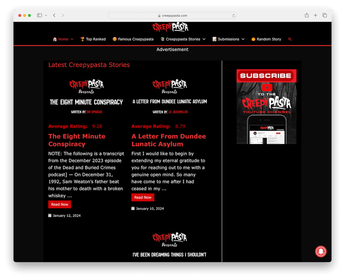
Creepy Pasta is a unique website that stands out for its eerie and chilling design, perfect for horror fans and the macabre.
The site’s black background exudes darkness, accentuated by red detailing that adds an ominous feel.
Navigation is intriguing with a menu bar. Each link is adorned with thematic emojis, enhancing the (not-so-spooky) experience. Plus, it features a user-friendly drop-down menu for easy access.
The layout is thoughtfully designed with a two-column post structure, immersing readers in terrifying tales and creepy lore.
On the right, there’s a sidebar dedicated to a YouTube subscription widget, keeping visitors connected to multimedia horror content and space for a floating advertisement.
What stands out: Creating a scary/creepy website using black look makes perfect sense. (Check some fantastic examples of black websites.)
What stands out: Creepy Pasta excels as a top scary website with its eerie design and a wide array of gripping horror stories.
See this simple step-by-step guide on how to make a WordPress website that’s both scary and creepy. (Hint: help yourself with a dark WordPress theme.)
2. FrightFind
Built with: WordPress
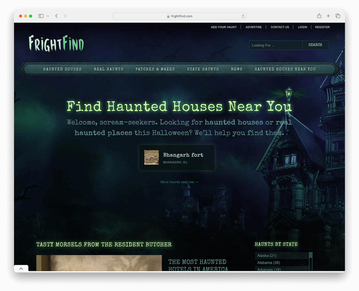
FrightFind is a uniquely thrilling website designed for lovers of horror and the supernatural. Its custom background sets a spooky atmosphere right from the start.
The site includes convenient top bar links and a dynamic search bar that displays live results, enhancing user engagement.
A special section above the fold prominently promotes haunted houses, drawing visitors into the world of real-life horror.
The base of the website is organized into a grid layout, showcasing haunted locations and the latest scary news.
The footer is well-equipped with social media icons and a newsletter subscription option, keeping horror enthusiasts connected and updated.
What stands out: Create a more immersive website atmosphere with a custom background.
What stands out: FrightFind has an interactive design, real-world haunted house listings, and constantly updated content for horror enthusiasts.
3. Hashima Island
Built with: /
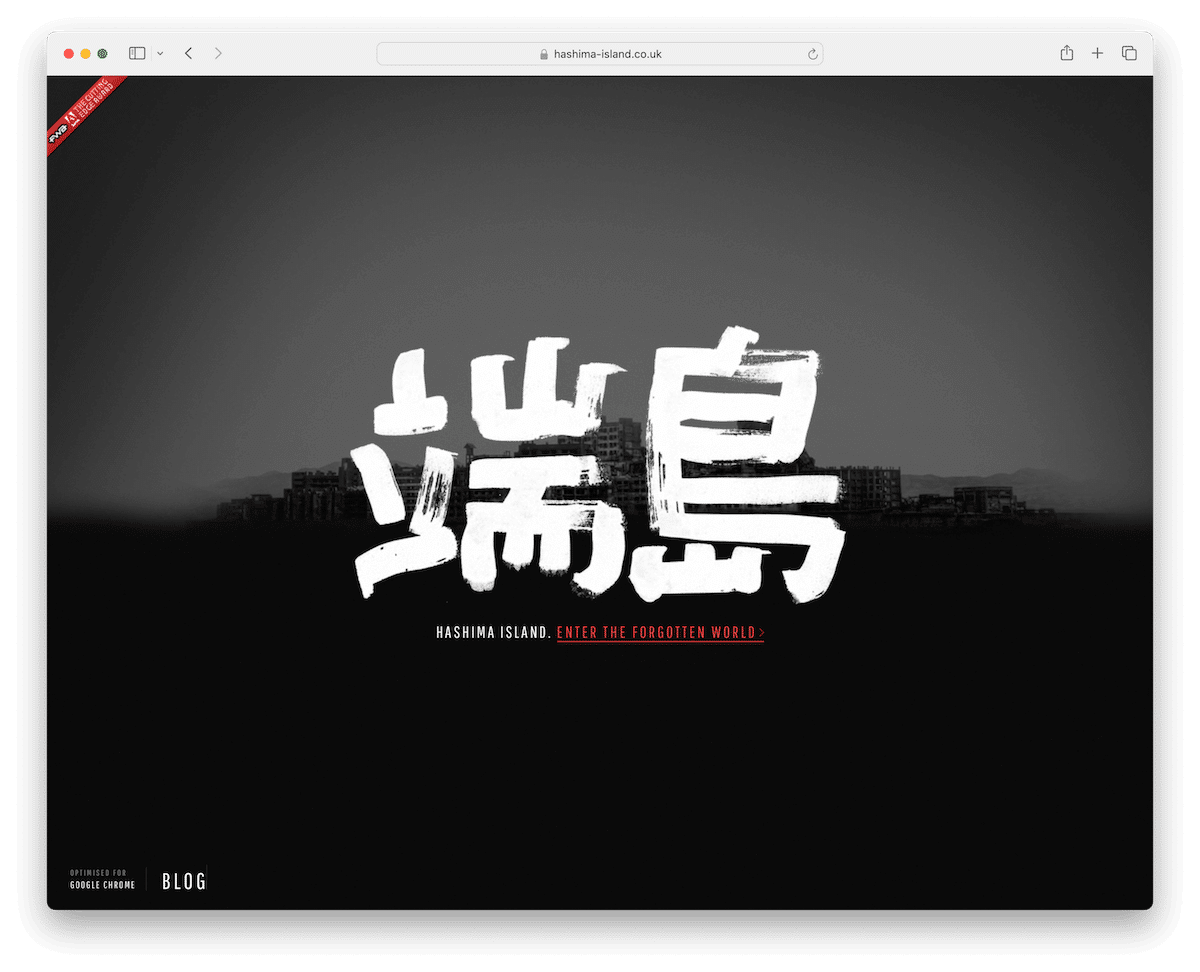
Hashima Island is a scary and creepy website that captures attention immediately. Its dark vibe and background audio get you into the forgotten world without even considering it.
The site provides an advanced introduction to the areas that can be explored on the island, adding context and backstory to Google’s street view.
On the right side is a menu that guides you through different areas, while on the left side is a black and white street view for detailed exploration.
What stands out: Implementing a ghostly song in the background can deliver a much higher level of creepiness to the website.
What stands out: The Hashima Island website strategically uses the power of Google Maps to create a more immersive, dark and intriguing experience.
4. Homicide Monitor
Built with: WordPress
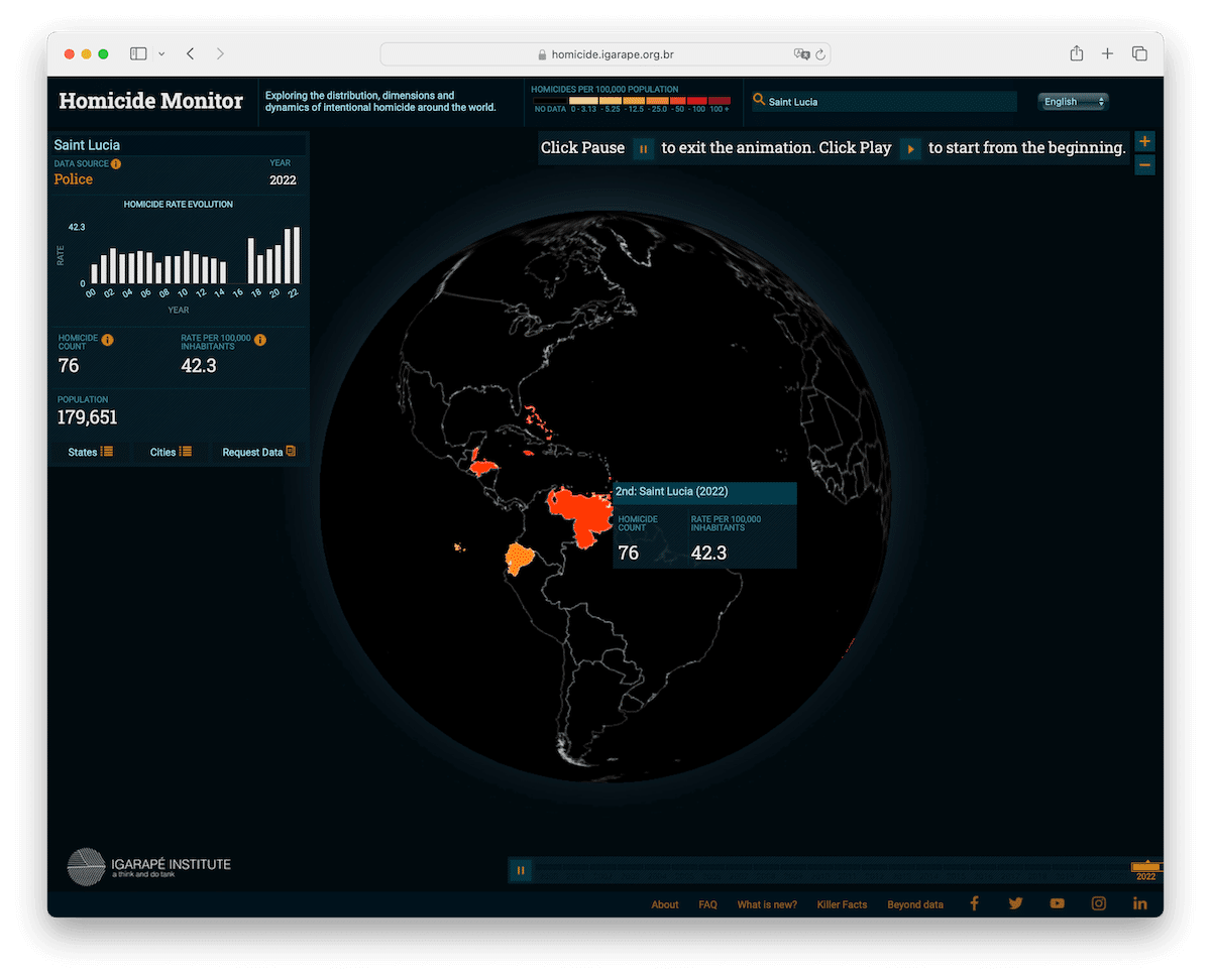
Homicide Monitor is a distinctive website that offers a chilling insight into global homicide rates. Its homepage greets visitors with unsettling “fun facts” about homicides, setting a somber tone.
The site’s dark design reinforces its grave subject matter. A notable feature is the live monitor, which users can customize based on their interests, offering a real-time, interactive experience.
The search bar allows for location-specific homicide data, adding a personal dimension to the global statistics.
Additionally, users can play or pause the live monitor and zoom into the map for detailed views.
What stands out: Visitors can spend more time on site with a live statistic monitor, especially if it’s possible to customize results.
What stands out: Interactive features and dark aesthetics make Homicide Monitor a fascinating, if unnerving, destination for those interested in crime statistics and global trends.
5. Bloody Disgusting
Built with: WordPress
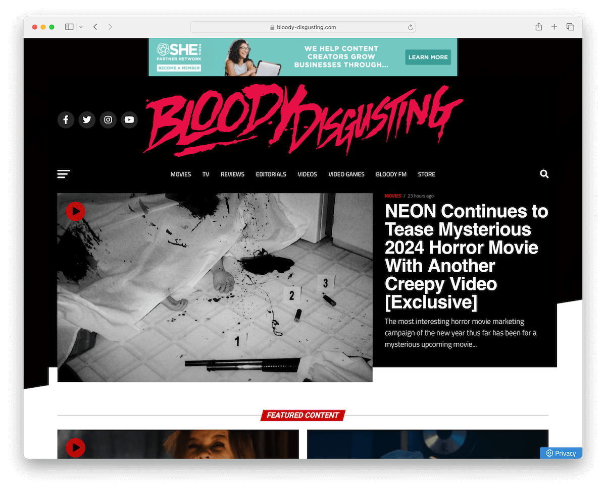
Bloody Disgusting is a premier destination for horror aficionados. Its magazine-like layout immerses visitors in a world of horror and gore.
The website features a main navigation bar with a convenient hamburger menu, ensuring easy access to its vast content. And it boasts a full-screen search overlay for effortless browsing.
A handy back-to-top button enhances user navigation, but the header reappears when scrolling back to the top.
The design includes a sticky right sidebar, keeping essential elements within reach. Its dark, minimalist footer nicely ends the site, making it a comprehensive and stylish hub for all things horror, from movies to literature.
What stands out: Ensure your website’s navigation is easy to use and convenient for quick content finding (mega menu, hamburger menu, drop-down, etc.)
What stands out: Bloody Disgusting’s extensive horror-focused content, user-friendly design and absorbing layout make it a top scary magazine website.
6. Grey Lady Ghost
Built with: WordPress
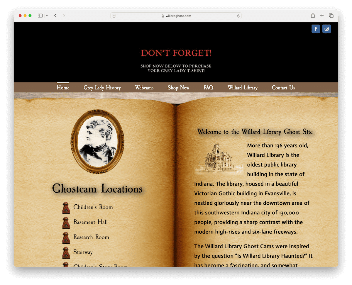
The Grey Lady Ghost website stands out among scary and creepy websites due to its unique design elements.
Above the navigation bar, a merch promotion sets the tone, while a sticky drop-down menu guides users to the right information.
Moreover, it draws users in with a spine-chilling atmosphere, featuring an open-book design with links on the left page and information on the right.
The site offers embedded live ghost cams for an immersive experience and a well-organized layout that feels like turning the pages of a ghostly tome.
Grey Lady Ghost ensures a truly chilling encounter with a captivating blend of design and content.
What stands out: Create a custom-made website look for your scary and creepy website, like Grey Lady Ghost.
What stands out: Grey Lady Ghost has a catchy design, spooky ambient, and unique interactive features that captivate and terrify users.
7. Death Row Information
Built with: /
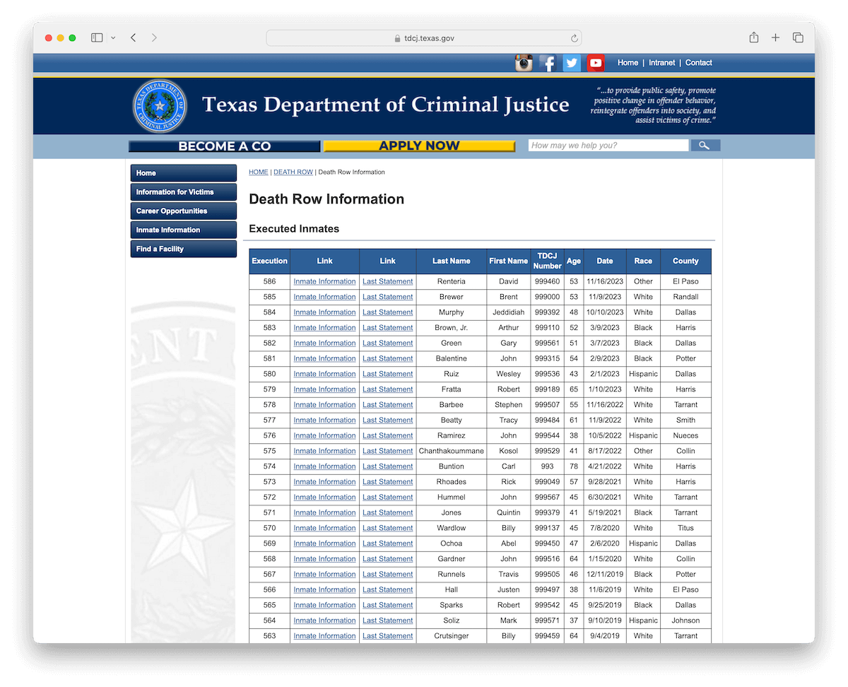
The Death Row Information website exudes a fearful aura with its minimalist, list-style layout featuring executed inmates.
The ability to access detailed information about each inmate, complete with images, makes it spine-chilling. But it takes the creepiness to another level, including their last statements.
This chilling website delves into the world of final moments and confessions, making it a truly haunting online experience.
What stands out: A minimalist layout still wins even when creating a fear-first website.
What stands out: Death Row Information provides a chilling online experience with its unsettling profiles of executed inmates, including their last statements.
8. FatefulDay
Built with: /
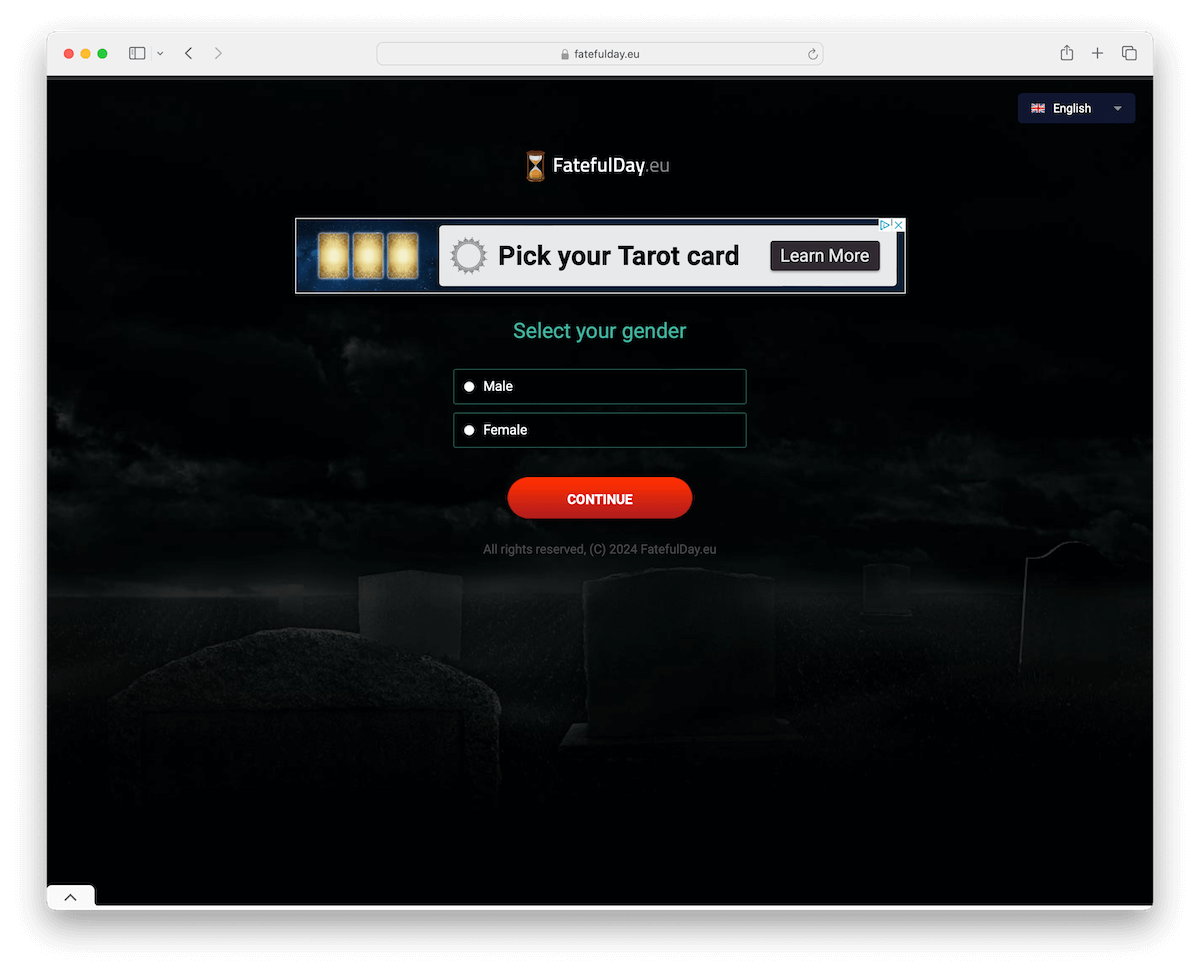
Yup, you read that right: enter the FatefulDay website. What’s it all about? It’ll tell you when you’ll die – as simple as that.
Through a multi-step questionnaire, FatefulDay reveals your, well, fateful day. It also comes with a countdown timer featuring years, weeks, days, hours, minutes and seconds until your D-day.
Apparently, I’ll live over 100, which is my goal anyway, so thanks for confirming, FatefulDay.
What’s also cool is that you can select your language in case English is too challenging for you.
What stands out: Keep the user in the zone with a multi-step question wizard.
What stands out: FatefulDay is a simple yet powerful website that gives you more chills with every step of the questionnaire.
9. Castle Of Spirits
Built with: Wix
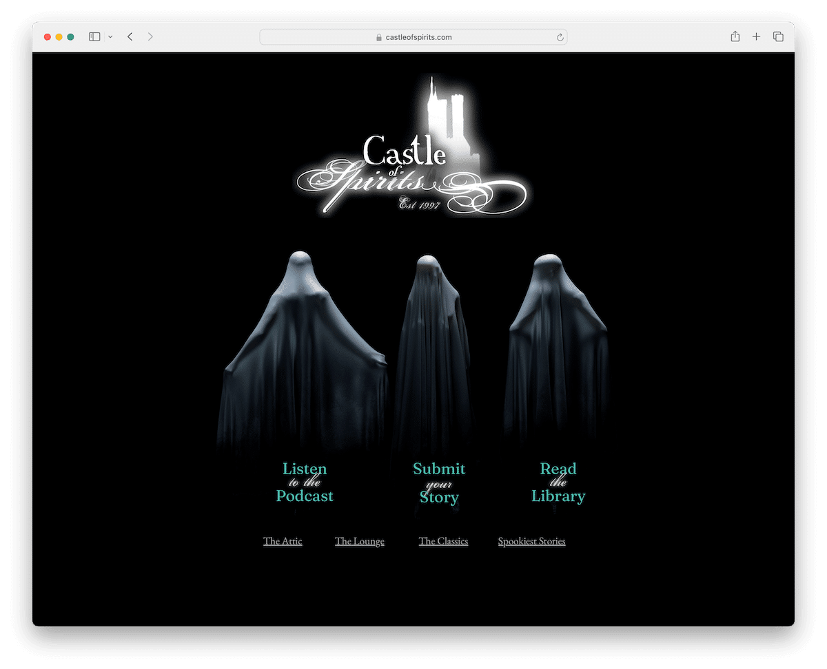
Castle Of Spirits entices visitors with its spookish charm, featuring a dark-themed design that sets a foreboding tone.
This Wix website showcases its podcast prominently on the simple homepage and invites users to submit and read spine-tingling stories in its library. It also rocks a newsletter subscription pop, offering a dose of the supernatural directly to your inbox.
With a minimalist yet unsettling approach, Castle Of Spirits delivers a curious online experience for those seeking paranormal tales.
What stands out: Grow your email list with a newsletter subscription popup even on a scary and creepy website.
What stands out: Castle Of Spirits blends captivating storytelling, darkish design and a mysterious ambience.
10. This Man
Built with: WordPress
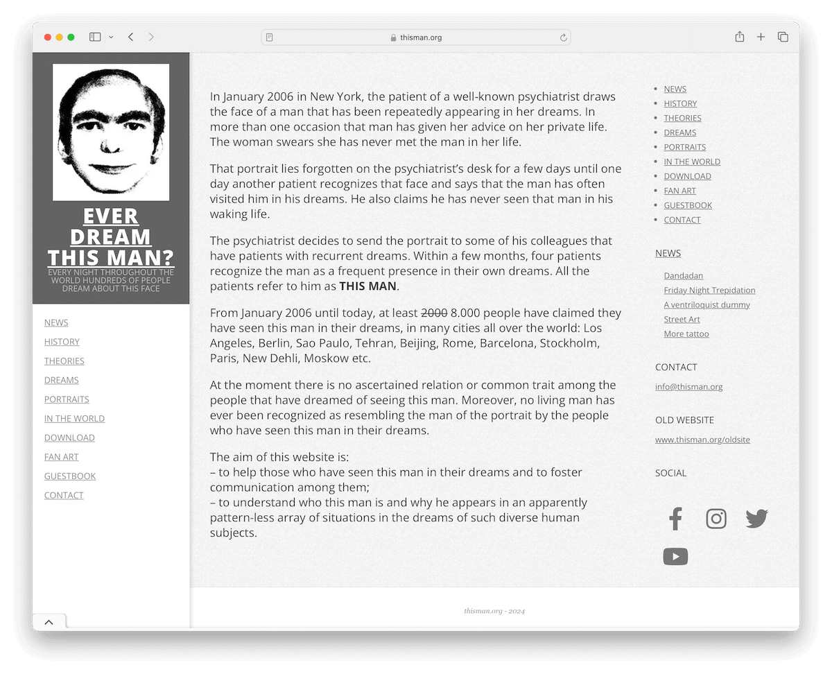
While This Man website might not really have a scary or creepy appearance, the story behind it is pretty uneasy.
According to the page, there are more than eight thousand people around the world who have seen this man in their dreams. I haven’t – yet.
Who is this mean? No one knows. But if it ever appeared in your dreams, you’re not alone. There are many theories, but I won’t go that round.
What stands out: It’s not necessarily the design that makes a website scary or creepy; a story, a piece of news, etc., can make it so, too.
What stands out: This Man isn’t a traditional scary website, but that makes it pop more.
11. Plane Crash Info – Last Words
Built with: /
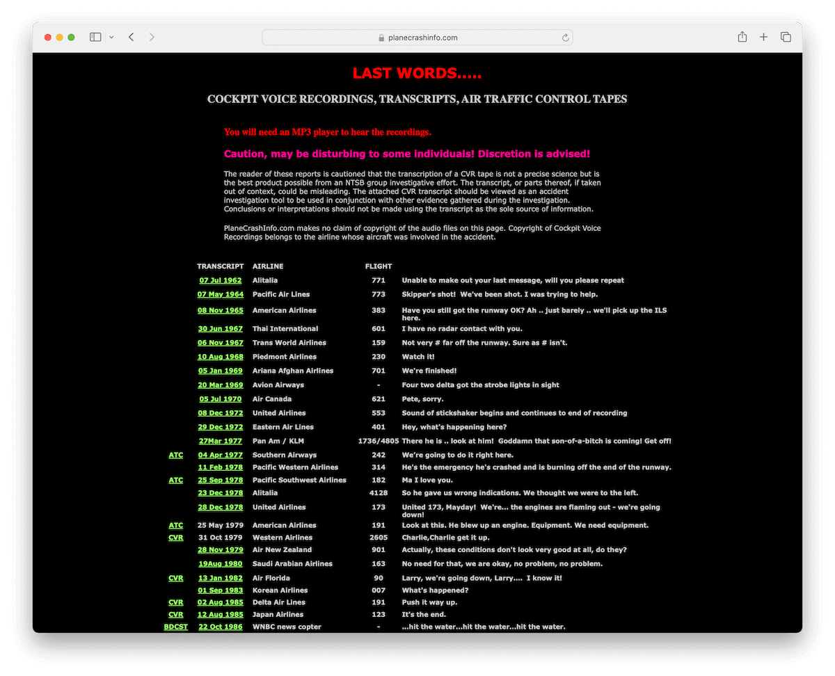
Plane Crash Info presents a spine-chilling experience with its collection of cockpit voice recordings, transcripts, and air traffic control tapes from aviation disasters.
A stark warning cautions visitors that the content may be disturbing, adding an extra layer of unease.
The website also offers a repository of information about recent plane crashes, complete with images, on its homepage.
With its unsettling audio records and grim imagery, Plane Crash Info takes visitors on a harrowing journey through aviation’s darkest moments.
What stands out: If you plan to create a website about real-time disasters, make it scarier by including actual images.
What stands out: Plane Crash has no scary or creepy website design, but its content is.
12. World Birth & Death Rates
Built with: /
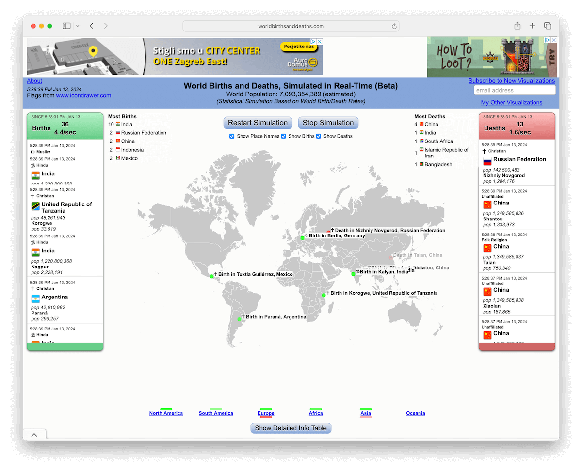
World Birth & Death Rates presents a doomy spectacle with its live monitor reminiscent of the Homicide Monitor, featuring central maps displaying real-time locations of births and deaths.
The website allows users to customize the map’s appearance, which is flanked by live counters on the left and right.
This unsettling platform offers a voyeuristic glimpse into the world’s birth and death rates, consuming visitors in the haunting rhythm of life and mortality through its interactive features.
What stands out: If creating a live monitor, ensure there’s also a counter so visitors can better picture the situation. For instance, World Birth & Death Rates shows that there are approx. four births and two deaths per second.
What stands out: World Birth & Death Rates offers a voyeuristic view into real-time birth and death locations, coupled with customizable maps and live counters, creating a not-so-pleasant exploration of life and mortality.
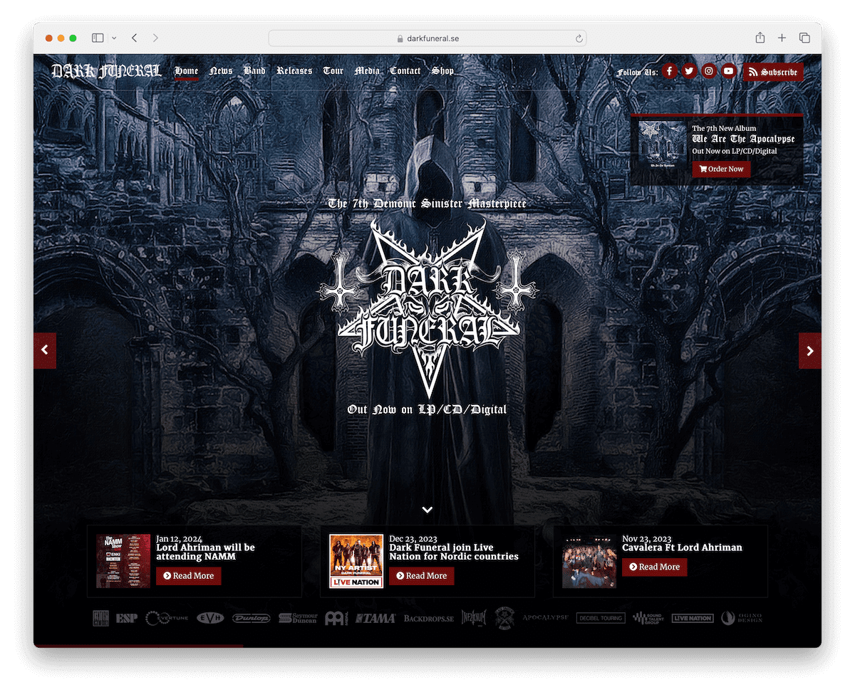
13. Dark Funeral
Built with: /
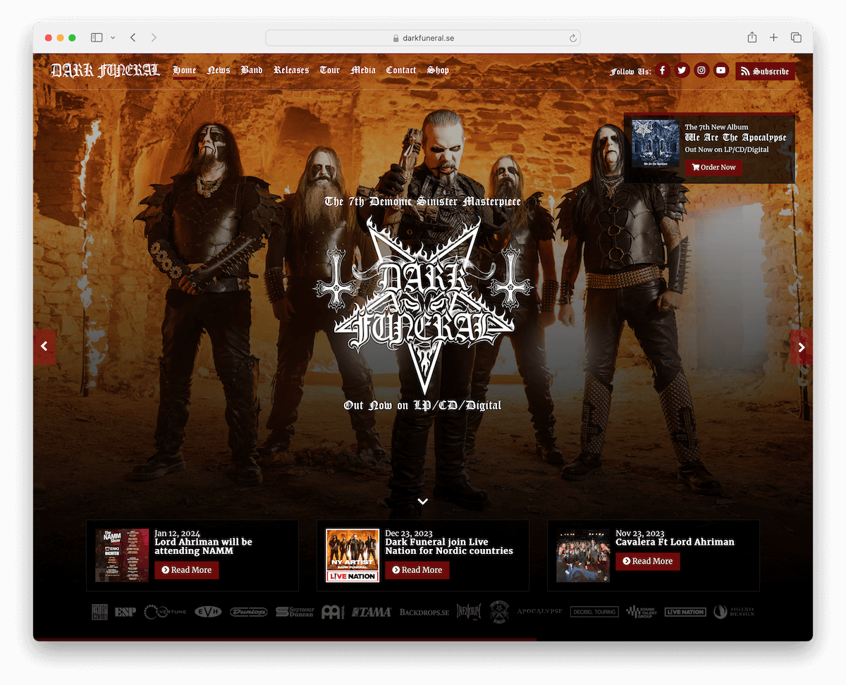
Dark Funeral is a black metal band from Sweden that rocks a website that perfectly reflects their vibe.
The page is black, and above the fold, a large slideshow features pictures of the band and the album cover.
The header is transparent but turns solid when scrolled, making it much easier and more convenient to visit different site sections.
The embedded music videos allow for on-the-spot watching, while the list of tour dates comes with RSVP and Ticket buttons.
What stands out: Promote your scary imagery and other content with a large and captivating slideshow above the fold.
What stands out: Dark Funeral is an excellent example of a website that might feel scary for some but exciting for the fans.
Since you are already on a path to researching weird websites, how about checking out the worst websites of all time?
14. SCP Foundation
Built with: Custom
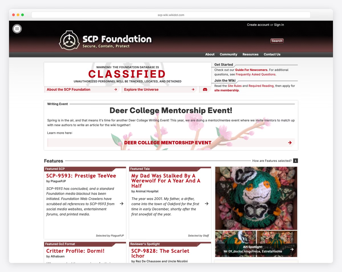
The SCP Foundation is a massive collaborative fiction wiki documenting fictional anomalous entities in a clinical, scientific tone. The sterile formatting and bureaucratic writing style make the horror content feel disturbingly plausible — like you’ve accidentally accessed a classified government database.
What stands out: The clinical, document-style formatting is what makes this site genuinely unsettling — horror presented as mundane fact is more disturbing than any jump scare.
15. Welcome Home
Built with: Custom
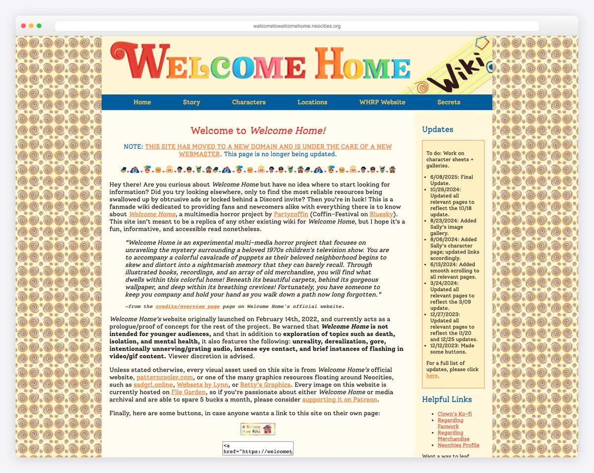
Welcome Home disguises itself as a nostalgic 1970s puppet show restoration site that gradually reveals a deeply unsettling alternate reality game. The retro color palette, hand-drawn characters, and cheerful tone create cognitive dissonance that makes the hidden horror elements even more disturbing.
What stands out: The contrast between wholesome vintage aesthetics and hidden horror elements creates one of the most effective ARG experiences on the web.
16. Housecreep
Built with: Custom
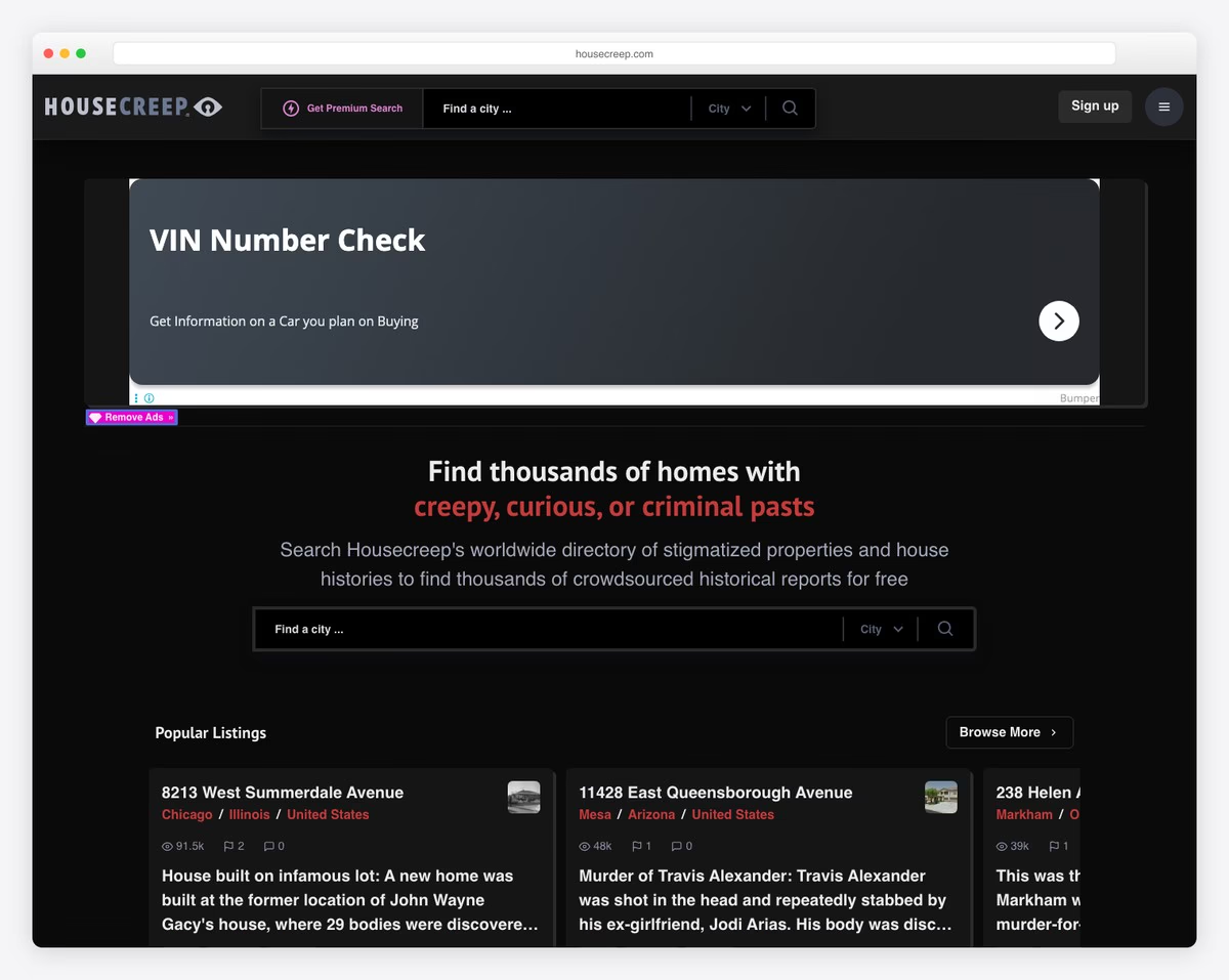
Housecreep is a real estate database mapping stigmatized properties worldwide — murder houses, haunted homes, and locations of violent crimes. The functional, map-based interface lets you search any address for its dark history, blurring the line between utility tool and morbid curiosity.
What stands out: What makes Housecreep genuinely creepy is that it documents real events — the horror is in the data, not the design.
17. Scary for Kids
Built with: Custom
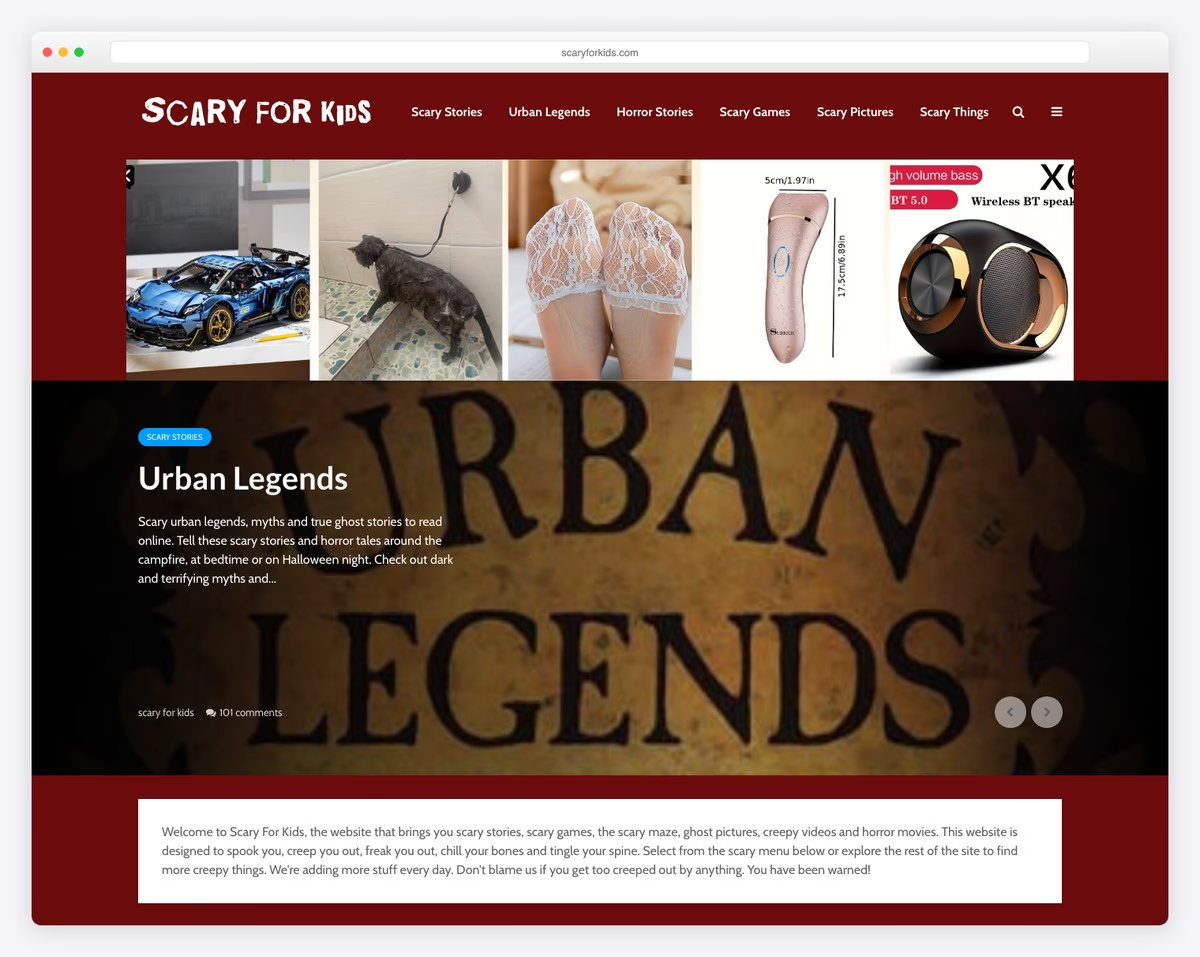
Scary for Kids is a long-running horror archive featuring Japanese urban legends, creepy images, ghost stories, and disturbing videos. The deliberately retro web design with dark backgrounds and eerie illustrations evokes early-2000s internet horror culture.
What stands out: The retro web design is intentional — it evokes the era of chain emails and early internet creepypasta that defined digital horror culture.
18. Delusion
Built with: Custom
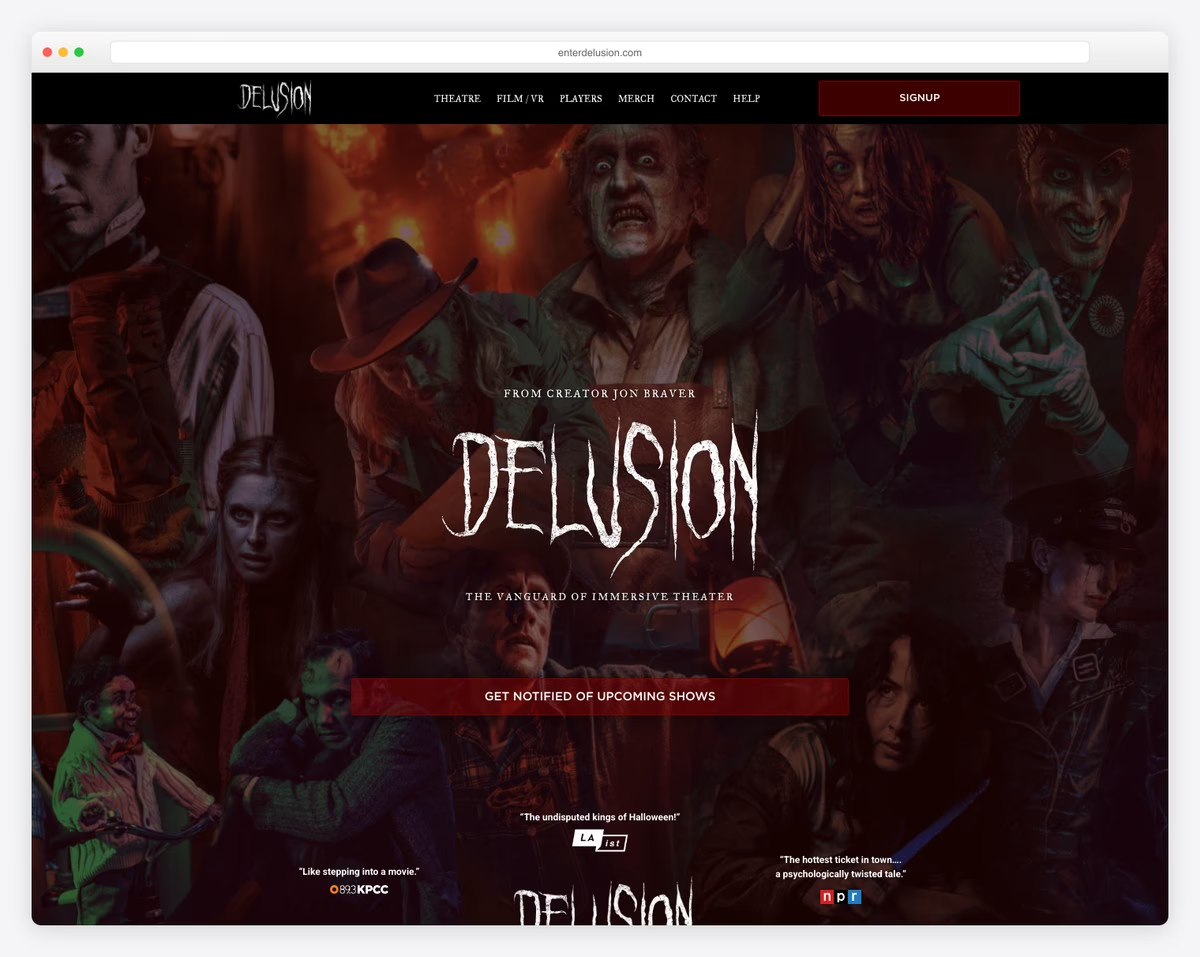
Delusion promotes Los Angeles’ premier interactive horror theater experience with dark, cinematic design. Video backgrounds, moody lighting, and bold typography mirror the immersive, choose-your-path haunted productions it advertises, creating anticipation before you even buy a ticket.
What stands out: Using dark video backgrounds and cinematic typography instantly establishes a horror atmosphere — the website itself becomes the first act of the experience.
19. Sinister Visions
Built with: Custom
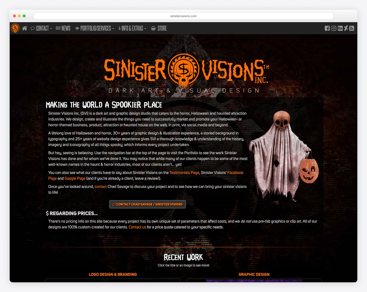
Sinister Visions is a horror-industry design studio whose own portfolio site drips with dark atmosphere. Their work for haunted houses, Halloween attractions, and horror brands is showcased in a gallery that doubles as a masterclass in dark web design.
What stands out: A portfolio site that embodies the aesthetic of its target industry is the ultimate form of design credibility — clients can see the skill before reading a single case study.
20. Creepy Catalog
Built with: Custom
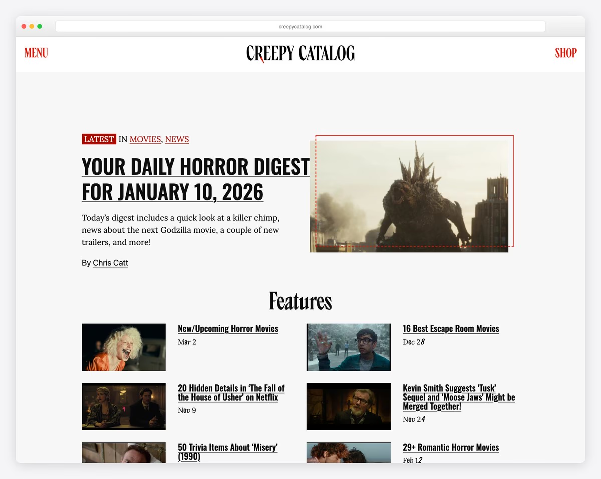
Creepy Catalog is a dedicated horror content hub featuring true crime stories, paranormal encounters, urban legends, and disturbing real-life mysteries. The magazine-style layout with dark typography and atmospheric imagery creates a browsing experience that keeps you reading long past bedtime.
What stands out: A content hub with a focused niche (horror/true crime) and magazine-quality design attracts dedicated readers who return daily for new content.
What Makes A Great Scary & Creepy Website
Venturing into the online macabre requires more than just dark themes and eerie images.
Here are five key features that elevate a website from merely unsettling to truly terrifying, crafting an unforgettable journey into the heart of darkness.
Hint: You can do much better than any of the above examples.
- Atmospheric design: A great scary and creepy website immerses the user in an unsettling atmosphere right from the start. You can achieve this through a dark color palette, wacky background images, or unsettling graphics that set the tone for the site’s content.
- Suspenseful audio and sound effects: Strategic use of audio can significantly enhance the creepiness of a website. Low, ominous background music, sudden sound effects, or even complete silence at times can create a sense of suspense and unease.
- Interactive elements: Interactive features, such as hidden clickable areas that trigger jump scares or reveal disturbing content, can engage users more deeply. These elements often add a level of unpredictability and surprise, heightening the sense of fear.
- Narrative and storytelling: Incorporating a compelling, mysterious, or disturbing story draws users in. Whether it’s through text, images, or videos, a good story can make the website more engaging and memorable, especially if it plays on common fears or psychological horror.
- Visual effects and animations: Effective use of visual effects, such as flickering lights, shadowy figures moving in the background, or unsettling animations, can create a sense of movement and life that makes the site feel more real and terrifying. These visual elements contribute to an immersive experience that keeps users on edge.
FAQs About Scary & Creepy Websites
How can color schemes enhance the scary atmosphere of a website?
Dark and muted color schemes, often with contrasting splashes of red or other stark colors, can create a foreboding atmosphere. These colors can evoke danger, fear, and unease, setting the right mood for a scary and creepy website.
What role do typography and font choice play in creating a creepy vibe?
Fonts play a crucial role in setting the tone. Gothic, handwritten, or irregular fonts can give an eldritch, unsettling feel. The key is to use fonts that are not only visually disturbing but also readable to maintain user engagement.
How important is mobile responsiveness for scary and creepy websites?
Mobile responsiveness is critical, as many users will access these sites on their phones. A responsive design ensures the frightening experience is consistent across all devices, maintaining the atmosphere and functionality of the website.
What kind of imagery is most effective for a scary website?
Imagery that invokes fear or discomfort works best. This can include dark, shadowy figures, unsettling landscapes, distorted faces, or bizarre, abandoned places.
How can sound be used effectively without being overwhelming?
Sound should be used sparingly and strategically. Background music can be low and ominous, with occasional startling sound effects for jump scares. The key is to balance it to enhance the creepy ambiance without overpowering the user’s senses or becoming a distraction.
Related Posts


Comments (0)